
Analytics Documentation
Analytics answers one question: what is Sledge actually earning you? Every number here is revenue Sledge can take credit for — an order where a customer interacted with one of your Sledge widgets befo
Analytics answers one question: what is Sledge actually earning you? Every number here is revenue Sledge can take credit for — an order where a customer interacted with one of your Sledge widgets before buying — not your whole store’s revenue.
The six tabs across the top are the same data cut six different ways. Rather than reading them in order, it helps to know which question each one answers:
- Overview — how much, in total?
- By Surfaces — where in the store did it happen?
- By Features — which tool earned it?
- By Goals — is it moving the outcome I care about?
- Journey Performance — where are customers dropping out?
- Signals — what are customers telling me they want?
The filters in the top-right apply to every tab: the date range (Today), No comparison to compare against a previous period, plus All traffic and All channels. Export downloads what you’re looking at.
Overview — the headline number
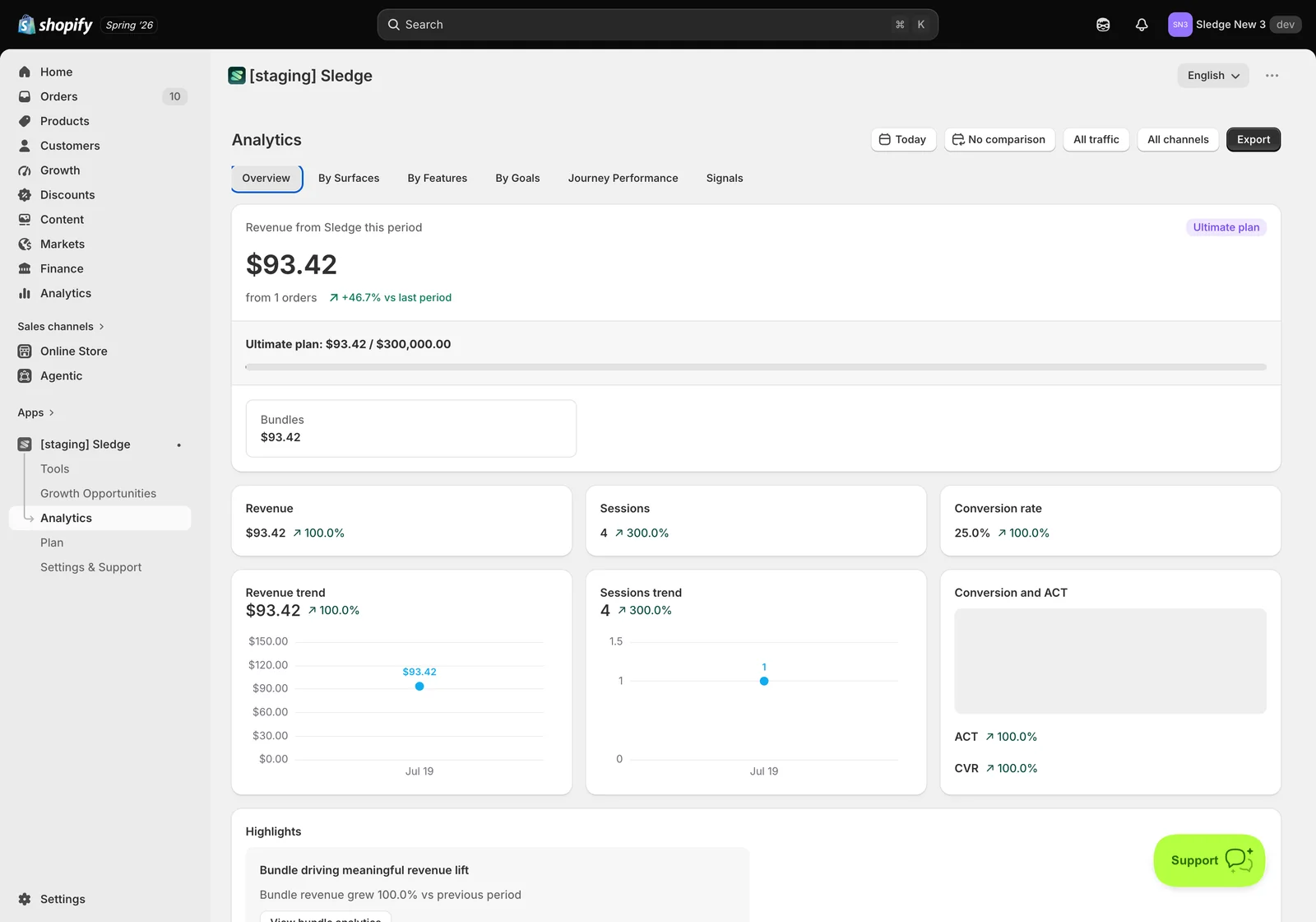
Revenue from Sledge this period sits at the top, with the order count beneath it and the change against the previous period. Under that, a breakdown by feature shows which tools contributed, then the core metrics: Revenue, Sessions, Conversion rate, and their trends.
Start here to see whether Sledge is earning at all, then use the other tabs to find out why. If your plan has a revenue allowance, the progress bar here also shows how much of it you’ve used.
By Surfaces — where it happened
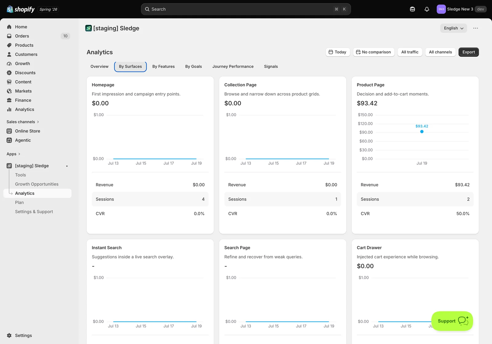
A card per surface — Homepage, Collection Page, Product Page, Instant Search, Search Page, Cart Drawer and the rest — each with its own Revenue, Sessions and CVR.
This is the most actionable tab in the whole section, because it tells you which parts of your store are pulling their weight. In the example above, Product Page shows $93.42 from 2 sessions at 50% CVR, while Homepage sits at $0.00 from 4 sessions and Instant Search and Search Page show only a dash.
Read a dash as “not measured”, not “not working”. A surface with no Sledge widget enabled cannot record anything — there is nothing there for a customer to interact with. Zero revenue on a surface you never switched on isn’t a result; it’s a blind spot.
Why switching on more surfaces matters
It’s tempting to enable Sledge on one page, see revenue, and stop. That leaves two things on the table.
First, coverage. Customers don’t arrive in one place. Some land on a collection page from an ad, some search, some go straight to a product. Each surface you enable is another point where Sledge can help — and another point where it can be measured. The example above makes this concrete: all the revenue is on Product Page because that’s where the bundle runs. The four homepage sessions produced nothing measurable, not because the homepage is worthless, but because nothing was running on it.
Second, and less obvious: surfaces are how Sledge learns. Every interaction is a data point — what customers searched, which filters they used, what they ignored, where they gave up. One surface produces a thin trickle. Several surfaces produce enough for a pattern to form, and patterns are what turn raw numbers into the recommendations in Signals and Journey Performance.
This is why a new store sees empty panels. It isn’t broken — there simply isn’t enough behaviour recorded yet to say anything trustworthy. The fastest way through that phase is to give Sledge more places to observe, then let real traffic accumulate.
By Features — which tool earned it
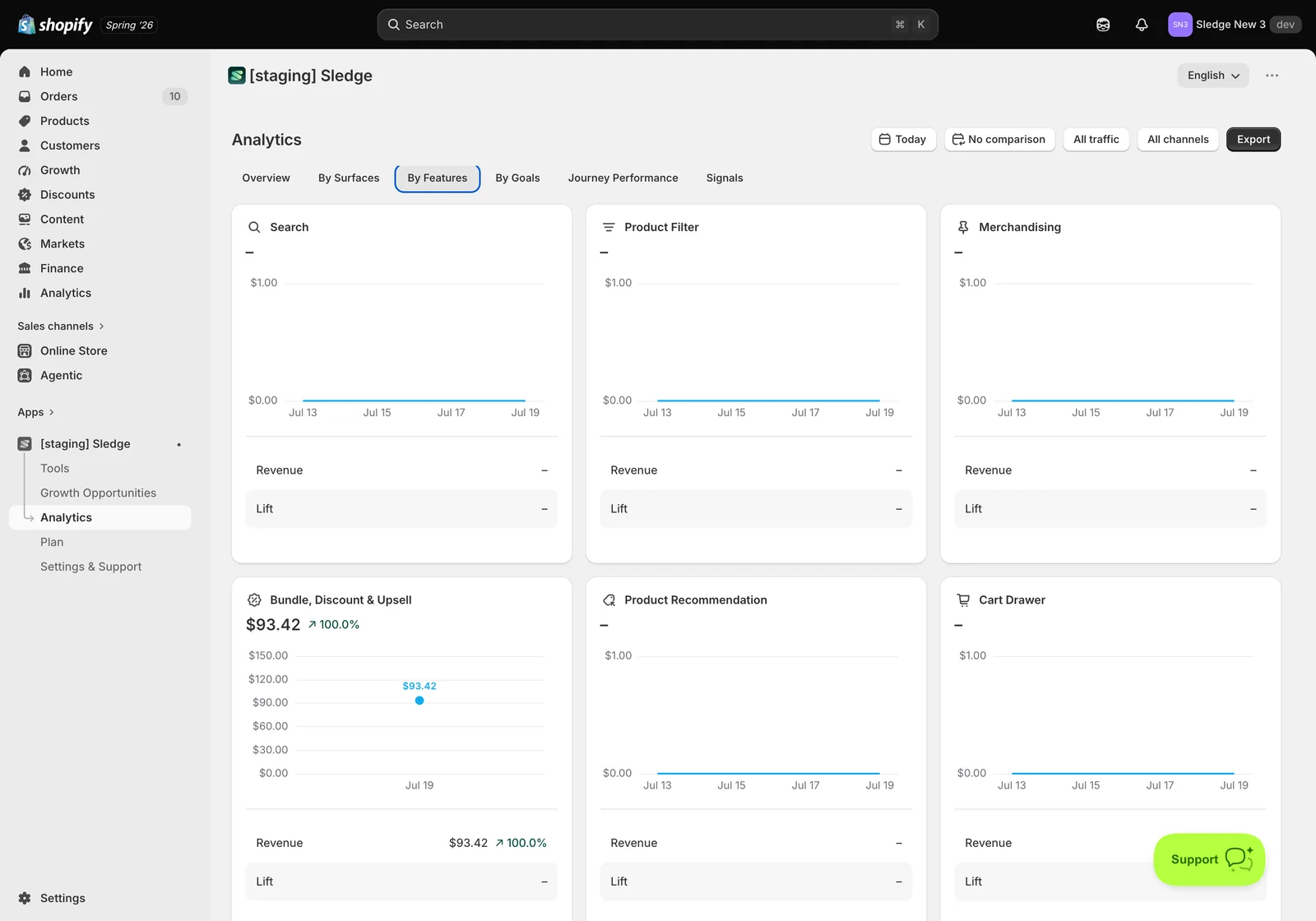
The same revenue, split by tool instead of by page: Search, Product Filter, Merchandising, Bundle, Discount & Upsell, Product Recommendation, Cart Drawer. Each card carries a trend line, its Revenue, and its Lift.
Use this to decide where your effort goes. In the example, Bundle, Discount & Upsell is carrying everything at $93.42 while the rest show a dash — a clear sign the other tools either aren’t configured or aren’t placed anywhere customers meet them.
By Goals — is it moving the needle
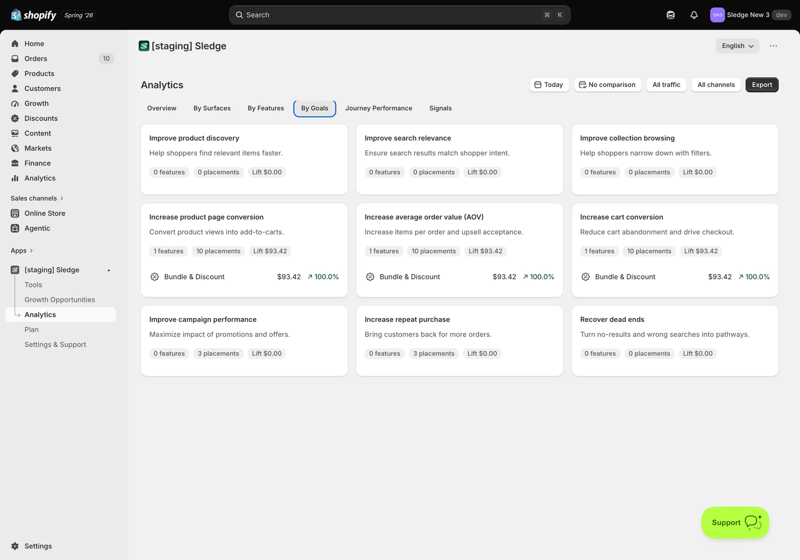
Nine business outcomes rather than features: Improve product discovery, Improve search relevance, Improve collection browsing, Increase product page conversion, Increase average order value (AOV), Increase cart conversion, Improve campaign performance, Increase repeat purchase, and Recover dead ends.
Each card shows how many features and placements are working toward that goal and the Lift they’ve produced. It’s the quickest way to spot a goal you care about that has nothing assigned to it — a card reading 0 features, 0 placements is a goal you’ve left unattended.
Journey Performance — where customers drop out
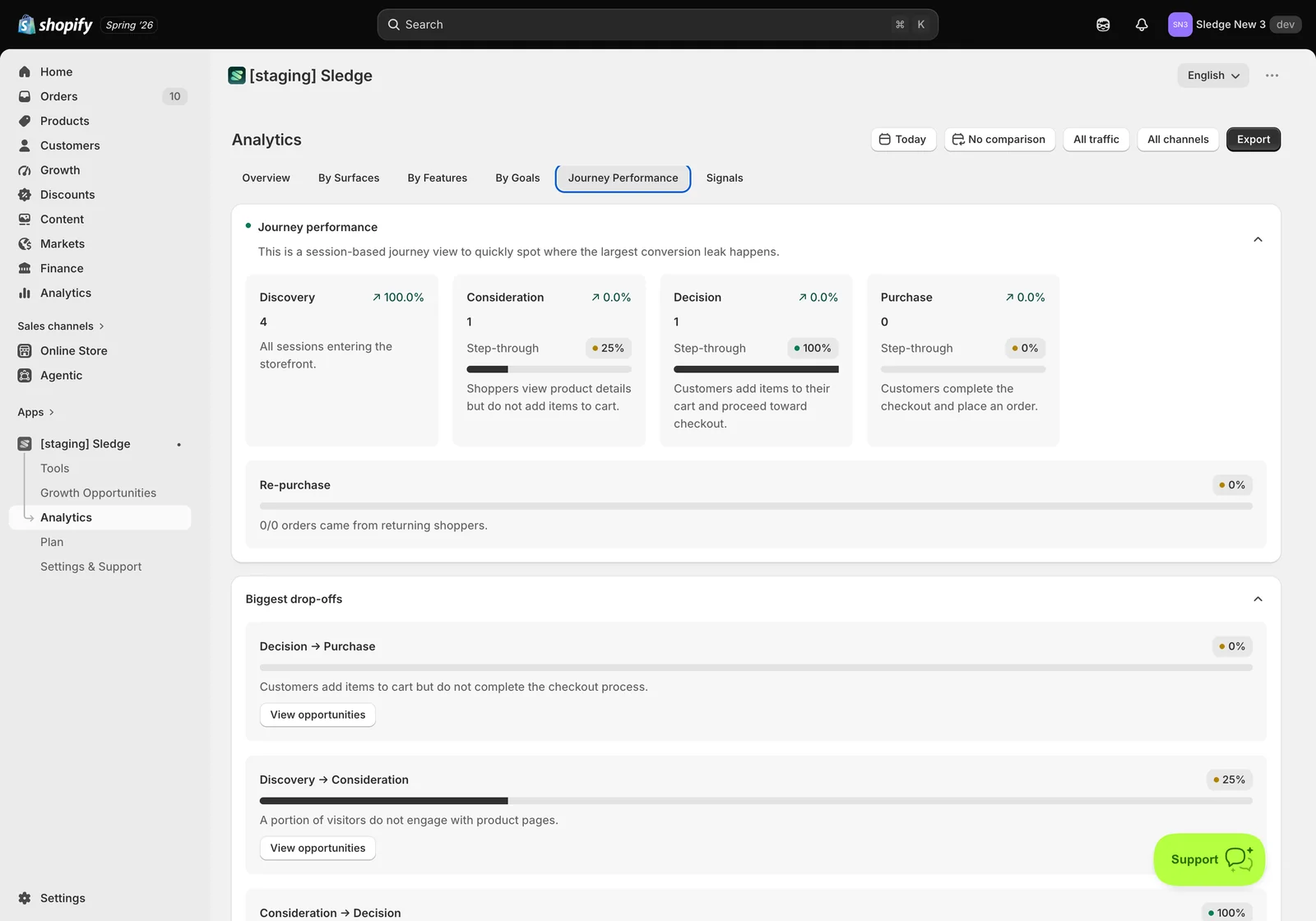
A session-based funnel across four stages, each with a step-through rate:
- Discovery — all sessions entering the storefront.
- Consideration — customers view product details but haven’t added to cart.
- Decision — items are in the cart and the customer is heading to checkout.
- Purchase — the order is placed.
Below the funnel, Re-purchase tracks how many orders came from returning customers, and Biggest drop-offs ranks the leaks — for example Discovery → Consideration at 25%, meaning three of four visitors never reached a product page. Each leak has a View opportunities button that takes you to what Sledge suggests doing about it.
Read this tab as a diagnosis: the stage with the worst step-through is where your next change should go.
Signals — what customers are telling you
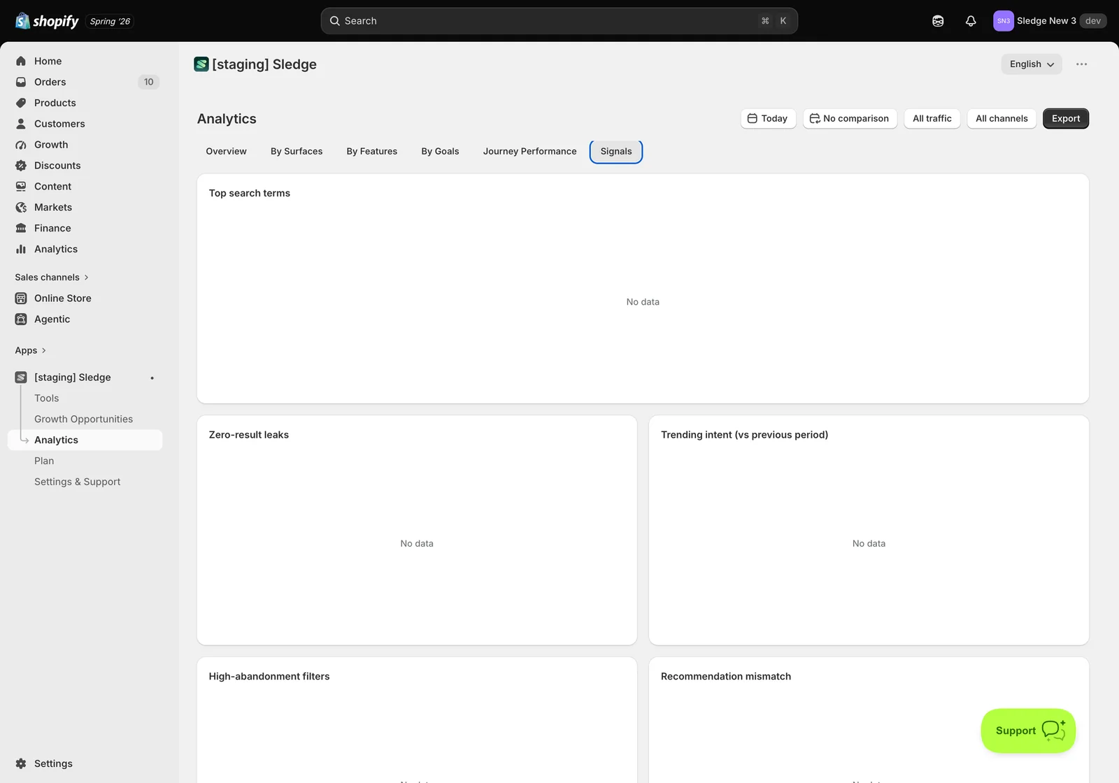
Signals is the qualitative side — intent rather than money:
- Top search terms — what customers actually type, in their words rather than yours.
- Zero-result leaks — searches that returned nothing. Demand you already have and can’t serve; often the fastest win on the whole page.
- Trending intent — what’s rising compared with the previous period.
- High-abandonment filters — filters customers apply and then give up on.
- Recommendation mismatch — where recommendations aren’t landing.
In the example every panel reads No data, and that’s the point worth understanding: these panels are built from repeated behaviour. Sledge won’t report a “top” search term from one search, or call a filter high-abandonment from a single session — a pattern needs volume before it means anything. Enable search and filtering, let traffic run, and this tab fills in on its own.
Reading the tabs together
Overview tells you the size of the prize. By Surfaces and By Features tell you where it’s coming from — and, by their gaps, where it isn’t. By Goals checks you’re aimed at the right outcome. Journey Performance shows the leak, and Signals often explains it.
A worked example: if Journey Performance shows a big Discovery → Consideration drop and Signals shows zero-result searches, customers are looking for things your search can’t find. That’s a search and merchandising fix, and you’d expect it to show up later as revenue on the Search Page surface.
Numbers look wrong? Check the date range first — Today is a narrow window and most stores need a longer one to see anything. Remember this reports Sledge-attributed revenue only, so it will always be lower than your Shopify total. Analytics is event-based, so a brand-new order can take a few minutes to appear. And if a surface or feature shows a dash, confirm it’s actually enabled under Tools before reading it as poor performance.
Related
- Growth Opportunities
- Where widgets appear (Surfaces)
Last updated on