
How to set up cart drawer?
The Cart Drawer is the slide-out cart that opens when a customer adds something, instead of sending them away to a separate cart page. They keep their place, and you keep the momentum.
The Cart Drawer is the slide-out cart that opens when a customer adds something, instead of sending them away to a separate cart page. They keep their place, and you keep the momentum.
It’s also the highest-intent surface in your store — everyone who opens it has already decided to buy. That’s why it’s built from stackable blocks: a rewards bar showing how close free shipping is, a countdown, a recommendation row, a discount field, trust badges. You switch on the ones that suit your store and leave the rest off.
This guide walks through every setting, in the order they appear: General, Header, Body, then Footer.
Before you start — Sledge must be active on your theme. Settings are grouped into collapsible cards; click a card heading to open it. The Preview on the right updates as you edit, so keep an eye on it — it’s the fastest way to see what a setting actually does.
Turn the cart drawer on
- Go to Tools → Cart Drawer. The first card has a single switch: Cart Drawer — turn this on to activate the cart drawer experience on your storefront. Switch it on.
- Under Features, click Cart Drawer — manage all settings cart drawer to open the settings page. (Translation next to it is where you localise the drawer’s text.)
General — position and overall look
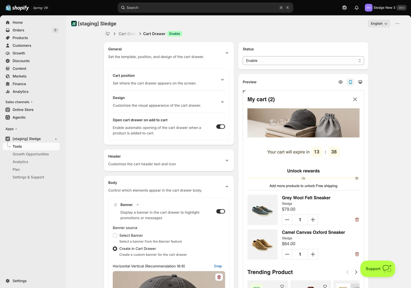
- Cart position — choose whether the drawer slides in from the Left or the Right. Right is the common choice because most themes put the cart icon top-right, so the drawer opens under the customer’s cursor.
- Design — the drawer’s overall appearance: Border radius, Background color, and Border color. Match these to your theme so the drawer reads as part of your store rather than a bolt-on.
- Open cart drawer on add to cart — when on, the drawer opens automatically the moment a product is added. Leave it on if you want customers to see upsells immediately; switch it off if you’d rather they carry on browsing uninterrupted.
Header — the top of the drawer
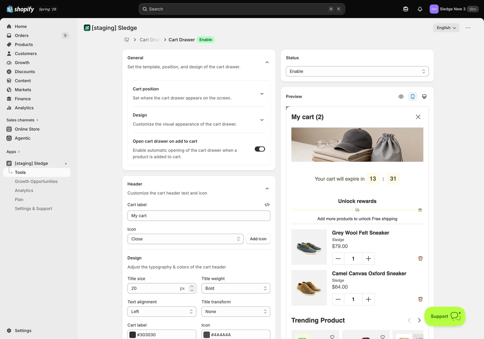
- Cart label — the title customers see, e.g. My cart. Sledge appends the item count automatically, so it reads My cart (2).
- Icon — the close control in the corner. Pick the icon (for example Close) or use Add icon to upload your own.
- Design — typography and colours for the header: Title size in px, Title weight, Text alignment, Title transform (for uppercase and similar), plus separate colours for the Cart label and the Icon.
Body — what sits between the header and the totals
The Body card holds the blocks that make up the middle of the drawer. Each has its own on/off switch, and each has a drag handle on the left — the order you arrange them here is the order customers see. Switch off anything you don’t need; an overloaded drawer converts worse than a focused one.
Banner
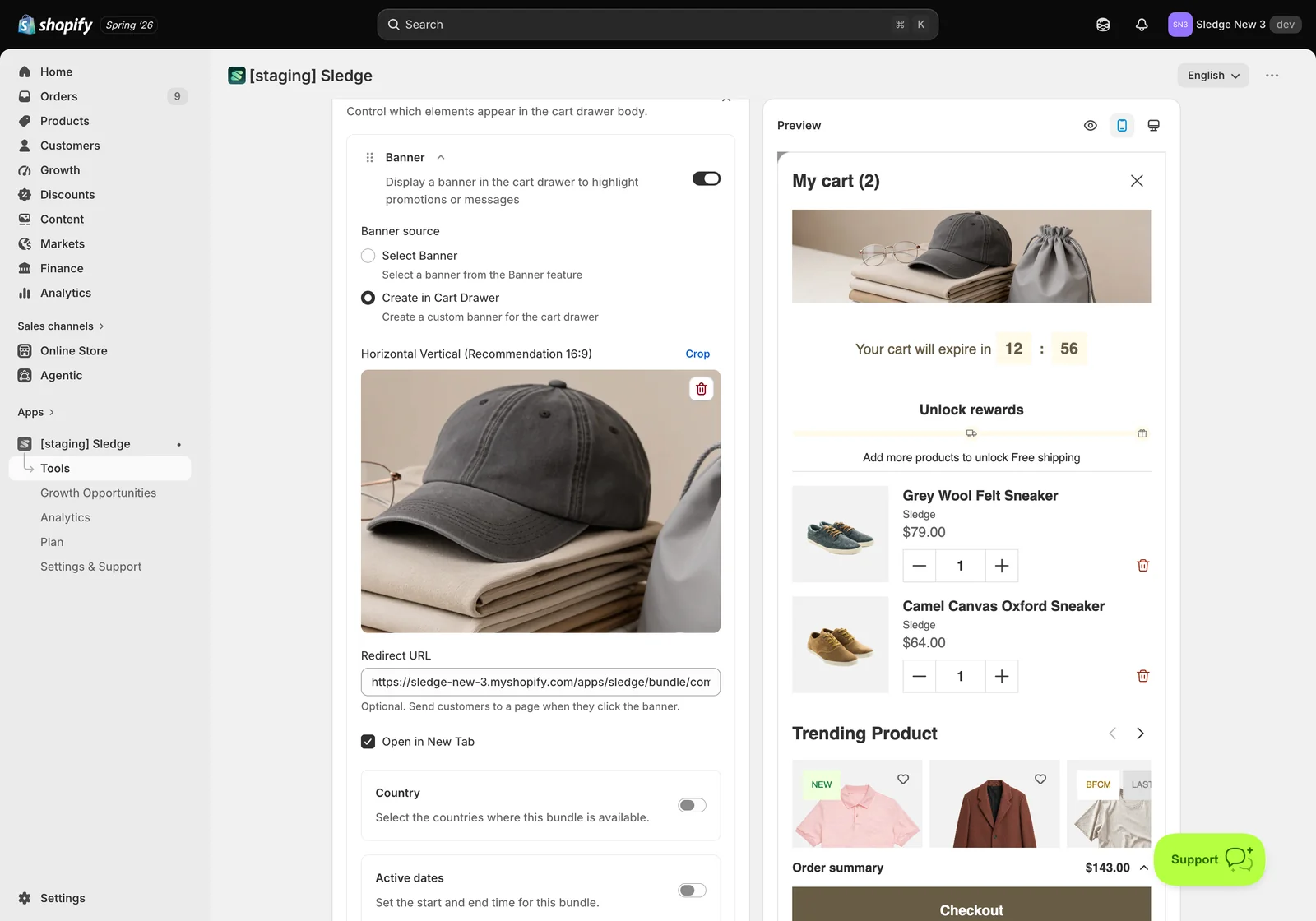
Puts a promotional image at the top of the drawer. Upload artwork for Horizontal and Vertical (Recommendation 16:9), and use Crop to control framing. Country and Active dates limit where and when it runs — useful for a sale banner that should retire itself automatically.
Countdown timer
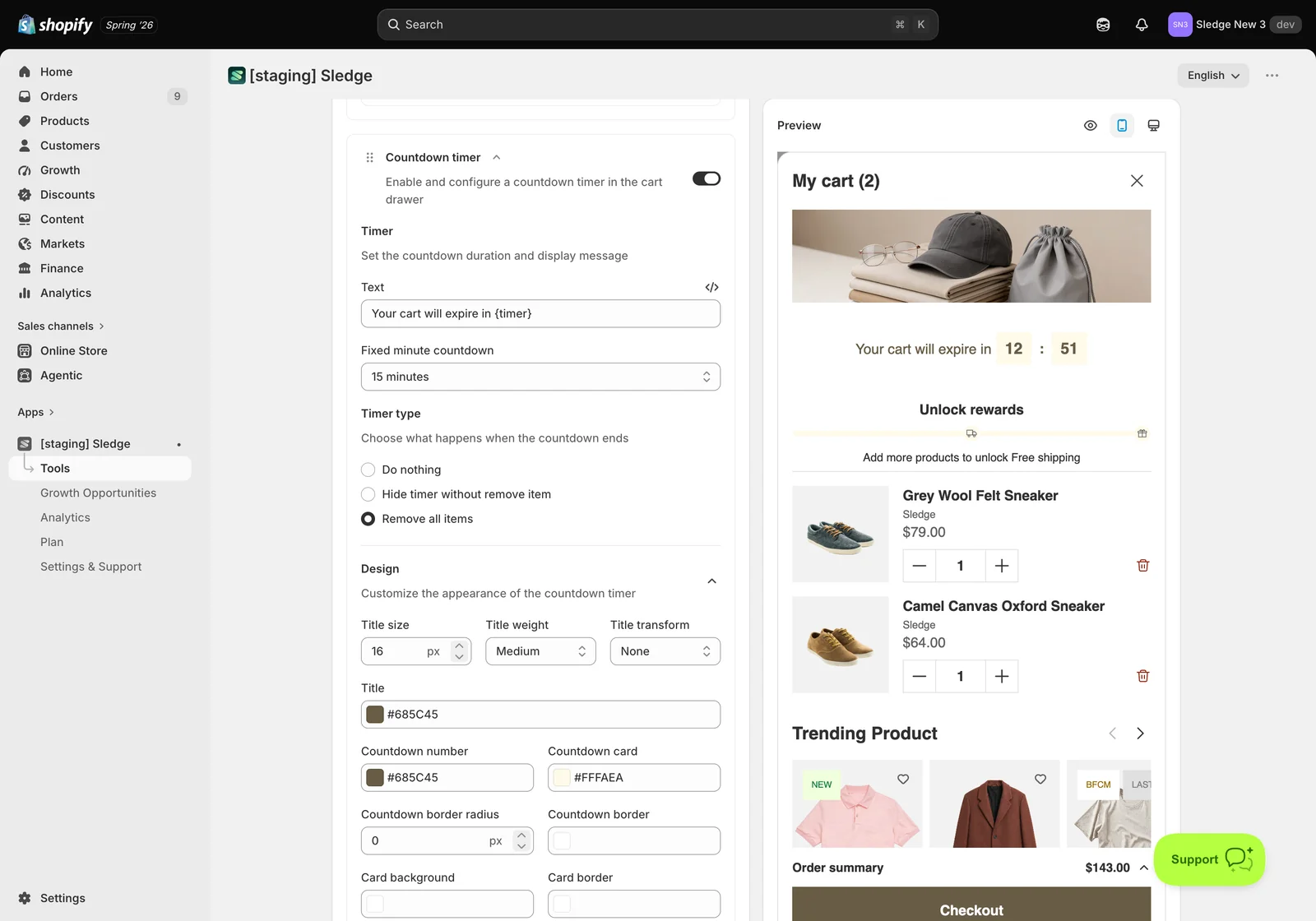
Adds a live clock to the drawer — the Your cart will expire in 12:00 line. Under Timer you set the duration and the message shown beside it. Timer type decides what happens when it reaches zero, and Design controls its appearance. Keep the promise honest: if nothing actually expires, a fake clock costs you trust.
Progress goal
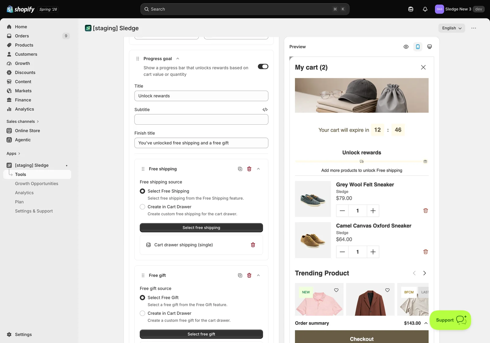
The rewards bar — the strongest upsell in the drawer, because it tells customers exactly what one more item gets them.
- Title and Subtitle — the heading above the bar, e.g. Unlock rewards.
- Finish title — what customers see once every reward is unlocked, e.g. You’ve unlocked free shipping and a free gift.
- Reward tiers — add one per reward. Each is Free shipping, Order discount, or Free gift, and each can be duplicated, deleted, or dragged into a different order.
- For every tier you choose a source: Select Free Shipping / Select Free Gift reuses an offer you already built in that feature, while Create in Cart Drawer makes one that lives only here. Reusing keeps a single source of truth; creating in the drawer is quicker for a one-off.
- Design — the look of the progress bar itself.
Cart items
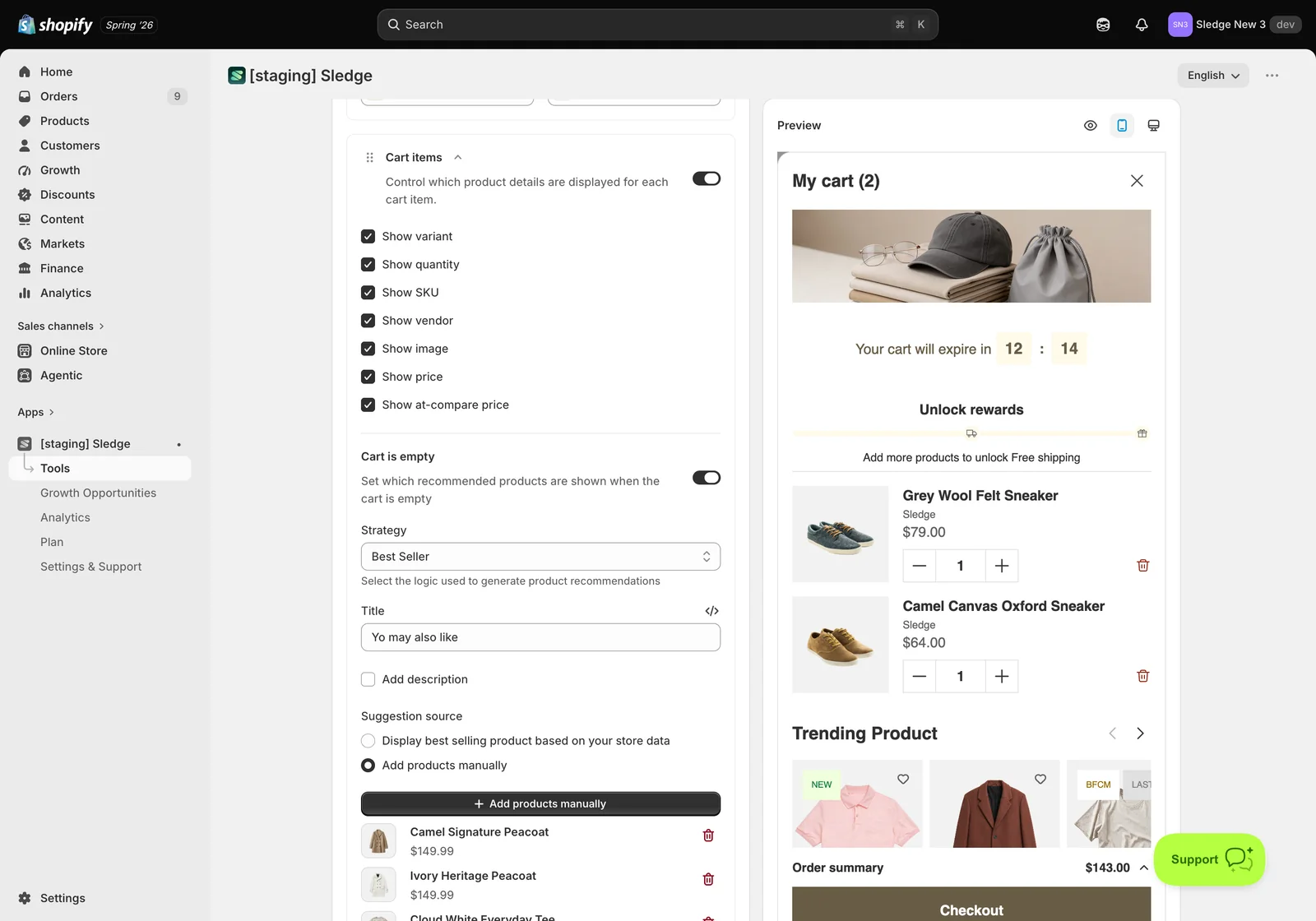
Controls which product details each line in the cart shows. It also owns the Cart is empty state: set a Title and pick the products to recommend when there’s nothing in the cart yet, either automatically or with Add products manually. Layout switches those between Slider and Grid. An empty drawer is a dead end otherwise — this turns it into a starting point.
Product recommendations
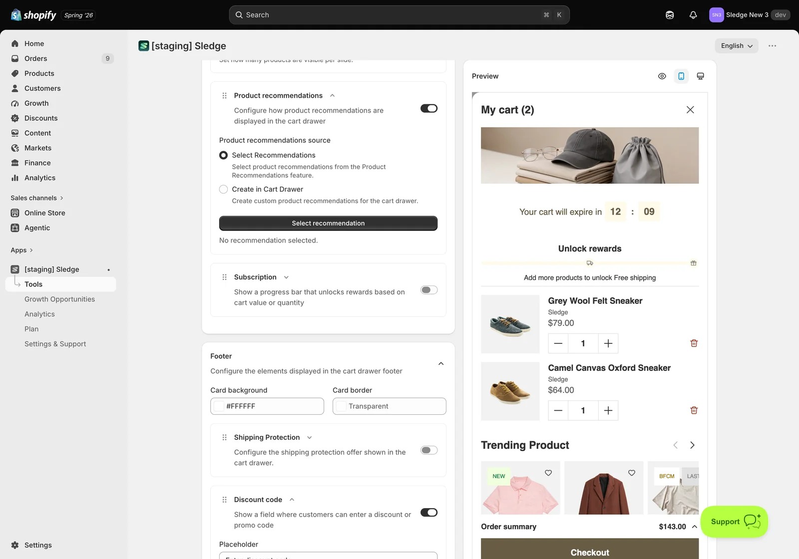
Shows a recommendation row inside the drawer. Use Select recommendation to choose which of your Product Recommendation campaigns runs here — so the drawer can show best sellers, trending items, or a hand-picked set, depending on which campaign you point it at.
Footer — totals and everything below them
The Footer card starts with Card background and Card border, which style the footer panel itself. Below that sits a stack of blocks. Like the body, each has its own switch and drag handle, so you control both whether a block appears and where.
Every block follows the same shape: a toggle, its own text fields, and a Design section for typography and colours. Discount code is a good worked example:
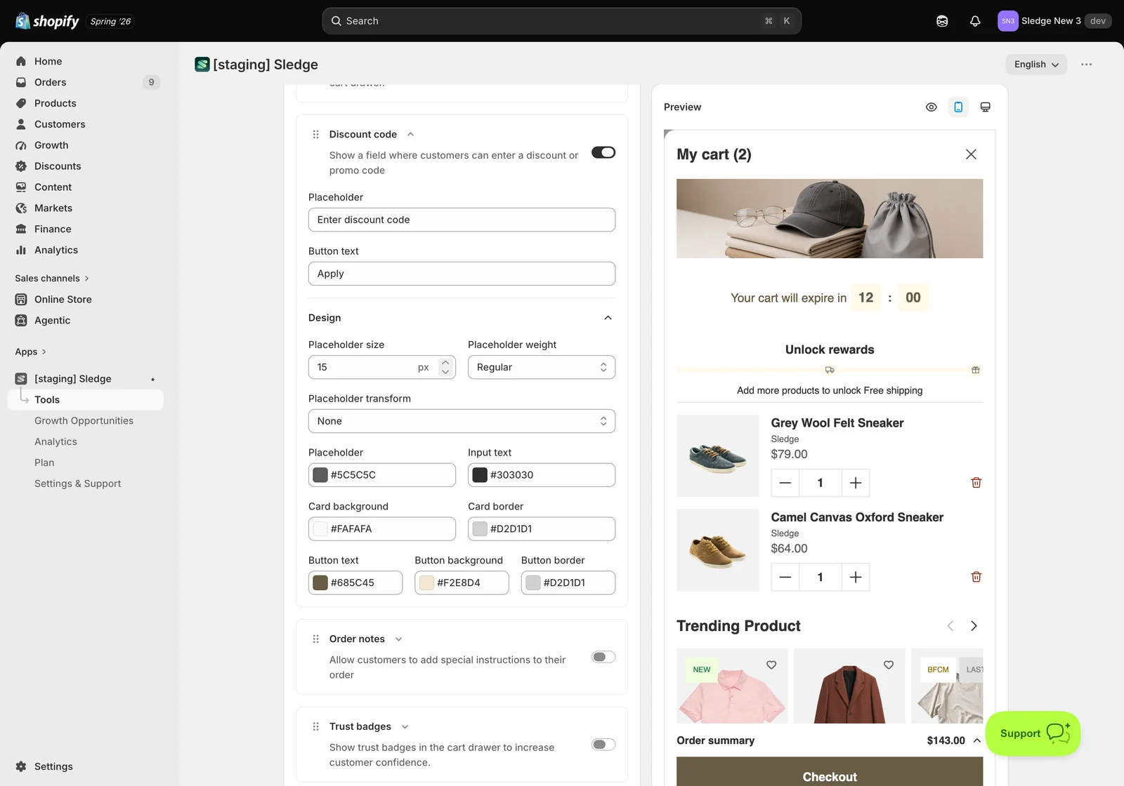
It has a Placeholder (Enter discount code) and Button text (Apply), then a Design block covering Placeholder size, Placeholder weight, Placeholder transform, and separate colours for the placeholder, the typed input, the card background and border, and the button’s text, background and border.
The full set of footer blocks:
- Shipping Protection — offers shipping protection as an add-on before checkout.
- Discount code — the promo-code field described above. Worth thinking about: showing it invites customers to go hunting for a code, so some stores deliberately leave it off.
- Order notes — lets customers add special instructions with their order.
- Trust badges — payment or guarantee badges, placed right where hesitation happens.
- Discount applied — the text and colours of the discount line once a code lands.
- Subtotal — the subtotal label and its text colour in the summary.
- Checkout button — the wording on the main call to action.
- Term and condition — the terms text shown near checkout.
- Continue shop — the continue-shopping link that sends customers back to browsing.
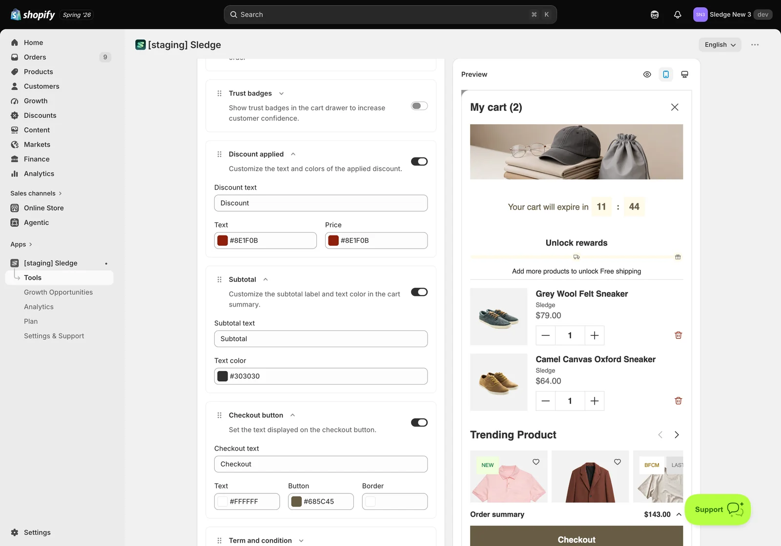
When everything reads the way you want, check the Preview, click Save, and set Status to Enable.
Result
Done. Adding a product now opens your configured drawer. Below is the live drawer with the blocks switched on: the header banner and cart label, the countdown, the Unlock rewards bar telling the customer what’s left to earn free shipping, the line item, the discount field, the totals, and the checkout button with the continue-shopping link beneath it.
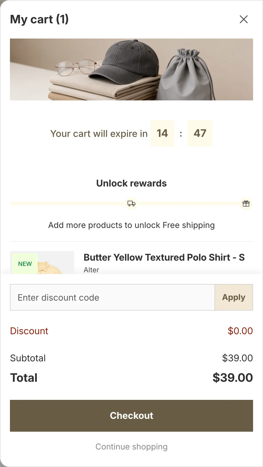
Not showing up? Check Status is Enable on the settings page and that the master Cart Drawer switch on the Tools page is on — both have to be on. If a single block is missing, its own toggle in Body or Footer is off. If the blocks appear in the wrong order, drag them into place with the handles. An empty drawer is expected when the cart has nothing in it — add a product and reopen. Storefront changes can take about a minute to sync.
Related
Last updated on