
How do I set up a filter group?
A filter group is the set of filters a customer sees on one page of your store. Sledge keeps filters in groups so that a customer browsing Women's Elegant Tops can see a Colour and a Size filter, whil
A filter group is the set of filters a customer sees on one page of your store. Sledge keeps filters in groups so that a customer browsing Women's Elegant Tops can see a Colour and a Size filter, while a customer browsing Accessories sees something completely different.
This guide walks through the three levels of the feature, from the top down:
- Filter Group — the list of every group in your store
- Edit Filter Group — which collections a group applies to, and which filters it contains
- Edit Filter Item — one single filter, and its Advanced settings
Before you start
Filter groups render inside the Sledge product filter on your storefront, so make sure of the following first:
- Sledge Core is enabled on your theme. Sledge Core is the app embed that loads Sledge on your storefront — without it, nothing Sledge does reaches your customers. You enable it during onboarding (Enable in theme), or any time via Online Store → Themes → Customize → App embeds → Sledge Core.
- The Collections page surface is turned on. Open Sledge → Tools → Product Filter and check the Collections page switch at the top — this is what puts the filter on your collection pages.
- Your products are synced. Filters are built from data that already exists on your products (vendor, product type, tags, options, price), so a filter can only show values your products actually have.

Step 1 — Open the Filter Group page
In the Sledge admin go to Tools → Product Filter → Filter Group. You will see two cards.
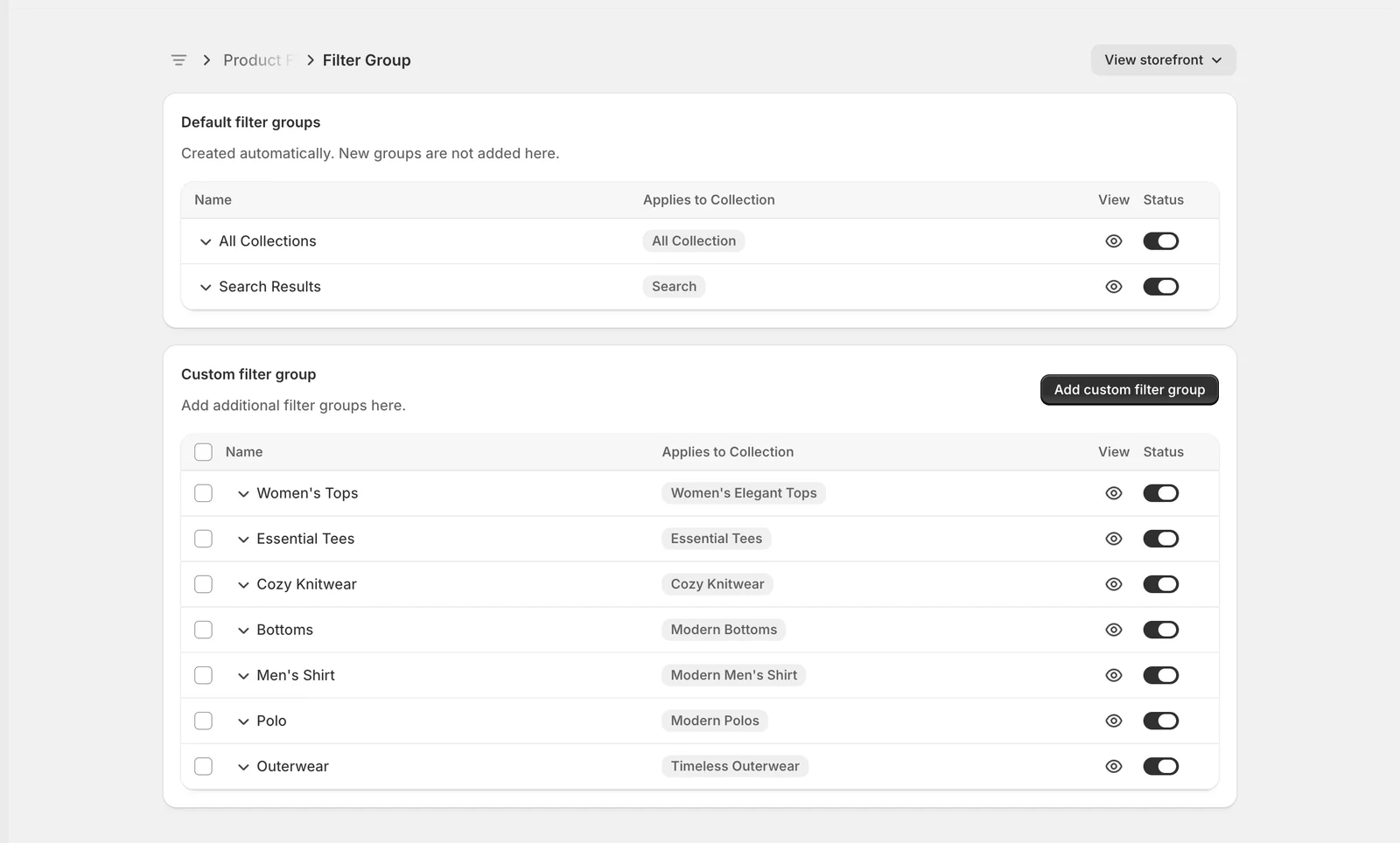
Default filter groups
Sledge creates these two groups for you and you cannot add or remove them:
- All Collections — the fallback group. It applies to every collection page that does not have its own group.
- Search Results — the filters shown on your search results page and in instant search.
Custom filter group
This is where you add your own groups. Each custom group is tied to one or more specific collections, and it overrides the default group on those pages.
Both tables use the same four columns:
- Name — your own label for the group. Click it to open the group.
- Applies to Collection — the collections this group is attached to.
- View — the eye icon opens that collection on your live storefront in a new tab, so you can check the result immediately.
- Status — turns the whole group on or off. Switching it off means those filters stop appearing on the storefront. This saves straight away.
To create a new group, click Add custom filter group. Tick the checkboxes on the left of one or more rows to Duplicate or Delete several groups at once.
Step 2 — Expand a group to see its filters
Click the small chevron next to a group name to expand it without leaving the page. This is the quickest way to see what a group contains.
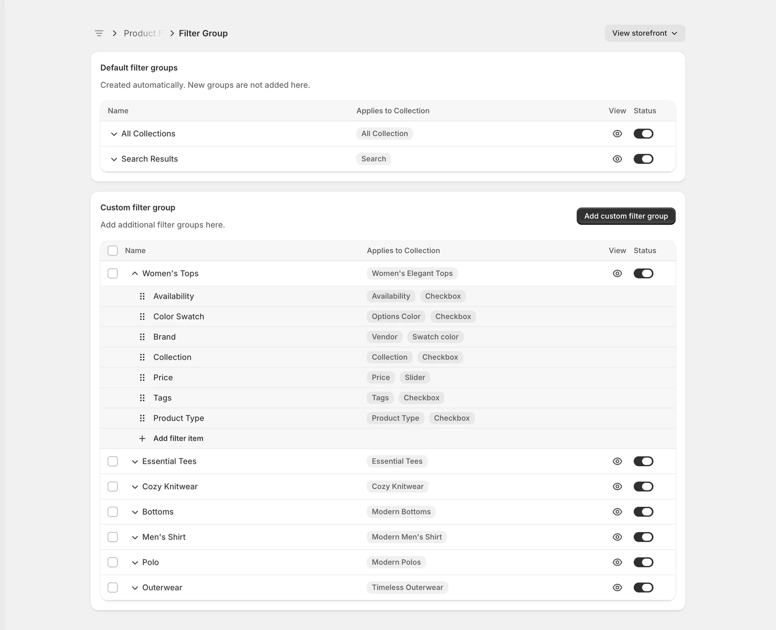
Each child row is one filter. The two grey badges tell you how it is built: the first is the source (where the values come from) and the second is the display (how it looks on the storefront). In the example above, Brand reads from Vendor and is shown as a Swatch color.
The dotted handle on the left lets you drag a filter up or down. That order is exactly the order the filters appear in on your storefront, so put the filters your customers use most at the top. Use Add filter item at the bottom of the list to add another filter to that group.
Step 3 — Open a group
Click a group name to open it. This page has two cards.
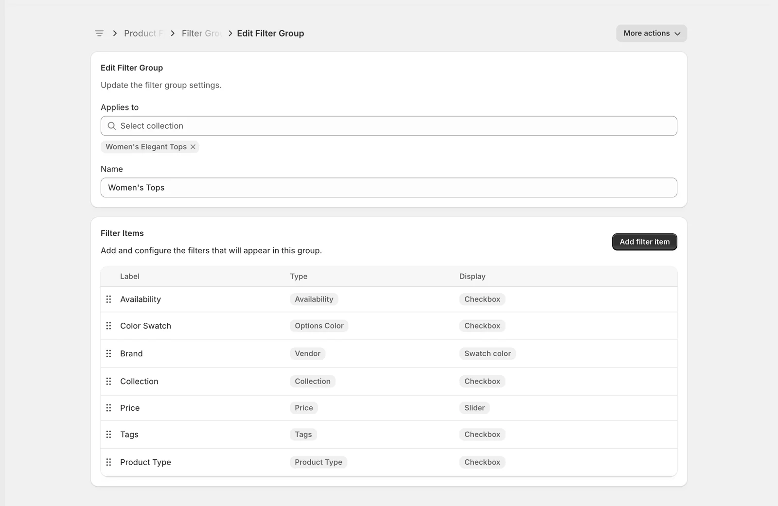
Edit Filter Group
- Applies to — choose the collections this group should be used on. Start typing to search, then click a collection to add it as a chip below the field. Remove a collection with the small cross on its chip. A group with no collection is never shown, so leave at least one here.
- Name — an internal label to help you find the group later. Customers never see it. It cannot be left empty.
Filter Items
Every filter in this group, in storefront order. Drag the handle to reorder, or click any row to open that filter. Add filter item creates a new one.
The More actions menu at the top right holds View storefront (opens the first collection this group applies to) and Delete filter group.
Changes on this page are not live until you press Save in the bar that appears at the top of the screen.
Step 4 — Open a filter item
Click a row in the Filter Items table to configure one filter on its own.
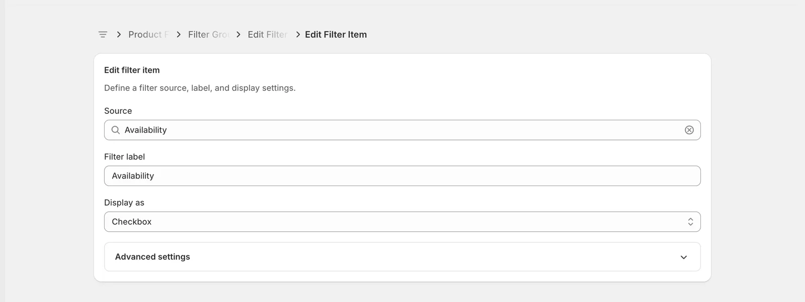
- Source — the product data this filter reads. Options include Collection, Vendor, Product Type, Availability, Price, Sale Percent, Tags, plus any product options and metafields your store uses. The list only offers sources that actually have values in the collections this group covers, so you cannot build an empty filter by accident.
- Filter label — the heading your customers see above the filter. This is the one field on this page they will read, so use their words: Brand usually beats Vendor.
- Display as — how the filter is drawn. The available choices depend on the source. Checkbox, Radio, Select and the four swatch styles are for list-type sources; Slider, Input Range and Slider with Input Range are for Price and Sale Percent; Filter Tree is for Collection and Product Type.
Changing the source may automatically change the display, because not every display works with every source. Press Save when you are done.
Step 5 — Open Advanced settings
Click the Advanced settings bar at the bottom of the card to expand it. It is closed every time the page loads, and none of these settings are required — the defaults are fine for most stores.
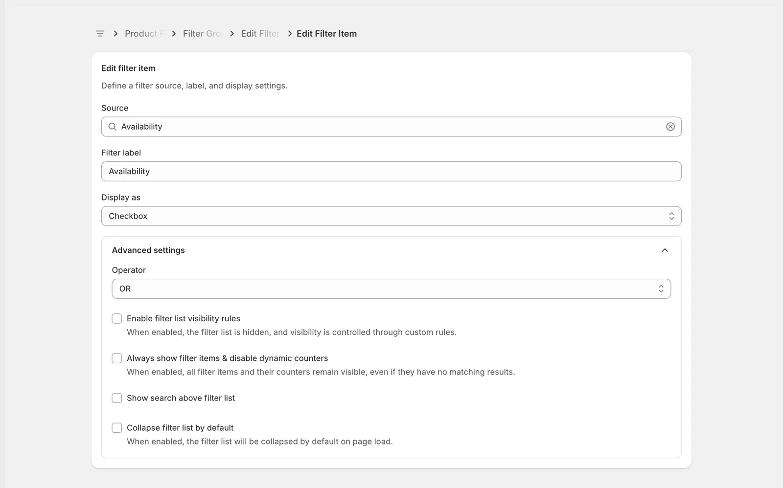
The settings shown here are:
- Operator — how several selections inside this one filter are combined. OR (the default) shows products matching any value the customer picked, which is what people expect from colours or brands. AND shows only products matching every value picked, which suits tags where a product can genuinely carry several at once.
- Enable filter list visibility rules — hides this filter until the customer's other selections match rules you define. Useful for a filter that only makes sense in context, such as showing Shoe size only after Footwear has been selected.
- Always show filter items & disable dynamic counters — normally values disappear and the result counts update as a customer narrows down. Turn this on to keep every value visible at all times.
- Show search above filter list — adds a small search box above this filter's values. Worth turning on for long lists such as brands.
- Collapse filter list by default — the filter loads closed and the customer clicks its heading to open it. Handy for keeping a long sidebar tidy.
Settings that open more options
Two of the checkboxes reveal further settings when you tick them.
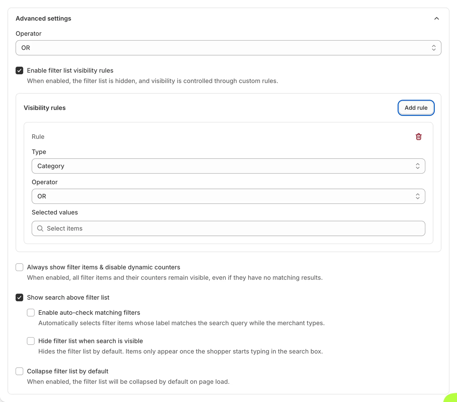
Enable filter list visibility rules opens a Visibility rules panel. Click Add rule, then set Type (which other filter the rule watches), Operator, and Selected values (which values trigger it — pick All values to match any selection). Add as many rules as you need, and remove one with the bin icon.
Show search above filter list opens two extra choices: Enable auto-check matching filters selects values automatically as the text is typed, and Hide filter list when search is visible keeps the values hidden until the customer starts typing.
Advanced settings for other sources
Advanced settings adapts to the filter you opened, so a different filter shows a different set. The example below is a Tags filter, which adds two settings that Availability does not have.
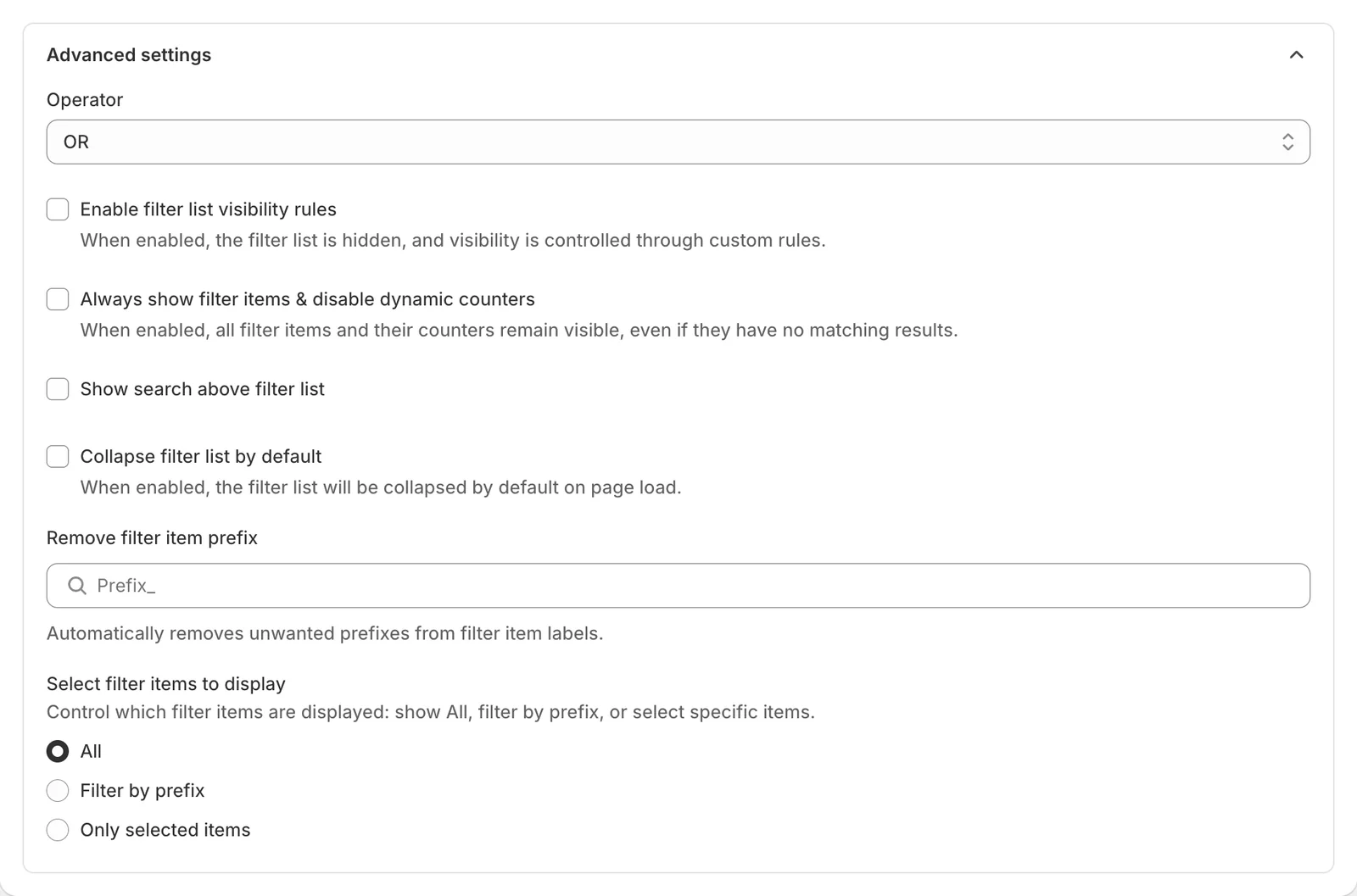
- Remove filter item prefix — tidies up messy value names. If your tags are stored as color_Red and color_Blue , type color_ here and customers will simply see Red and Blue. Your tags are not changed, only the labels shown.
- Select filter items to display — controls which values appear at all. All shows everything, Filter by prefix shows only values starting with the prefixes you list, and Only selected items lets you hand-pick the exact values.
Other sources and displays add their own settings in the same place — a Price or Sale Percent filter shows Round values, and a Filter Tree adds Expand all filter items along with tree separators.
Reorder
For sources that hold a list of values, a second card called Reorder appears below the filter card.
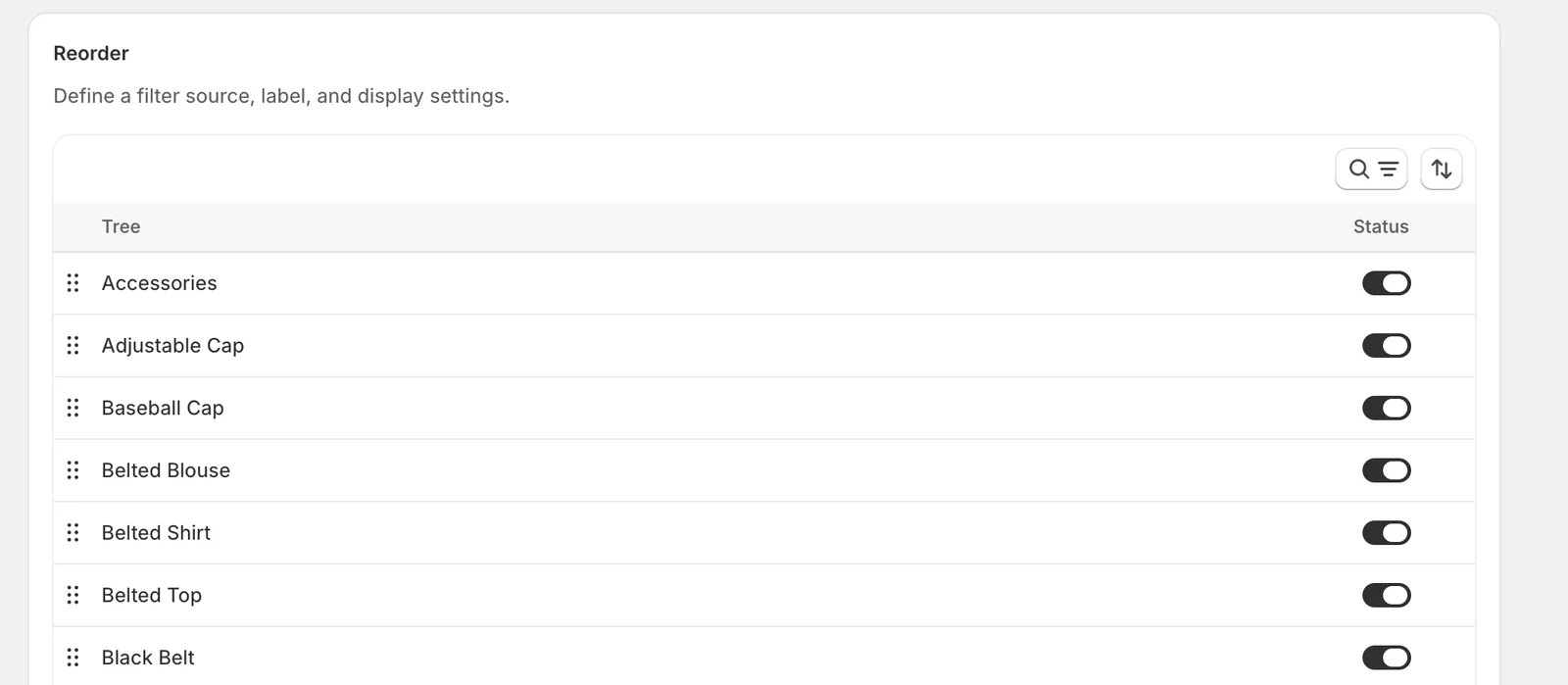
Drag the handles to set the order the values appear in on your storefront — putting Small, Medium, Large in a sensible order rather than alphabetically makes a real difference. The toggle on the right hides a single value without deleting anything. Use the search and sort controls above the table when the list is long.
Result
Once you save, open the collection you attached the group to (the eye icon in the View column takes you straight there). Your filters appear in the order you set, with the labels you chose, and each one behaves the way you configured it.
Not showing up?
- Check the Status toggle on the Filter Group list — the whole group may be switched off.
- Check Applies to on the group. If the collection is not listed, the default All Collections group is used instead.
- A filter with no matching values on the current page is hidden automatically. Try it on a collection where products actually carry that vendor, tag or option.
- If you turned on Enable filter list visibility rules, the filter stays hidden until its rules are met.
- Make sure you pressed Save. The Edit Filter Group and Edit Filter Item pages only apply changes when you save.
Related
Last updated on
How do I configure Display Settings?
Display Settings is the behavior panel of the product filter: which values are visible, how long lists are broken up, whether result counts show, and how product variants appear in the filtered grid.
How do I merge duplicate filter values?
Merge Value combines several filter values into one clean label. Catalogs accumulate near-duplicates — “Navy” and “navy blue”, or a run of granular sizes like 28, 30, 32 — and every one of them become