
How do I choose a filter Layout?
Layout controls how the whole product filter is presented to customers — where it sits on desktop, how it opens on mobile, and how filtered products load as customers browse. It’s one page with three
Layout controls how the whole product filter is presented to customers — where it sits on desktop, how it opens on mobile, and how filtered products load as customers browse. It’s one page with three choices and a live preview.
Before you start
This feature renders inside the Sledge product filter on your storefront, so make sure of the following first:
- Sledge Core is enabled on your theme. Sledge Core is the app embed that loads Sledge on your storefront — without it, nothing Sledge does reaches your customers. You enable it during onboarding (Enable in theme), or any time via Online Store → Themes → Customize → App embeds → Sledge Core.
- The Collections page surface is turned on. Open Sledge → Tools → Product Filter and check the Collections page switch at the top — this is what puts the Sledge filter on your collection pages.

Open Layout
Go to Sledge → Tools → Product Filter, and under Features click Layout. Each option is a picture card with a Choose button — the current selection shows a green Current layout badge. Picking an option marks it; click Save in the save bar to apply (or Discard to revert).
Mobile
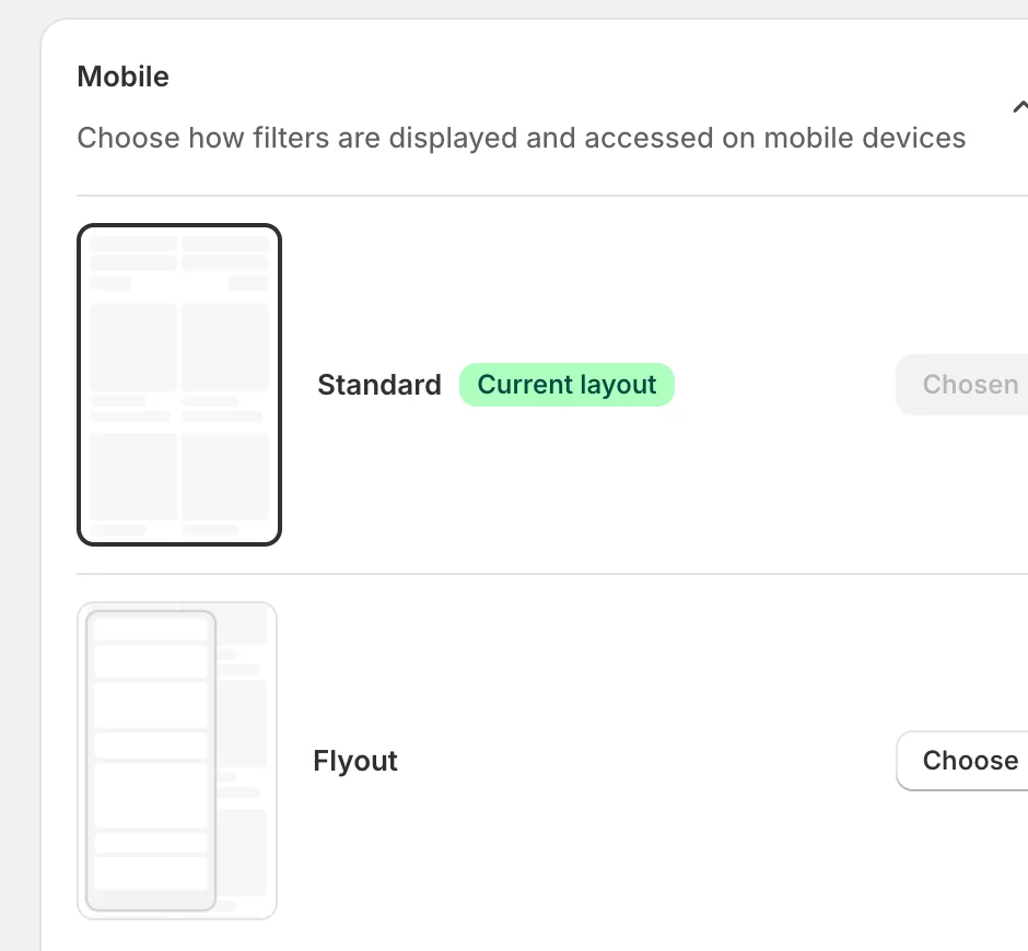
How filters are displayed and accessed on mobile devices:
- Standard — the filter opens as a full panel over the product list, the common pattern customers know from most stores.
- Flyout — the filter slides in as a drawer from the side, keeping the product list partly visible.
Desktop
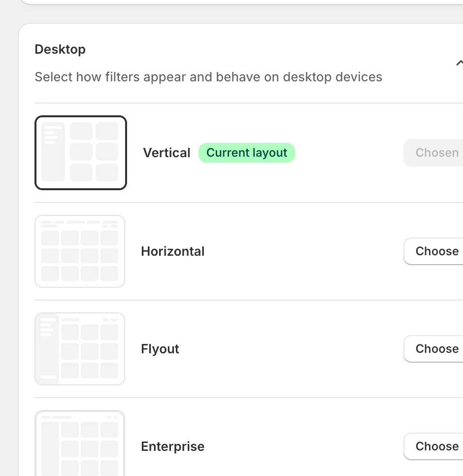
How filters appear and behave on desktop devices:
- Vertical — the classic sidebar on the left of the product grid. A safe default for most themes.
- Horizontal — filters run in a bar across the top of the grid, freeing the full width for products.
- Flyout — filters stay hidden behind a button and slide in as a drawer when opened.
- Enterprise — a denser layout designed for very large catalogs with many filter groups.
Pagination
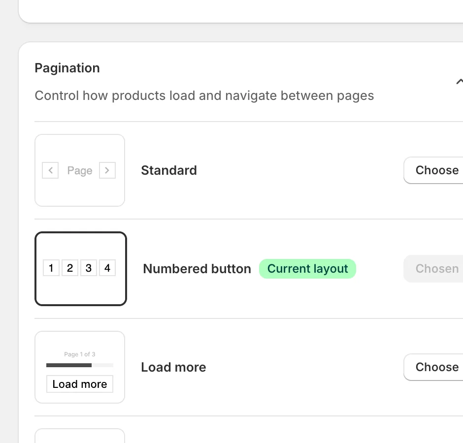
How products load and navigate between pages after filtering:
- Standard — previous / next page controls.
- Numbered button — numbered pages (1 2 3 4) so customers can jump directly to a page.
- Load more — a button at the bottom appends the next page under the current one.
- Infinite scroll — the next page loads automatically as the customer scrolls; no clicking at all.
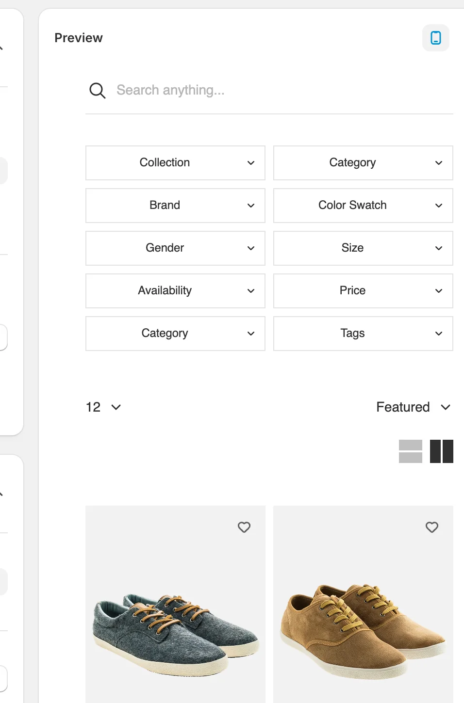
Preview
The panel on the right shows a schematic of your current combination — use the icons at its top-right to switch between the mobile and desktop preview:
Result
After saving, your collection pages use the chosen combination — the sidebar (or bar, or drawer) on the device the customer is on, and your pagination style at the bottom of the product grid.
Not showing up? Give the change a minute to sync, then reload the collection page. Also confirm that Sledge Core and the Collections page switch are enabled as described above.
Related
Last updated on
Filters
Filters in Sledge — 6 guides covering setup and day-to-day use.
How do I configure Display Settings?
Display Settings is the behavior panel of the product filter: which values are visible, how long lists are broken up, whether result counts show, and how product variants appear in the filtered grid.