
How do I configure Display Settings?
Display Settings is the behavior panel of the product filter: which values are visible, how long lists are broken up, whether result counts show, and how product variants appear in the filtered grid.
Display Settings is the behavior panel of the product filter: which values are visible, how long lists are broken up, whether result counts show, and how product variants appear in the filtered grid. One page, two cards, with a live preview on the right.
Before you start
This feature renders inside the Sledge product filter on your storefront, so make sure of the following first:
- Sledge Core is enabled on your theme. Sledge Core is the app embed that loads Sledge on your storefront — without it, nothing Sledge does reaches your customers. You enable it during onboarding (Enable in theme), or any time via Online Store → Themes → Customize → App embeds → Sledge Core.
- The Collections page surface is turned on. Open Sledge → Tools → Product Filter and check the Collections page switch at the top — this is what puts the Sledge filter on your collection pages.

Open Display Settings
Go to Sledge → Tools → Product Filter, and under Features click Display Settings. Change any setting, then click Save in the save bar to apply.
The Filter card
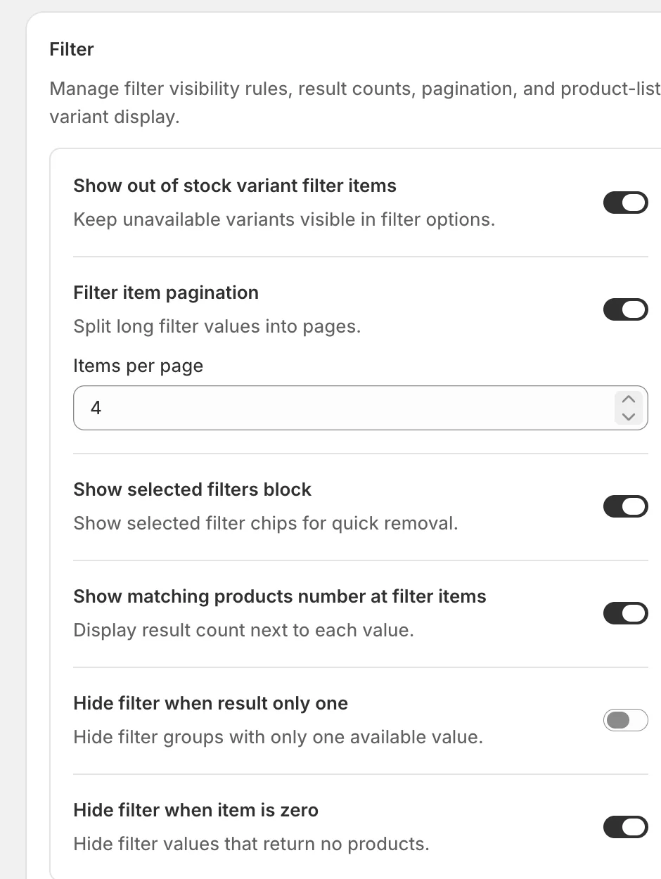
- Show out of stock variant filter items — keep values visible in the filter even when every matching variant is unavailable. Turn it off to hide options customers can’t buy anyway.
- Filter item pagination — split long value lists into pages instead of one endless list. When it’s on, Items per page sets how many values show before the “Show more” control appears (4 in the example).
- Show selected filters block — display the customer’s active filters as chips above the results, each with an ✕ for quick removal, plus a Clear all.
- Show matching products number at filter items — show the result count next to each value (for example “Male (22)”), so customers know what to expect before clicking.
- Hide filter when result only one — hide a whole filter group when only one value is available; a filter with a single choice doesn’t help anyone narrow down.
- Hide filter when item is zero — hide values that would return no products, keeping dead ends out of the list.
The Product list card
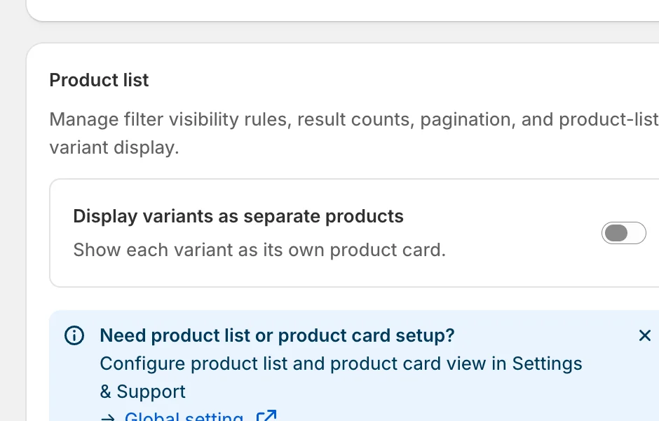
Display variants as separate products — when on, each variant gets its own card in the filtered grid (a shirt in three colours shows as three cards). The info banner links to Global setting in Settings & Support, where the product list and product card styling themselves are configured.
Preview
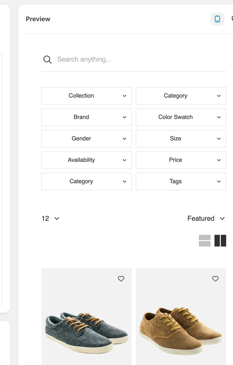
The right-hand panel reflects your settings on a sample filter and product grid — use the icons at its top-right to switch between mobile and desktop:
Result
Your collection page filter follows these rules everywhere Sledge renders it — value lists paginate at the number you set, counts appear next to values, selected filters show as removable chips, and empty or single-value groups stay hidden.
Not showing up? Give the change a minute to sync, then reload the collection page. Also confirm that Sledge Core and the Collections page switch are enabled as described above.
Related
Last updated on
How do I choose a filter Layout?
Layout controls how the whole product filter is presented to customers — where it sits on desktop, how it opens on mobile, and how filtered products load as customers browse. It’s one page with three
How do I set up a filter group?
A filter group is the set of filters a customer sees on one page of your store. Sledge keeps filters in groups so that a customer browsing Women's Elegant Tops can see a Colour and a Size filter, whil