
How do I configure the product list?
The product list is the grid around the cards — the toolbar, sorting, paging, and stock rules used by instant search, the search page, collection pages, and the wishlist. One page controls them all.
The product list is the grid around the cards — the toolbar, sorting, paging, and stock rules used by instant search, the search page, collection pages, and the wishlist. One page controls them all.
Before you start
These settings shape what Sledge renders on your storefront, so make sure of the following first:
- Sledge Core is enabled on your theme. Sledge Core is the app embed that loads Sledge on your storefront — without it, nothing you configure here reaches your customers. You enable it during onboarding (Enable in theme), or any time via Online Store → Themes → Customize → App embeds → Sledge Core.
- The Collections page surface is turned on. Open Sledge → Tools → Product Filter and check the Collections page switch — collection pages are where these settings are most visible, since Sledge renders the product grid there.

Open Product List
Go to Sledge → Settings & Support, open Global setting, and click Product List.
List behavior
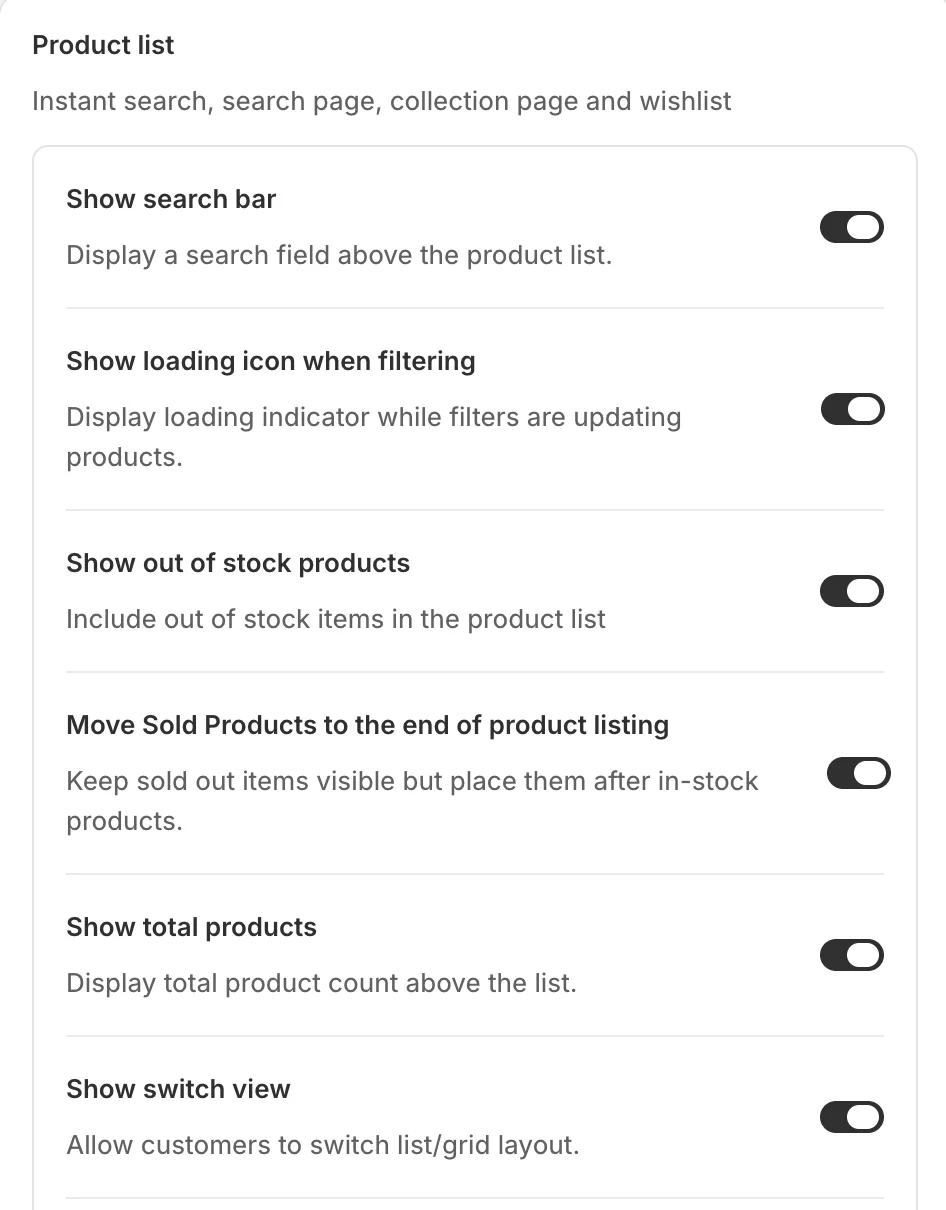
- Show search bar — a search field above the product list.
- Show loading icon when filtering — a loading indicator while filters update the products.
- Show out of stock products — include sold-out items in the list.
- Move Sold Products to the end of product listing — keep sold-out items visible but push them after everything in stock.
- Show total products — the product count above the list.
- Show switch view — let customers flip between list and grid layout.
Sort
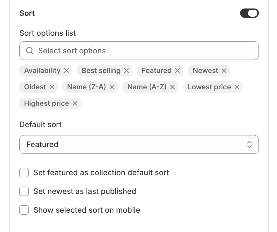
The Sort switch turns the sort control on. Sort options list picks which options customers can choose (Availability, Best selling, Featured, Newest, Oldest, Name A–Z / Z–A, Lowest / Highest price), and Default sort sets what the list opens with. Three refinements below: Set featured as collection default sort (collections open in your curated order), Set newest as last published, and Show selected sort on mobile.
Limit
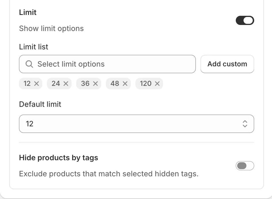
The Limit switch exposes the per-page selector. Limit list defines the choices (12, 24, 36, 48, 120 — Add custom adds your own), and Default limit is what the list starts at. Below it, Hide products by tags can exclude products matching selected hidden tags from every list.
Preview
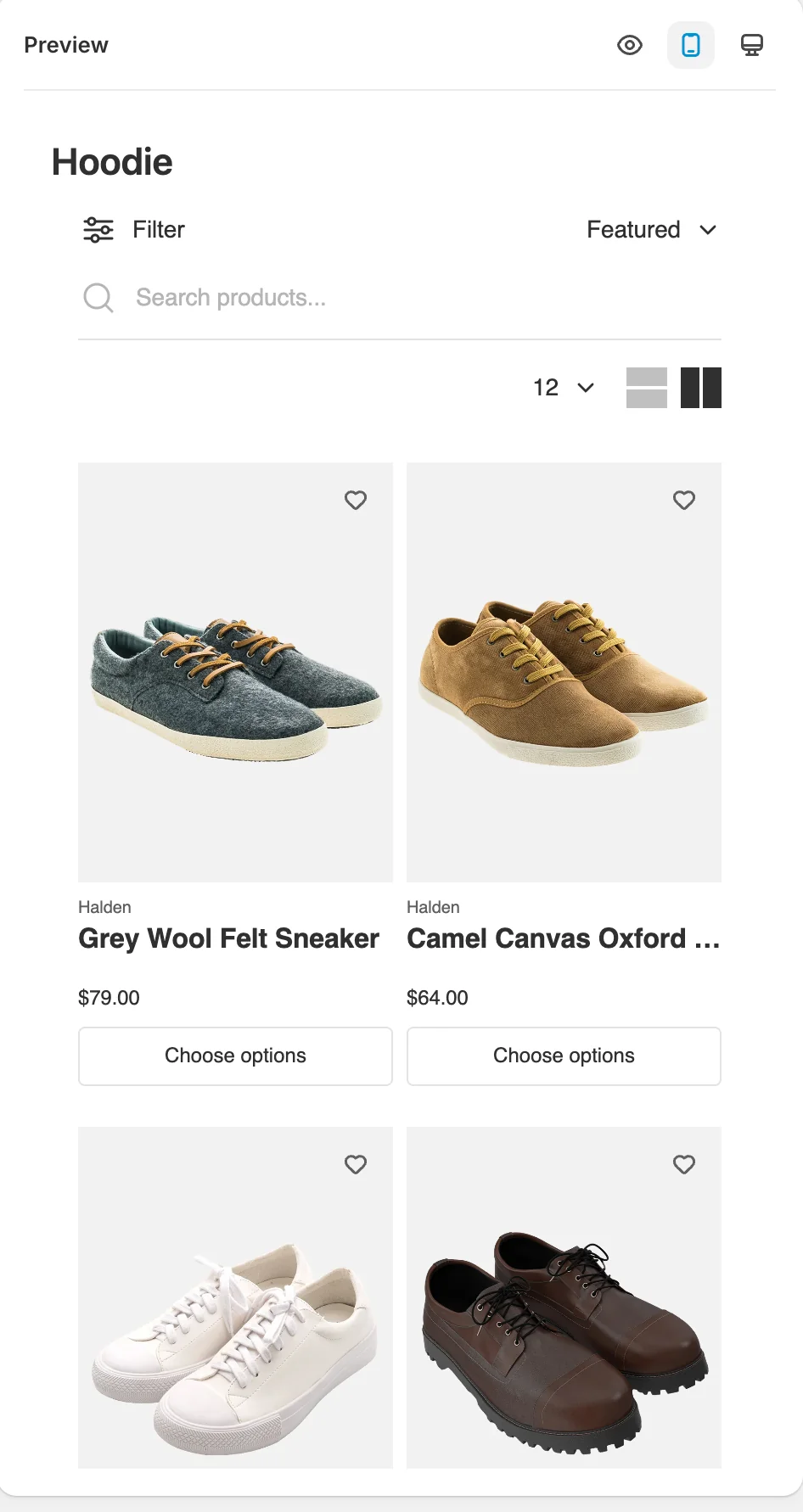
The preview renders a full collection grid with your settings — toolbar with Filter and sort, search bar, per-page selector, and view switcher.
Result
Every Sledge product grid — instant search, the search page, collection pages, and the wishlist — behaves the same way: your sort options, your paging, your stock rules.
Not showing up? Give the change a minute to sync, then reload the page, and confirm Sledge Core and the Collections page switch are on as described above.
Related
Last updated on
How do I configure the product card?
The product card is the single product tile Sledge renders everywhere — in filtered collection grids, search results, recommendations, and the wishlist. This page decides what every one of those tiles
How do I set up skeleton loaders?
Skeleton loaders are the grey placeholder blocks shown while products load. Instead of a blank space or a layout jump, customers see the shape of the grid immediately — then products fade in.