
How do I set up Instant Search?
Instant Search is the panel that drops down under your store's search bar. It reacts as the customer types — showing matching products, collections and pages — so they can jump straight to what they w
Instant Search is the panel that drops down under your store's search bar. It reacts as the customer types — showing matching products, collections and pages — so they can jump straight to what they want instead of loading a results page first.
This guide covers the whole setup: turning the feature on, then working through the four settings cards one at a time — Layout, With result, No result and Search on click.
Before you start. Sledge must be enabled in your theme and your products need to have finished syncing. Instant Search reads from your synced catalogue, so an empty or half-synced store will show empty results.
Step 1 — Turn on Instant Search and Search Result Page
Go to Tools → Search. The first card holds two switches, and you need both of them.
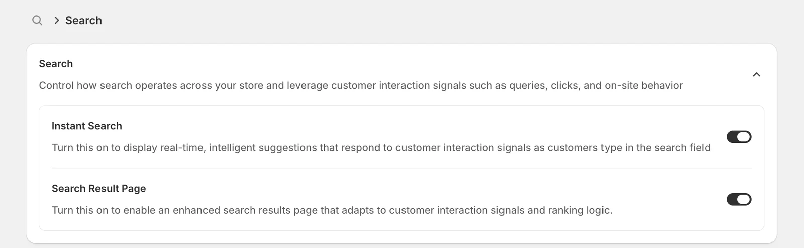
- Instant Search — the drop-down panel itself. This is what shows suggestions while the customer is still typing.
- Search Result Page — the full results page the customer lands on when they press Enter or click through from the panel.
Leaving Search Result Page off is the most common mistake here. The panel would work, but the moment a customer submits their search they drop back onto your theme's default results page and lose everything Sledge ranked for them. Turn both on.
These two switches save the moment you flip them — there is no Save button on this page. When you turn one on, a short confirmation appears with a Preview button that opens your live storefront in a new tab, and a Skip button if you would rather carry on. The setting is already saved either way.
Step 2 — Open the Instant Search settings
Scroll down to the Features list on the same page and click Instant Search.
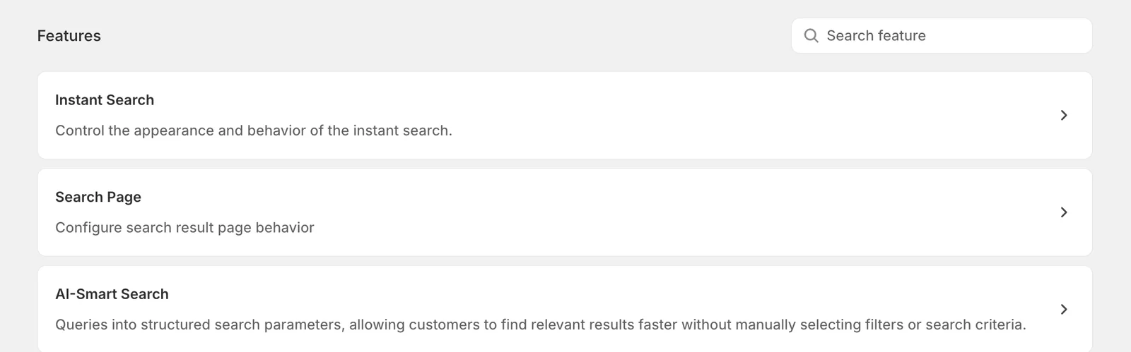
The settings page is split in two: your settings on the left, and a Preview on the right that redraws every time you change something. The preview shows unsaved edits, so you can try a setting, look across, and decide before committing.
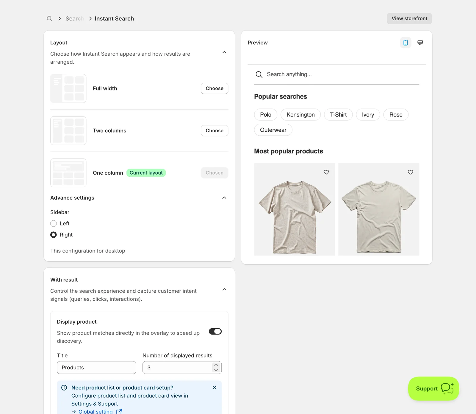
Use the two small icons at the top of the Preview to switch between the mobile and desktop view — the desktop icon opens it full screen. The View storefront button at the top right opens your real store with instant search active.
Unlike the previous page, this one does not save automatically. A bar appears at the top as soon as you change anything, and your edits only go live when you click Save.
Step 3 — Layout
Choose how Instant Search appears and how results are arranged.
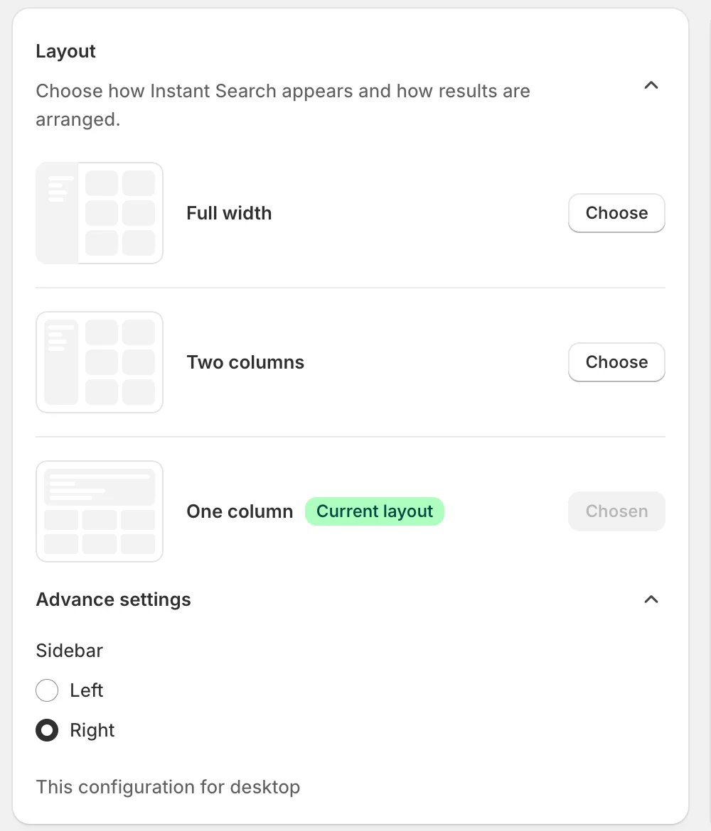
Pick one of three shapes. The thumbnail on the left of each row shows how the panel is built, and the one you are currently using is marked with a green Current layout badge and a greyed-out Chosen button. Click Choose on any other row to switch.
- Full width — the panel stretches across the whole window, with a sidebar on one side and a grid of products filling the rest. Best for stores with a large catalogue and several result types switched on.
- Two columns — a narrower panel, still with a sidebar next to the results. A good middle ground.
- One column — everything stacked in a single column, with no sidebar. The simplest and least intrusive option, and the closest to what most themes do by default.
Under Advance settings you choose which side the sidebar sits on — Left or Right. The note underneath, This configuration for desktop, is there because the sidebar only exists on desktop; on mobile the panel is always a single stacked column, so this choice has no effect there.
Step 4 — With result
Control the search experience and capture customer intent signals (queries, clicks, interactions).
This card decides what appears in the panel while the customer is typing and there are matches. Each row is a type of content, with its own switch. Turn a row on and its settings appear underneath.
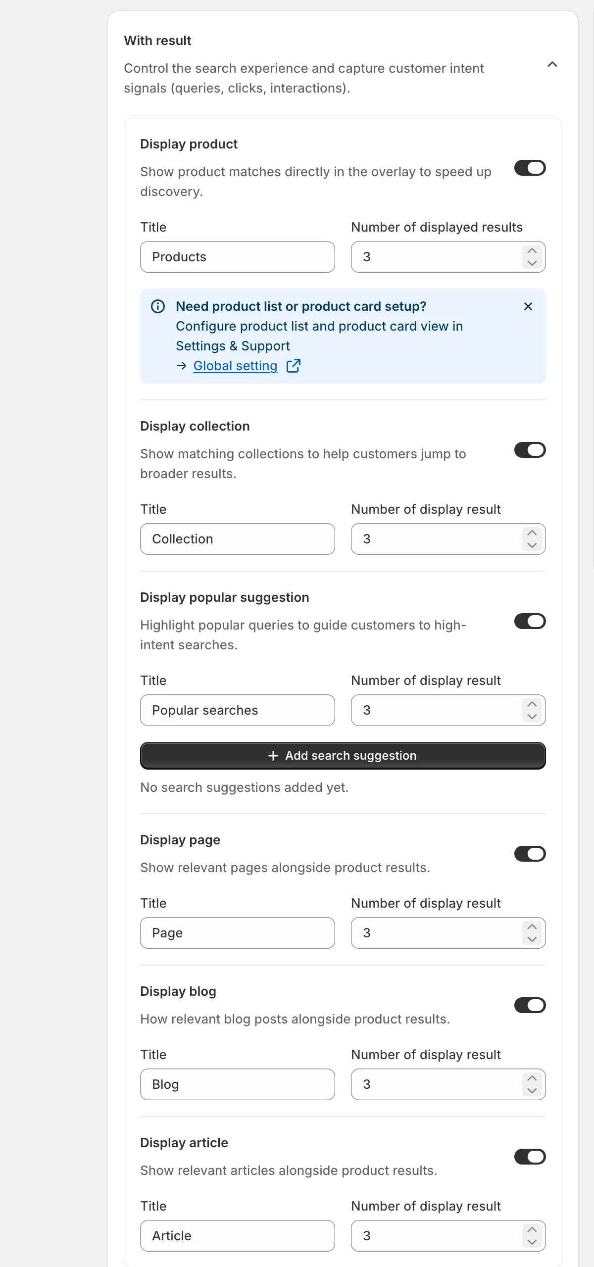
The six rows are Display product, Display collection, Display popular suggestion, Display page, Display blog and Display article — matching products, collections, suggested search terms, pages, blogs and blog articles respectively.
Every row that is switched on gives you the same two fields:
- Title — the small heading shown above that group in the panel. This is customer-facing, so write it the way your customers speak. Products, Collection and Page are the defaults.
- Number of display result — how many items of that type to show. Keep these numbers low. The panel is meant to be scanned in a second or two, and 3–6 products with 2–3 collections reads far better than a wall of everything.
Two rows add something extra:
- Display product shows an information banner with a Global setting link. The content of each product card — image, price, swatches, ratings — is set once for the whole app in Settings & Support → Global setting, not here.
- Display popular suggestion adds an Add search suggestion button. Use it to hand-pick the phrases you want promoted while customers type.
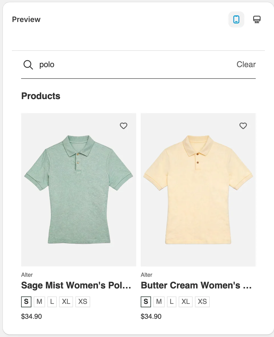
Here is the result in the preview after typing polo — the Products heading comes from the Title field, and the number of cards from the count.
At least one row must stay on. If you switch all six off, Save is blocked and a red banner appears reading "Enable at least one result type to show search results." Each count also has to be 1 or more.
Step 5 — No result
Configure what customers see when there are no matching results.
A dead end is where searches turn into lost sales. This card lets you put something useful in front of the customer instead of an empty panel. Both rows are off until you turn them on.
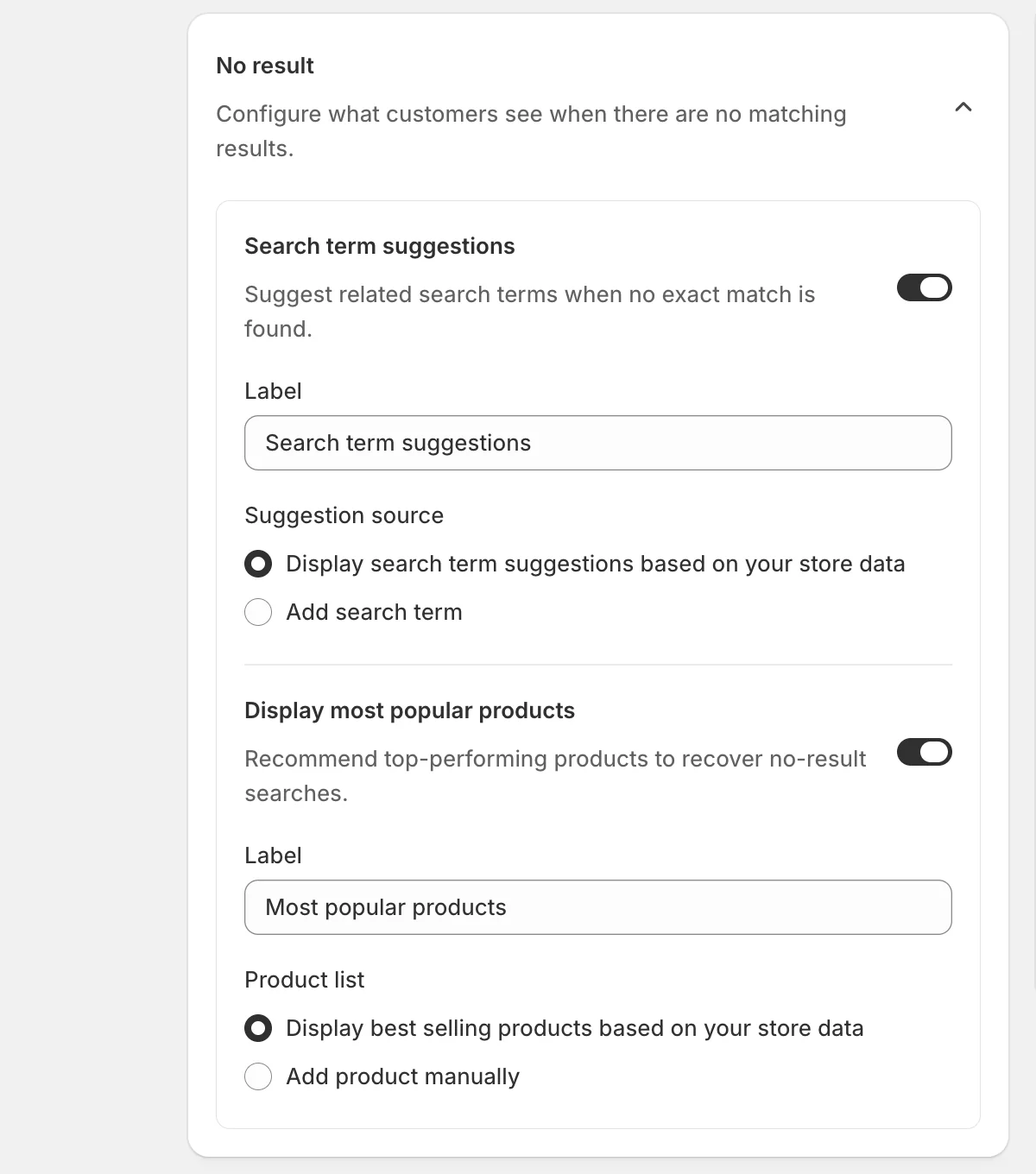
Search term suggestions — offers alternative phrases to try. Label is the heading customers see. Suggestion source decides where the terms come from:
- Display search term suggestions based on your store data — Sledge picks them automatically from what people actually search for in your store. Set it and forget it.
- Add search term — you type the list yourself. Choose this when you want to steer customers towards specific products or a seasonal push. An Add search term button appears so you can build the list.
Display most popular products — shows products instead of leaving the panel blank. Label is again the heading, and Product list works the same way as above: Display best selling products based on your store data keeps itself up to date automatically, while Add product manually reveals an Add products button and lets you pick exactly which products to fall back to.
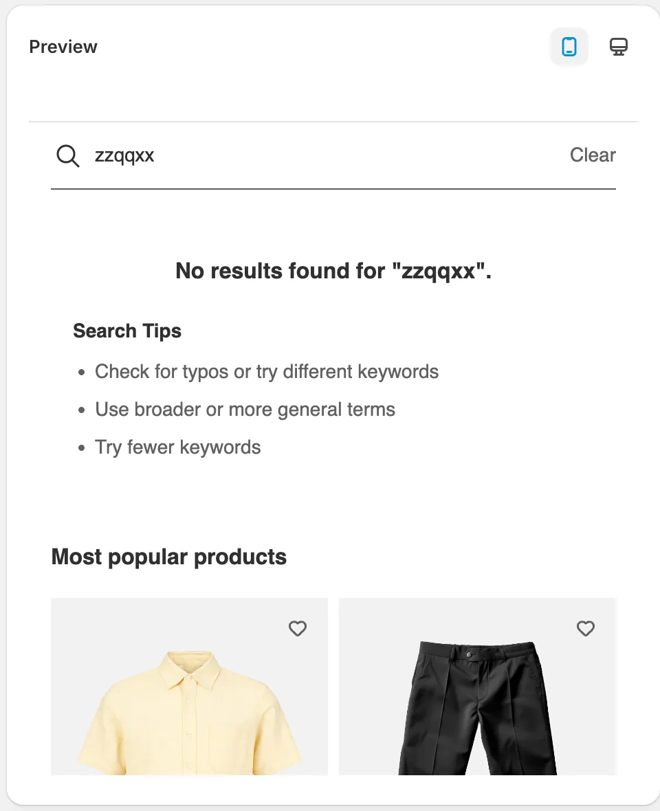
The preview below shows the result for a query with no matches — the message, the built-in search tips, and the popular products underneath.
Step 6 — Search on click
Choose what customers see when they click the search bar before typing.
This card fills the panel in the moment before the customer has typed anything. An empty box asks the customer to do all the work; a few suggestions here often turn a hesitant click into a search. Three rows, all off by default.
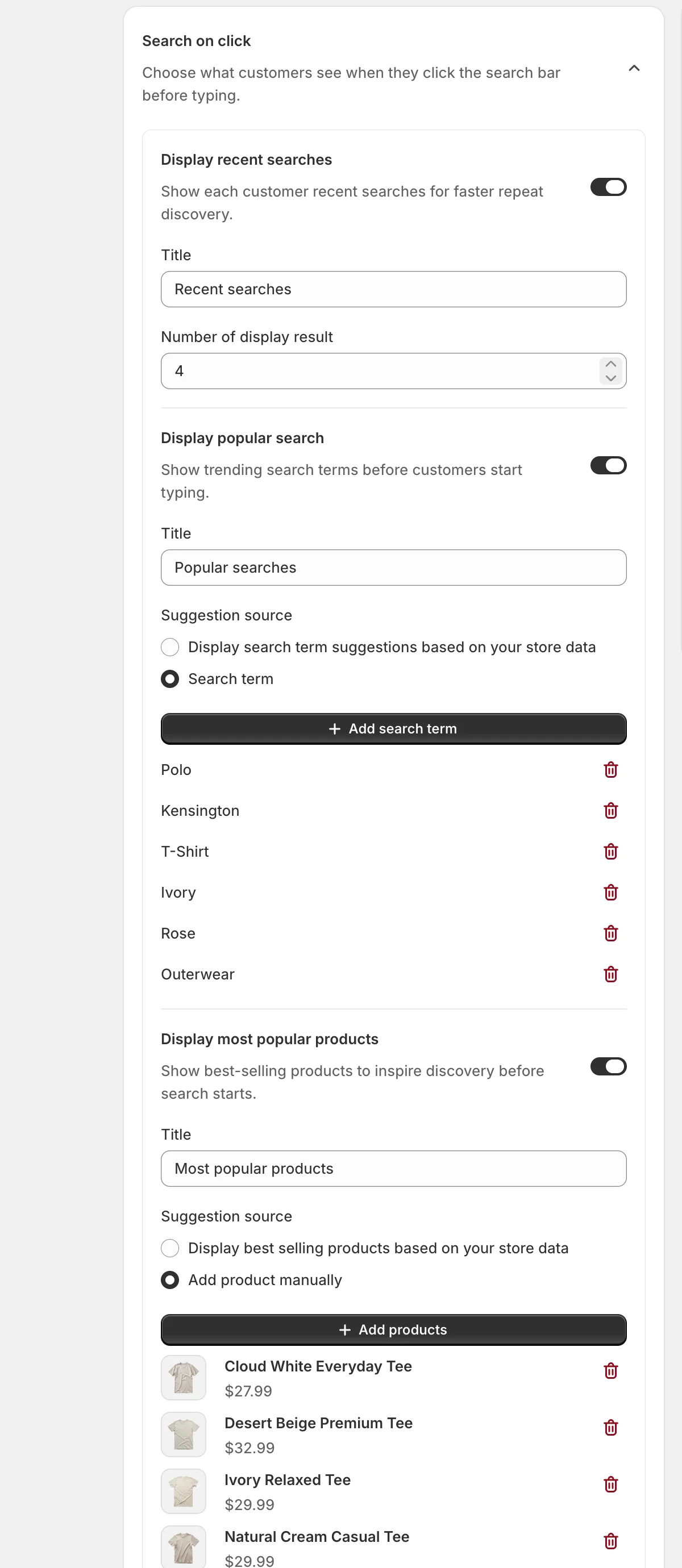
- Display recent searches — each customer's own previous searches, so returning visitors can pick up where they left off. Set the Title and Number of display result. There is no source option here, because the list is personal to each customer.
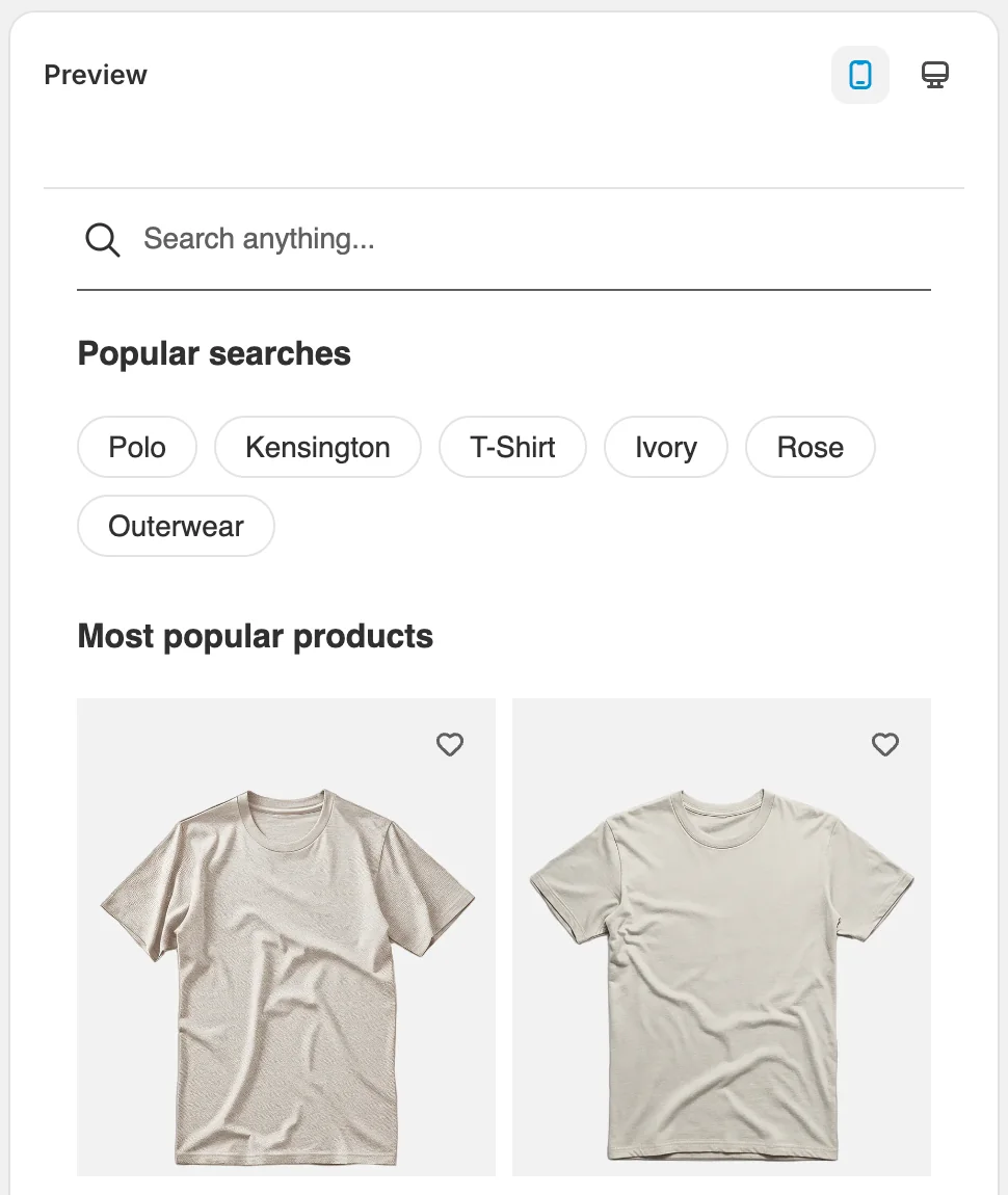
- Display popular search — trending terms shown as clickable chips. Suggestion source is either Display search term suggestions based on your store data (automatic) or Search term, which gives you an Add search term button to curate the list by hand.
- Display most popular products — a row of products to browse before searching at all. Again either automatic best sellers, or Add product manually with an Add products button so you can push a specific range.
The example above uses hand-picked terms and hand-picked products. This is what the customer sees the instant they click the search bar:
Save your changes
Click Save in the bar at the top of the page. If the button does not respond, check the two rules from Step 4: at least one With result row has to be on, and every Number of display result field has to be 1 or more. The page scrolls to whichever field is blocking the save.
Not showing up?
- Check both switches on Tools → Search. Instant Search being off is the first thing to rule out.
- Confirm you pressed Save on the settings page. The preview updates from unsaved edits, so it can look correct while your storefront is still on the old settings.
- Nothing appears before typing? That is Search on click — all three rows are off until you turn them on.
- A result type is missing? Check its switch in With result, and confirm you have that content in your store. A blog row cannot show blogs if the store has none.
- Fewer items than expected? Check Number of display result for that row.
- The sidebar is on the wrong side, or missing? The sidebar only exists on desktop, and One column has no sidebar at all.
Last updated on
Search
Search in Sledge — 9 guides covering setup and day-to-day use.
How do I set up AI-Powered Synonyms?
Synonyms let customers find products even when they use different words — a search for “tshirt” can still find your “Polo Shirt”. Sledge builds this in two ways: the AI Synonym tab generates synonym a