Start using Sledge and Next.js
Prior using all Sledge's widgets, follow the steps below to start integrating Sledge into your Next.js storefront.
Quickstart
Install Sledge Core
First, you need to install the core of sledge package, run the following command:
pnpm i @sledge-app/coreSetup the SledgeProvider
Once you've installed the core, create a new directory for your components (if it doesn't already exist).
For example, you can create a directory named components and create a new directory in the component folder named sledge and finally create a file named sledge-provider-component.tsx.
- sledge-provider-component.tsx
"use client";

import { SledgeProvider } from "@sledge-app/core";
import "@sledge-app/core/style.css";
import { ReactNode } from "react";

interface ISledgeProvider {
  children: React.ReactNode;
  userId: string;
  userEmail: string;
  userFullname: string;
  domain: string;
}

export default function SledgeProviderComponent({
  children,
  userId,
  userEmail,
  userFullname,
  domain,
}: ISledgeProvider) {
  return (
    <SledgeProvider
      config={{
        userId: userId,
        userEmail: userEmail,
        userFullname: userFullname,
        domain: domain
      }}
    >
      {children}
    </SledgeProvider>
  );
}
In app/layout.tsx, import your sledge-provider-component.tsx component and use it to render SledgeProviderComponent
"use client";

import SledgeProviderComponent from "components/sledge/sledge-provider-component";

export default async function RootLayout() {
  return (
    <html>
      <body>
        <SledgeProviderComponent
          userId=""
          userEmail=""
          userFullname=""
          domain=""
        >
          {/* Main content */}
        </SledgeProviderComponent>
      </body>
    </html>
  );
}
Let's look on list of all available parameters:
| Parameter | Type | Description |
|---|---|---|
| userId | string | Fill with your own user logined data, |
| userEmail | string | Fill with your own user logined data, |
| userFullname | string | Fill with your own user logined data, |
| domain | string (required) | Fill with your shop's |
Install one of the Sledge's widget
We're going to try implement product filters widget so install @sledge-app/react-instant-search package first :
pnpm i @sledge-app/react-instant-searchImplement Widget
Create a file named sledge-product-filter-widget.tsx in the components/sledge folder.
- sledge-product-filter-widget.tsx
"use client";

import { ProductFilterWidget } from "@sledge-app/react-instant-search";

const SledgeProductFilterWidget = (product) => (
  <ProductFilterWidget
    query={{
      keyword: "q",
    }}
    params={{
      collectionId: "",
      collectionName: "",
    }}
  />
);
ProductFilterWidget Parameters
Let's look on list of all available parameters:
| Parameter | Type | Description |
|---|---|---|
| keyword | string | Fill up your unique |
| collectionId | string (required) | Fill with your own collection id, |
| collectionName | string (required) | Fill with your own collection name, |
Create collections route
Create a new route for your collections page.
- page.tsx
In collections/[handle]/page.tsx, import your sledge-product-filter-widget.tsx component and use it to render ProductFilterWidget
import SledgeProductFilterWidget from "components/sledge/sledge-product-filter-widget.tsx";
import { getCollection } from "lib/shopify";
export default async function Page({ params }: any) {
const collection: any = await getCollection(params.handle);
return (
<>
<SledgeProductFilterWidget collection={collection} />
</>
);
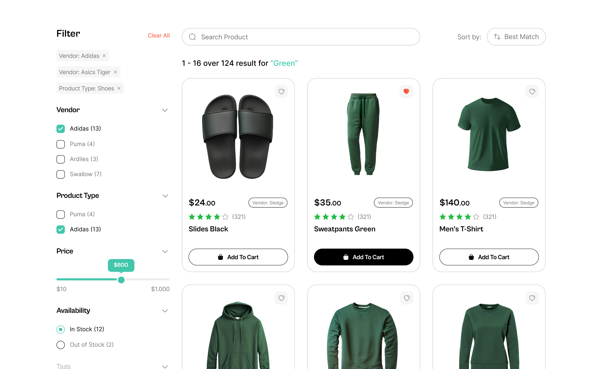
}Widget completely running
Sledge's product filters widget is now ready to be used.
Learn more
Congratulations! Now that the installation is complete, you can use all Sledge's widgets and start integrating to your Next.js storefront.