Instant Search
Make the appearance of the Sledge instant search app remain in line with the theme you have using the custom components that Sledge provides.
Available custom components :
- Other Index List
- Suggestion Keyword List
- Search View More Result
- Collection Card
- Page Card
- Blog Card
- Article Card
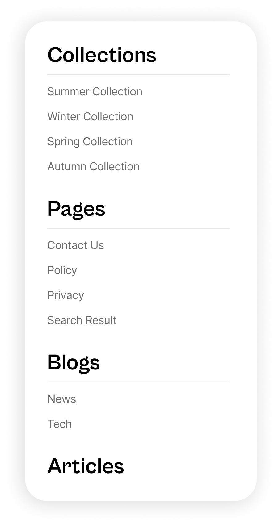
Other Index List
Other Index List is custom component for showing sidebar of popup search result except Suggestion Keyword List.
Build a custom component, e.g:
import { Link } from '@remix-run/react';

export default function SledgeOtherIndexList({
    name,
    items,
    setShowPopupComponent,
}: any) {
    return (
        <>
            <div className="sledge-instant-search__icon-widget-search-form-result-title">
                {name}
            </div>
            {items?.length ? (
                <ul className="sledge-instant-search__icon-widget-search-form-result-list">
                {items.map((hit: any, index: number) => {
                    const {title, handle} = hit;

                    let linkTo = '';

                    if (String(name)?.toLowerCase().includes('collections')) {
                        linkTo = `/collections/${handle}`;
                    } else if (String(name)?.toLowerCase().includes('pages')) {
                        linkTo = `/pages/${handle}`;
                    } else if (String(name)?.toLowerCase().includes('blogs')) {
                        linkTo = `/blogs/${handle}`;
                    } else if (String(name)?.toLowerCase().includes('articles')) {
                        linkTo = `/articles/${handle}`;
                    }

                    return (
                    <li key={index}>
                        <Link
                            to={linkTo}
                            className="sledge-instant-search__icon-widget-search-form-result-list-link"
                            onClick={() =>
                                setShowPopupComponent && setShowPopupComponent(false)
                            }
                        >
                            {title}
                        </Link>
                    </li>
                    );
                })}
                </ul>
            ) : (
                <ul className="sledge-instant-search__icon-widget-search-form-result-list">
                    <li className="sledge-instant-search__icon-widget-search-form-result-item-disabled">
                        No {name?.toLowerCase()} were found
                    </li>
                </ul>
            )}
        </>
    );
};
Call custom component to prop
Only provide the function name (without ()), see the API reference
<CustomComponent>must be added as a child of another sledge's widget.
import { CustomComponents } from "@sledge-app/core";
import { SearchIconWidget } from "@sledge-app/react-instant-search";
import SledgeOtherIndexList from "~/components/SledgeOtherIndexList";
export default function InstantSearchIconWidget() {
return (
<SearchIconWidget
size='sm'
onAfterAddWishlist={(state) => {
if (state) {
// if condition is state === true, run your custom code
} else {
// if condition is state === true, run your custom code
}
}}
onAfterRemoveWishlist={(state) => {
if (state) {
// if condition is state === true, run your custom code
} else {
// if condition is state === true, run your custom code
}
}}
onAfterRenderProduct={(state) => {
if (state) {
// if condition is state === true, run your custom code
} else {
// if condition is state === true, run your custom code
}
}}
>
<CustomComponents otherIndexList={SledgeOtherIndexList} />
</SearchIconWidget>
);
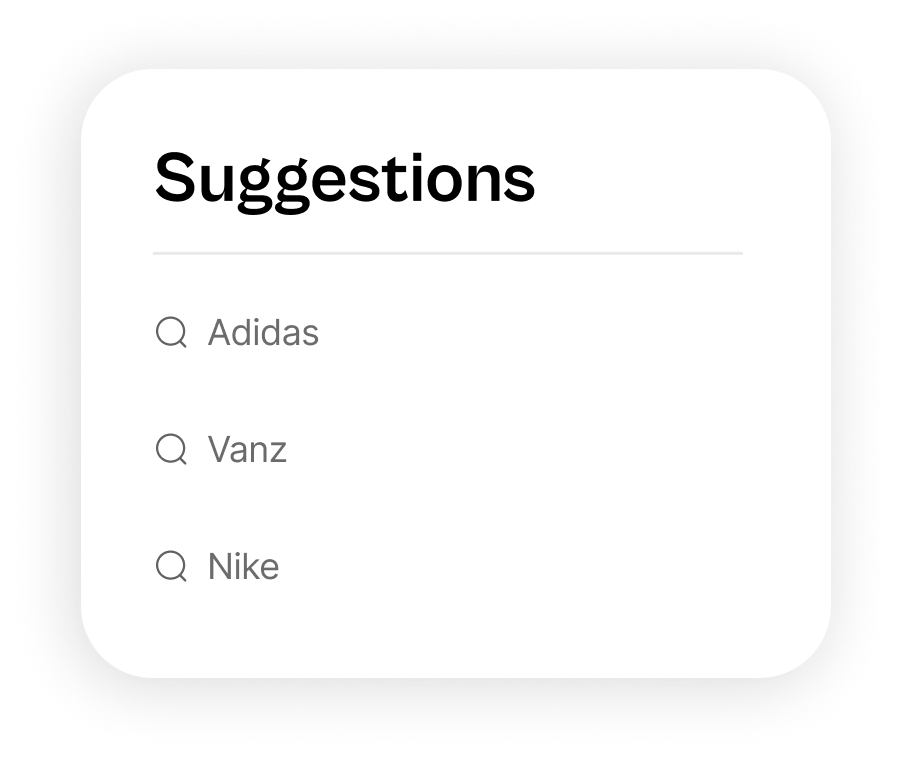
}Suggestion Keyword List
Suggestion Keyword List is custom component for showing suggestion keyword from suggestion setting on backend.
Build a custom component, e.g:
import { Link } from '@remix-run/react';

export default function SledgeSuggestionKeywordList({
    keywords,
    setShowPopupComponent,
}: any) {
    return (
        <>
            <div className="sledge-instant-search__icon-widget-search-form-result-title">
                Suggestions
            </div>
            <ul className="sledge-instant-search__icon-widget-search-form-result-list">
                {keywords.map((keyword: string, index: number) => {
                return (
                    <li key={index}>
                    <Link
                        to={`/pages/search-result?q=${keyword}`}
                        className="sledge-instant-search__icon-widget-search-form-result-list-link sledge-instant-search__icon-widget-search-form-result-list-link-suggestion"
                        onClick={() => setShowPopupComponent && setShowPopupComponent(false)}
                    >
                        <span className="sledge-icon__search">
                        <svg
                            width={12}
                            height={12}
                            viewBox="0 0 20 21"
                            fill="none"
                            xmlns="http://www.w3.org/2000/svg"
                        >
                            <path
                            fillRule="evenodd"
                            clipRule="evenodd"
                            d="M9.78283 2.16669C14.2578 2.16669 17.8978 5.80669 17.8978 10.2817C17.8978 12.393 17.0876 14.3186 15.7617 15.7638L18.3707 18.3673C18.6148 18.6114 18.6157 19.0064 18.3715 19.2506C18.2498 19.3739 18.089 19.4348 17.929 19.4348C17.7698 19.4348 17.6098 19.3739 17.4873 19.2523L14.8469 16.6192C13.4579 17.7316 11.6967 18.3975 9.78283 18.3975C5.30783 18.3975 1.66699 14.7567 1.66699 10.2817C1.66699 5.80669 5.30783 2.16669 9.78283 2.16669ZM9.78283 3.41669C5.99699 3.41669 2.91699 6.49585 2.91699 10.2817C2.91699 14.0675 5.99699 17.1475 9.78283 17.1475C13.5678 17.1475 16.6478 14.0675 16.6478 10.2817C16.6478 6.49585 13.5678 3.41669 9.78283 3.41669Z"
                            fill="#677487"
                            />
                        </svg>
                        </span>{' '}
                        {keyword}
                    </Link>
                    </li>
                );
                })}
            </ul>
        </>
    );
};
Call custom component to prop
Only provide the function name (without ()), see the API reference
<CustomComponent>must be added as a child of another sledge's widget.
import { CustomComponents } from "@sledge-app/core";
import { SearchIconWidget } from "@sledge-app/react-instant-search";
import SledgeSuggestionKeywordList from "~/components/SledgeSuggestionKeywordList";

export default function InstantSearchIconWidget() {
    return (
        <SearchIconWidget
            size='sm'
            onAfterAddWishlist={(state) => {
                if (state) {
                    // if condition is state === true, run your custom code
                } else {
                    // if condition is state === true, run your custom code
                }
            }}
            onAfterRemoveWishlist={(state) => {
                if (state) {
                    // if condition is state === true, run your custom code
                } else {
                    // if condition is state === true, run your custom code
                }
            }}
            onAfterRenderProduct={(state) => {
                if (state) {
                    // if condition is state === true, run your custom code
                } else {
                    // if condition is state === true, run your custom code
                }
            }}
        >
            <CustomComponents suggestionKeywordList={SledgeSuggestionKeywordList} />
        </SearchIconWidget>
    );
}
Search View More Result
Search View More Result is custom component for showing button for view all search result. You can add custom url and custom onclick action to button.

Build a custom component, e.g:
import { Link } from '@remix-run/react';

export default function SledgeSearchViewMoreResult({
    keyword,
    setShowPopupComponent,
}: any) {
    return (
        <Link
            to={`/pages/search-result?q=${keyword}`}
            className="sledge-instant-search__icon-widget-button-more"
            onClick={() => setShowPopupComponent && setShowPopupComponent(false)}
        >
            View More Result
        </Link>
    );
};
Call custom component to prop
Only provide the function name (without ()), see the API reference
<CustomComponent>must be added as a child of another sledge's widget.
import { CustomComponents } from "@sledge-app/core";
import { SearchIconWidget } from "@sledge-app/react-instant-search";
import SledgeSearchViewMoreResult from "~/components/SledgeSearchViewMoreResult";
export default function InstantSearchIconWidget() {
return (
<SearchIconWidget
size='sm'
onAfterAddWishlist={(state) => {
if (state) {
// if condition is state === true, run your custom code
} else {
// if condition is state === true, run your custom code
}
}}
onAfterRemoveWishlist={(state) => {
if (state) {
// if condition is state === true, run your custom code
} else {
// if condition is state === true, run your custom code
}
}}
onAfterRenderProduct={(state) => {
if (state) {
// if condition is state === true, run your custom code
} else {
// if condition is state === true, run your custom code
}
}}
>
<CustomComponents searchViewMoreResult={SledgeSearchViewMoreResult} />
</SearchIconWidget>
);
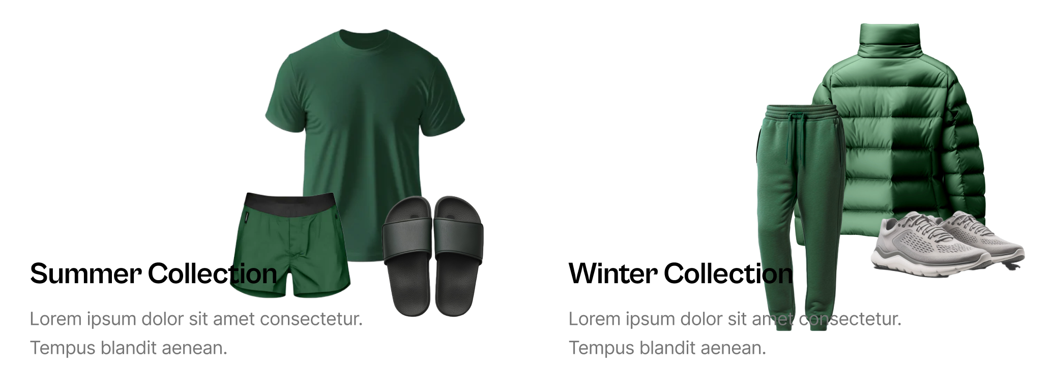
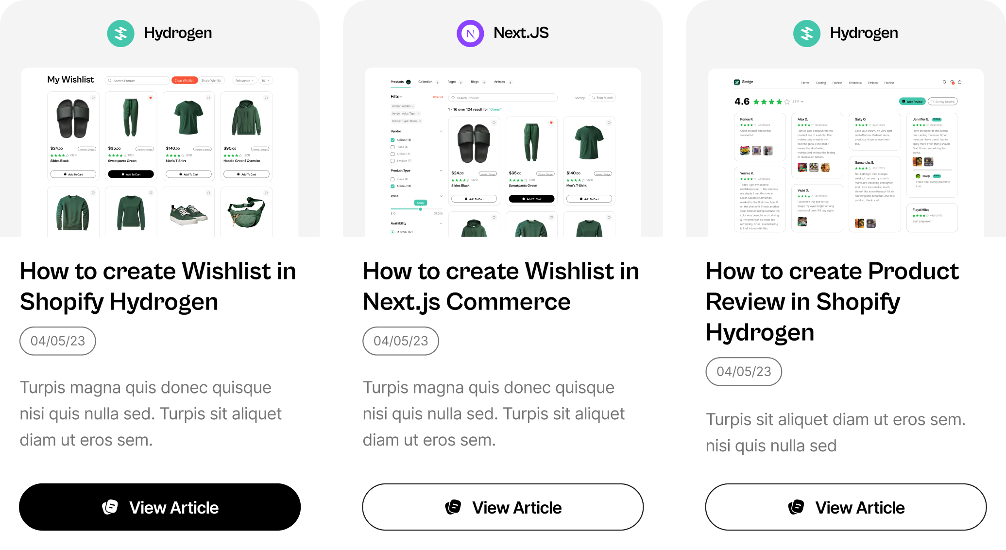
}Collection Card
Collection card are component will show on tab collection of search result.
This custom components works in these packages:
@sledge-app/react-instant-search
Build a custom component, e.g:
import { Link } from "@remix-run/react";

export default function SledgeCollectionCard({ data }: any) {
    const { handle, image, title, body_html } = data;
    return (
        <Link to={`/collections/${handle}`}>
            <div className="sledge__collection-grid-card">
                <div className="sledge__collection-grid-card-image-wrapper">
                <div className="sledge__collection-grid-card-image">
                    <img src={image?.src} alt="sledge-card-image" loading="lazy" />
                </div>
                </div>
                <div className="sledge__collection-grid-card-content">
                <div className="sledge__collection-grid-card-content-title">
                    {title}
                </div>
                <div
                    className="sledge__collection-grid-card-content-description"
                    dangerouslySetInnerHTML={{
                    __html: body_html,
                    }}
                />
                </div>
            </div>
        </Link>
    );
}
Call custom component to prop
Only provide the function name (without ()), see the API reference
<CustomComponent>must be added as a child of another sledge's widget.
import { CustomComponents } from "@sledge-app/core";
import { SearchResultWidget } from "@sledge-app/react-instant-search";
import SledgeCollectionCard from "app/SledgeCollectionCard";

export default function SearchResultPage({ data }: { data?: any }) {
    return (
        <SearchResultWidget
            query={{
                keyword: "q",
            }}
        >
            <CustomComponents collectionCard={SledgeCollectionCard} />
        </SearchResultWidget>
    );
}
Page Card
Page card are component will show on tab page of search result.
This custom components works in these packages:
@sledge-app/react-instant-search
Build a custom component, e.g:
import { Link } from "@remix-run/react";

export default function SledgePageCard({ data }: any) {
    const { id, title, body_html, handle, image } = data;
    return (
        <Link to={`/pages/${handle}`}>
            <div className="sledge__page-grid-card">
                <div className="sledge__page-grid-card-image-wrapper">
                    <div className="sledge__page-grid-card-image">
                        <img src="${image?.src}" alt="sledge-card-image" loading="lazy" />
                    </div>
                </div>
                <div className="sledge__page-grid-card-content">
                    <div className="sledge__page-grid-card-content-title">${title}</div>
                    <div
                        className="sledge__page-grid-card-content-description"
                        dangerouslySetInnerHTML={{
                            __html: body_html,
                        }}
                    />
                </div>
            </div>
        </Link>
    );
}
Call custom component to prop
Only provide the function name (without ()), see the API reference
<CustomComponent>must be added as a child of another sledge's widget.
import { CustomComponents } from "@sledge-app/core";
import { SearchResultWidget } from "@sledge-app/react-instant-search";
import SledgePageCard from "app/SledgePageCard";
export default function SearchResultPage({ data }: { data?: any }) {
return (
<SearchResultWidget
query={{
keyword: "q",
}}
>
<CustomComponents pageCard={SledgePageCard} />
</SearchResultWidget>
);
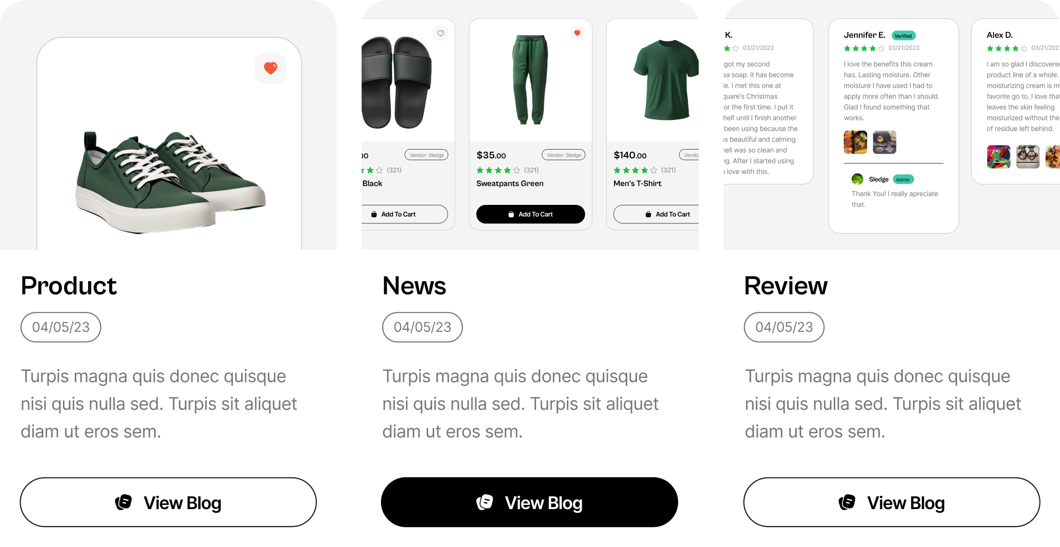
}Blog Card
Blog card are component will show on tab blog of search result.
This custom components works in these packages:
@sledge-app/react-instant-search
Build a custom component, e.g:
import { Link } from "@remix-run/react";

export const SledgeBlogCard = ({data}) => {
    const { title, created_at, url, image } = item;

    return (
        <div className="sledge__blog-grid-card" key={index}>
            <div className="sledge__blog-grid-content">
                <div className="sledge__blog-grid-card-image">
                    <a href={url}>
                        <img src={image?.src} alt="sledge-card-image" loading="lazy" />
                    </a>
                </div>
                <div className="sledge__blog-grid-card-desc">
                    <a href={url}>
                        <div className="sledge__blog-grid-card-title">{title}</div>
                    </a>
                    {created_at ? <div className="sledge__blog-grid-badge-vendor">{convertDate(created_at)}</div> : null}
                </div>
            </div>
            <div className="sledge__blog-grid-button-wrapper">
                <a href={url}>
                    <Button type="button" colorType="light">
                        <NoteIcon width={16} height={16} color="#000000" />
                        <span>View Blog</span>
                    </Button>
                </a>
            </div>
        </div>
    );
};
Call custom component to prop
Only provide the function name (without ()), see the API reference
<CustomComponent>must be added as a child of another sledge's widget.
import { CustomComponents } from "@sledge-app/core";
import { SearchResultWidget } from "@sledge-app/react-instant-search";
import SledgeBlogCard from "app/SledgeBlogCard";

export default function SearchResultPage({ data }: { data?: any }) {
    return (
        <SearchResultWidget
            query={{
                keyword: "q",
            }}
        >
            <CustomComponents blogCard={SledgeBlogCard} />
        </SearchResultWidget>
    );
}
Article Card
Article card are component will show on tab article of search result.
This custom components works in these packages:
@sledge-app/react-instant-search
Build a custom component, e.g:
import { Link } from "@remix-run/react";

export const SledgeArticleCard = ({data}) => {
    const {
        title,
        image,
        body_html,
        summary_html,
        published_at,
        blog_handle,
        handle,
    } = data;

    return (
        <div className="sledge__article-grid-card" key={index}>
            <div className="sledge__article-grid-content">
                <div className="sledge__article-grid-card-image">
                    <a href={url}>
                        <img src={image?.src} alt="sledge-card-image" loading="lazy" />
                    </a>
                </div>
                <div className="sledge__article-grid-card-desc">
                    <a href={url}>
                        <div className="sledge__article-grid-card-title">{title}</div>
                    </a>
                    {created_at ? <div className="sledge__article-grid-badge-vendor">{convertDate(created_at)}</div> : null}
                    {summary_html ? <div className="sledge__article-grid-card-text" dangerouslySetInnerHTML={{ __html: summary_html }}></div> : null}
                </div>
            </div>
            <div className="sledge__article-grid-button-wrapper">
                <a href={url}>
                    <Button type="button" colorType="light">
                        <NoteIcon width={16} height={16} color="#000000" />
                        <span>View Article</span>
                    </Button>
                </a>
            </div>
        </div>
    )
};
Call custom component to prop
Only provide the function name (without ()), see the API reference
<CustomComponent>must be added as a child of another sledge's widget.
import { CustomComponents } from "@sledge-app/core";
import { SearchResultWidget } from "@sledge-app/react-instant-search";
import SledgeArticleCard from "app/SledgeArticleCard";

export default function SearchResultPage({ data }: { data?: any }) {
    return (
        <SearchResultWidget
            query={{
                keyword: "q",
            }}
        >
            <CustomComponents articlecard={SledgeArticleCard} />
        </SearchResultWidget>
    );
}