Global
All of Sledge's themes use of several kinds of classes. To assist you in customizing CSS to your needs, the most frequently used element selectors and classes are listed below.
- Select Field
- Input Field
- Search Input Field
- Pagination
- Product Card
- Toast Notification
- Confirmation Popup
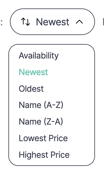
Select Field
| Class | Description |
|---|---|
| sledge__select-field-wrapper | Select field wrapper |
| sledge__button sledge__select-field | Select field button |
| sledge__select-field-icon | Select field icon |
| sledge-icon__swap | Select field icon swap |
| sort-trigger-icon | Select field trigger icon |
| sledge-icon__arrow-down | Select field trigger arrow up or down icon |
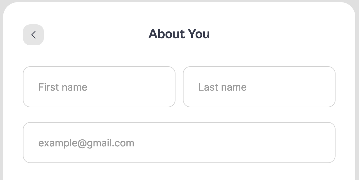
Input Field
| Class | Description |
|---|---|
| sledge__input-field-wrapper | Input wrapper |
| sledge__input-field | Input field |
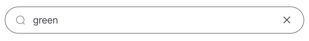
Search Input Field
| Class | Description |
|---|---|
| sledge__search-input-field-wrapper | Search input wrapper |
| sledge__search-input-field-icon | Search input icon |
| sledge__search-input-field | Search input field |
| sledge-icon__search | Search input search icon |
| sledge__clear-field | Search input clear button wrapper |
| sledge-icon__close | Search input clear icon |
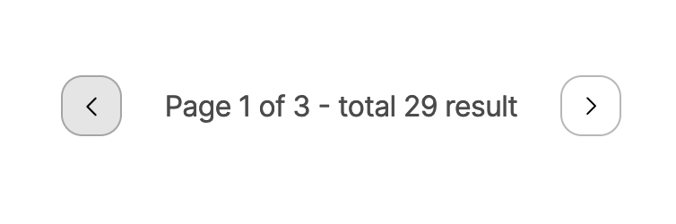
Pagination
| Class | Description |
|---|---|
| sledge__pagination | Pagination wrapper |
| sledge__pagination-navigation | Pagination button |
| sledge-icon__arrow-left | Pagination arrow left icon |
| sledge-icon__arrow-right | Pagination arrow right icon |
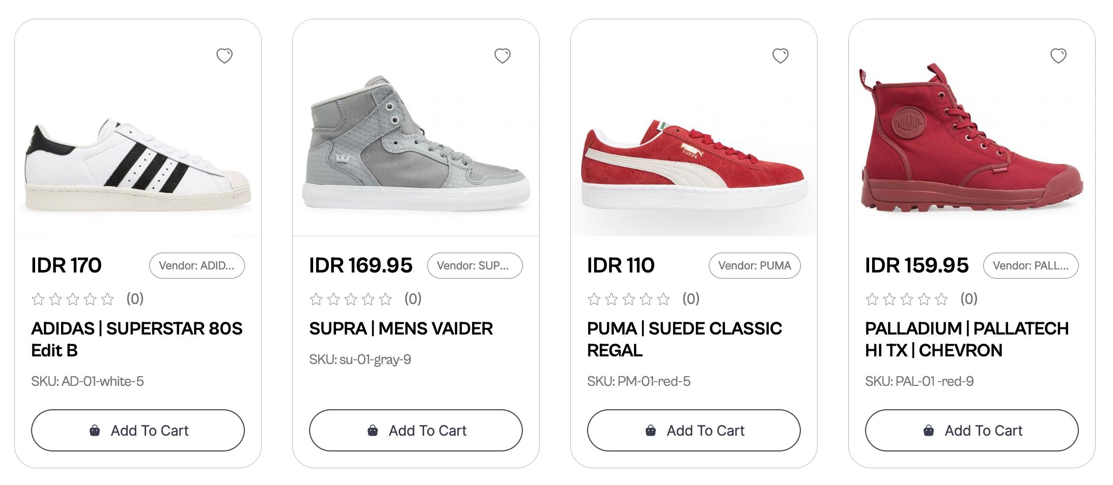
Product Card
| Class | Description |
|---|---|
| sledge__product-grid | Product card wrapper |
| sledge__product-grid-card | Product card parent class |
| sledge__product-grid-content | Product card content wrapper |
| sledge__product-grid-card-image | Product card image wrapper |
| sledge-wishlist__trigger-parent-element | Product card wishlist trigger |
| sledge__product-grid-card-desc | Product card description wrapper for: title, price & etc |
| sledge__product-grid-card-price | Product price |
| sledge__product-grid-badge-vendor | Product vendor |
| sledge__product-grid-card-product-name | Product title |
| sledge__product-grid-card-text | Product SKU & First variant name |
| sledge__product-grid-button-wrapper | Product card add to cart button wrapper |
For Wishlist Trigger, you can check out
here.
For Rating stars, you can check out
here.
Using Selector
| Selector | Description |
|---|---|
| .sledge__product-grid-button-wrapper .sledge__button | Product card add to cart button |
| .sledge__product-grid-card-image img | Product image |
Toast Notification
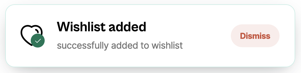
| Class | Description |
|---|---|
| sledge__toast-viewport | Toast wrapper |
| sledge__toast-icon-wrapper | Toast icon wrapper |
| sledge__toast-message-wrapper | Toast message wrapper |
| sledge__toast-action-wrapper | Toast action wrapper |
Using Selector
| Selector | Description |
|---|---|
| .sledge__toast-icon-wrapper .sledge-icon__heart | Toast heart icon |
| .sledge__toast-message-wrapper .sledge__toast-title | Toast title |
| .sledge__toast-message-wrapper .sledge__toast-description | Toast description |
| .sledge__toast-action-wrapper button.sledge__toast-action | Toast dismiss button |
Confirmation Popup
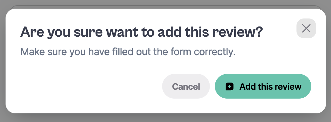
| Class | Description |
|---|---|
| sledge__alert-dialog-content | Confirmation Popup wrapper |
| sledge__alert-dialog-content-close | Confirmation Popup close button |
| sledge__alert-dialog-title | Confirmation Popup title |
| sledge__alert-dialog-description | Confirmation Popup descripion |
| sledge__alert-dialog-button-cancel | Confirmation Popup 'cancel' button |
Using Selector
| Selector | Description |
|---|---|
| .sledge__alert-dialog-button[data-button-color-type="success"] | Confirmation Popup add review button |
| .sledge__alert-dialog-button .sledge-icon__message-add | Confirmation Popup add icon |
| .sledge__alert-dialog-button span | Confirmation Popup add icon |
| .sledge__button[data-button-color-type="success"] span:nth-child(2) | Confirmation Popup add button text |