Product Review
All of Sledge's themes use of several kinds of classes. To assist you in customizing CSS to your needs, the most frequently used element selectors and classes are listed below.
- Rating
- List
- Review Popup
- Write Review Form
- Happy Customers Page
- Sticky Sidebar Widget
- Trust Badge
- Snippet Carousel Widget
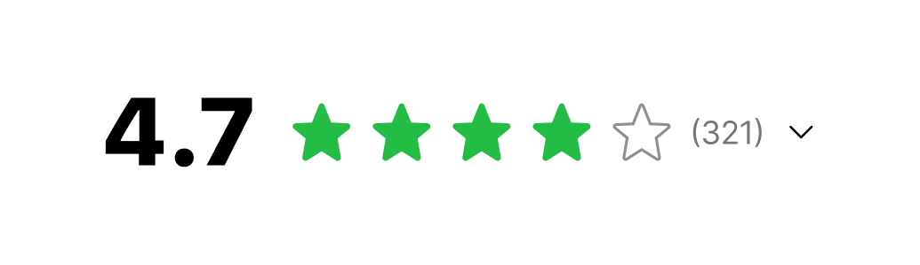
Rating

| Class | Description |
|---|---|
| sledge-product-review__rating | Rating component |
| sledge-product-review__rating-summary-total | Rating count |
You can edit this component with Using Backend in Star Rating Color
section, check out here.
Using Selector
| Selector | Description |
|---|---|
| #sledge-product-review-icons-rating-icon-fill path | Rating color, you can use this selector to edit rating color e.g : `fill:yellow` |
List
Grid Type
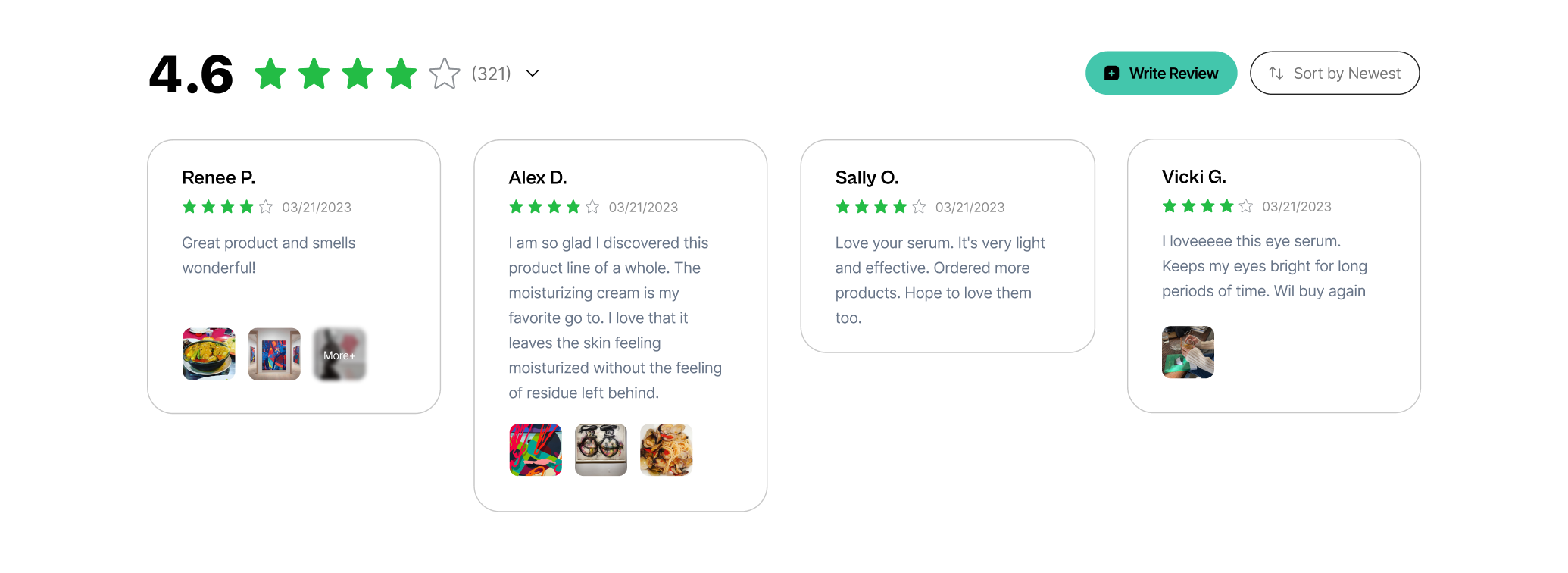
| Class | Description |
|---|---|
| sledge-product-review__widget-review-wrapper | Review lists wrapper |
| sledge-product-review__widget-review-card-content | Review card content wrapper |
| sledge-product-review__widget-review-card-customer | Reviewer name |
| sledge-product-review__widget-review-card-date | Review submitted |
| sledge-product-review__widget-review-card-message | Review message |
| sledge-product-review__widget-review-card-reply | Review Reply wrapper |
| sledge-product-review__widget-review-card-reply-name | Review Reply name |
| sledge-product-review__widget-review-card-verified-text | Review Reply verified badge |
| sledge-product-review__widget-review-card-reply-message | Review Reply message |
You can edit Write a Review button with Using Backend in Button : Write a Review section, check out
here.
You can edit Verified badge with Using Backend in Verified Badge
section, check out here.
You can edit Load More button with Using Backend in Button : Load More
section, check out here.
For Rating stars component, you can check out
here.
Using Selector
| Selector | Description |
|---|---|
| .sledge-product-review__widget-review-card-image img | Review image, you can use this selector to edit review image |
| .sledge-product-review__widget-review-card-reply-title img | Admin avatar, you can use this selector to edit admin avatar |
List Type
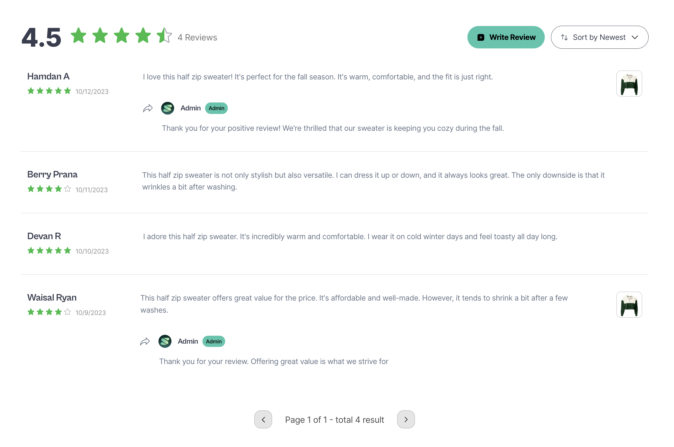
| Class | Description |
|---|---|
| sledge-product-review__widget-review-wrapper | Review lists wrapper |
| sledge-product-review__widget-review-card | Review card content wrapper |
| sledge-product-review__widget-review-card-customer | Reviewer name |
| sledge-product-review__widget-review-card-date | Review submitted |
| sledge-product-review__widget-review-card-message | Review message |
| sledge-product-review__widget-review-card-reply | Review Reply wrapper |
| sledge-product-review__widget-review-card-reply-name | Review Reply name |
| sledge-product-review__widget-review-card-verified-text | Review Reply verified badge |
| sledge-product-review__widget-review-card-reply-message | Review Reply message |
You can edit Write a Review button with Using Backend in Button : Write a Review section, check out
here.
You can edit Verified badge with Using Backend in Verified Badge
section, check out here.
For Rating stars component, you can check out
here.
For Pagination component, you can check out
here.
Using Selector
| Selector | Description |
|---|---|
| .sledge-product-review__widget-review-card-image img | Review image, you can use this selector to edit review image |
| .sledge-product-review__widget-review-card-reply-title img | Admin avatar, you can use this selector to edit admin avatar |
Rating Summary
| Class | Description |
|---|---|
| sledge-product-review__rating | Rating component |
| sledge-product-review__widget-summary-average | Review average |
| sledge-product-review__widget-summary-total | Review total |
| sledge-product-review__widget-summary-total-desc | Review total text |
| summary-trigger-icon | Review summary trigger icon |
You can edit Summary Bar Colors badge with Using Backend in Summary Bar Colors section, check out here.
For Rating stars component, you can check out
here.
Review Popup
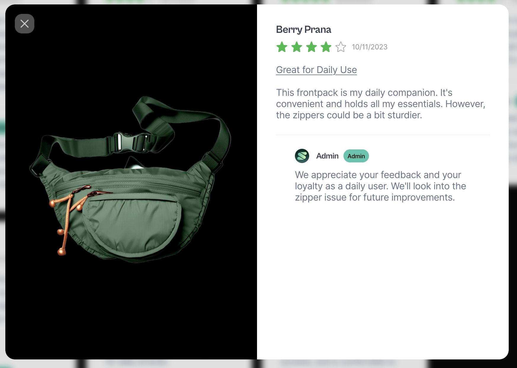
| Class | Description |
|---|---|
| sledge-product-review__widget-popup-flex | Review popup wrapper |
| sledge-product-review__widget-popup-close | Review popup close button |
| sledge-review-card-image | Review popup images |
| sledge-product-review__widget-popup-media-nav | Review popup image next and prev button |
| sledge-product-review__widget-popup-content-title | Review popup name |
| sledge-product-review__widget-popup-content-title | Review popup name |
| sledge-product-review__widget-popup-content-date | Review popup submitted date |
| sledge-product-review__widget-popup-content-title-description | Review popup title |
| sledge-product-review__widget-popup-content-message | Review popup message |
| sledge-product-review__widget-review-card-reply-profile-image | Admin avatar |
| sledge-product-review__widget-review-card-reply-name | Admin name |
| sledge-product-review__widget-review-card-verified-text | verified badge |
You can edit Verified badge with Using Backend in Verified Badge
section, check out here.
For Rating stars component, you can check out
here.
Write Review Form
Select Rating
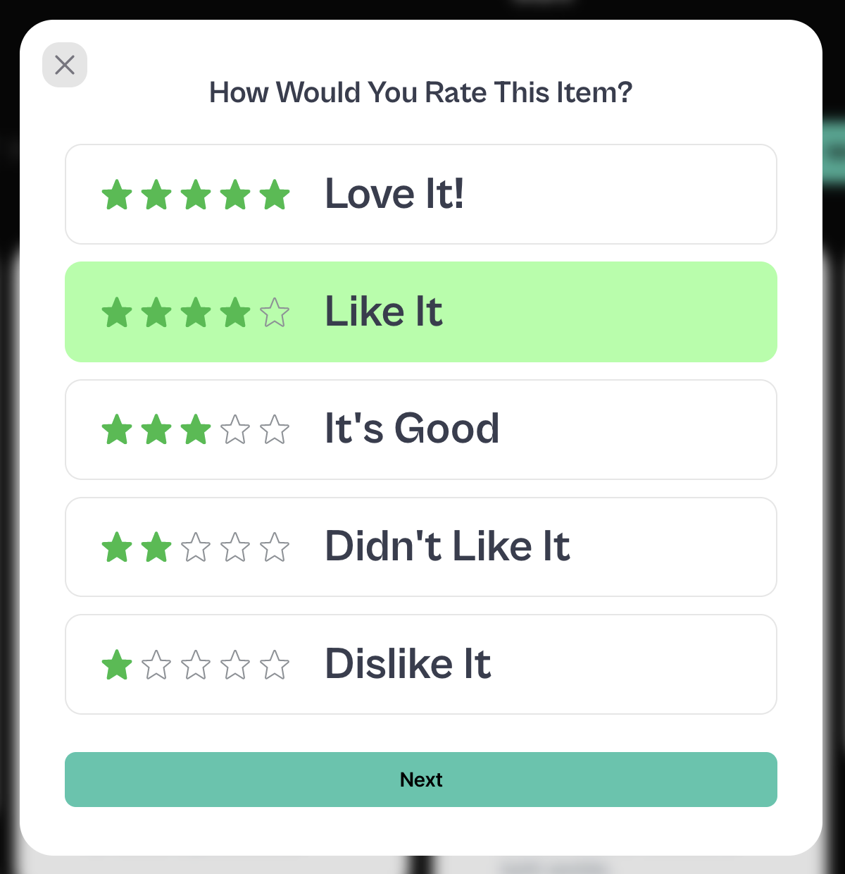
| Class | Description |
|---|---|
| sledge-product-review__widget-form-add-content | Review form wrapper |
| sledge-product-review__widget-form-add-step-close | Review form close button |
| sledge-product-review__widget-form-title | Review form title |
| sledge-product-review__widget-form-select-rate-list-item | Review form select rate |
| sledge-product-review__widget-form-select-rate-text | Review form select rate text |
For Rating stars component, you can check out
here.
Using Selector
| Selector | Description |
|---|---|
| .sledge-product-review__widget-form-select-rate-list-item.selected | Selected rate, you can use this selector to edit background color when rate is selected |
| .sledge-product-review__widget-form-add-step-navigator .sledge__button | Next button, you can use this selector to edit size, background color & etc |
Write Review
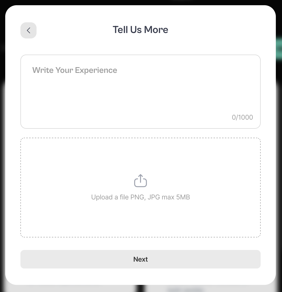
| Class | Description |
|---|---|
| sledge-product-review__widget-form-add-content | Review form wrapper |
| sledge-product-review__widget-form-add-step-back | Review form step back button |
| sledge-product-review__widget-form-title | Review form title |
| sledge__text-area-field | Review form text area fields |
| sledge__text-area-field-counter | Review form text area counter |
| sledge-product-review__widget-form-upload-media-file | Review form media upload |
| sledge-icon__upload | Review form upload icon |
Using Selector
| Selector | Description |
|---|---|
| .sledge-product-review__widget-form-upload-media-text>span | Media upload text, you can use this selector to edit text size, color & etc |
| .sledge-product-review__widget-form-add-step-navigator .sledge__button | Next button, you can use this selector to edit size, background color & etc |
Input User Information
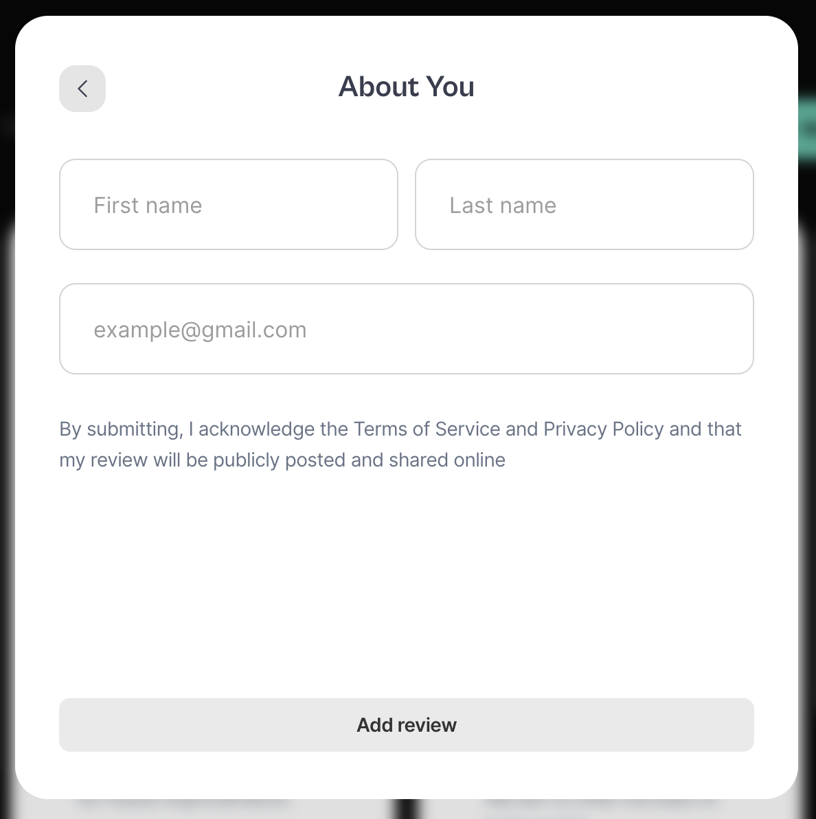
| Class | Description |
|---|---|
| sledge-product-review__widget-form-add-content | Review form wrapper |
| sledge-product-review__widget-form-add-step-back | Review form step back button |
| sledge-product-review__widget-form-title | Review form title |
| sledge-product-review__widget-form-review-description | Review form description |
For input field, you can check out
here.
Using Selector
| Selector | Description |
|---|---|
| .sledge-product-review__widget-form-add-step-navigator .sledge__button | Add review button, you can use this selector to edit size, background color & etc |
Confirmation Popup
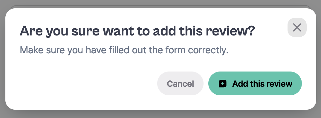
For Confirmation Popup component, you can check out
here.
Happy Customers Page
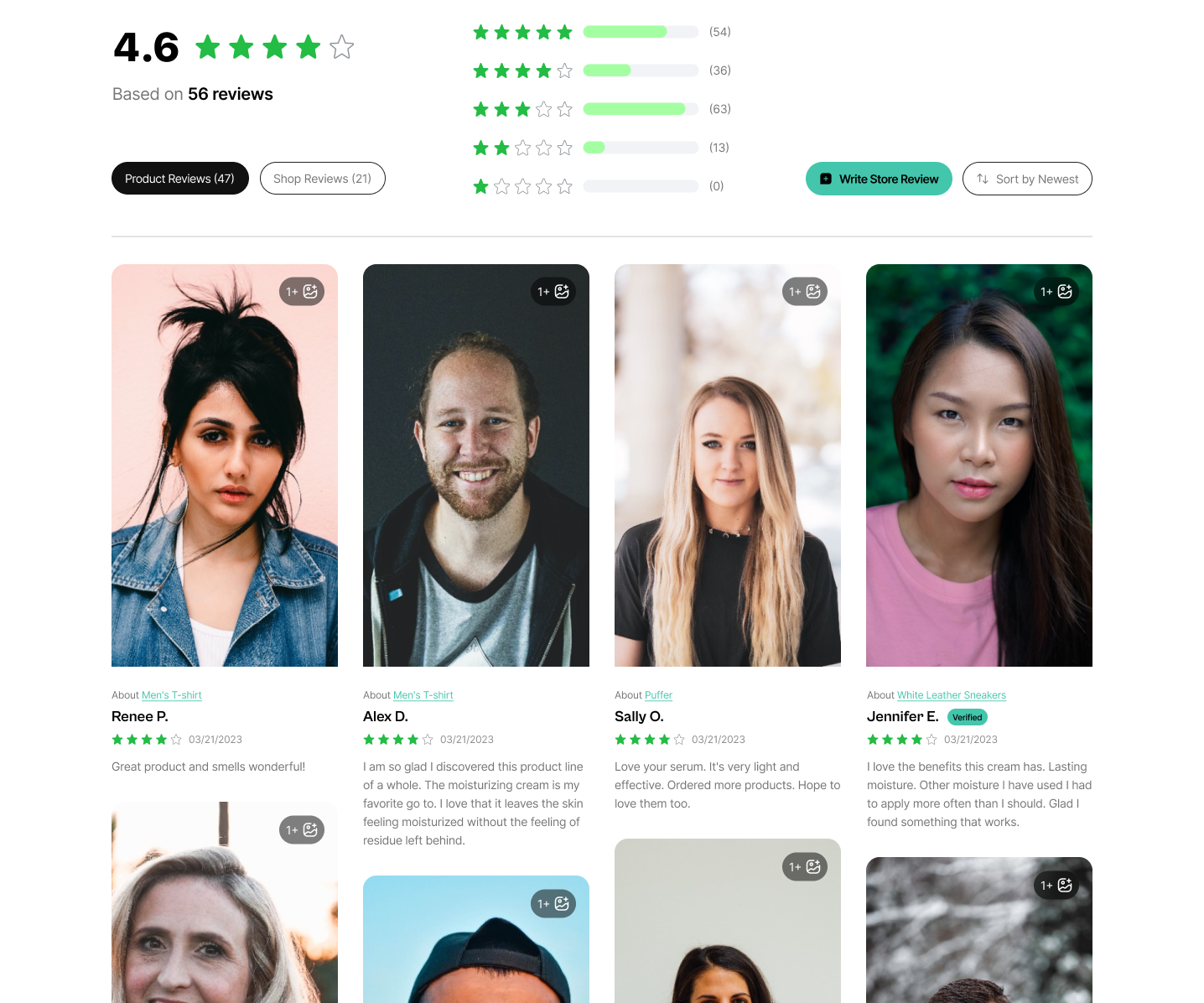
| Class | Description |
|---|---|
| sledge-product-review__happy-customers-page-widget-wrapper | Happy Customers Page wrapper |
| sledge-product-review__happy-customers-page-widget-header | Happy Customers Page header wrapper |
| sledge-product-review__happy-customers-page-widget-header | Happy Customers Page header wrapper |
For Rating stars component, you can check out
here.
You can edit this component with Using Backend in Happy Customer Page
section, check out here.
Using Selector
| Selector | Description |
|---|---|
| .sledge-product-review__happy-customers-page-widget-average .sledge-product-review__widget-summary-average | Average number, you can use this selector to edit font size & color. |
| .sledge-product-review__happy-customers-page-widget-summary-rating .sledge-product-review__rating | Average rating, you can use this selector to edit rating width. |
| .sledge-product-review__happy-customers-page-widget-summary-total span | Average total, you can use this selector to edit font size & color. |
| .sledge-product-review__happy-customers-page-widget-tab button | Product review & Shop Review button, you can use this selector to edit button or font size & color. |
| .sledge-product-review__happy-customers-page-widget-header .sledge-product-review__widget-summary | Review Summary bar wrapper, you can use this selector to edit summary width. |
| .sledge-product-review__happy-customers-page-widget-header .sledge-product-review__widget-summary .sledge-product-review__rating | Review Summary bar rating, you can use this selector to edit rating width. |
| .sledge-product-review__happy-customers-page-widget-header .sledge-product-review__widget-summary .sledge__progress | Review Summary bar progress, you can use this selector to edit progress width & etc. |
| .sledge-product-review__happy-customers-page-widget-header .sledge-product-review__widget-summary .sledge-product-review__happy-customers-page-widget-summary-dist-total | Review Summary bar total, you can use this selector to edit font size & color. |
| .sledge-product-review__happy-customers-page-widget-header .sledge-product-review__happy-customers-page-widget-header-buttons-flex | Write Store Review button & Sort button wrapper, you can use this selector to edit element width. |
| .sledge-product-review__happy-customers-page-widget-header .sledge-product-review__happy-customers-page-widget-header-buttons-flex button | Write Store Review button & Sort button, you can use this selector to edit button width & color. |
| .sledge-product-review__happy-customers-page-widget-wrapper .sledge-product-review__widget-about-product-text | About Product link you can use this selector to edit font size & color. |
Image Grid Type
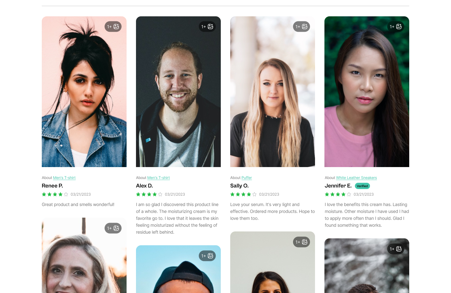
| Class | Description |
|---|---|
| sledge-product-review__widget-review-card-image-grid-wrapper | Review card image wrapper |
You can edit this component with Using Backend in Happy Customer Page
section, check out here.
Using Selector
| Selector | Description |
|---|---|
| .sledge-product-review__widget-review-card-image-grid-more-image span | Review more images label, you can use this selector to edit font size & color. |
| .sledge-product-review__widget-review-card-image-grid-more-image .sledge-icon__gallery-add | Review more images icon. you can use this selector to edit icon width, height & color. |
| .sledge-product-review__widget-review-card-image-grid-wrapper img | Review card image. you can use this selector to edit image width, height & position. |
Grid Type
For Grid type, you can check out
here.
You can edit this component with Using Backend in Happy Customer Page
section, check out here.
List Type
For List type, you can check out
here.
You can edit this component with Using Backend in Happy Customer Page
section, check out here.
Trust Badge
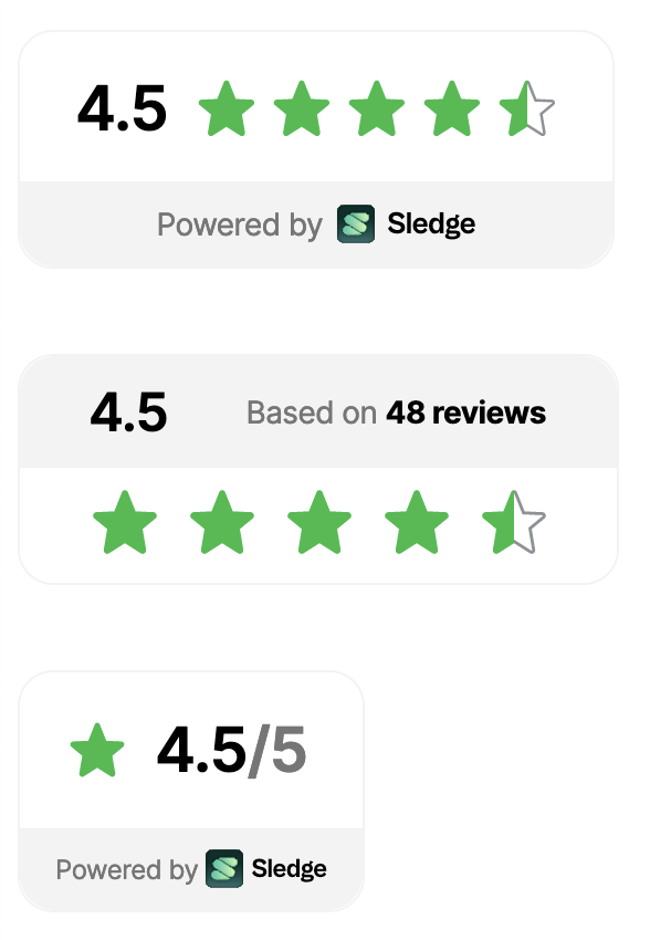
| Class | Description |
|---|---|
| sledge-product-review__trust-badge | Trust badge component |
| sledge-product-review__trust-badge-average-text | Trust badge average text |
| sledge-product-review__trust-badge-text | Trust badge text |
| sledge-product-review__trust-badge-logo-text | Trust badge logo text |
You can edit this component with Using Backend in Trust Badge Widget
section, check out here.
Using Selector
| Selector | Description |
|---|---|
| #sledge-product-review-icons-rating-icon-fill path | Rating color, you can use this selector to edit rating color e.g : `fill:yellow` |
Sticky Sidebar Widget
| Class | Description |
|---|---|
| sledge-product-review__badge-floating | Sticky Sidebar Widget wrapper |
| sledge-product-review__badge-floating-icon-link | Sticky Sidebar Widget total & rating wrapper, you can use this class to edit button color & size. |
| sledge-product-review__badge-floating-text | Sticky Sidebar Widget total text, you can use this class to edit font color & size. |
For Rating stars component, you can check out
here.
You can edit this component with Using Backend in Sticky Sidebar Widget
section, check out here.
Snippet Carousel Widget
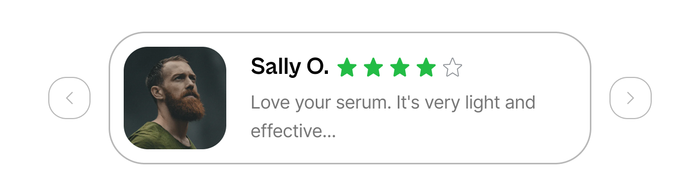
| Class | Description |
|---|---|
| sledge-product-review__snippet | Snippet Widget wrapper |
| sledge-product-review__snippet-card-image | Snippet Widget review image |
| sledge-product-review__snippet-card-name | Snippet Widget reviewer name |
| sledge-product-review__snippet-card-rating | Snippet Widget rating |
| sledge__carousel | Carousel wrapper |
| sledge__carousel-button | Carousel button |
| sledge__carousel-button-prev | Carousel prev button |
| sledge__carousel-button-next | Carousel next button |
| sledge__carousel-viewport | Carousel viewport |
| sledge__carousel-container | Carousel container |
You can edit this component with Using Backend in Snippet Widget
section, check out here.