Custom Styles
Using your own style guide and branding requirements, you can add optional custom CSS for our components.
There are a few techniques for modifying the appearance and feel of a component :
Overriding CSS Classes
Since the displayed components are contained within your application's DOM, the rules in your CSS files will have an impact on the component itself. The produced DOM elements have many classes included to make customisation easier, allowing you to target only the elements you want with a single class name.
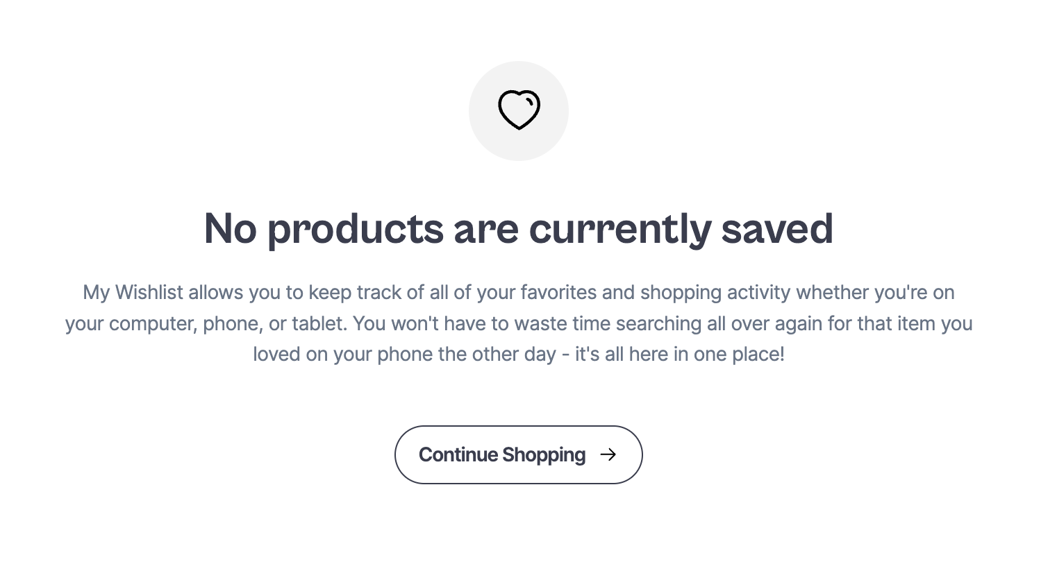
For example in Wishlist Empty :
Selector :
<div class="sledge-wishlist__widget-product-empty">
  <div class="sledge-wishlist__widget-product-empty-icon"></div>
  <div class="sledge-wishlist__widget-product-empty-title">
    No products are currently saved
  </div>
  <div class="sledge-wishlist__widget-product-empty-description">
    My Wishlist allows you to keep track of all of your favorites and shopping
    activity whether you're on your computer, phone, or tablet. You won't have
    to waste time searching all over again for that item you loved on your phone
    the other day - it's all here in one place!
  </div>
  <div class="sledge-wishlist__widget-button-wrapper">
    <a
      href="/"
      class="sledge__button sledge-wishlist__widget-product-empty-button-shopping"
      data-button-color-type="light"
    >
      <span>Continue Shopping</span>
      <span class="sledge-icon__arrow-right"></span>
    </a>
  </div>
</div>
You can modify the color of the text title component with :
Adding
bodyselector before the component class to override CSS.
body .sledge-wishlist__widget-product-empty-title {
  color: green;
}
Import CSS
After importing the Sledge provided styles, add all of your individual rules to override CSS :
- By
<link>tag
<link
  rel="stylesheet"
  href="https://cdn.jsdelivr.net/npm/@sledge-app/js@latest/dist/style.css"
/>

<style>
  /* add the component classes you want to change */
</style>- By
@importon CSS file
@import "https://cdn.jsdelivr.net/npm/@sledge-app/js@latest/dist/style.css";
/* add the component classes you want to change */
Some components already have customization
available in the Backend, so you can't custom CSS for some properties. But you
can override with !important on CSS property, for example :
body .sledge__button[data-button-color-type="light"] {
  background-color: green !important;
}
Using Customize in Backend
Sledge let's you to directly edit the appearance component in the Backend and makes adjustments for component styling.
For example, you can access the Backend, go to the Customize menu, and apply the customizations you want.
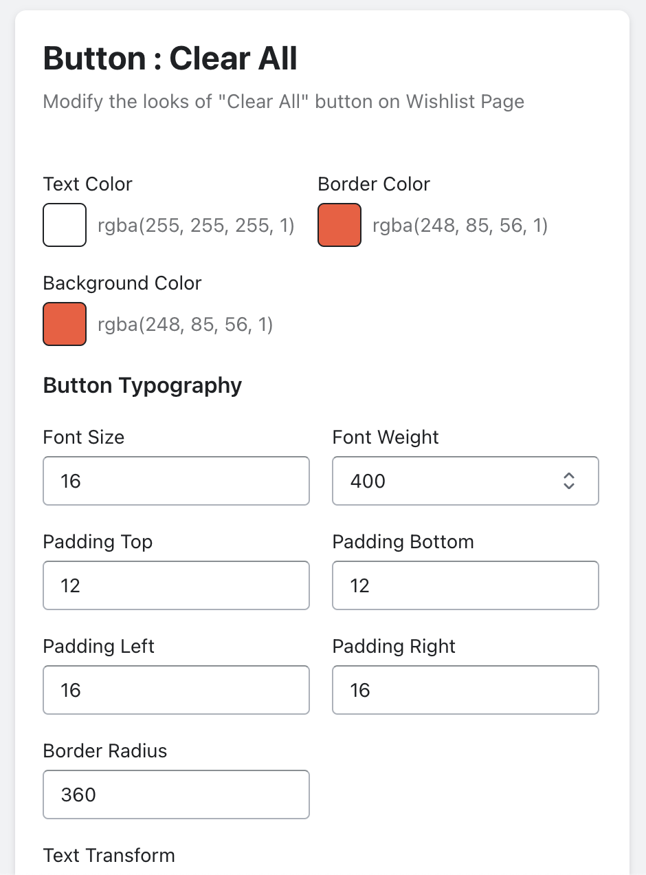
Customization result will be find in style attribute by digging around the browser inspector.
<button
  class="sledge__button"
  type="button"
  ...
  style="color: rgb(255, 255, 255); border-color: rgb(248, 85, 56); border-radius: 360px; padding: 12px 16px; background-color: rgb(248, 85, 56); font-size: 16px; font-weight: 400; text-transform: none;"
>
  Clear Wishlist
</button>
Element Classes
Most of the features of the Sledge themes are modifiable using the element classes provided below and by digging around the browser inspector. If you prefer that way follow along step-by-step below.