@sledge-app/react-product-review
You can use our React-built widget by using the @sledge-app/react-product-review package.
@sledge-app/react-product-review provides several components you can use to integrate it with your store.
Available components :
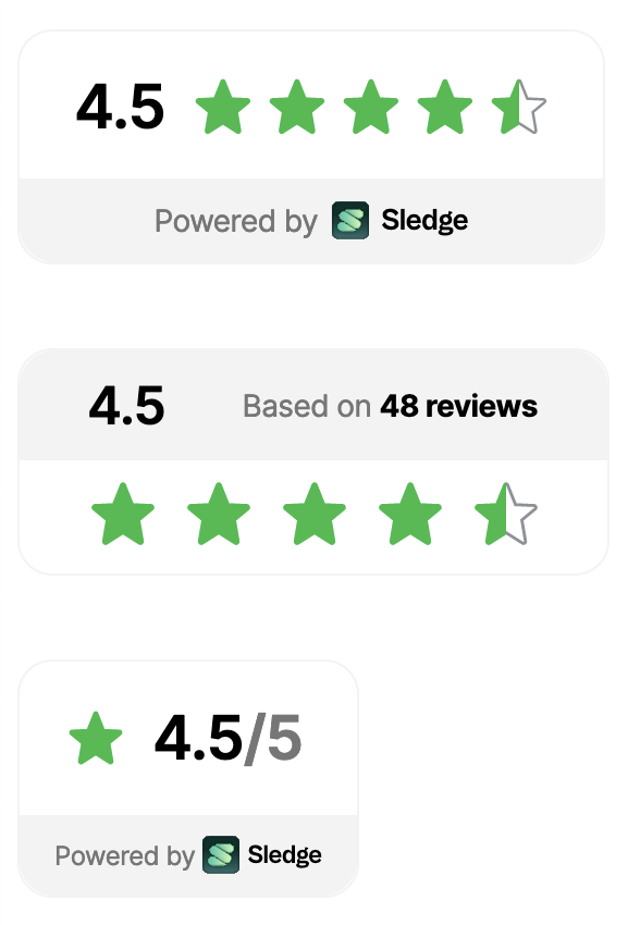
Rating
Rating is a Product Review's widget you can use to display your review's score and total rating of your product.

Anatomy
import { Rating } from "@sledge-app/react-product-review";

export default function SledgeProductReviewRating() {
  return (
    <Rating
        params={{
            productId: "",
        }}
        size="md"
    />
  );
}
API reference
params.productId
Fill with your own product id
- Type:
string
size
Customize rating size.
- Type:
'xs' | 'sm' | 'md' - Default:
'md'
Widget
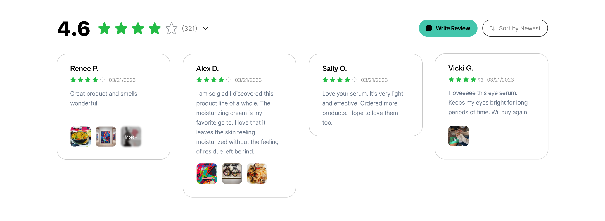
You can use Widget to display list data of your product reviews. Typically used on product detail page.
Anatomy
import { Widget, WidgetHeader } from "@sledge-app/react-product-review";

export default function SledgeProductReviewWidget() {
  return (
    <Widget.Root
        params={{
            productId: "",
            productVariantId: "",
        }}
        width="1180px"
        onAfterAddReview={(state) => {
            // Your custom function
        }}
    >
        <WidgetHeader>
            <WidgetHeader.Summary />
            <WidgetHeader.AddTrigger text="Add review" />
            <WidgetHeader.Sort />
        </WidgetHeader>
        <Widget.List />
    </Widget.Root>
  );
}
API reference
<Widget.Root>
params.productId
Fill with your own product id
- Type:
string
params.productVariantId
Fill with your own product variant id
- Type:
string
width
Customize max width of element.
- Type:
string - Default:
'1180px'
onAfterAddReview(state: boolean)
Running using your own custom function
- Type:
function - Required:
false
<WidgetHeader.AddTrigger>
text
Customize write review button title in widget
- Type:
string - Default:
'Add review'
Happy Customers Page
Happy Customers Page is a Product Review widget that you can use to display all reviews of your store, aimed at building credibility, trust, and confidence in potential customers by showcasing the real-life experiences of others who have interacted positively with your store.

Anatomy
import { HappyCustomersPage } from '@sledge-app/react-product-review';

export default function SledgeHappyCustomersPage() {
  return (
    <HappyCustomersPage.Root width=''>
      <HappyCustomersPage.Header />
      <HappyCustomersPage.List />
    </HappyCustomersPage.Root>
  );
}
API reference
<HappyCustomersPage.Root>
width
Customize max width of element.
- Type:
string - Default:
'1180px' - Required:
false
Sticky Sidebar Widget
Sticky Sidebar Widget is a Product Review widget that you can use to display all reviews associated with store and products. This badge remains 'sticky' on your store, drawing attention to all reviews or ratings for potential customers.
Anatomy
import { StickySidebarWidget } from '@sledge-app/react-product-review';

export default function SledgeStickySidebar() {
  return (
    <StickySidebarWidget position="" showRatingAverage="" />
  );
}
API reference
position
Place the widget based on the selected position.
- Type:
string - Value :
'none' | 'left' | 'right' - Required:
false
showRatingAverage
Customize the rating average to be visible or not.
- Type:
boolean - Required:
false
Trust Badge
The Trust Badge is a Product Review widget that you can use to display review scores from all of your products.
Anatomy
import { TrustBadge } from "@sledge-app/react-product-review";

export default function SledgeTrustBadge() {
    return (
        <TrustBadge variant="medium-logo" fillColor="" outlineColor="" />
    );
}
API reference
variant
Changes the visual appearance of the Trust Badge.
- Type:
'medium-logo' | 'medium' | 'small-logo' - Default:
'medium-logo'
fillColor
Set the color for the SVG fill.
- Type:
'string'
outlineColor
Set the color for the SVG outline.
- Type:
'string'
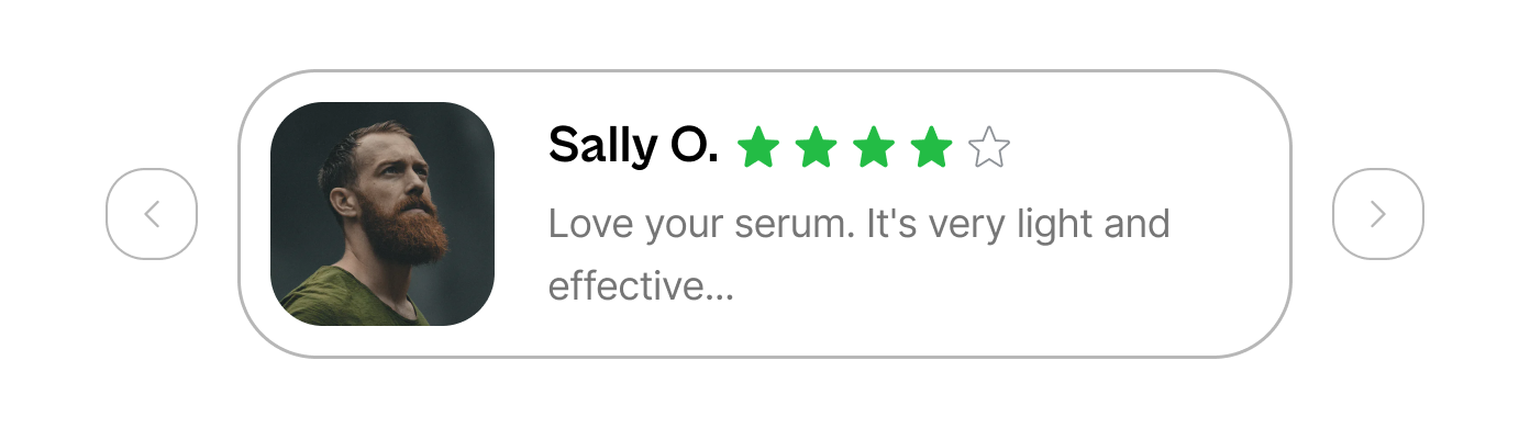
Snippet Carousel Widget
Snippet Carousel Widget is a Product Review widget that you can use to display product reviews and ratings in a carousel format
Anatomy
import { Snippet } from "@sledge-app/react-product-review";

export default function SledgeSnippetWidget() {
  return <Snippet productId="" maxWidth="" />;
}
API reference
productId
Fill with your own product id
- Type:
string - Required:
true
maxWidth
Customize max width of element.
- Type:
string - Required:
false
Learn more
Congratulations! Now that you've learned the @sledge-app/react-product-review API references, you can start integrating Sledge to your store. Useful resources about integrating Sledge :