@sledge-app/react-instant-search
You can use our React-built widget by using the @sledge-app/react-instant-search package.
@sledge-app/react-instant-search provides several components you can use to integrate it with your store.
Available components :
SearchWidget
SearchWidget is an Instant Search's widget you can use to search your product or other data like (collection, page, blog, article) in a text field form.
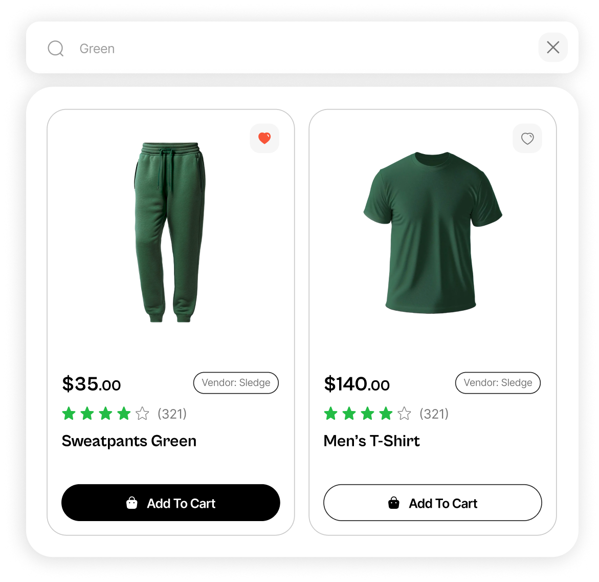
Anatomy
import { SearchWidget } from "@sledge-app/react-instant-search";

export default function InstantSearchWidget() {
  return (
    <SearchWidget
        width="400px"
        onAfterAddToCart={(state) => {
            // Your custom function
        }}
        onAfterAddWishlist={(state) => {
            // Your custom function
        }}
        onAfterRemoveWishlist={(state) => {
            // Your custom function
        }}
        onAfterRenderProduct={(state) => {
            // Your custom function
        }}
    />
  );
}
API reference
width
Customize element width.
'400px'- Type:
string
onAfterAddToCart(state: boolean)
Running using your own custom function
Using Custom Components will deactivate this props.
- Type:
function - Required:
false
onAfterAddWishlist(state: boolean)
Running using your own custom function
Using Custom Components will deactivate this props.
- Type:
function - Required:
false
onAfterRemoveWishlist(state: boolean)
Running using your own custom function
Using Custom Components will deactivate this props.
- Type:
function - Required:
false
onAfterRenderProduct(state: boolean)
Running using your own custom function
Using Custom Components will deactivate this props.
- Type:
function - Required:
false
SearchIconWidget
SearchIconWidget is an Instant Search's widget you can use to search your product or other data like (collection, page, blog, article) in a popup search form.
Anatomy
import { SearchIconWidget } from "@sledge-app/react-instant-search";

export default function InstantSearchIconWidget() {
  return (
    <SearchIconWidget
        size='sm'
        onAfterAddToCart={(state) => {
            // Your custom function
        }}
        onAfterAddWishlist={(state) => {
            // Your custom function
        }}
        onAfterRemoveWishlist={(state) => {
            // Your custom function
        }}
        onAfterRenderProduct={(state) => {
            // Your custom function
        }}
    />
  );
}
API reference
size
Customize icon size.
- Type:
'xs' | 'sm' | 'md' - Default:
'sm'
onAfterAddToCart(state: boolean)
Running using your own custom function
Using Custom Components will deactivate this props.
- Type:
function - Required:
false
onAfterAddWishlist(state: boolean)
Running using your own custom function
Using Custom Components will deactivate this props.
- Type:
function - Required:
false
onAfterRemoveWishlist(state: boolean)
Running using your own custom function
Using Custom Components will deactivate this props.
- Type:
function - Required:
false
onAfterRenderProduct(state: boolean)
Running using your own custom function
- Type:
string - Required:
false
SearchResultWidget
SearchResultWidget is an Instant Search's widget you can use to display product or other data search results like (collection, page, blog, article) on a single page.
Anatomy
import { SearchResultWidget } from "@sledge-app/react-instant-search";

export default function InstantSearchResultWidget() {
  return (
    <SearchResultWidget
        query={{
            keyword: "q",
            sortBy: "sort_by",
            page: "page",
            limit: 'limit',
        }}
        width="1180px"
        onAfterAddToCart={(state) => {
            // Your custom function
        }}
        onAfterAddWishlist={(state) => {
            // Your custom function
        }}
        onAfterRemoveWishlist={(state) => {
            // Your custom function
        }}
        onAfterRenderProduct={(state) => {
            // Your custom function
        }}
        onAfterRenderCollection={(state) => {
            // Your custom function
        }}
        onAfterRenderPage={(state) => {
            // Your custom function
        }}
        onAfterRenderBlog={(state) => {
            // Your custom function
        }}
        onAfterRenderArticle={(state) => {
            // Your custom function
        }}
    />
  );
}
API reference
query.keyword
Fill up your unique queryParam name for keyword.
e.g: https://your-online-store.com/collection/all?{value}=
- Type:
string - Default:
'q'
query.sortBy
Fill up your unique queryParam name for sort by.
e.g: https://your-online-store.com/collection/all?{value}=
- Type:
string - Default:
'sort_by'
query.page
Fill up your unique queryParam name for page.
e.g: https://your-online-store.com/collection/all?{value}=
- Type:
string - Default:
'page'
query.limit
Fill up your unique queryParam name for limit.
e.g: https://your-online-store.com/collection/all?{value}=
- Type:
string - Default:
'limit'
width
Customize max width of element.
- Type:
string - Default:
'1180px'
onAfterAddToCart(state: boolean)
Running using your own custom function
Using Custom Components will deactivate this props.
- Type:
function - Required:
false
onAfterAddWishlist(state: boolean)
Running using your own custom function
Using Custom Components will deactivate this props.
- Type:
function - Required:
false
onAfterRemoveWishlist(state: boolean)
Running using your own custom function
Using Custom Components will deactivate this props.
- Type:
function - Required:
false
onAfterRenderProduct(state: boolean)
Running using your own custom function
Using Custom Components will deactivate this props.
- Type:
function - Required:
false
onAfterRenderCollection(state: boolean)
Running using your own custom function
Using Custom Components will deactivate this props.
- Type:
function - Required:
false
onAfterRenderPage(state: boolean)
Running using your own custom function
Using Custom Components will deactivate this props.
- Type:
function - Required:
false
onAfterRenderBlog(state: boolean)
Running using your own custom function
Using Custom Components will deactivate this props.
- Type:
function - Required:
false
onAfterRenderArticle(state: boolean)
Running using your own custom function
Using Custom Components will deactivate this props.
- Type:
function - Required:
false
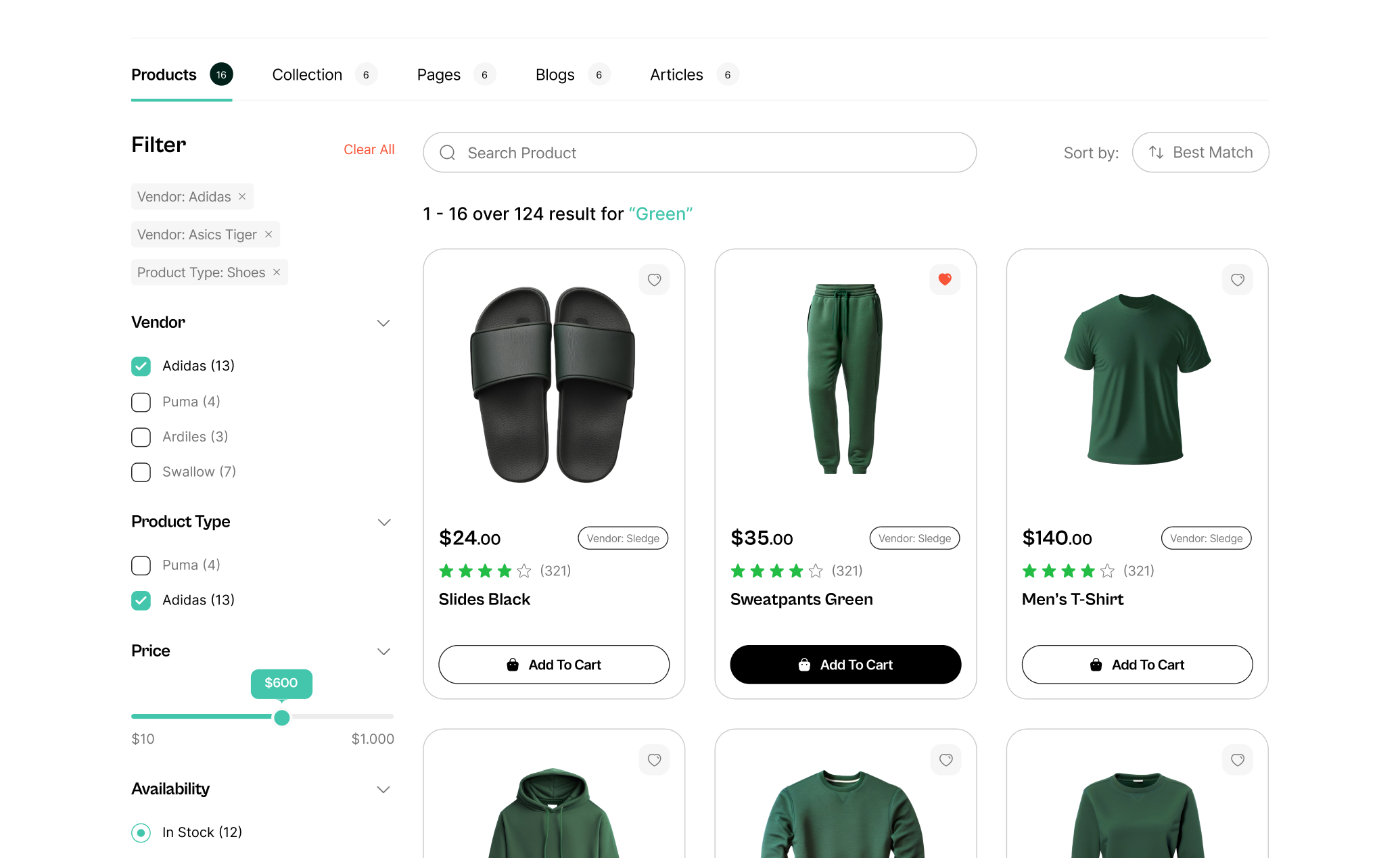
ProductFilterWidget
ProductFilterWidget is an Instant Search's widget you can use to search your products on a single page. This widget is also known as a "Product Listing Page."
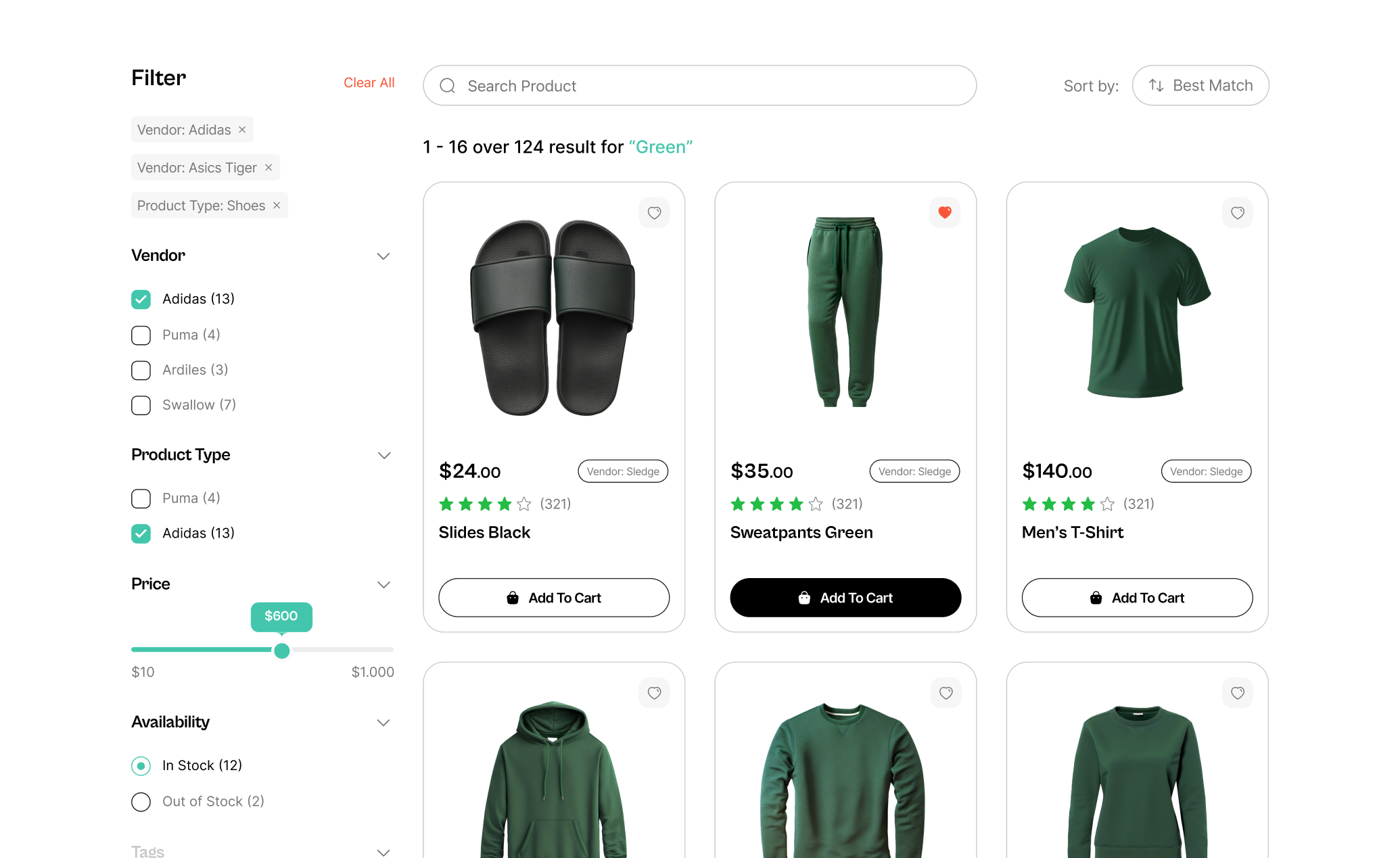
Anatomy
import { ProductFilterWidget } from "@sledge-app/react-instant-search";

export default function InstantSearchProductFilterWidget() {
  return (
    <ProductFilterWidget
        query={{
            keyword: "q",
            sortBy: "sort_by",
            page: "page",
            limit: 'limit',
        }}
        width="1180px"
        params={{
            collectionId: '',
            collectionName: ''
        }}
        currentTags={[]}
        onAfterAddToCart={(state) => {
            // Your custom function
        }}
        onAfterAddWishlist={(state) => {
            // Your custom function
        }}
        onAfterRemoveWishlist={(state) => {
            // Your custom function
        }}
        onAfterRenderProduct={(state) => {
            // Your custom function
        }}
    />
  );
}
API reference
query.keyword
Fill up your unique queryParam name for keyword.
e.g: https://your-online-store.com/collection/all?{value}=
- Type:
string - Default:
'q'
query.sortBy
Fill up your unique queryParam name for sort by.
e.g: https://your-online-store.com/collection/all?{value}=
- Type:
string - Default:
'sort_by'
query.page
Fill up your unique queryParam name for page.
e.g: https://your-online-store.com/collection/all?{value}=
- Type:
string - Default:
'page'
query.limit
Fill up your unique queryParam name for limit.
e.g: https://your-online-store.com/collection/all?{value}=
- Type:
string - Default:
'limit'
params.collectionId
Fill with your own collection id
- Type:
string | number
params.collectionName
Fill with your own collection name
- Type:
string
currentTags
This prop is used to filter the products based on the current tags.
['men', 'women', 'accessories']- Type:
string[] | number[]
width
Customize max width of element.
- Type:
string - Default:
'1180px'
onAfterAddToCart(state: boolean)
Running using your own custom function
Using Custom Components will deactivate this props.
- Type:
function - Required:
false
onAfterAddWishlist(state: boolean)
Running using your own custom function
Using Custom Components will deactivate this props.
- Type:
function - Required:
false
onAfterRemoveWishlist(state: boolean)
Running using your own custom function
Using Custom Components will deactivate this props.
- Type:
function - Required:
false
onAfterRenderProduct(state: boolean)
Running using your own custom function
Using Custom Components will deactivate this props.
- Type:
function - Required:
false
Learn more
Congratulations! Now that you've learned the @sledge-app/react-instant-search API references, you can start integrating Sledge to your store. Useful resources about integrating Sledge :