Wishlist
All of Sledge's themes use of several kinds of classes. To assist you in customizing CSS to your needs, the most frequently used element selectors and classes are listed below.
- Alert
- Badge
- Badge Floating Full (Left / Right)
- Badge Floating Icon (Bottom Left / Bottom Right)
- Trigger
- Button Detail
- List
- Empty List
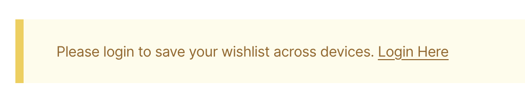
Alert
| Class | Description |
|---|---|
| sledge-wishlist__widget-alert | Alert wrapper |
| sledge-wishlist__widget-alert-text | Alert text |
| sledge-wishlist__widget-alert-link | Alert link |
Badge
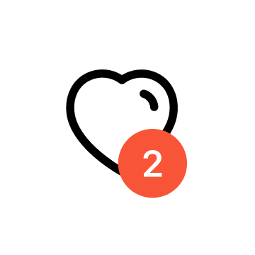
| Class | Description |
|---|---|
| sledge-icon__heart | Wishlist heart icon |
| sledge-wishlist__badge-counter | Wishlist counter |
You can edit this component with Using Backend in Button Style section,
check out here.
Using Selector
| Selector | Description |
|---|---|
| .sledge-icon__heart #sledge-icon-heart-line | Wishlist trigger icon line, you can use this selector to edit line color |
| .sledge-icon__heart #sledge-icon-heart-fill | Wishlist trigger active icon, you can use this selector to edit fill color icon |
Badge Floating Full (Left / Right)
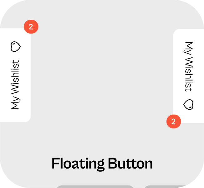
| Class | Description |
|---|---|
| sledge-wishlist__badge-floating | Wishlist badge floating wrapper |
| sledge-wishlist__badge-floating-text | Wishlist badge floating text |
For Heart icon, you can check out here.
Badge Floating Icon (Bottom Left / Bottom Right)
| Class | Description |
|---|---|
| sledge-wishlist__badge-floating-icon | Wishlist badge floating icon wrapper |
For Heart icon, you can check out here.
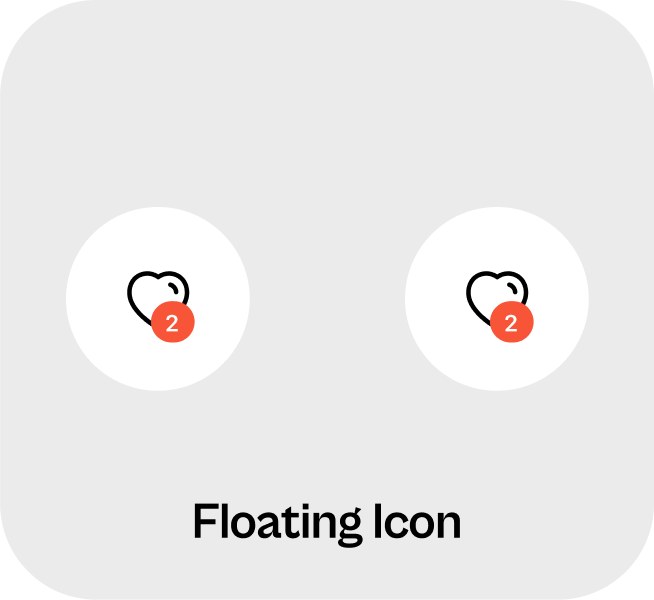
Trigger

| Class | Description |
|---|---|
| sledge-wishlist__trigger-block | Wishlist trigger block wrapper, you can use this class to edit position |
| sledge-wishlist__trigger | Wishlist trigger wrapper, you can use this class to edit background color |
For Heart icon, you can check out here.
Using Selector
| Selector | Description |
|---|---|
| .sledge-icon__heart #sledge-icon-heart-line | Wishlist trigger icon line, you can use this selector to edit line color |
| .sledge-icon__heart #sledge-icon-heart-fill | Wishlist trigger active icon, you can use this selector to edit fill color icon |
Button Detail
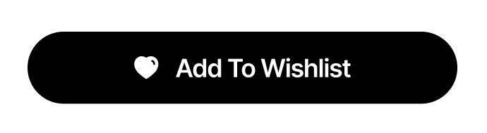
| Class | Description |
|---|---|
| sledge-wishlist__widget-button-detail-wrapper | Wishlist button detail wrapper |
| sledge-wishlist__widget-button-detail-icon | Wishlist button detail icon |
| sledge-wishlist__widget-button-detail-icon | Wishlist button detail icon |
Using Selector
| Selector | Description |
|---|---|
| .sledge-wishlist__widget-button-detail-wrapper button | Wishlist button detail, you can use this selector to edit button color, width & text |
List
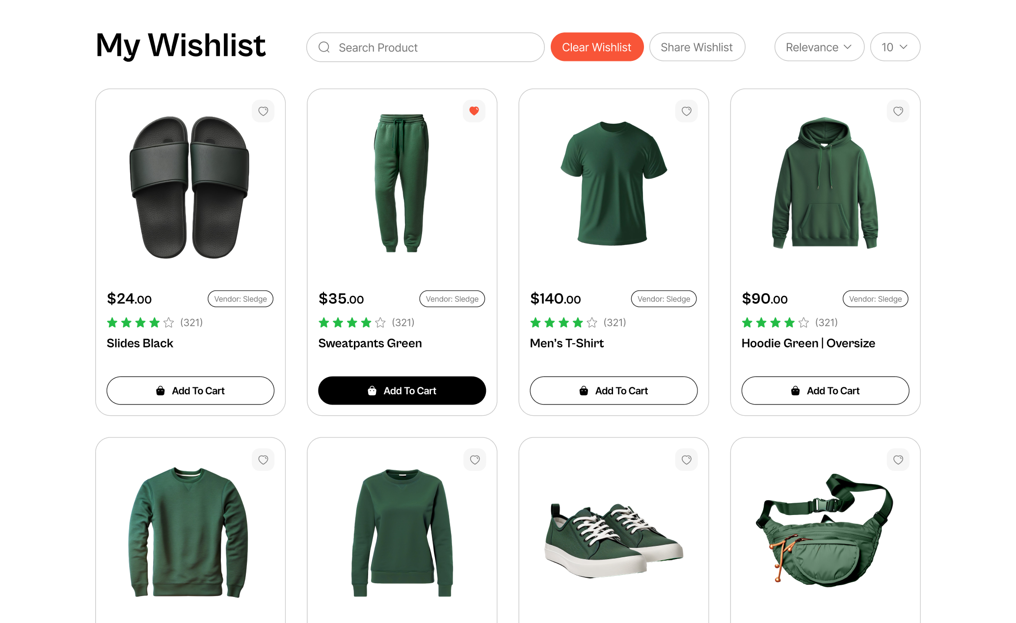
| Class | Description |
|---|---|
| sledge-wishlist__widget-header-item | Wishlist header title |
| sledge-wishlist__widget-product-wrapper | Wishlist product card wrapper |
For Heart icon, you can check out here.
You can edit Header Title with Using Backend in Wishlist Page section,
check out here.
You can edit Clear All Button with Using Backend in Button : Clear All
section, check out here.
You can edit Share Button with Using Backend in Button : Share section,
check out here.
For Product Card, you can check out
here.
Empty List
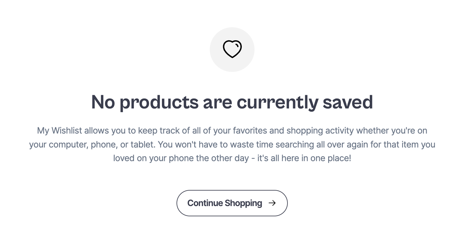
| Class | Description |
|---|---|
| sledge-wishlist__widget-product-empty | Empty wishlist wrapper |
| sledge-wishlist__widget-product-empty-icon | Empty wishlist icon wrapper |
| sledge-wishlist__widget-product-empty-title | Empty wishlist title |
| sledge-wishlist__widget-product-empty-description | Empty wishlist description |
| sledge-wishlist__widget-button-wrapper | Empty wishlist button wrapper |
| sledge-wishlist__widget-product-empty-button-shopping | Empty wishlist button, you can use this selector to edit button size, color & etc |
Using Selector
| Selector | Description |
|---|---|
| .sledge-wishlist__widget-product-empty-icon #sledge-icon-heart-line | Empty Wishlist icon, you can use this selector to edit icon size & color |
| .sledge-wishlist__widget-product-empty-button-shopping span:nth-child(1) | Empty Wishlist button text, you can use this selector to edit text size & color |
| .sledge-wishlist__widget-product-empty-button-shopping span:nth-child(2) | Empty Wishlist button icon, you can use this selector to edit button icon size & color |