Intanst Search Icon Widget
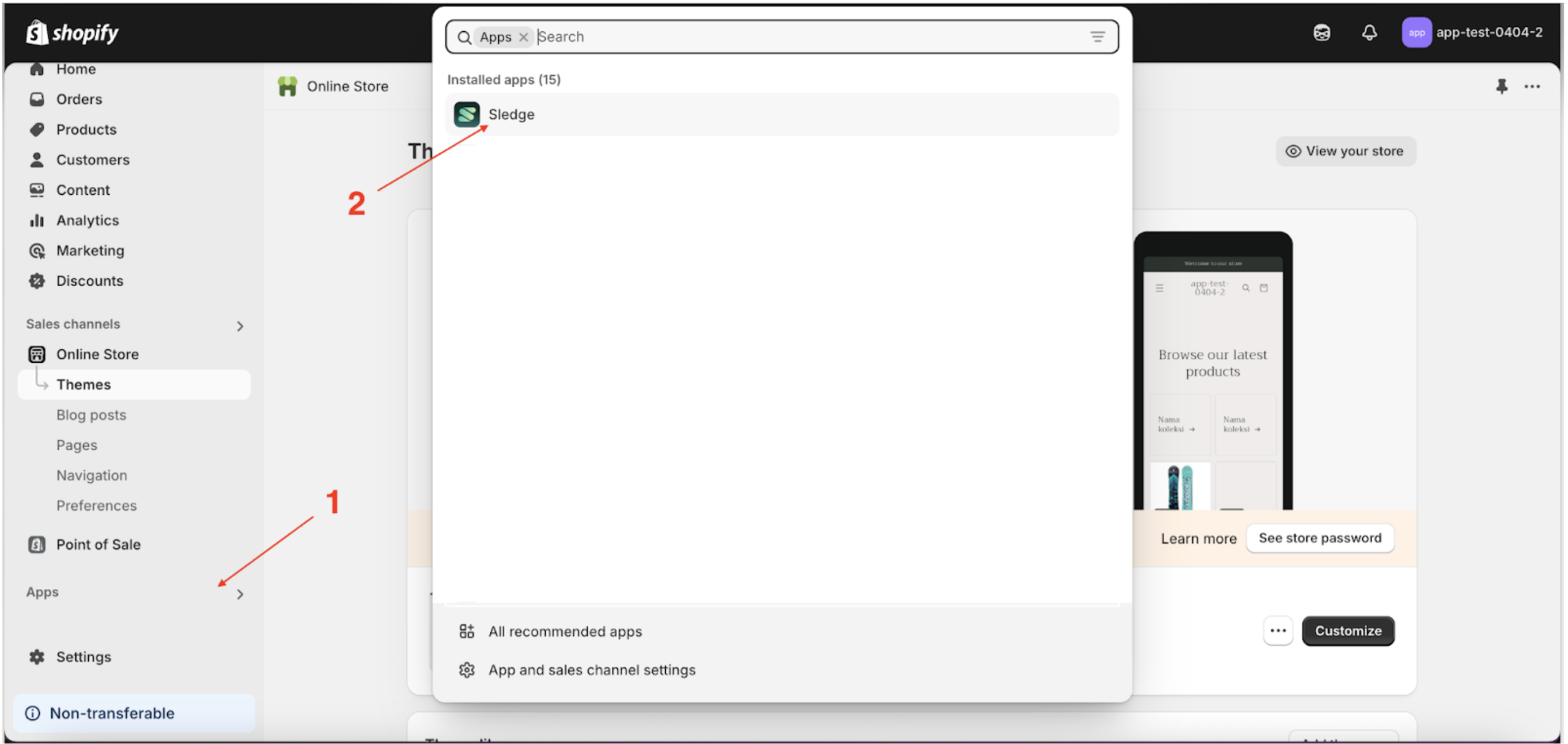
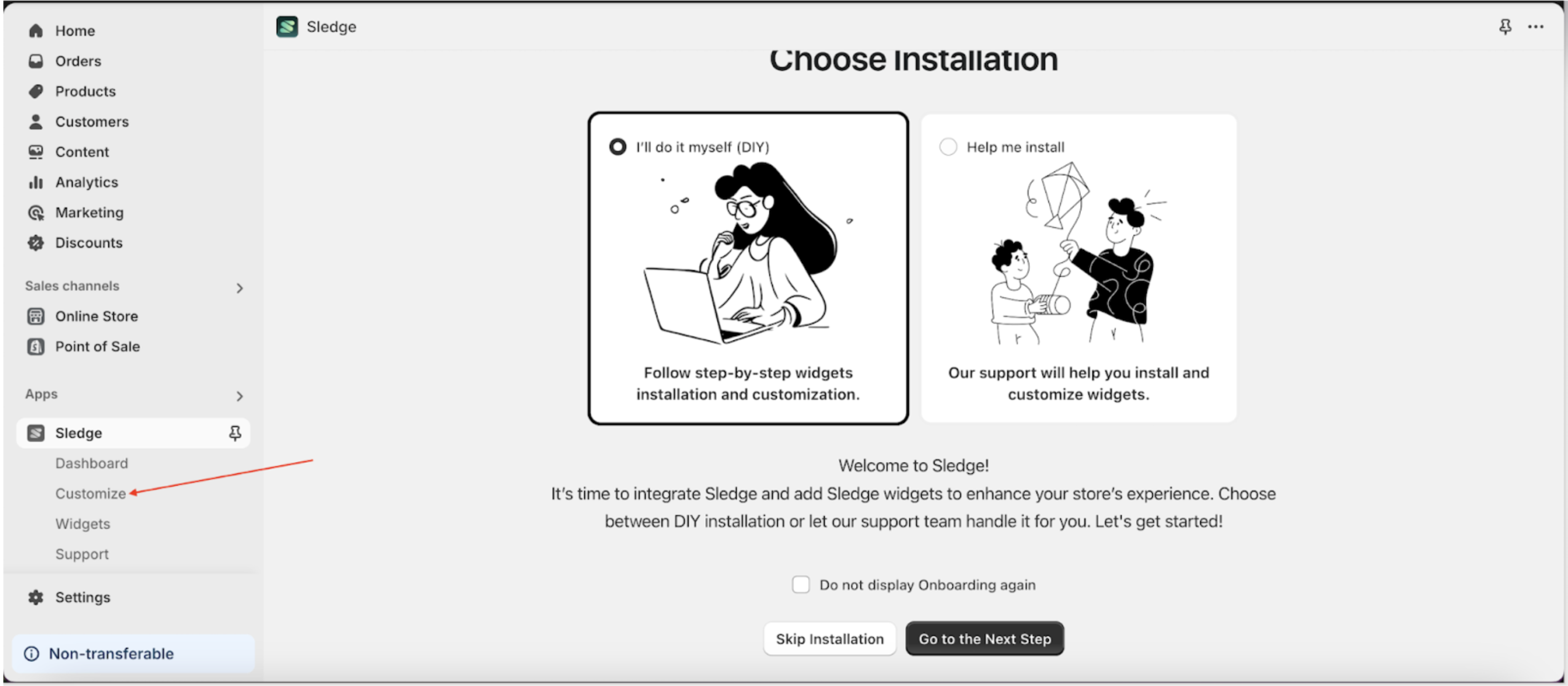
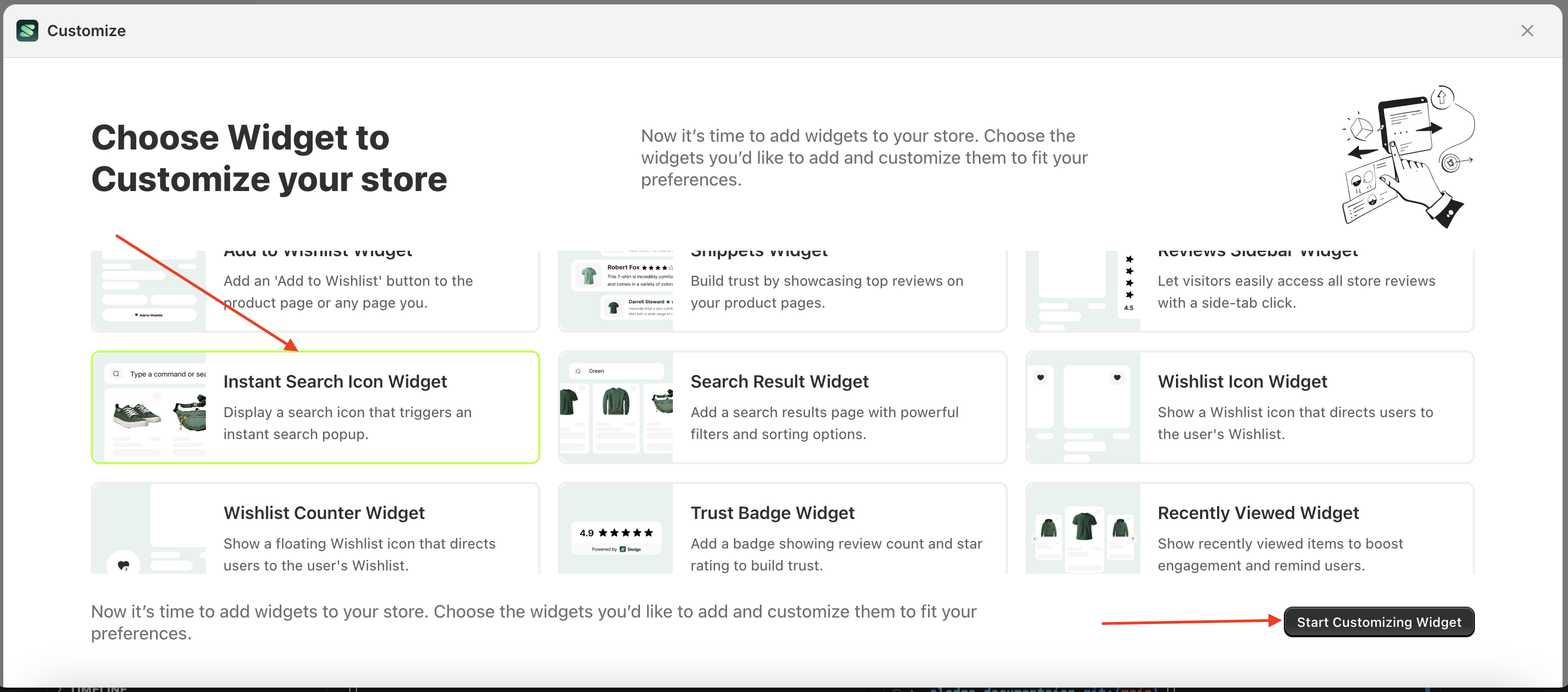
- Go to the Apps Sledge.
- Select the Customizer menu.
- Choose instant search icon widget and click the Start Customizing Widget button.
Layout
Purpose of This Layout
The layout is designed to allow users or merchants to easily change their desired layout without the hassle of creating it from scratch.
Available settings:
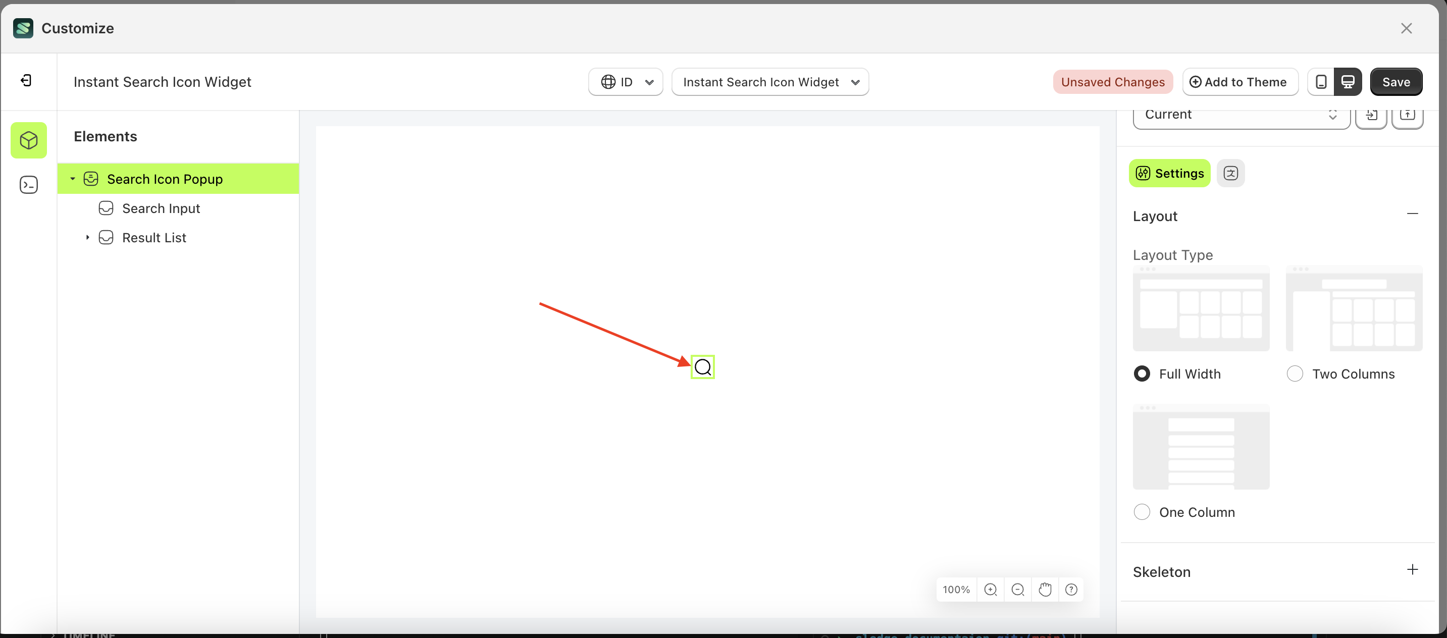
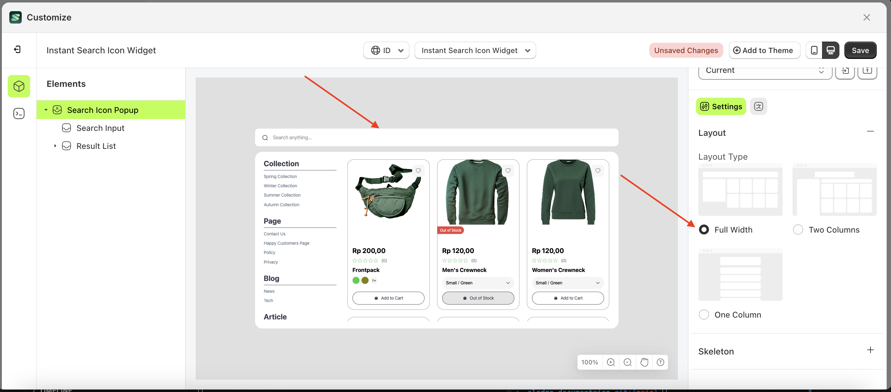
Full Width
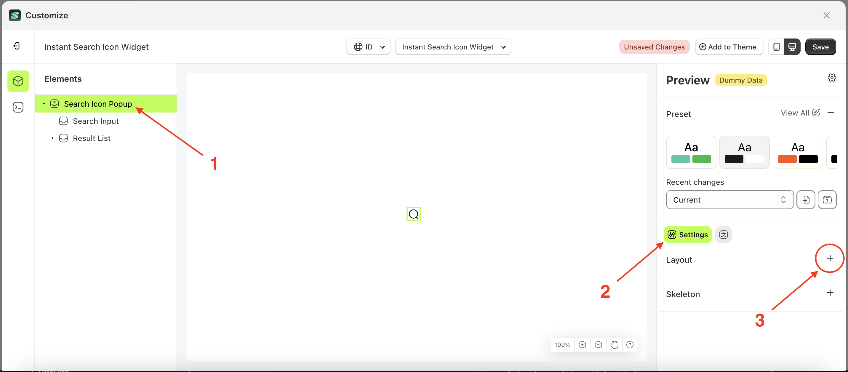
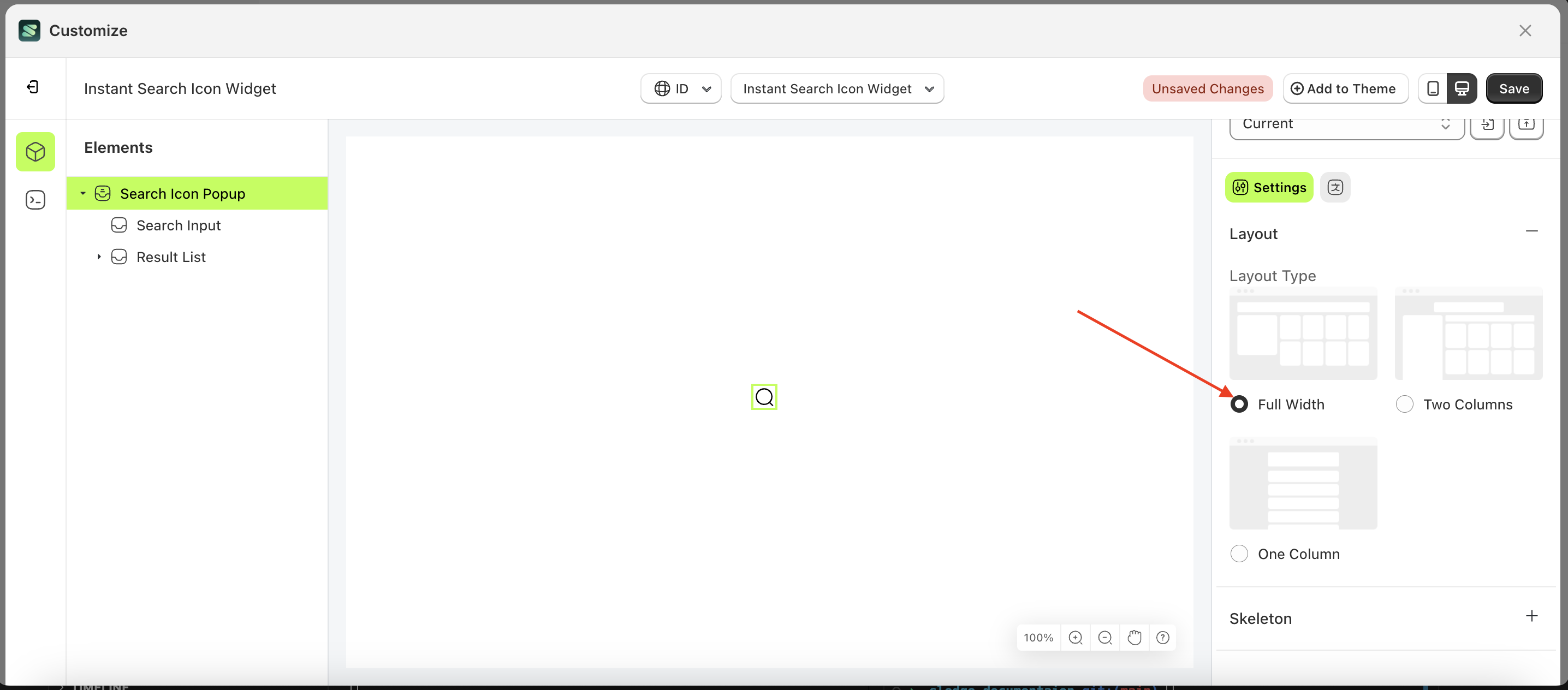
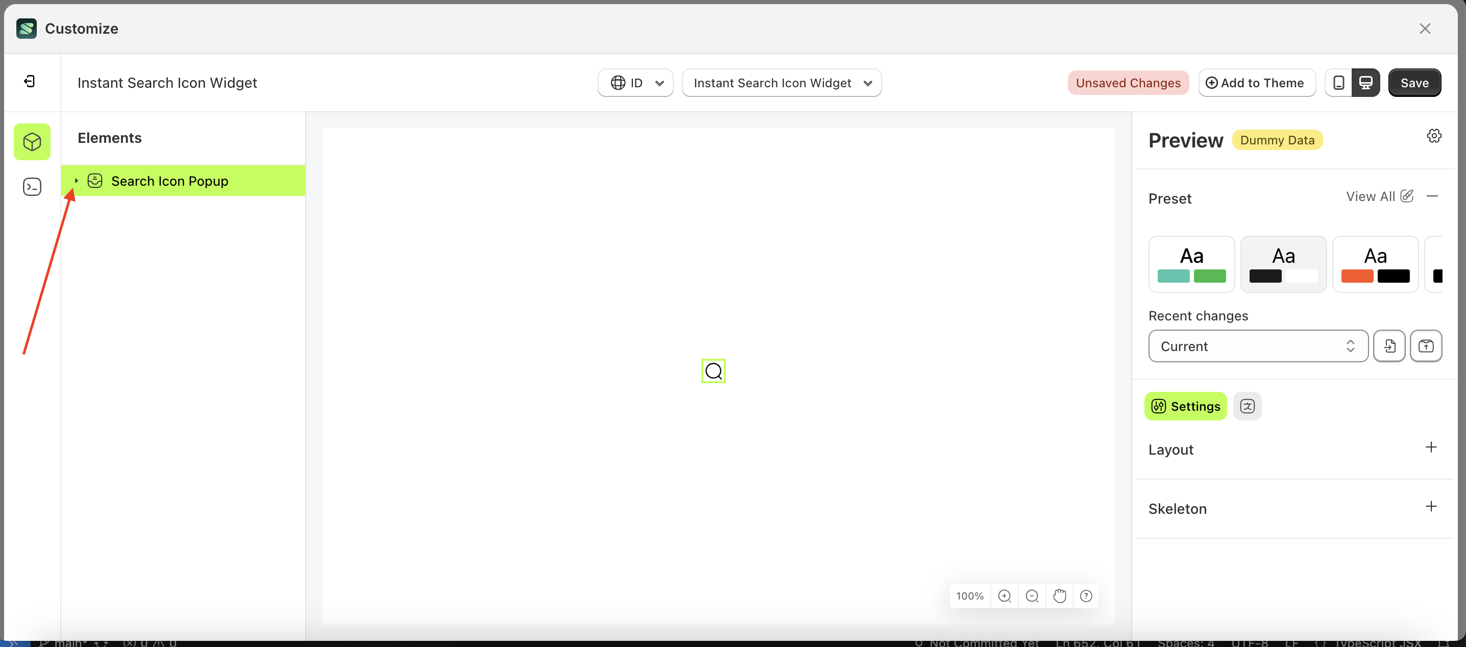
- Select the Search icon pop up element on the left, then click the Settings tab and click the icon marked with a red arrow.
- Select Layout Full Width by following the red arrow
- To see the changes in this setting on the element, click the Search icon pop up element
- Here's the chosen layout display.
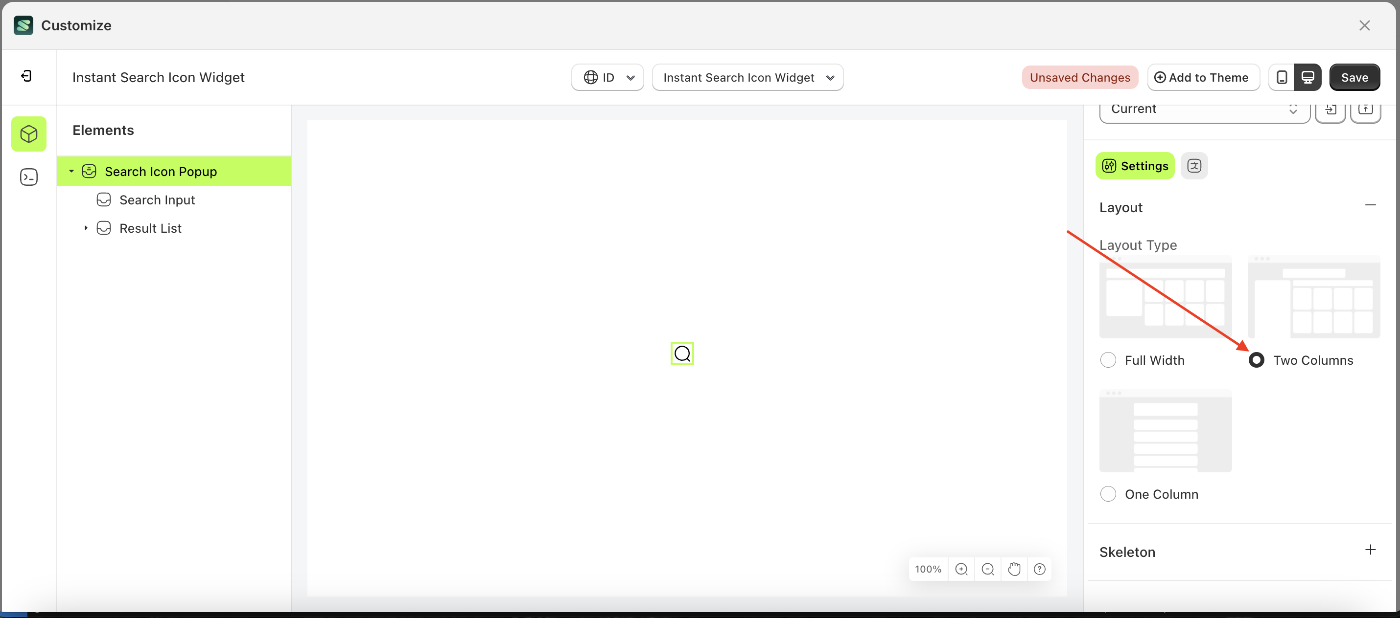
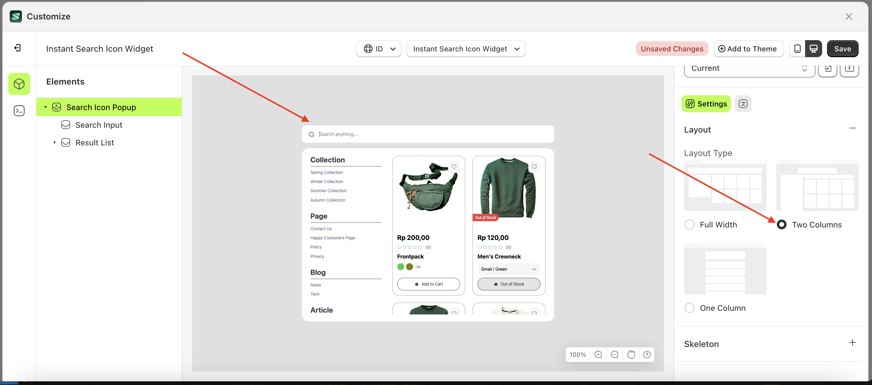
Two Columns
- Select the Search icon pop up element on the left, then click the Settings tab and click the icon marked with a red arrow.
- Select Layout Two Columns by following the red arrow
- To see the changes in this setting on the element, click the Search icon pop up element
- Here's the chosen layout display.

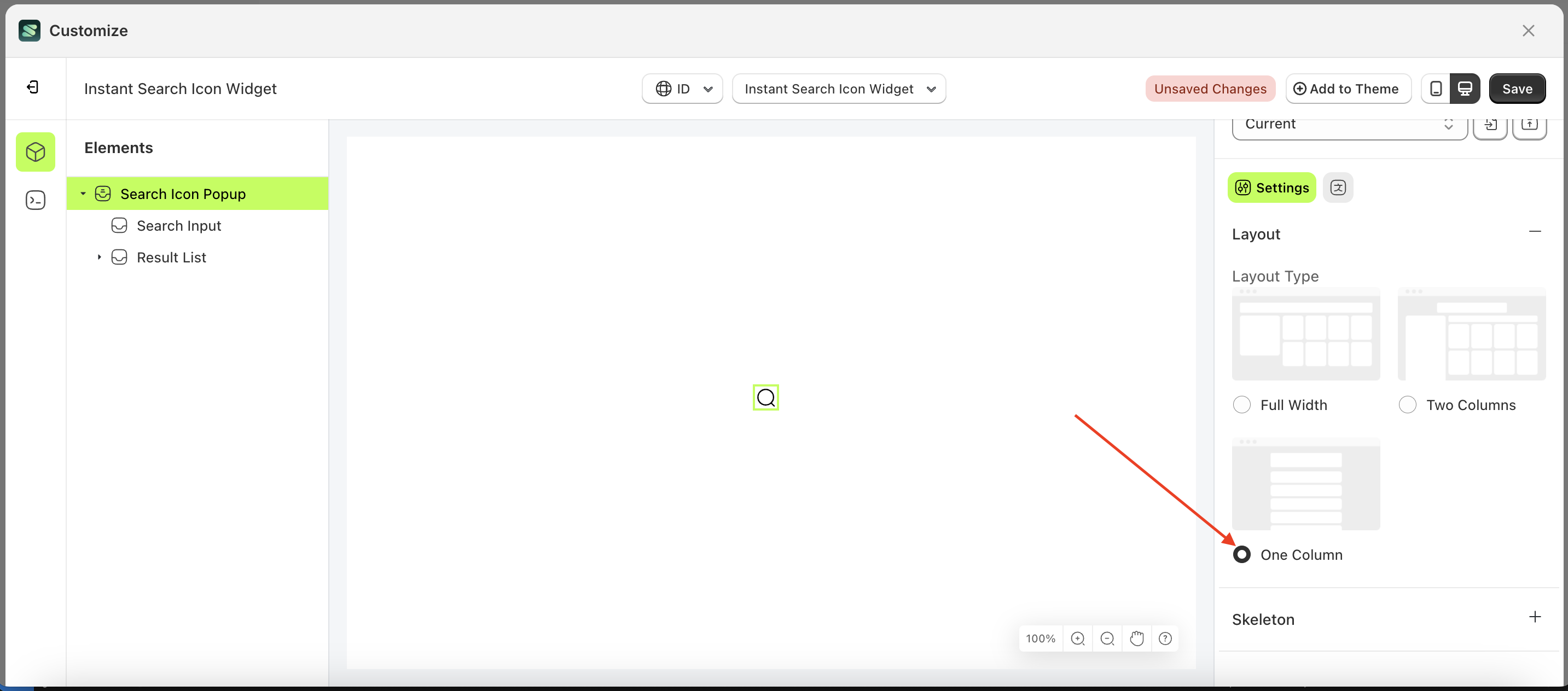
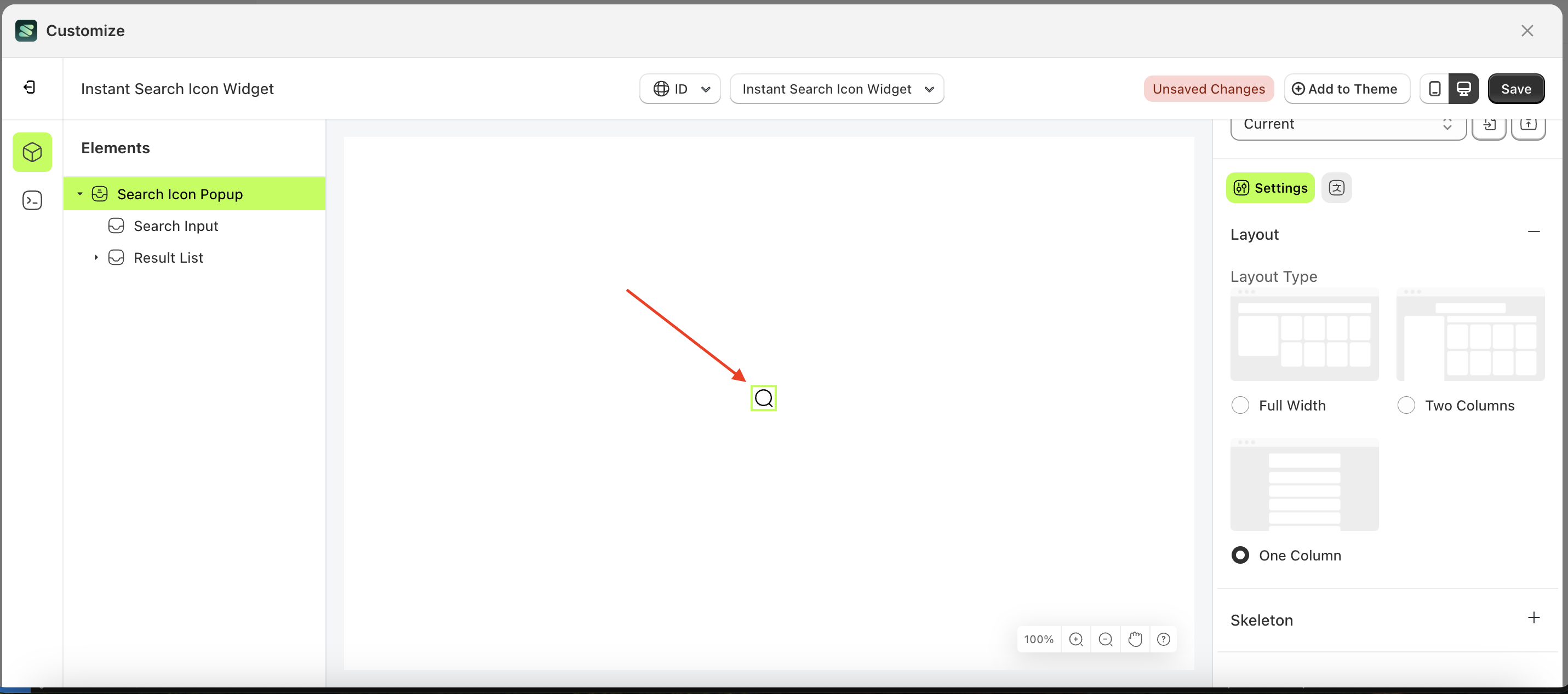
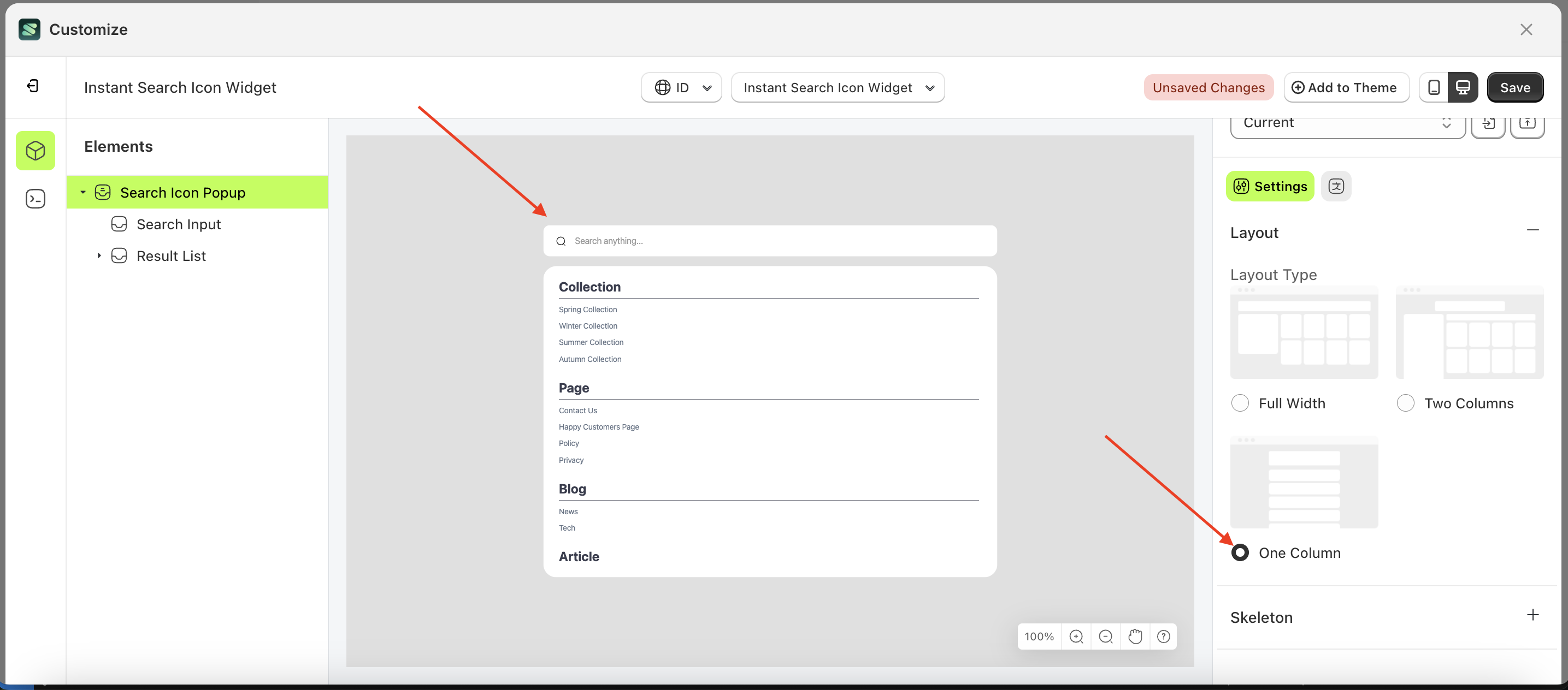
One Columns
- Select the Search icon pop up element on the left, then click the Settings tab and click the icon marked with a red arrow.
- Select Layout One Columns by following the red arrow
- To see the changes in this setting on the element, click the Search icon pop up element
- Here's the chosen layout display.
Skeleton
Available settings:
Enable Skeleton
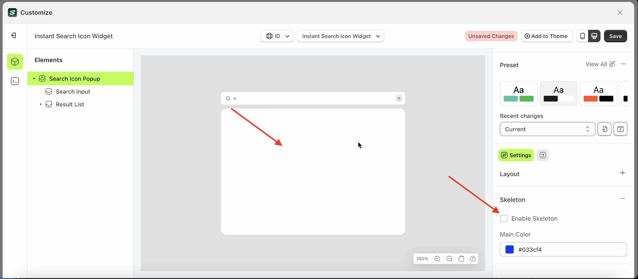
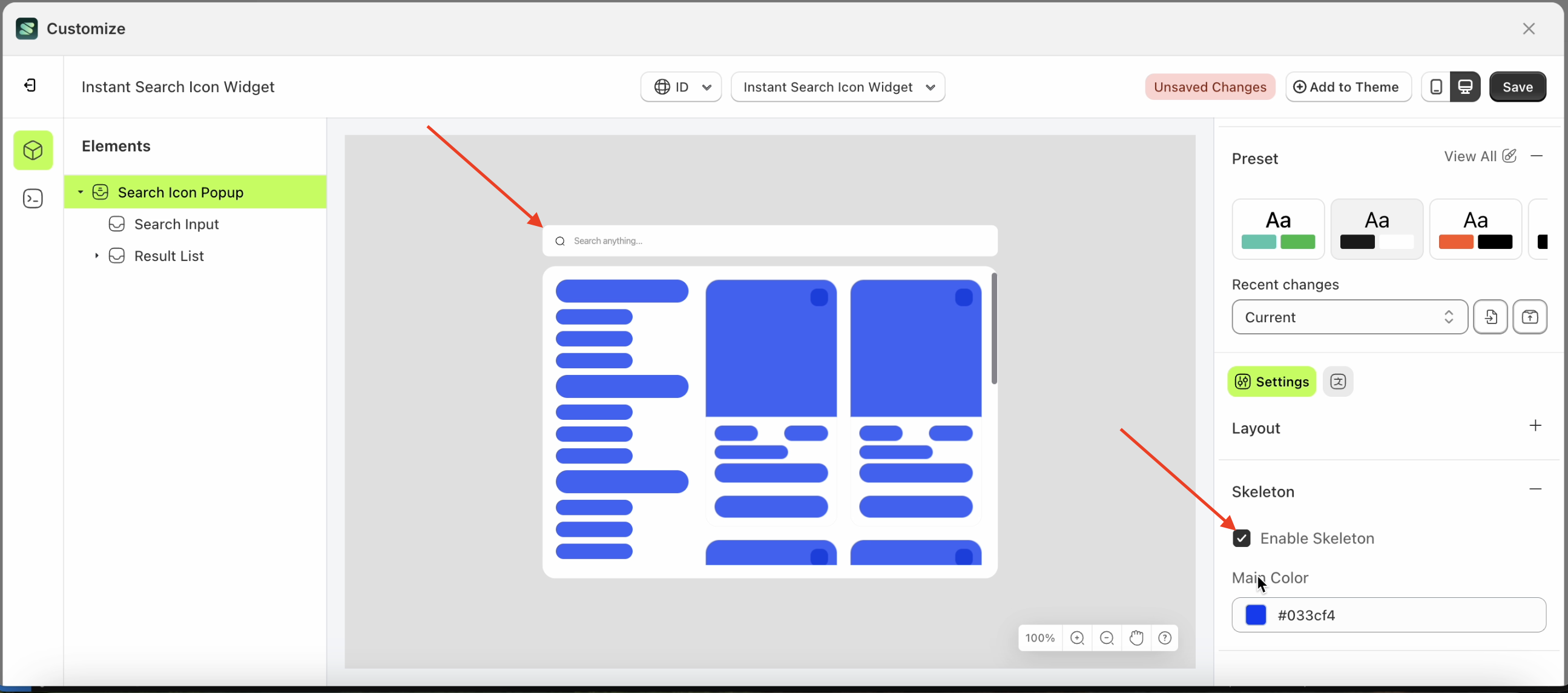
Enable Skeleton is a feature used to activate or deactivate the skeleton loader while data is being processed and has not yet been received.
Follow the steps below:
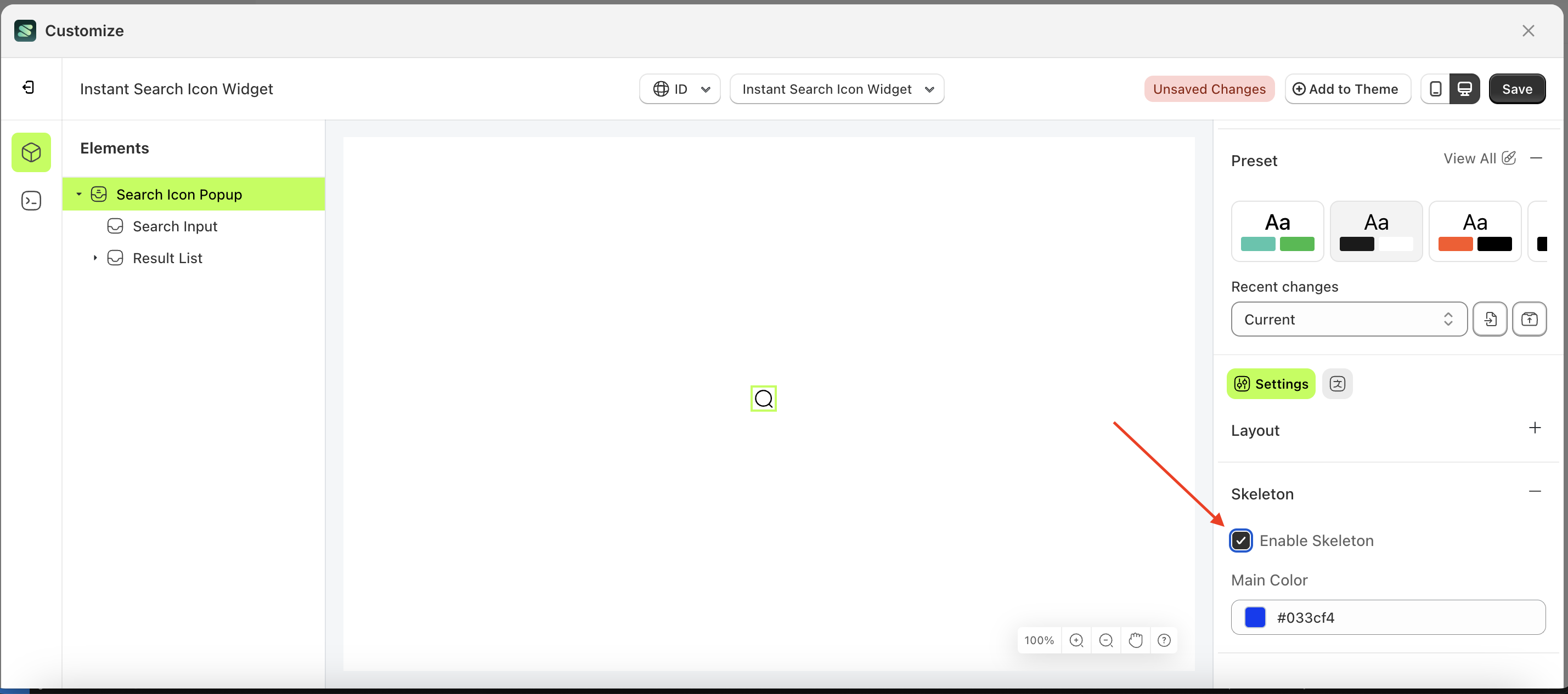
- Select the Search icon pop up element on the right, then click the Settings tab and click the icon marked with a red arrow.
- Enable the Enable Skeleton checkbox
- Example : Before Enable Skeleton is enabled
- Example : After Enable Skeleton is enabled
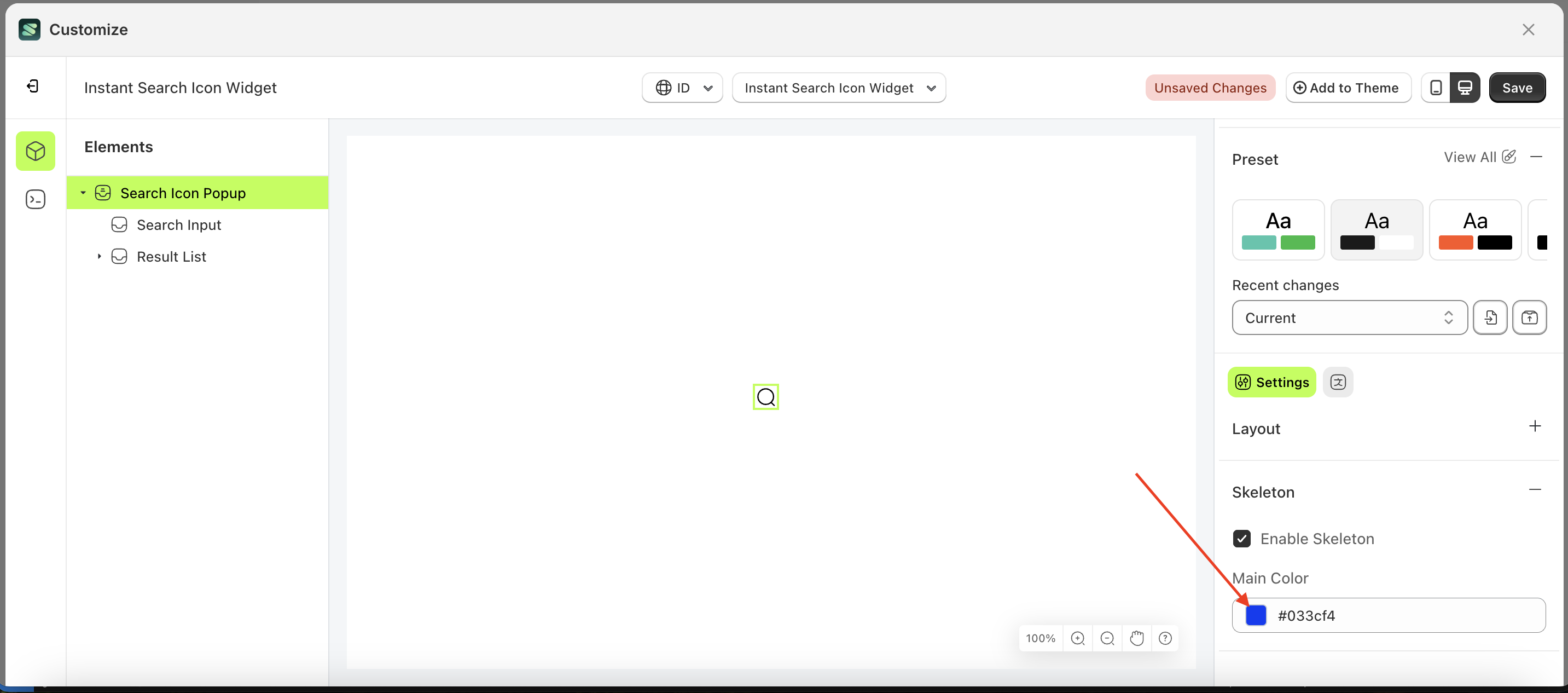
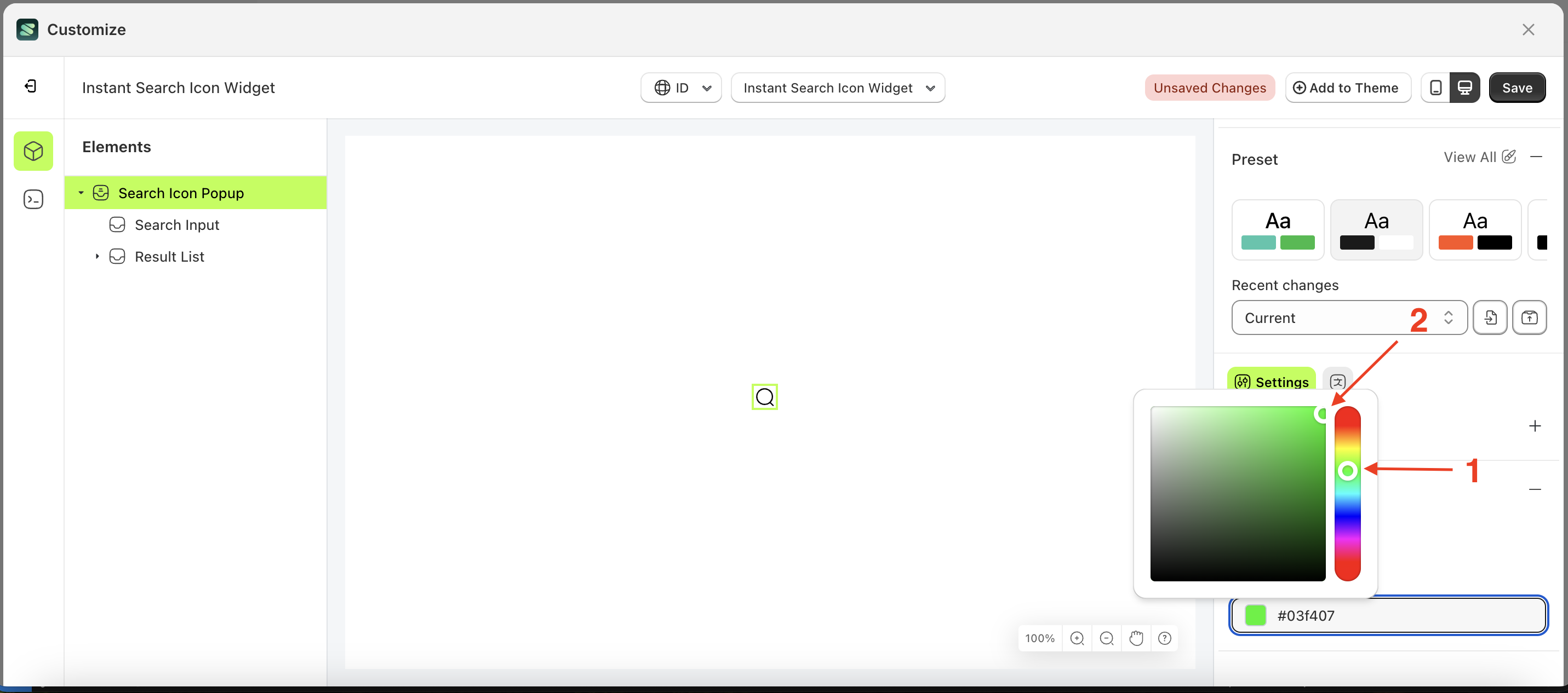
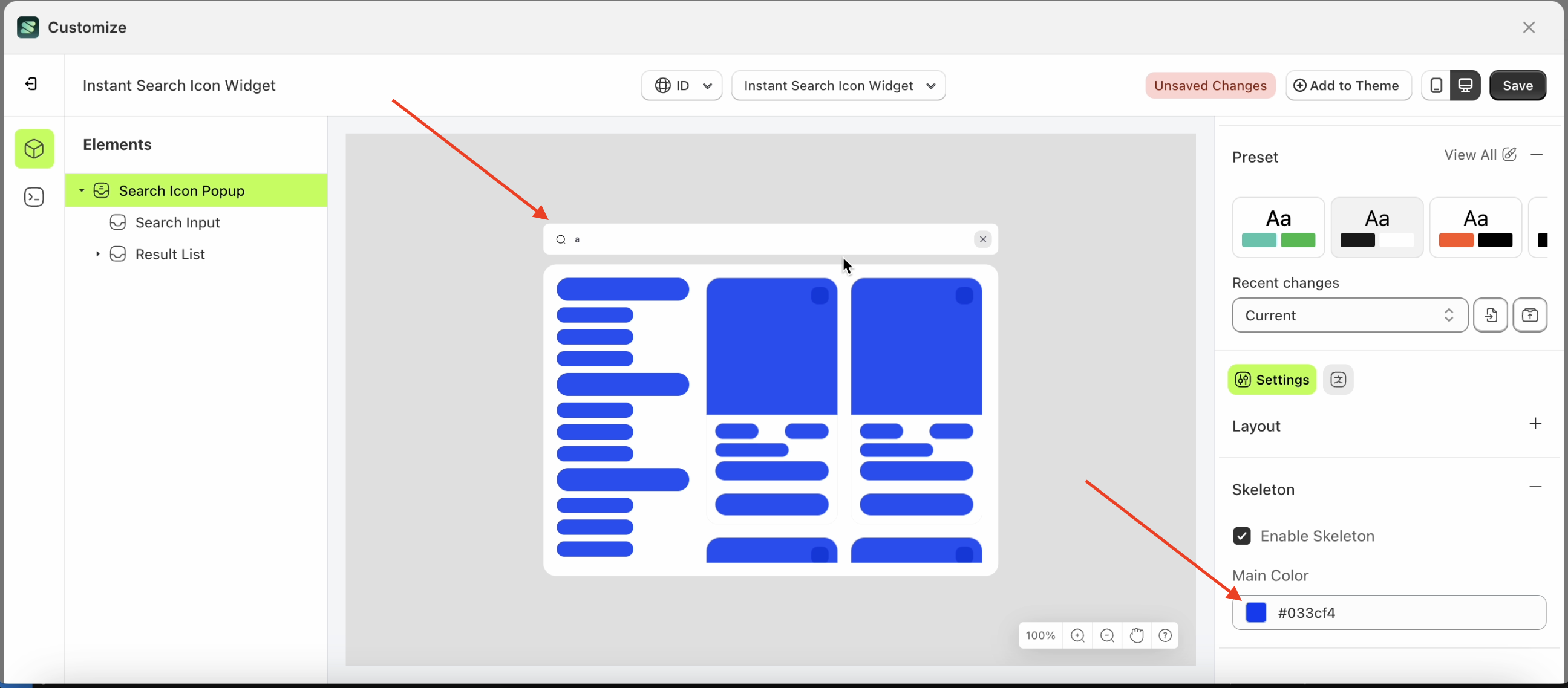
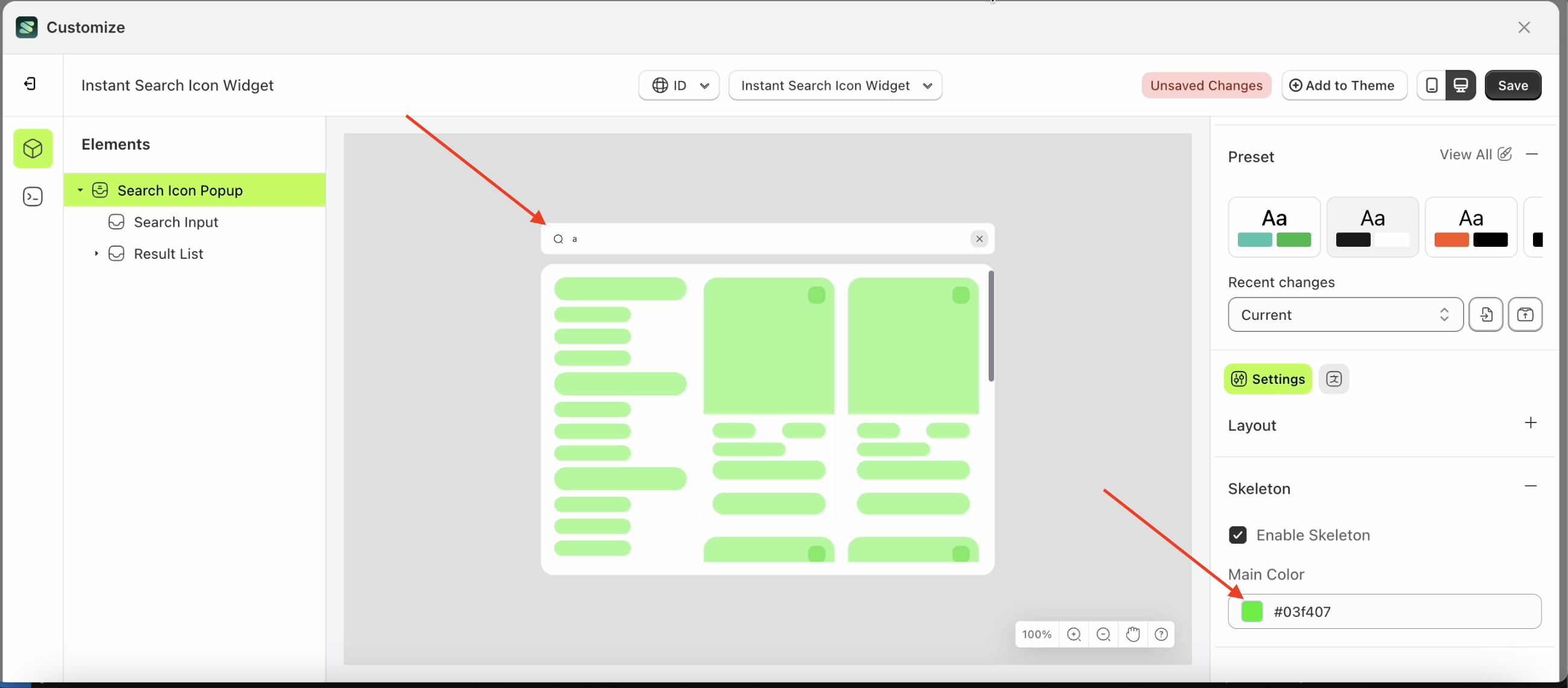
Main Color
This feature is used to adjust the skeleton loader color using a color palette.
Follow the steps below:
- Select the Search Icon Popup element on the left, then click the Settings tab and click the icon marked with a red arrow.
- Click the Color Palette on the right side, which is also marked with a red arrow.
- The Color Palette will appear. Click the right side of the palette where the red arrow and number 1 are indicated, then click the right side again where the red arrow and number 2 are marked.
- The instant search icon widget of the Search Icon Popup element will adjust accordingly.
- Example : Before Search Icon Popup change settings
- Example : After Search Icon Popup change settings
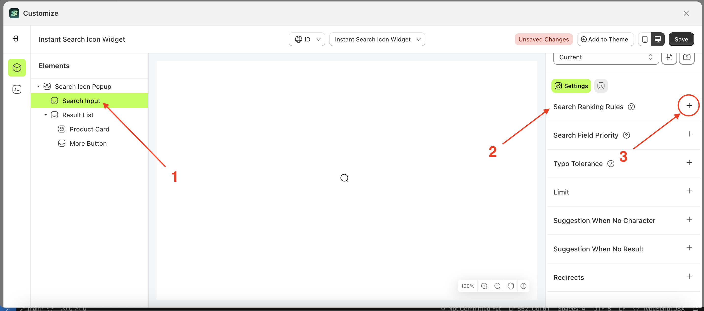
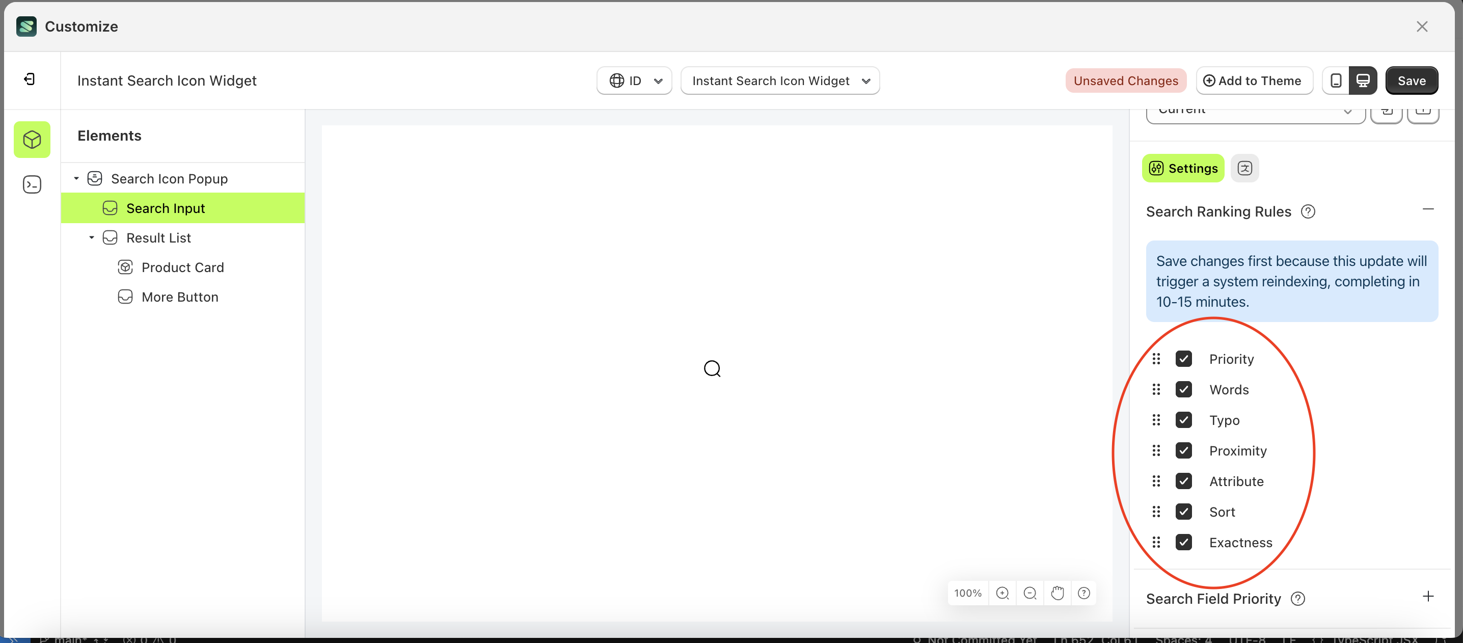
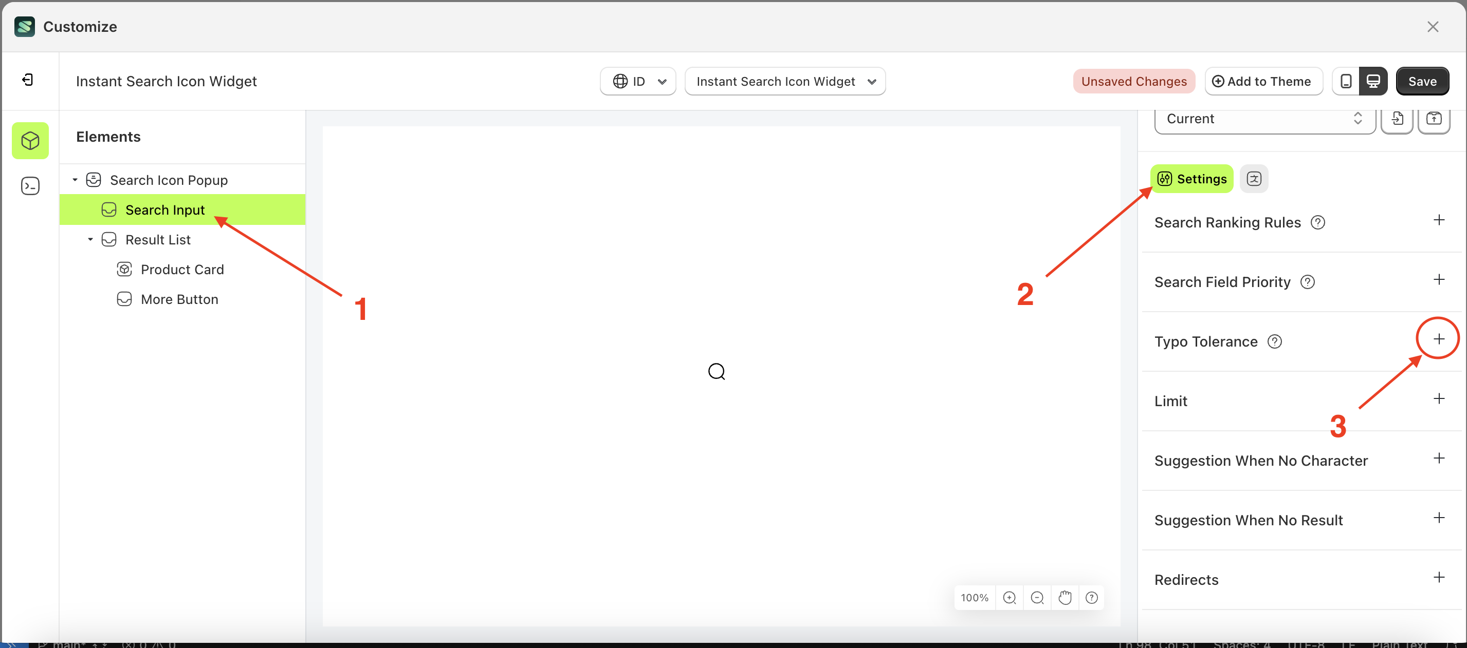
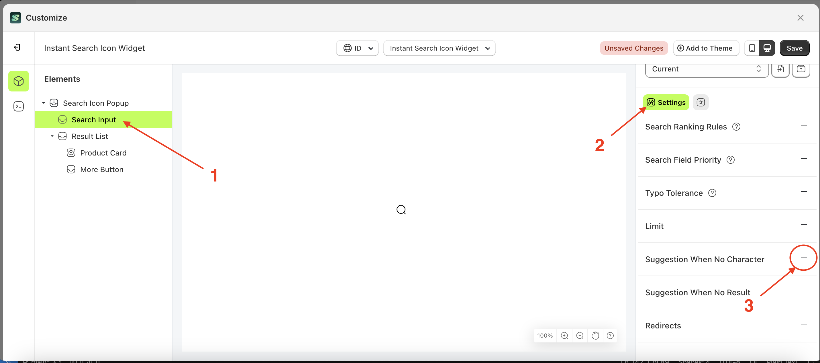
Search ranking rules
This feature is designed to control the execution order of functions based on a predefined sequence.
Follow the steps below:
- Select the Search icon popup element on the left, then click the icon marked with a red arrow to open the menu within that item.
- Once the menu is open select the element on the left, then click the Settings tab and click the icon marked with a red arrow.
- Set the desired order by dragging items up or down in the list marked below
- Note: Save changes first because this update will trigger a system reindexing, completing in 10-15 minutes
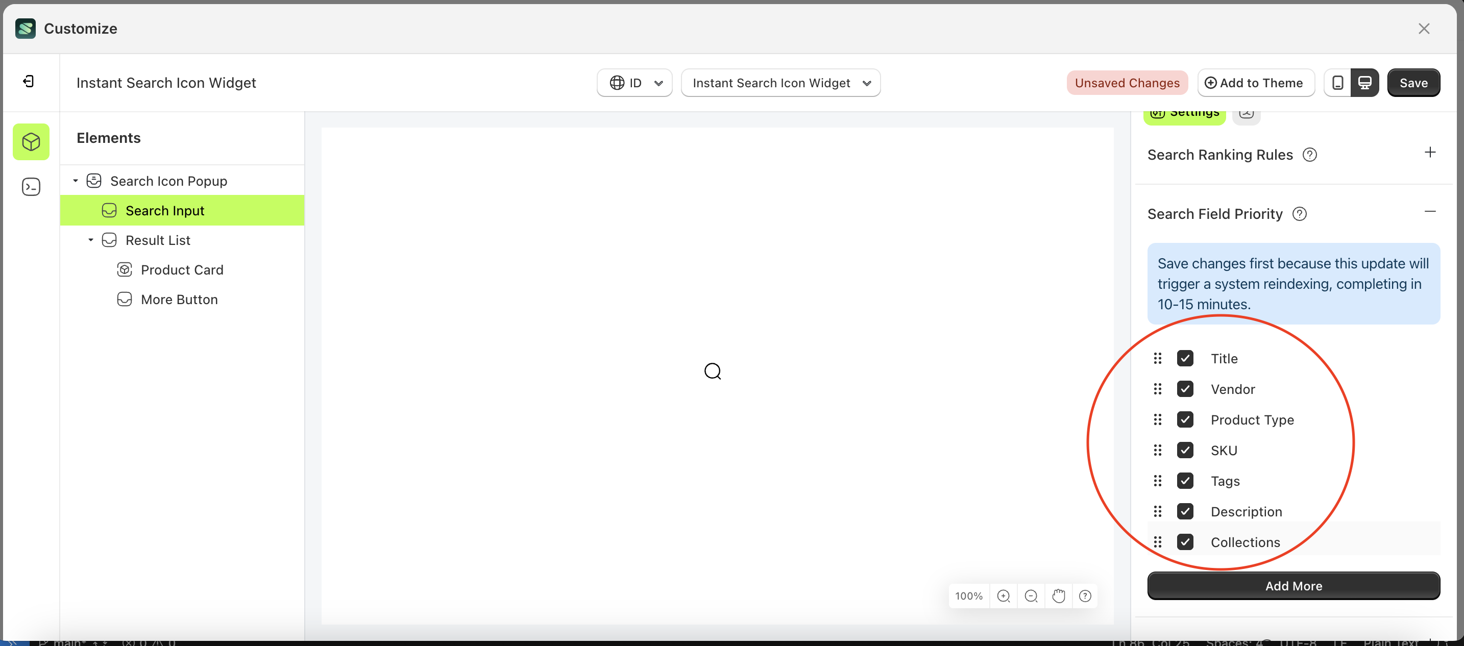
Search Field Priority
Search field priority is a setting designed to manage searches based on a ranked field order. For example, if "title" is set as the highest priority and its status checkbox is active, products with matching titles will be displayed first. Once those results are processed, the system will continue to the next prioritized field with an active status checkbox.
Note: You can reorder the fields by moving them up or down according to your store's needs.
Follow the steps below:
- Select the Search icon popup element on the left, then click the icon marked with a red arrow to open the menu within that item.
- Once the menu is open select the element on the left, then click the Settings tab and click the icon marked with a red arrow.
- Set the desired order by dragging items up or down in the list marked below
- Note: Save changes first because this update will trigger a system reindexing, completing in 10-15 minutes
Typo Tolerance
Available settings:
Enable Typo Tolerance
By default, this feature allows one typo for query terms with five or more characters and up to two typos for terms with at least nine characters.
For example, if your dataset contains "seven," searching for "sevem" or "sevan" will still match "seven." However, "tow" will not match "two" because it has fewer than five characters.
You can override these default settings using the minWordSizeForTypos object. The code sample below sets the minimum word size for one typo to 4 and for two typos to 10.
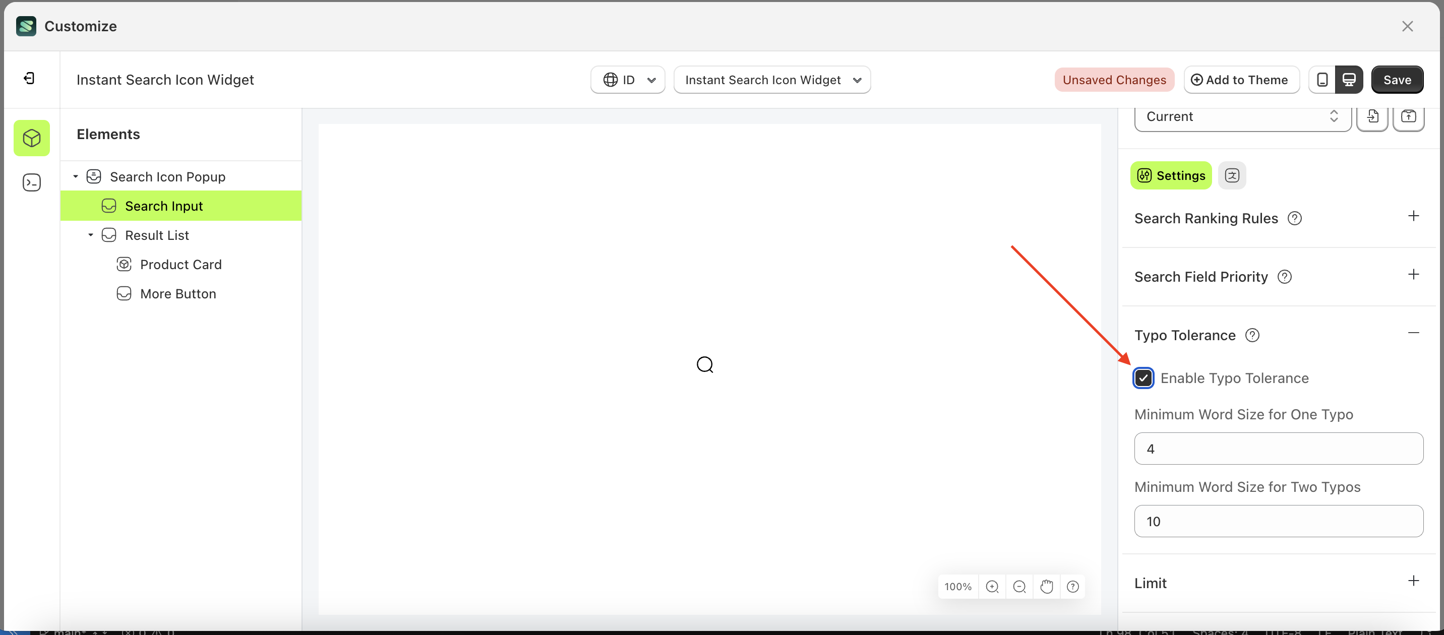
Note: The Enable Typo Tolerance setting must be activated first.
Follow the steps below:
- Select the Product card element on the right, then click the Settings tab and click the icon marked with a red arrow.
- Enable the Enable Typo Tolerance checkbox
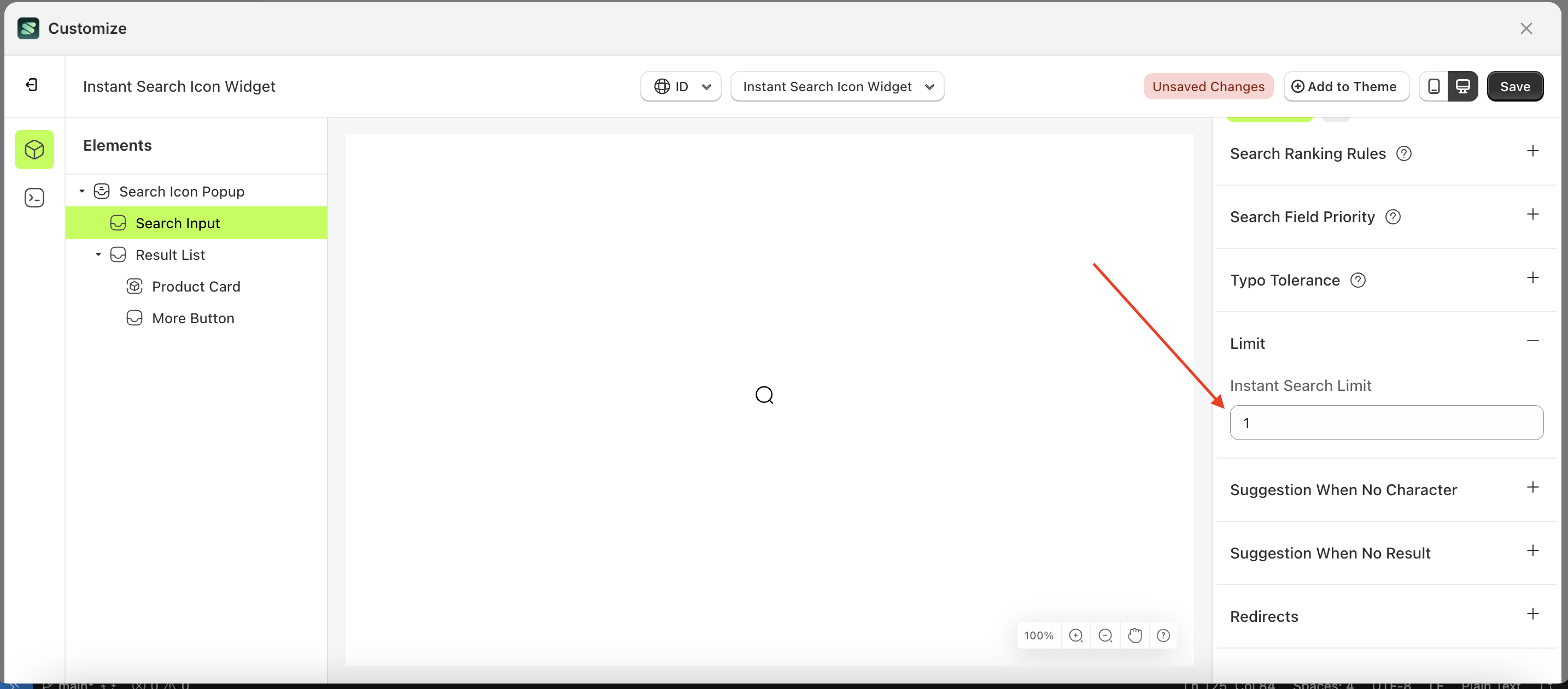
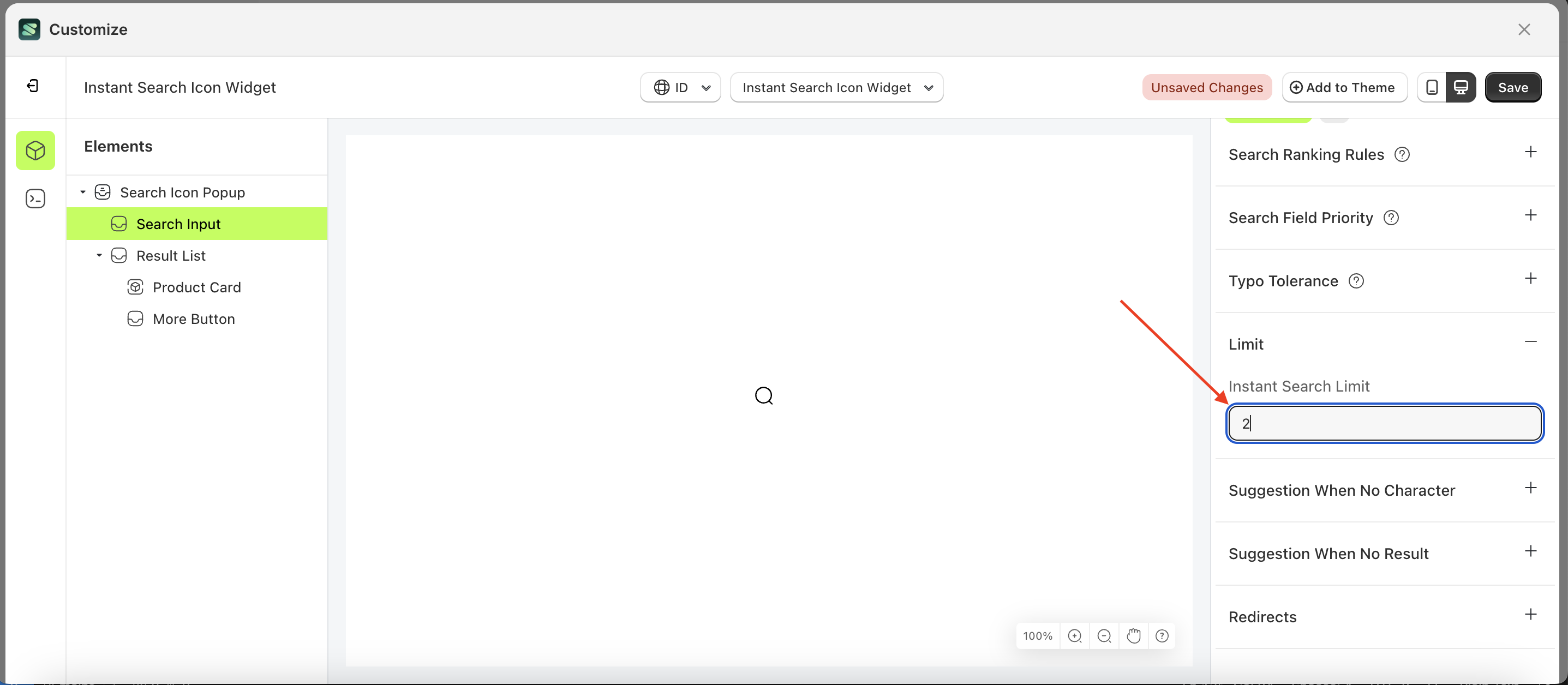
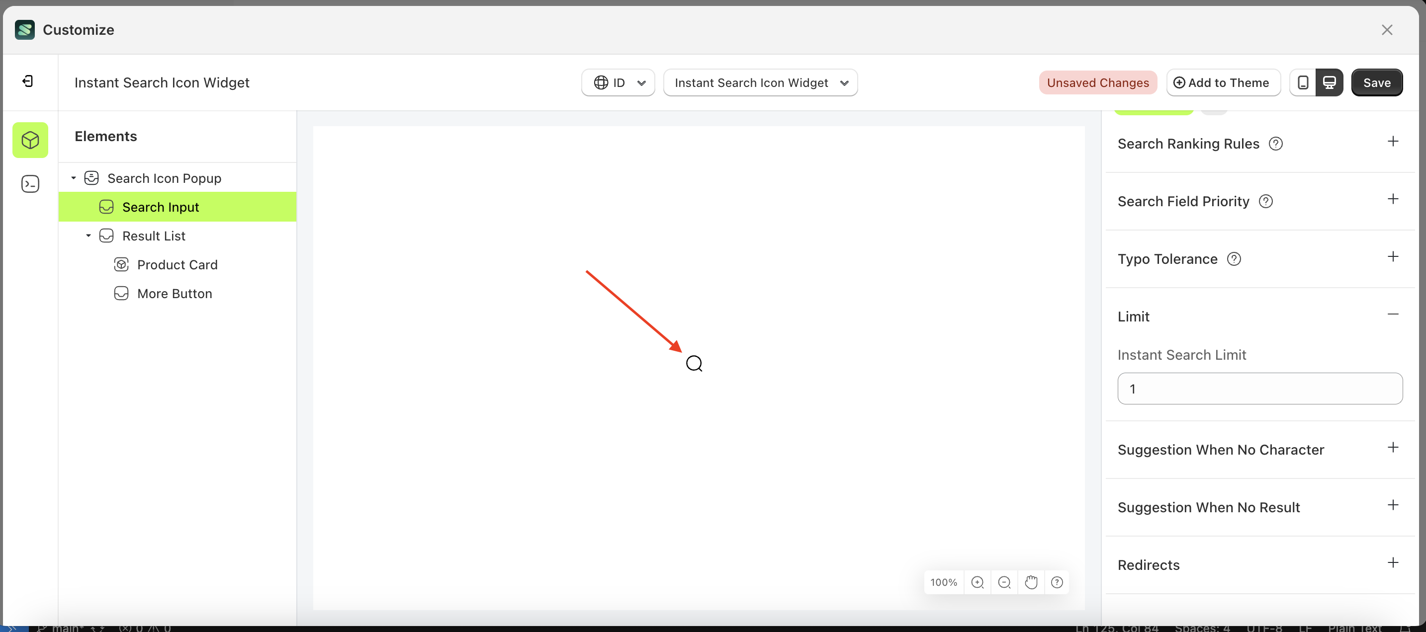
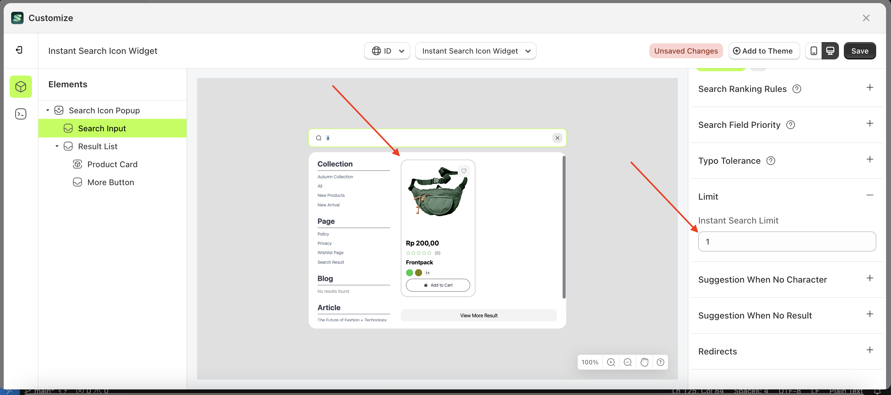
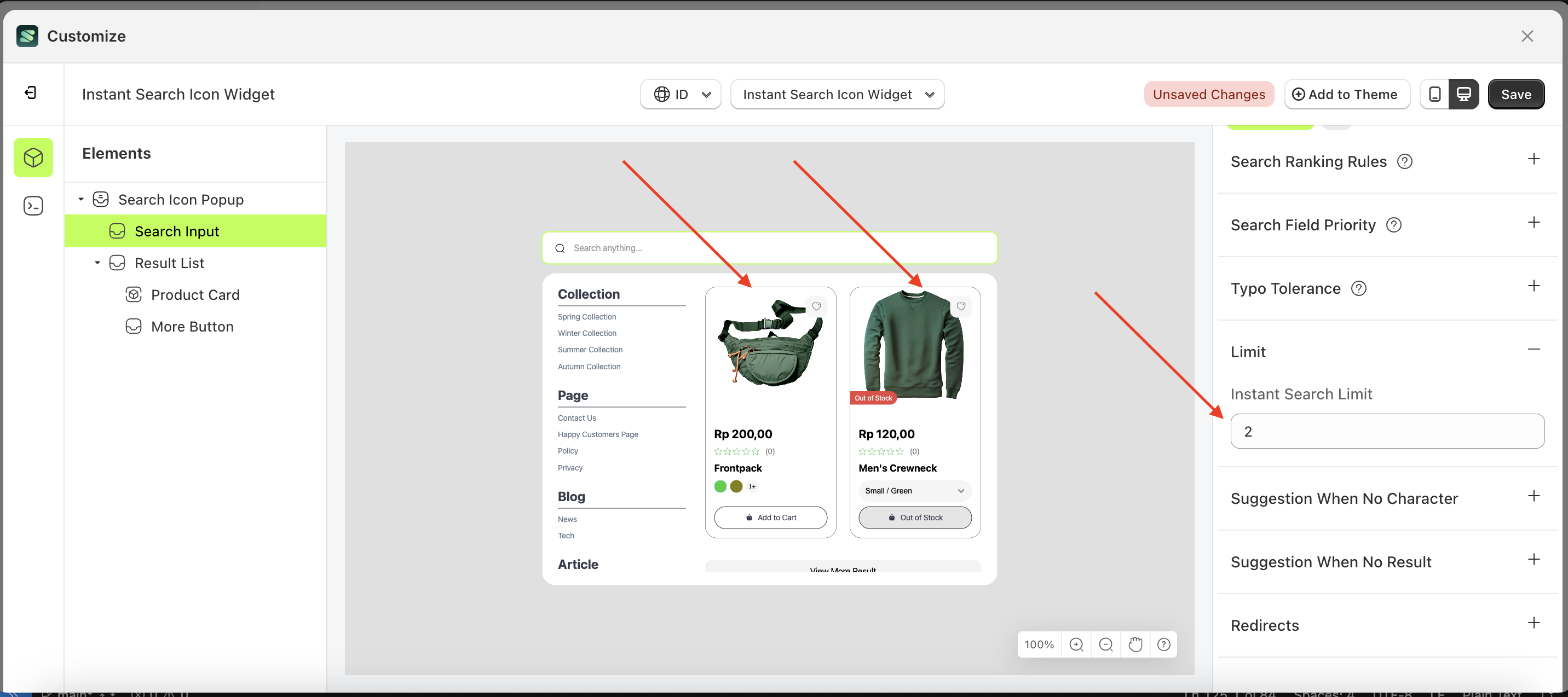
Limit
Available settings:
Instant Search limit
Display search results based on user input with a specified number of results.
Follow the steps below:
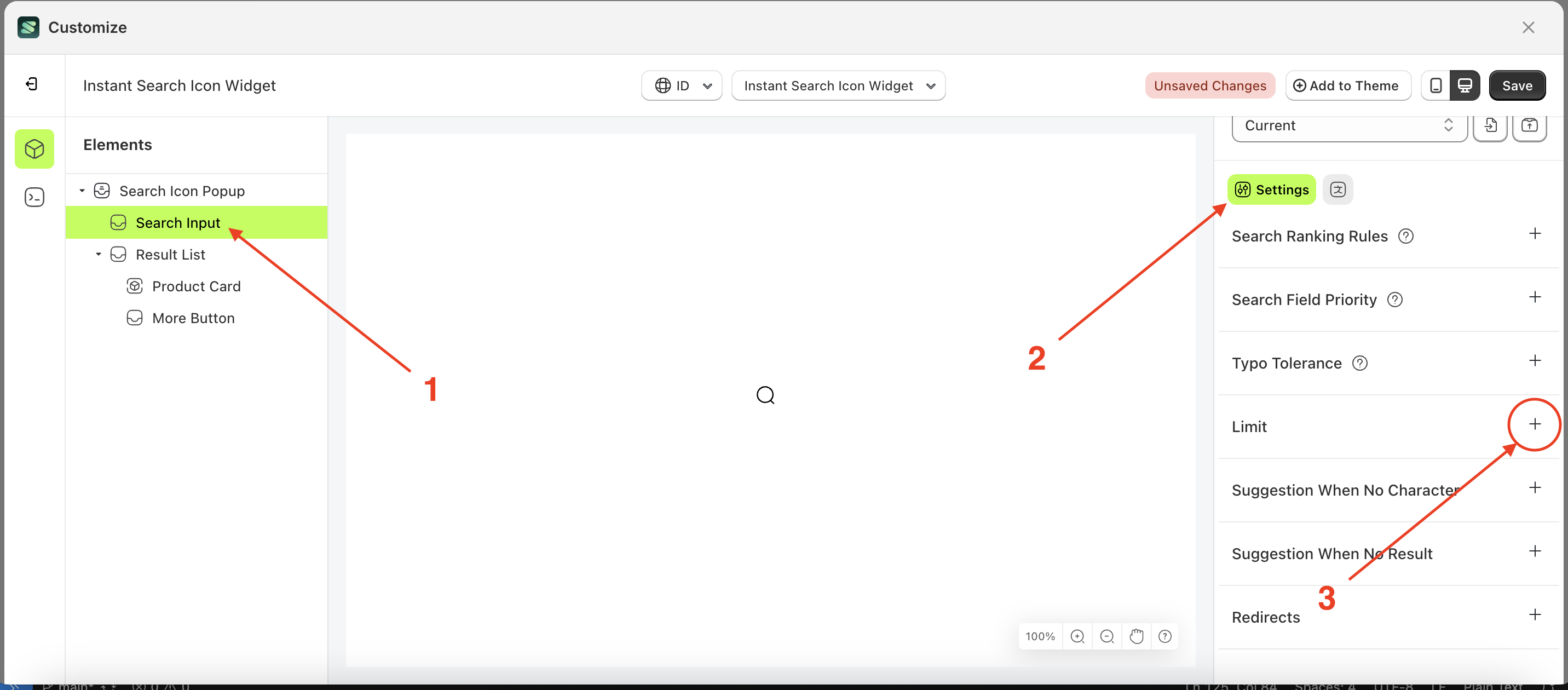
- Select the Popup element on the left, then click the Settings tab and click the icon marked with a red arrow.
- Click the Color Palette on the right side, which is also marked with a red arrow.
- The Color Palette will appear. Click the right side of the palette where the red arrow and number 1 are indicated, then click the right side again where the red arrow and number 2 are marked.
- To see the changes in this setting on the element, click the search icon popup element
- The instant search icon widget of the Popup element will adjust accordingly.
- Example : Before Popup change settings
- Example : After Popup change settings
Suggestion When No Character
Available settings:
Enable Keyword suggestionKeywordsEnable Products suggestion- [
select-products](#select products)
Enable Keyword suggestion
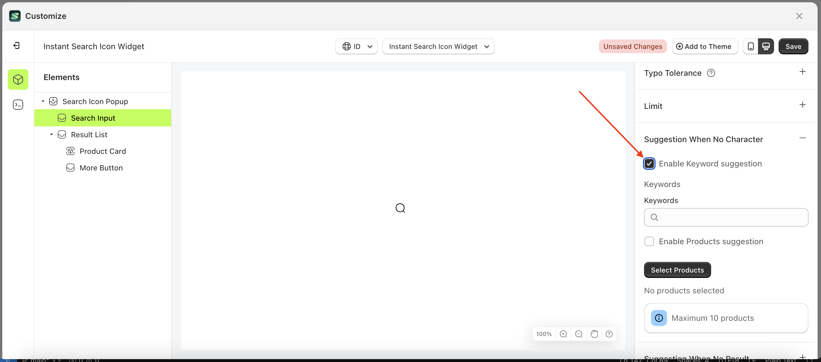
- Select the Search Input element on the right, then click the Settings tab and click the icon marked with a red arrow.
- Enable the Enable Keyword suggestion checkbox
Keywords
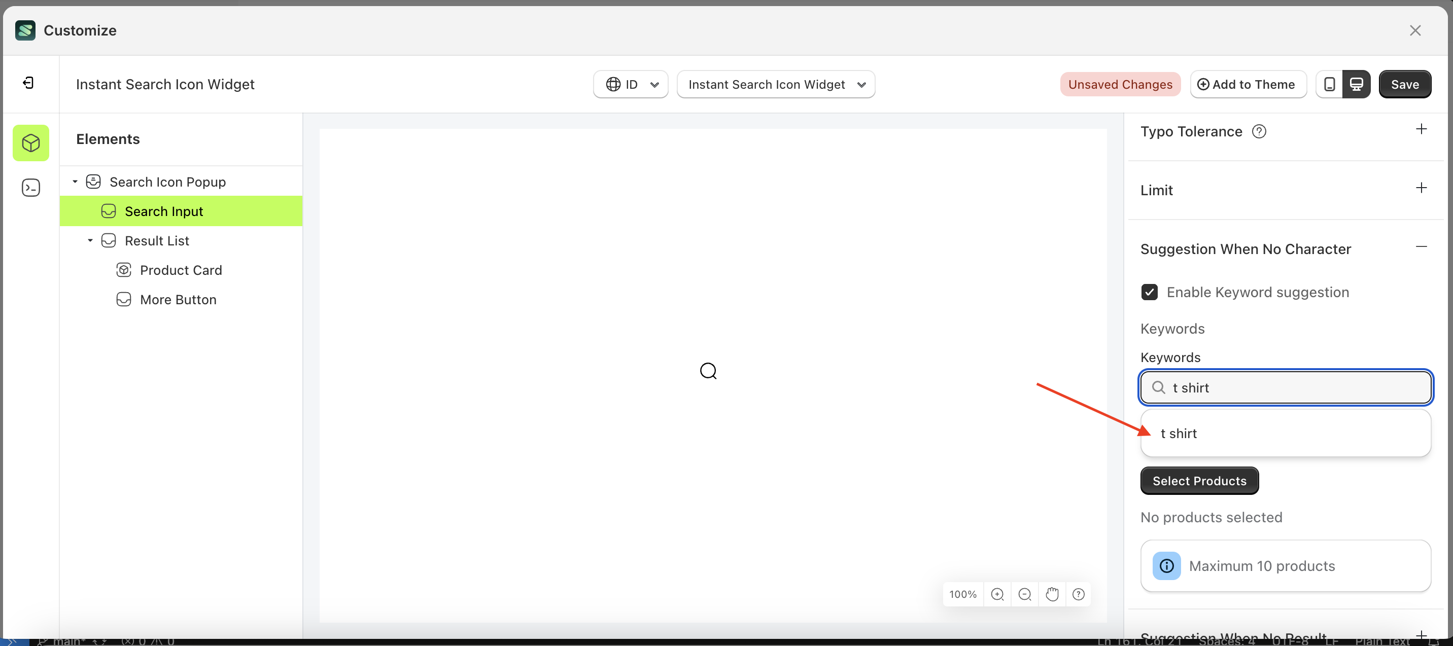
This feature is designed to help merchants generate keyword suggestions that are frequently searched by customers.
To use this function, you must first enable "Enable Keyword Suggestion" to ensure it works properly.
Follow the steps below:
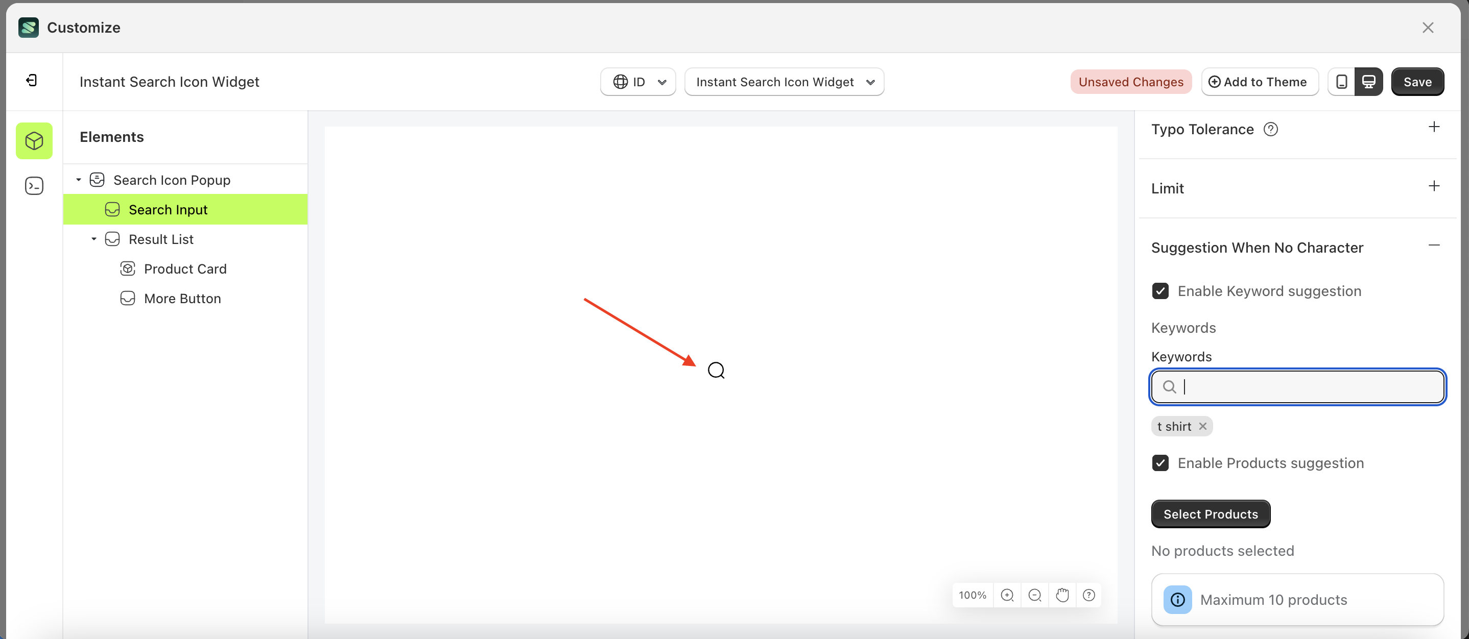
- Select the Search Input element on the right, then click the Settings tab and click the icon marked with a red arrow.
- Enter the keyboard input you want to create.
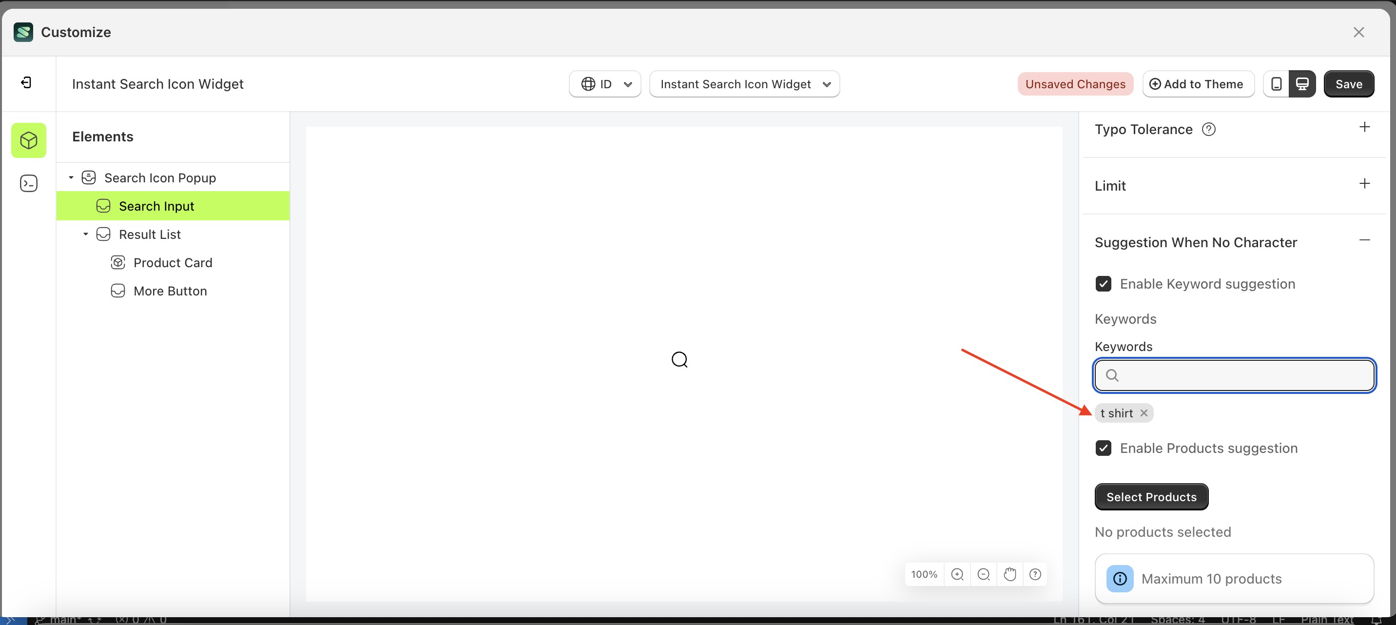
- Click on the suggestions displayed below your input
- Your input will appear below the input field.
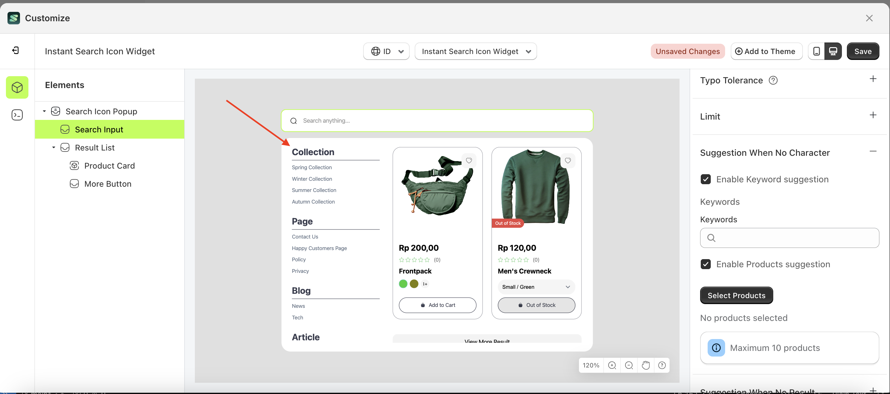
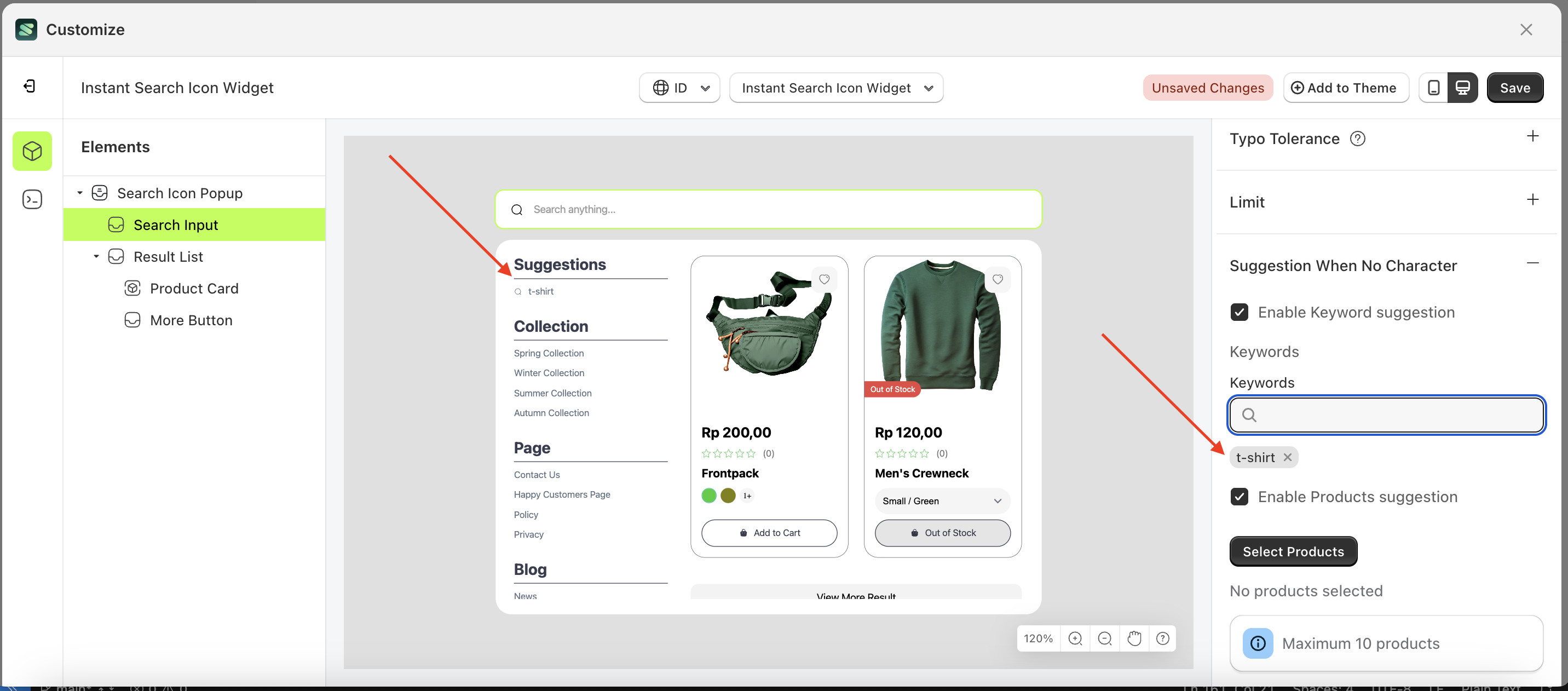
- To see the changes, click the search icon popup.
- The entered keyword will appear in the suggestion list
- Before creating the keyword input.
- After creating the keyword input.
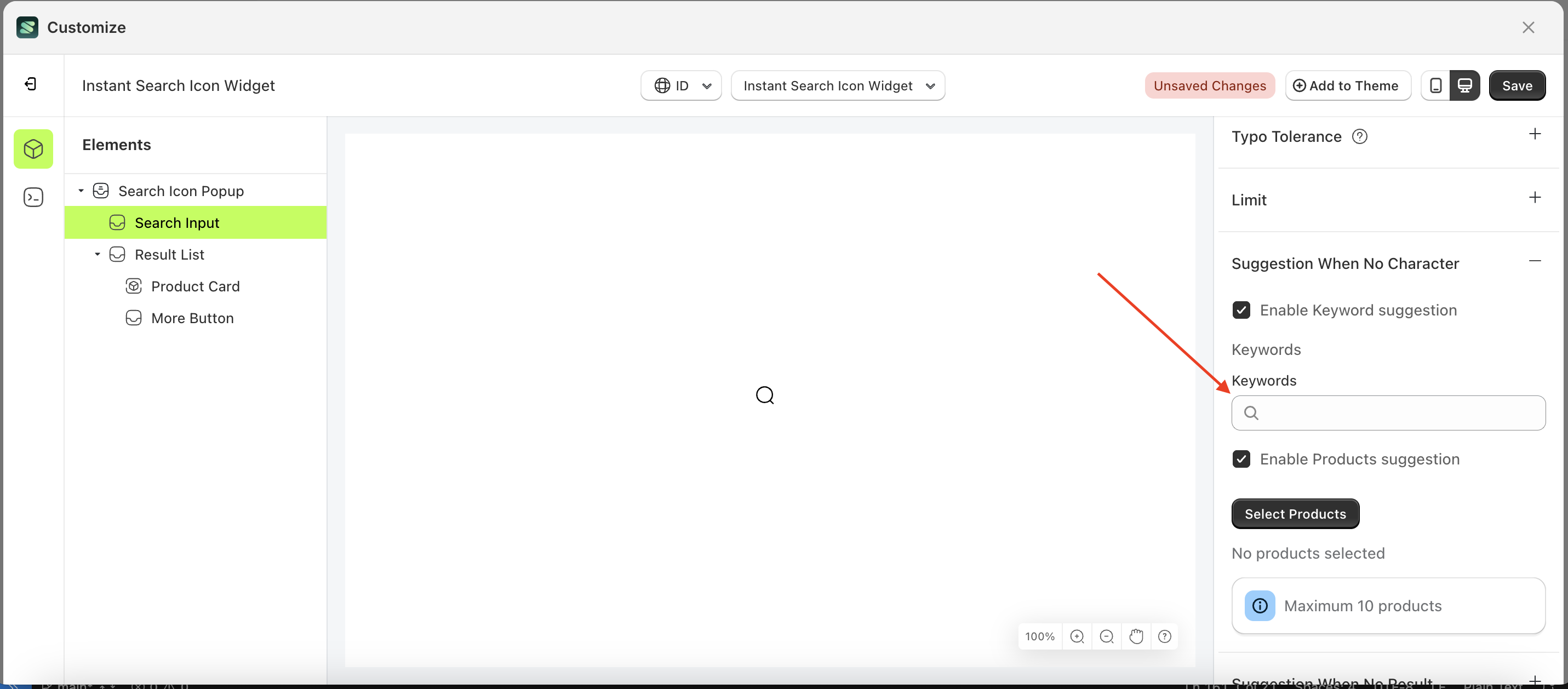
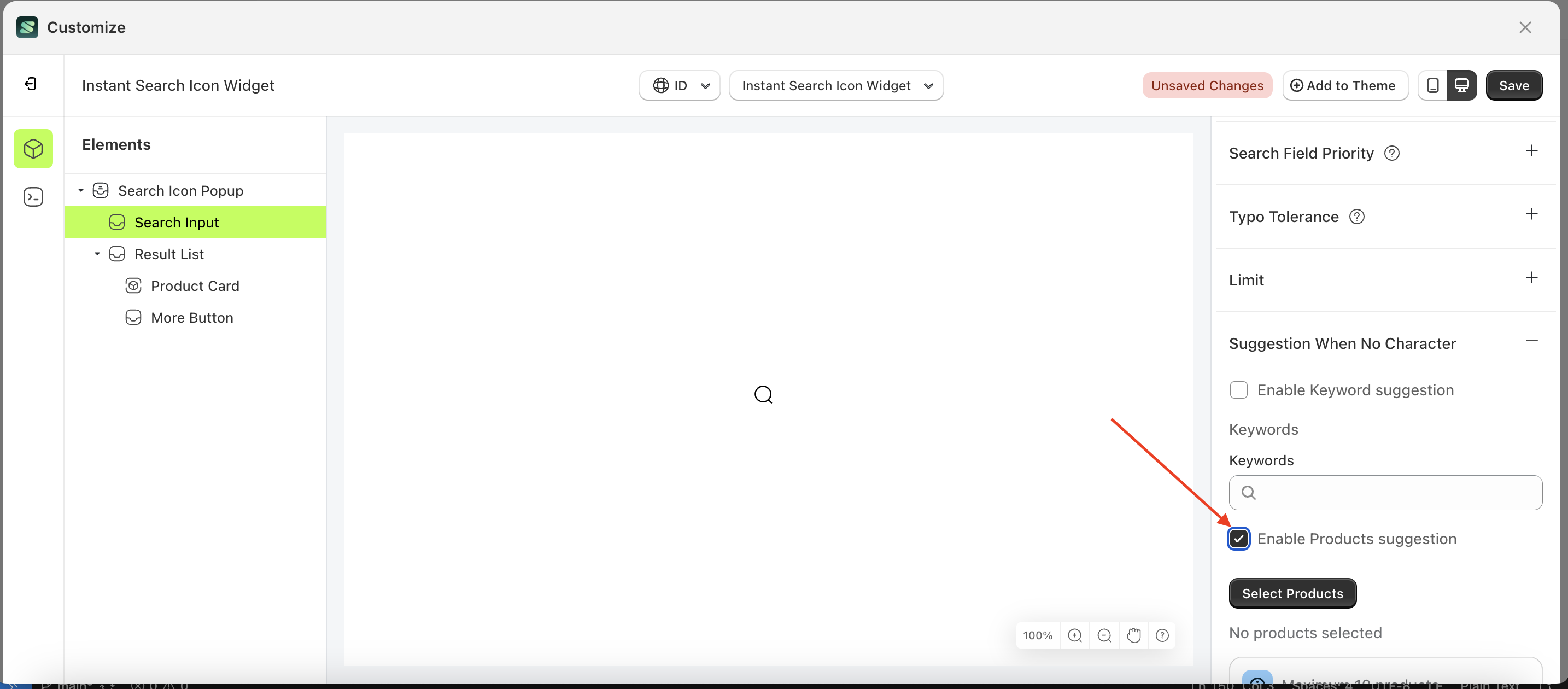
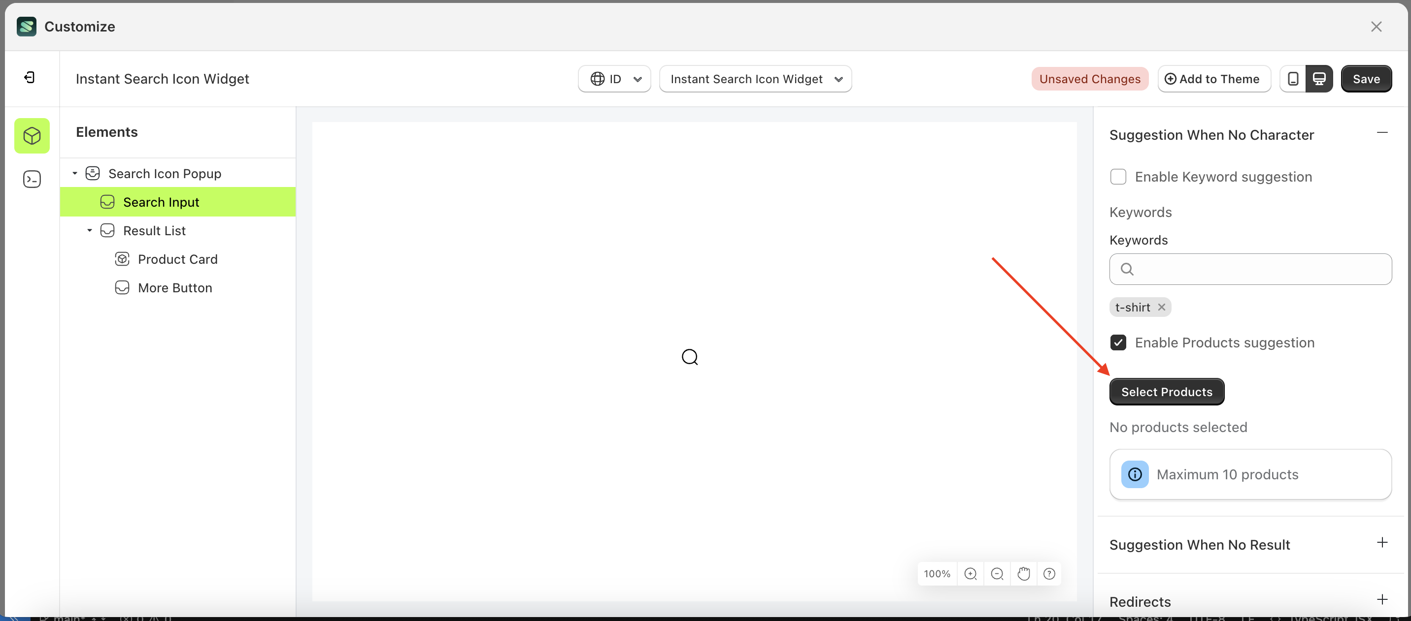
Enable Products suggestion
- Select the Search Input element on the right, then click the Settings tab and click the icon marked with a red arrow.
- Enable the Enable Products suggestion checkbox
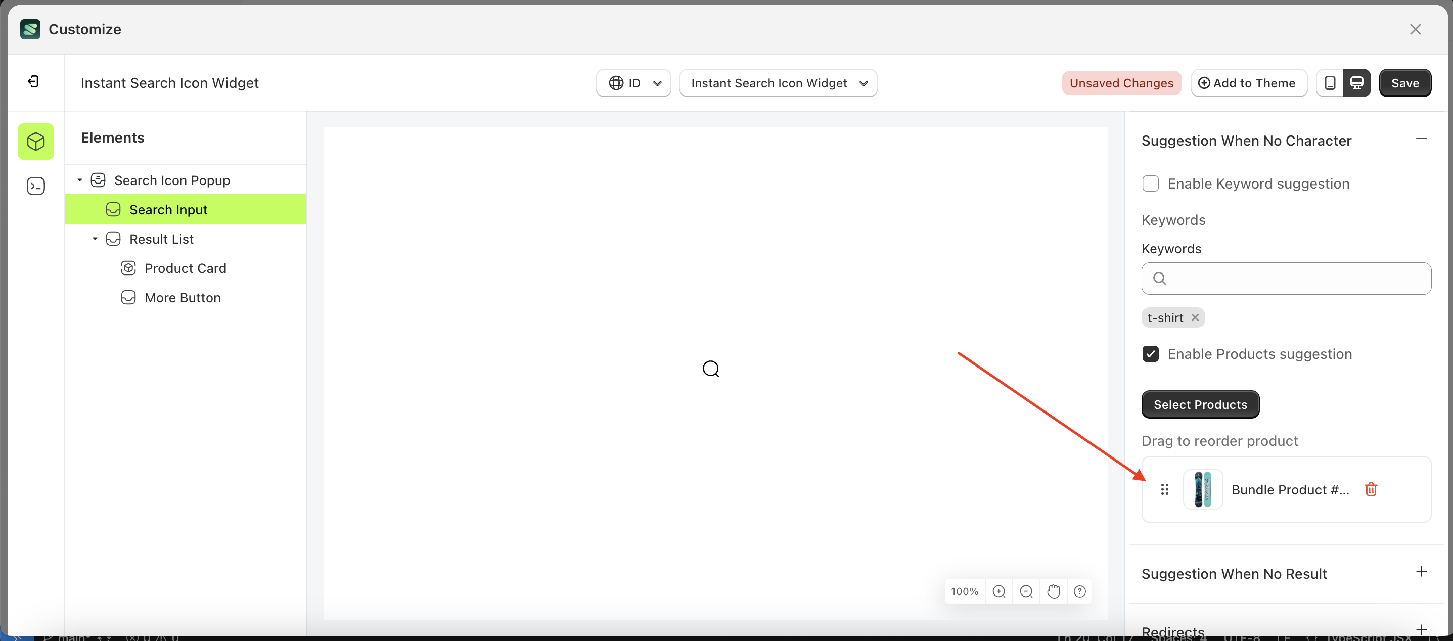
Select Products
This feature is designed to help merchants generate product recommendations aimed at maximizing the likelihood of customers purchasing the suggested products.
To use this function, you must first enable "Enable Product Suggestion" to ensure it works properly.
Follow the steps below:
- Select the Search Input element on the right, then click the Settings tab and click the icon marked with a red arrow.
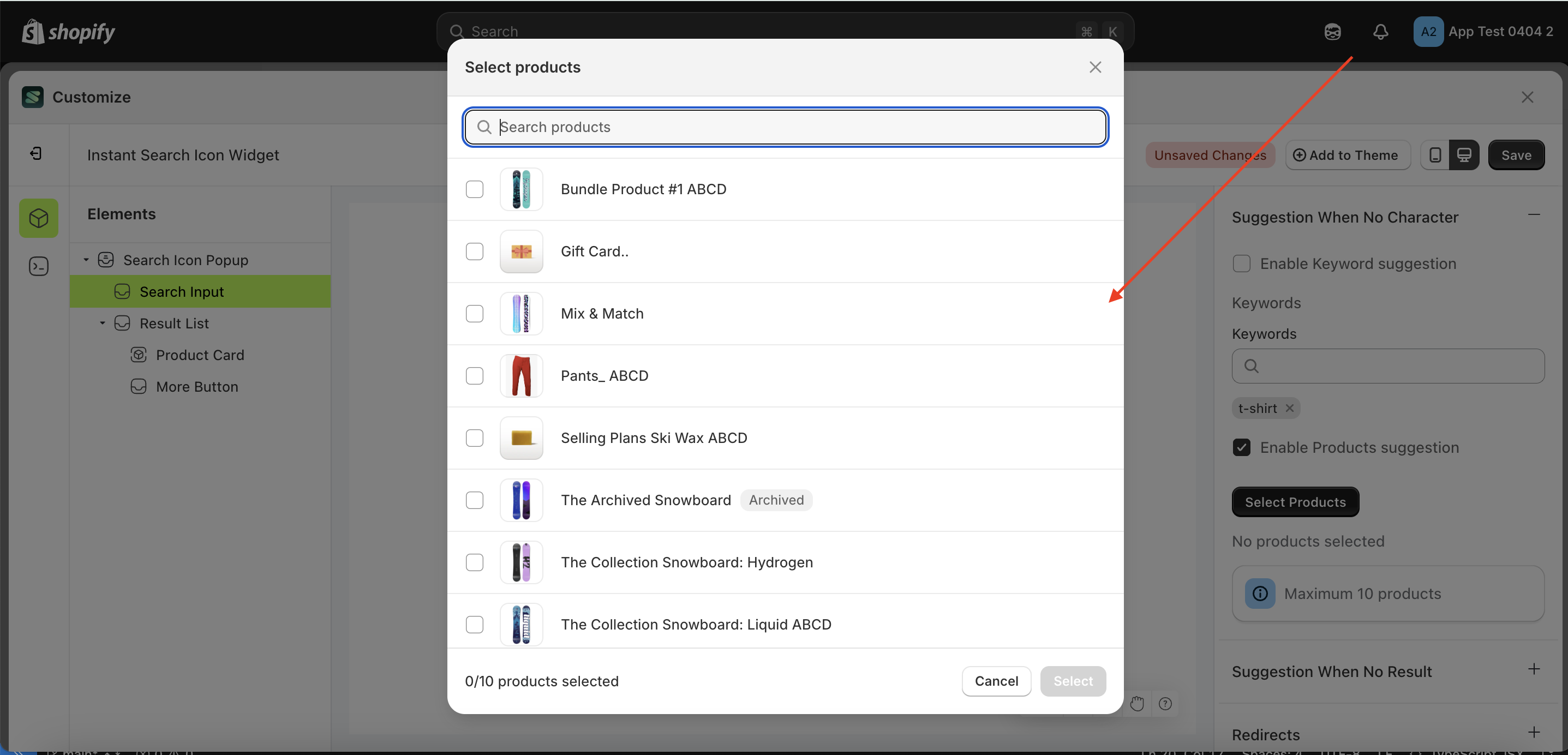
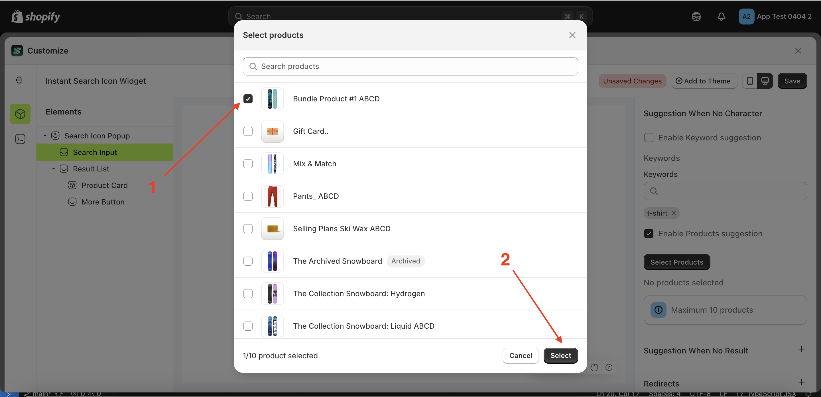
- Click the "Select Product" button.
- A popup will appear with a list of products.
- Choose the product that suits your needs.
- Your selection will appear below the "Select Product" button.
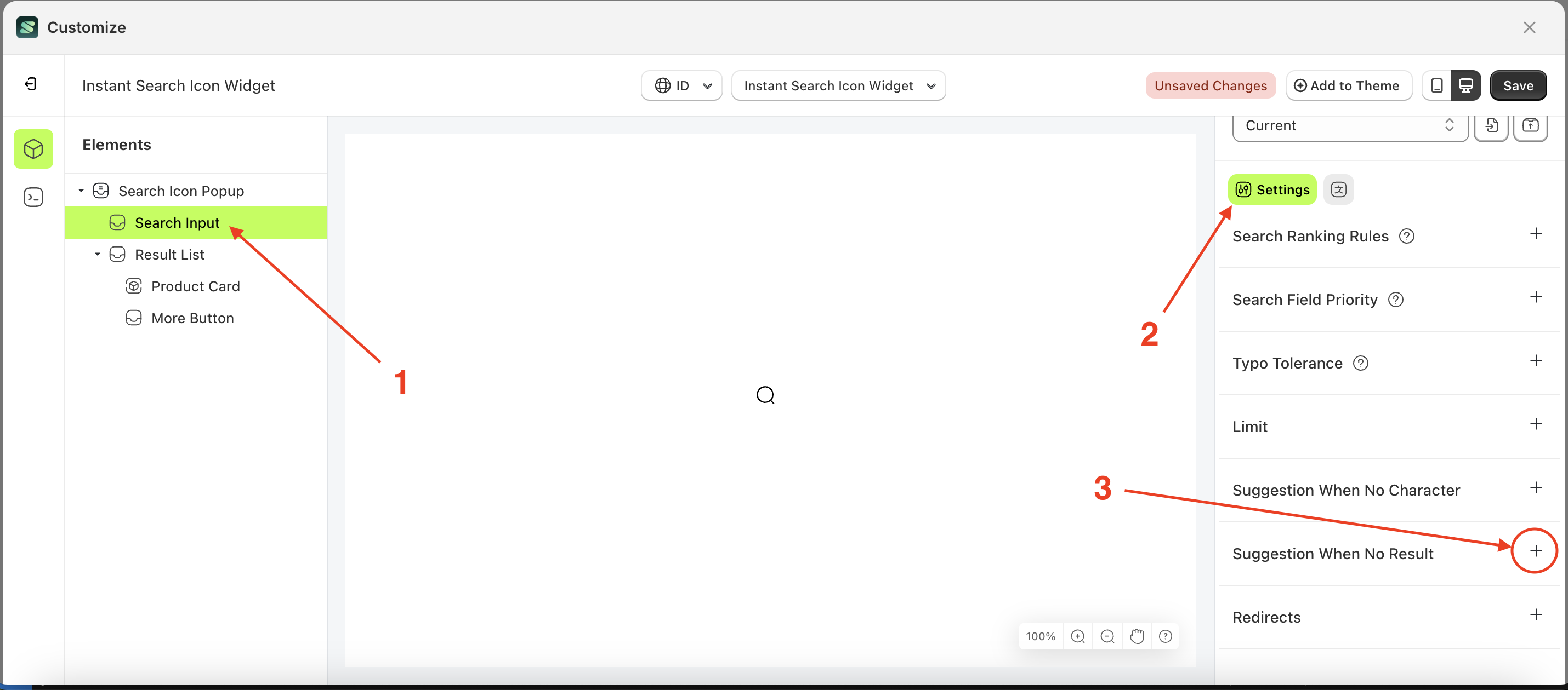
Suggestion When No Result
Available settings:
Enable Keyword suggestion
- Select the Search Input element on the right, then click the Settings tab and click the icon marked with a red arrow.
- Enable the Enable Keyword suggestion checkbox
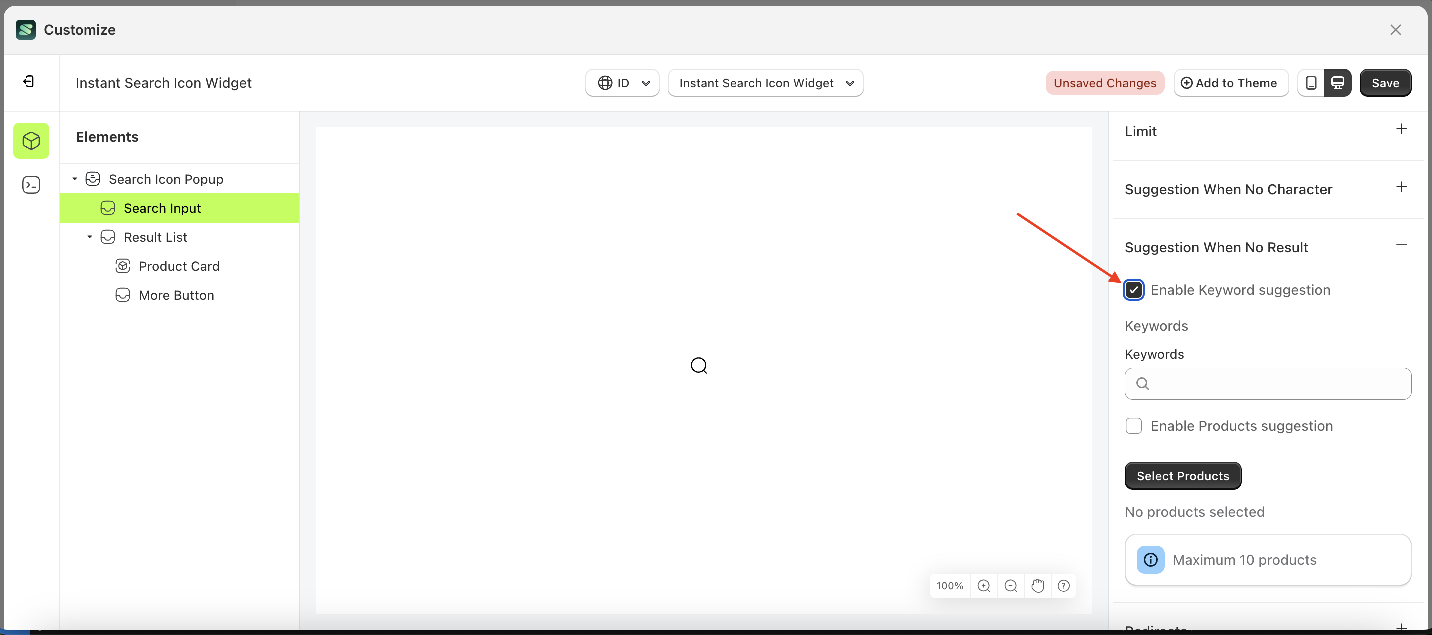
Keywords
This feature is designed to help merchants generate keyword suggestions commonly searched by customers when their search returns no results.
To use this function, you must first enable "Enable Keyword Suggestion" to ensure it works properly.
Follow the steps below:
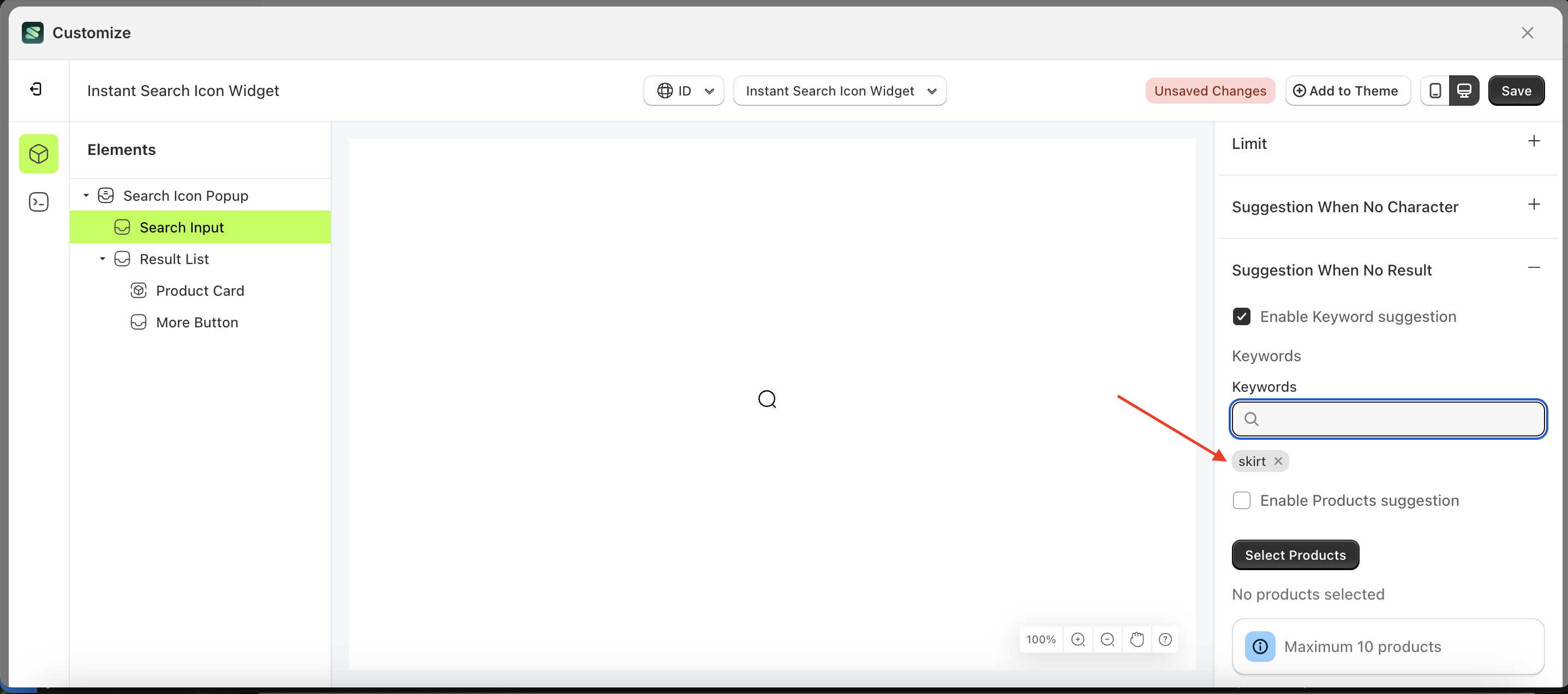
- Select the Search Input element on the right, then click the Settings tab and click the icon marked with a red arrow.
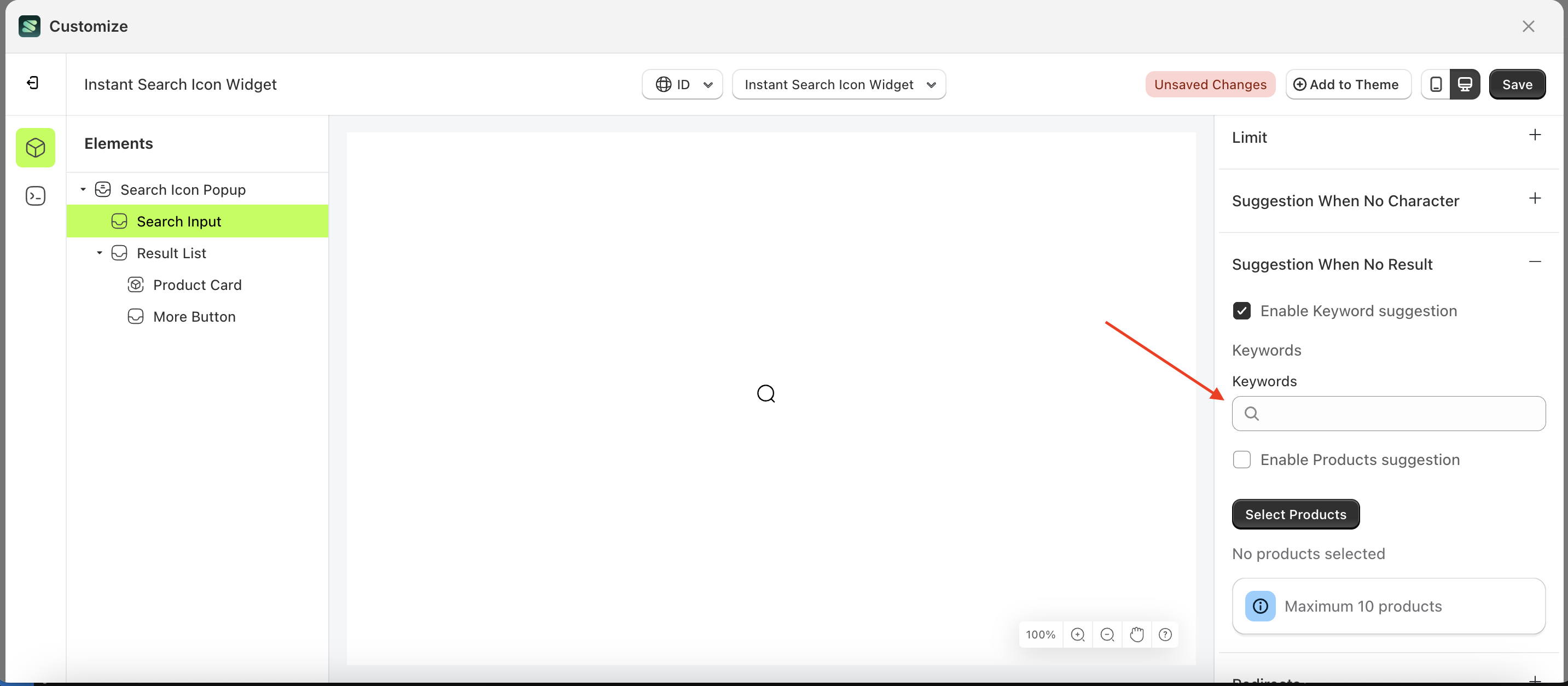
- Enter the keyboard input you want to create.
- Click on the suggestions displayed below your input
- Your input will appear below the input field.
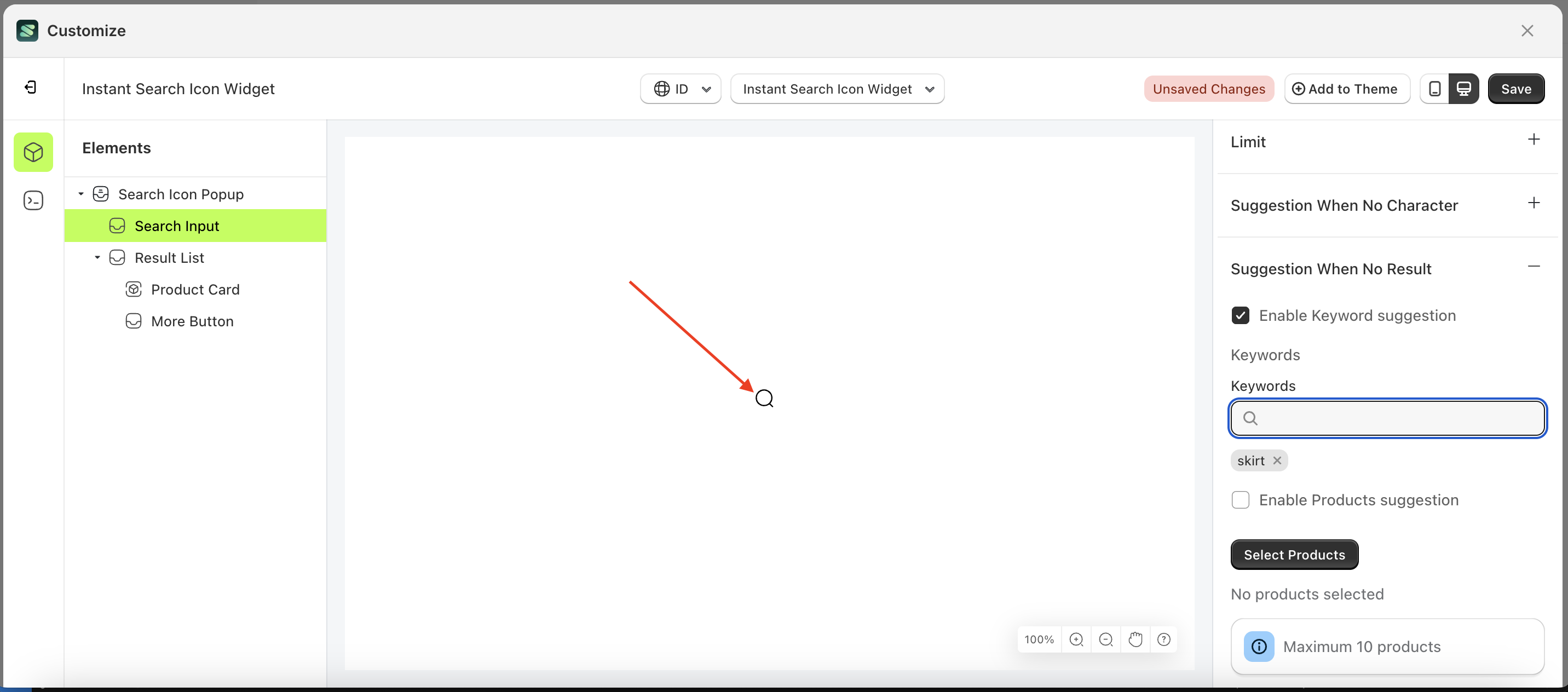
- To see the changes, click the search icon popup.
- The entered keyword will appear in the suggestion list
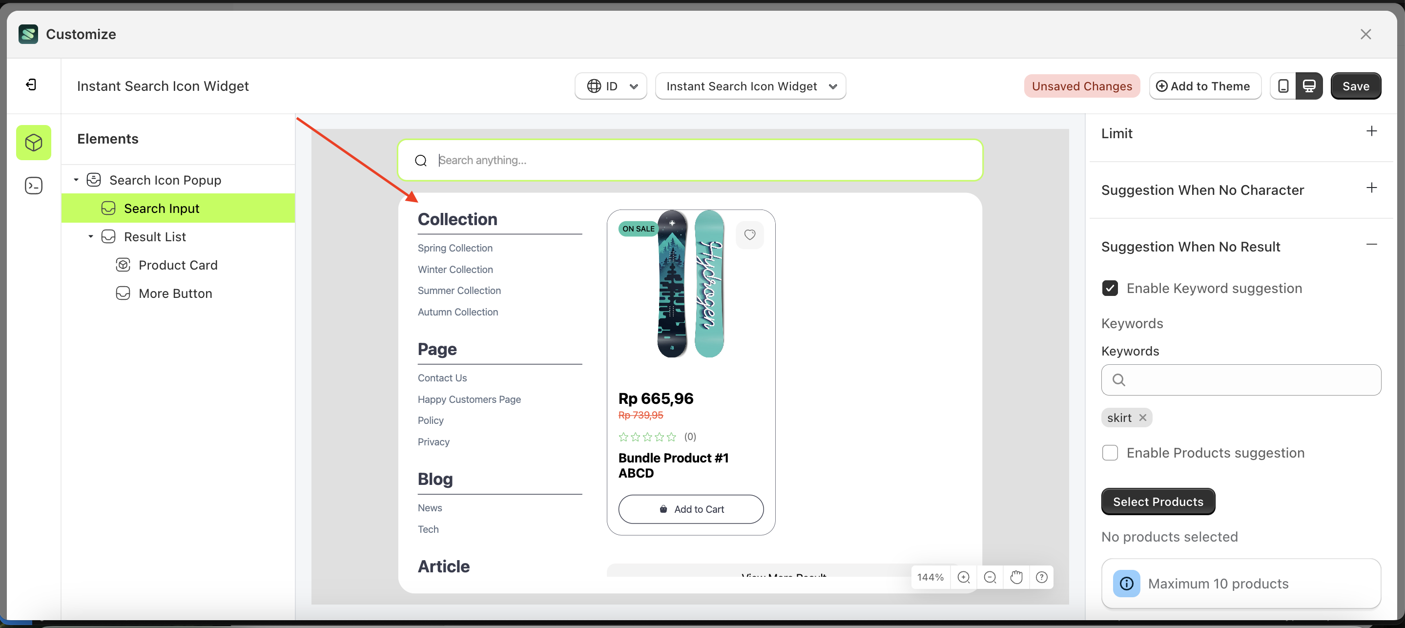
- Before creating the keyword input.
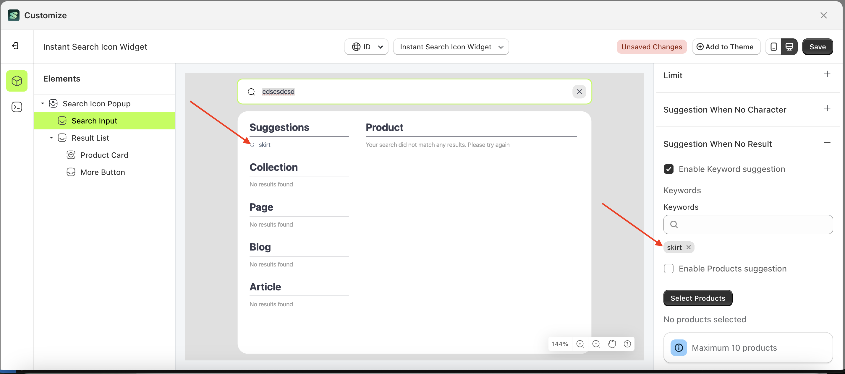
- After creating the keyword input.
Enable Product Suggestion
- Select the Search Input element on the right, then click the Settings tab and click the icon marked with a red arrow.
- Enable the Enable Product suggestion checkbox
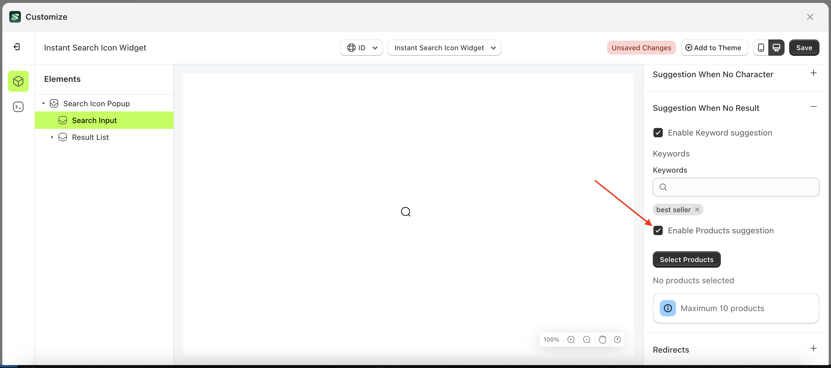
Select Product
This feature is designed to help merchants generate product recommendations when a customer's search returns no results.
To use this function, you must first enable "Enable Product Suggestion" to ensure it works properly.
Follow the steps below:
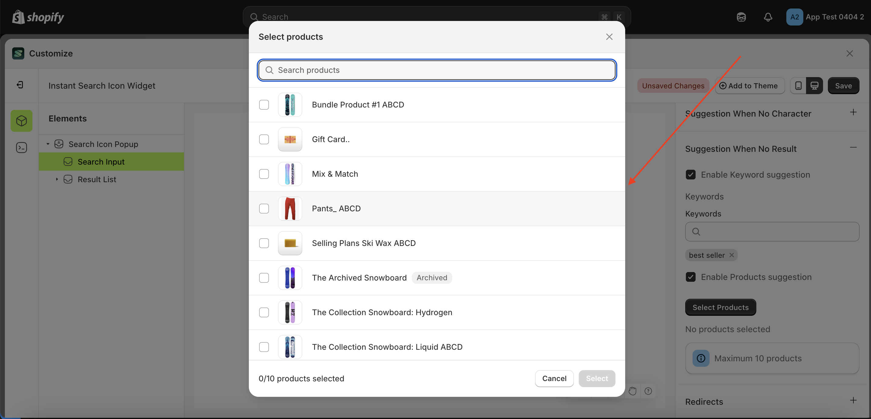
- Select the Search Input element on the right, then click the Settings tab and click the icon marked with a red arrow.
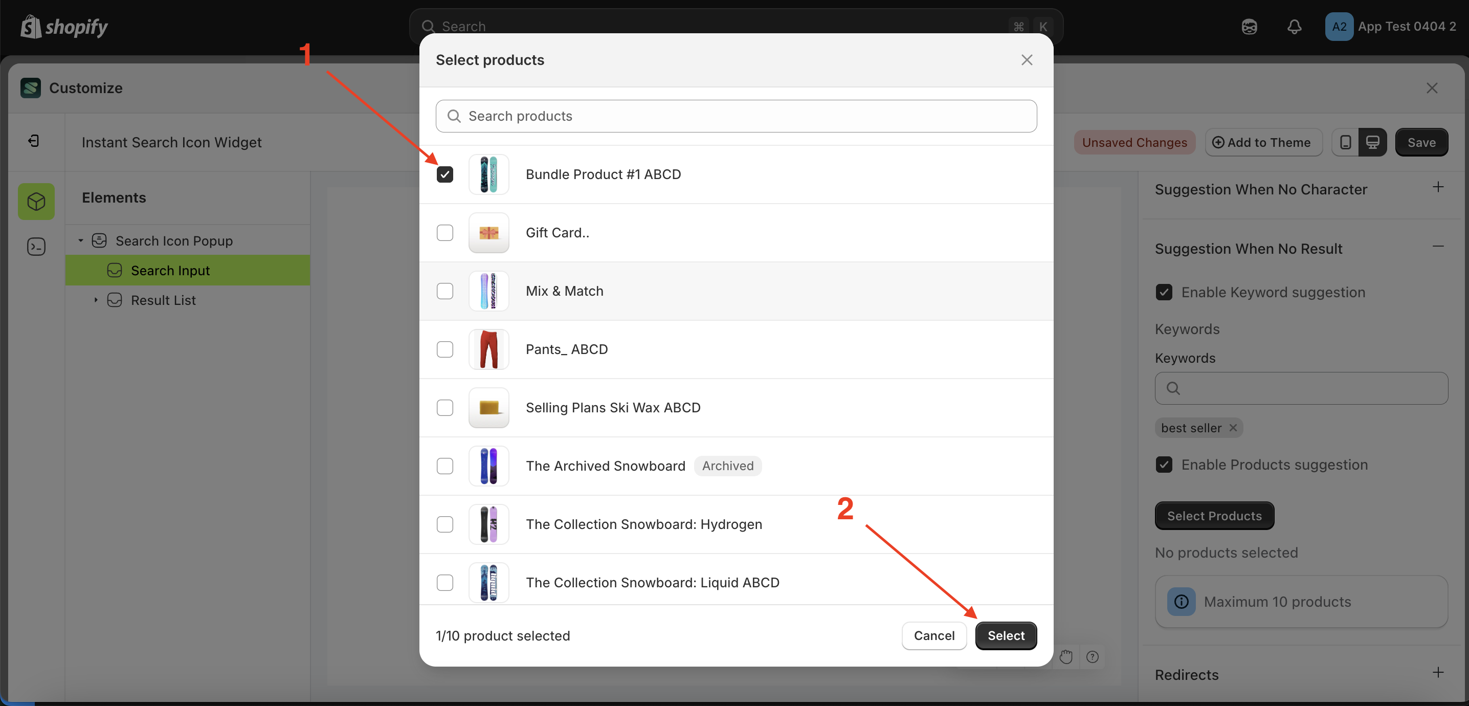
- Click the "Select Product" button.
- A popup will appear with a list of products.
- Choose the product that suits your needs.
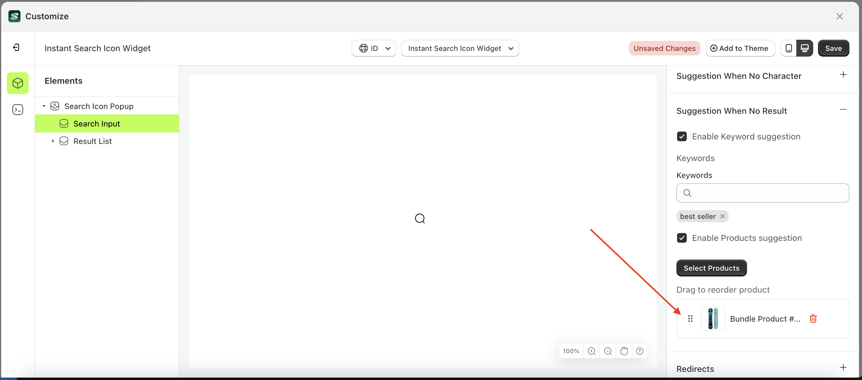
- Your selection will appear below the "Select Product" button.

Options
Available settings:
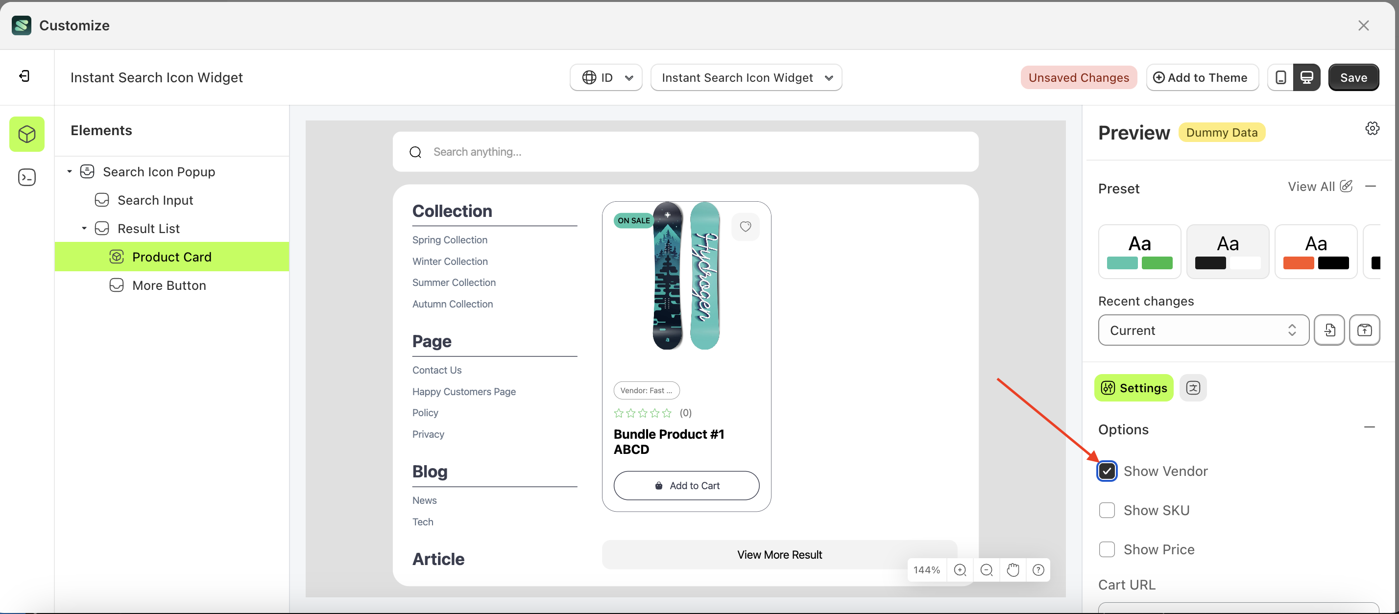
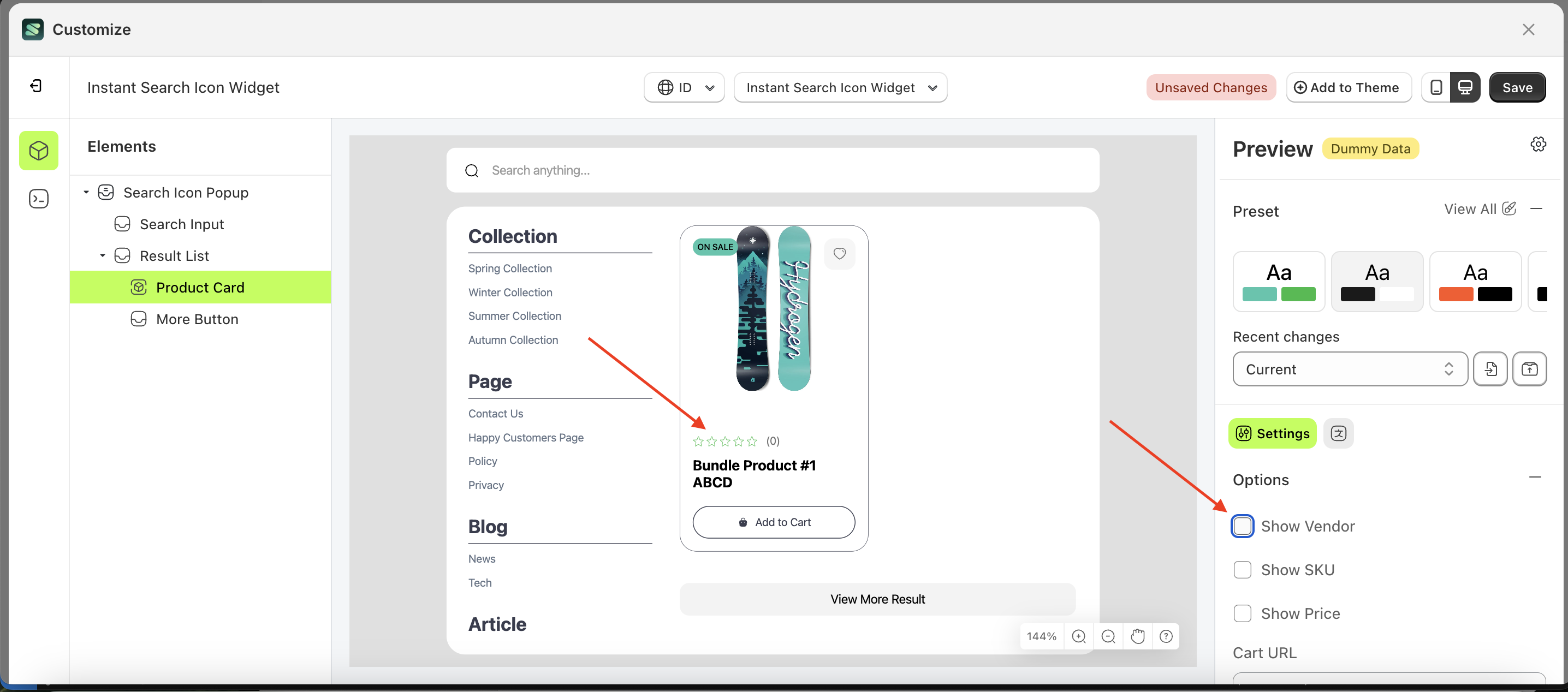
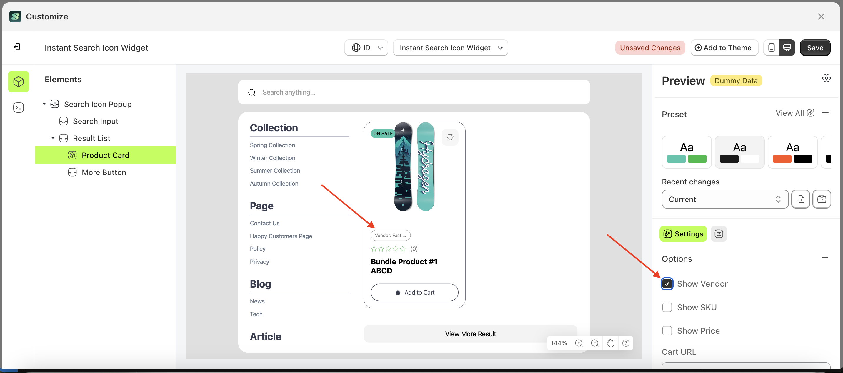
Show Vendor
This feature is designed to show or hide information about the product vendor
Follow the steps below:
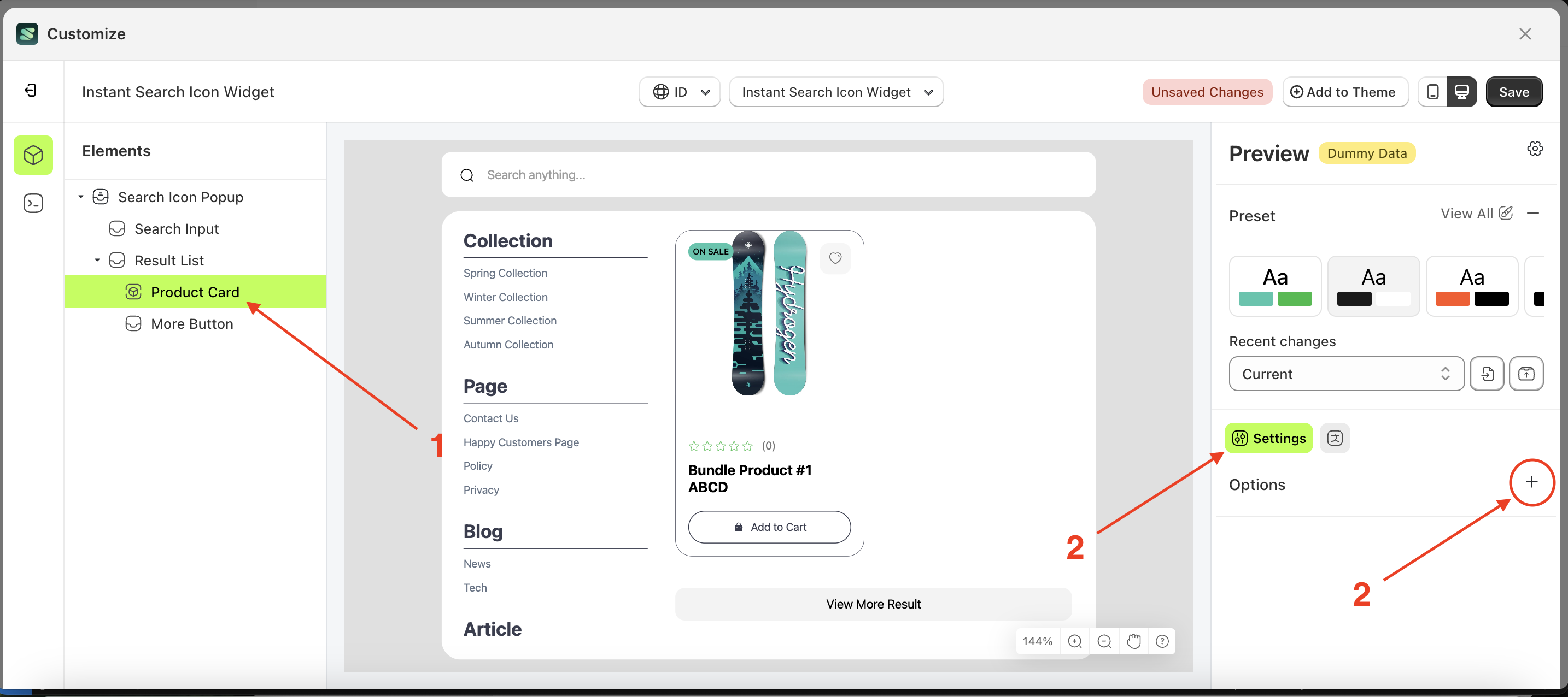
- Select the Product Card element on the right, then click the Settings tab and click the icon marked with a red arrow.
- Enable the Show Vendor checkbox
- Example : Before Show Vendor is enabled
- Example : After Show Vendor is enabled
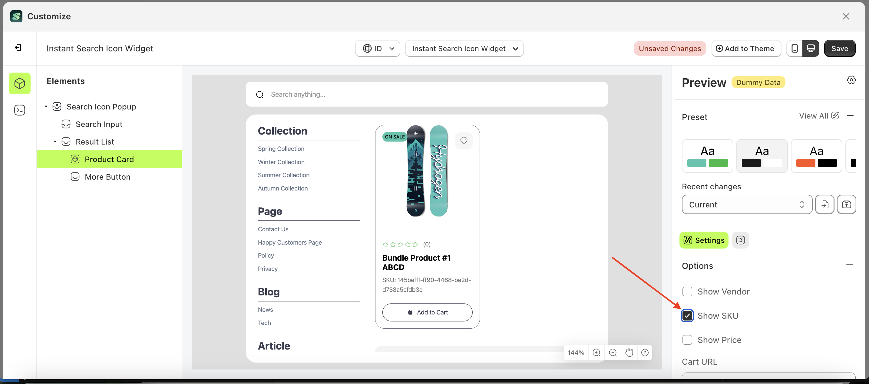
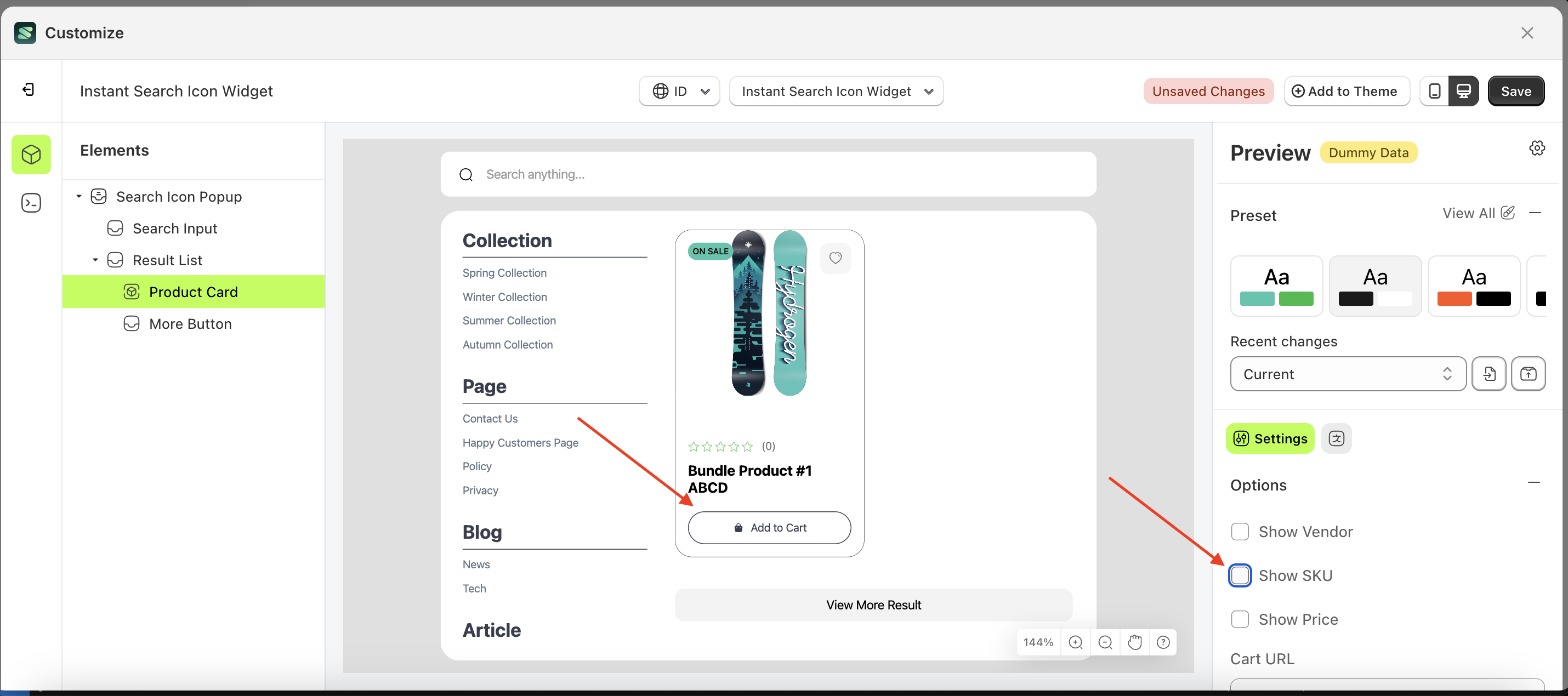
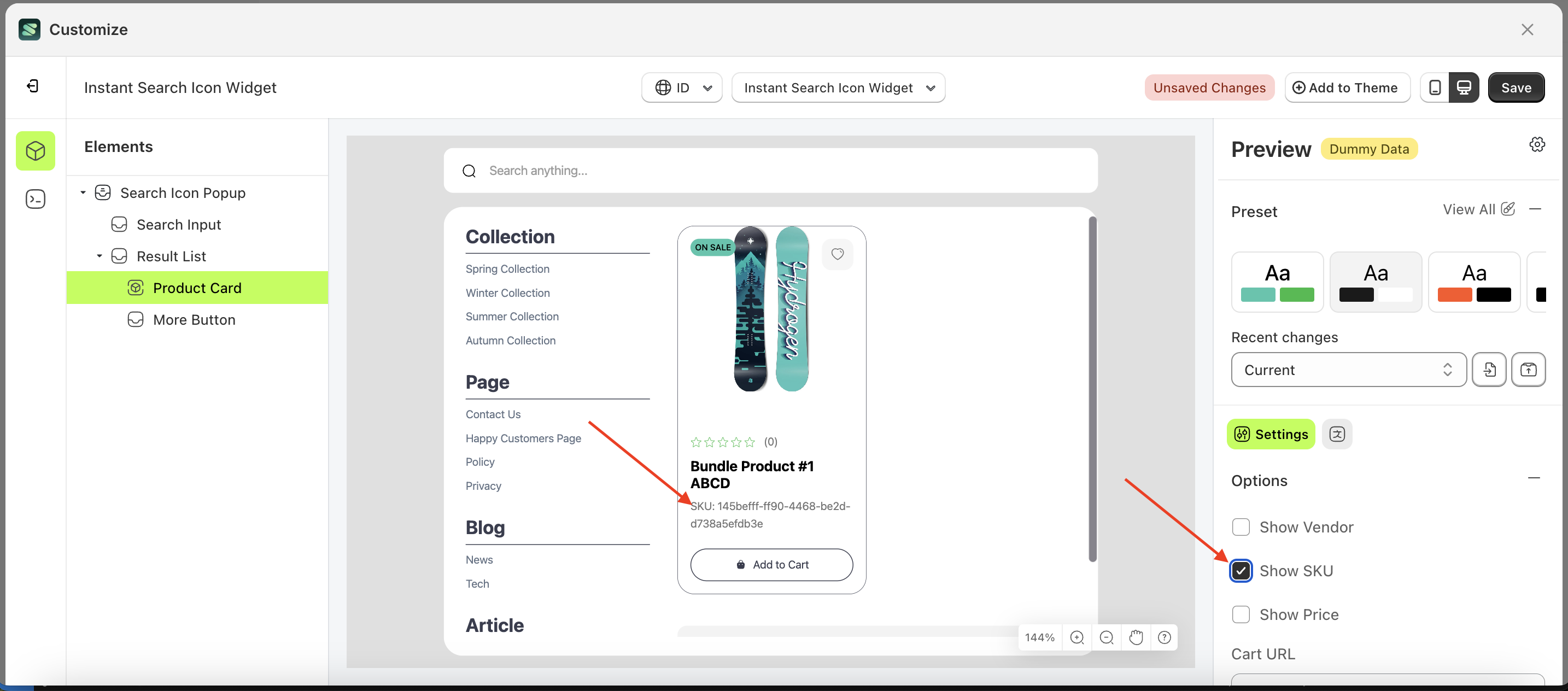
Show SKU
This feature is designed to show or hide information about the product SKU
Follow the steps below:
- Select the Product Card element on the right, then click the Settings tab and click the icon marked with a red arrow.
- Enable the Show Vendor checkbox
- Example : Before Show Vendor is enabled
- Example : After Show Vendor is enabled
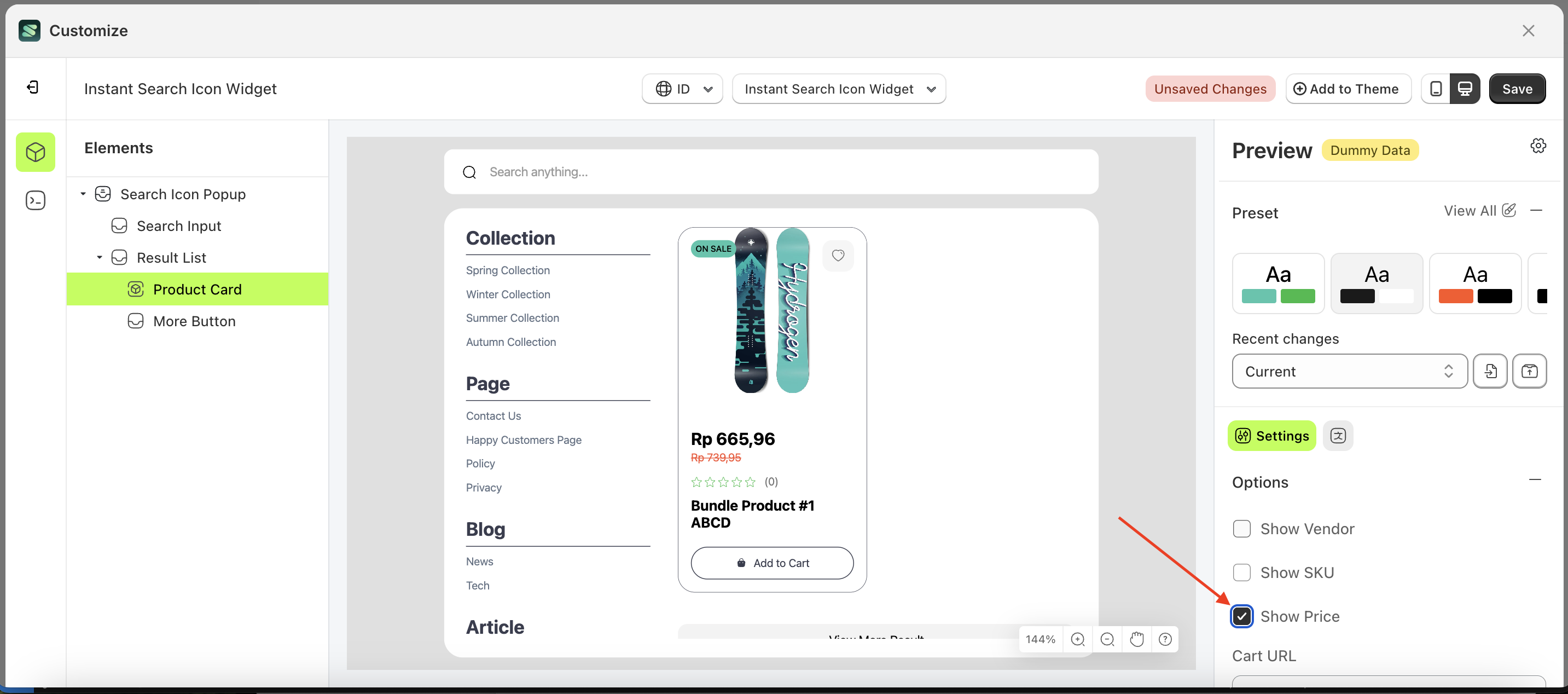
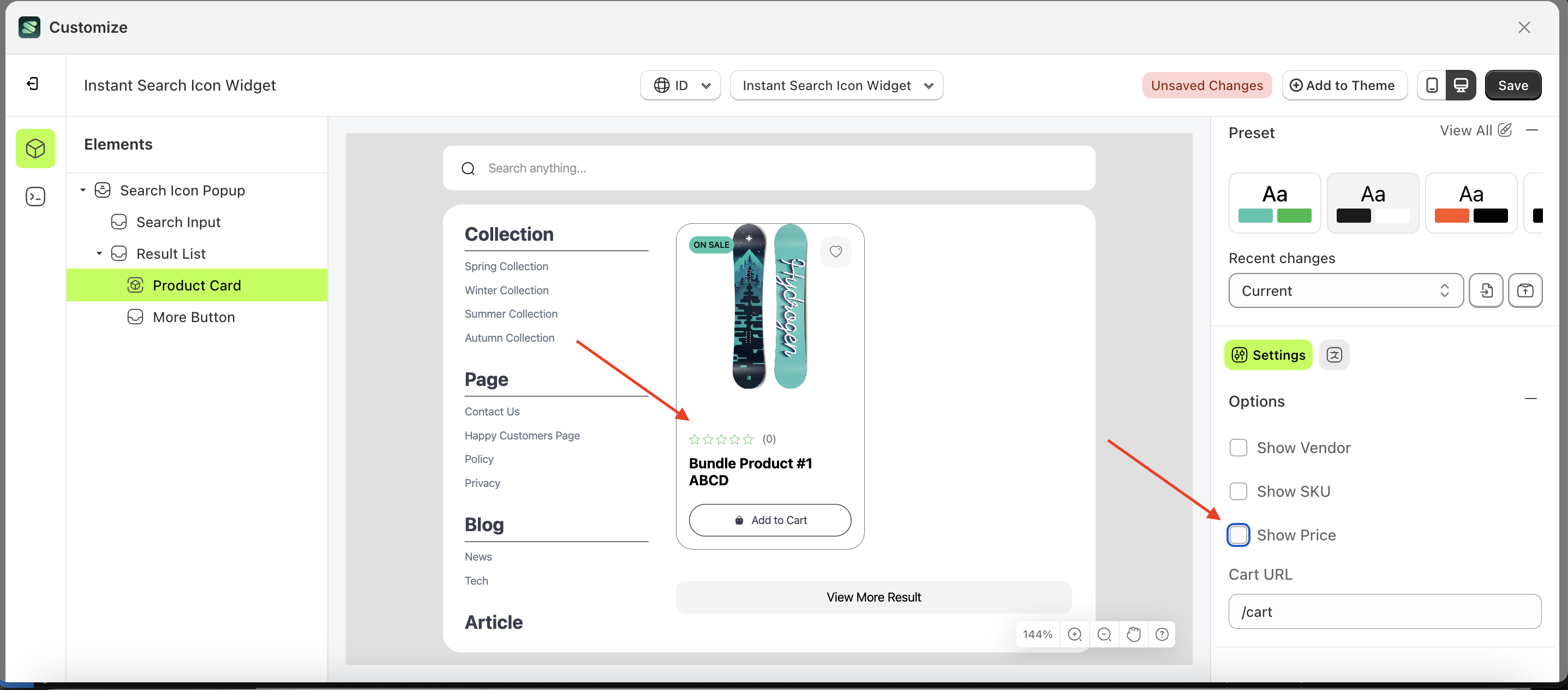
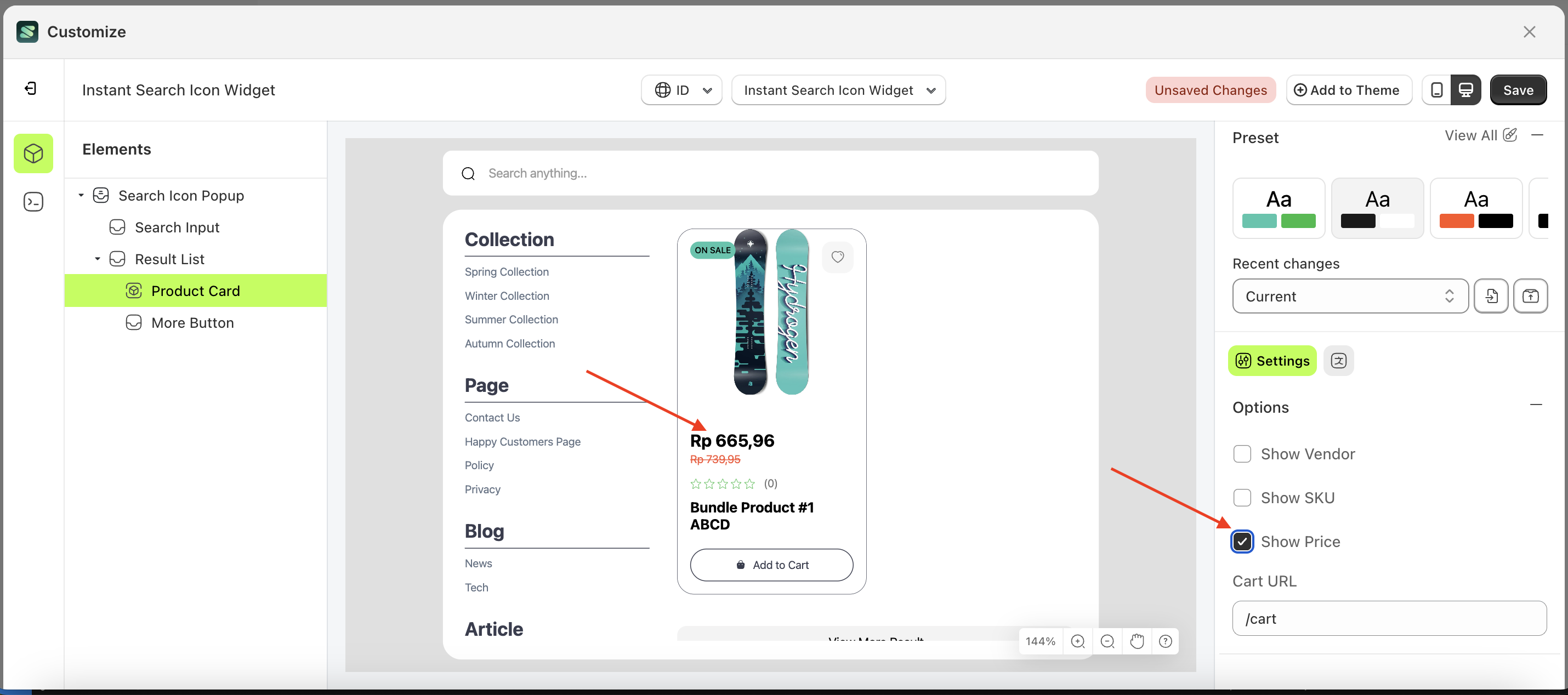
Show Price
This feature is designed to show or hide information about the product Price
Follow the steps below:
- Select the Product Card element on the right, then click the Settings tab and click the icon marked with a red arrow.
- Enable the Show Vendor checkbox
- Example : Before Show Vendor is enabled
- Example : After Show Vendor is enabled