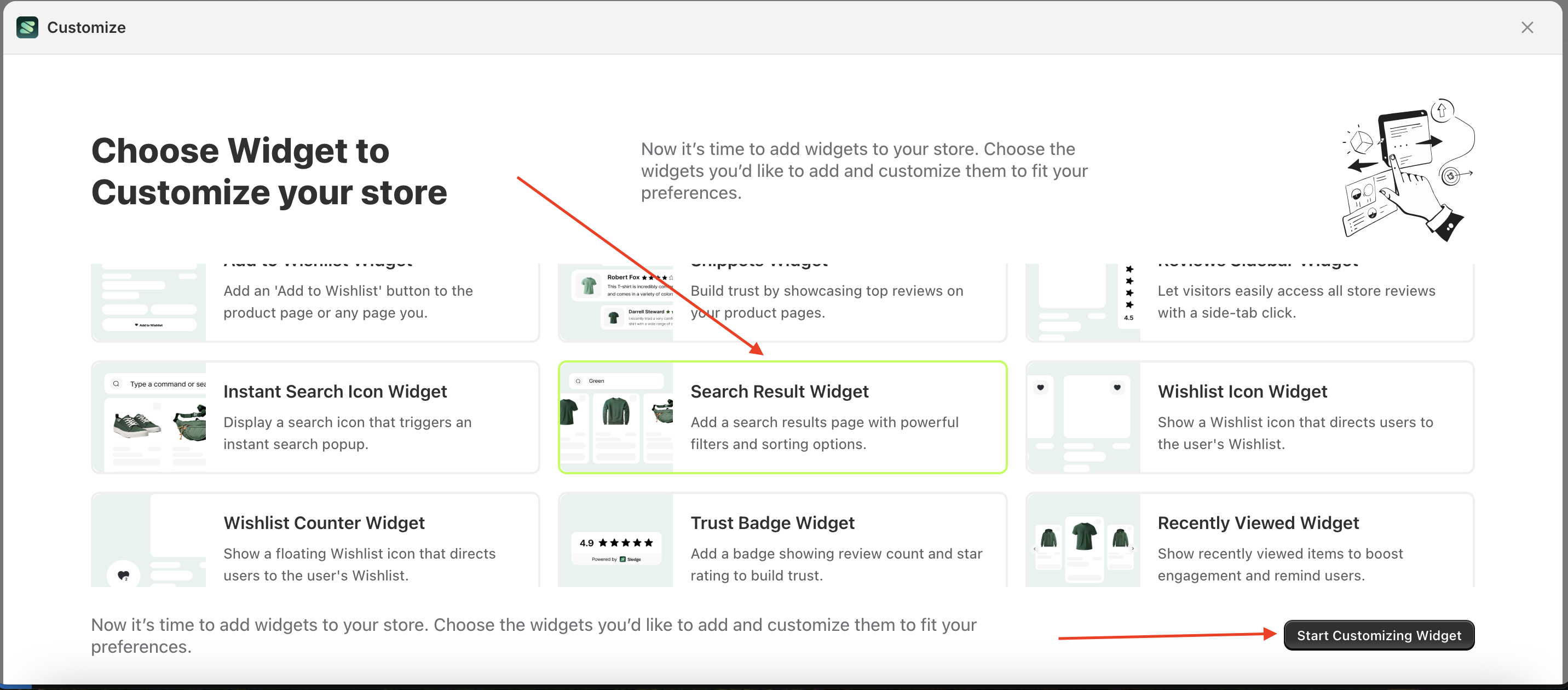
Search result widget
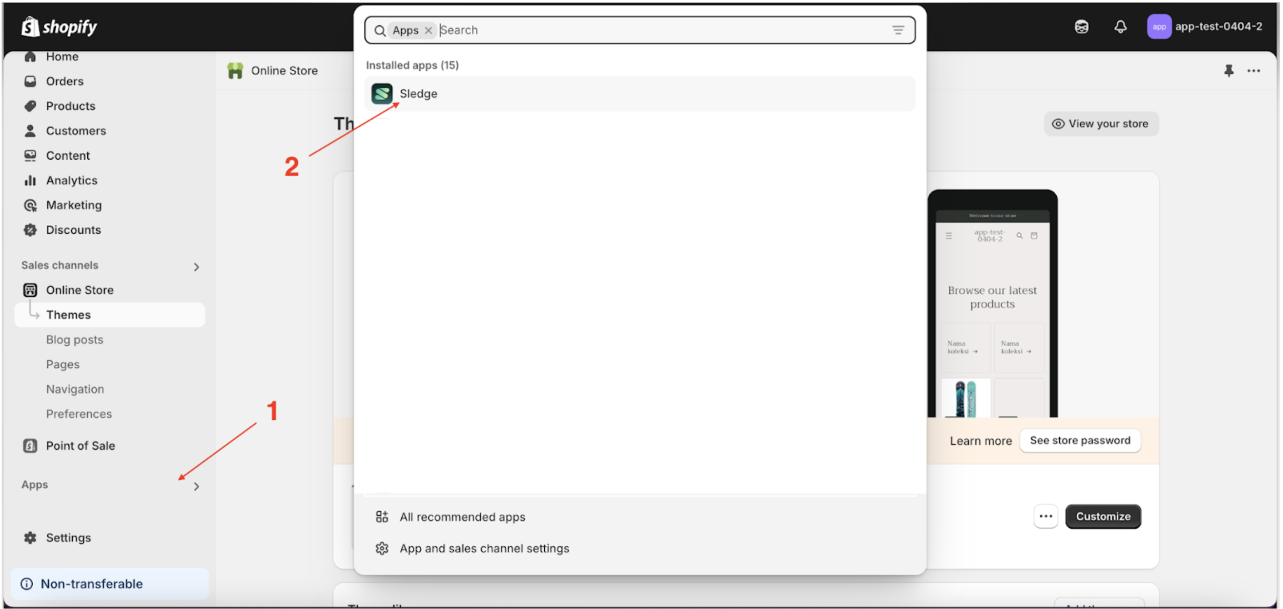
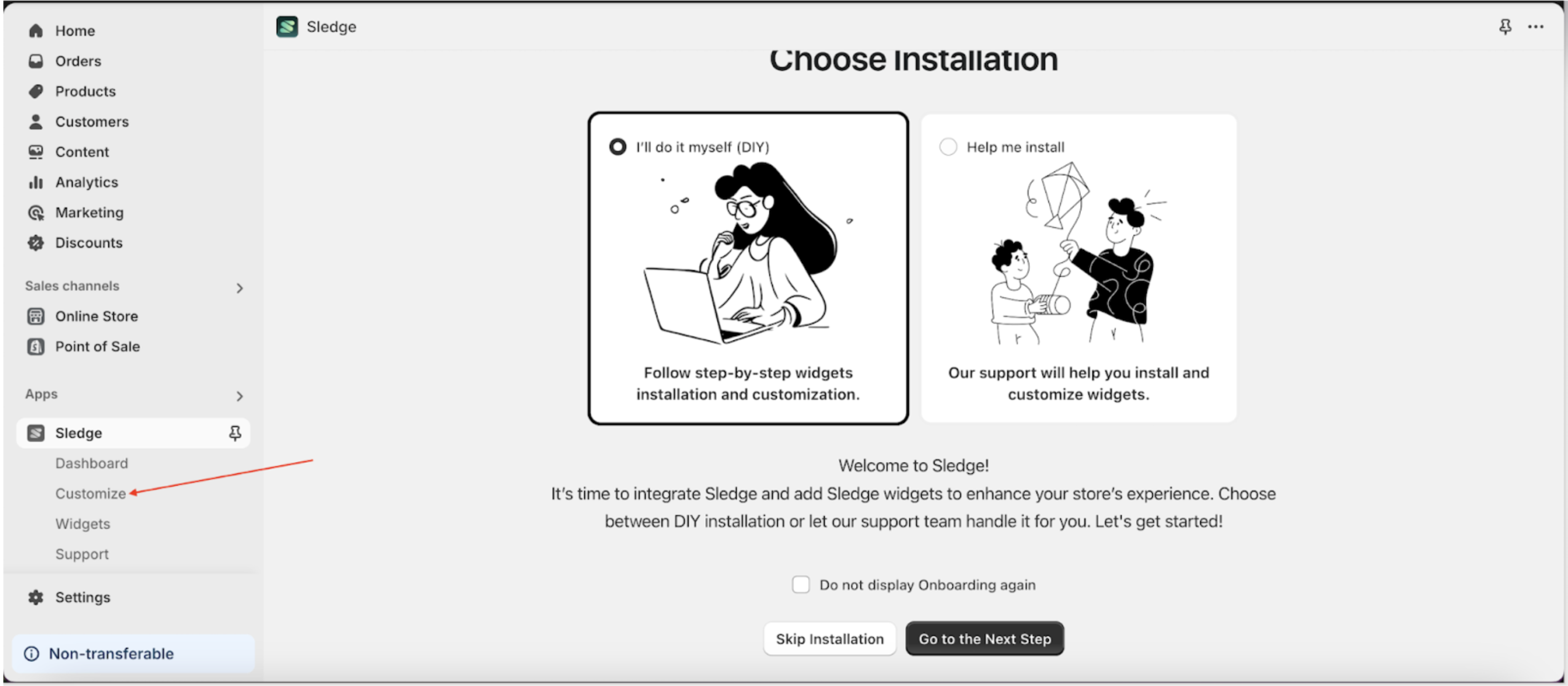
- Go to the Apps Sledge.
- Select the Customizer menu.
- Choose search result widget and click the Start Customizing Widget button.
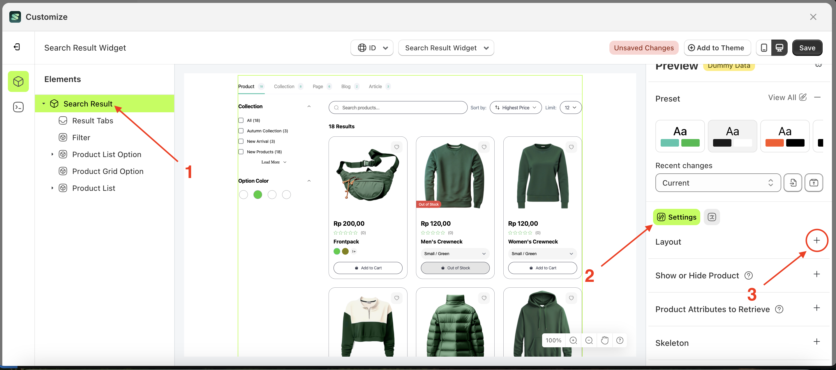
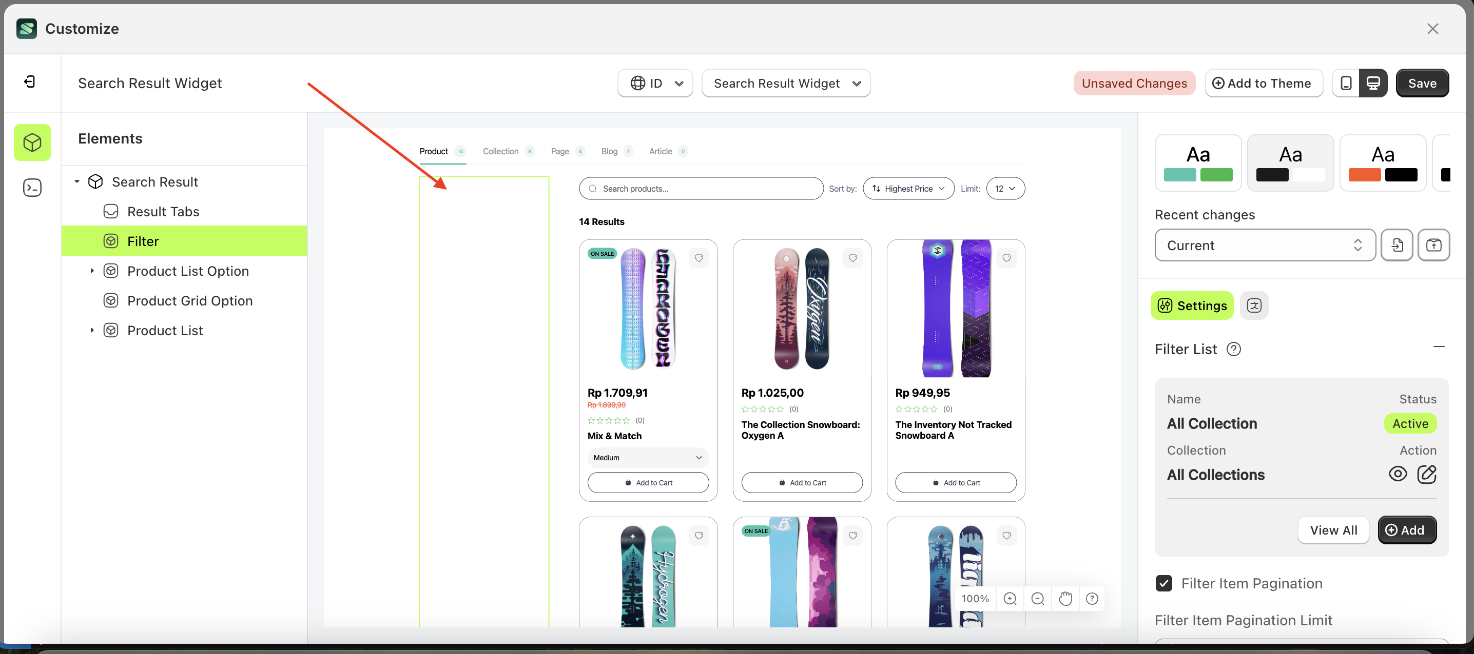
Layout
Purpose of This Layout
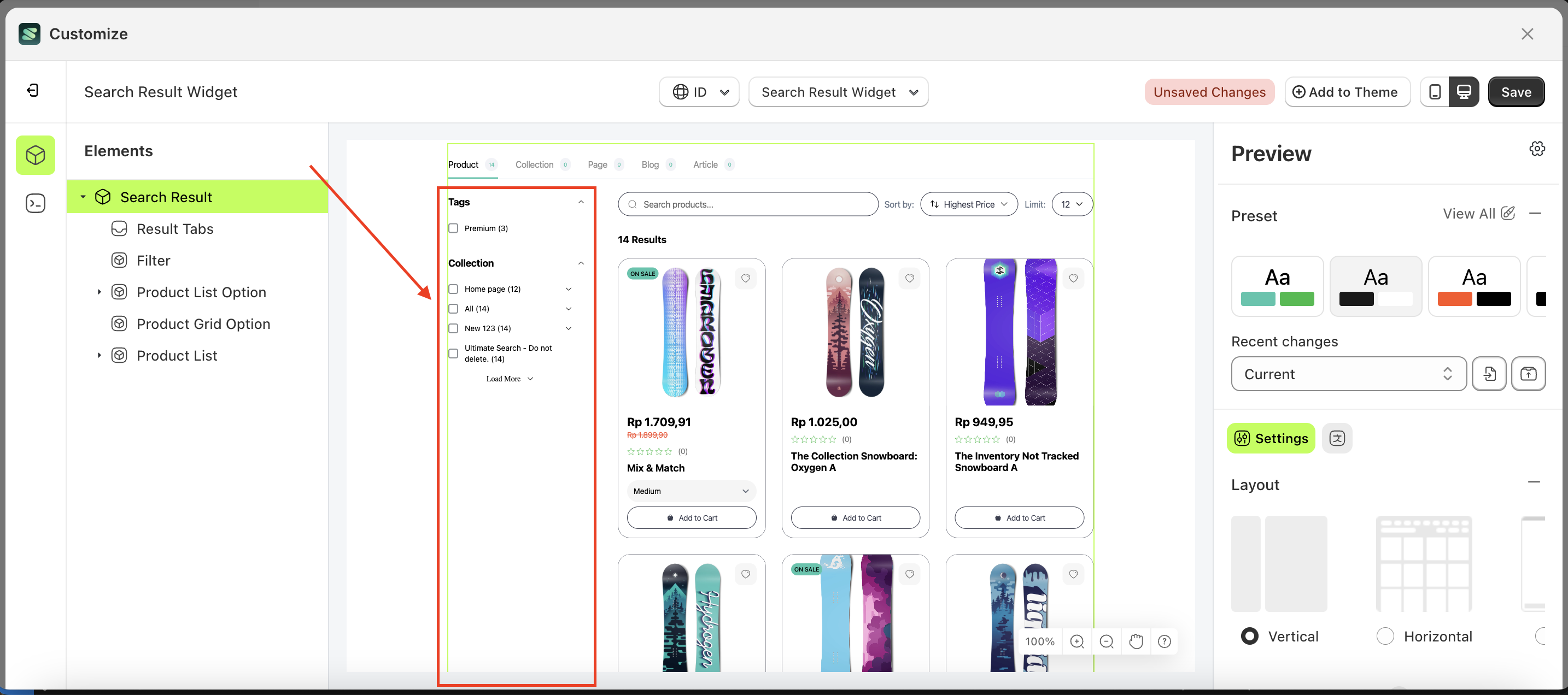
The layout is designed to allow users or merchants to easily change their desired layout without the hassle of creating it from scratch.
Available settings:
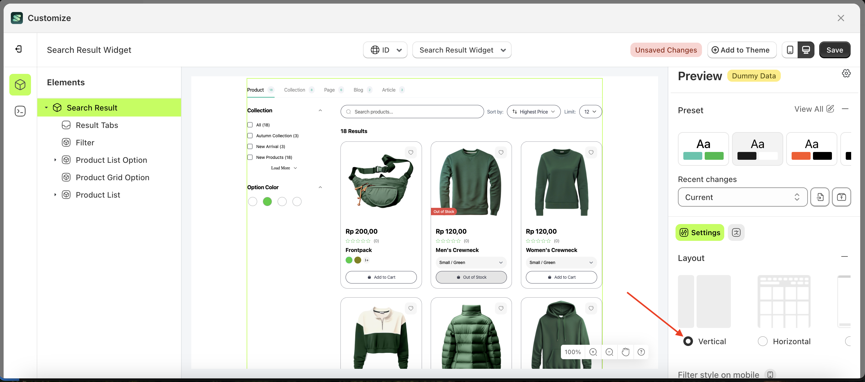
Vertical
Follow the steps below:
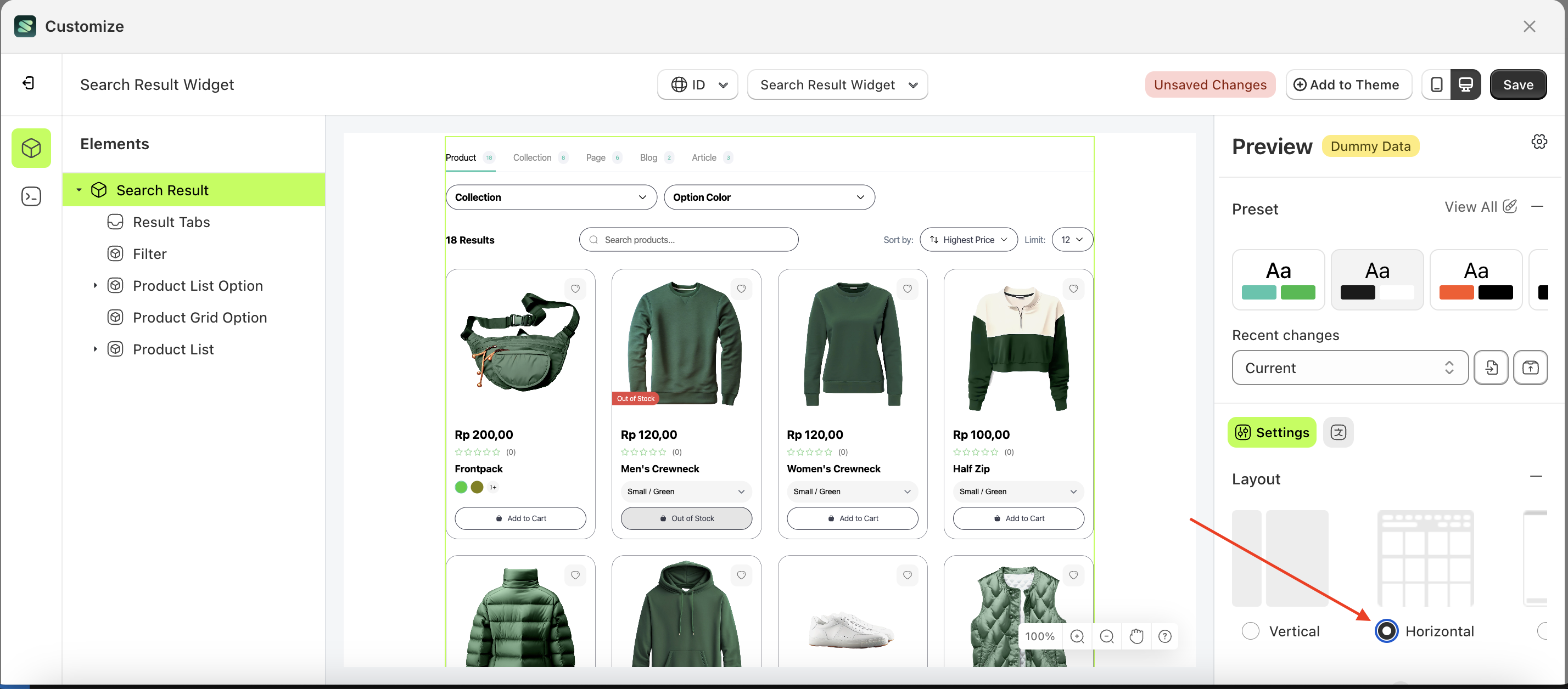
- Select the Search Result element on the left, then click the Settings tab and click the icon marked with a red arrow.
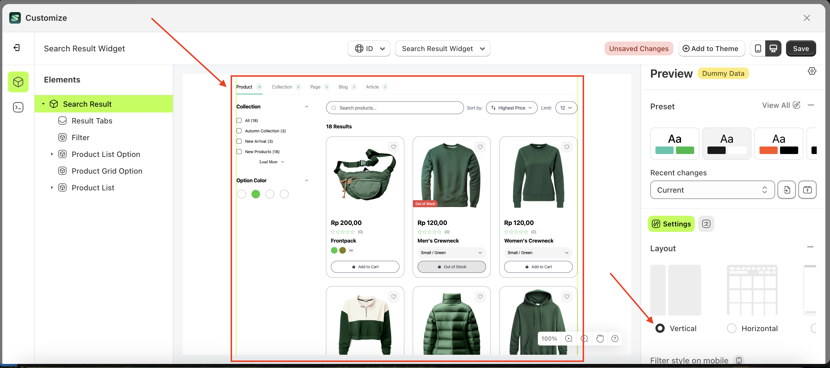
- Select Layout Vertical by following the red arrow
- Here's the chosen layout display.
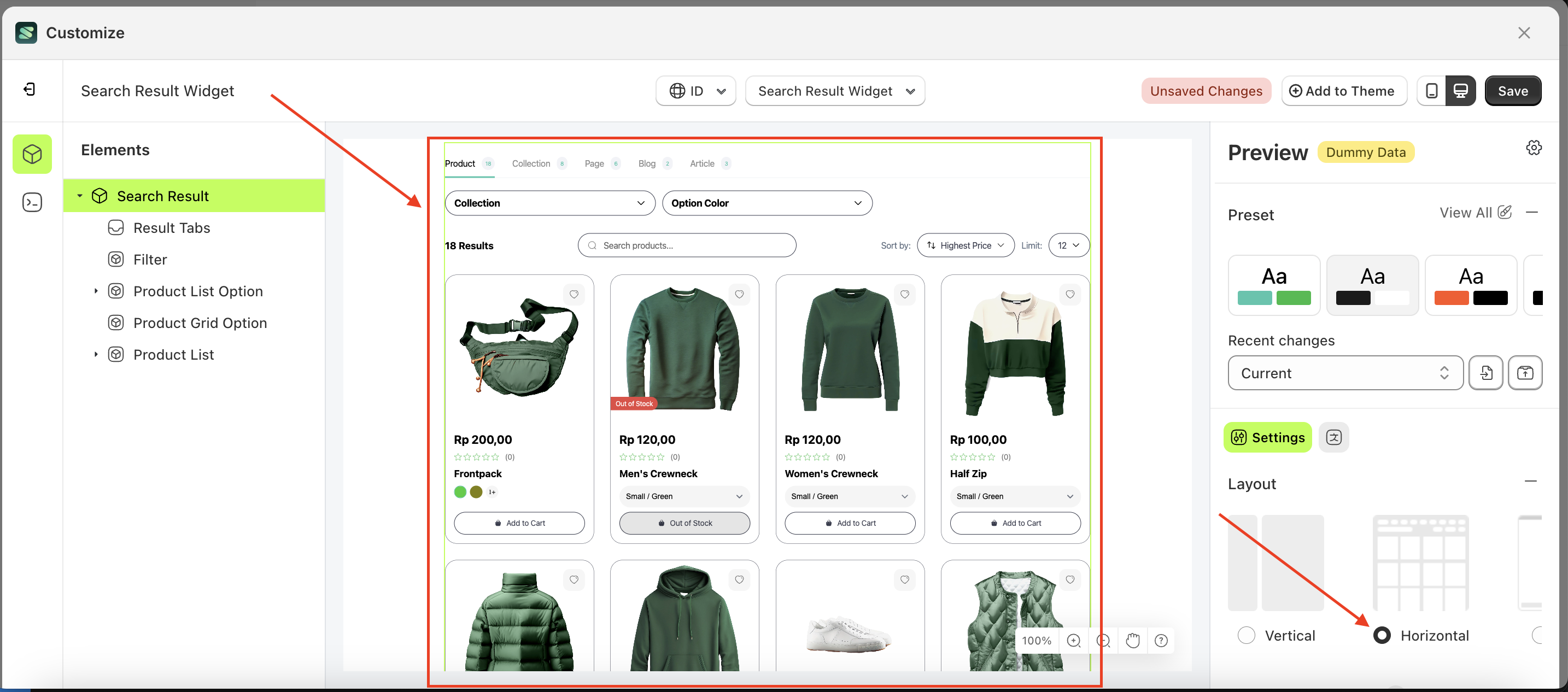
Horizotal
Follow the steps below:
- Select the Search Result element on the left, then click the Settings tab and click the icon marked with a red arrow.
- Select Layout Horizotal by following the red arrow
- Here's the chosen layout display.
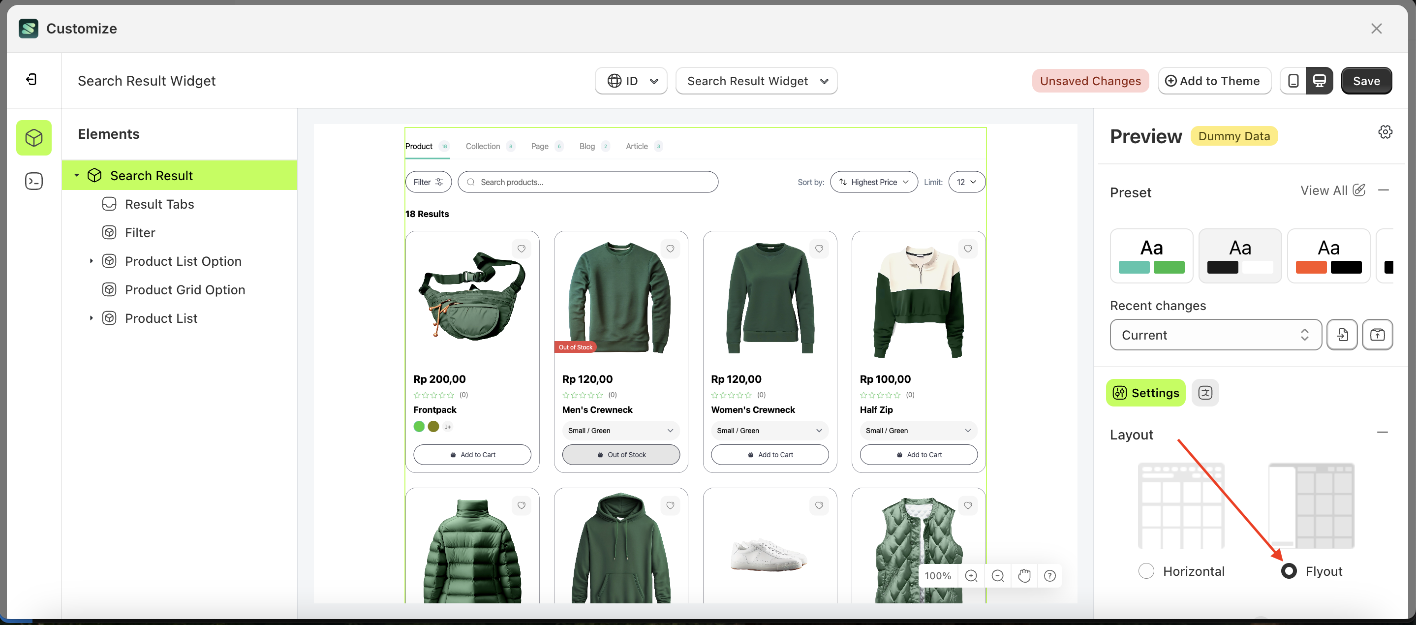
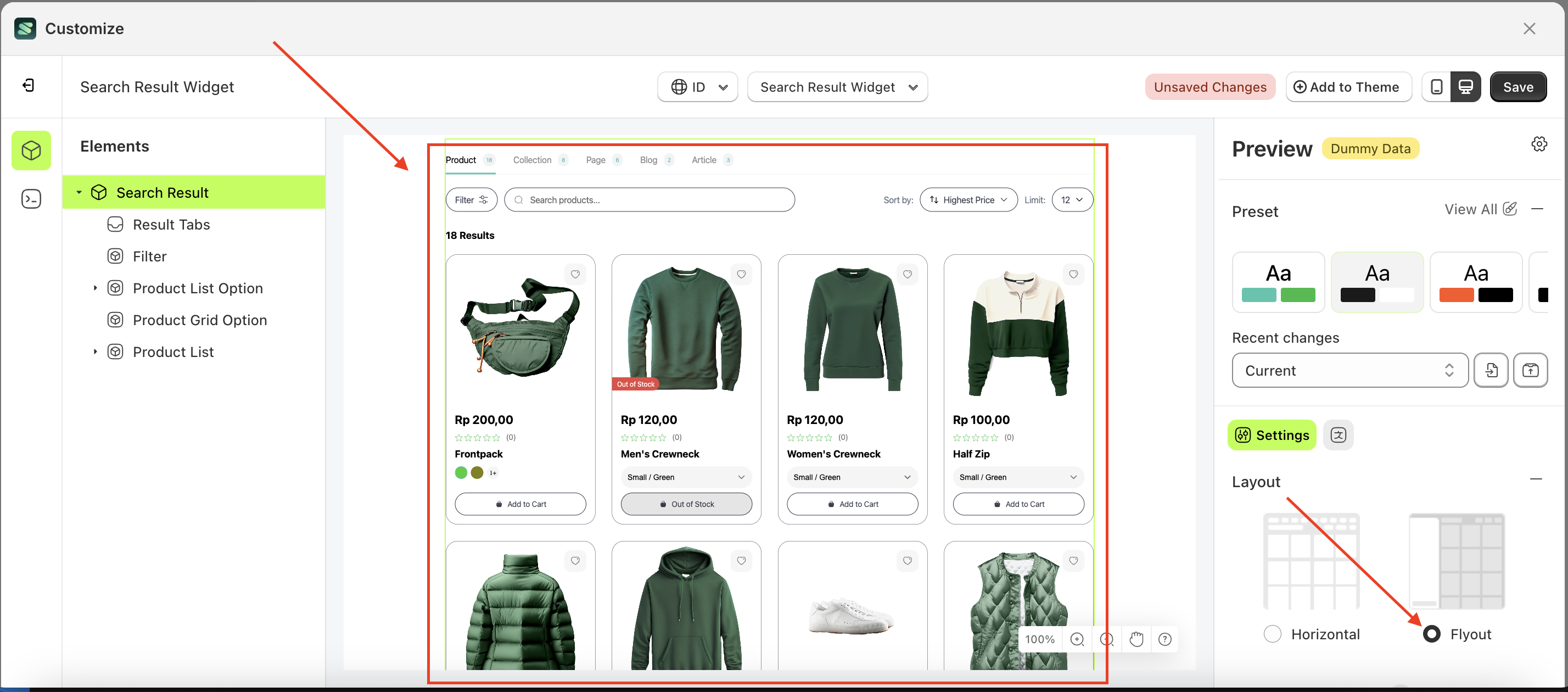
Flyout
Follow the steps below:
- Select the Search Result element on the left, then click the Settings tab and click the icon marked with a red arrow.
- Select Layout Flyout by following the red arrow
- Here's the chosen layout display.
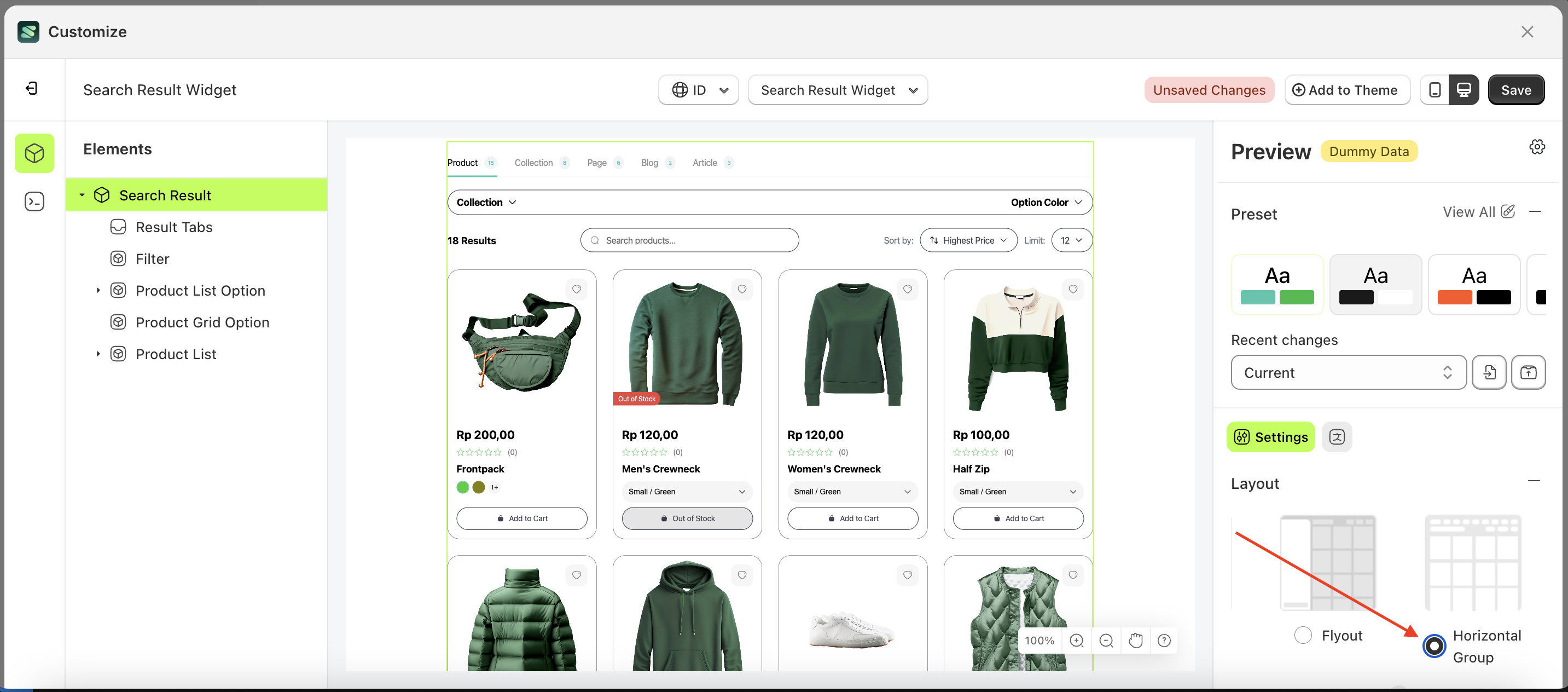
Horizotal Group
Follow the steps below:
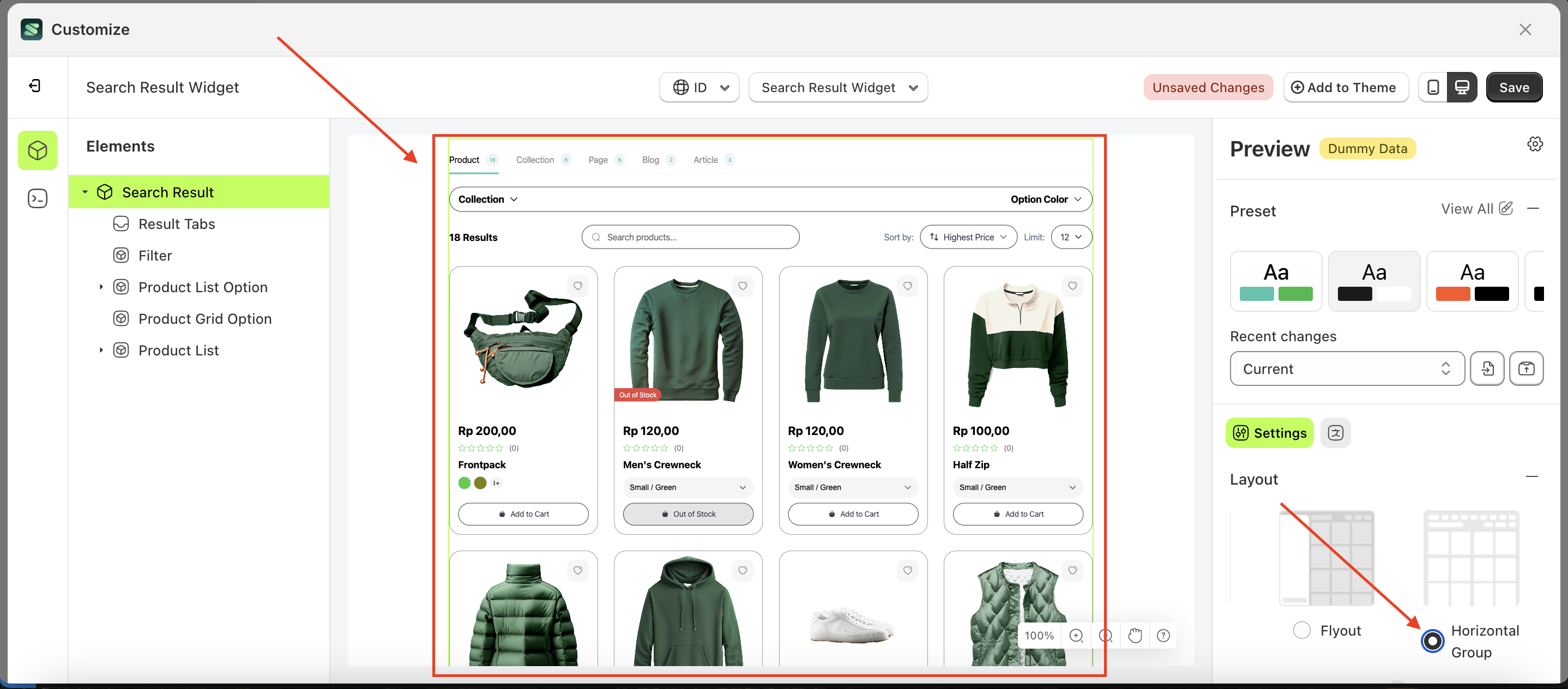
- Select the Search Result element on the left, then click the Settings tab and click the icon marked with a red arrow.
- Select Layout Horizotal Group by following the red arrow
- Here's the chosen layout display.
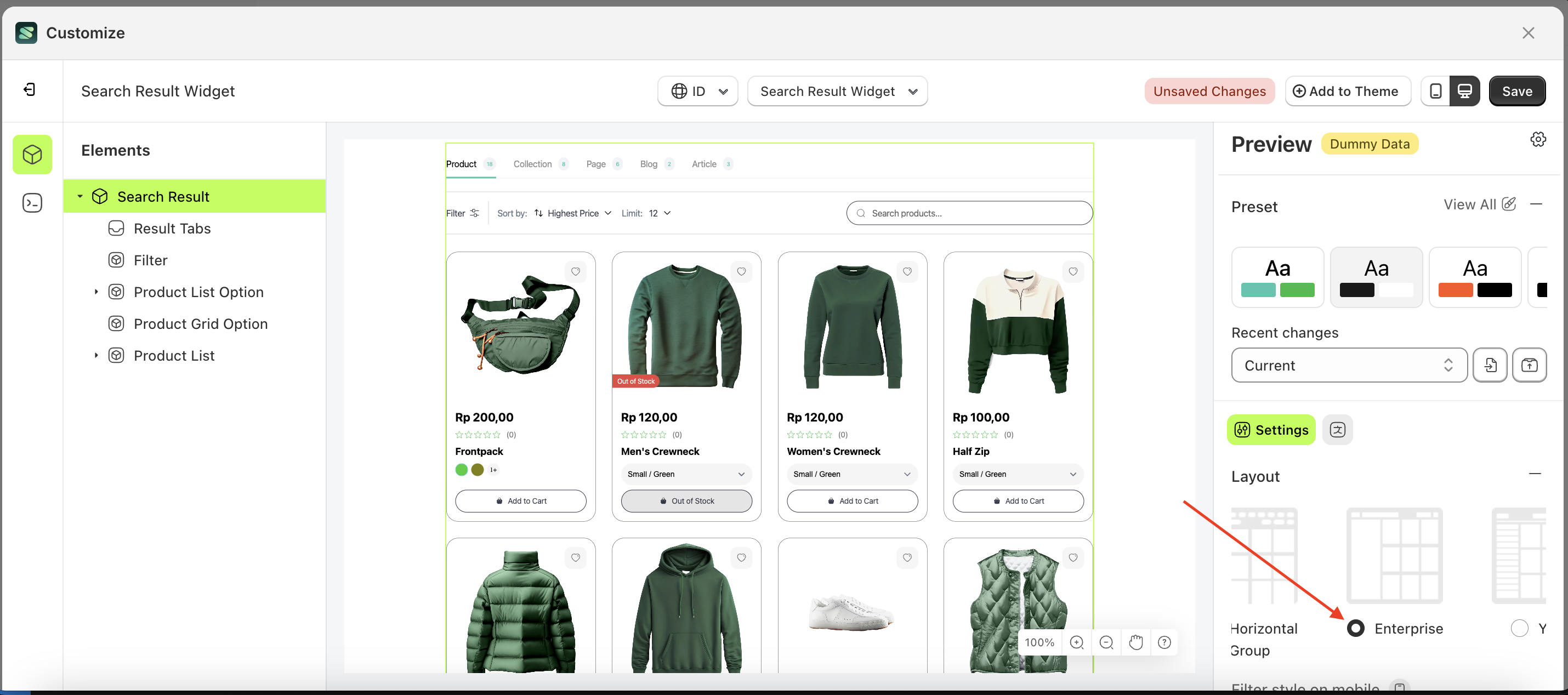
Enterprise
Follow the steps below:
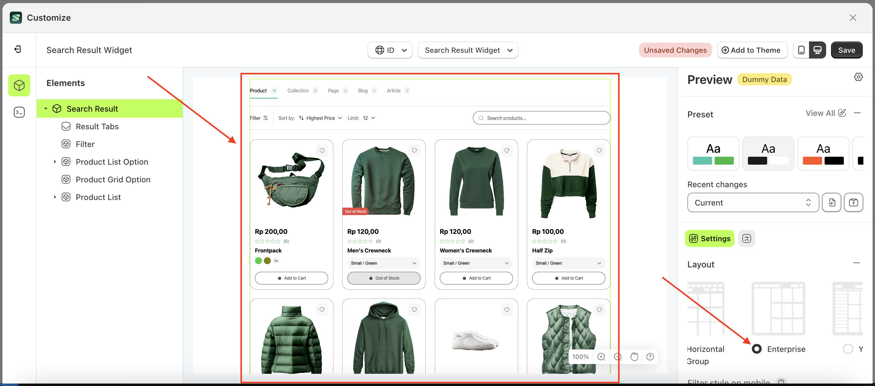
- Select the Search Result element on the left, then click the Settings tab and click the icon marked with a red arrow.
- Select Layout Enterprise by following the red arrow
- Here's the chosen layout display.
Yuva
Follow the steps below:
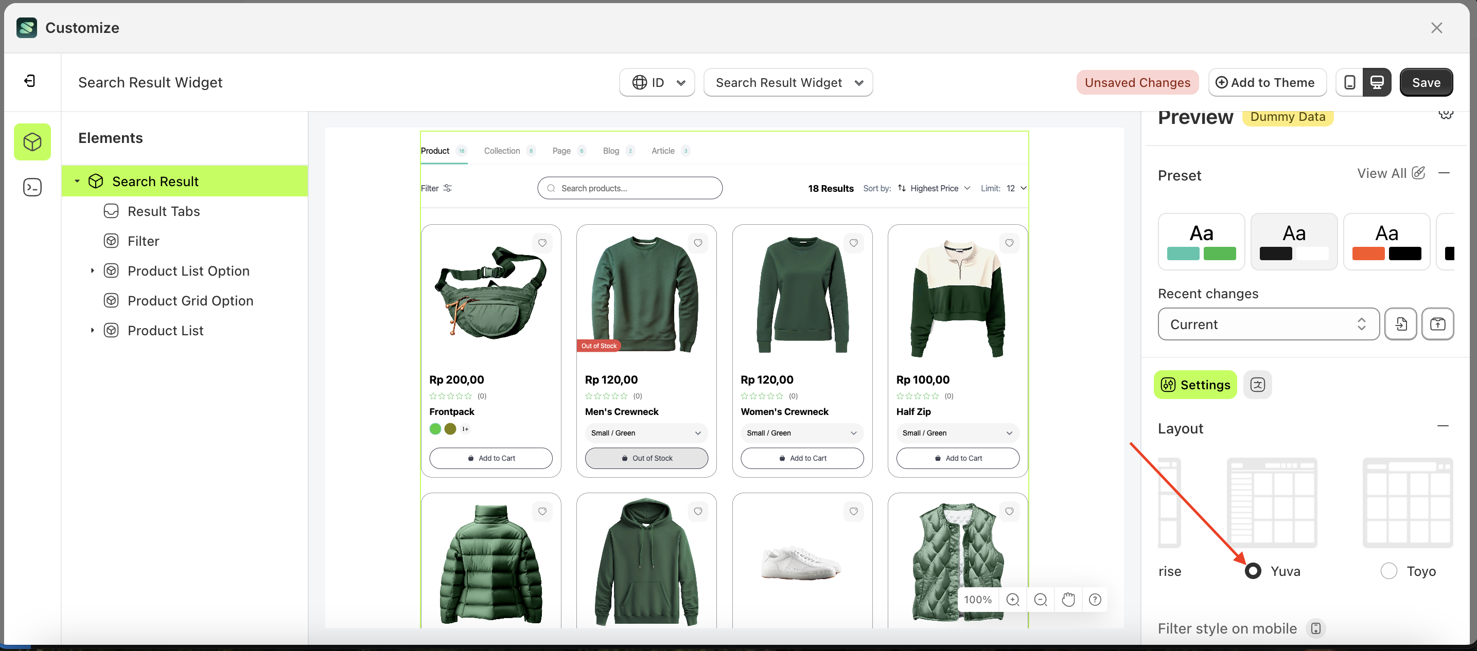
- Select the Search Result element on the left, then click the Settings tab and click the icon marked with a red arrow.
- Select Layout Yuva by following the red arrow
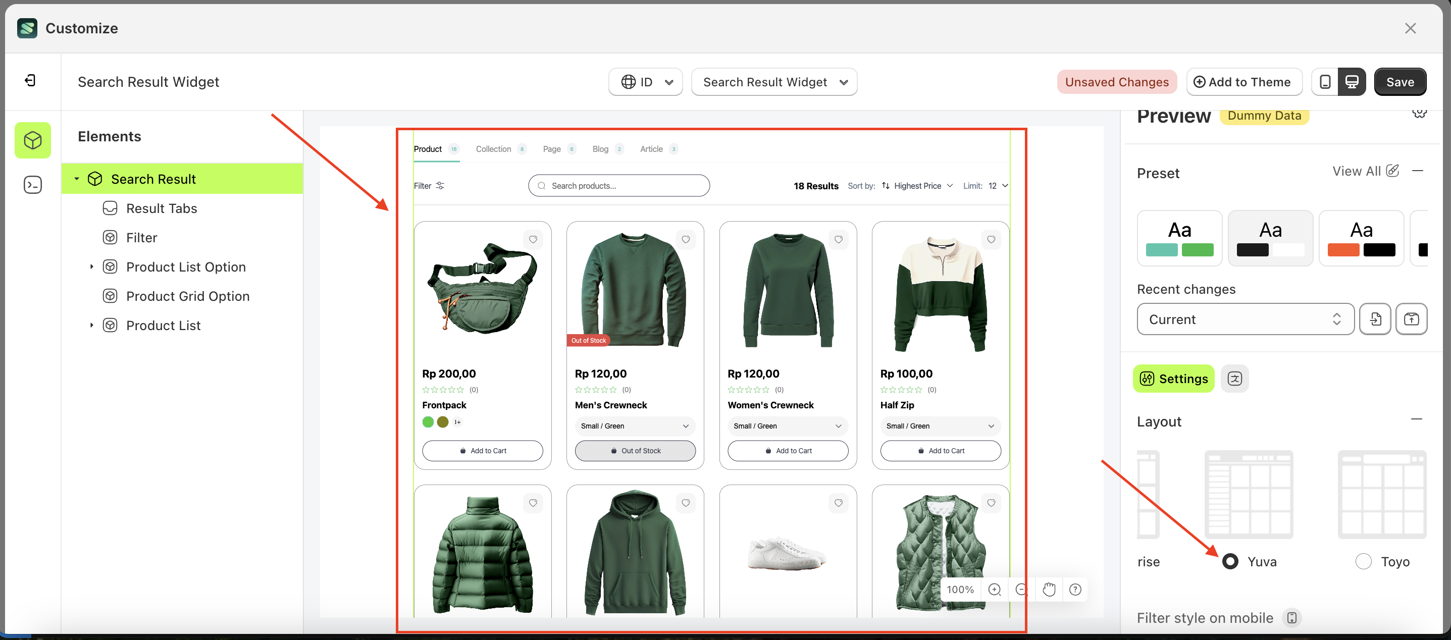
- Here's the chosen layout display.
Toyo
Follow the steps below:
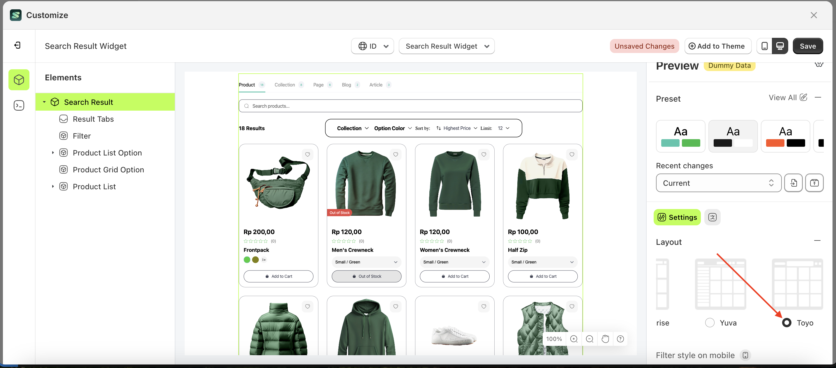
- Select the Search Result element on the left, then click the Settings tab and click the icon marked with a red arrow.
- Select Layout Toyo by following the red arrow
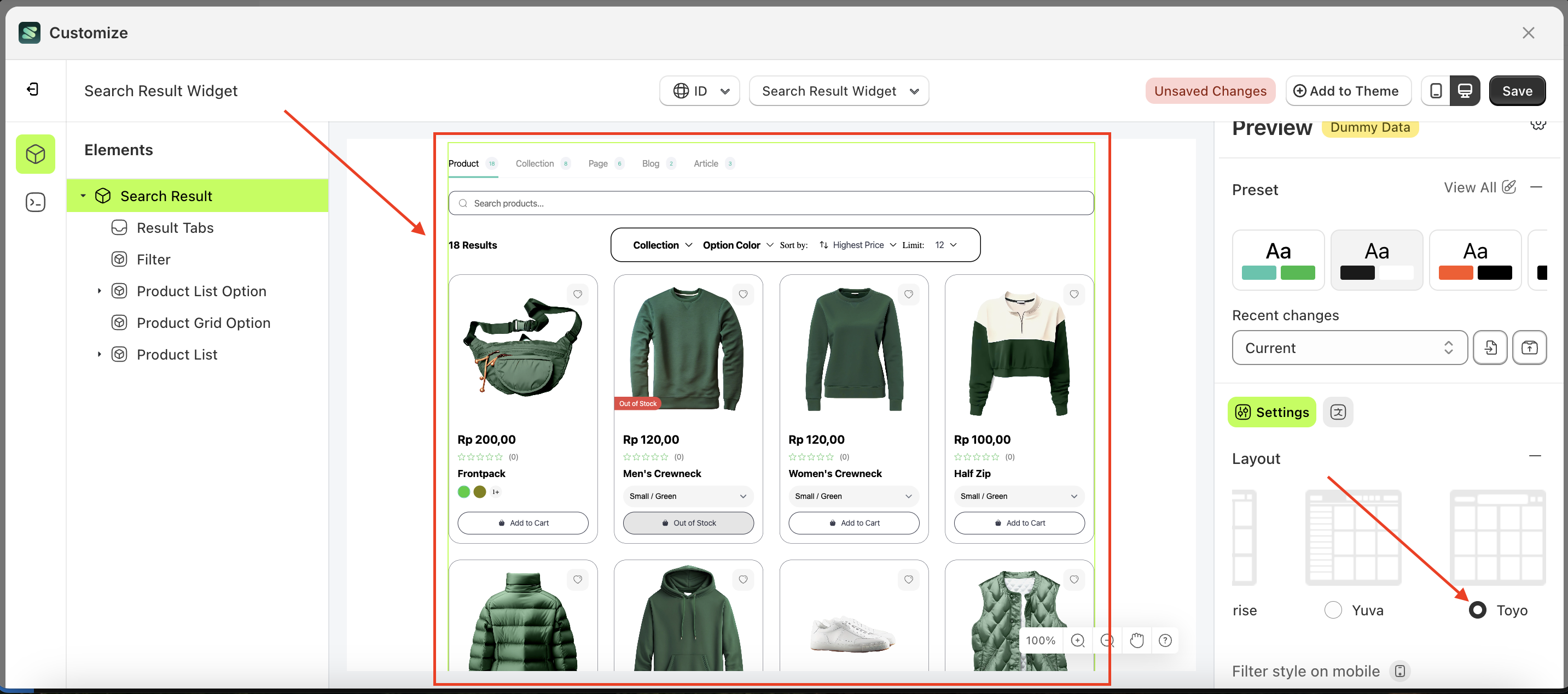
- Here's the chosen layout display.
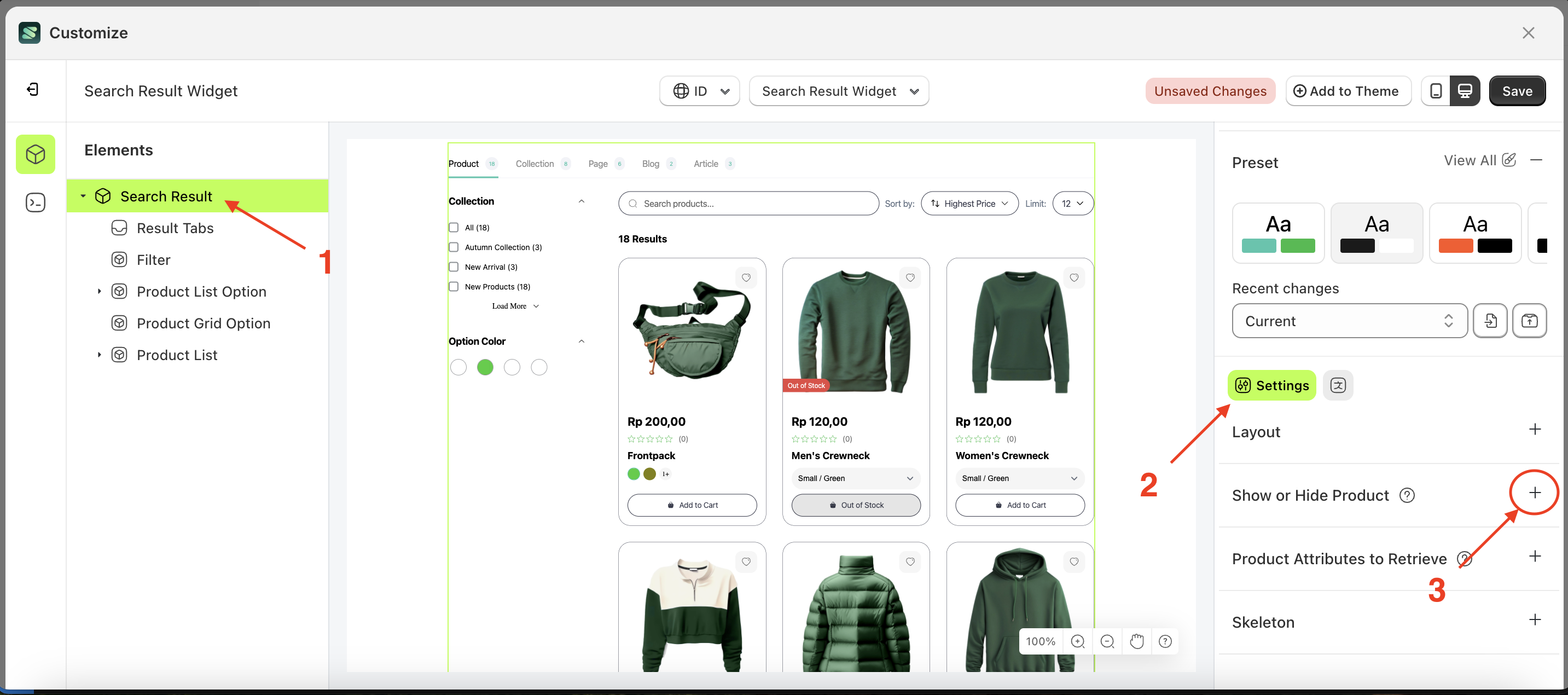
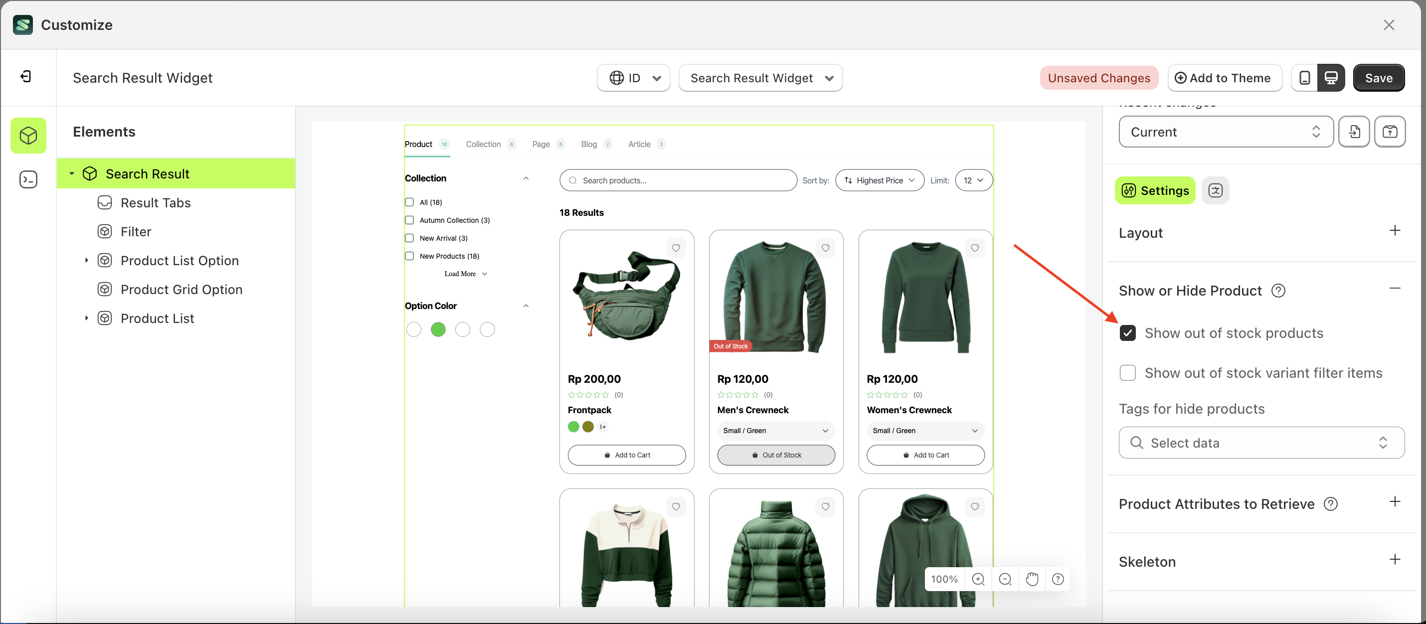
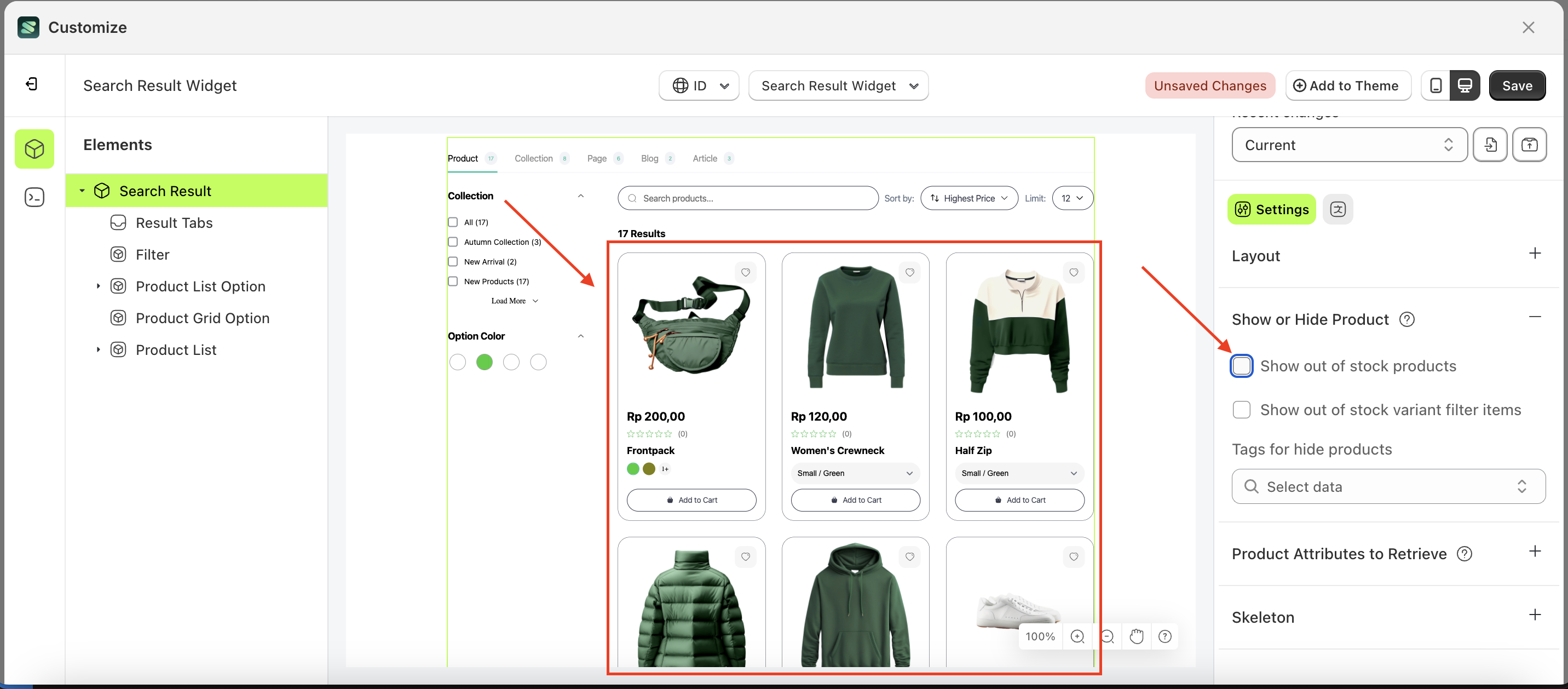
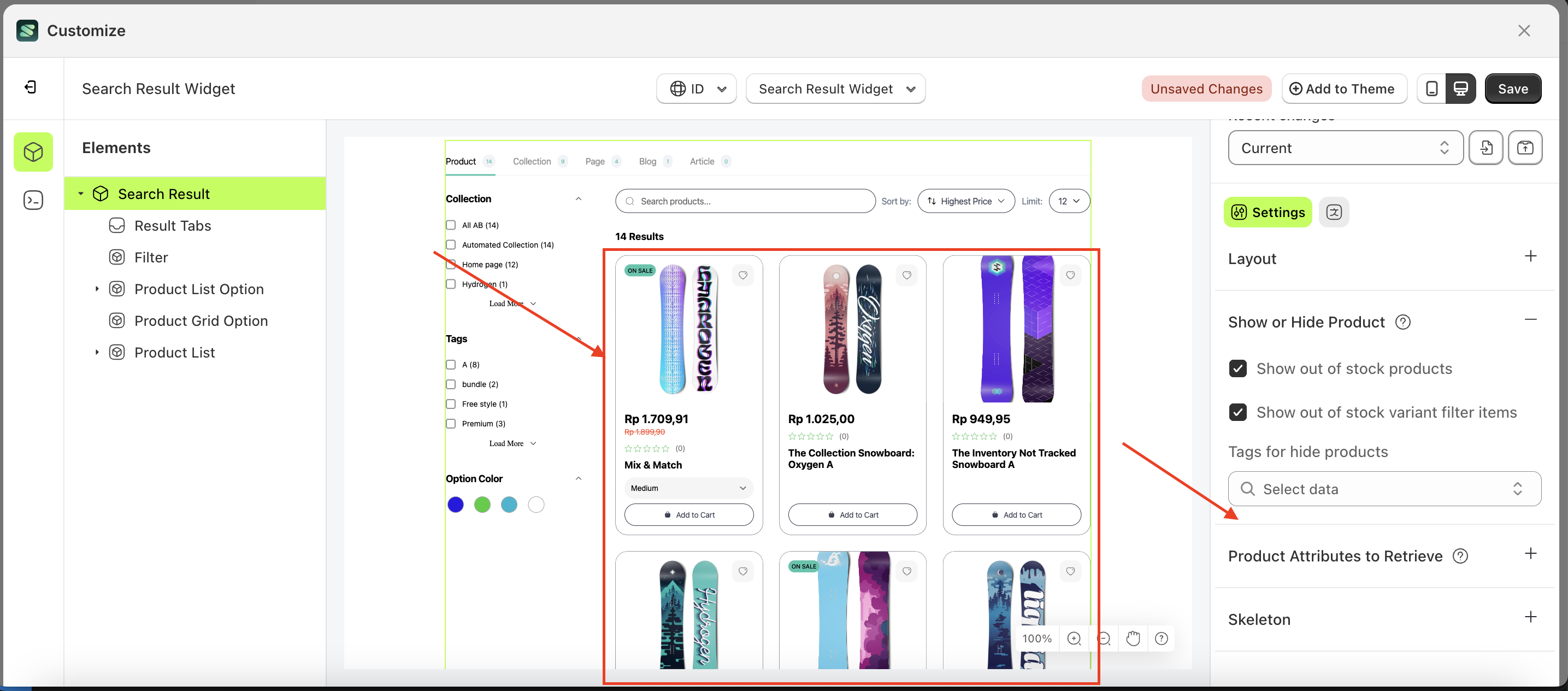
Show or Hide Product
This setting feature allows you to display or hide products or product variants that are out of stock.
When the "Show out of stock products" or "Show out of stock variant filter items" option is checked, out-of-stock products orvariants will still be displayed.
Show out of stock products
Follow the steps below:
- Select the Show Result element on the right, then click the Settings tab and click the icon marked with a red arrow.
- Enable the Show out of stock products checkbox
- Example : Before Show out of stock products is enabled
- Example : After Show out of stock products is enabled
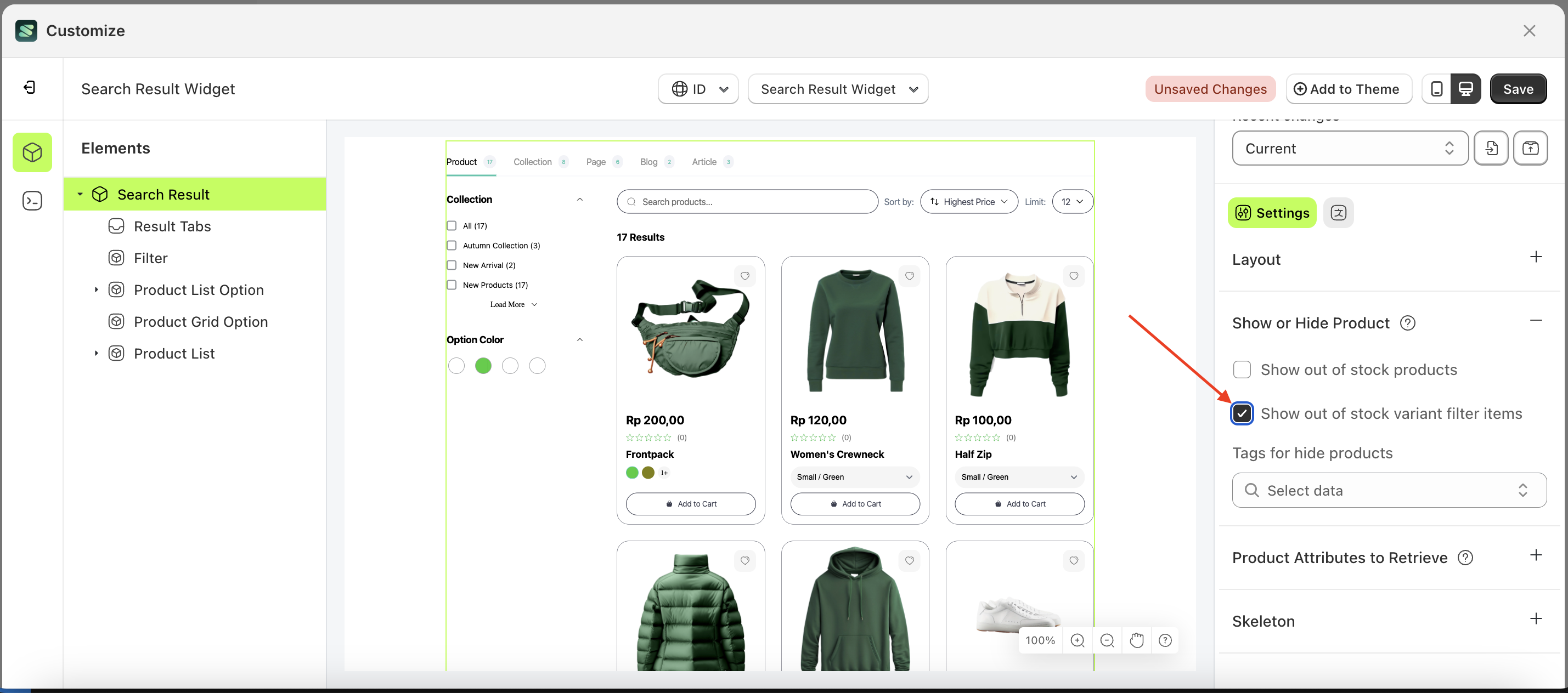
Show out of stock variant filter items
Follow the steps below:
- Select the Search Input element on the right, then click the Settings tab and click the icon marked with a red arrow.
- Enable the Show out of stock variant filter items checkbox
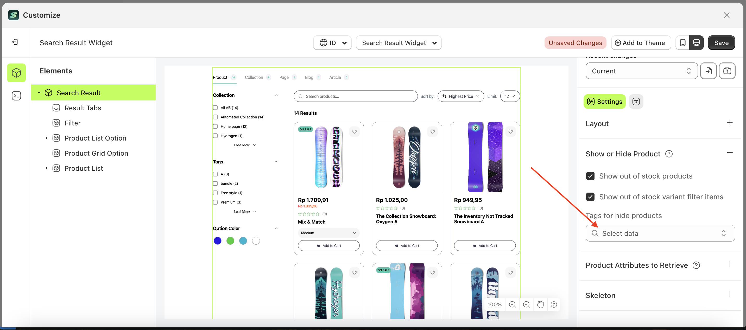
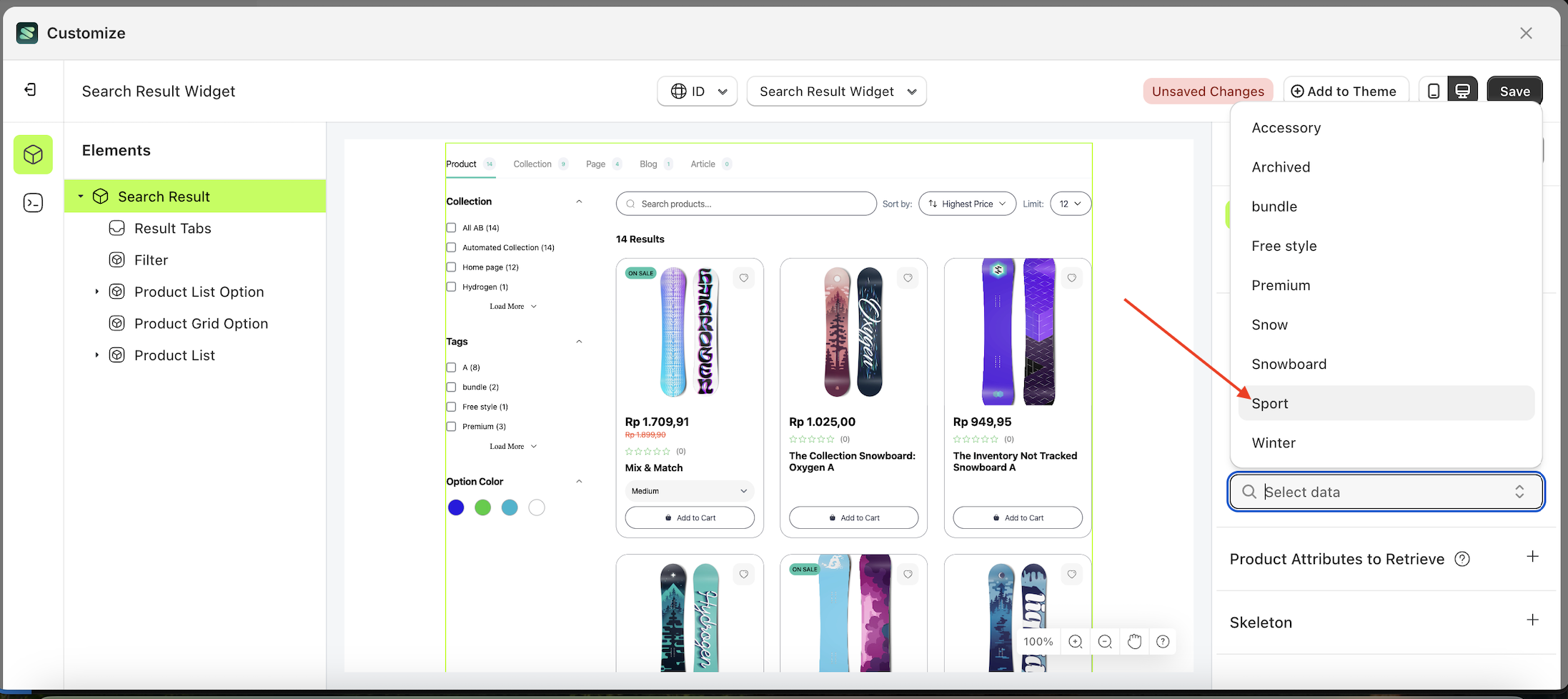
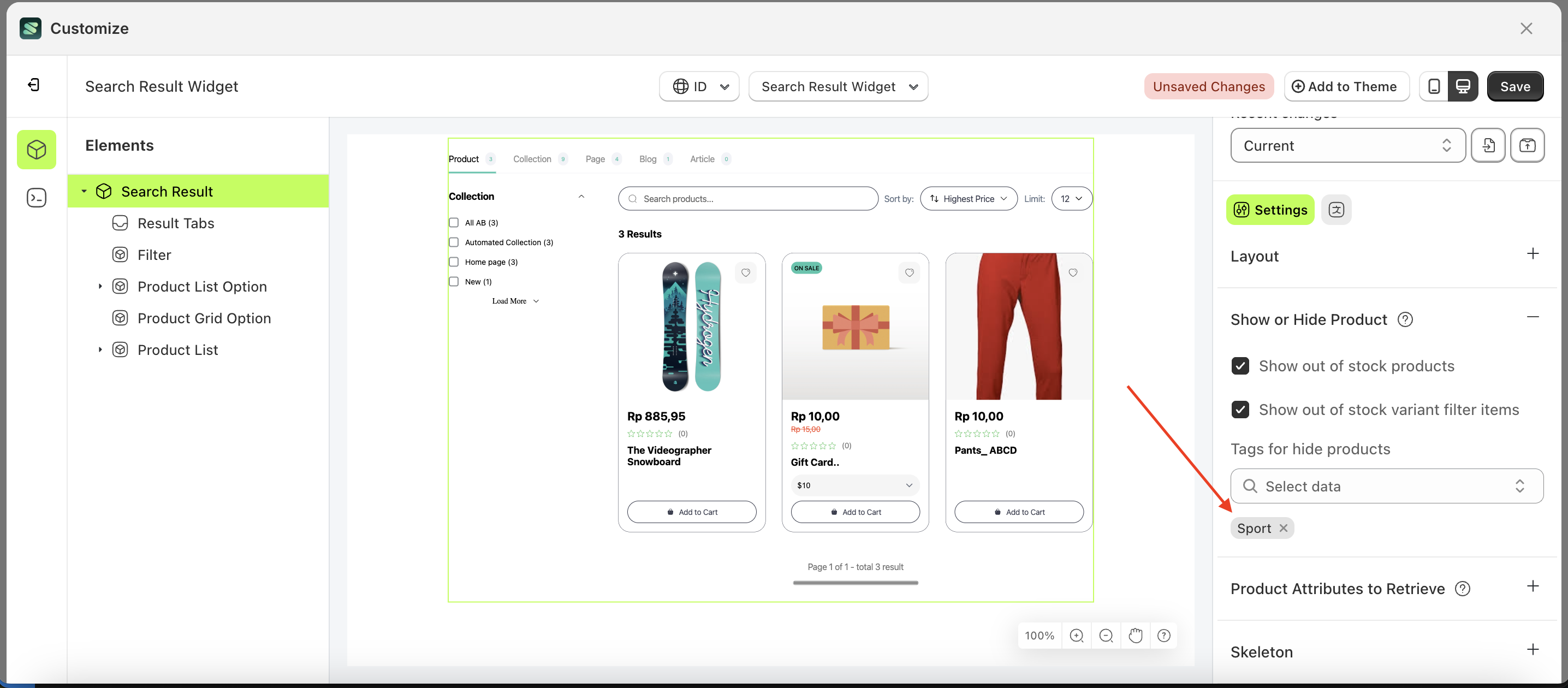
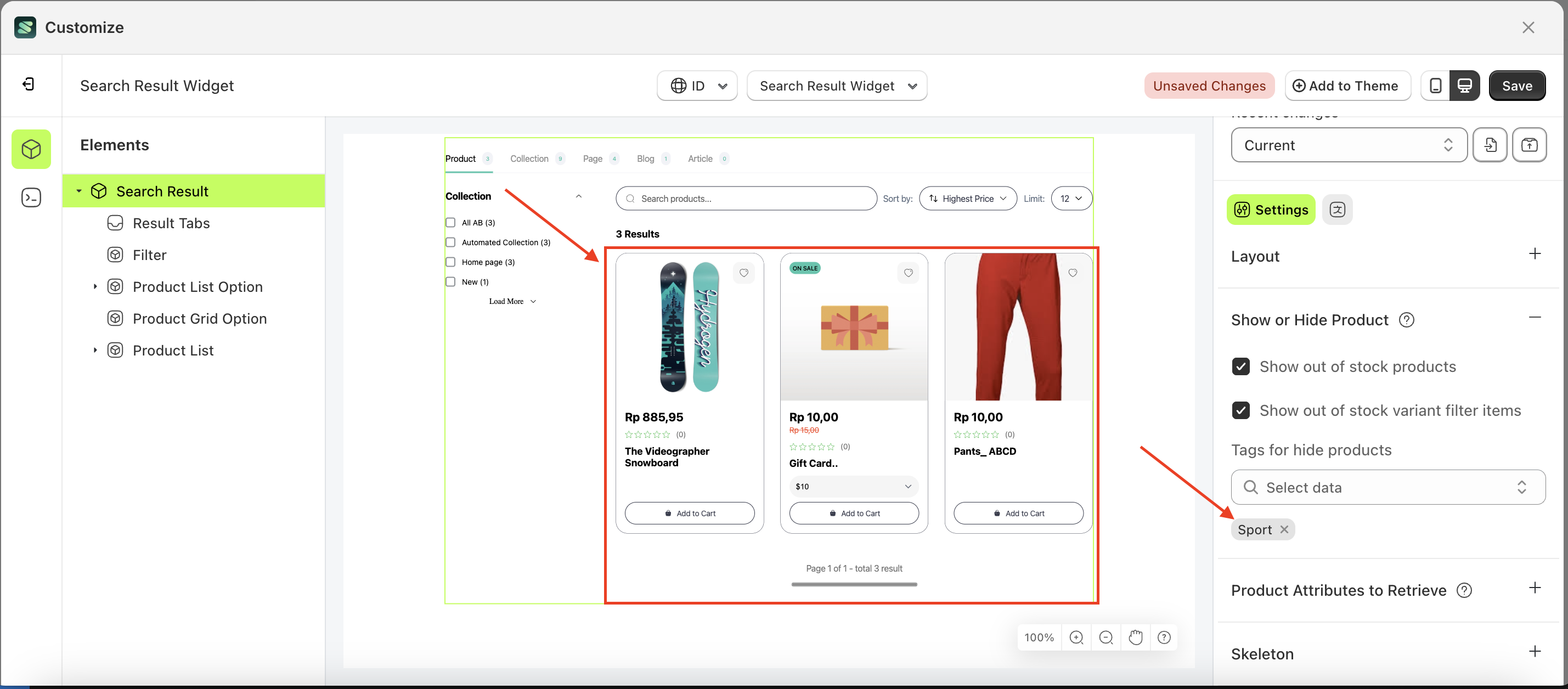
Tags for hide products
This feature is designed to manage products that will be hidden based on the desired tags.
Follow the steps below:
- Select the element on the right, then click the Settings tab and click the icon marked with a red arrow.
- Click the data select element the keyboard input you want to create.
- A list of data will appear.
- Select the desired data
- Once selected, your choice will be displayed below the data select element.
- Before creating the keyword input.
- After creating the keyword input.
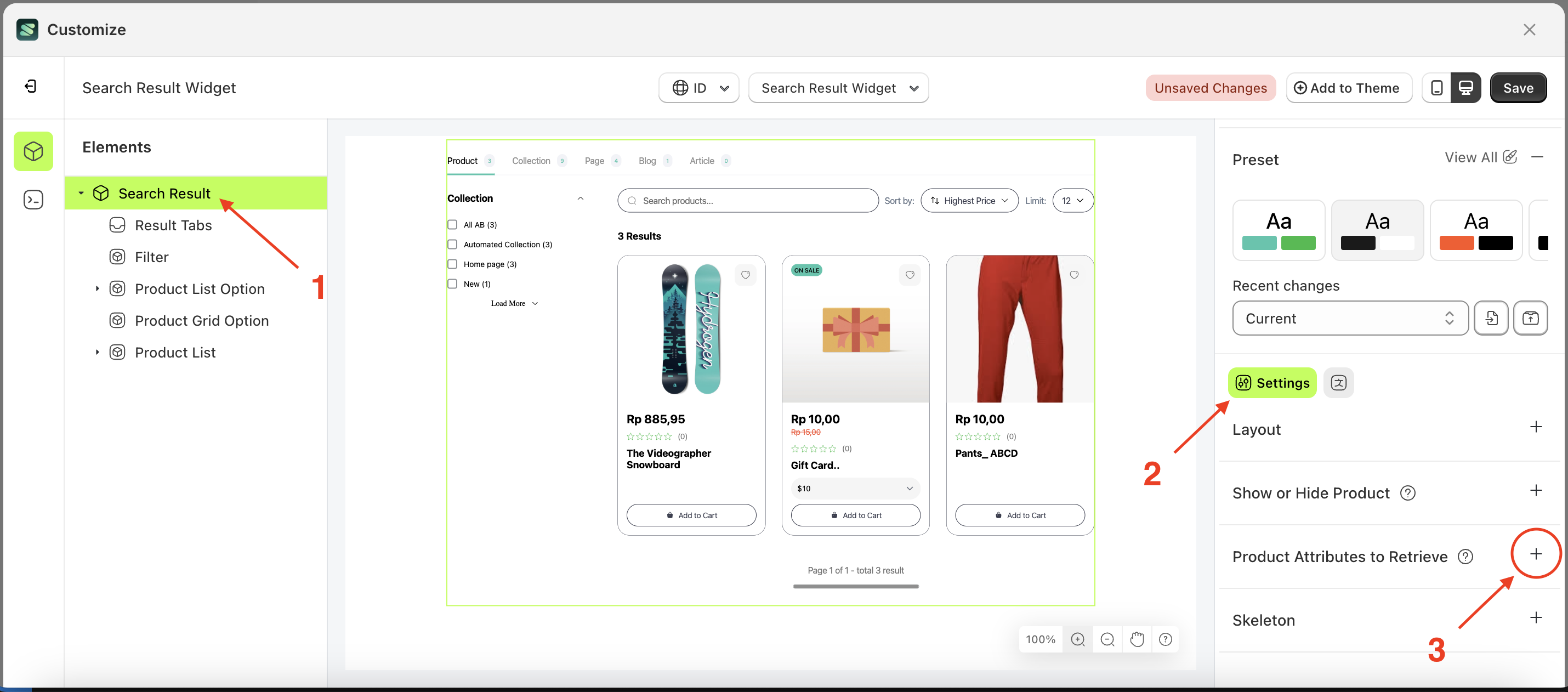
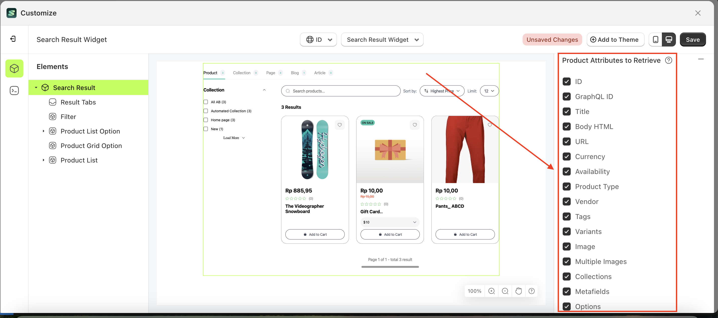
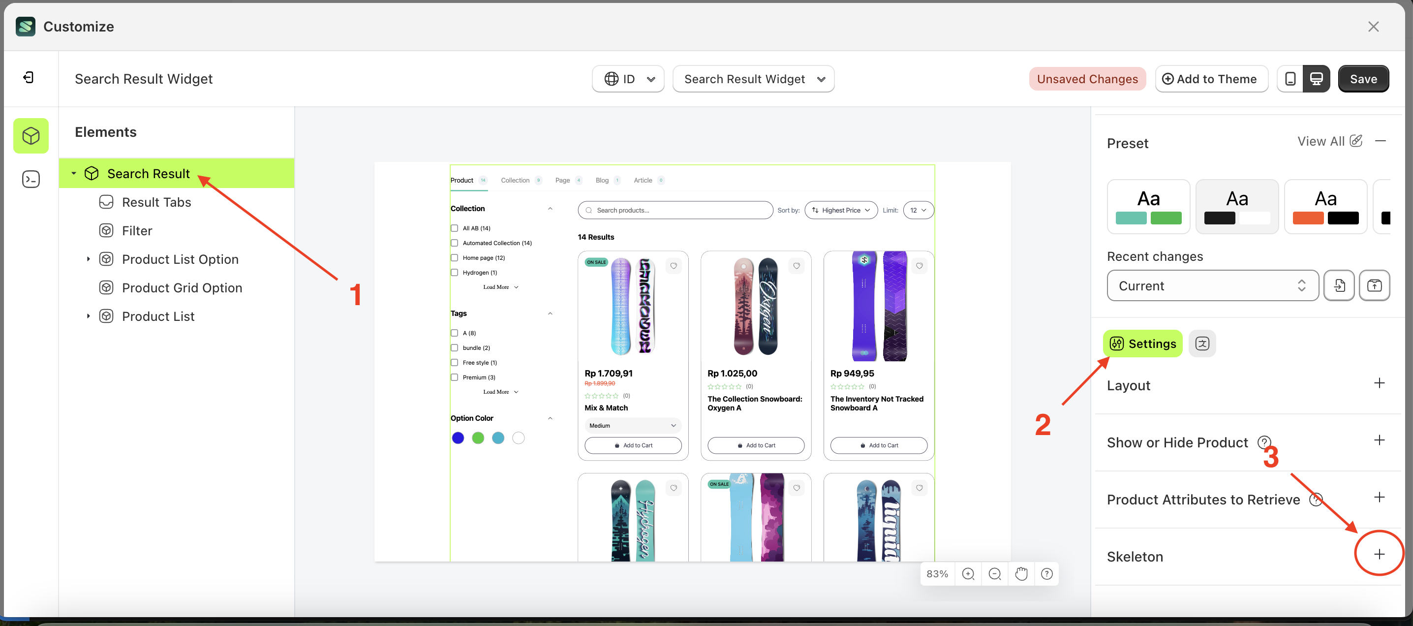
Product Attributes to Retrieve
This feature is designed to manage which data will be displayed in the Sledge feature. For example, if you select "Image," an image will appear on the product card in the storefront, and vice versa.
Follow the steps below:
- Select the Search Result element on the right, then click the Settings tab and click the icon marked with a red arrow.
- Here is an example of how to activate the data you want to retrieve
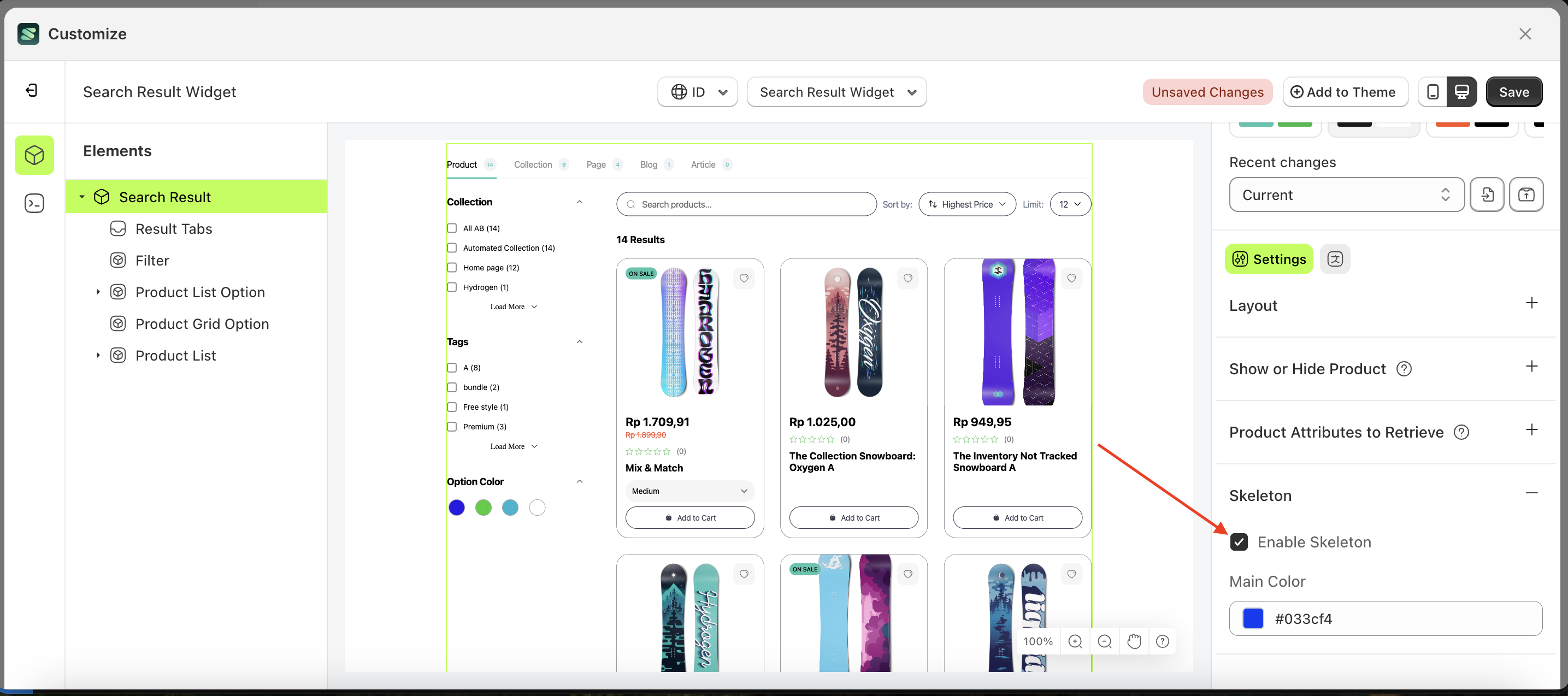
Skeleton
Available settings:
Enable Skeleton
Enable Skeleton is a feature used to activate or deactivate the skeleton loader while data is being processed and has not yet been received.
Follow the steps below:
- Select the Search Result element on the right, then click the Settings tab and click the icon marked with a red arrow.
- Enable the Enable Skeleton checkbox
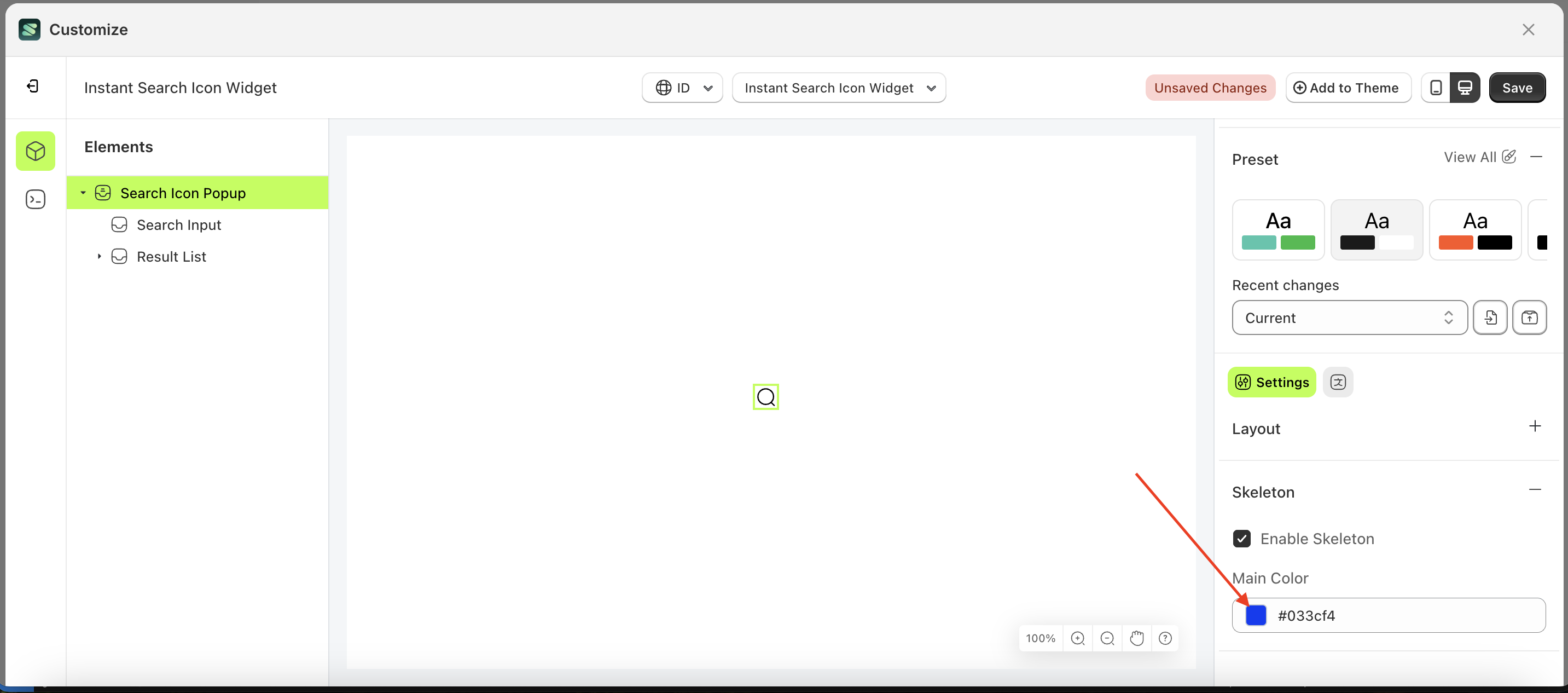
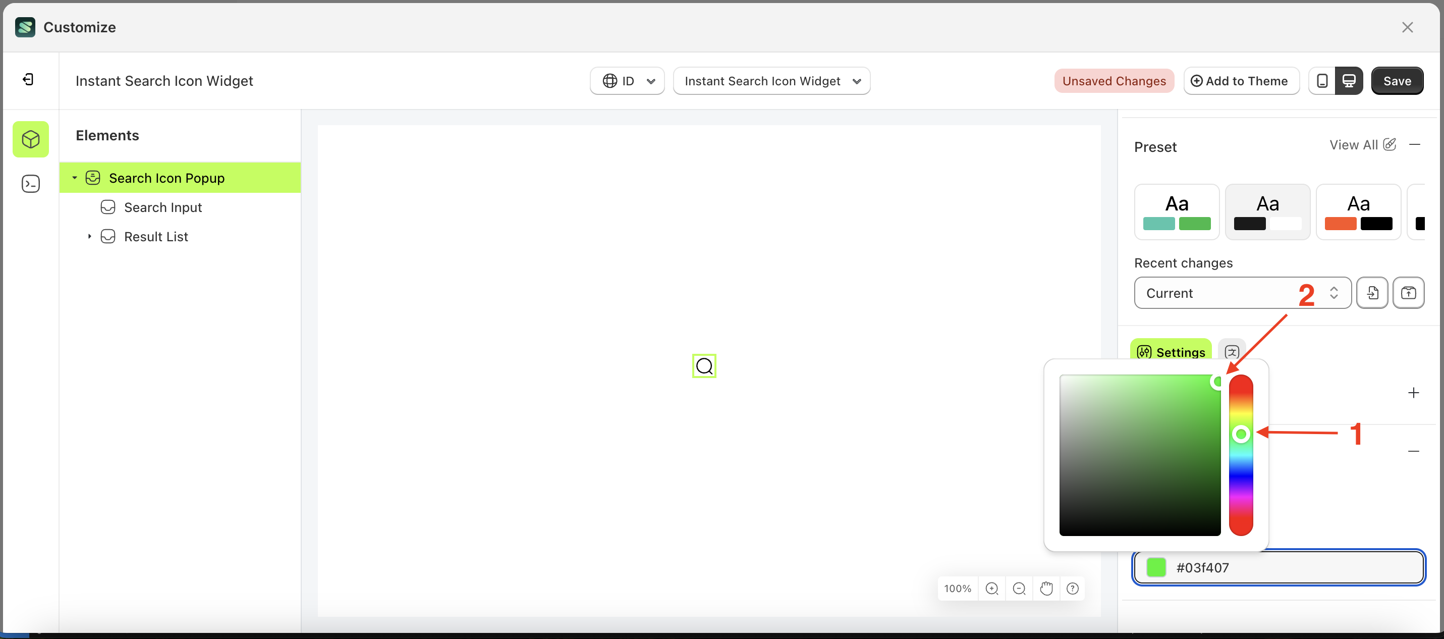
Main Color
This feature is used to adjust the skeleton loader color
Follow the steps below:
- Select the Search Result element on the left, then click the Settings tab and click the icon marked with a red arrow.
- Click the Color Palette on the right side, which is also marked with a red arrow.
- The Color Palette will appear. Click the right side of the palette where the red arrow and number 1 are indicated, then click the right side again where the red arrow and number 2 are marked.
- The instant search icon widget of the Search Result element will adjust accordingly.
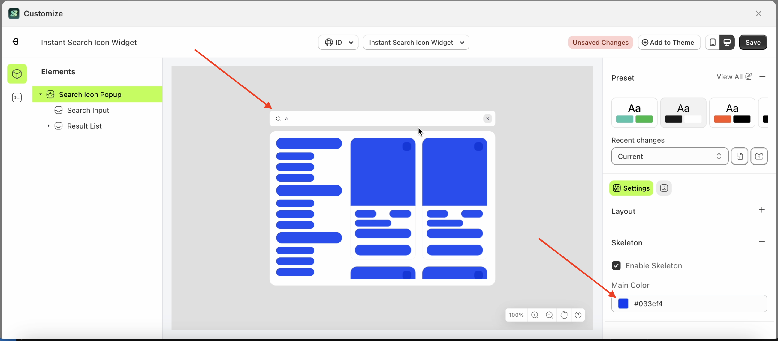
- Example : Before Search Result change settings
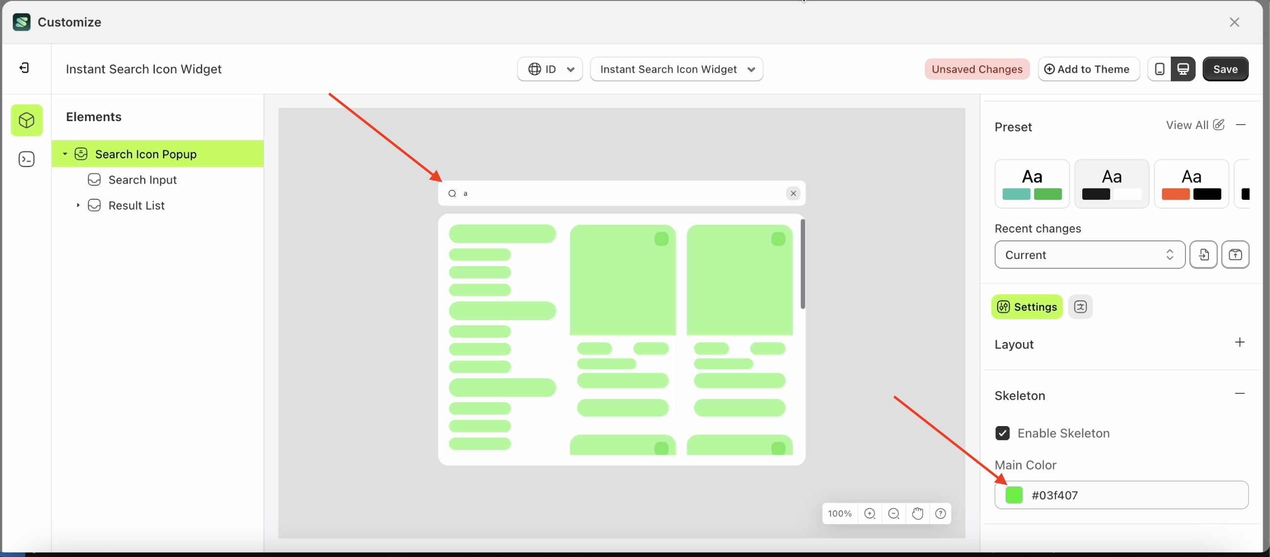
- Example : After Search Result change settings
Result Tabs
Available settings:
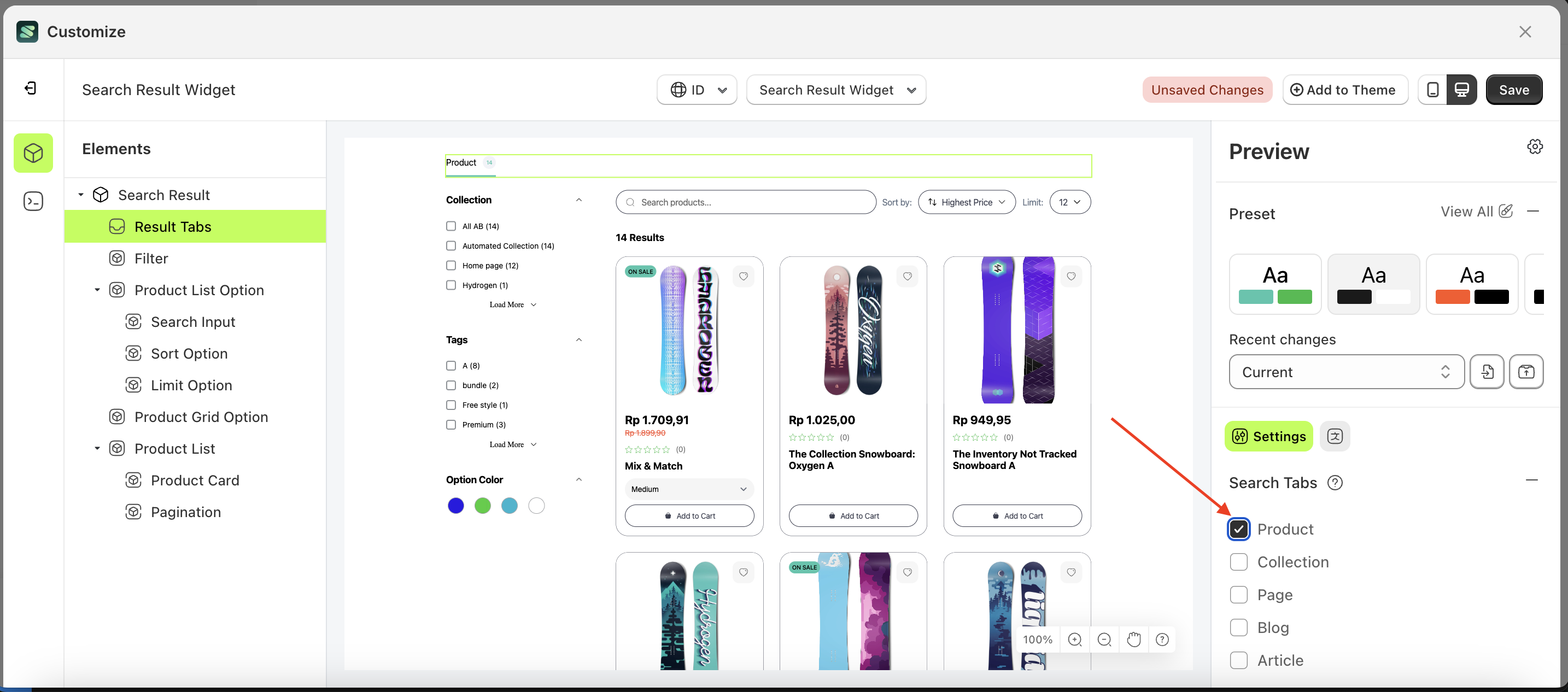
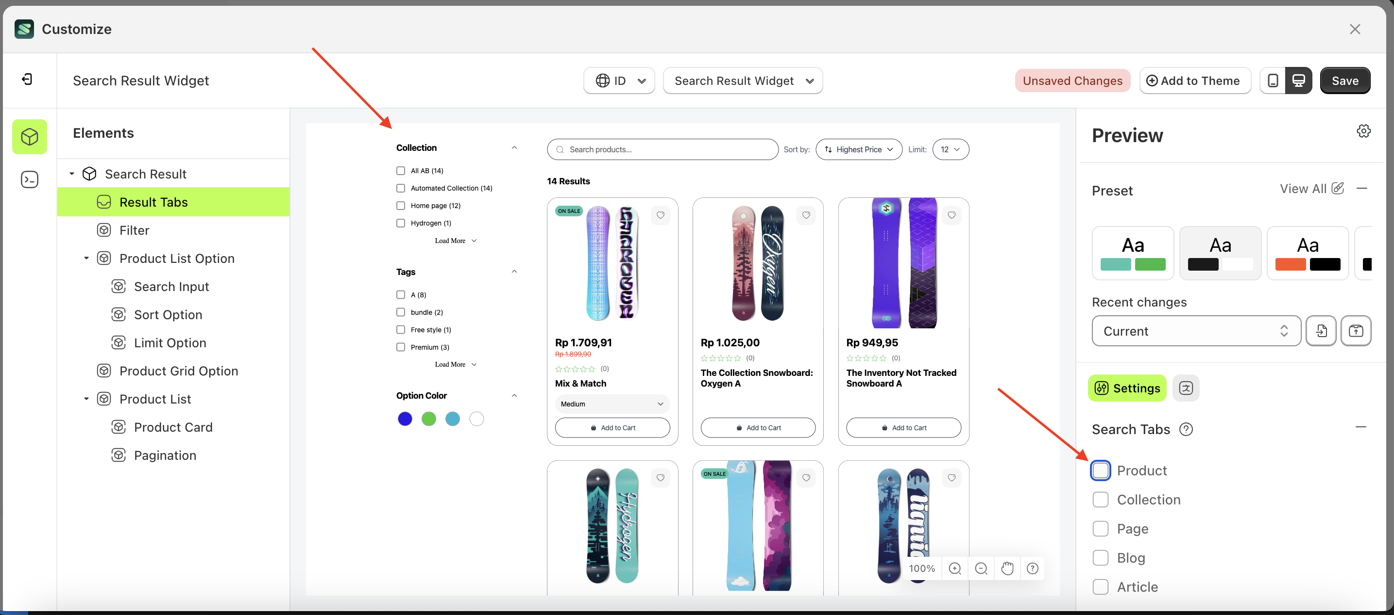
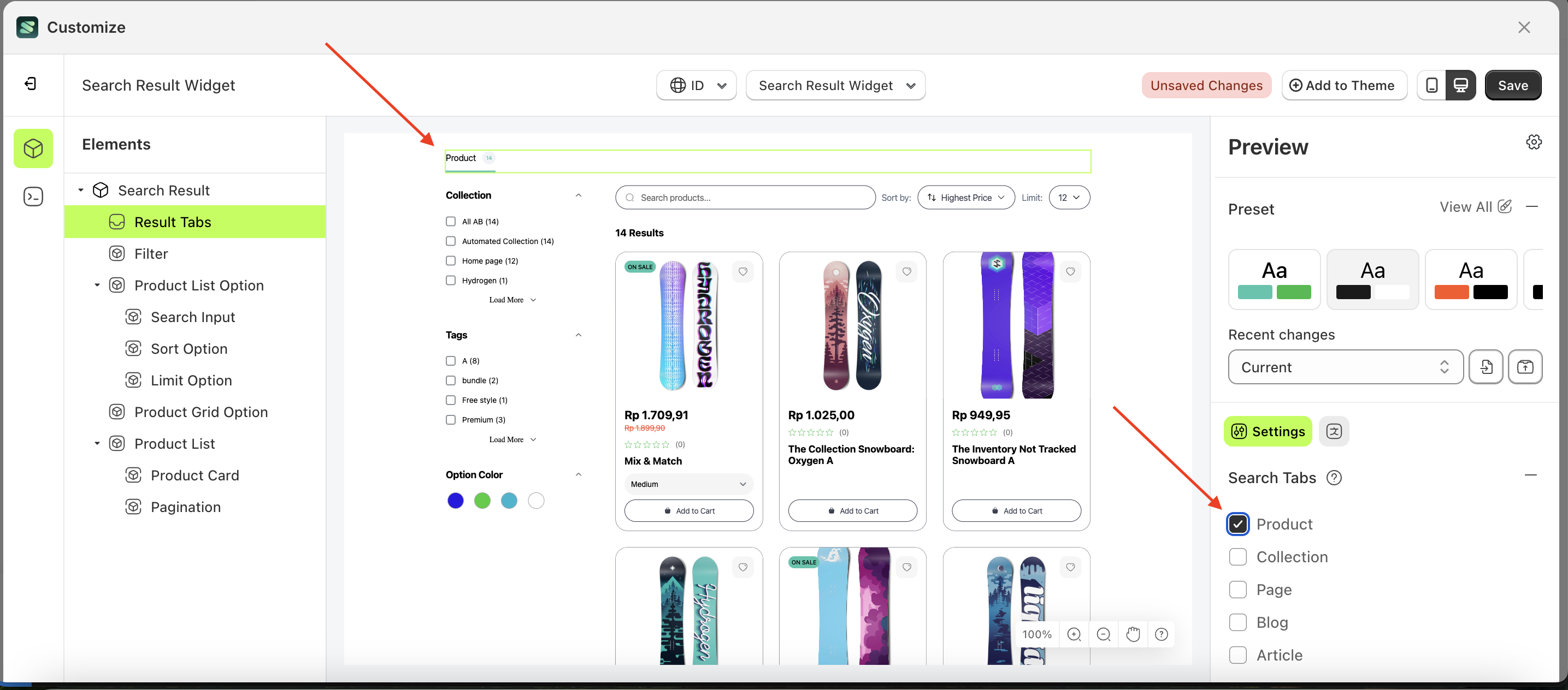
Product
This feature is designed to display a product list page based on the created product tabs.
Follow the steps below:
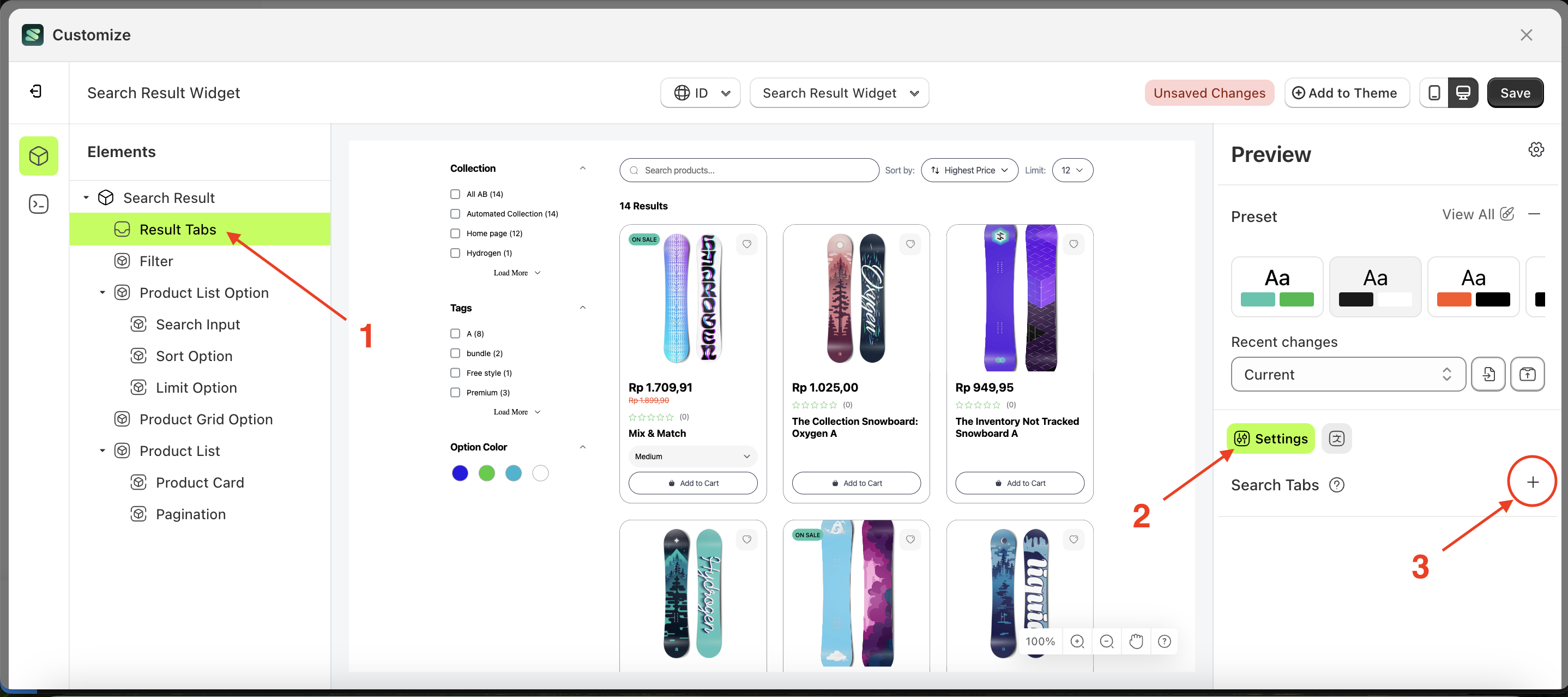
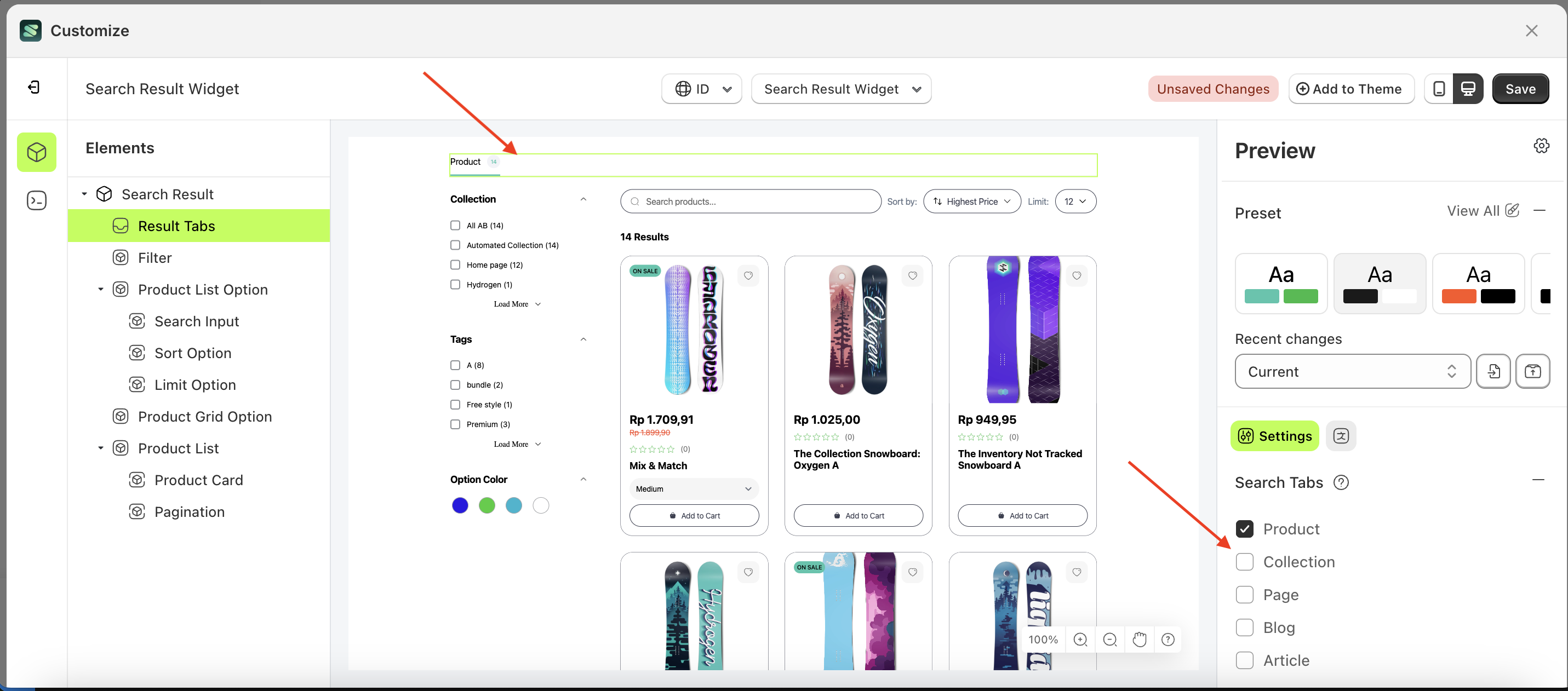
- Select the Result Tabs element on the right, then click the Settings tab and click the icon marked with a red arrow.
- Enable the Product checkbox
- Example : Before Product is enabled
- Example : After Product is enabled
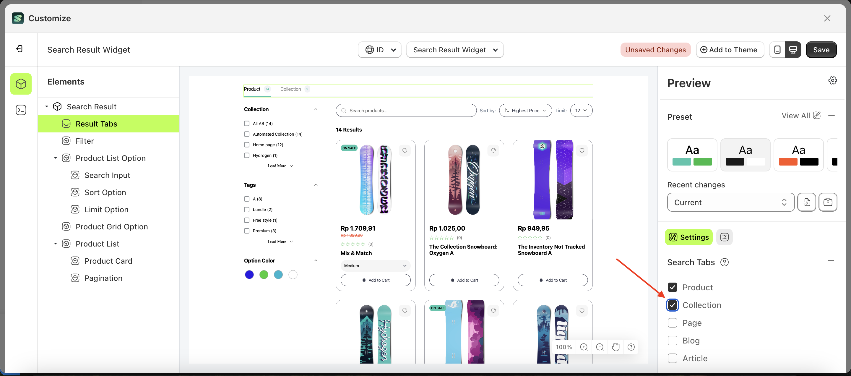
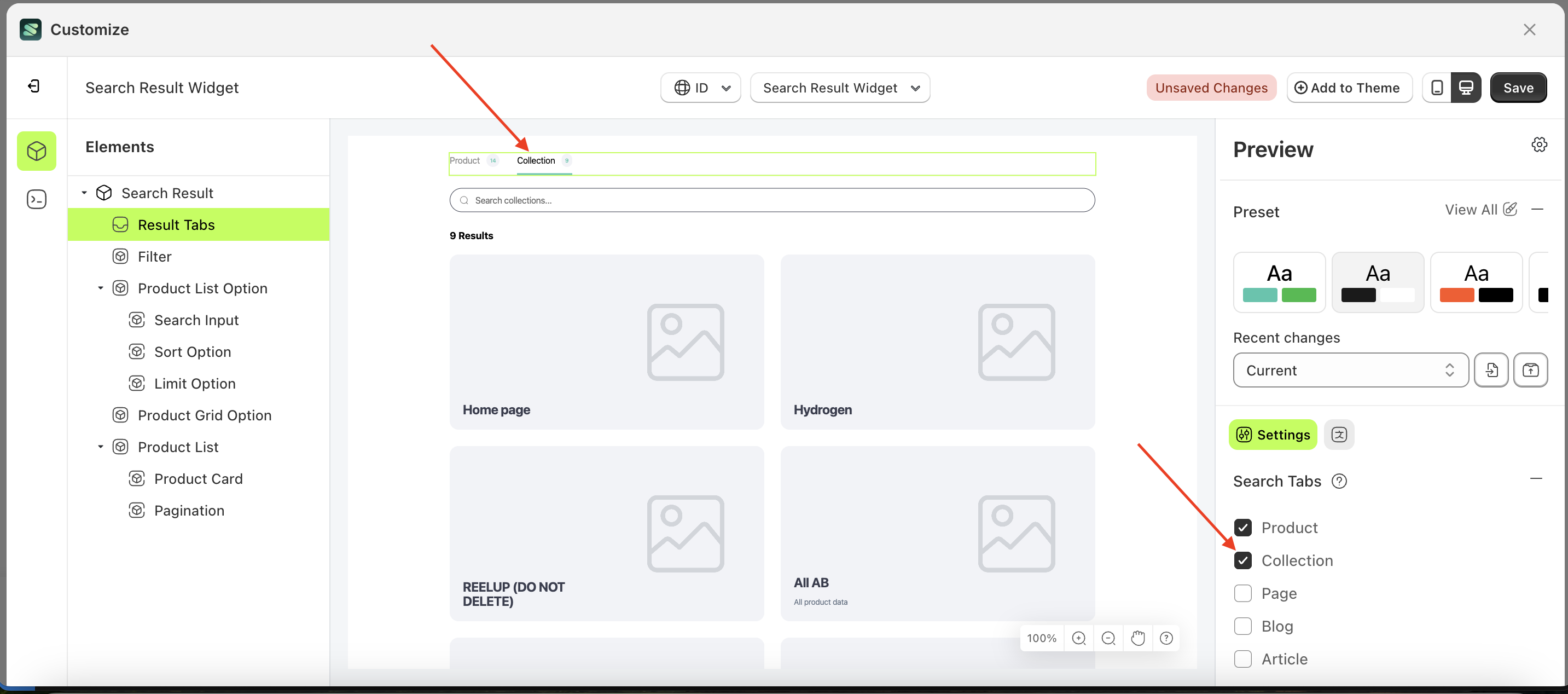
Collection
This feature is designed to display a collection list page based on the created collection tabs.
Follow the steps below:
- Select the Result Tabs element on the right, then click the Settings tab and click the icon marked with a red arrow.
- Enable the Collection checkbox
- Example : Before Collection is enabled
- Example : After Collection is enabled
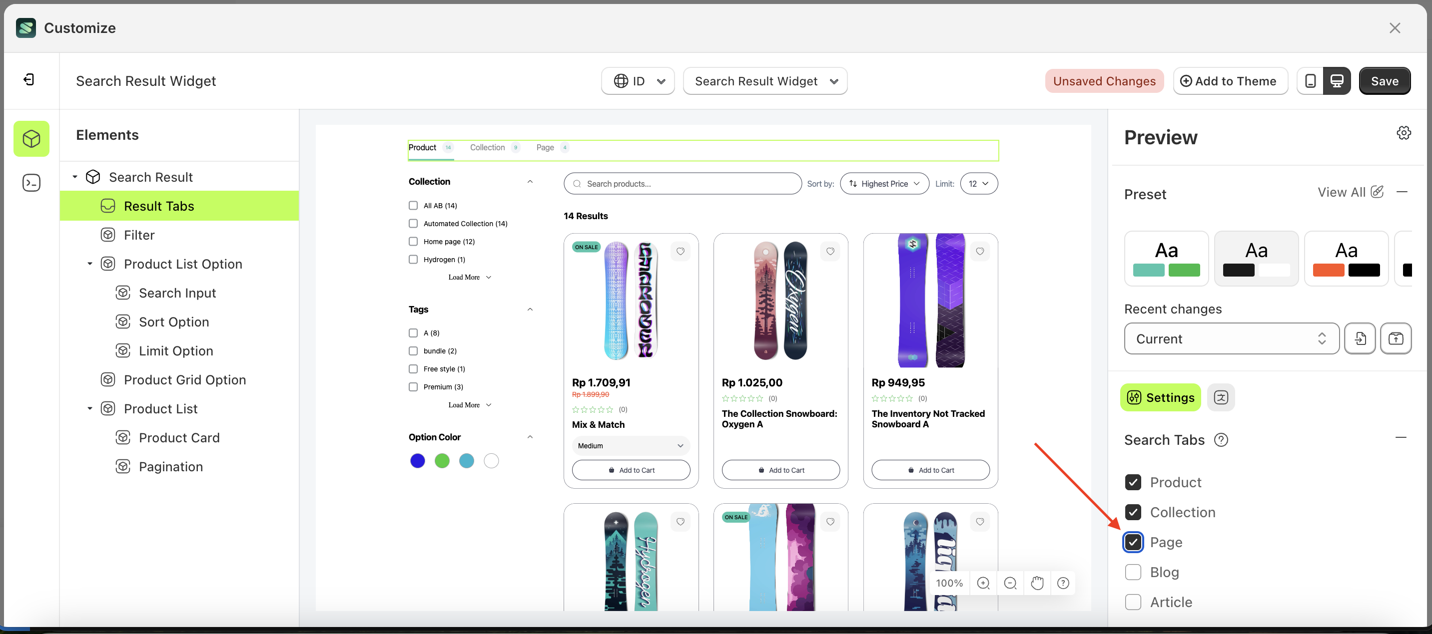
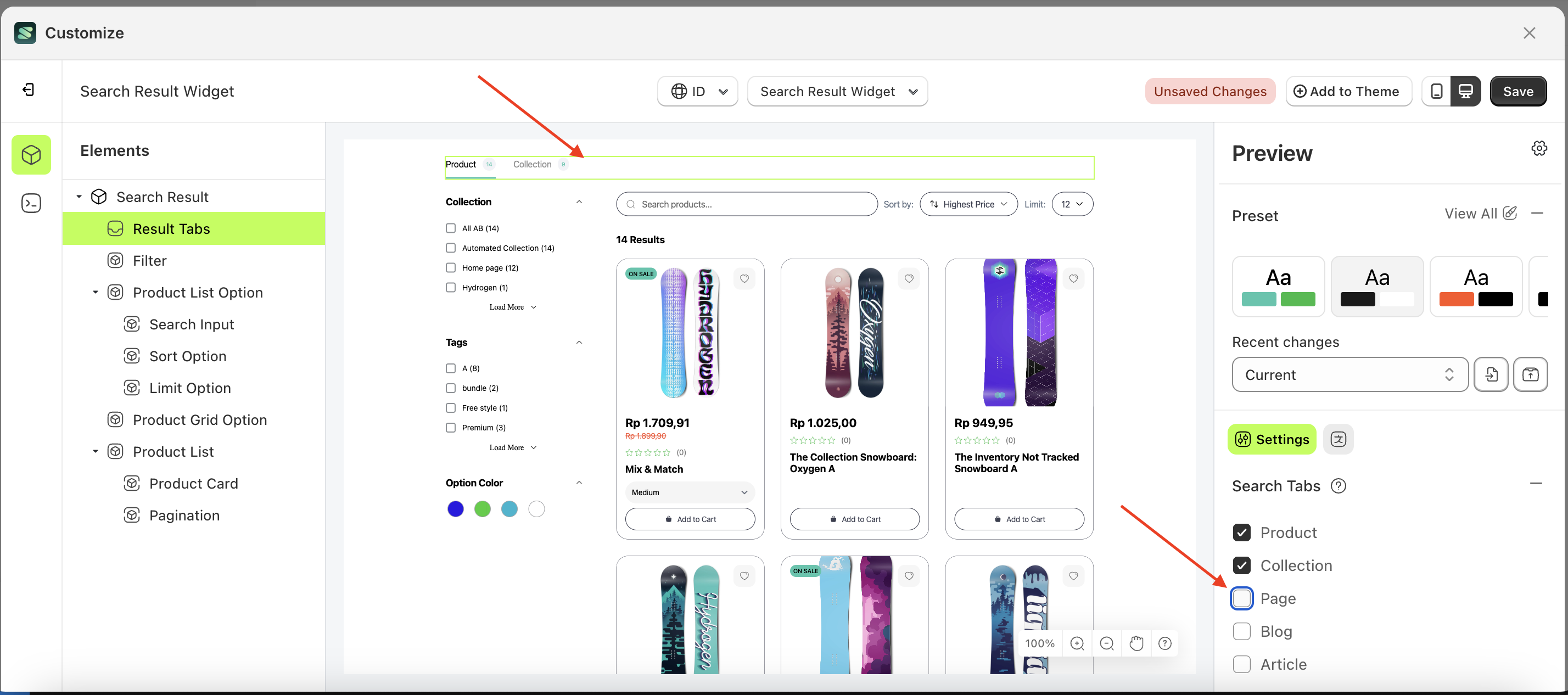
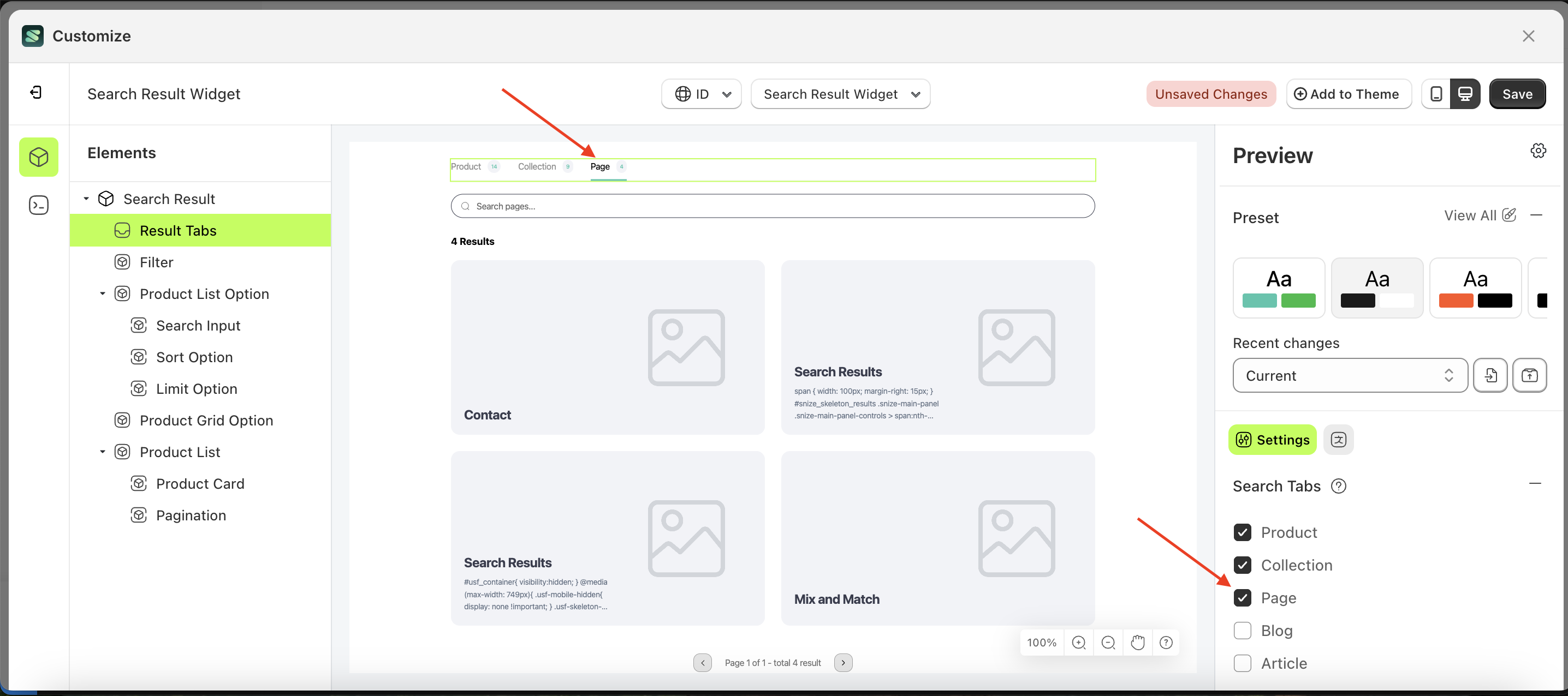
Page
This feature is designed to display a page list based on the created page tabs.
Follow the steps below:
- Select the Result Tabs element on the right, then click the Settings tab and click the icon marked with a red arrow.
- Enable the Page checkbox
- Example : Before Page is enabled
- Example : After Page is enabled
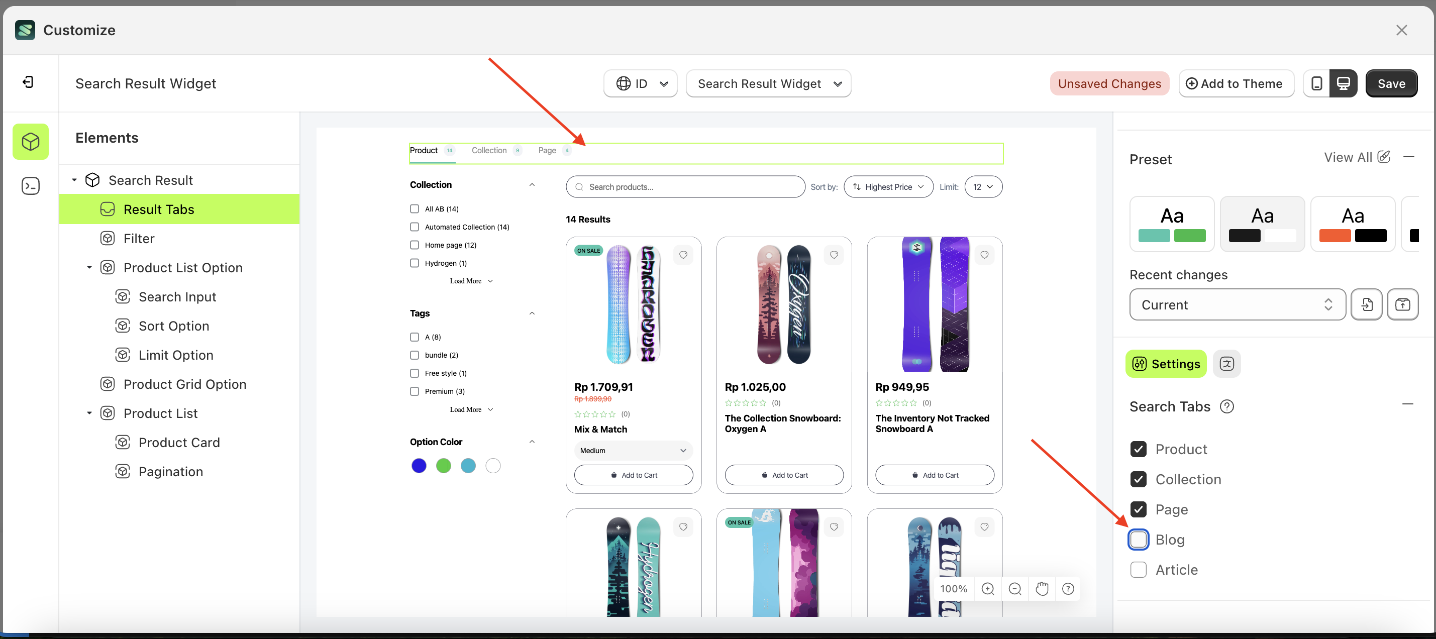
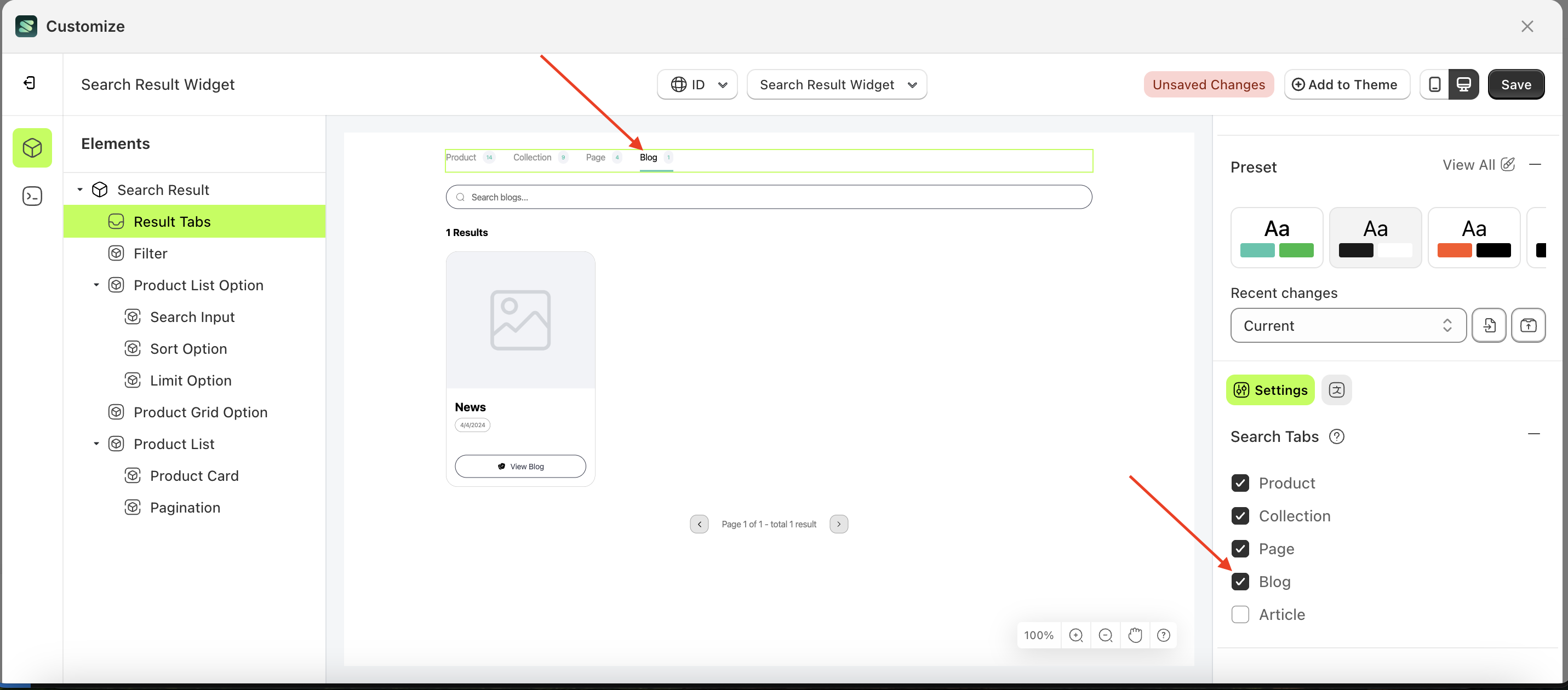
Blog
This feature is designed to display a blog list page based on the created blog tabs.
Follow the steps below:
- Select the Result Tabs element on the right, then click the Settings tab and click the icon marked with a red arrow.
- Enable the Blog checkbox
- Example : Before Blog is enabled
- Example : After Blog is enabled

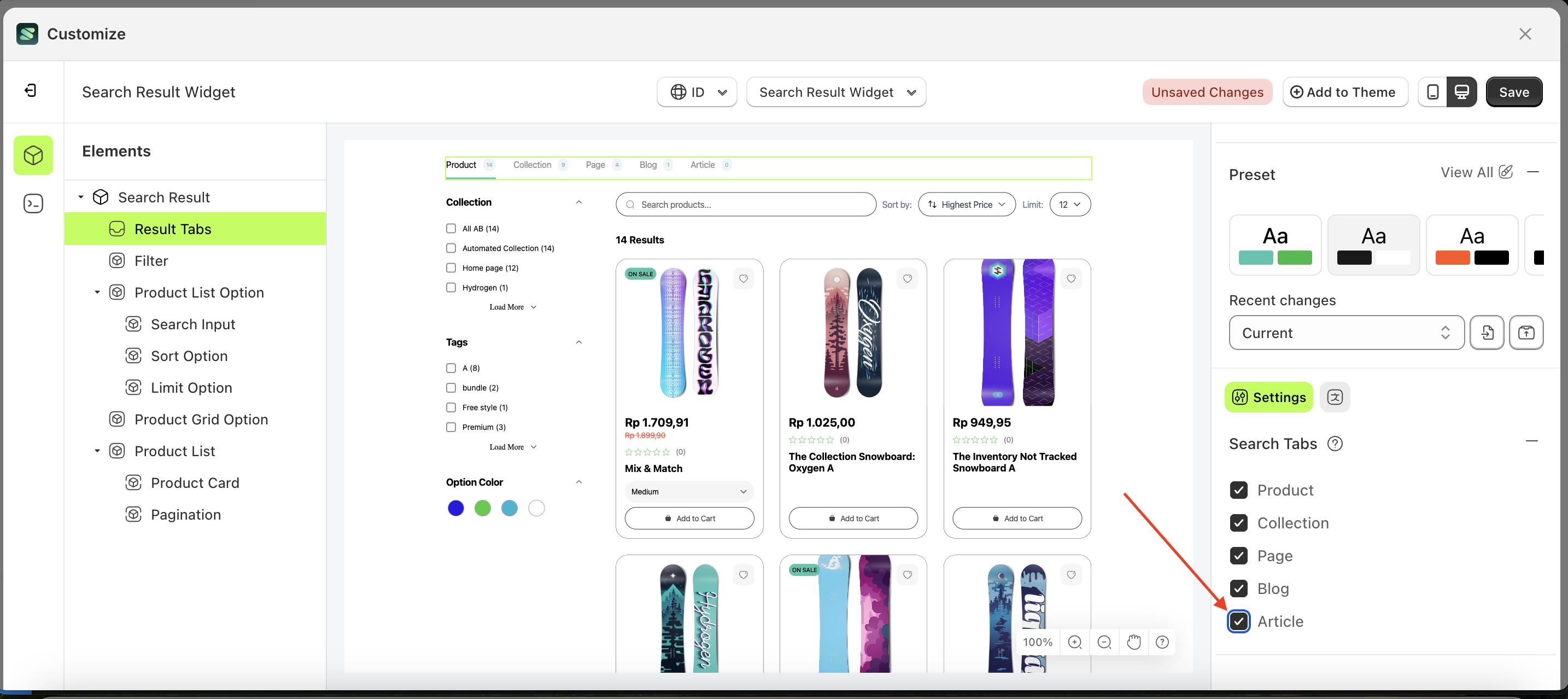
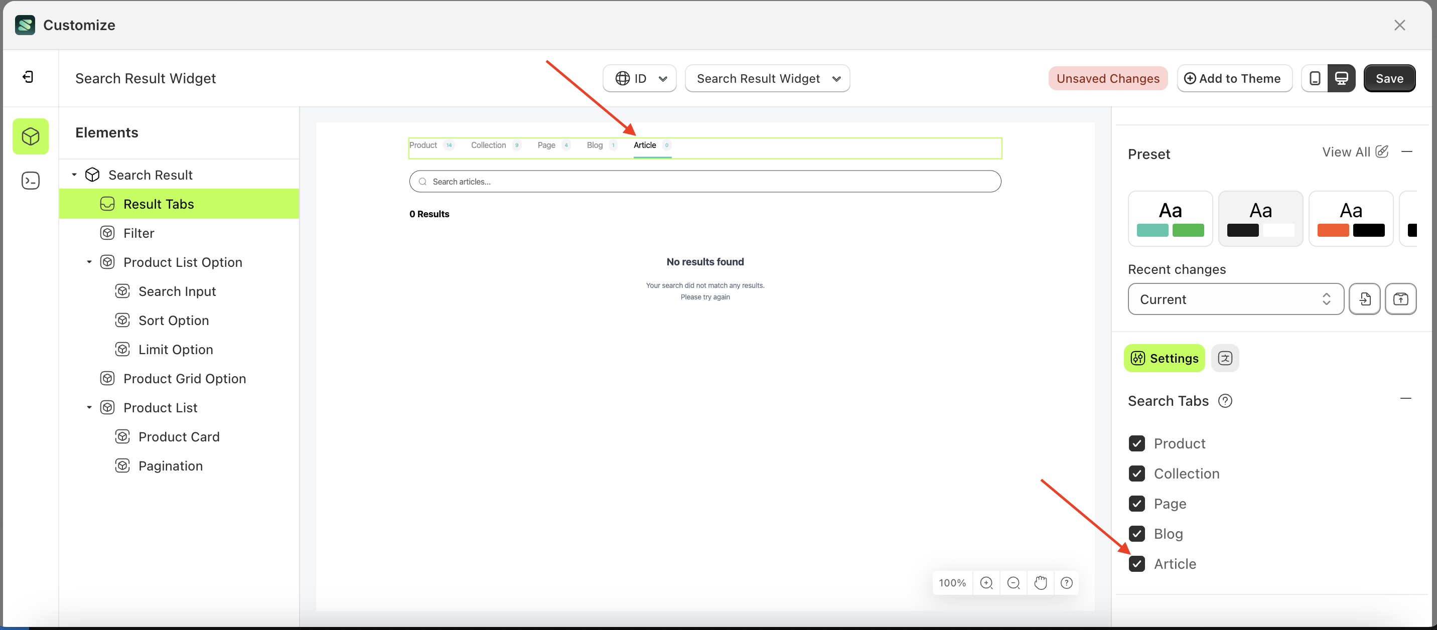
Article
This feature is designed to display an article list page based on the created article tabs.
Follow the steps below:
- Select the Result Tabs element on the right, then click the Settings tab and click the icon marked with a red arrow.
- Enable the Article checkbox
- Example : Before Article is enabled
- Example : After Article is enabled

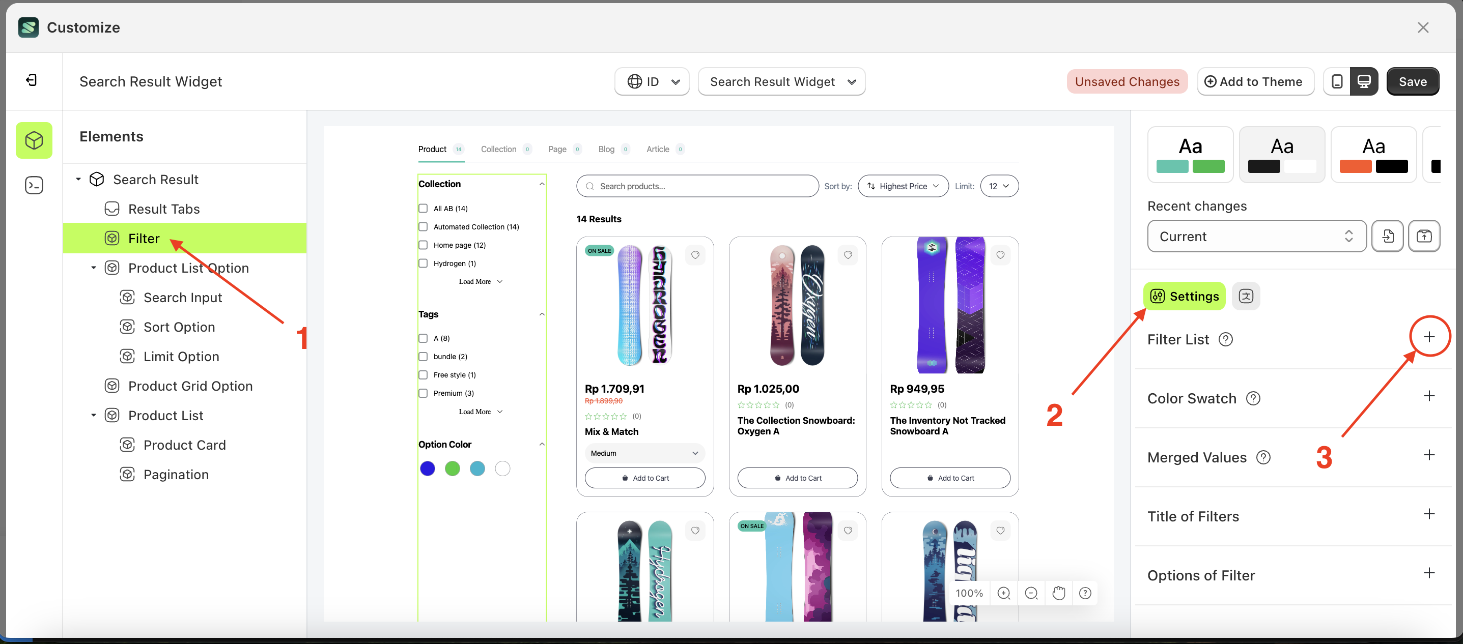
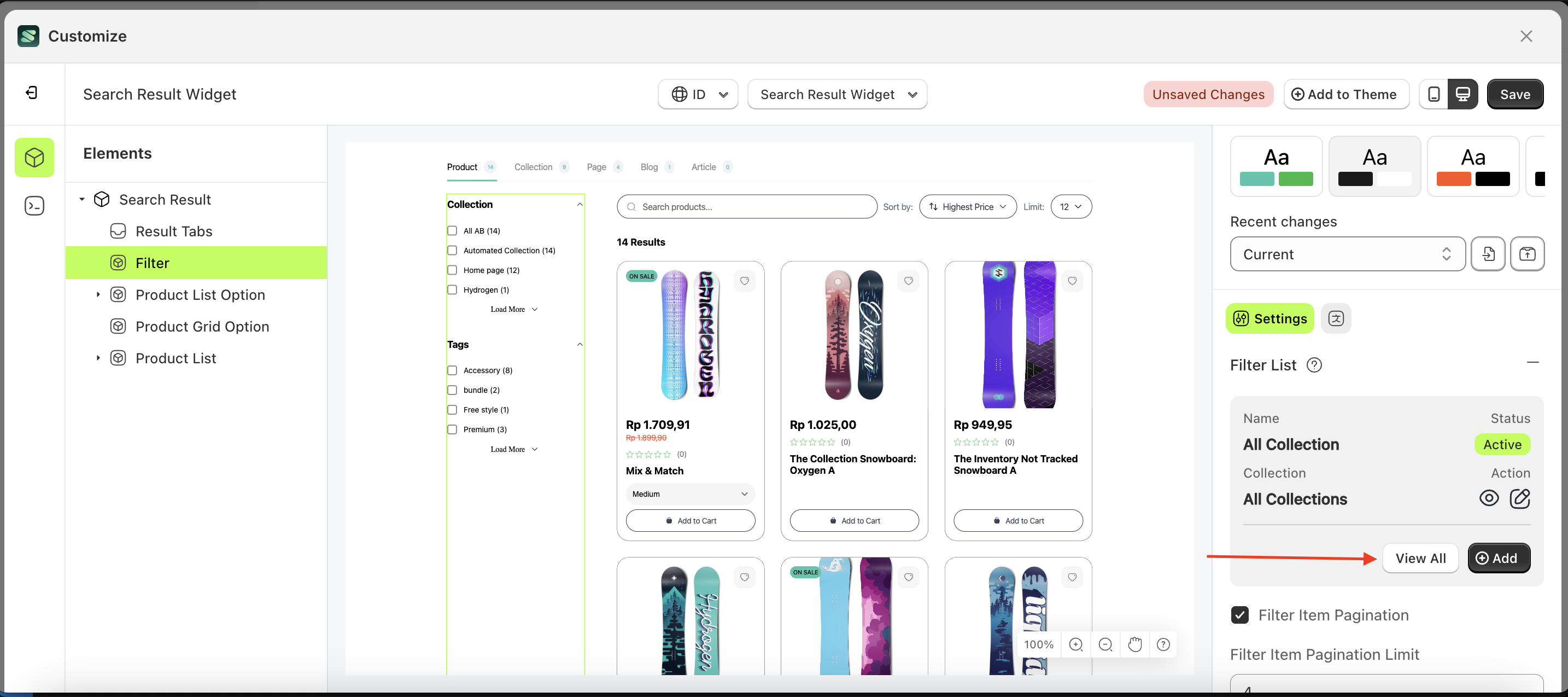
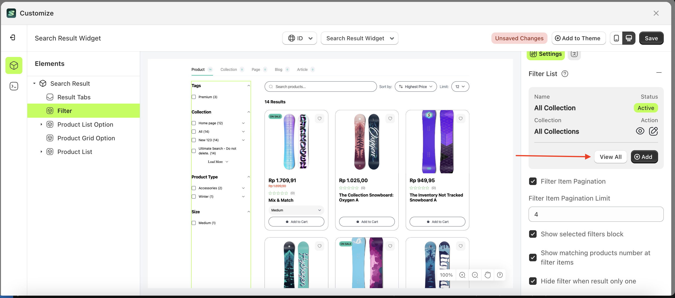
Filter List
Available settings:
Add Filter ListFilter by PrefixDelete by PrefixFilter Tree CollectionFilter Tree Product TypeChained FilterAdd Spesific FIlter ListFilter Item PaginationFilter Item Pagination LimitShow selected filters blockShow matching products number at filter itemsHide filter when result only one
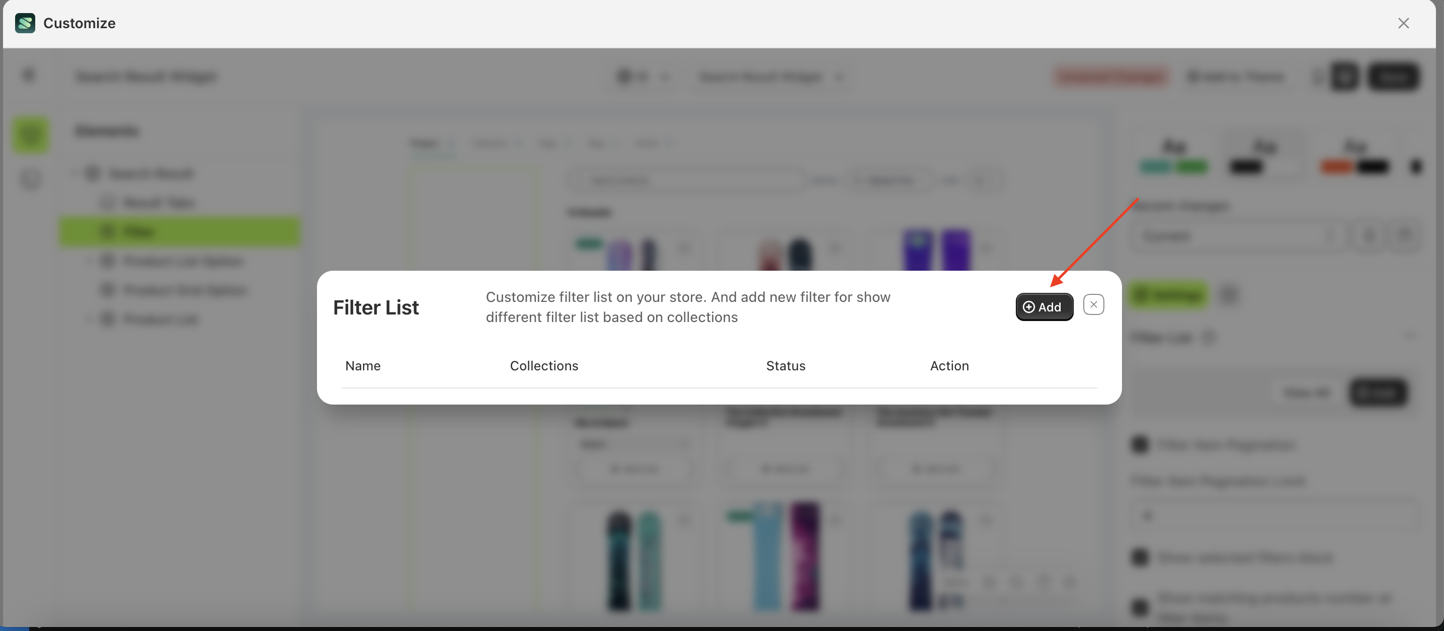
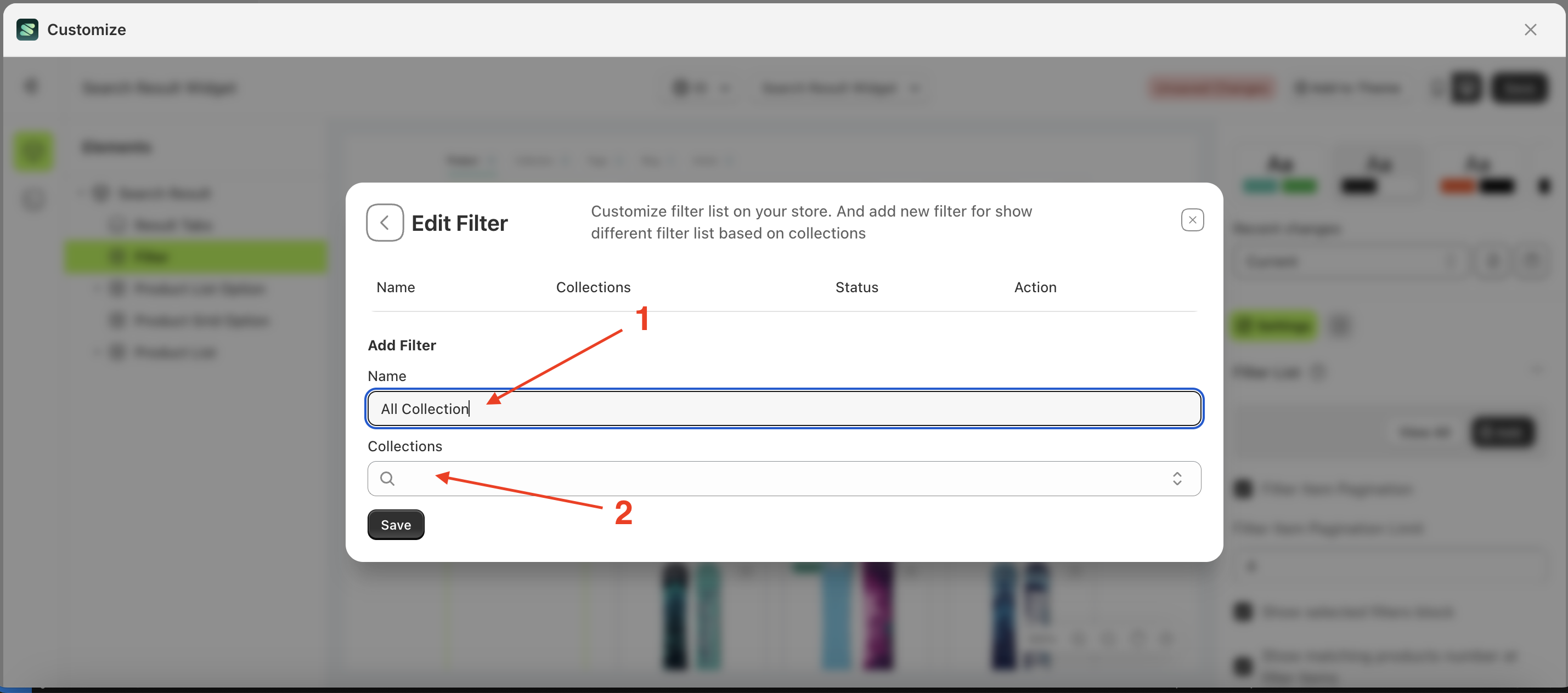
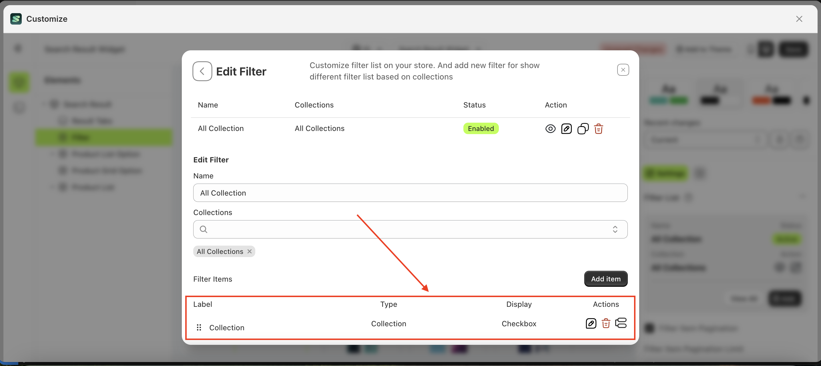
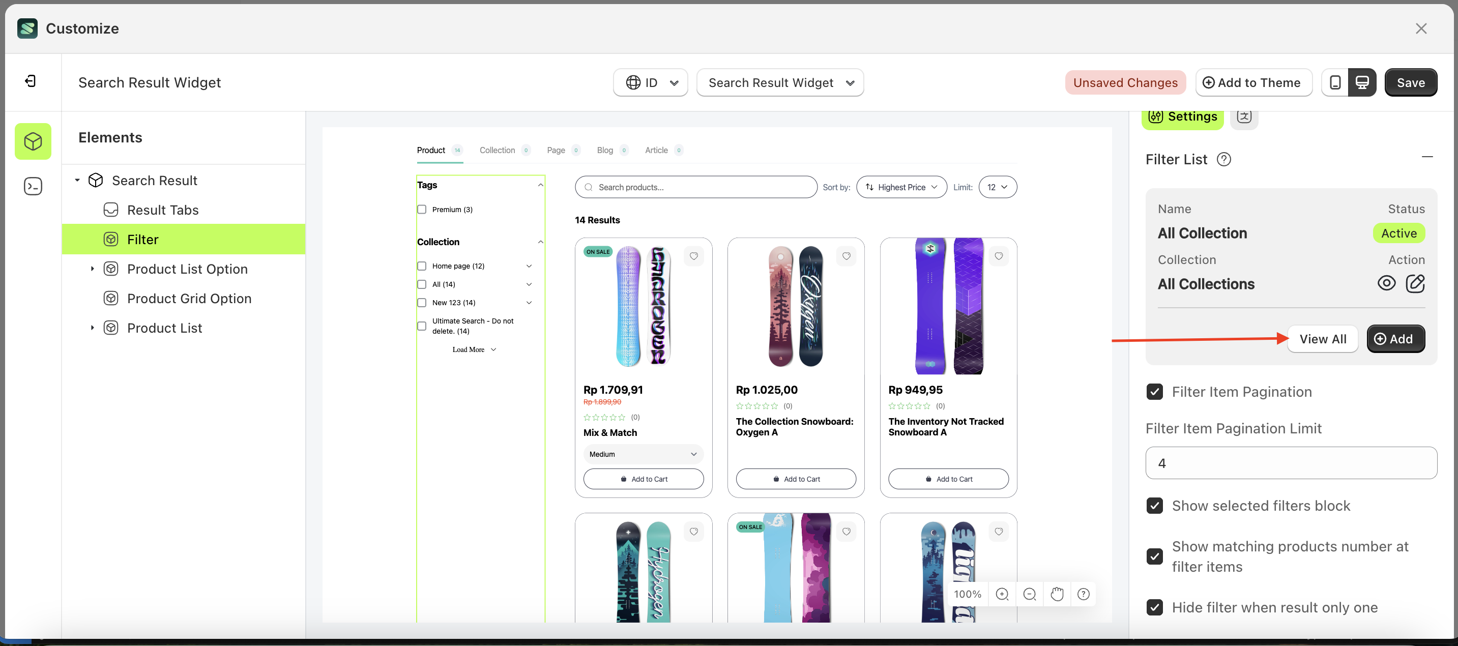
Add Filter List
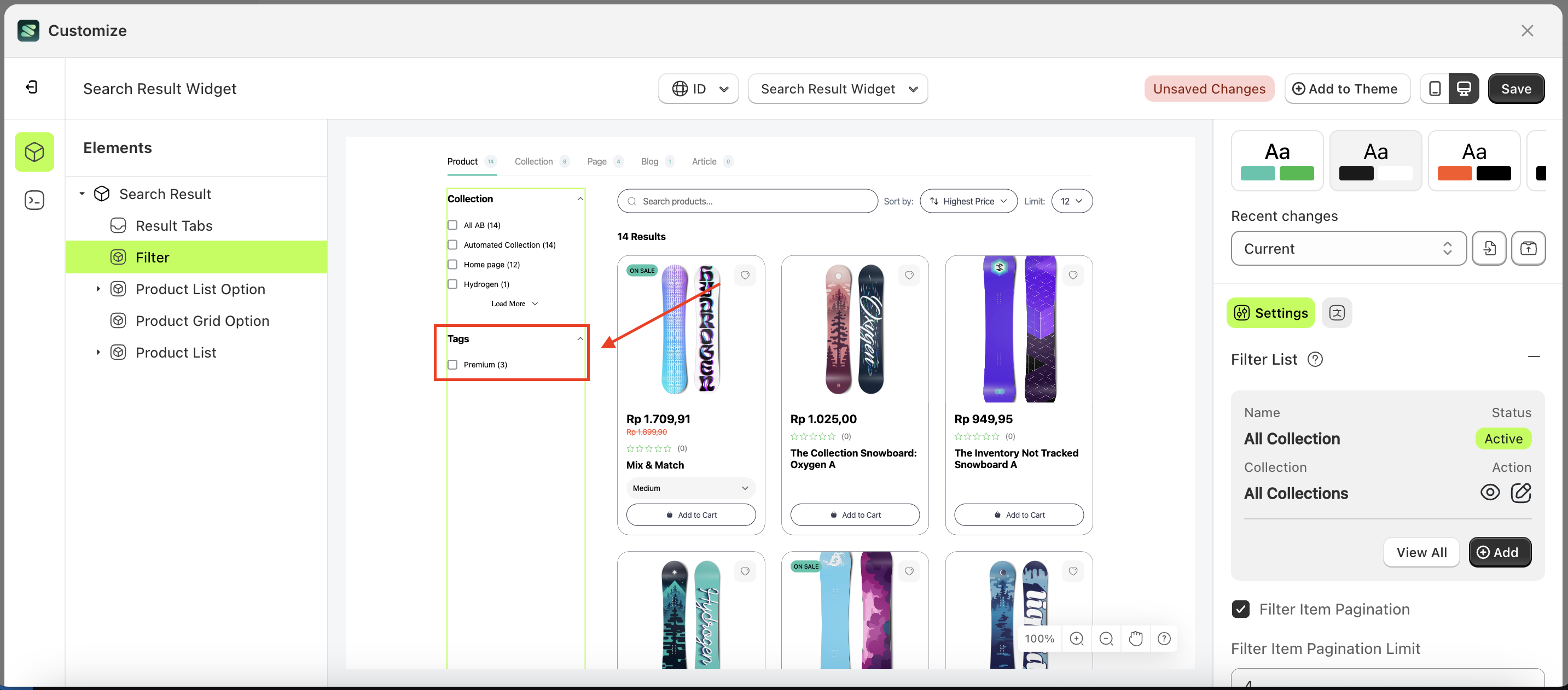
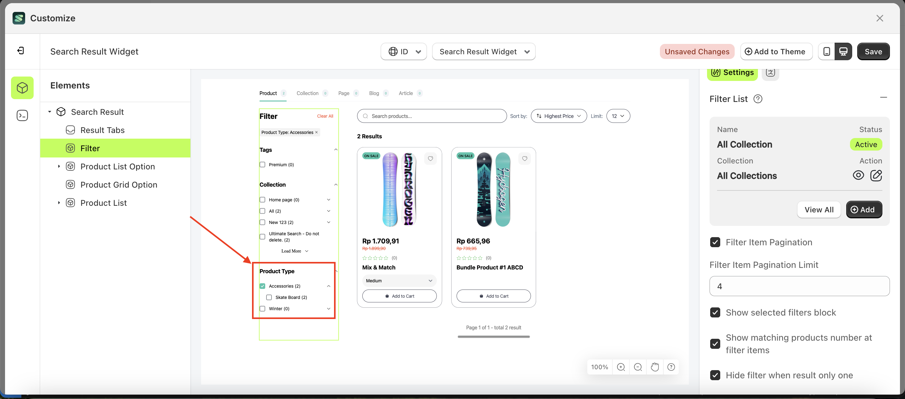
The Add Filter List feature allows you to add a list of filters, enabling you to display the specific criteria you need. For example, you can add filters for tags, product type, color, and collection. This feature applies to all collections by default, except for those that already have specifically defined filters.
Follow the steps below:
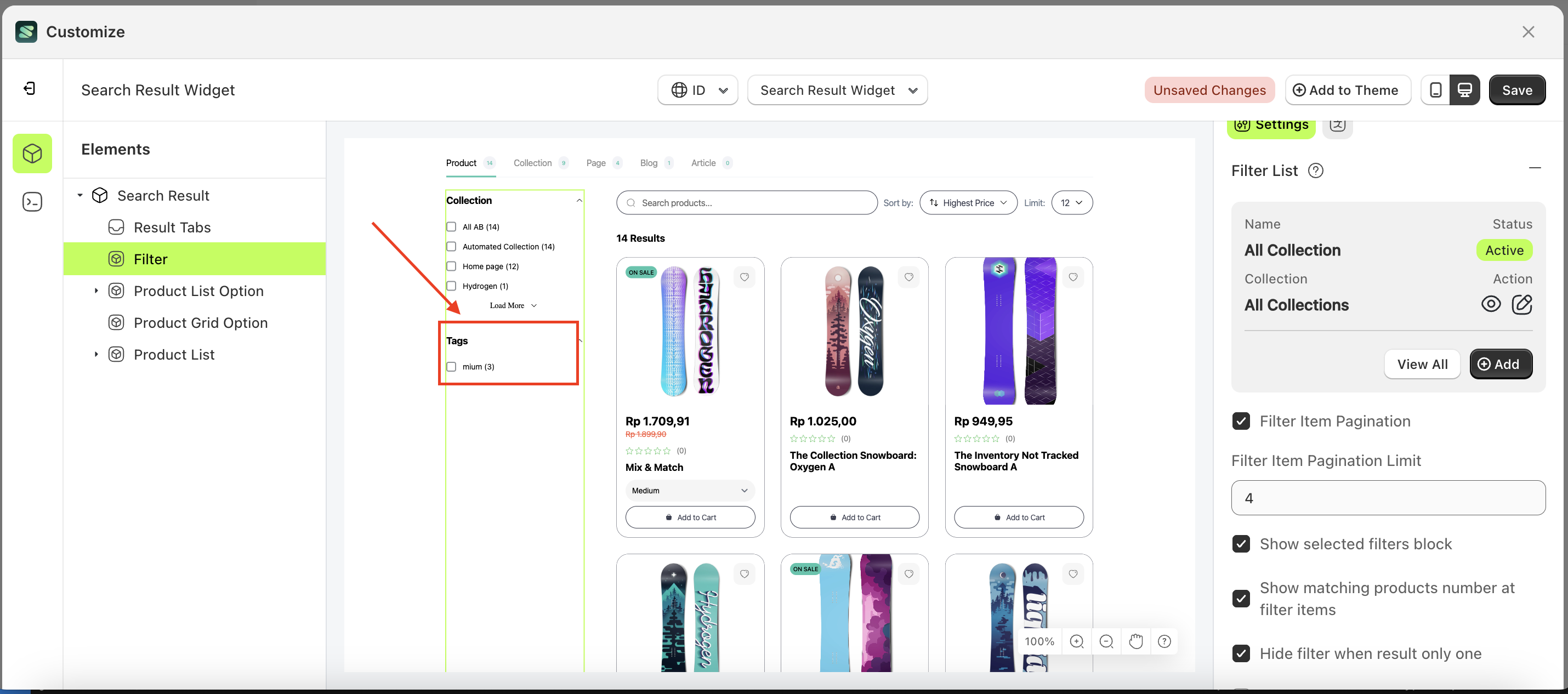
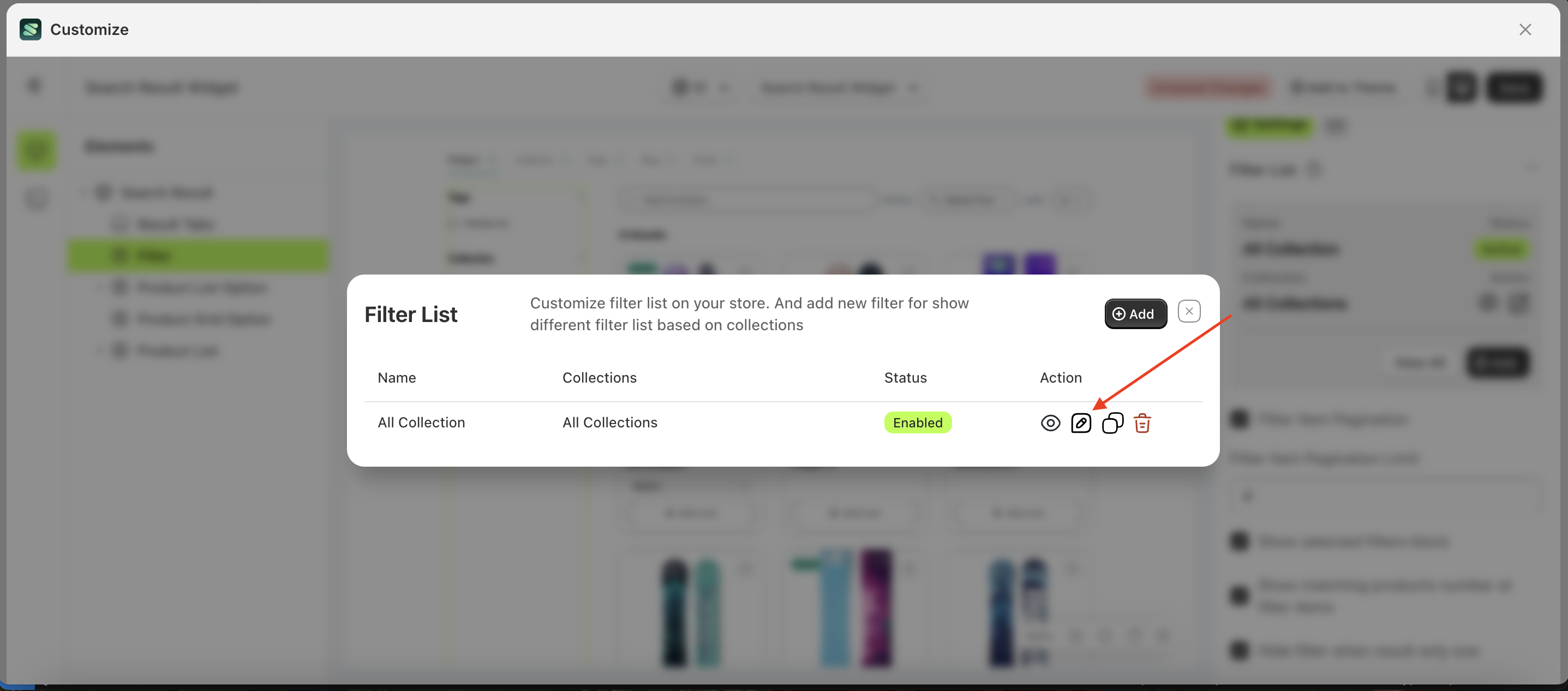
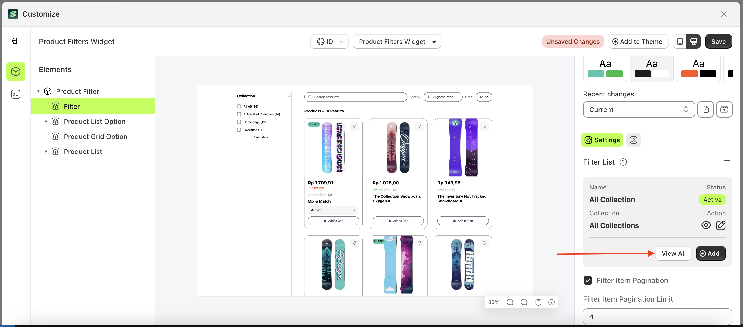
- Select the Filter element on the left, then click the Settings tab and click the icon marked with a red arrow.
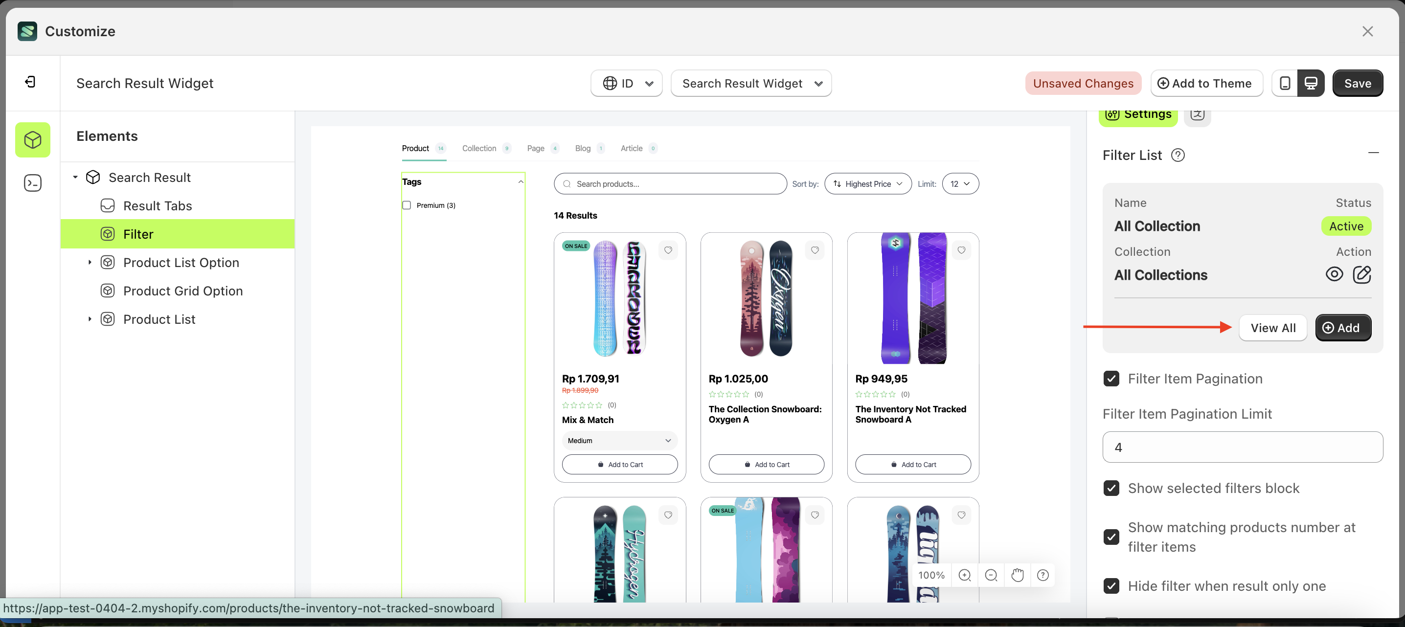
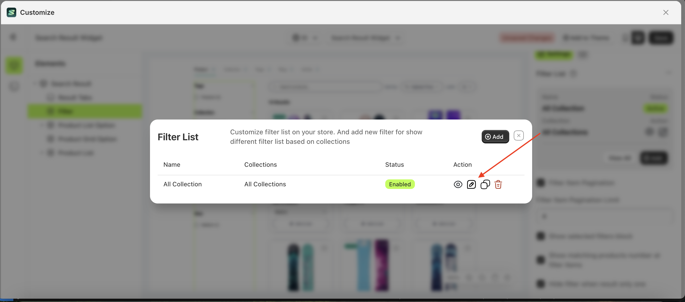
- Click the "View All" button to open a popup.
- Click the "Add" button
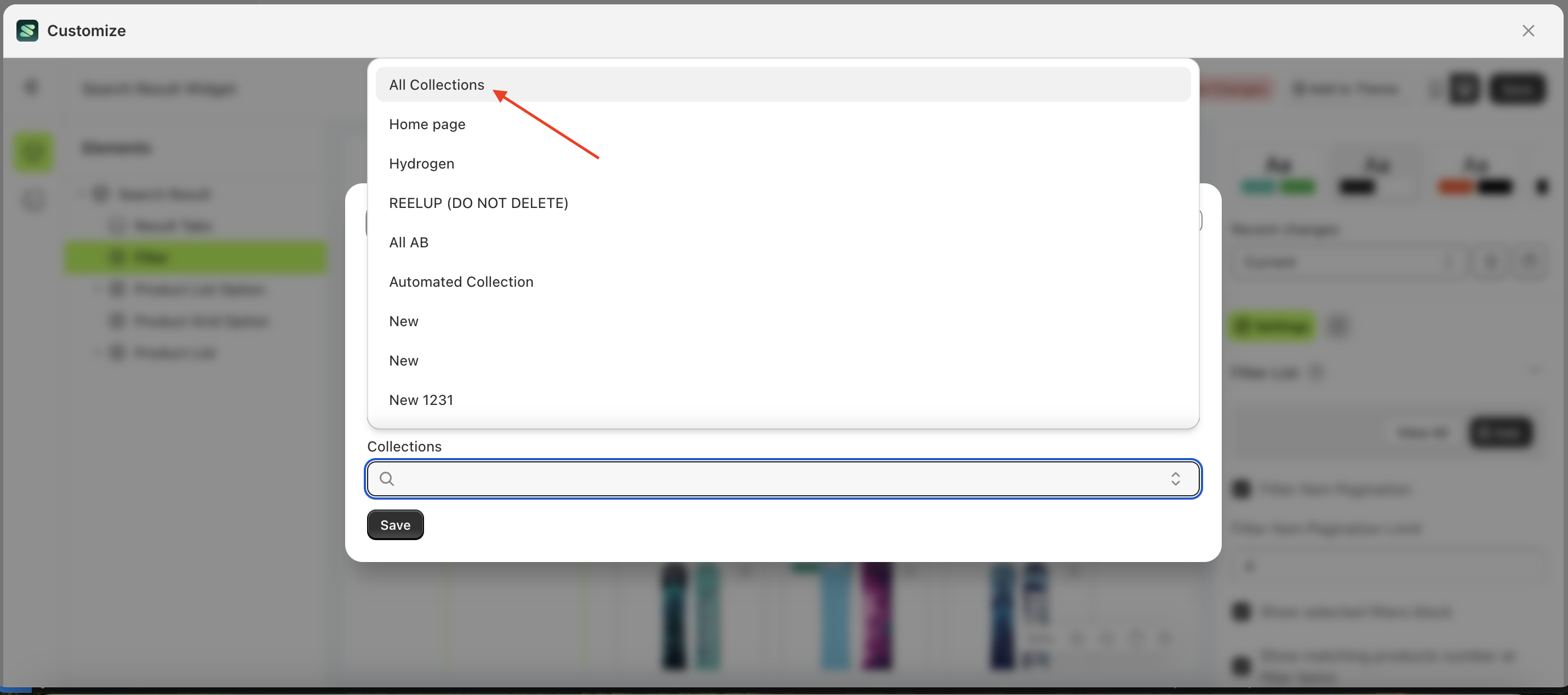
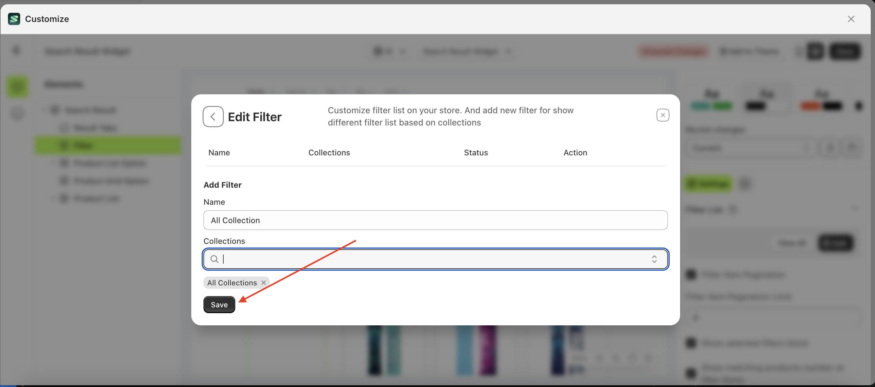
- Enter the desired filter list name and select the collection to be displayed in the filter list
- Choose the collection
- Click Save Button
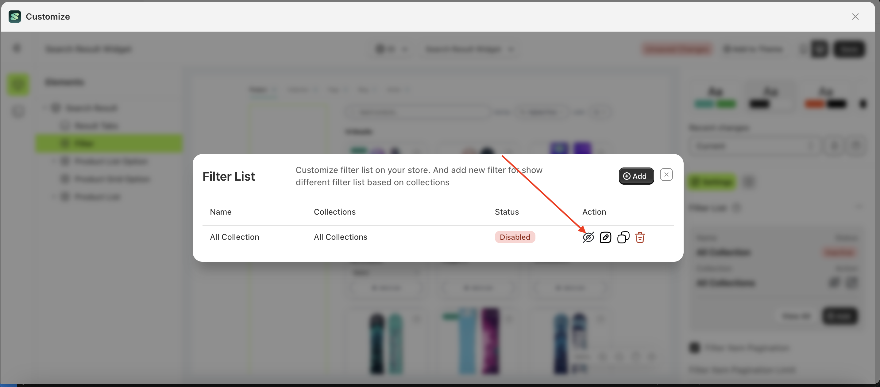
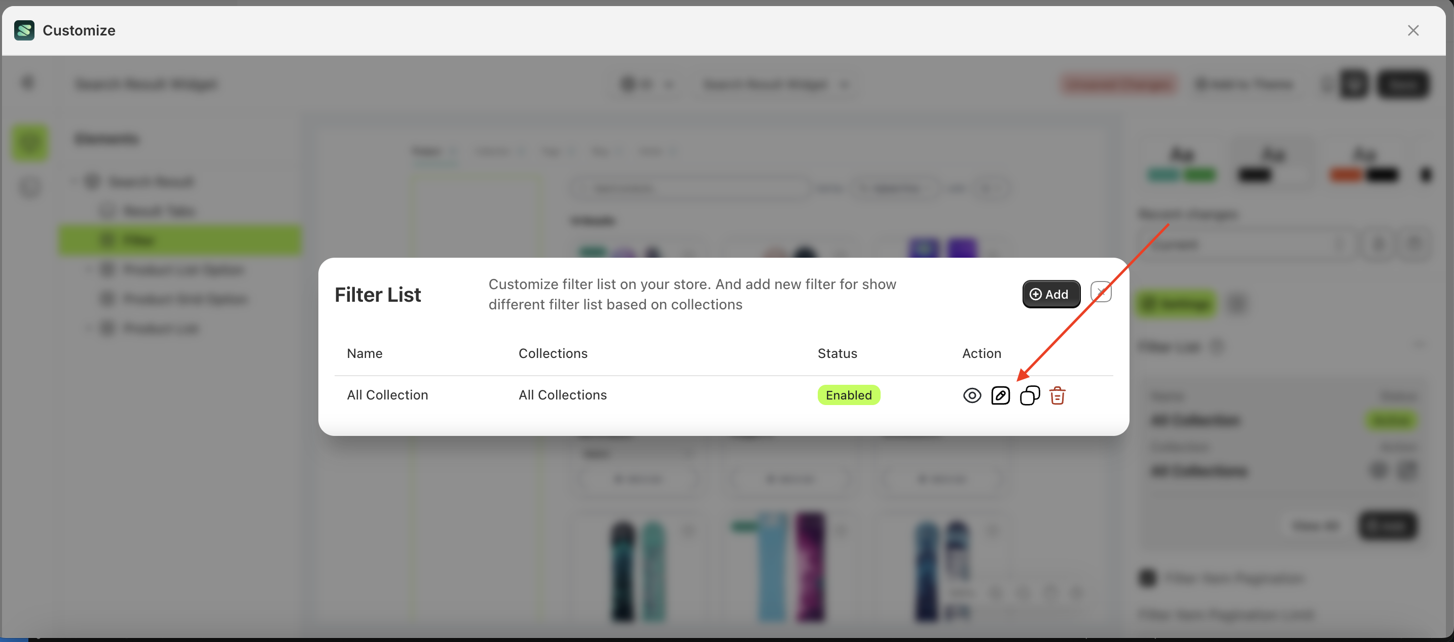
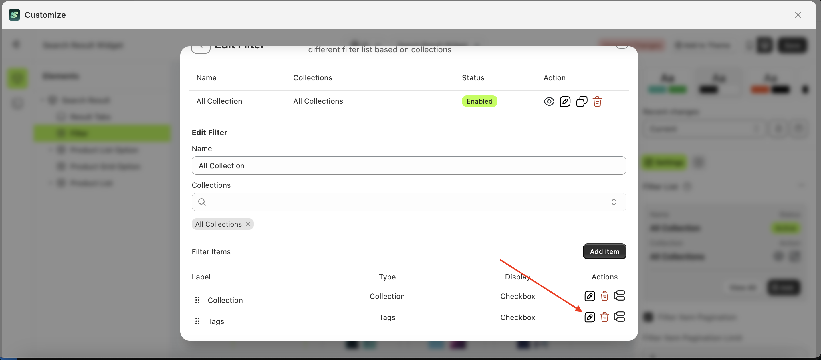
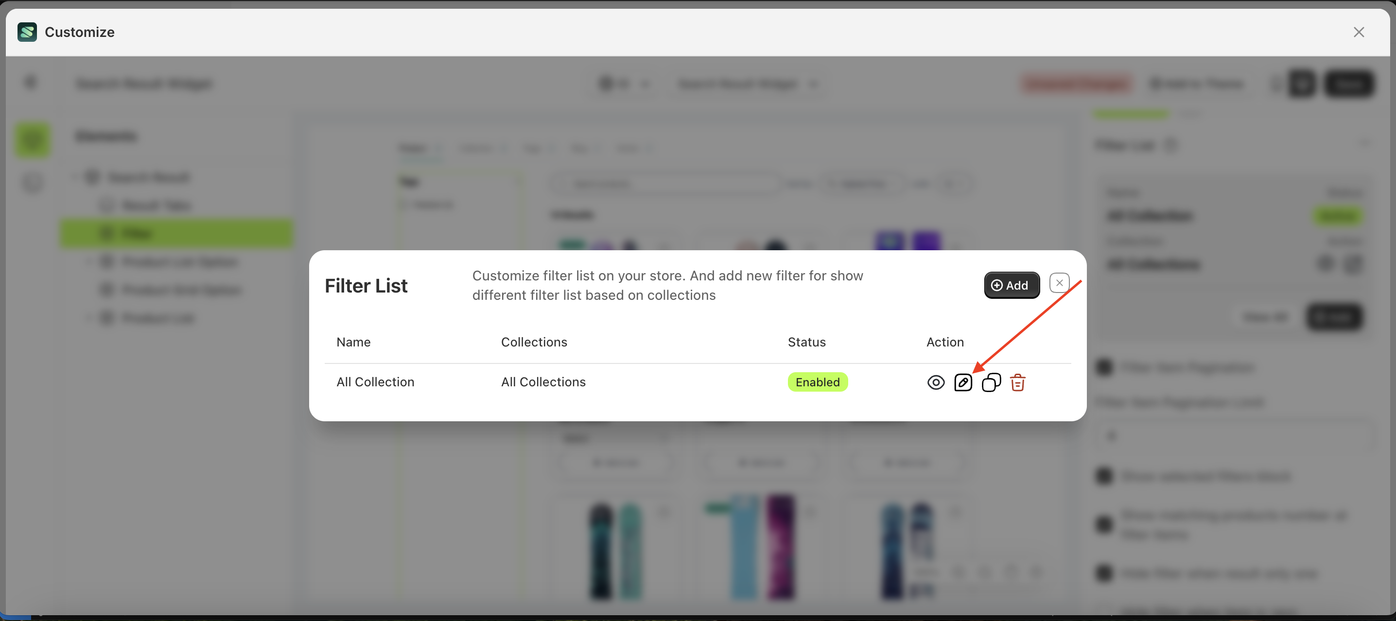
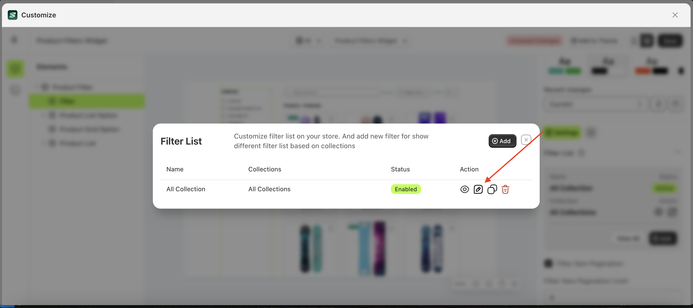
- The filter list has now been added, but its status is still inactive. Change it to active by clicking the icon indicated by the arrow on the right
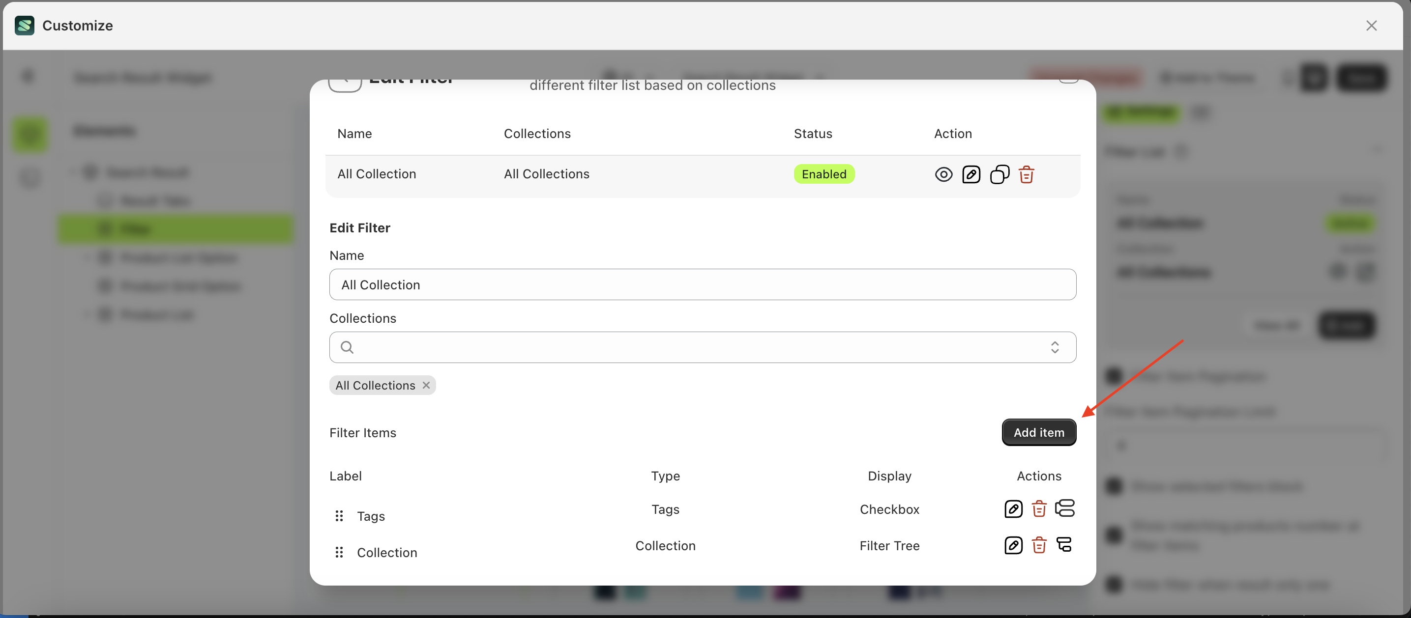
- The status will change to active. Next, click the edit icon as shown in the image below
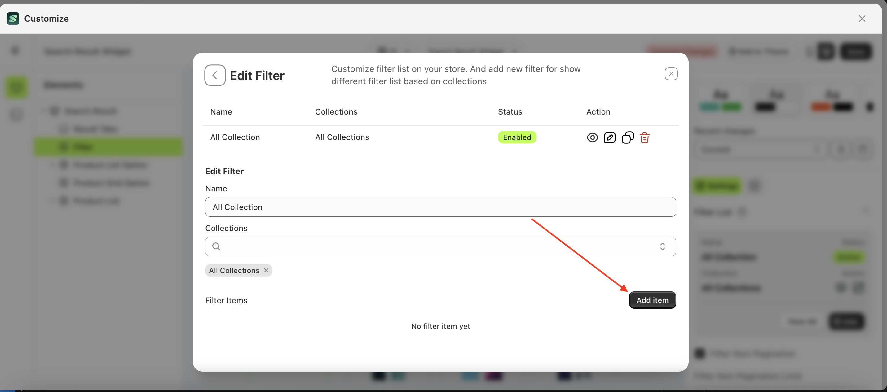
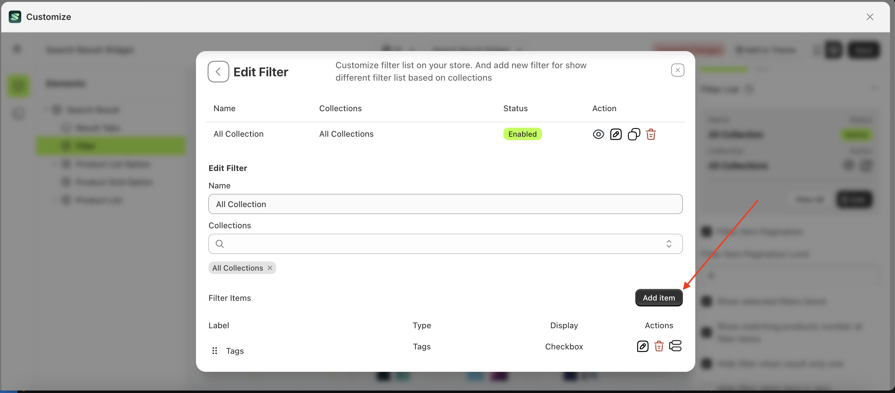
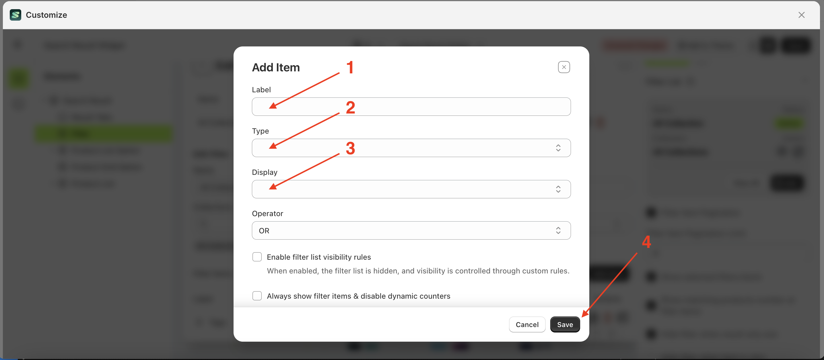
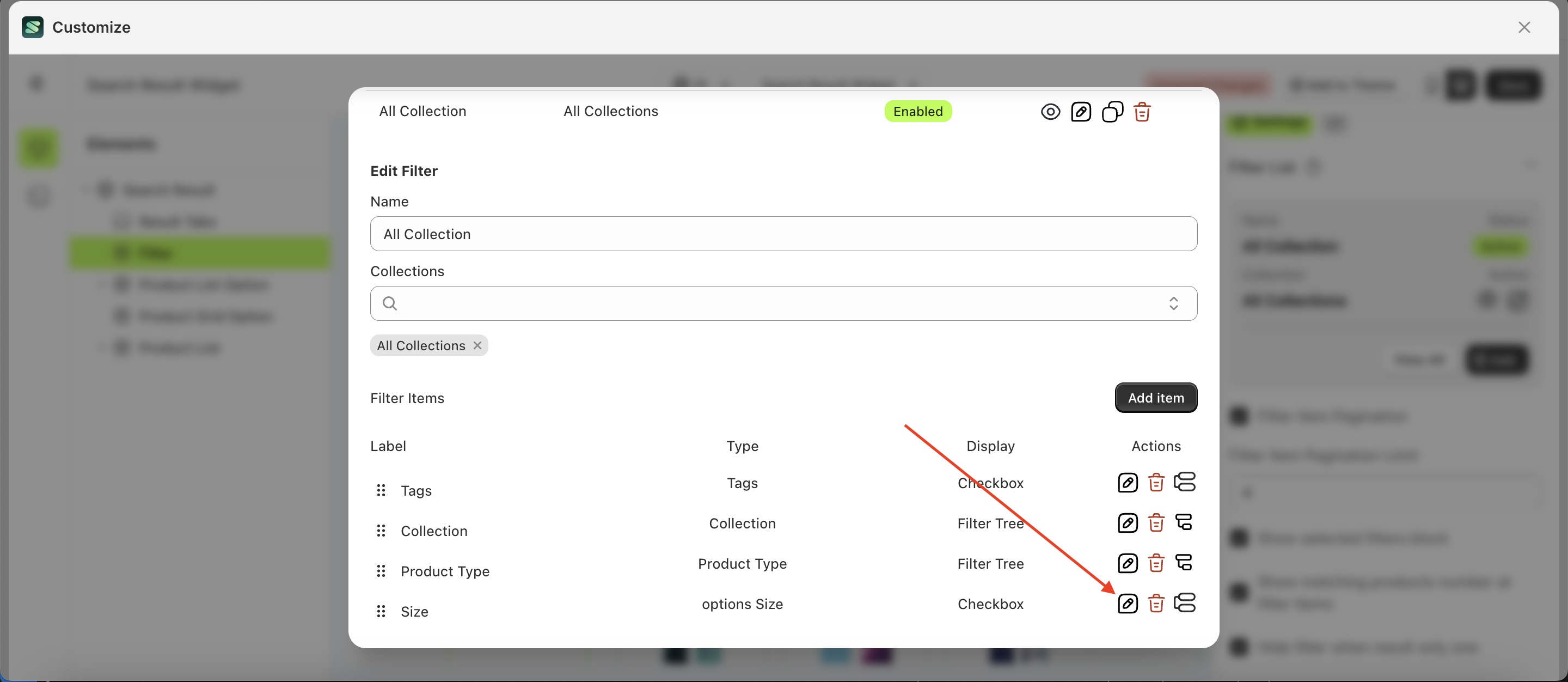
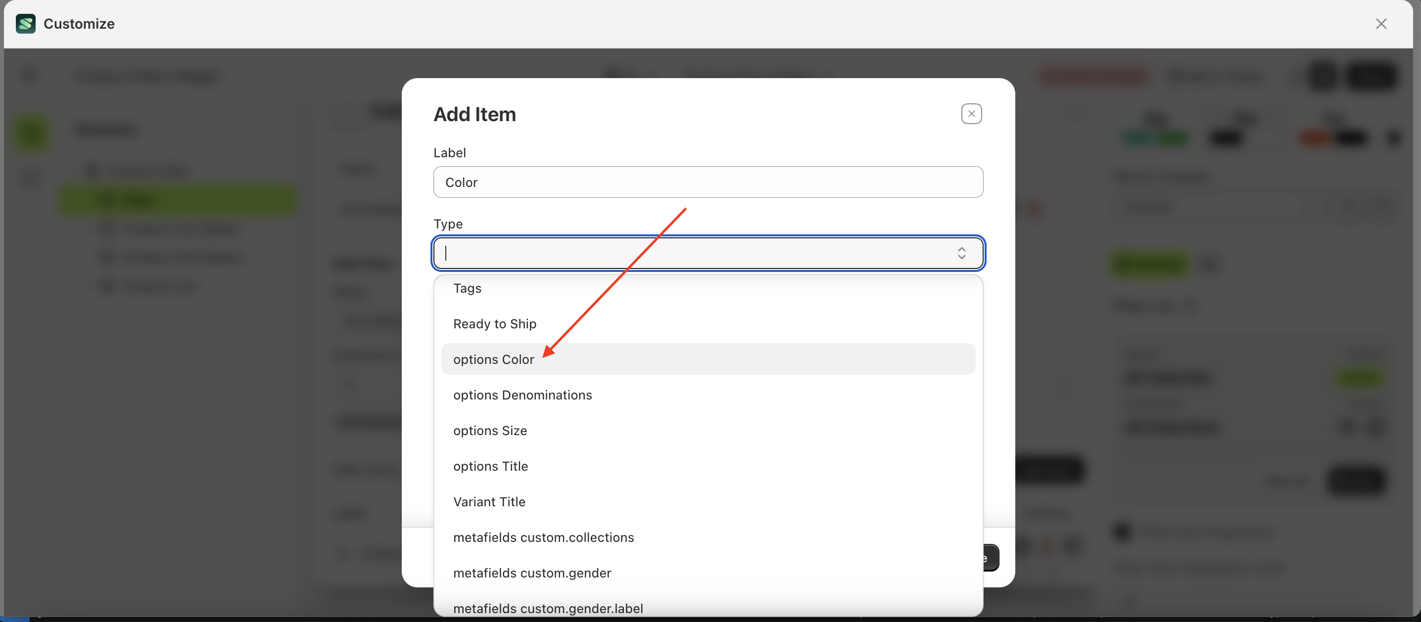
- A new section will appear at the bottom. Click the "Add Item" button.
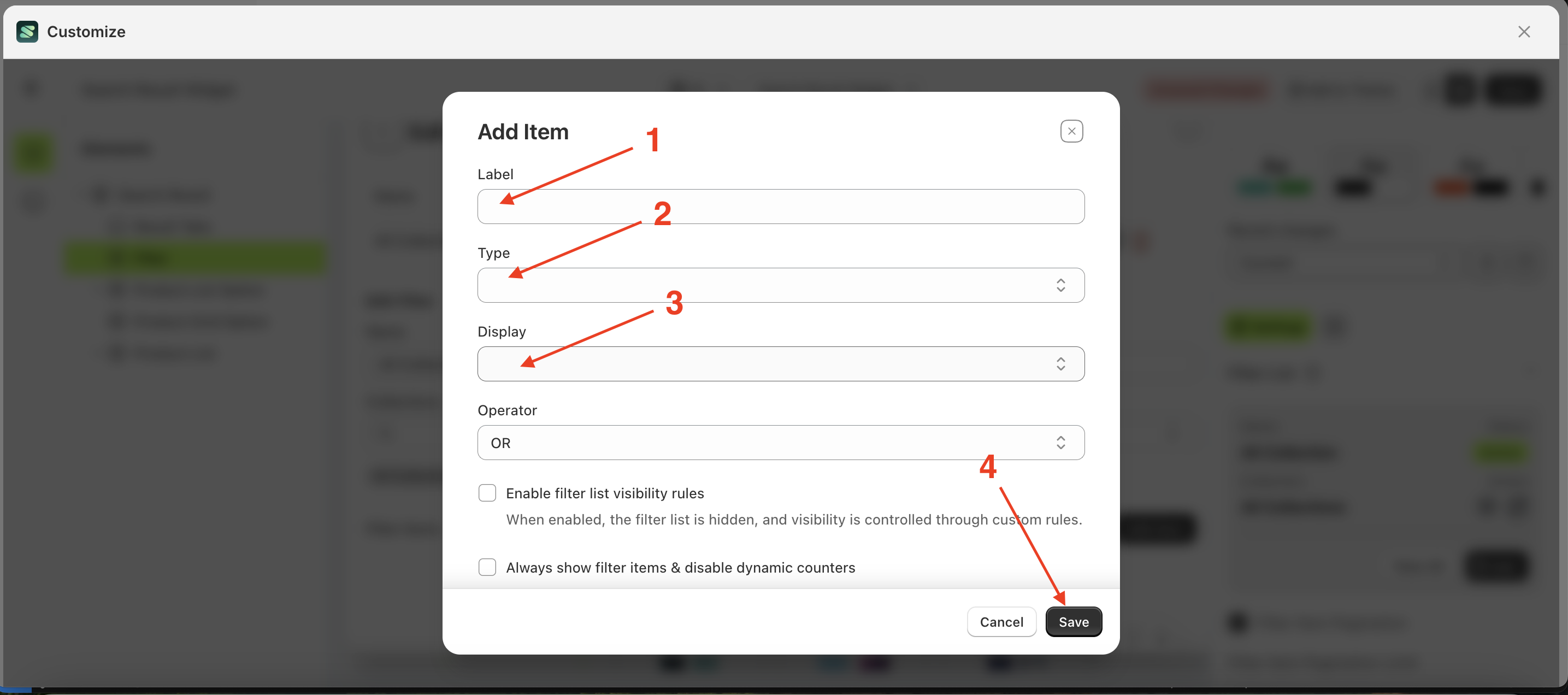
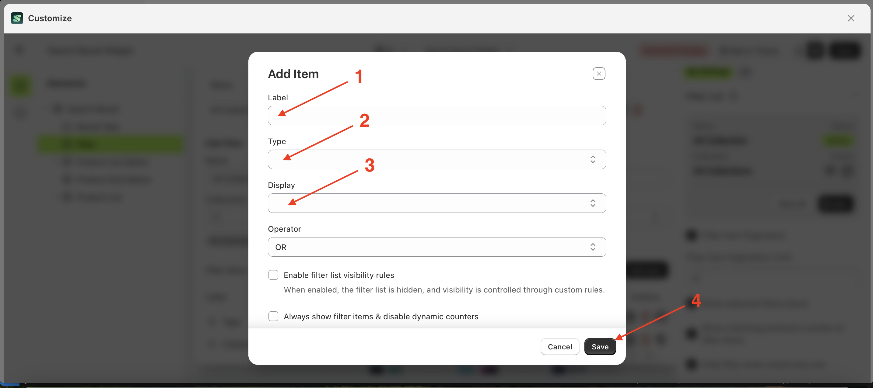
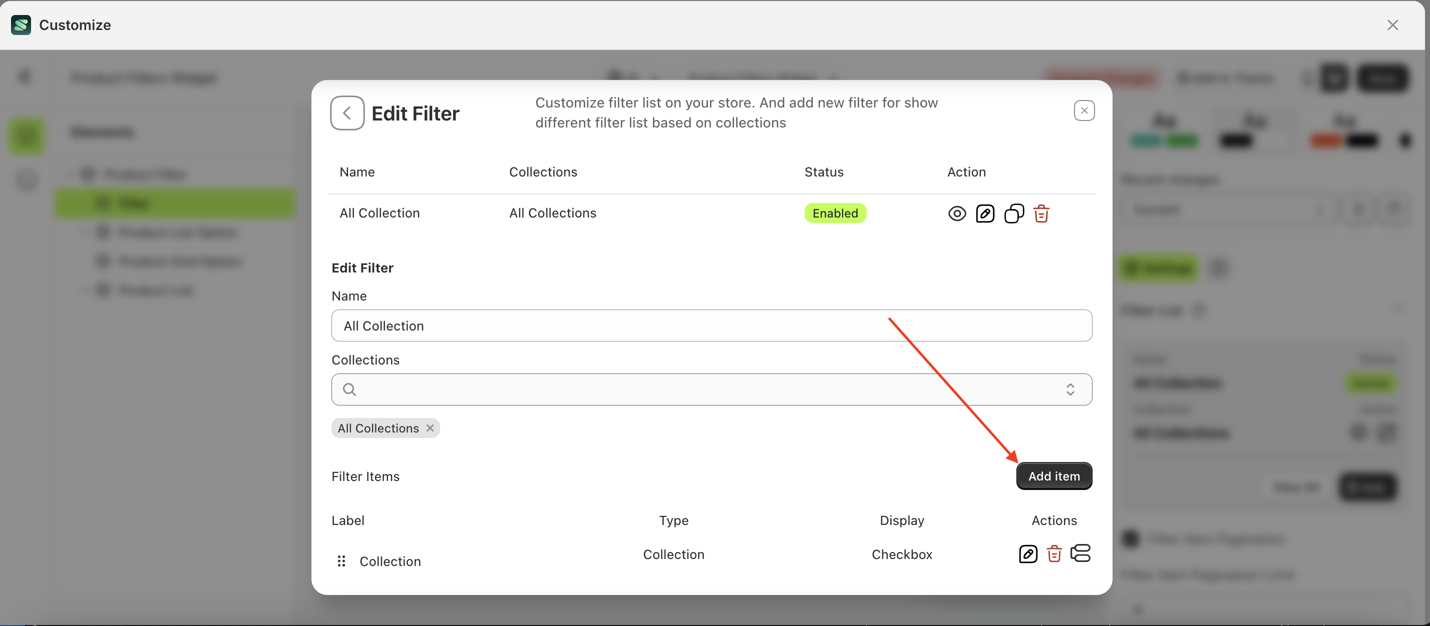
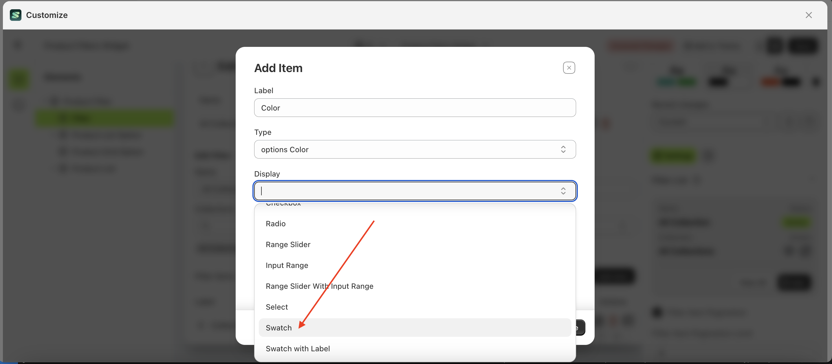
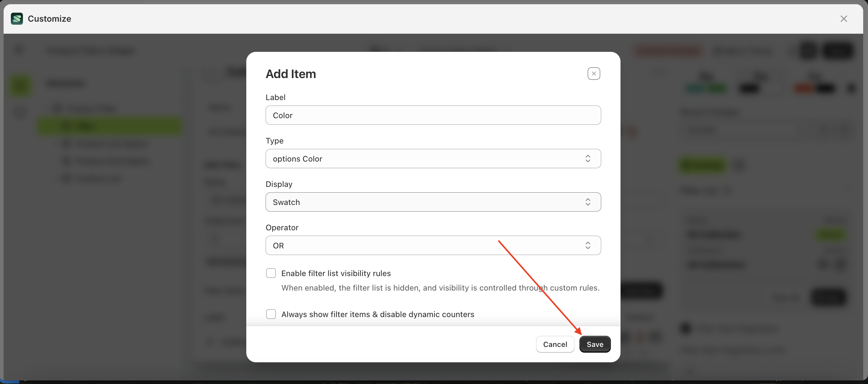
- Fill in the form with the desired details: Label, Type, Display, and Operator
- Label: The title displayed in the collection list as the parent category.
- Type: The type of filter to be displayed.
- Display: The input type used for filtering, such as Checkbox, Radio Button, Select Option, Swatch, or Tree.
- Operator: The logic that will be applied.
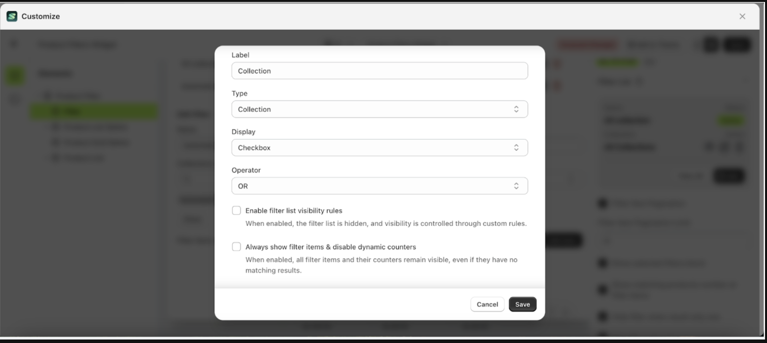
- Example of a completed form
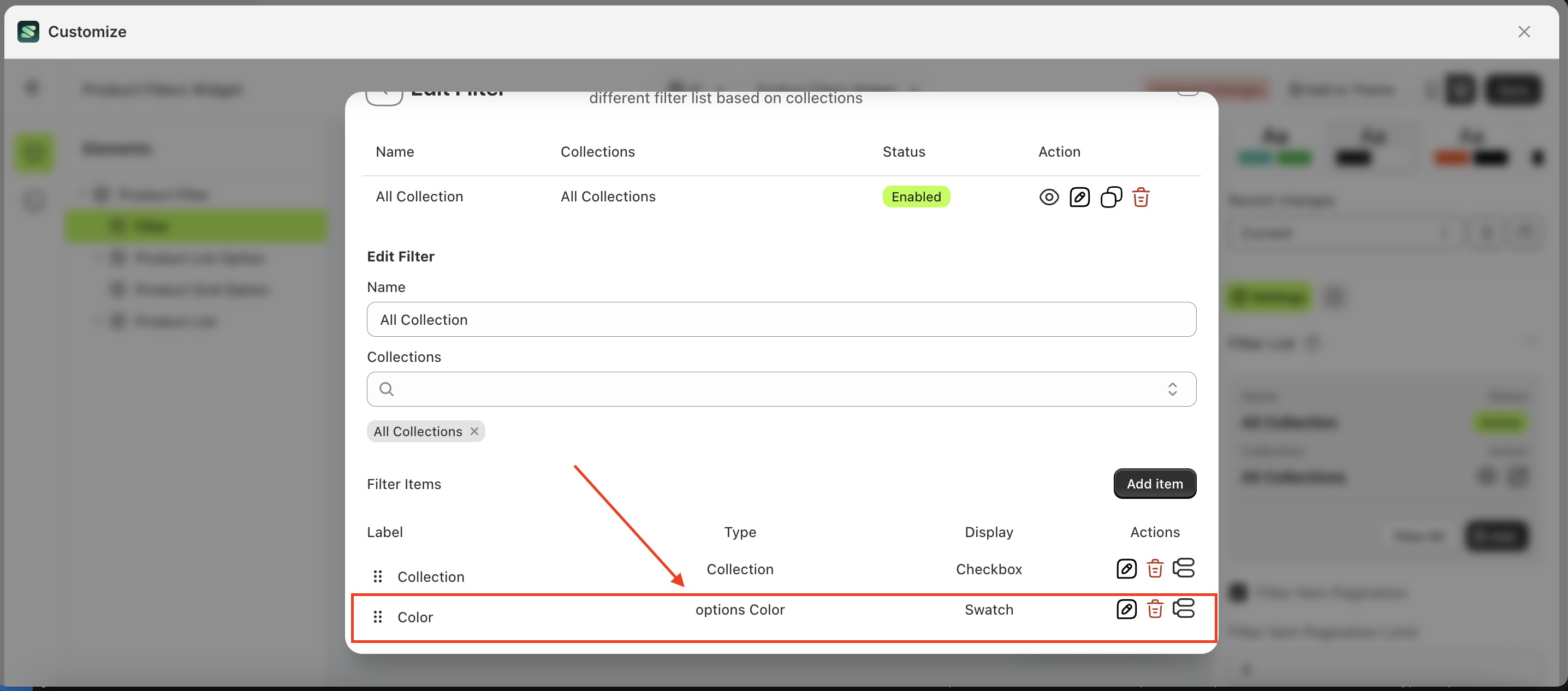
- Once successfully added, the item will appear in the list below
- The filter list will appear in the preview customization.
- Before
- After
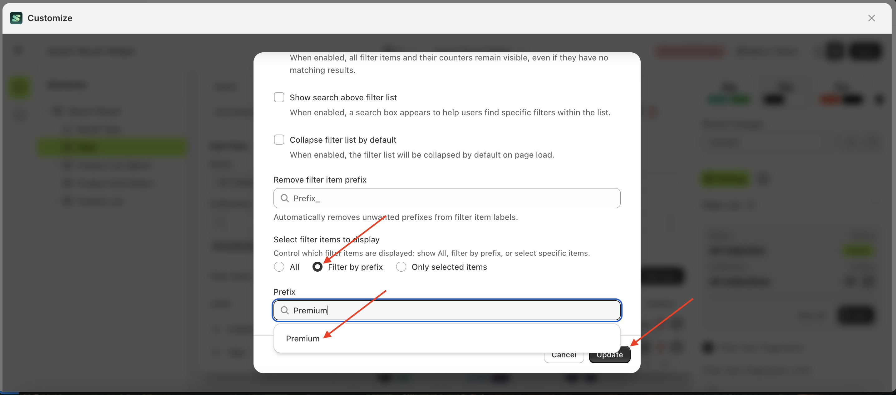
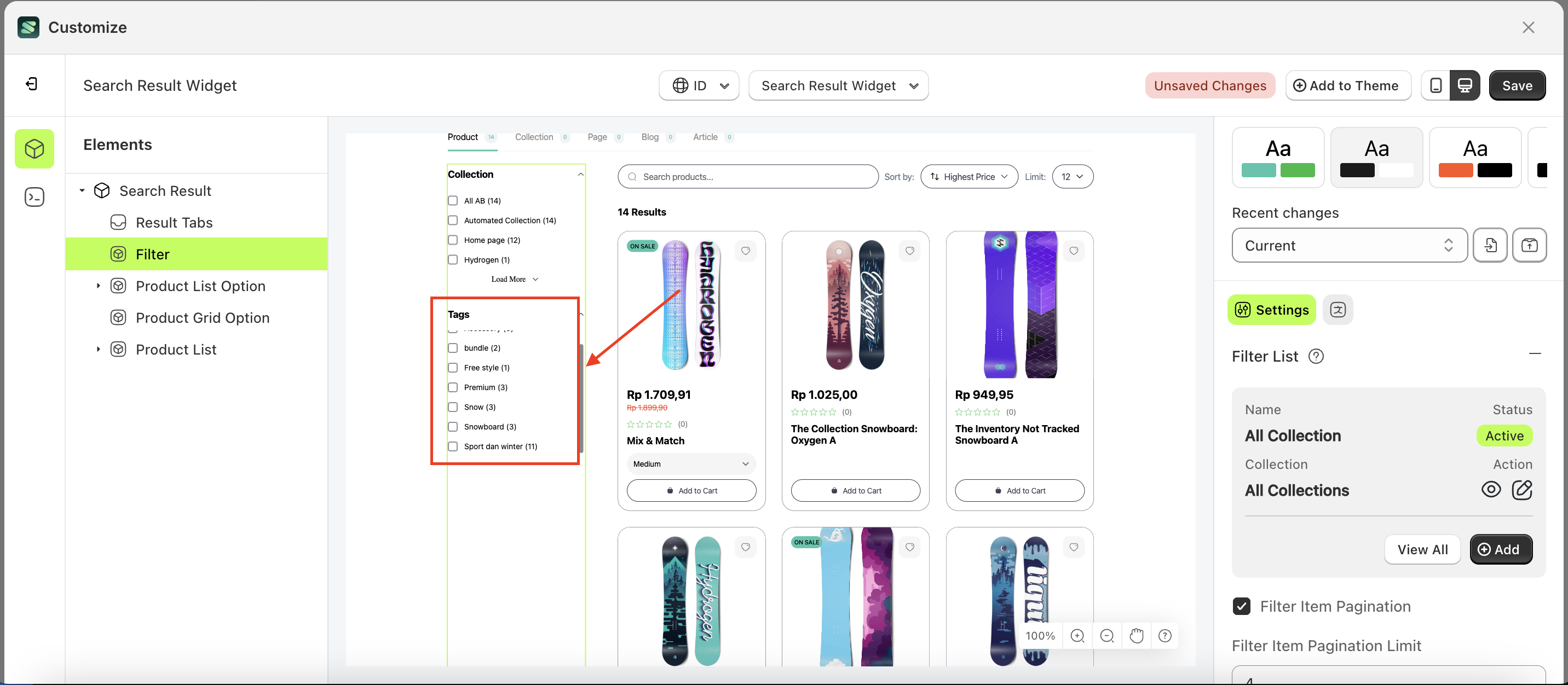
Filter by Prefix
The Filter by Prefix feature allows you to refine which filters are displayed. For example, if there are numerous items within the filter tags, but you only want to show items related to "sport," this feature helps you achieve that efficiently.
Follow the steps below:
- Select the Filter element on the left, then click the Settings tab and click the icon marked with a red arrow.
- Click the "View All" button to open a popup.
- Scroll down to find the filter item you want to set a prefix for, then click the icon indicated by the arrow.
- The Edit Filter Items form will appear. Scroll down to the Filter List section, select Filter By Prefix, choose the list to apply the prefix filter to, and click the "Update" button.
- Preview the changes to ensure the filter item is correctly Filter By Prefix.
- Before applying the Filter By Prefix
- After applying the Filter By Prefix
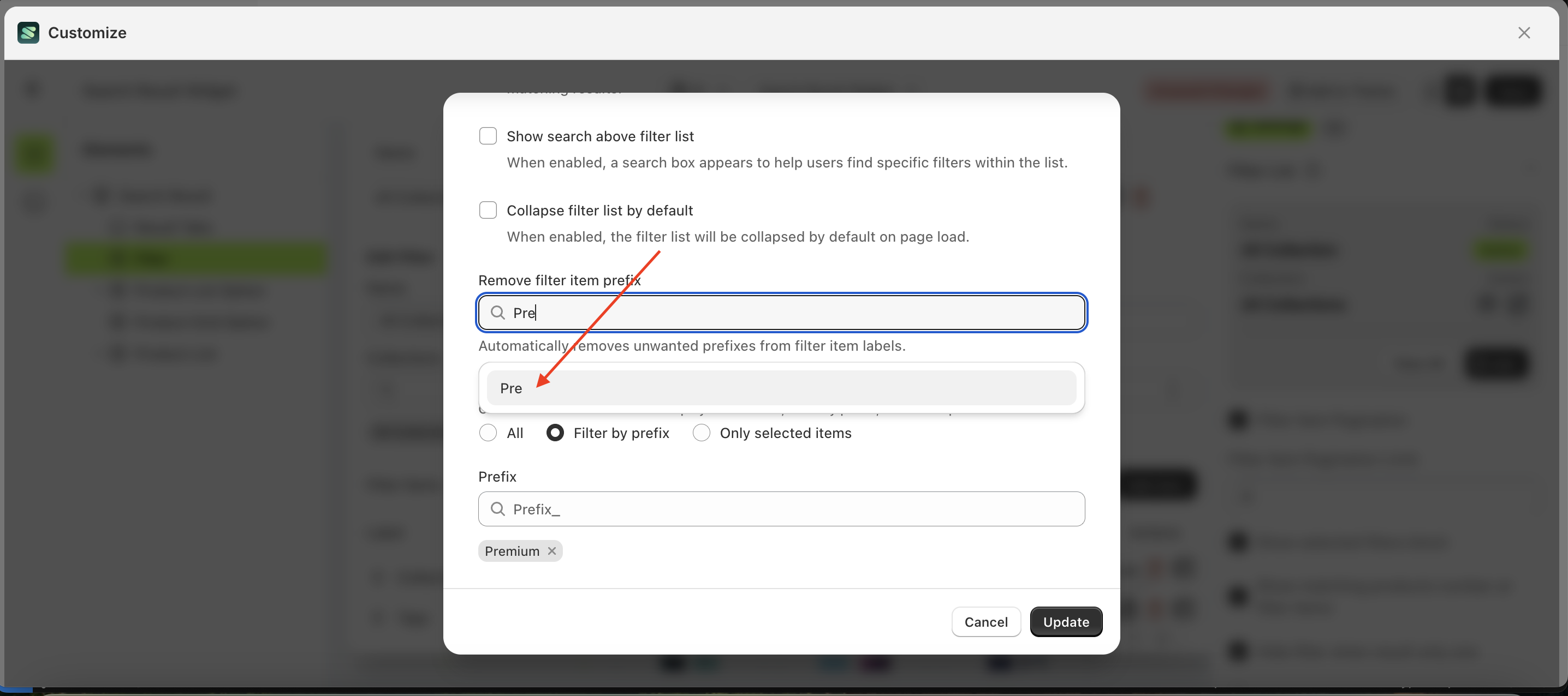
Delete by Prefix
The Delete Prefix feature allows you to trim text from filter items. For example, if you have a filter item in the tags named "sport" and want to remove a specific part of the text, this feature enables you to do so efficiently.
Follow the steps below:
- Select the Filter element on the left, then click the Settings tab and click the icon marked with a red arrow.
- Click the "View All" button to open a popup.
- Scroll down to find the filter item you want to set a prefix for, then click the icon indicated by the arrow.
- The Edit Filter Items form will appear. Scroll down to the Filter List section, select Remove filter item prefix, choose the list to apply the prefix filter to, and click the "Update" button.
- Preview the changes to ensure the filter item is correctly Remove filter item prefix.
- Before applying the Remove filter item prefix
- After applying the Remove filter item prefix
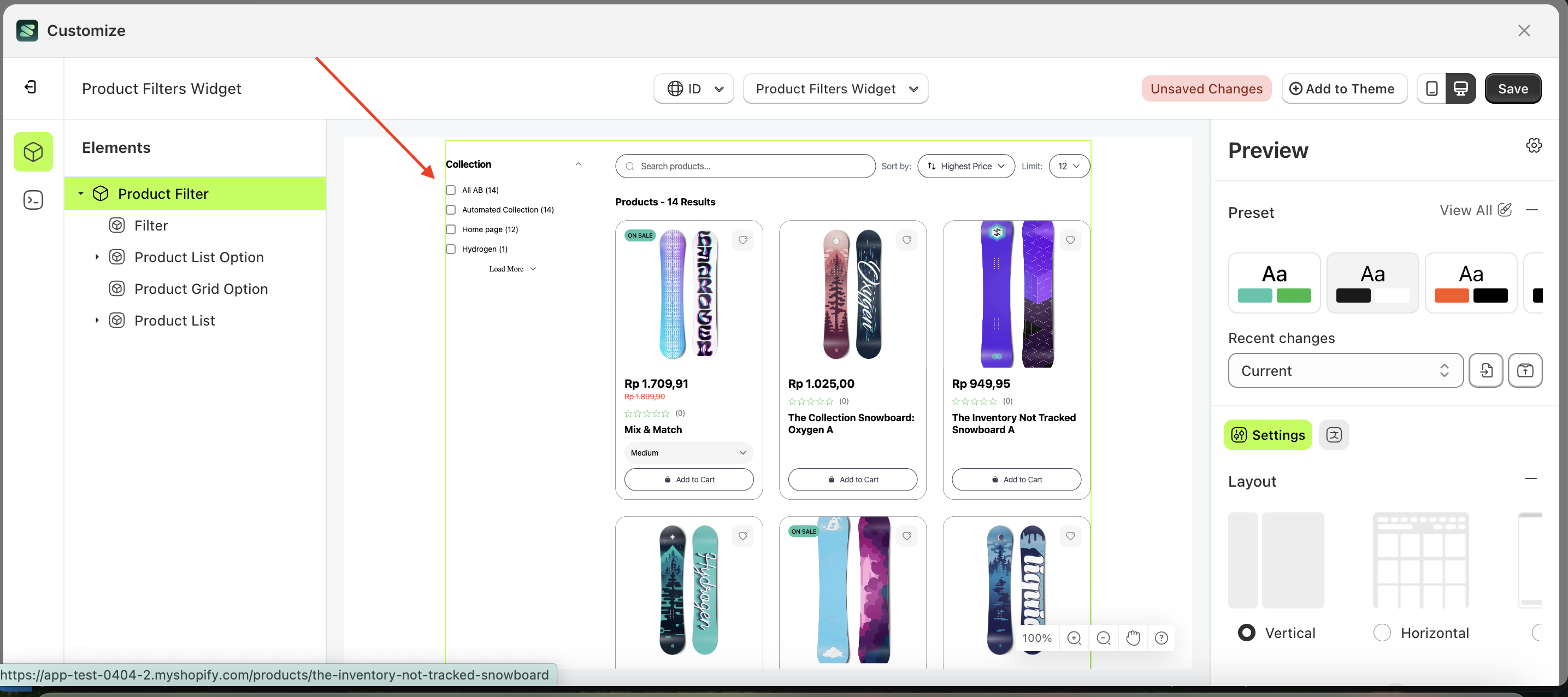
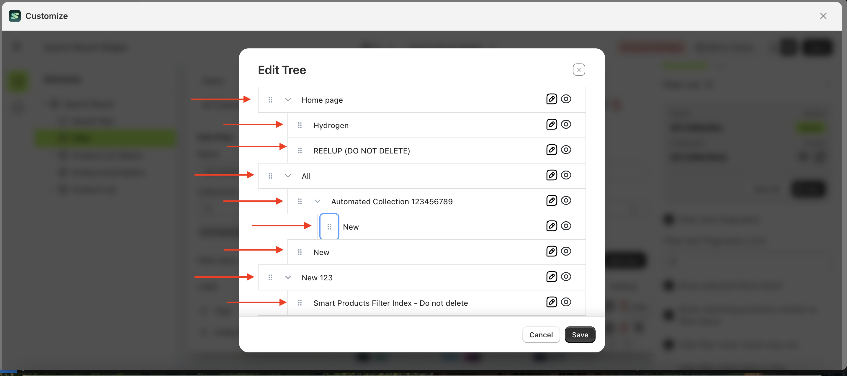
Filter Tree Collection
The Filter Tree feature is designed to accommodate user needs by grouping collections based on the desired categorization.
Follow the steps below:
- Select the Filter element on the left, then click the Settings tab and click the icon marked with a red arrow.
- Click the "View All" button to open a popup.
- Click the edit icon to open the Edit Filter form
- Click the "Add Item" button.
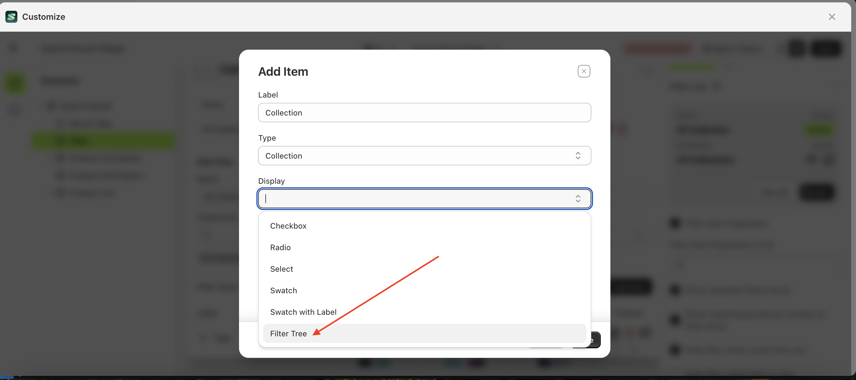
- Fill in the required fields in the Add Item form.
- In the Display field, select "Filter Tree", then click the "Save" button.
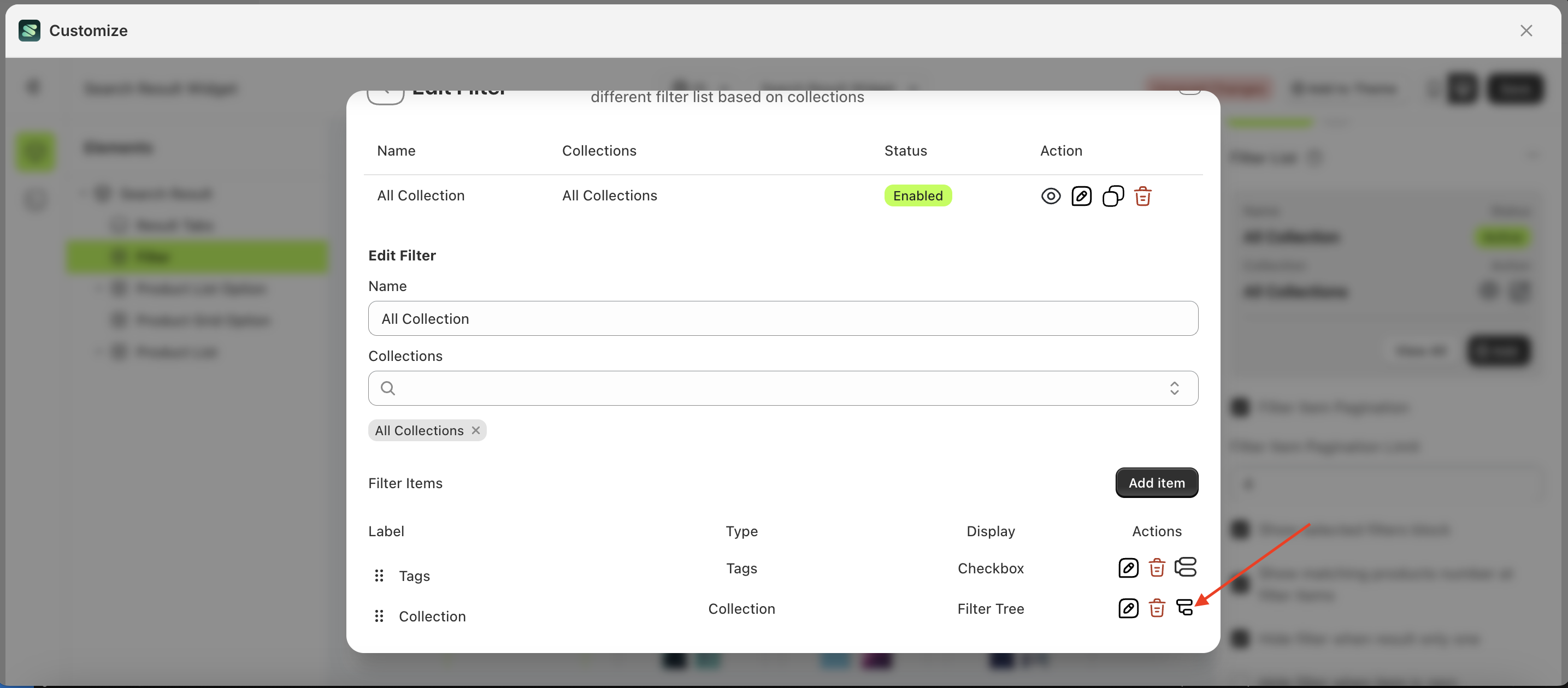
- A list of Filter Items will appear. Next, click the tree icon in the bottom left corner, as indicated by the arrow.
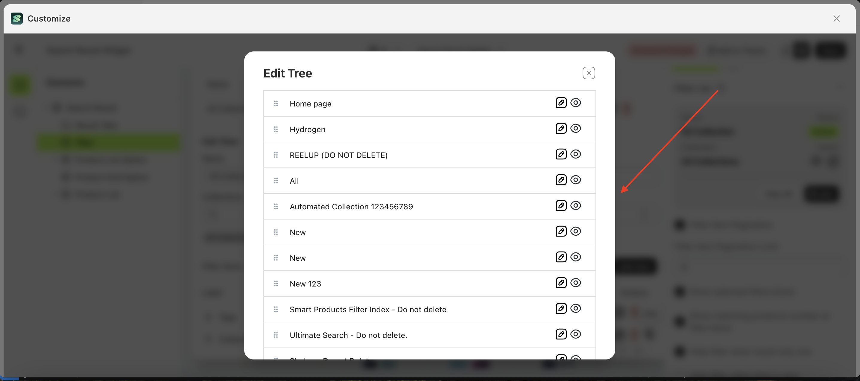
- After clicking the icon, a new interface will appear for configuring the Filter Tree.
- Drag and arrange the items according to the desired filter tree structure, then click the "Save" button
- Once inside the Product Filter Widget, the Filter Tree should now be visible in the Filter Element.
- Before the tree collection filter is added
- After the tree collection filter is added.
Filter Tree By Product Type
The Filter Tree Product Type feature is designed to help users group products based on their available data.
Follow the steps below:
- Select the Filter element on the left, then click the Settings tab and click the icon marked with a red arrow.
- Click the "View All" button to open a popup.
- Click the edit icon to open the Edit Filter form.
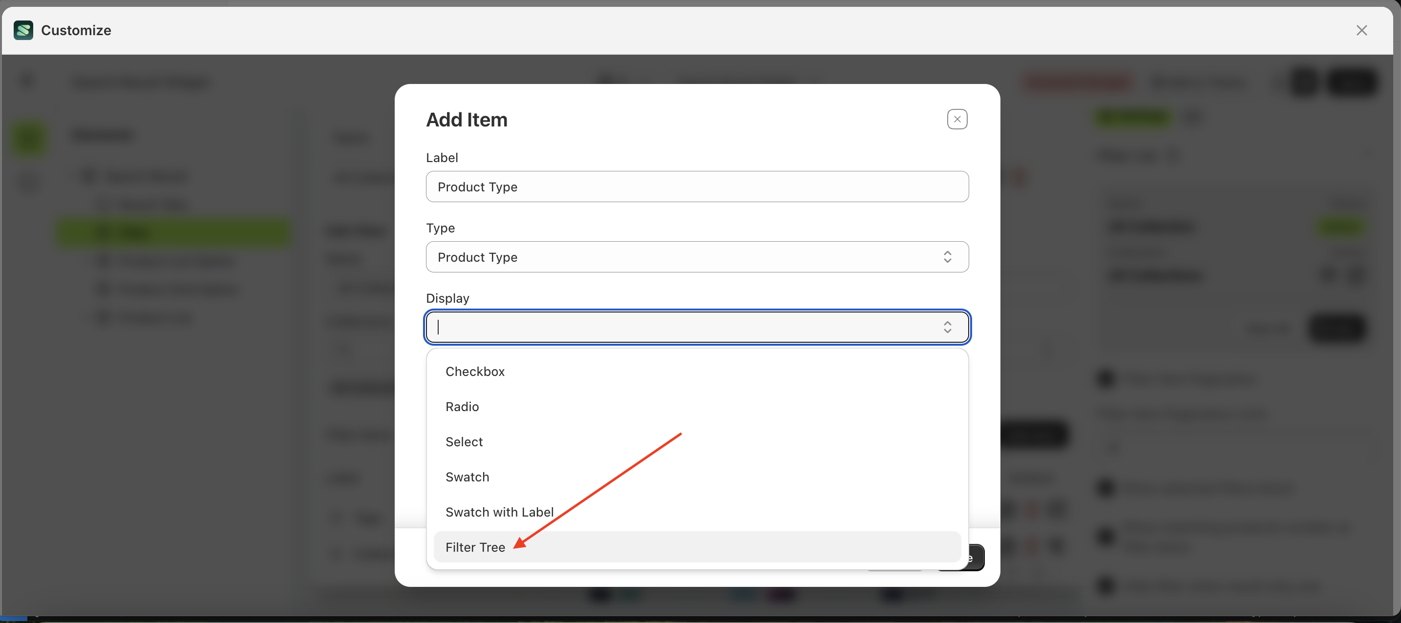
- After the Filter List Form appears, click "Add Item".
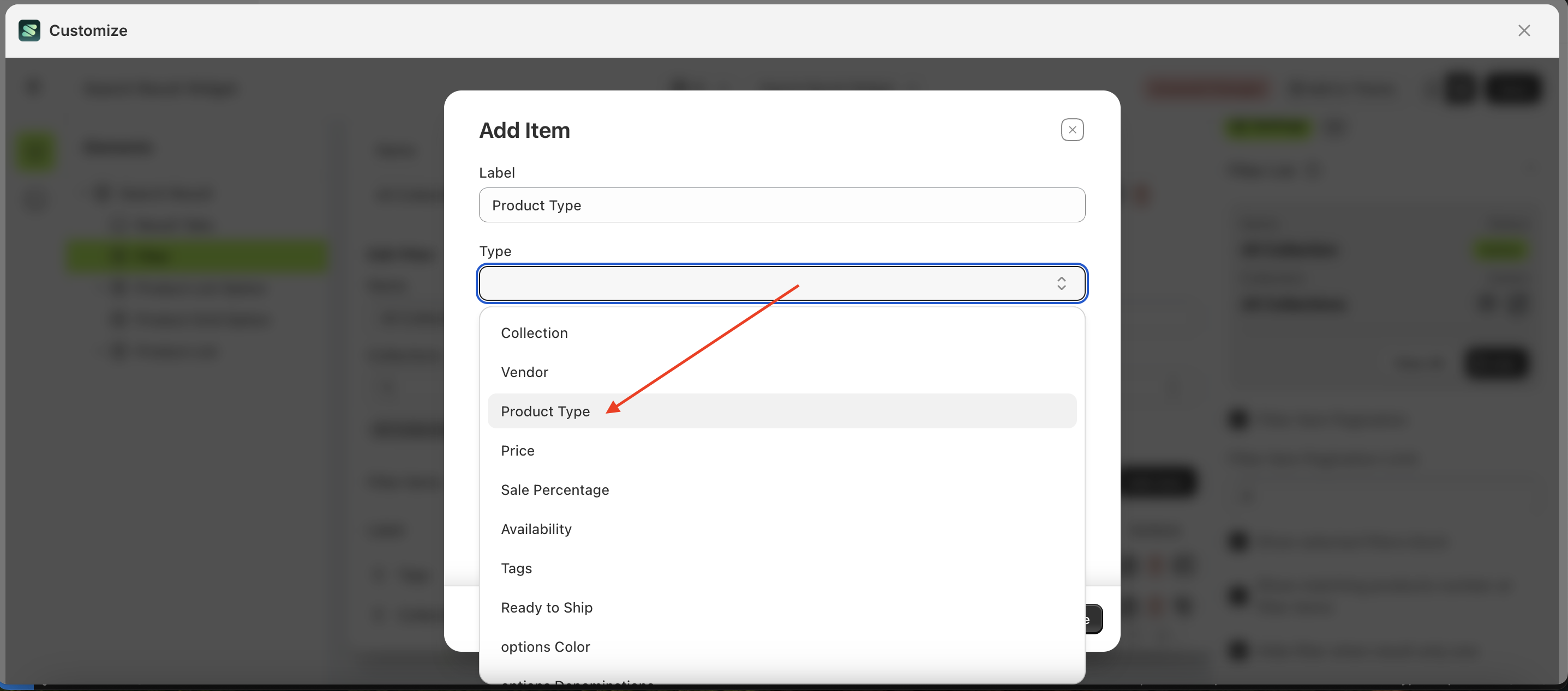
- Fill in the form with the desired details: Label, Type, Display, and Operator.
- Label: The title displayed in the collection list as the parent category.
- Type: The type of filter to be displayed.
- Display: The input type used for filtering, such as Checkbox, Radio Button, Select Option, Swatch, or Tree.
- Operator: The logic that will be applied.
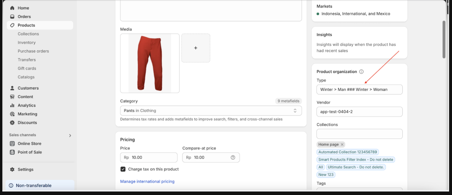
- Enter the Label as needed and set the Type field to Product Type.
- In the Display field, select Filter Tree.
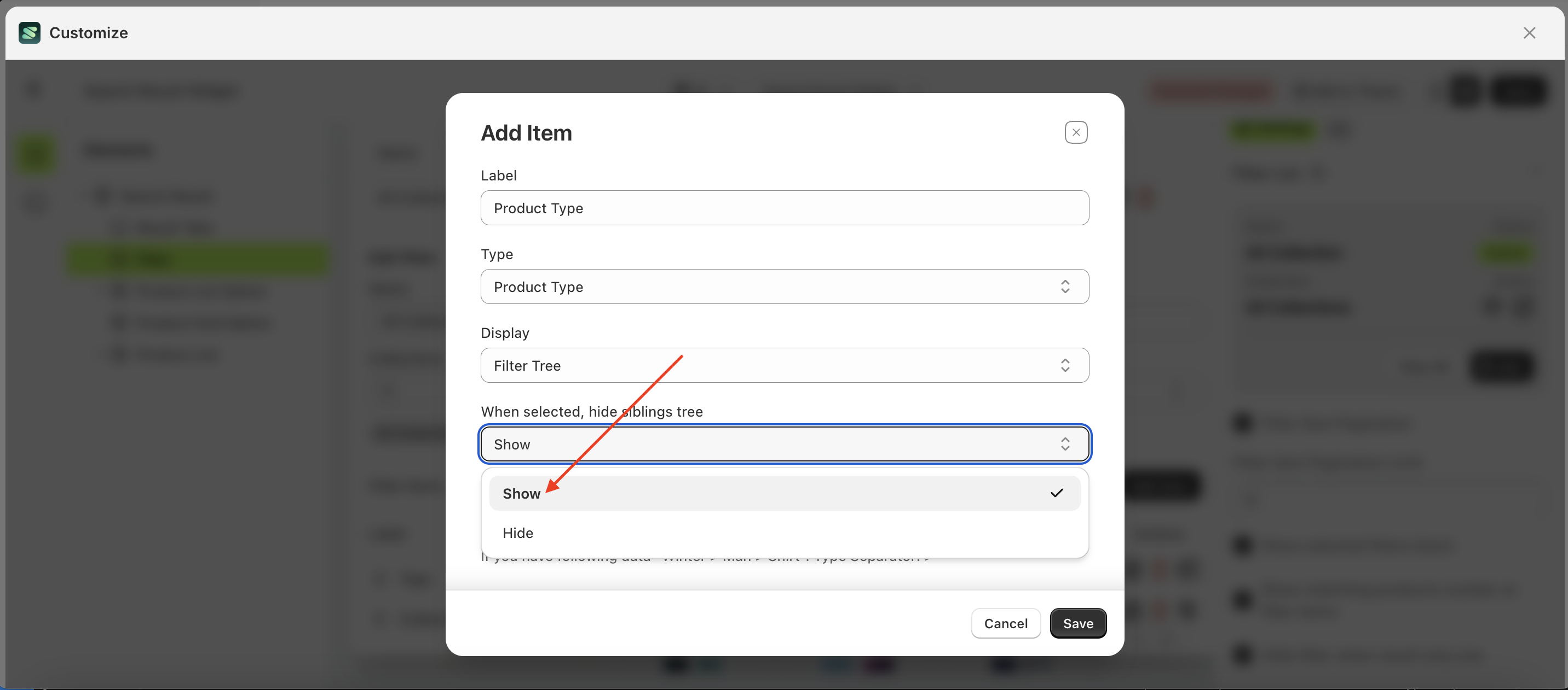
- For the "When selected, hide siblings tree" option, choose according to your preference.
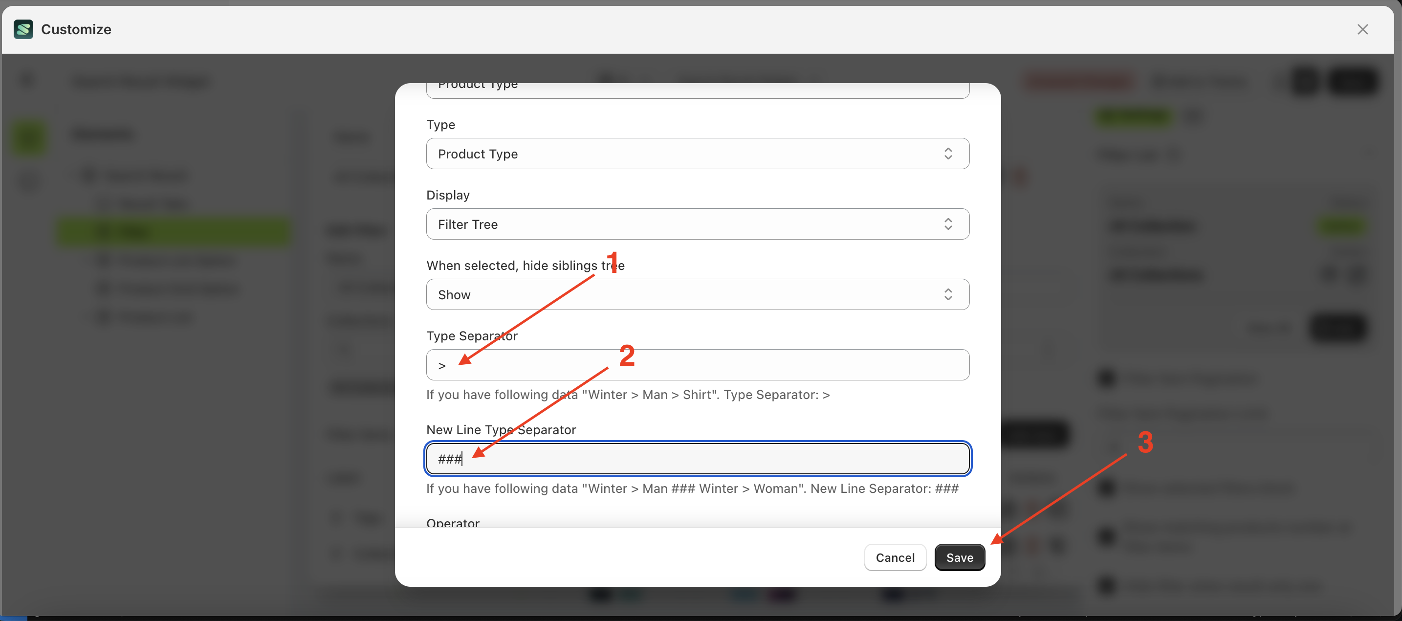
- Fill in the "Type Separator" and "New Line Type Separator" fields based on your store's data. In the example below, the input follows this format because the store's data structure is "Winter > Man ### Winter > Woman"
- Once saved, the filter preview in the Customizer will update as shown below:
- Here is the Type field as displayed on the Product Detail Page:
Chained Filter
Chained Filter is a method used to manage filters with dependencies. This feature utilizes Visibility Rules, making it useful for hiding filters that shouldn't be displayed until certain conditions are met.
For example, consider a filter list with items such as price, product type, tags, collection, and size. The size filter is highly specific and only applies to products with the bundle tag.
Follow the steps below:
- Select the Filter element on the left, then click the Settings tab and click the icon marked with a red arrow.
- Click the "View All" button to open a popup.
- Click the edit icon to open the Edit Filter form.
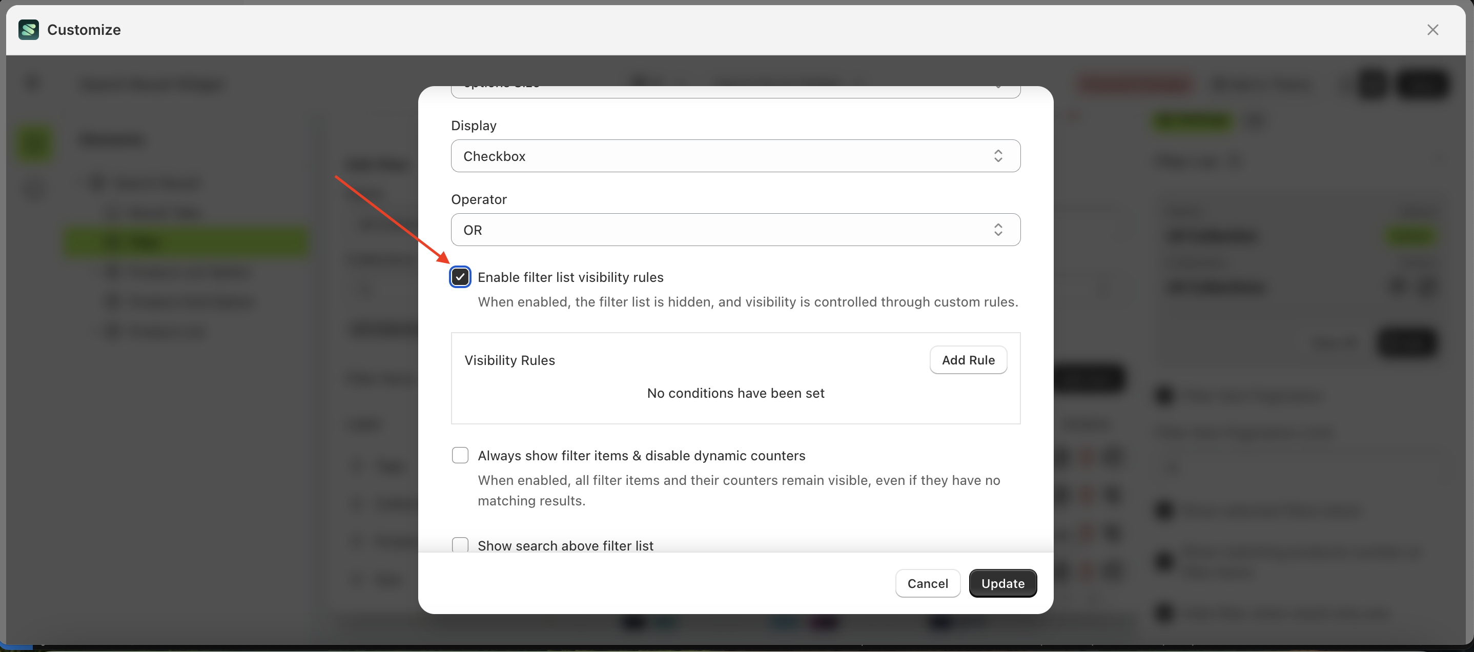
- Scroll down to find the filter item you want to set a chained filter for, then click the icon indicated by the arrow
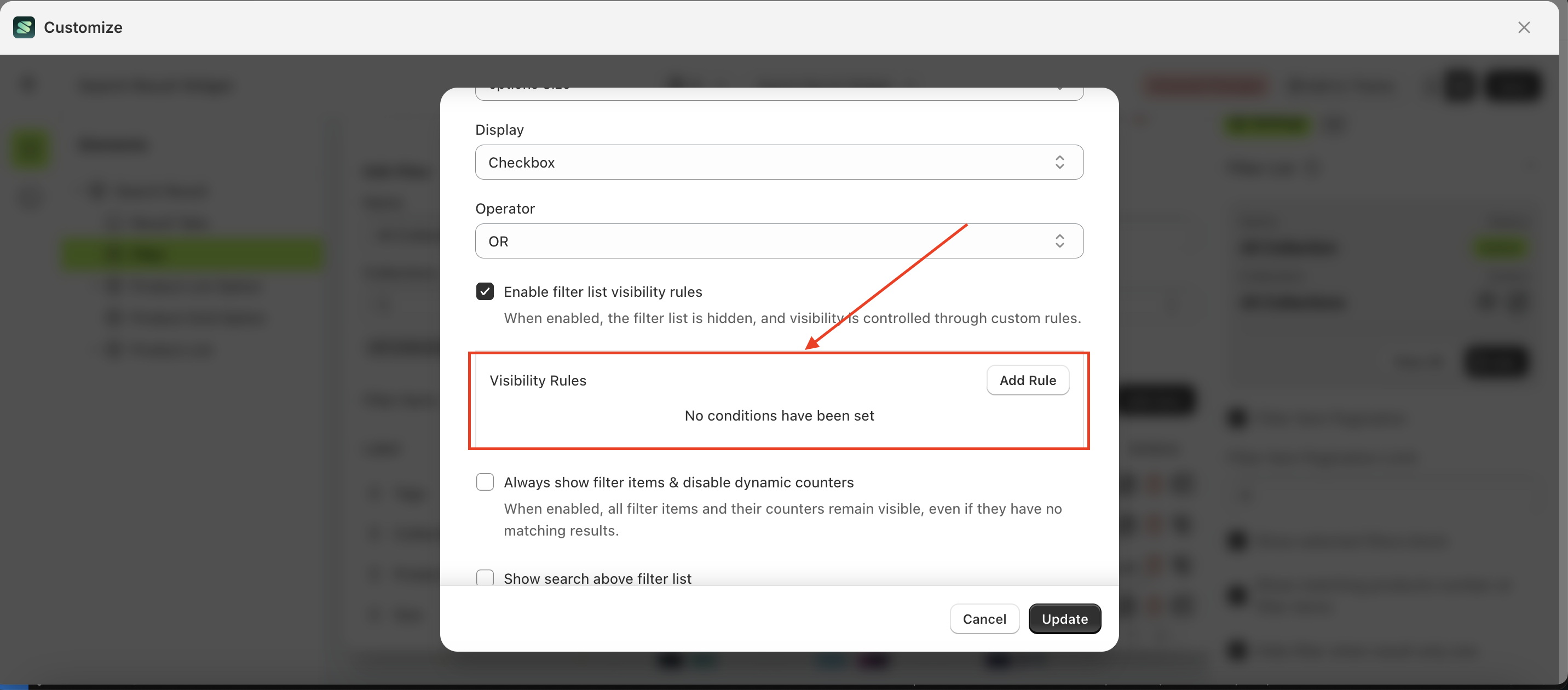
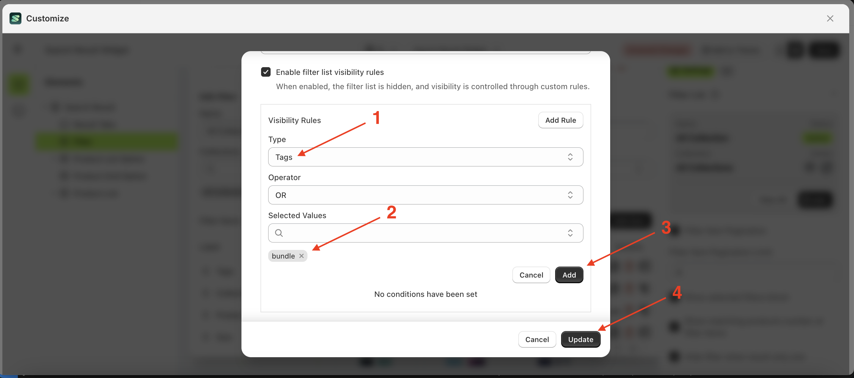
- The Edit Filter Item form will appear. Scroll down to the Filter List section, select "Enable filter list visibility rules," and enable the checkbox.
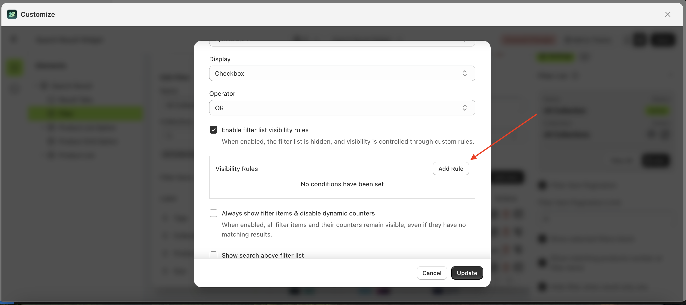
- The Visibility Rules section, highlighted with a red box, will appear
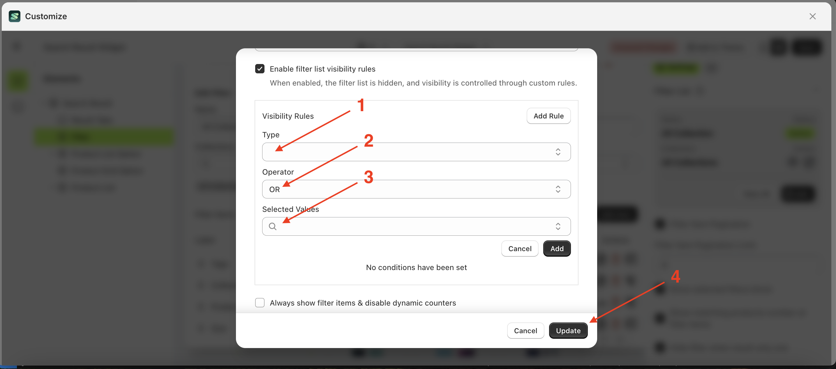
- A pop-up will appear—click Add Rule.
- A form will appear—fill it out based on your requirements.
- For example, we will trigger the filter tags with the value bundle using the OR logic
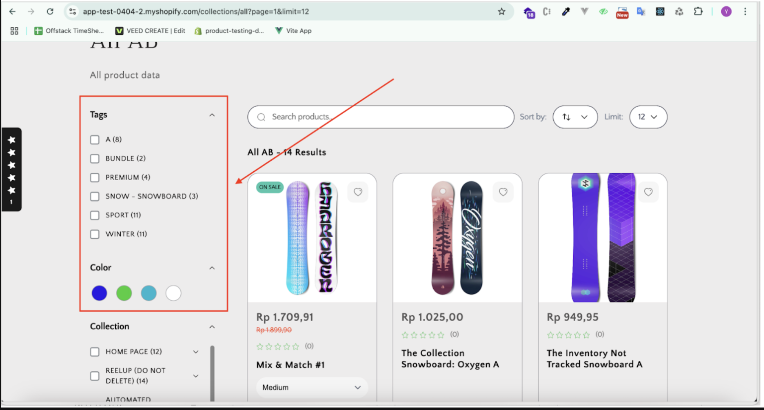
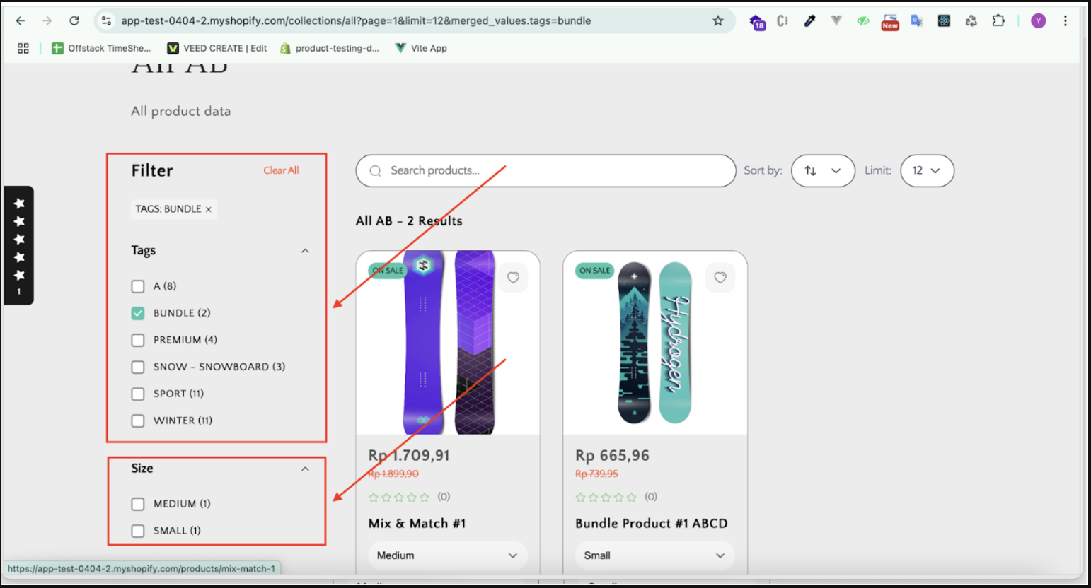
- Here’s how it appears on the storefront:
- The Size filter does not appear because the bundle tag has not been selected.
- The Size filter remains hidden until the bundle tag is selected
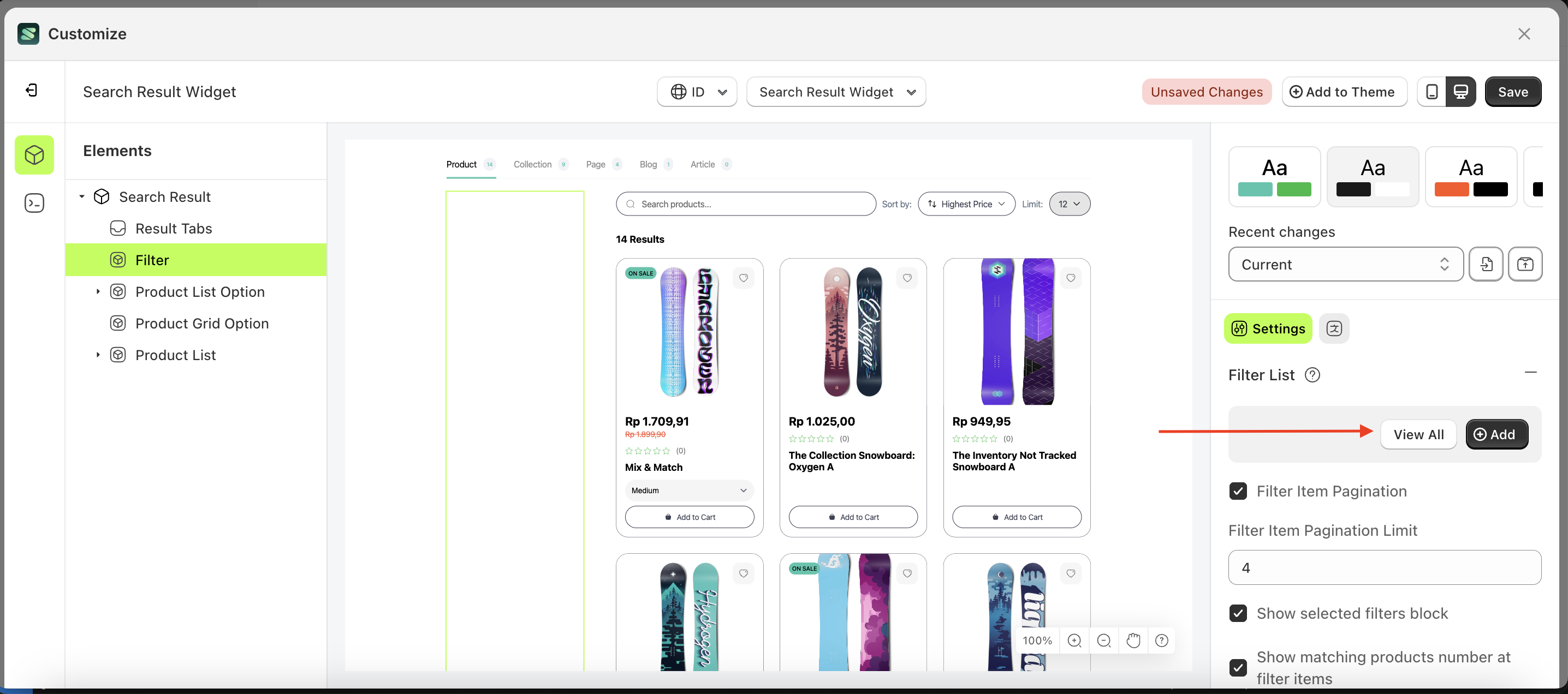
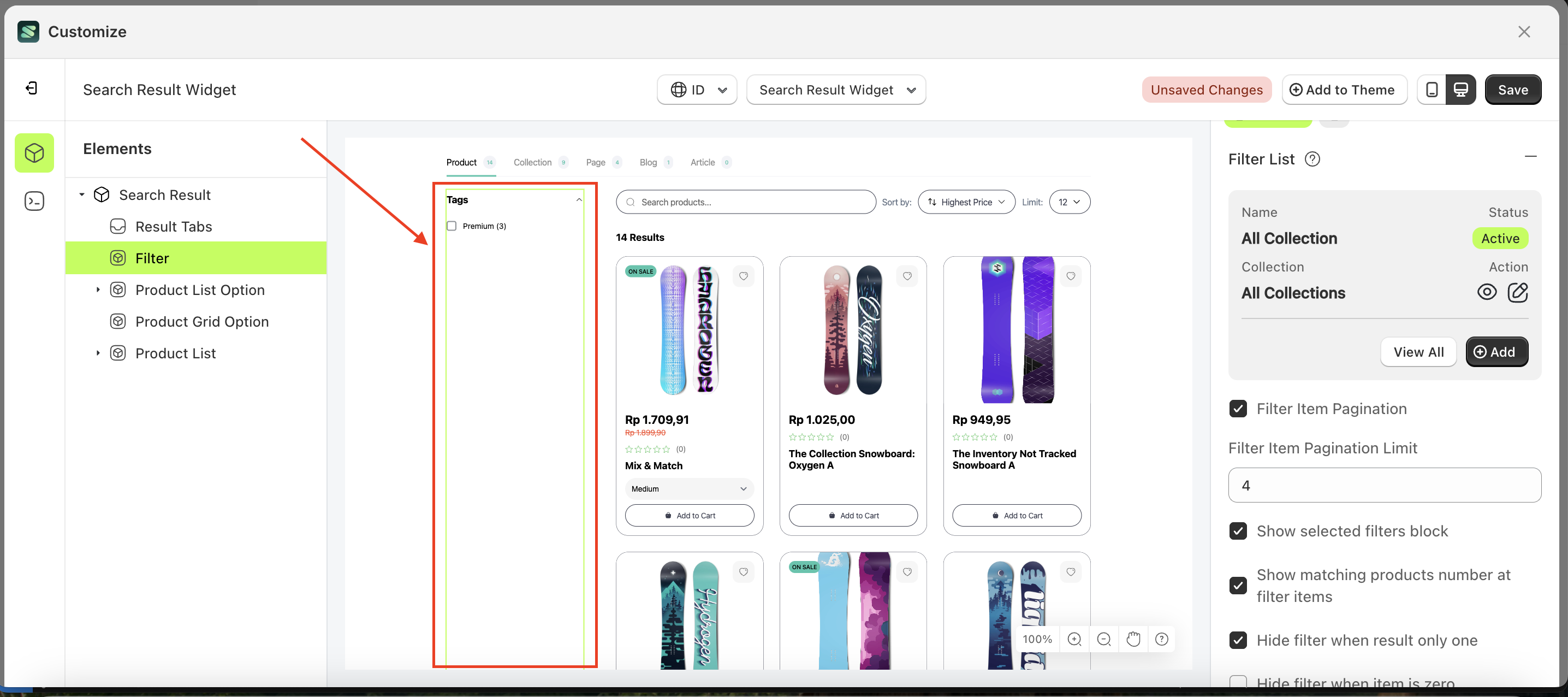
Filter Item Pagination
This feature is designed to show or hide pagination on filter items.
Follow the steps below:
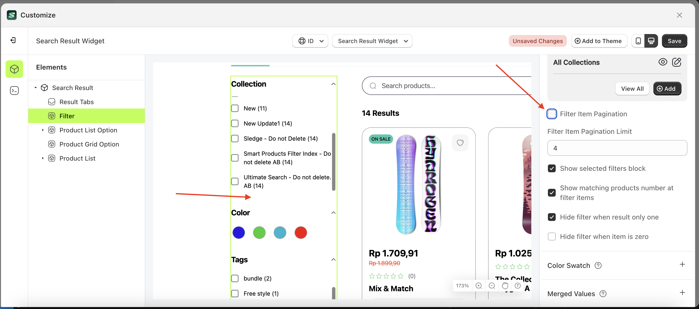
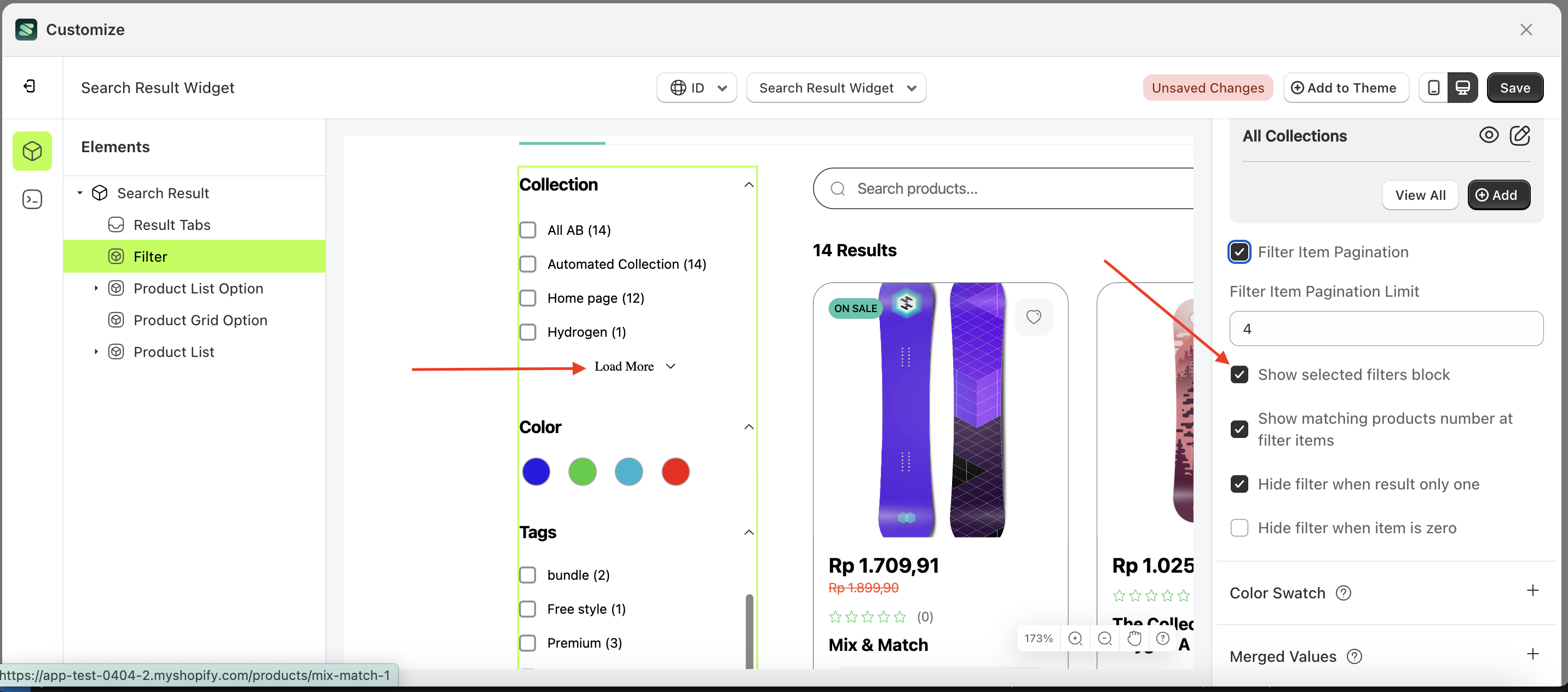
- Select the Filter element on the right, then click the Settings tab and click the icon marked with a red arrow.
- Enable the Filter Item Pagination checkbox
- Example : Before Filter Item Pagination is enabled
- Example : After Filter Item Pagination is enabled
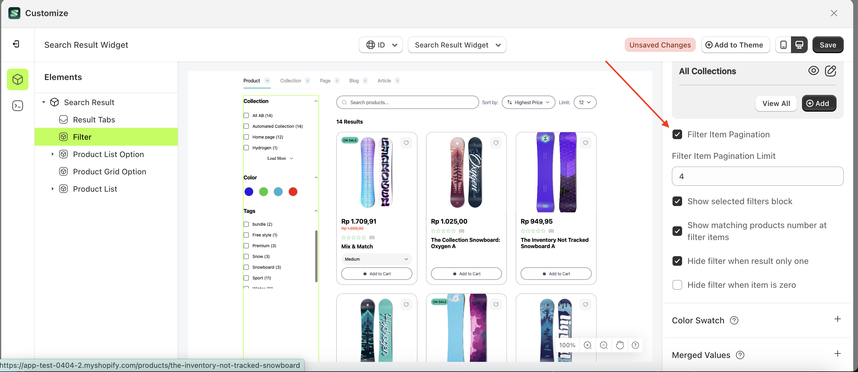
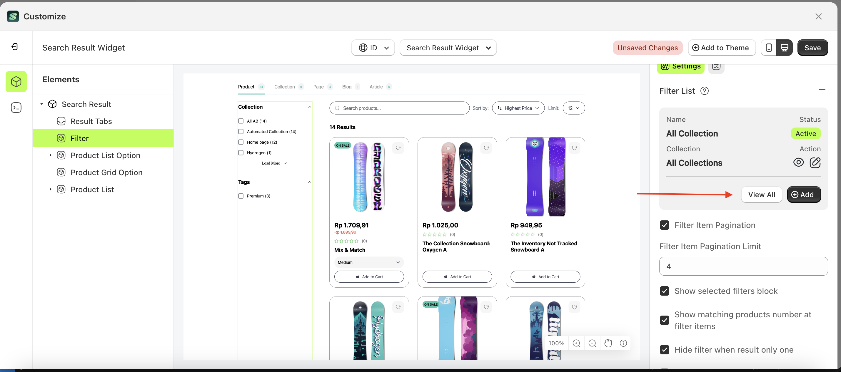
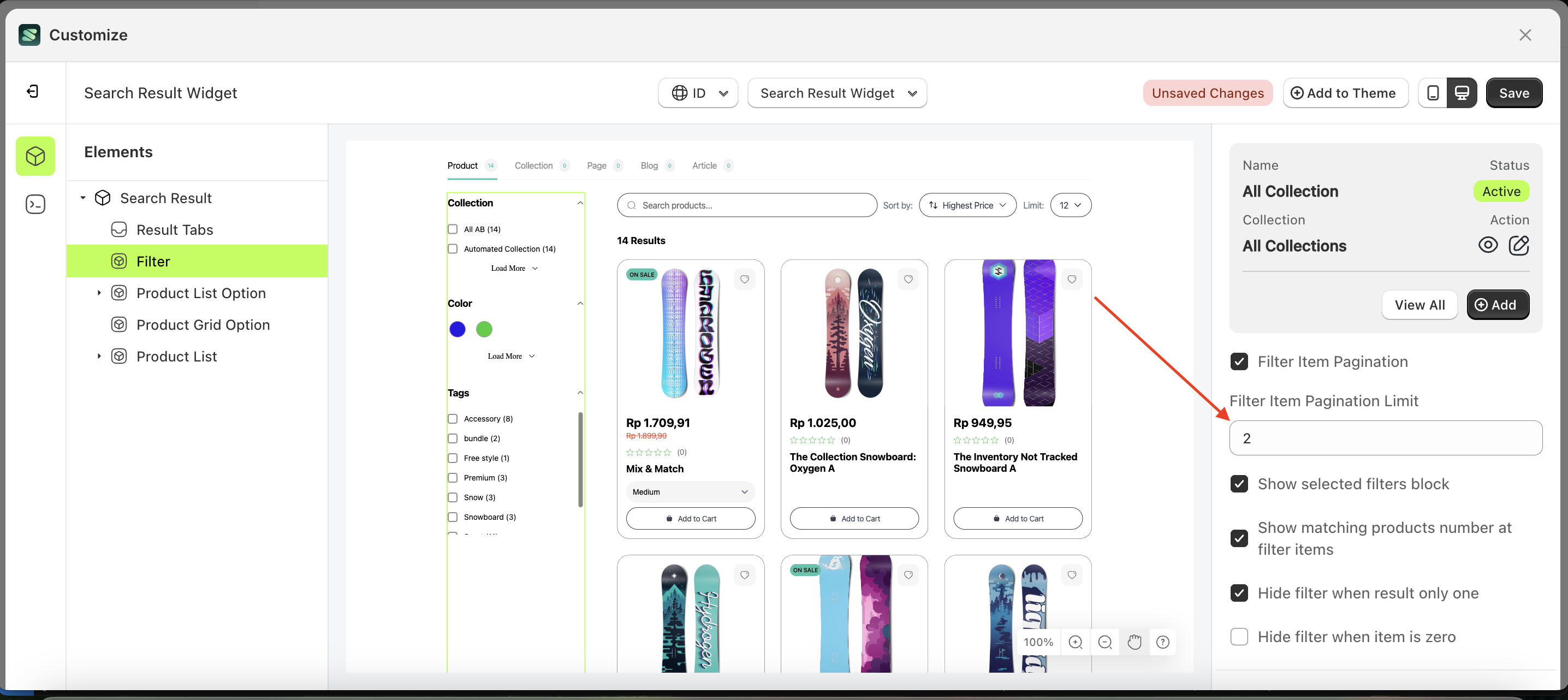
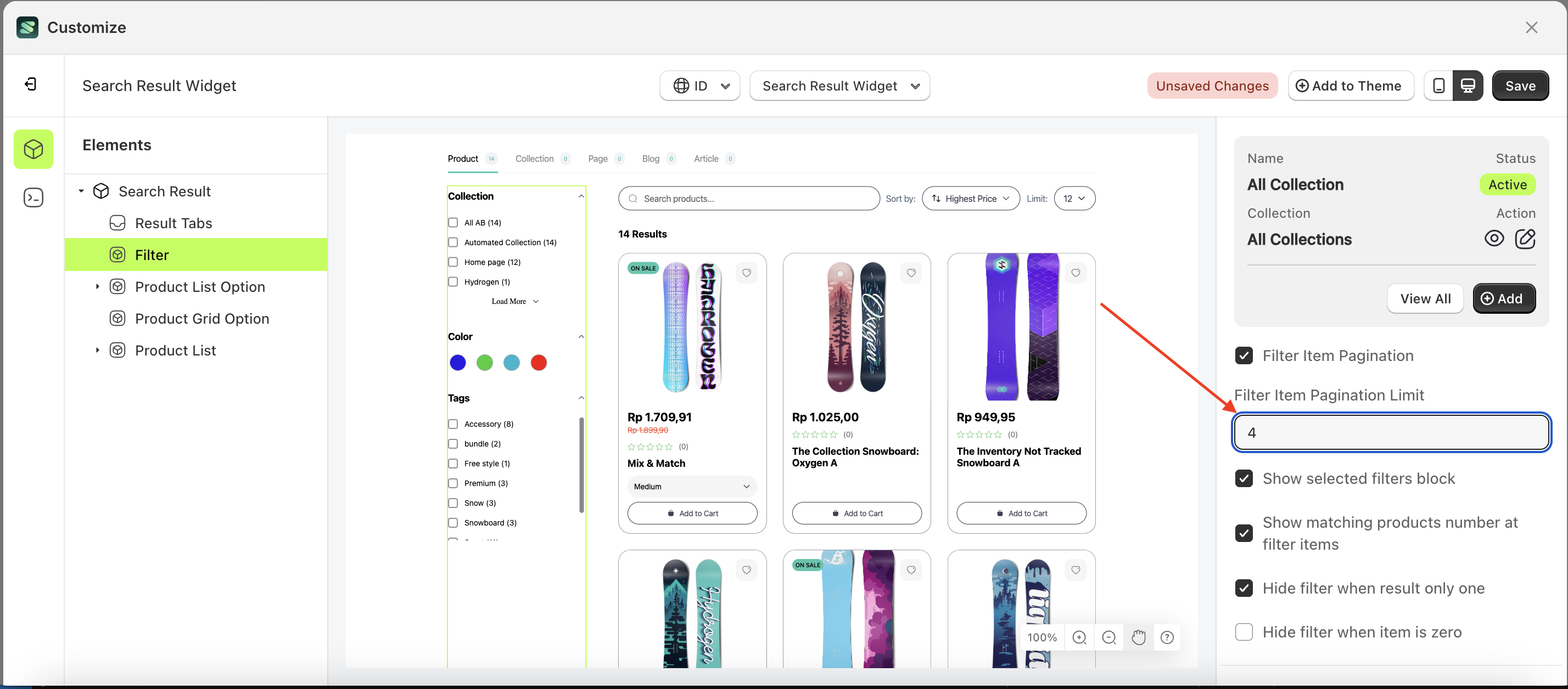
Filter Item Pagination Limit
This feature is designed to set the item row limit before pagination is displayed.
Follow the steps below:
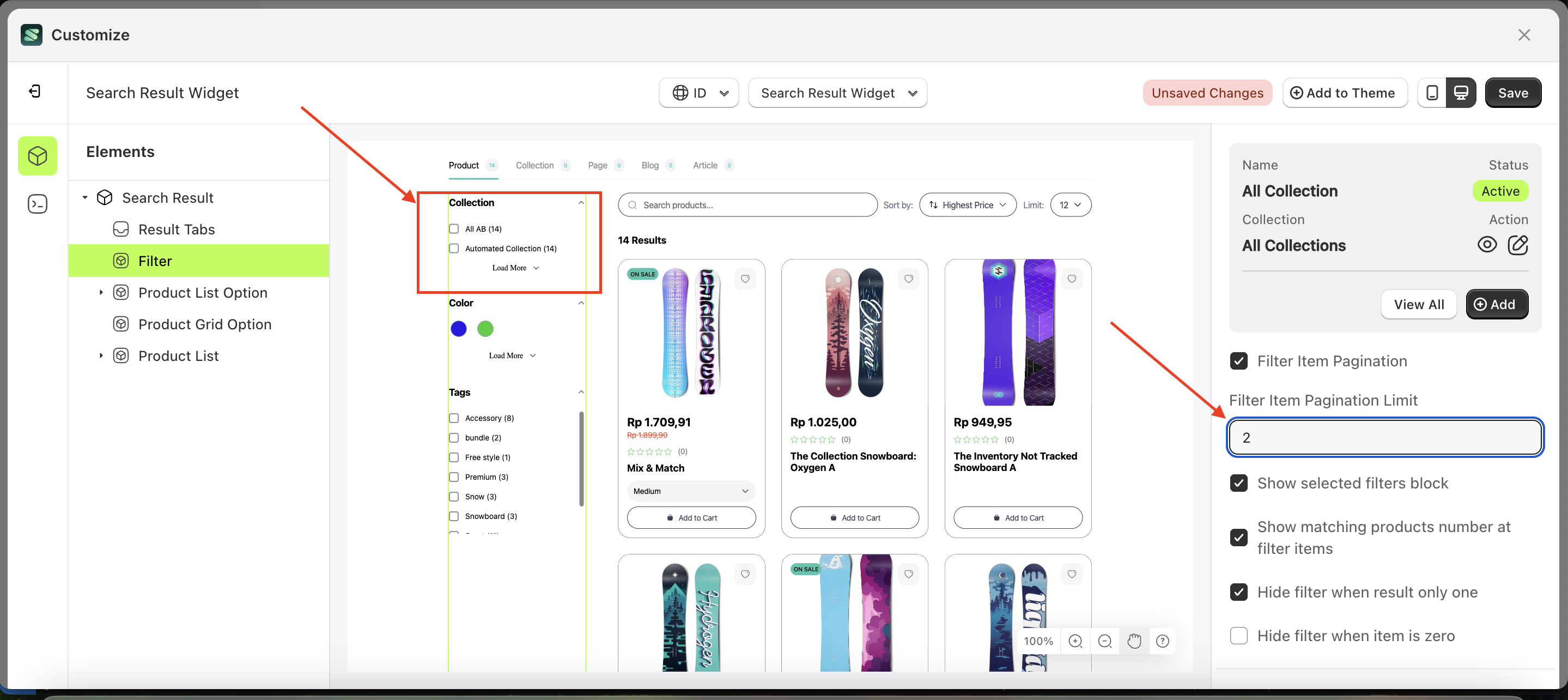
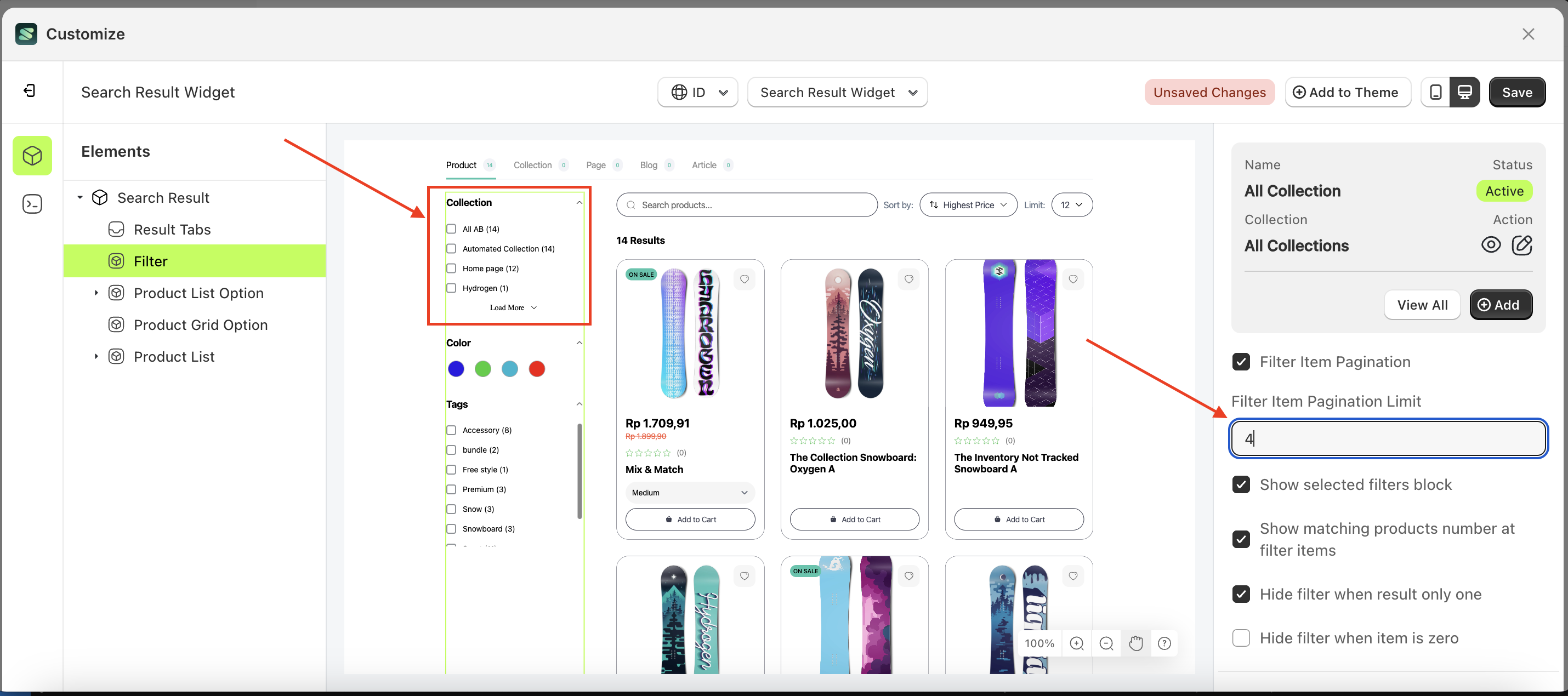
- Select the Filter element on the left, then click the Settings tab and click the icon marked with a red arrow.
- On the right side, marked with a red arrow, you can change the filter item pagination limit to your desired value.
- Note: The filter item pagination limit The format is in numbers like 1, 2, 3, and so on..
- For example, if you set the filter item pagination limit to 4
- The filter item pagination limit of the Filter element will adjust accordingly.
- Example : Before filter item pagination limit change settings
- Example : After filter item pagination limit change settings
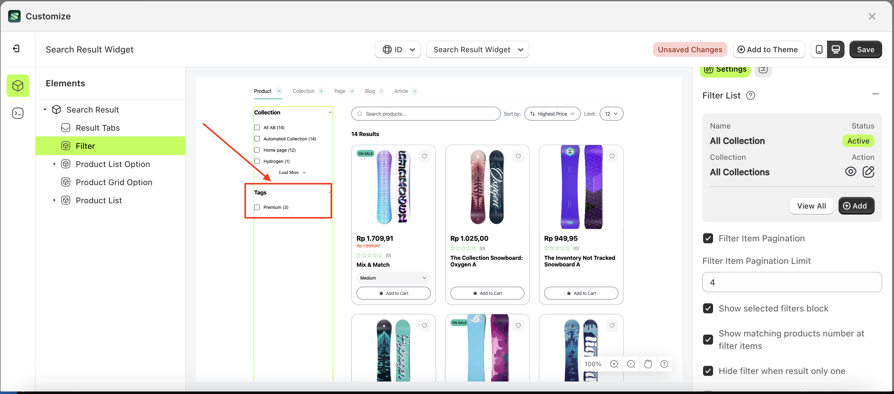
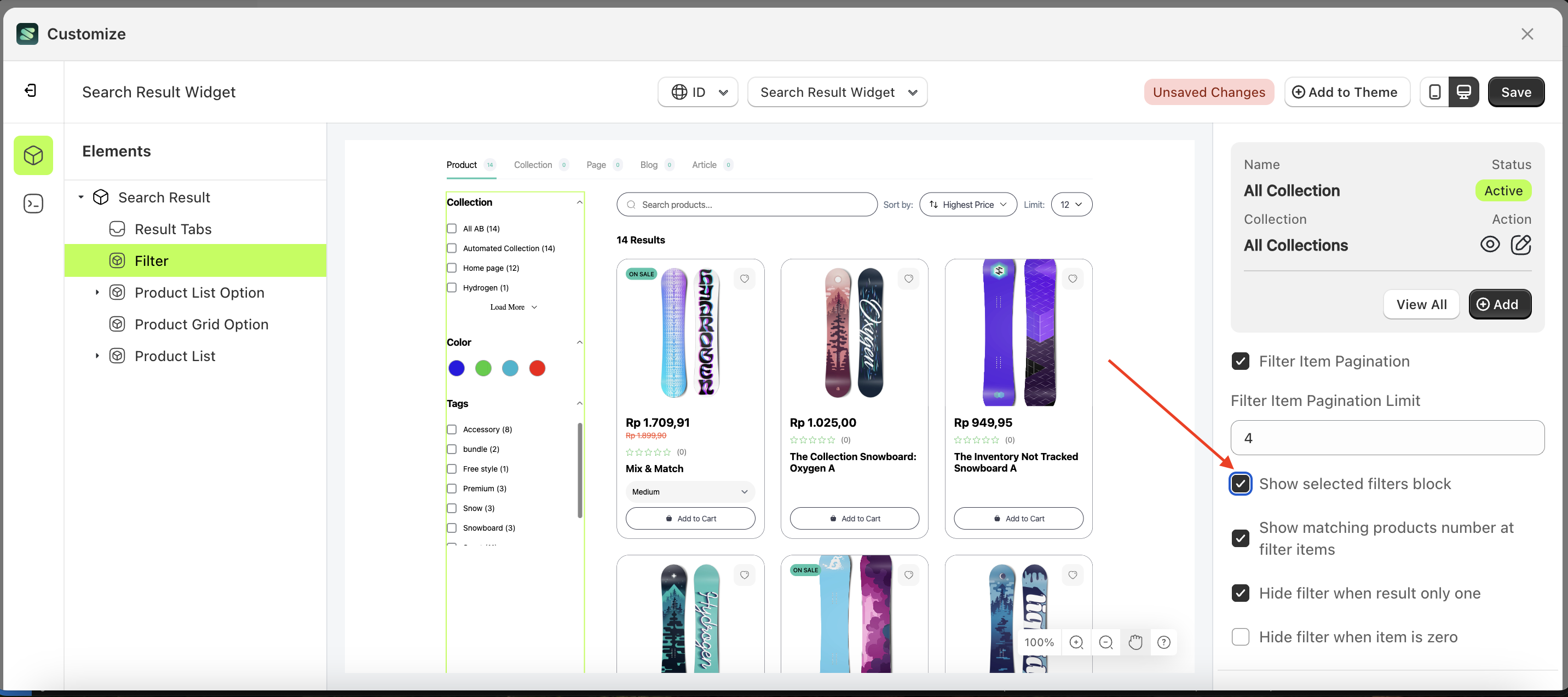
Show selected filters block
Follow the steps below:
- Select the Filter element on the right, then click the Settings tab and click the icon marked with a red arrow.
- Enable the Show selected filters block checkbox
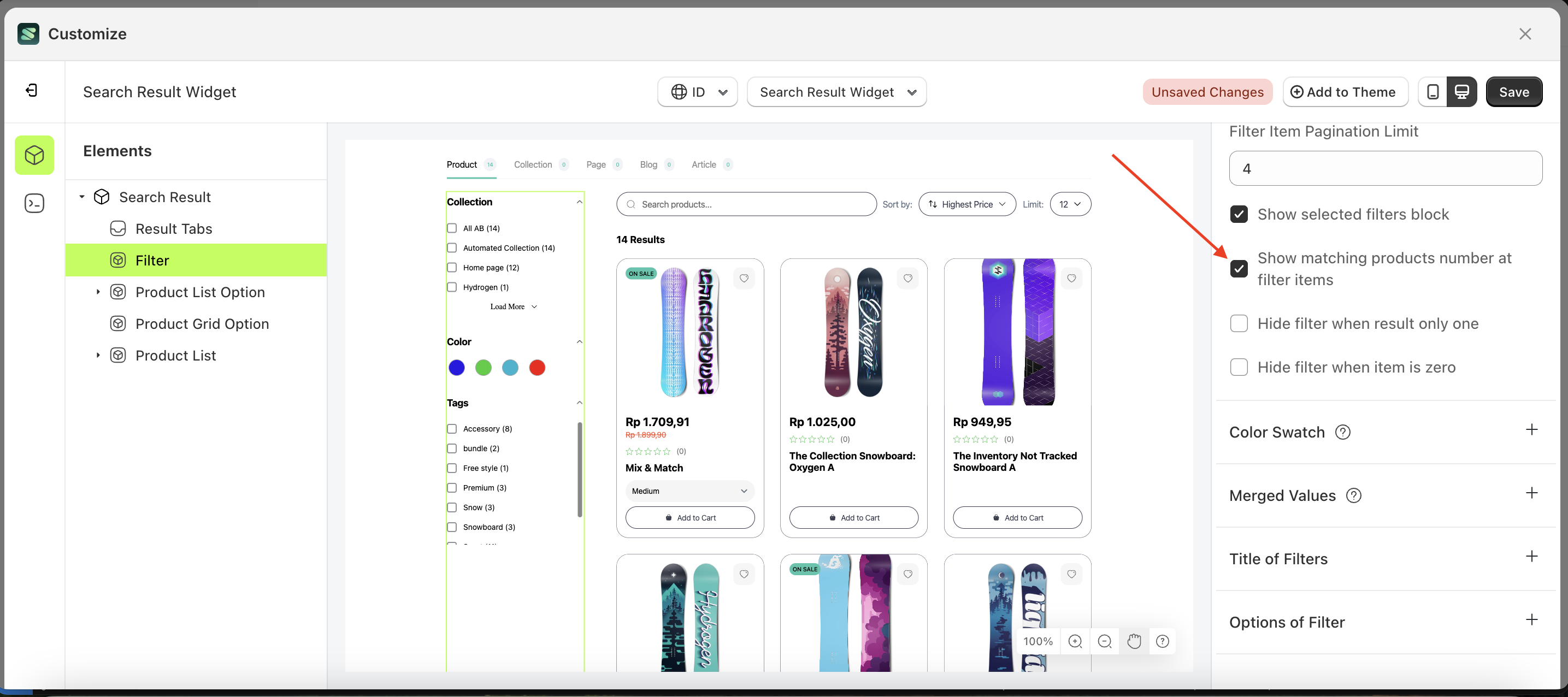
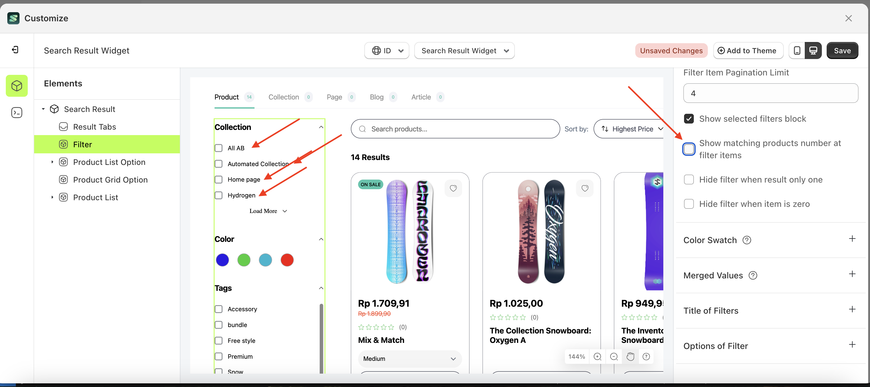
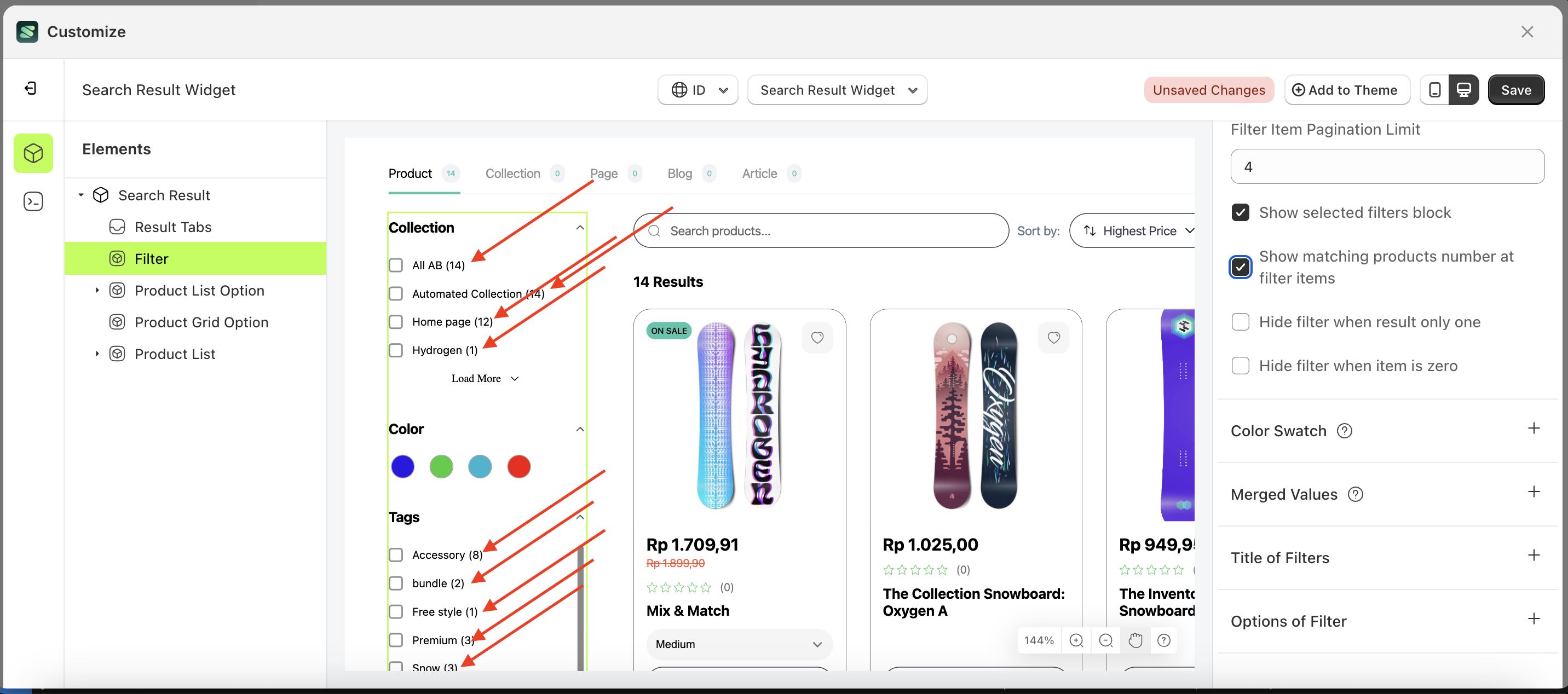
Show matching products number at filter items
This feature is designed to display the number of products for each filter item.
Follow the steps below:
- Select the Filter element on the right, then click the Settings tab and click the icon marked with a red arrow.
- Enable the Show matching products number at filter items checkbox
- Example : Before Show matching products number at filter items is enabled
- Example : After Show matching products number at filter items is enabled
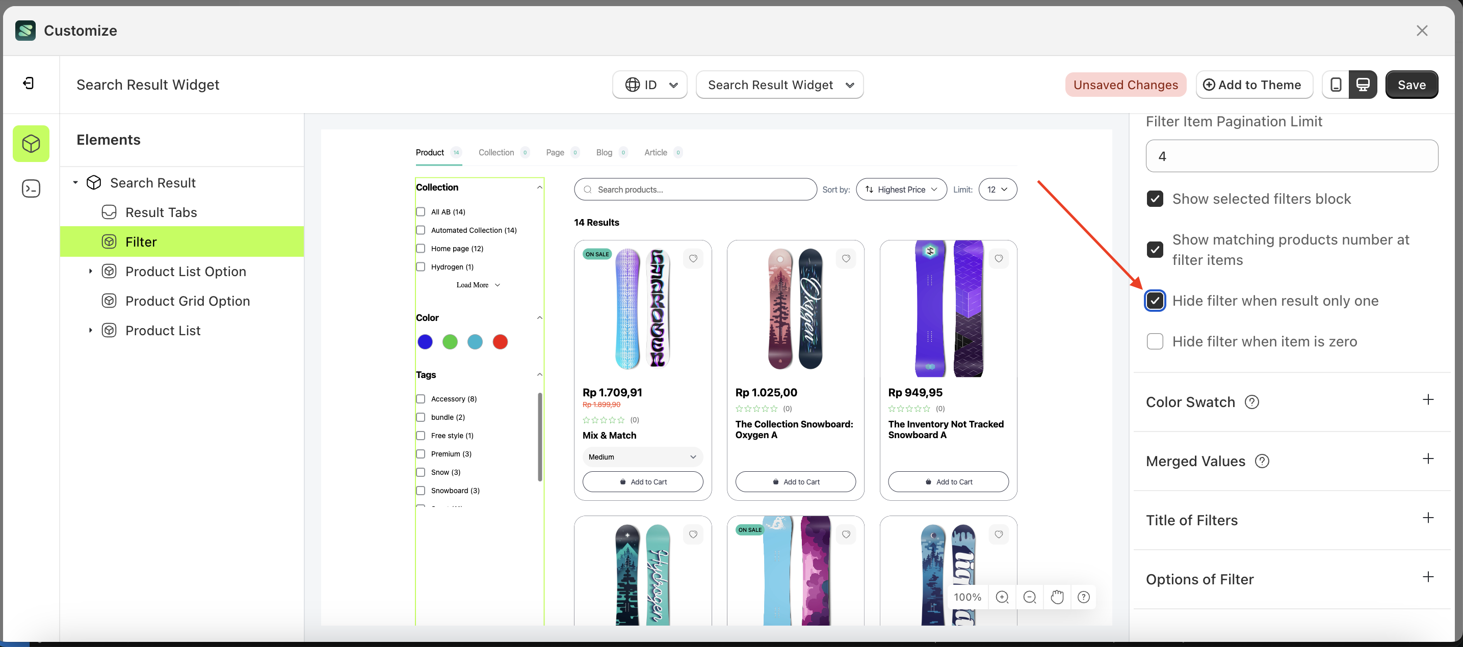
Hide filter when result only one
Follow the steps below:
- Select the Filter element on the right, then click the Settings tab and click the icon marked with a red arrow.
- Enable the Hide filter when result only one checkbox
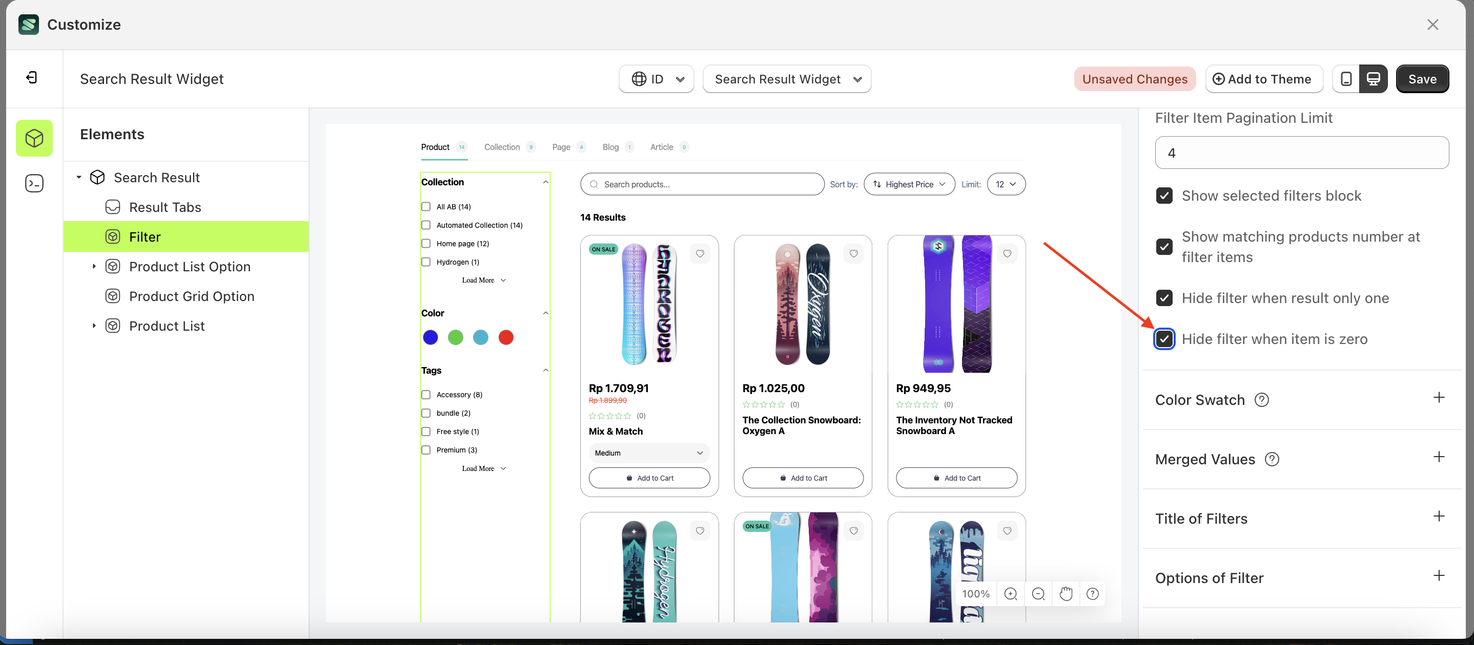
Hide filter when result only one
Follow the steps below:
- Select the Filter element on the right, then click the Settings tab and click the icon marked with a red arrow.
- Enable the Hide filter when item is zero checkbox
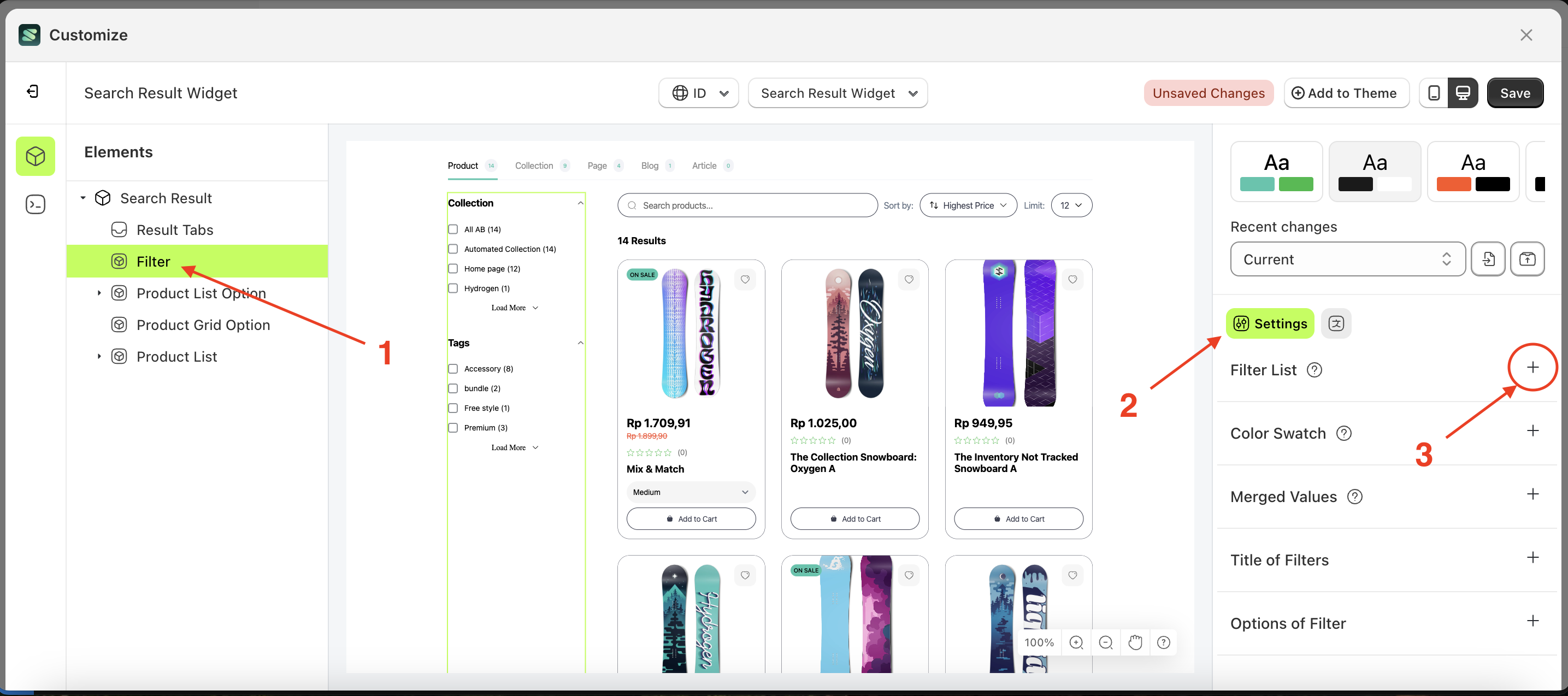
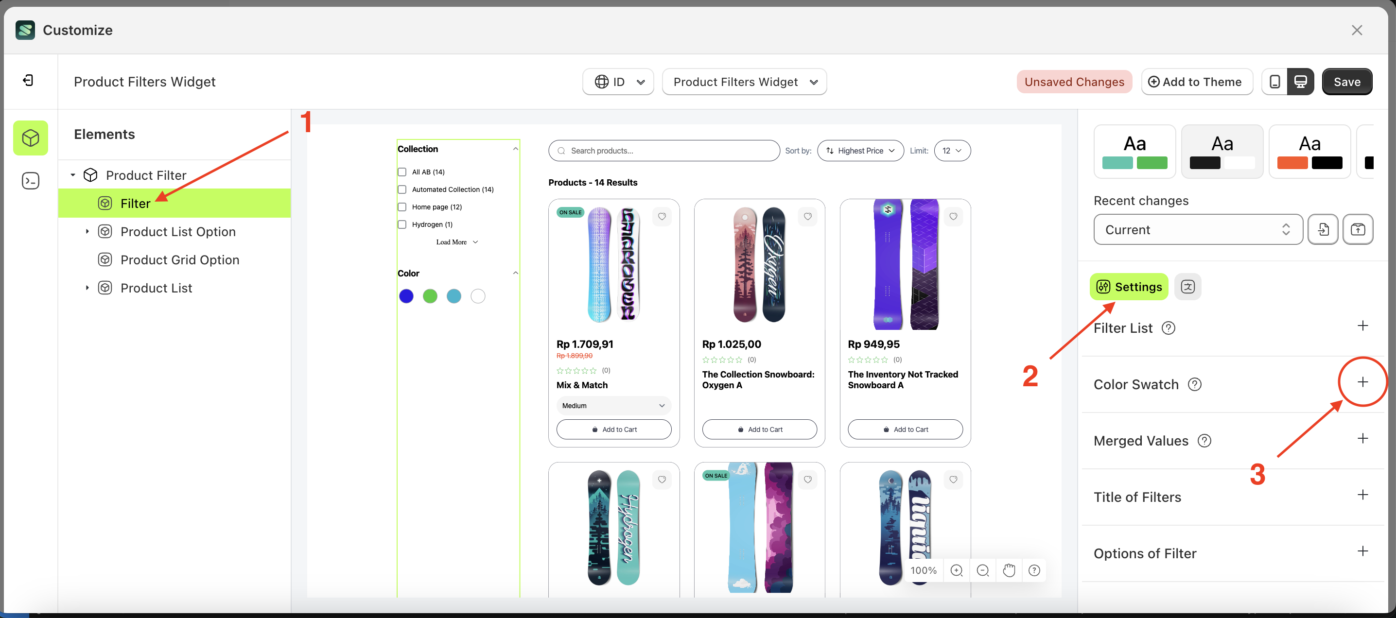
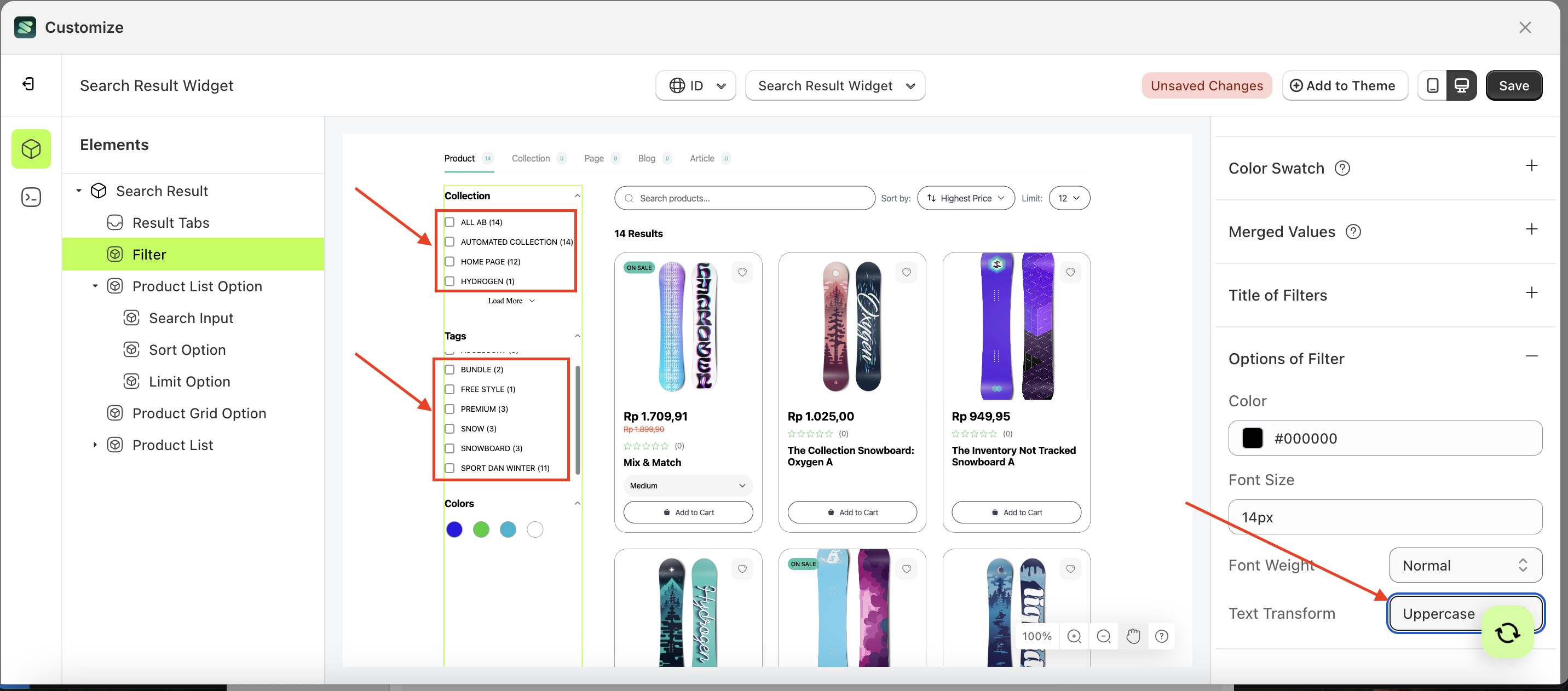
Color Swatch
Available settings:
Add Color Swatch
This feature is designed to add colors based on product data that has color variants.
Follow the steps below:
- Select the Filter element on the left, then click the Settings tab and click the icon marked with a red arrow.
- Click the "View All" button to open a popup.
- Click the edit icon to open the Edit Filter form.
- After the Filter List Form appears, click "Add Item".
- Fill in the form with the desired details: Label, Type, Display, and Operator.
- Label: The title displayed in the collection list as the parent category
- Type: The type of filter to be displayed.
- Display: The input type used for filtering, such as Checkbox, Radio Button, Select Option, Swatch, or Tree.
- Operator: The logic that will be applied.
- In the Type column, select Option Color.
- In the Display column, choose Swatch.
- Click the Save button.
- Check the results after adding the filter item.
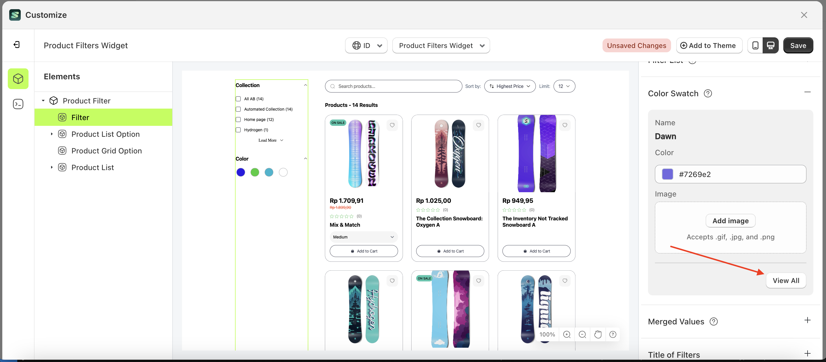
- Close the previous form by clicking outside the popup, then select the Color Swatch Settings, indicated by the arrow in the image below.
- The Color Swatch Settings window will appear—click the View All button.
- The Color Swatch Settings window will appear—click the View All button.
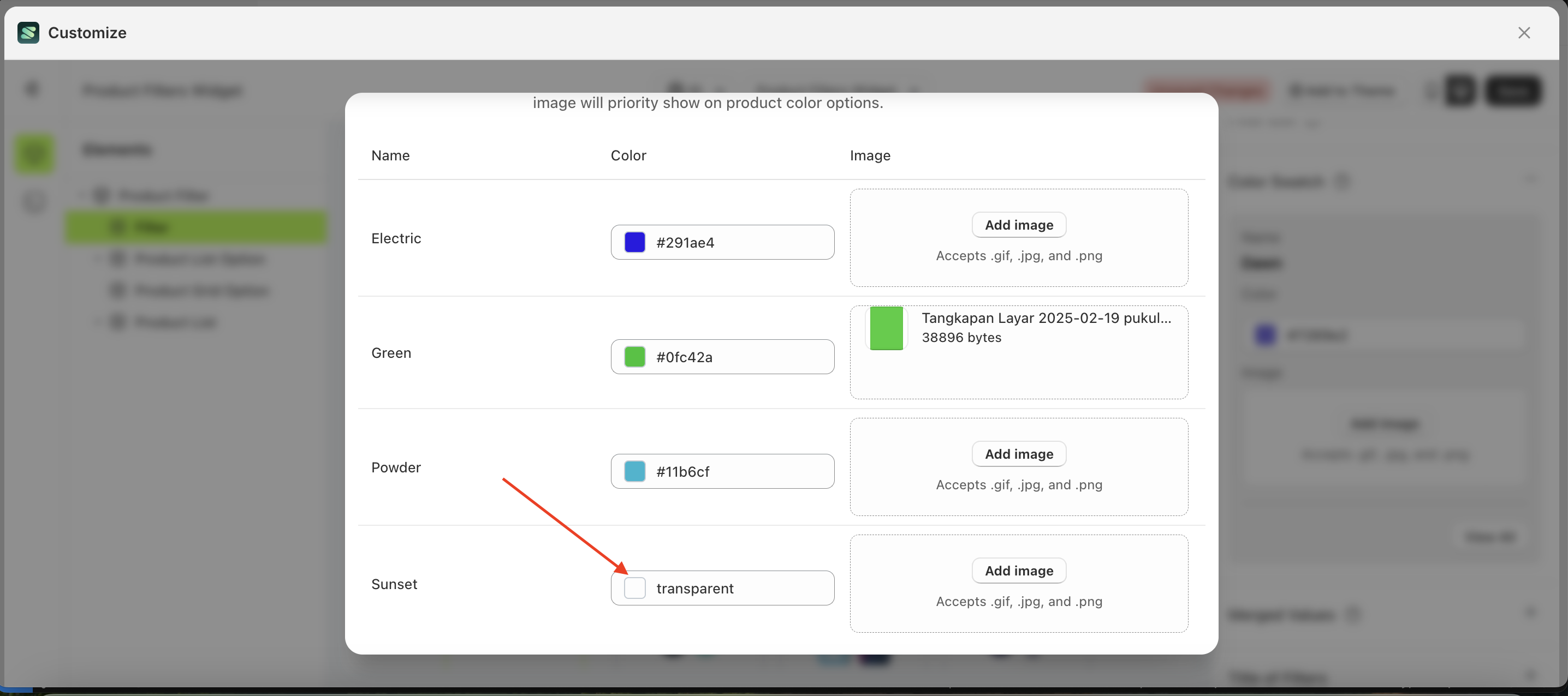
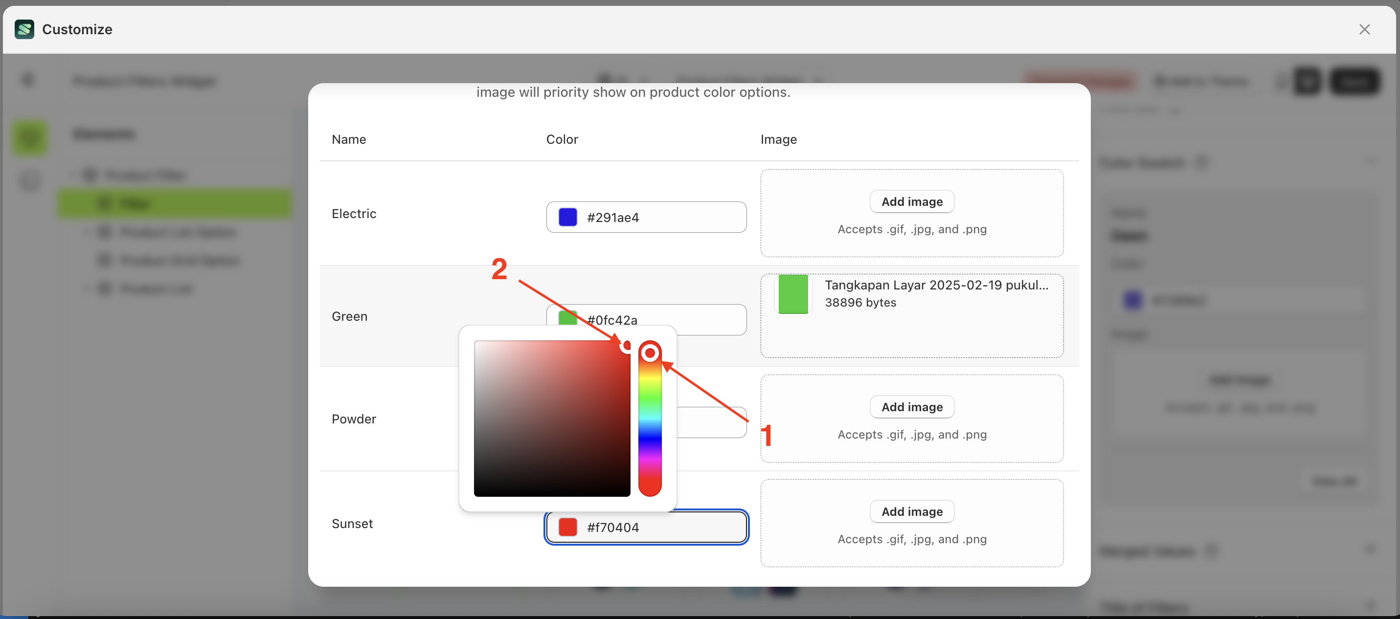
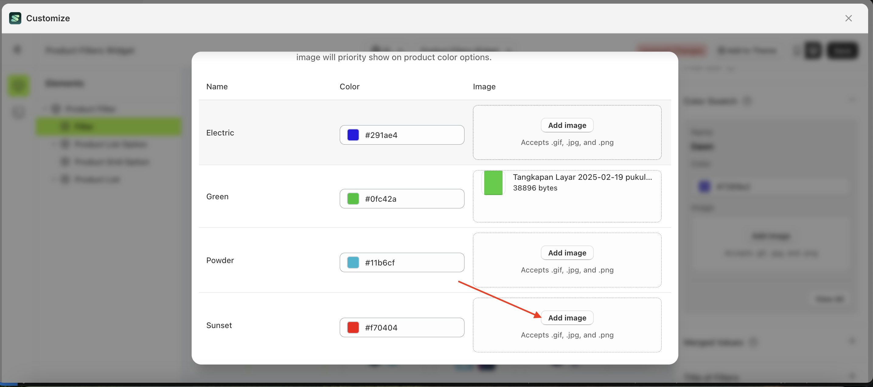
- Choose your preferred color.
- You can also set the color using an image of your choice. However, if both color and image are selected, the swatch will prioritize the image.
- Below is the appearance after the Color Swatch has been customized.
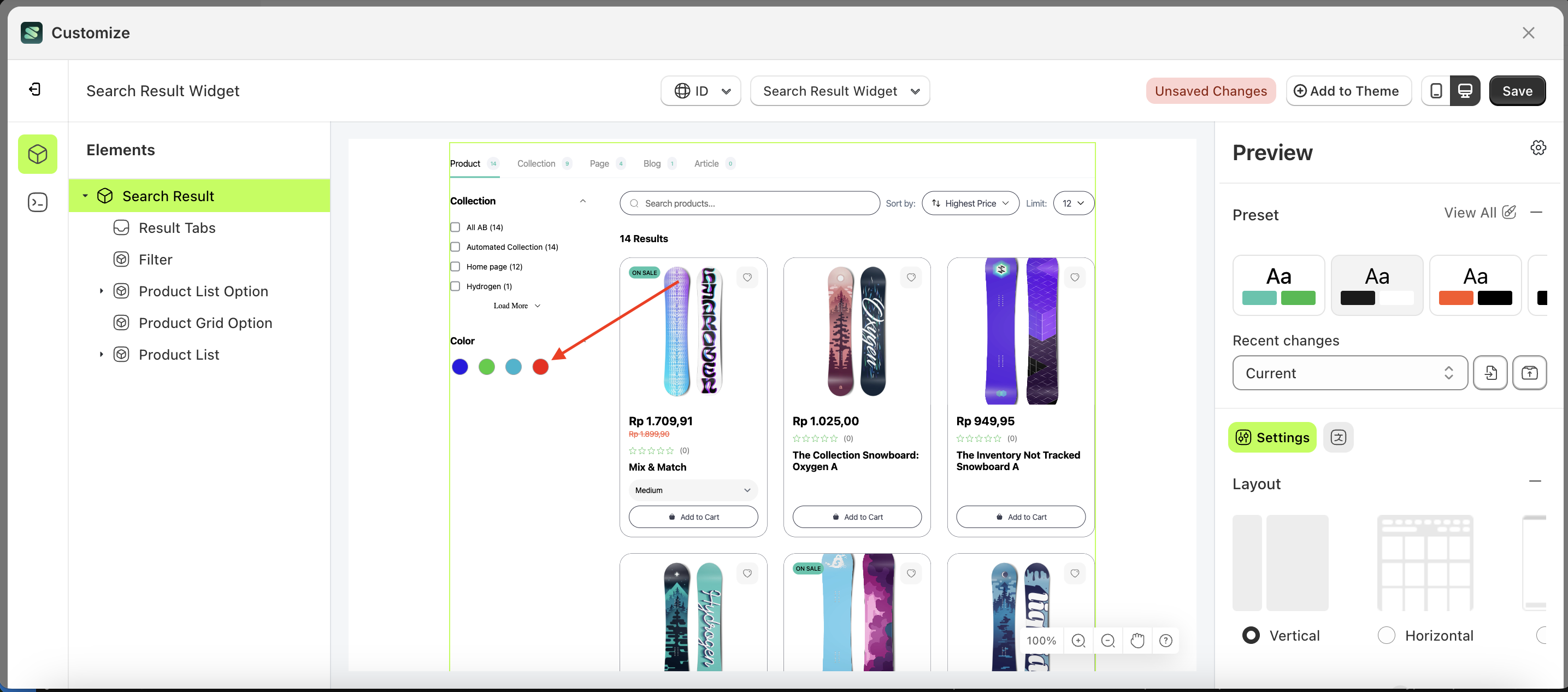
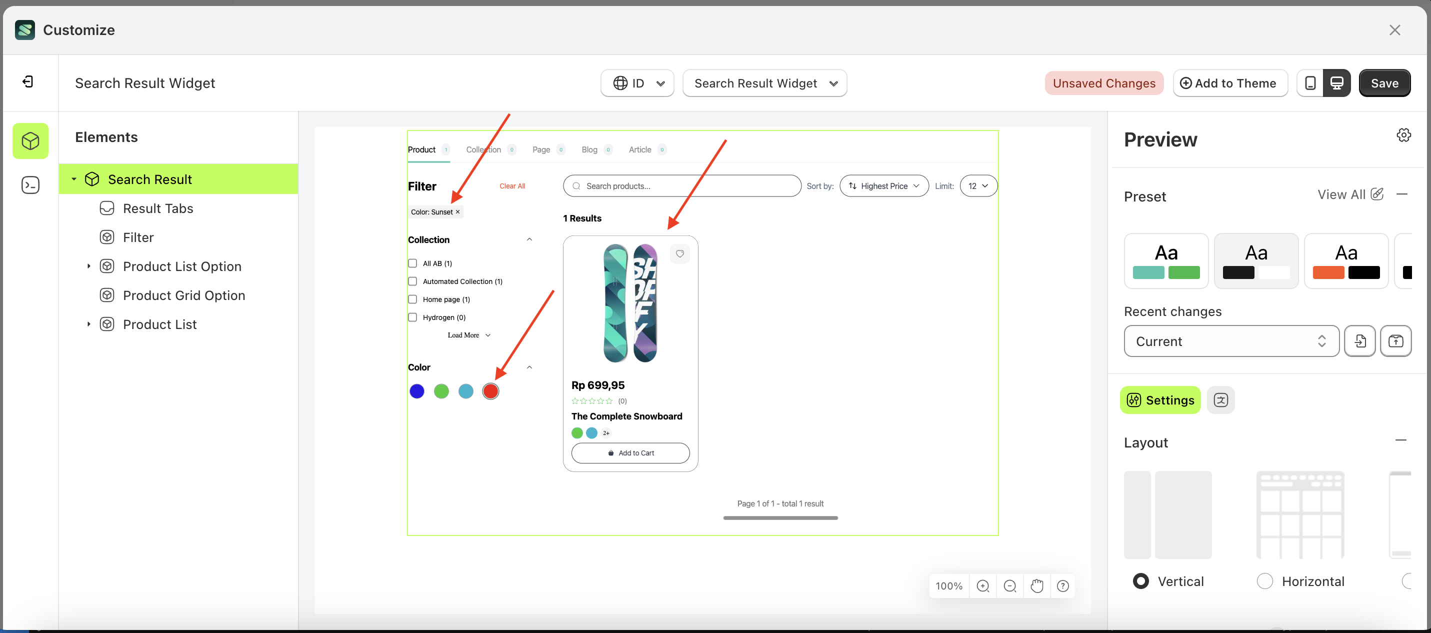
- When the Filter Color is applied, it will filter data based on the selected Option Color.
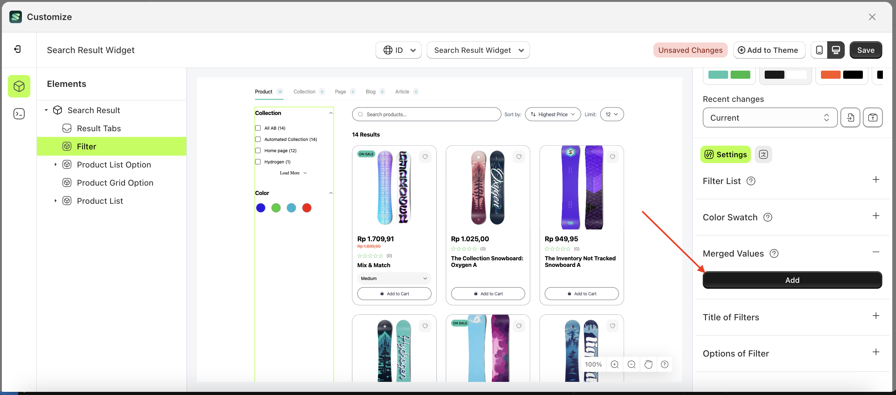
Merge Values
Available settings:
Add Merge Values
This feature is designed to merge two filter items into one. For example, if the filter tags contain items like "snowboard" and "snow," they can be combined into "Snowboard - Snow."
Follow the steps below:
- Select the Filter element on the right, then click the Settings tab and click the icon marked with a red arrow.
- click the Add button
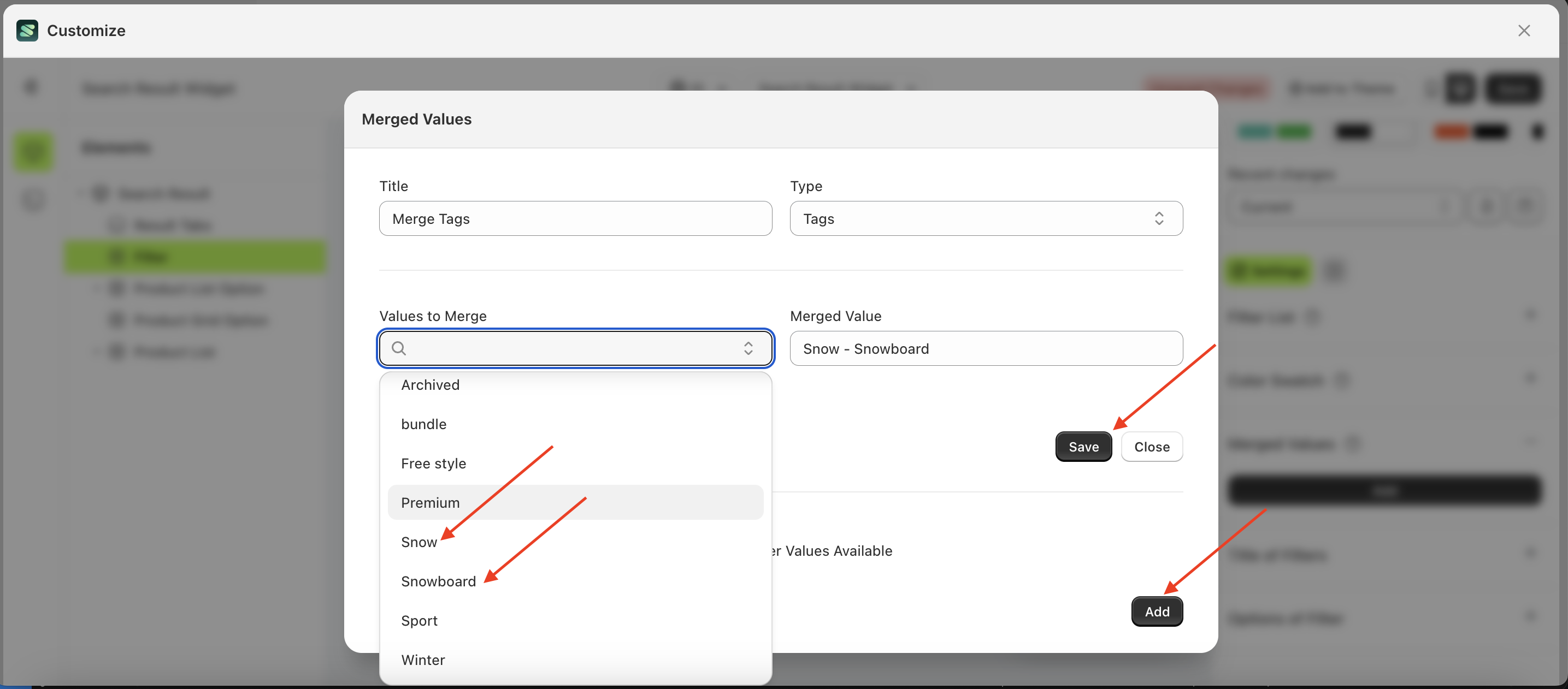
- Fill in each field as follows:
- Title Column: Enter the desired title, e.g., "Merged Tags".
- Type Column: Select the type of value you want to merge, e.g., "Tags".
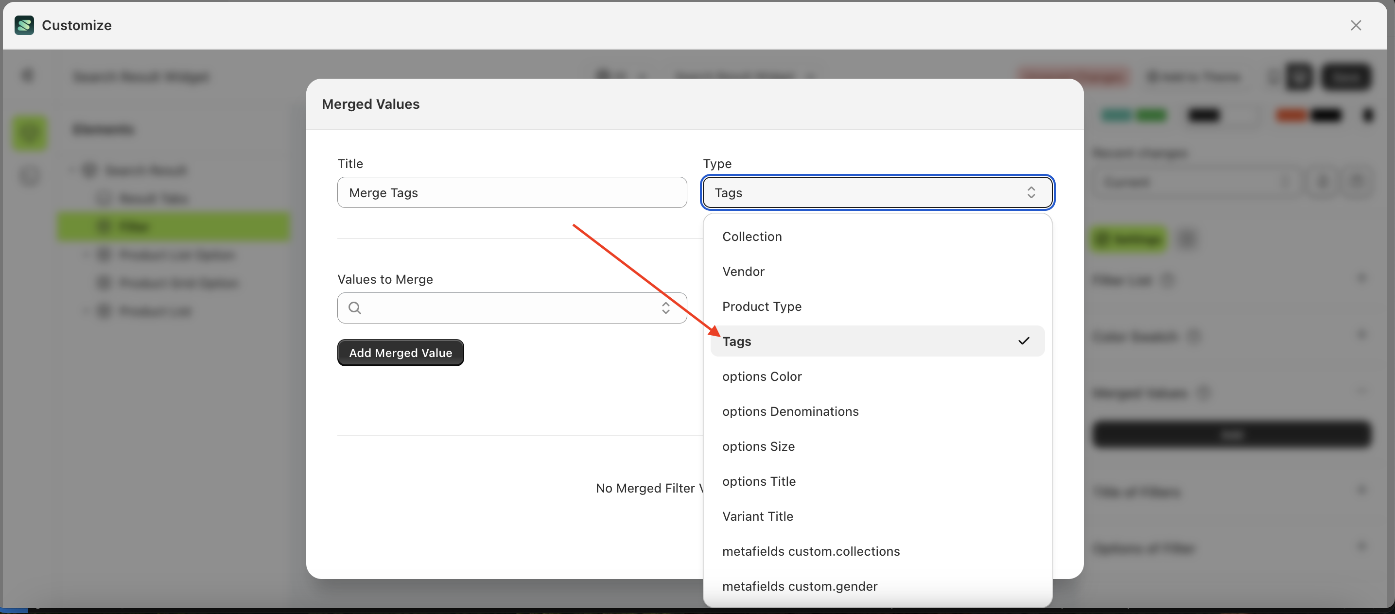
- Values to Merge: Choose the values you want to merge, e.g., "Snow, Snowboard"
- The entered Title Name will be displayed in the filter item.
- Here is an example of selecting Tags in the Type column
- in the Values to Merge field, an example selection would be "Snow" and "Snowboard".
- Below is the result after successfully merging the values.
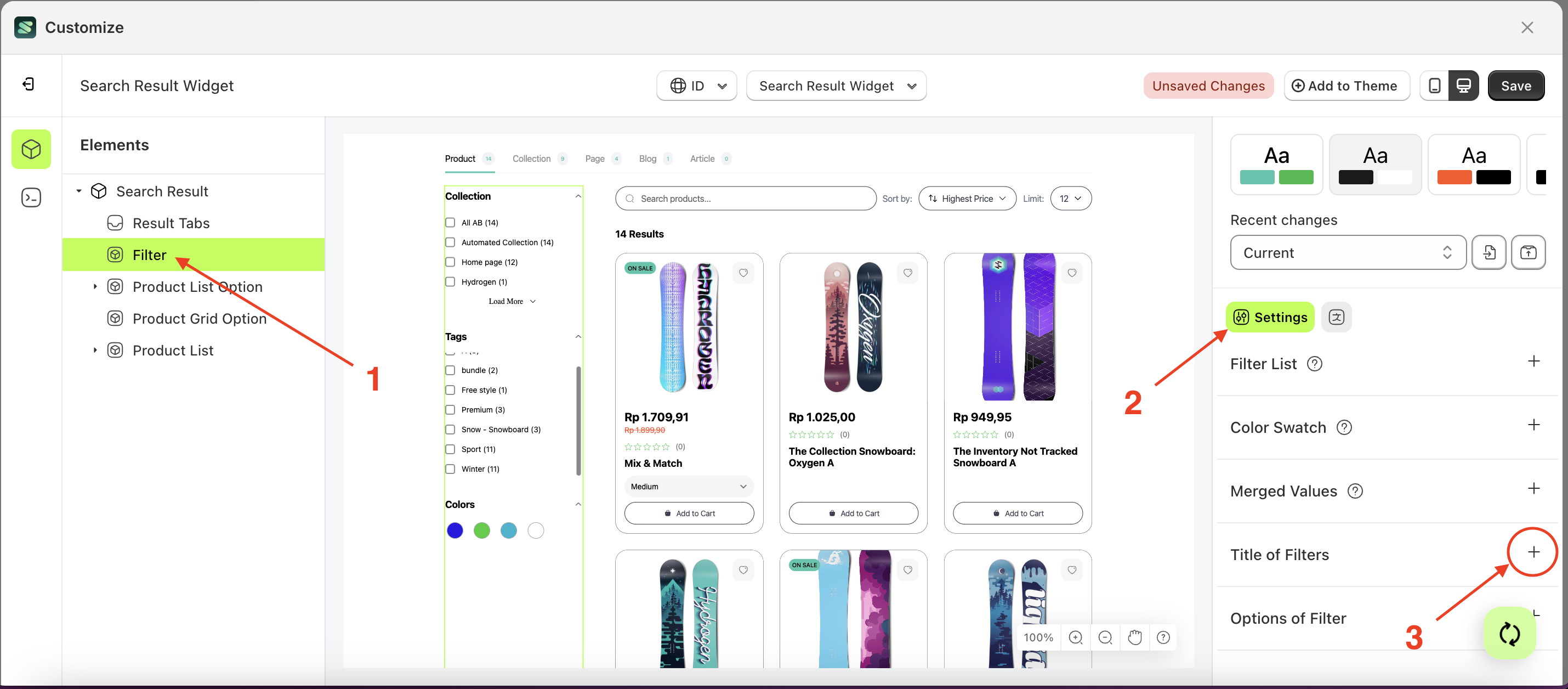
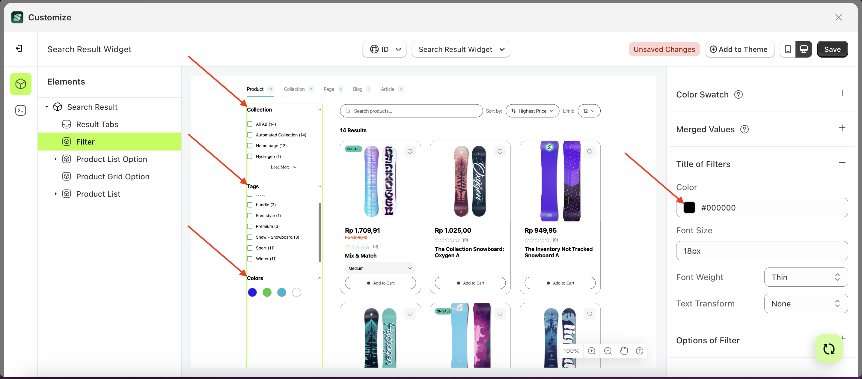
Title of filters
Available settings:
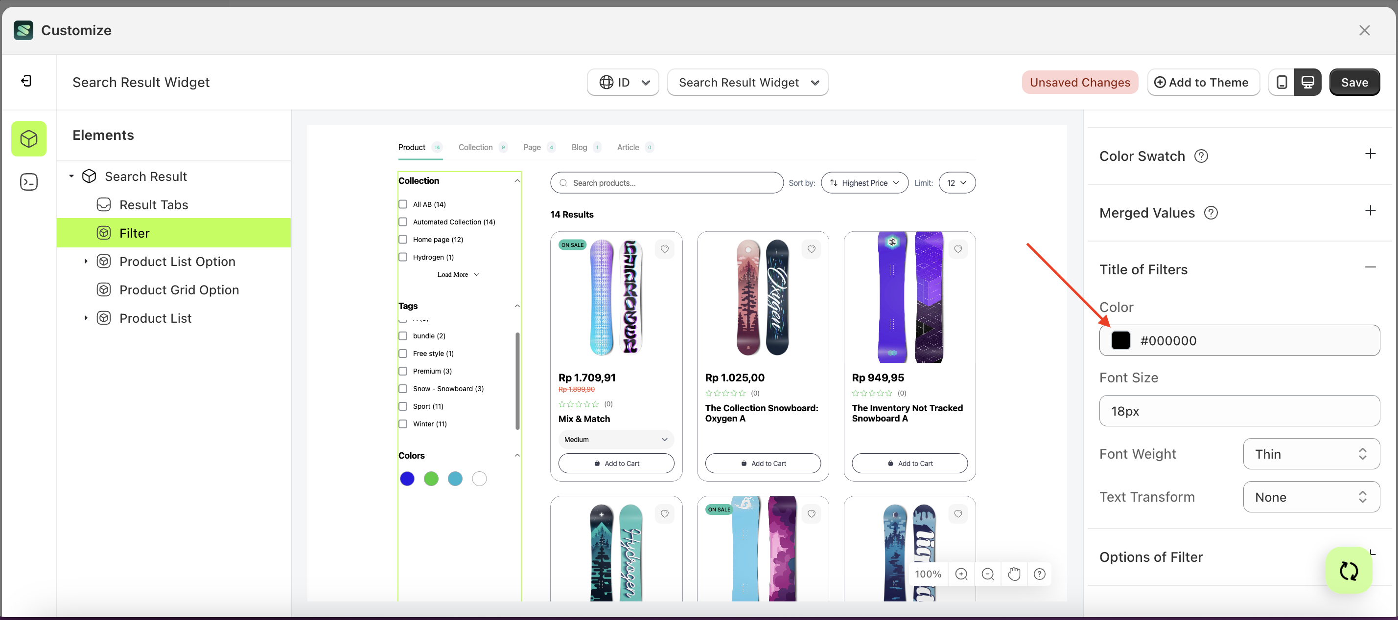
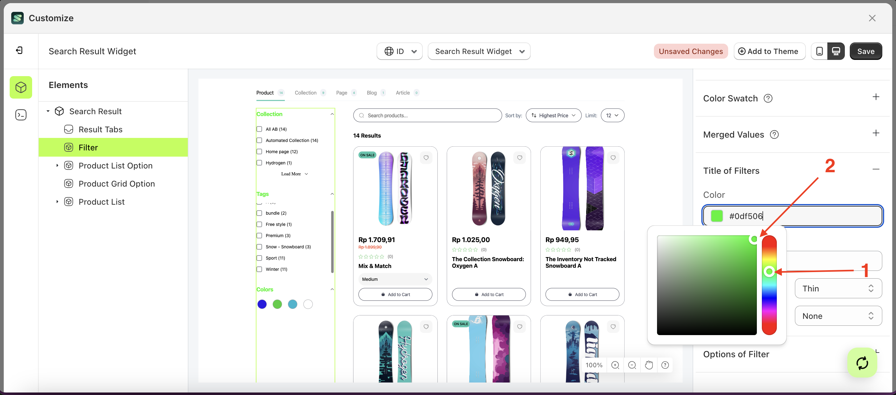
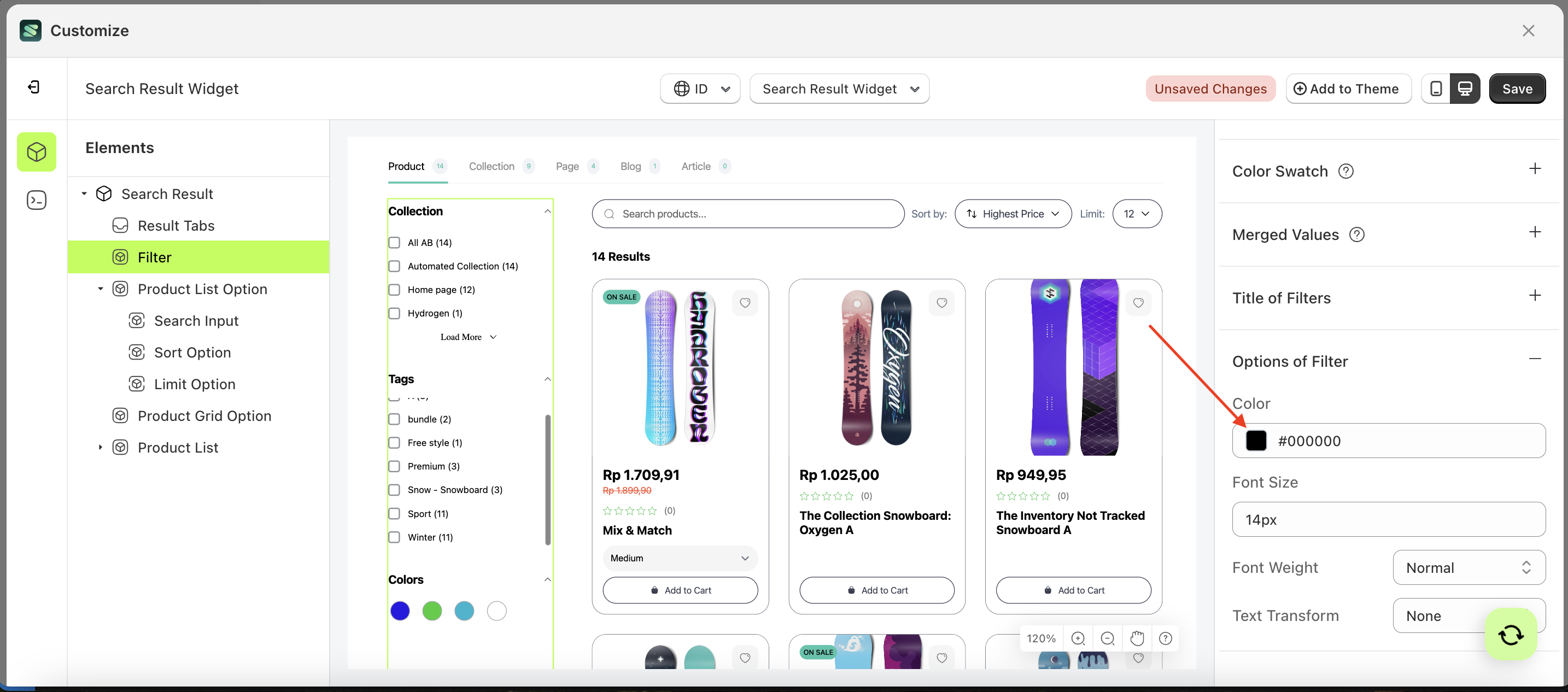
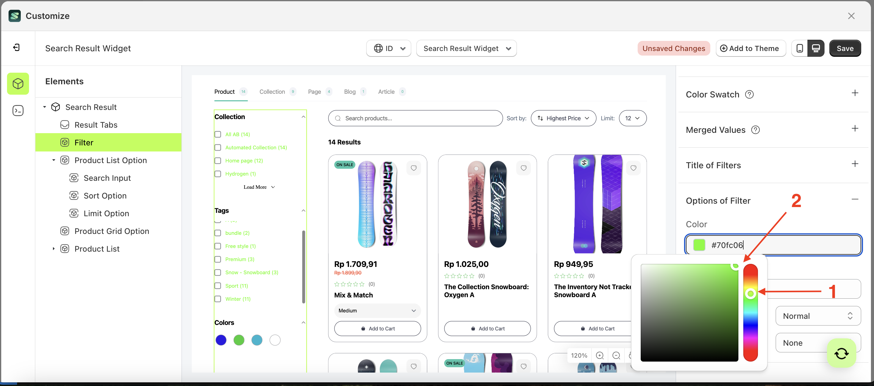
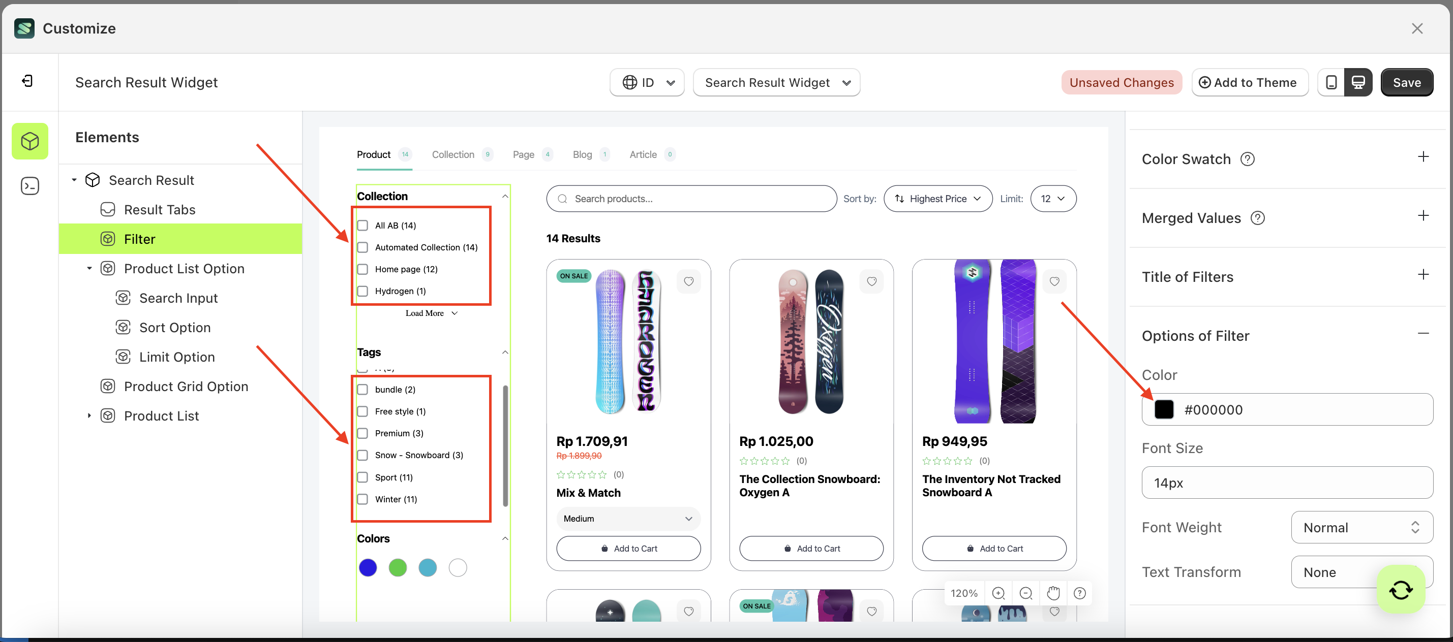
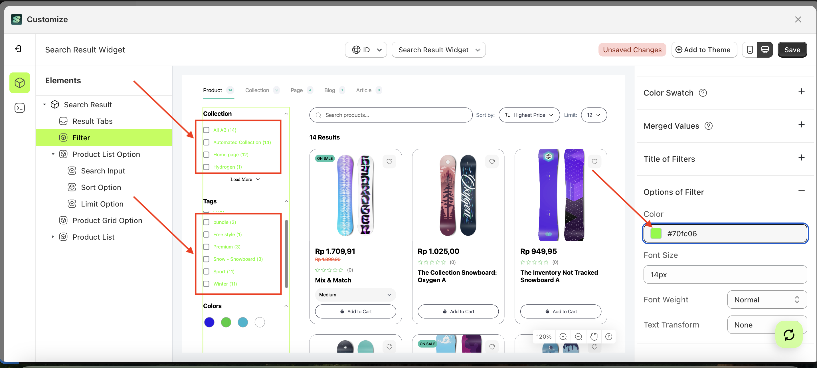
Color
This feature is designed to customize the text color of the title of filter
Follow the steps below:
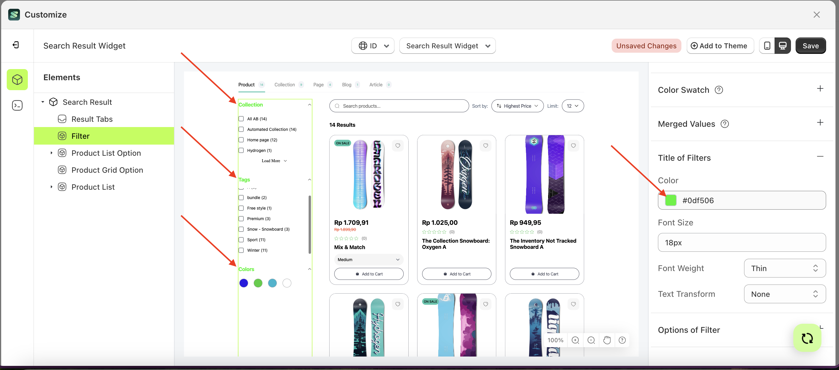
- Select the Filter element on the left, then click the Settings tab and click the icon marked with a red arrow.
- Click the Color Palette on the right side, which is also marked with a red arrow.
- The Color Palette will appear. Click the right side of the palette where the red arrow and number 1 are indicated, then click the right side again where the red arrow and number 2 are marked.
- The search result widget of the Filter element will adjust accordingly.
- Example : Before Filter change settings
- Example : After Filter change settings
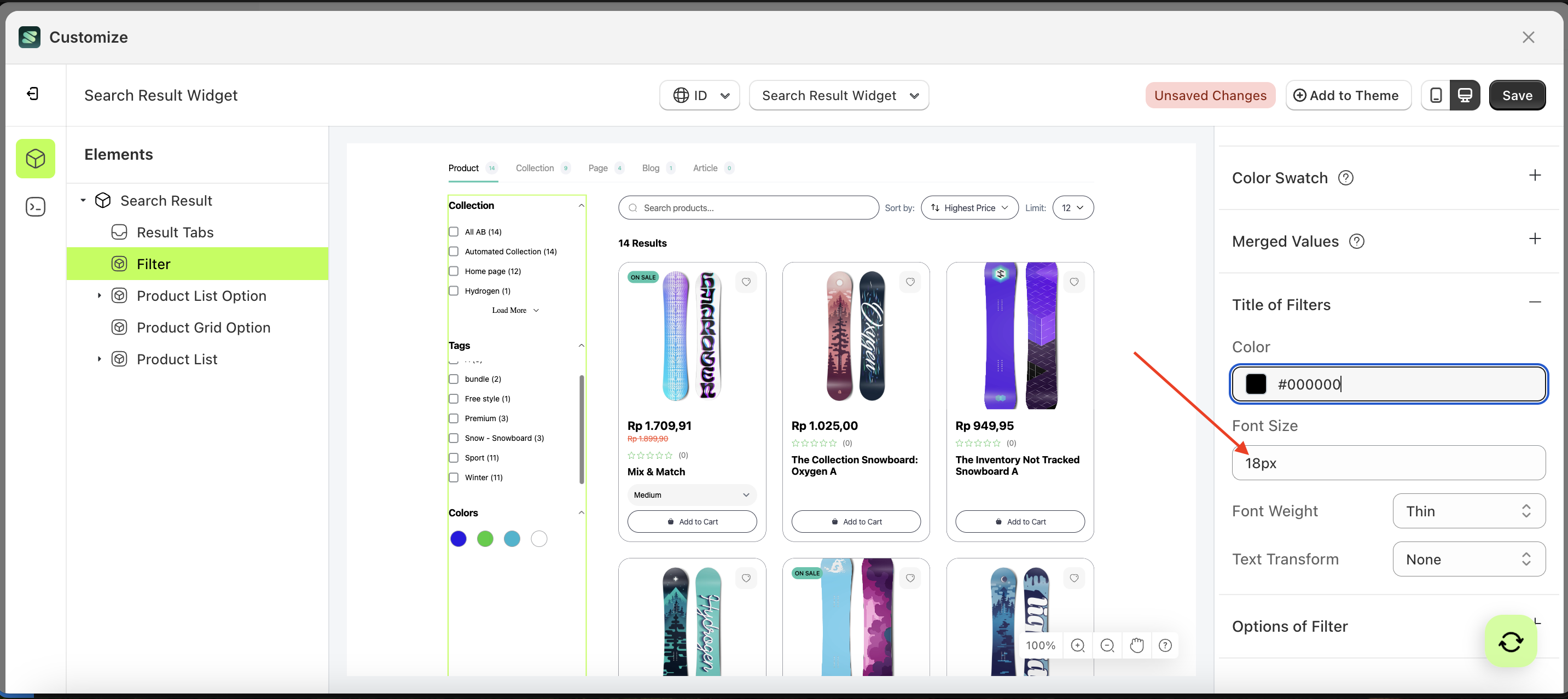
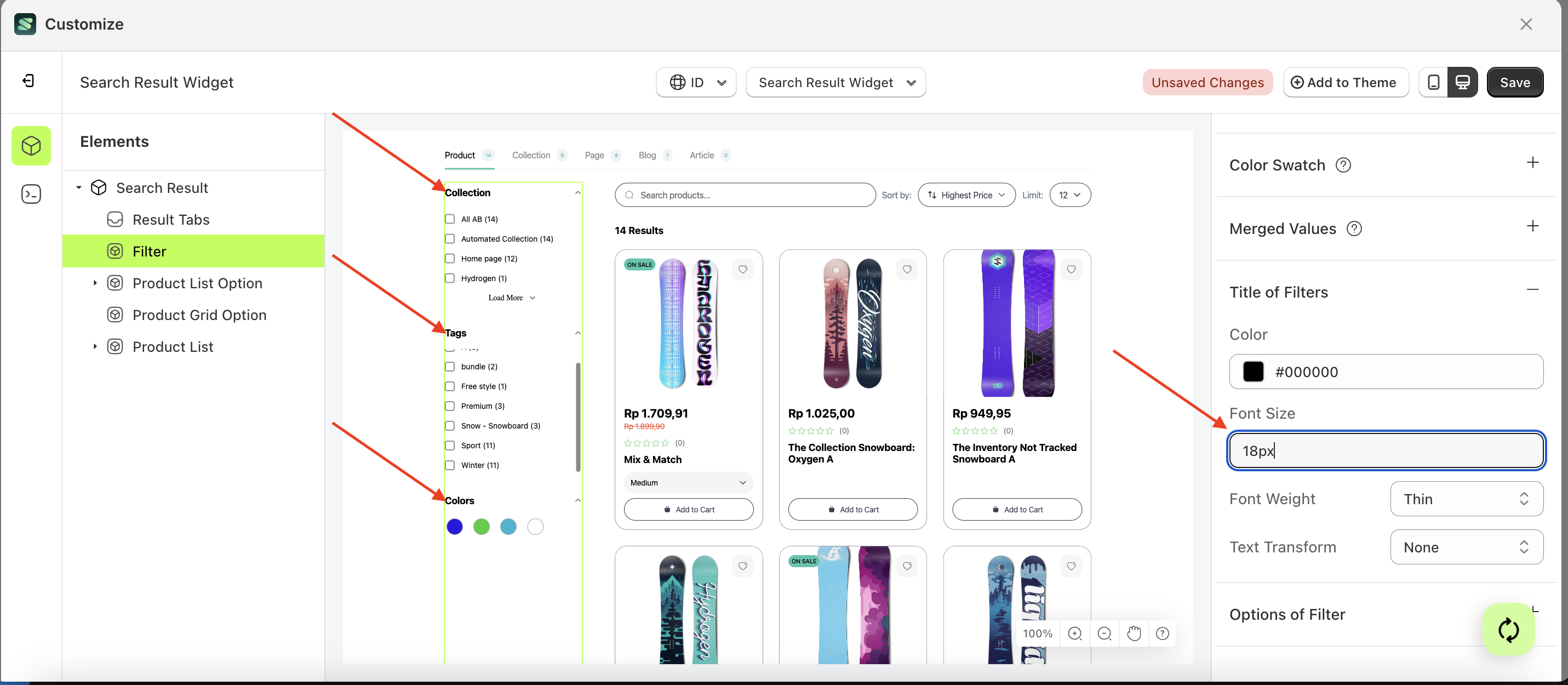
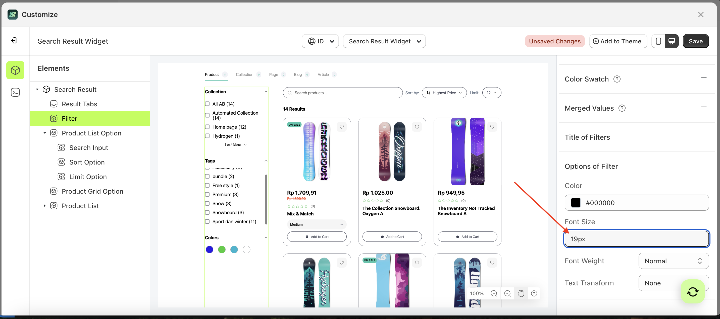
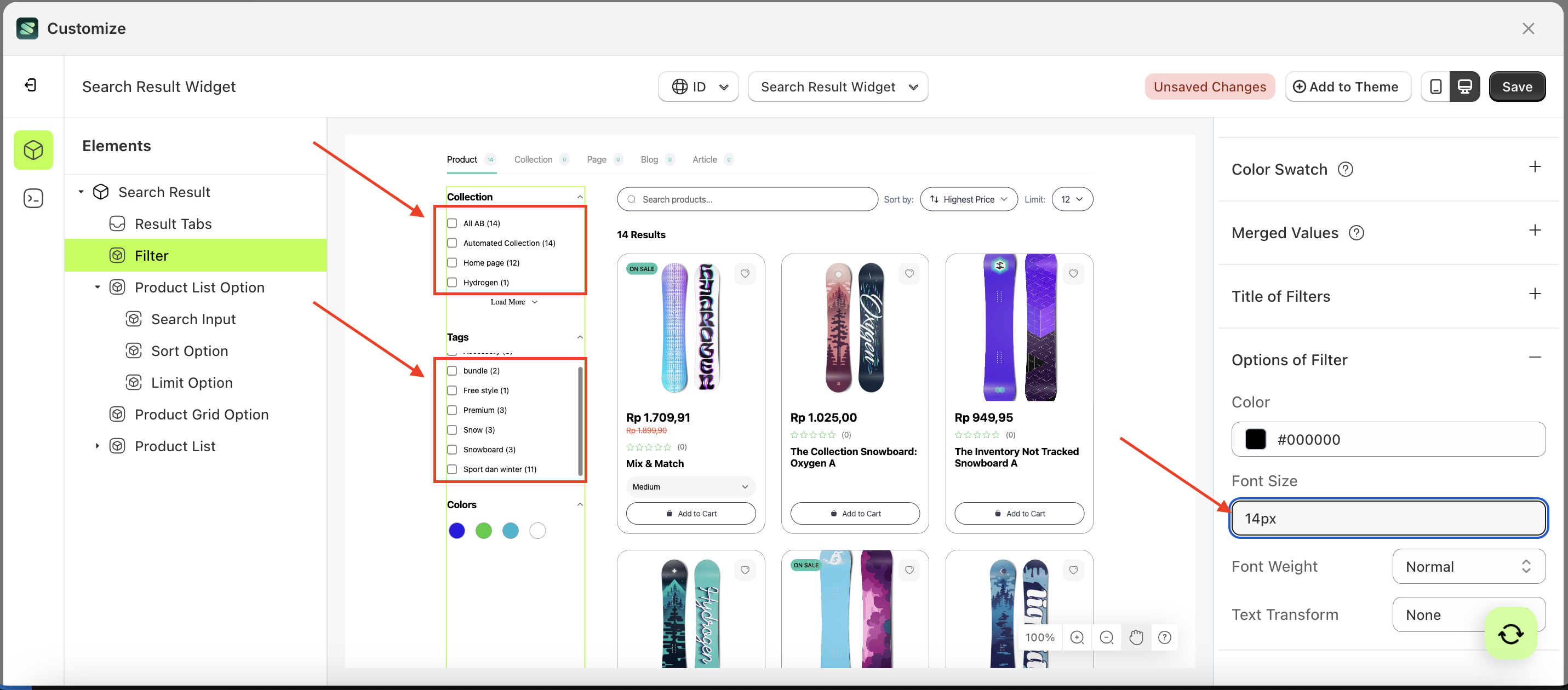
Font Size
This feature is designed to customize the text size of the title of filter
Follow the steps below:
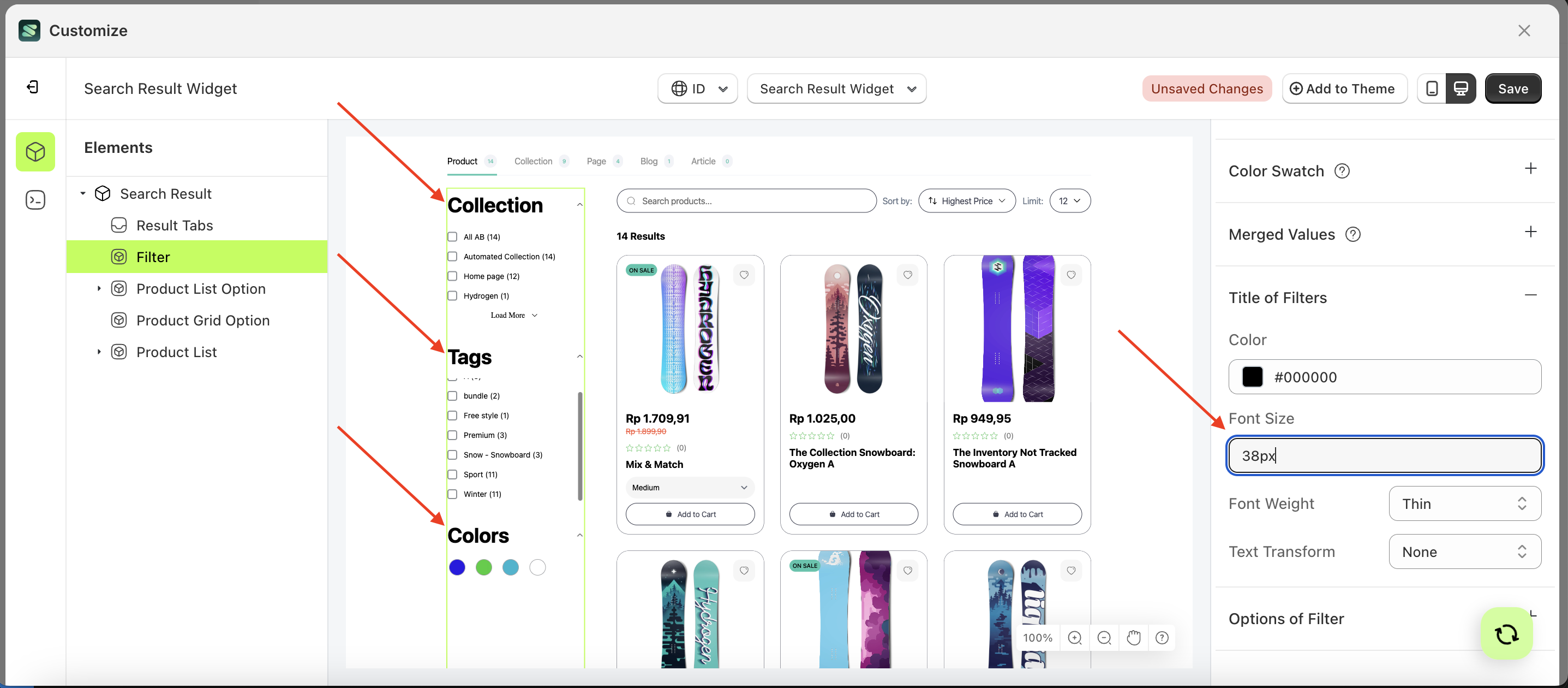
- Select the Filter element on the left, then click the Settings tab and click the icon marked with a red arrow.
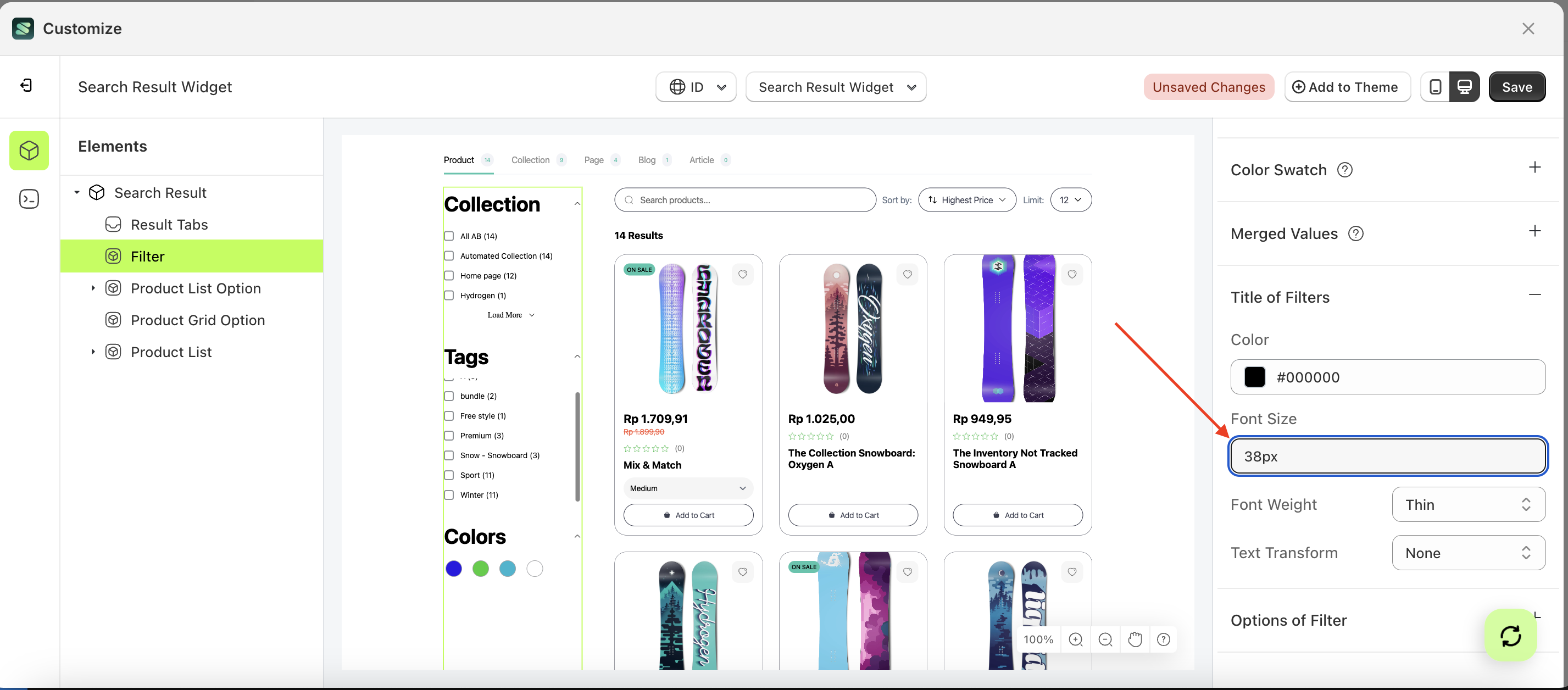
- On the right side, marked with a red arrow, you can change the font size to your desired value.
- Note: The font size format can be Button Text With Icon, Button Text, Text With Icon, Icon.
- For example, if you set the font size to 38px
- The font size of the Filter element will adjust accordingly.
- Example : Before font size change settings
- Example : After font size change settings
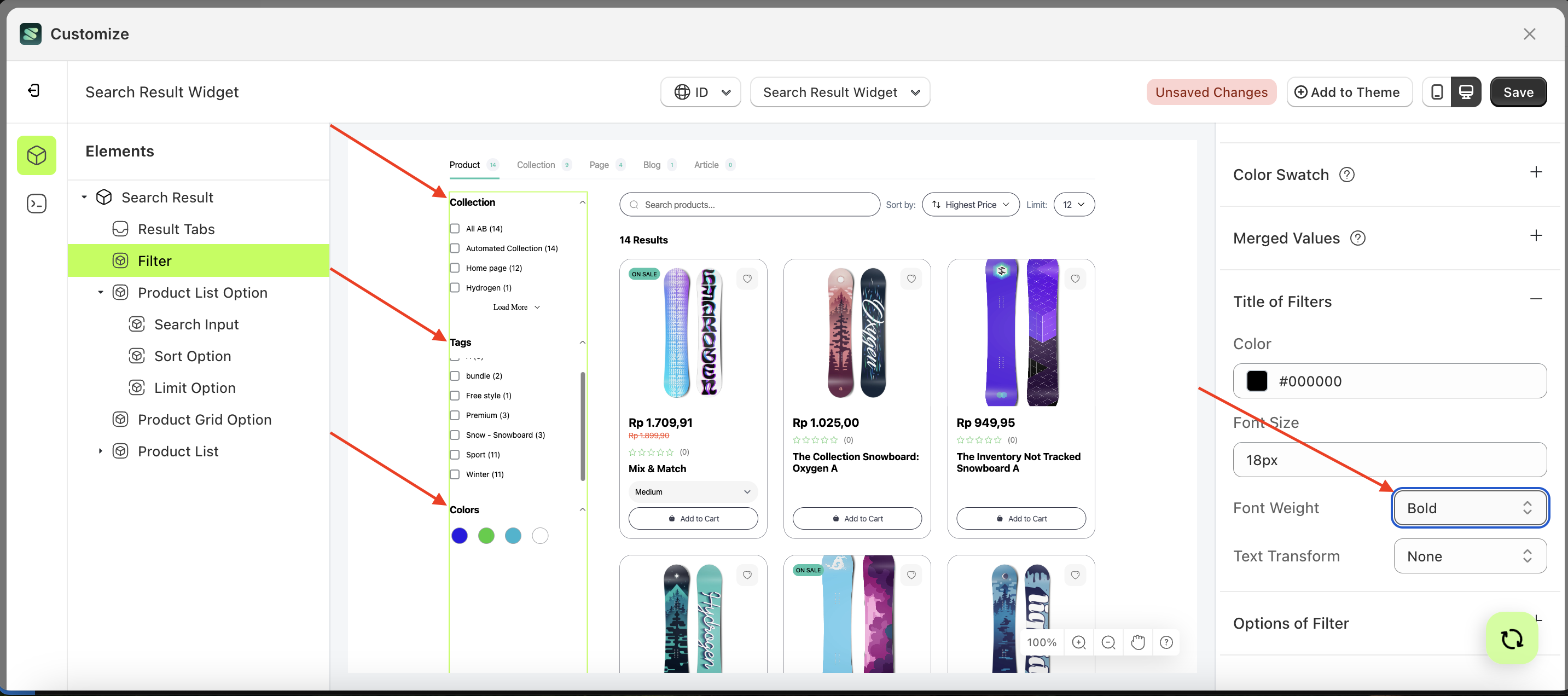
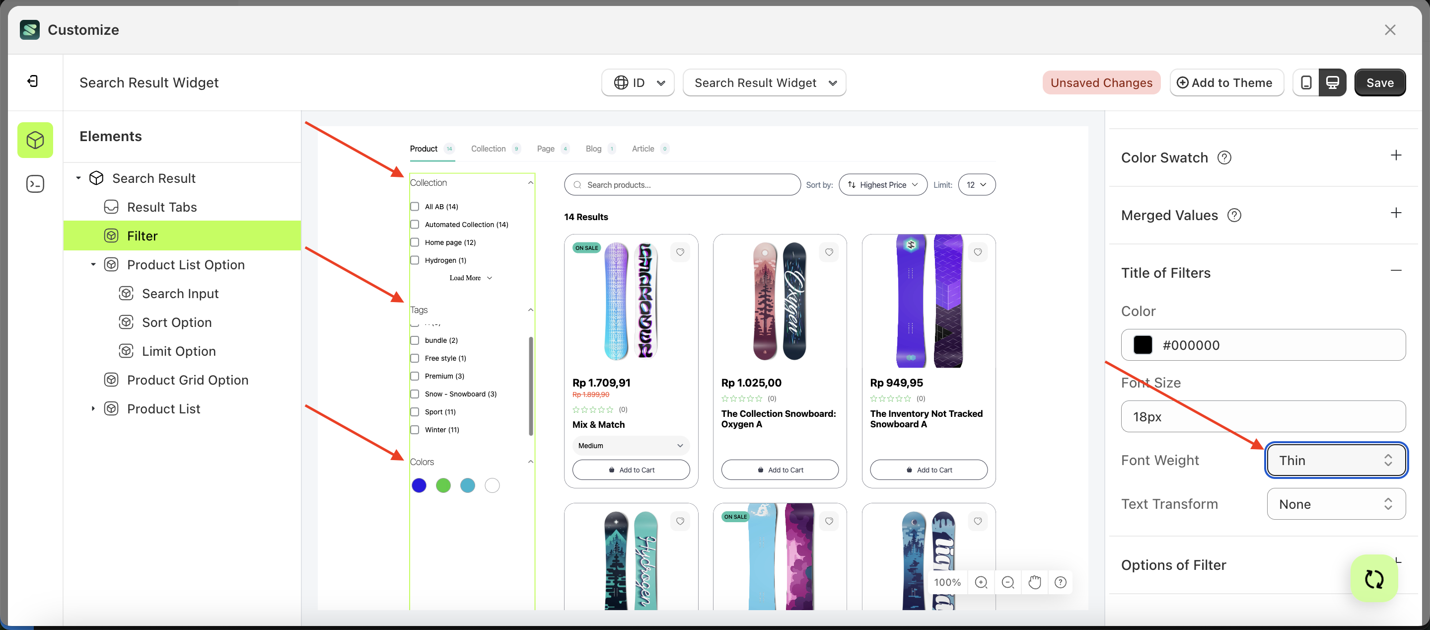
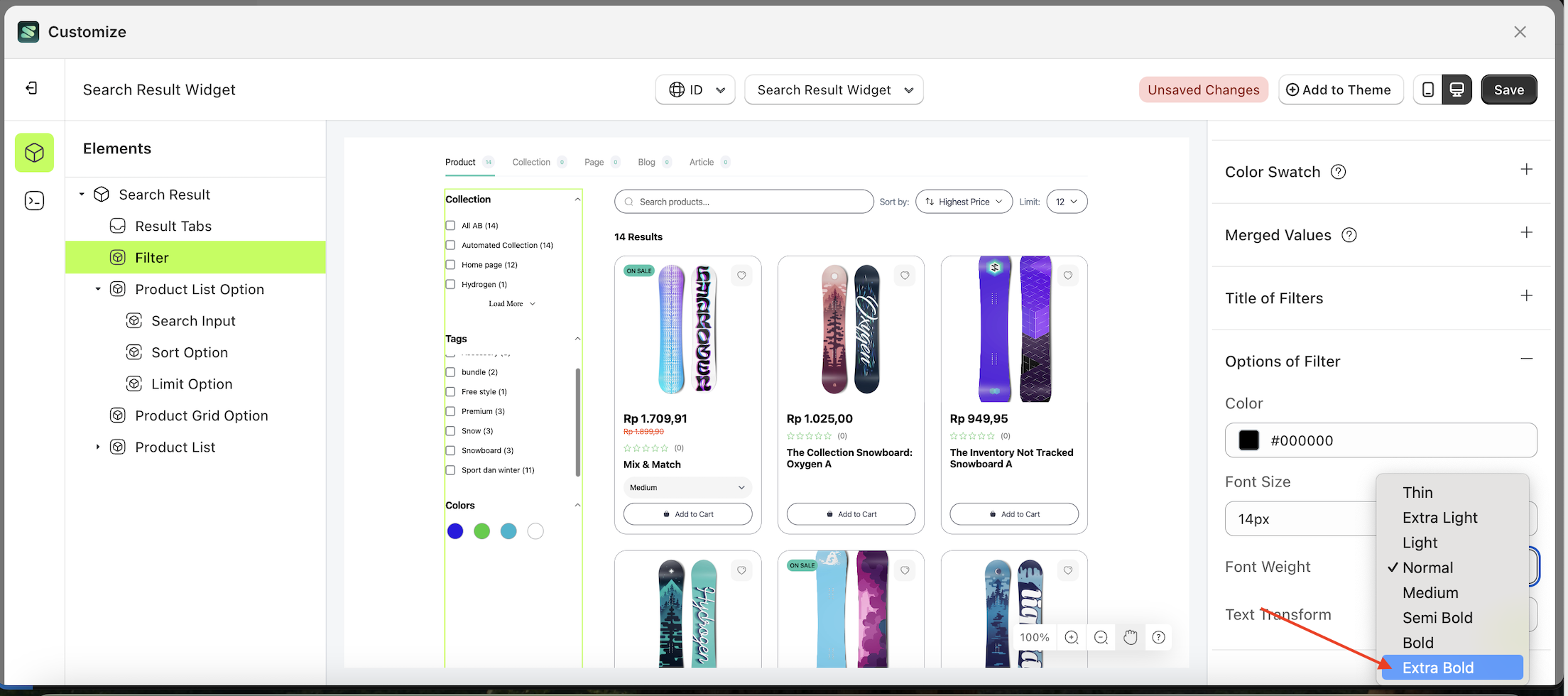
Font Weight
This feature is designed to customize the text weight of the title of filter
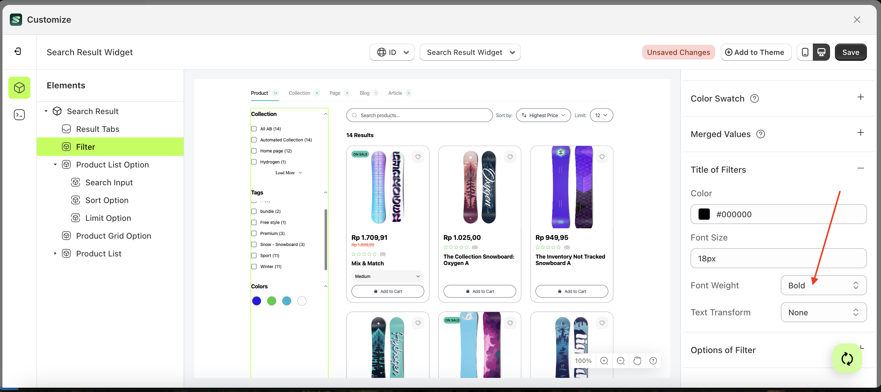
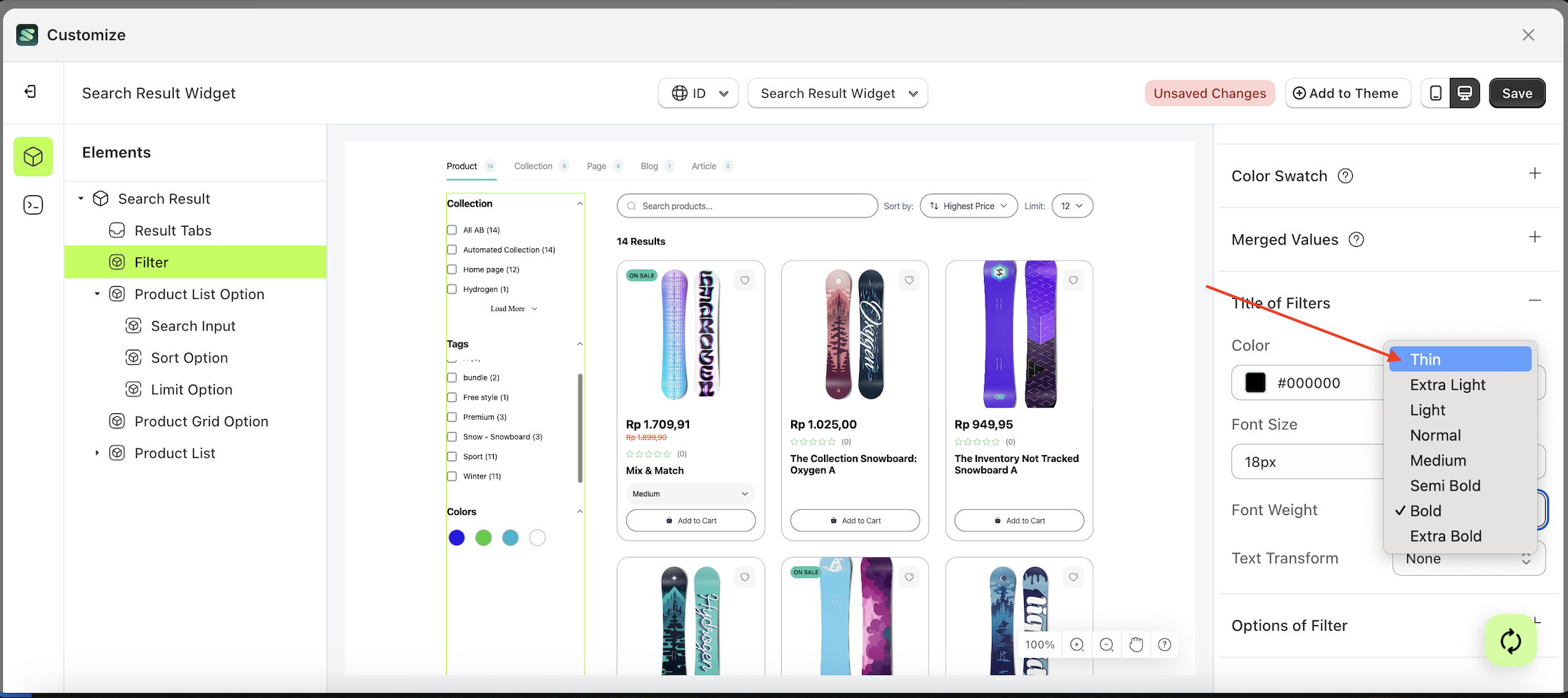
Follow the steps below:
- Select the Filter element on the left, then click the Settings tab and click the icon marked with a red arrow.
- On the right side, marked with a red arrow, you can change the font weight to your desired value.
- Note: The font weight format can be Button Text With Icon, Button Text, Text With Icon, Icon.
- Once the menu opens, select an option from the list
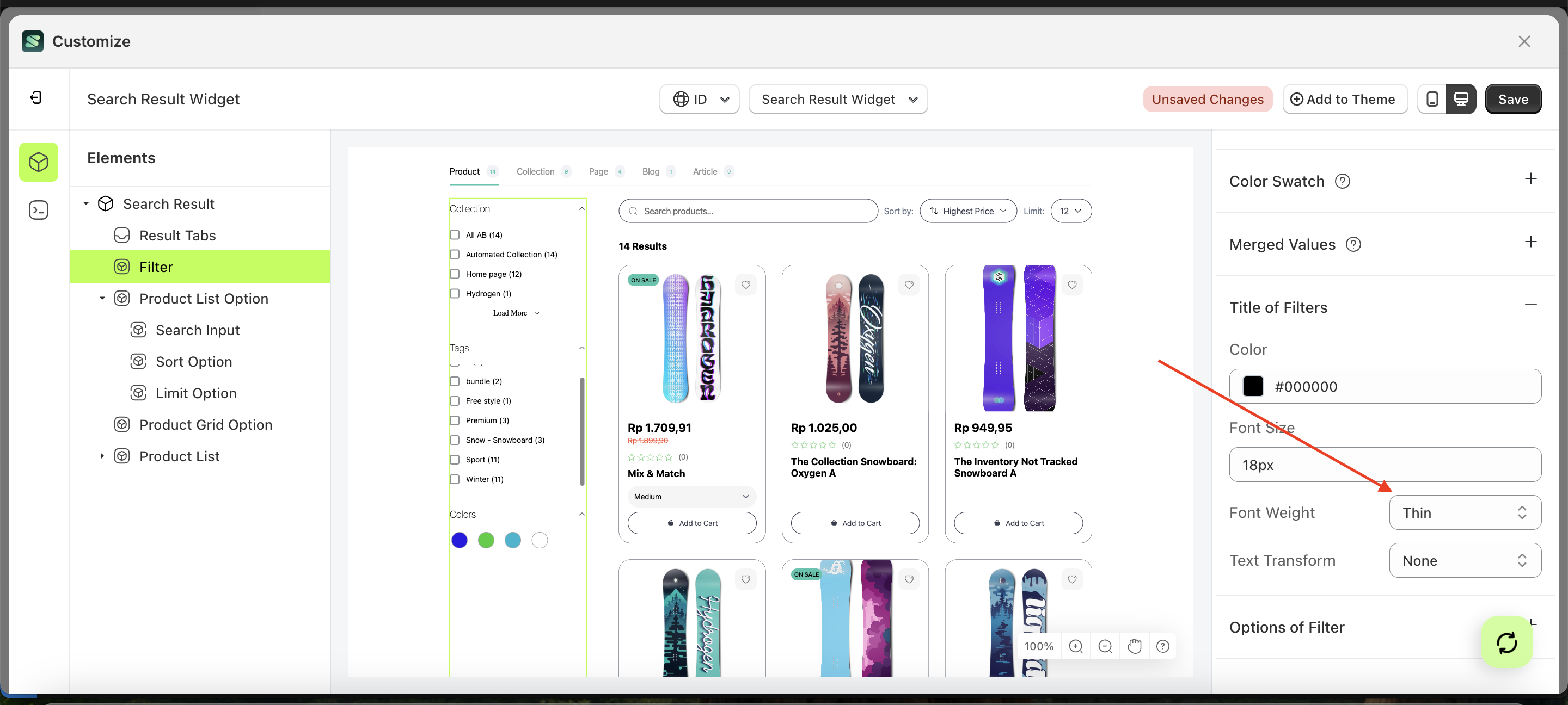
- For example, if you set the font weight to thin
- The font weight of the Filter element will adjust accordingly.
- Example : Before font weight change settings
- Example : After font weight change settings
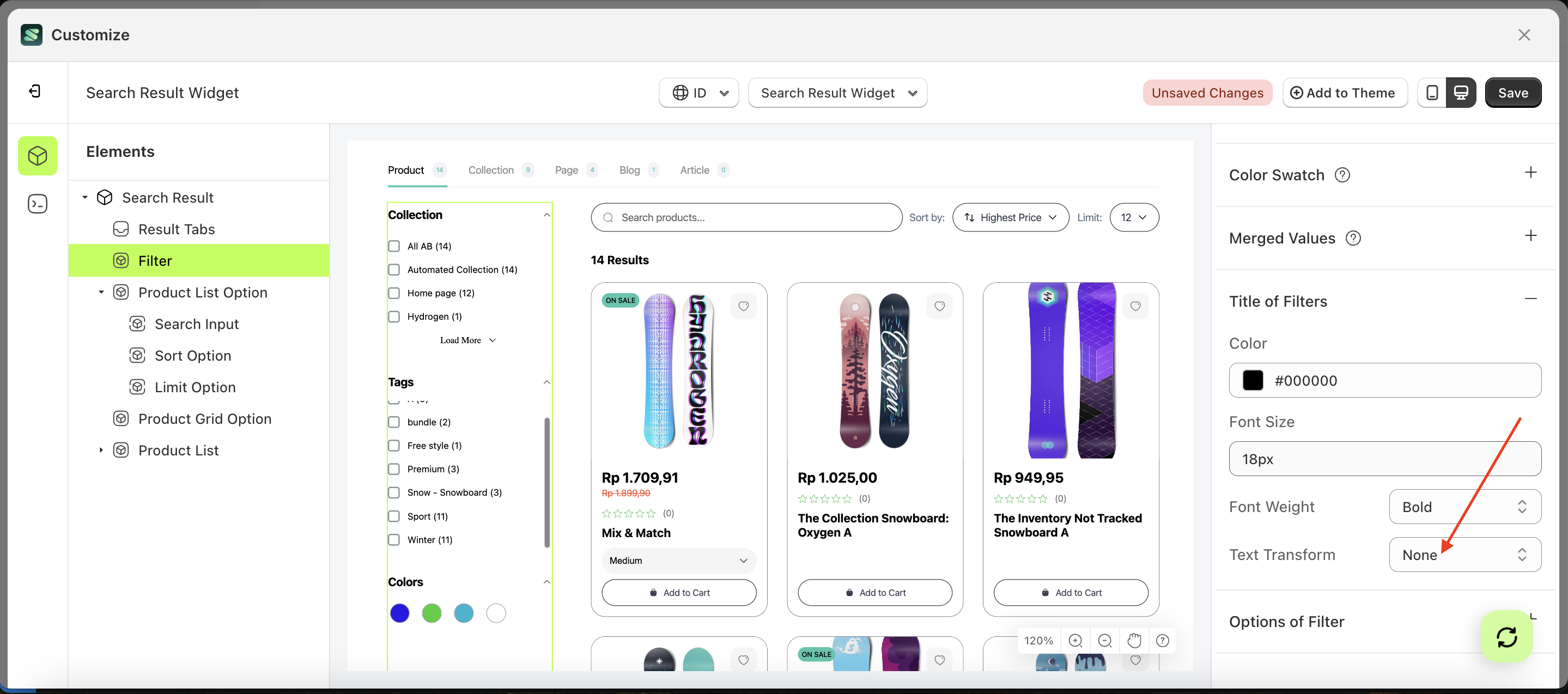
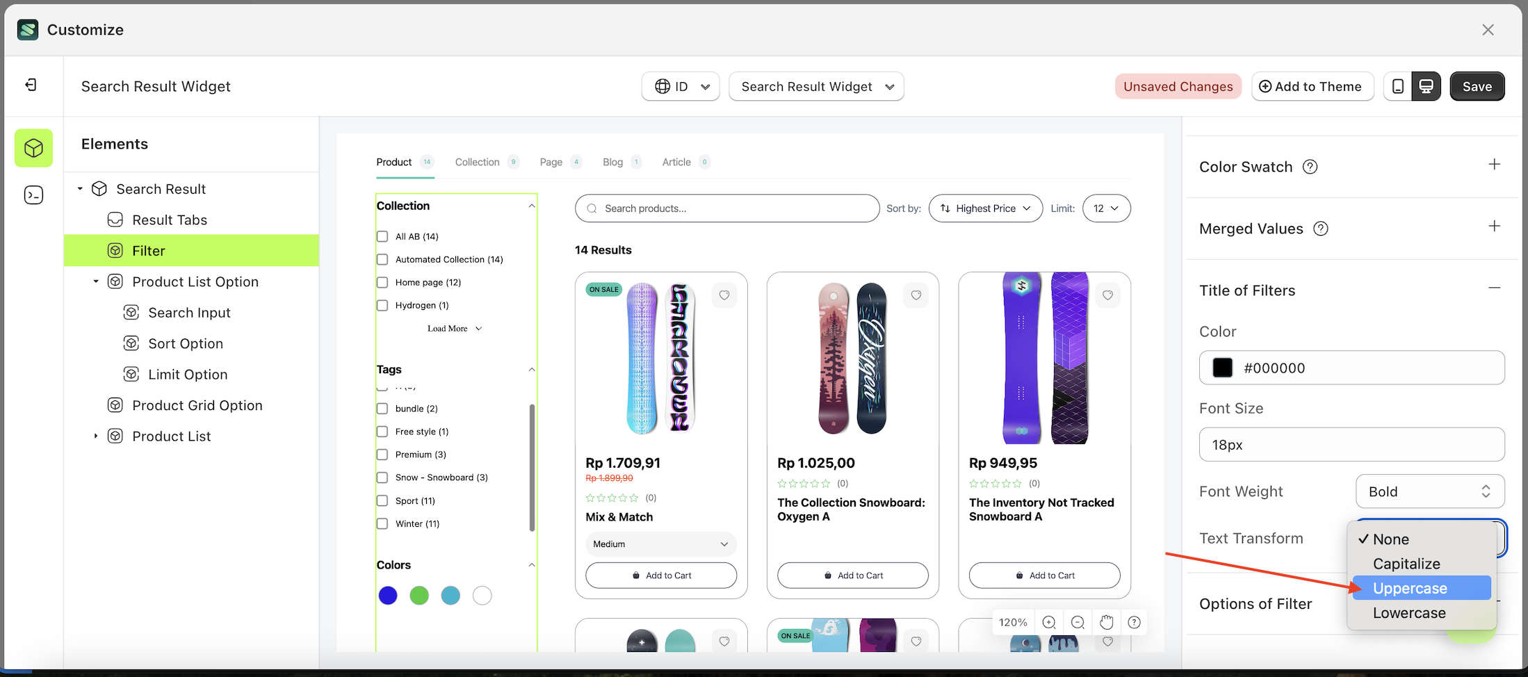
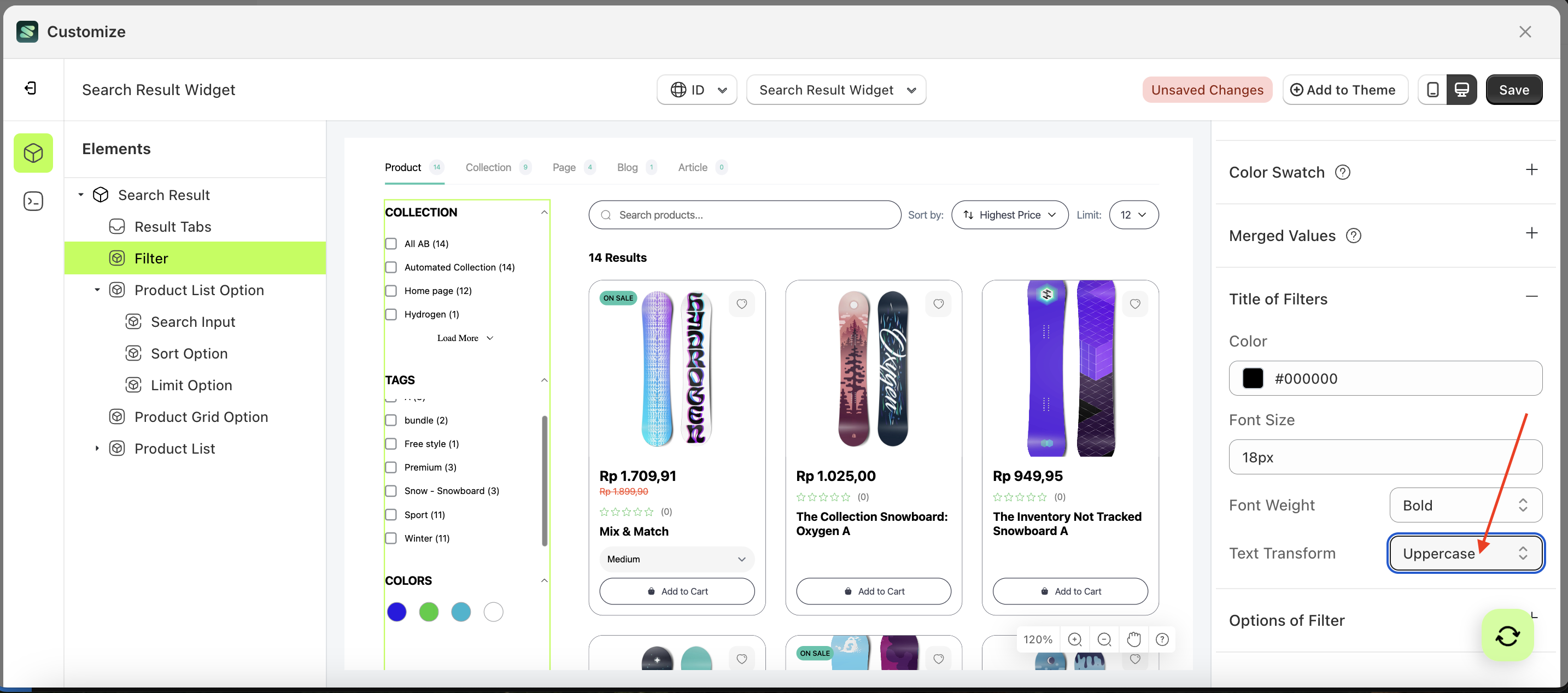
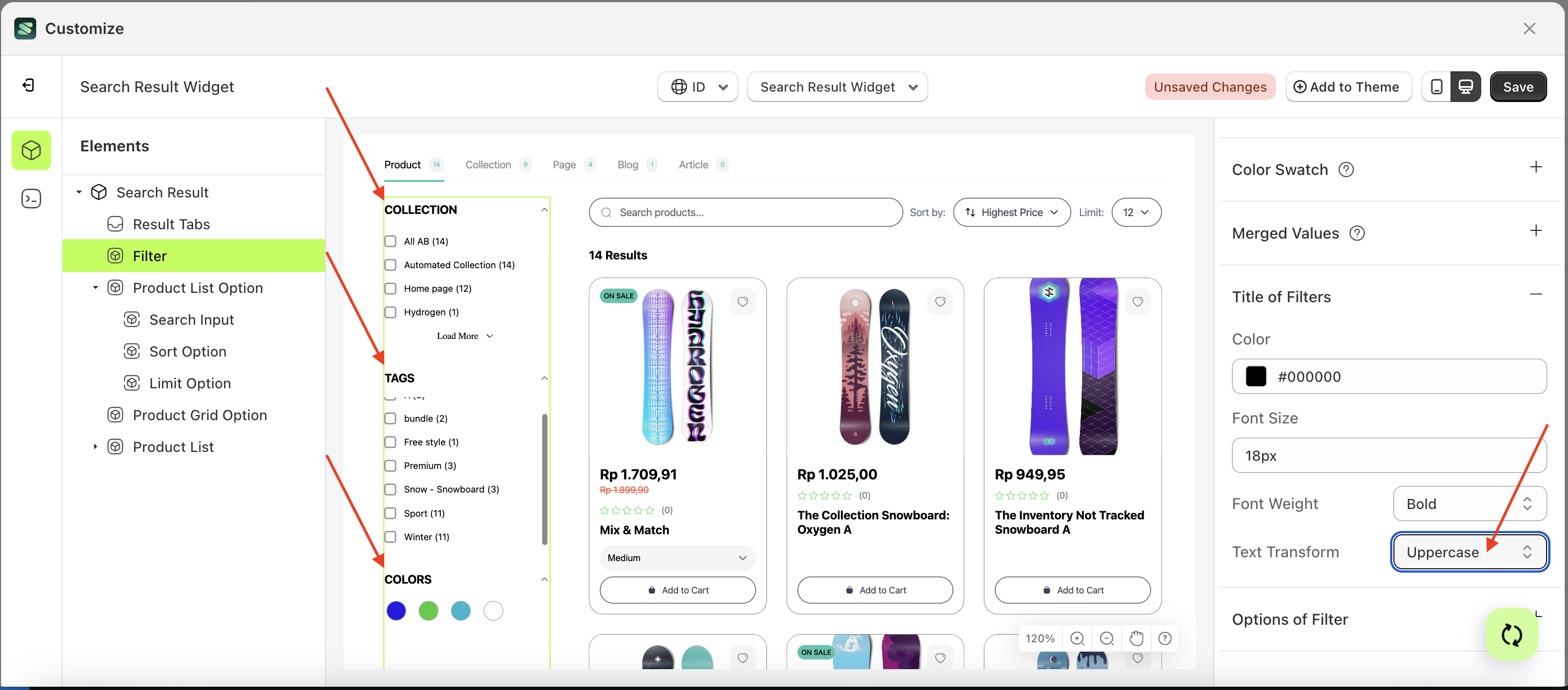
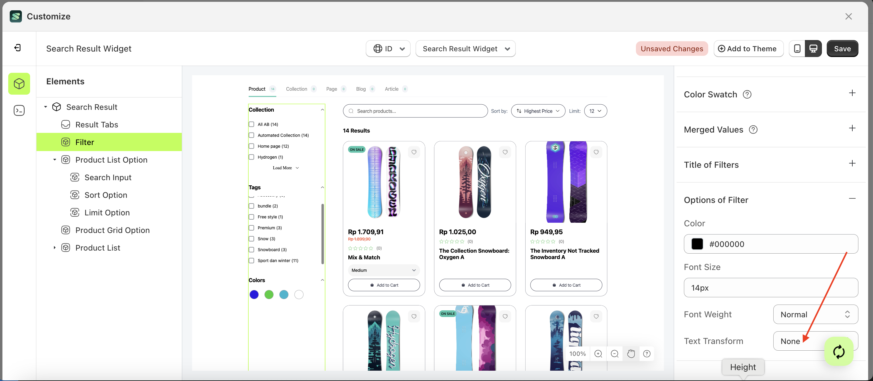
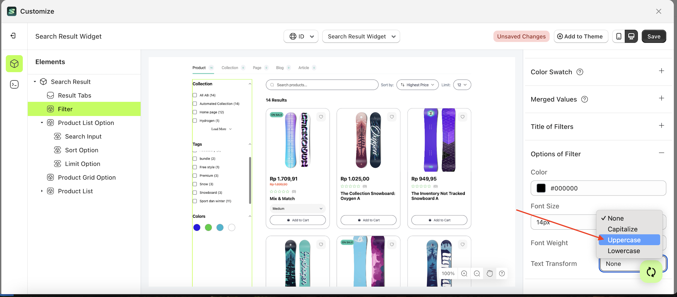
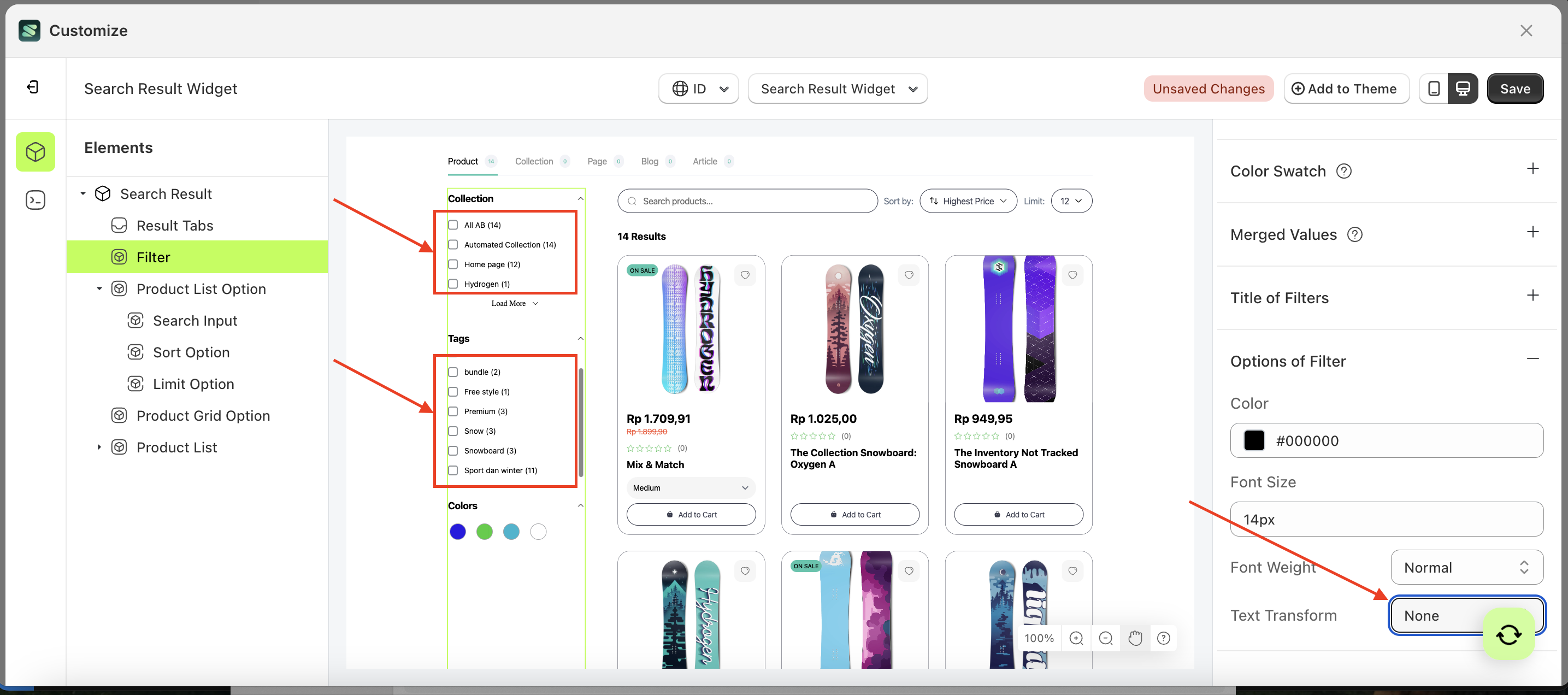
Text Transform
This feature allows you to adjust the capitalization style of the text weight text
Follow the steps below:
- Select the Filter element on the left, then click the Settings tab and click the icon marked with a red arrow.
- On the right side, marked with a red arrow, you can change the text transform to your desired value.
- Note: The text transform format can be None, Capitalize, Uppercase, Lowercase.
- Once the menu opens, select an option from the list
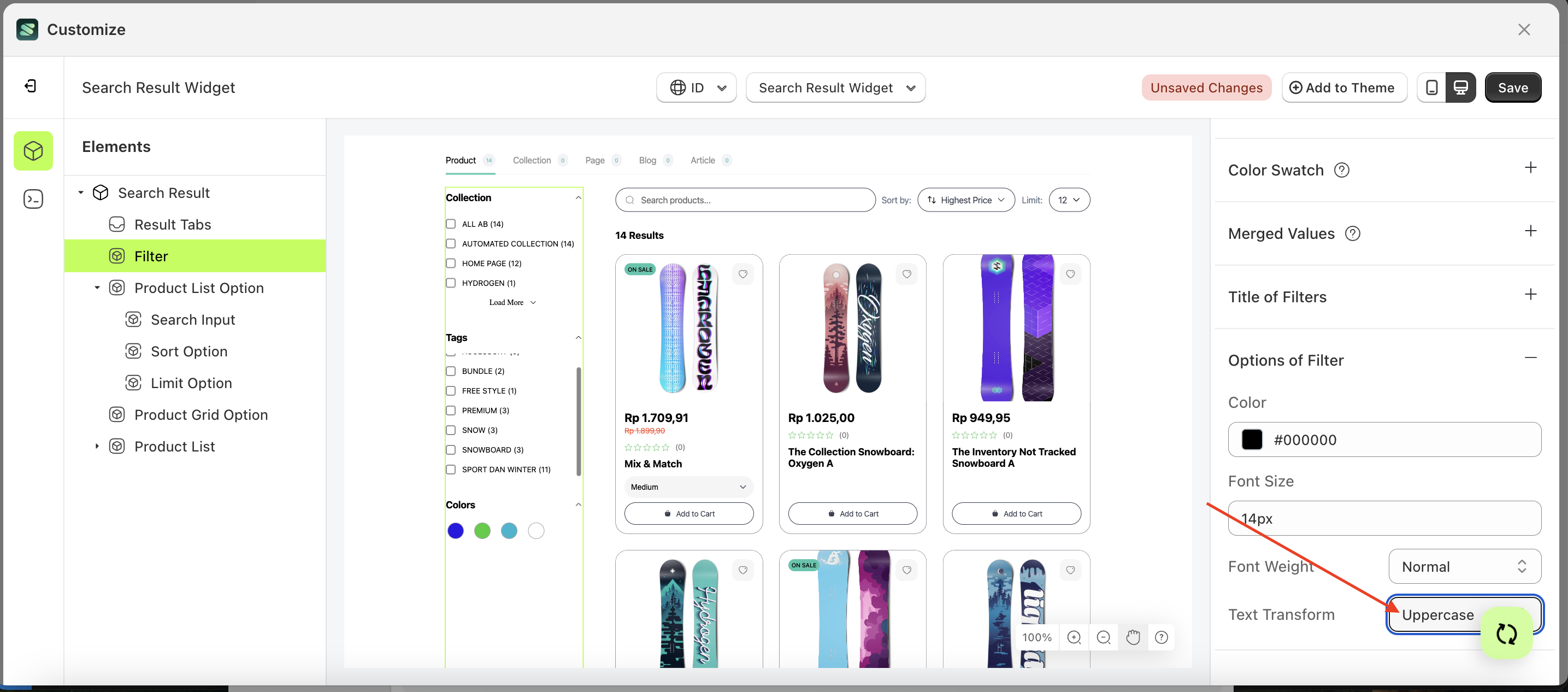
- For example, if you set the text transform to Uppercase
- The text transform of the Filter element will adjust accordingly.
- Example : Before text transform change settings
- Example : After text transform change settings
Option of filters
Available settings:
Color Option of FilterFont Size Option of FilterFont Weight Option of FilterText Transform Option of Filter
Color Option of Filter
This feature is designed to customize the text color of the option of filter
Follow the steps below:
- Select the Filter element on the left, then click the Settings tab and click the icon marked with a red arrow.
- Click the Color Palette on the right side, which is also marked with a red arrow.
- The Color Palette will appear. Click the right side of the palette where the red arrow and number 1 are indicated, then click the right side again where the red arrow and number 2 are marked.
- The search result widget of the Filter element will adjust accordingly.
- Example : Before Filter change settings
- Example : After Filter change settings
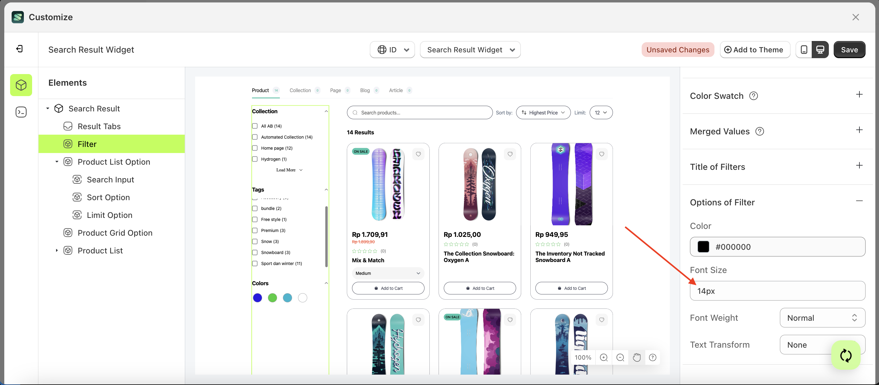
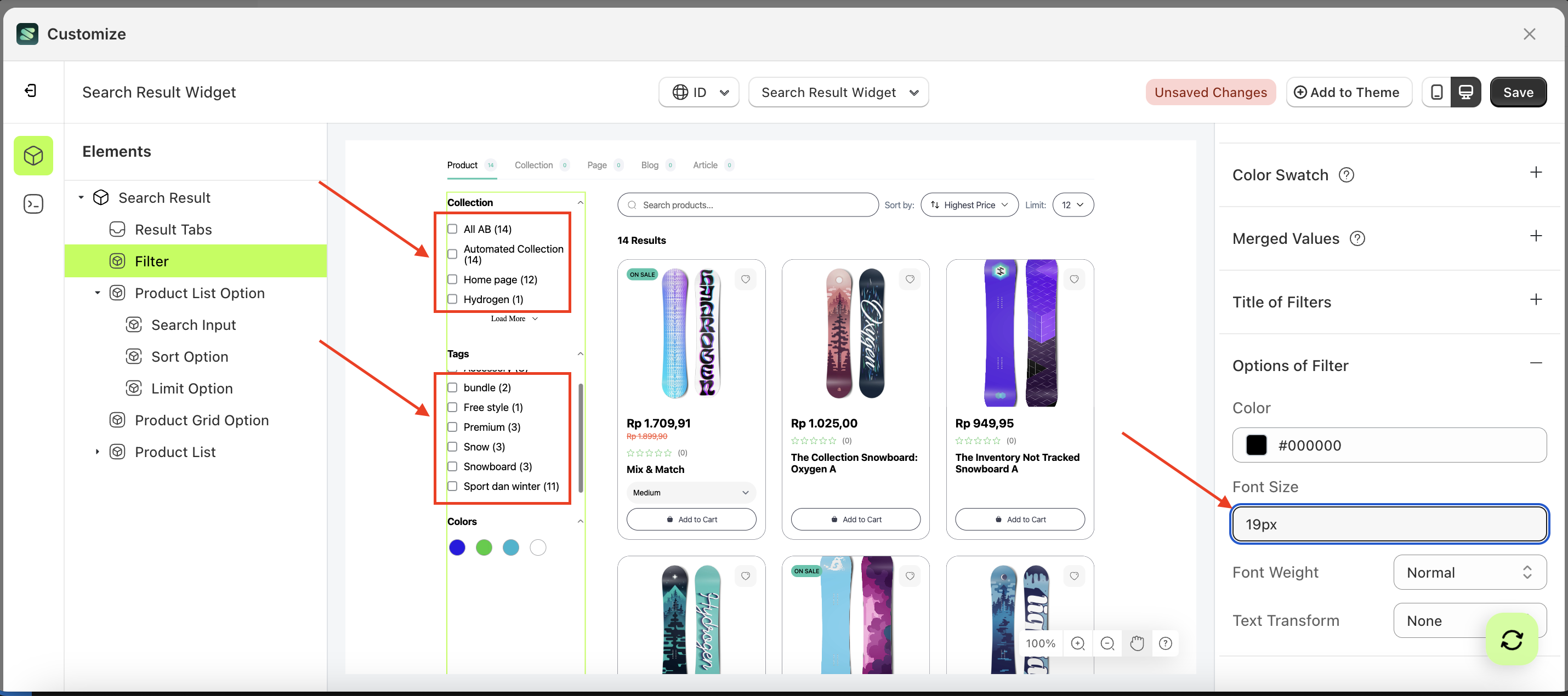
Font Size Option of Filter
This feature is designed to customize the text size of the option of filter
Follow the steps below:
- Select the Filter element on the left, then click the Settings tab and click the icon marked with a red arrow.
- On the right side, marked with a red arrow, you can change the font size to your desired value.
- Note: The font size format can be Button Text With Icon, Button Text, Text With Icon, Icon.
- For example, if you set the font size to 19px
- The font size of the Filter element will adjust accordingly.
- Example : Before font size change settings
- Example : After font size change settings
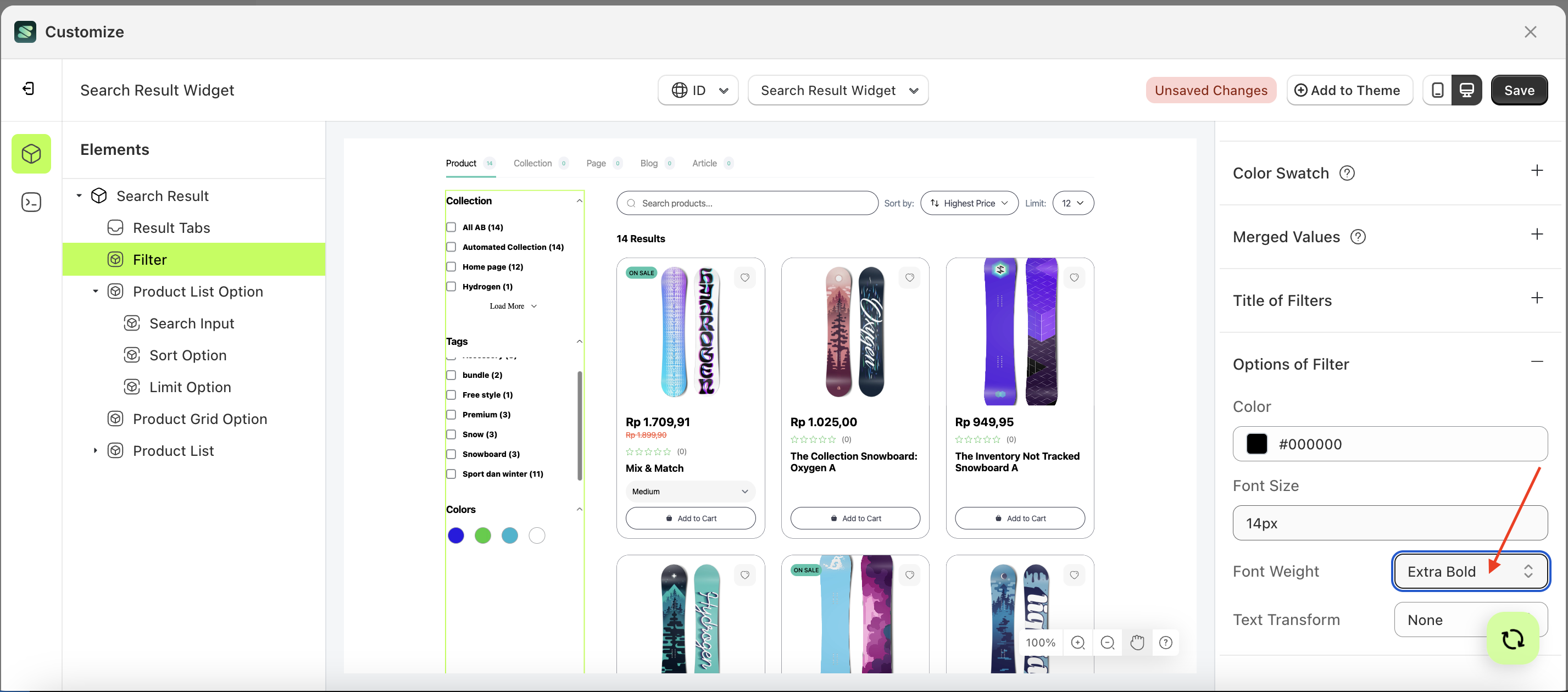
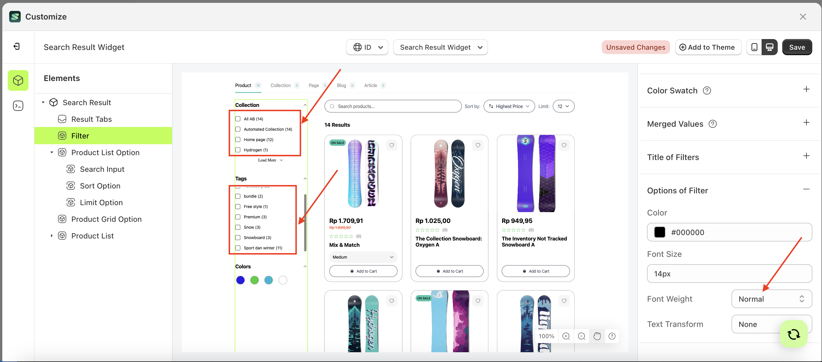
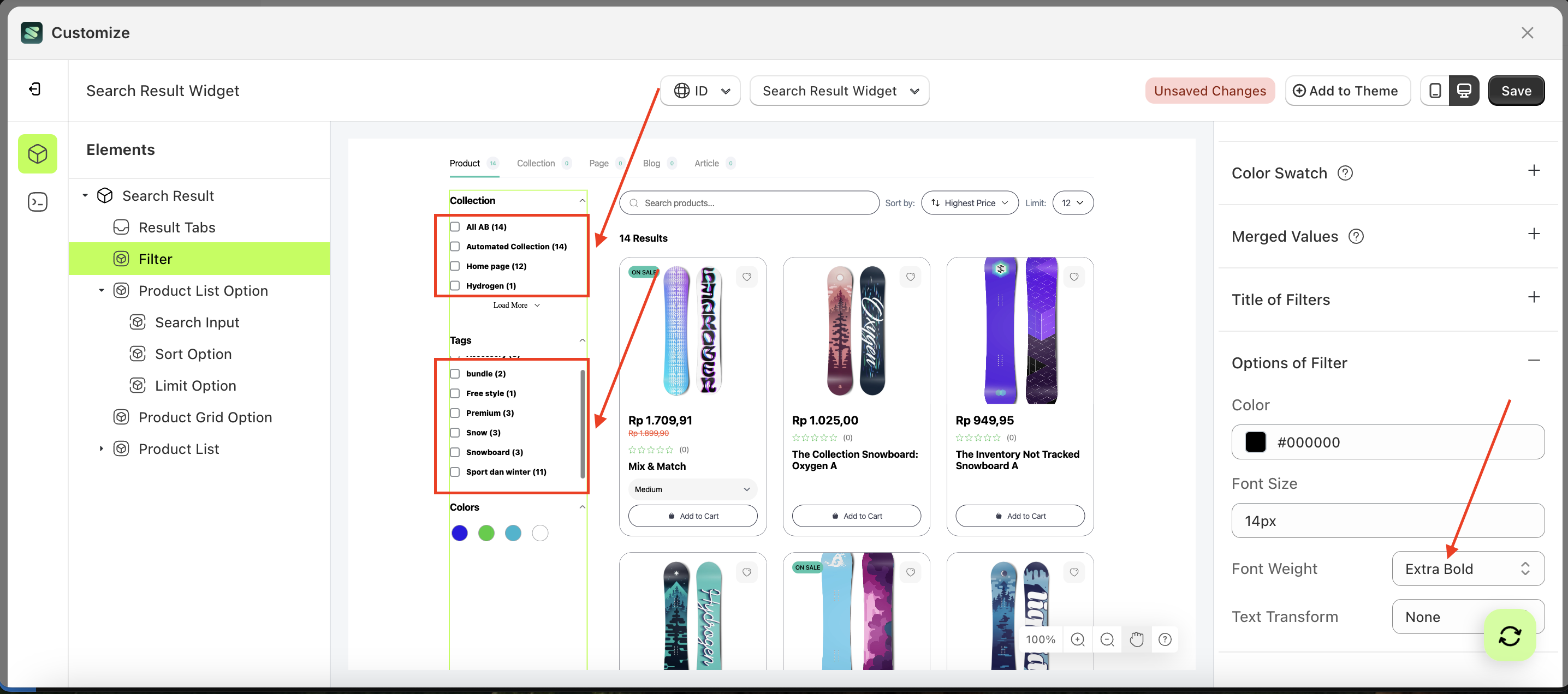
Font Weight
This feature is designed to customize the text weight of the option of filter
Follow the steps below:
- Select the Filter element on the left, then click the Settings tab and click the icon marked with a red arrow.
- On the right side, marked with a red arrow, you can change the font weight to your desired value.
- Note: The font weight format can be Button Text With Icon, Button Text, Text With Icon, Icon.
- Once the menu opens, select an option from the list
- For example, if you set the font weight to thin
- The font weight of the Filter element will adjust accordingly.
- Example : Before font weight change settings
- Example : After font weight change settings

Text transform
This feature allows you to adjust the capitalization style of the text
Follow the steps below:
- Select the Filter element on the left, then click the Settings tab and click the icon marked with a red arrow.
- On the right side, marked with a red arrow, you can change the text transform to your desired value.
- Note: The text transform format can be None, Capitalize, Uppercase, Lowercase.
- Once the menu opens, select an option from the list
- For example, if you set the text transform to Uppercase
- The text transform of the Filter element will adjust accordingly.
- Example : Before text transform change settings
- Example : After text transform change settings
Visibility
Available settings:
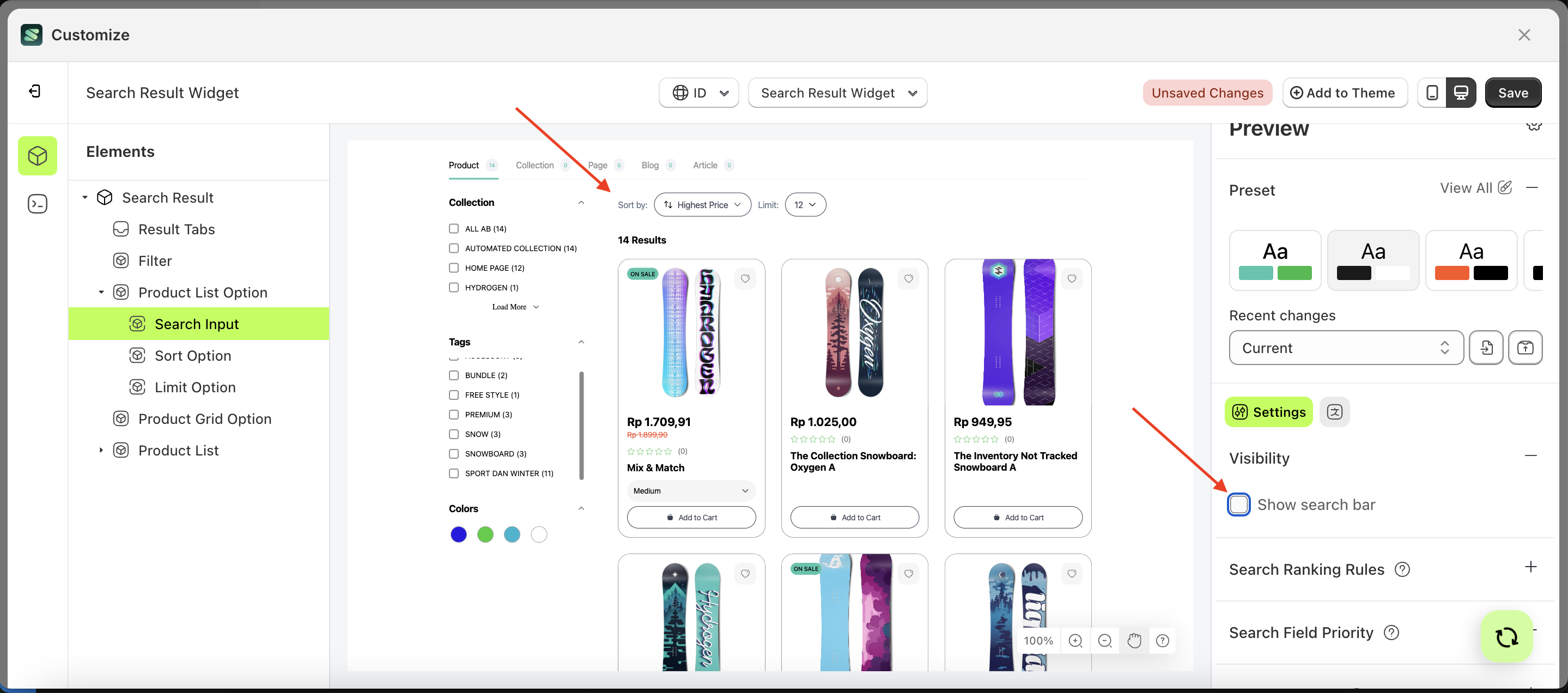
Show Search Bar
This feature is designed to show or hide the search element based on checkbox input.
Follow the steps below:
- Select the Search Input element on the right, then click the Settings tab and click the icon marked with a red arrow.
- Enable the Show Search Bar checkbox
- Example : Before Show Search Bar is enabled
- Example : After Show Search Bar is enabled
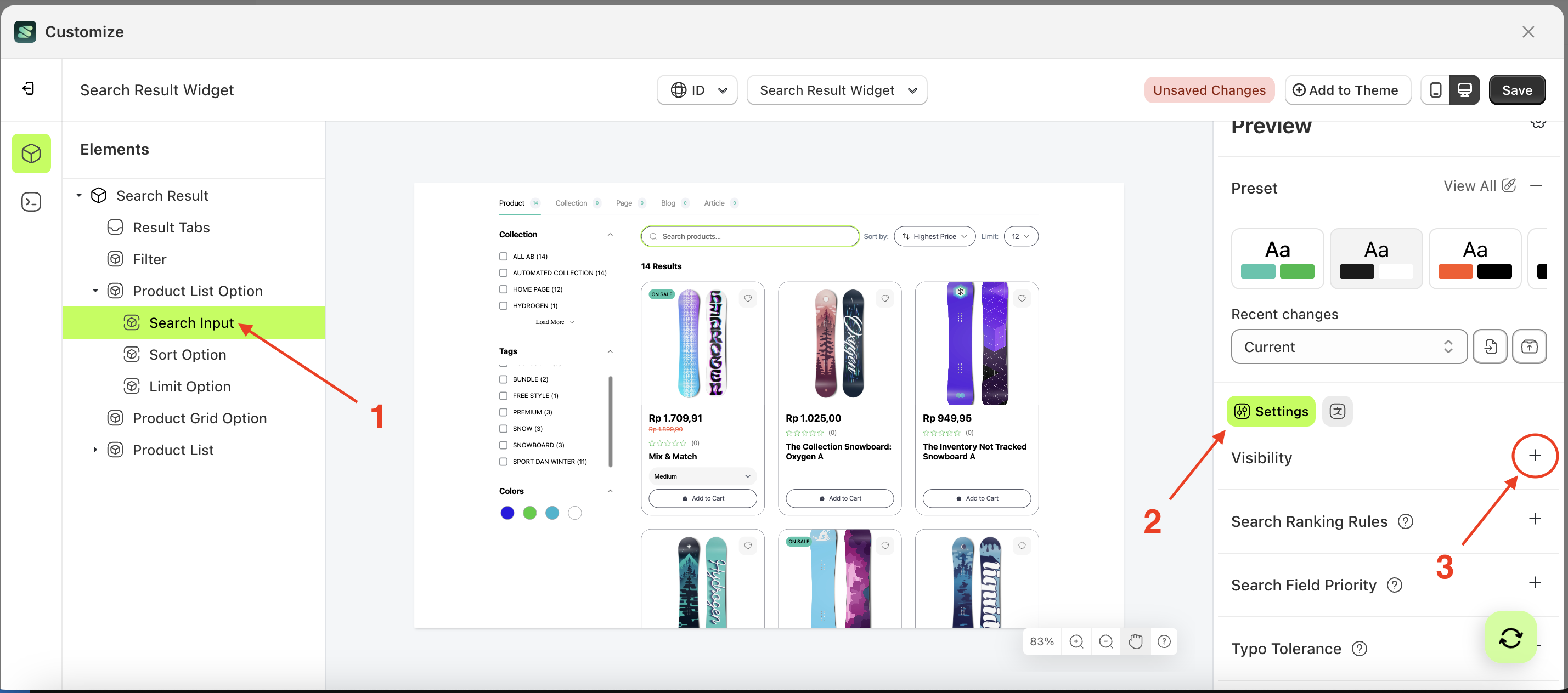

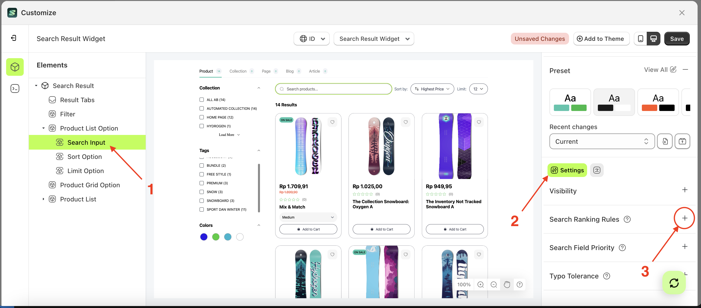
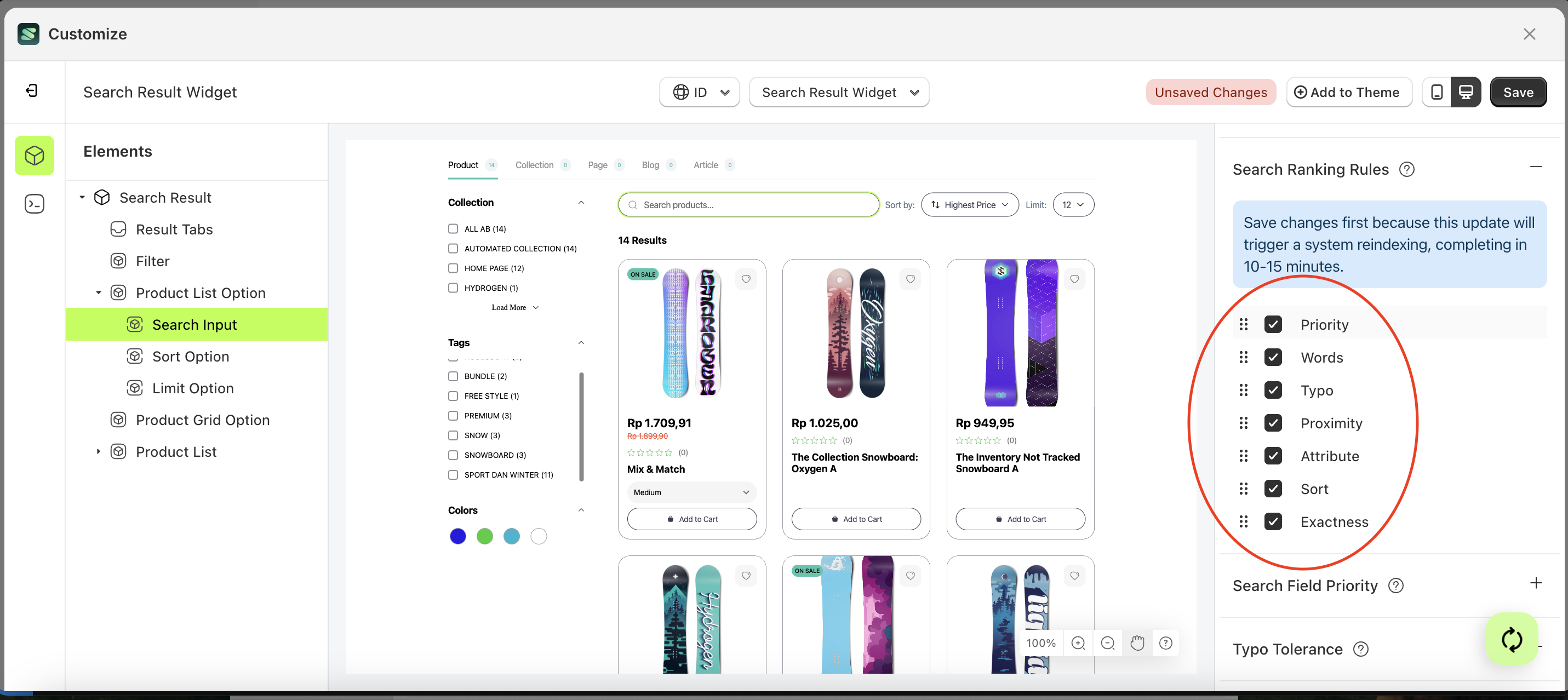
Search Ranking Rules
Each source has a list of ranking rules that are stored with the index settings. For each search query, Instant Search uses a sorting order to rank documents. The first ranking rule is applied to all documents, while each subsequent rule is applied only to documents that are considered equal according to the previous rule (i.e., as a tiebreaker).
Follow the steps below:
- Select the Search Input element on the right, then click the Settings tab and click the icon marked with a red arrow.
- Set the desired order by dragging items up or down in the list marked below
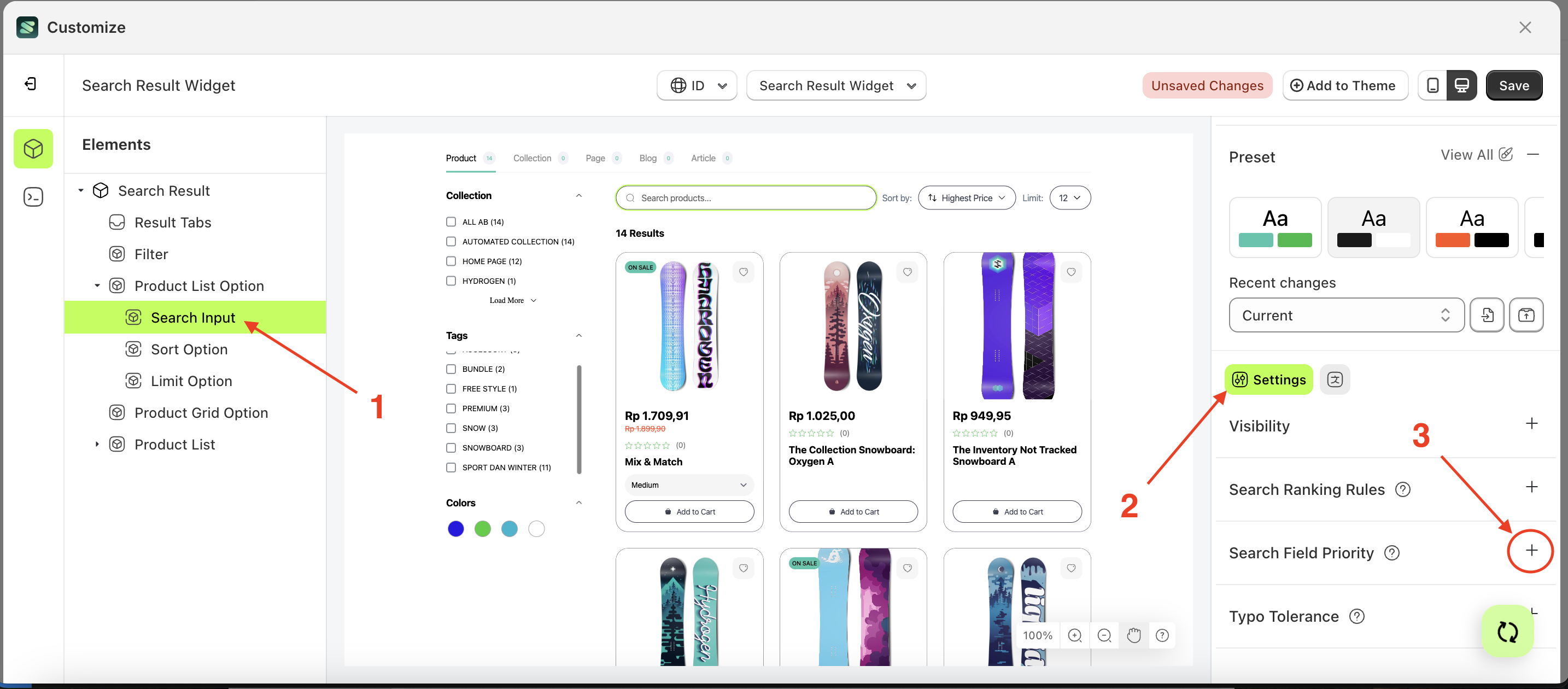
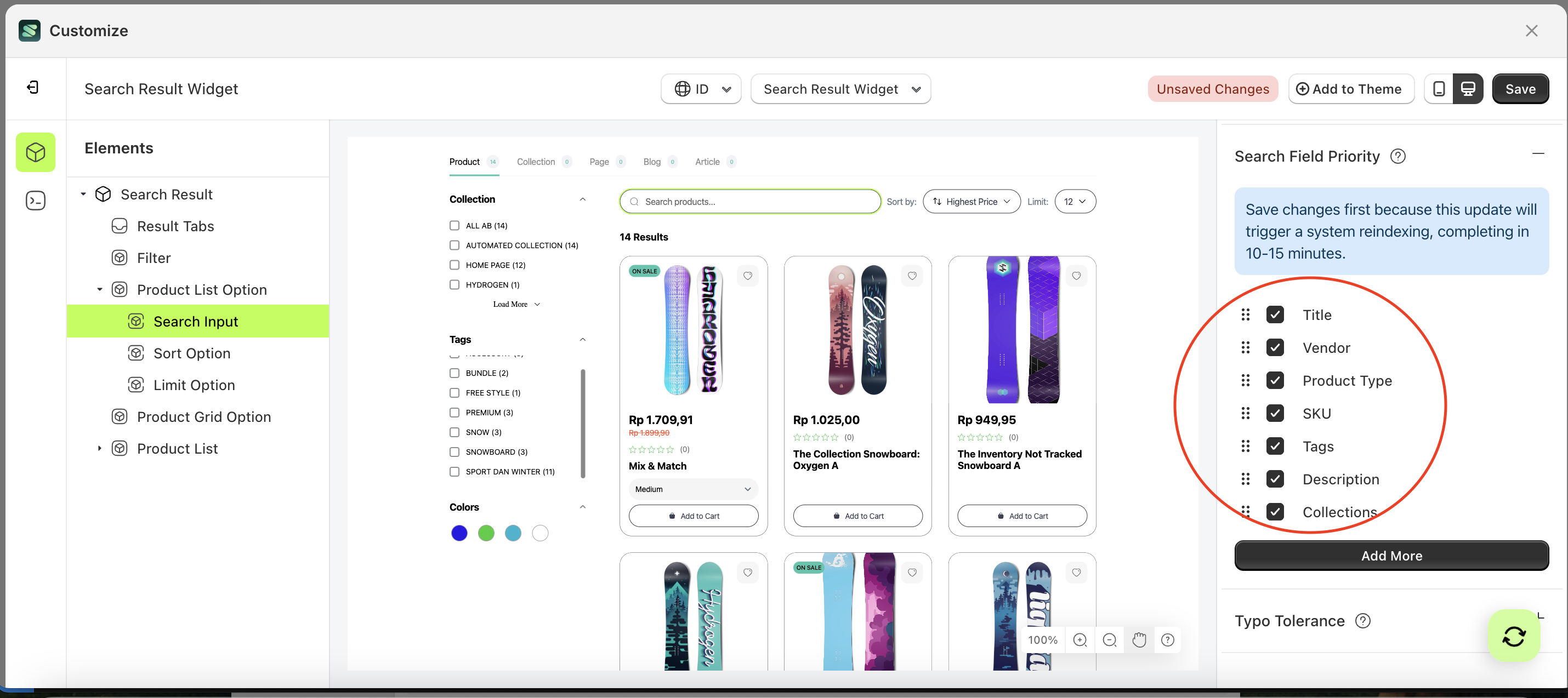
Search Field Priority
Search field priority is a setting designed to manage searches based on a ranked field order. For example, if "title" is set as the highest priority and its status checkbox is active, products with matching titles will be displayed first. Once those results are processed, the system will continue to the next prioritized field with an active status checkbox.
Follow the steps below:
- Select the Search Input element on the right, then click the Settings tab and click the icon marked with a red arrow.
- Set the desired order by dragging items up or down in the list marked below
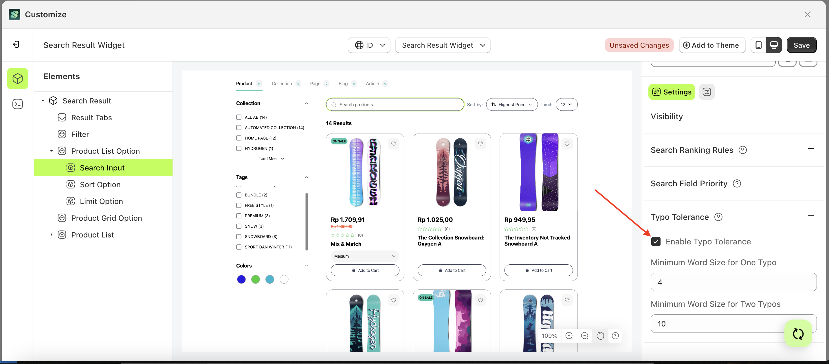
Typo tolerance
By default, this feature allows one typo for query terms with five or more characters and up to two typos for terms with at least nine characters.
For example, if your dataset contains "seven," searching for "sevem" or "sevan" will still match "seven." However, "tow" will not match "two" because it has fewer than five characters.
You can override these default settings using the minWordSizeForTypos object. The code sample below sets the minimum word size for one typo to 4 and for two typos to 10.
Follow the steps below:
- Select the Search Input element on the right, then click the Settings tab and click the icon marked with a red arrow.
- Enable the Show out of stock variant filter items checkbox

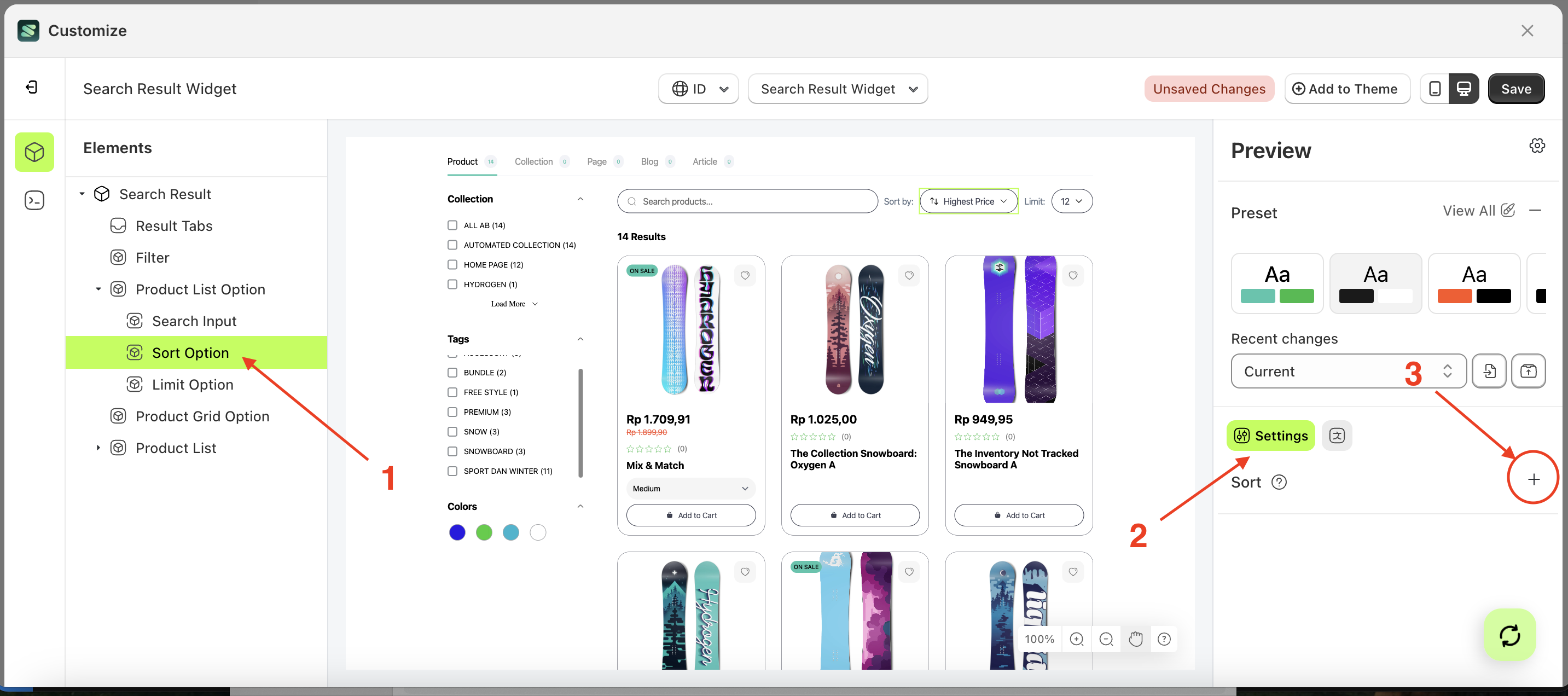
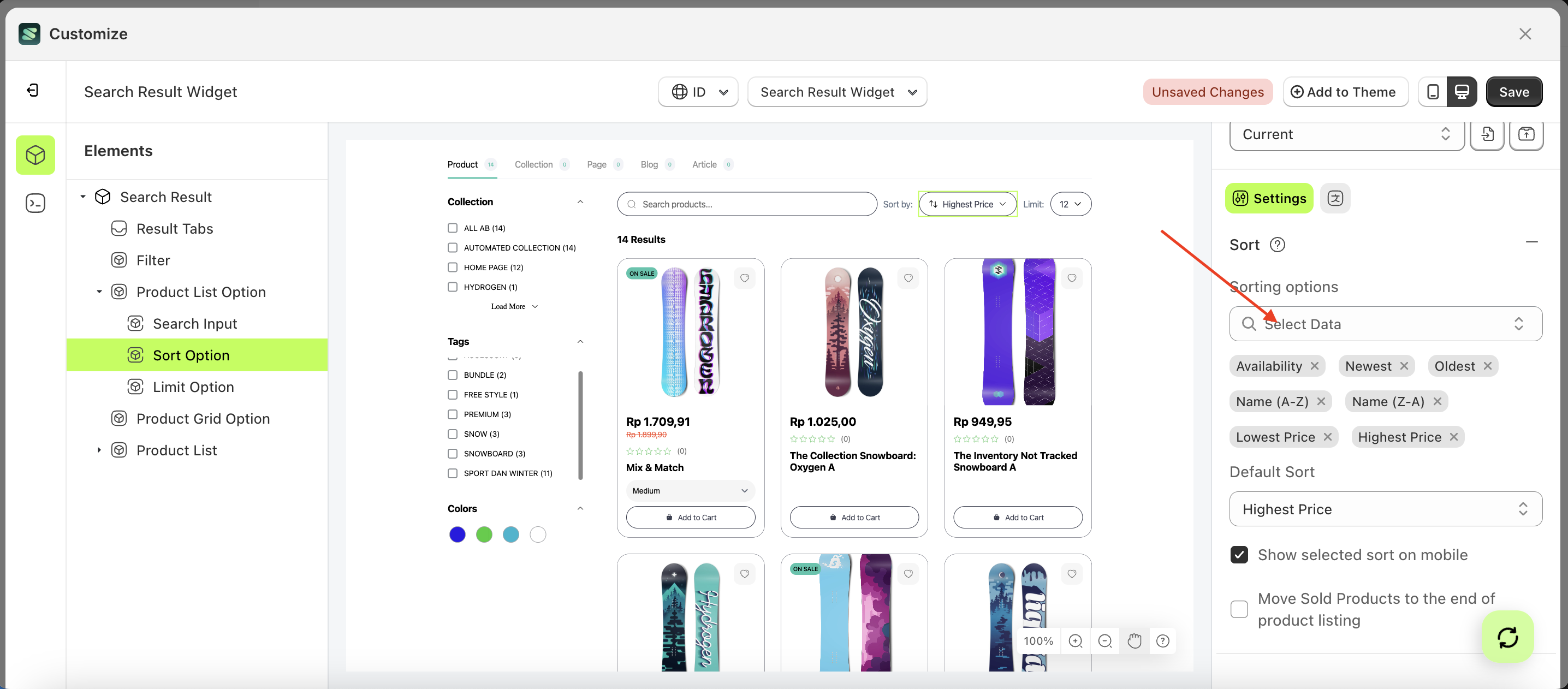
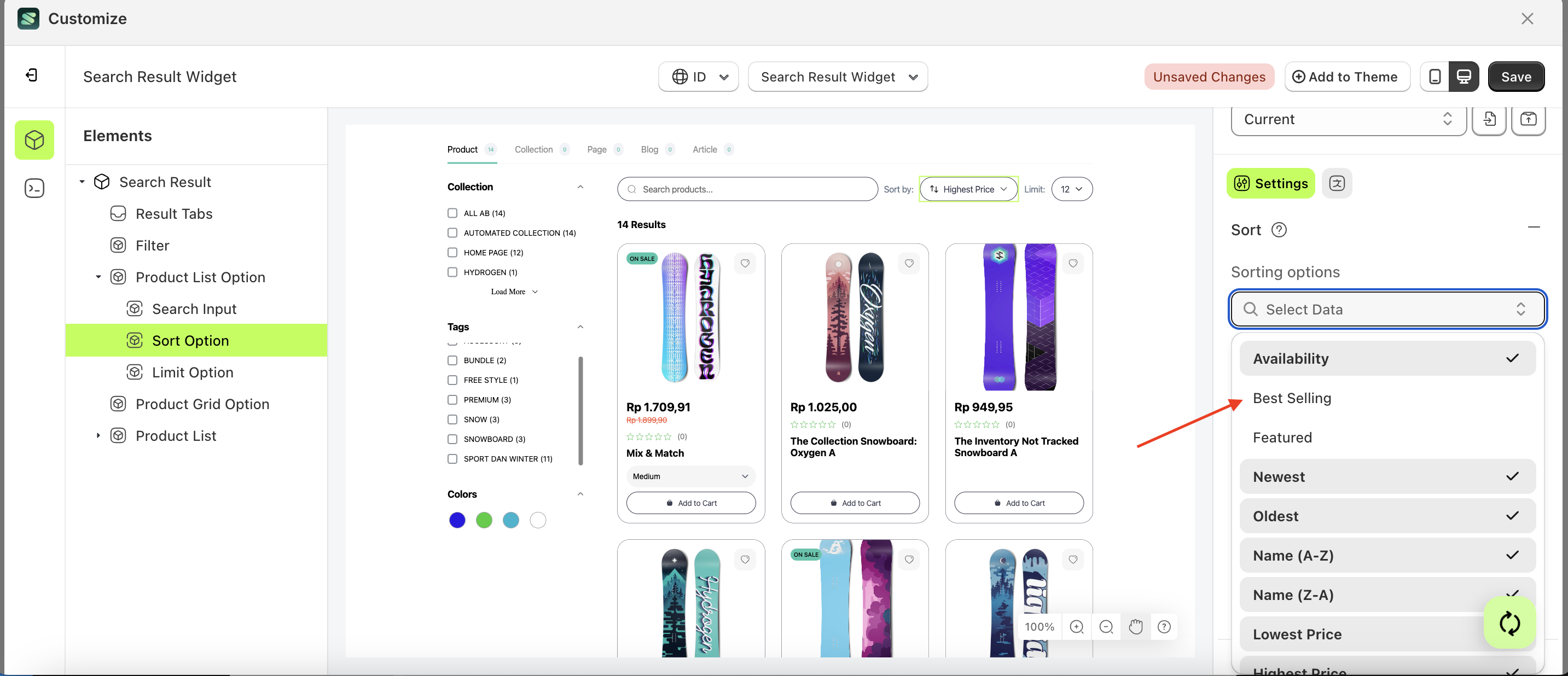
Sort
Available settings:
Sorting Options
This feature is used to add sorting lists according to your store's needs.
Follow the steps below:
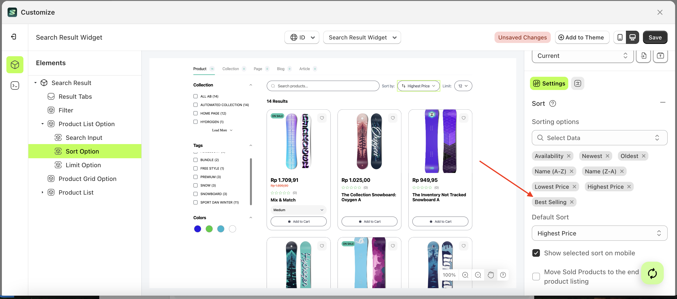
- Select the element on the right, then click the Settings tab and click the icon marked with a red arrow.
- Click the data select element the keyboard input you want to create.
- A list of data will appear.
- Select the desired data
- Once selected, your choice will be displayed below the data select element.
- Before creating the keyword input.
- After creating the keyword input.
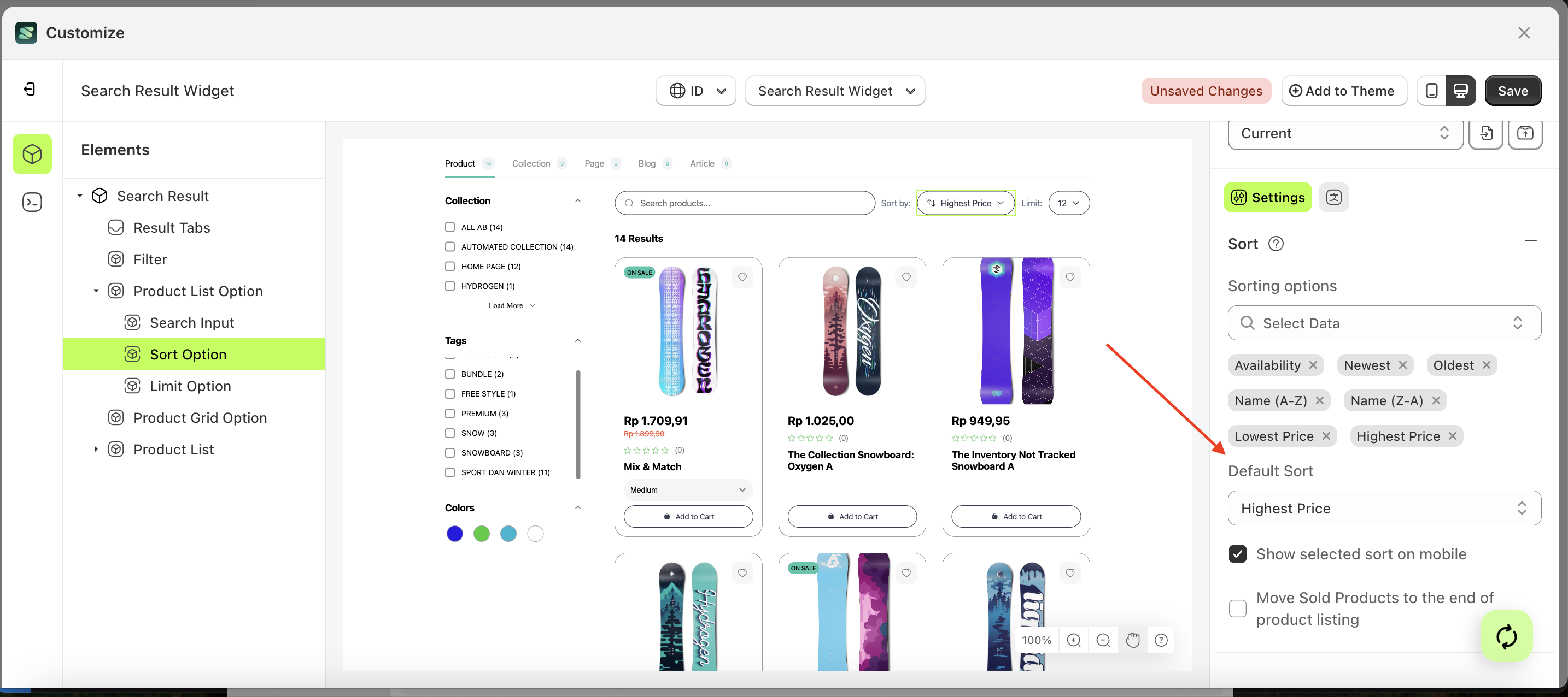
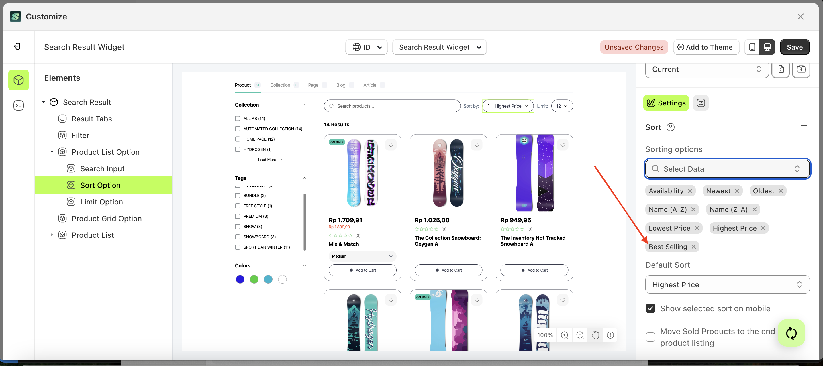
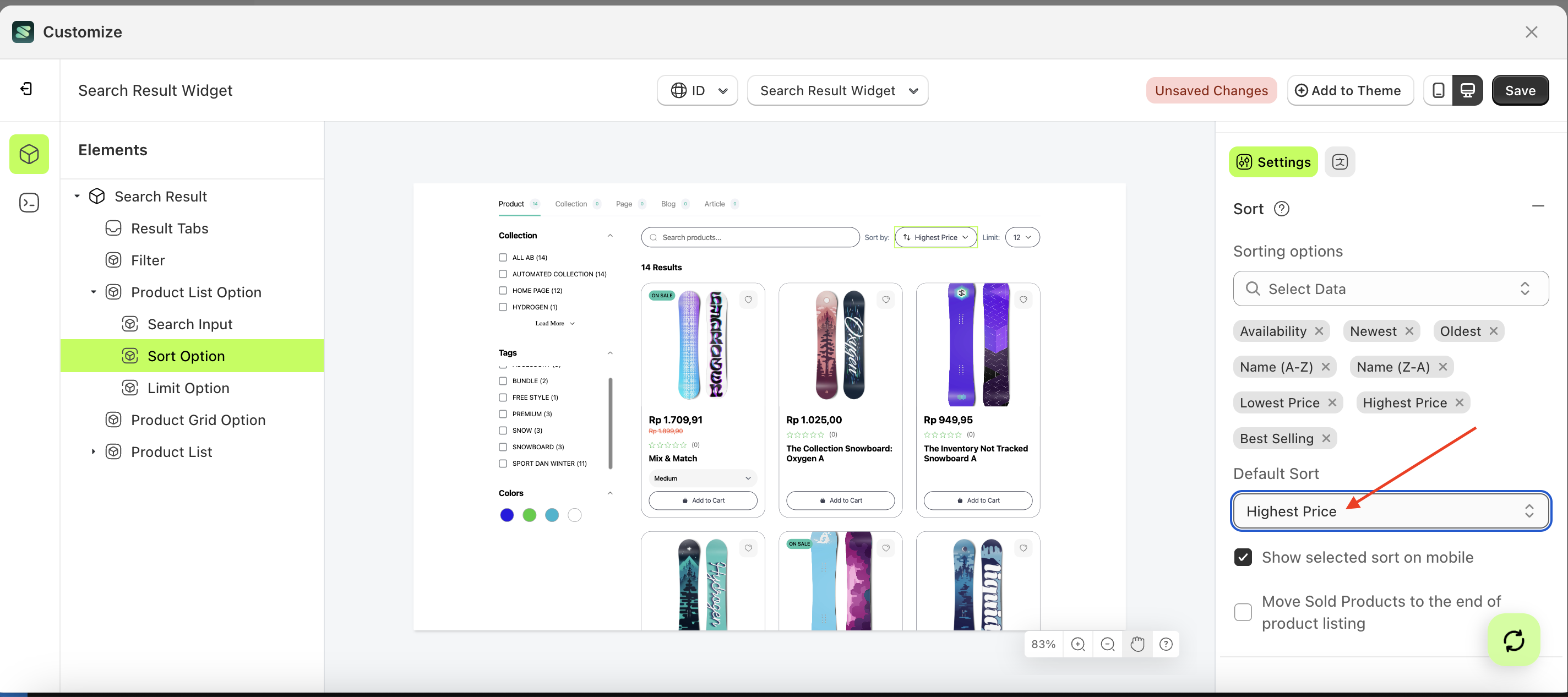
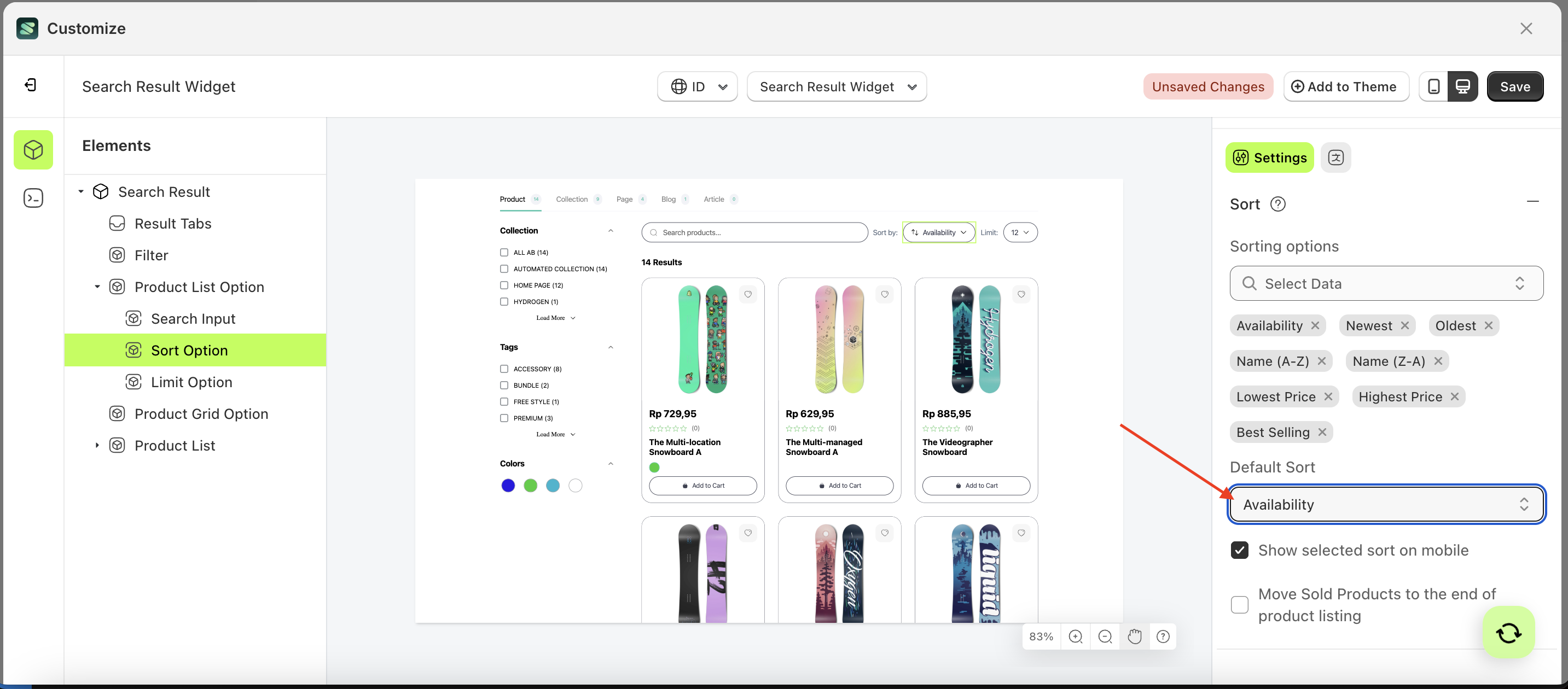
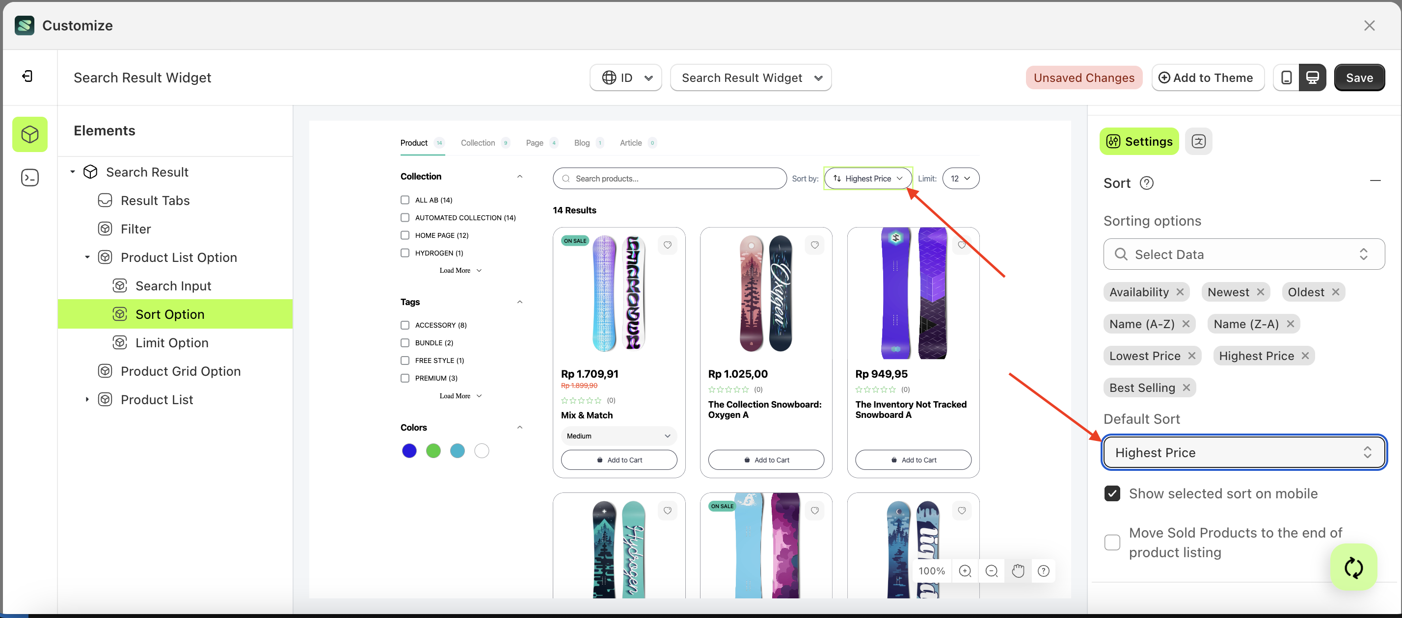
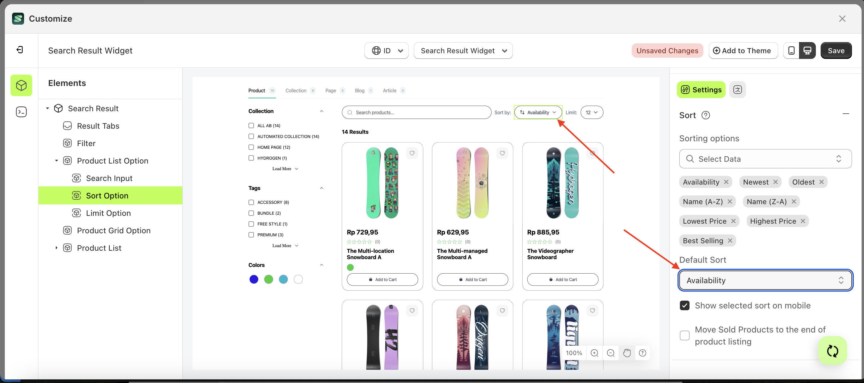
Default Sort
This feature is used to set a sorting list as the default.
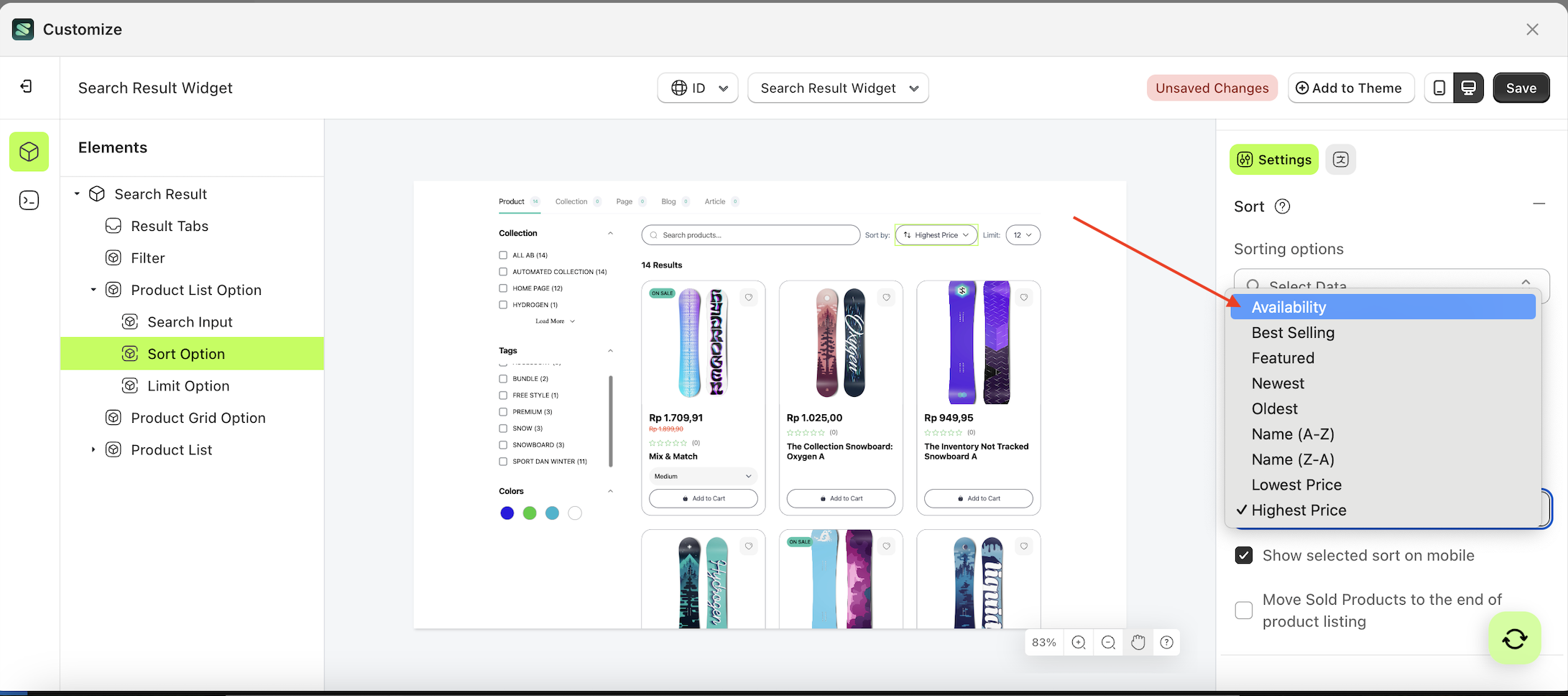
Follow the steps below:
- Select the Sort Option element on the left, then click the Settings tab and click the icon marked with a red arrow.
- On the right side, marked with a red arrow, you can change the default sort to your desired value.
- Note: The default sort format can be Available, feature, Newest, Older and ETC.
- Once the menu opens, select an option from the list
- For example, if you set the default sort to Available
- The default sort of the Sort Option element will adjust accordingly.
- Example : Before default sort change settings
- Example : After default sort change settings
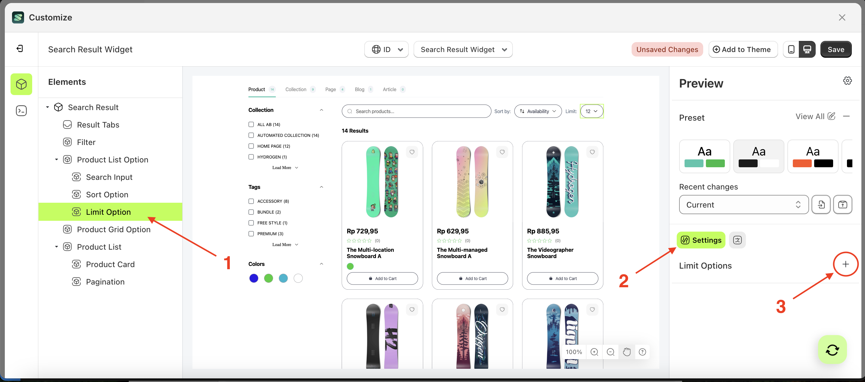
Limit Options
Available settings:
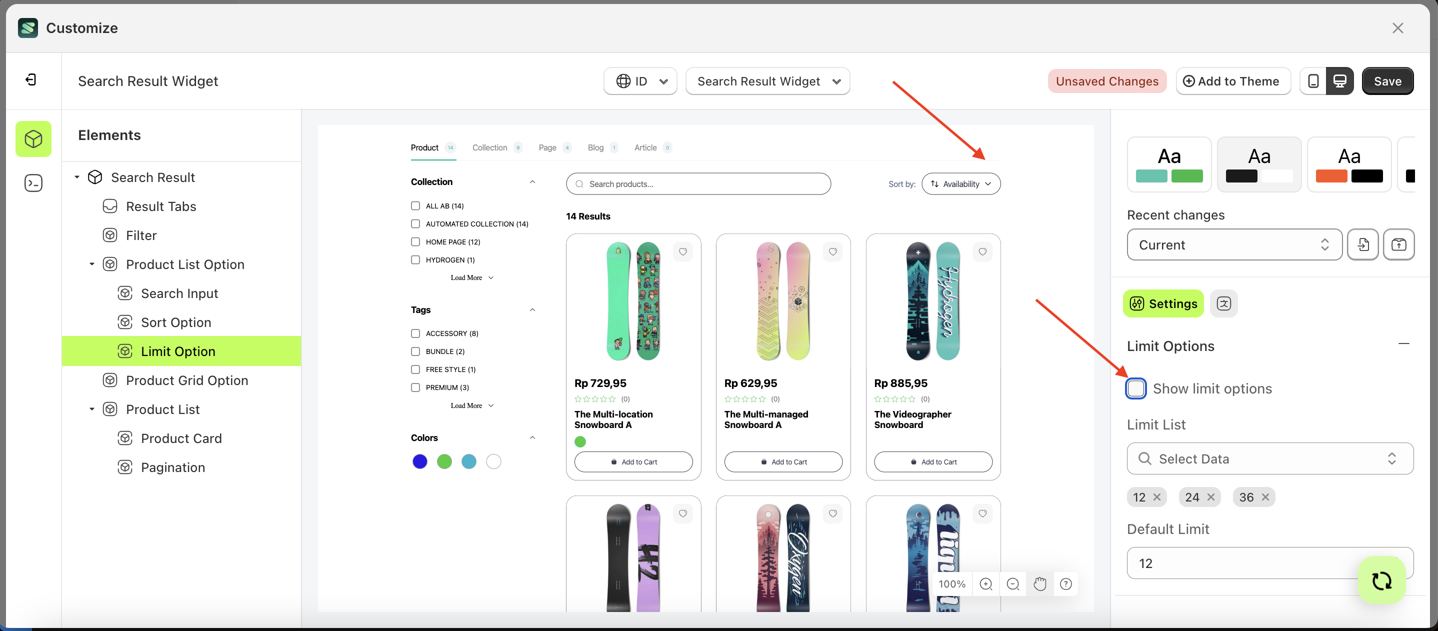
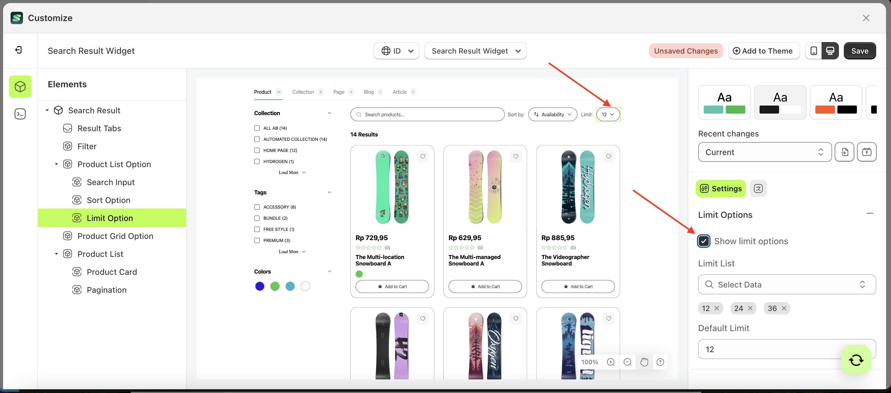
Show Limit Option
This feature is designed to show or hide the limit option element.
Follow the steps below:
- Select the Search Input element on the right, then click the Settings tab and click the icon marked with a red arrow.
- Enable the Limit Option checkbox
- Example : Before Limit Option is enabled
- Example : After Limit Option is enabled
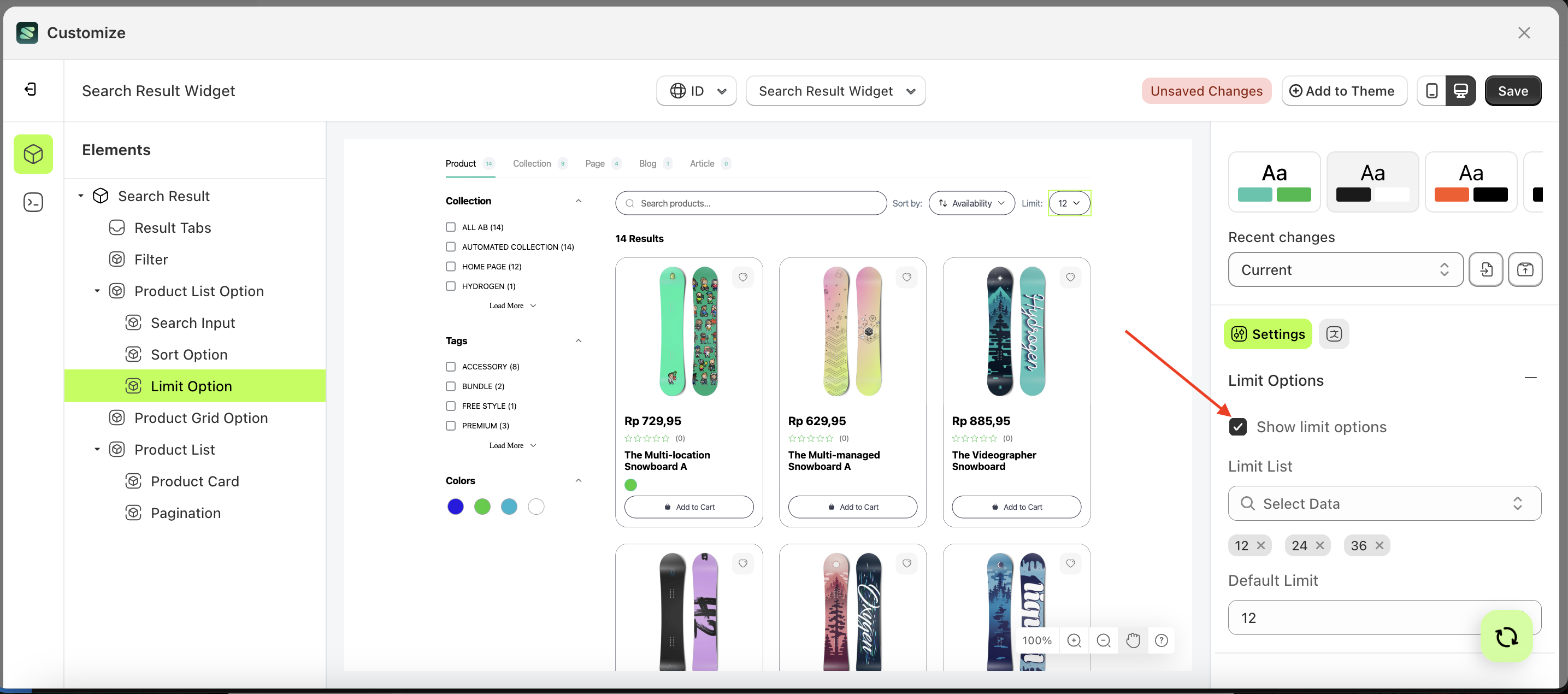
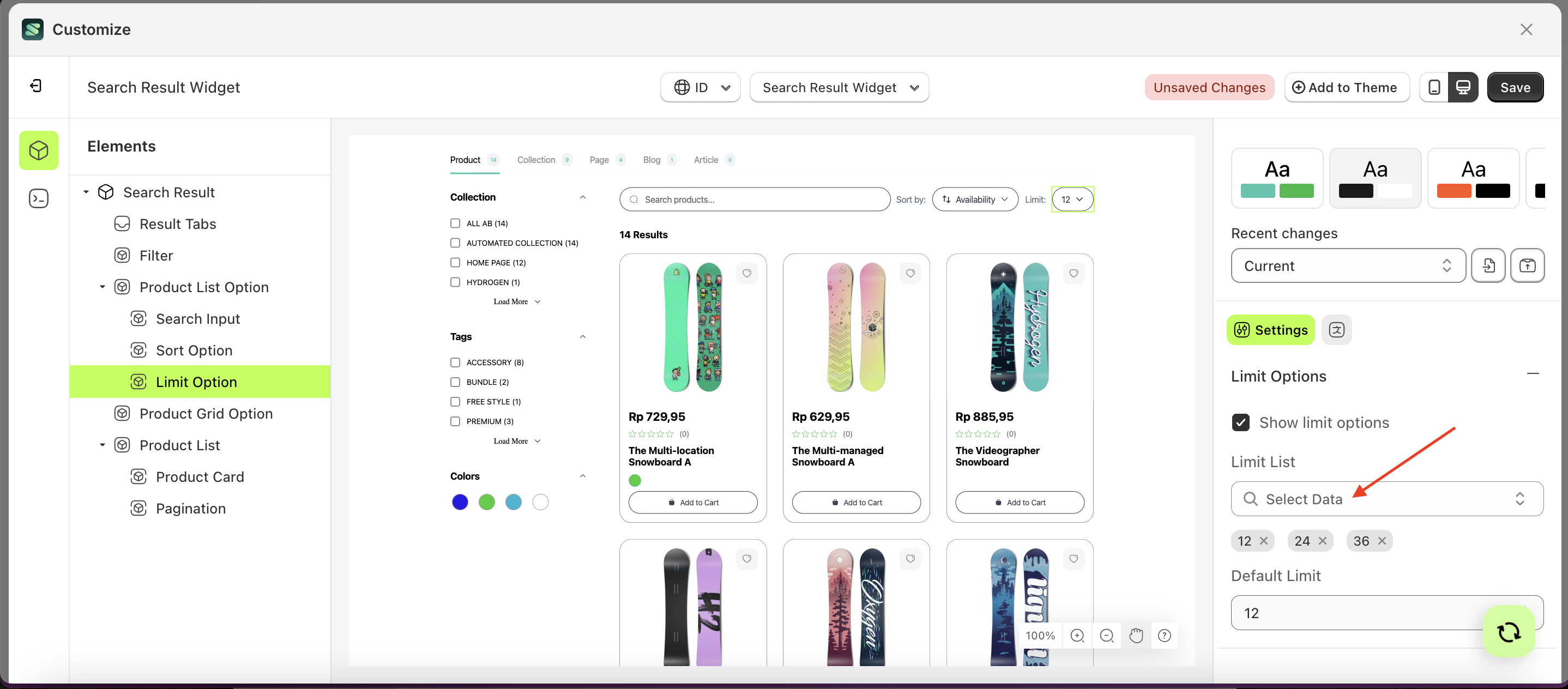
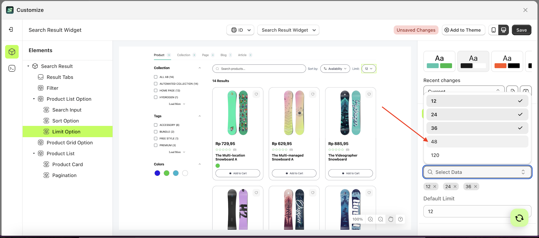
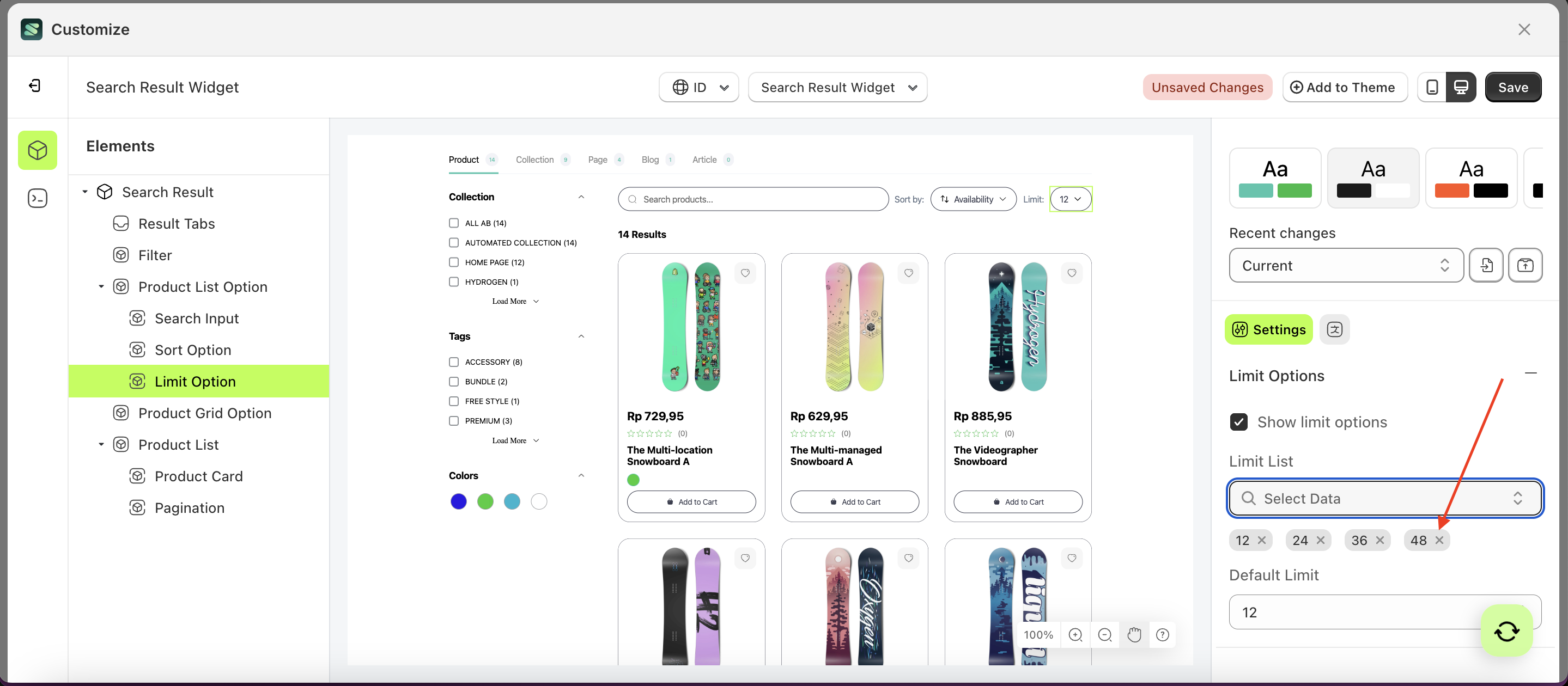
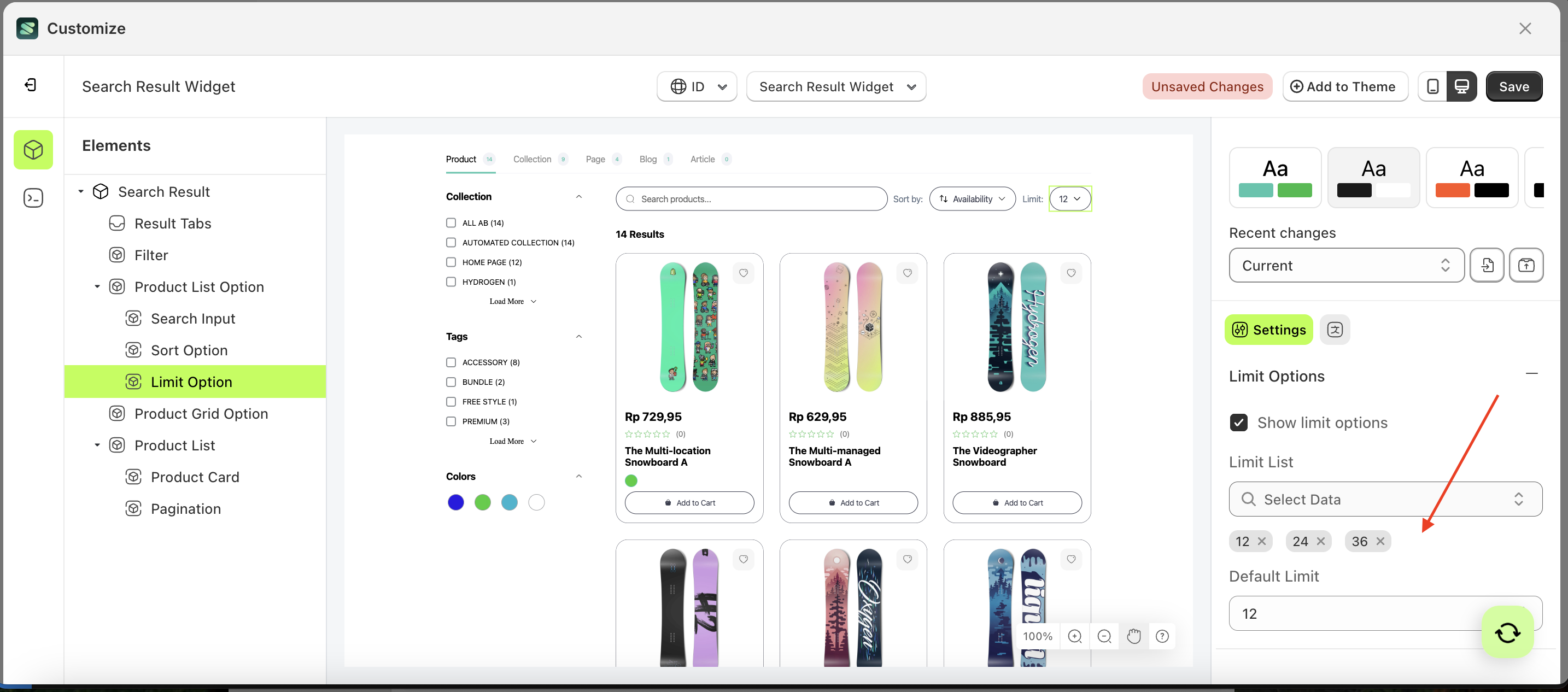
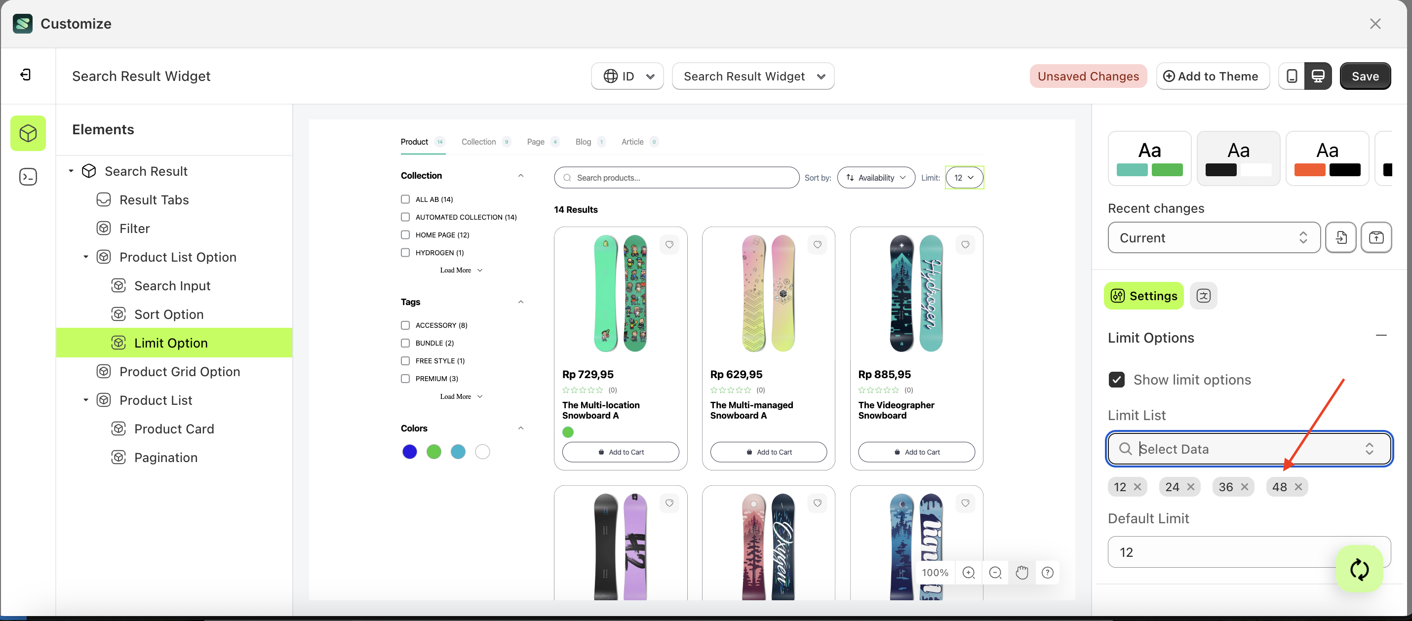
Limit LIst
This feature is designed to create a list for your option elements.
Follow the steps below:
- Select the element on the right, then click the Settings tab and click the icon marked with a red arrow.
- Click the data select element the keyboard input you want to create.
- A list of data will appear.
- Select the desired data
- Once selected, your choice will be displayed below the data select element.
- Before creating the keyword input.
- After creating the keyword input.
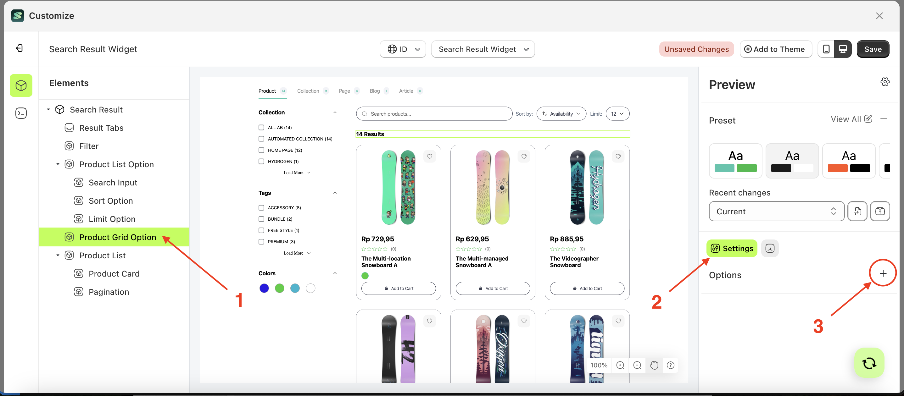
Options
Available settings:
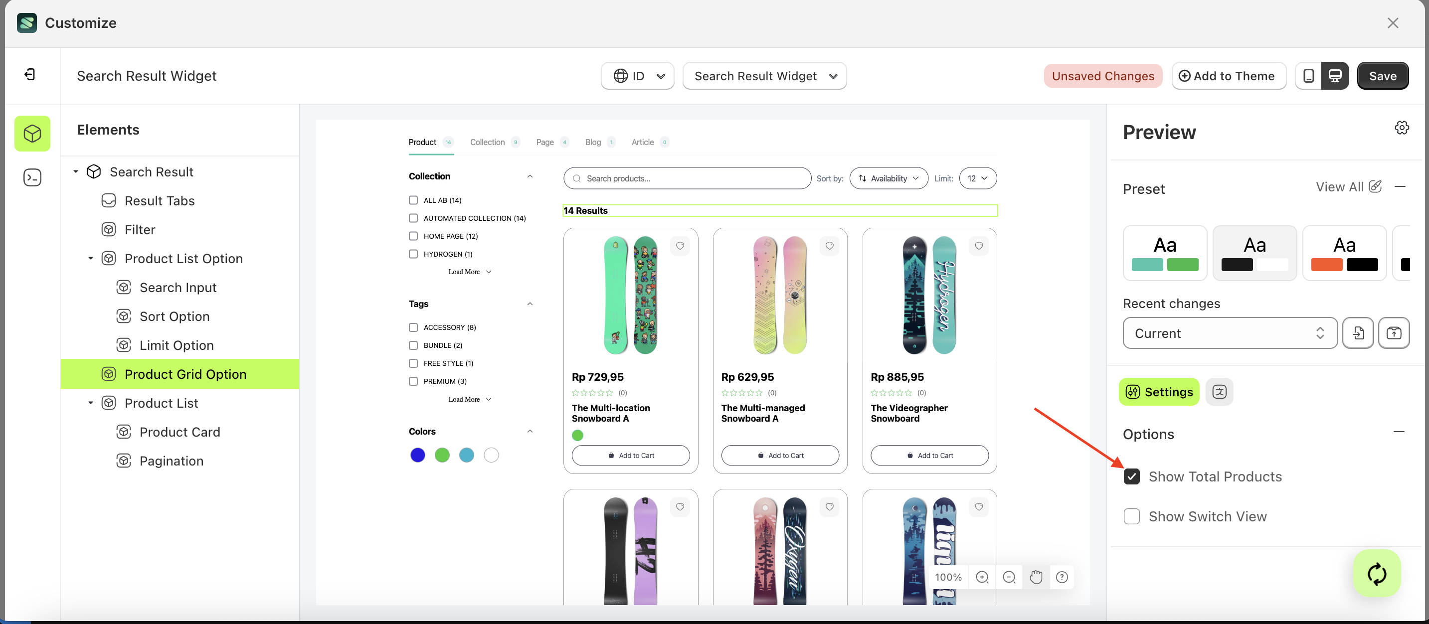
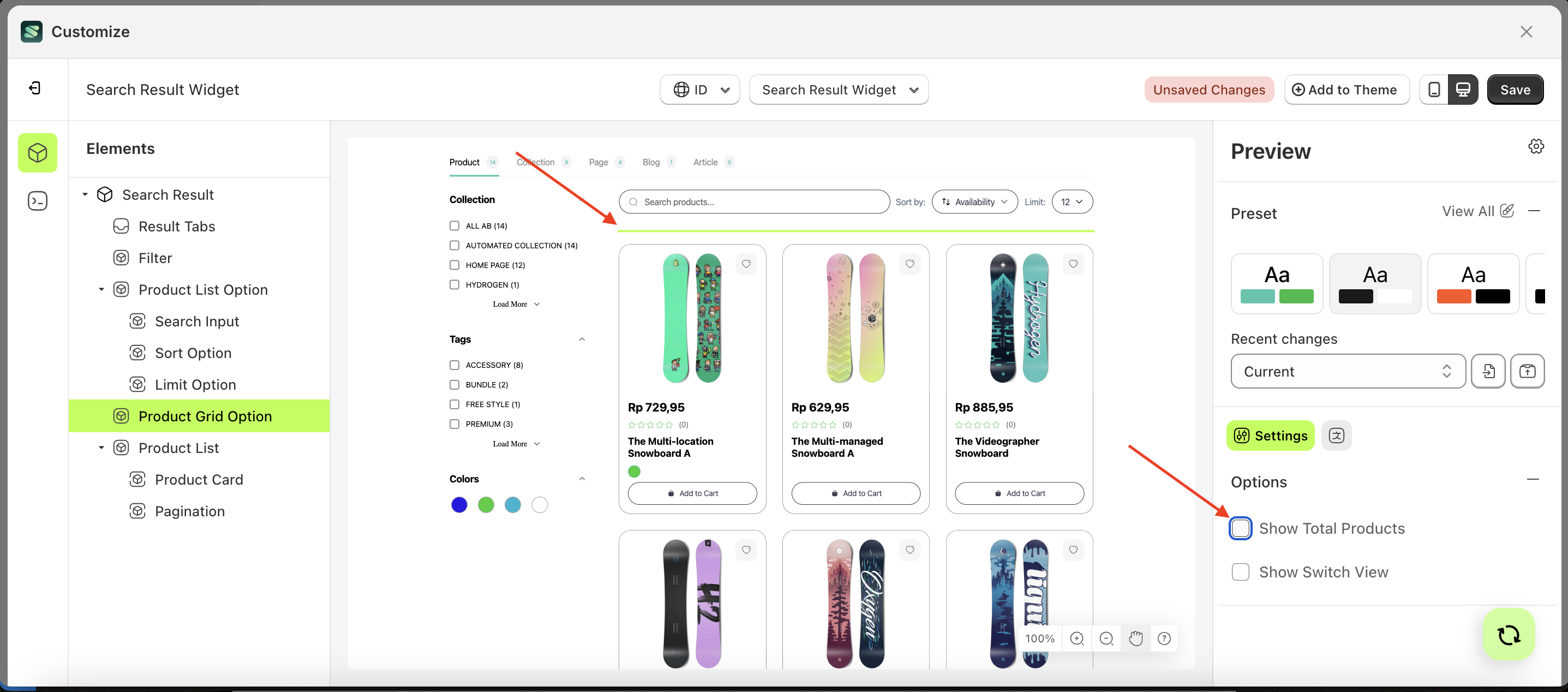
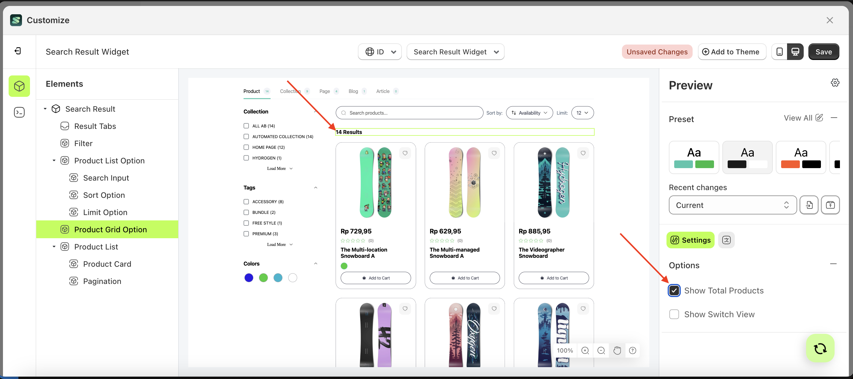
Show Total Products
This feature is designed to display the total number of products in the product list.
Follow the steps below:
- Select the Search Input element on the right, then click the Settings tab and click the icon marked with a red arrow.
- Enable the Show Total Products checkbox
- Example : Before Show Total Products is enabled
- Example : After Show Total Products is enabled
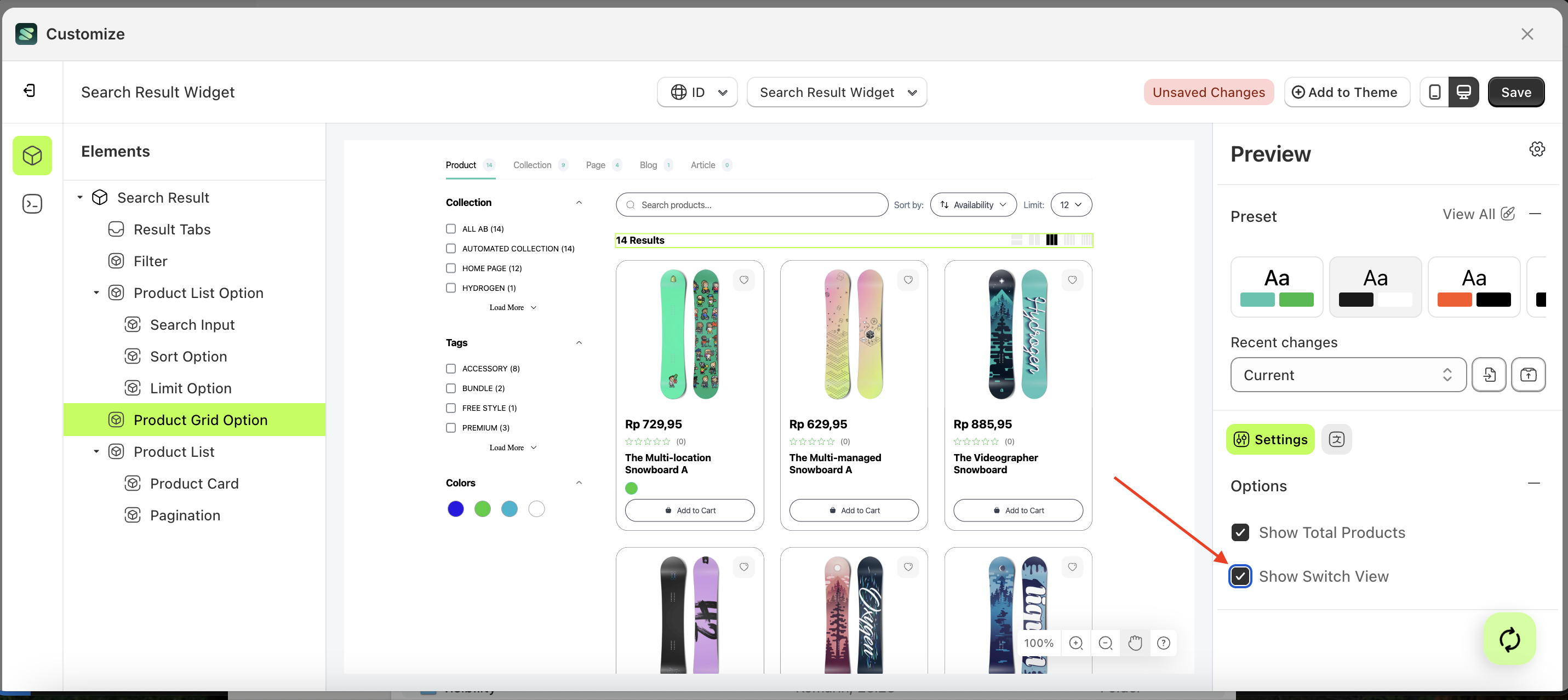
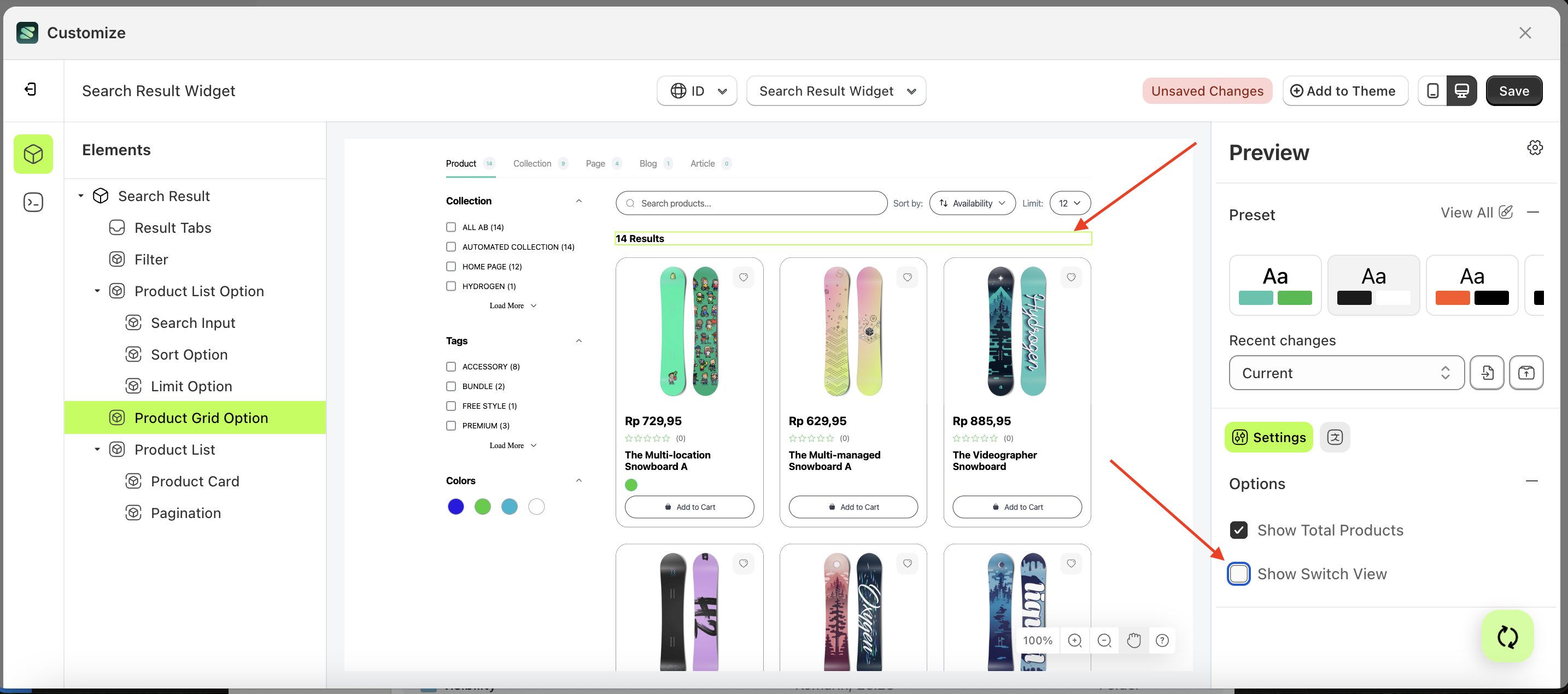
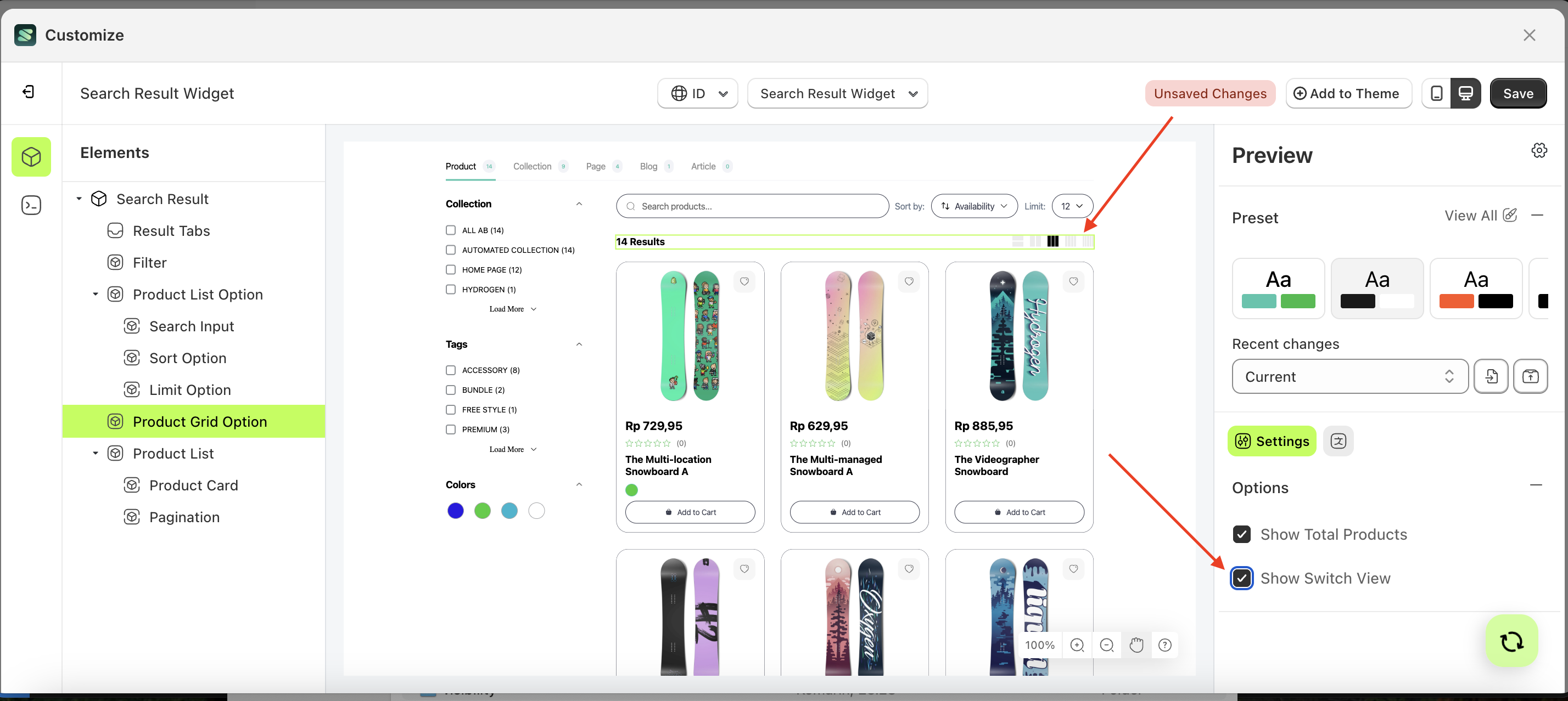
Show Switch View
This feature is designed to set how many products are displayed per row.
Follow the steps below:
- Select the Search Input element on the right, then click the Settings tab and click the icon marked with a red arrow.
- Enable the Show Switch View checkbox
- Example : Before Show Switch View is enabled
- Example : After Show Switch View is enabled
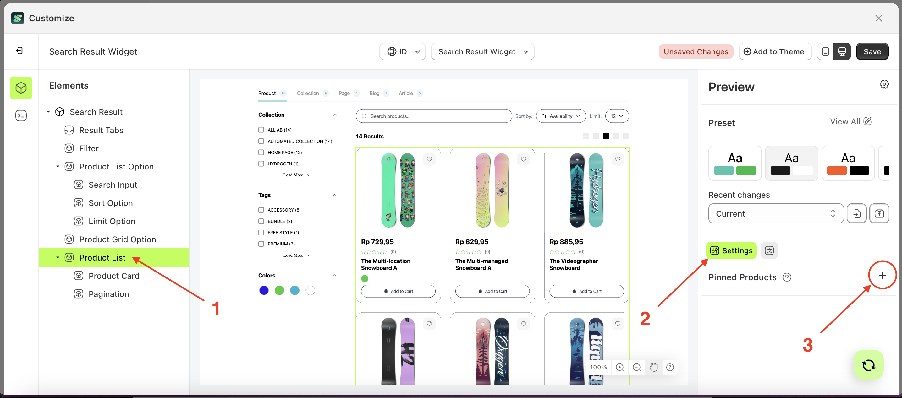
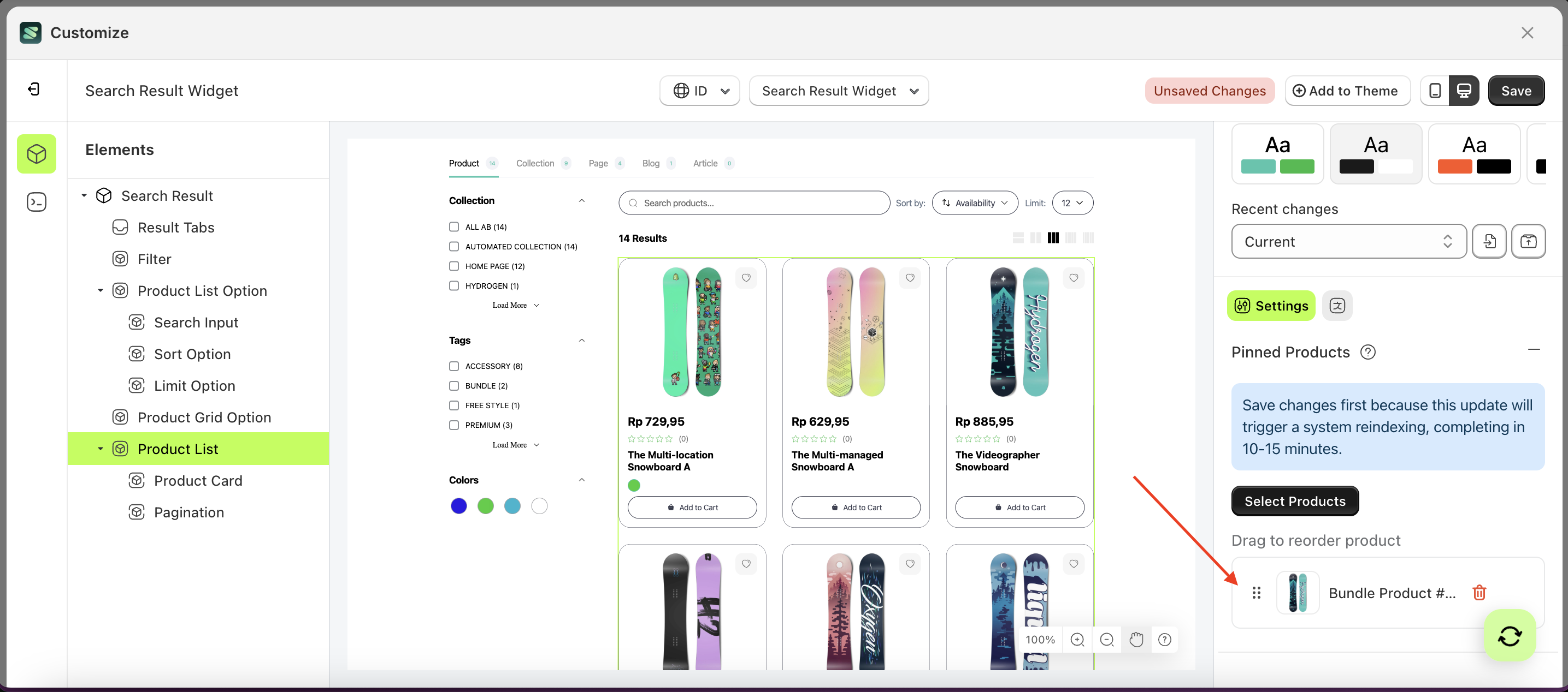
Pinned Products
This feature is designed to pin products so they appear at the top of the list when the sorting function is applied.
Follow the steps below:
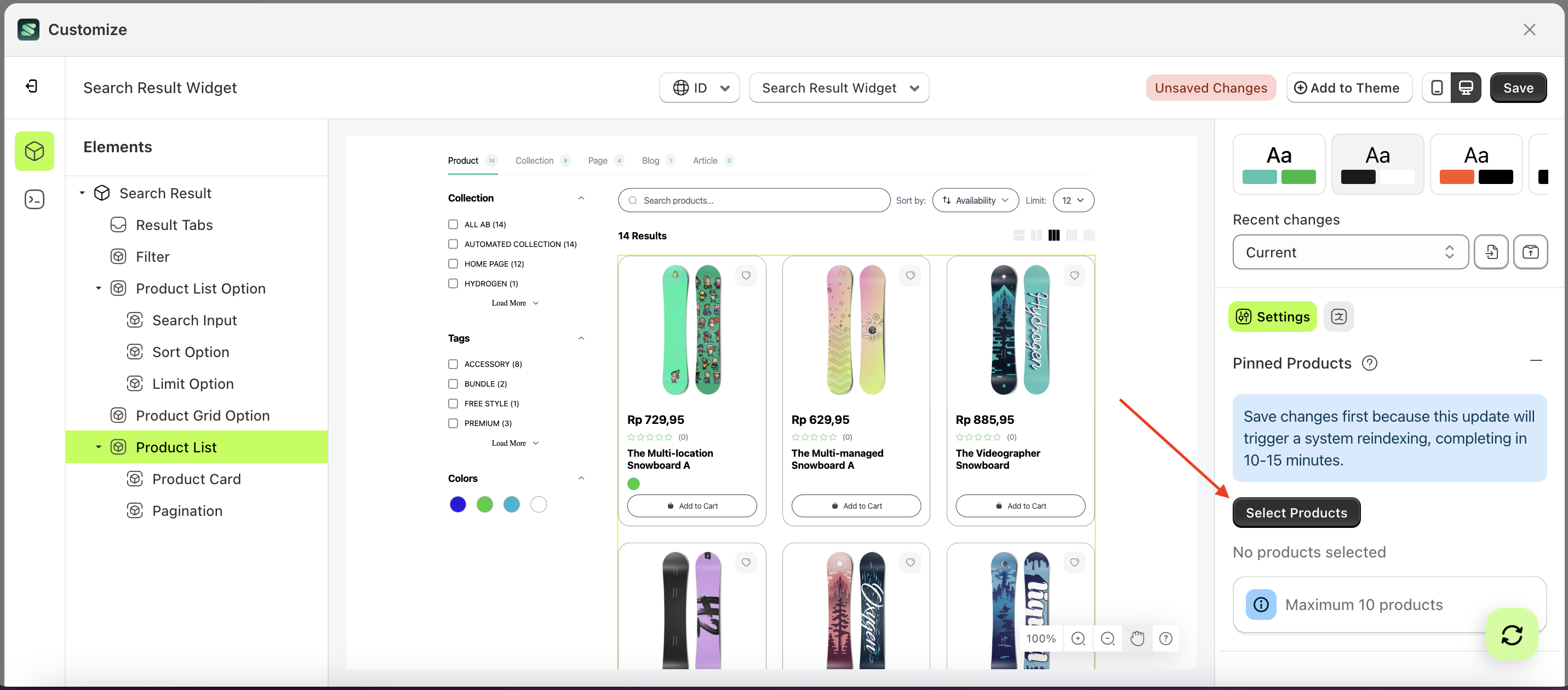
- Select the Product List element on the right, then click the Settings tab and click the icon marked with a red arrow.
- Click the "Select Product" button.
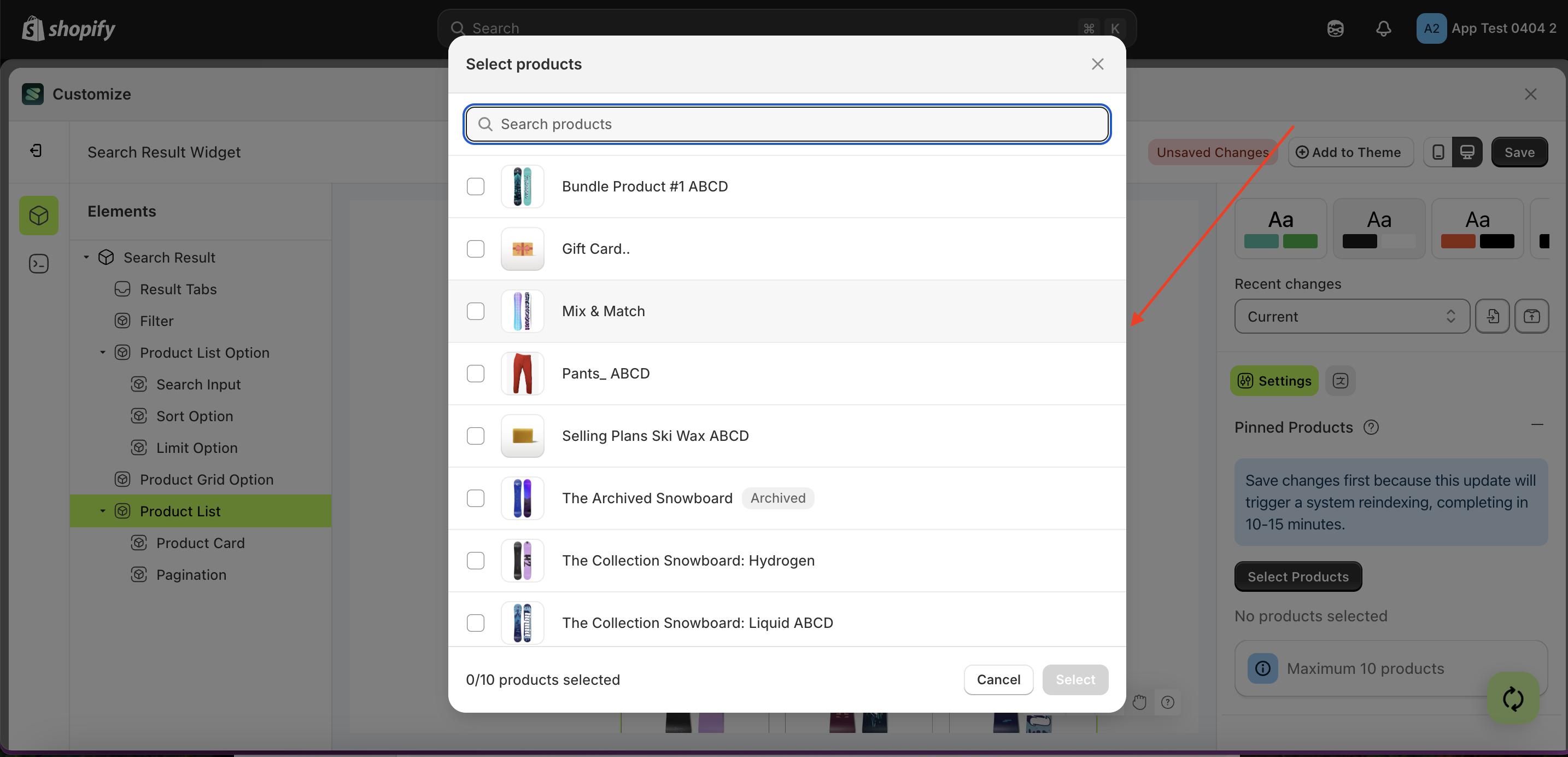
- A popup will appear with a list of products.
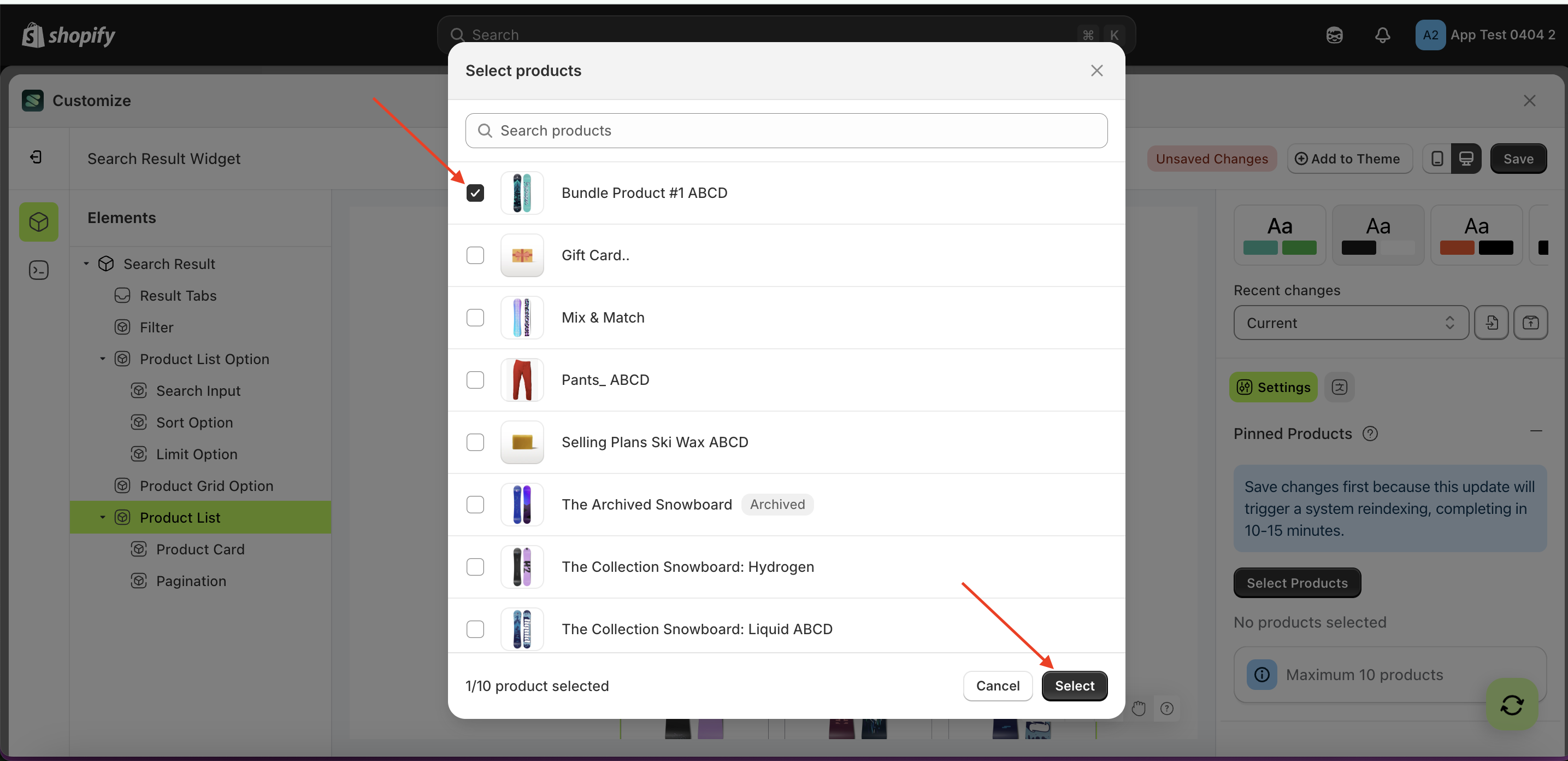
- Choose the product that suits your needs.
- Your selection will appear below the "Select Product" button.
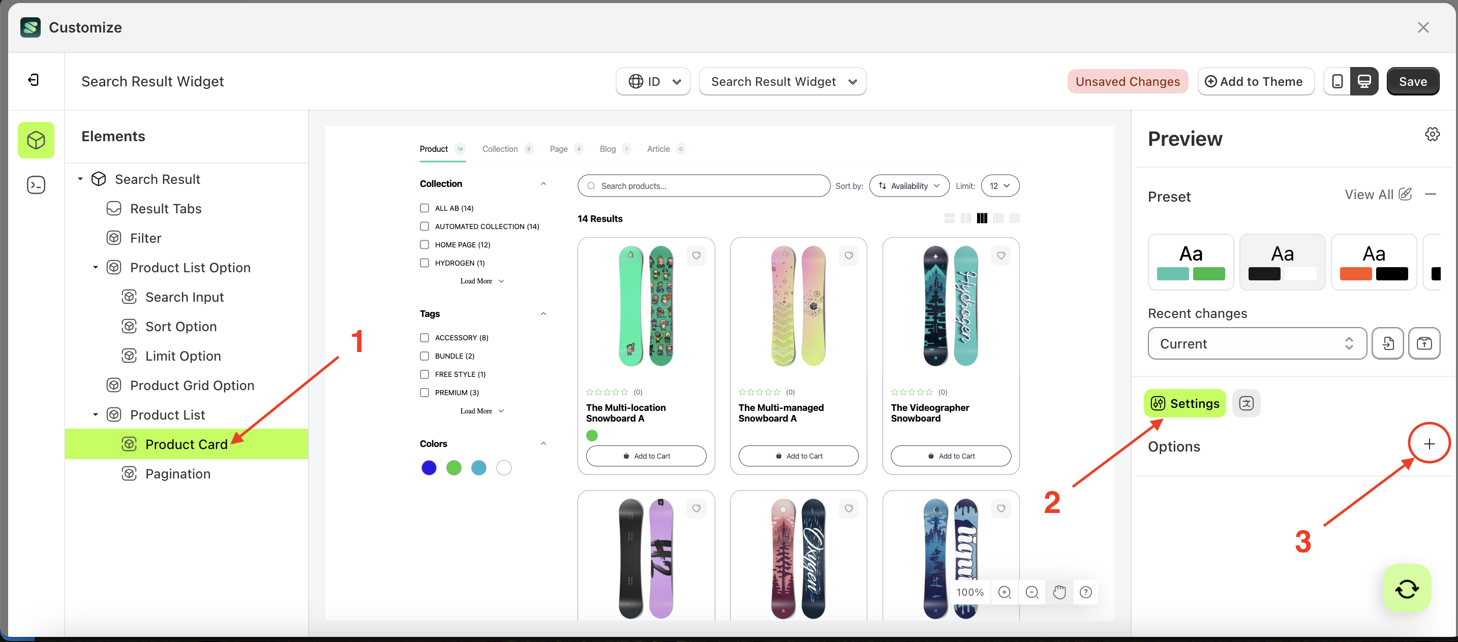
Option Product card
Available settings:
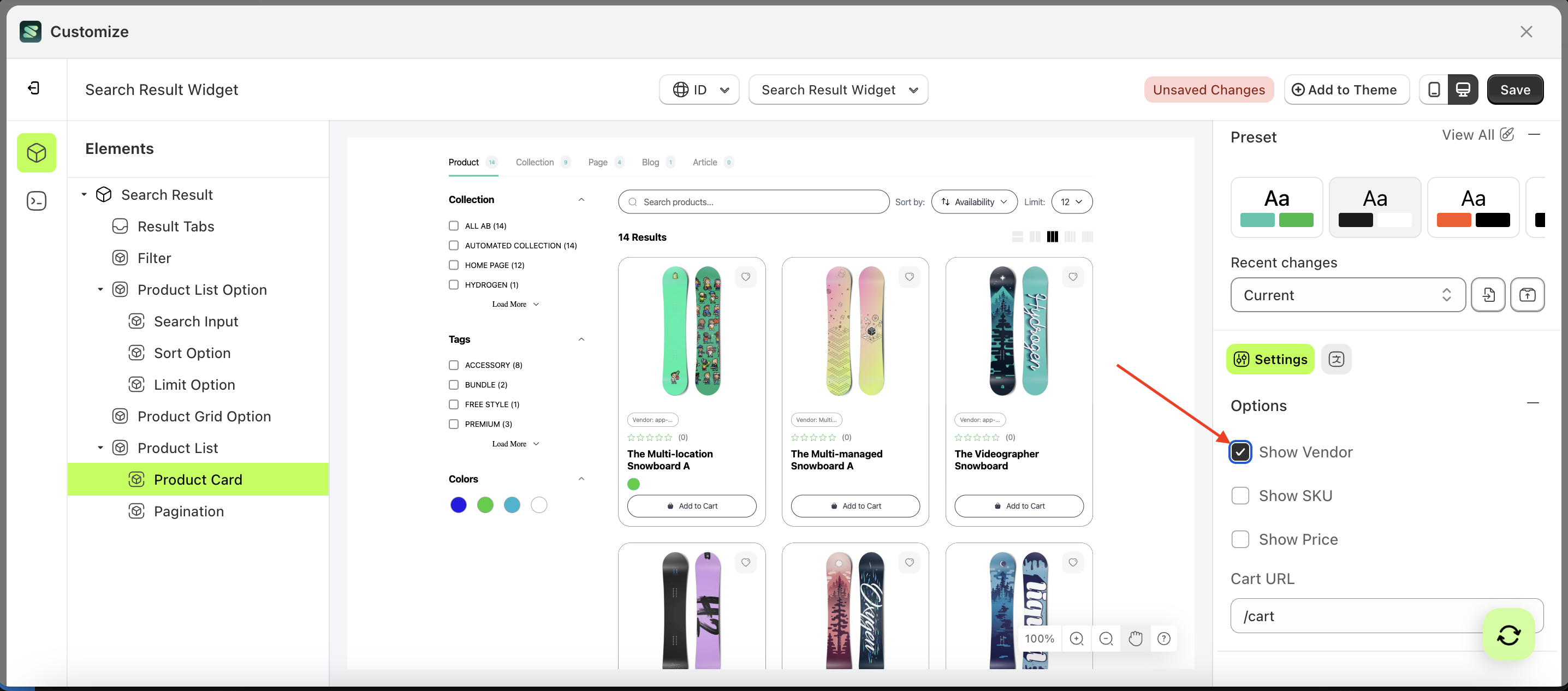
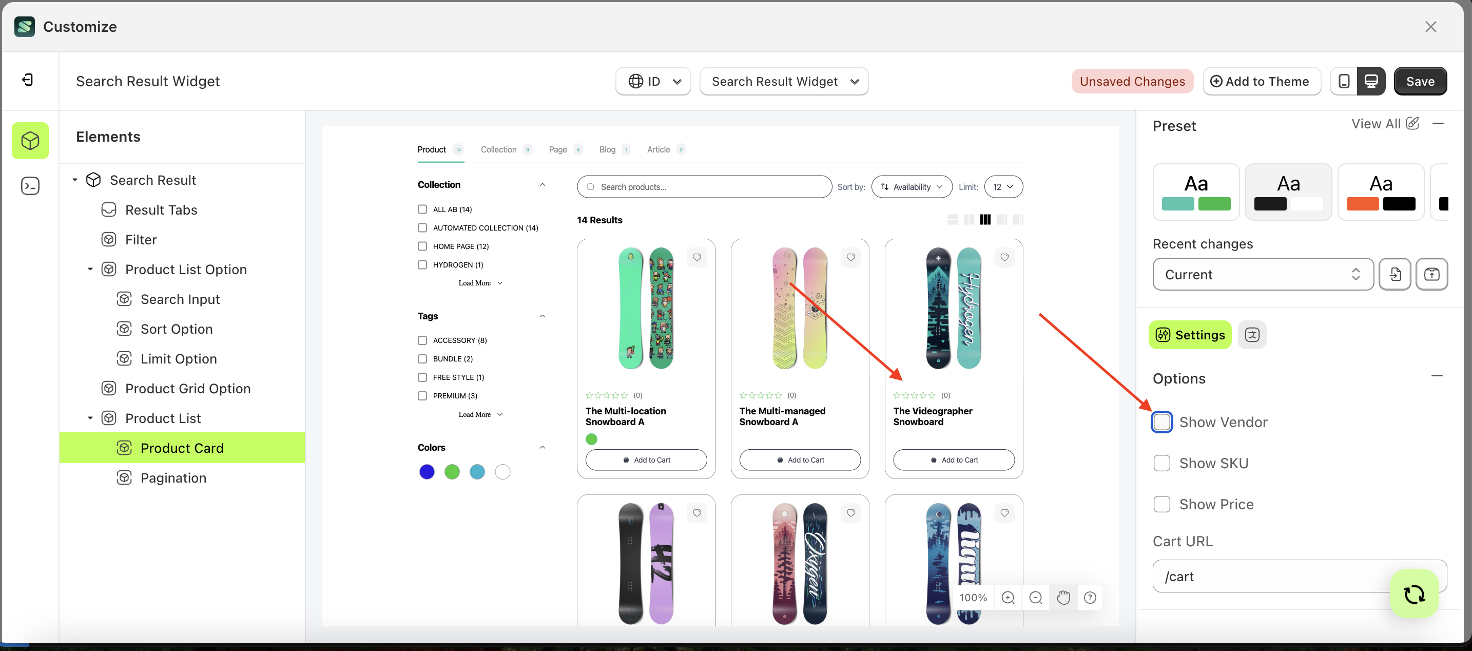
Show Vendor
This feature is designed to show or hide vendor information on the product.
Follow the steps below:
- Select the Product Card element on the right, then click the Settings tab and click the icon marked with a red arrow.
- Enable the Show Vendor checkbox
- Example : Before Show Vendor is enabled
- Example : After Show Vendor is enabled

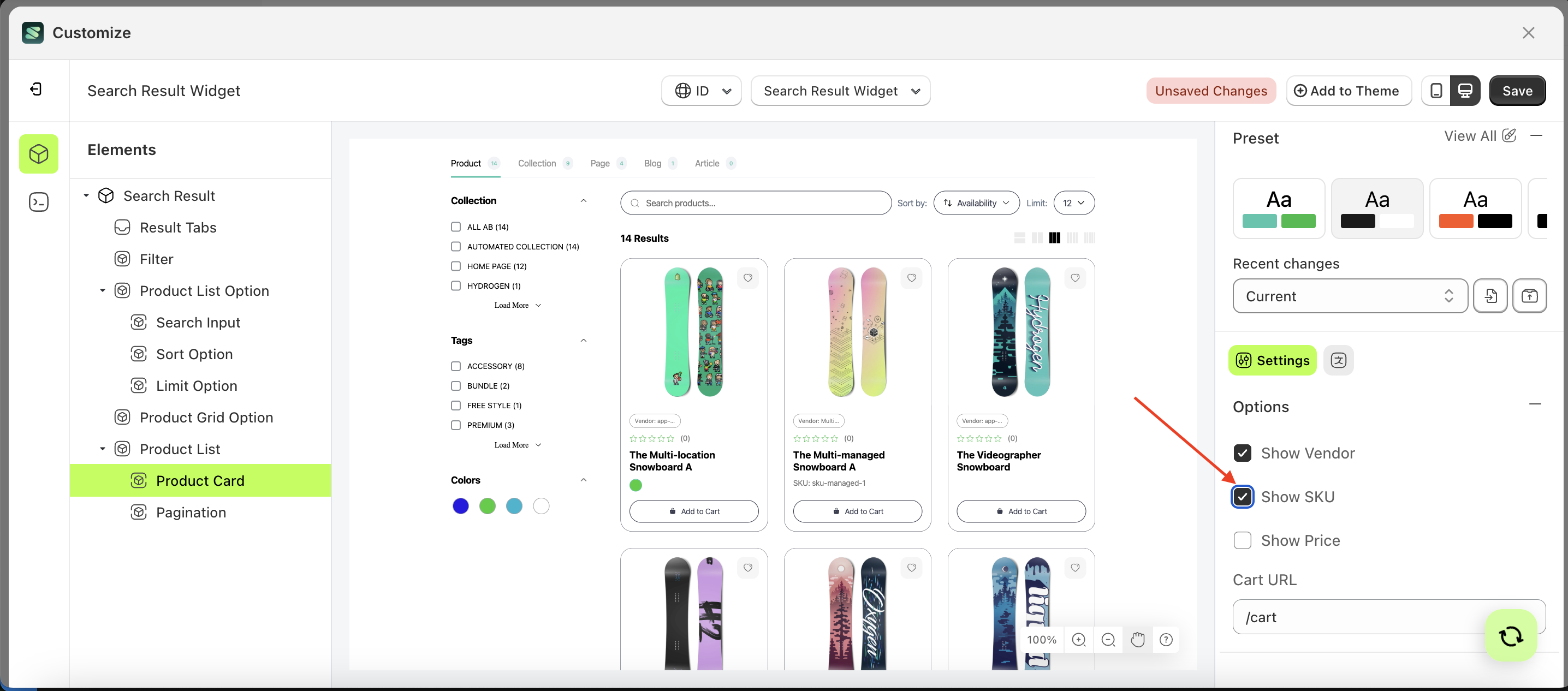
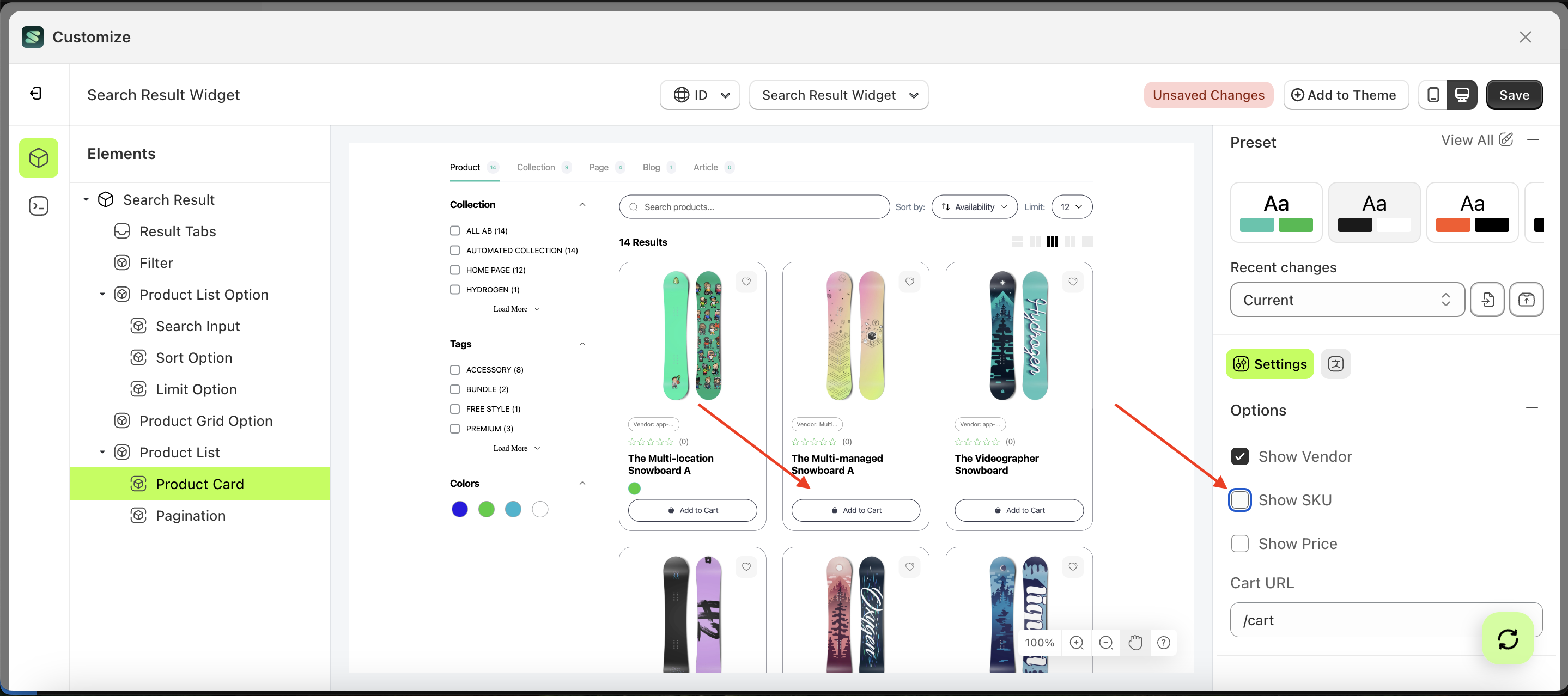
Show SKU
This feature is designed to show or hide SKU information on the product.
Follow the steps below:
- Select the Product Card element on the right, then click the Settings tab and click the icon marked with a red arrow.
- Enable the Show SKU checkbox
- Example : Before Show SKU is enabled
- Example : After Show SKU is enabled
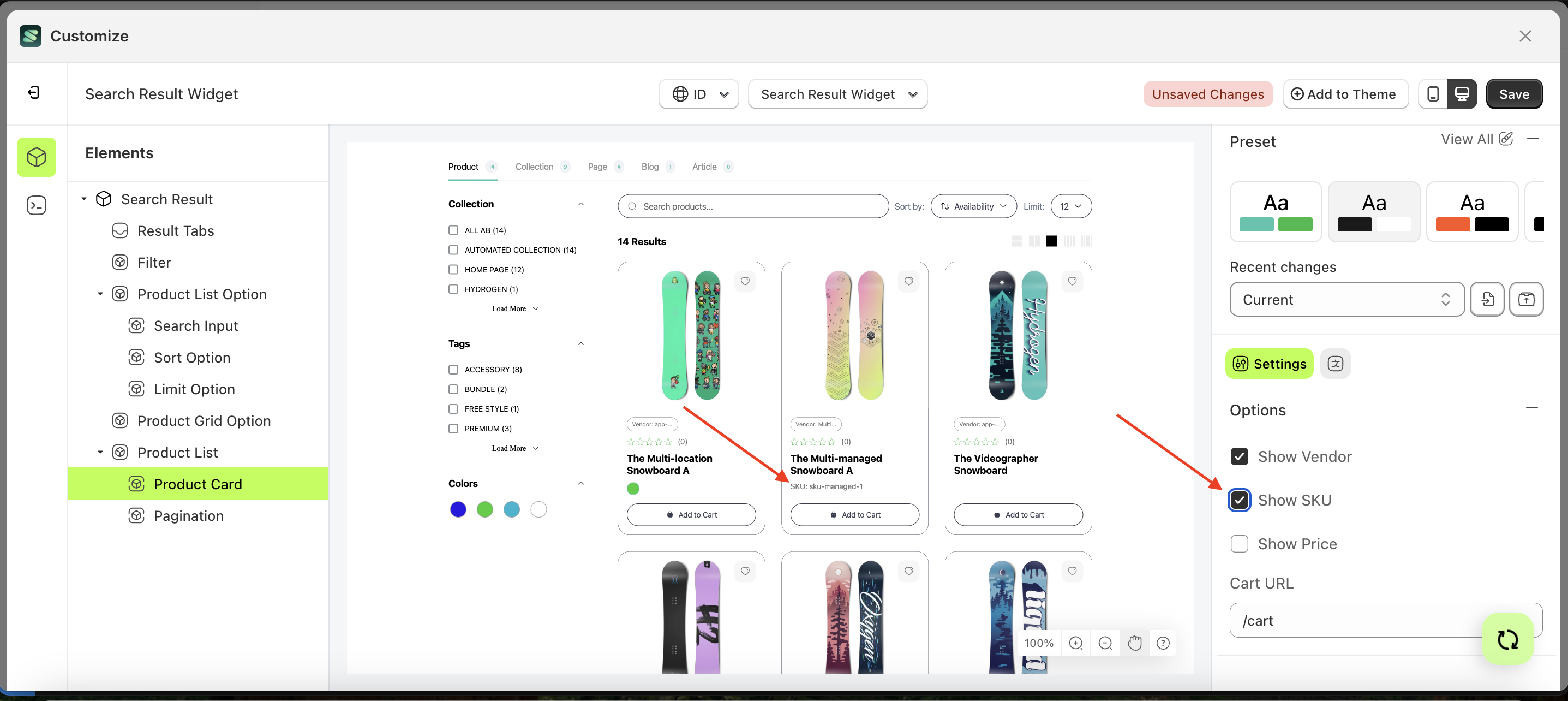
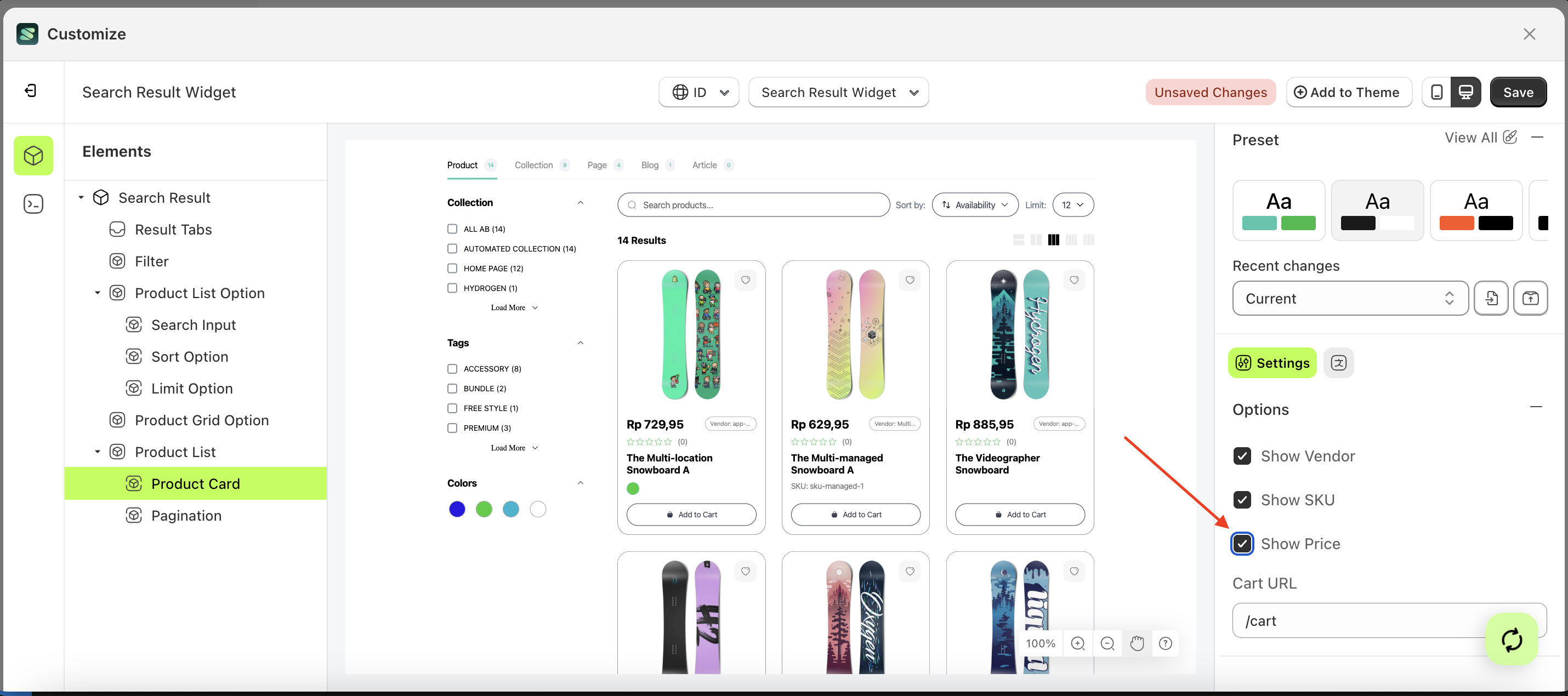
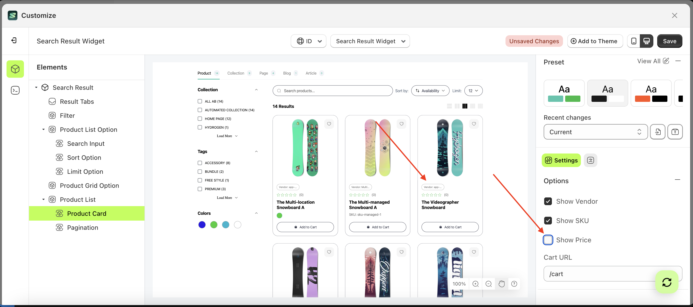
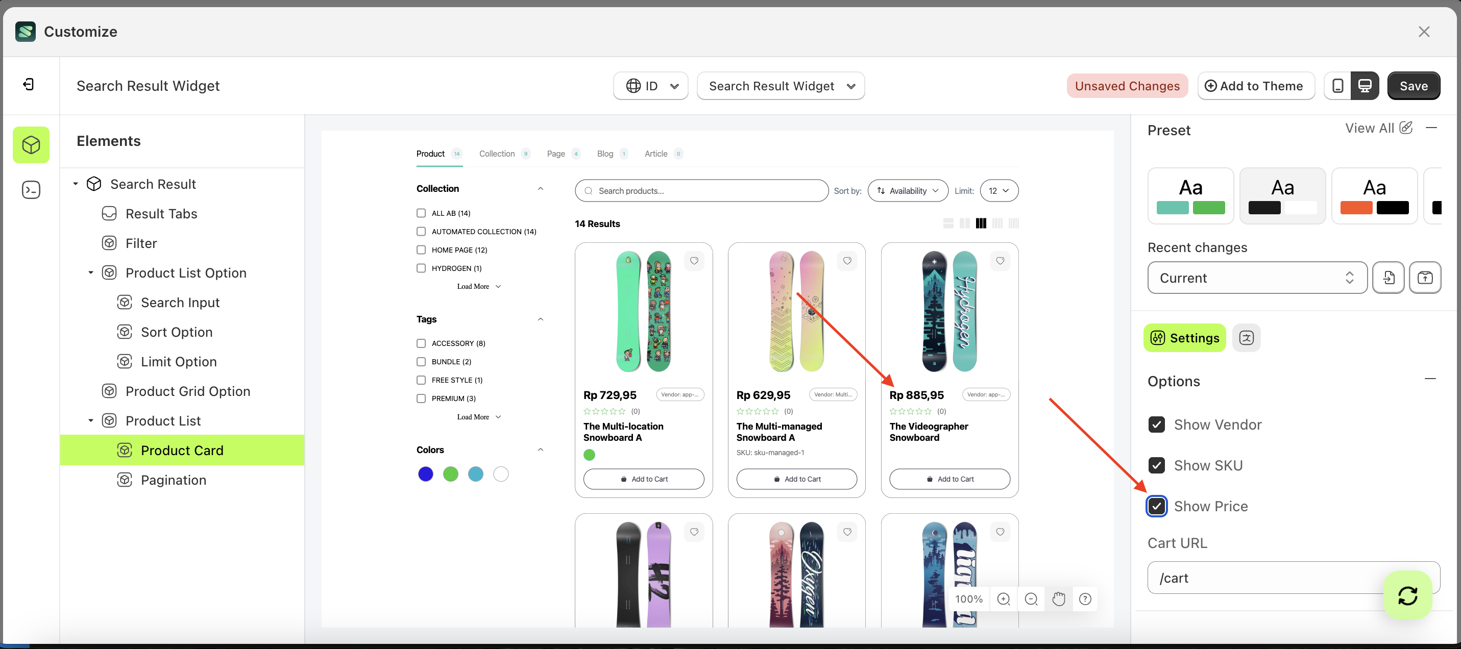
Show Price
This feature is designed to show or hide price information on the product.
Follow the steps below:
- Select the Product Card element on the right, then click the Settings tab and click the icon marked with a red arrow.
- Enable the Show Price checkbox
- Example : Before Show Price is enabled
- Example : After Show Price is enabled
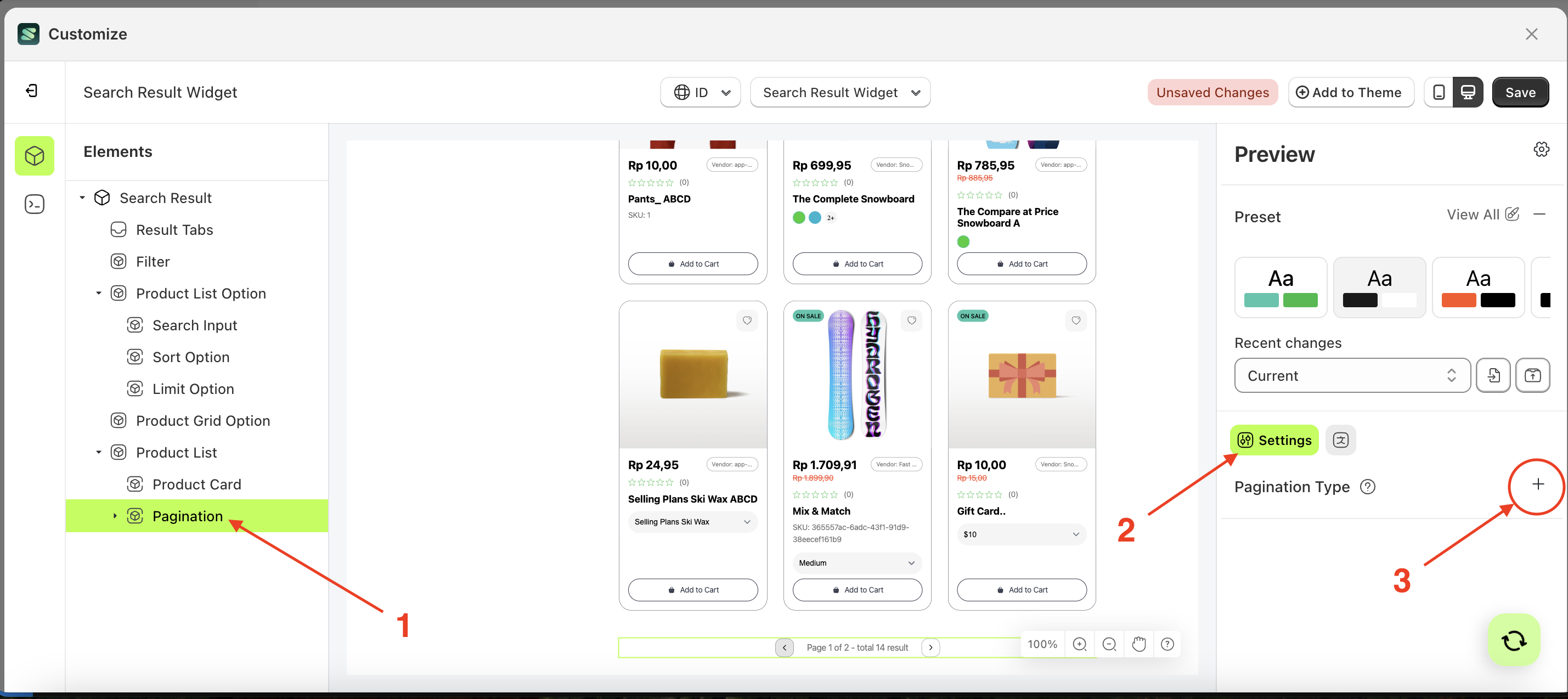
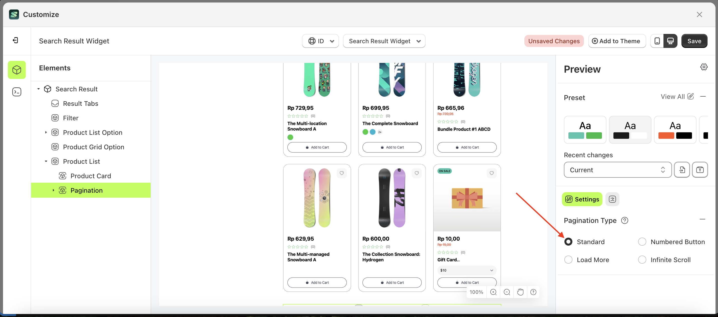
Pagination Type
This feature is used to configure the pagination style on your product list page without needing to create it manually.
Available settings:
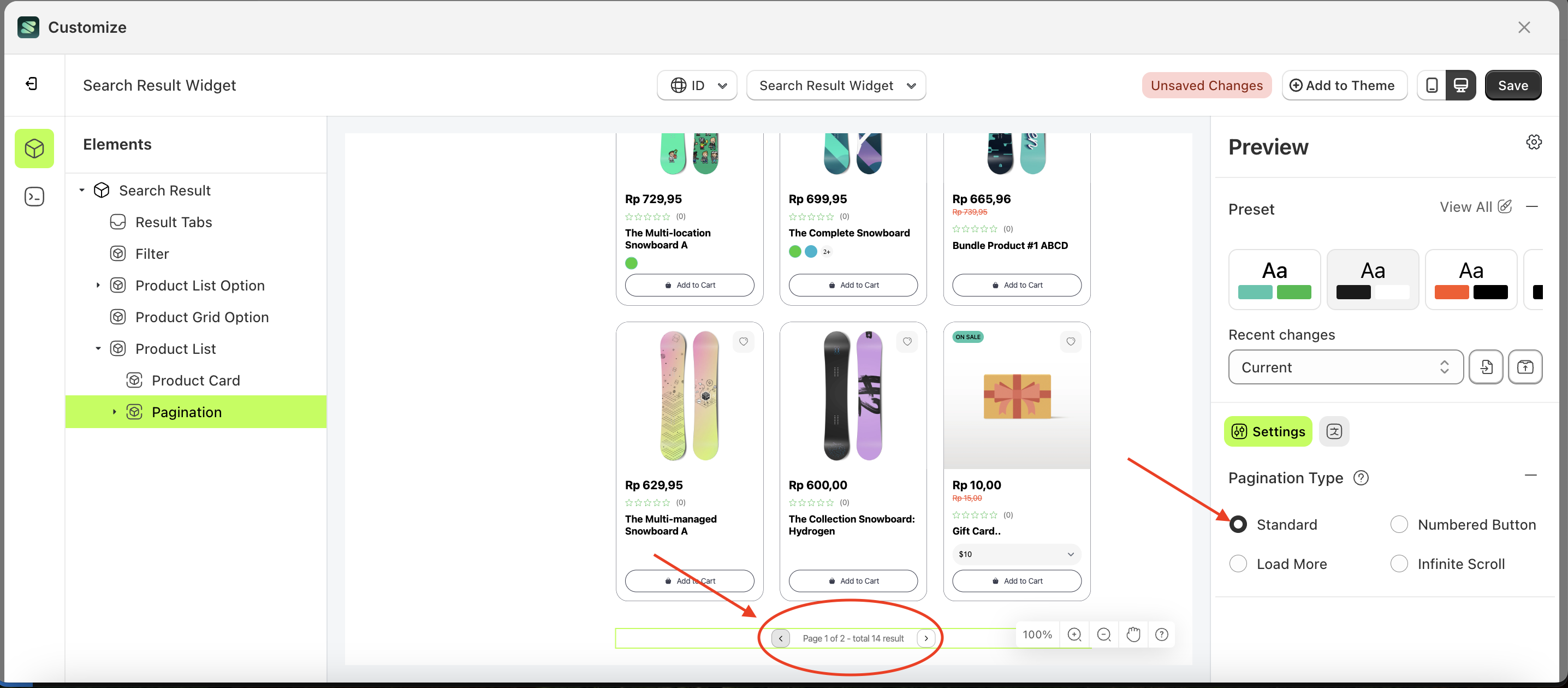
Standard
Follow the steps below:
- Select the Pagination element on the left, then click the Settings tab and click the icon marked with a red arrow.
- Select Type Standard by following the red arrow
- Here's the chosen layout display.
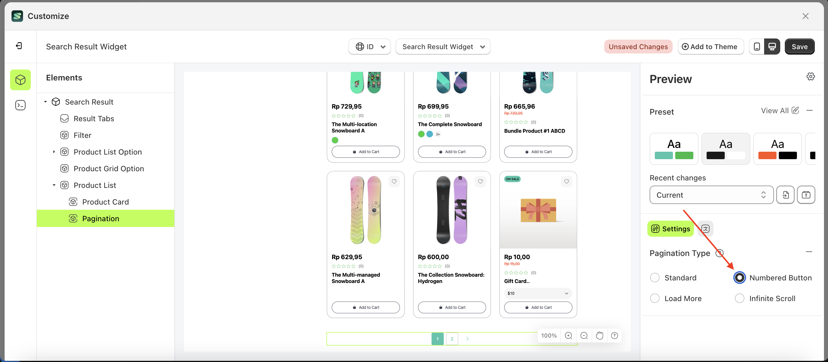
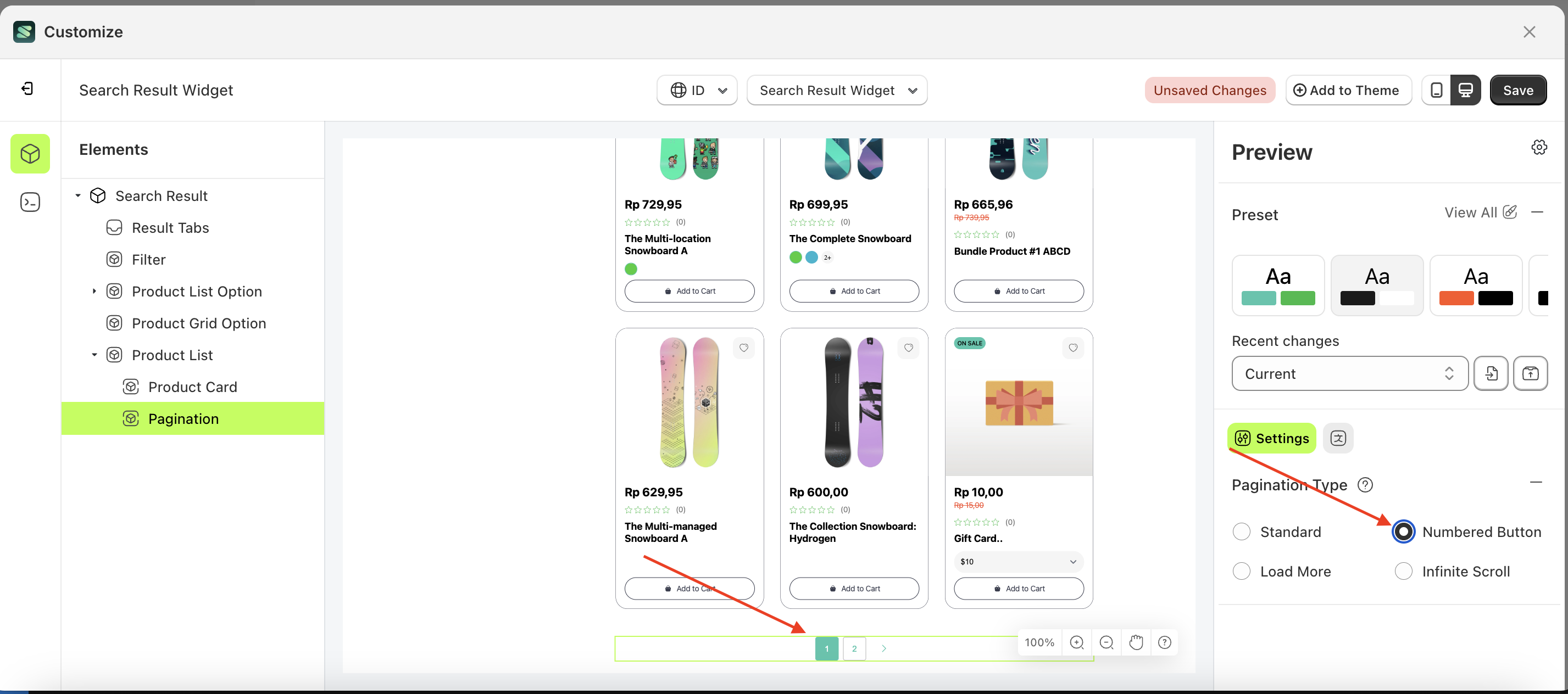
Numbered Button
Follow the steps below:
- Select the Pagination element on the left, then click the Settings tab and click the icon marked with a red arrow.
- Select Type Numbered Button by following the red arrow
- Here's the chosen layout display.
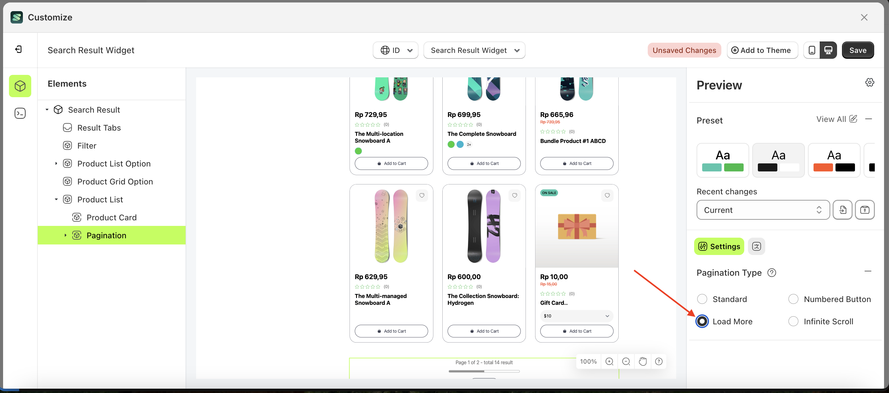
Load More
Follow the steps below:
- Select the Pagination element on the left, then click the Settings tab and click the icon marked with a red arrow.
- Select Type Load More by following the red arrow
- Here's the chosen layout display.

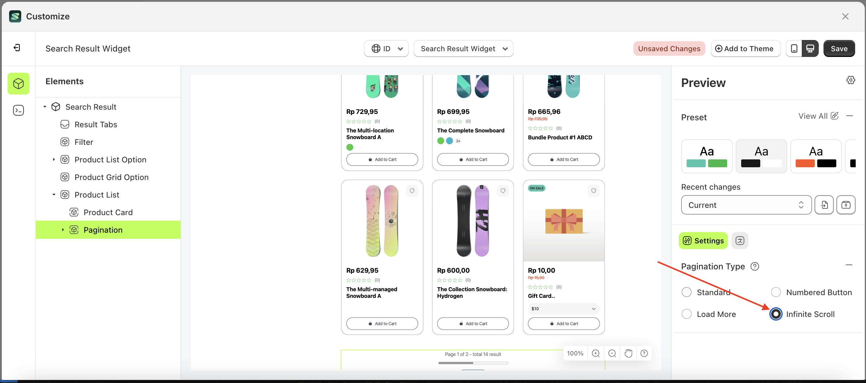
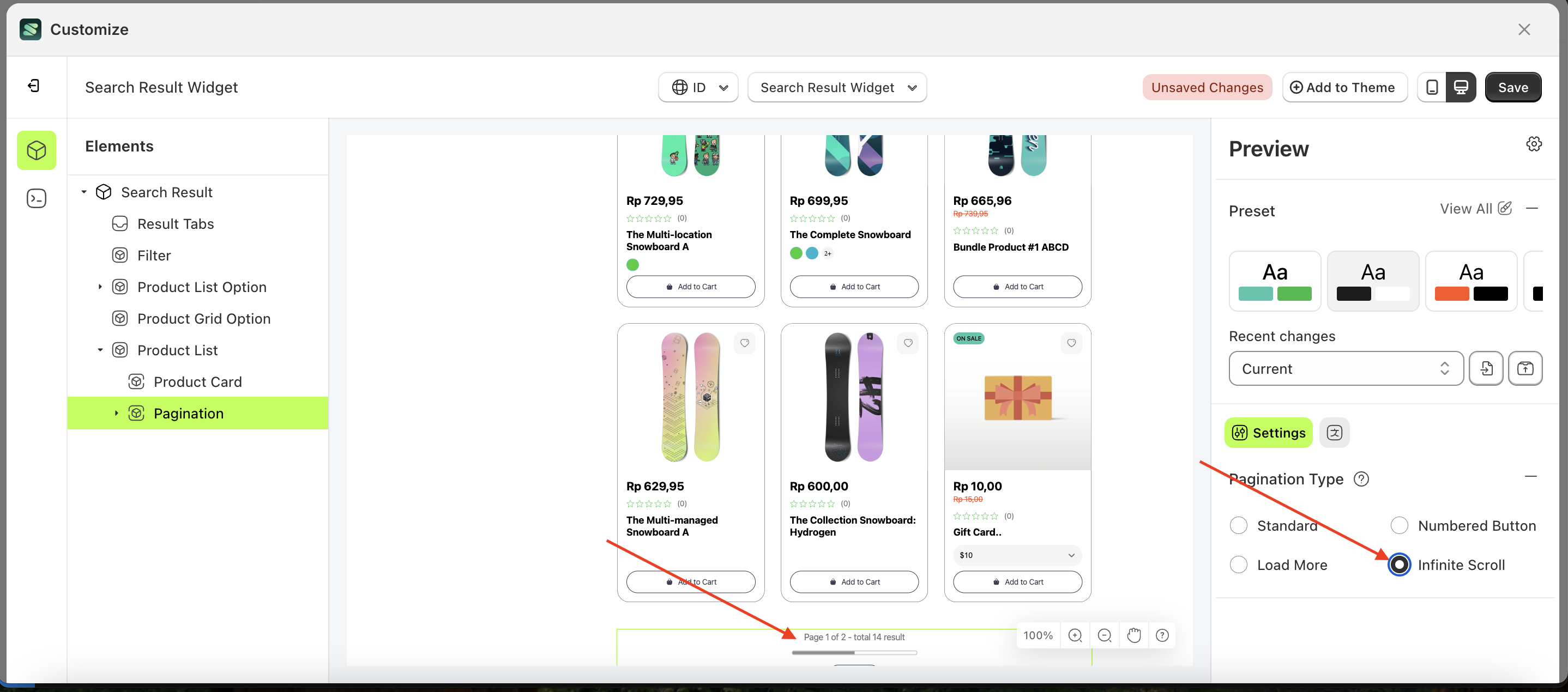
Infinite Scroll
Follow the steps below:
- Select the Pagination element on the left, then click the Settings tab and click the icon marked with a red arrow.
- Select Type Infinite Scroll by following the red arrow
- Here's the chosen layout display.