Review sidebar widget
To Access the Happy Customer Widget, Follow These Steps:
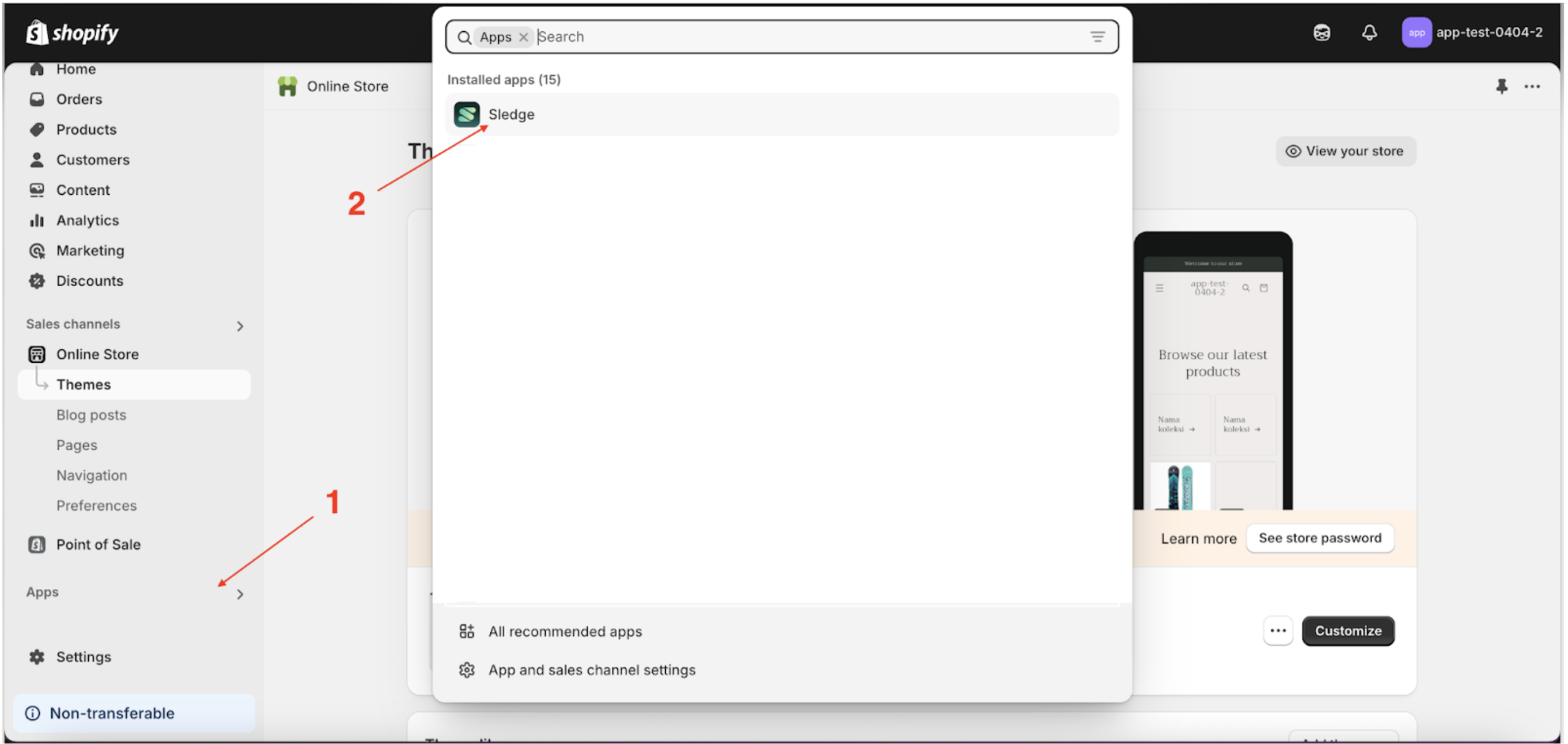
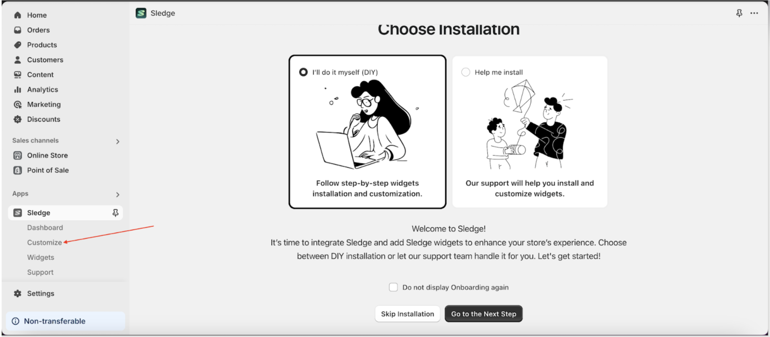
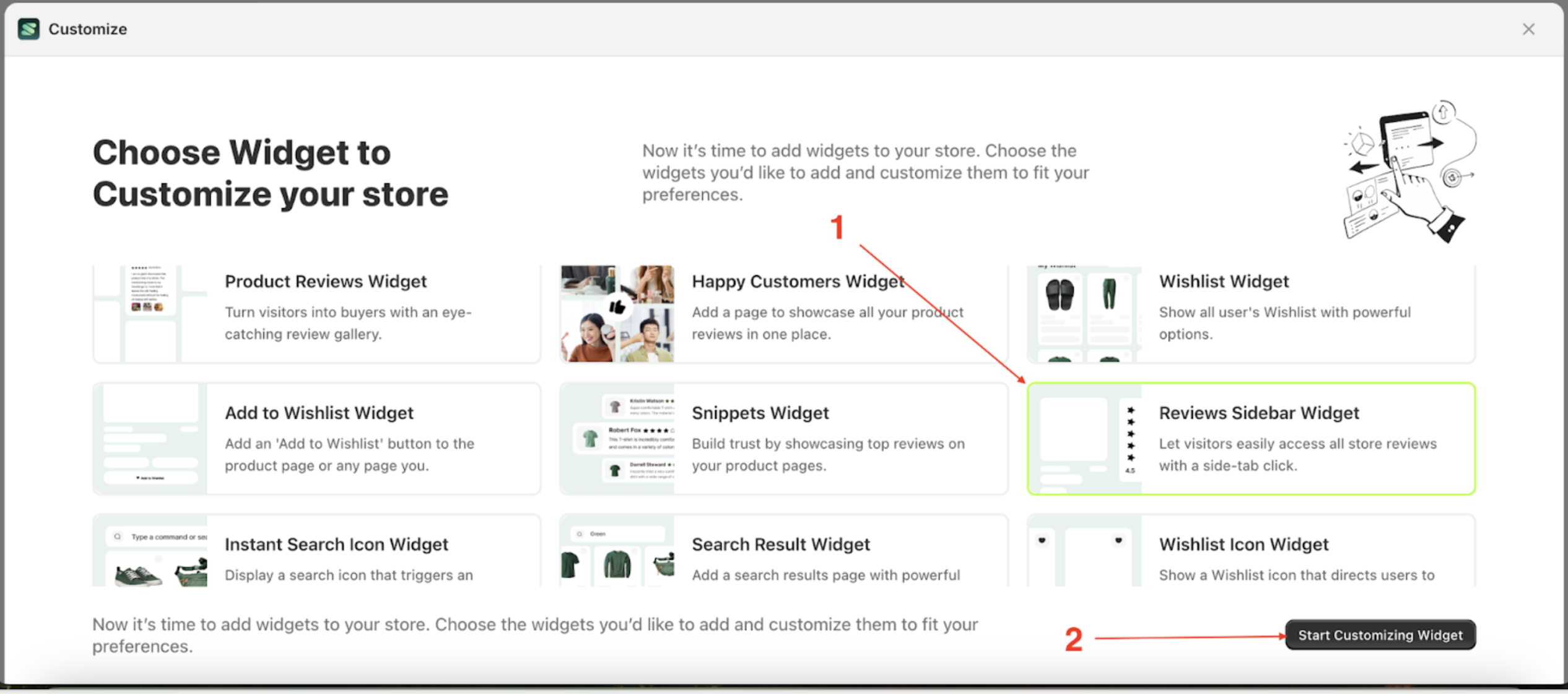
- Go to the Apps Sledge.
- Select the Customizer menu.
- Choose review sidebar widget and click the Start Customizing Widget button.
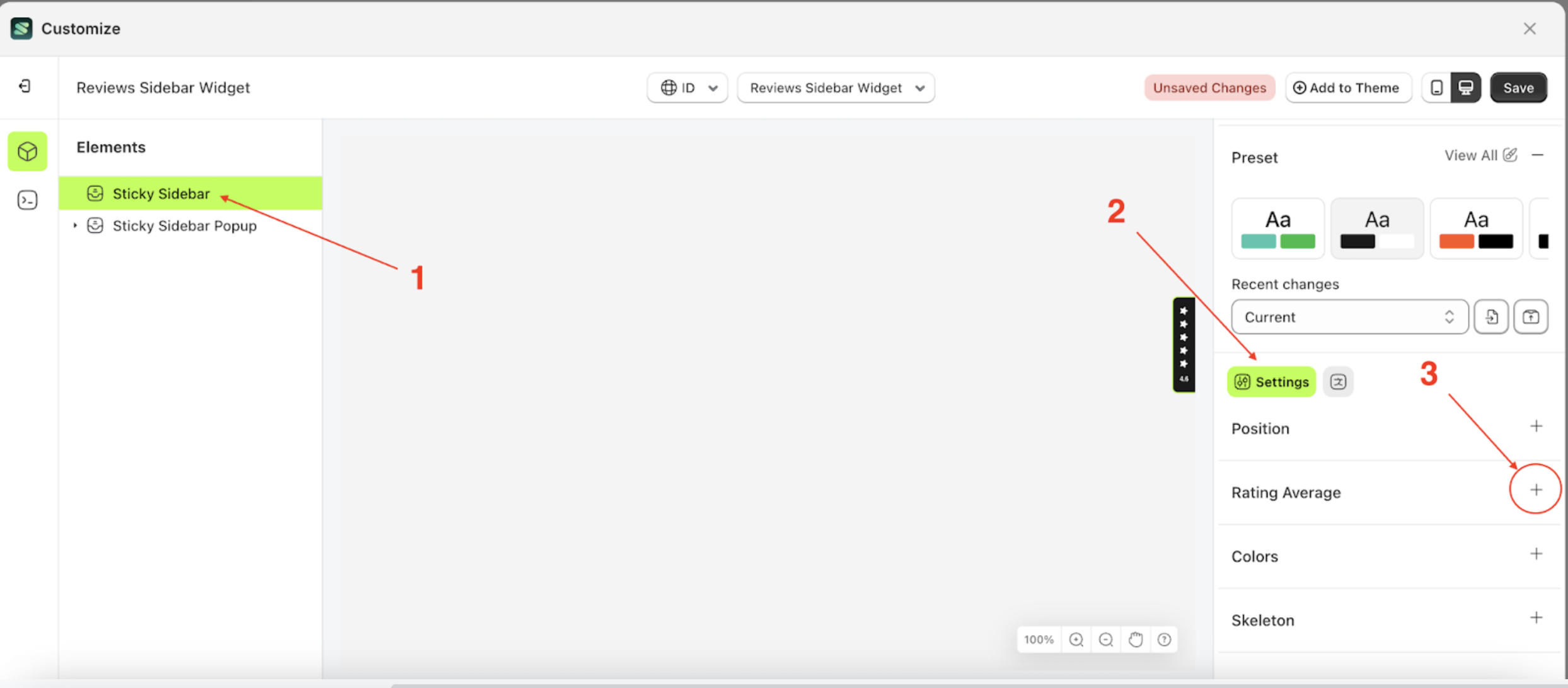
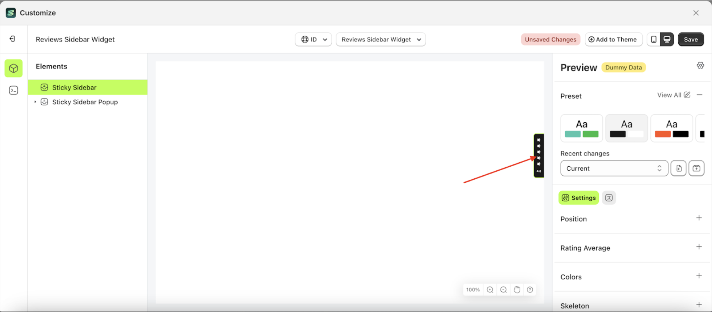
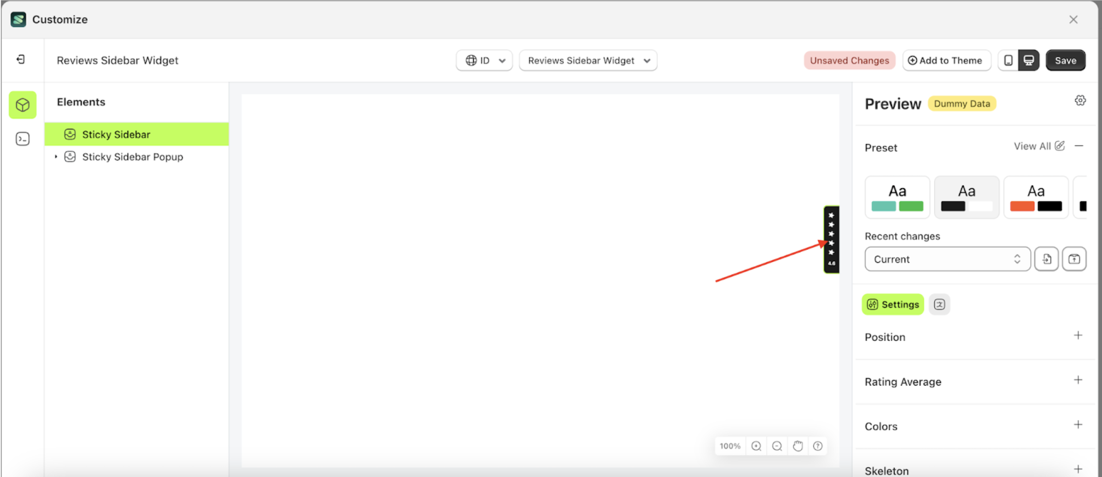
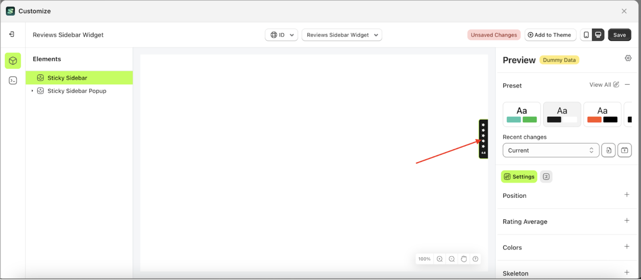
Position
Available settings:
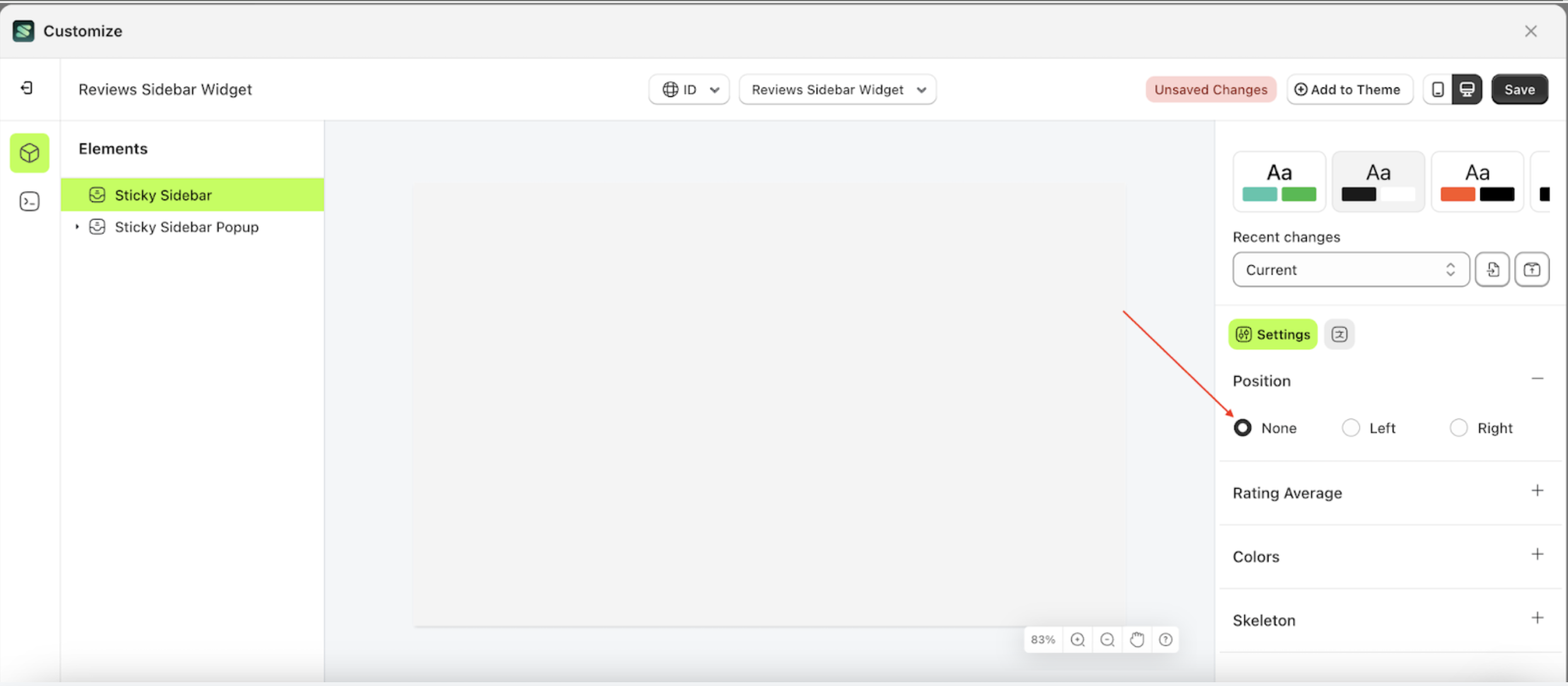
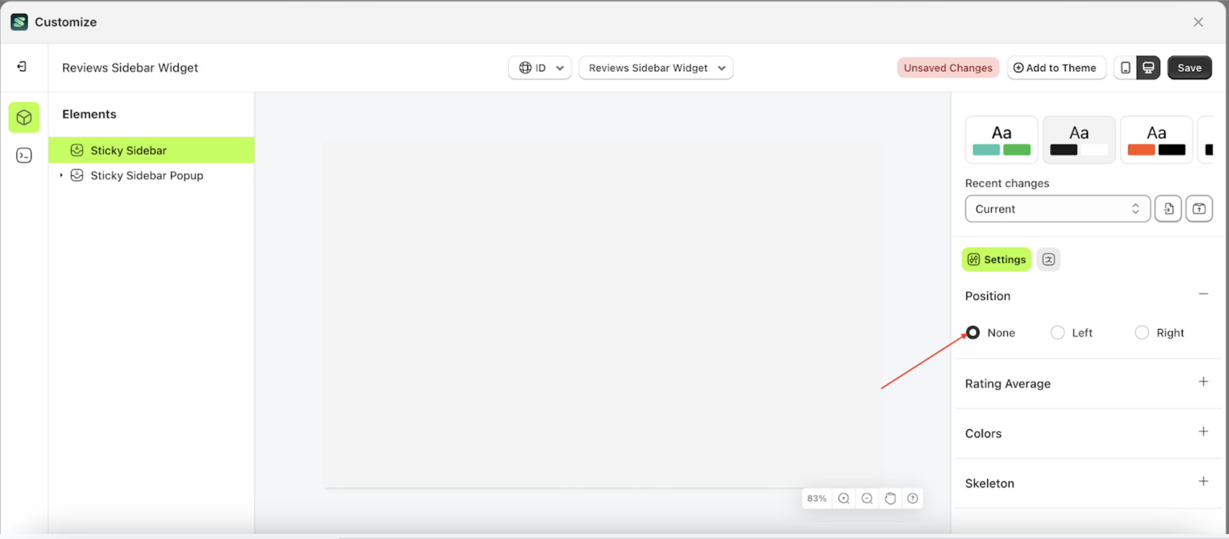
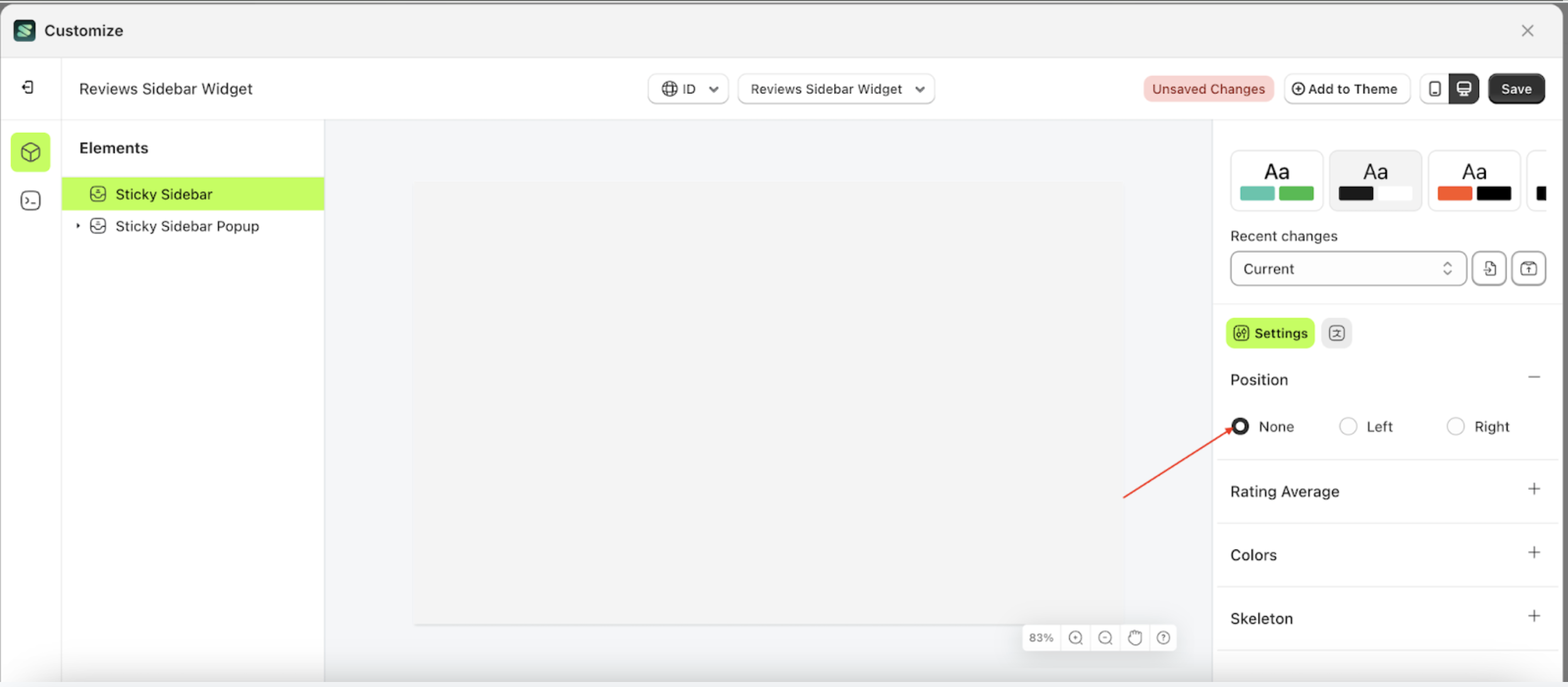
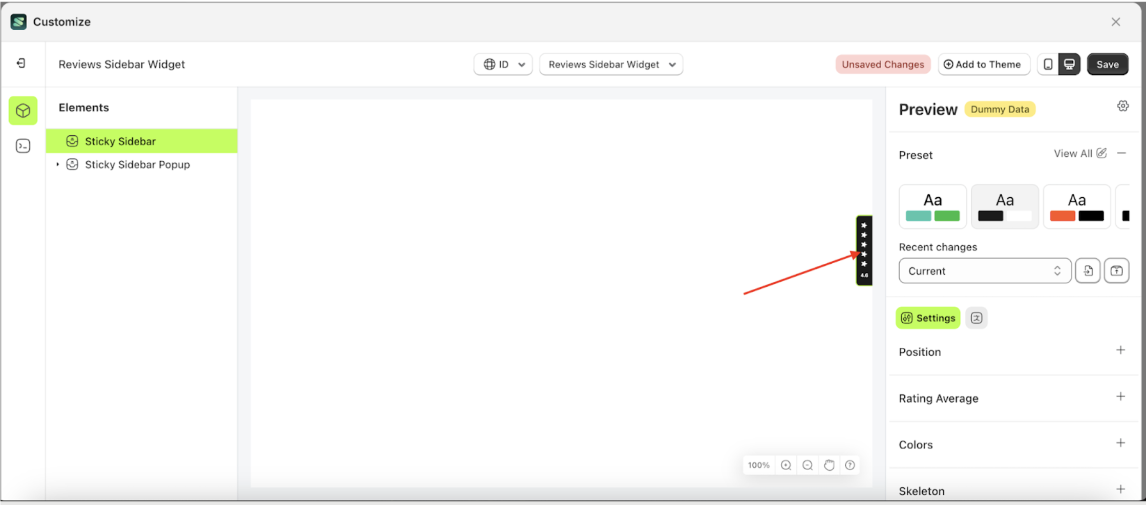
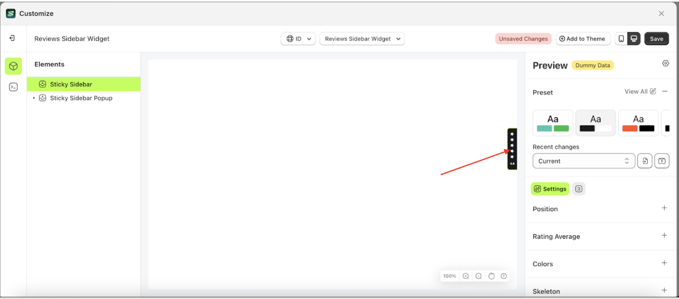
None
None is a setting that controls the position of the Sticky Sidebar element. However, when this setting is selected, the element will be hidden.
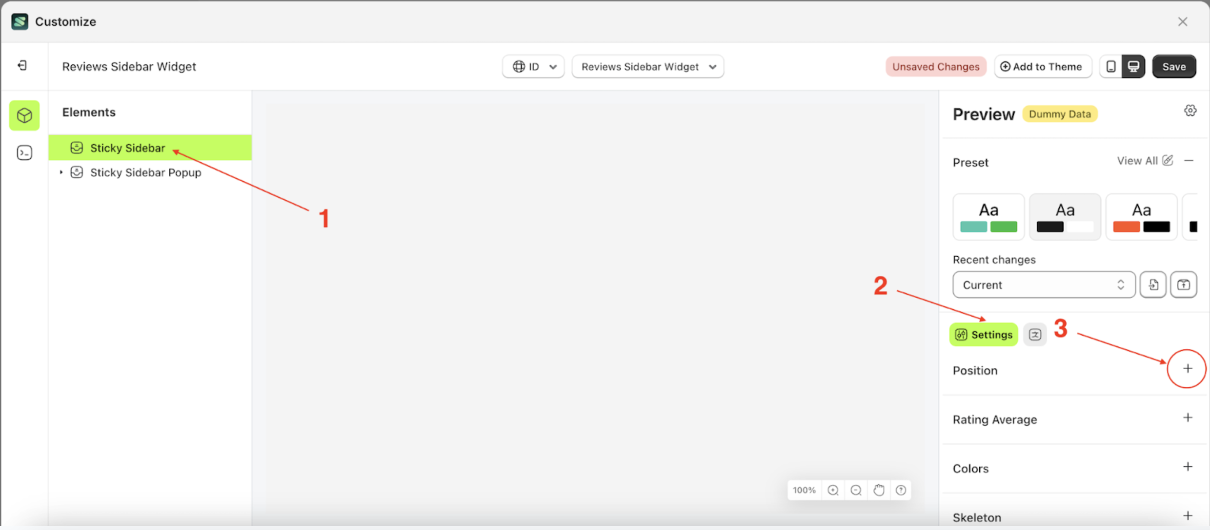
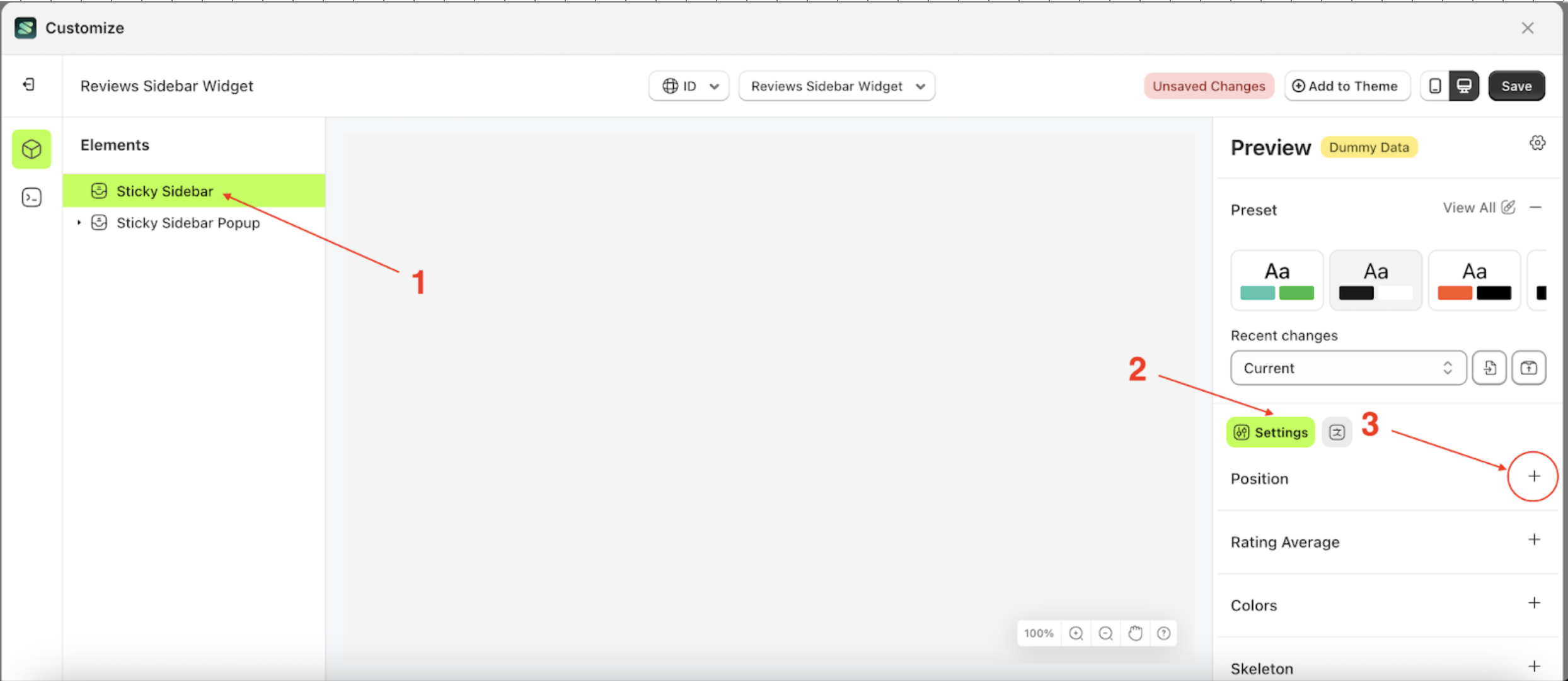
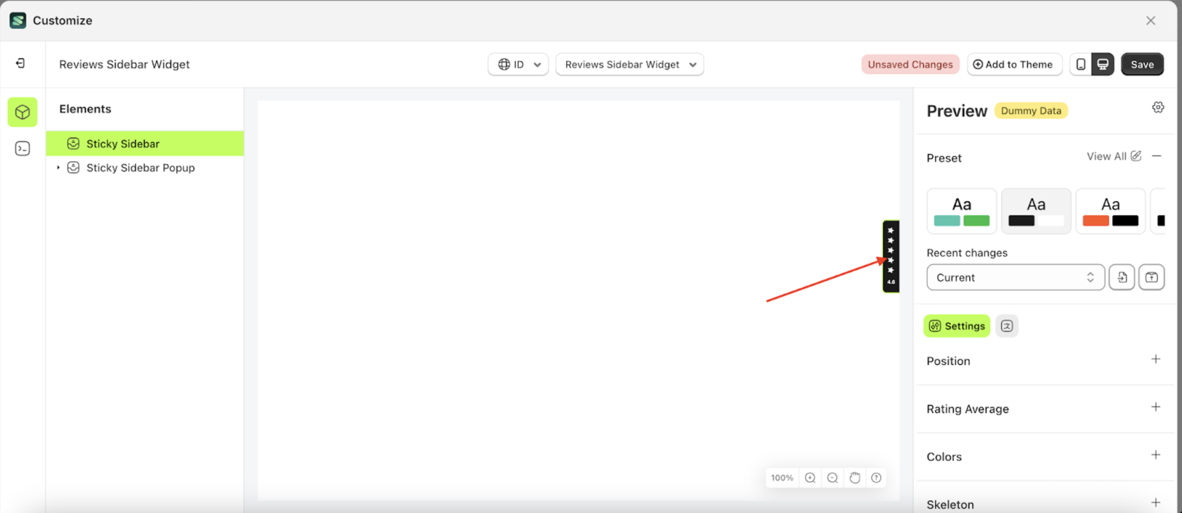
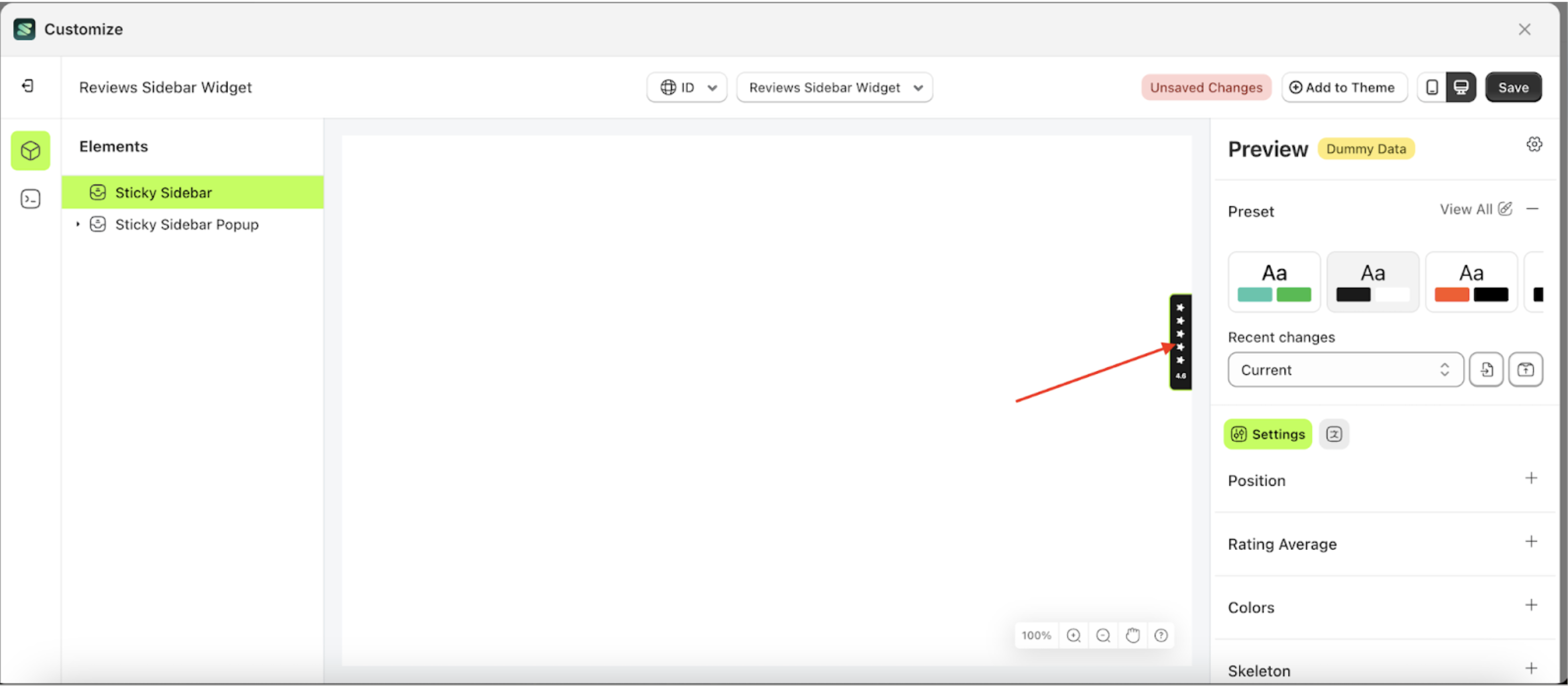
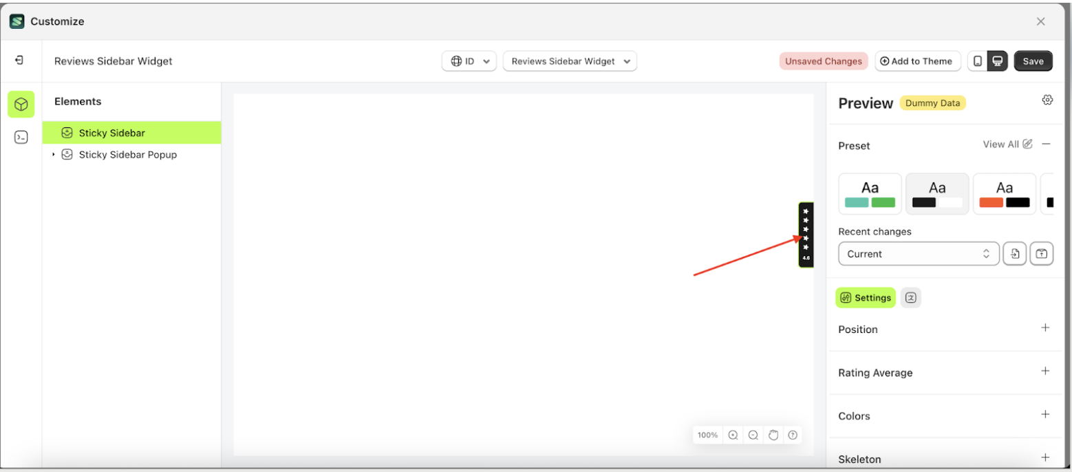
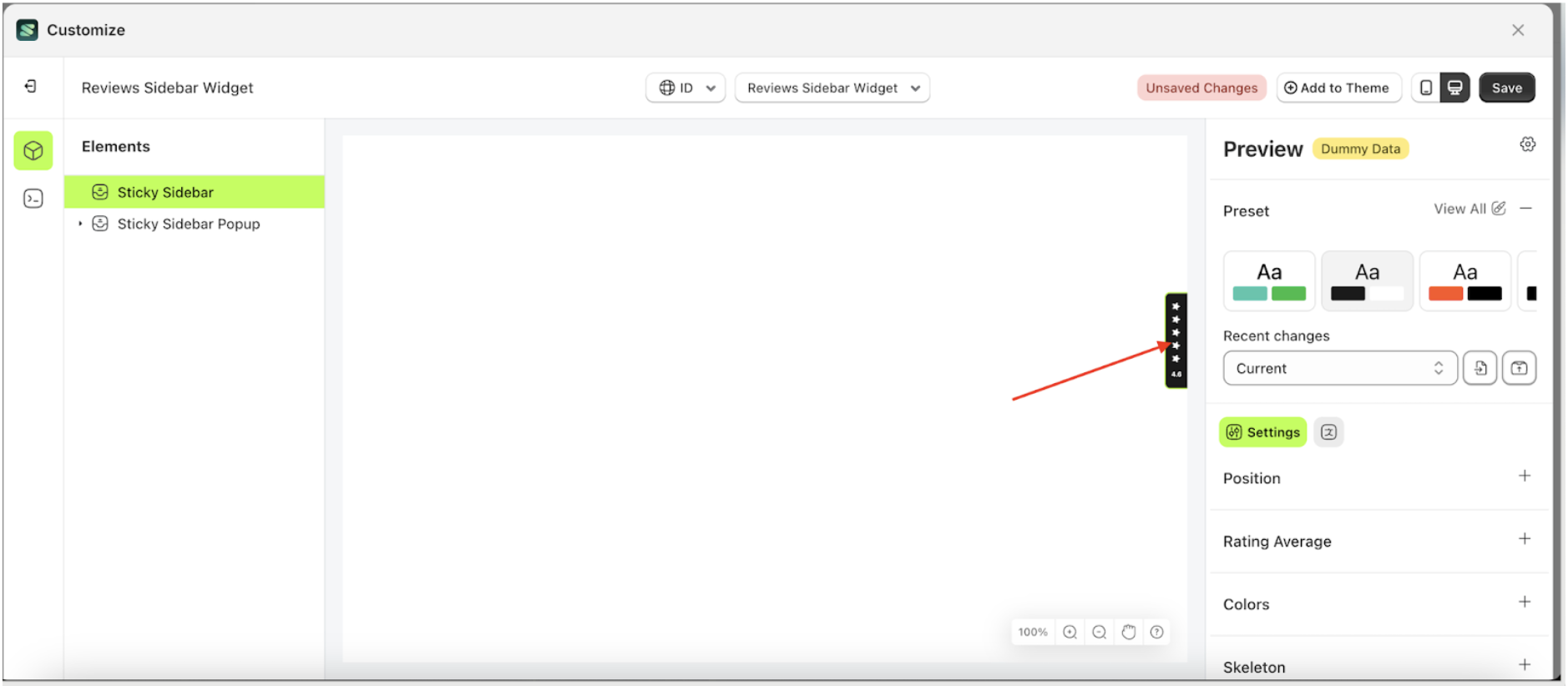
Follow the steps below:
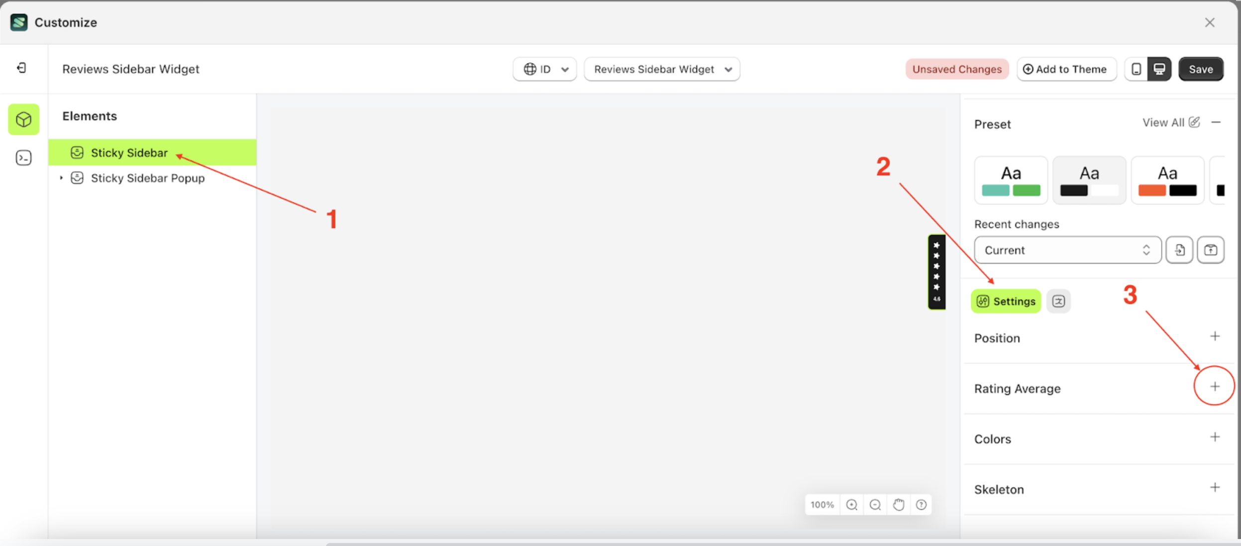
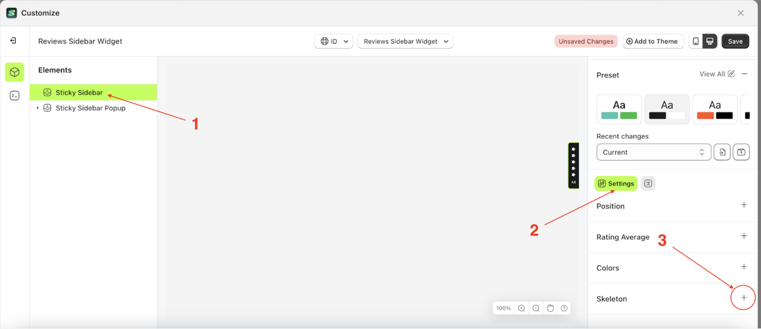
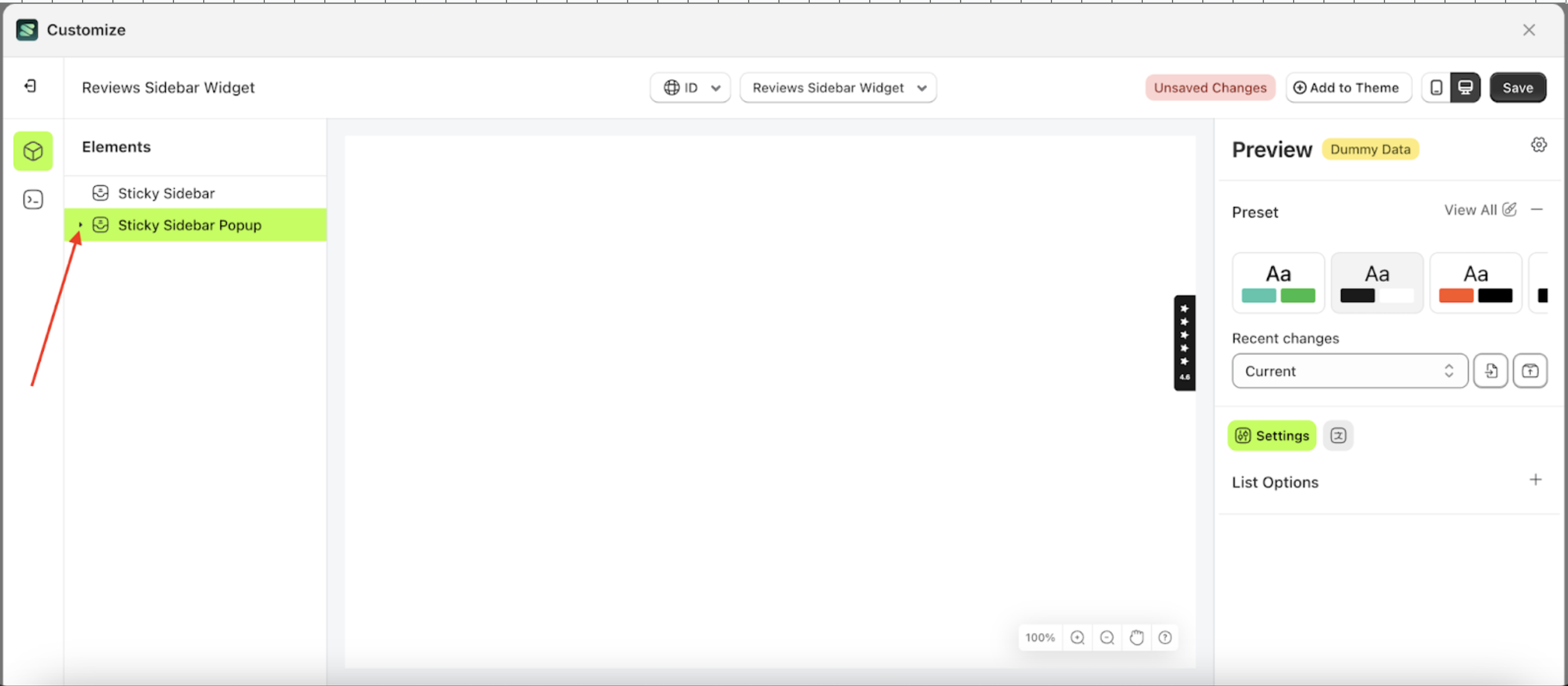
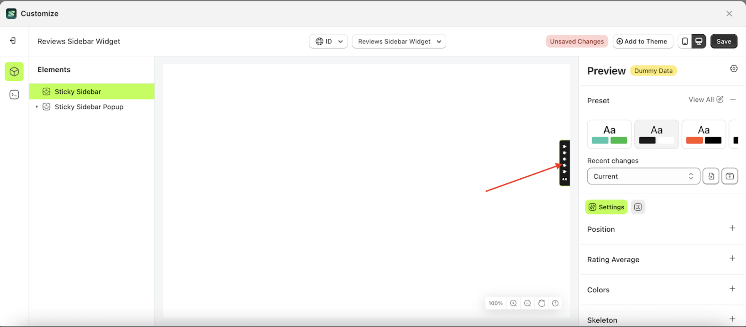
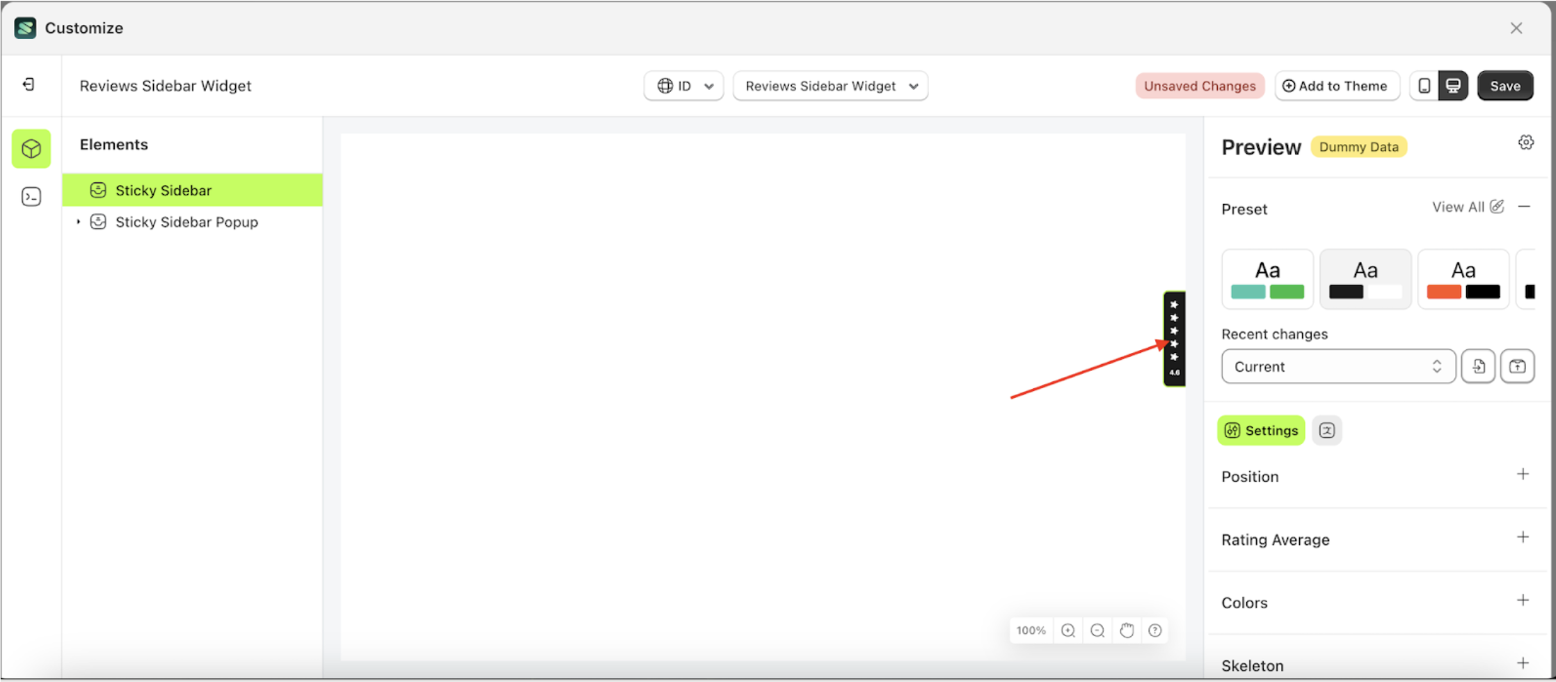
- Select the Sticky sidebar element on the right, then click the Settings tab and click the icon marked with a red arrow.
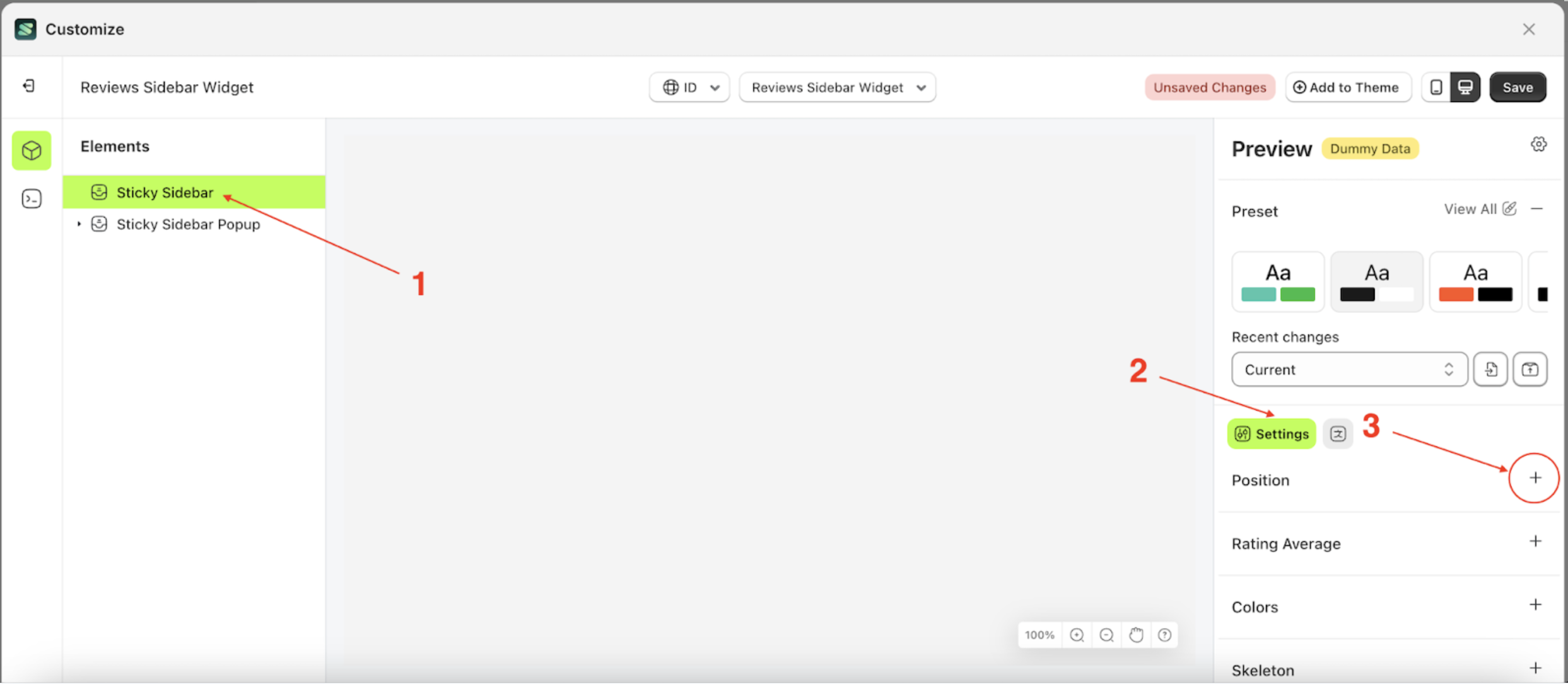
- Select None by following the red arrow.
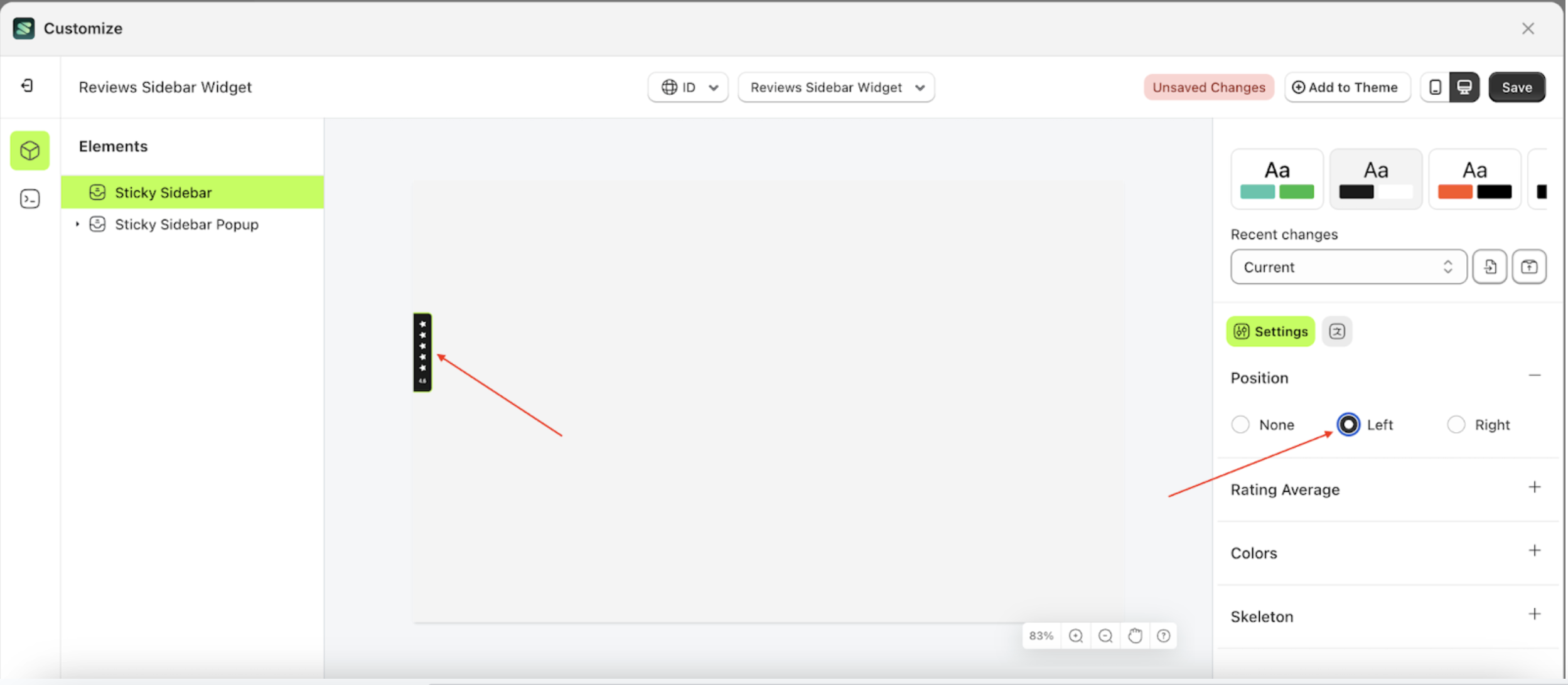
Left
Left is a setting that controls the position of the Sticky Sidebar element, placing it on the left side.
Follow the steps below:
- Select the Sticky sidebar element on the right, then click the Settings tab and click the icon marked with a red arrow.
- Select Left by following the red arrow.
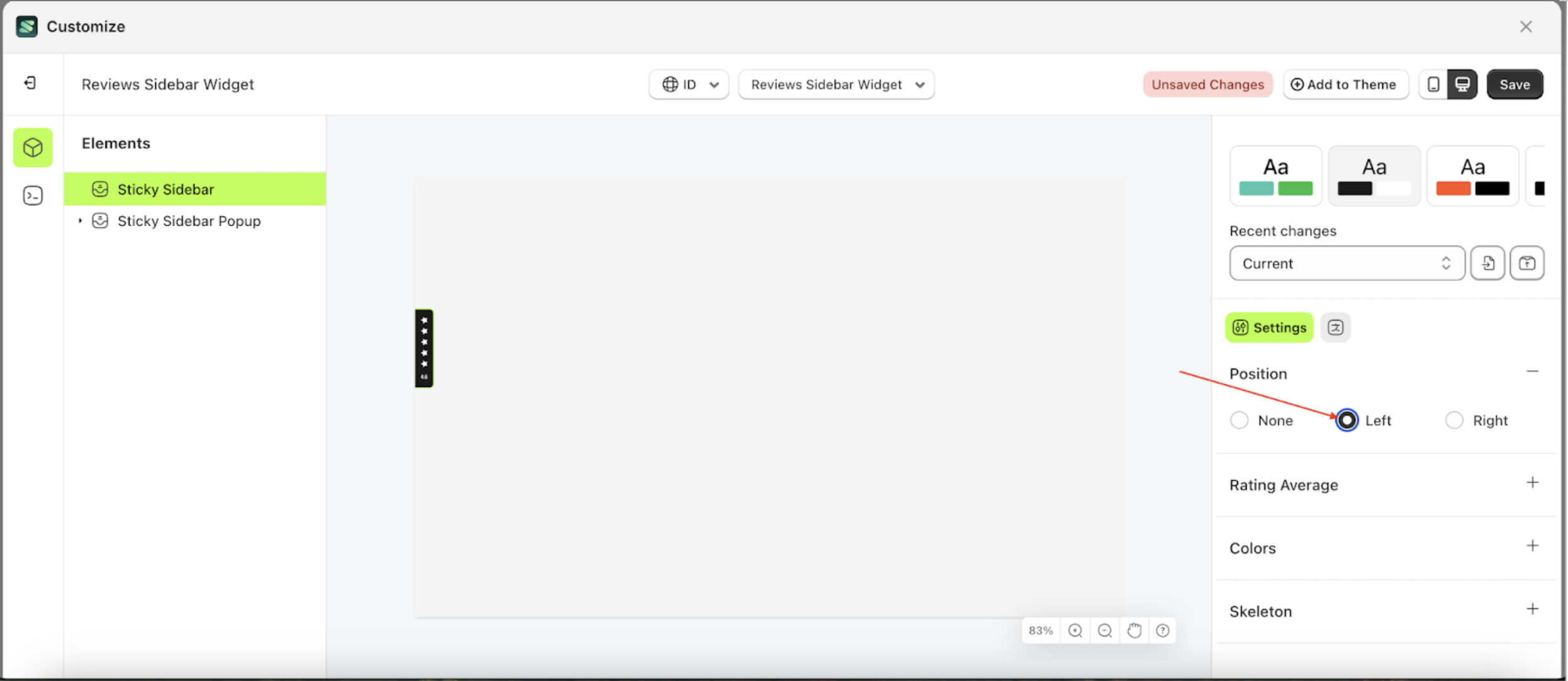
- The Sticky Sidebar will adjust accordingly
- Example: Before configuring the Sticky Sidebar position settings.
- Example: After configuring the Sticky Sidebar position settings.
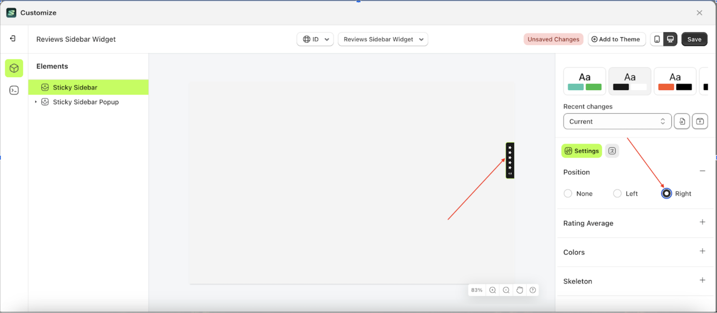
Right
Right is a setting that controls the position of the Sticky Sidebar element, placing it on the right side.
Follow the steps below:
- Select the Sticky sidebar element on the right, then click the Settings tab and click the icon marked with a red arrow.
- Select Right by following the red arrow.
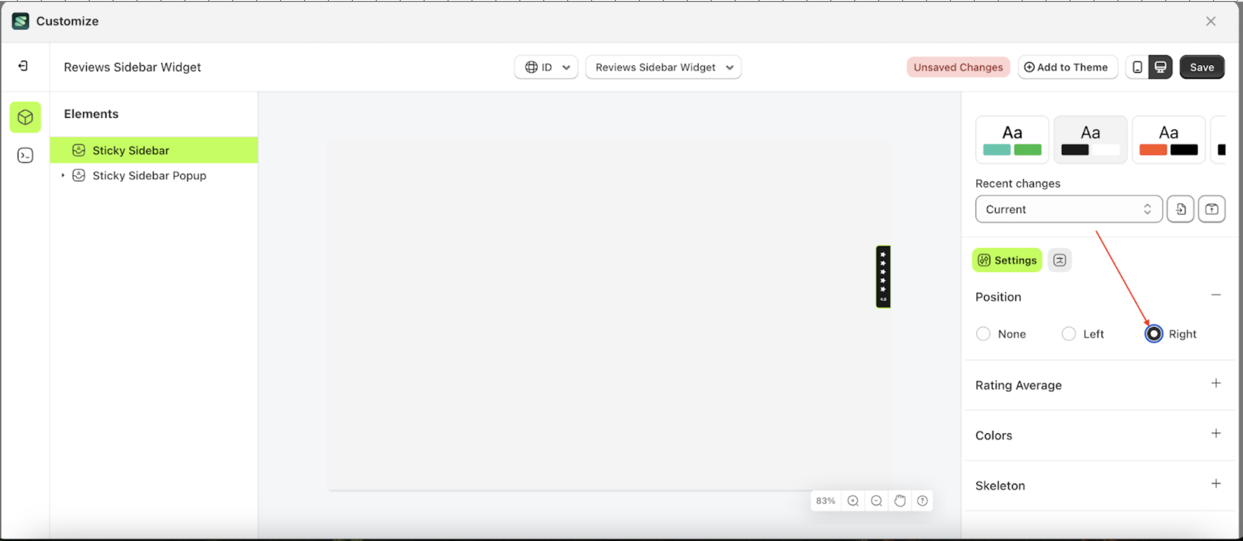
- The Sticky Sidebar will adjust accordingly
- Example: Before configuring the Sticky Sidebar position settings.
- Example: After configuring the Sticky Sidebar position settings.
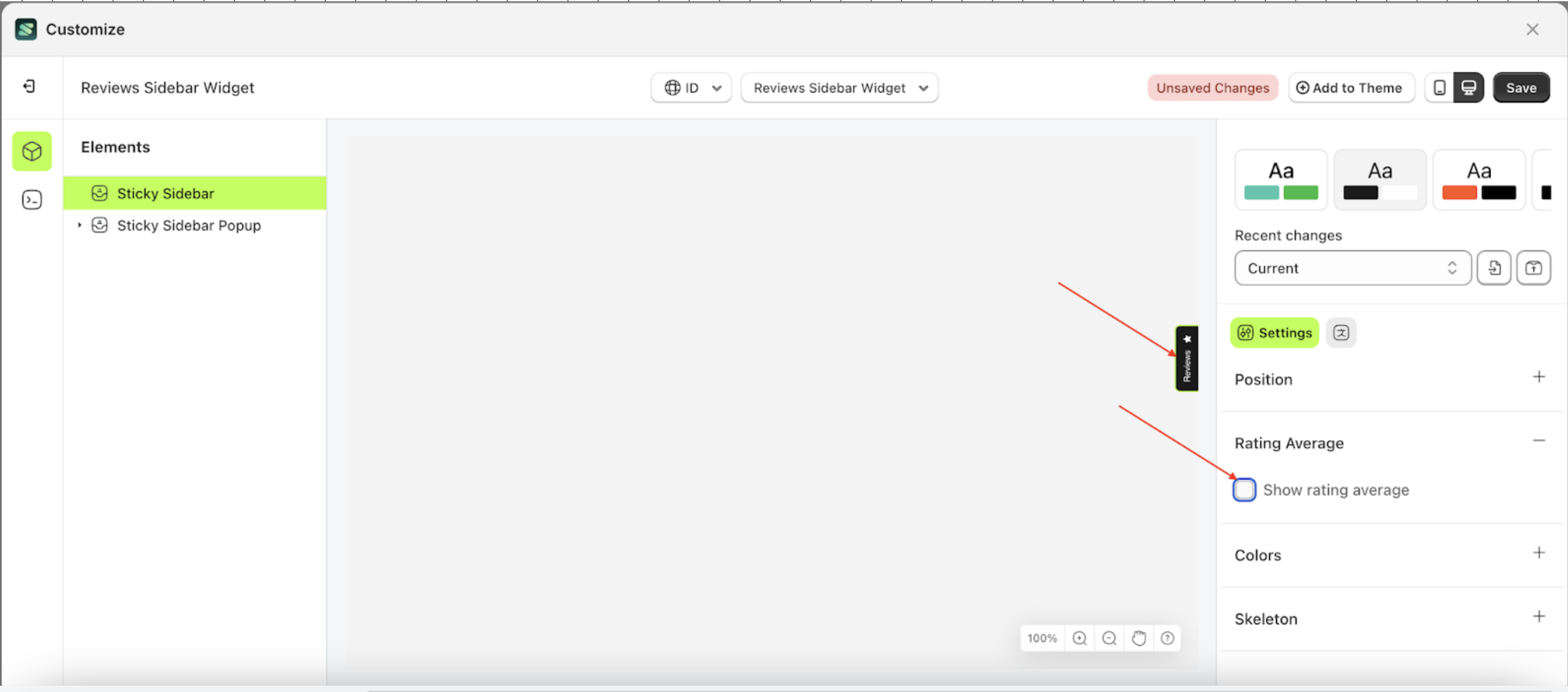
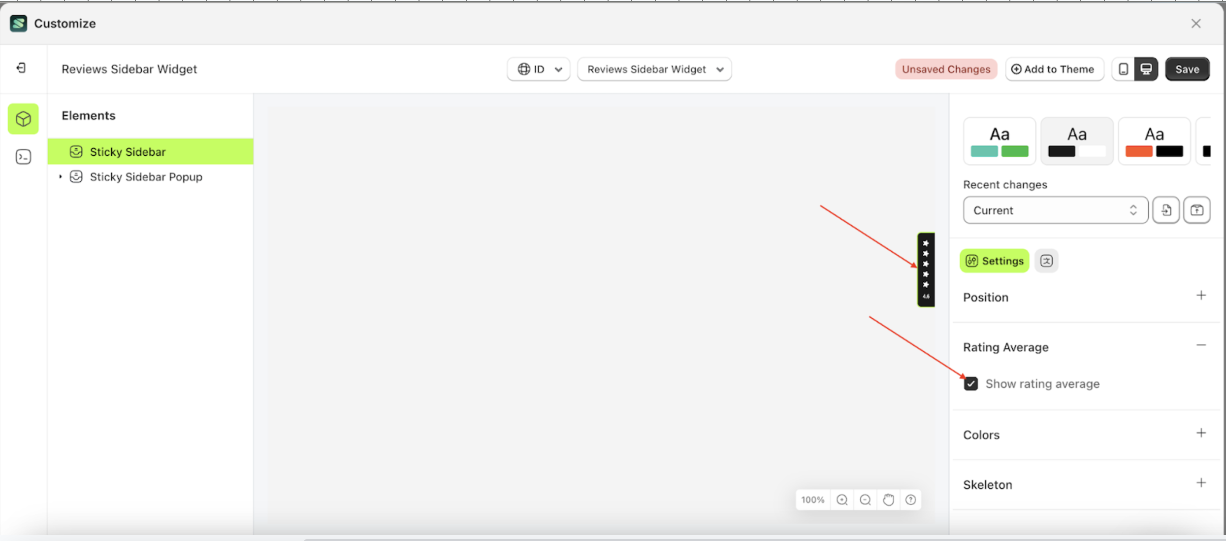
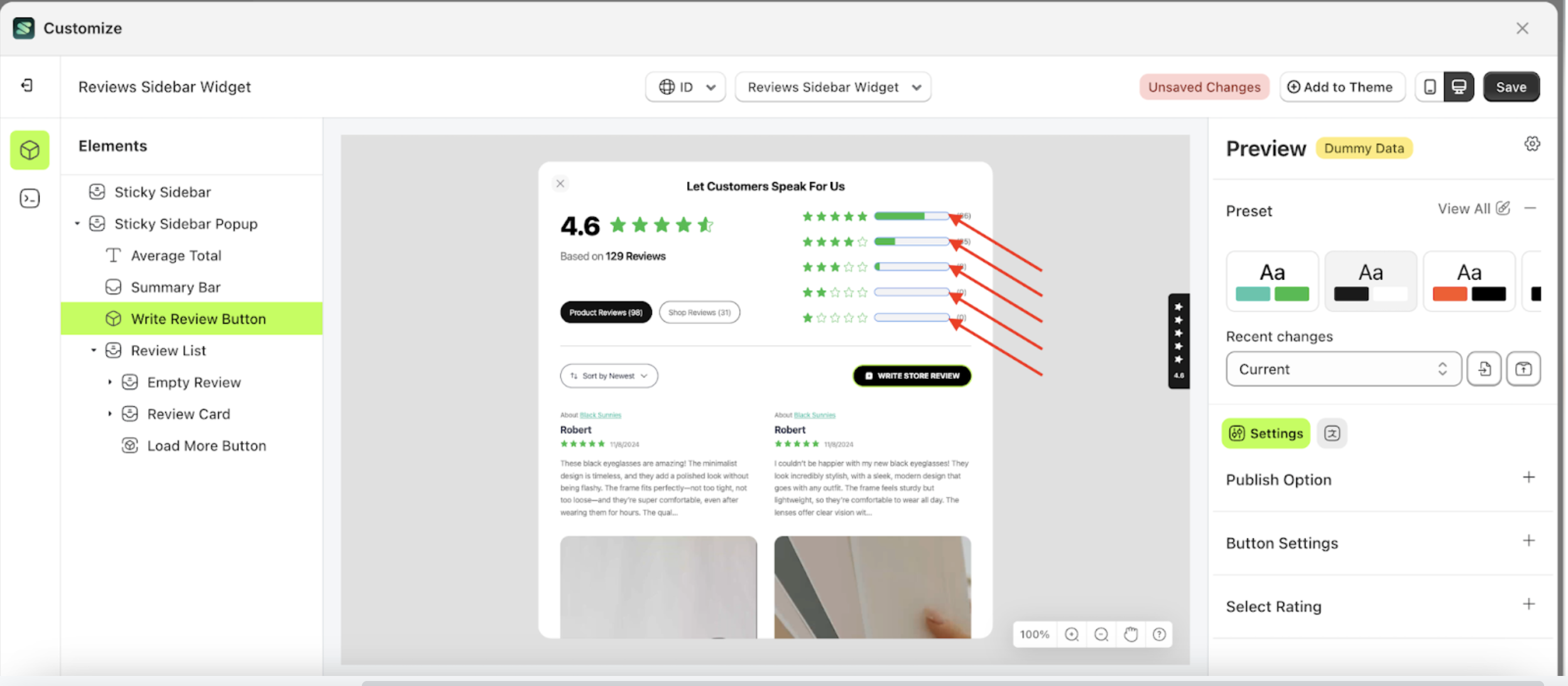
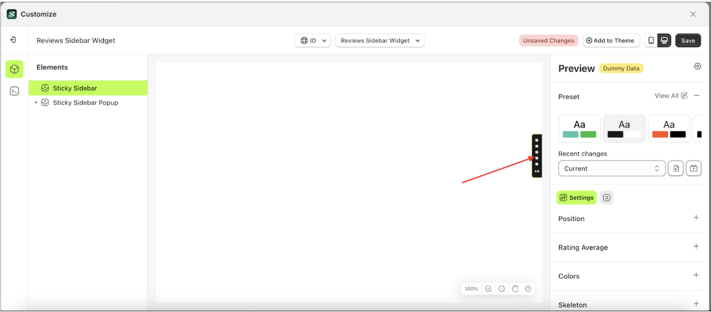
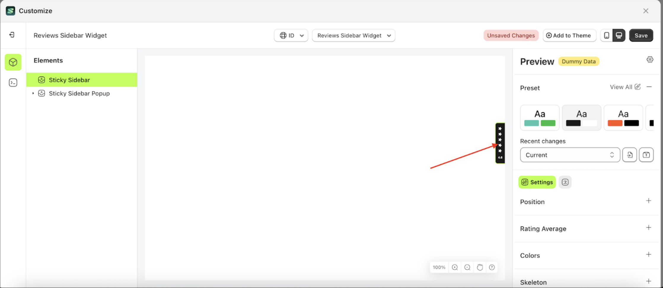
Rating Average
Available settings:
Show Rating Average
Show Rating Average is a setting designed to display or hide the star ratings on the Sticky Sidebar element.
Follow the steps below:
- Select the Sticky sidebar element on the right, then click the Settings tab and click the icon marked with a red arrow.
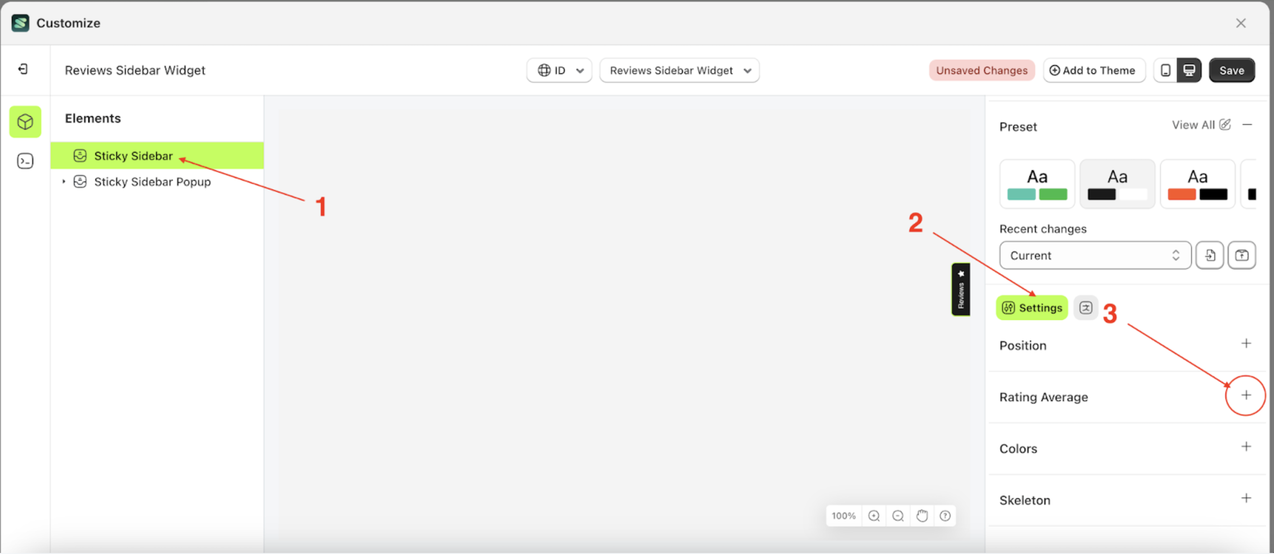
- Enable the Show rating average checkbox.
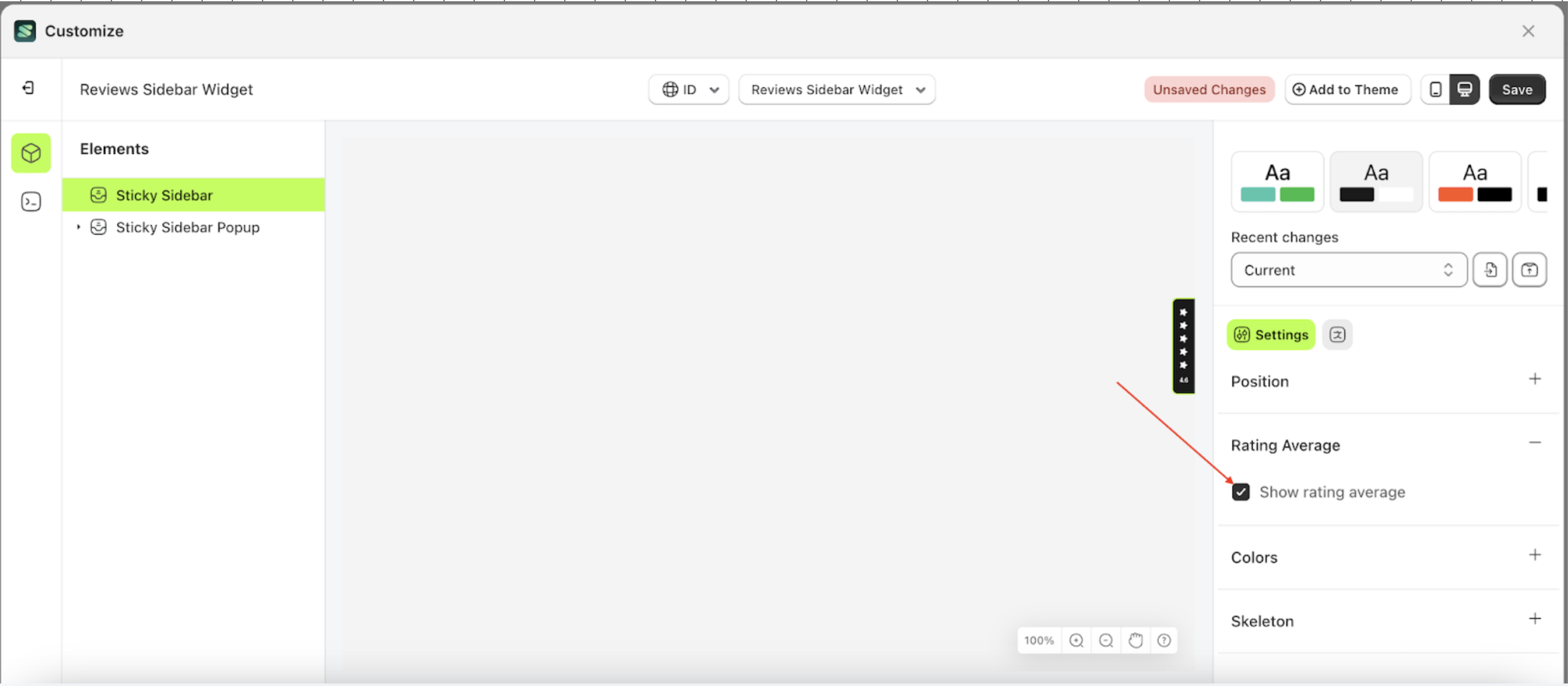
- The Sticky Sidebar will adjust accordingly
- Example: Before configuring the Sticky Sidebar position settings.
- Example: After configuring the Sticky Sidebar position settings.
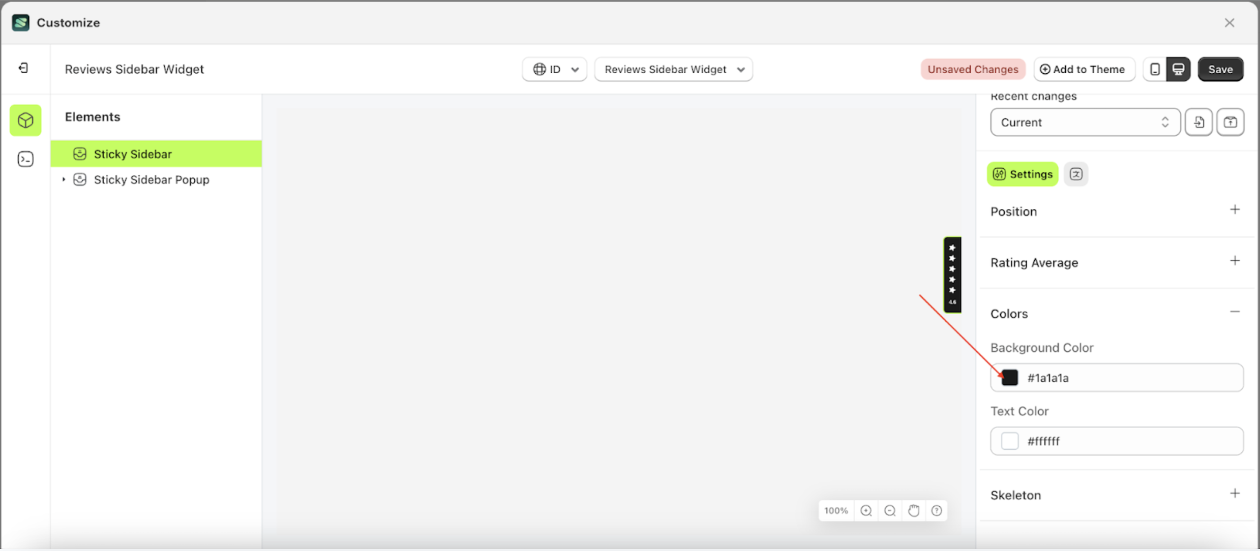
Color
Available settings:
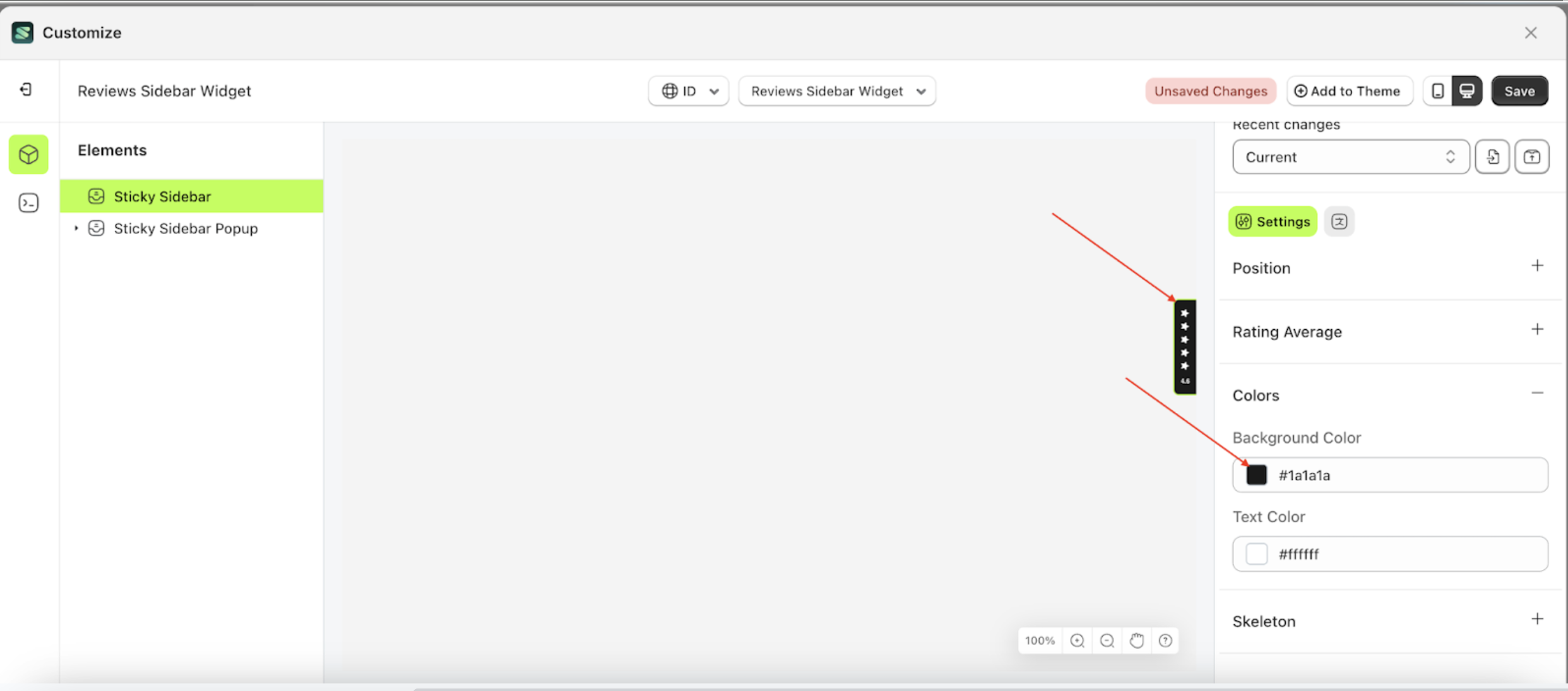
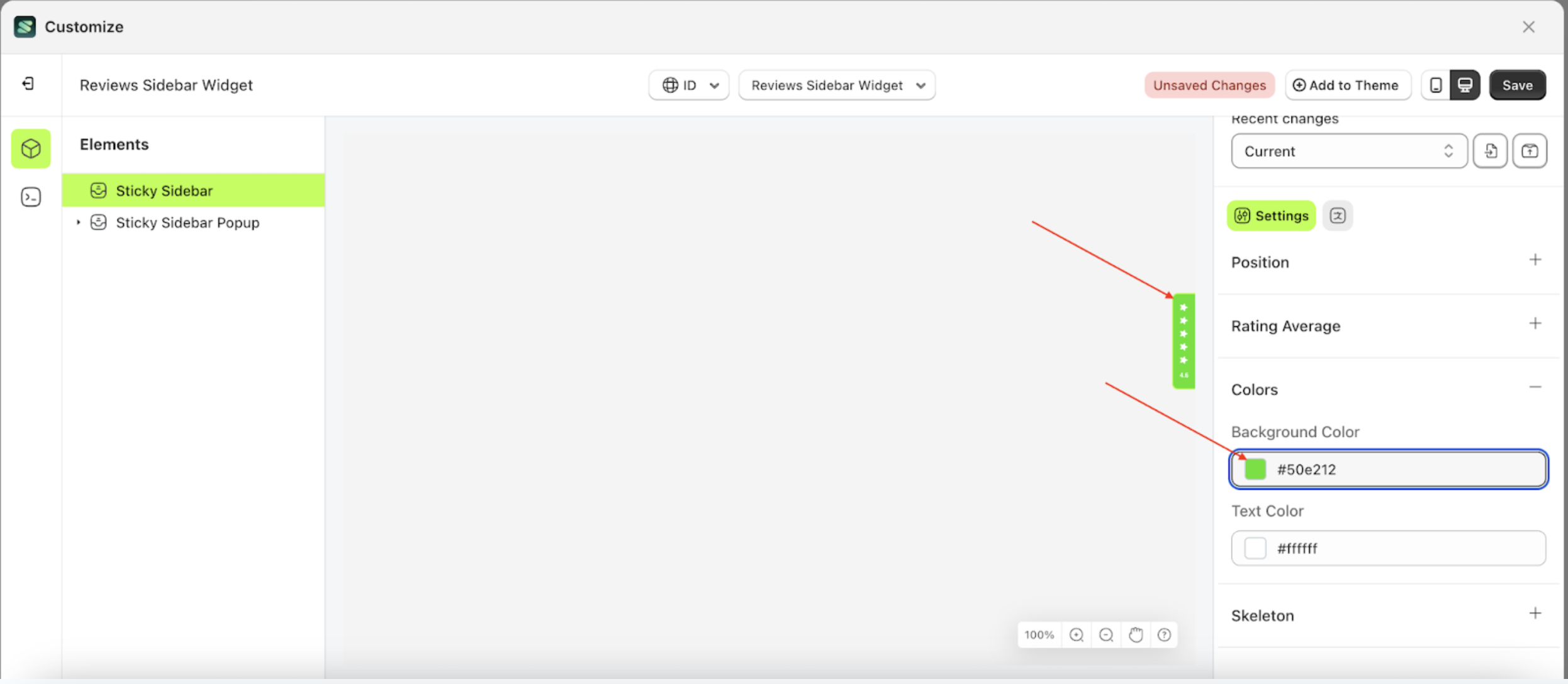
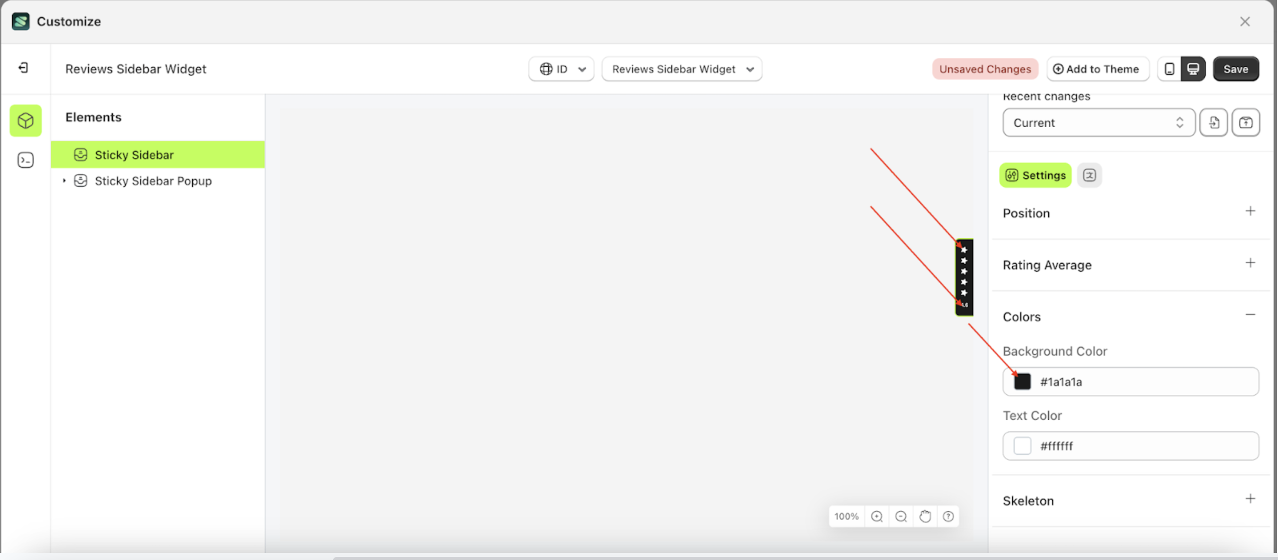
Background Color
Background Color is a setting designed to control the base or background color of an element.
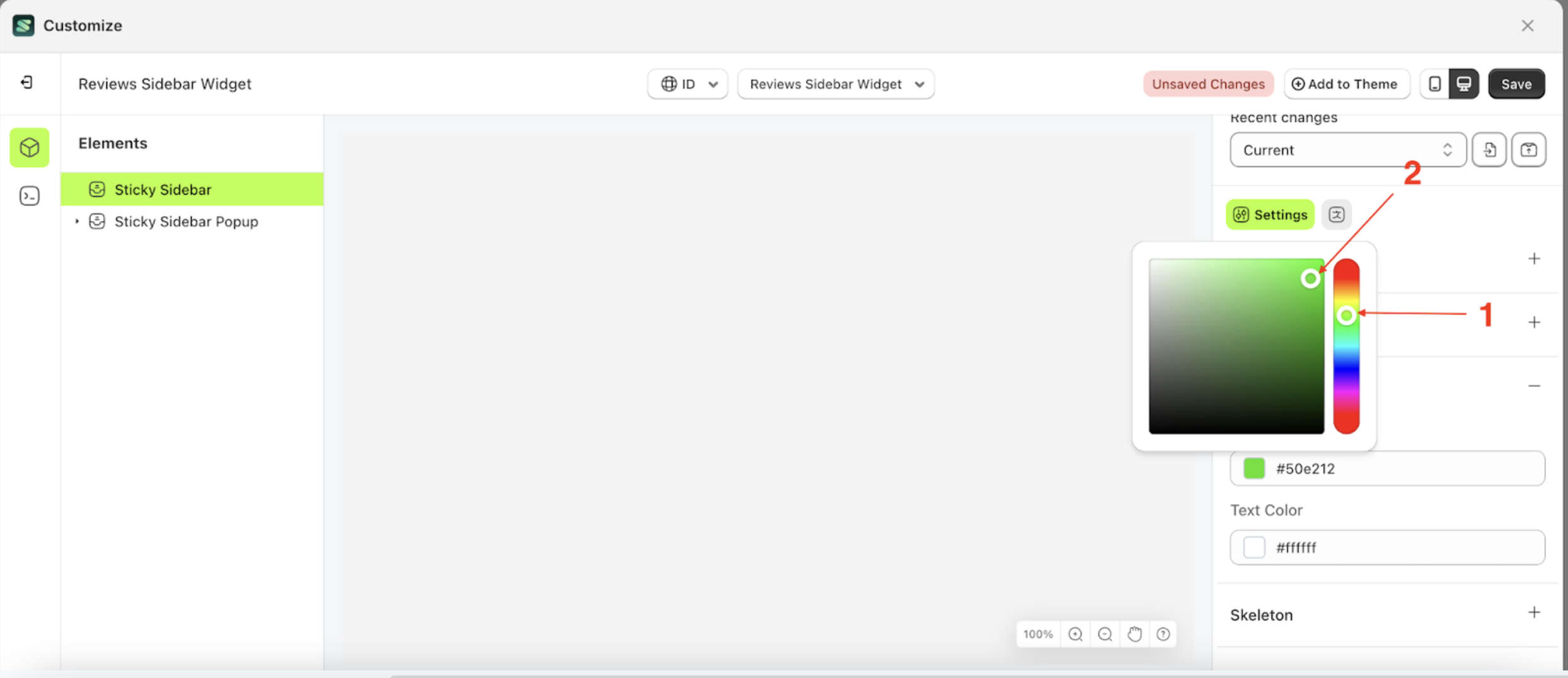
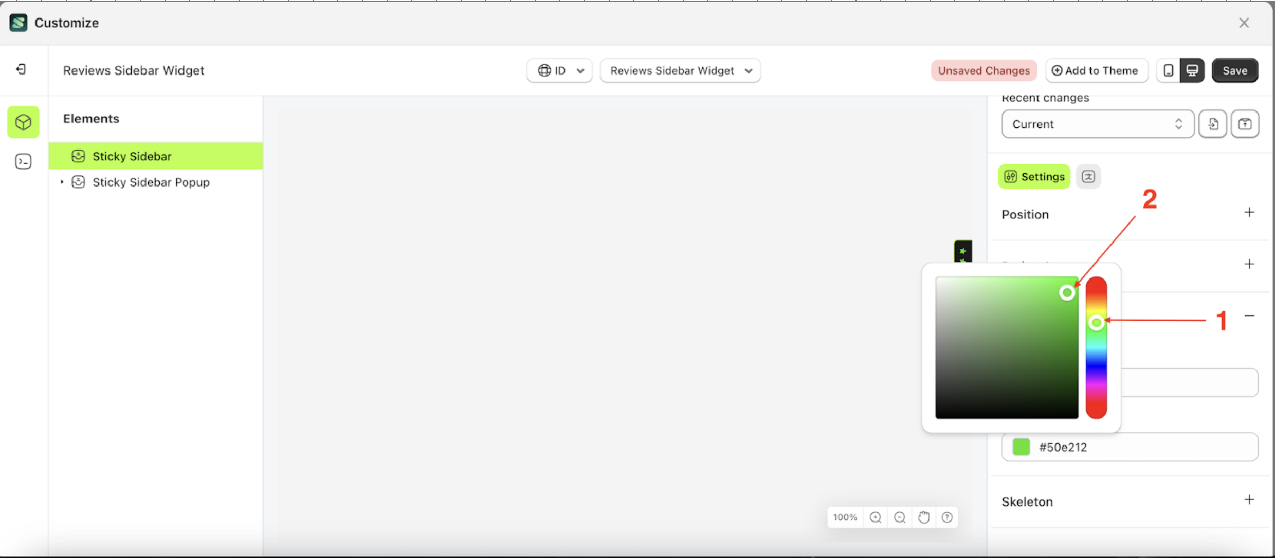
- Select the Sticky Sidebar element on the left, then click the Settings tab and click the icon marked with a red arrow.
- Click the Color Palette on the right side, which is also marked with a red arrow.
- The Color Palette will appear. Click the right side of the palette where the red arrow and number 1 are indicated, then click the right side again where the red arrow and number 2 are marked.
- The review sidebar widget of the Sticky Sidebar element will adjust accordingly.
- Example : Before Sticky Sidebar change settings
- Example : After Sticky Sidebar change settings
Follow the steps below:
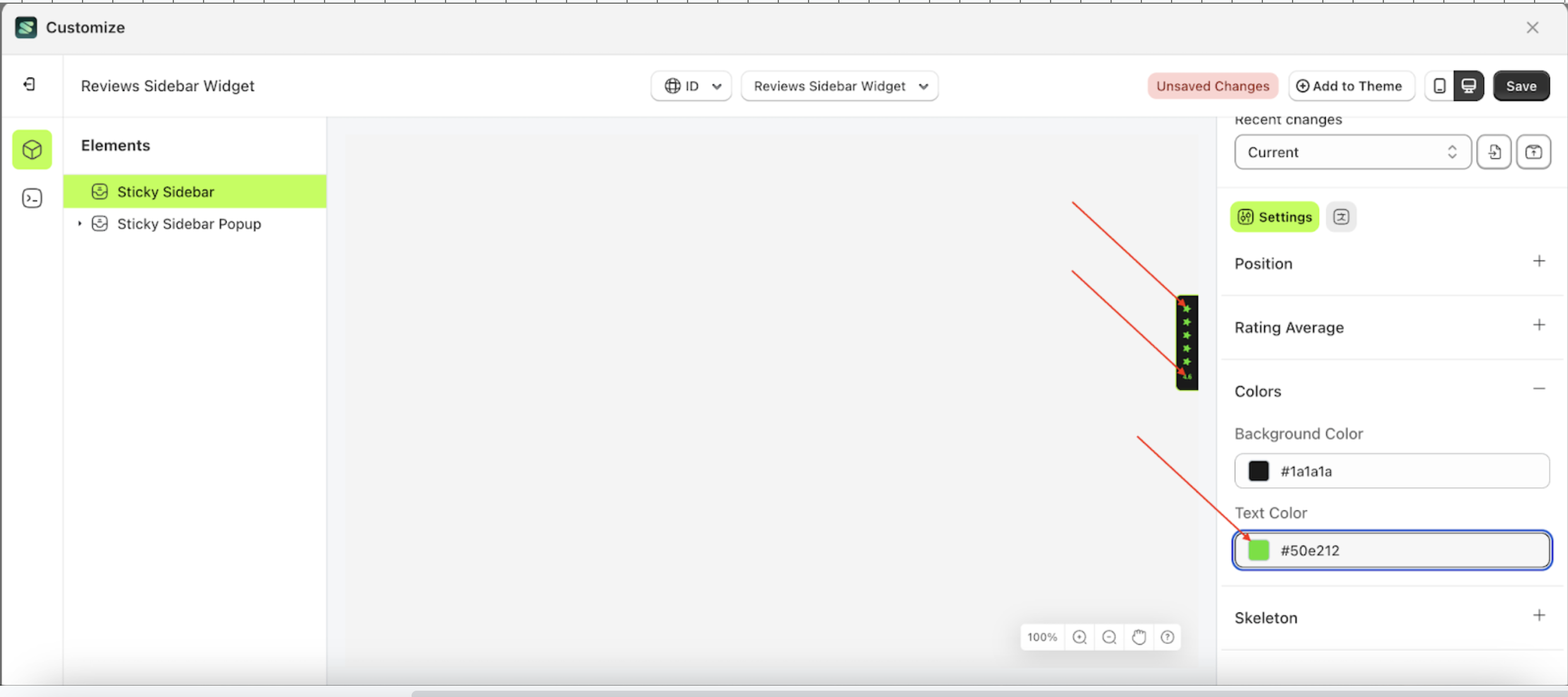
Text Color
Text Color is a setting designed to control the color of the content within the Sticky Sidebar, including text and other elements.
Follow the steps below:
- Select the Sticky Sidebar element on the left, then click the Settings tab and click the icon marked with a red arrow.
- Click the Color Palette on the right side, which is also marked with a red arrow.
- The Color Palette will appear. Click the right side of the palette where the red arrow and number 1 are indicated, then click the right side again where the red arrow and number 2 are marked.
- The review sidebar widget of the Sticky Sidebar element will adjust accordingly.
- Example : Before Sticky Sidebar change settings
- Example : After Sticky Sidebar change settings

Skeleton
Available settings:
Enable Skeleton
Enable Skeleton is a setting that controls whether a loader or skeleton is displayed before the required data is fully loaded.
Follow the steps below:
- Select the Sticky Sidebar element on the right, then click the Settings tab and click the icon marked with a red arrow.
- Enable the Enable Skeleton checkbox.
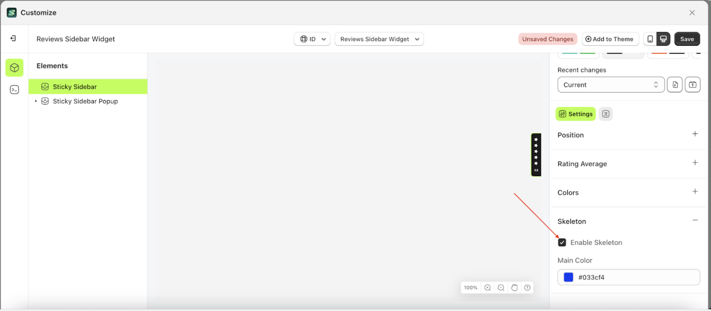
Main Color
Main Color is a setting that manages the color of the skeleton.
Follow the steps below:
- Select the Sticky Sidebar element on the right, then click the Settings tab and click the icon marked with a red arrow.
- Enable the Enable Skeleton checkbox.
- Click the Color Palette on the right side, which is also marked with a red arrow.
- The Color Palette will appear. Click the right side of the palette where the red arrow and number 1 are indicated, then click the right side again where the red arrow and number 2 are marked.
- Then, click the Save button on the right.
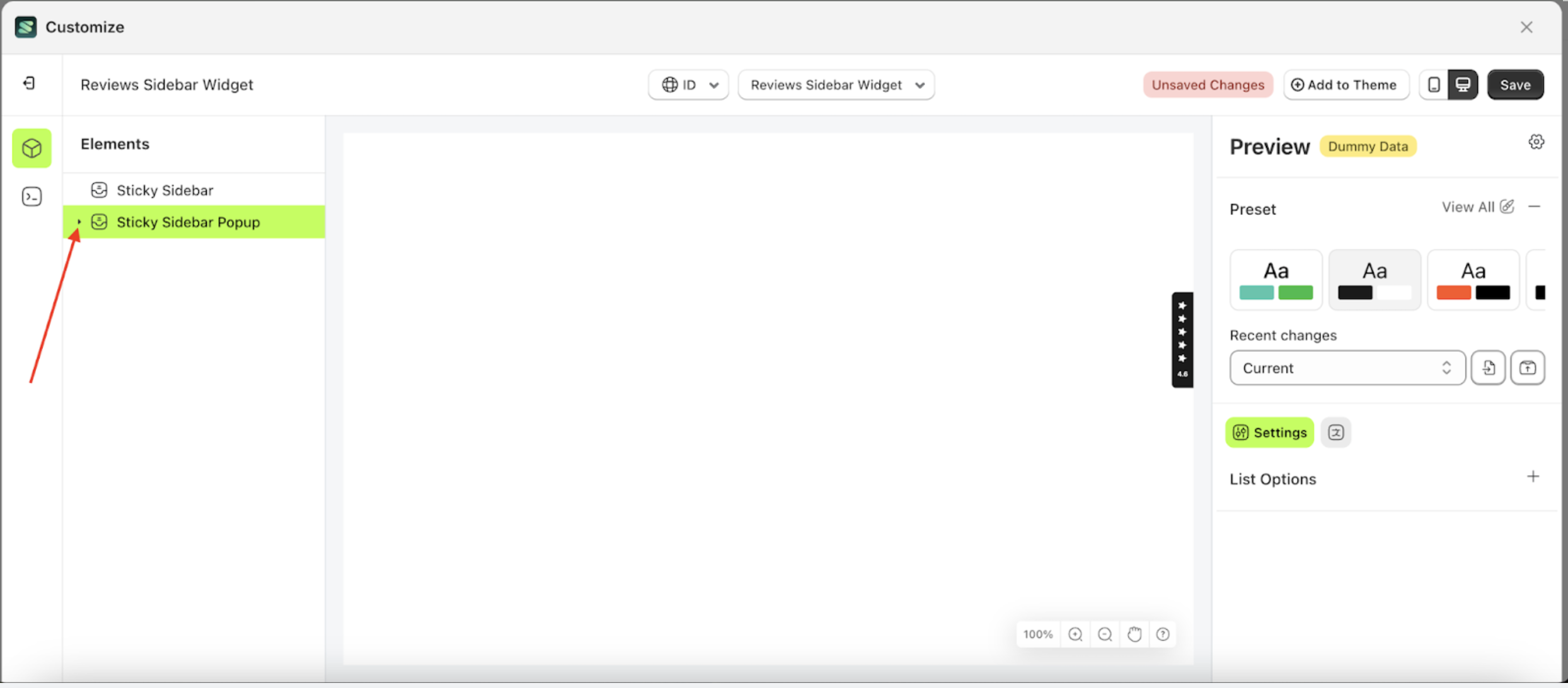
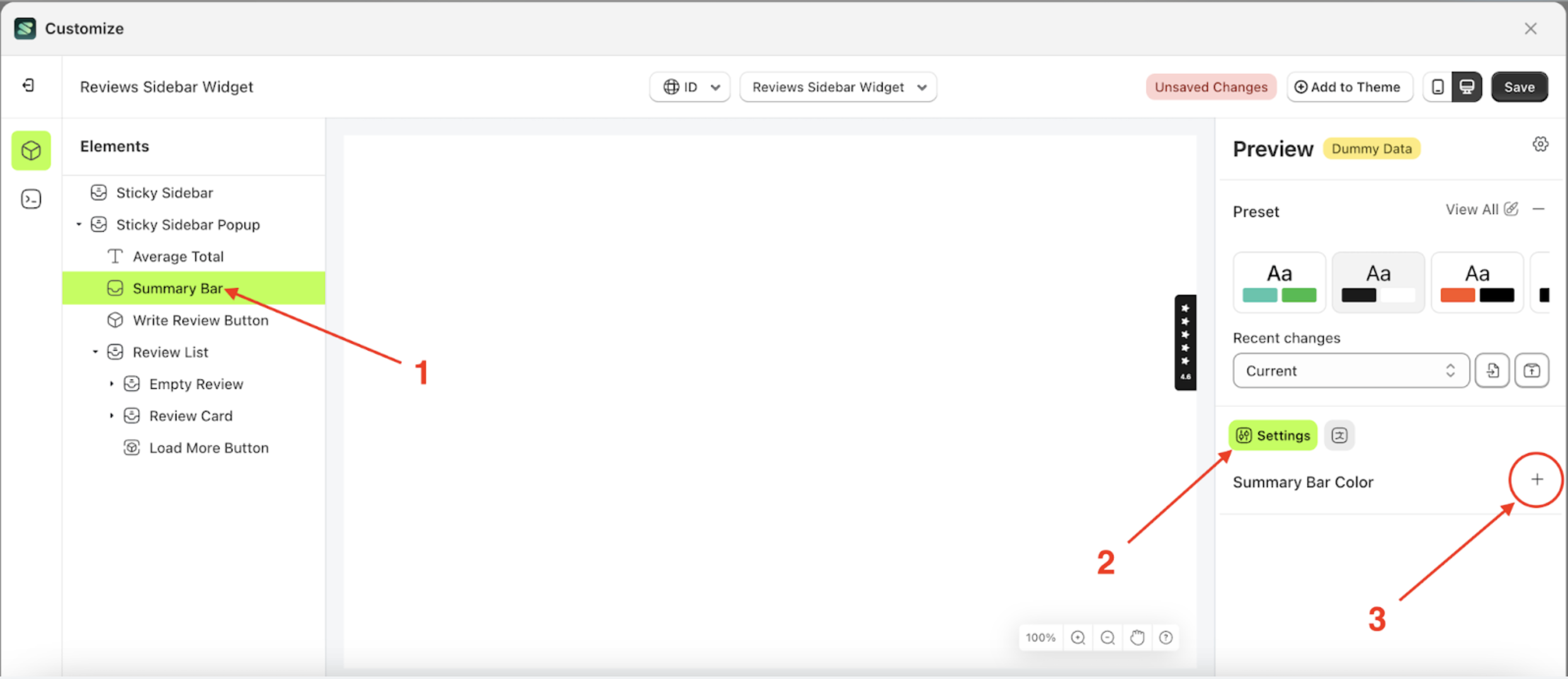
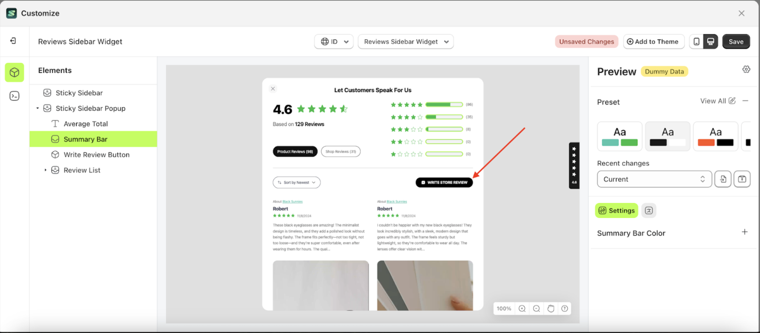
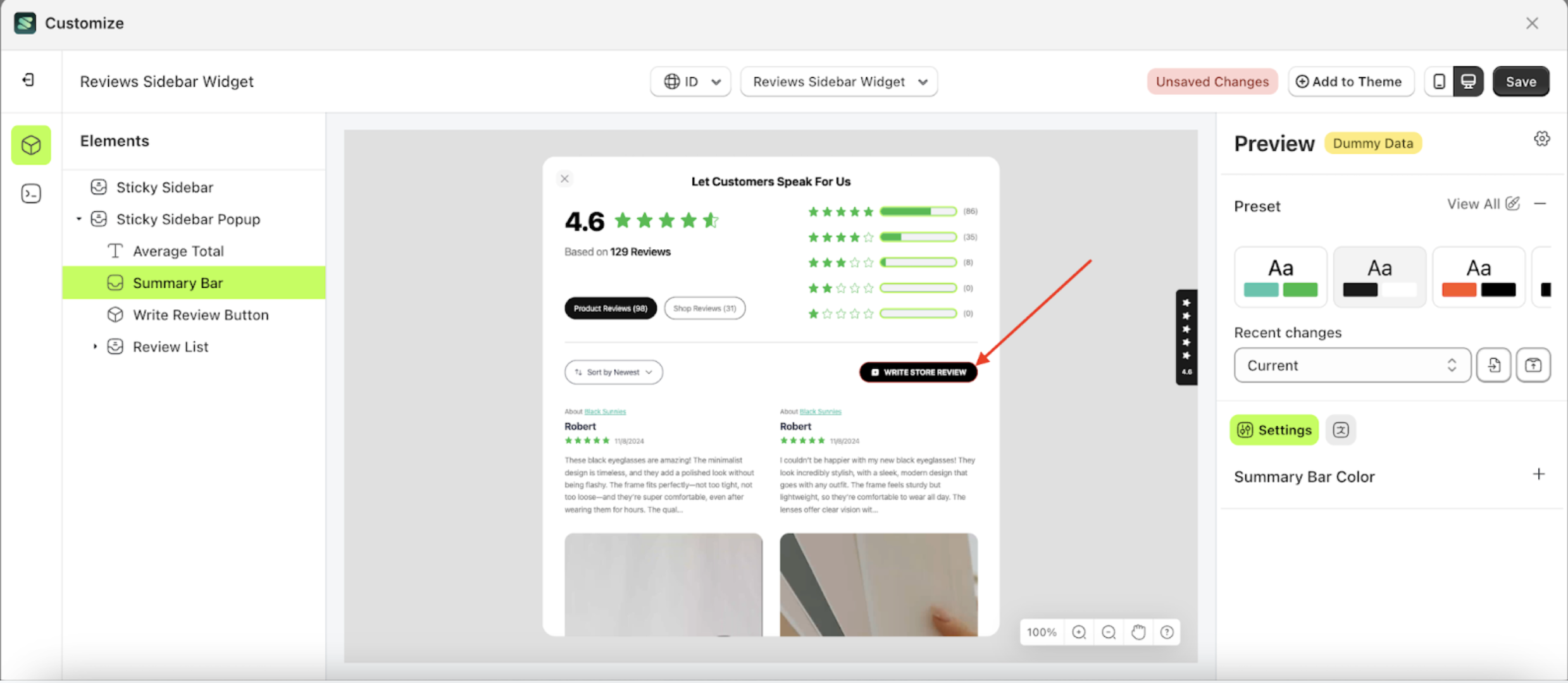
Summary Bar Color
Available settings:
Fill Color
Fill Color is a setting designed to control the background color of the stars element.
Follow the steps below:
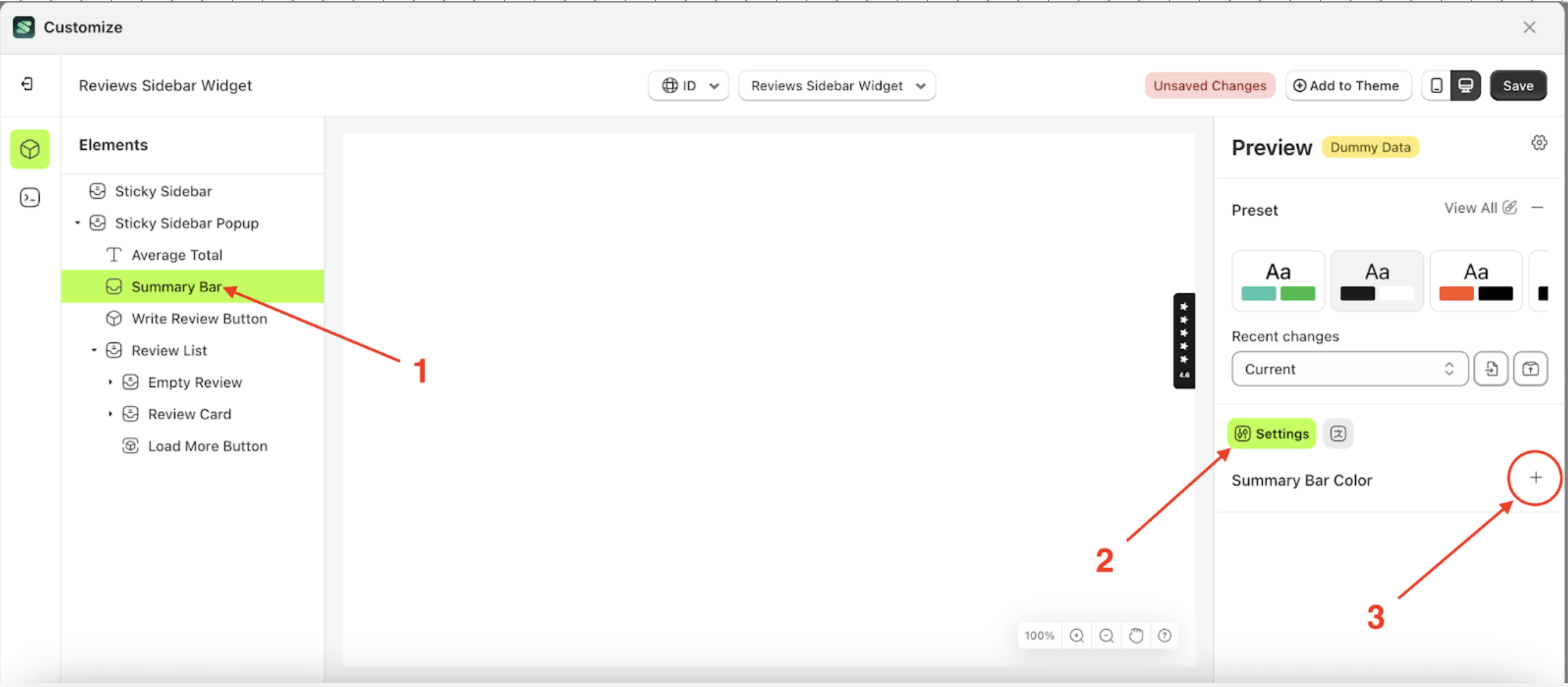
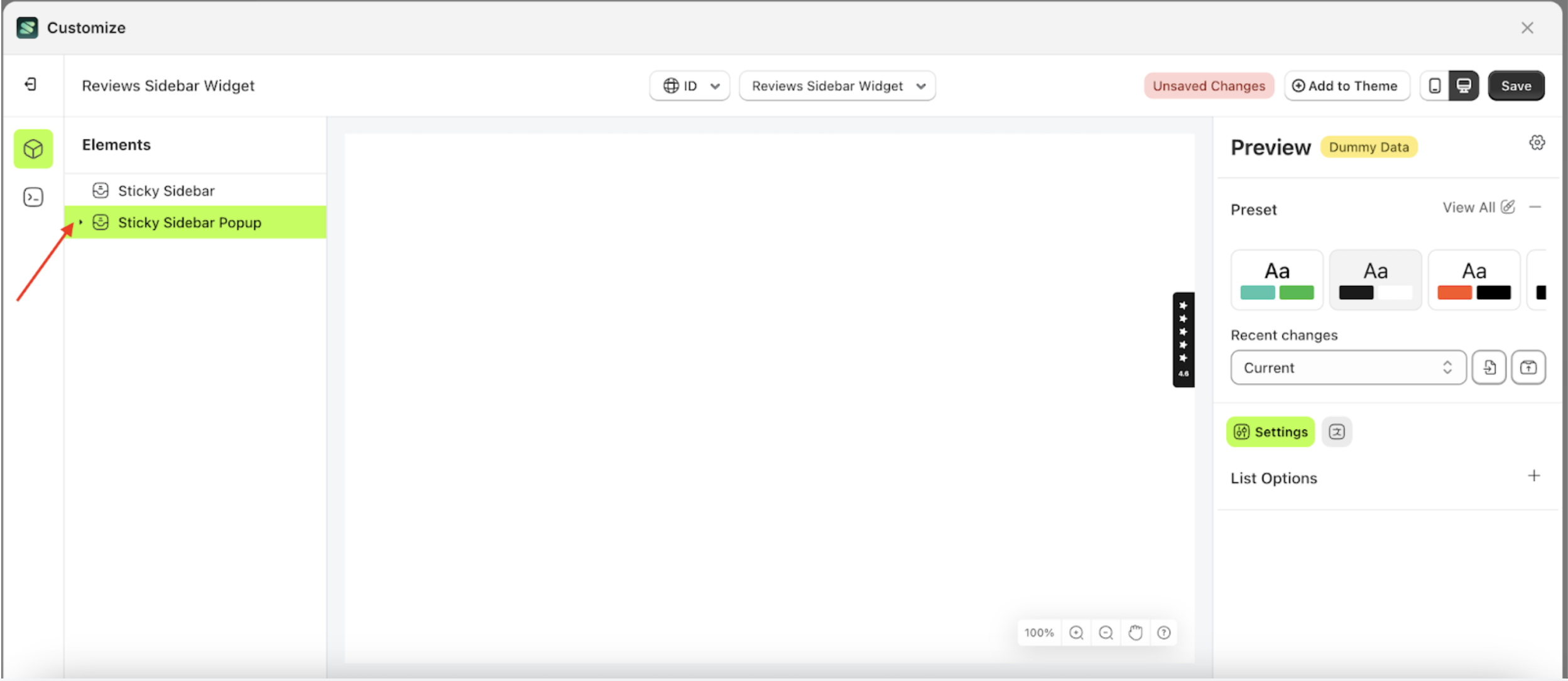
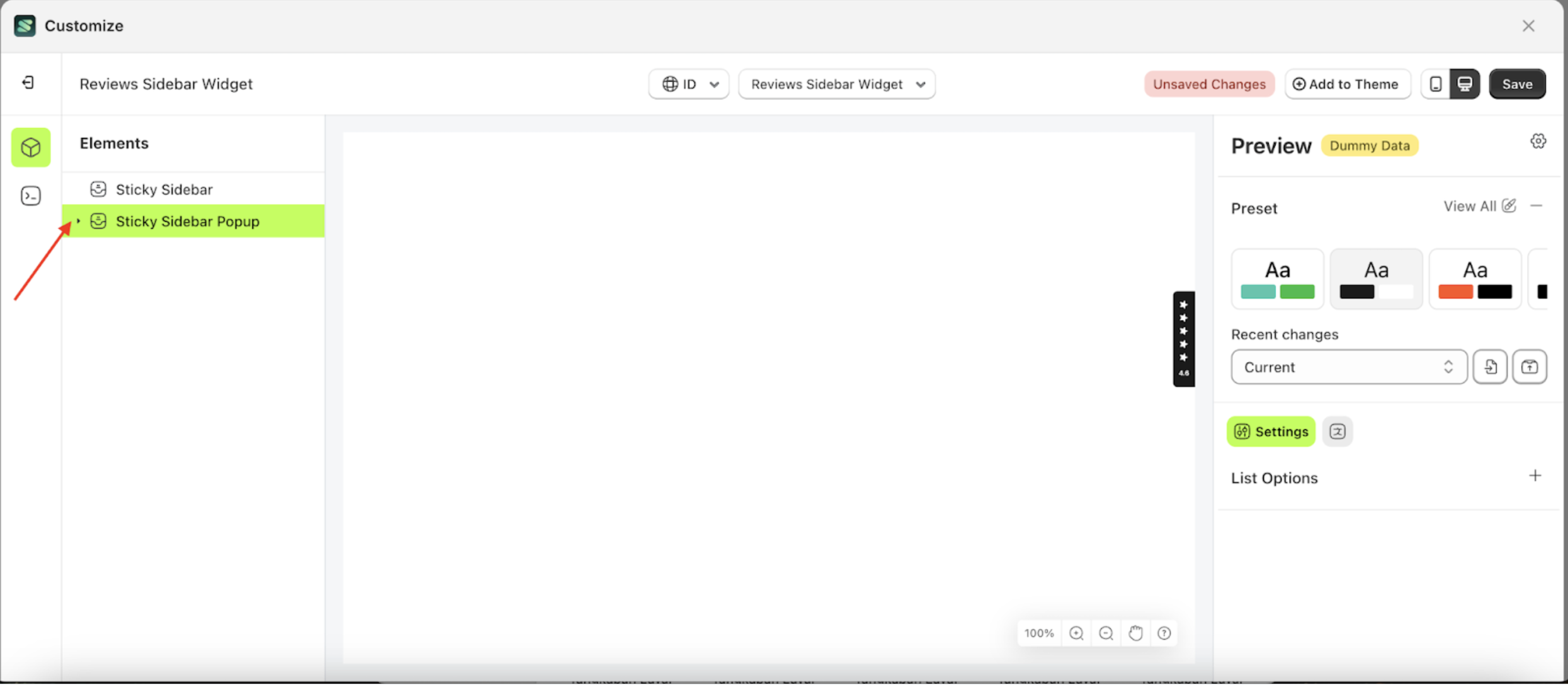
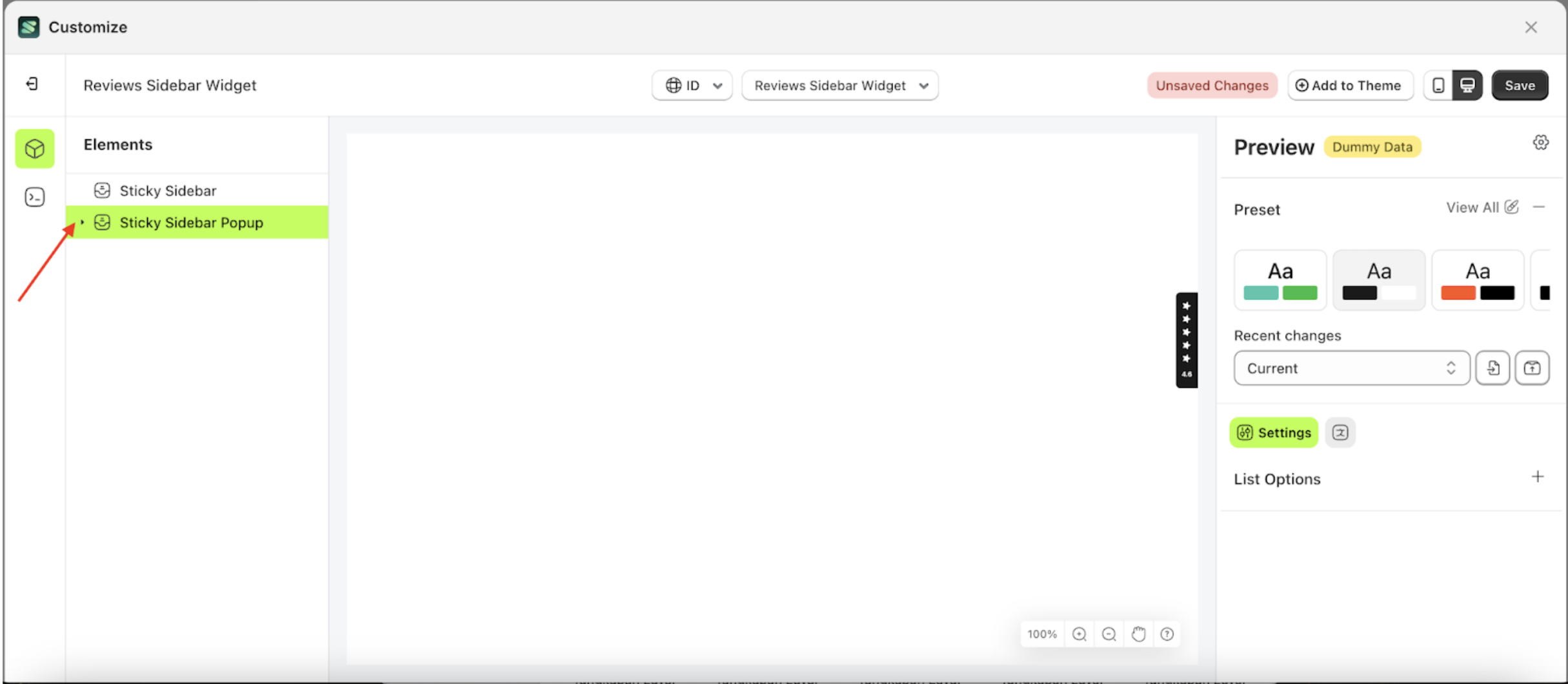
- Select the Sticky Sidebar Pop up element on the left, then click the icon marked with a red arrow to open the menu within that item.
- Once the menu is open, select the Summary Bar element on the left, then click the Settings tab and click the icon marked with a red arrow.
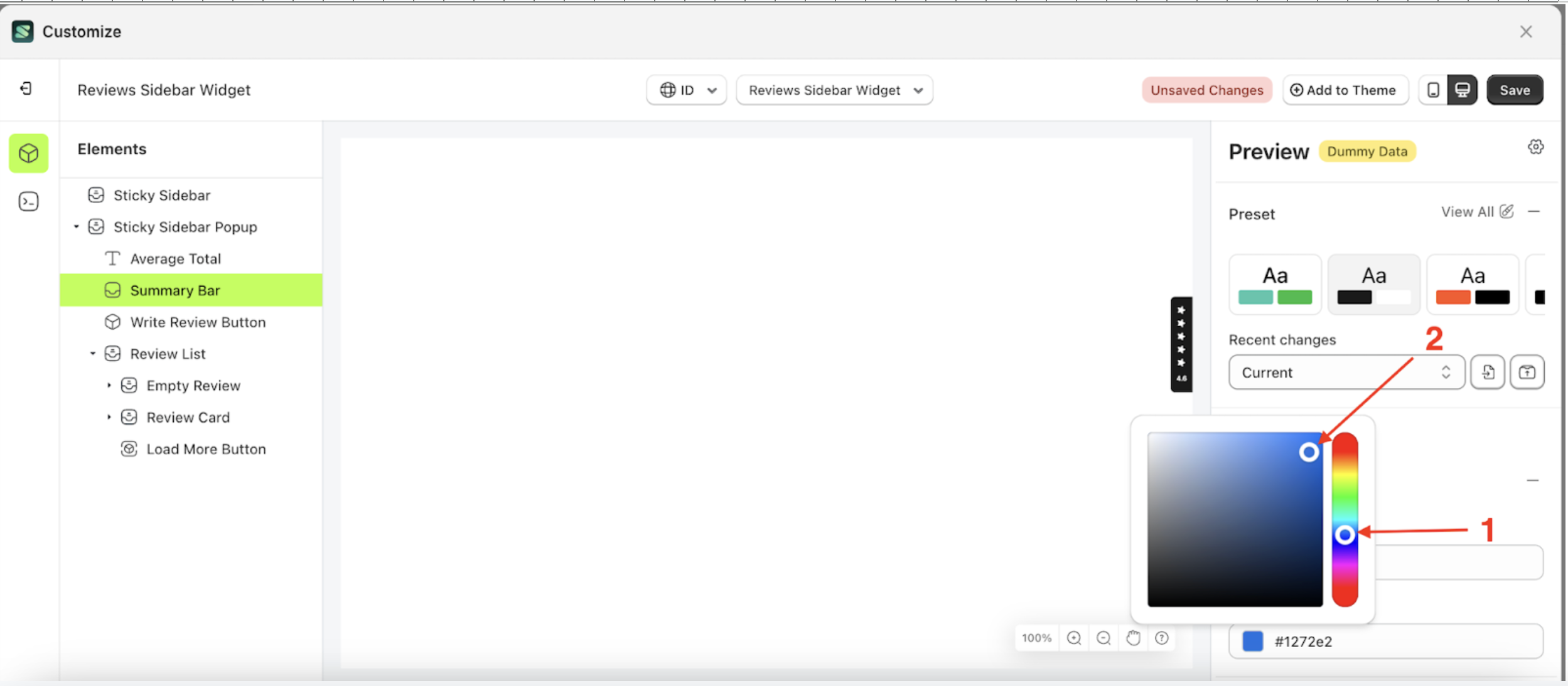
- Click the Color Palette on the right side, which is also marked with a red arrow.
- The Color Palette will appear. Click the right side of the palette where the red arrow and number 1 are indicated, then click the right side again where the red arrow and number 2 are marked.
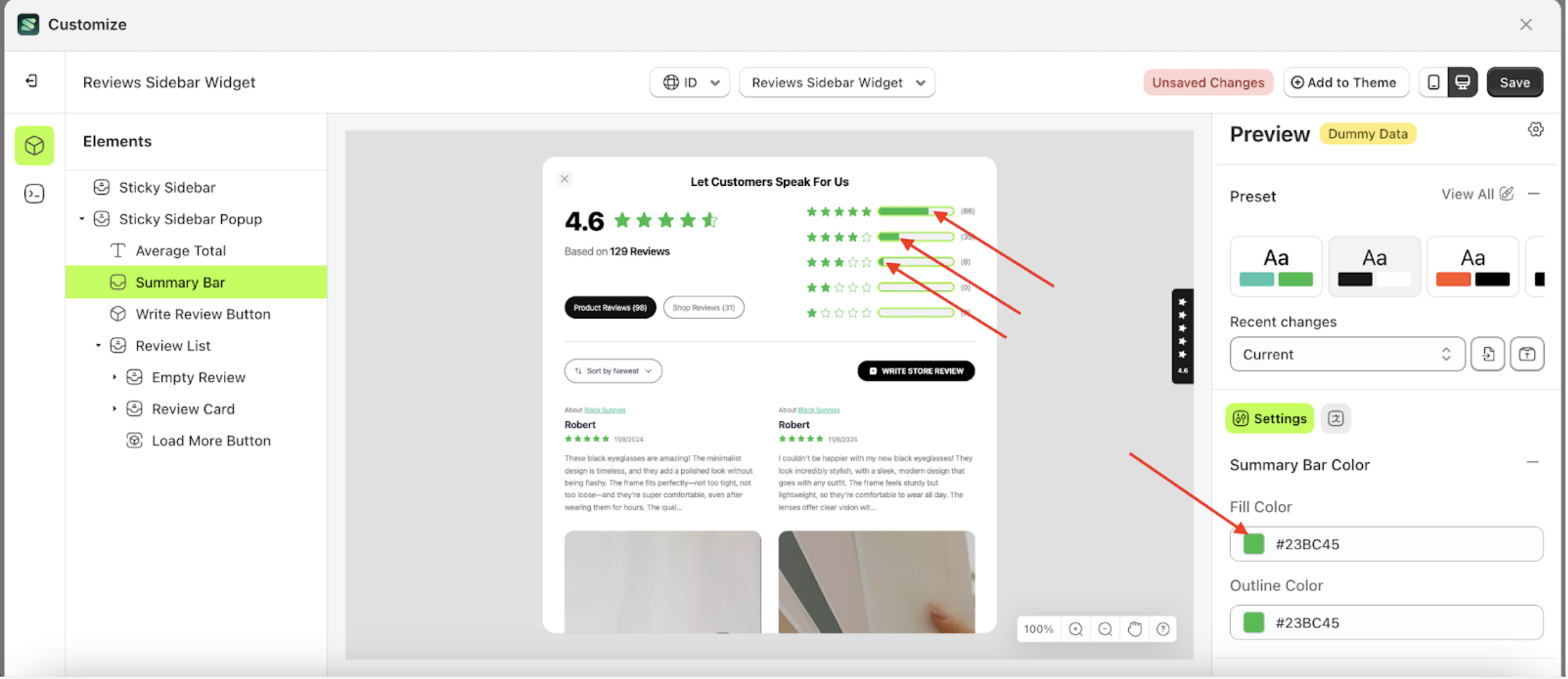
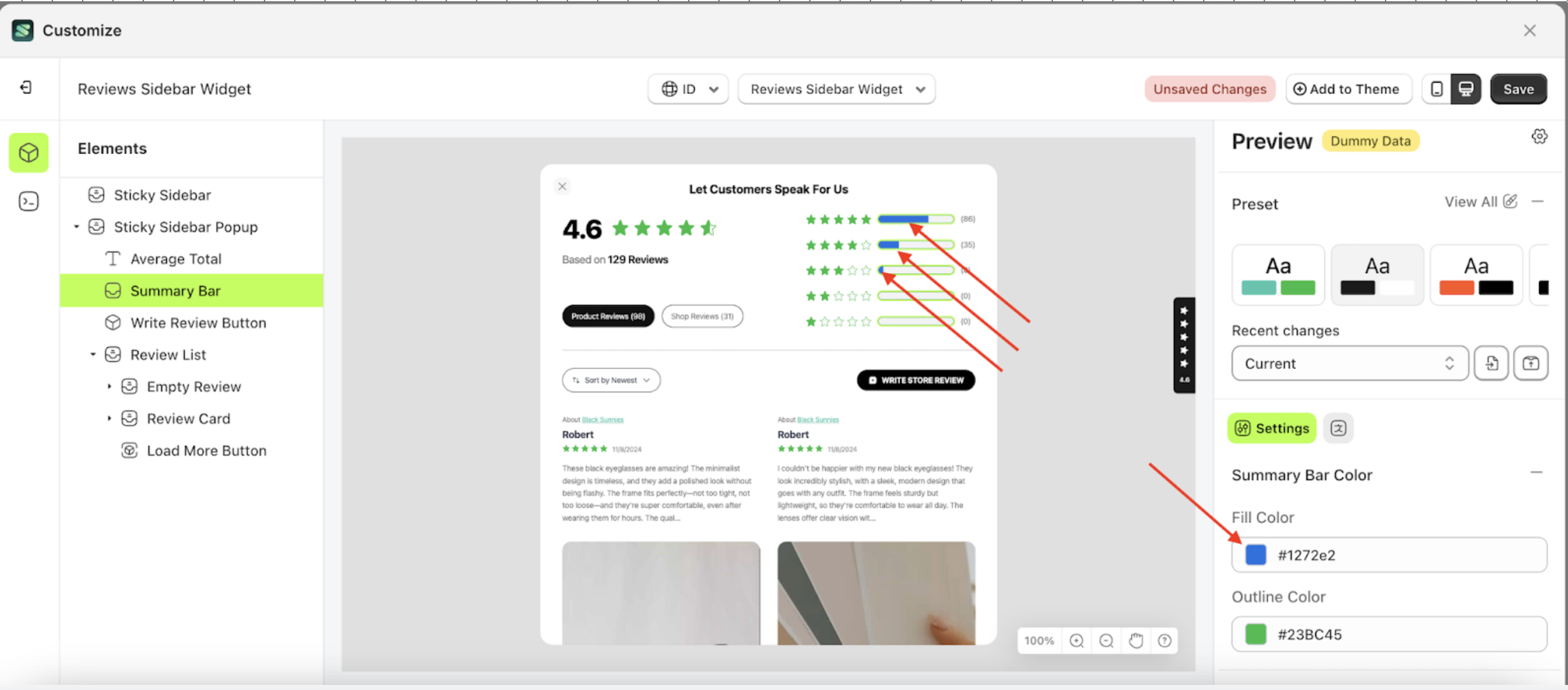
- To see the changes in this setting on the element, click the Sticky Sidebar element
- The review sidebar widget of the Summary Bar element will adjust accordingly.
- Example : Before Summary Bar change settings
- Example : After Summary Bar change settings
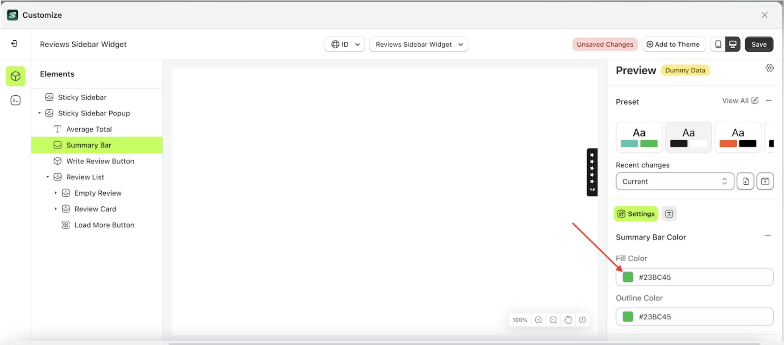
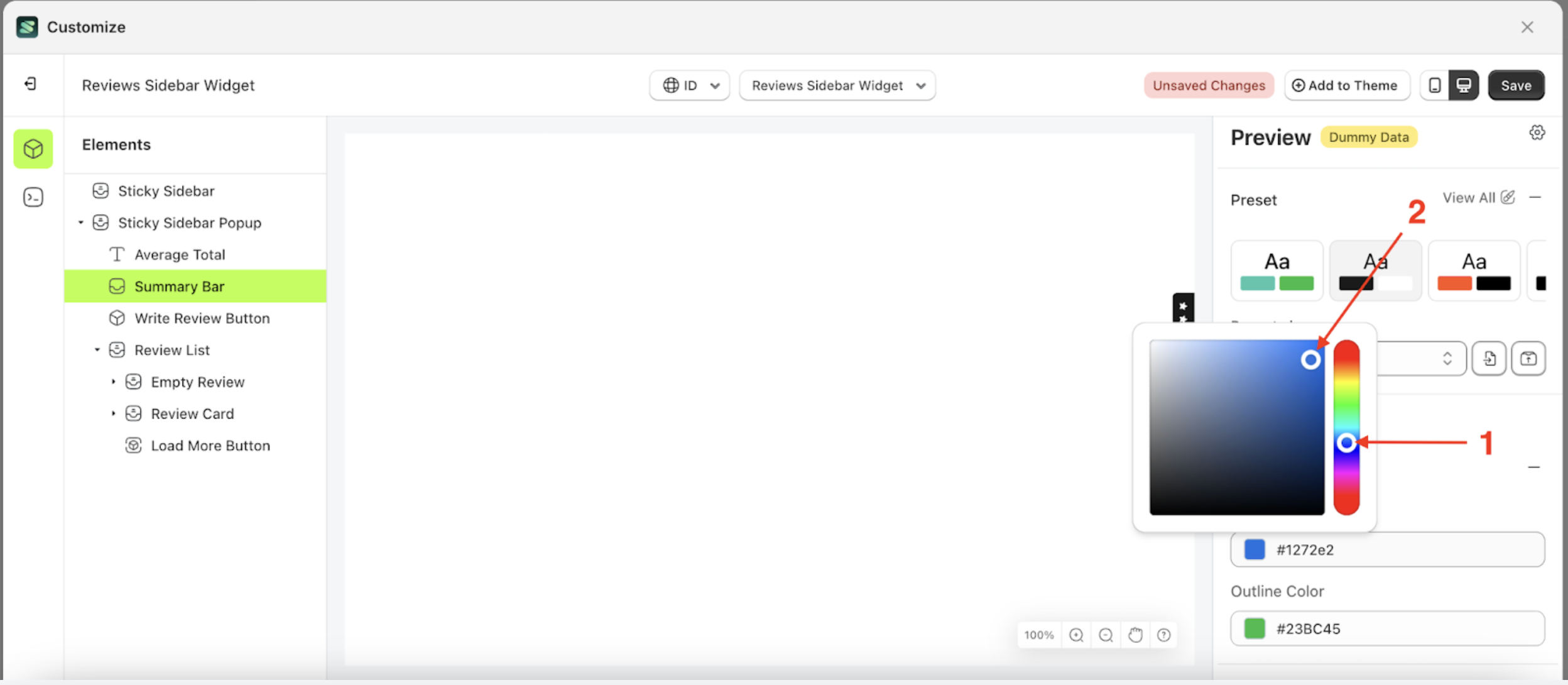

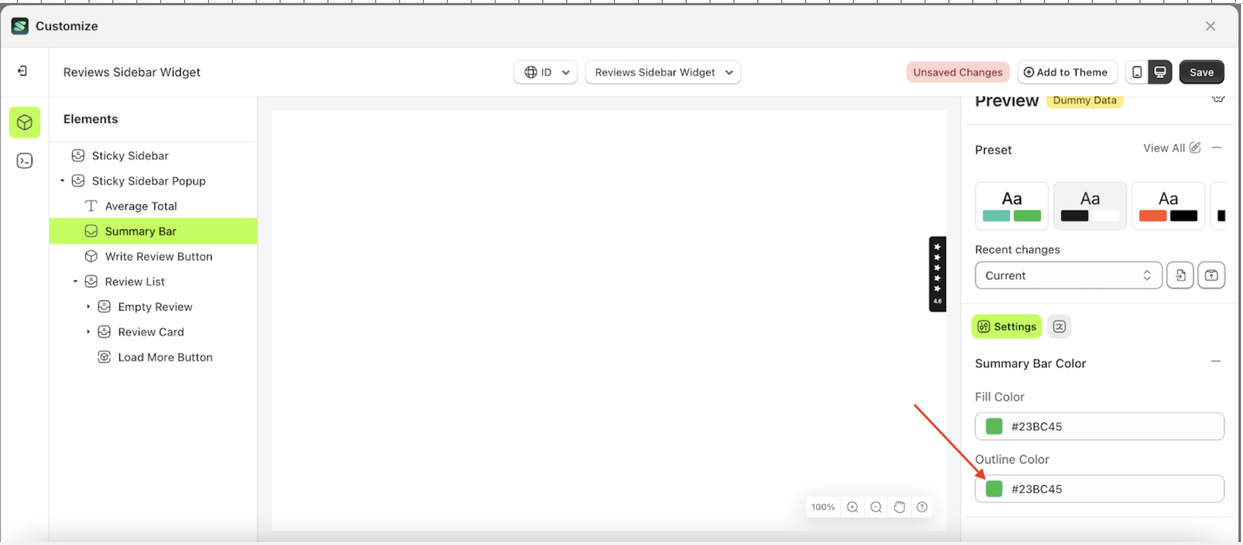
Outline Color
Fill Color is a setting designed to control the background color of the stars element.
Follow the steps below:
- Select the Sticky Sidebar Pop up element on the left, then click the icon marked with a red arrow to open the menu within that item.
- Once the menu is open, select the Summary Bar element on the left, then click the Settings tab and click the icon marked with a red arrow.
- Click the Color Palette on the right side, which is also marked with a red arrow.
- The Color Palette will appear. Click the right side of the palette where the red arrow and number 1 are indicated, then click the right side again where the red arrow and number 2 are marked.
- To see the changes in this setting on the element, click the Sticky Sidebar element
- The review sidebar widget of the Summary Bar element will adjust accordingly.
- Example : Before Summary Bar change settings
- Example : After Summary Bar change settings

Publish Option
Available settings:
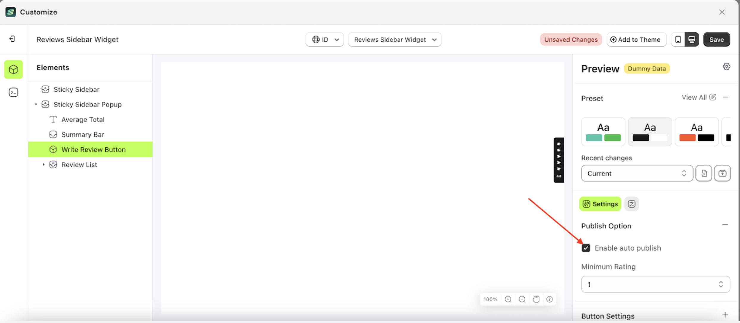
Enable Auto Publish
The Enable Auto Publish feature manages the settings for displaying customer ratings. When this option is enabled, ratings submitted by customers will be published immediately on the storefront. Conversely, if disabled, ratings will require manual approval before appearing.
This feature is closely related to the Minimum Rating setting. If Enable Auto Publish is turned on but a minimum rating is set, only reviews that meet or exceed the minimum rating will be published automatically. Reviews below the set threshold will not appear on the storefront.
Follow the steps below:
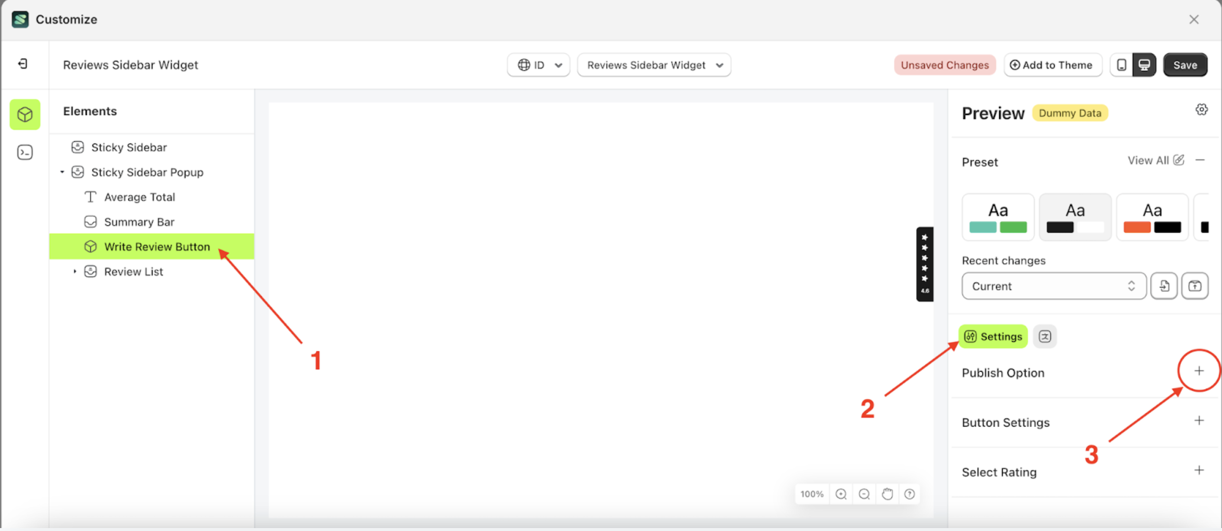
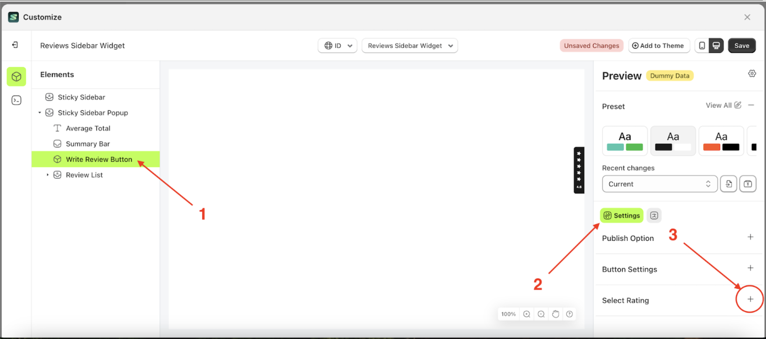
- Select the Review options element on the right, then click the Settings tab and click the icon marked with a red arrow.
- Once the menu is open, select the Add Review Button element on the left side, then click the icon on the right side, marked with a red arrow, to access the publish option settings.
- Enable the checkbox Minimum Rating
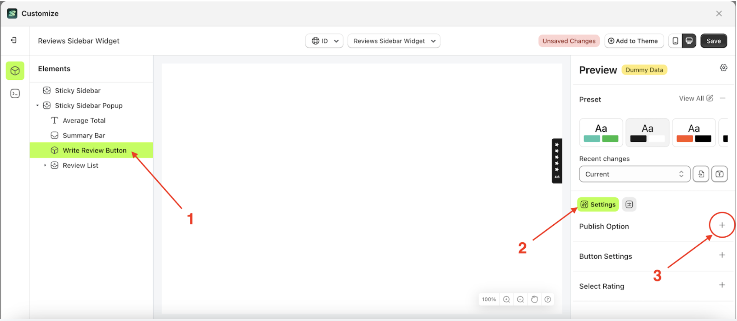
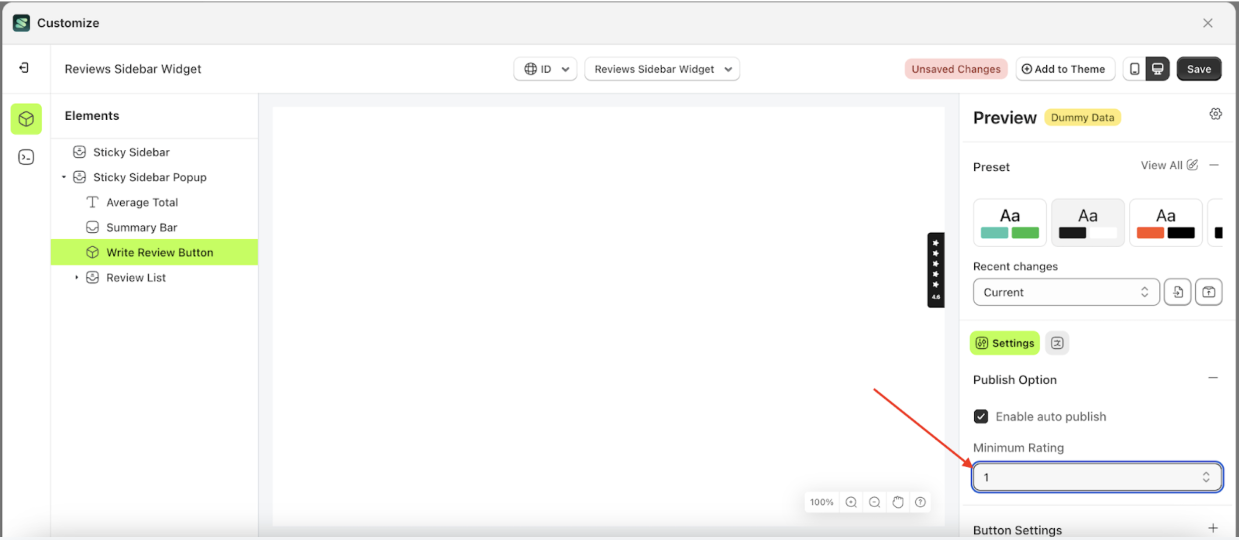
Minimum Rating
This feature controls whether the submitted rating is displayed or not. If a customer's rating is lower than the Minimum Rating setting, it will not be shown on the storefront. Conversely, ratings that meet or exceed the minimum rating will be displayed. However, Enable Auto Publish must be activated for this feature to work.
Follow the steps below:
- Select the Review options element on the right, then click the Settings tab and click the icon marked with a red arrow.
- Once the menu is open, select the Add Add Review Button element on the left side, then click the icon on the right side, marked with a red arrow, to access the publish option settings.
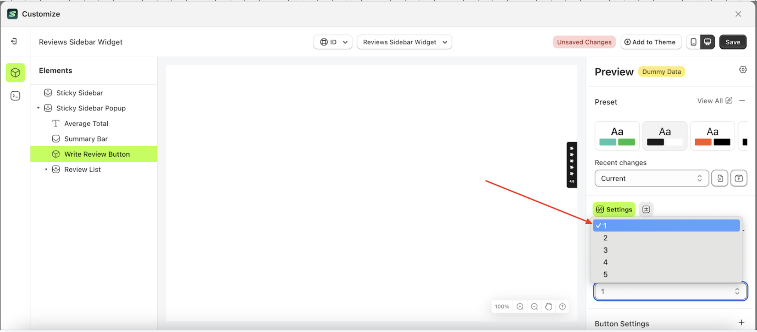
- Click the area marked with a red arrow to open the Minimum Rating list.
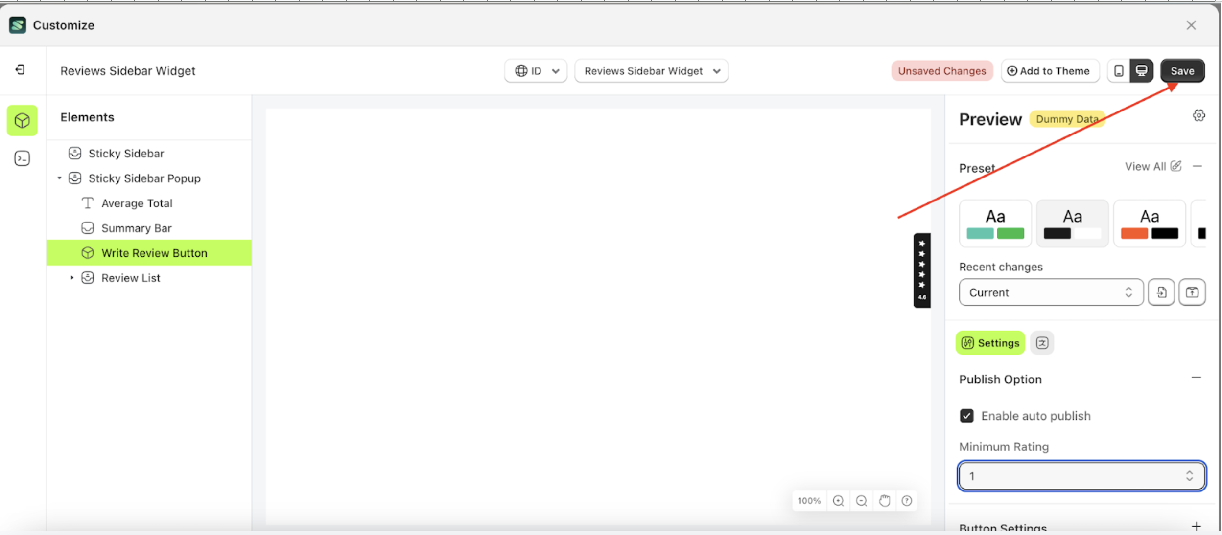
- Select your desired Minimum Rating. For example, choose 1 as the Minimum Rating.
- Click the Save button to apply the changes and update the storefront.

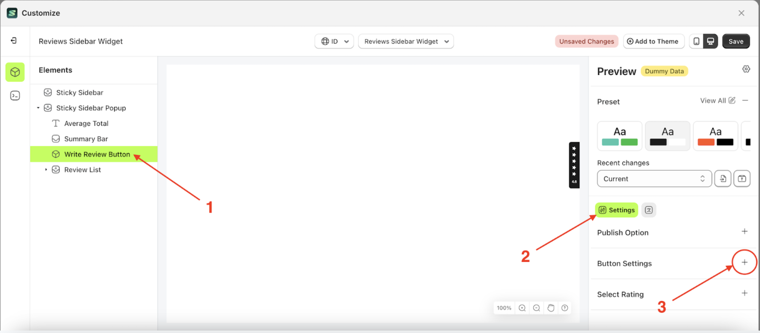
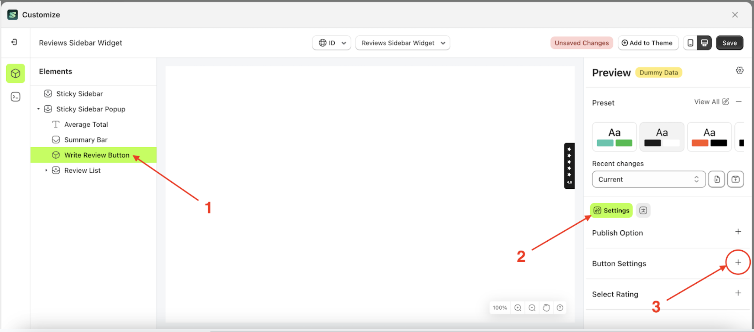
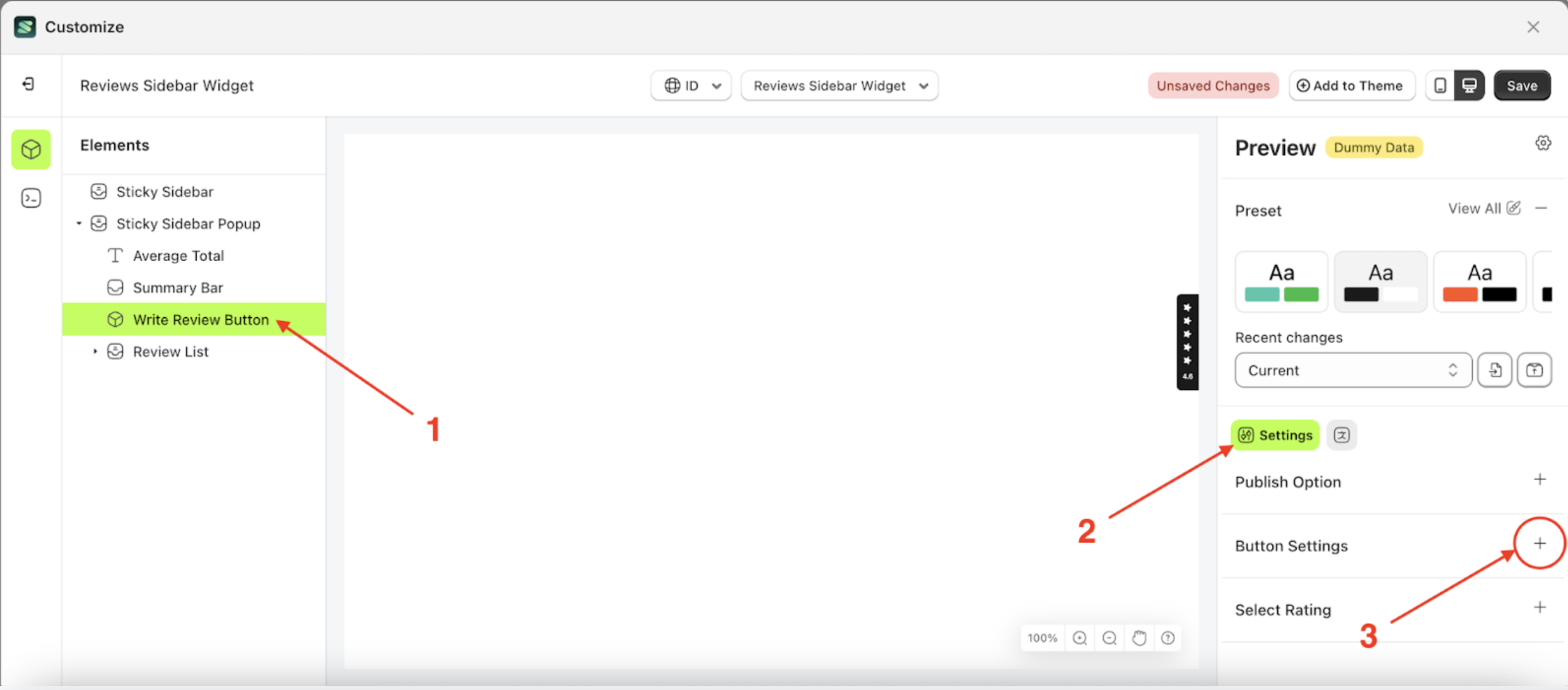
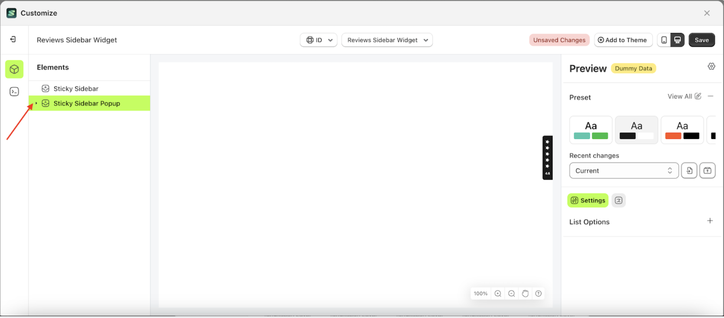
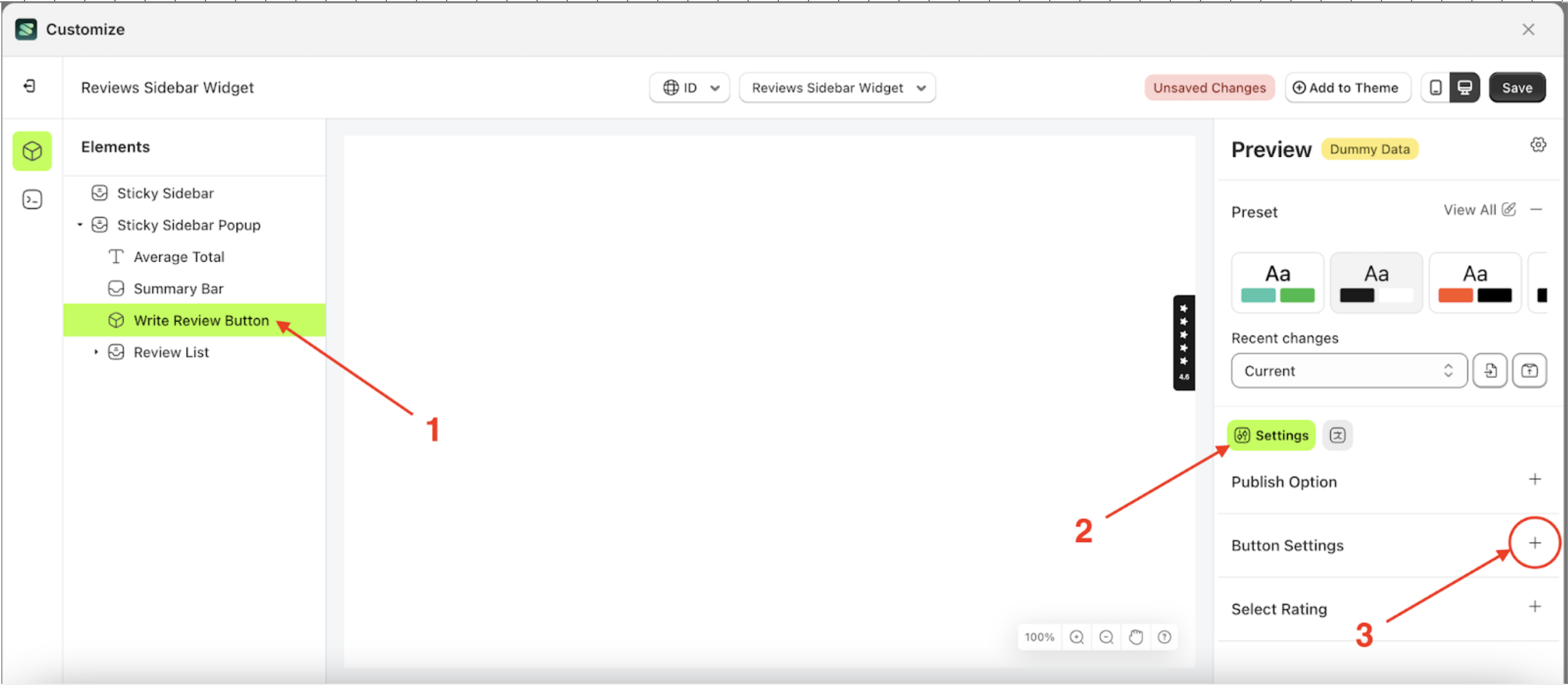
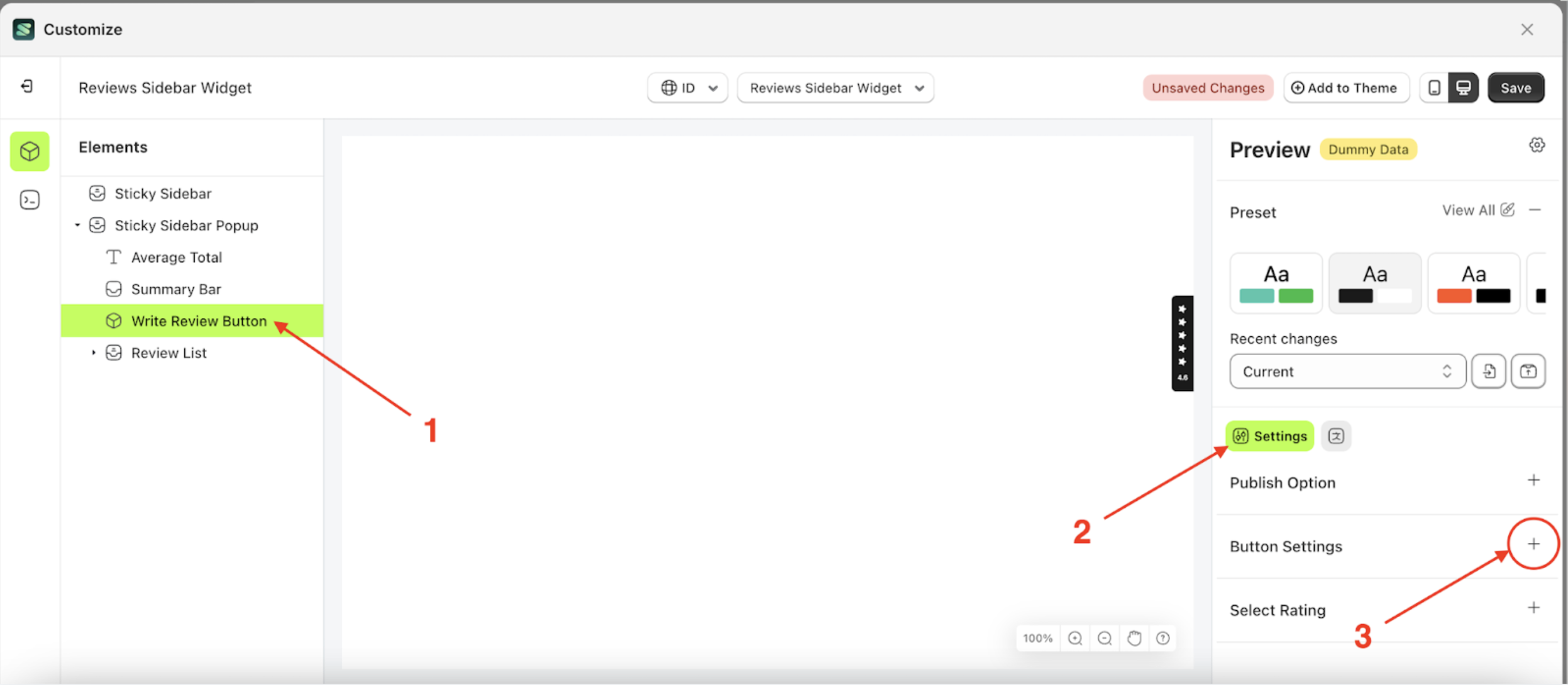
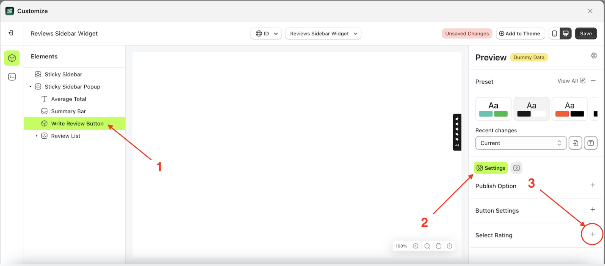
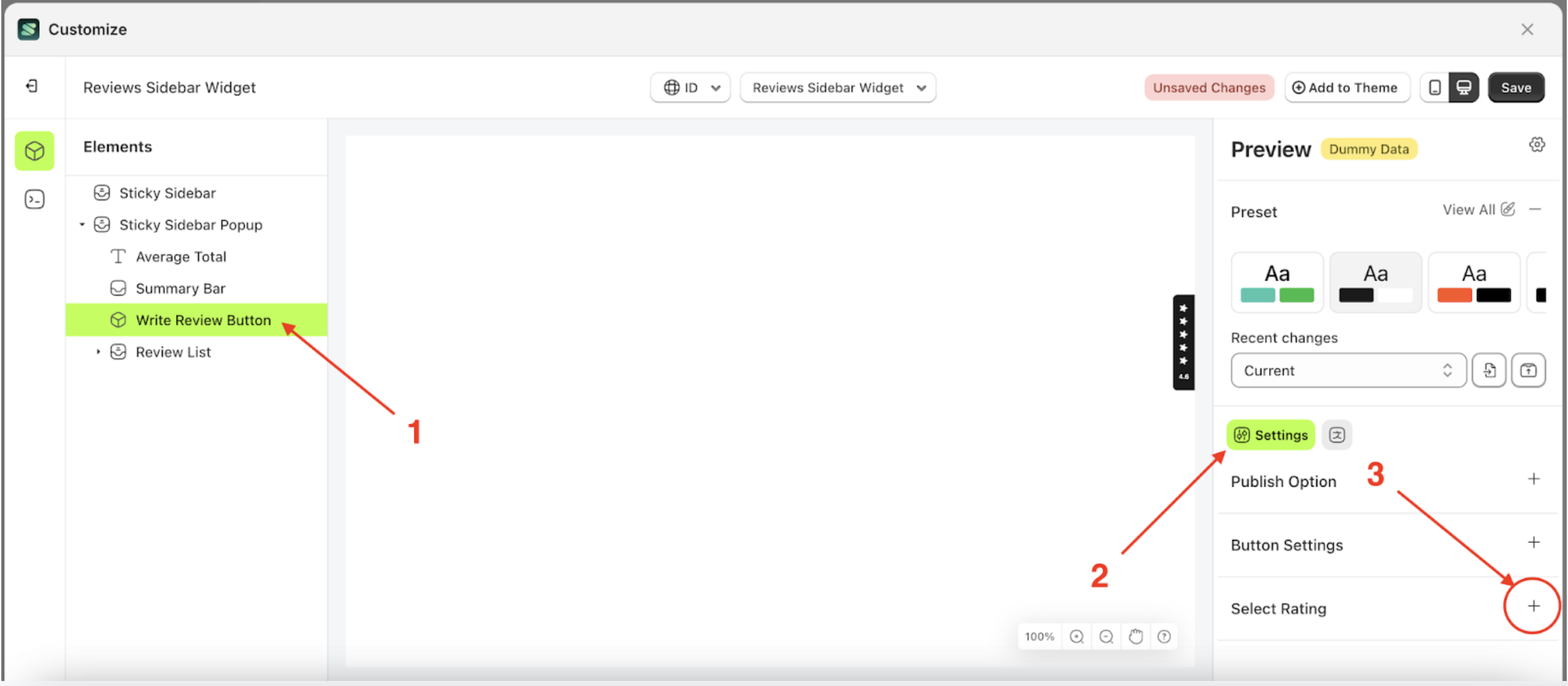
Button Settings
Available settings:
Button ColorText ColorOutline ColorPadding TopPadding RightPadding BottomPadding LeftBorder RadiusFont SizeFont WeightText Transform
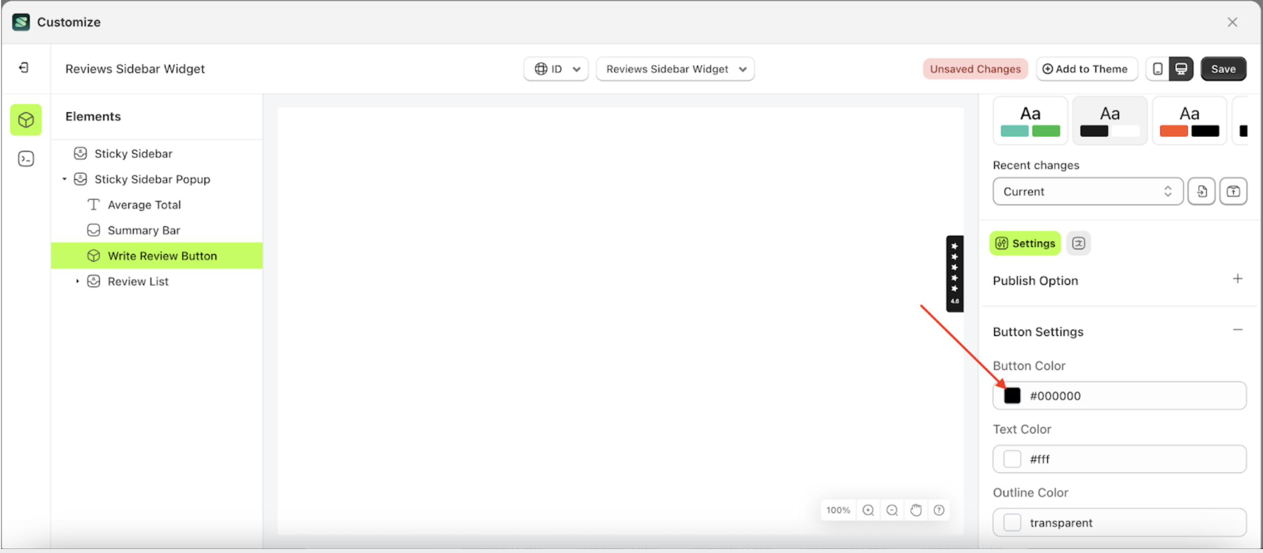
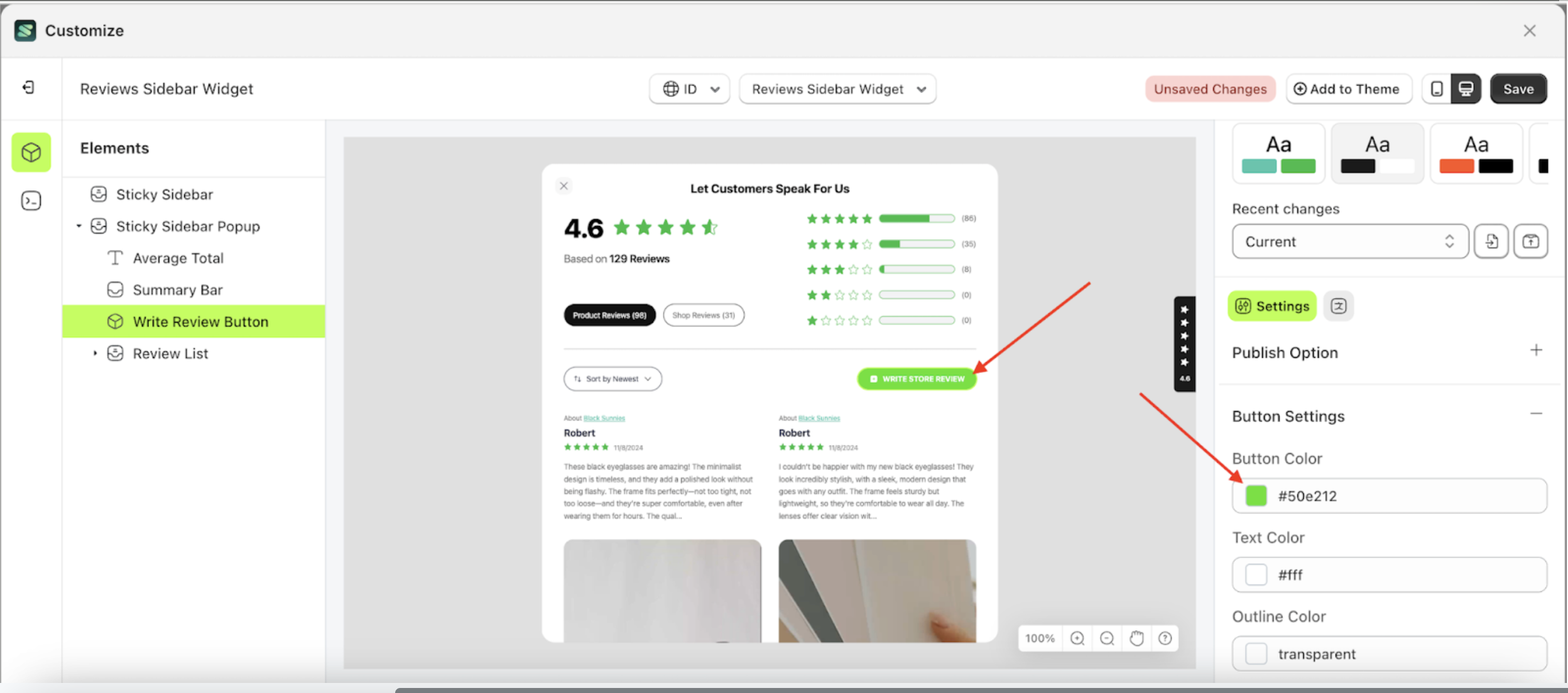
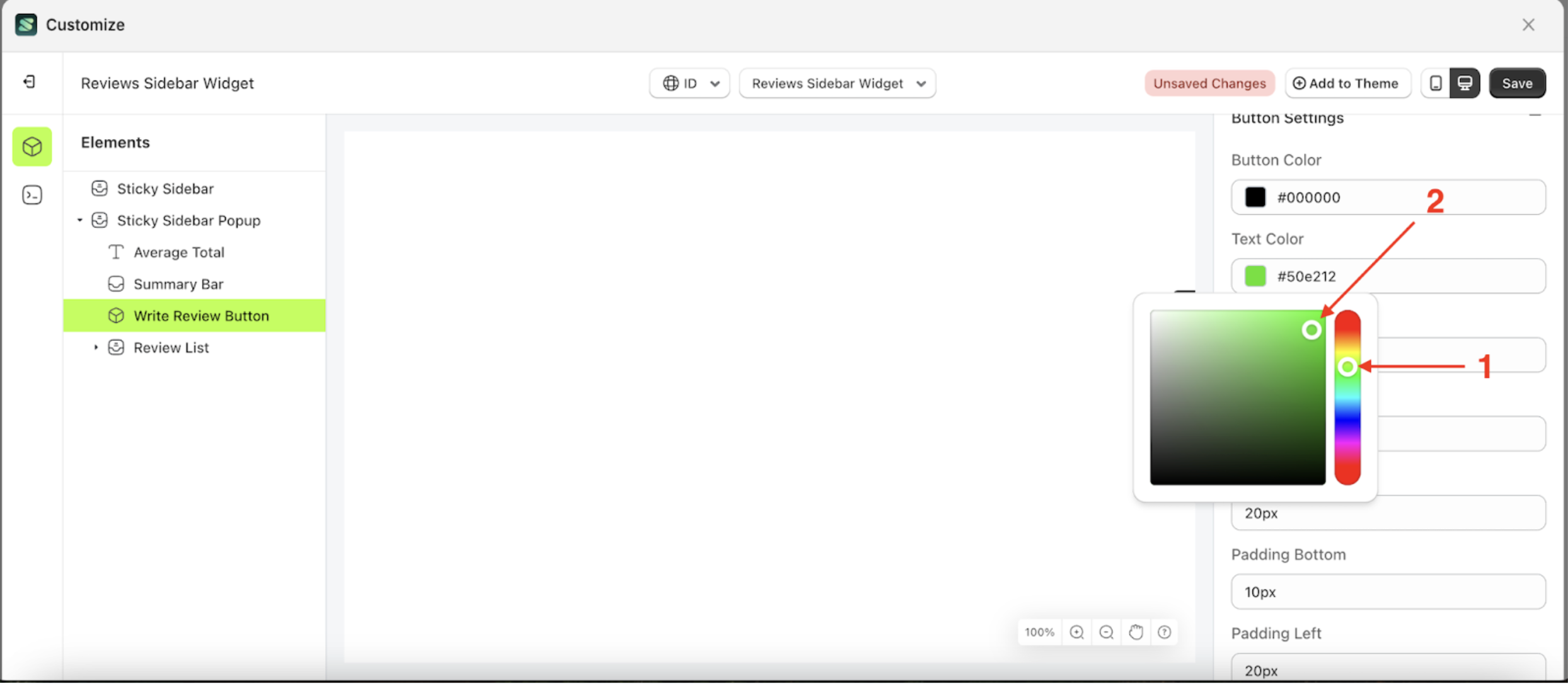
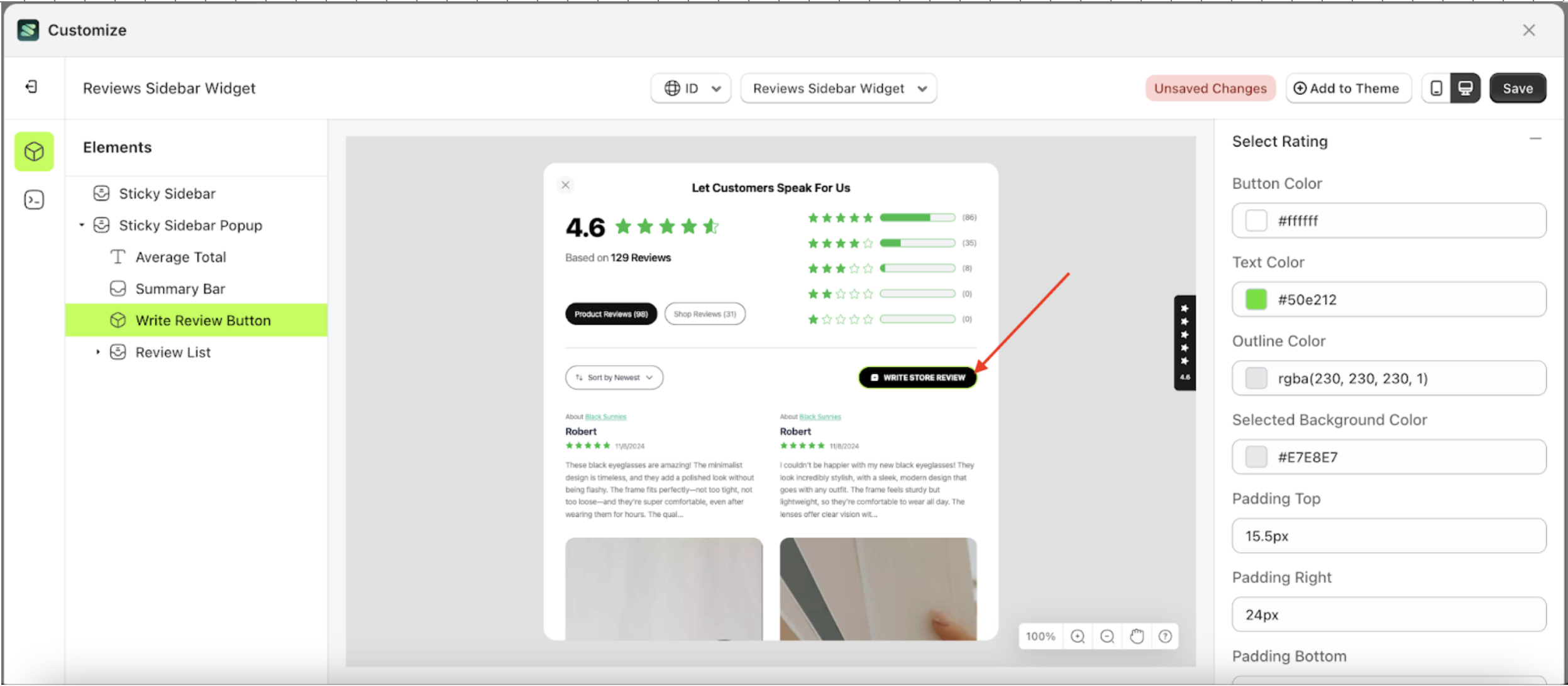
Button Color
This feature is designed to customize the button color of the button settings
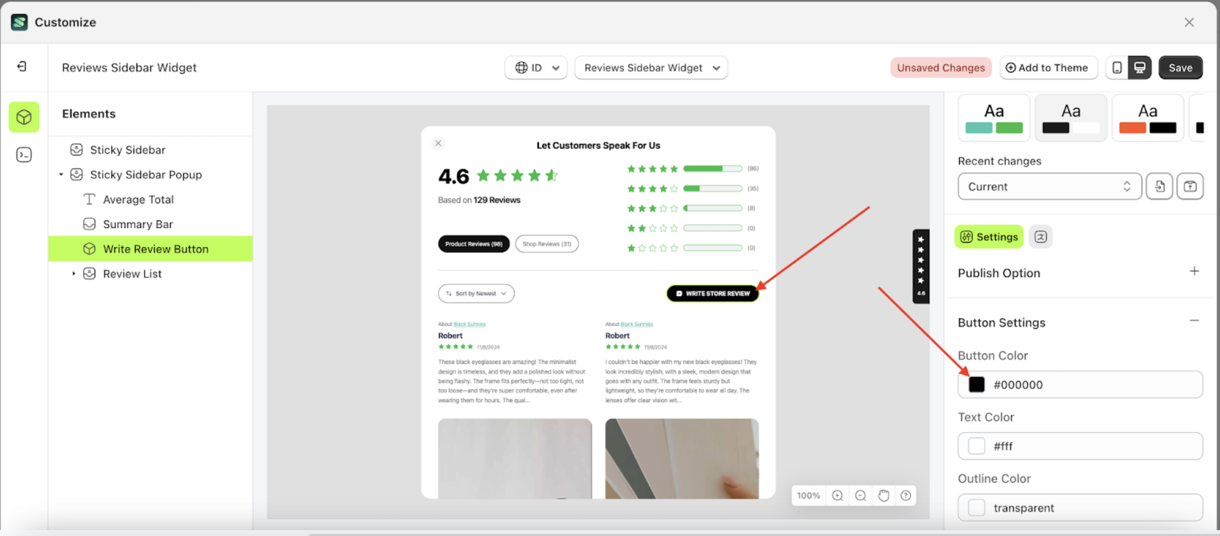
Follow the steps below:
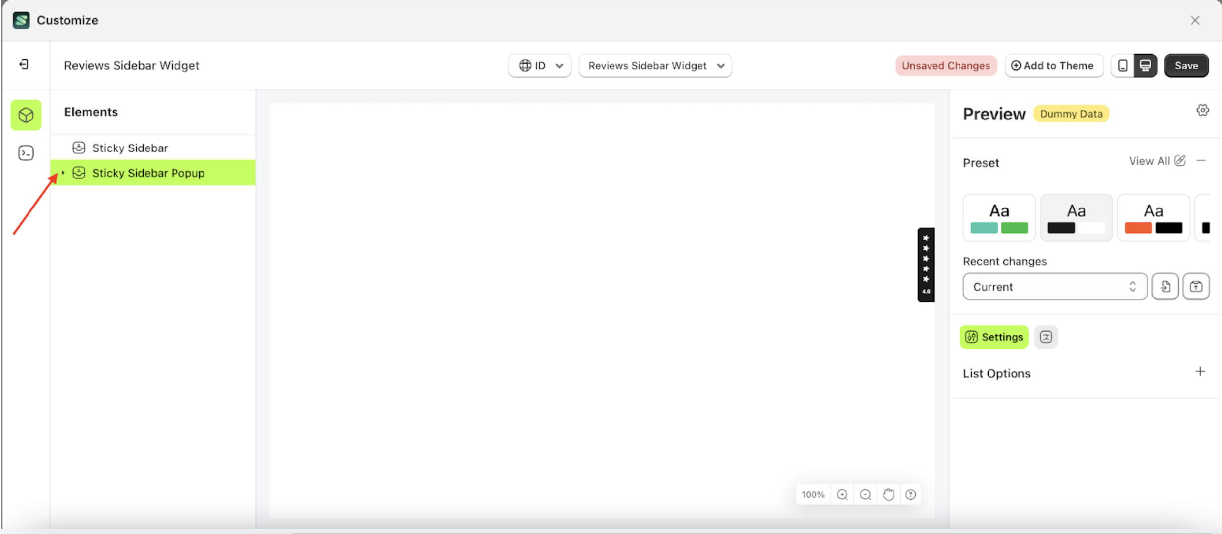
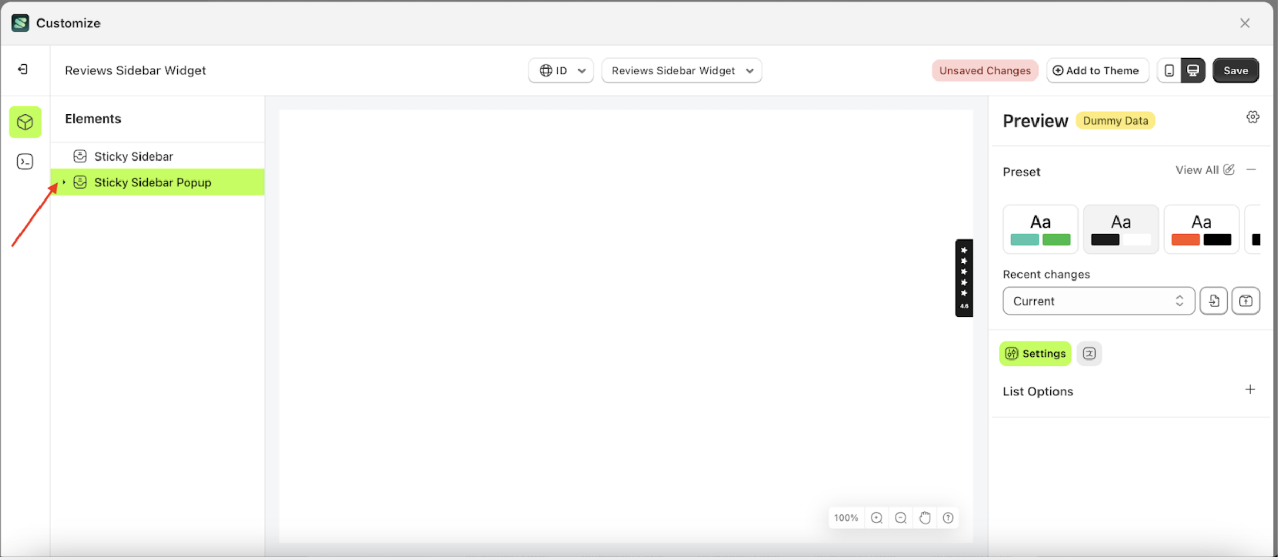
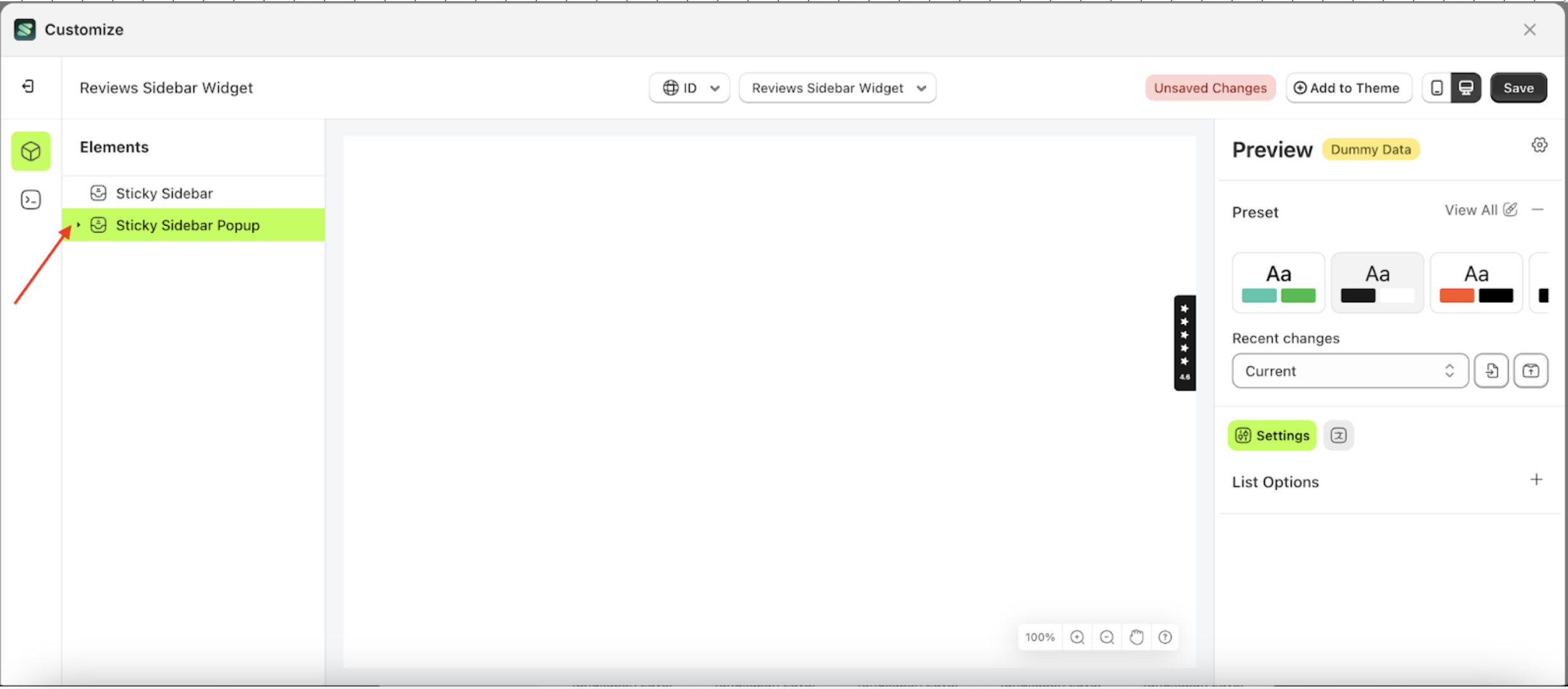
- Select the Sticky Sidebar Popup element on the left, then click the icon marked with a red arrow to open the menu within that item.
- Once the menu is open, select the Write Review Button element on the left, then click the Settings tab and click the icon marked with a red arrow.
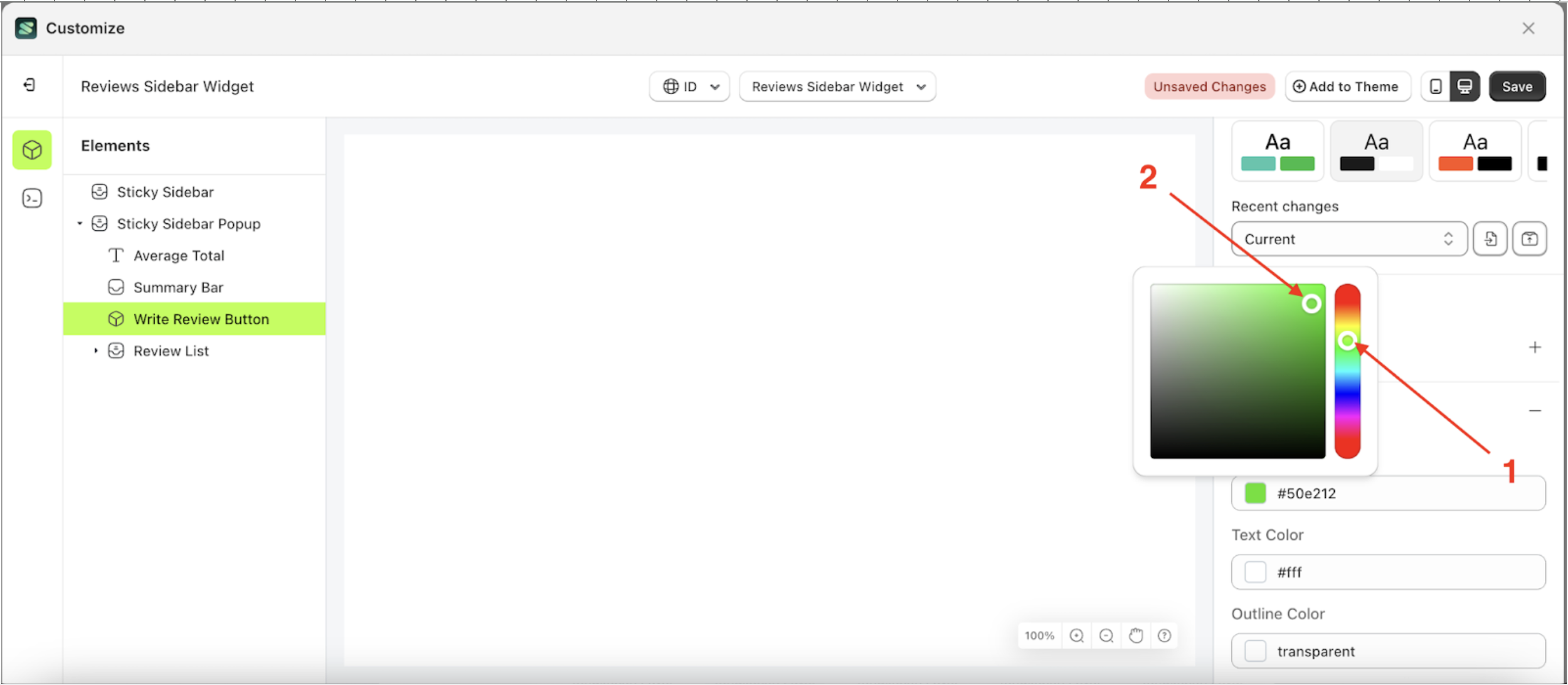
- Click the Color Palette on the right side, which is also marked with a red arrow.
- The Color Palette will appear. Click the right side of the palette where the red arrow and number 1 are indicated, then click the right side again where the red arrow and number 2 are marked.
- To see the changes in this setting on the element, click the Sticky Sidebar element
- The review sidebar widget of the Write Review Button element will adjust accordingly.
- Example : Before Write Review Button change settings
- Example : After Write Review Button change settings


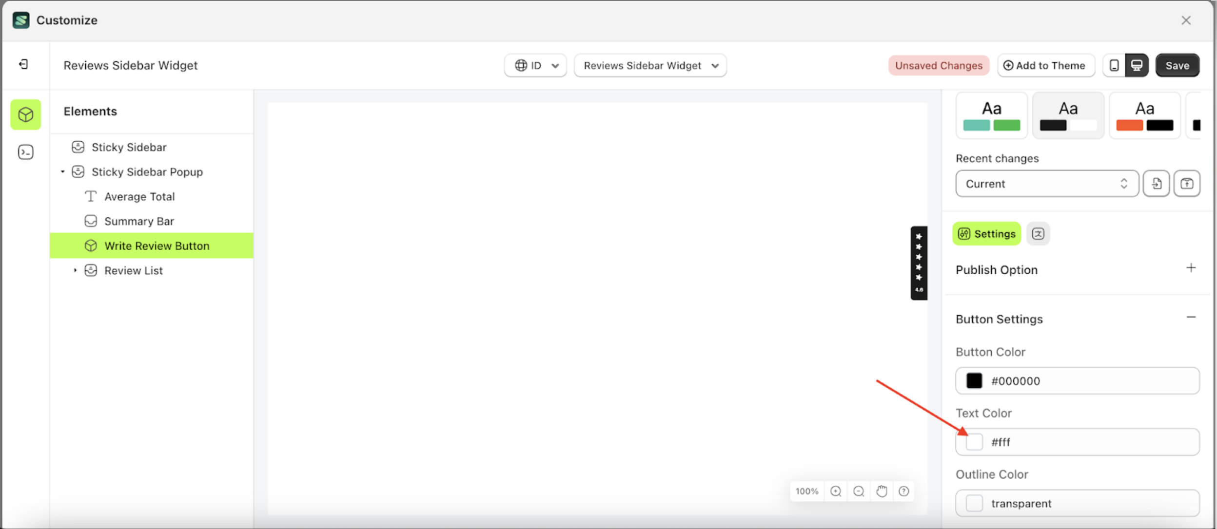
Text Color
This feature is designed to customize the text color of the button settings
Follow the steps below:
- Select the Sticky Sidebar Popup element on the left, then click the icon marked with a red arrow to open the menu within that item.
- Once the menu is open, select the Write Review Button element on the left, then click the Settings tab and click the icon marked with a red arrow.
- Click the Color Palette on the right side, which is also marked with a red arrow.
- The Color Palette will appear. Click the right side of the palette where the red arrow and number 1 are indicated, then click the right side again where the red arrow and number 2 are marked.
- To see the changes in this setting on the element, click the Sticky Sidebar element
- The review sidebar widget of the Write Review Button element will adjust accordingly.
- Example : Before Write Review Button change settings
- Example : After Write Review Button change settings


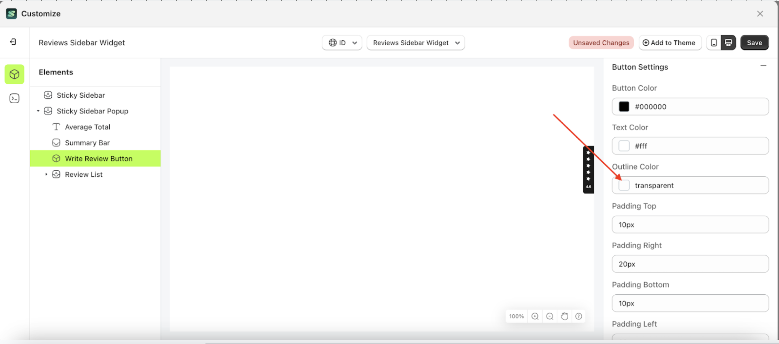
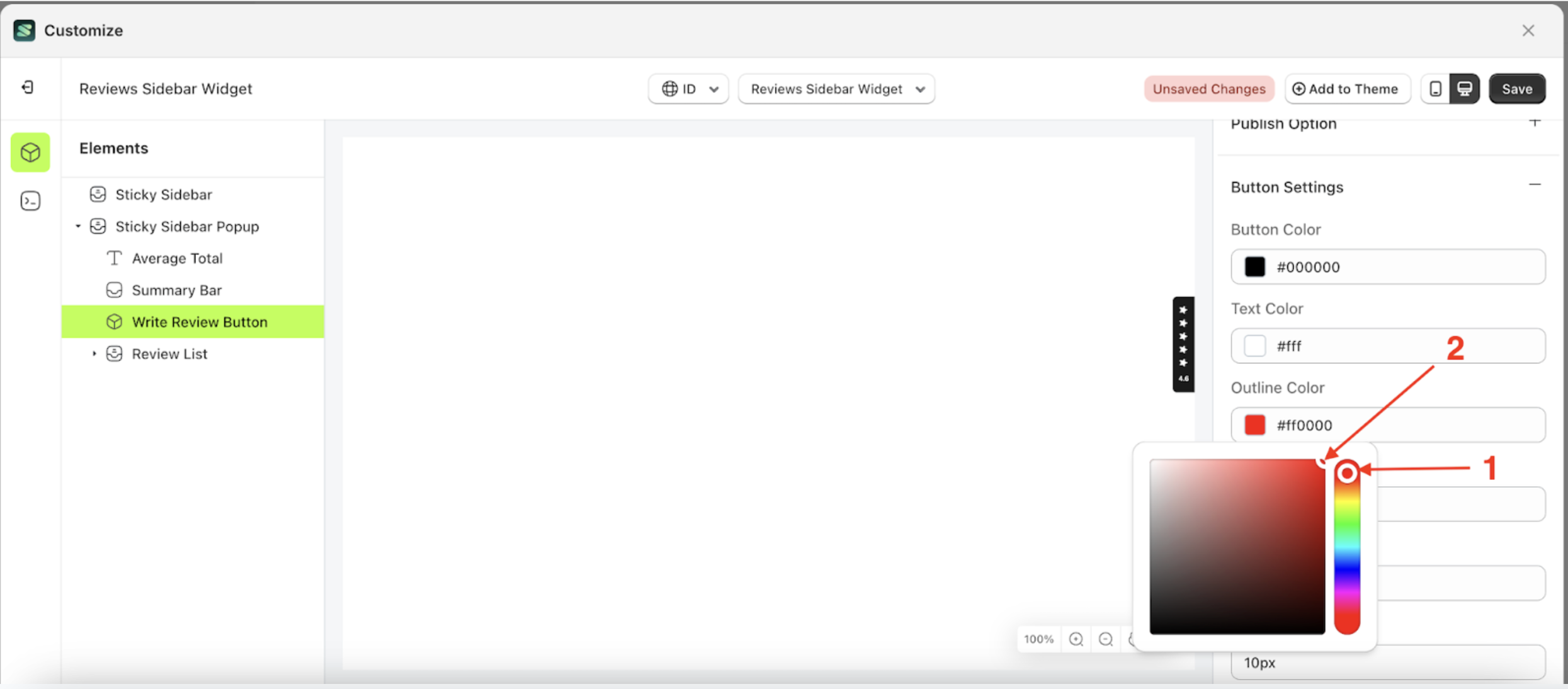
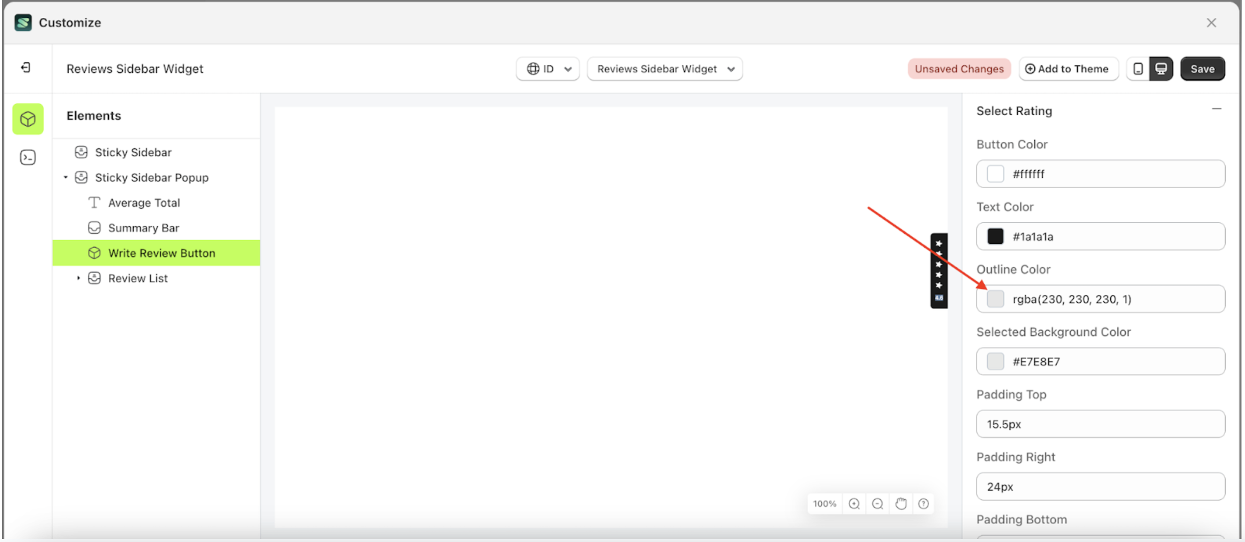
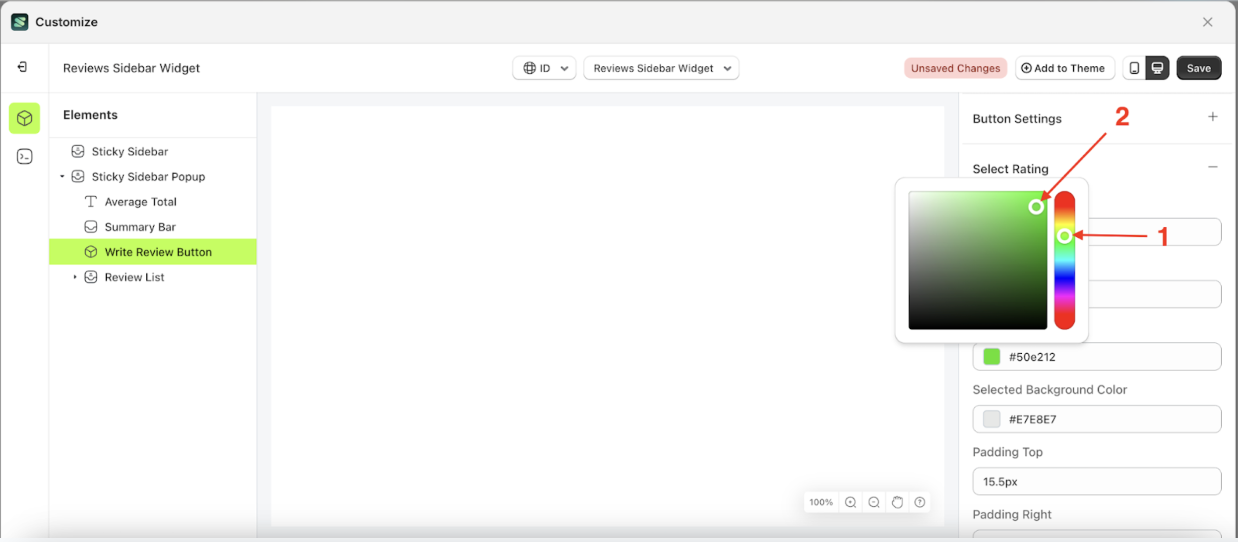
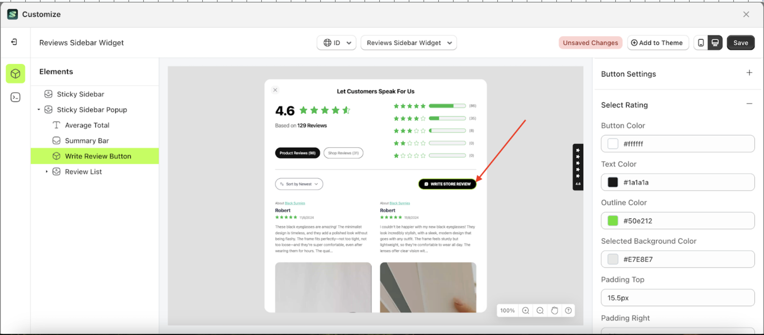
Outline Color
This feature is designed to customize the outline color of the button settings
Follow the steps below:
- Select the Sticky Sidebar Popup element on the left, then click the icon marked with a red arrow to open the menu within that item.
- Once the menu is open, select the Write Review Button element on the left, then click the Settings tab and click the icon marked with a red arrow.
- Click the Color Palette on the right side, which is also marked with a red arrow.
- The Color Palette will appear. Click the right side of the palette where the red arrow and number 1 are indicated, then click the right side again where the red arrow and number 2 are marked.
- To see the changes applied to the configured element, first, switch to another element to remove the active border effect.
- To see the changes in this setting on the element, click the Sticky Sidebar element
- The review sidebar widget of the Write Review Button element will adjust accordingly.
- Example : Before Write Review Button change settings
- Example : After Write Review Button change settings


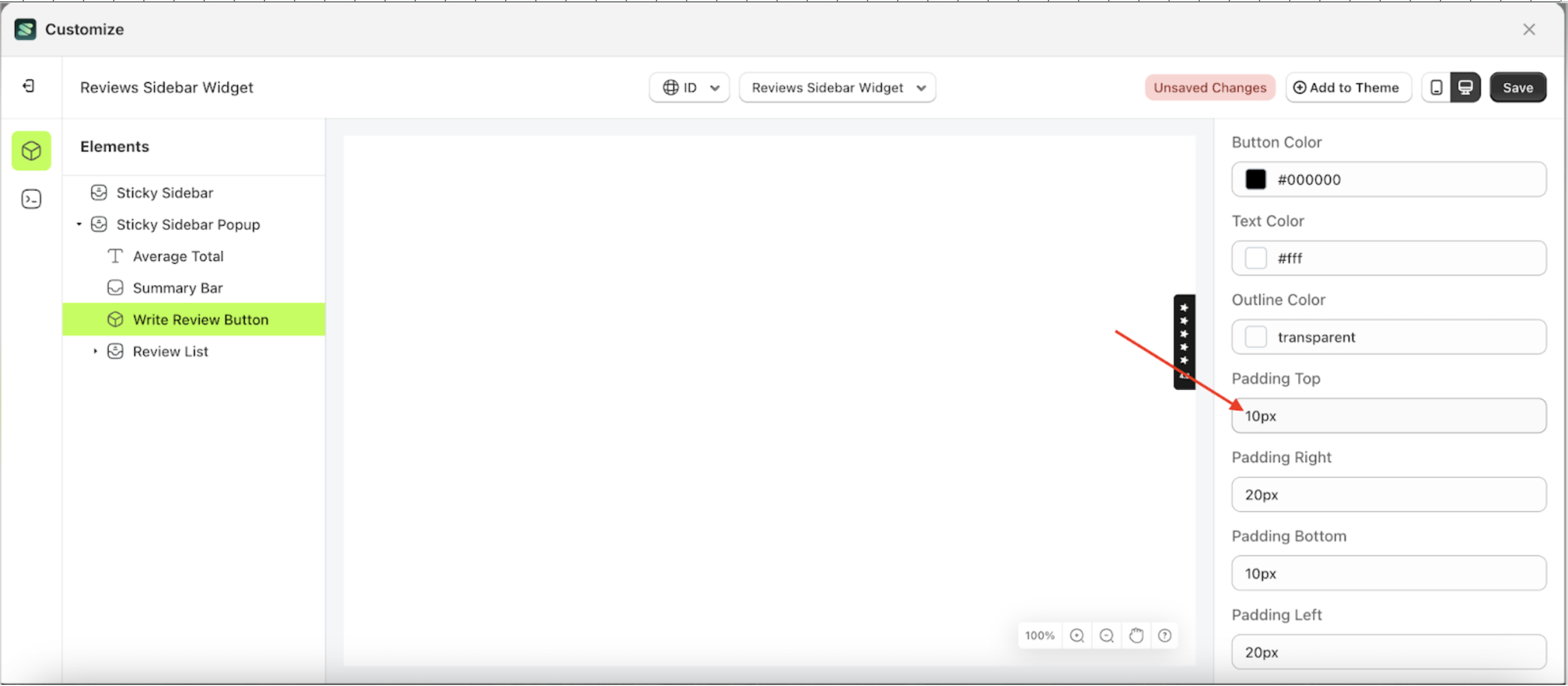
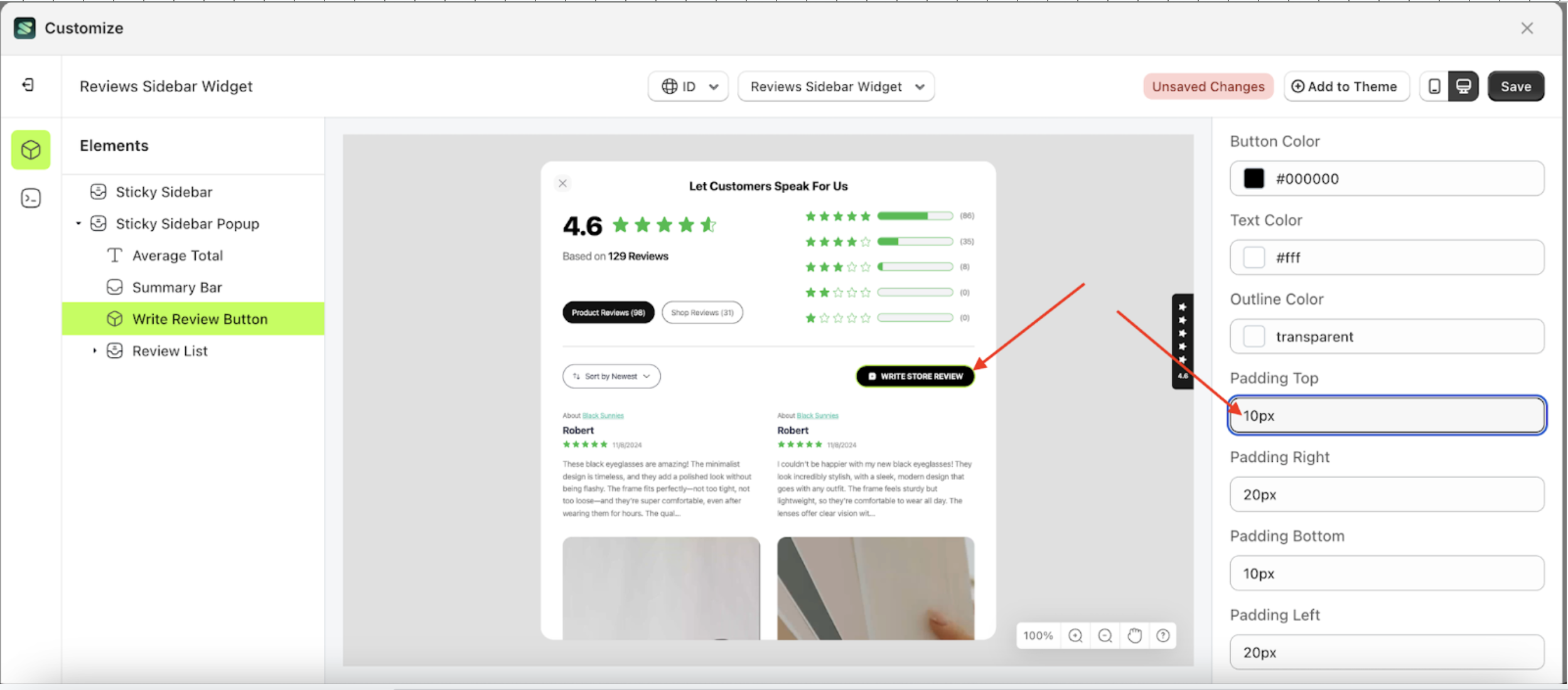
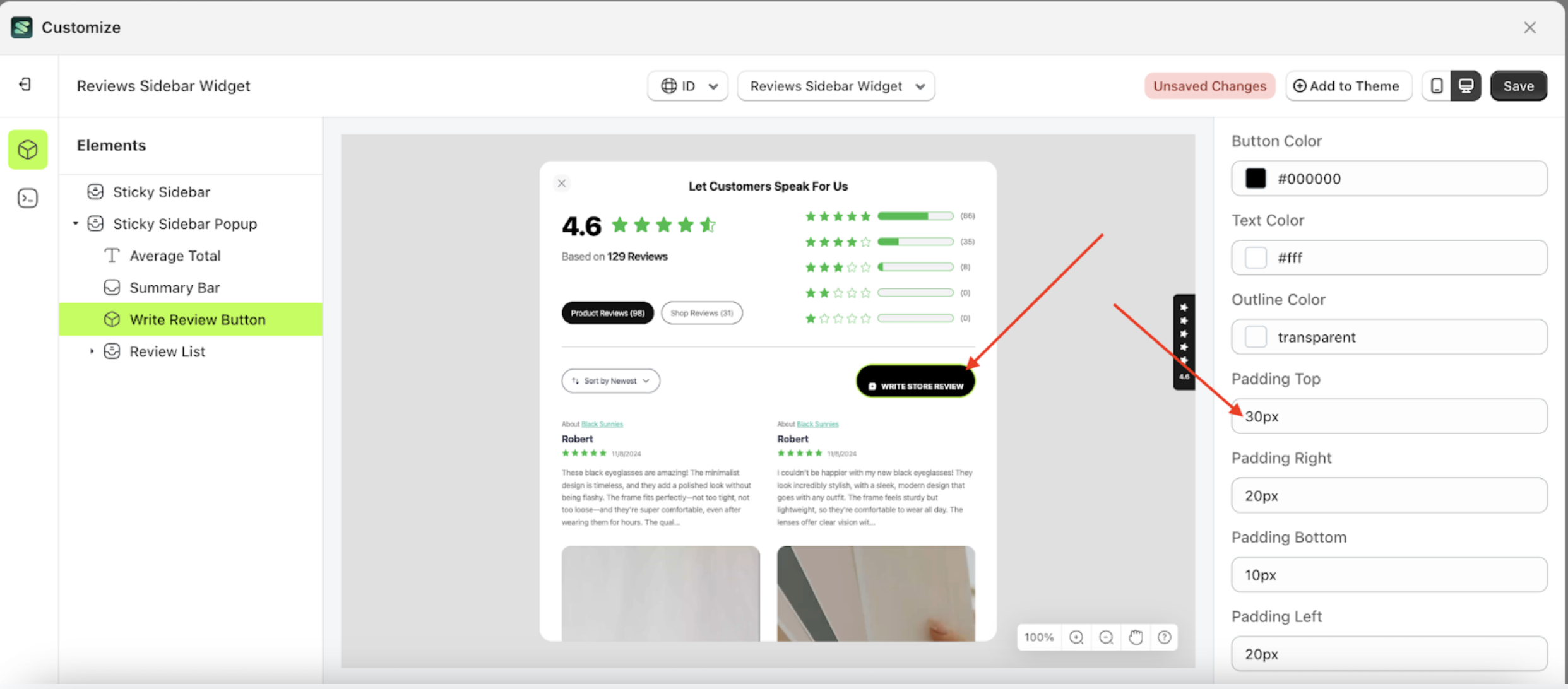
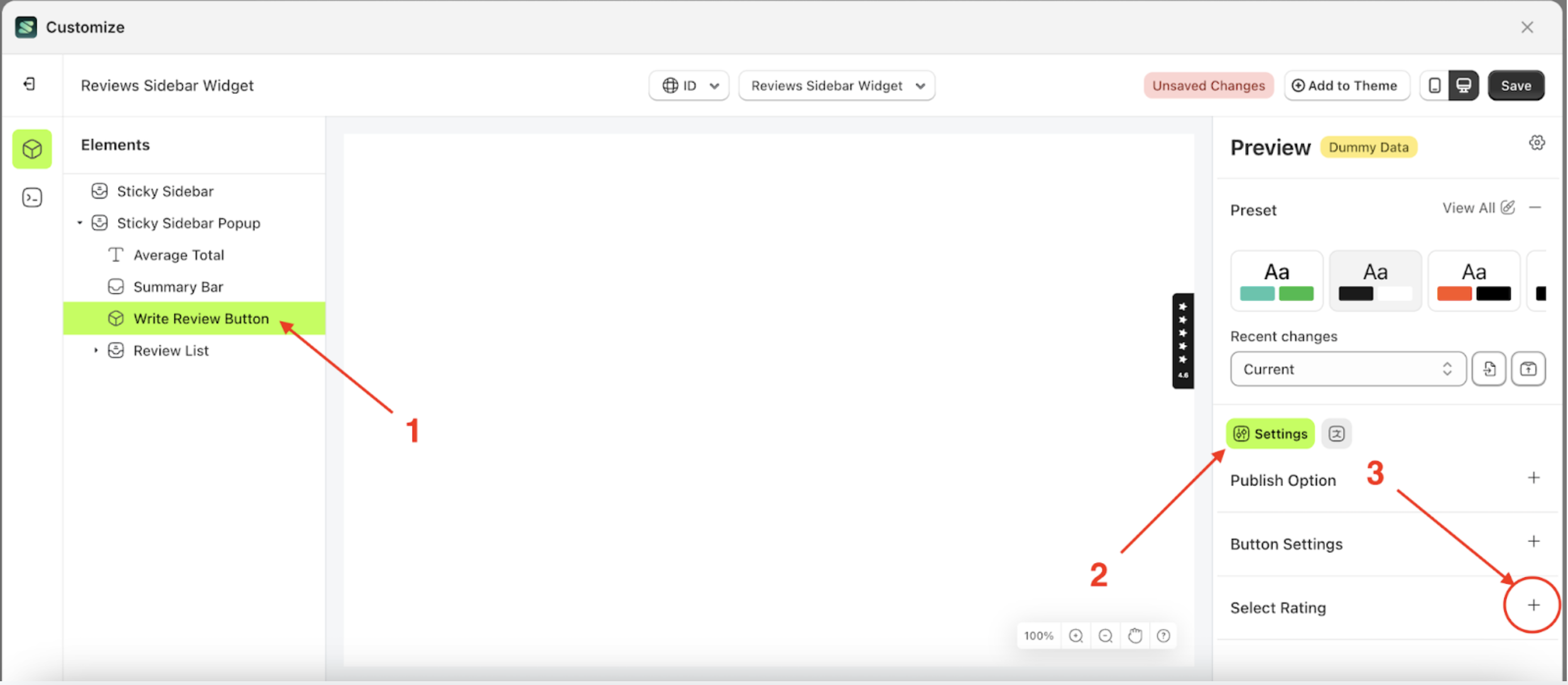
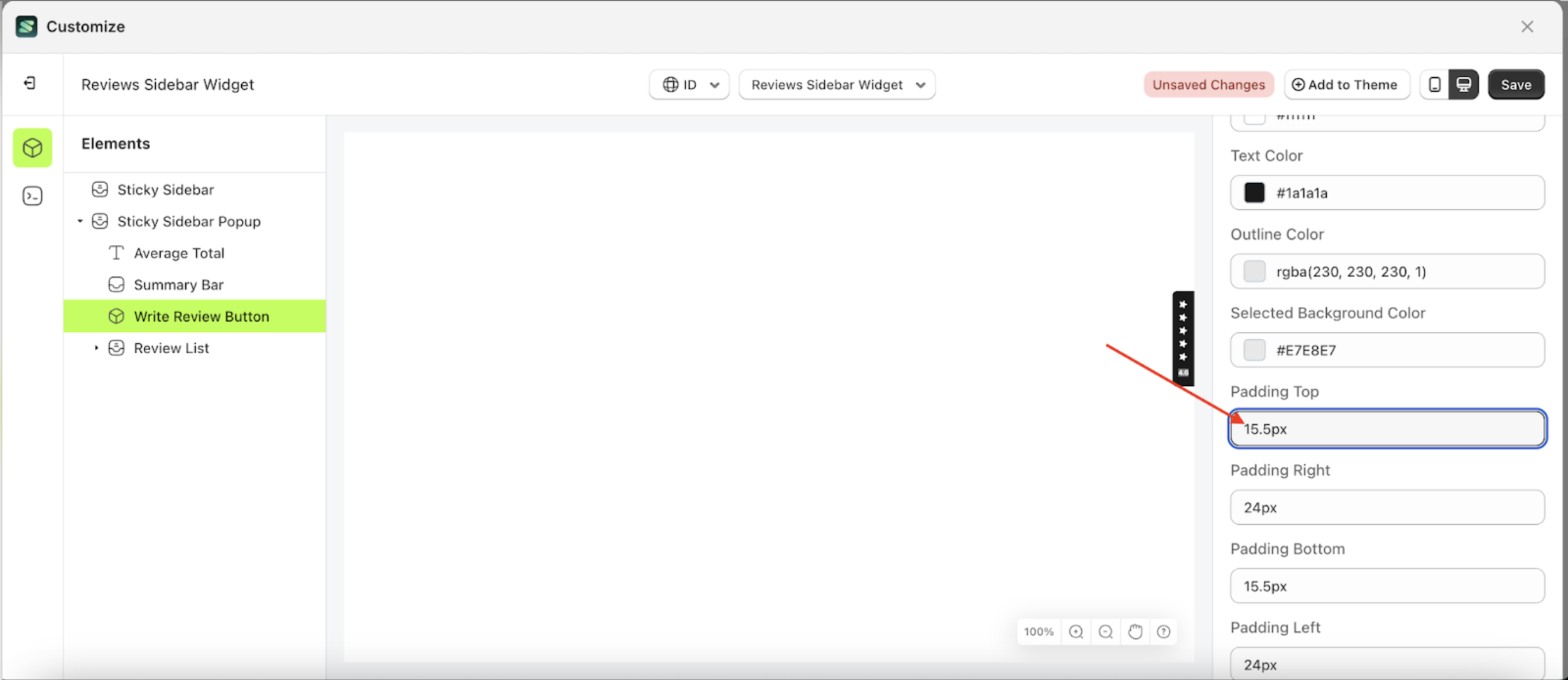
Padding Top
This feature is designed to customize the top padding of the button settings
Follow the steps below:
- Select the Sticky Sidebar Popup element on the left, then click the icon marked with a red arrow to open the menu within that item.
- Once the menu is open, select the Write Review Button element on the left, then click the Settings tab and click the icon marked with a red arrow.
- On the right side, marked with a red arrow, you can change the padding top to your desired value.
- Note: The padding top format can be px, em, rem, %, or other units..
- For example, if you set the padding top to 30px
- To see the changes in this setting on the element, click the Sticky Sidebar element
- The padding top of the Write Review Button element will adjust accordingly.
- Example : Before padding top change settings
- Example : After padding top change settings


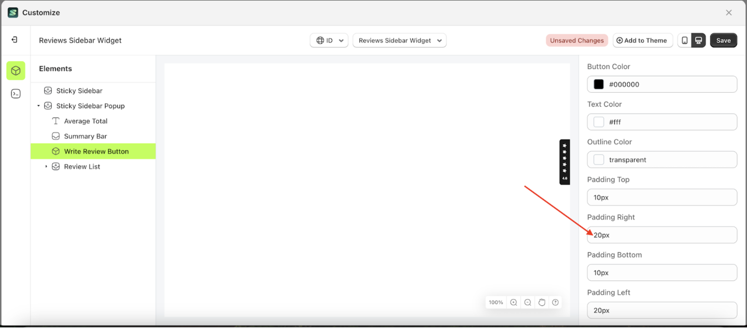
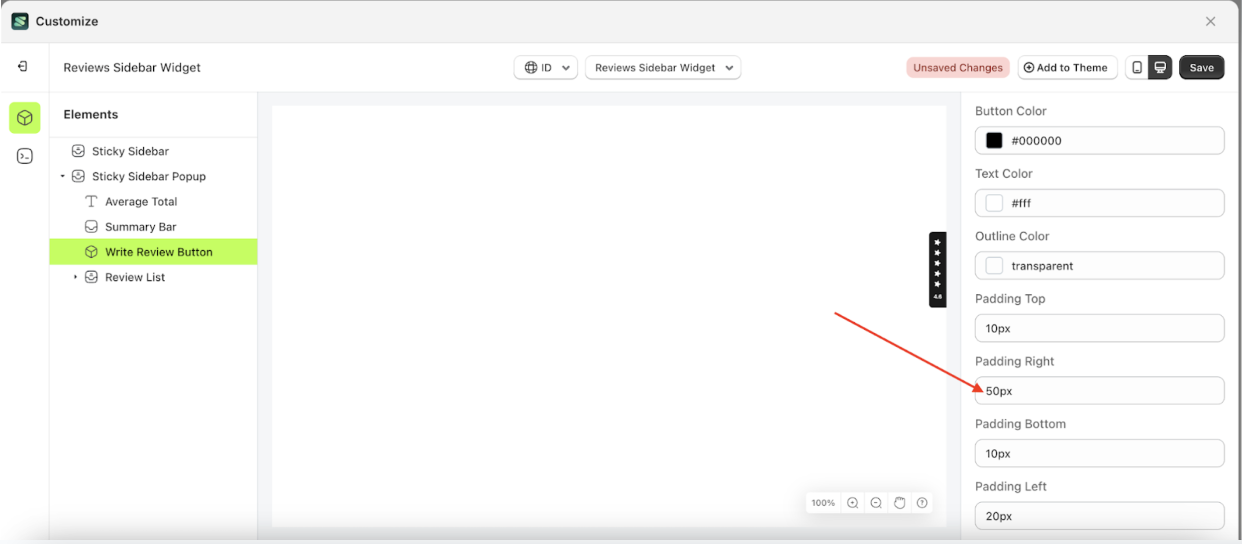
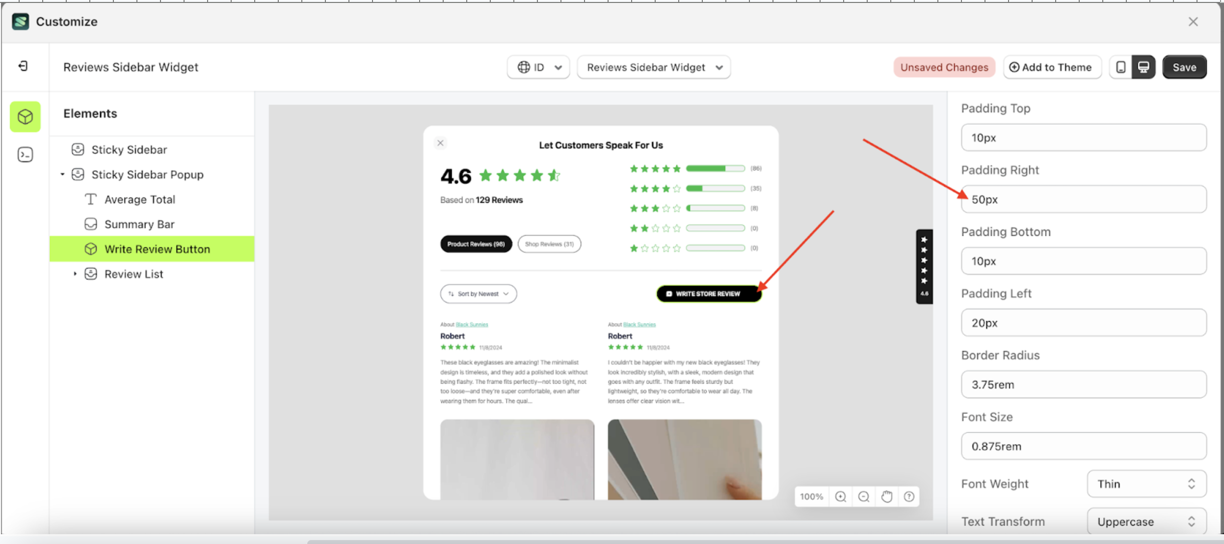
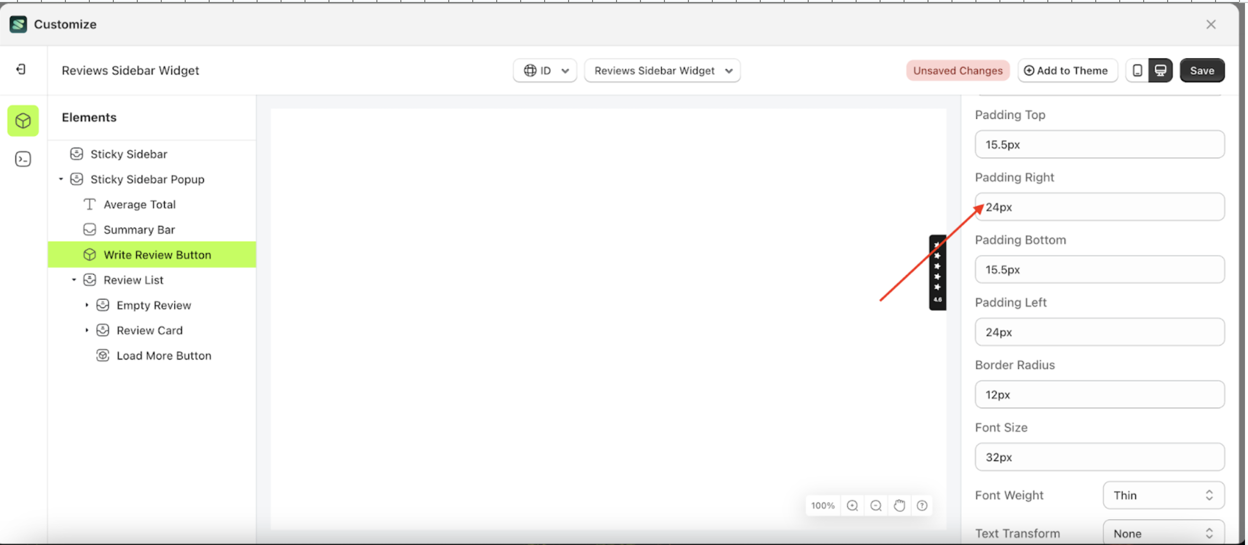
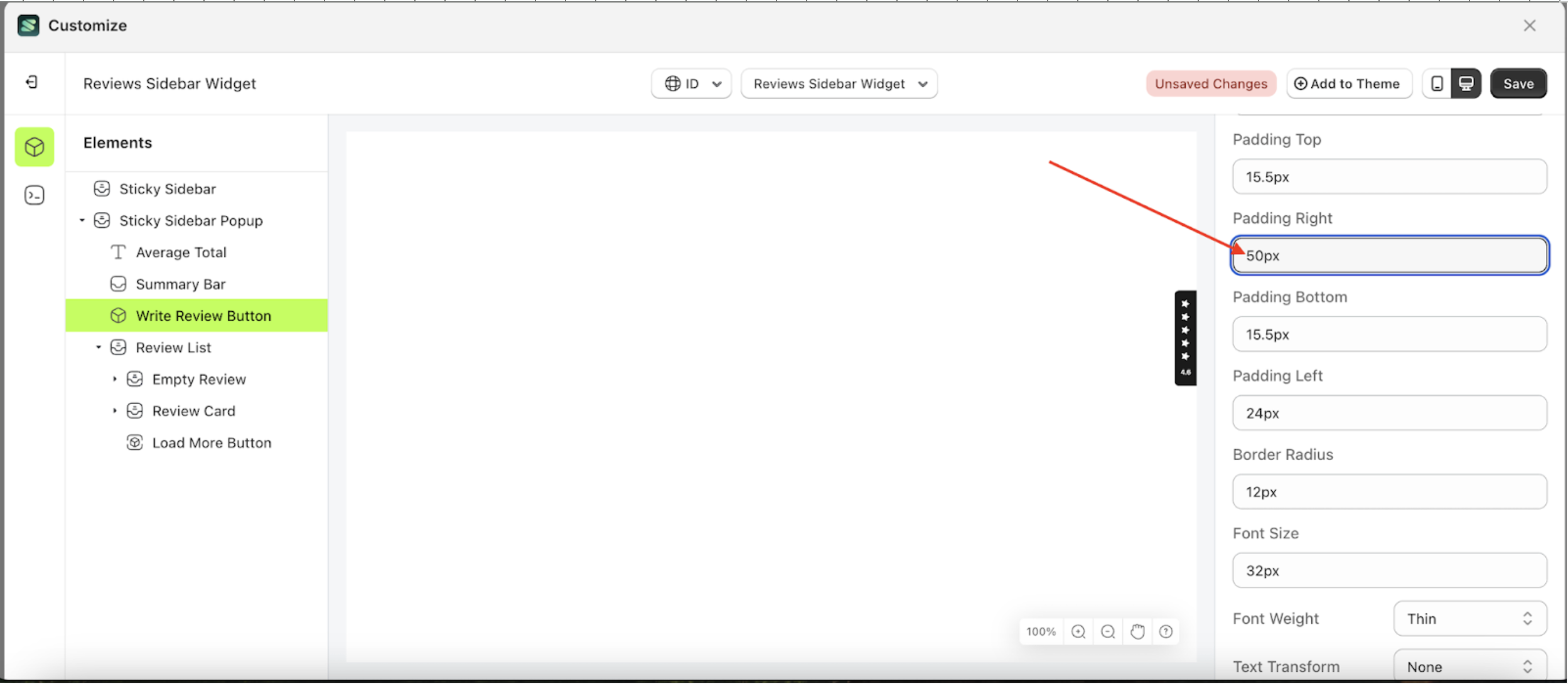
Padding Right
This feature is designed to customize the right padding of the button settings
Follow the steps below
- Select the Sticky Sidebar Popup element on the left, then click the icon marked with a red arrow to open the menu within that item.
- Once the menu is open, select the Write Review Button element on the left, then click the Settings tab and click the icon marked with a red arrow.
- On the right side, marked with a red arrow, you can change the padding right to your desired value.
- Note: The padding right format can be px, em, rem, %, or other units..
- For example, if you set the padding right to 50px
- To see the changes in this setting on the element, click the Sticky Sidebar element
- The padding right of the Write Review Button element will adjust accordingly.
- Example : Before padding right change settings
- Example : After padding right change settings


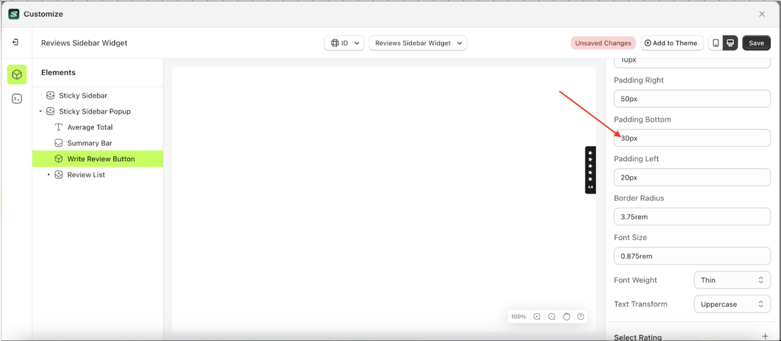
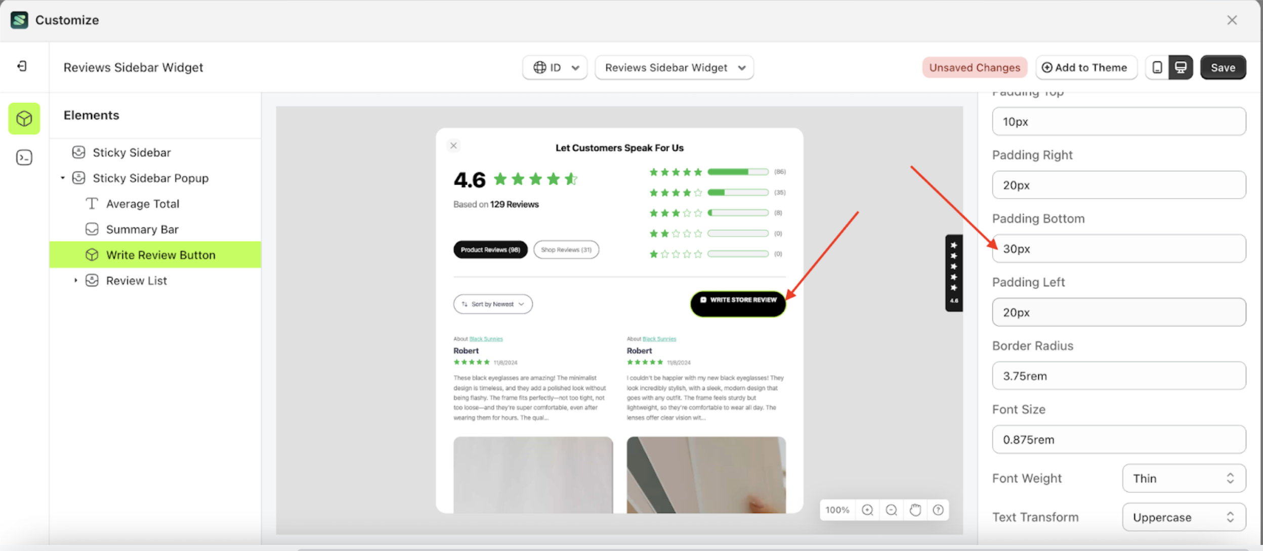
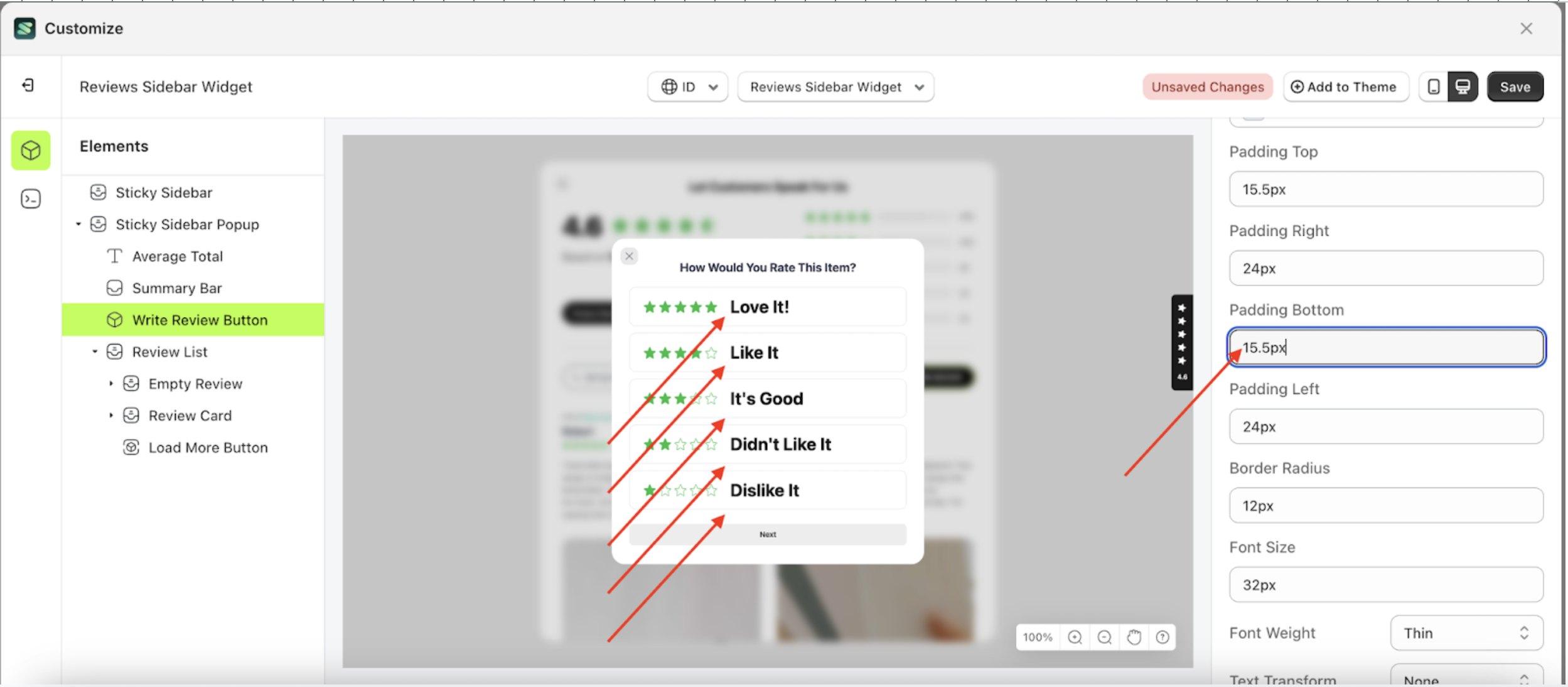
Padding Bottom
This feature is designed to customize the bottom padding of the button settings
Follow the steps below
- Select the Sticky Sidebar Popup element on the left, then click the icon marked with a red arrow to open the menu within that item.
- Once the menu is open, select the Write Review Button element on the left, then click the Settings tab and click the icon marked with a red arrow.
- On the right side, marked with a red arrow, you can change the padding bottom to your desired value.
- Note: The padding bottom format can be px, em, rem, %, or other units..
- For example, if you set the padding bottom to 30px
- To see the changes in this setting on the element, click the Sticky Sidebar element
- The padding bottom of the Write Review Button element will adjust accordingly.
- Example : Before padding bottom change settings
- Example : After padding bottom change settings


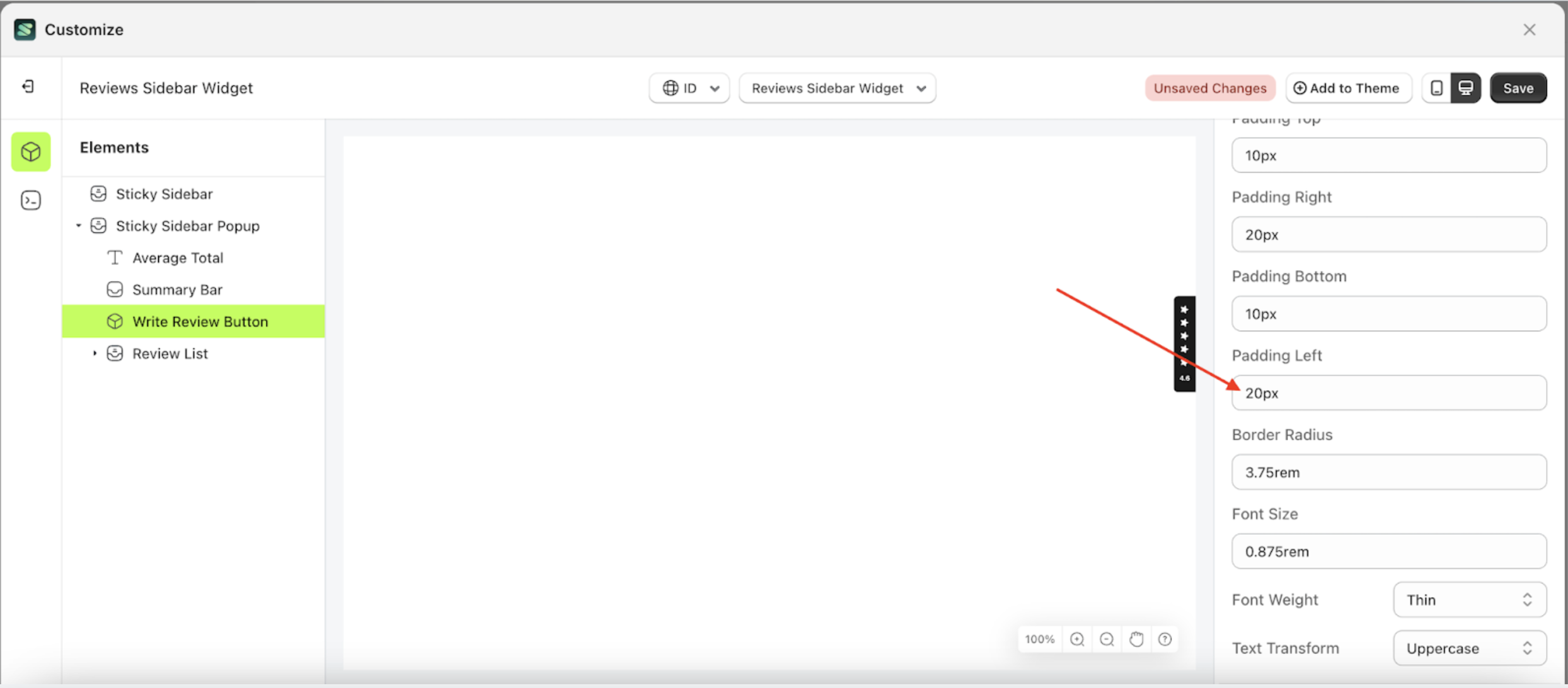
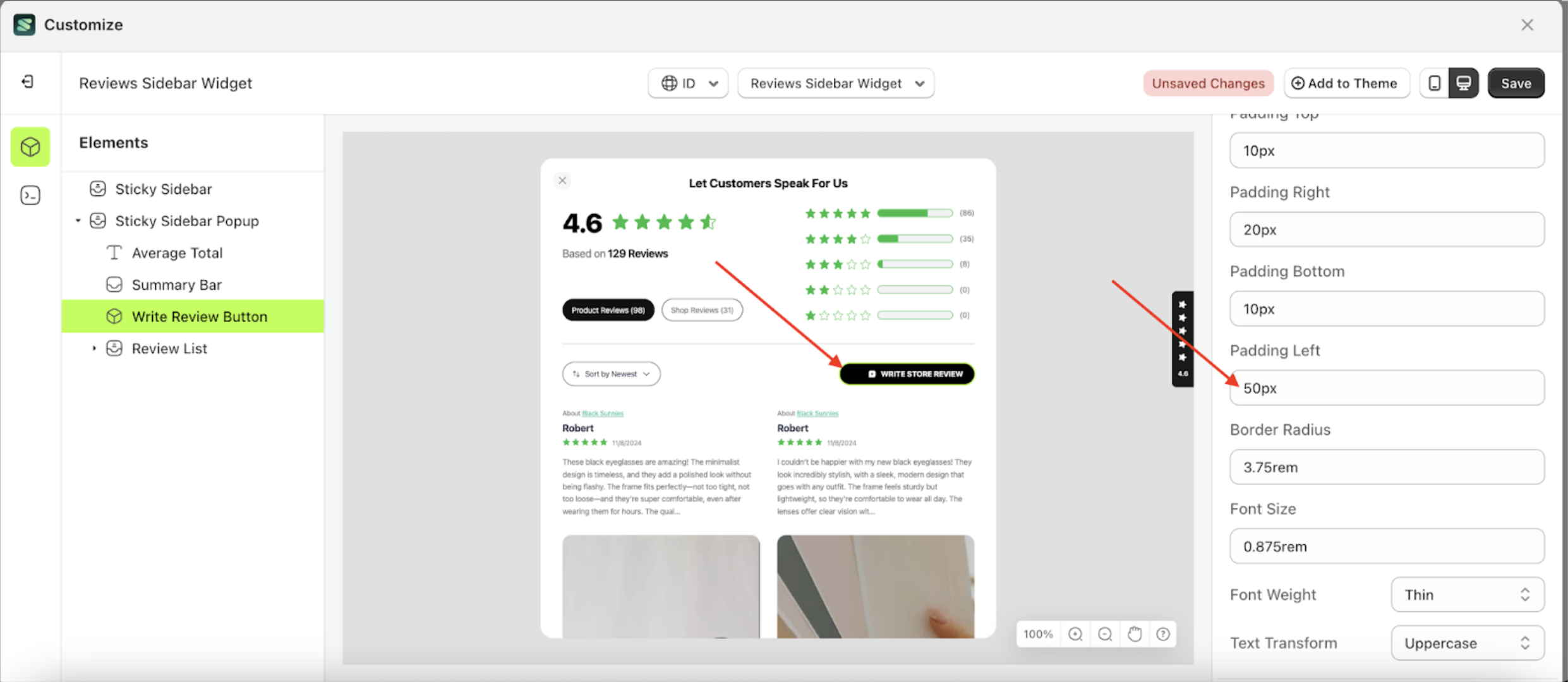
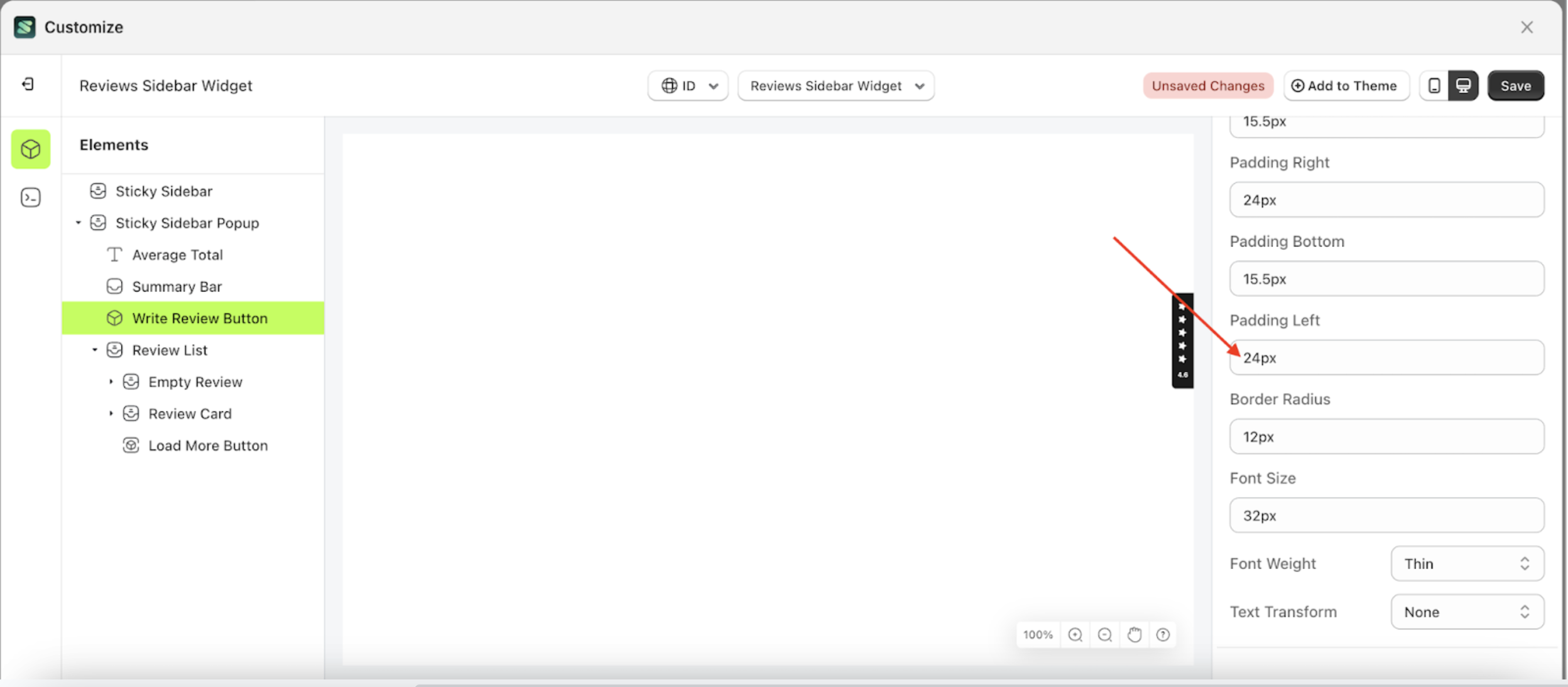
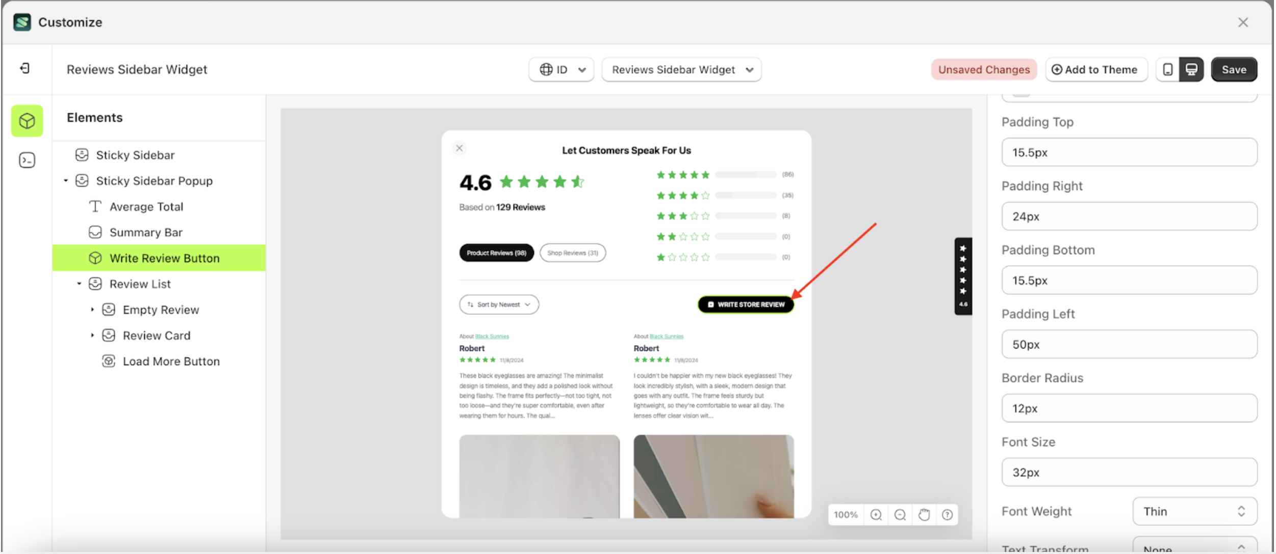
Padding Left
This feature is designed to customize the left padding of the button settings
Follow the steps below
- Select the Sticky Sidebar Popup element on the left, then click the icon marked with a red arrow to open the menu within that item.
- Once the menu is open, select the Write Review Button element on the left, then click the Settings tab and click the icon marked with a red arrow.
- On the right side, marked with a red arrow, you can change the padding left to your desired value.
- Note: The padding left format can be px, em, rem, %, or other units..
- For example, if you set the padding left to 50px
- To see the changes in this setting on the element, click the Sticky Sidebar element
- The padding left of the Write Review Button element will adjust accordingly.
- Example : Before padding left change settings
- Example : After padding left change settings


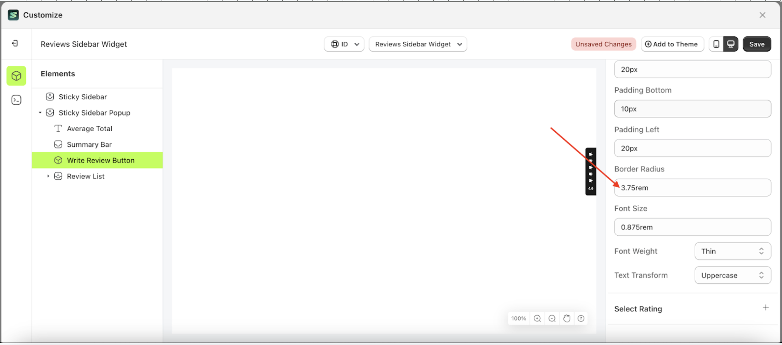
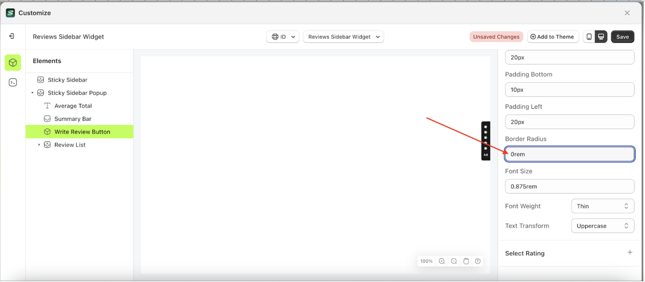
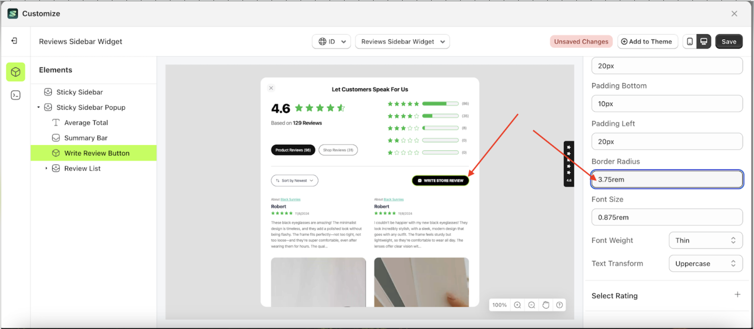
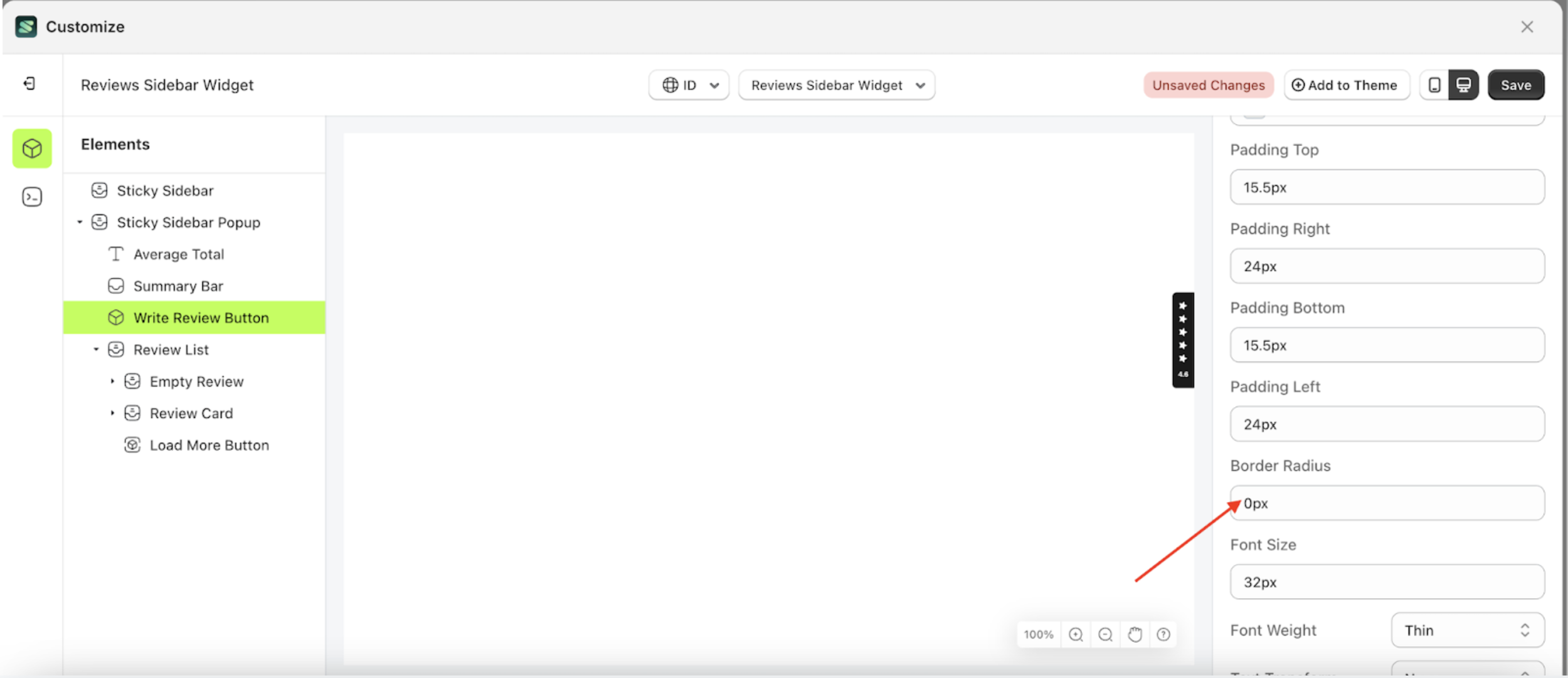
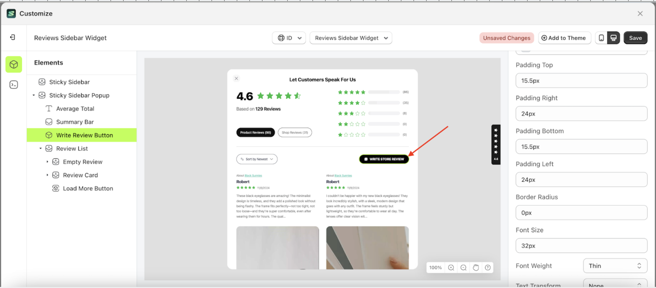
Border Radius
This feature is designed to customize the corner radius of the button settings
Follow the steps below
- Select the Sticky Sidebar Popup element on the left, then click the icon marked with a red arrow to open the menu within that item.
- Once the menu is open, select the Write Review Button element on the left, then click the Settings tab and click the icon marked with a red arrow.
- On the right side, marked with a red arrow, you can change the border radius to your desired value.
- Note: The border radius format can be px, em, rem, %, or other units..
- For example, if you set the border radius to 0rem
- To see the changes in this setting on the element, click the Sticky Sidebar element
- The border radius of the Write Review Button element will adjust accordingly.
- Example : Before border radius change settings
- Example : After border radius change settings


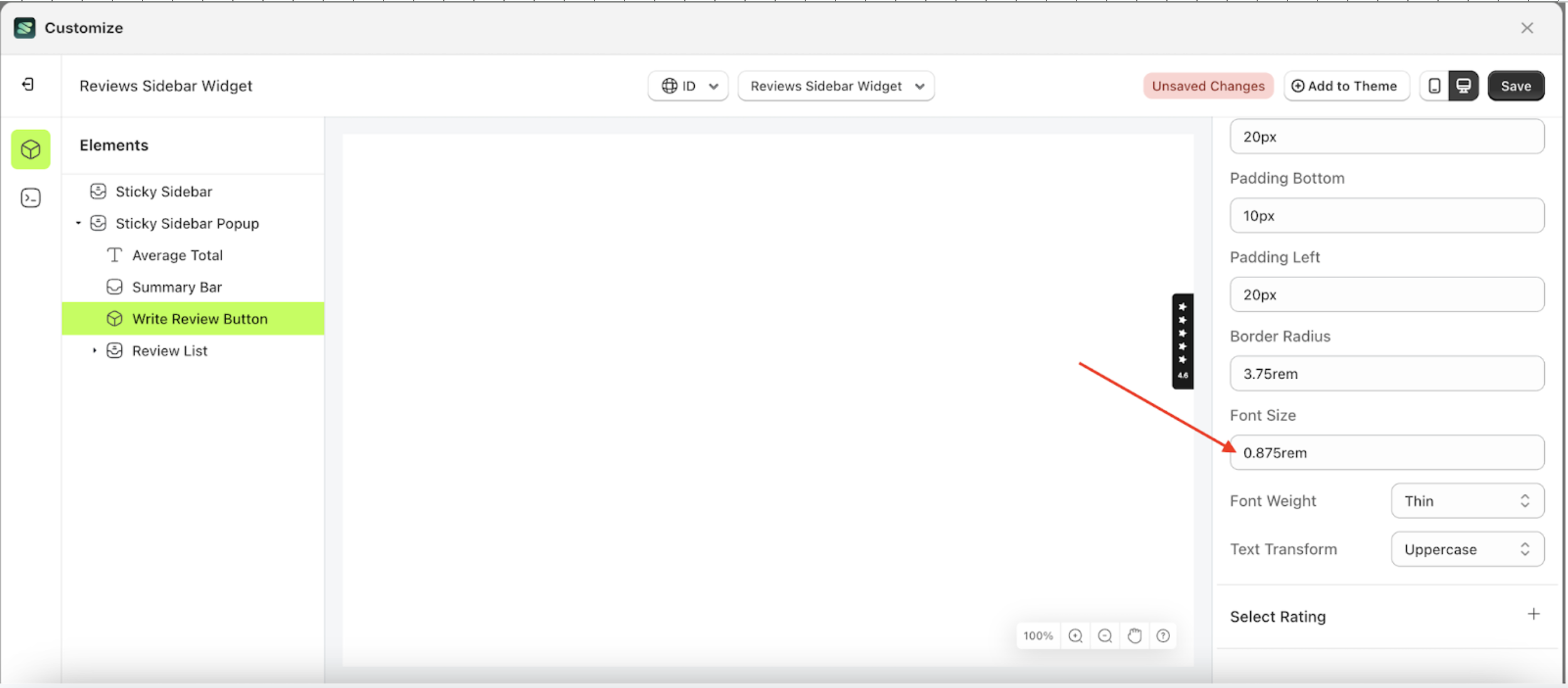
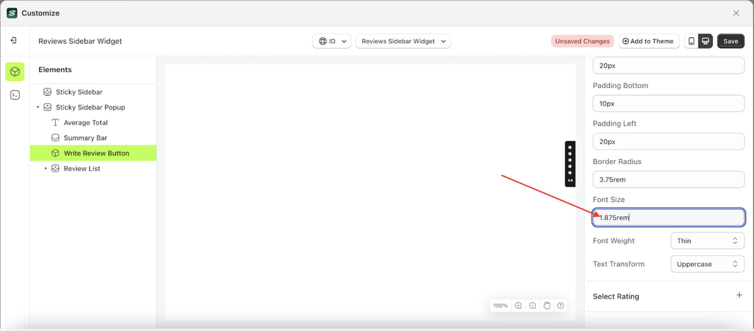
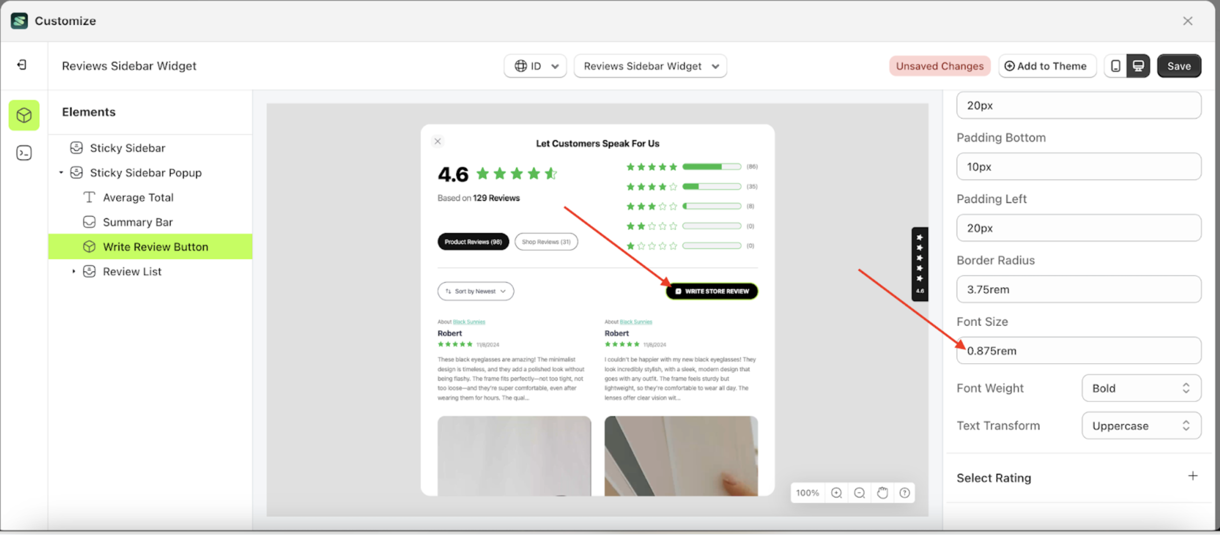
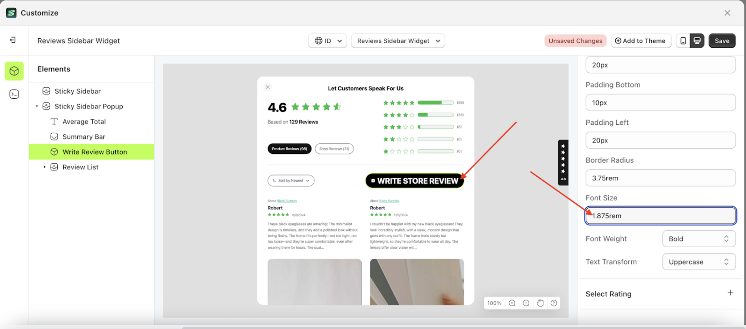
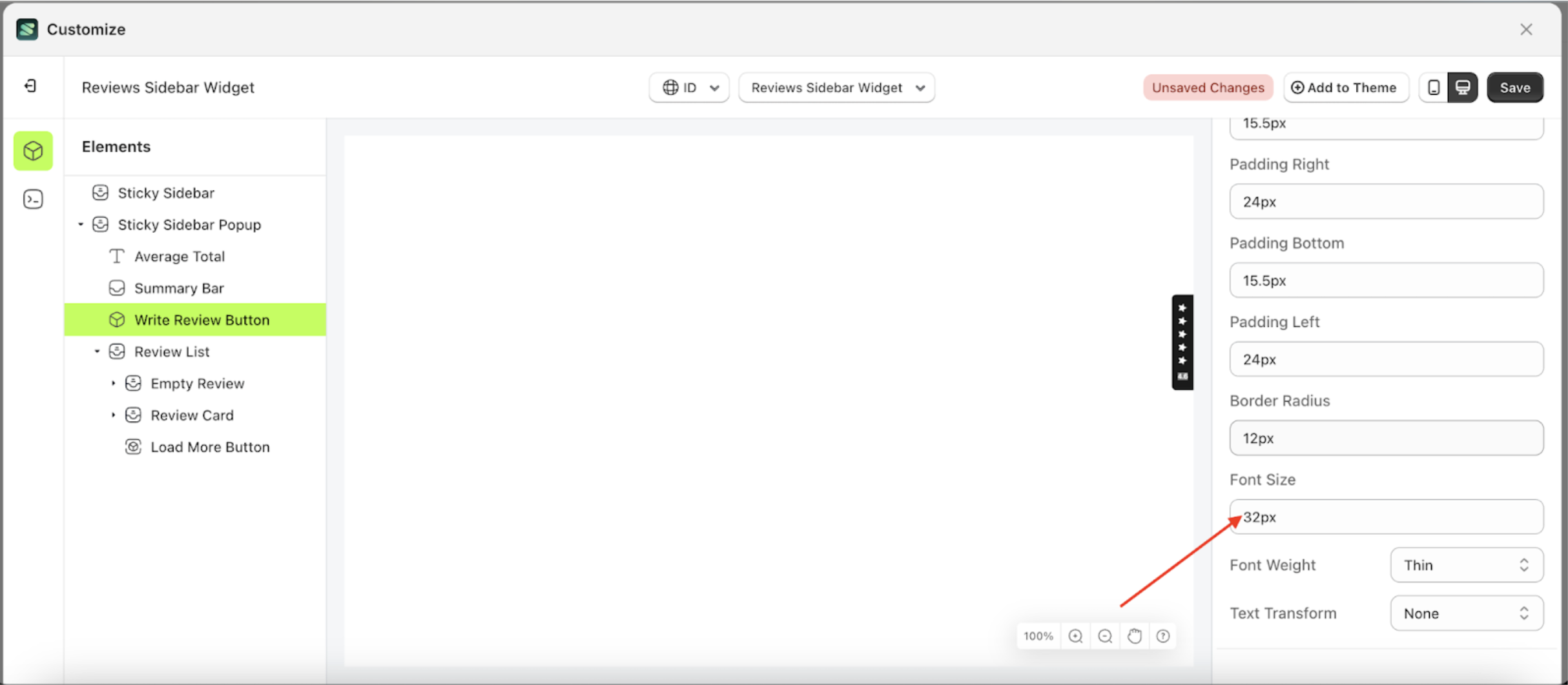
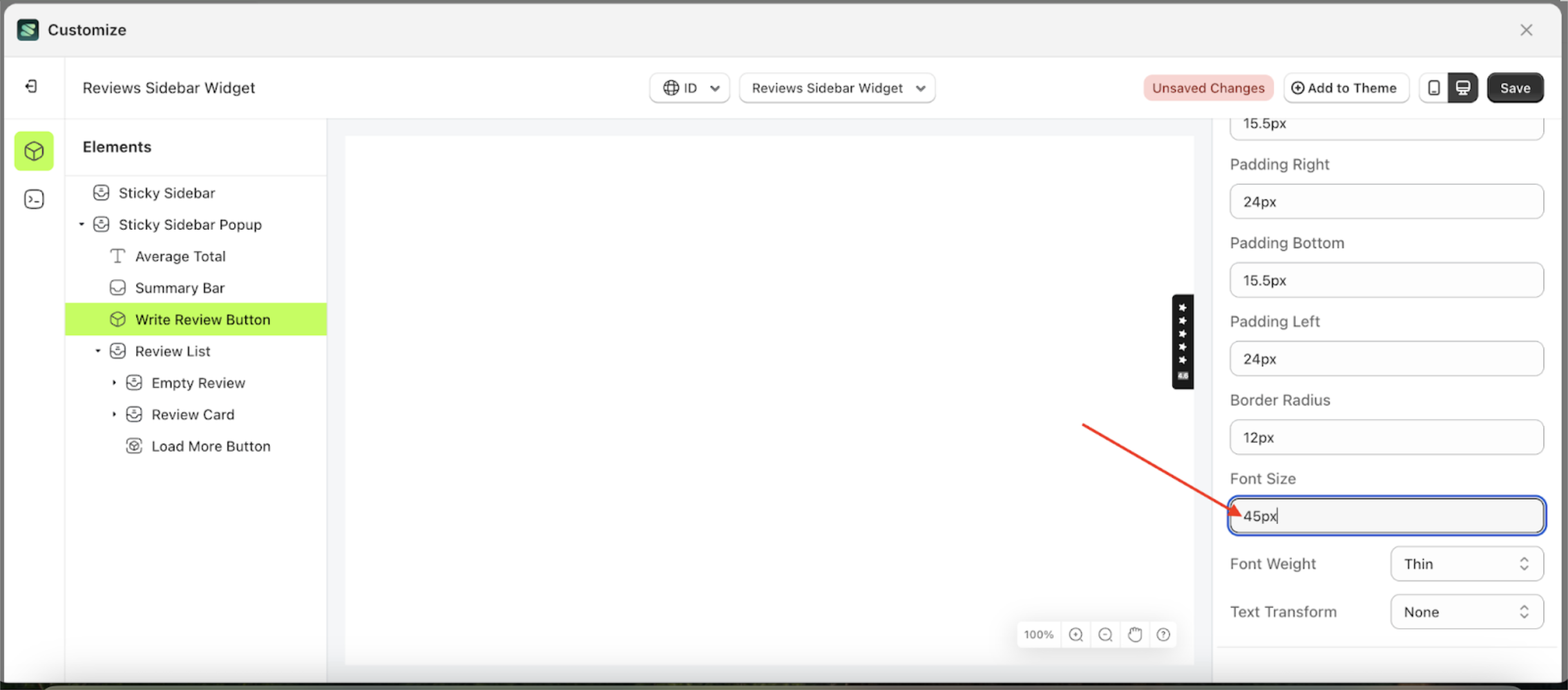
Font Size
This feature is designed to customize the text size of the button settings
Follow the steps below
- Select the Sticky Sidebar Popup element on the left, then click the icon marked with a red arrow to open the menu within that item.
- Once the menu is open, select the Write Review Button element on the left, then click the Settings tab and click the icon marked with a red arrow.
- On the right side, marked with a red arrow, you can change the font size to your desired value.
- Note: The font size format can be px, em, rem, %, or other units..
- For example, if you set the font size to 1.875rem
- To see the changes in this setting on the element, click the Sticky Sidebar element
- The font size of the Write Review Button element will adjust accordingly.
- Example : Before font size change settings
- Example : After font size change settings
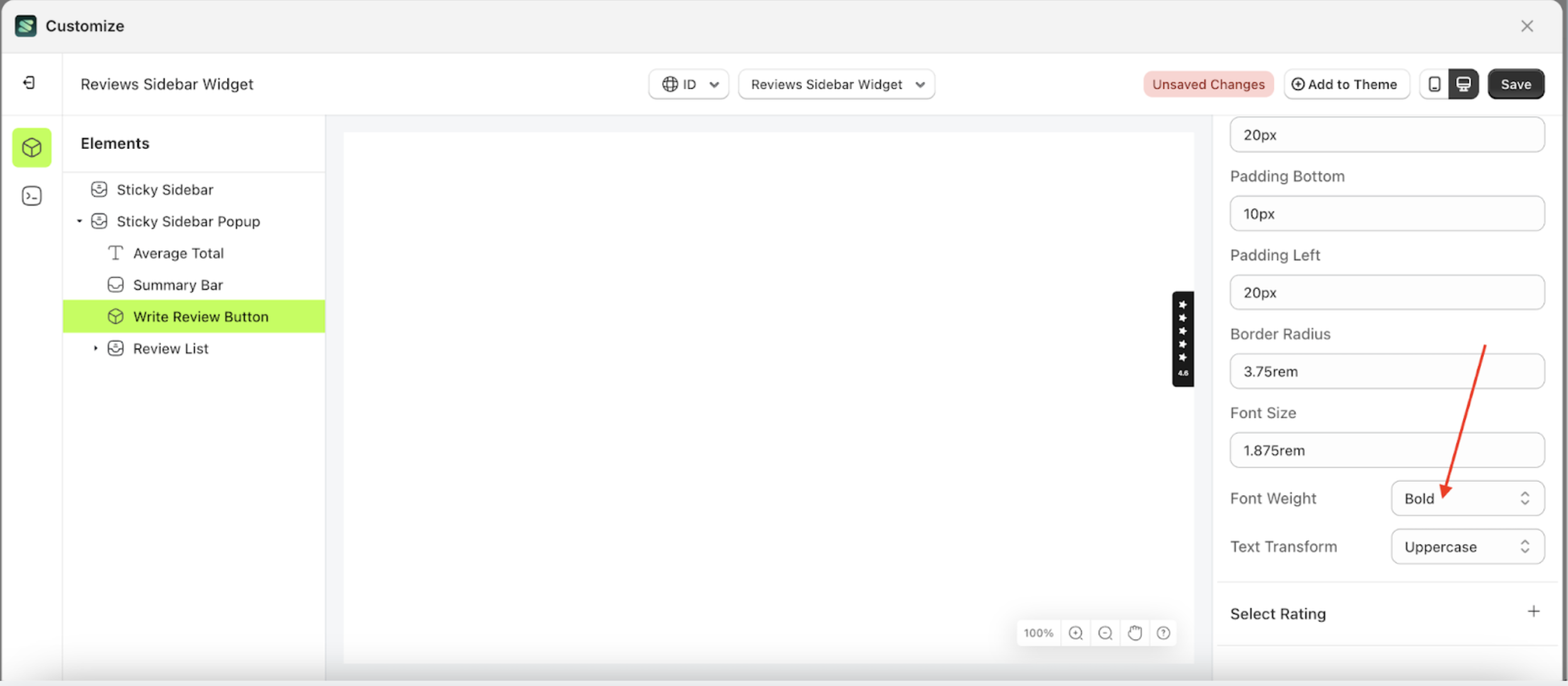
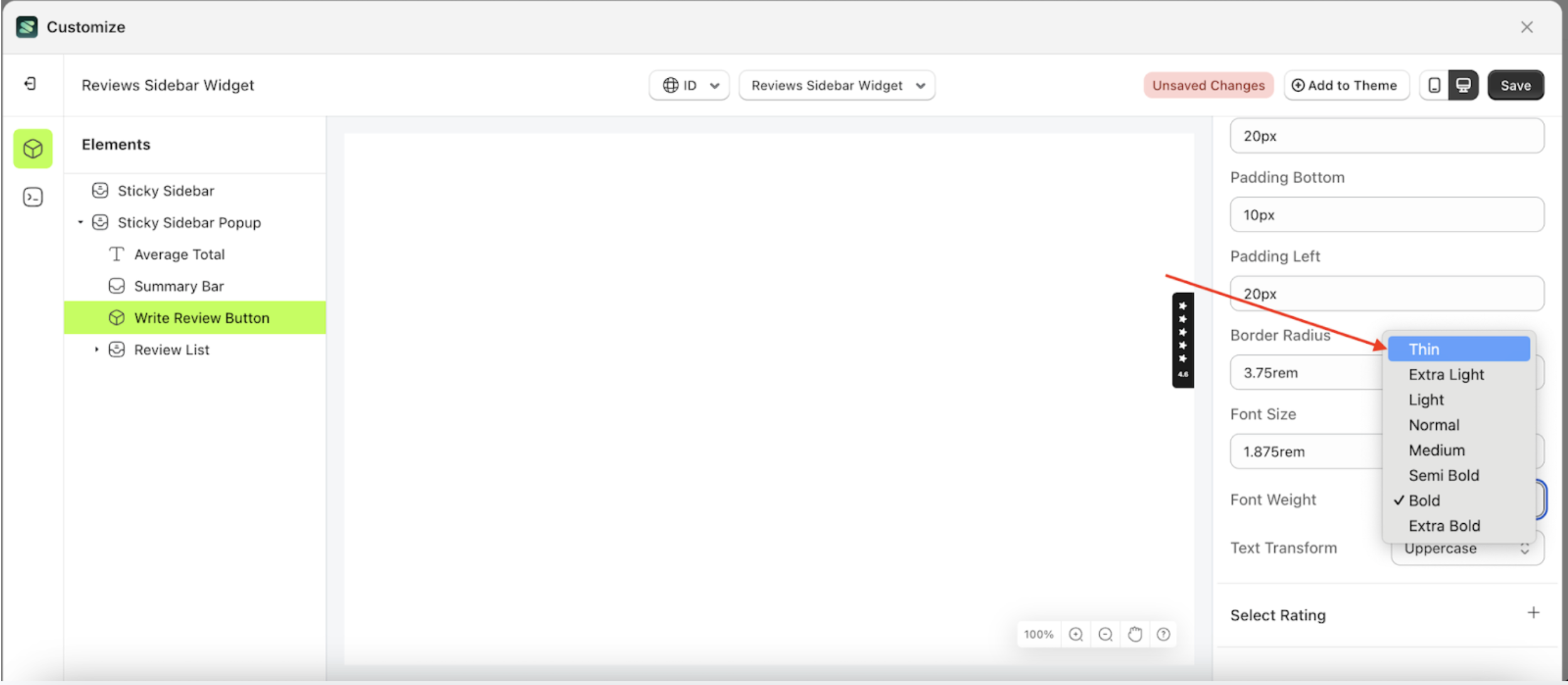
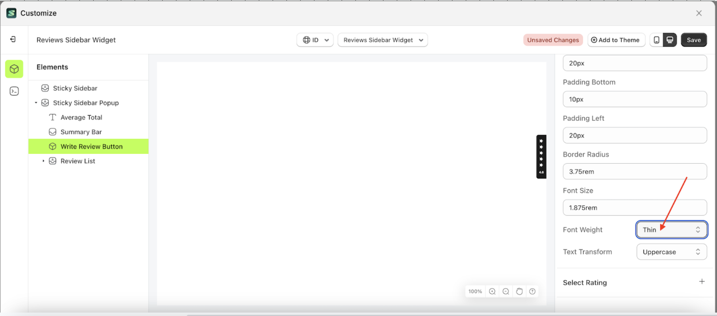
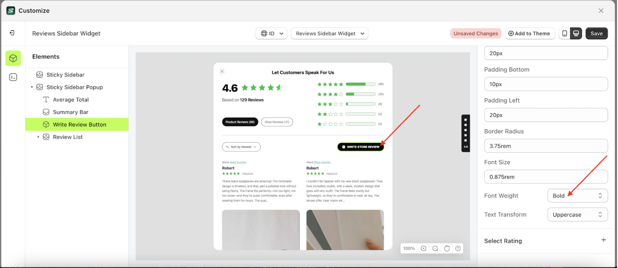
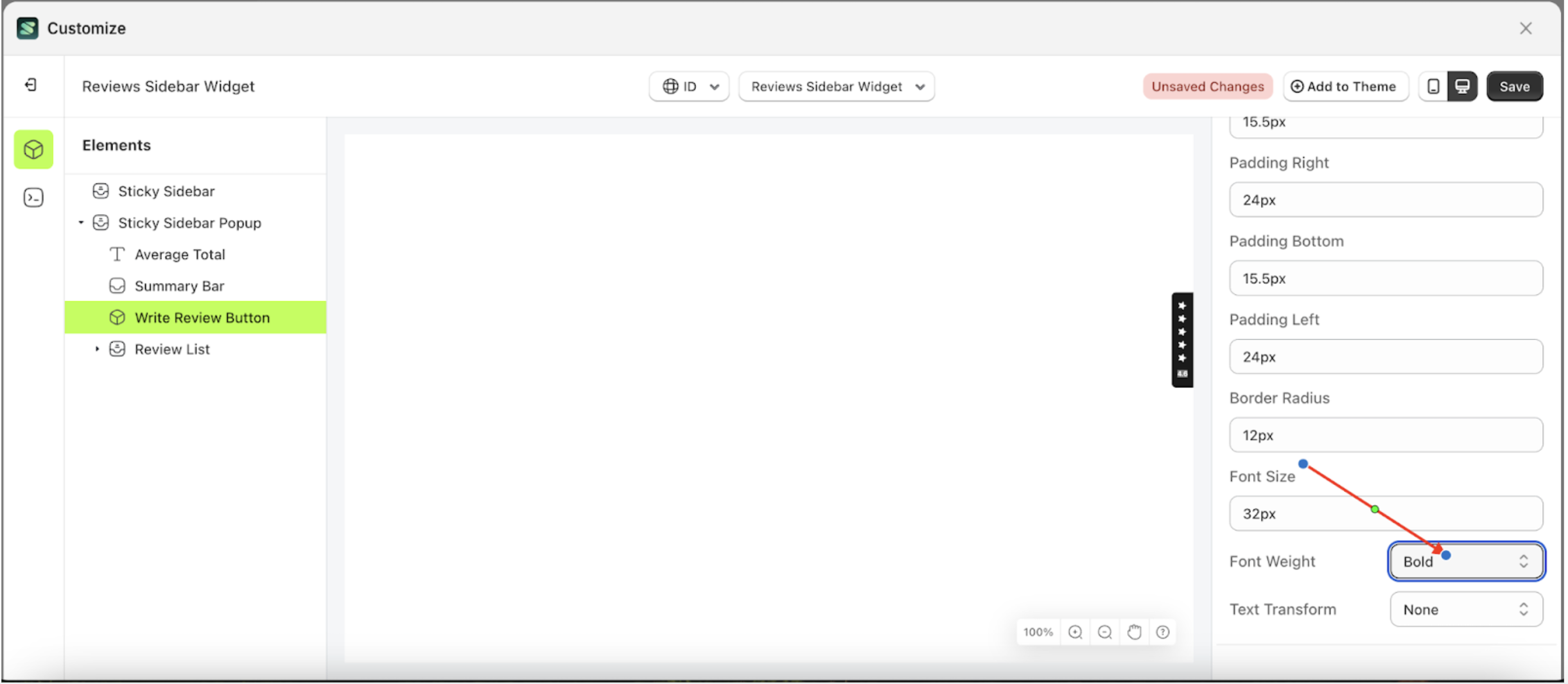
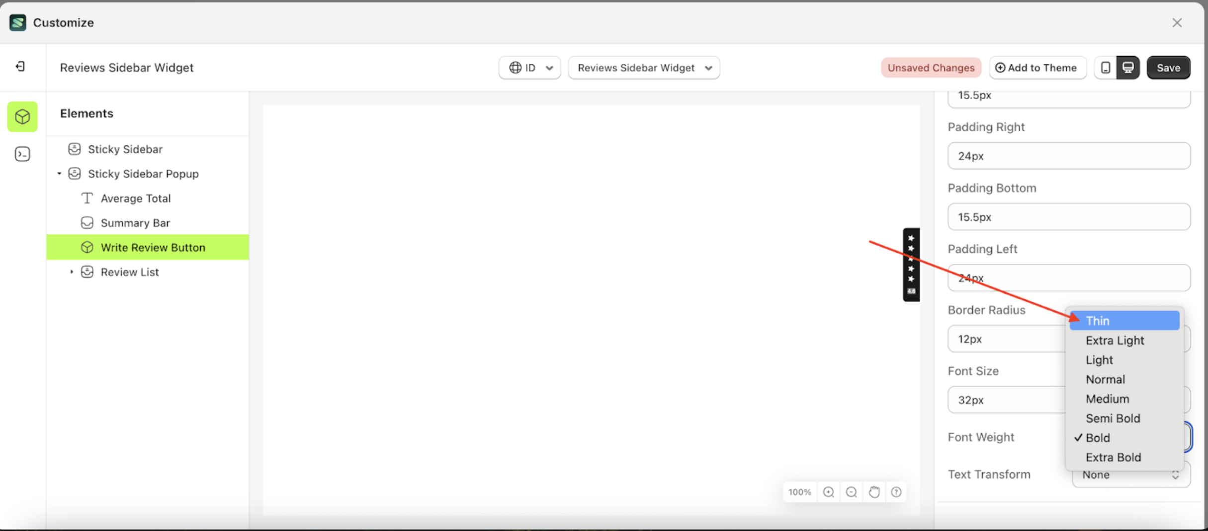
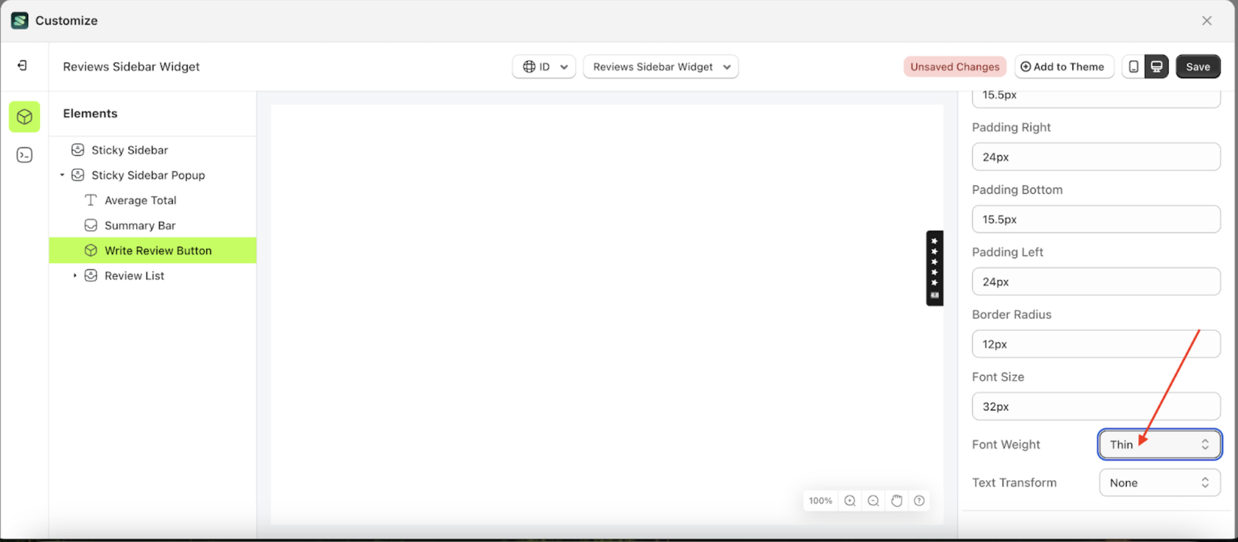
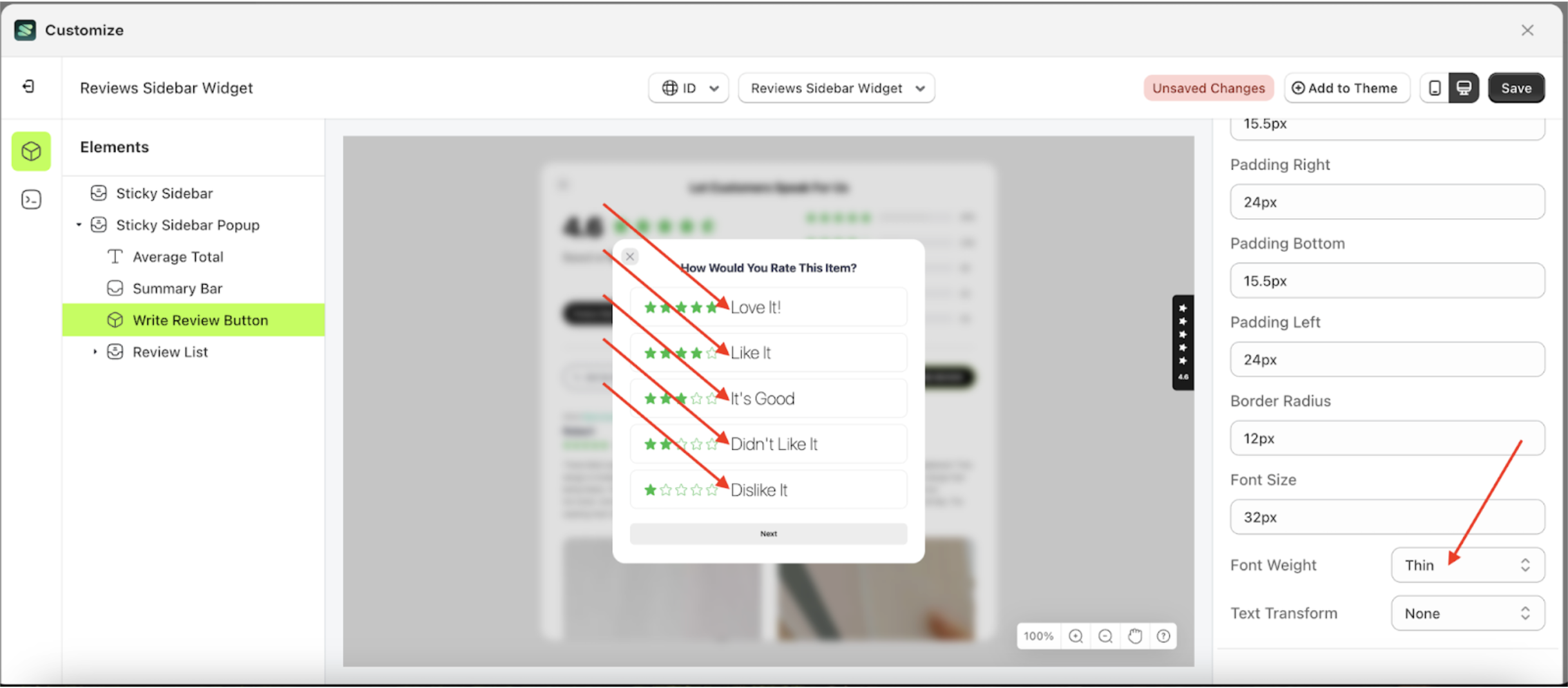
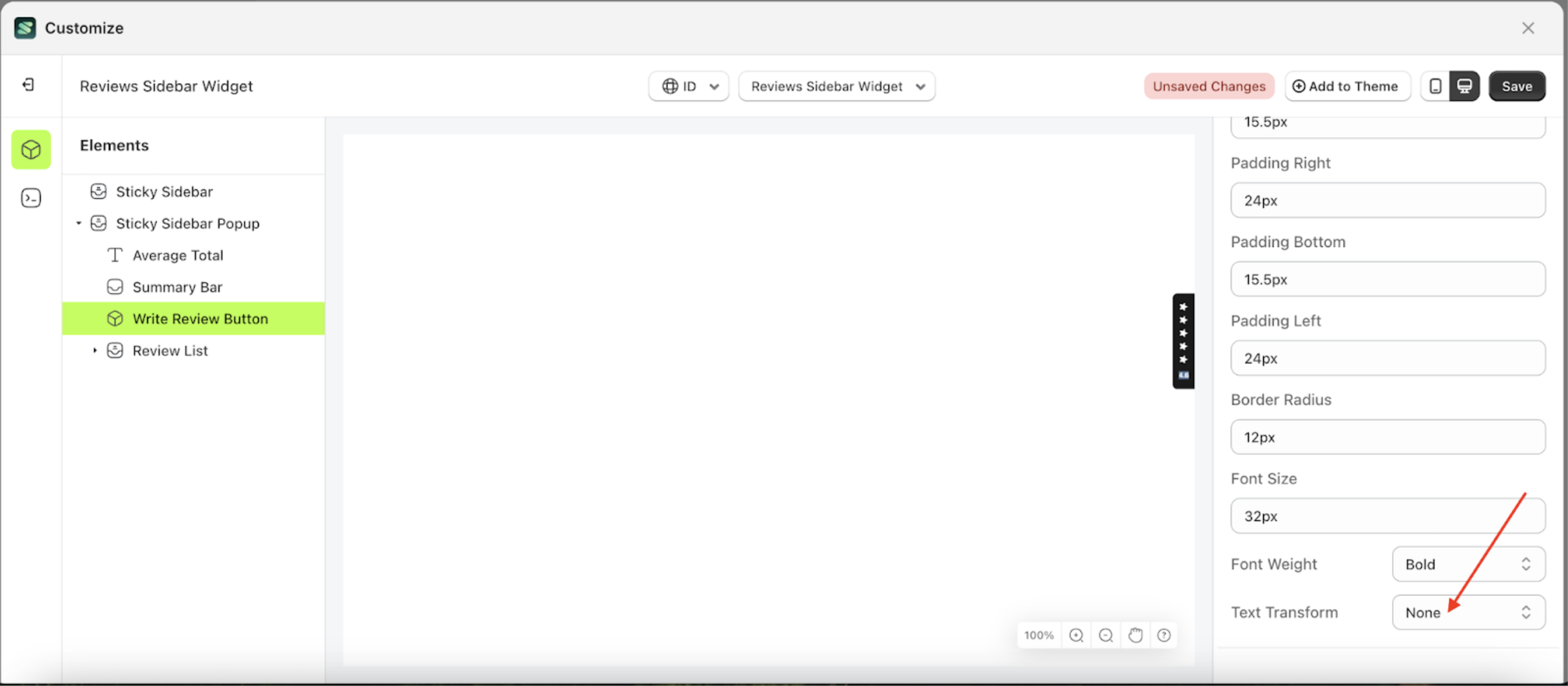
Font Weight
This feature is designed to customize the text weight of the button settings
Follow the steps below
- Select the Sticky Sidebar Popup element on the left, then click the icon marked with a red arrow to open the menu within that item.
- Once the menu is open, select the Write Review Button element on the left, then click the Settings tab and click the icon marked with a red arrow.
- On the right side, marked with a red arrow, you can change the font weight to your desired value.
- Note: The font weight format can be px, em, rem, %, or other units..
- Once the menu opens, select an option from the list
- For example, if you set the font weight to thin
- To see the changes in this setting on the element, click the Sticky Sidebar element
- The font weight of the Write Review Button element will adjust accordingly.
- Example : Before font weight change settings
- Example : After font weight change settings


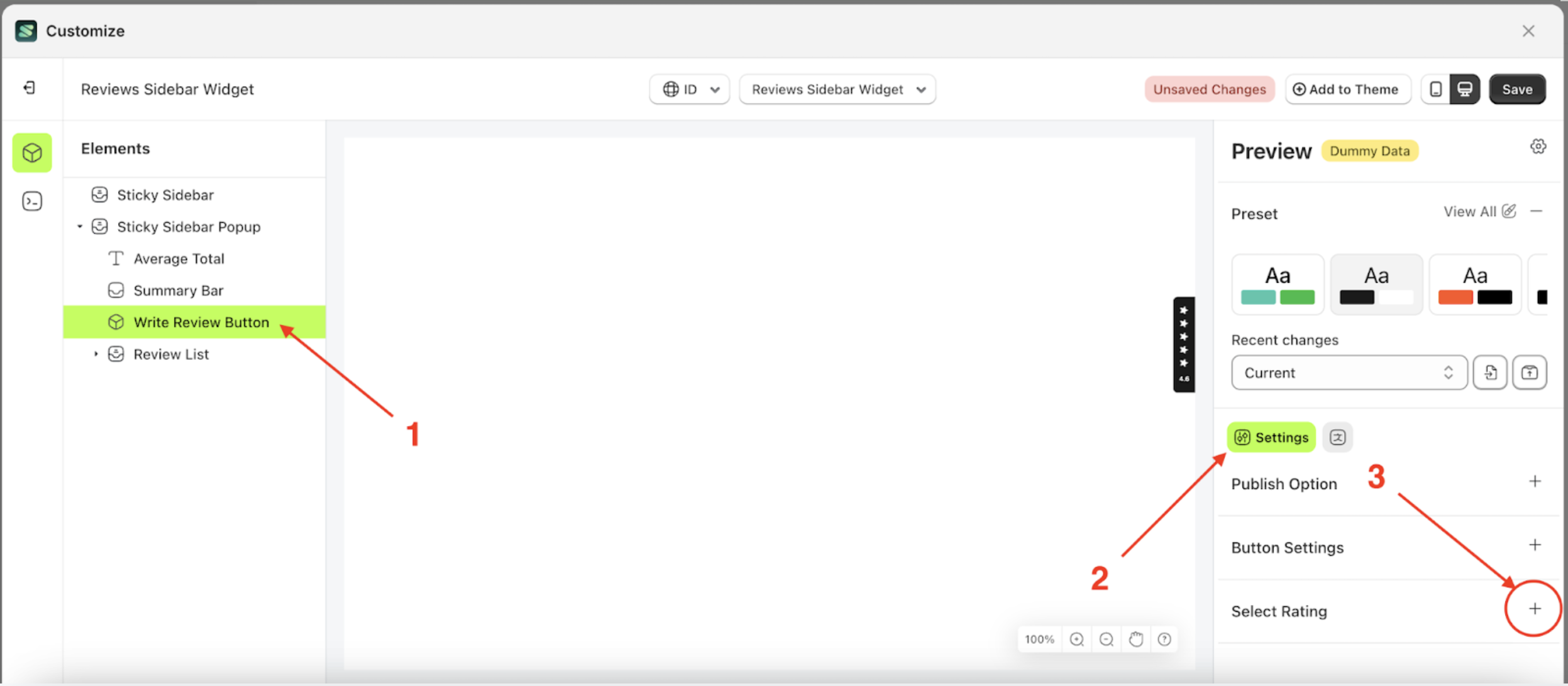
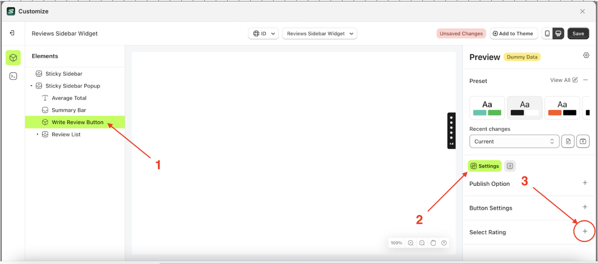
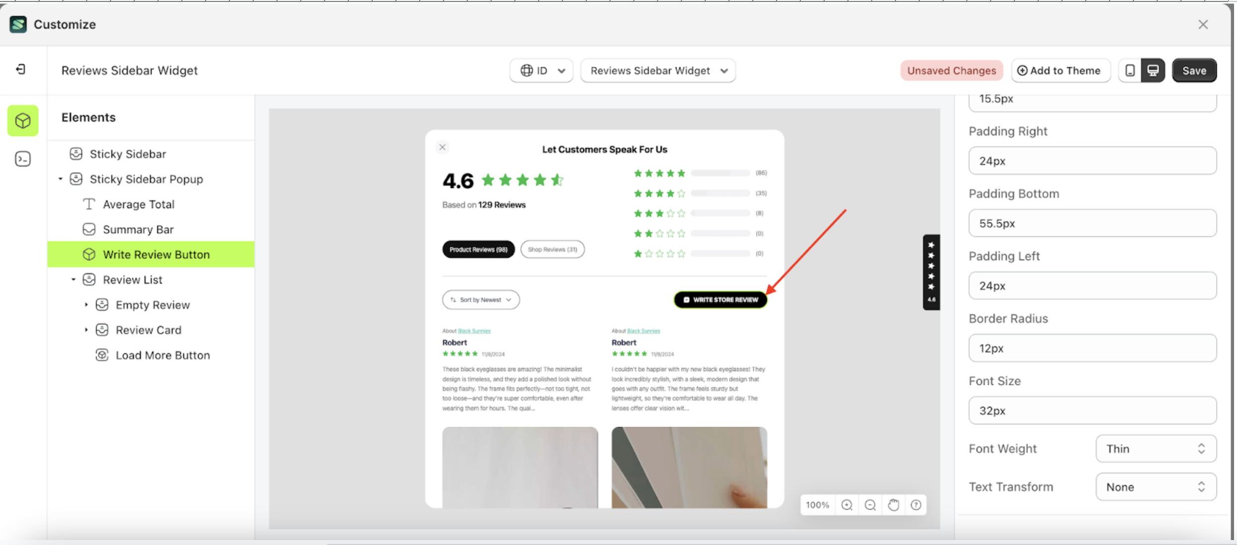
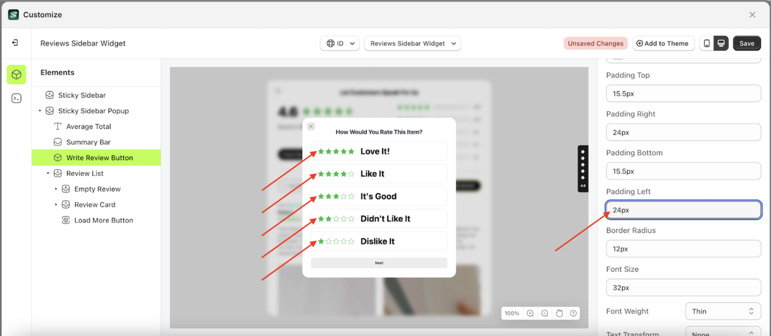
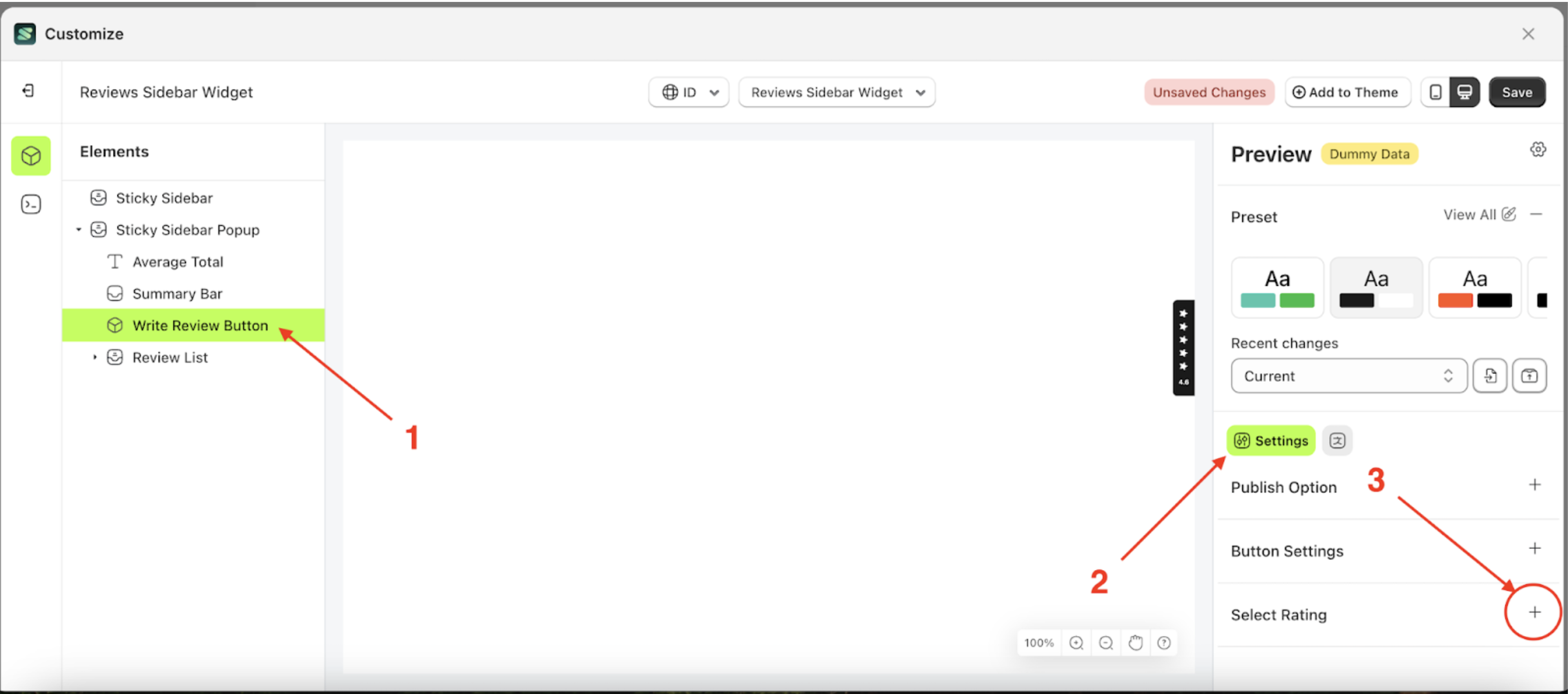
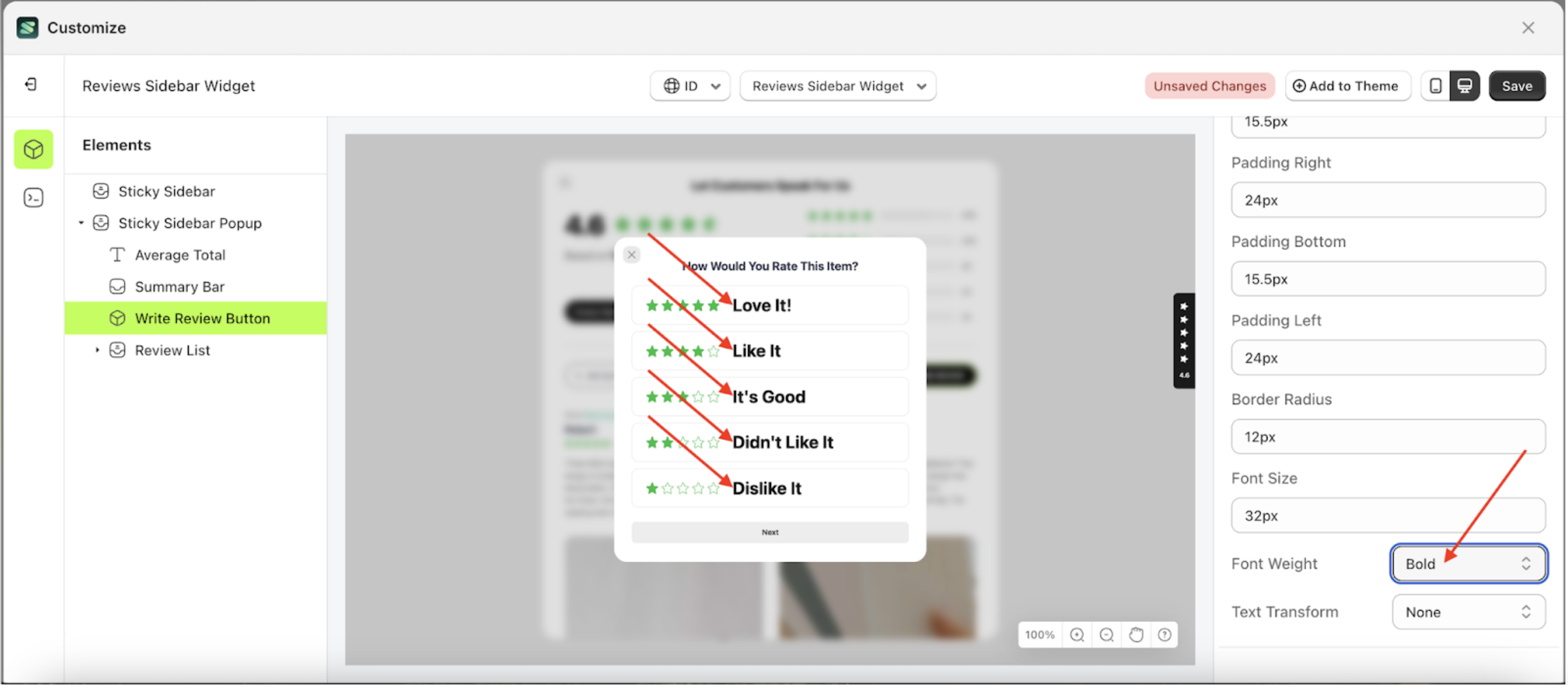
Select rating
Available settings:
Button Color Select RatingText Color Select RatingOutline Color Select RatingSelected Background Color Select RatingPadding Top Select RatingPadding Right Select RatingPadding Bottom Select RatingPadding Left Select RatingBorder Radius Select RatingFont Size Select RatingFont Weight Select RatingText Transform Select Rating
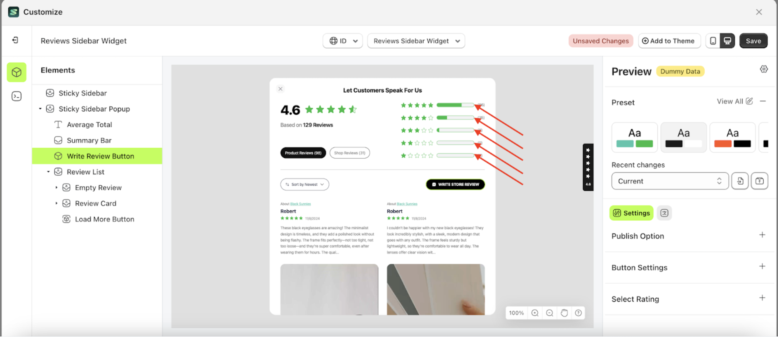
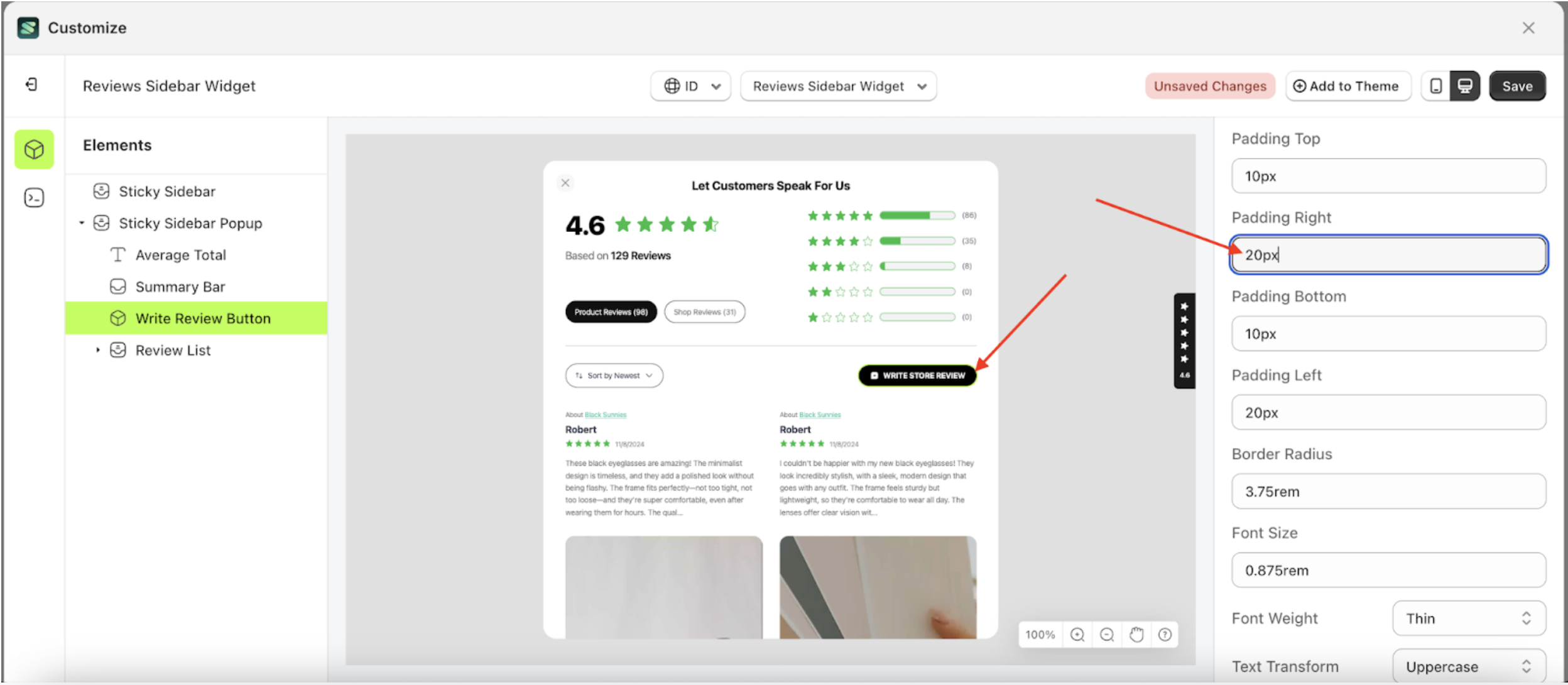
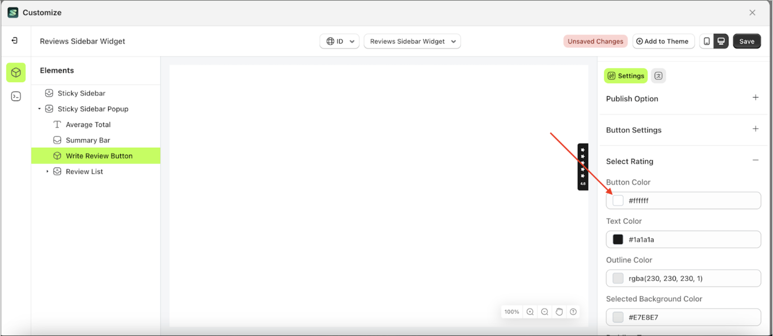
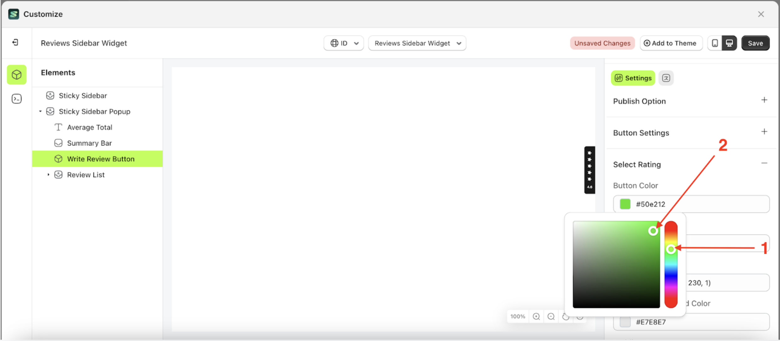
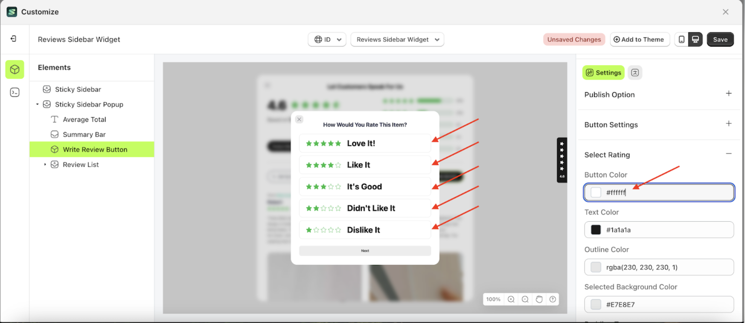
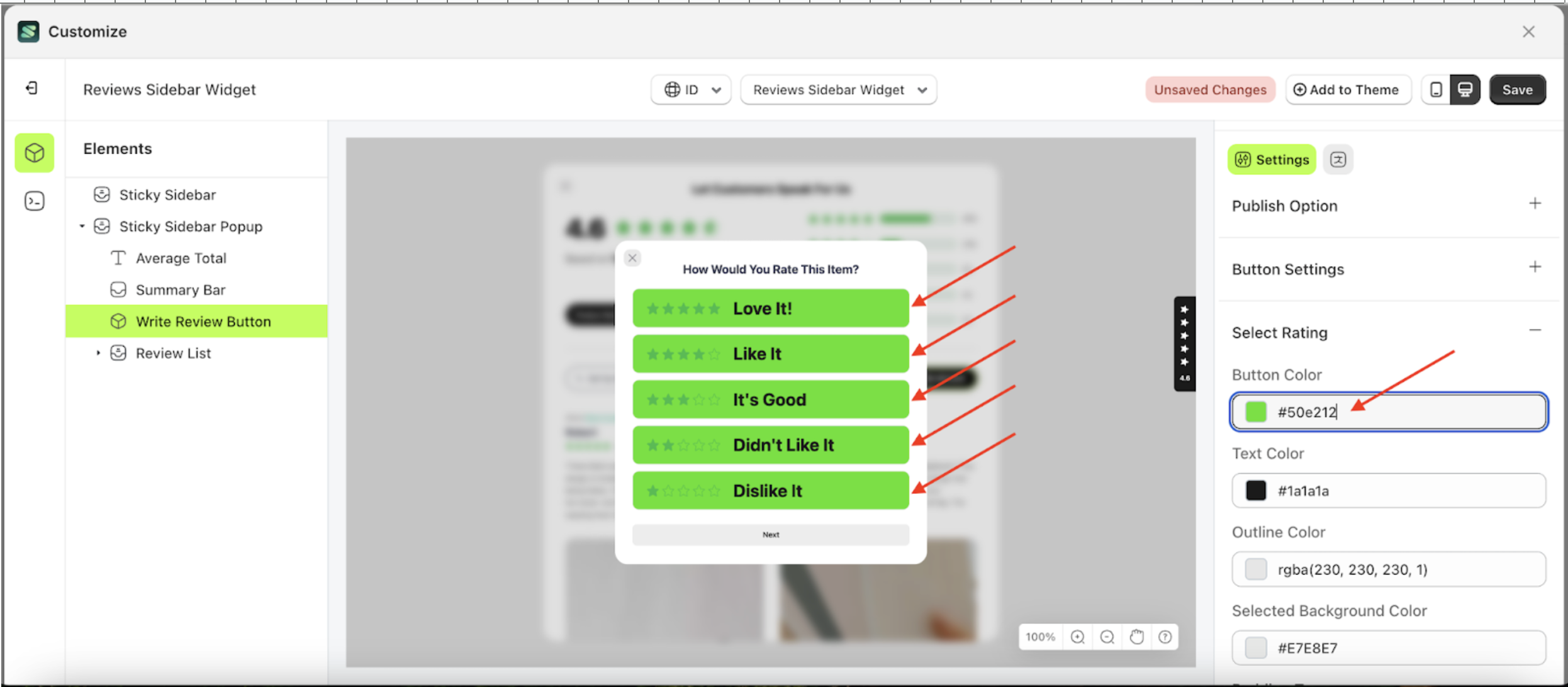
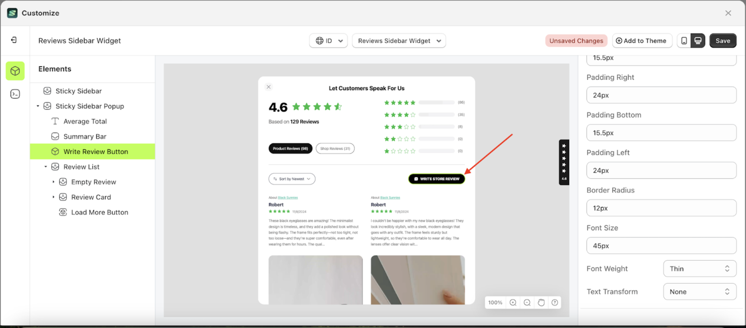
Button Color Select Rating
This feature is designed to customize the button color of the select rating
Follow the steps below:
- Select the Sticky Sidebar Popup element on the left, then click the icon marked with a red arrow to open the menu within that item.
- Once the menu is open, select the Write Review Button element on the left, then click the Settings tab and click the icon marked with a red arrow.
- Click the Color Palette on the right side, which is also marked with a red arrow.
- The Color Palette will appear. Click the right side of the palette where the red arrow and number 1 are indicated, then click the right side again where the red arrow and number 2 are marked.
- To see the changes in this setting on the element, click the Sticky Sidebar element
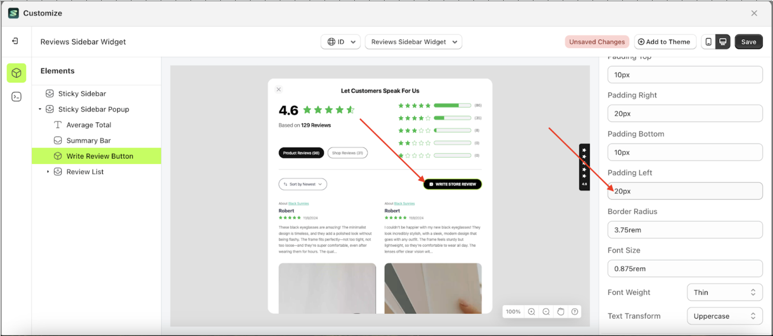
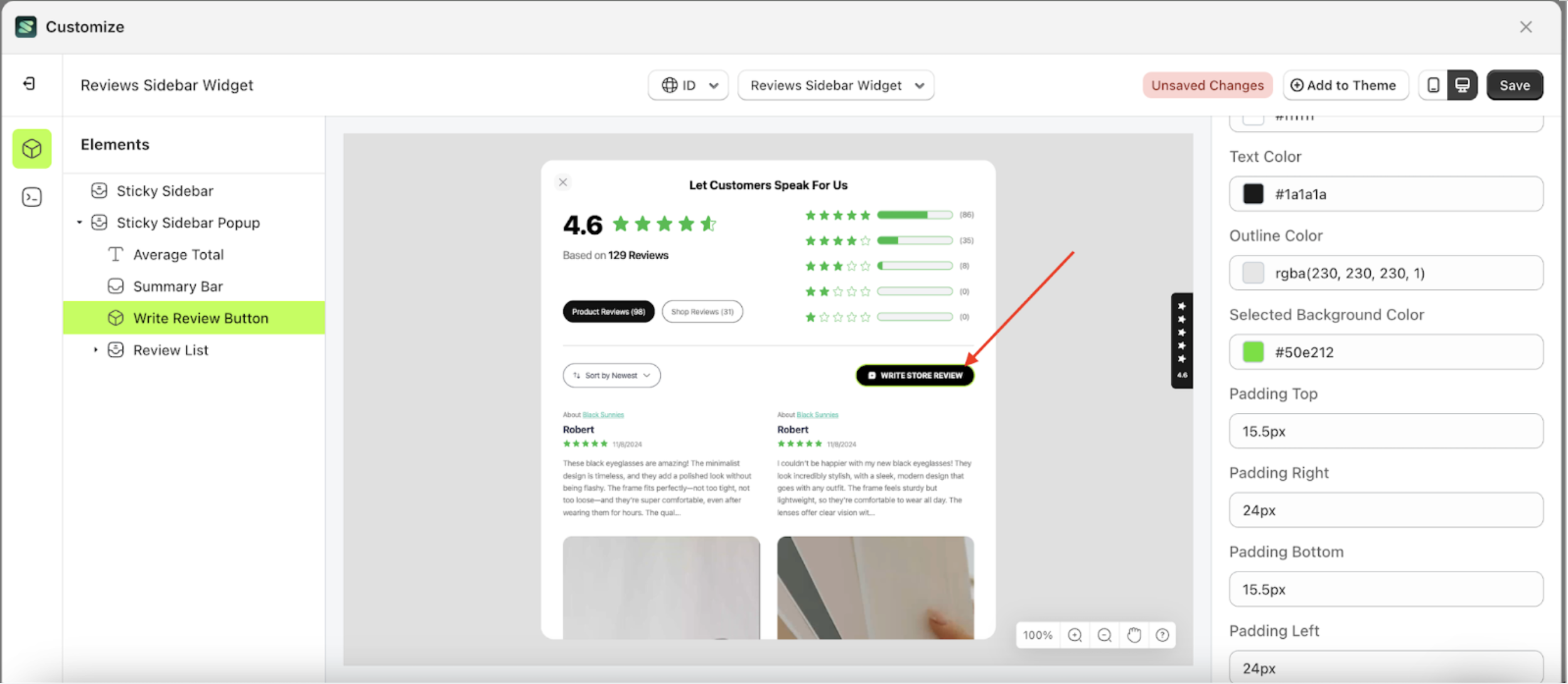
- Then, click "WRITE STORE REVIEW".
- The review sidebar widget of the Write Review Button element will adjust accordingly.
- Example : Before Write Review Button change settings
- Example : After Write Review Button change settings


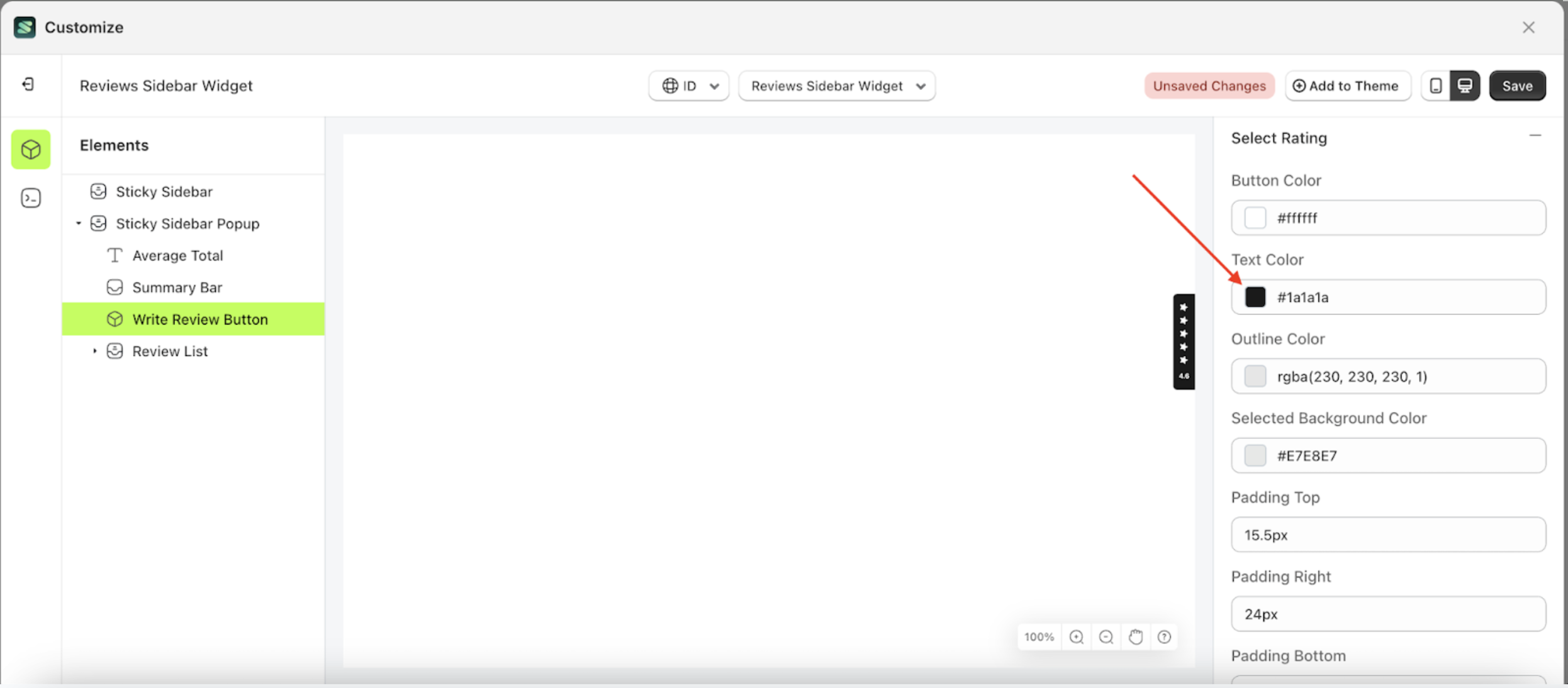
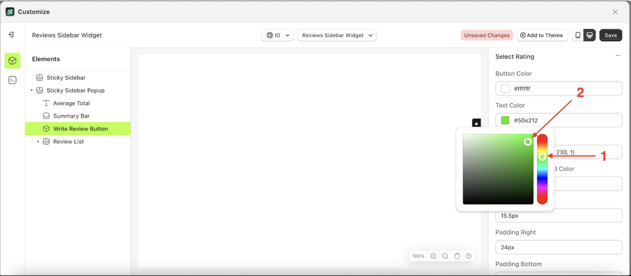
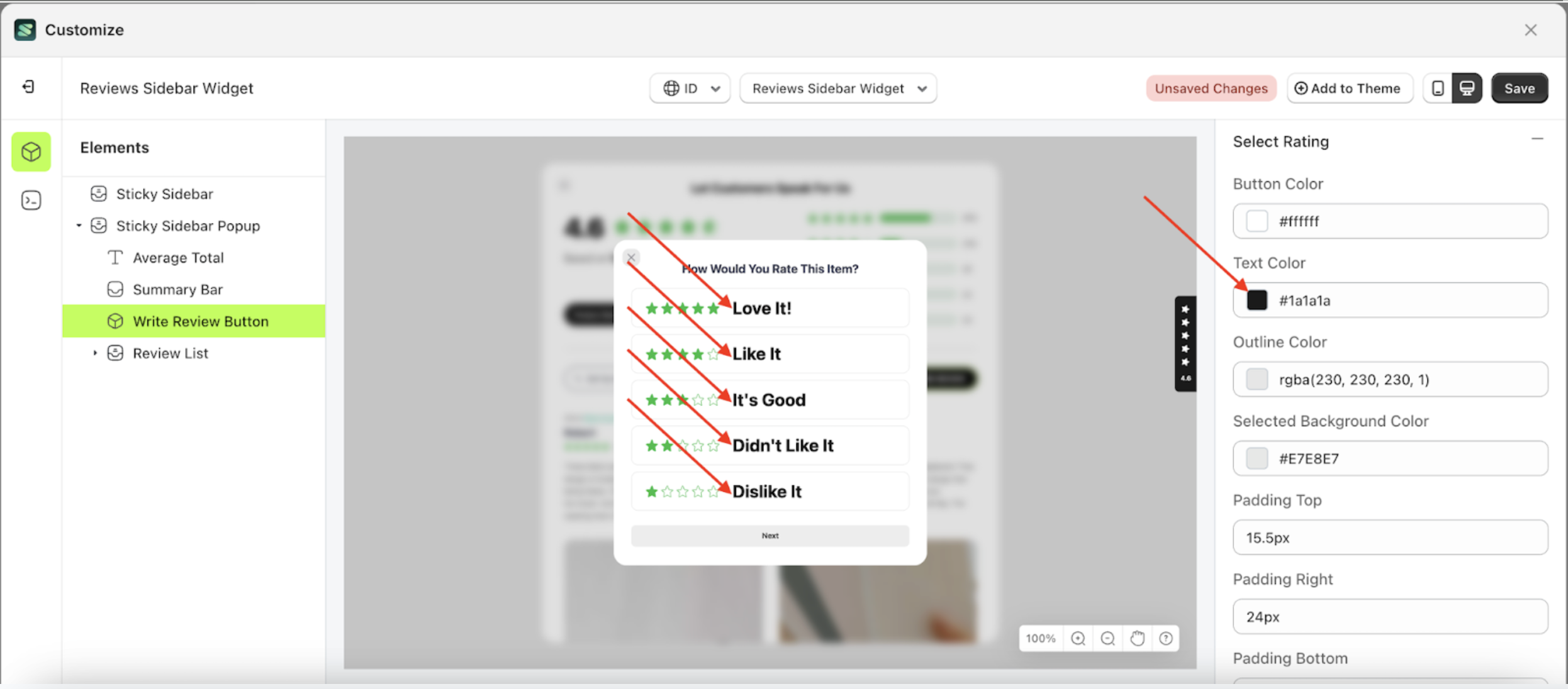
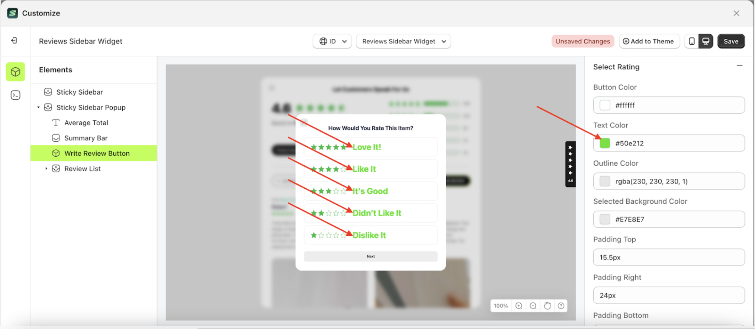
Text Color Select Rating
This feature is designed to customize the text color of the select rating
Follow the steps below:
- Select the Sticky Sidebar Popup element on the left, then click the icon marked with a red arrow to open the menu within that item.
- Once the menu is open, select the Write Review Button element on the left, then click the Settings tab and click the icon marked with a red arrow.
- Click the Color Palette on the right side, which is also marked with a red arrow.
- The Color Palette will appear. Click the right side of the palette where the red arrow and number 1 are indicated, then click the right side again where the red arrow and number 2 are marked.
- To see the changes in this setting on the element, click the Sticky Sidebar element
- Then, click "WRITE STORE REVIEW".
- The review sidebar widget of the Write Review Button element will adjust accordingly.
- Example : Before Write Review Button change settings
- Example : After Write Review Button change settings


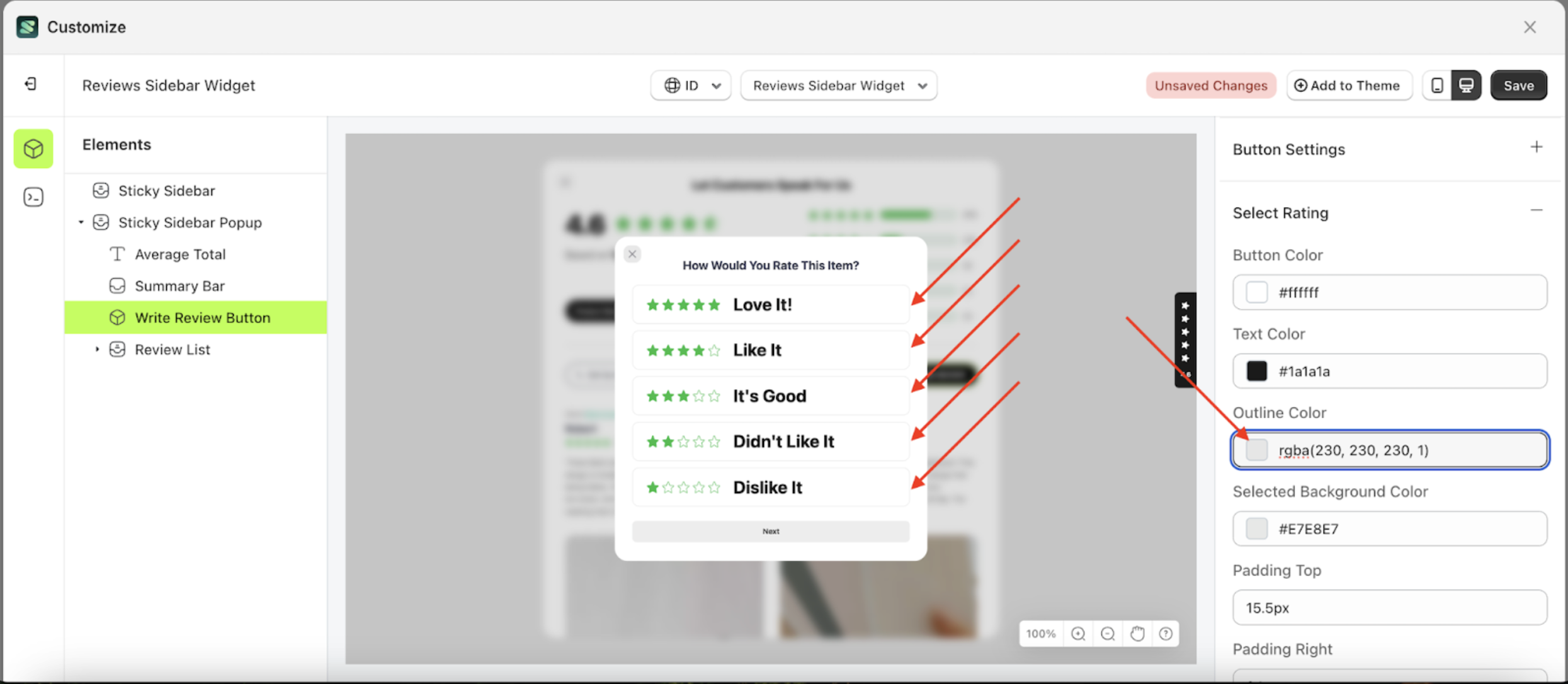
Outline Color Select Rating
This feature is designed to customize the outline color of the select rating
Follow the steps below:
- Select the Sticky Sidebar Popup element on the left, then click the icon marked with a red arrow to open the menu within that item.
- Once the menu is open, select the Write Review Button element on the left, then click the Settings tab and click the icon marked with a red arrow.
- Click the Color Palette on the right side, which is also marked with a red arrow.
- The Color Palette will appear. Click the right side of the palette where the red arrow and number 1 are indicated, then click the right side again where the red arrow and number 2 are marked.
- To see the changes in this setting on the element, click the Sticky Sidebar element
- Then, click "WRITE STORE REVIEW".
- The review sidebar widget of the Write Review Button element will adjust accordingly.
- Example : Before Write Review Button change settings
- Example : After Write Review Button change settings


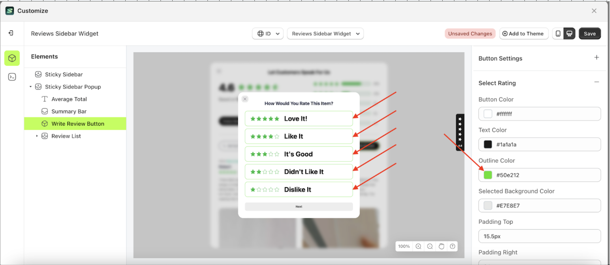
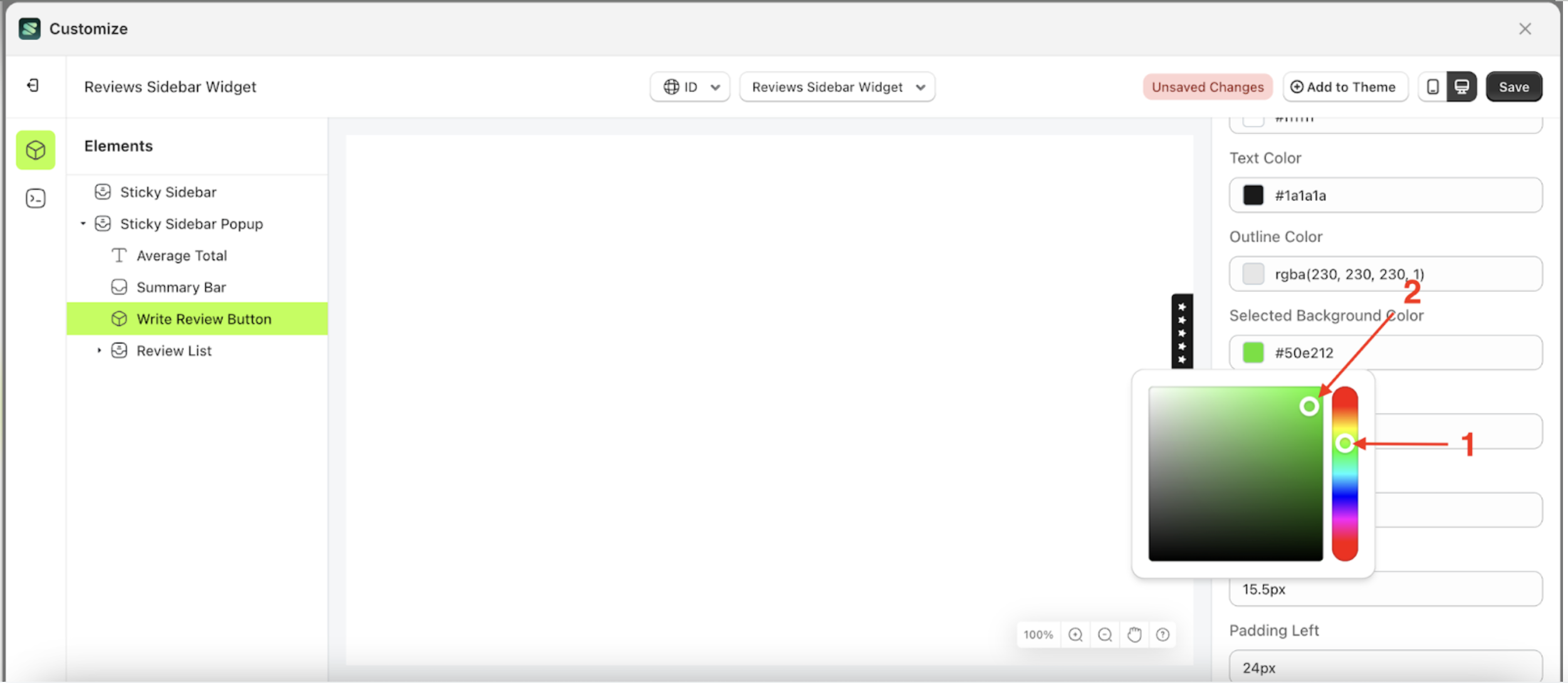
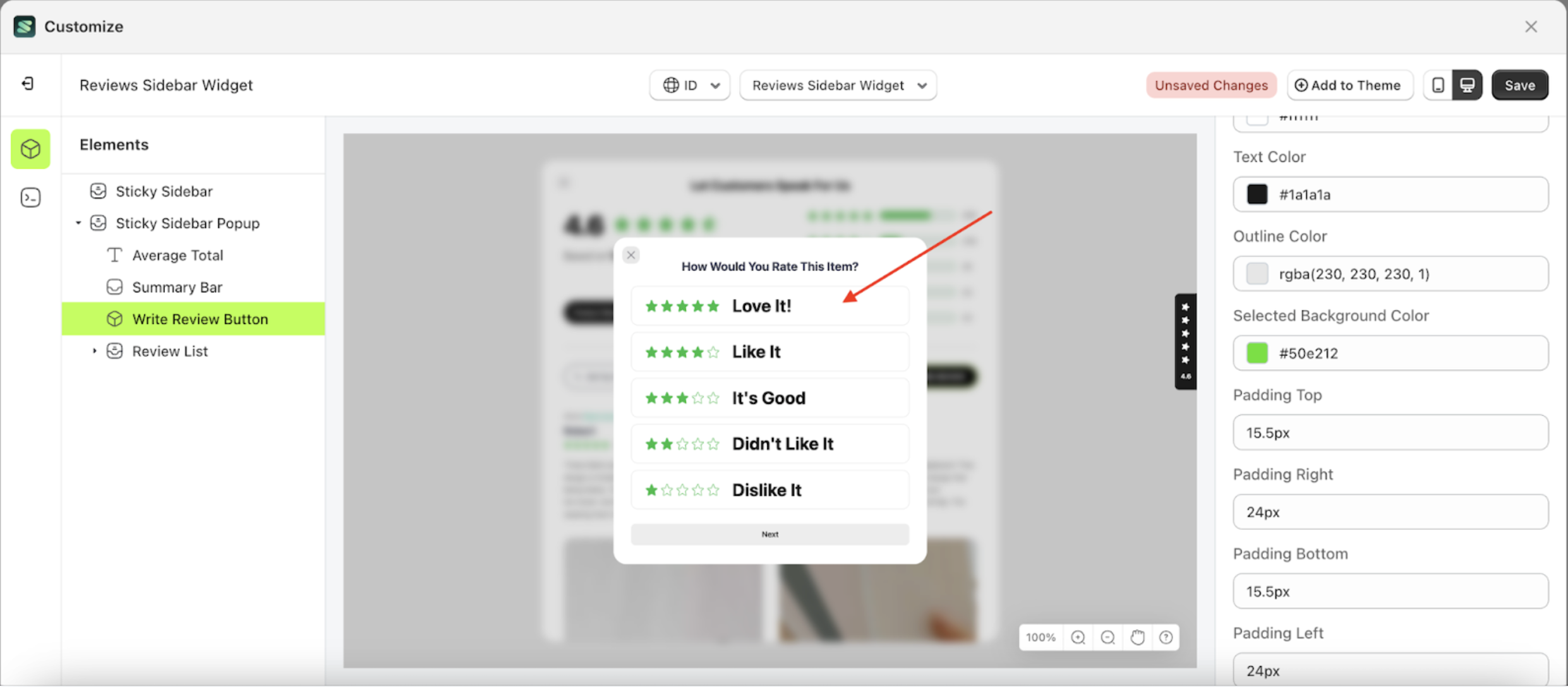
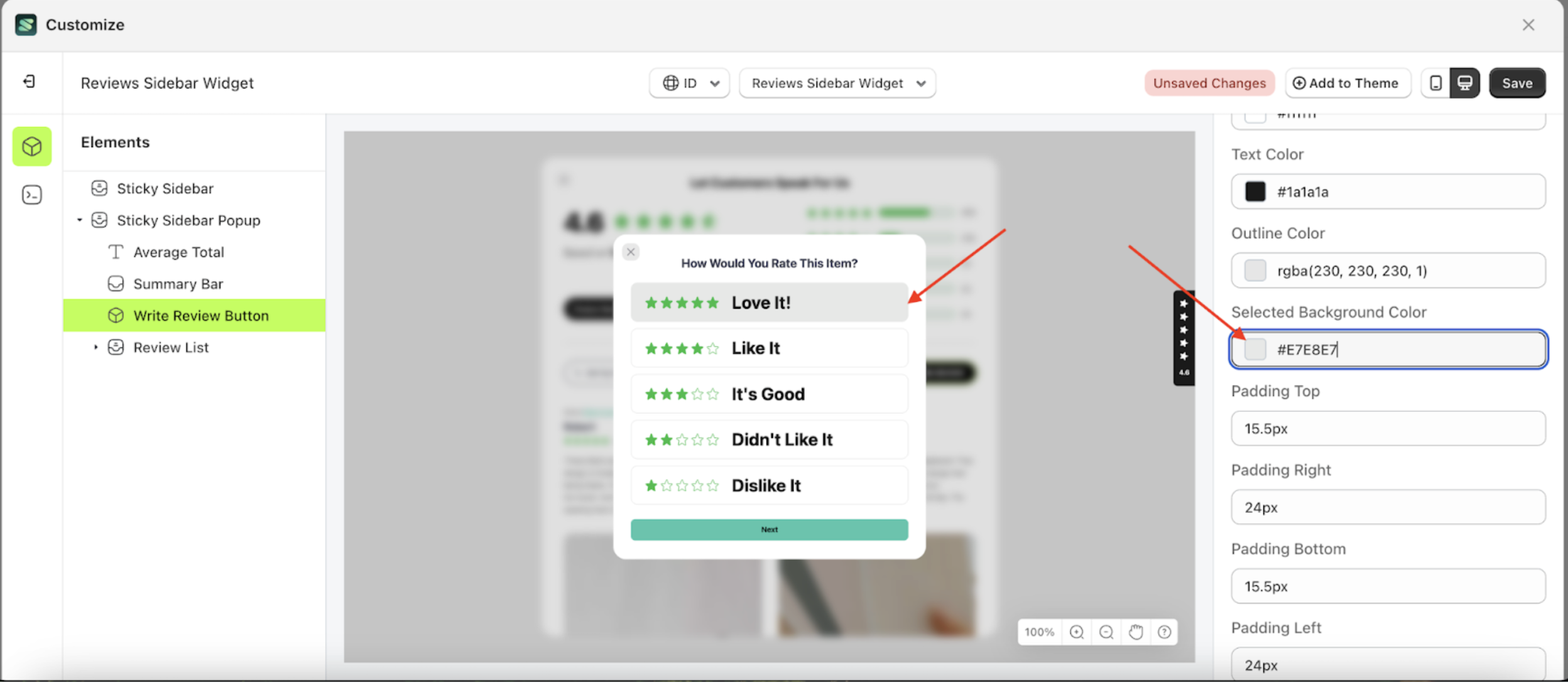
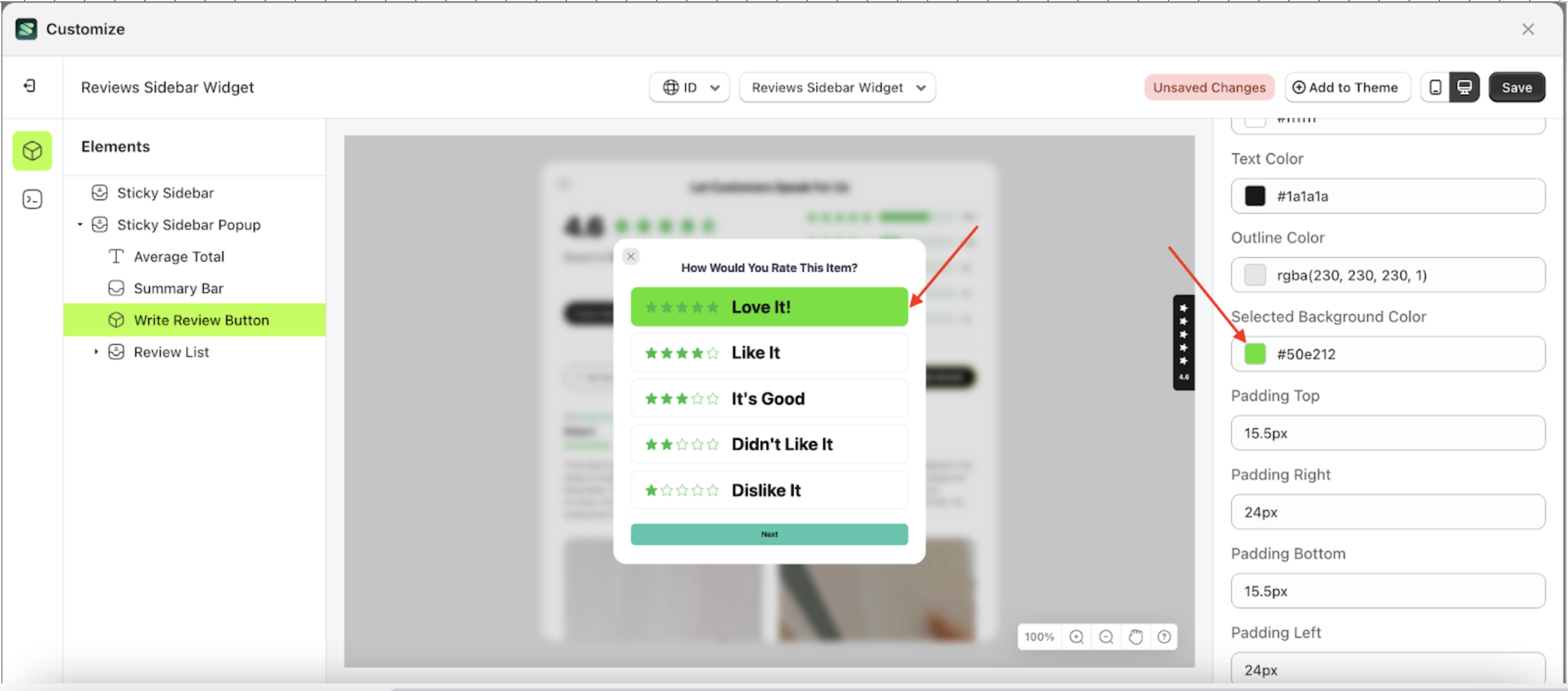
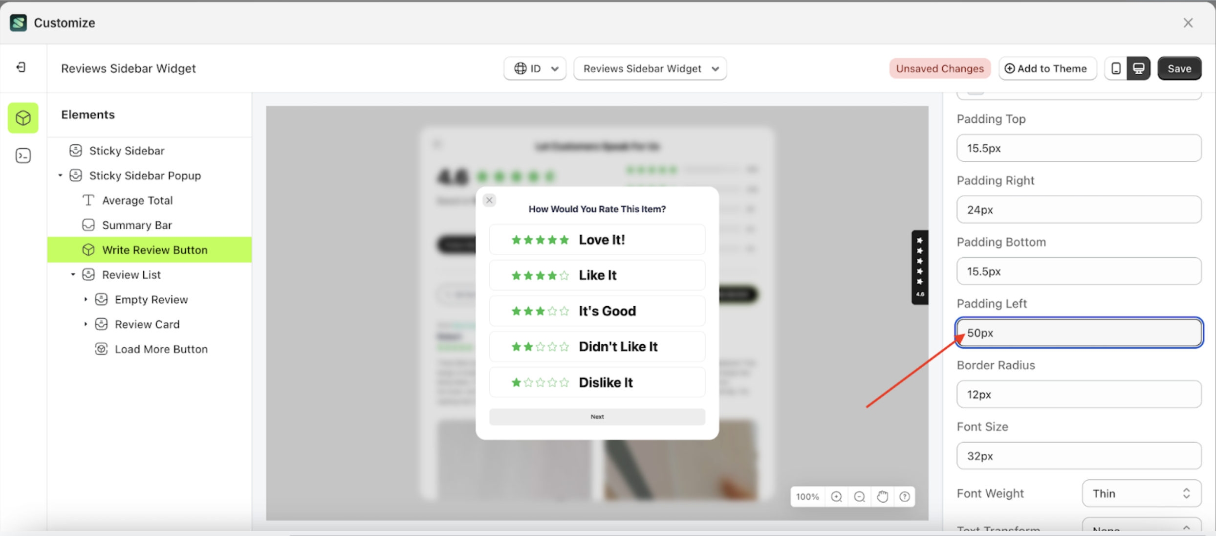
Selected Background Color Select Rating
This feature is designed to customize the selected background color of the select rating
Follow the steps below:
- Select the Sticky Sidebar Popup element on the left, then click the icon marked with a red arrow to open the menu within that item.
- Once the menu is open, select the Write Review Button element on the left, then click the Settings tab and click the icon marked with a red arrow.
- Click the Color Palette on the right side, which is also marked with a red arrow.
- The Color Palette will appear. Click the right side of the palette where the red arrow and number 1 are indicated, then click the right side again where the red arrow and number 2 are marked.
- To see the changes in this setting on the element, click the Sticky Sidebar element
- Then, click "WRITE STORE REVIEW".
- Then, click on one of the review list items. For example, select a 5-star rating.
- The review sidebar widget of the Write Review Button element will adjust accordingly.
- Example : Before Write Review Button change settings
- Example : After Write Review Button change settings


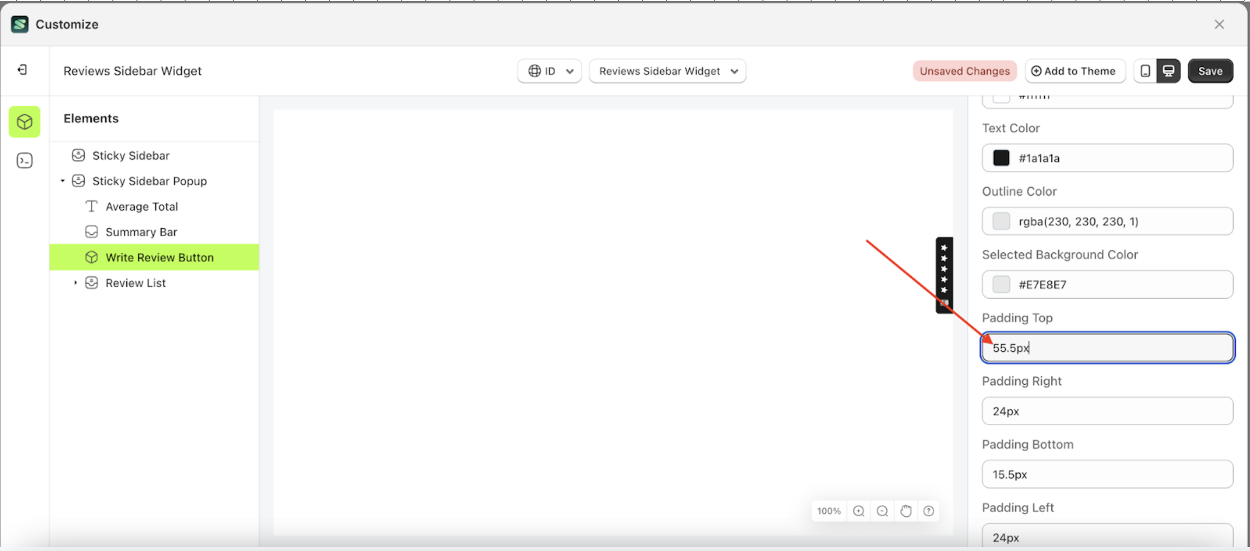
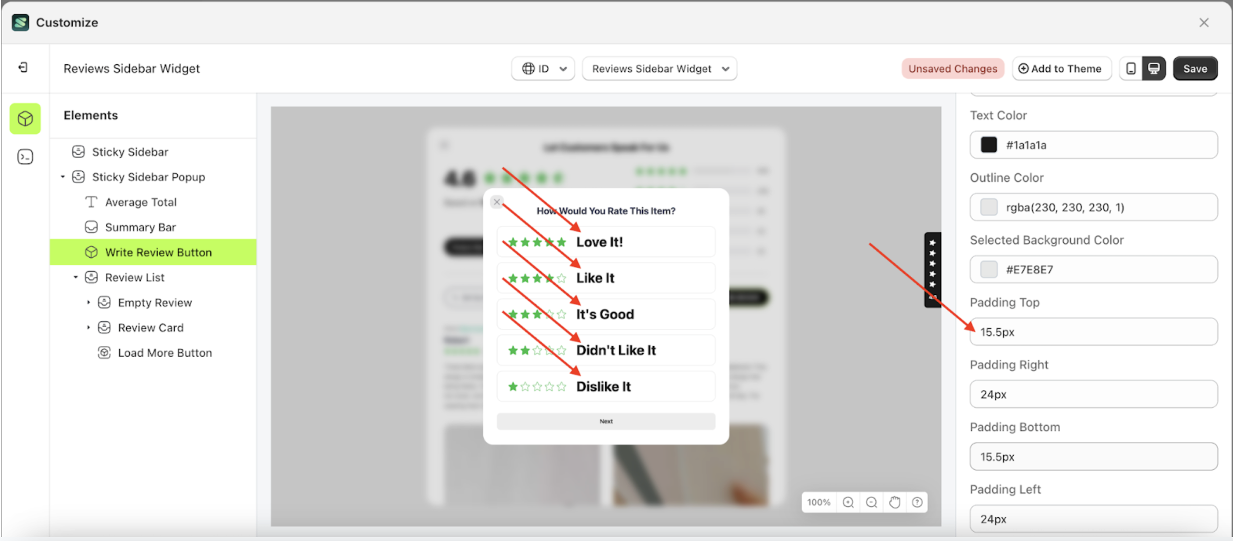
Padding top Select Rating
This feature is designed to customize the top padding of the select rating
Follow the steps below:
- Select the Sticky Sidebar Popup element on the left, then click the icon marked with a red arrow to open the menu within that item.
- Once the menu is open, select the Write Review Button element on the left, then click the Settings tab and click the icon marked with a red arrow.
- On the right side, marked with a red arrow, you can change the padding top to your desired value.
- Note: The padding top format can be px, em, rem, %, or other units..
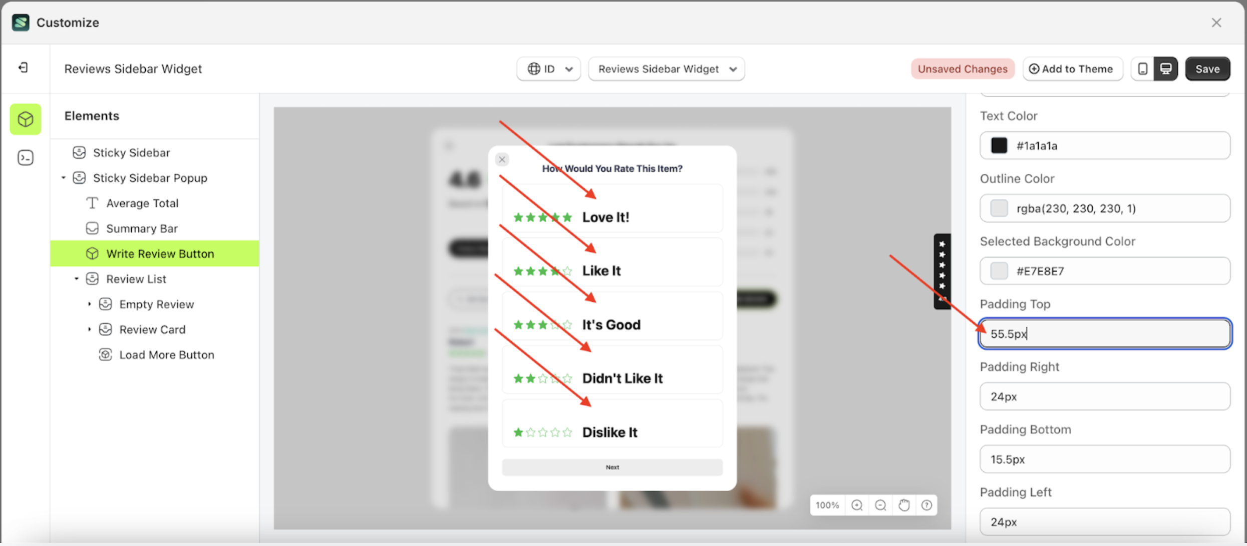
- For example, if you set the padding top to 55.5px
- To see the changes in this setting on the element, click the Sticky Sidebar element
- Then, click "WRITE STORE REVIEW".
- The padding top of the Write Review Button element will adjust accordingly.
- Example : Before padding top change settings
- Example : After padding top change settings


Padding right Select Rating
This feature is designed to customize the right padding of the select rating
Follow the steps below
- Select the Sticky Sidebar Popup element on the left, then click the icon marked with a red arrow to open the menu within that item

- Once the menu is open, select the Write Review Button element on the left, then click the Settings tab and click the icon marked with a red arrow.

- On the right side, marked with a red arrow, you can change the padding top to your desired value.
- Note: The padding right format can be px, em, rem, %, or other units..
- For example, if you set the padding top to 50px.
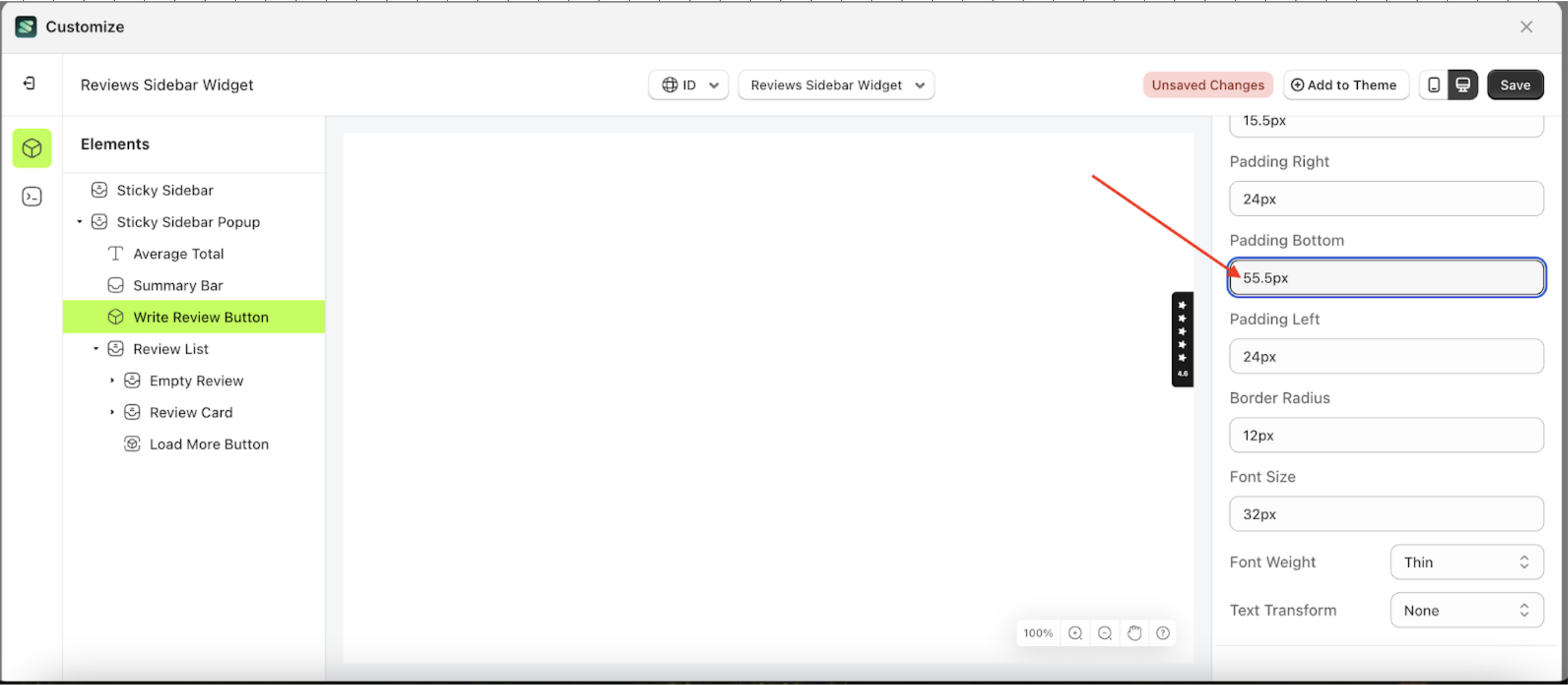
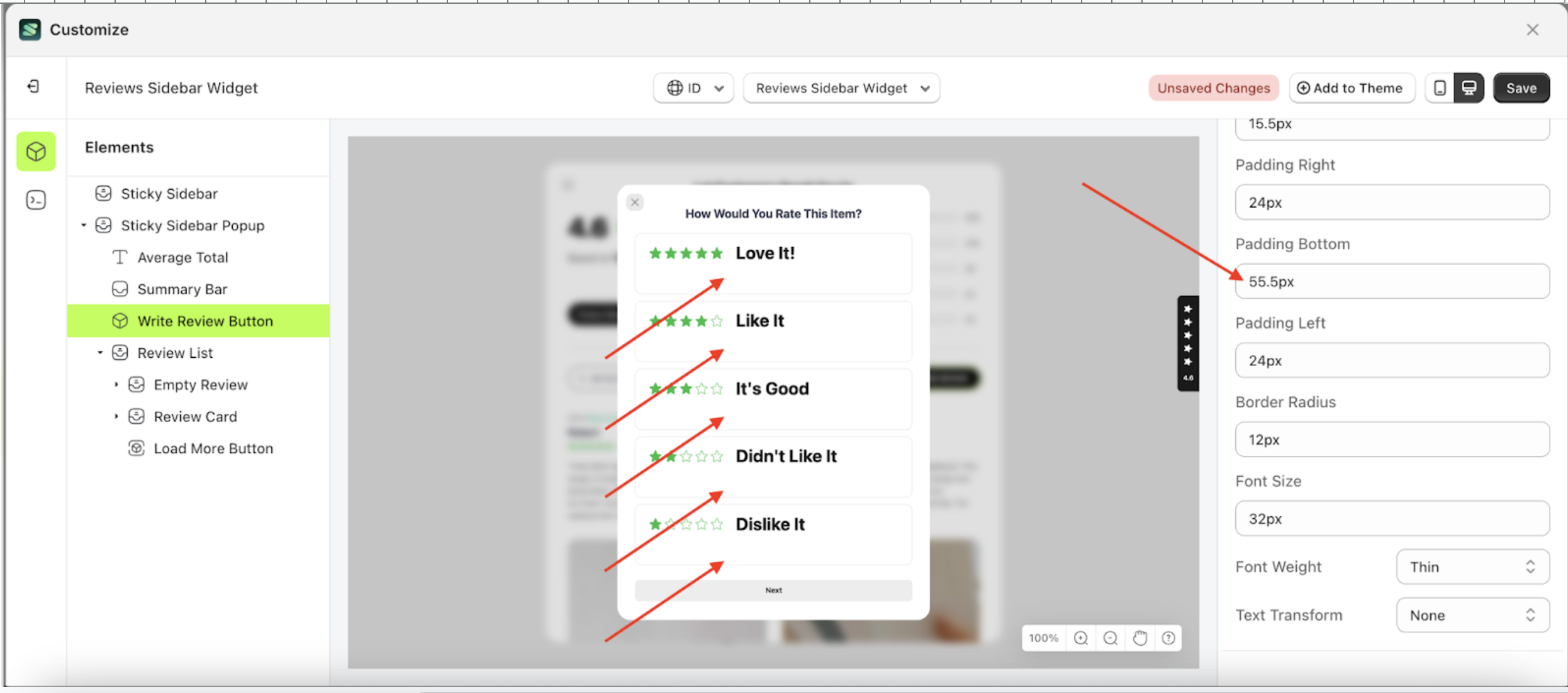
Padding bottom Select Rating
This feature is designed to customize the buttom padding of the select rating
Follow the steps below
- Select the Sticky Sidebar Popup element on the left, then click the icon marked with a red arrow to open the menu within that item.
- Once the menu is open, select the Write Review Button element on the left, then click the Settings tab and click the icon marked with a red arrow.
- On the right side, marked with a red arrow, you can change the padding bottom to your desired value.
- Note: The padding bottom format can be px, em, rem, %, or other units..
- For example, if you set the padding bottom to 55.5px
- To see the changes in this setting on the element, click the Sticky Sidebar element
- Then, click "WRITE STORE REVIEW".
- The padding bottom of the Write Review Button element will adjust accordingly.
- Example : Before padding bottom change settings
- Example : After padding bottom change settings


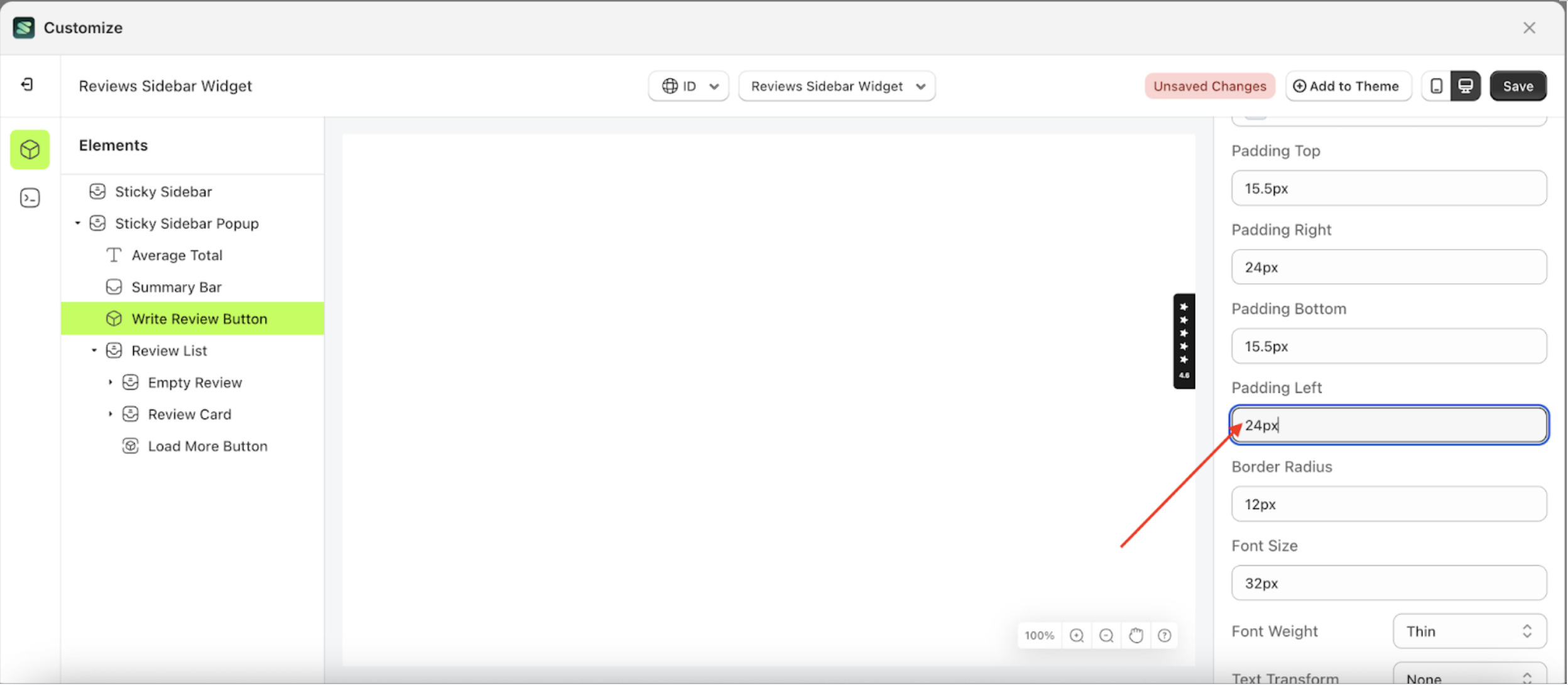
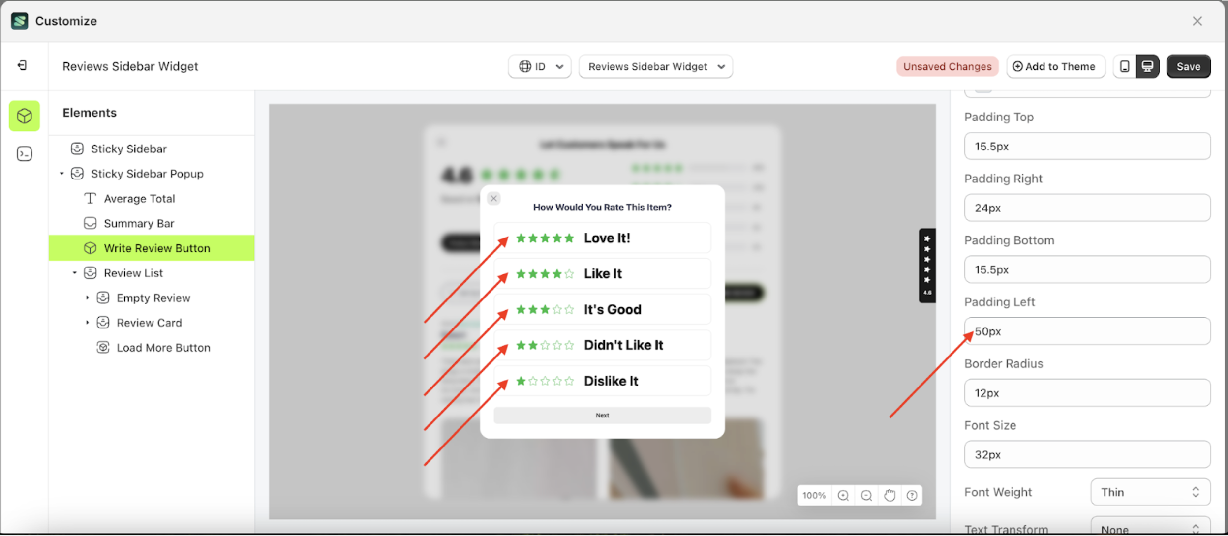
Padding left Select Rating
This feature is designed to customize the left padding of the select rating
Follow the steps below
- Select the Sticky Sidebar Popup element on the left, then click the icon marked with a red arrow to open the menu within that item.
- Once the menu is open, select the Write Review Button element on the left, then click the Settings tab and click the icon marked with a red arrow.
- On the right side, marked with a red arrow, you can change the padding left to your desired value.
- Note: The padding left format can be px, em, rem, %, or other units..
- For example, if you set the padding left to 50px
- To see the changes in this setting on the element, click the Sticky Sidebar element
- Then, click "WRITE STORE REVIEW".
- The padding left of the Write Review Button element will adjust accordingly.
- Example : Before padding left change settings
- Example : After padding left change settings


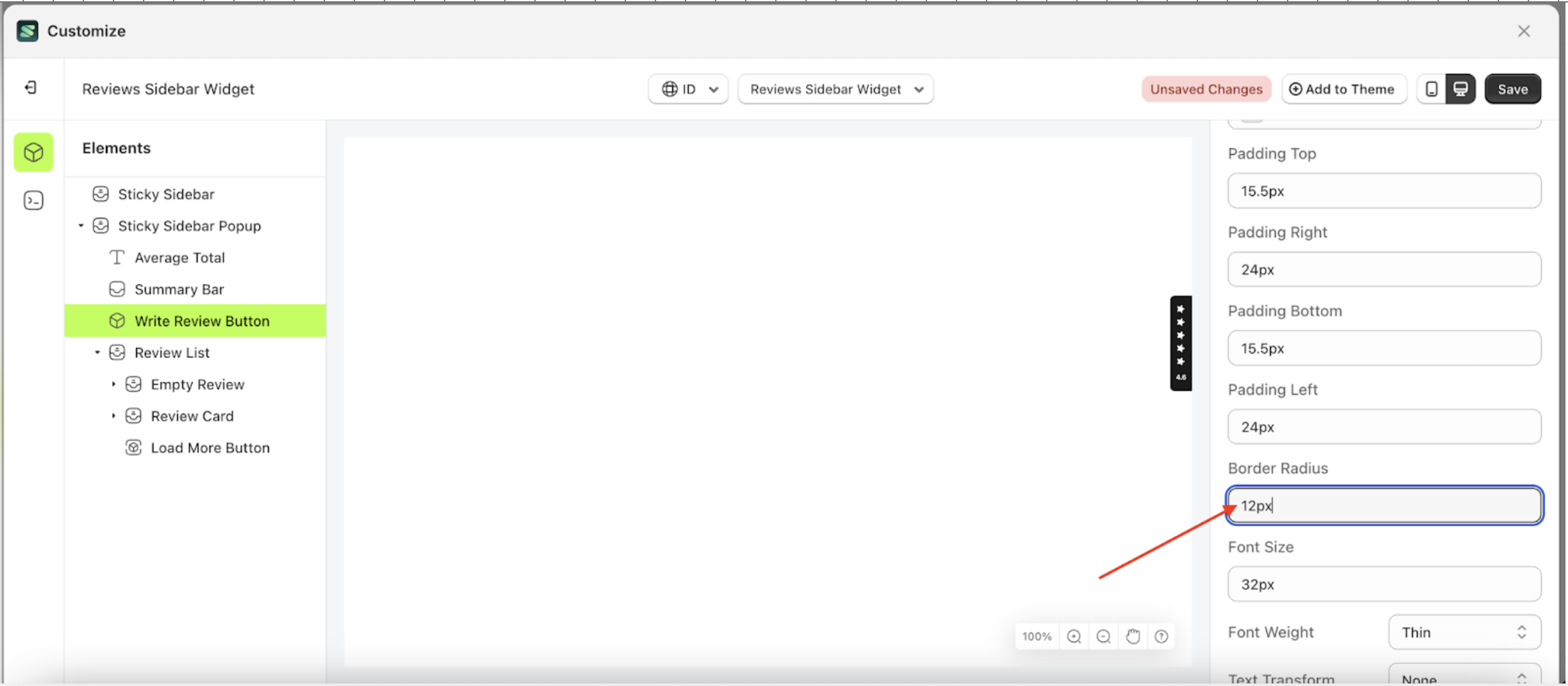
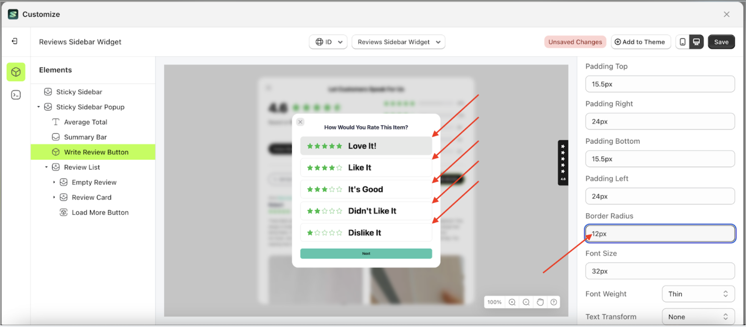
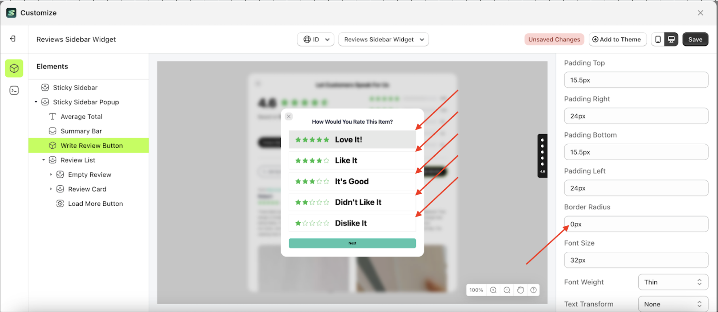
Border radius Select Rating
This feature is designed to customize the corner radius of the select rating
Follow the steps below
- Select the Sticky Sidebar Popup element on the left, then click the icon marked with a red arrow to open the menu within that item.
- Once the menu is open, select the Write Review Button element on the left, then click the Settings tab and click the icon marked with a red arrow.
- On the right side, marked with a red arrow, you can change the border radius to your desired value.
- Note: The border radius format can be px, em, rem, %, or other units..
- For example, if you set the border radius to 0rem
- To see the changes in this setting on the element, click the Sticky Sidebar element
- Then, click "WRITE STORE REVIEW".
- The border radius of the Write Review Button element will adjust accordingly.
- Example : Before border radius change settings
- Example : After border radius change settings


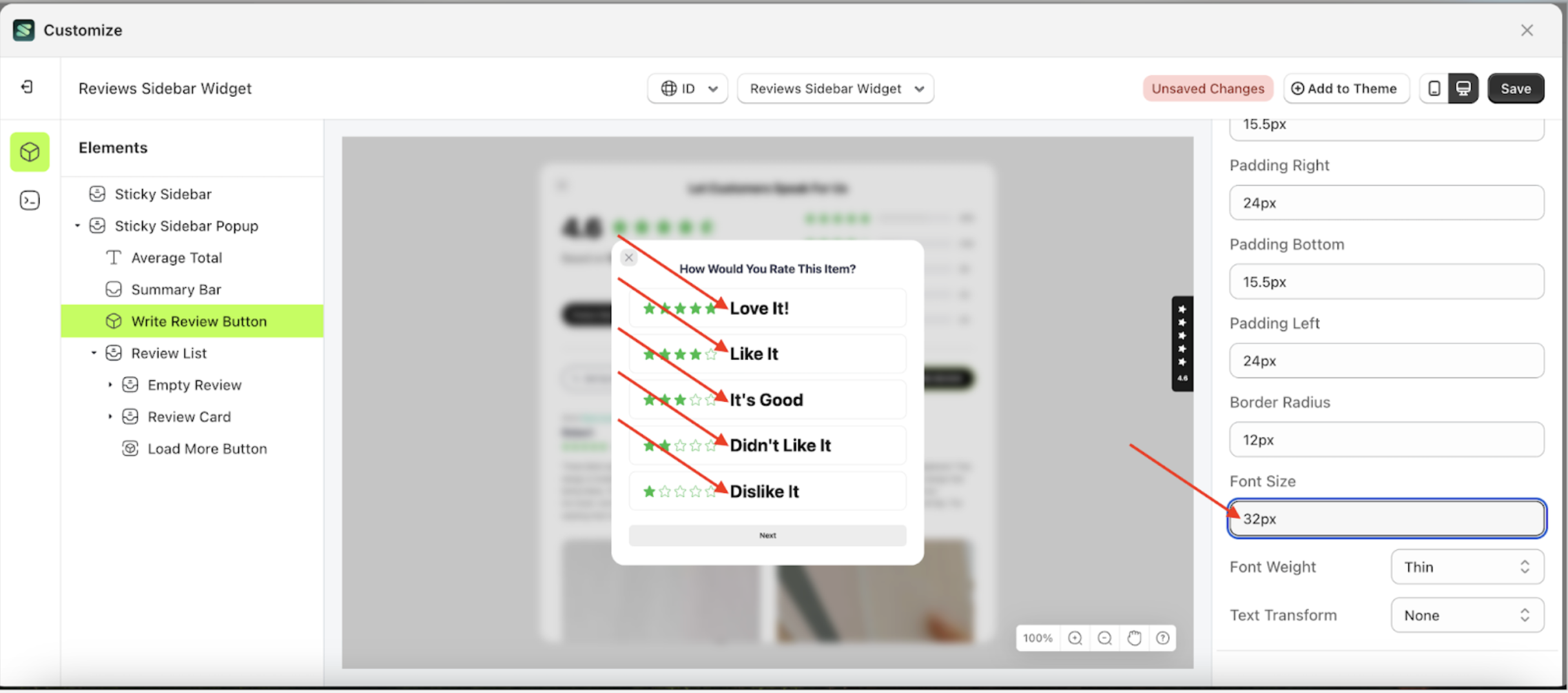
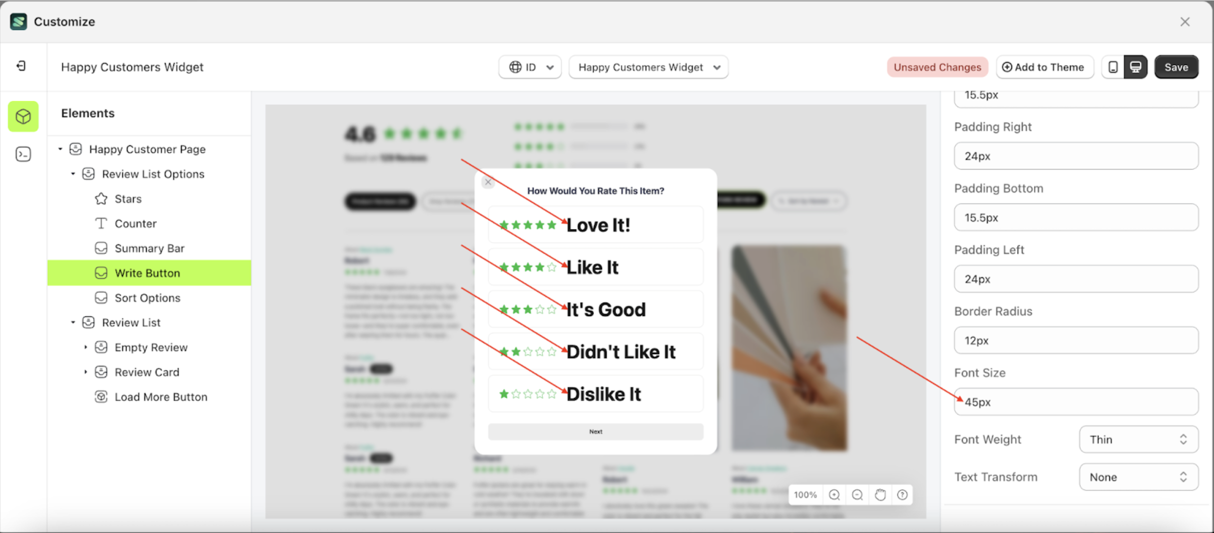
Font size Select Rating
This feature is designed to customize the text size of the select rating
Follow the steps below
- Select the Sticky Sidebar Popup element on the left, then click the icon marked with a red arrow to open the menu within that item.
- Once the menu is open, select the Write Review Button element on the left, then click the Settings tab and click the icon marked with a red arrow.
- On the right side, marked with a red arrow, you can change the font size to your desired value.
- Note: The font size format can be px, em, rem, %, or other units..
- For example, if you set the font size to 45px
- To see the changes in this setting on the element, click the Sticky Sidebar element
- Then, click "WRITE STORE REVIEW".
- The font size of the Write Review Button element will adjust accordingly.
- Example : Before font size change settings
- Example : After font size change settings


Font weight Select Rating
This feature is designed to customize the text weight of the select rating
Follow the steps below
- Select the Sticky Sidebar Popup element on the left, then click the icon marked with a red arrow to open the menu within that item.
- Once the menu is open, select the Write Review Button element on the left, then click the Settings tab and click the icon marked with a red arrow.
- On the right side, marked with a red arrow, you can change the font weight to your desired value.
- Note: The font weight format can thin, extra light, light and etc.
- Once the menu opens, select an option from the list
- For example, if you set the font weight to thin
- To see the changes in this setting on the element, click the Sticky Sidebar element
- Then, click "WRITE STORE REVIEW".
- The font weight of the Write Review Button element will adjust accordingly.
- Example : Before font weight change settings
- Example : After font weight change settings


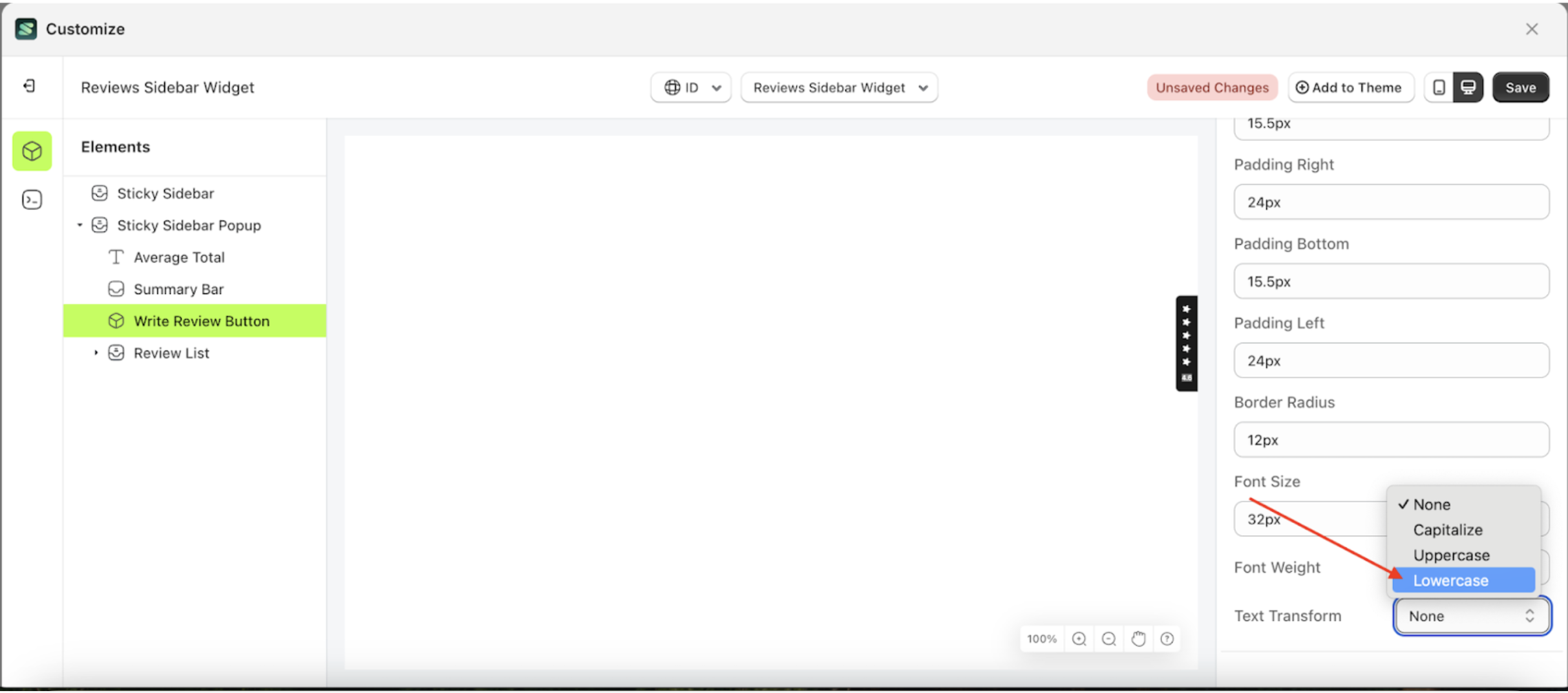
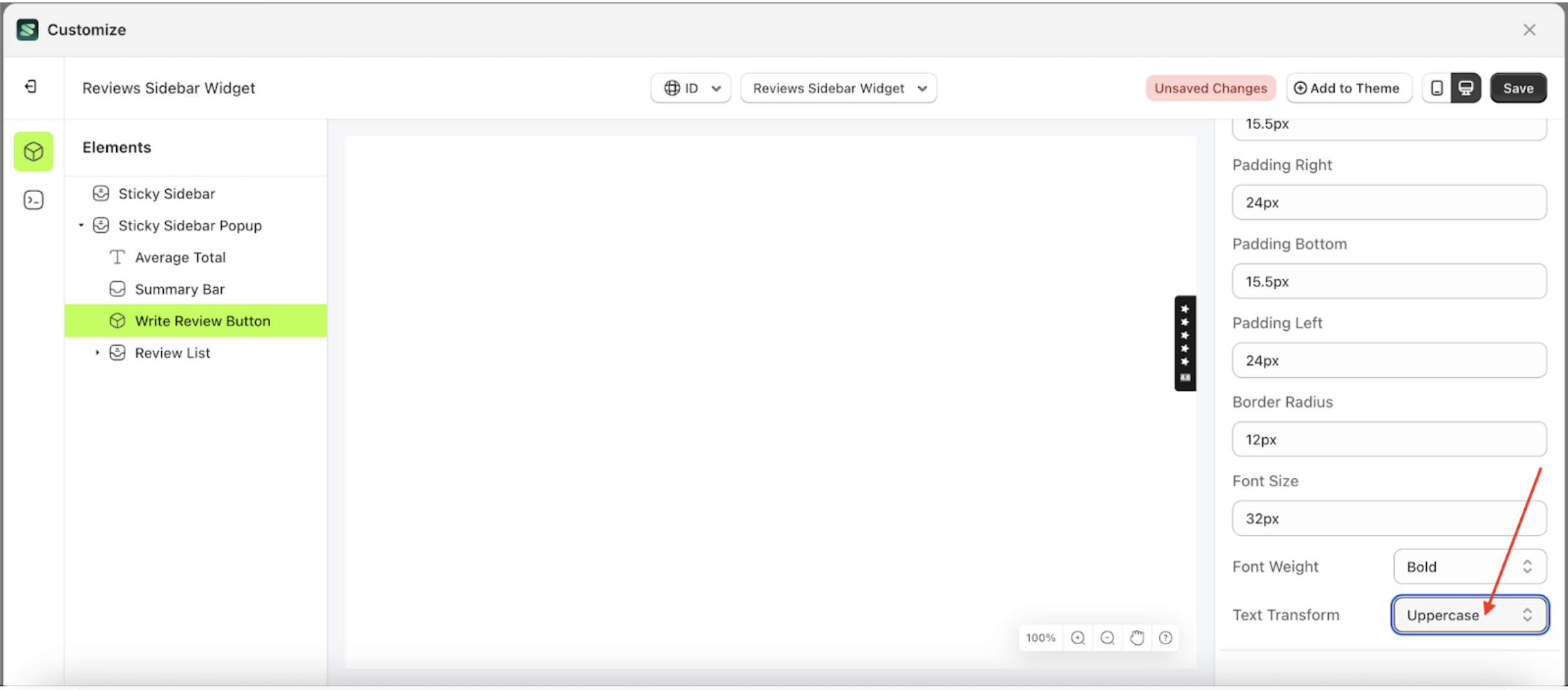
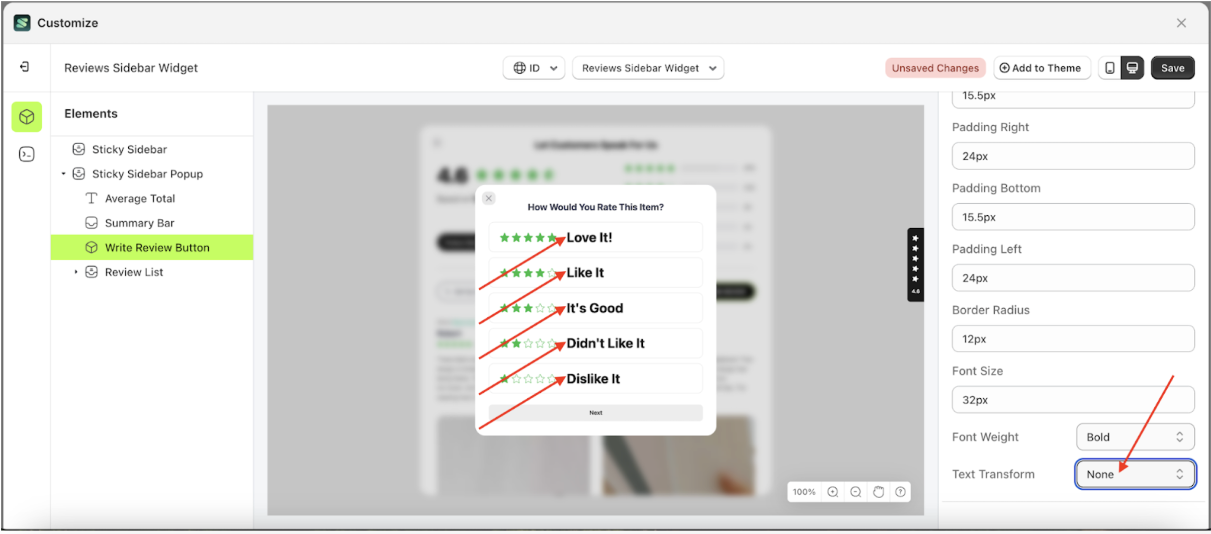
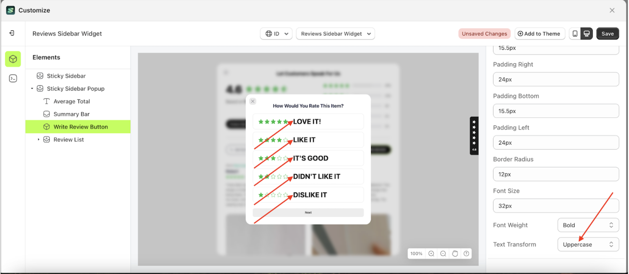
Text transform Select Rating
This feature allows you to adjust the capitalization style of the text
Follow the steps below
- Select the Sticky Sidebar Popup element on the left, then click the icon marked with a red arrow to open the menu within that item.
- Once the menu is open, select the Write Review Button element on the left, then click the Settings tab and click the icon marked with a red arrow.
- On the right side, marked with a red arrow, you can change the text transform to your desired value.
- Note: The text transform format can None, Capitalize, Uppercase and Lowercase.
- Once the menu opens, select an option from the list
- For example, if you set the text transform to thin
- To see the changes in this setting on the element, click the Sticky Sidebar element
- Then, click "WRITE STORE REVIEW".
- The text transform of the Write Review Button element will adjust accordingly.
- Example : Before text transform change settings
- Example : After text transform change settings


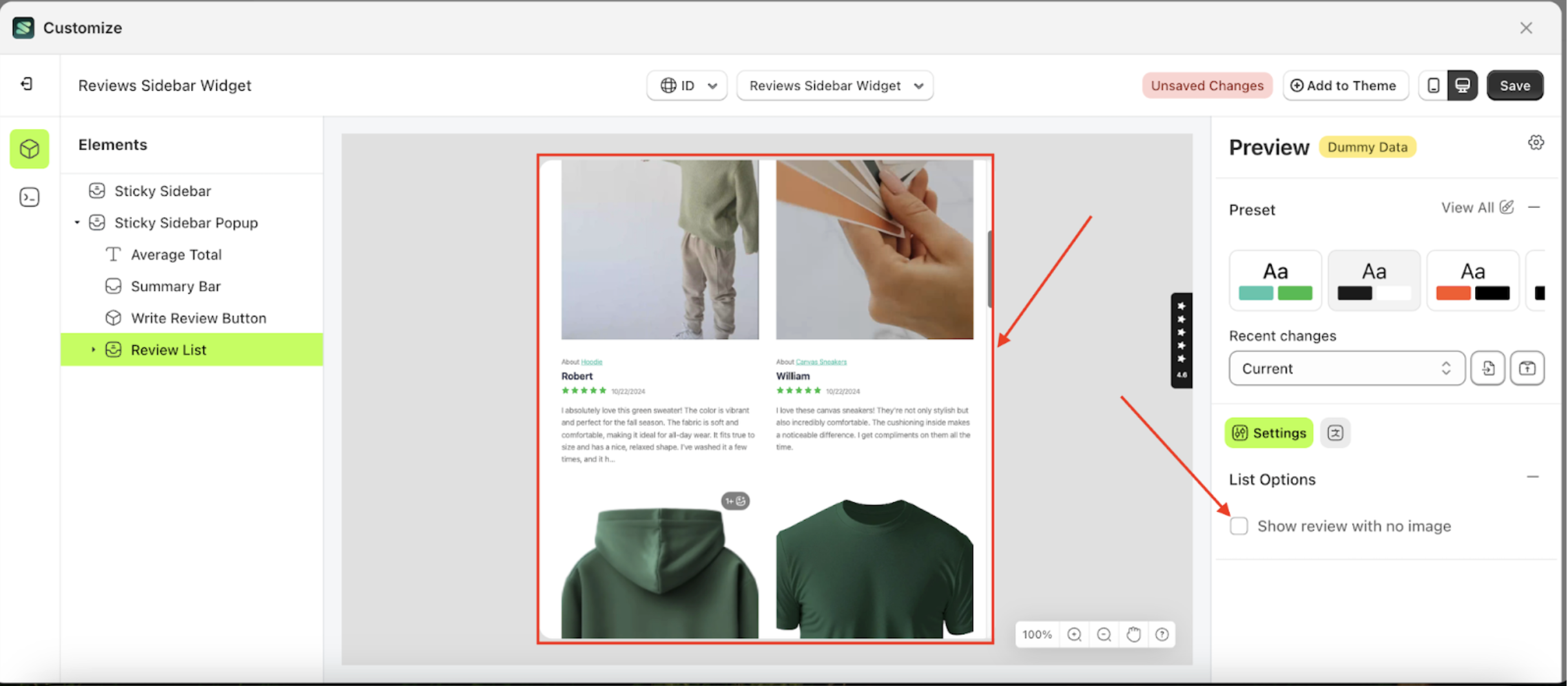
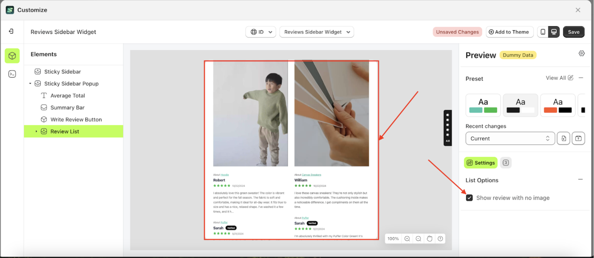
List Options
Available settings:
Show Review With no Image
This feature is designed to customize the background color of the Write Store Review.
Follow the steps below:
- Select the Review LIst element on the left side, then click the icon on the right side, marked with a red arrow, to access the list options settings.
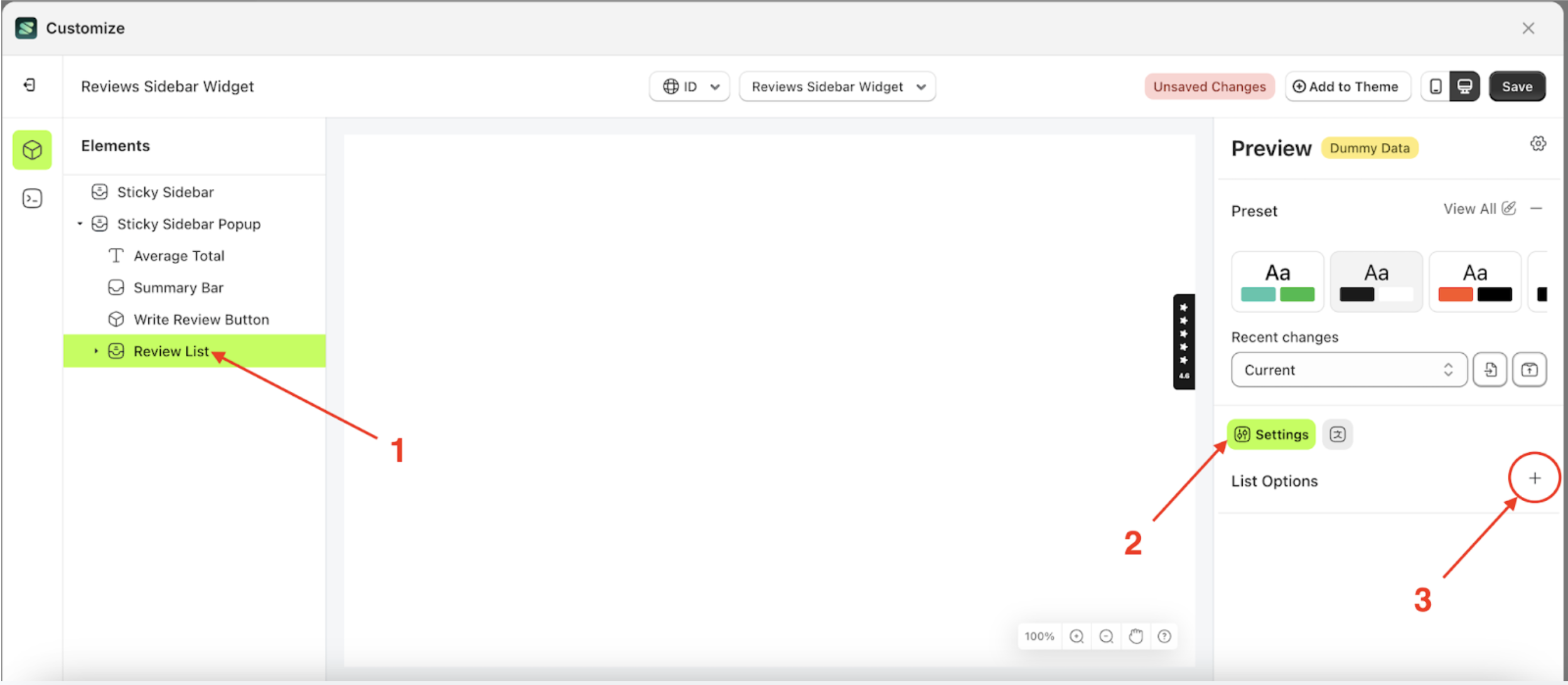
- Check the Enable Auto Publish option
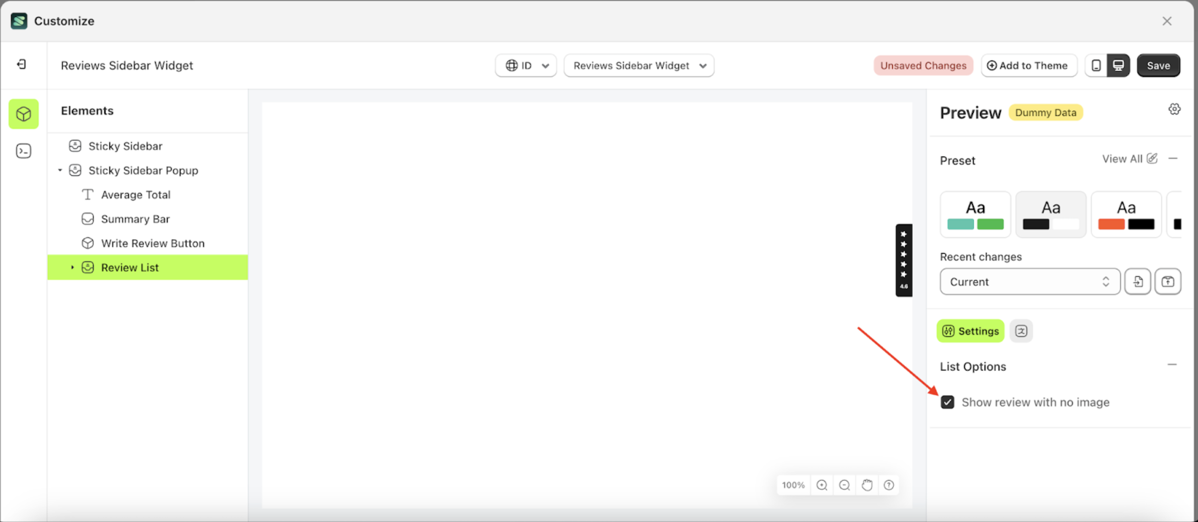
- To see the changes in this setting on the element, click the Sticky Bar element
- Review List element will adjust accordingly
- Example: Before Show review with no image change settings
- Example: After Show review with no image change settings
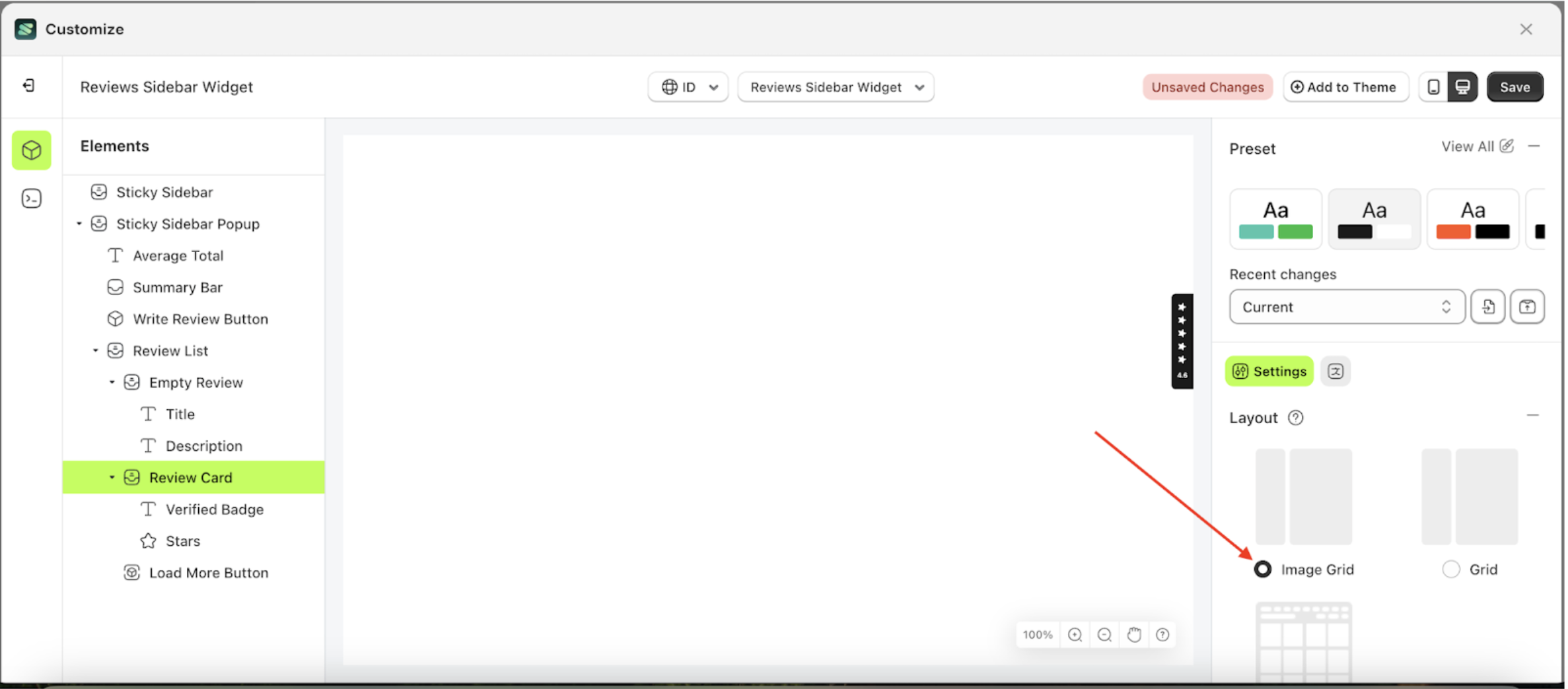
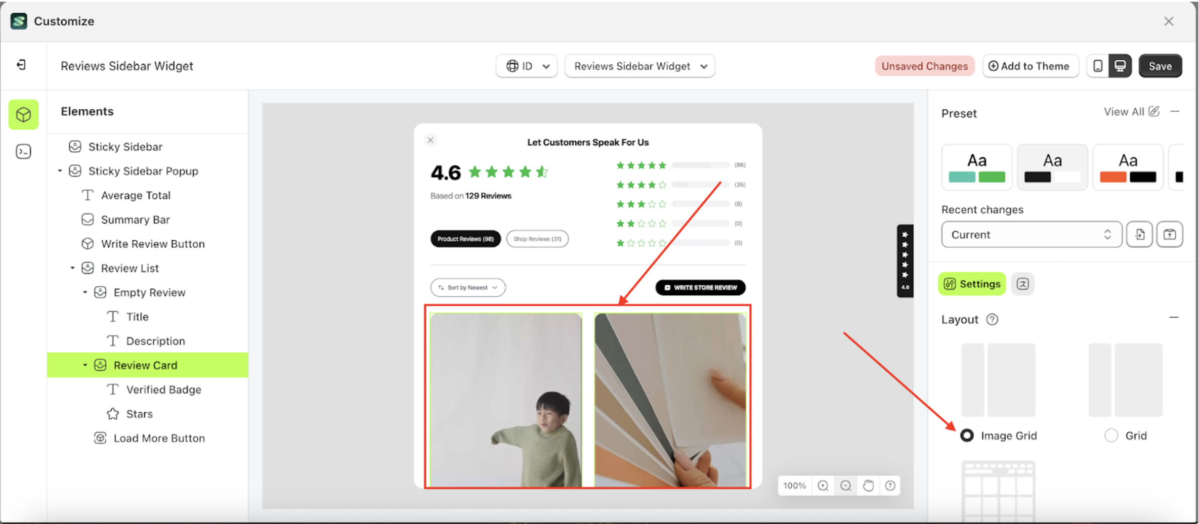
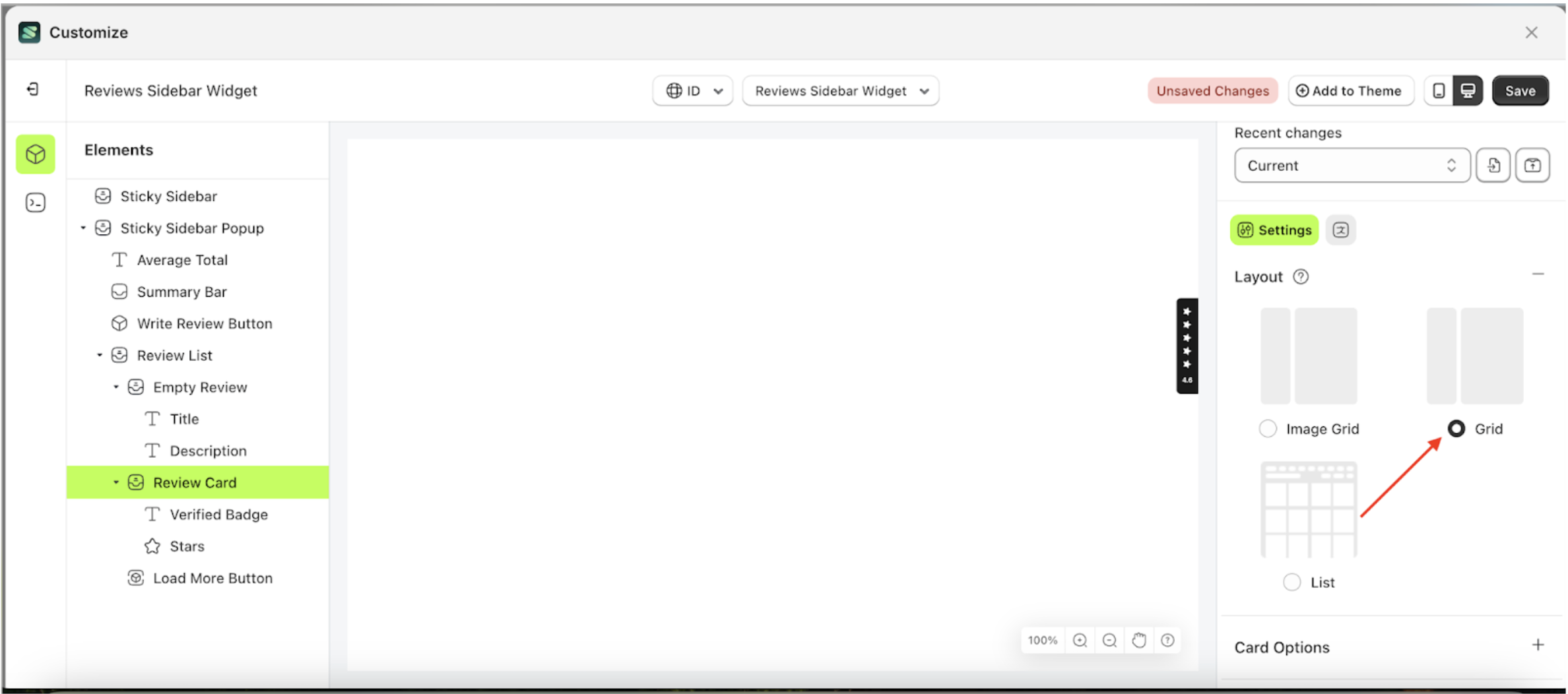
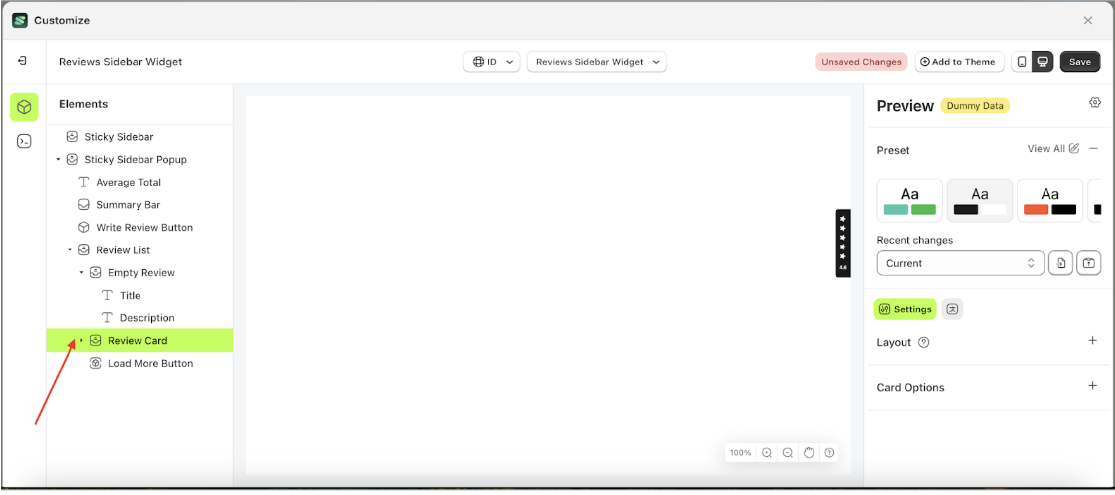
Layout
Available settings:
Image Grid
Image Grid is a layout setting for review cards, where images and review text are separated into distinct sections.
Follow the steps below:
- Select the Review Card element on the right, then click the Settings tab and click the icon marked with a red arrow.
- Select Image Grid by following the red arrow.
- To see the changes in this setting on the element, click the Sticky Bar element
- To see the changes in this setting on the element, click the Sticky Bar element
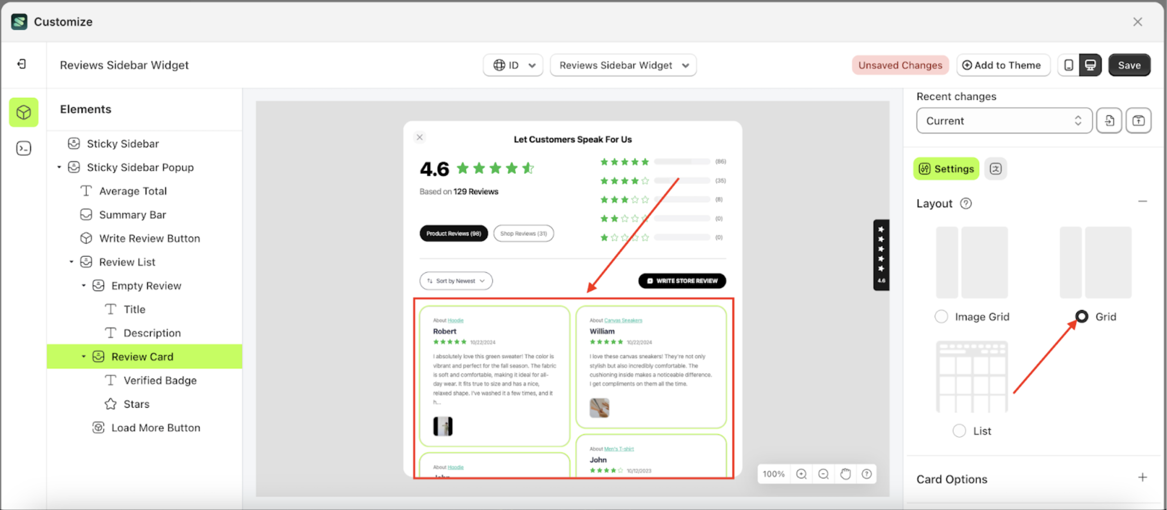
Grid
Grid is a layout setting for review cards, where images and review text are combined into a single section.
Follow the steps below:
- Select the Review Card element on the right, then click the Settings tab and click the icon marked with a red arrow.
- Select Image Grid by following the red arrow.
- To see the changes in this setting on the element, click the Sticky Bar element

- To see the changes in this setting on the element, click the Sticky Bar element
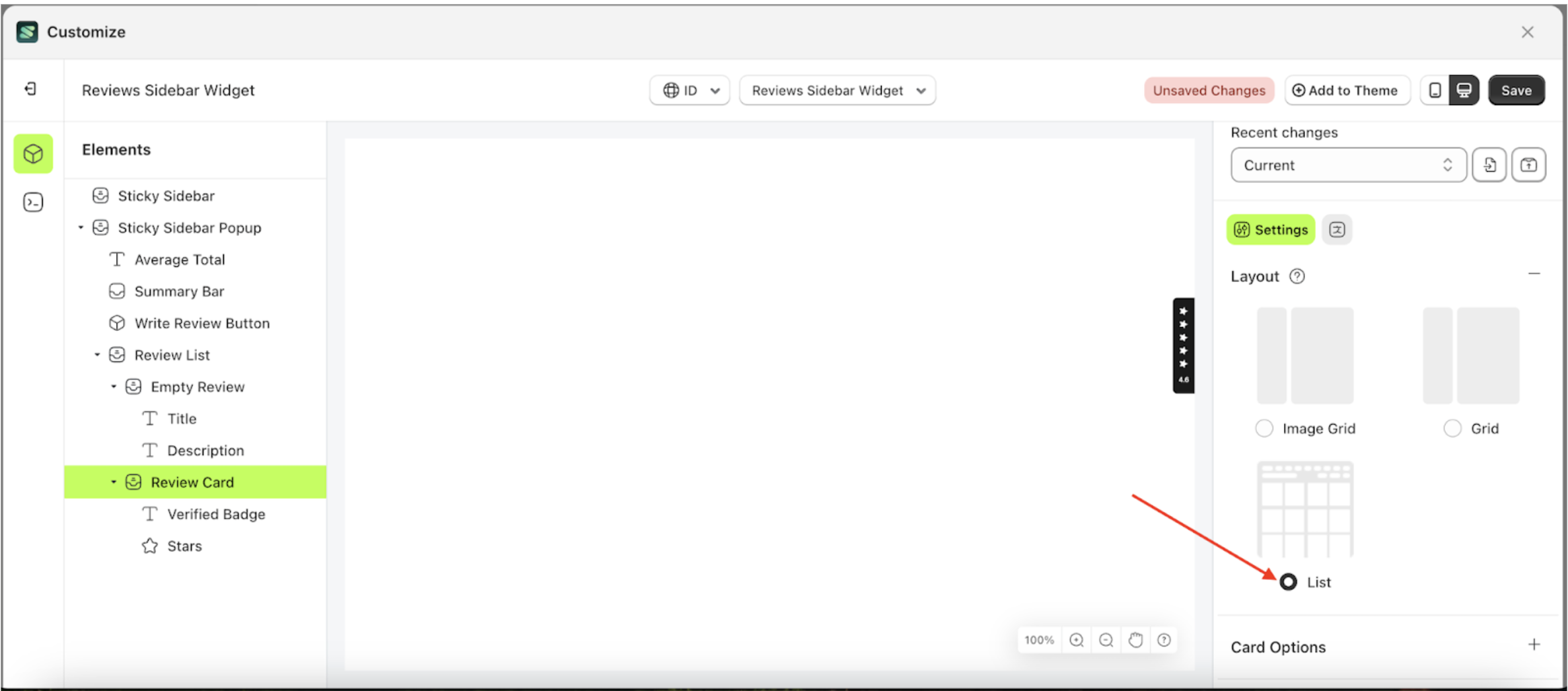
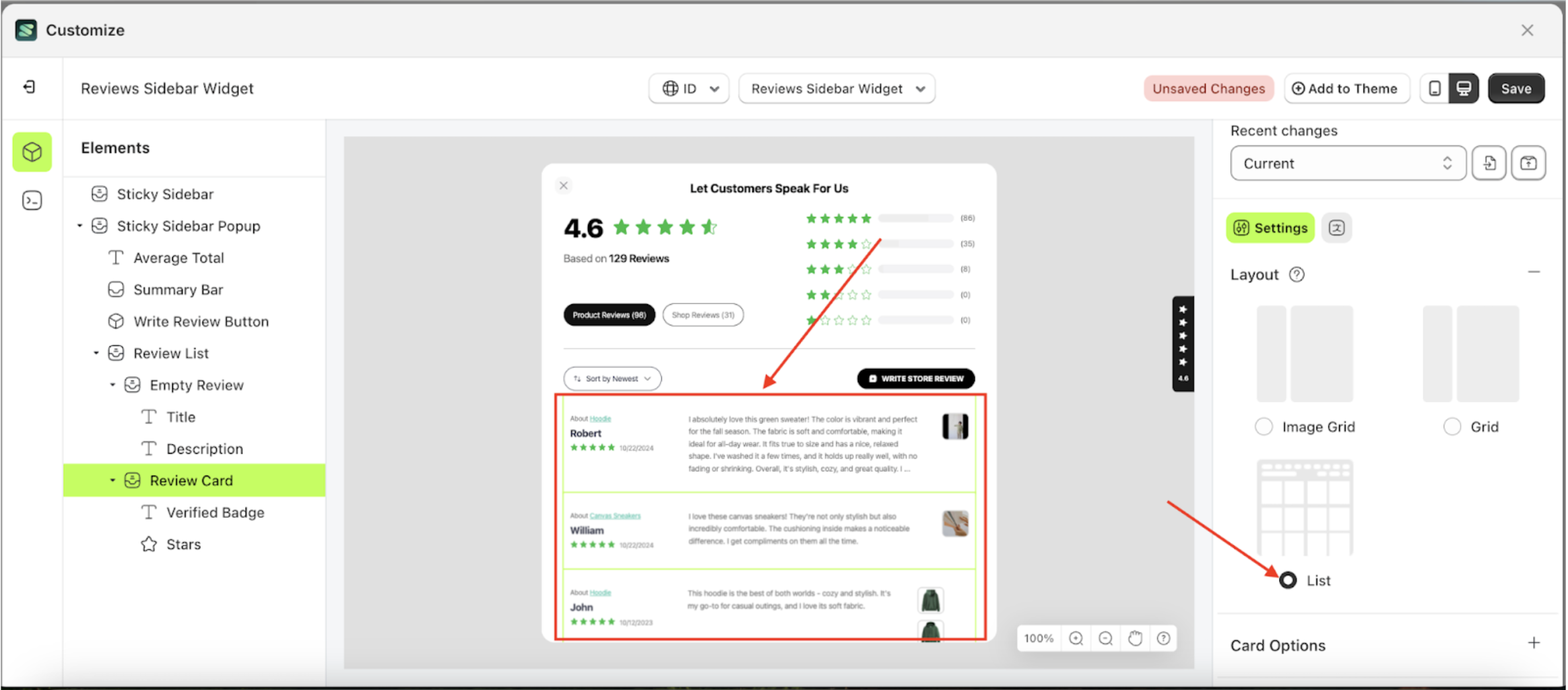
List
List is a layout setting for review cards, displayed in a row-by-row format.
Follow the steps below:
- Select the Review Card element on the right, then click the Settings tab and click the icon marked with a red arrow.
- Select Image Grid by following the red arrow.
- To see the changes in this setting on the element, click the Sticky Bar element
- To see the changes in this setting on the element, click the Sticky Bar element
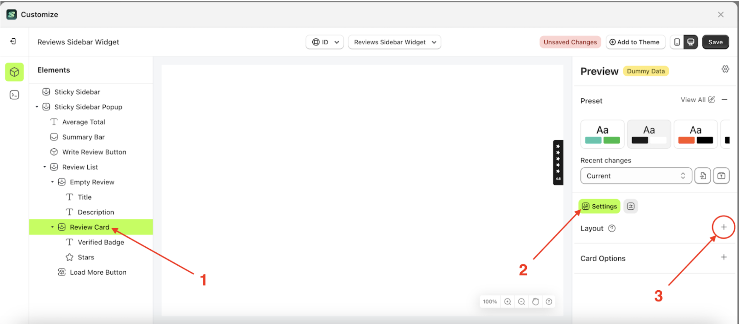
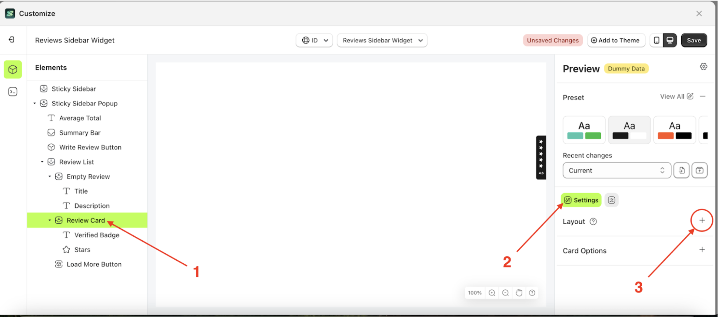
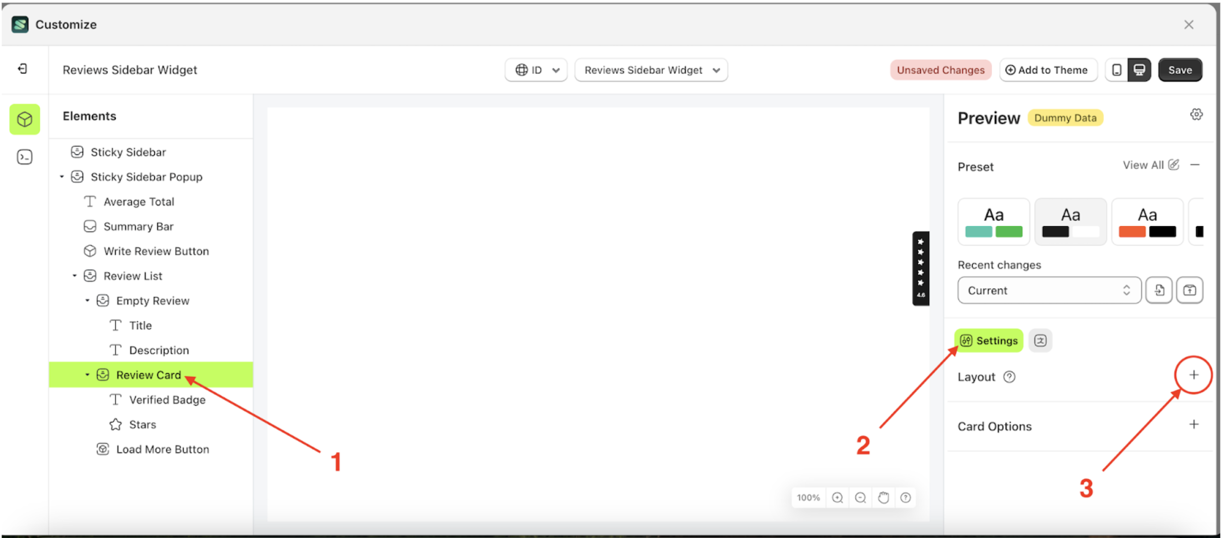
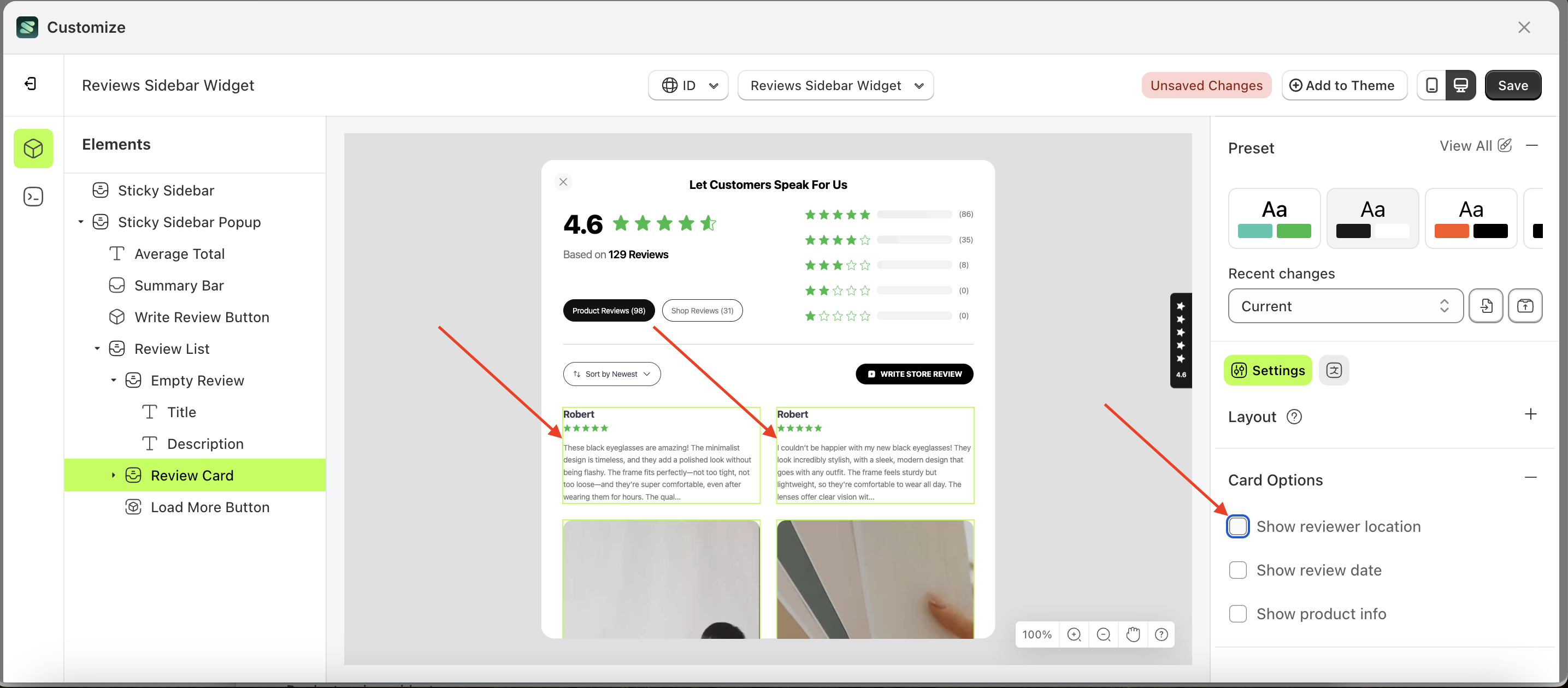
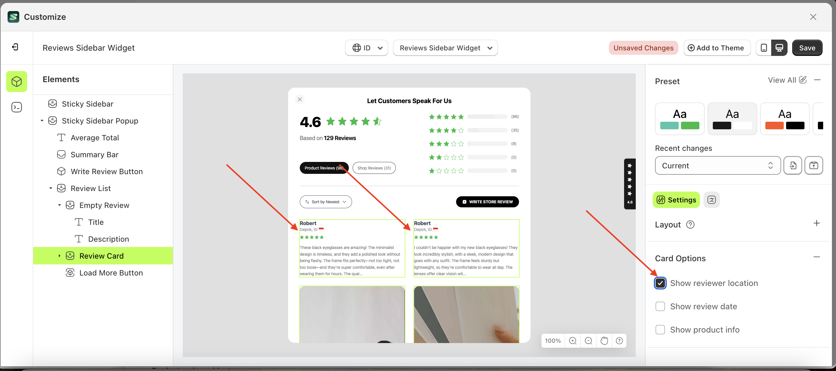
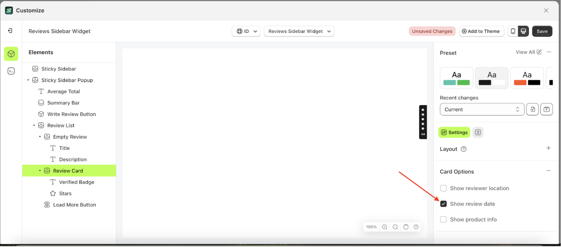
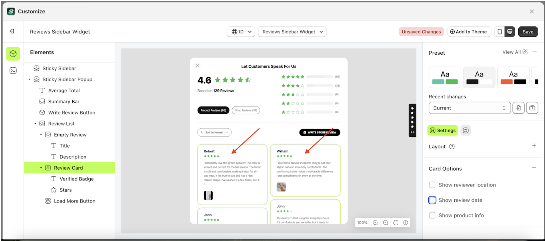
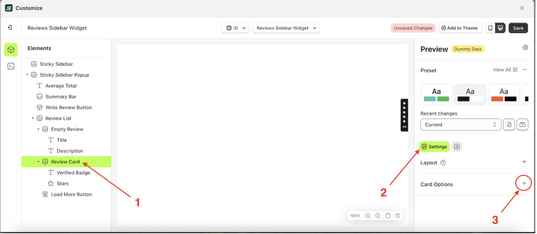
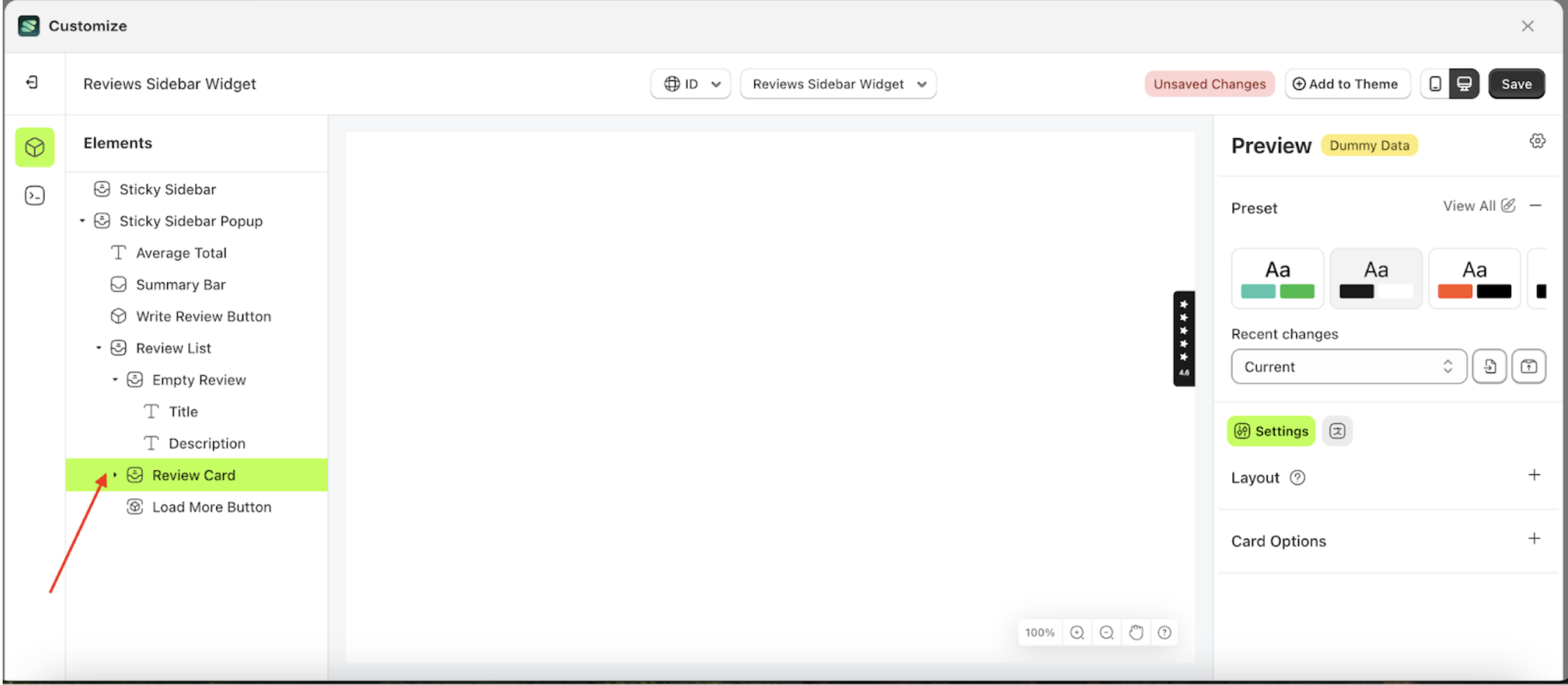
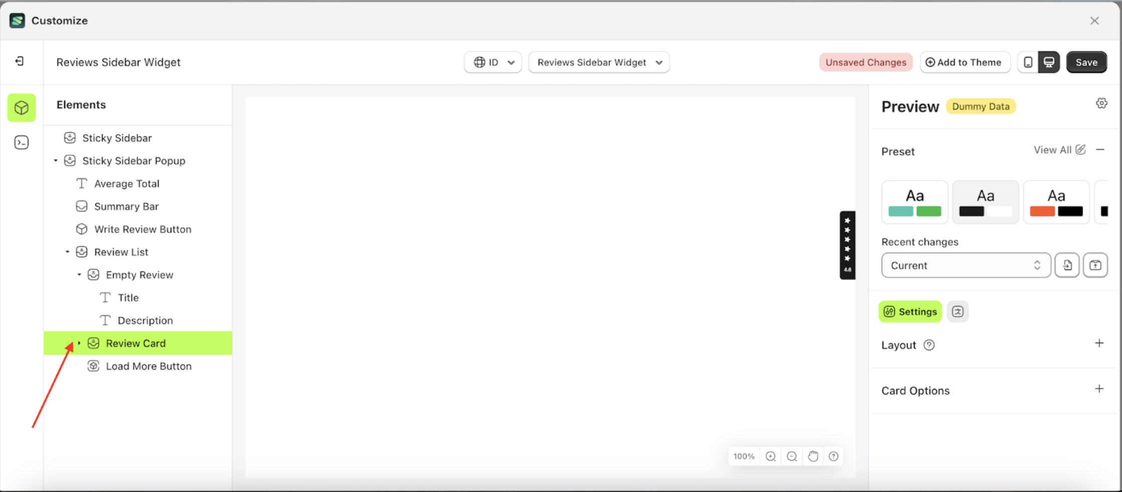
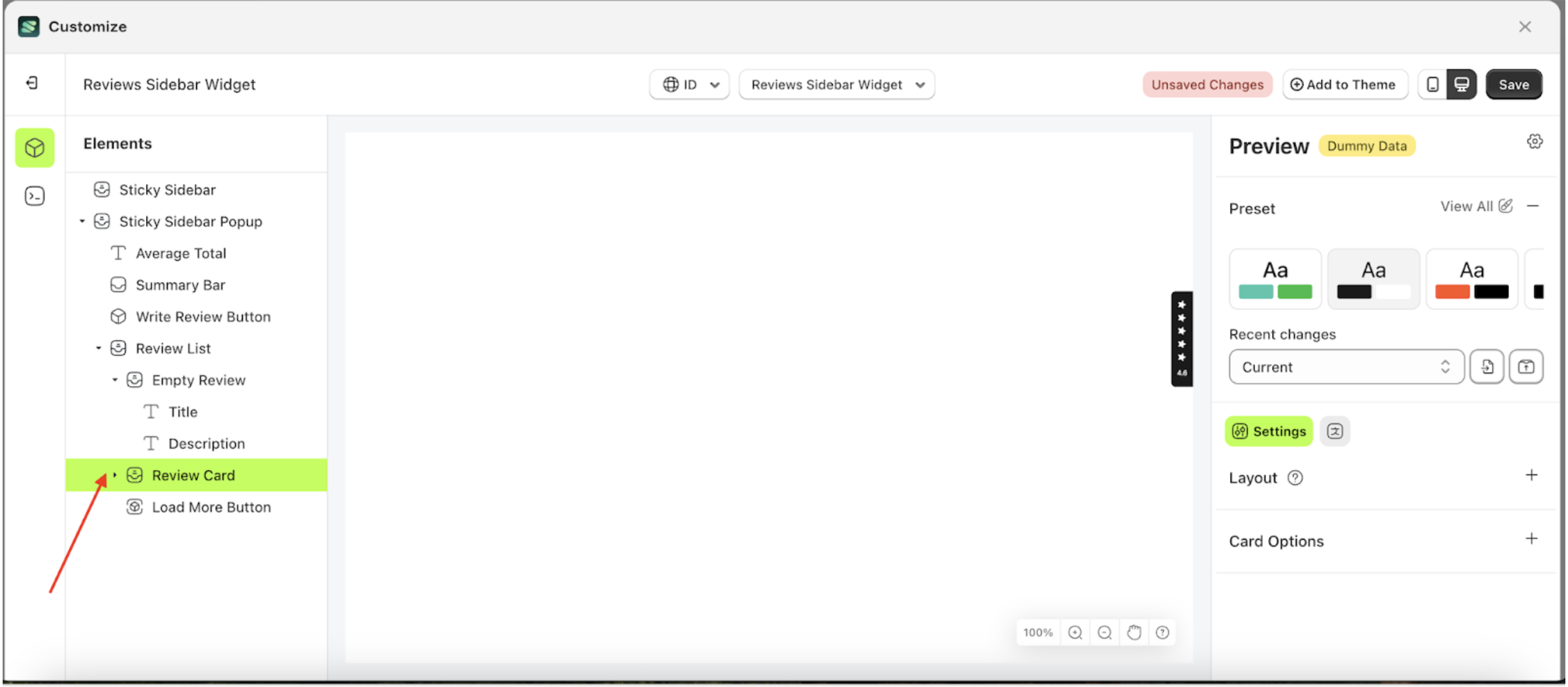
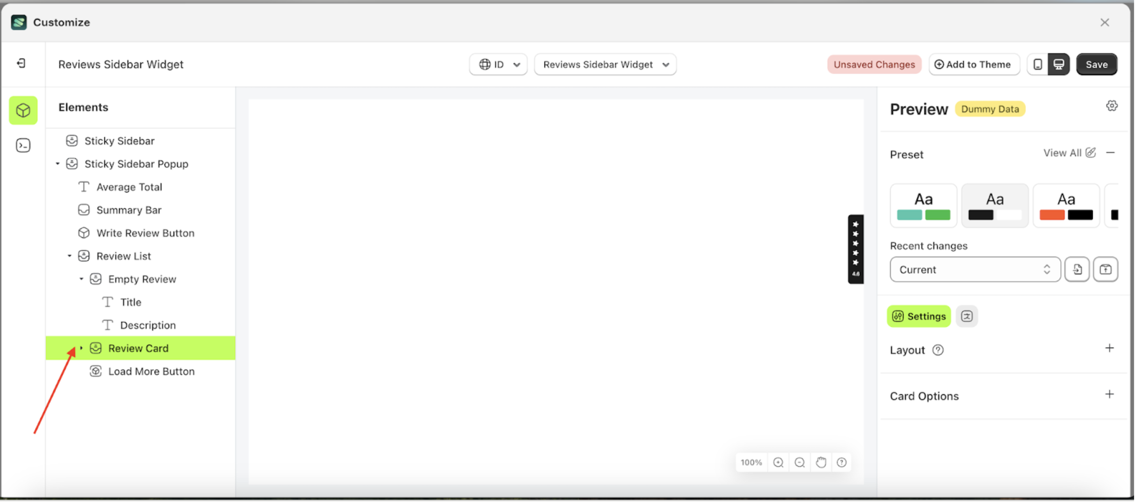
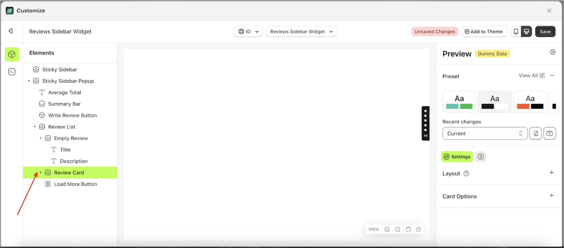
Card Options
Available settings:
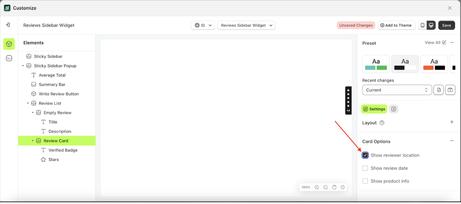
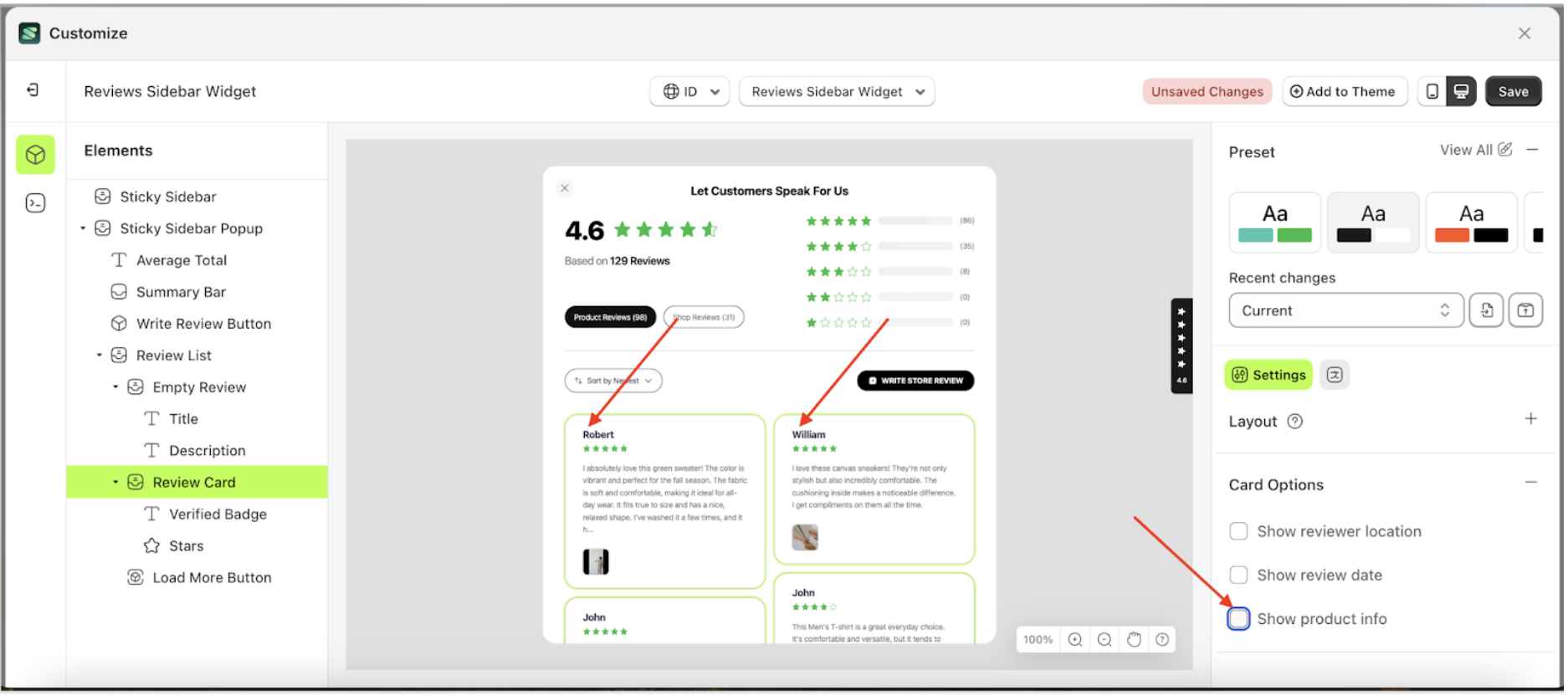
Show Review Location
This feature is designed to manage information about the reviewer’s location.
Follow the steps below:
- Select the Review Card element on the right, then click the Settings tab and click the icon marked with a red arrow.
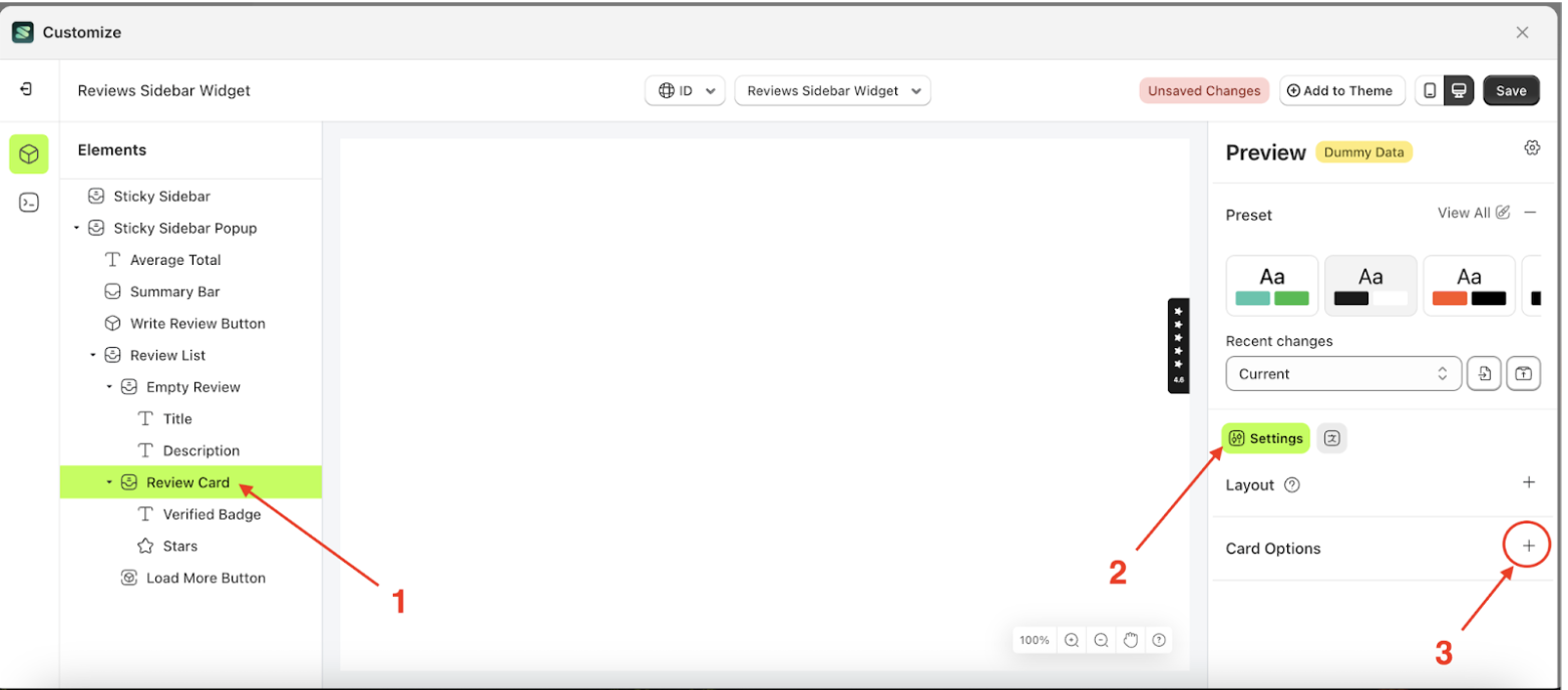
- Enable the Show Reviewer Location checkbox
- To see the changes in this setting on the element, click the Sticky Bar element
- The Show Review Location information will appear after the setting is enabled.
- Example: Before Show review location settings is enabled
- Example: After Show review location settings is enabled
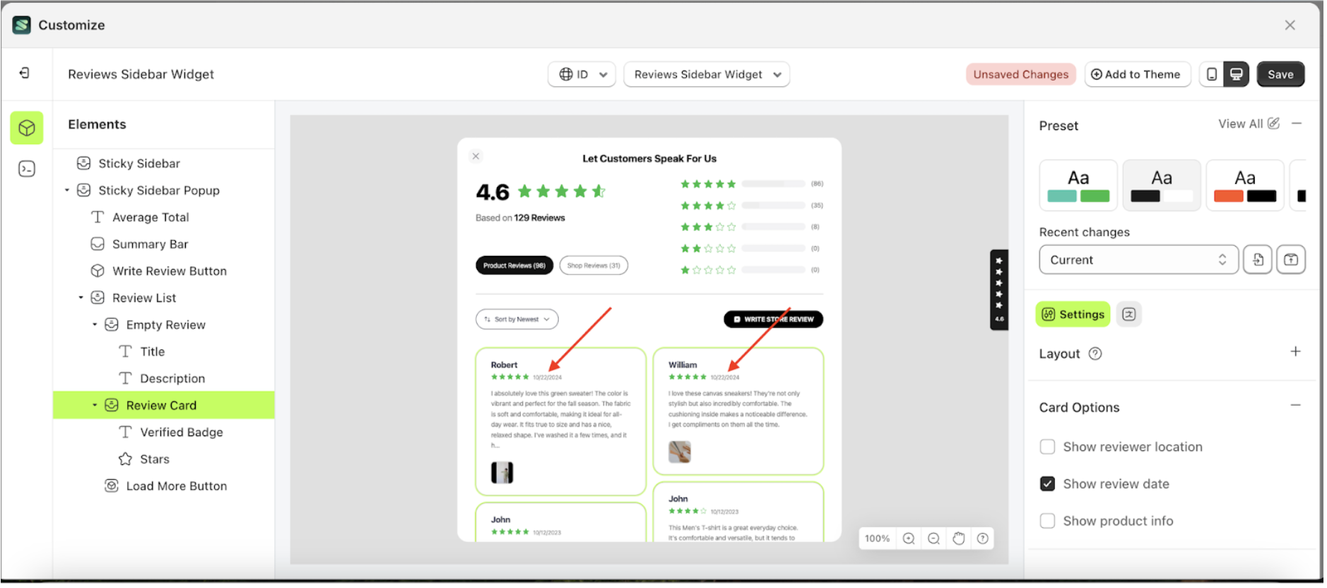
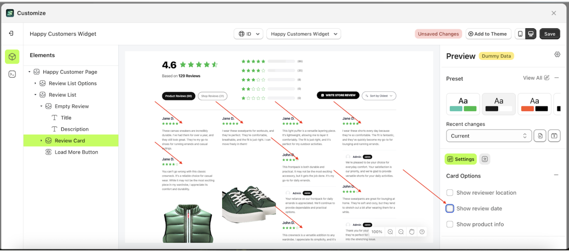
Show Review Date
This feature is designed to manage information about the reviewer’s date.
Follow the steps below:
- Select the Review Card element on the right, then click the Settings tab and click the icon marked with a red arrow.

- Enable the Show Reviewer Date checkbox
- To see the changes in this setting on the element, click the Sticky Bar element
- The Show Review Date information will appear after the setting is enabled.
- Example: Before Show review date settings is enabled
- Example: After Show review date settings is enabled
Show Product Info
This feature is designed to manage information about the reviewed product's name.
Follow the steps below:
- Select the Review Card element on the right, then click the Settings tab and click the icon marked with a red arrow.
- Enable the Show Product Info checkbox
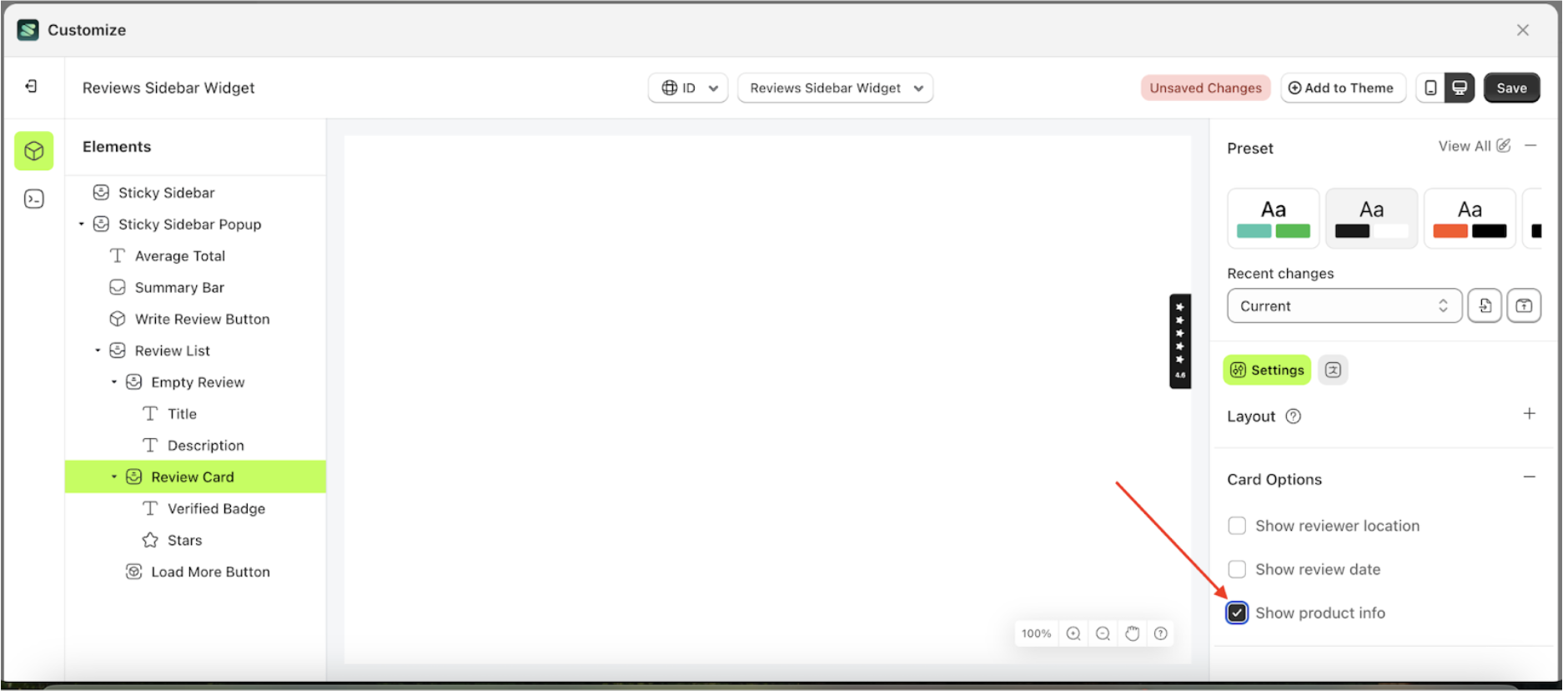
- To see the changes in this setting on the element, click the Sticky Bar element

- The Show product info information will appear after the setting is enabled.
- Example: Before Show product info settings is enabled
- Example: After Show product info settings is enabled
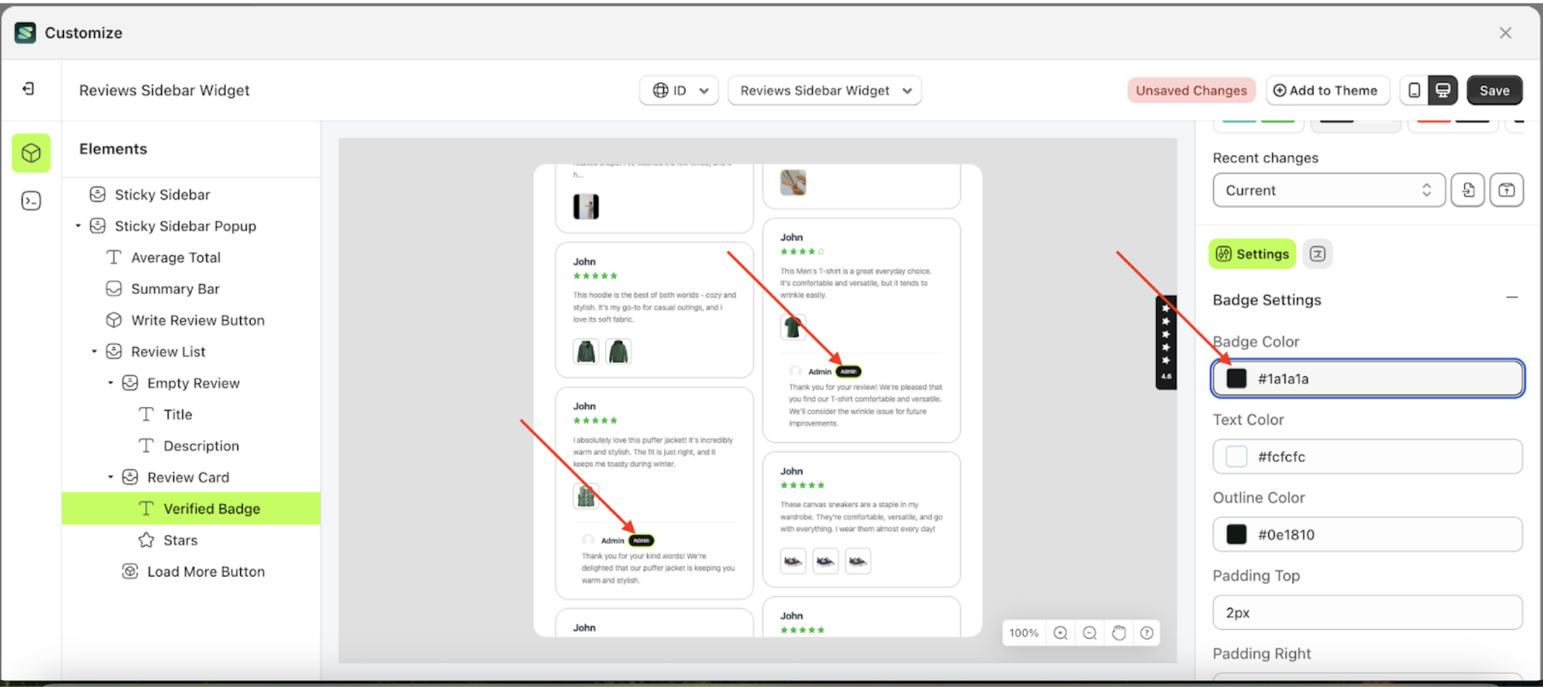
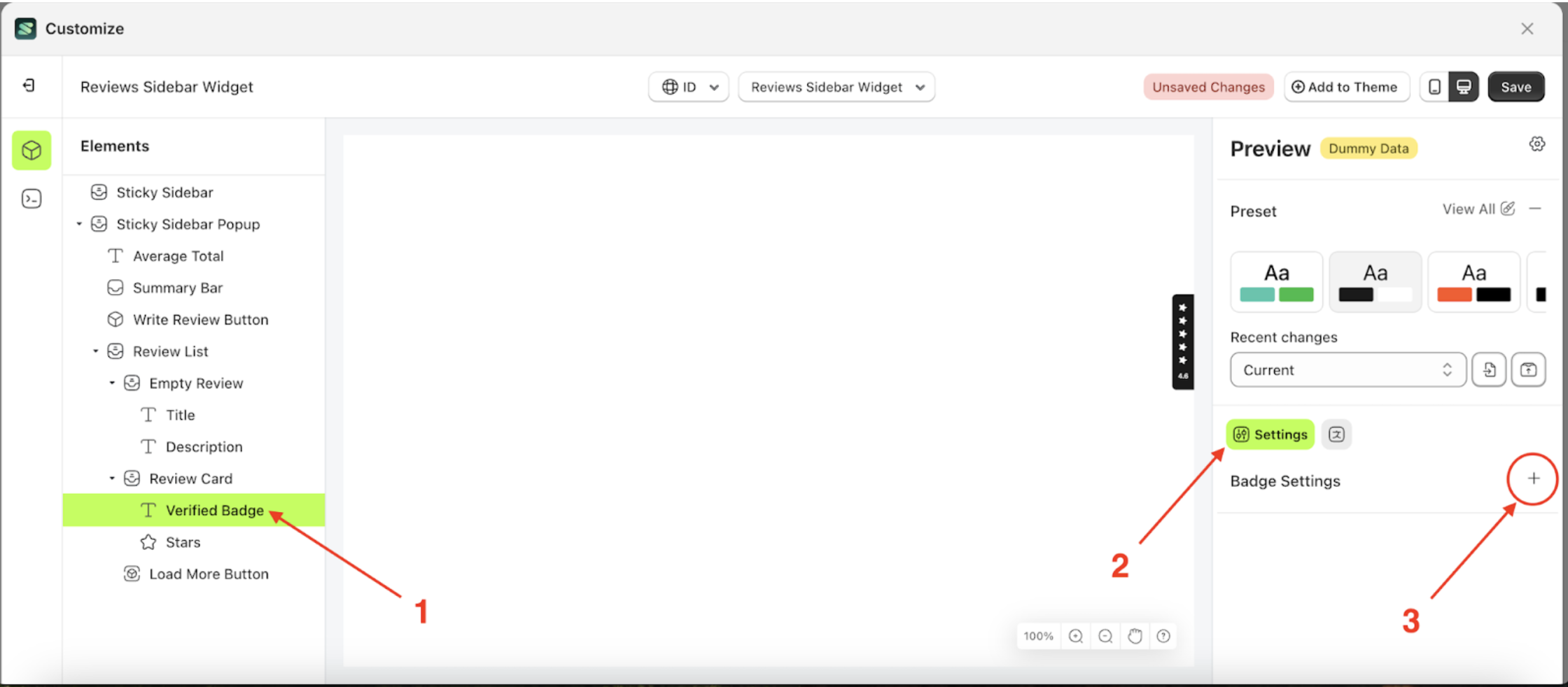
Badge Settings
Available settings:
Badge ColorText ColorOutline ColorPadding TopPadding RightPadding BottomPadding LeftBorder RadiusFont SizeFont WeightText Transform
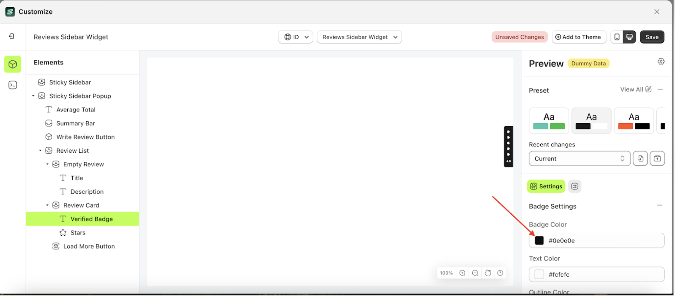
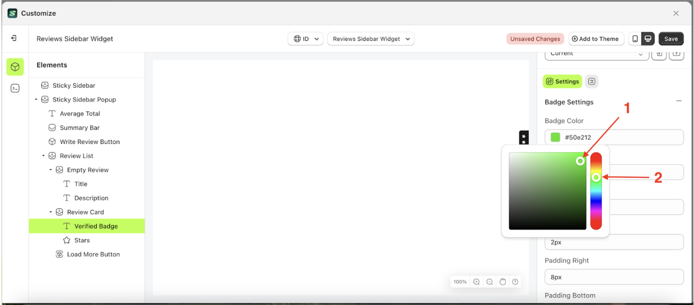
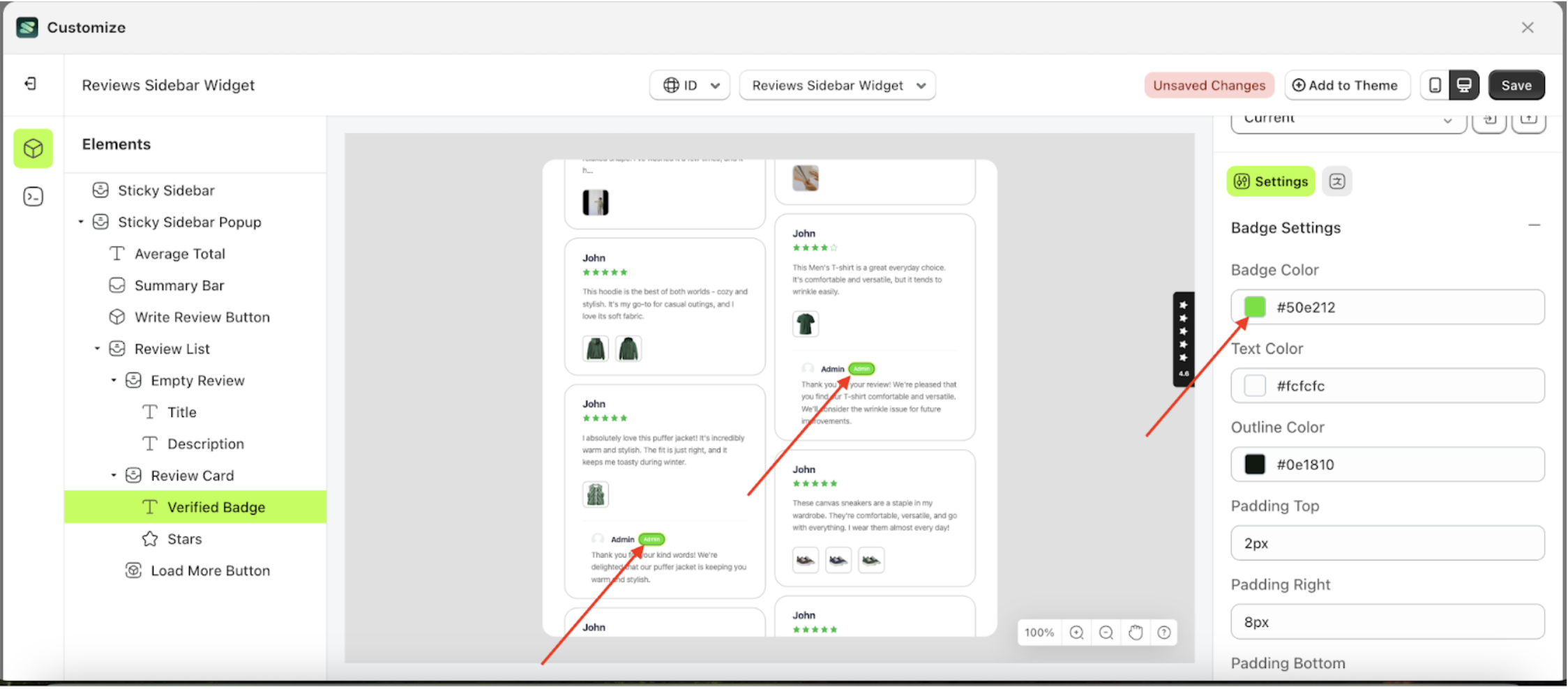
Badge Color
This feature is designed to customize the badge color of the badge settings
Follow the steps below:
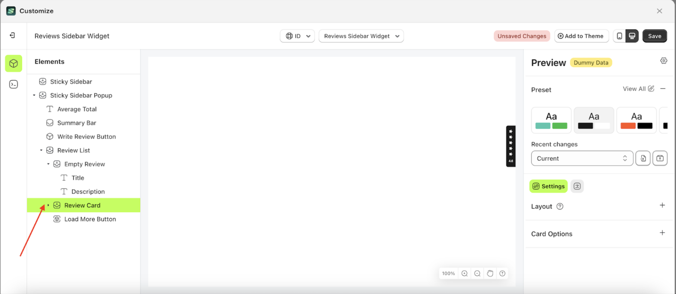
- Select the Review Card element on the left, then click the icon marked with a red arrow to open the menu within that item.
- Once the menu is open, select the Verify Badge element on the left, then click the Settings tab and click the icon marked with a red arrow.
- Click the Color Palette on the right side, which is also marked with a red arrow.
- The Color Palette will appear. Click the right side of the palette where the red arrow and number 1 are indicated, then click the right side again where the red arrow and number 2 are marked.
- To see the changes in this setting on the element, click the Sticky Sidebar element
- The review sidebar widget of the Verify Badge element will adjust accordingly.
- Example : Before Verify Badge change settings
- Example : After Verify Badge change settings

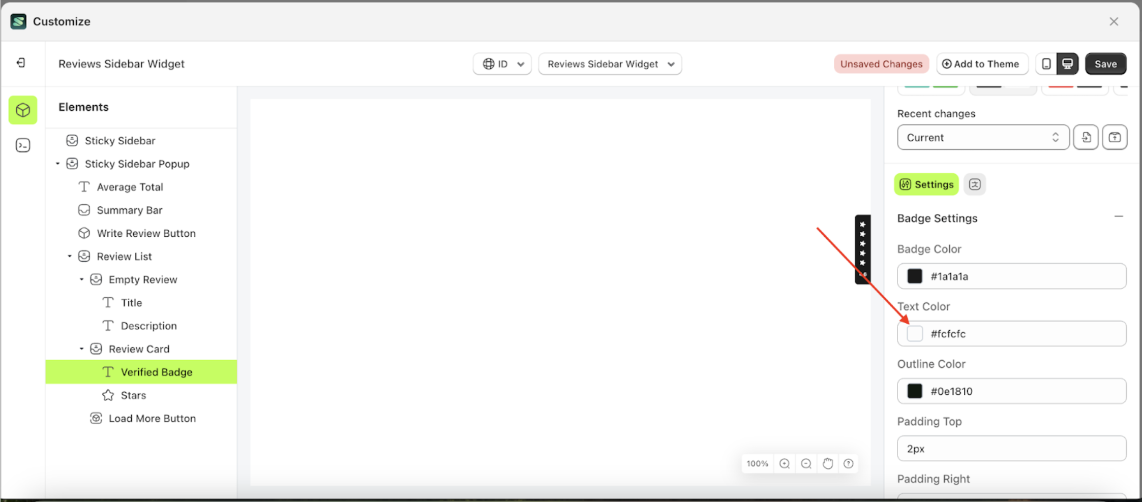
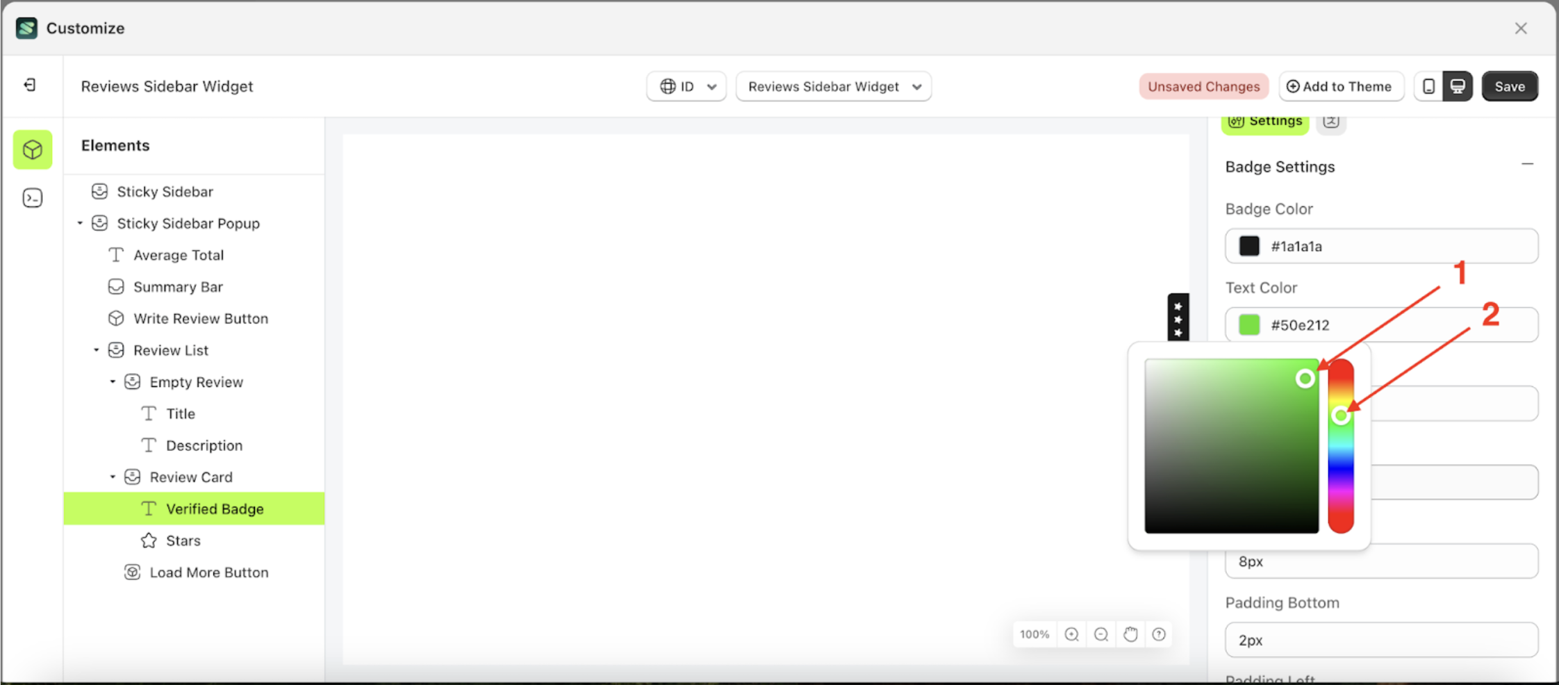
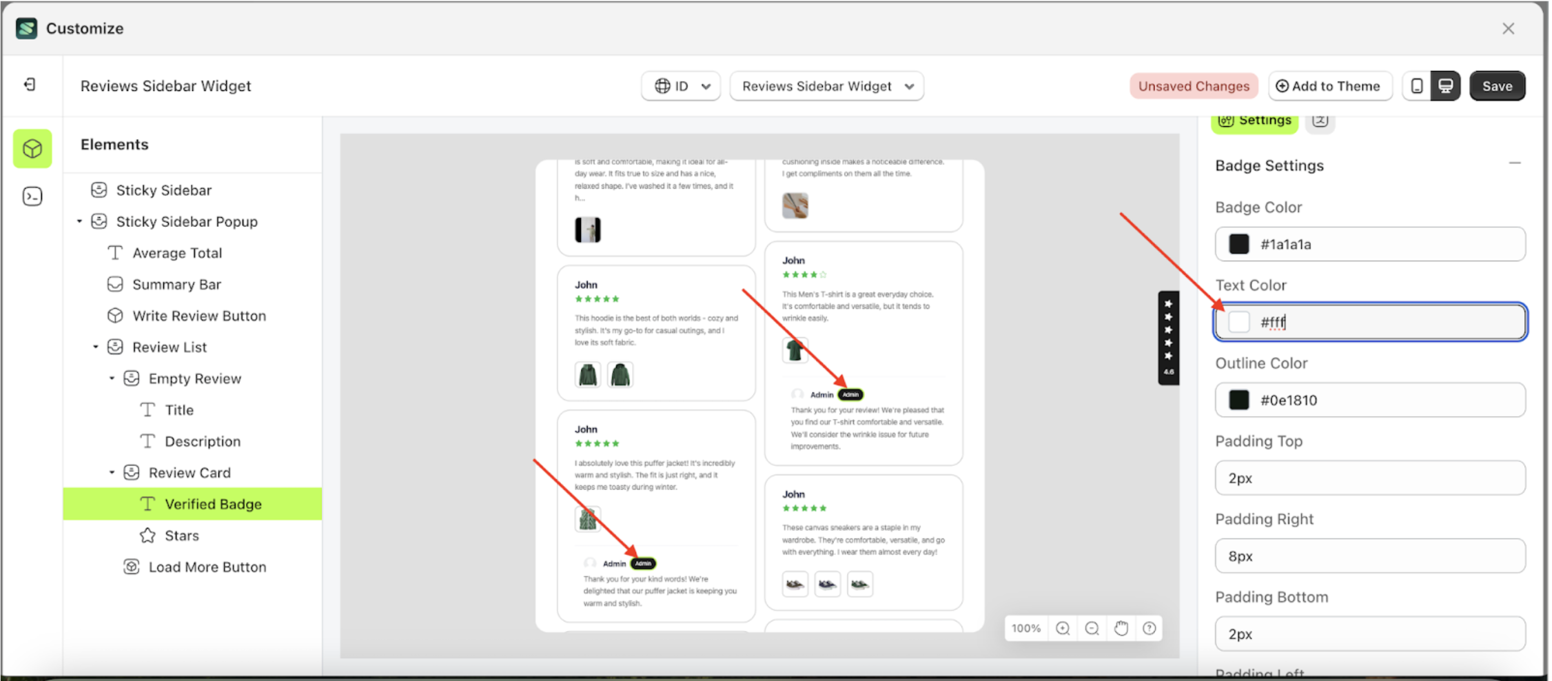
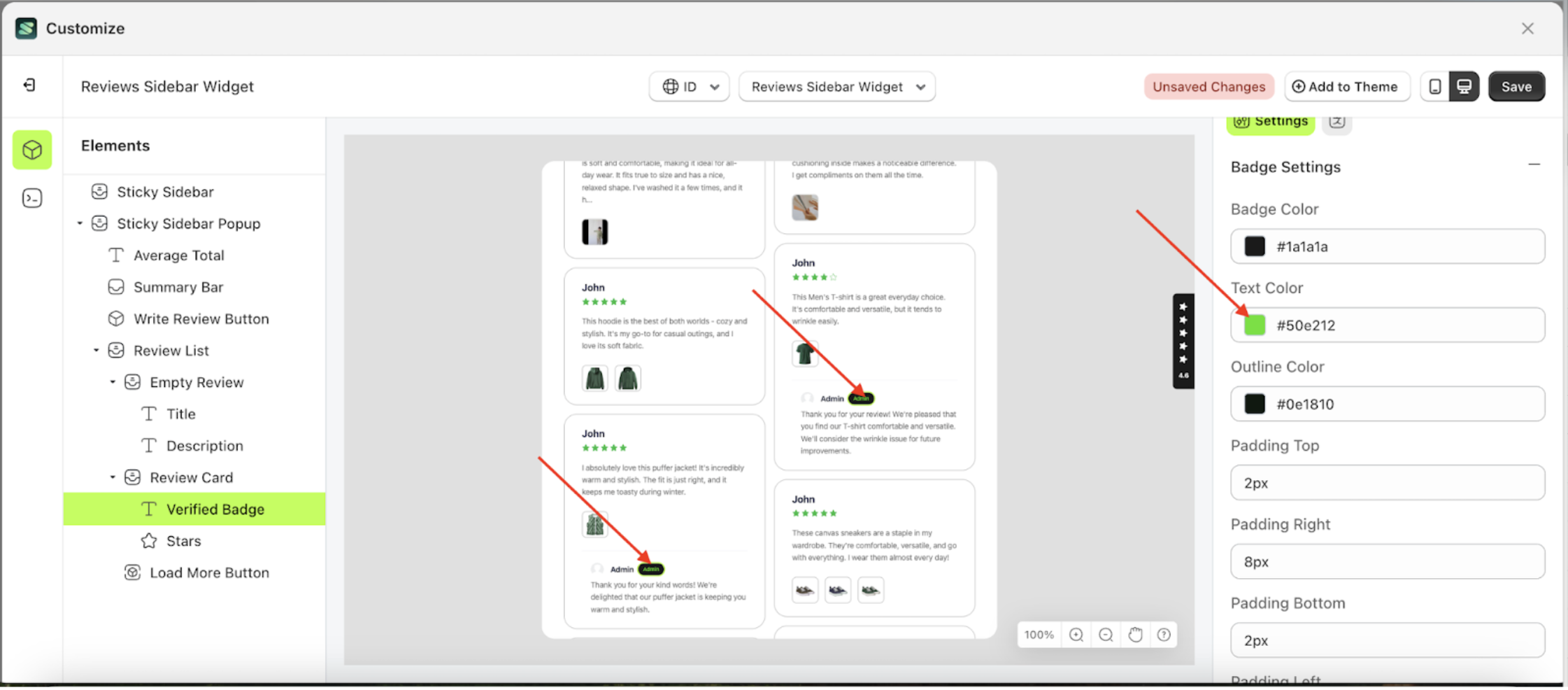
Text Color
This feature is designed to customize the text color of the badge settings
Follow the steps below:
- Select the Review Card element on the left, then click the icon marked with a red arrow to open the menu within that item.
- Once the menu is open, select the Verify Badge element on the left, then click the Settings tab and click the icon marked with a red arrow.
- Click the Color Palette on the right side, which is also marked with a red arrow.
- The Color Palette will appear. Click the right side of the palette where the red arrow and number 1 are indicated, then click the right side again where the red arrow and number 2 are marked.
- To see the changes in this setting on the element, click the Sticky Sidebar element
- The review sidebar widget of the Verify Badge element will adjust accordingly.
- Example : Before Verify Badge change settings
- Example : After Verify Badge change settings


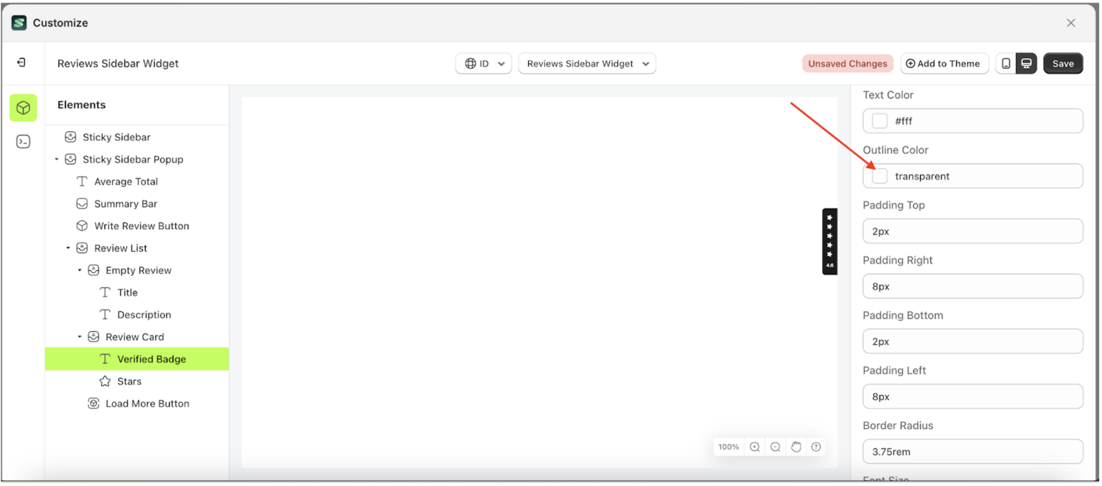
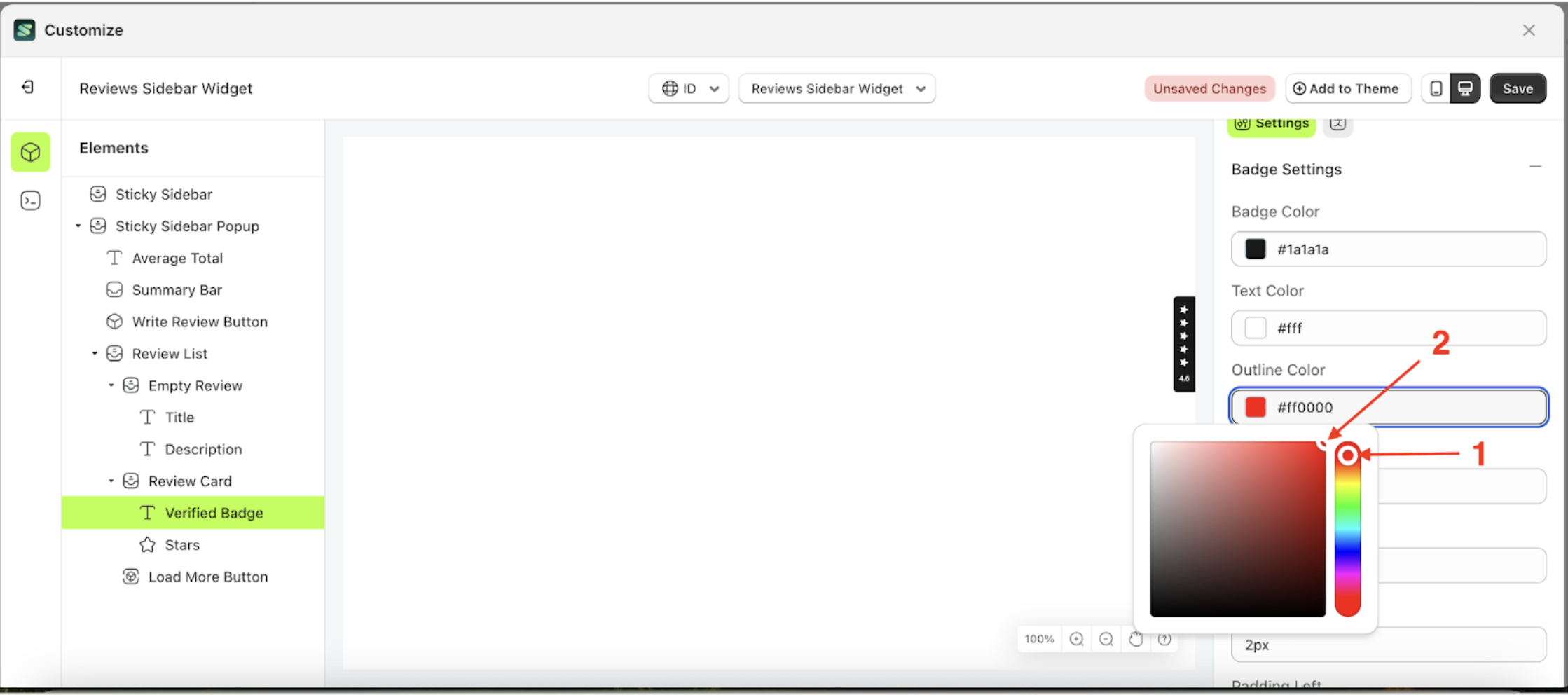
Outline Color
This feature is designed to customize the outline color of the badge settings
Follow the steps below:
- Select the Review Card element on the left, then click the icon marked with a red arrow to open the menu within that item.
- Once the menu is open, select the Verify Badge element on the left, then click the Settings tab and click the icon marked with a red arrow.
- Click the Color Palette on the right side, which is also marked with a red arrow.
- The Color Palette will appear. Click the right side of the palette where the red arrow and number 1 are indicated, then click the right side again where the red arrow and number 2 are marked.
- To see the changes in this setting on the element, click the Sticky Sidebar element
- The review sidebar widget of the Verify Badge element will adjust accordingly.
- Example : Before Verify Badge change settings
- Example : After Verify Badge change settings


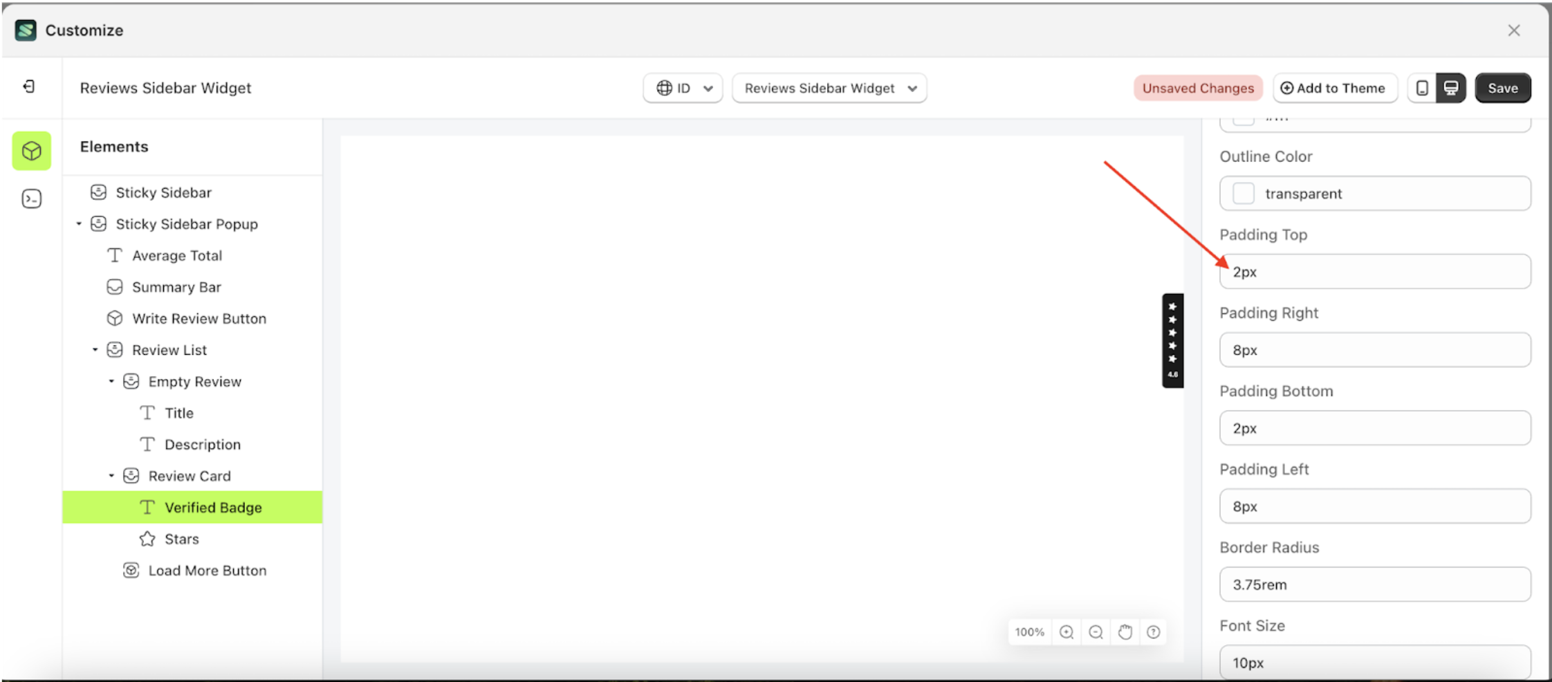
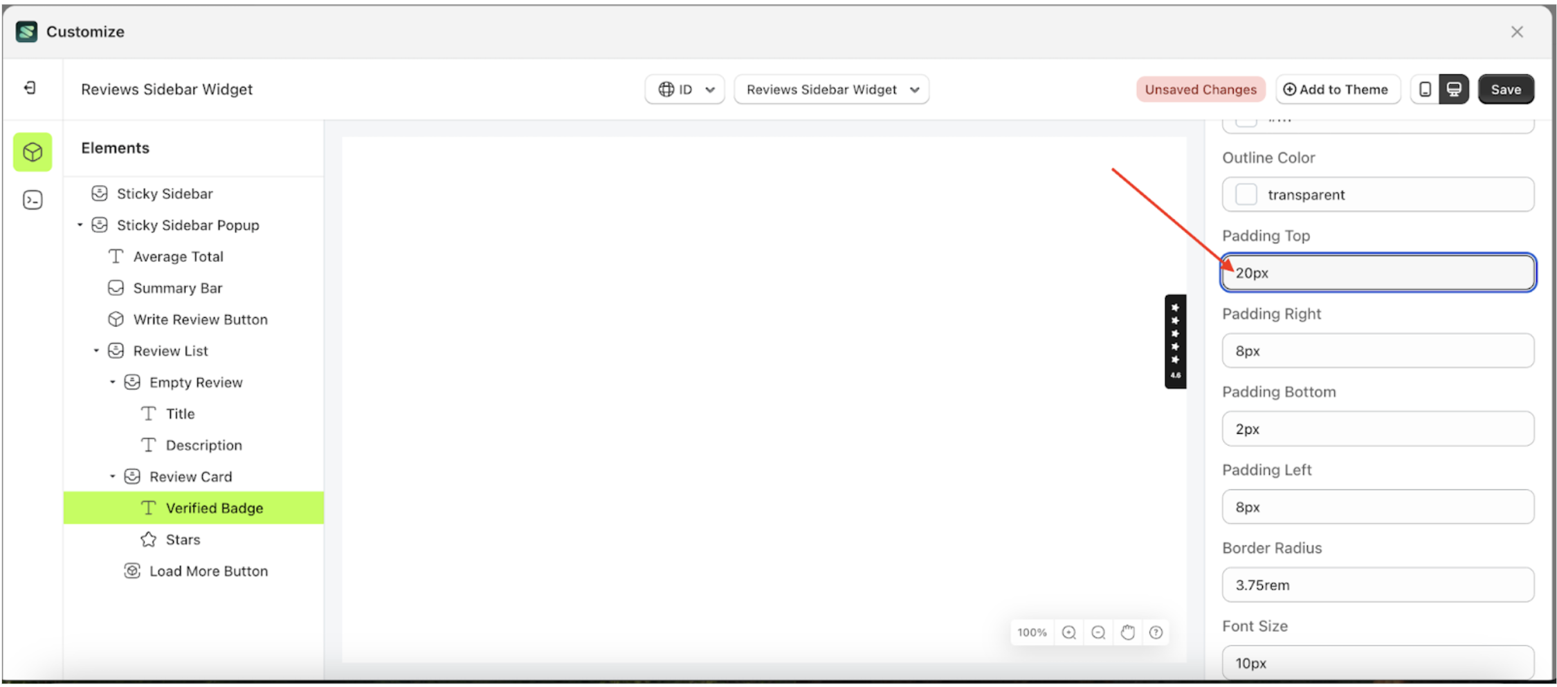
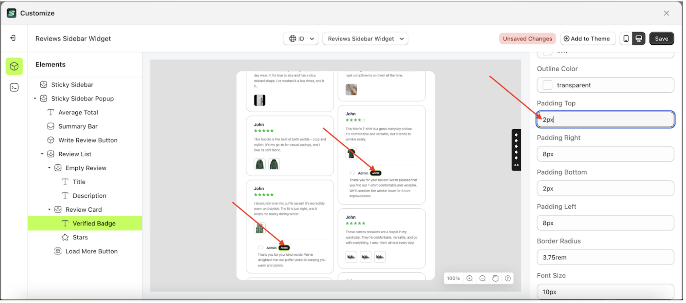
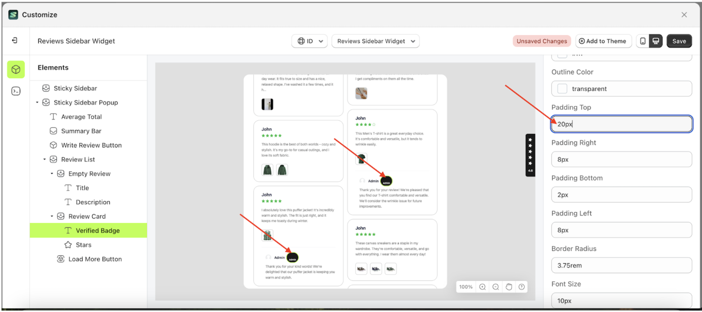
Padding Top
This feature is designed to customize the top padding of the badge settings
Follow the steps below:
- Select the Review Card element on the left, then click the icon marked with a red arrow to open the menu within that item.
- Once the menu is open, select the Verify Badge element on the left, then click the Settings tab and click the icon marked with a red arrow.
- On the right side, marked with a red arrow, you can change the padding top to your desired value.
- Note: The padding top format can be px, em, rem, %, or other units..
- For example, if you set the padding top to 20px
- To see the changes in this setting on the element, click the Sticky Sidebar element
- The padding top of the Verify Badge element will adjust accordingly.
- Example : Before padding top change settings
- Example : After padding top change settings


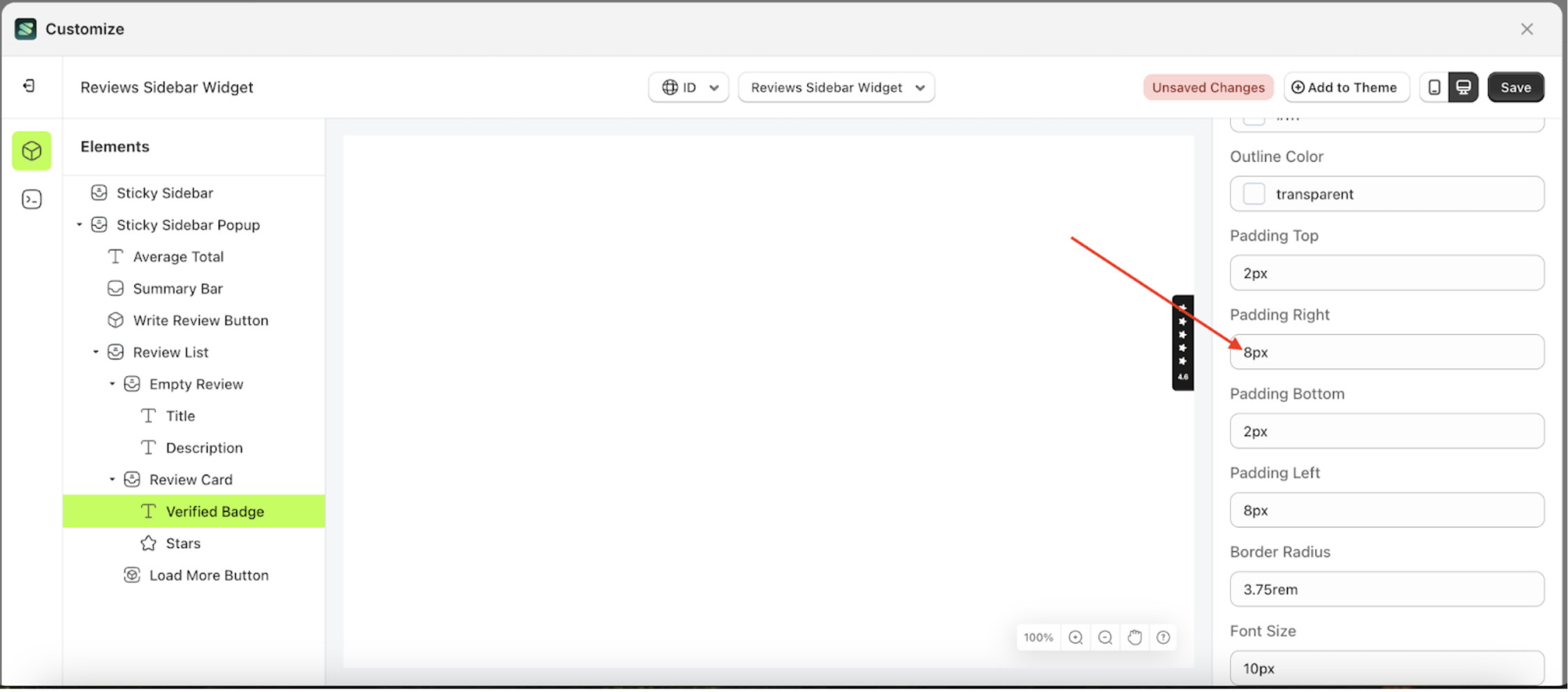
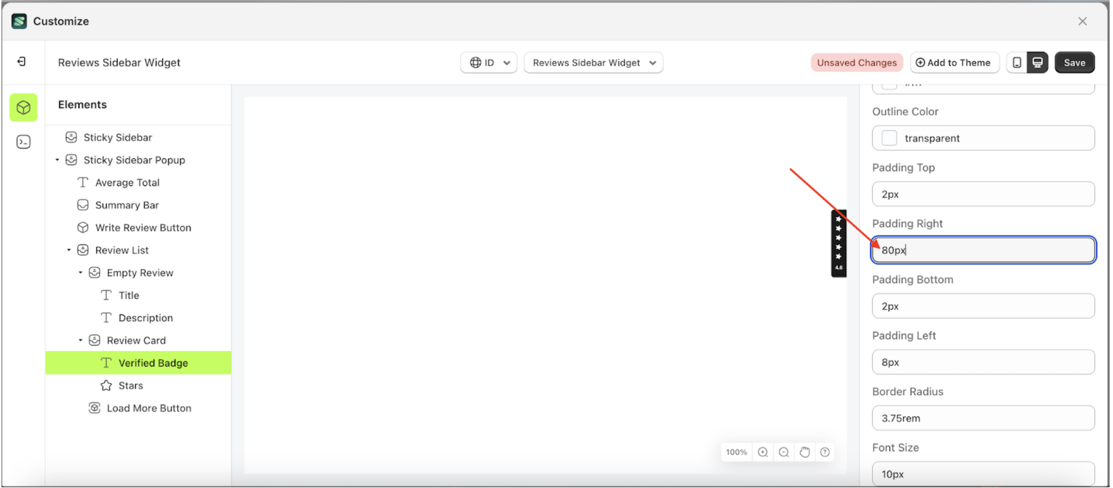
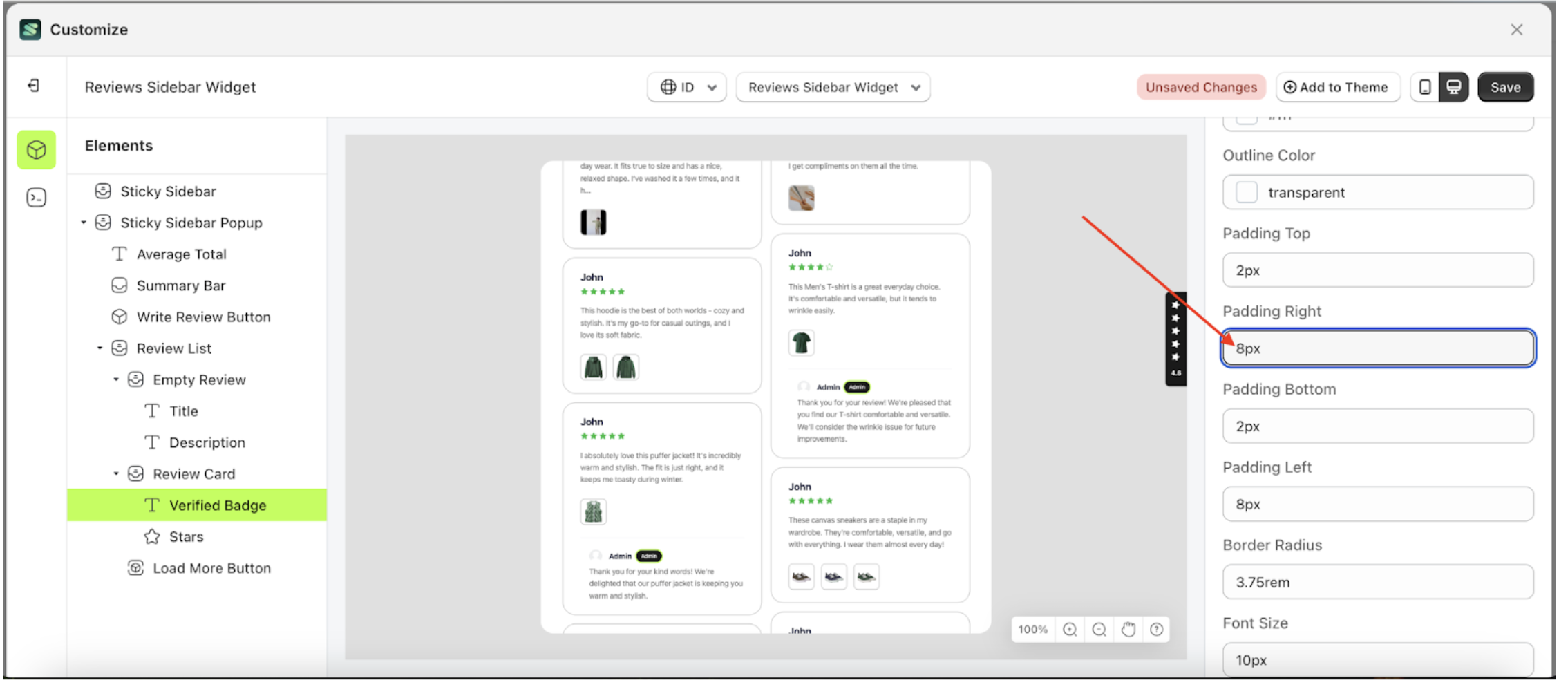
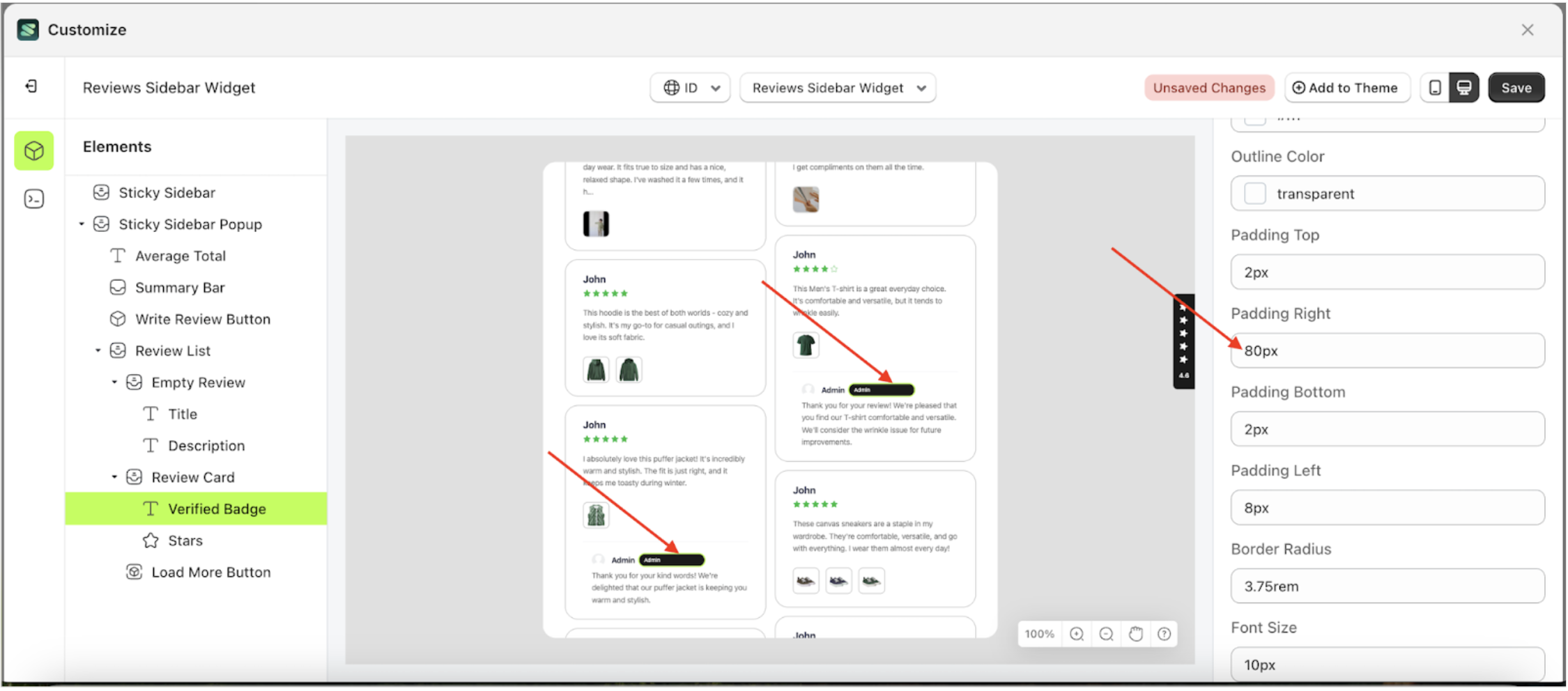
Padding Right
This feature is designed to customize the right padding of the badge settings
Follow the steps below:
- Select the Review Card element on the left, then click the icon marked with a red arrow to open the menu within that item.
- Once the menu is open, select the Verify Badge element on the left, then click the Settings tab and click the icon marked with a red arrow.
- On the right side, marked with a red arrow, you can change the padding right to your desired value.
- Note: The padding right format can be px, em, rem, %, or other units..
- For example, if you set the padding right to 80px
- To see the changes in this setting on the element, click the Sticky Sidebar element
- The padding right of the Verify Badge element will adjust accordingly.
- Example : Before padding right change settings
- Example : After padding right change settings


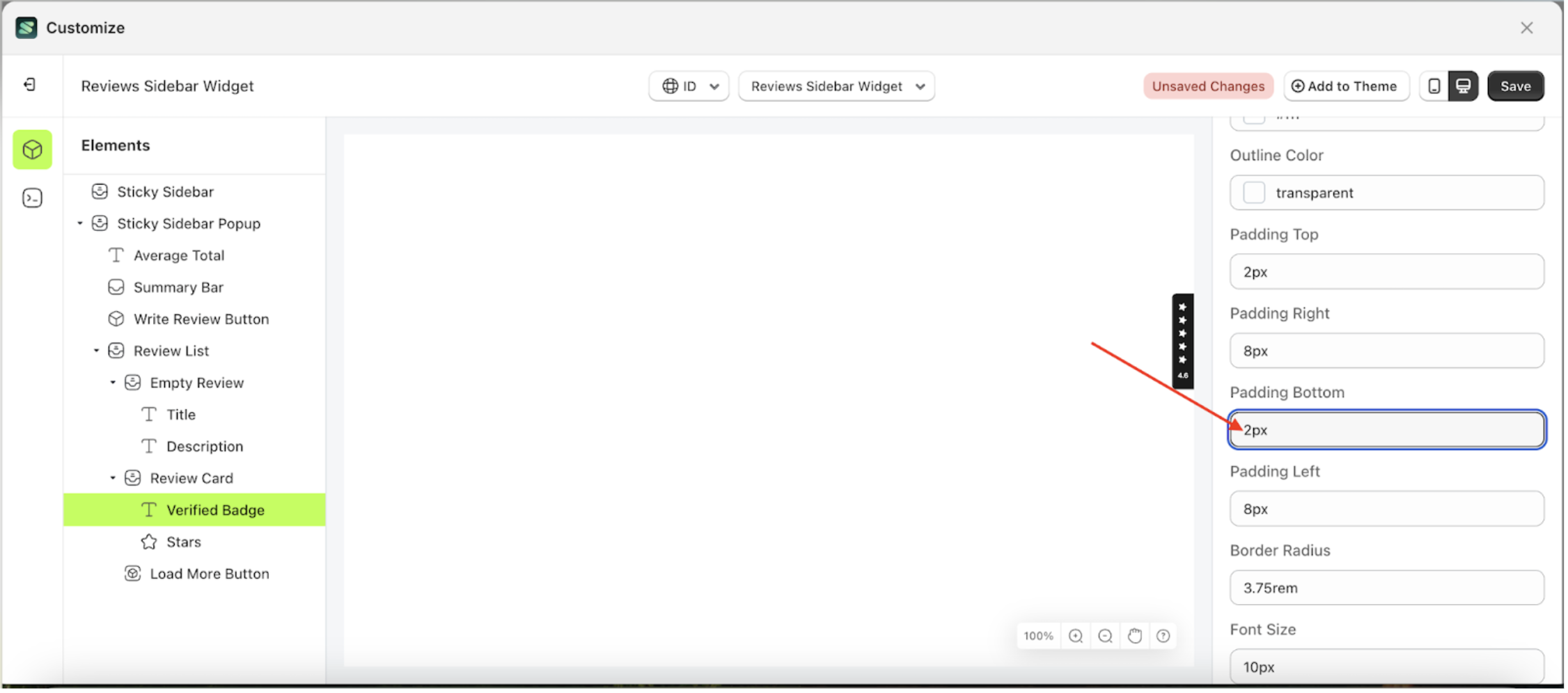
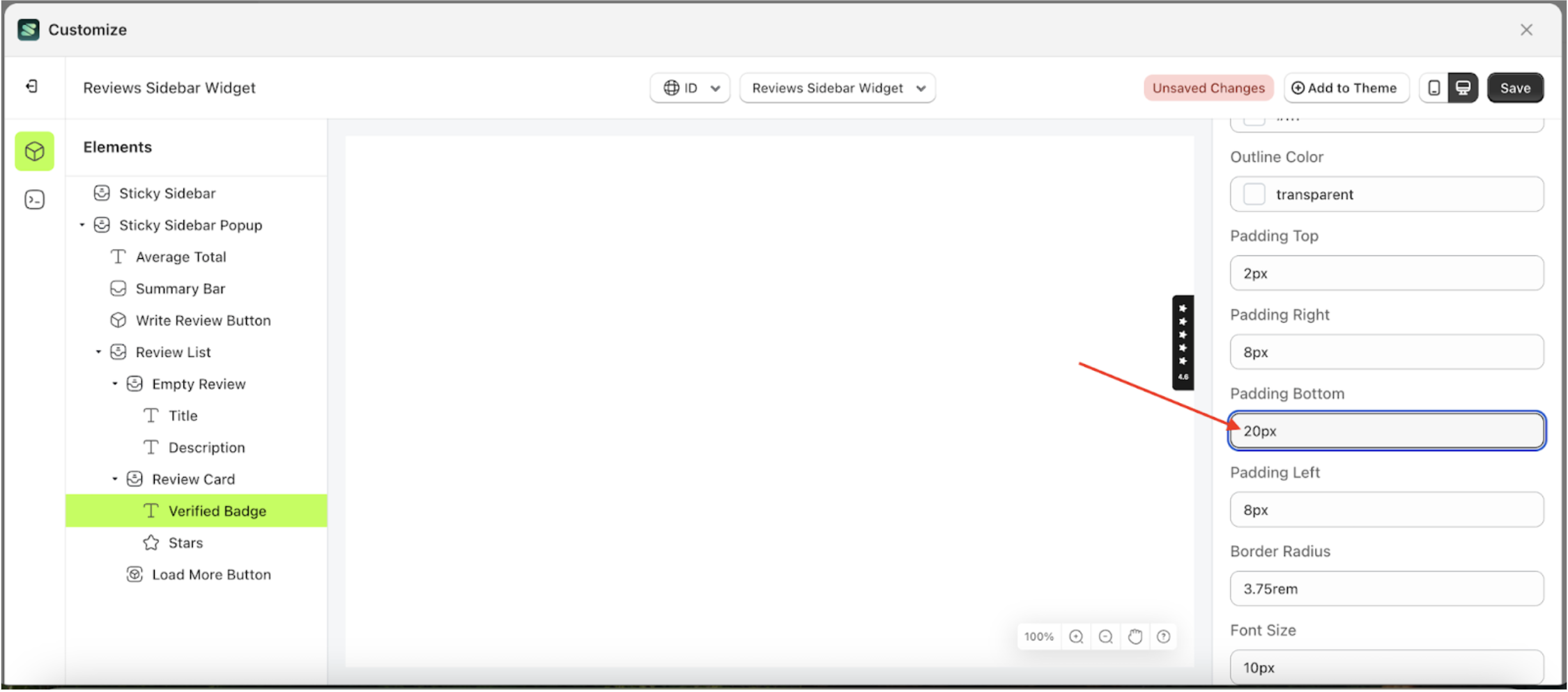
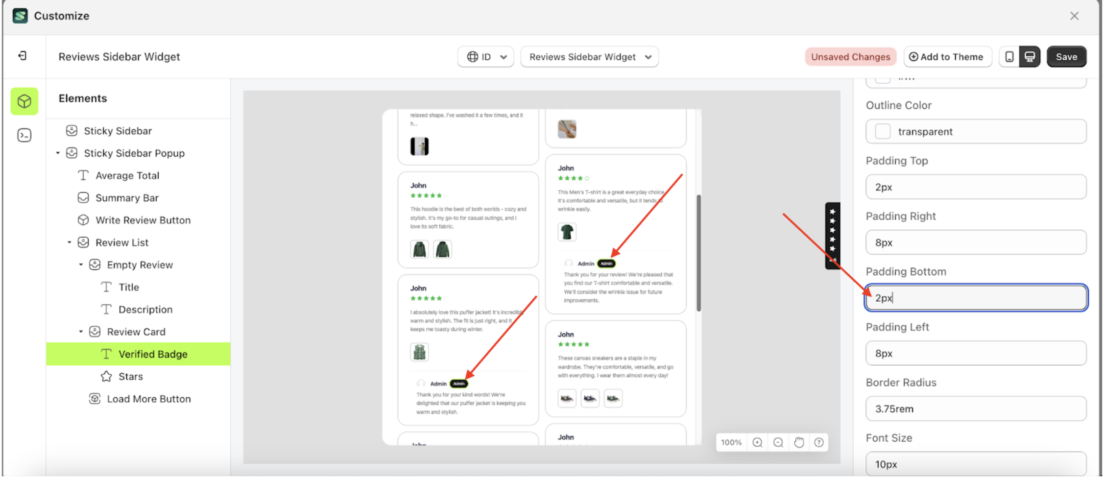
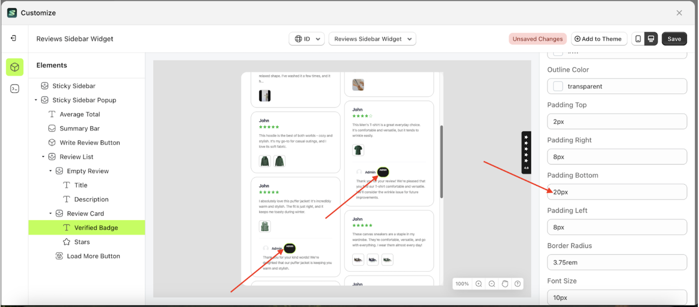
Padding Bottom
This feature is designed to customize the bottom padding of the badge settings
Follow the steps below:
- Select the Review Card element on the left, then click the icon marked with a red arrow to open the menu within that item.
- Once the menu is open, select the Verify Badge element on the left, then click the Settings tab and click the icon marked with a red arrow.
- On the right side, marked with a red arrow, you can change the padding right to your desired value.
- Note: The padding right format can be px, em, rem, %, or other units..
- For example, if you set the padding right to 20px
- To see the changes in this setting on the element, click the Sticky Sidebar element
- The padding right of the Verify Badge element will adjust accordingly.
- Example : Before padding right change settings
- Example : After padding right change settings


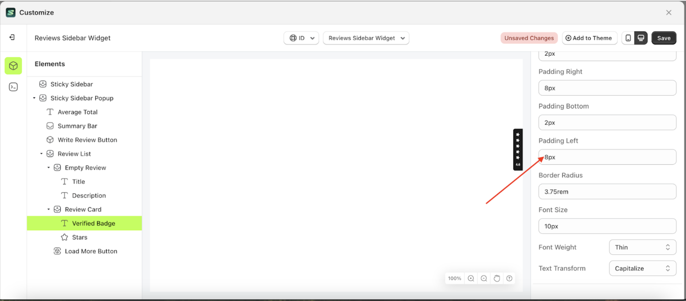
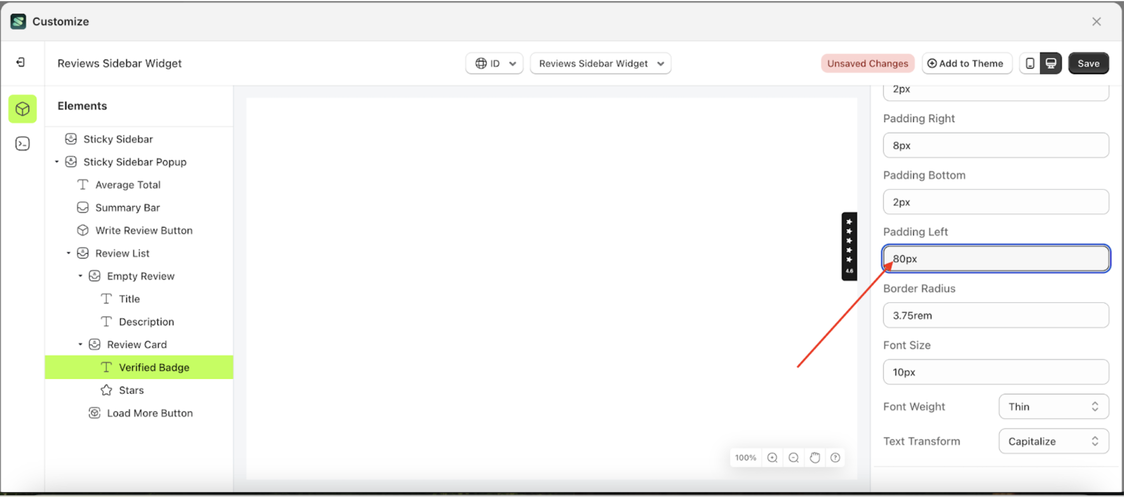
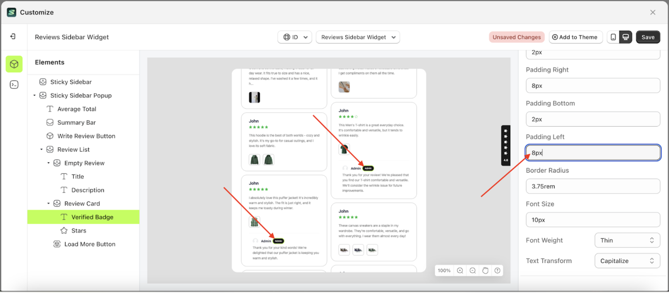
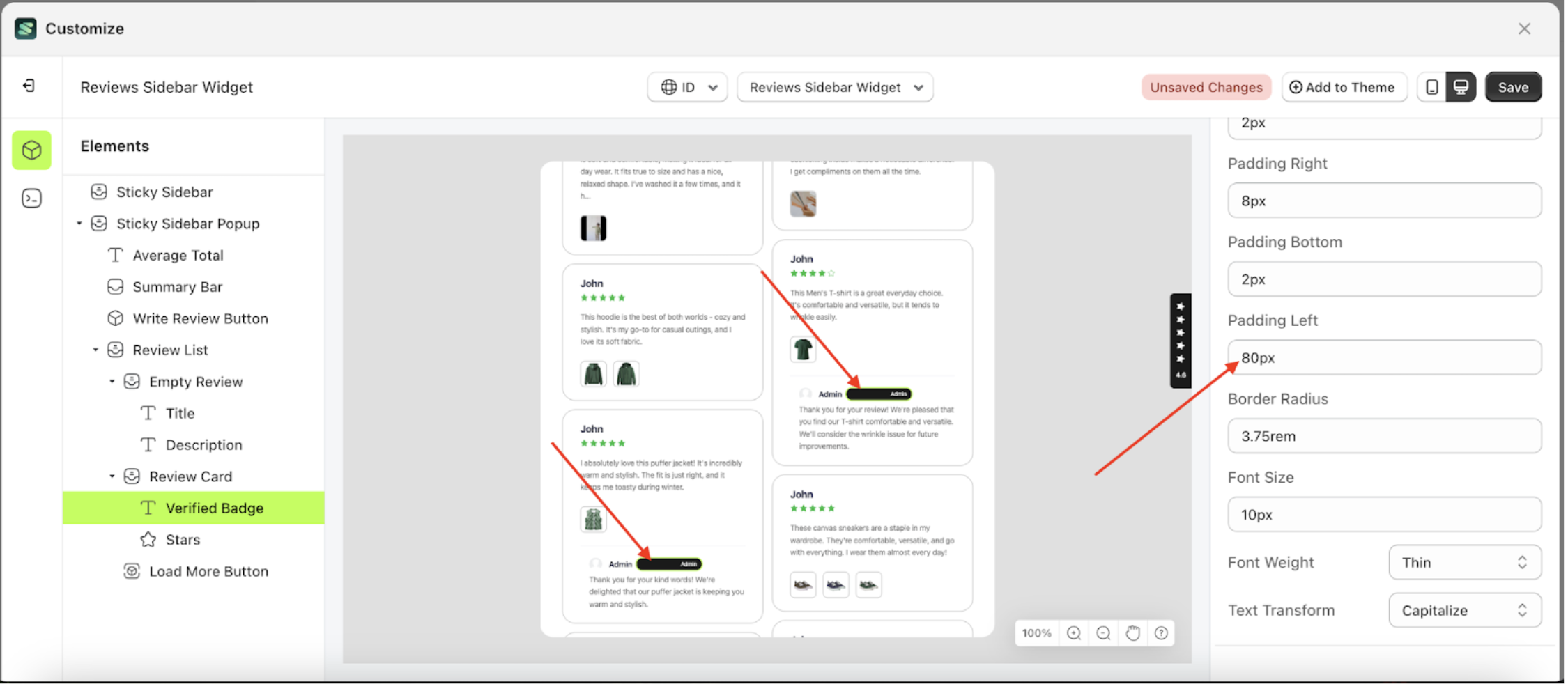
Padding Left
This feature is designed to customize the left padding of the badge settings
Follow the steps below:
- Select the Review Card element on the left, then click the icon marked with a red arrow to open the menu within that item.
- Once the menu is open, select the Verify Badge element on the left, then click the Settings tab and click the icon marked with a red arrow.
- On the right side, marked with a red arrow, you can change the padding left to your desired value.
- Note: The padding left format can be px, em, rem, %, or other units..
- For example, if you set the padding left to 80px
- To see the changes in this setting on the element, click the Sticky Sidebar element
- The padding left of the Verify Badge element will adjust accordingly.
- Example : Before padding left change settings
- Example : After padding left change settings


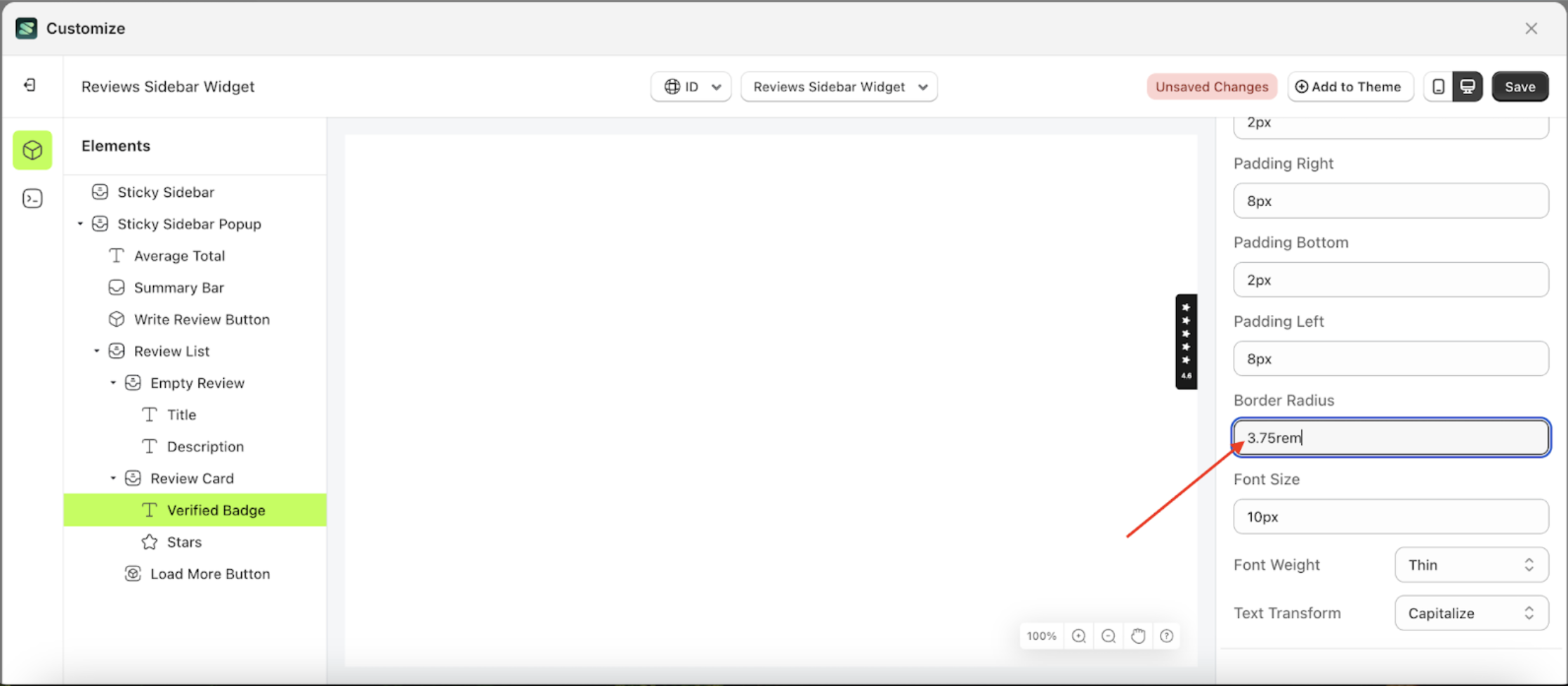
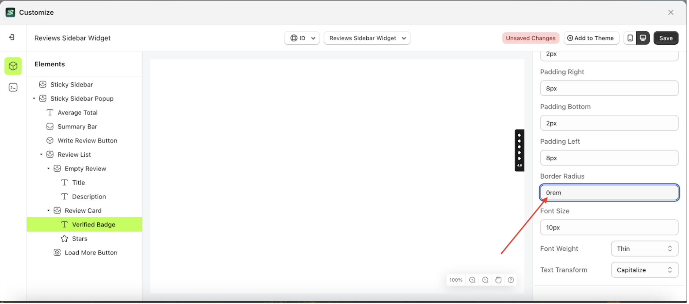
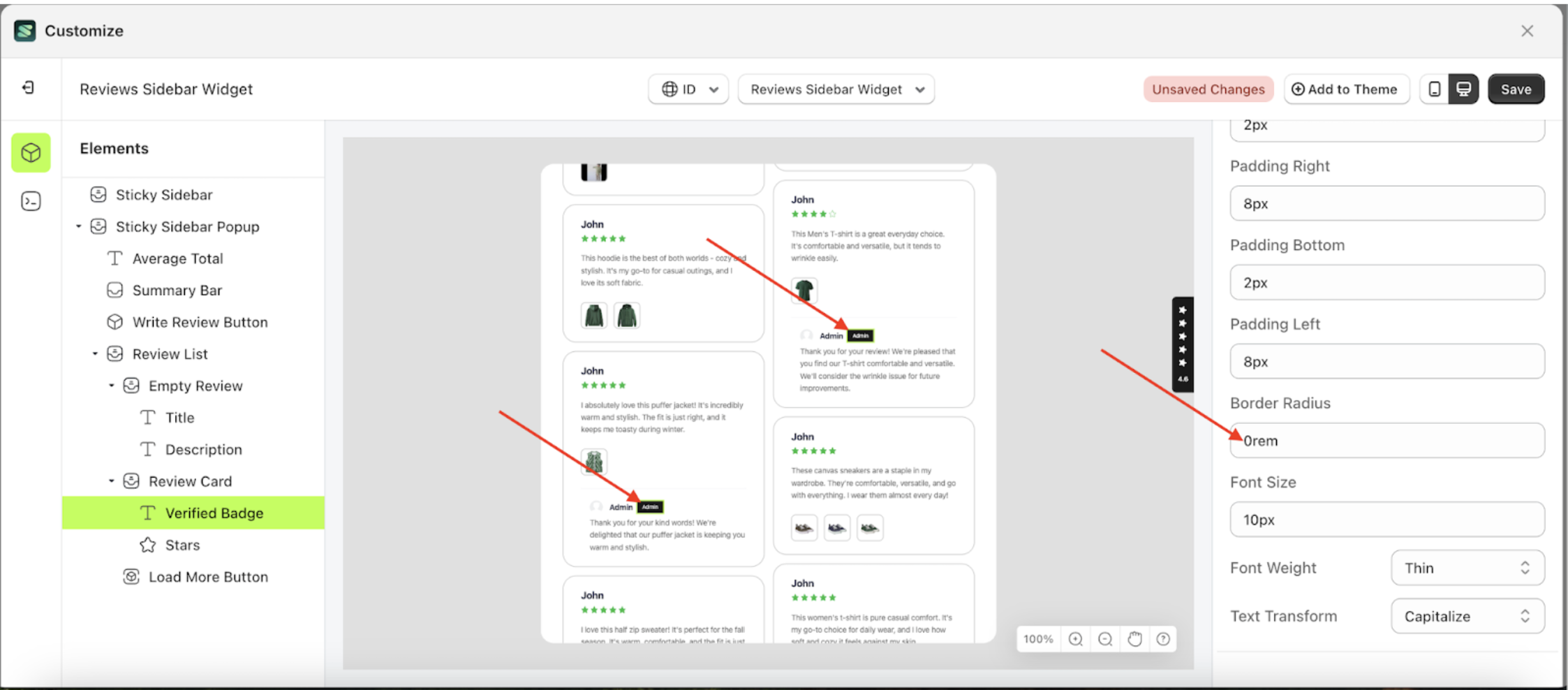
Border Radius
This feature is designed to customize the corner radius of the badge settings
Follow the steps below:
- Select the Review Card element on the left, then click the icon marked with a red arrow to open the menu within that item.
- Once the menu is open, select the Verify Badge element on the left, then click the Settings tab and click the icon marked with a red arrow.
- On the right side, marked with a red arrow, you can change the border radius to your desired value.
- Note: The border radius format can be px, em, rem, %, or other units..
- For example, if you set the border radius to 0rem
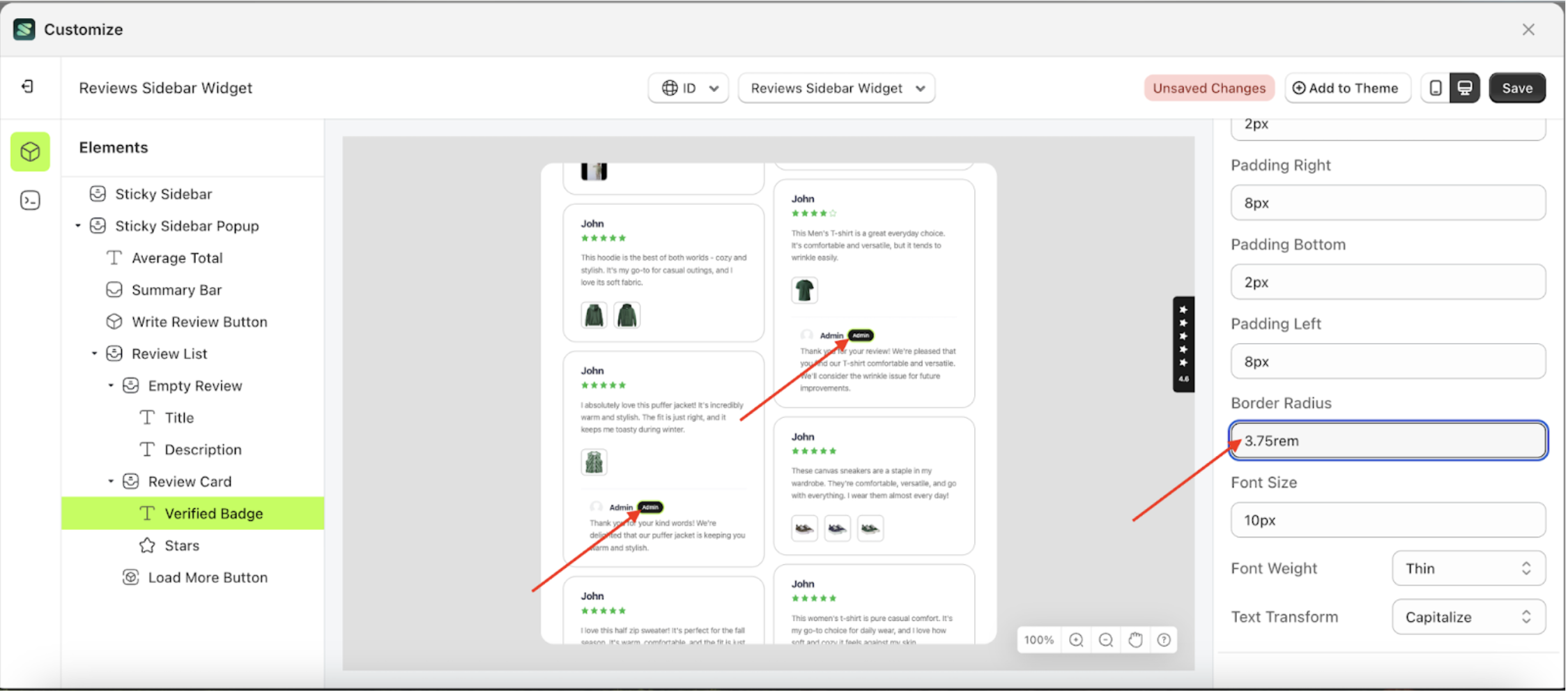
- To see the changes in this setting on the element, click the Sticky Sidebar element
- The border radius of the Verify Badge element will adjust accordingly.
- Example : Before border radius change settings
- Example : After border radius change settings


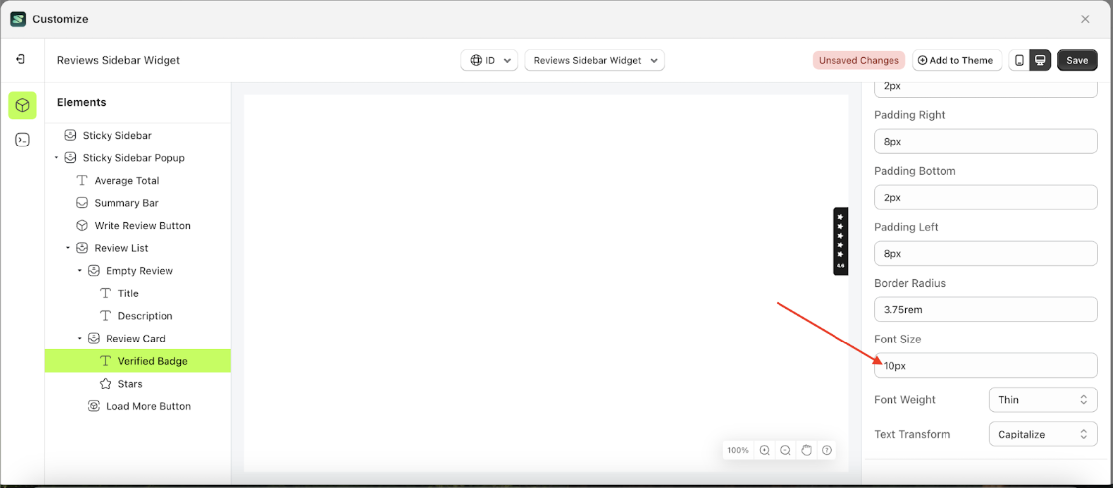
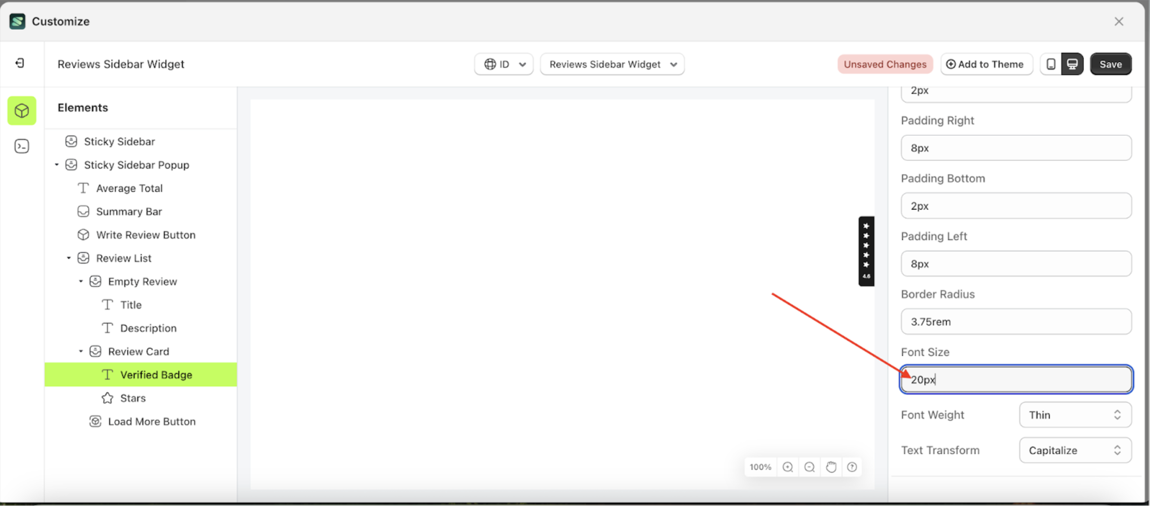
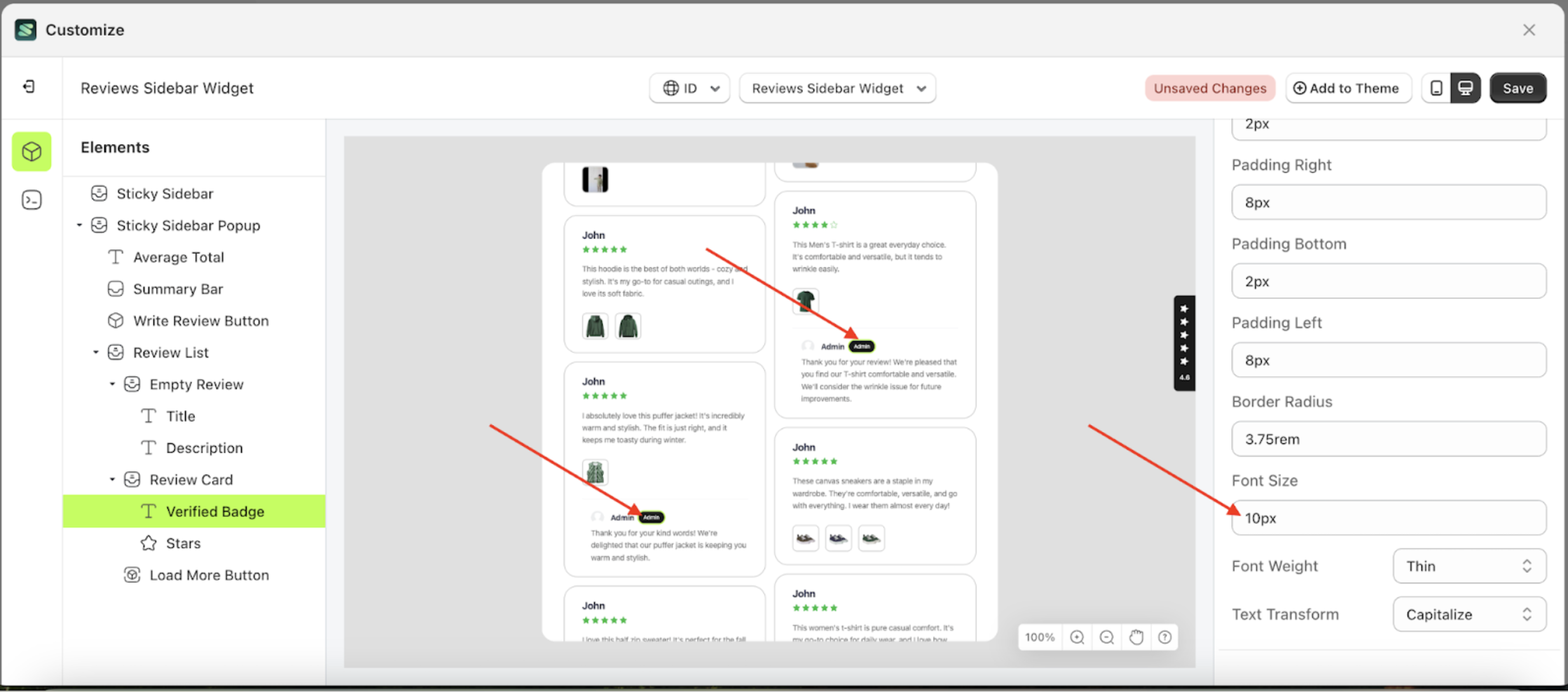
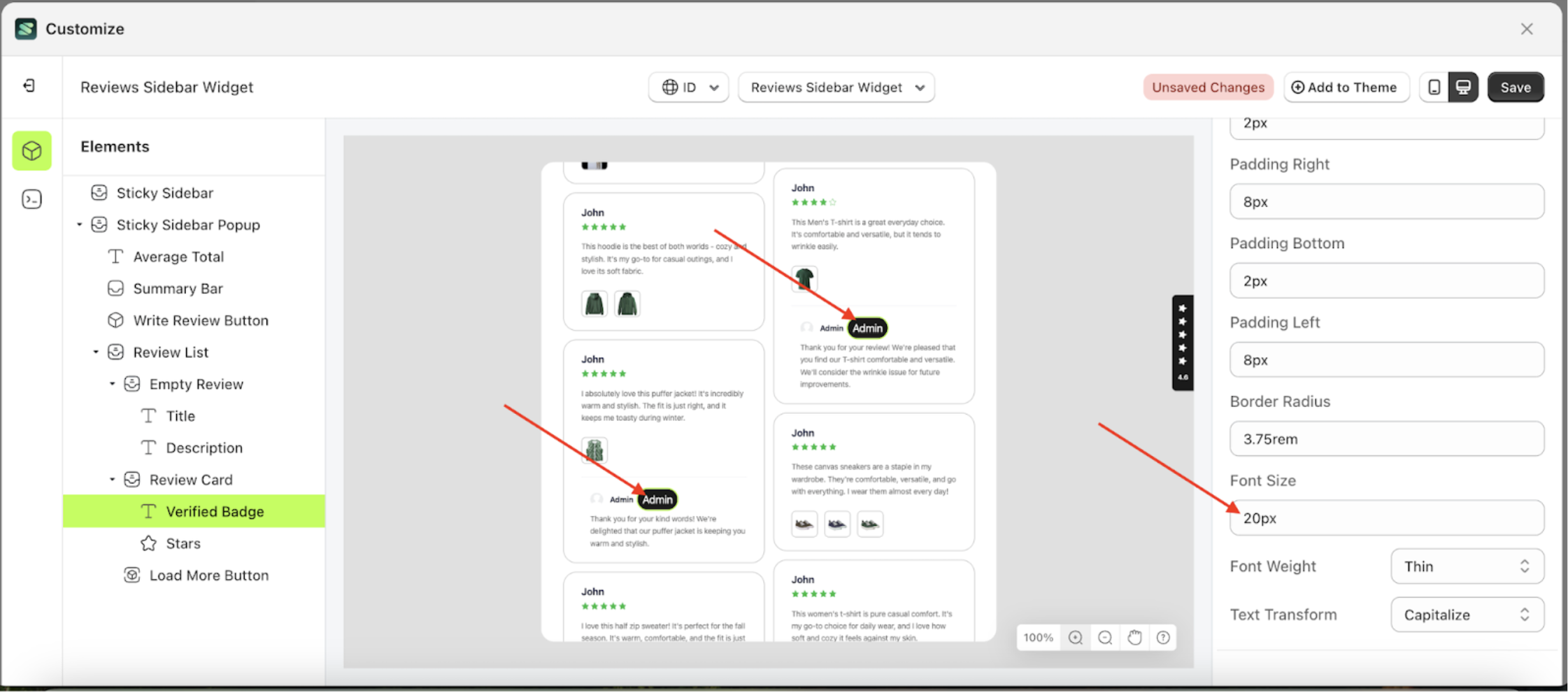
Font Size
This feature is designed to customize the text size of the badge settings
Follow the steps below:
- Select the Review Card element on the left, then click the icon marked with a red arrow to open the menu within that item.
- Once the menu is open, select the Verify Badge element on the left, then click the Settings tab and click the icon marked with a red arrow.
- On the right side, marked with a red arrow, you can change the font size to your desired value.
- Note: The font size format can be px, em, rem, %, or other units..
- For example, if you set the font size to 20px
- To see the changes in this setting on the element, click the Sticky Sidebar element
- The font size of the Verify Badge element will adjust accordingly.
- Example : Before font size change settings
- Example : After font size change settings


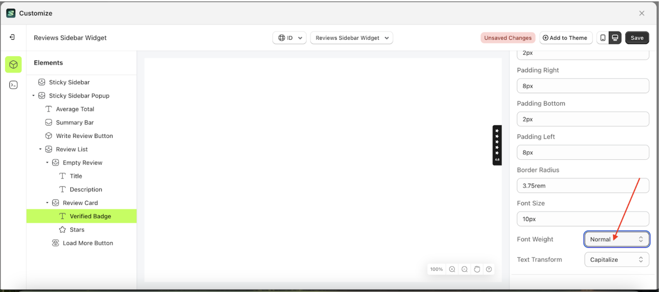
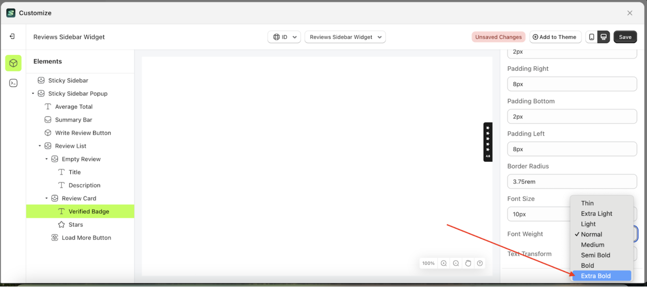
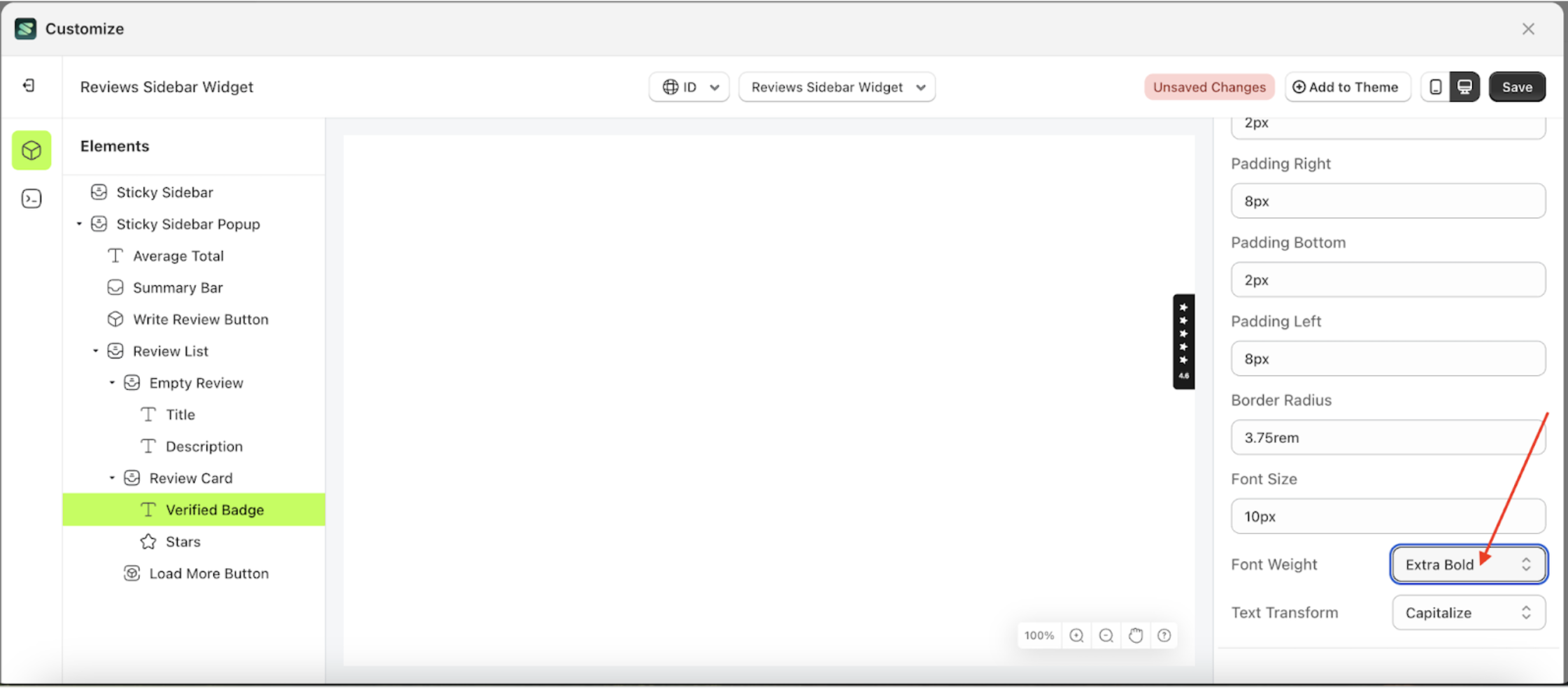
Font Weight
This feature is designed to customize the text-weignt of the badge settings
Follow the steps below:
- Select the Review Card element on the left, then click the icon marked with a red arrow to open the menu within that item.
- Once the menu is open, select the Verify Badge element on the left, then click the Settings tab and click the icon marked with a red arrow.
- On the right side, marked with a red arrow, you can change the font weight to your desired value.
- Note: The font weight format can be Thin, Extra light, Light and etc.
- Once the menu opens, select an option from the list
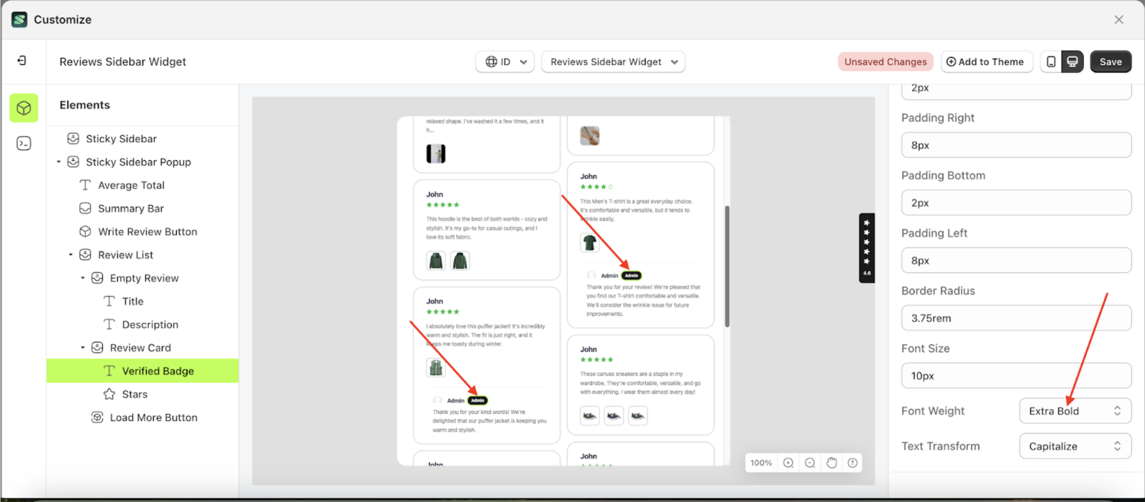
- For example, if you set the font weight to Extra Bold
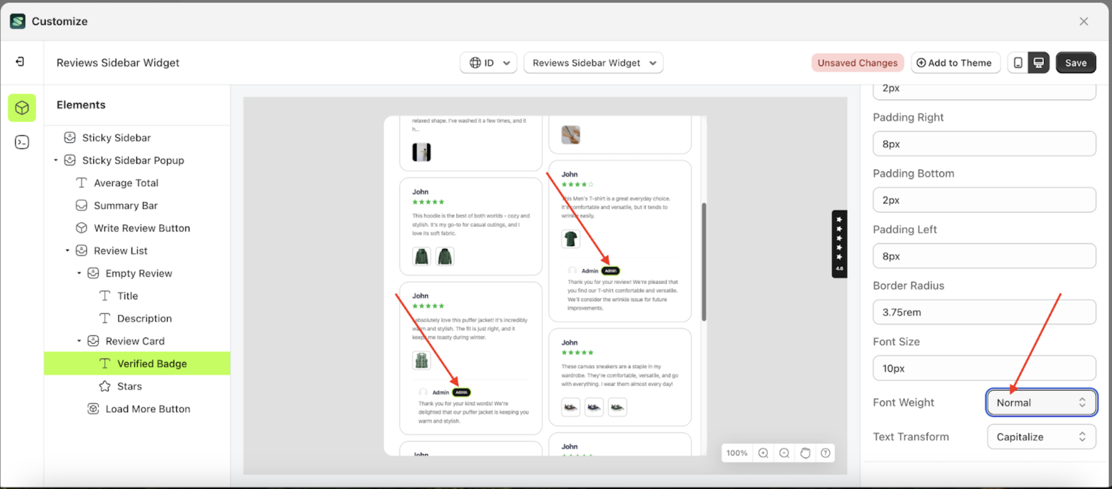
- To see the changes in this setting on the element, click the Sticky Sidebar element
- The font weight of the Verify Badge element will adjust accordingly.
- Example : Before font weight change settings
- Example : After font weight change settings


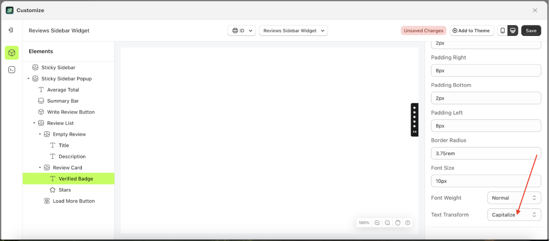
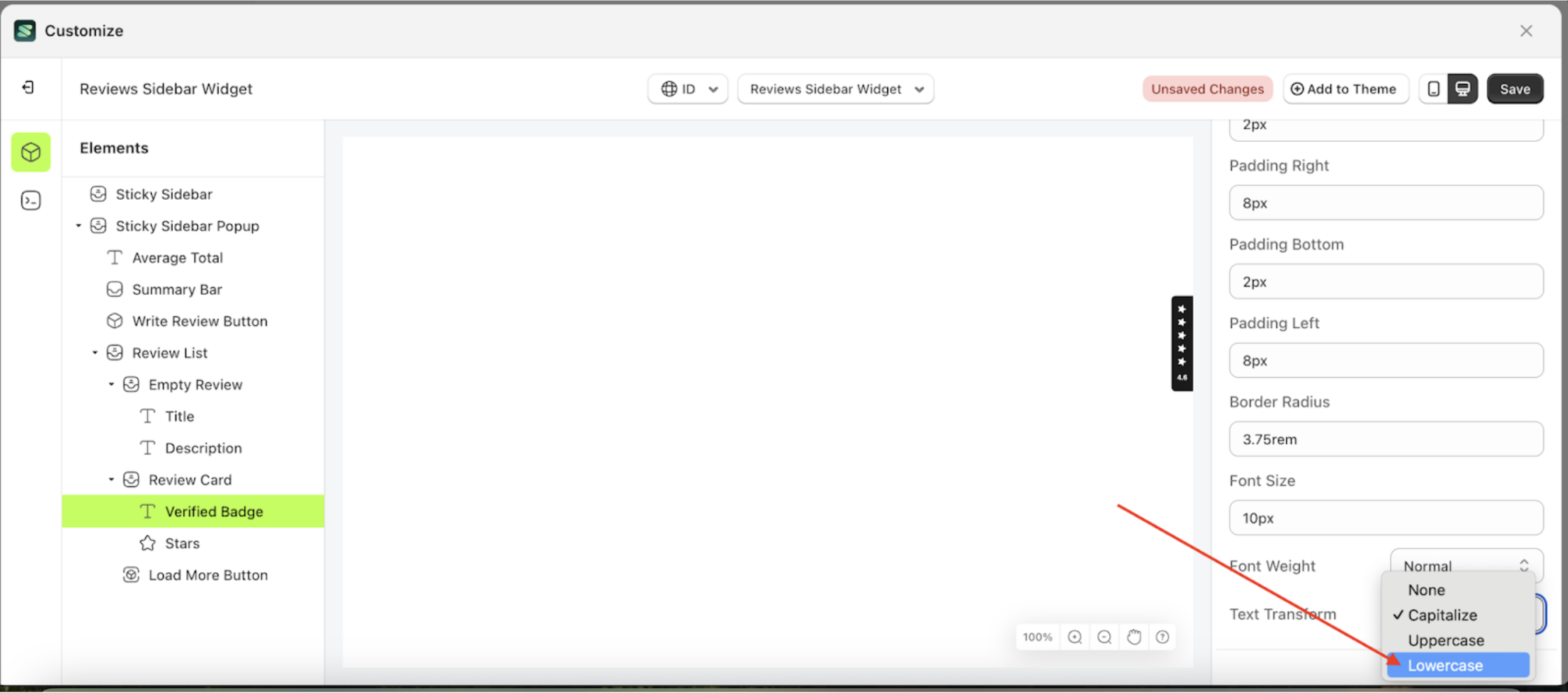
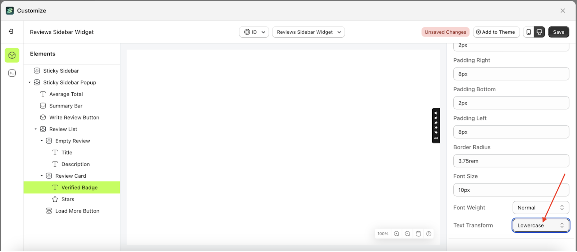
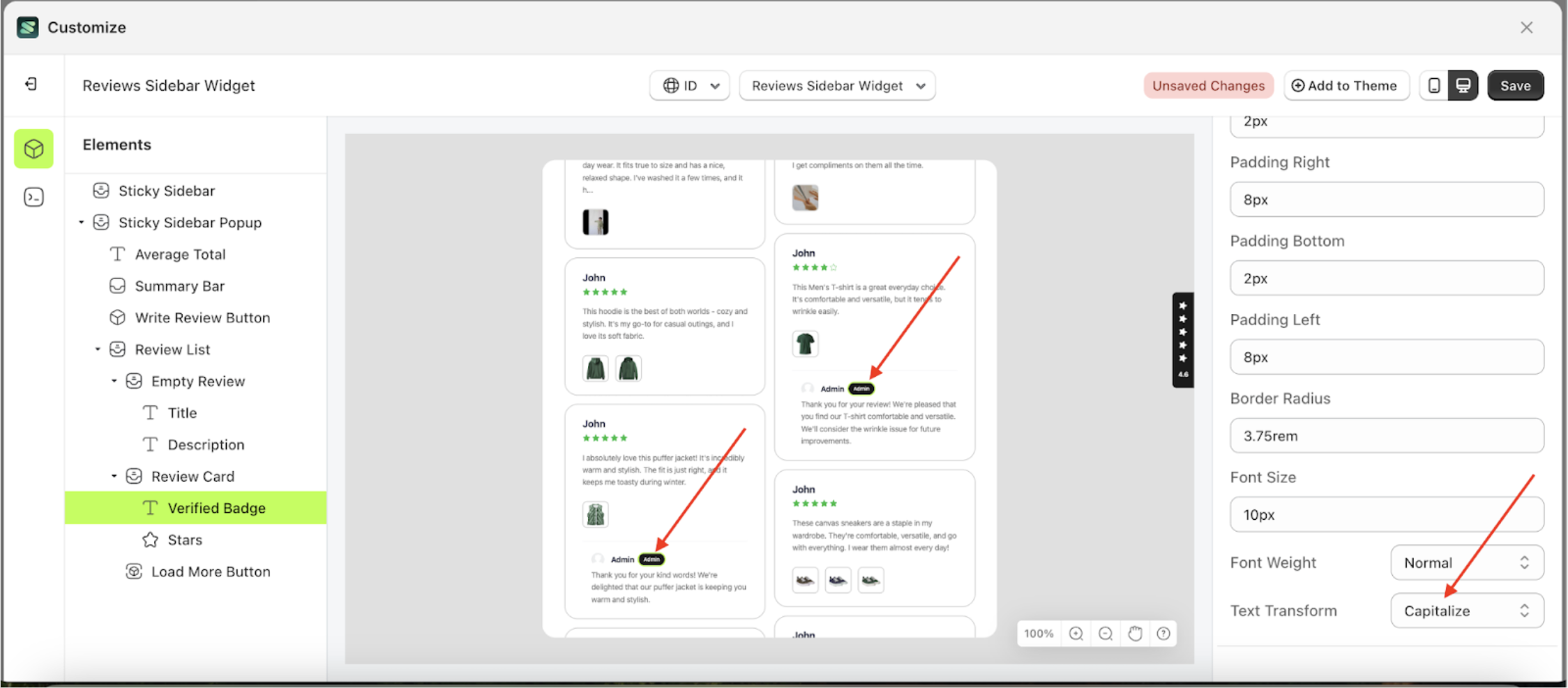
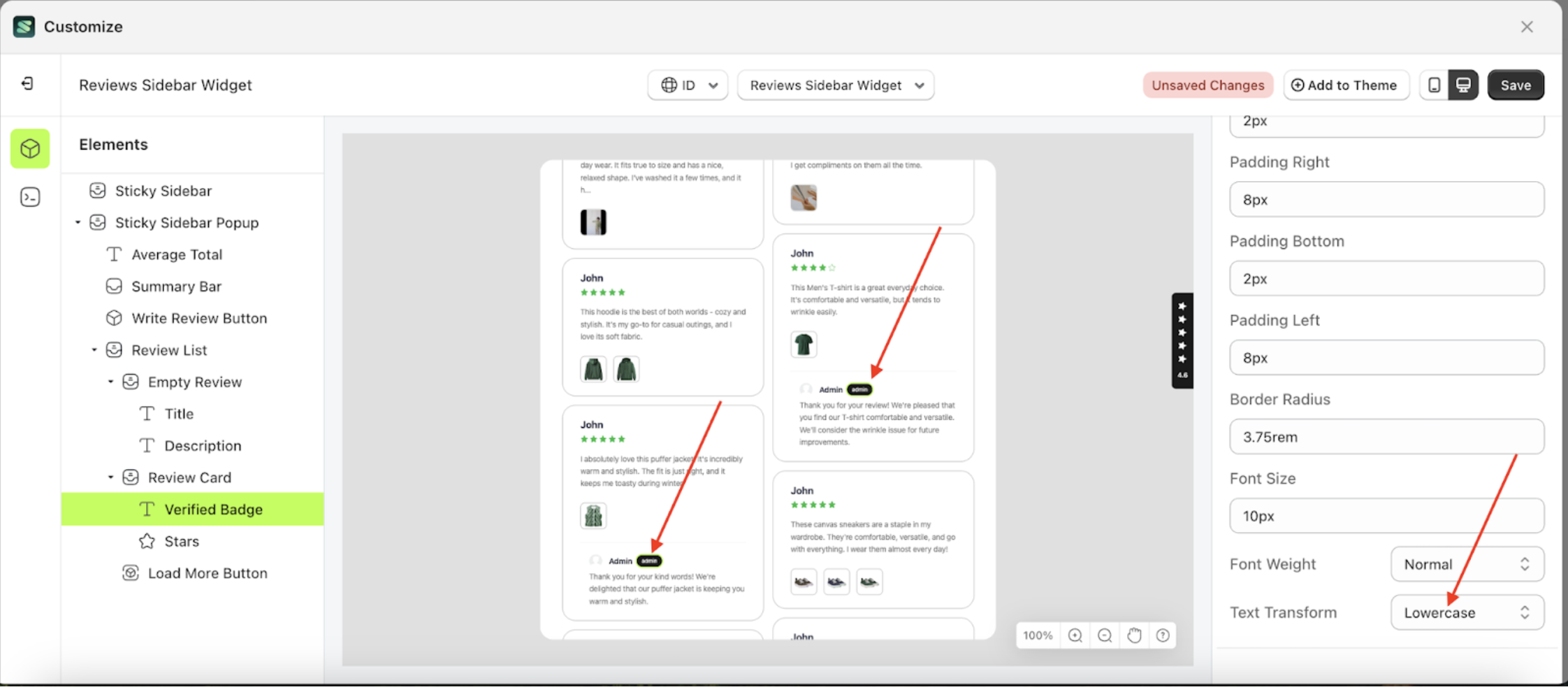
Text Transform
This feature allows you to adjust the capitalization style of the text
Follow the steps below:
- Select the Review Card element on the left, then click the icon marked with a red arrow to open the menu within that item.
- Once the menu is open, select the Verify Badge element on the left, then click the Settings tab and click the icon marked with a red arrow.
- On the right side, marked with a red arrow, you can change the text transform to your desired value.
- Note: The text transform format can be None, Capitalize, Uppercase, Lowercase..
- Once the menu opens, select an option from the list
- For example, if you set the text transform to Lowercase
- To see the changes in this setting on the element, click the Sticky Sidebar element
- The text transform of the Verify Badge element will adjust accordingly.
- Example : Before text transform change settings
- Example : After text transform change settings

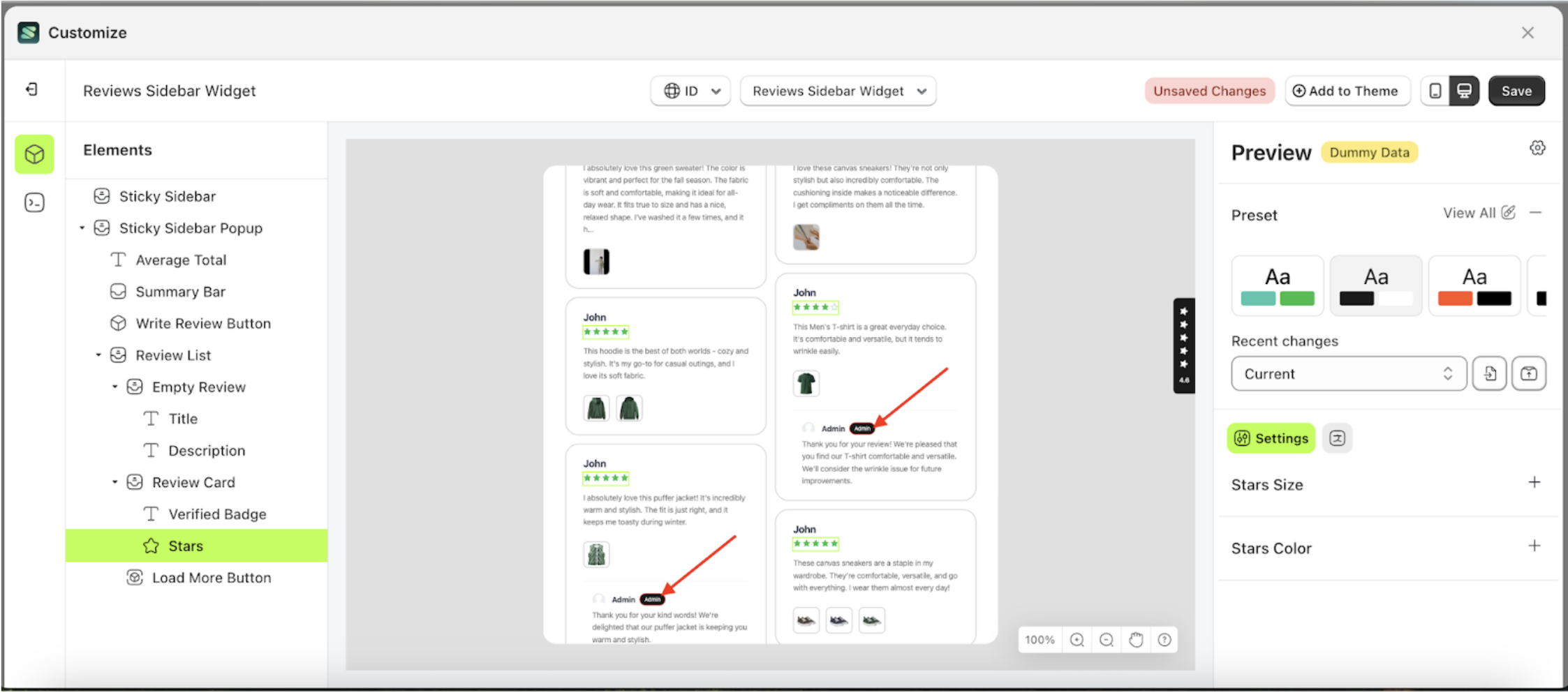
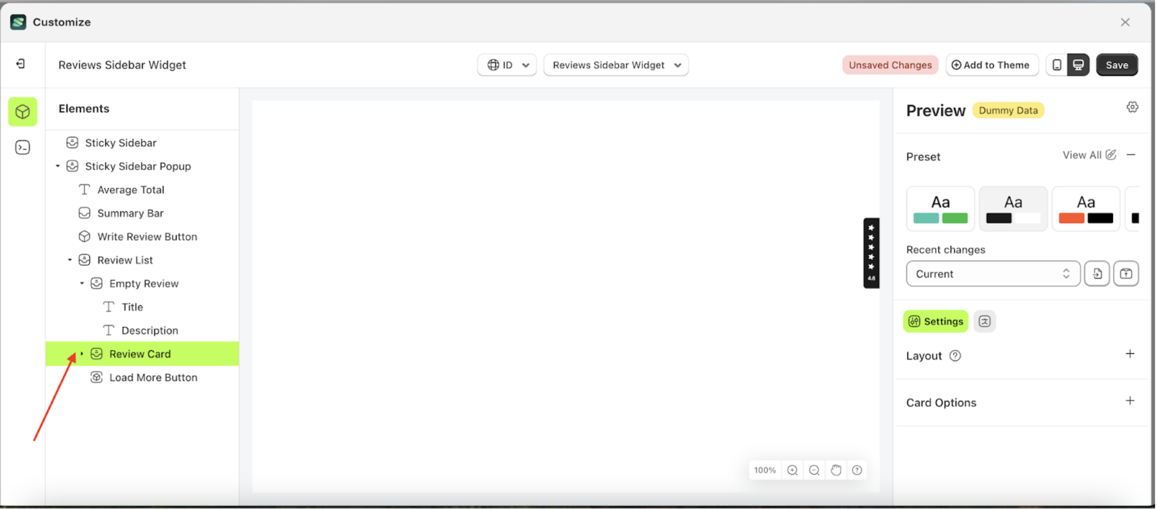
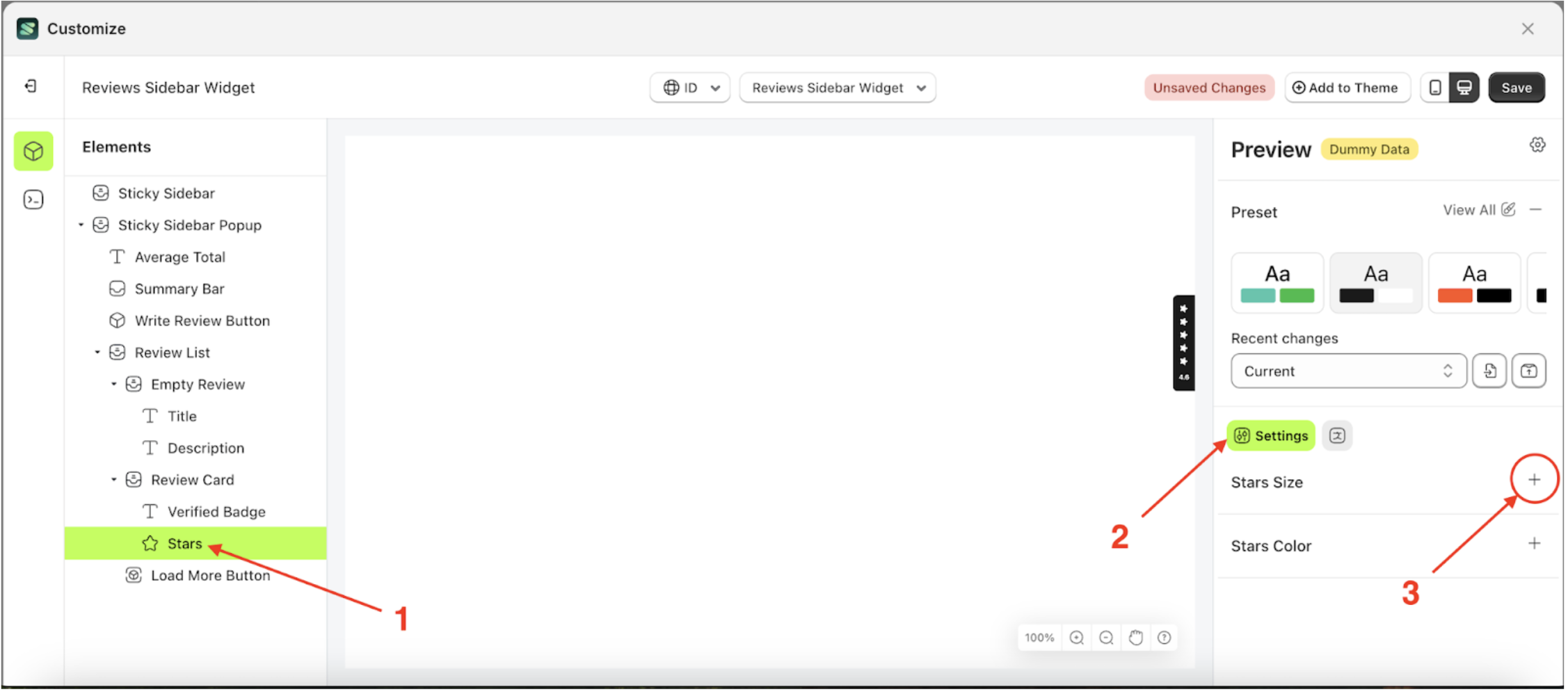
Stars
Available settings:
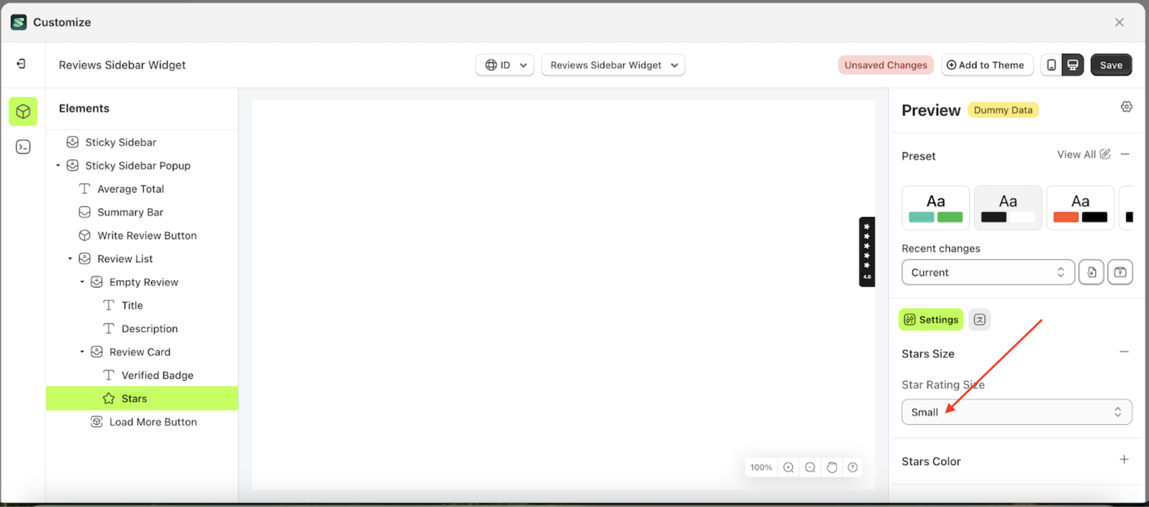
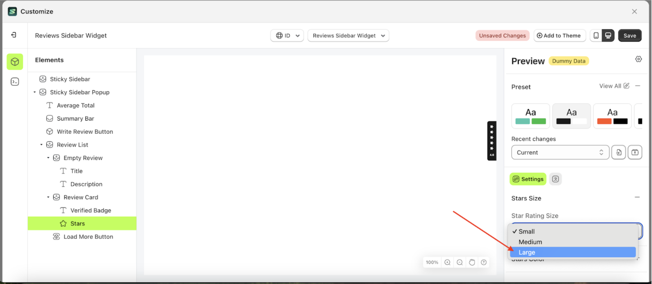
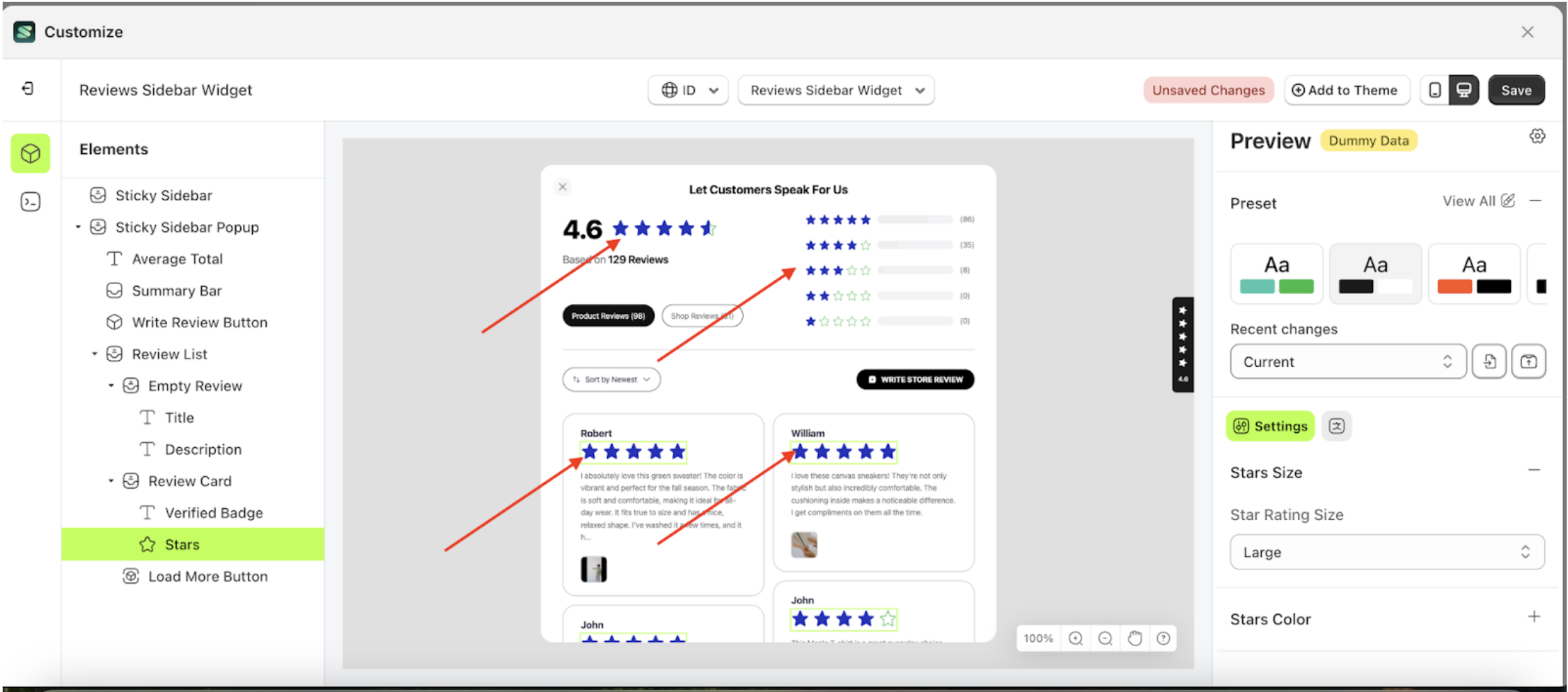
Stars Rating Size
This feature is designed to adjust the size of the star elements.
Follow the steps below:
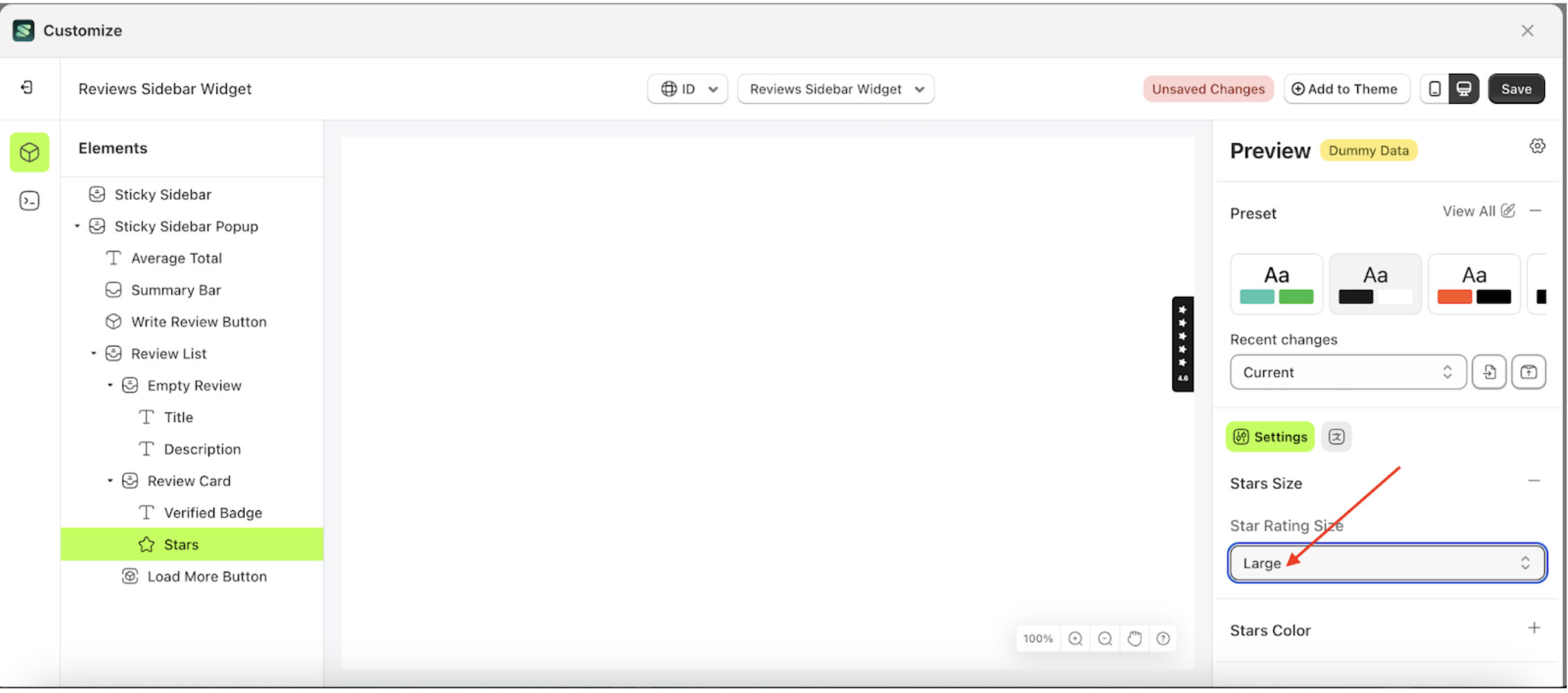
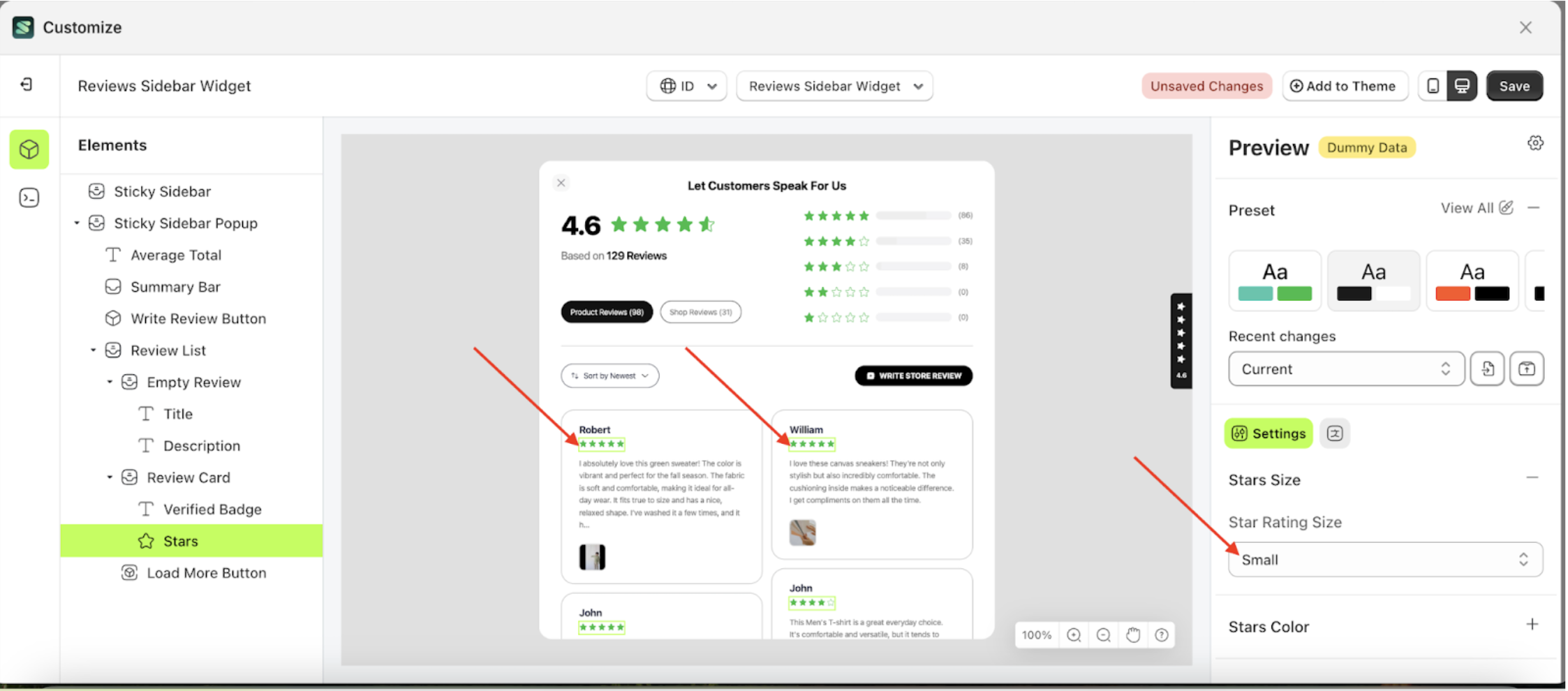
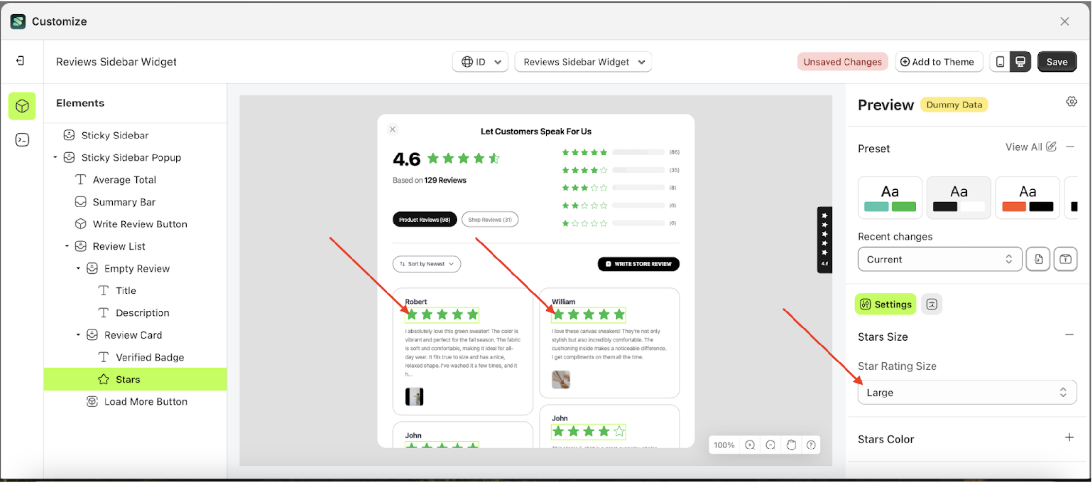
- Select the Review Card element on the left, then click the icon marked with a red arrow to open the menu within that item.
- Once the menu is open, select the Stars element on the left, then click the Settings tab and click the icon marked with a red arrow.
- On the right side, marked with a red arrow, you can change the stars rating size to your desired value.
- Note: The stars rating size format can be Small, Medium, and Large..
- Once the menu opens, select an option from the list
- For example, if you set the stars rating size to Large Size
- To see the changes in this setting on the element, click the Sticky Sidebar element
- The stars rating size of the Stars element will adjust accordingly.
- Example : Before stars rating size change settings
- Example : After stars rating size change settings

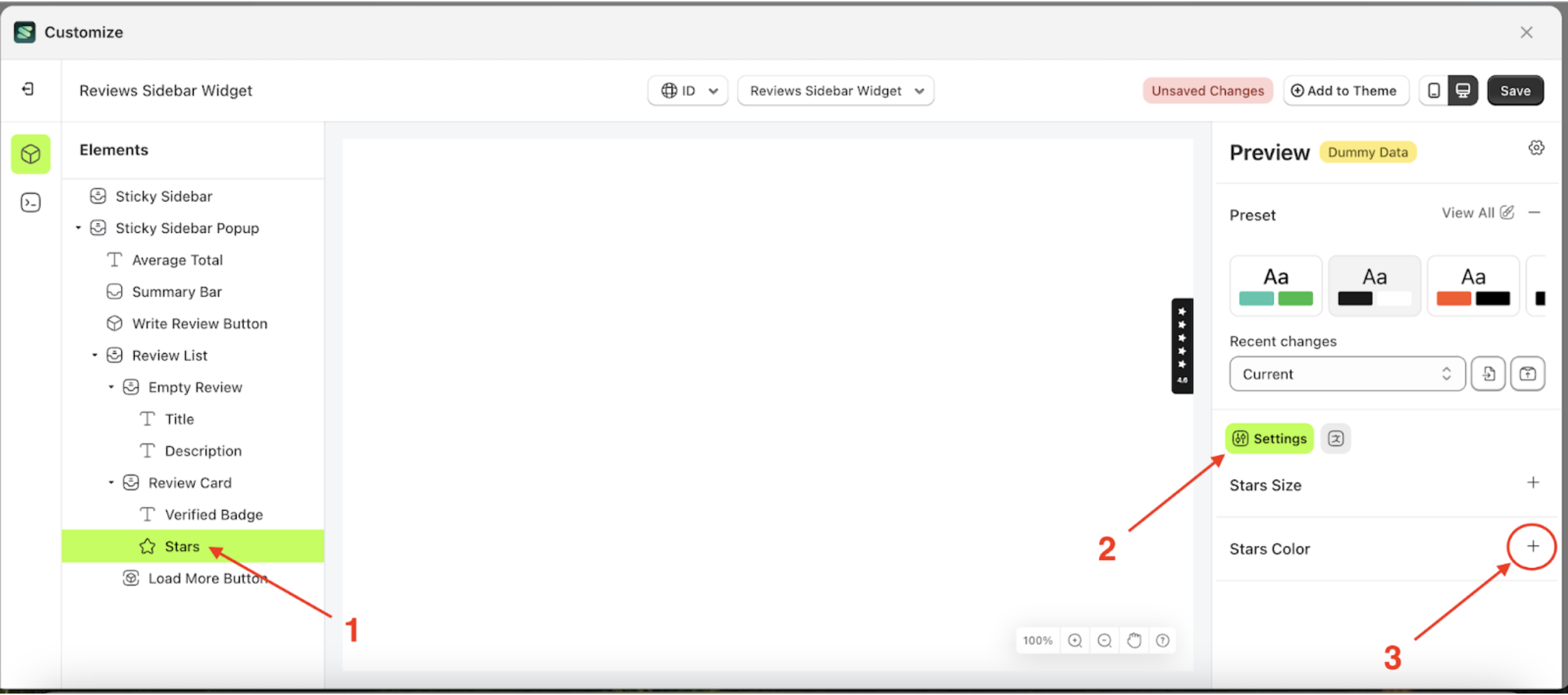
Stars Color
Available settings:
Fill Color
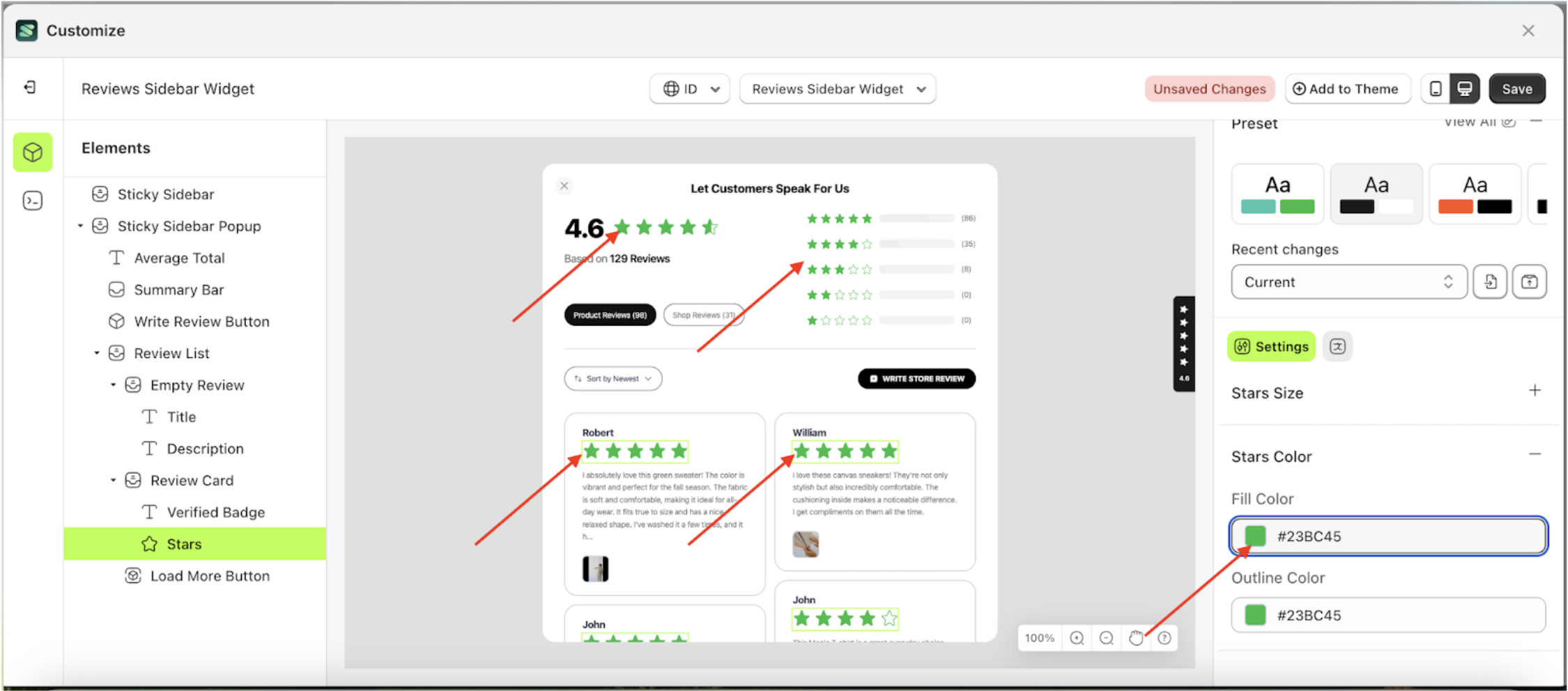
This feature is designed to manage the inner color of the stars.
Follow the steps below:
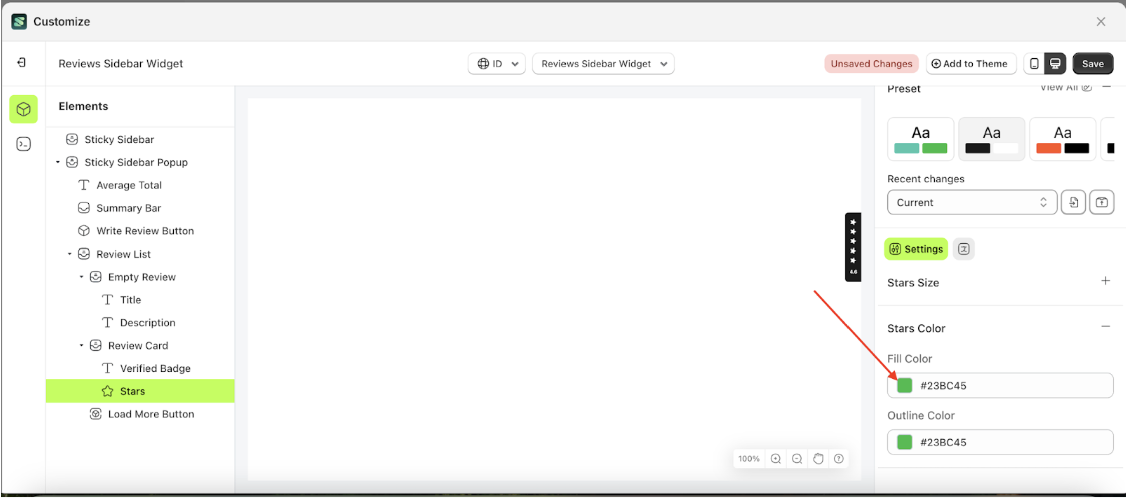
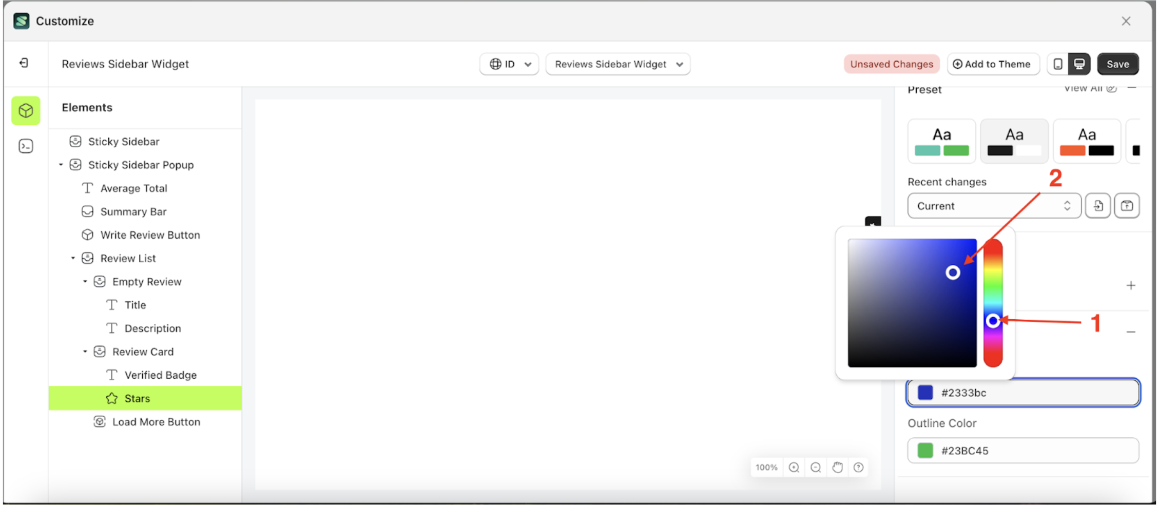
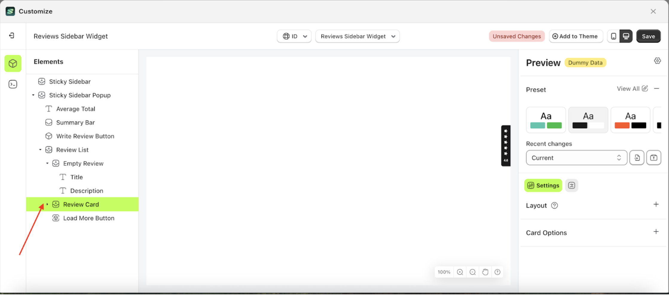
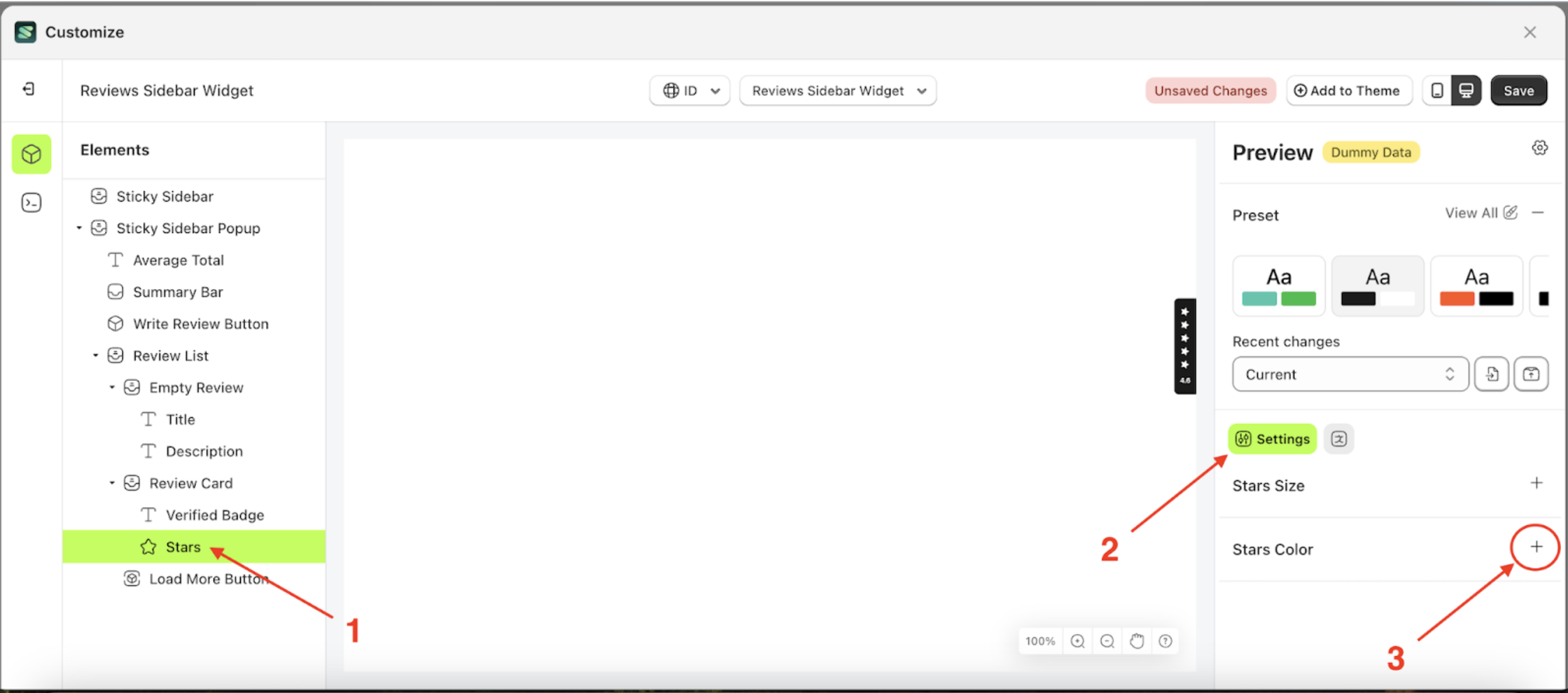
- Select the Review Card element on the left, then click the icon marked with a red arrow to open the menu within that item.
- Once the menu is open, select the Stars element on the left, then click the Settings tab and click the icon marked with a red arrow.
- Click the Color Palette on the right side, which is also marked with a red arrow.
- The Color Palette will appear. Click the right side of the palette where the red arrow and number 1 are indicated, then click the right side again where the red arrow and number 2 are marked.
- To see the changes in this setting on the element, click the Sticky Sidebar element
- The review sidebar widget of the Stars element will adjust accordingly.
- Example : Before Stars change settings
- Example : After Stars change settings


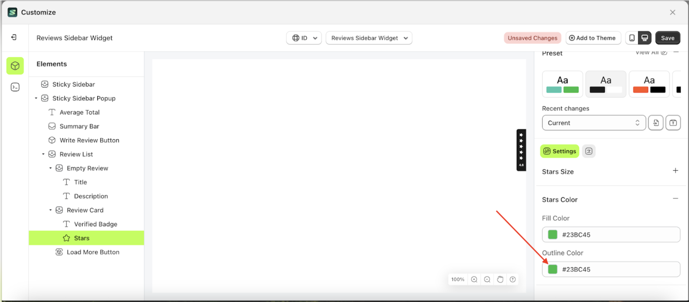
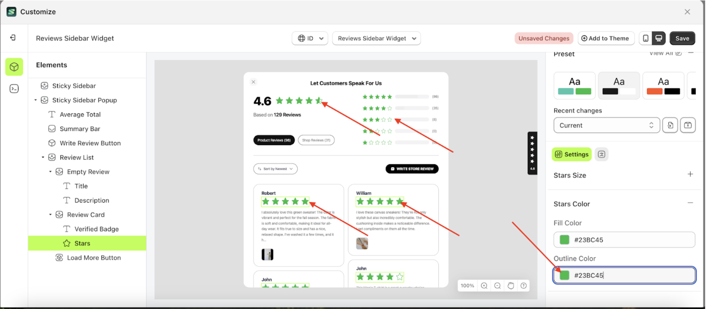
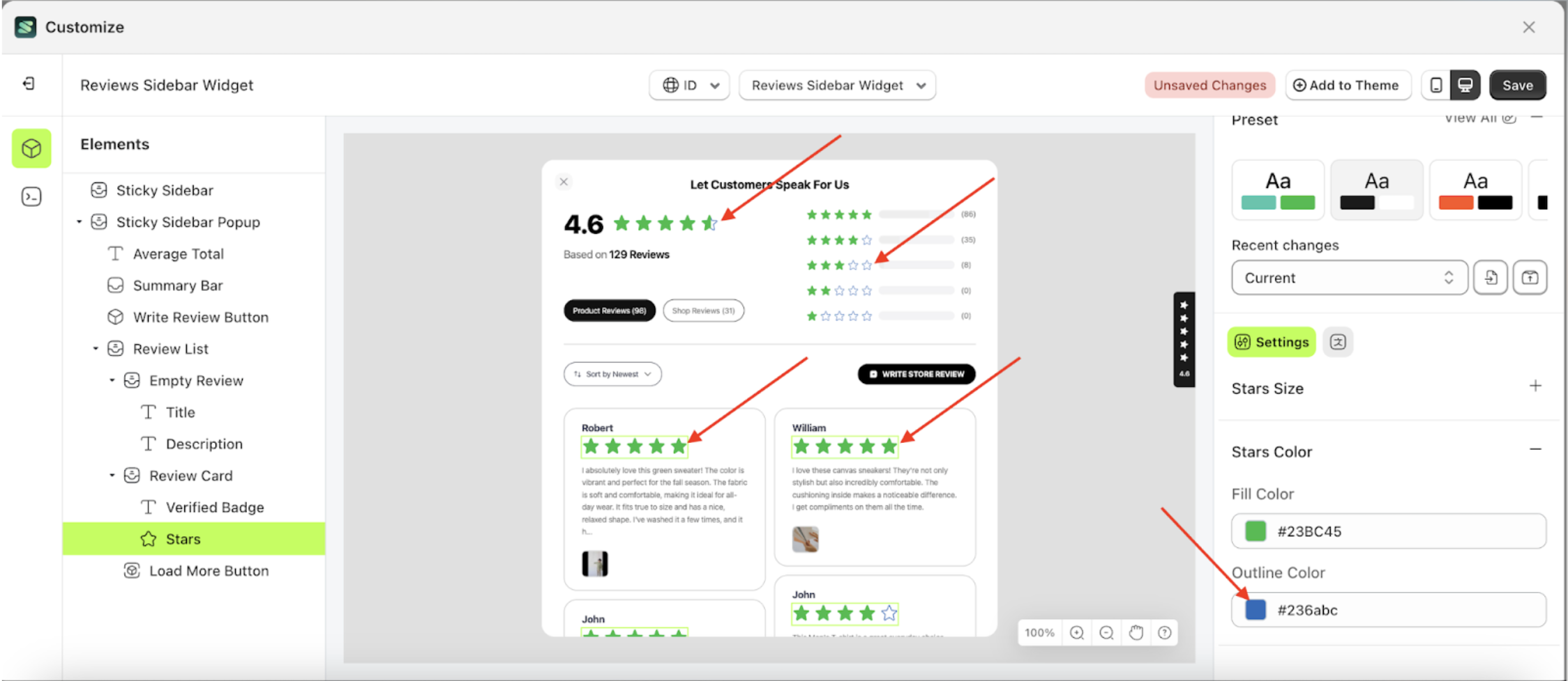
Outline Color
This feature is designed to manage the outer color or border of the stars
Follow the steps below:
- Select the Review Card element on the left, then click the icon marked with a red arrow to open the menu within that item.
- Once the menu is open, select the Stars element on the left, then click the Settings tab and click the icon marked with a red arrow.
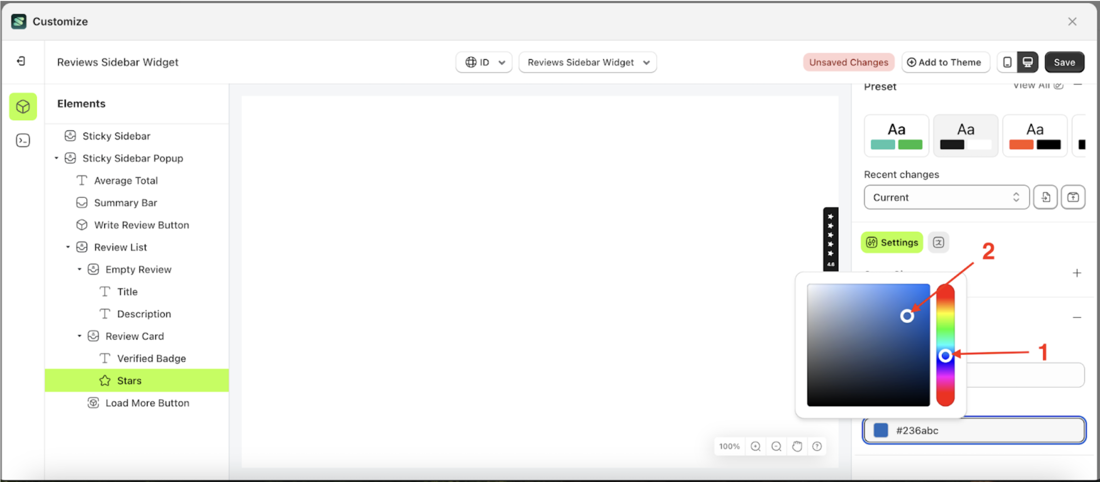
- Click the Color Palette on the right side, which is also marked with a red arrow.
- The Color Palette will appear. Click the right side of the palette where the red arrow and number 1 are indicated, then click the right side again where the red arrow and number 2 are marked.
- To see the changes in this setting on the element, click the Sticky Sidebar element
- The review sidebar widget of the Stars element will adjust accordingly.
- Example : Before Stars change settings
- Example : After Stars change settings

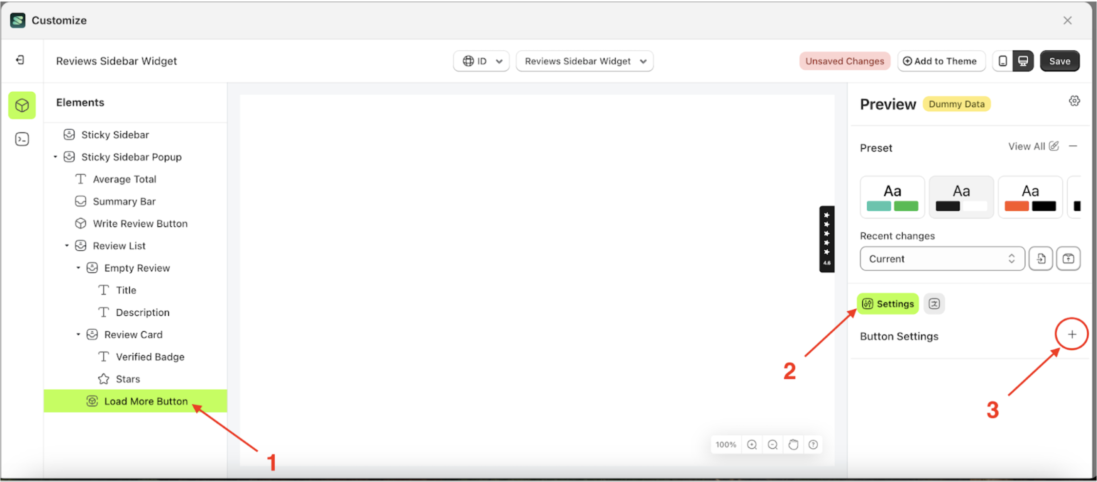
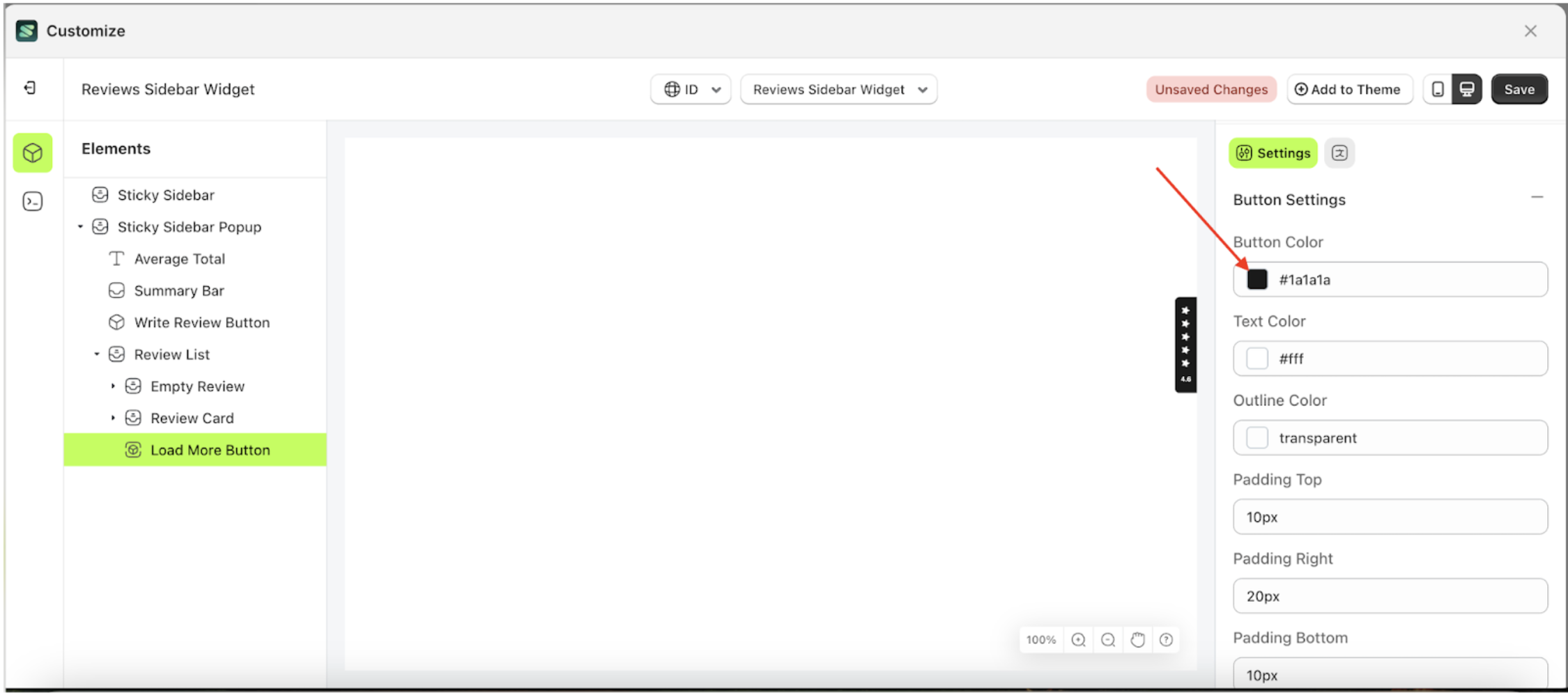
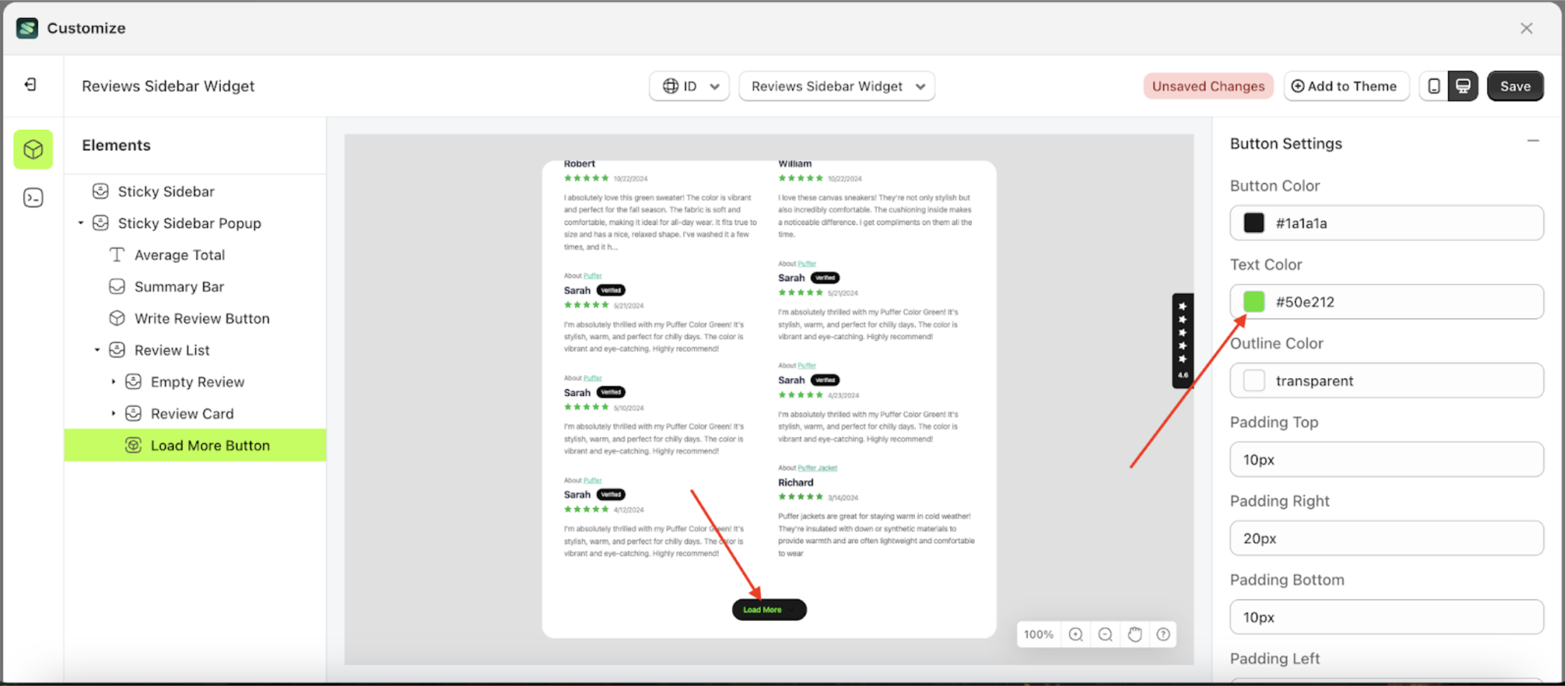
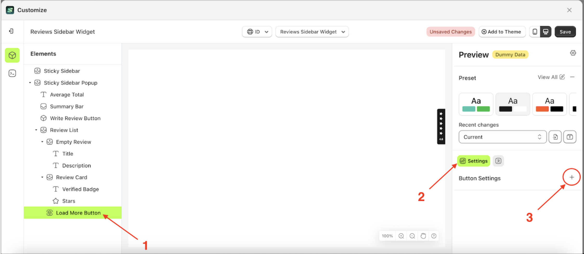
Button Settings Load More
Available settings:
Button Color Load MoreText Color Load MoreOutline Color Load MorePadding Top Load MorePadding Right Load MorePadding Bottom Load MorePadding Left Load MoreBorder Radius Load MoreFont Size Load MoreFont Weight Load MoreText Transform Load More
Button Color Load More
This feature is designed to customize the button color of the button settings
Follow the steps below:
- Select the Review Card element on the left, then click the icon marked with a red arrow to open the menu within that item.
- Once the menu is open, select the Load More Button element on the left, then click the Settings tab and click the icon marked with a red arrow.
- Click the Color Palette on the right side, which is also marked with a red arrow.
- The Color Palette will appear. Click the right side of the palette where the red arrow and number 1 are indicated, then click the right side again where the red arrow and number 2 are marked.
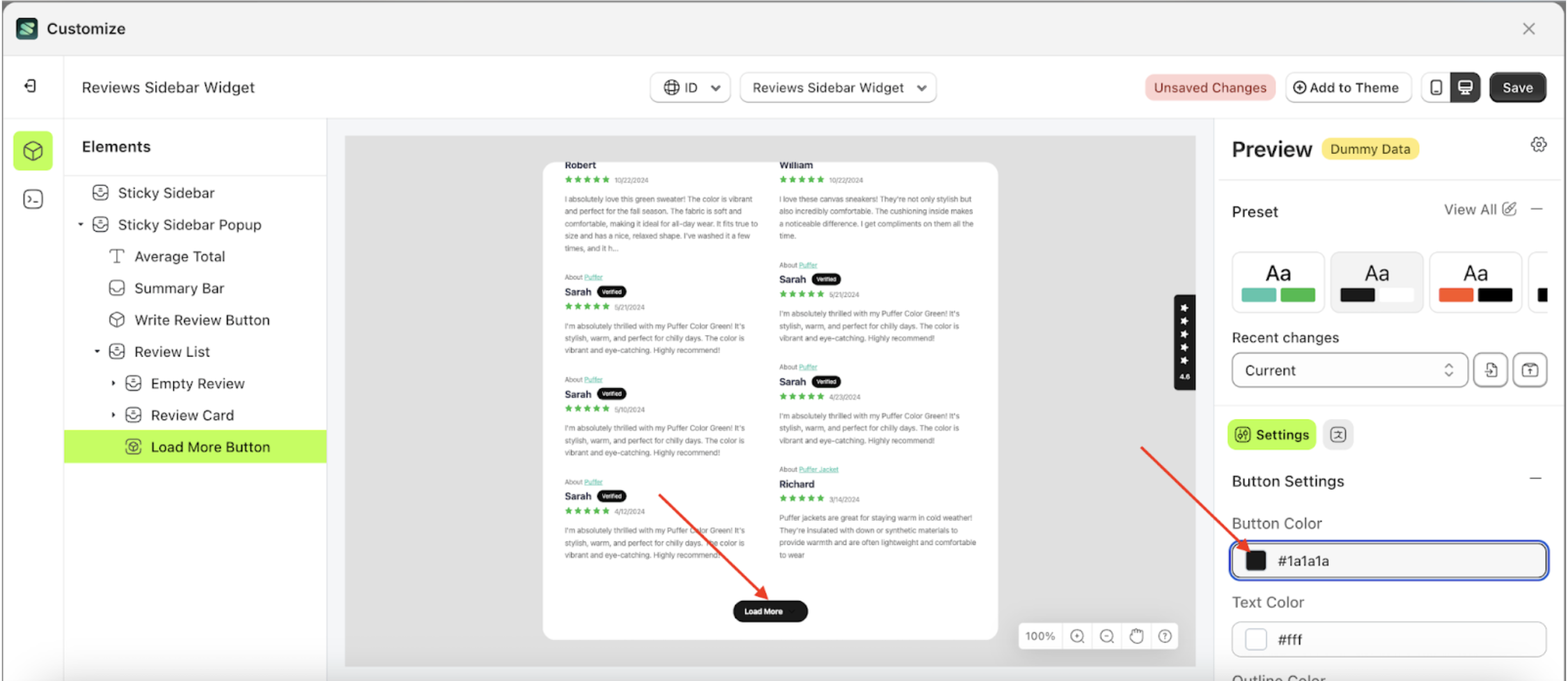
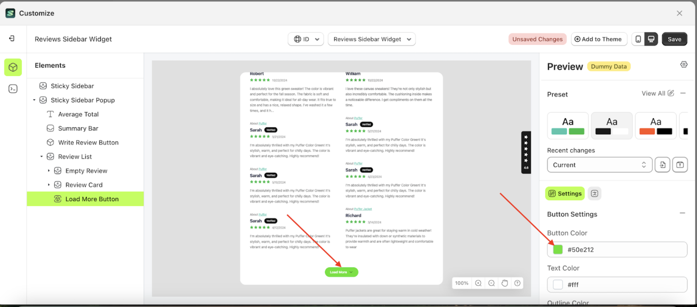
- To see the changes in this setting on the element, click the Sticky Sidebar element
- The review sidebar widget of the Load More Button element will adjust accordingly.
- Example : Before Load More Button change settings
- Example : After Load More Button change settings


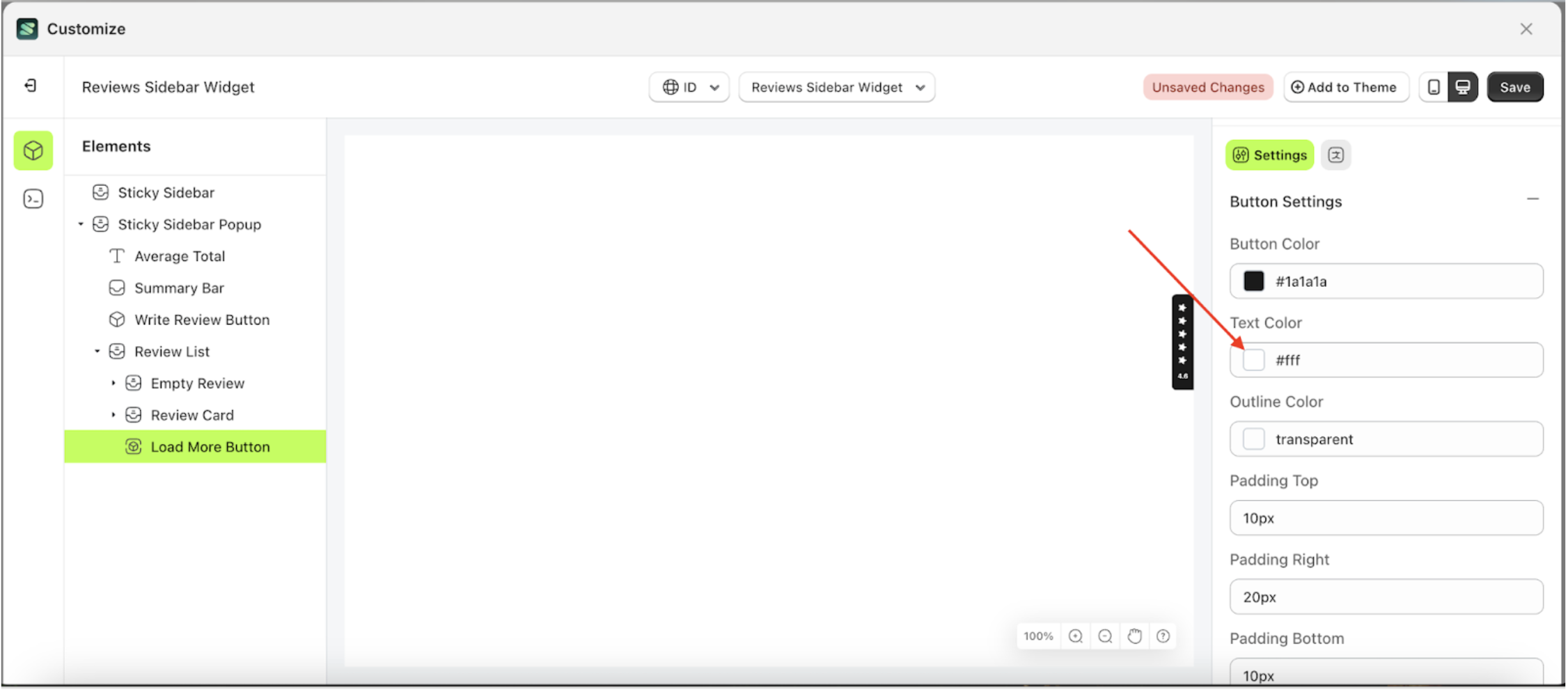
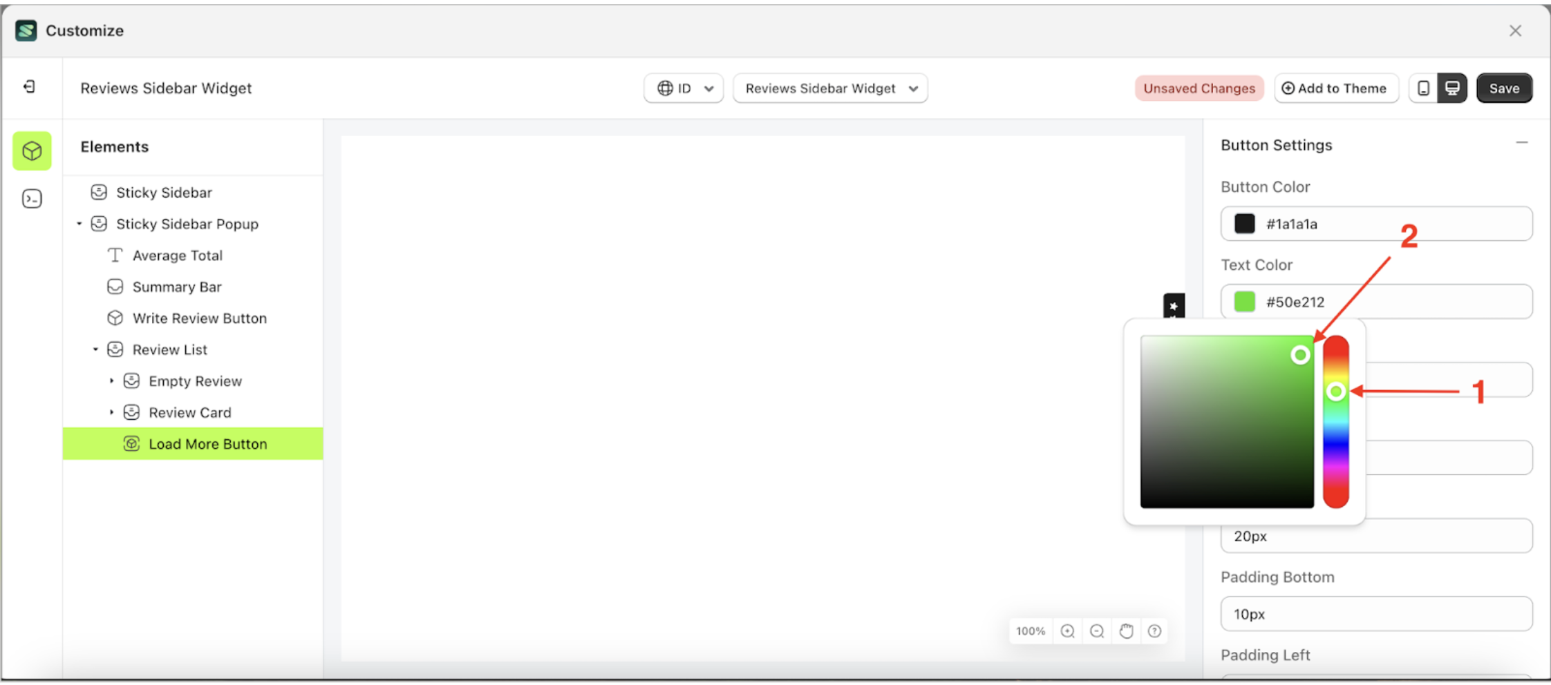
Text Color Load More
This feature is designed to customize the text color of the button settings
Follow the steps below:
- Select the Review Card element on the left, then click the icon marked with a red arrow to open the menu within that item.
- Once the menu is open, select the Load More Button element on the left, then click the Settings tab and click the icon marked with a red arrow.
- Click the Color Palette on the right side, which is also marked with a red arrow.
- The Color Palette will appear. Click the right side of the palette where the red arrow and number 1 are indicated, then click the right side again where the red arrow and number 2 are marked.
- To see the changes in this setting on the element, click the Sticky Sidebar element
- The review sidebar widget of the Load More Button element will adjust accordingly.
- Example : Before Load More Button change settings
- Example : After Load More Button change settings


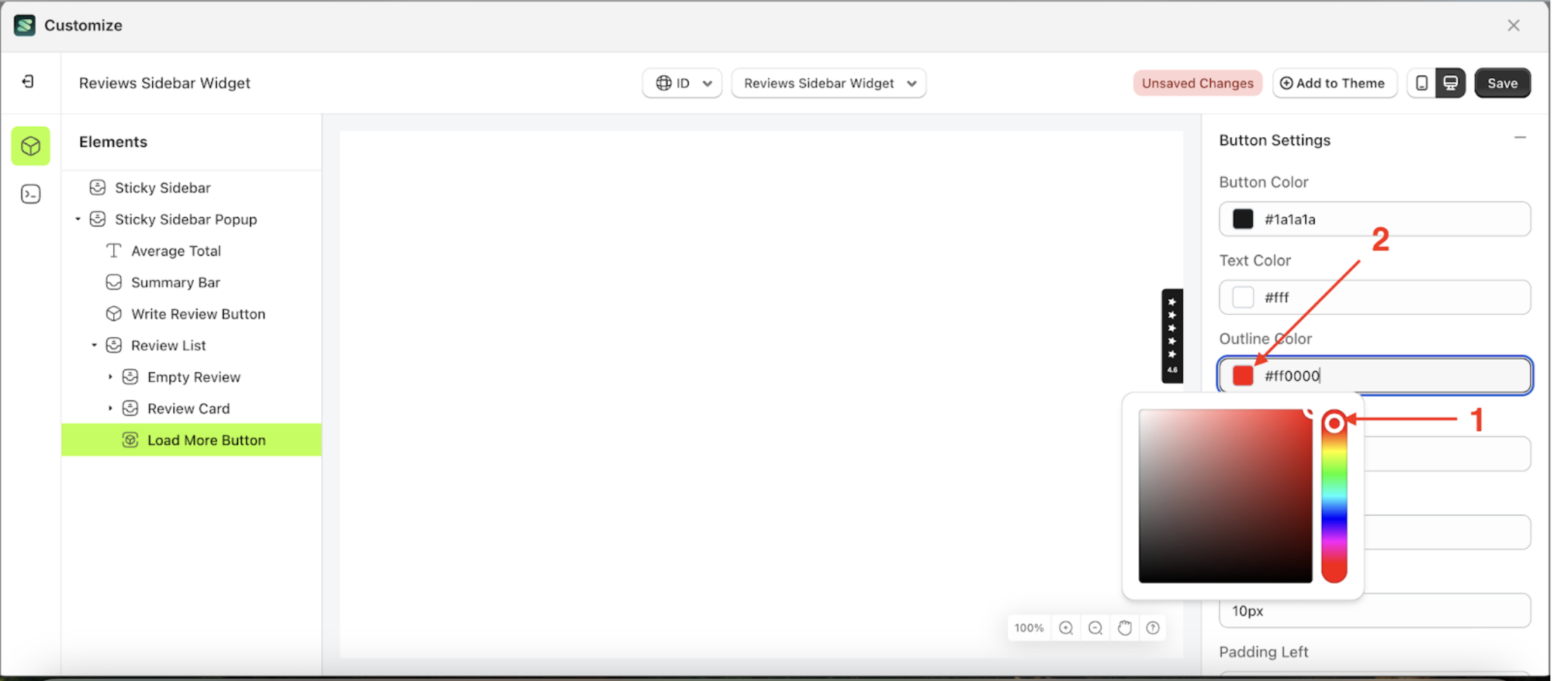
Outline Color Load More
This feature is designed to customize the outline color of the button settings
Follow the steps below:
- Select the Review Card element on the left, then click the icon marked with a red arrow to open the menu within that item.
- Once the menu is open, select the Load More Button element on the left, then click the Settings tab and click the icon marked with a red arrow.
- Click the Color Palette on the right side, which is also marked with a red arrow.
- The Color Palette will appear. Click the right side of the palette where the red arrow and number 1 are indicated, then click the right side again where the red arrow and number 2 are marked.
- To see the changes in this setting on the element, click the Sticky Sidebar element
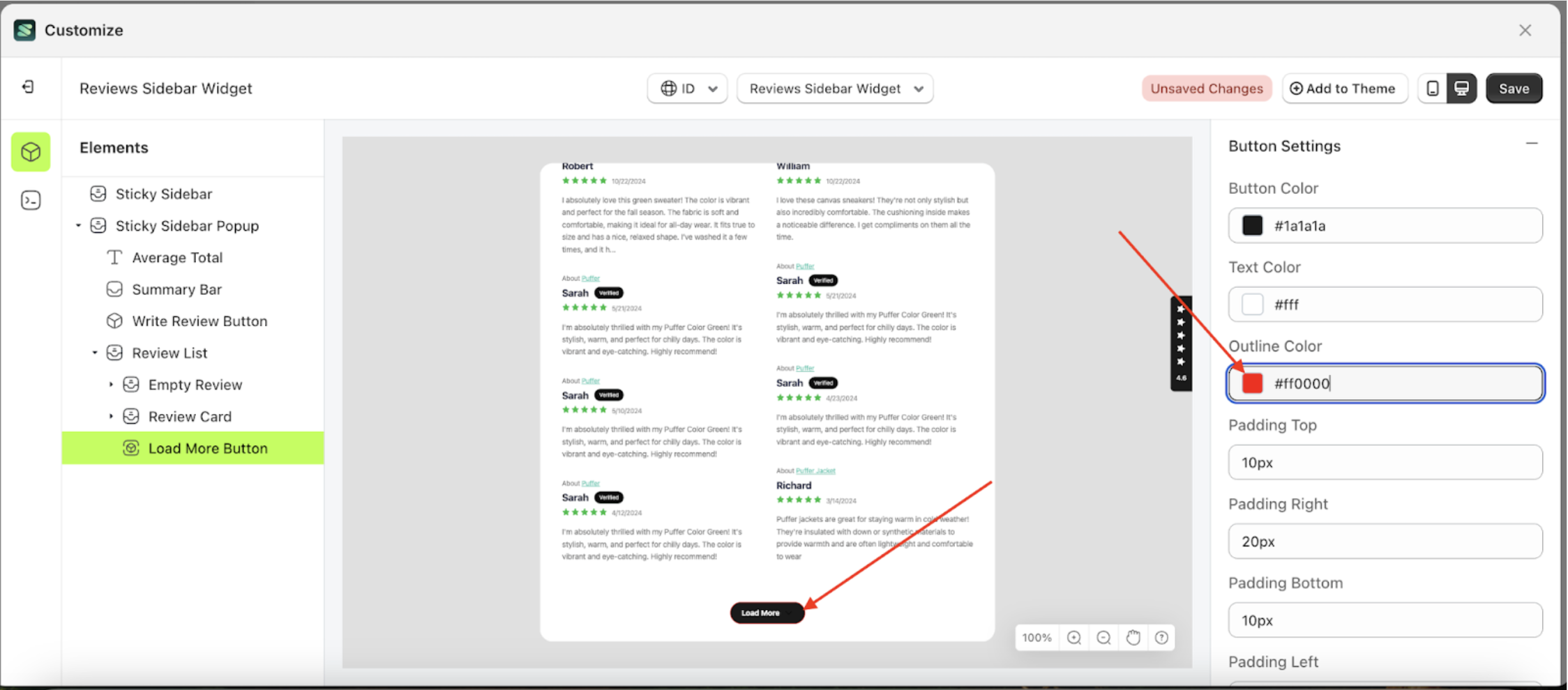
- The review sidebar widget of the Load More Button element will adjust accordingly.
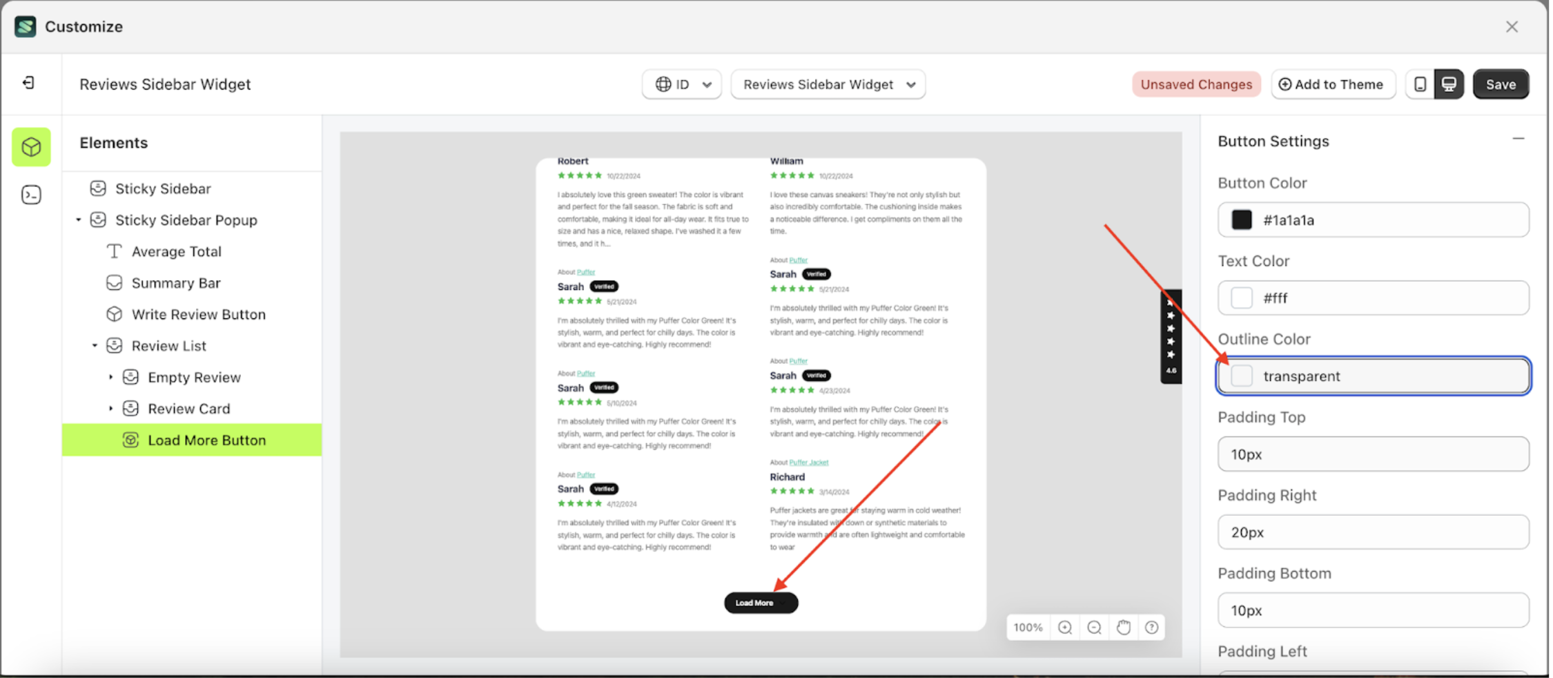
- Example : Before Load More Button change settings
- Example : After Load More Button change settings


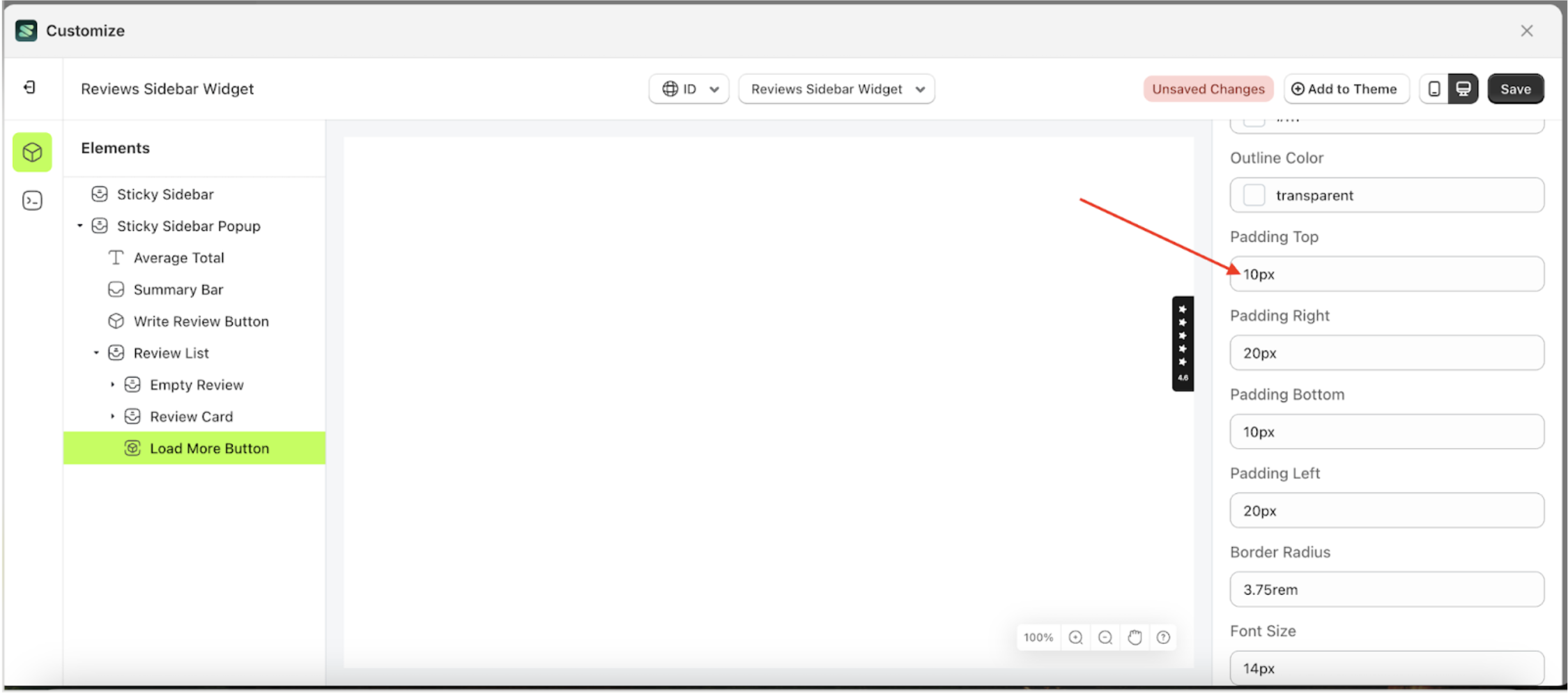
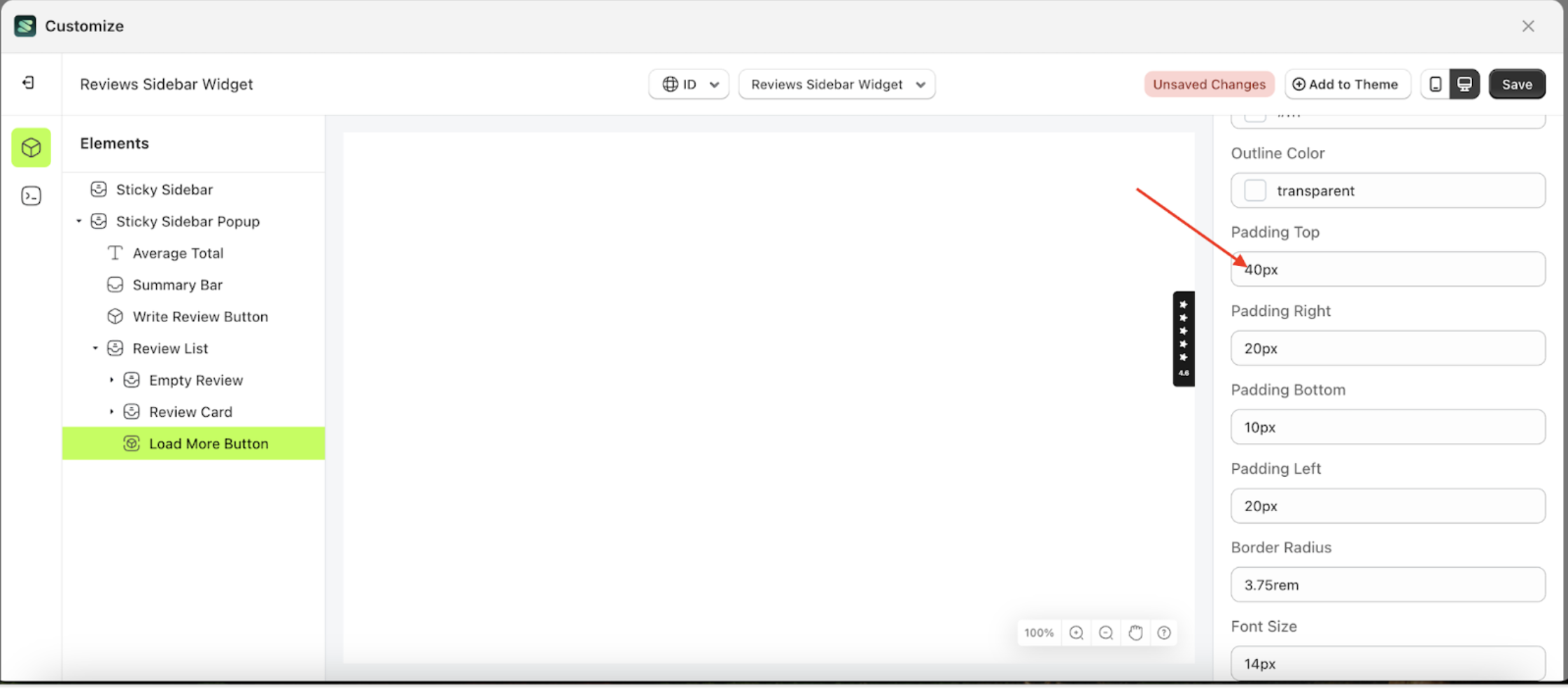
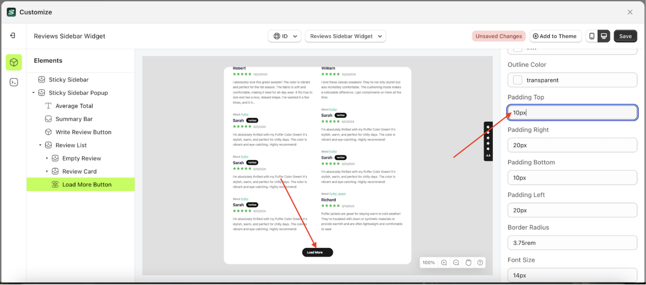
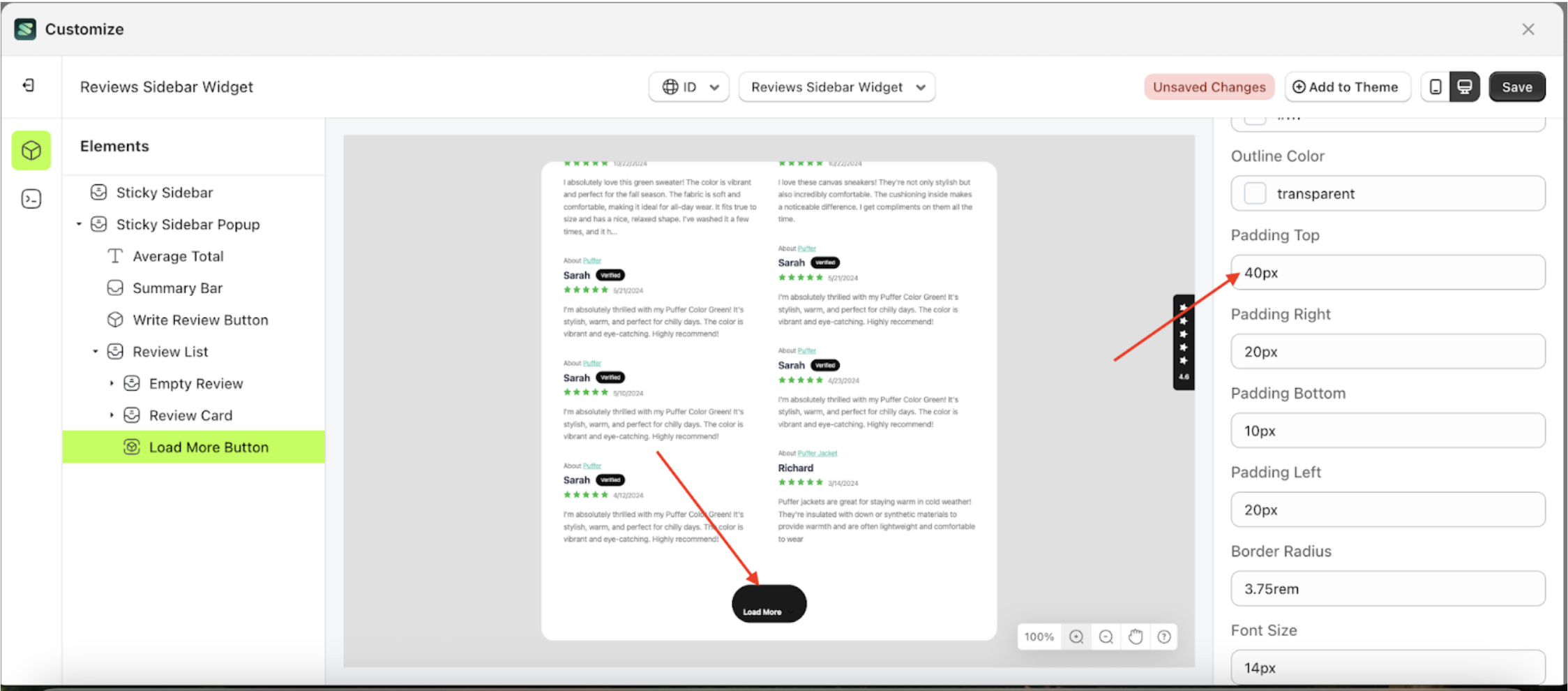
Padding Top Load More
This feature is designed to customize the top padding of the button settings
Follow the steps below:
- Select the Review Card element on the left, then click the icon marked with a red arrow to open the menu within that item.
- Once the menu is open, select the Load More Button element on the left, then click the Settings tab and click the icon marked with a red arrow.
- On the right side, marked with a red arrow, you can change the padding top to your desired value.
- Note: The padding top format can be px, em, rem, %, or other units..
- For example, if you set the padding top to 40px
- To see the changes in this setting on the element, click the Sticky Sidebar element
- The padding top of the Load More Button element will adjust accordingly.
- Example : Before padding top change settings
- Example : After padding top change settings


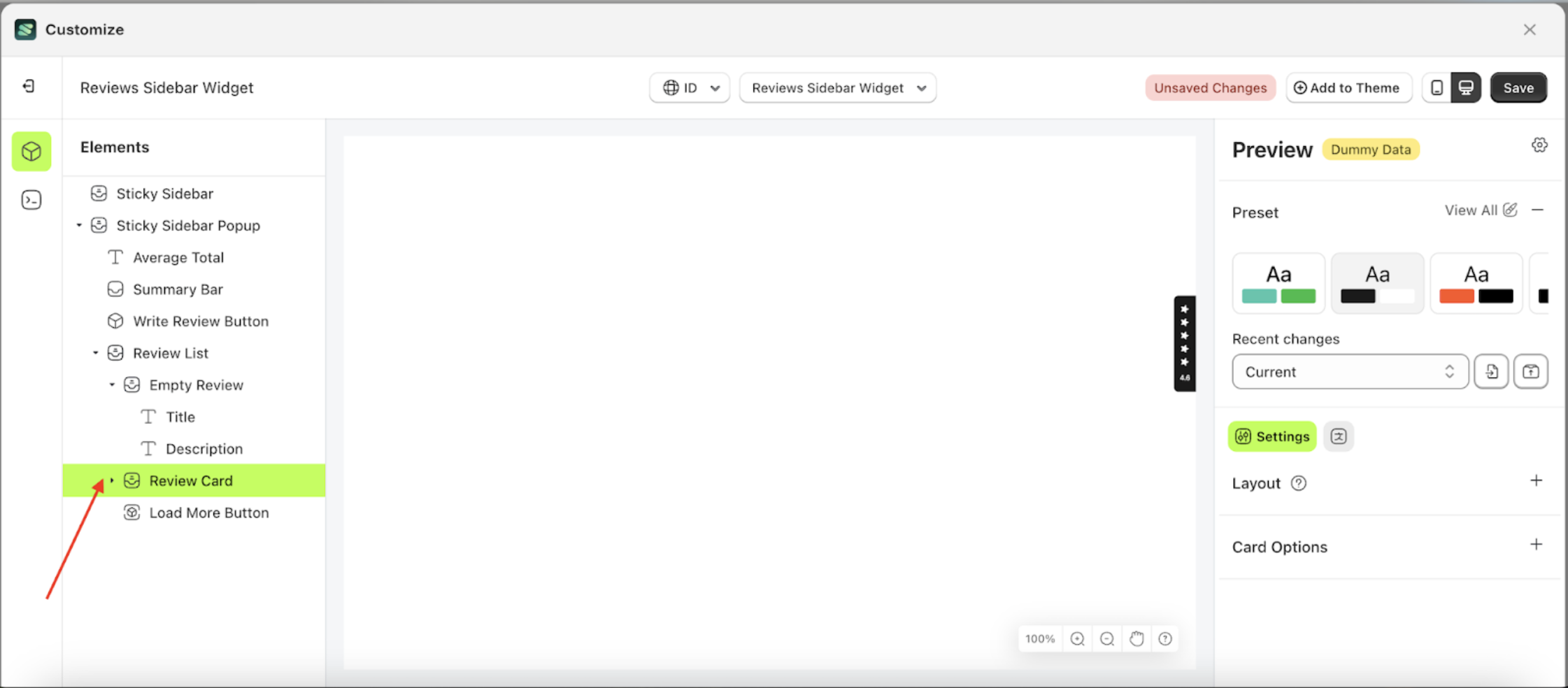
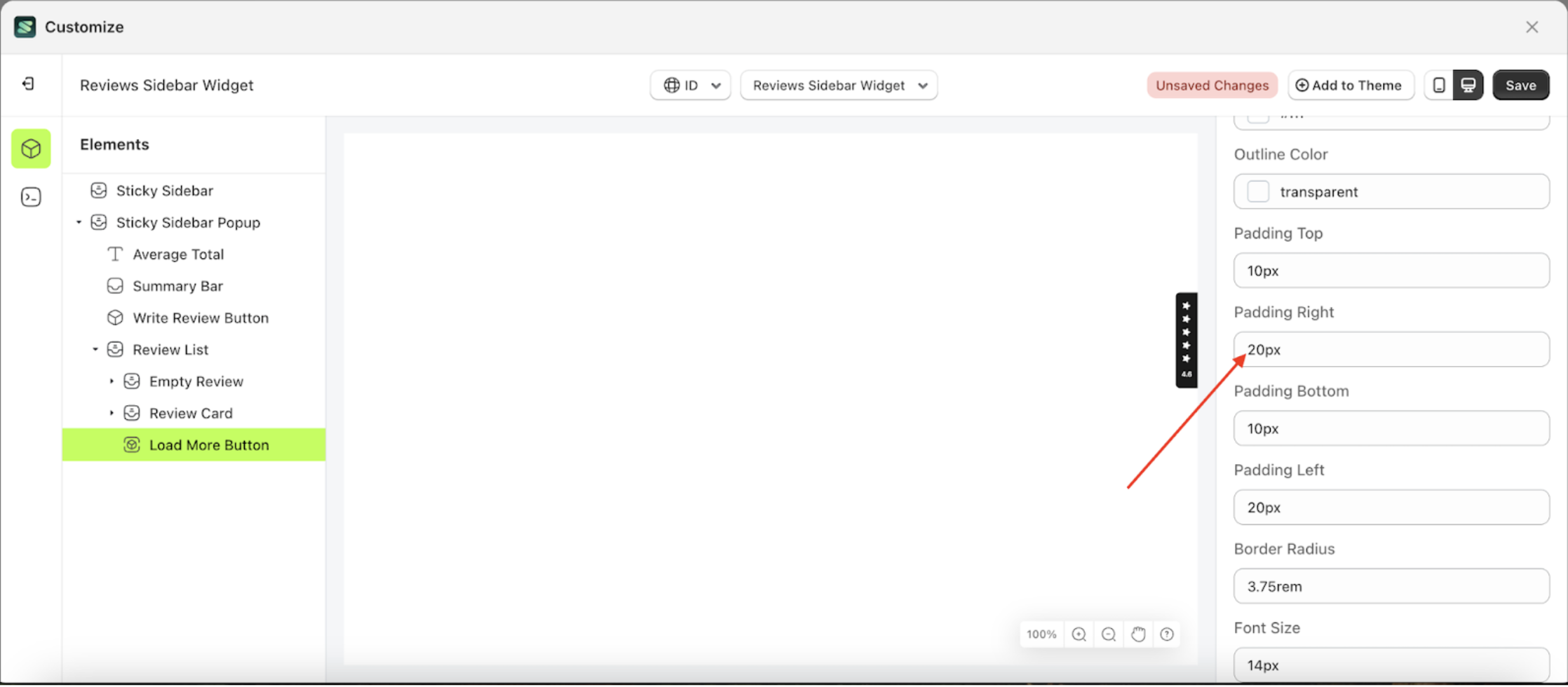
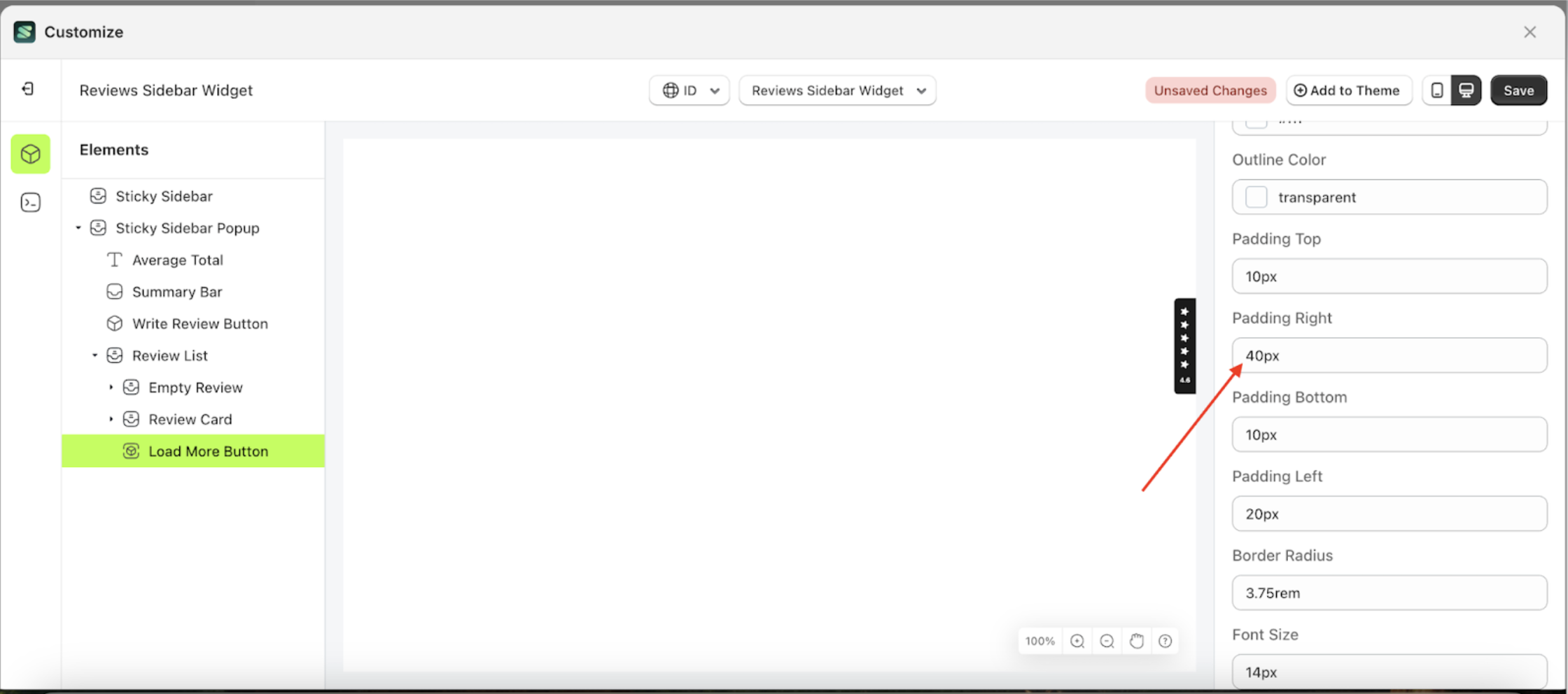
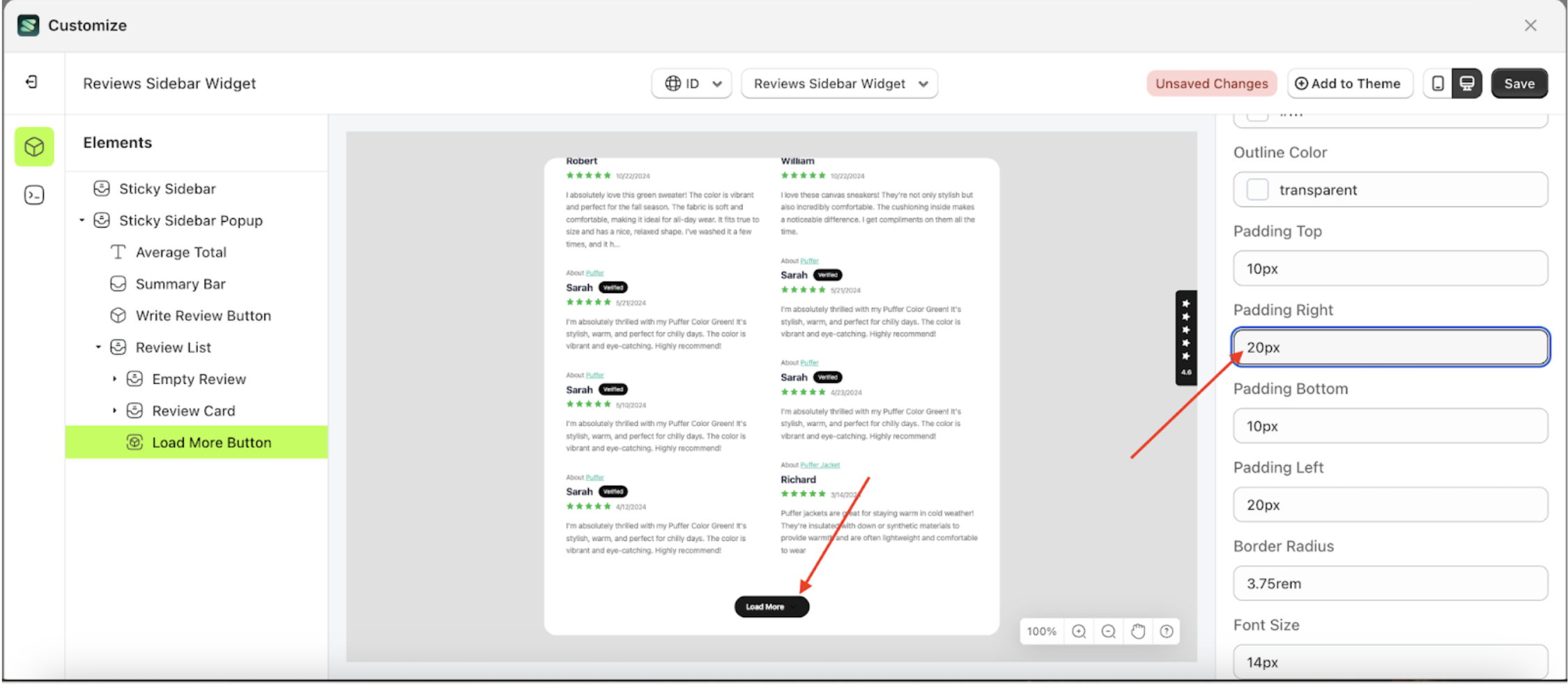
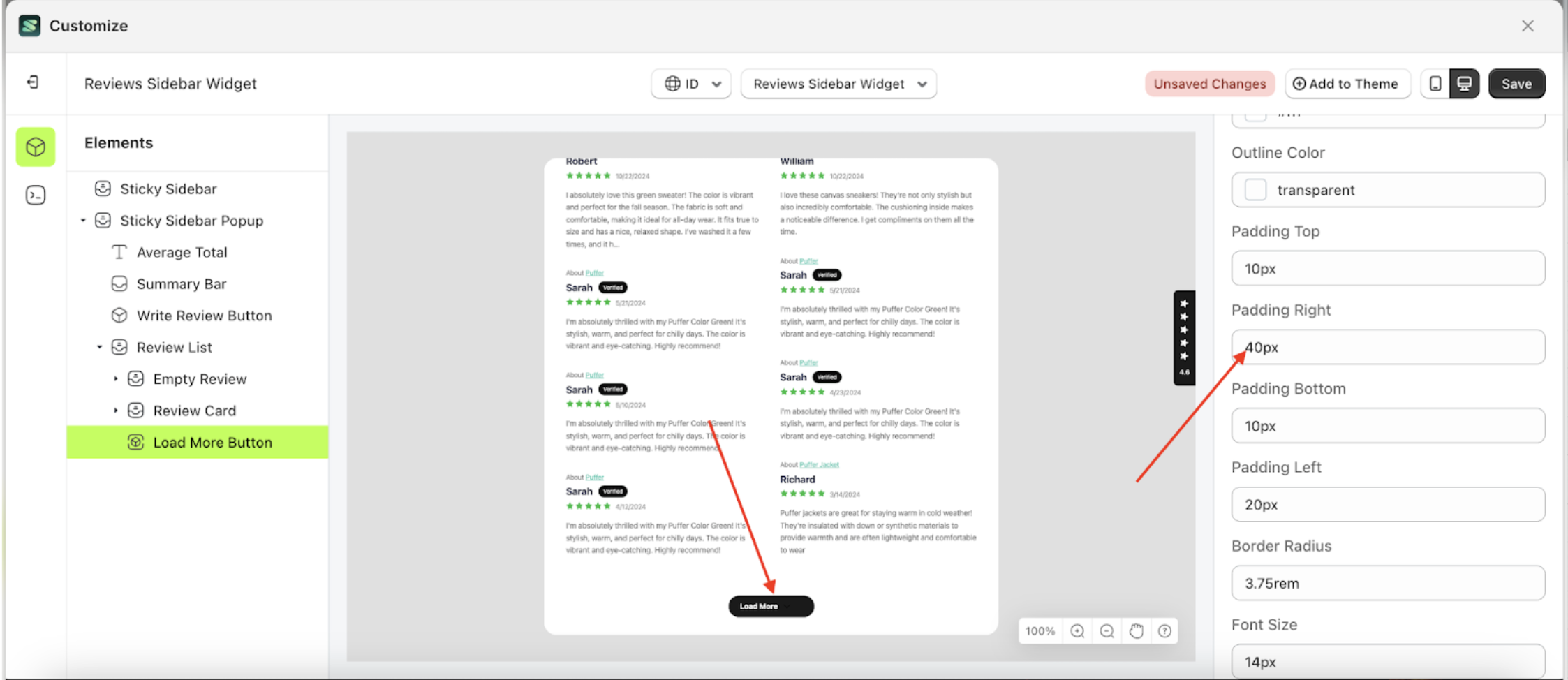
Padding Right Load More
This feature is designed to customize the right padding of the button settings
Follow the steps below:
- Select the Review Card element on the left, then click the icon marked with a red arrow to open the menu within that item.
- Once the menu is open, select the Load More Button element on the left, then click the Settings tab and click the icon marked with a red arrow.
- On the right side, marked with a red arrow, you can change the padding right to your desired value.
- Note: The padding right format can be px, em, rem, %, or other units..
- For example, if you set the padding right to 40px
- To see the changes in this setting on the element, click the Sticky Sidebar element
- The padding right of the Load More Button element will adjust accordingly.
- Example : Before padding right change settings
- Example : After padding right change settings


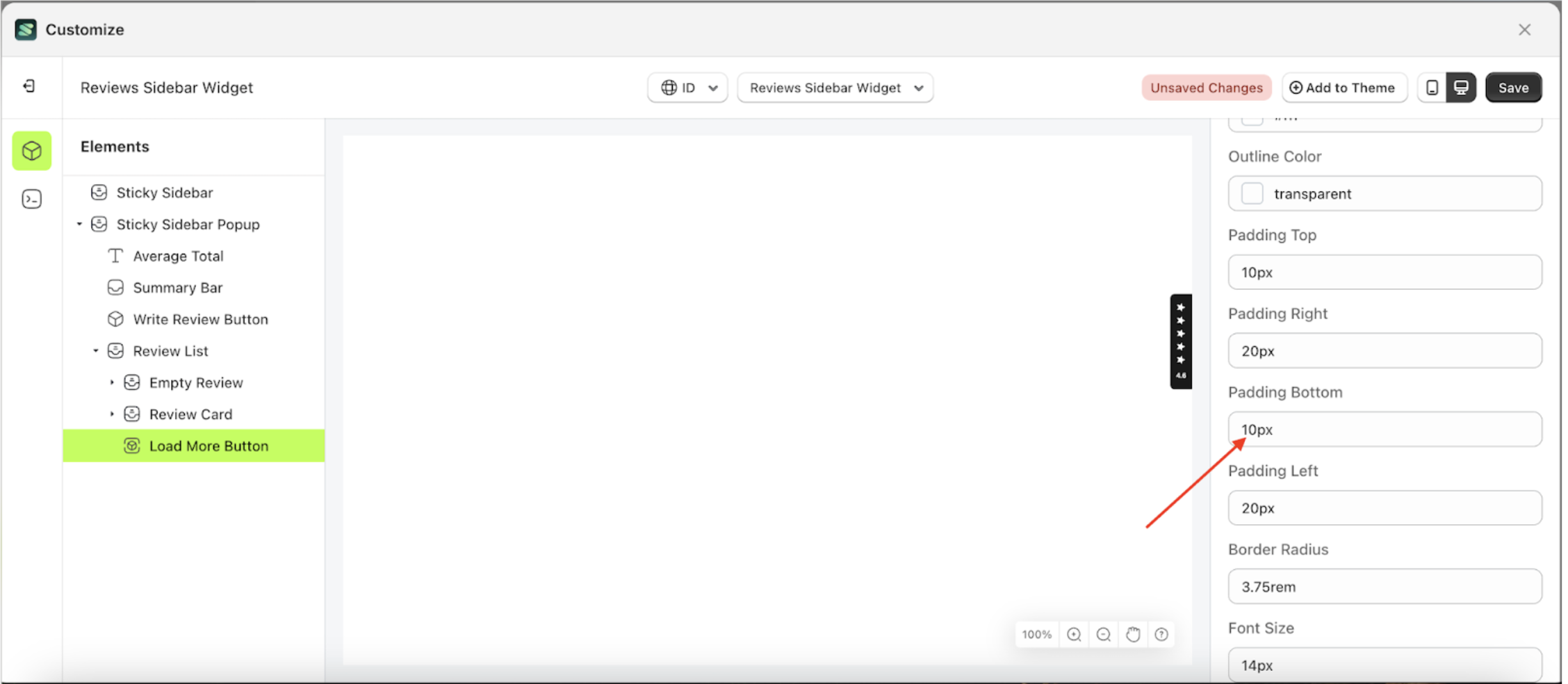
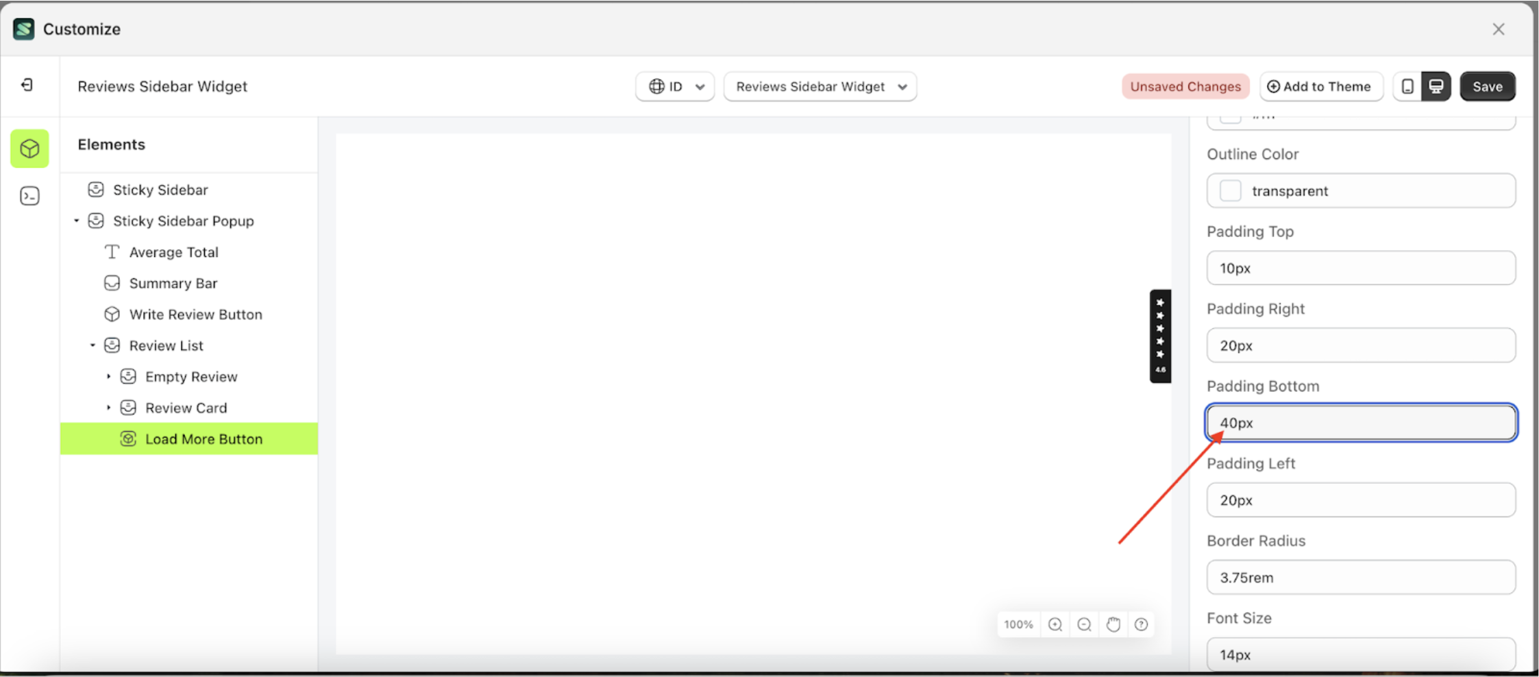
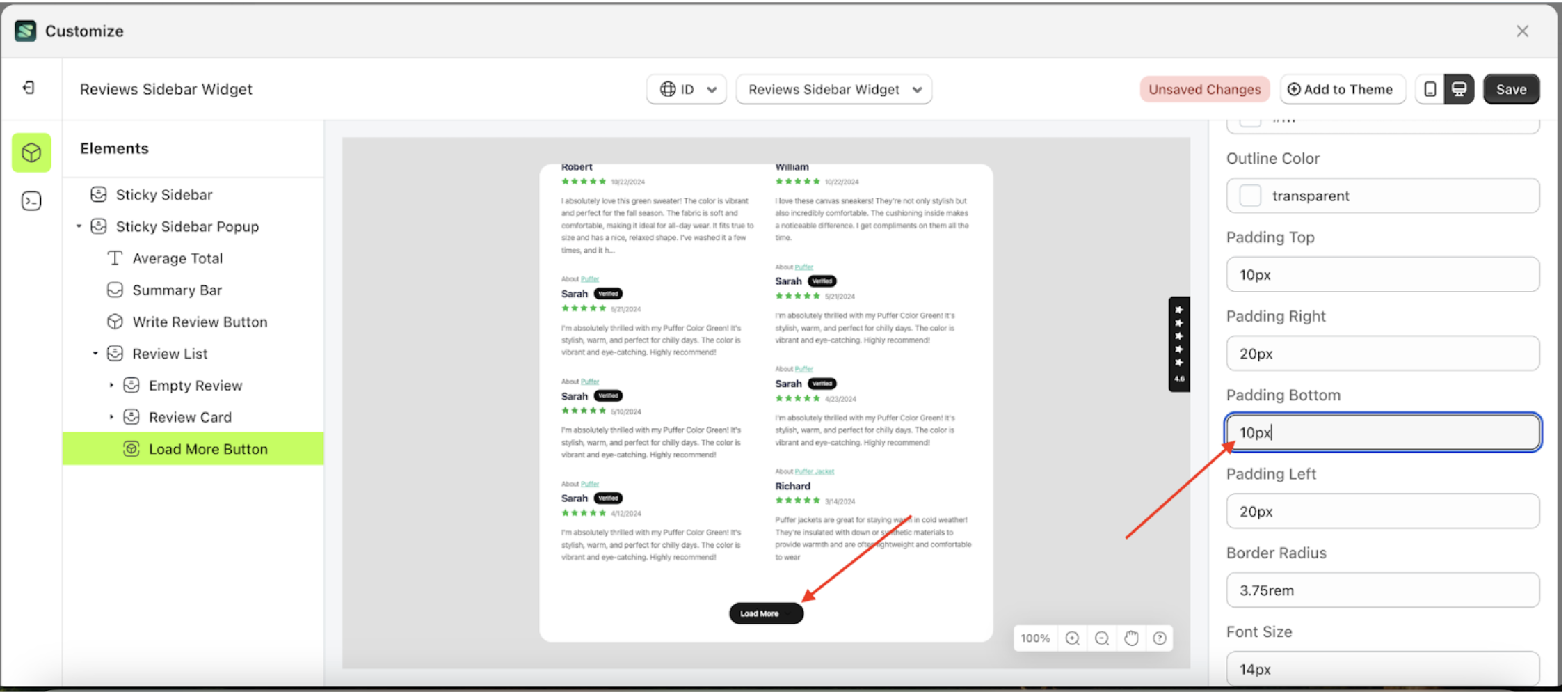
Padding Bottom Load More
This feature is designed to customize the bottom padding of the button settings
Follow the steps below:
- Select the Review Card element on the left, then click the icon marked with a red arrow to open the menu within that item.
- Once the menu is open, select the Load More Button element on the left, then click the Settings tab and click the icon marked with a red arrow.
- On the right side, marked with a red arrow, you can change the padding bottom to your desired value.
- Note: The padding bottom format can be px, em, rem, %, or other units..
- For example, if you set the padding bottom to 40px
- To see the changes in this setting on the element, click the Sticky Sidebar element
- The padding bottom of the Load More Button element will adjust accordingly.
- Example : Before padding bottom change settings
- Example : After padding bottom change settings


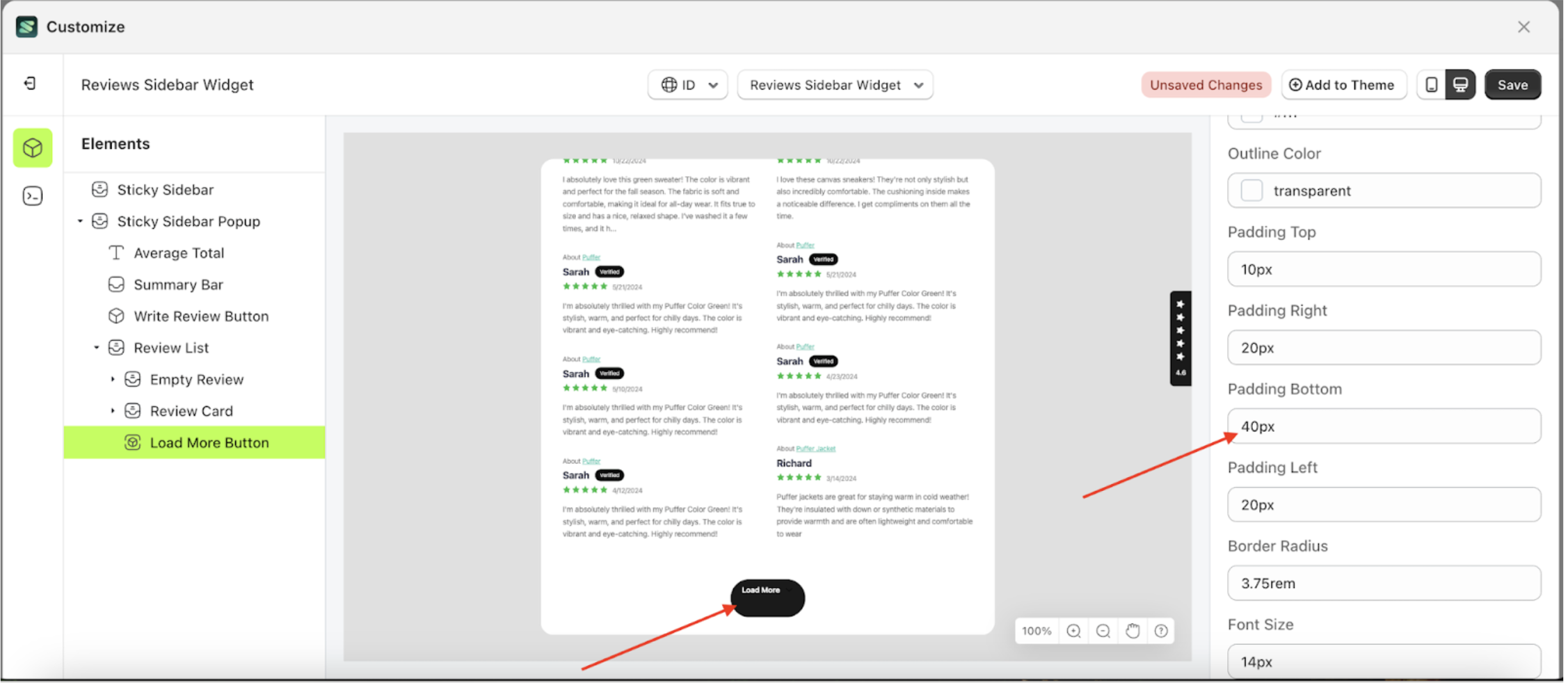
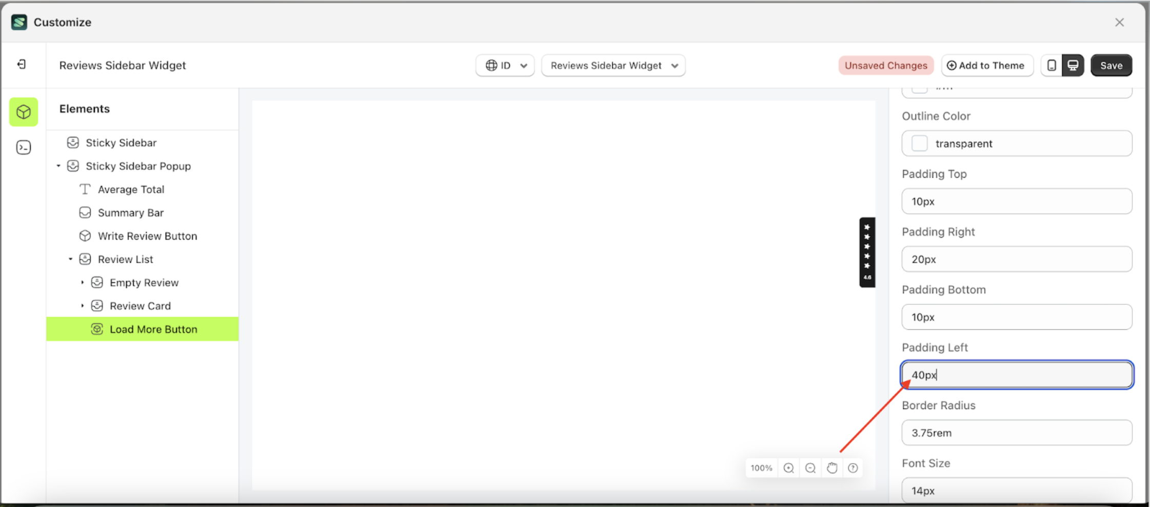
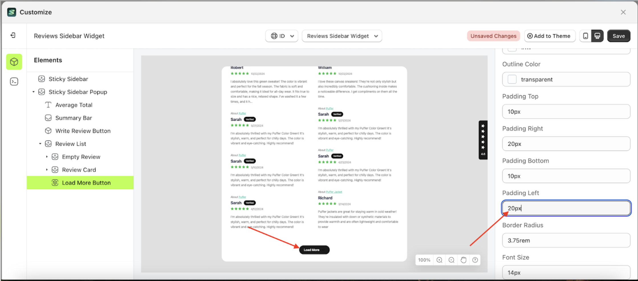
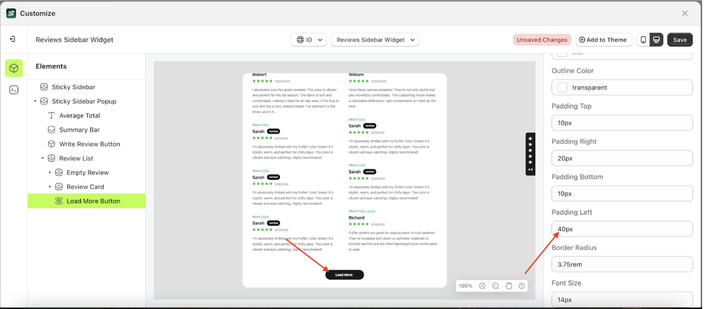
Padding Left Load More
This feature is designed to customize the left padding of the button settings
Follow the steps below:
- Select the Review Card element on the left, then click the icon marked with a red arrow to open the menu within that item.
- Once the menu is open, select the Load More Button element on the left, then click the Settings tab and click the icon marked with a red arrow.
- On the right side, marked with a red arrow, you can change the padding left to your desired value.
- Note: The padding left format can be px, em, rem, %, or other units..
- For example, if you set the padding left to 40px
- To see the changes in this setting on the element, click the Sticky Sidebar element
- The padding left of the Load More Button element will adjust accordingly.
- Example : Before padding left change settings
- Example : After padding left change settings


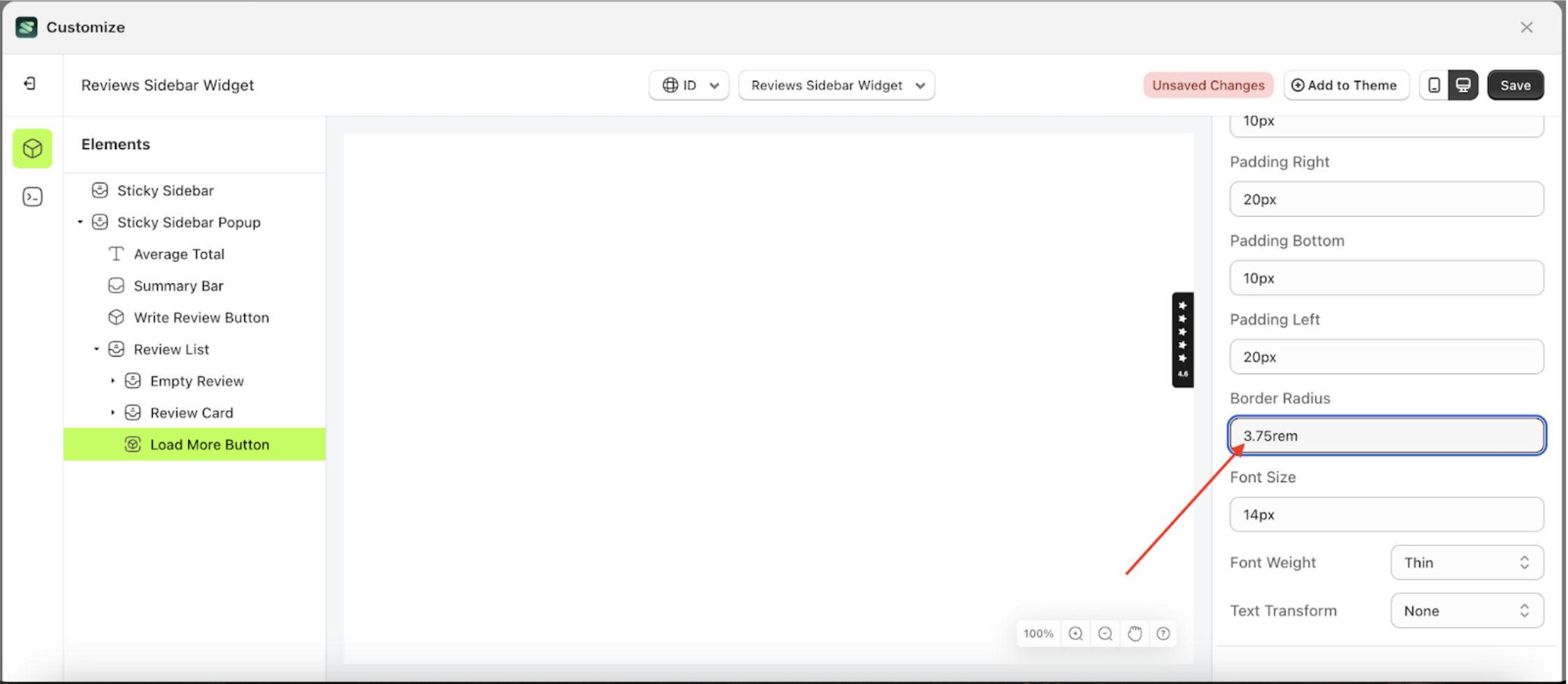
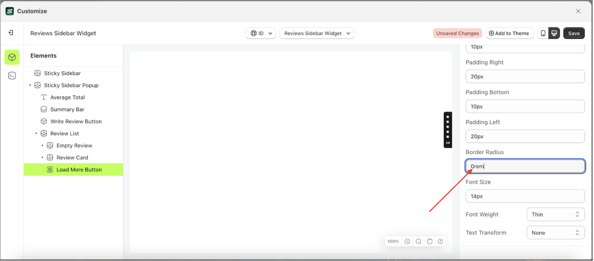
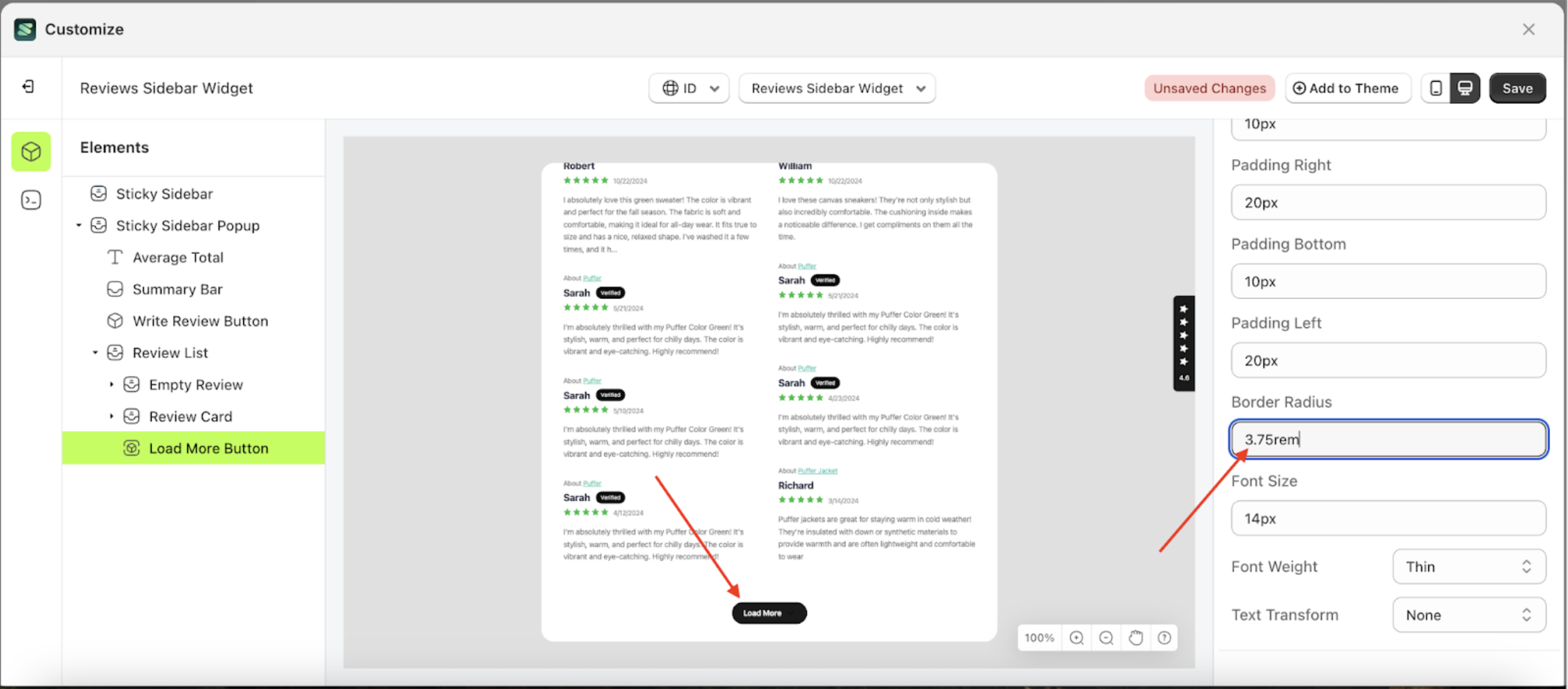
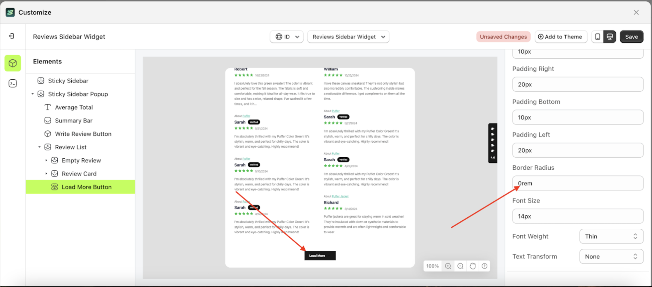
Border Radius Load More
This feature is designed to customize the corner radius of the button settings
Follow the steps below:
- Select the Review Card element on the left, then click the icon marked with a red arrow to open the menu within that item.
- Once the menu is open, select the Load More Button element on the left, then click the Settings tab and click the icon marked with a red arrow.
- On the right side, marked with a red arrow, you can change the border radius to your desired value.
- Note: The border radius format can be px, em, rem, %, or other units..
- For example, if you set the border radius to 0rem
- To see the changes in this setting on the element, click the Sticky Sidebar element
- The border radius of the Load More Button element will adjust accordingly.
- Example : Before border radius change settings
- Example : After border radius change settings


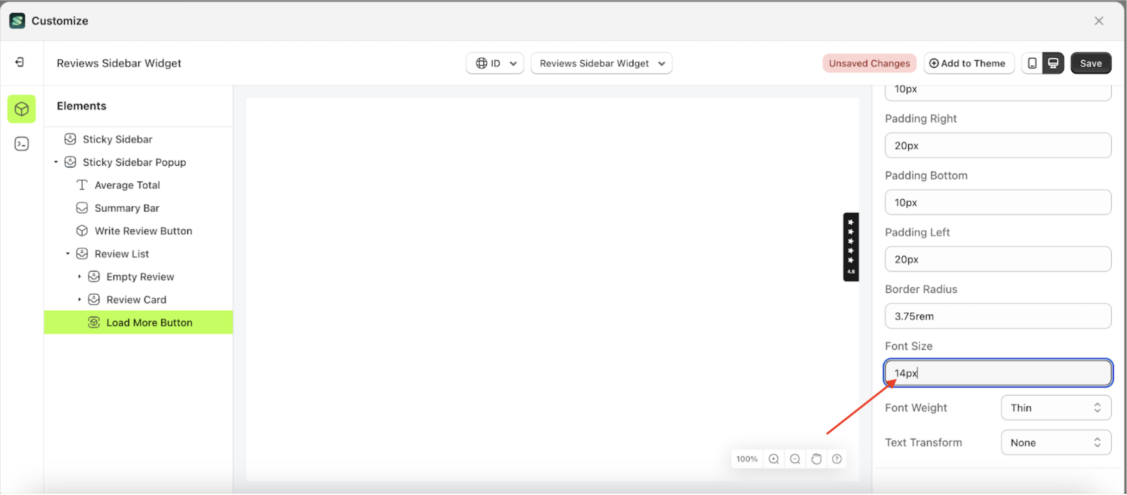
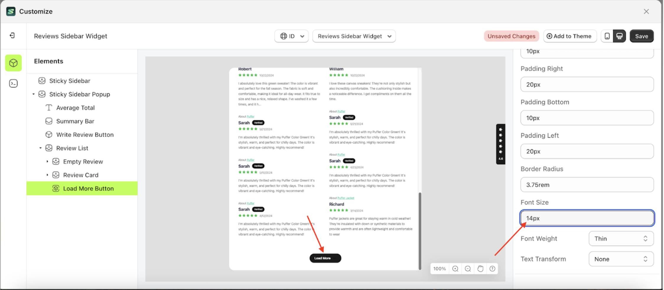
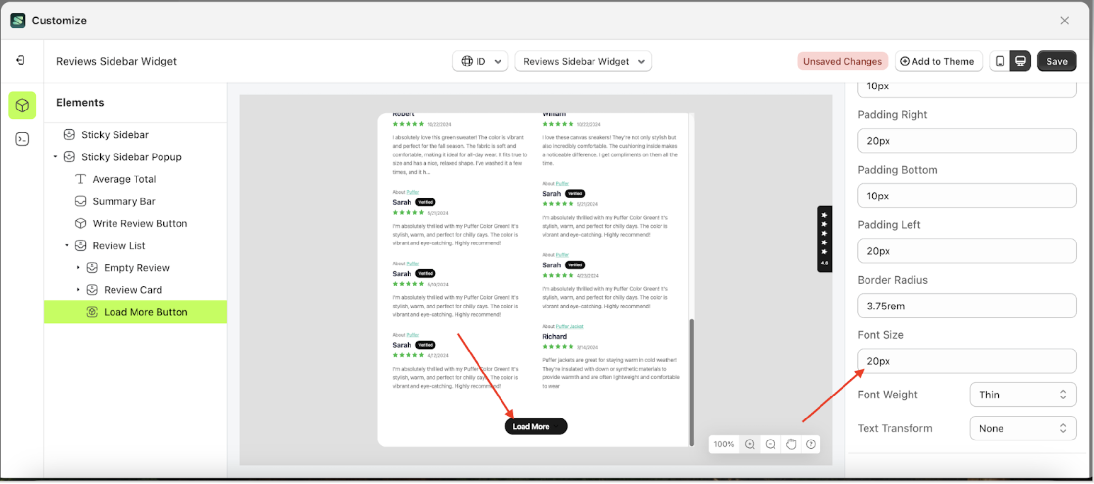
Font Size Load More
This feature is designed to customize the text size of the button settings
Follow the steps below:
- Select the Review Card element on the left, then click the icon marked with a red arrow to open the menu within that item.
- Once the menu is open, select the Load More Button element on the left, then click the Settings tab and click the icon marked with a red arrow.
- On the right side, marked with a red arrow, you can change the font size to your desired value.
- Note: The font size format can be px, em, rem, %, or other units..
- For example, if you set the font size to 20px
- To see the changes in this setting on the element, click the Sticky Sidebar element
- The font size of the Load More Button element will adjust accordingly.
- Example : Before font size change settings
- Example : After font size change settings


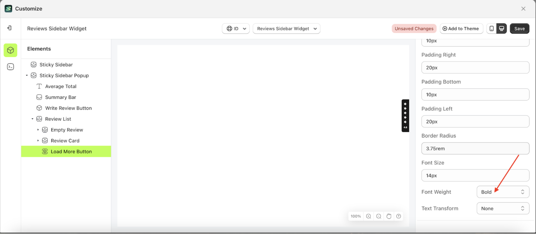
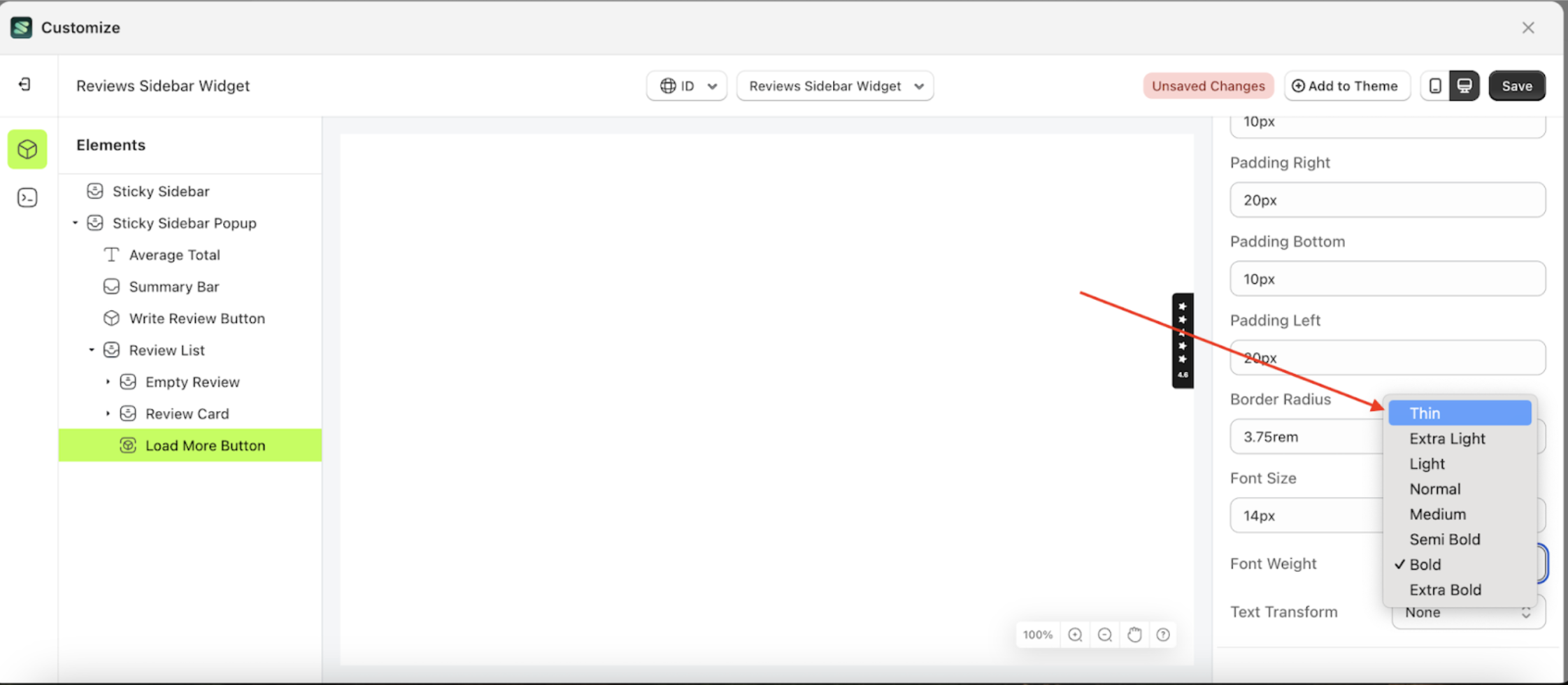
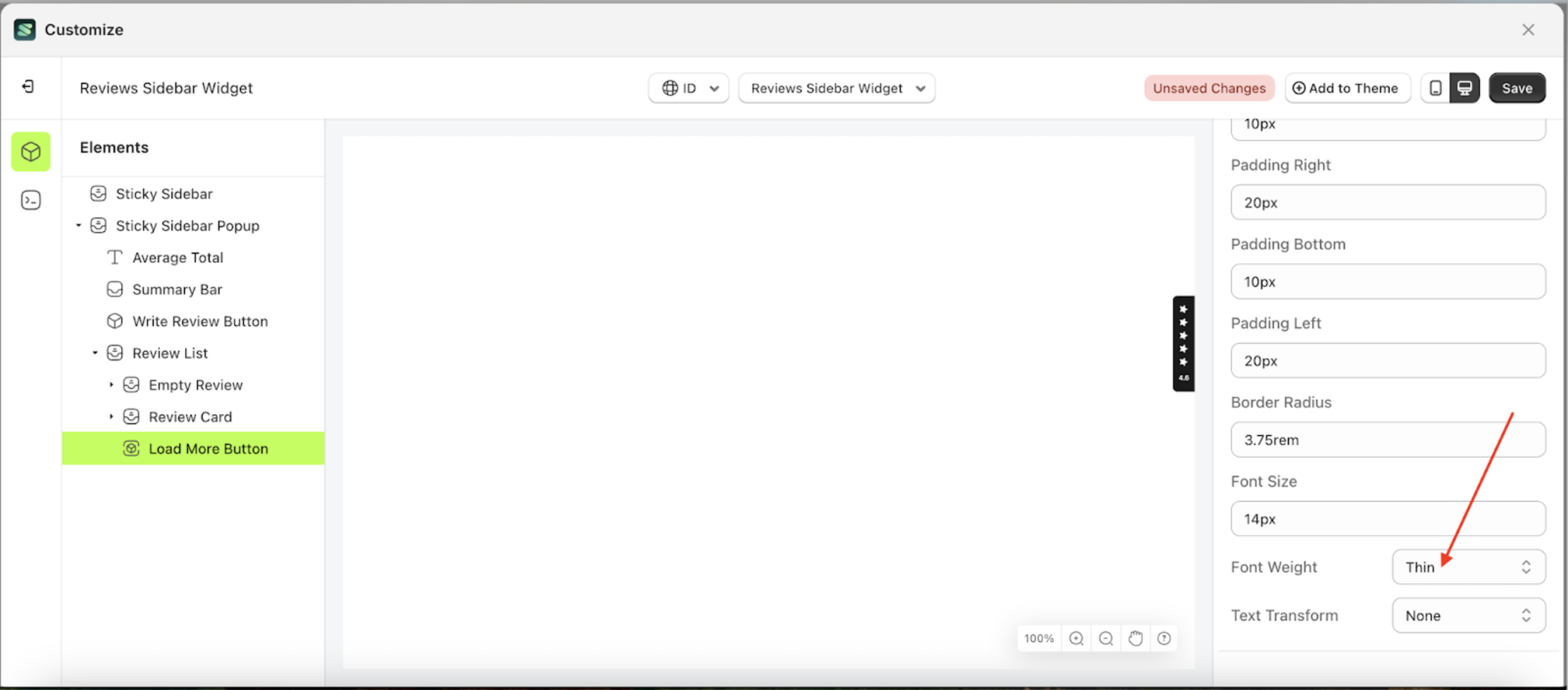
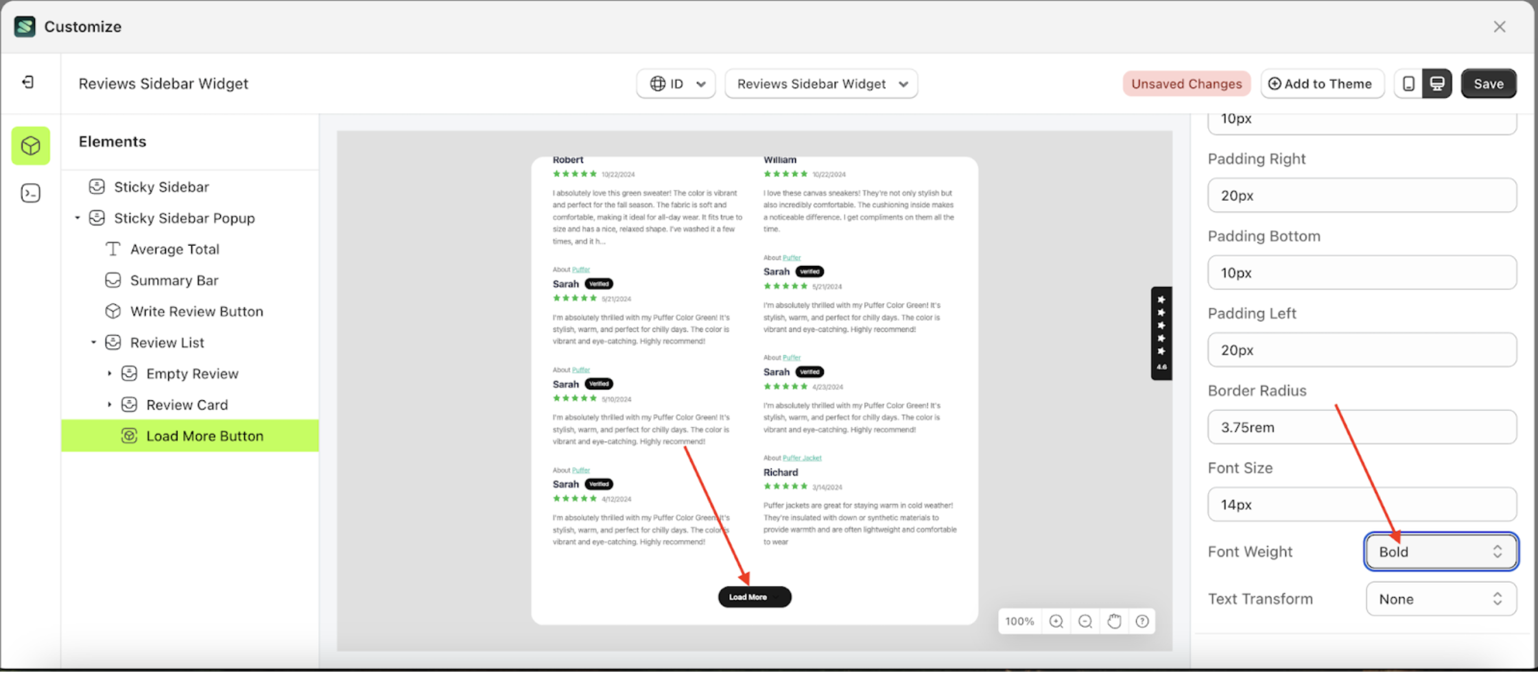
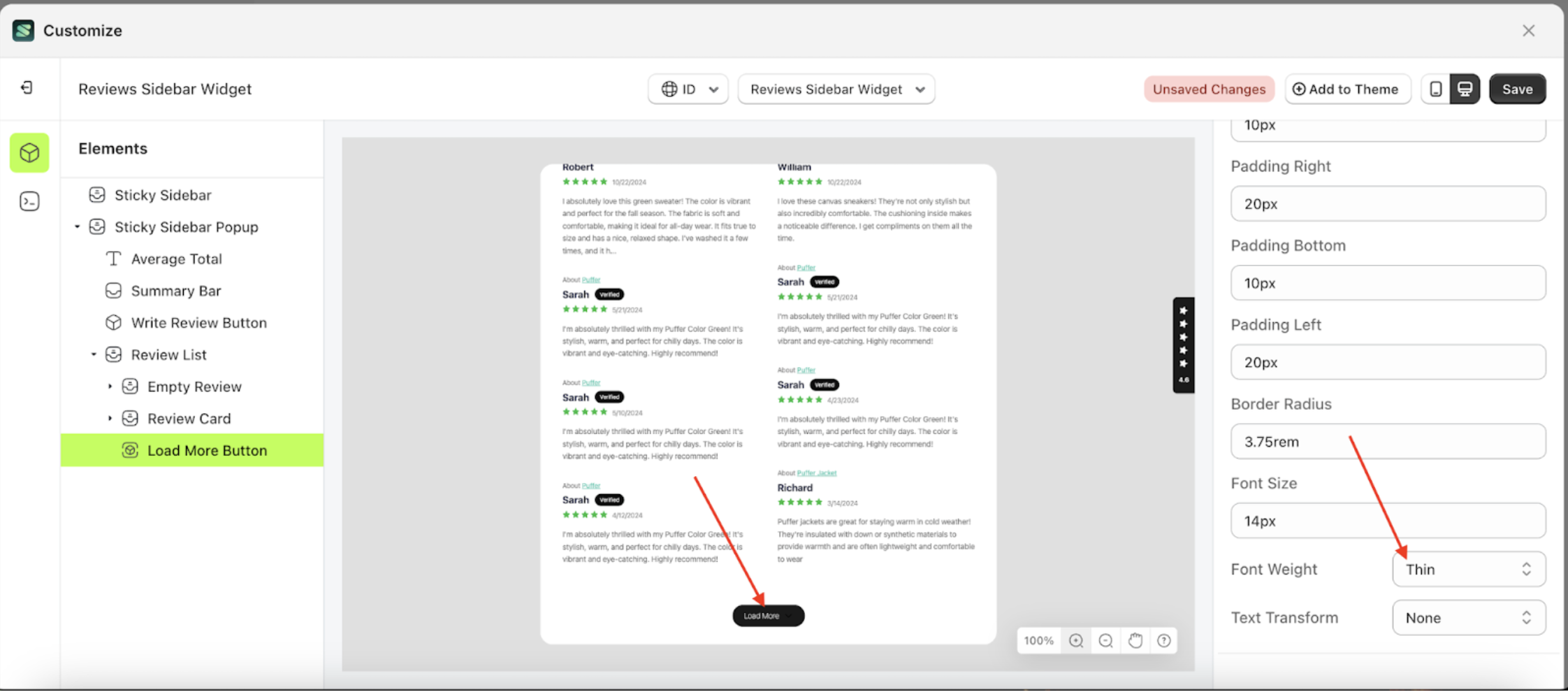
Font Weight Load More
This feature is designed to customize the text weight of the button settings
Follow the steps below:
- Select the Review Card element on the left, then click the icon marked with a red arrow to open the menu within that item.
- Once the menu is open, select the Load More Button element on the left, then click the Settings tab and click the icon marked with a red arrow.
- On the right side, marked with a red arrow, you can change the font weight to your desired value.
- Note: The font weight format can be Thin, Extra Light, Light, Normal or other units.
- Once the menu opens, select an option from the list
- For example, if you set the font weight to thin
- To see the changes in this setting on the element, click the Sticky Sidebar element
- The font weight of the Load More Button element will adjust accordingly.
- Example : Before font weight change settings
- Example : After font weight change settings


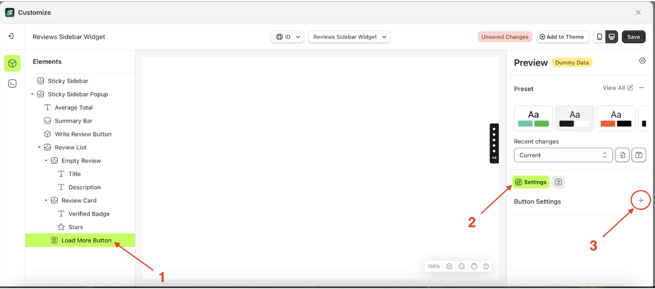
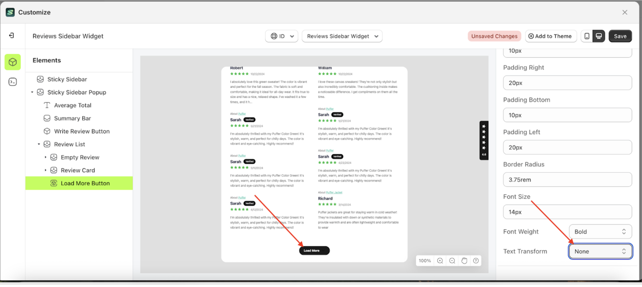
Text Transform Load More
This feature allows you to adjust the capitalization style of the text
Follow the steps below:
- Select the Review Card element on the left, then click the icon marked with a red arrow to open the menu within that item.
- Once the menu is open, select the Load More Button element on the left, then click the Settings tab and click the icon marked with a red arrow.
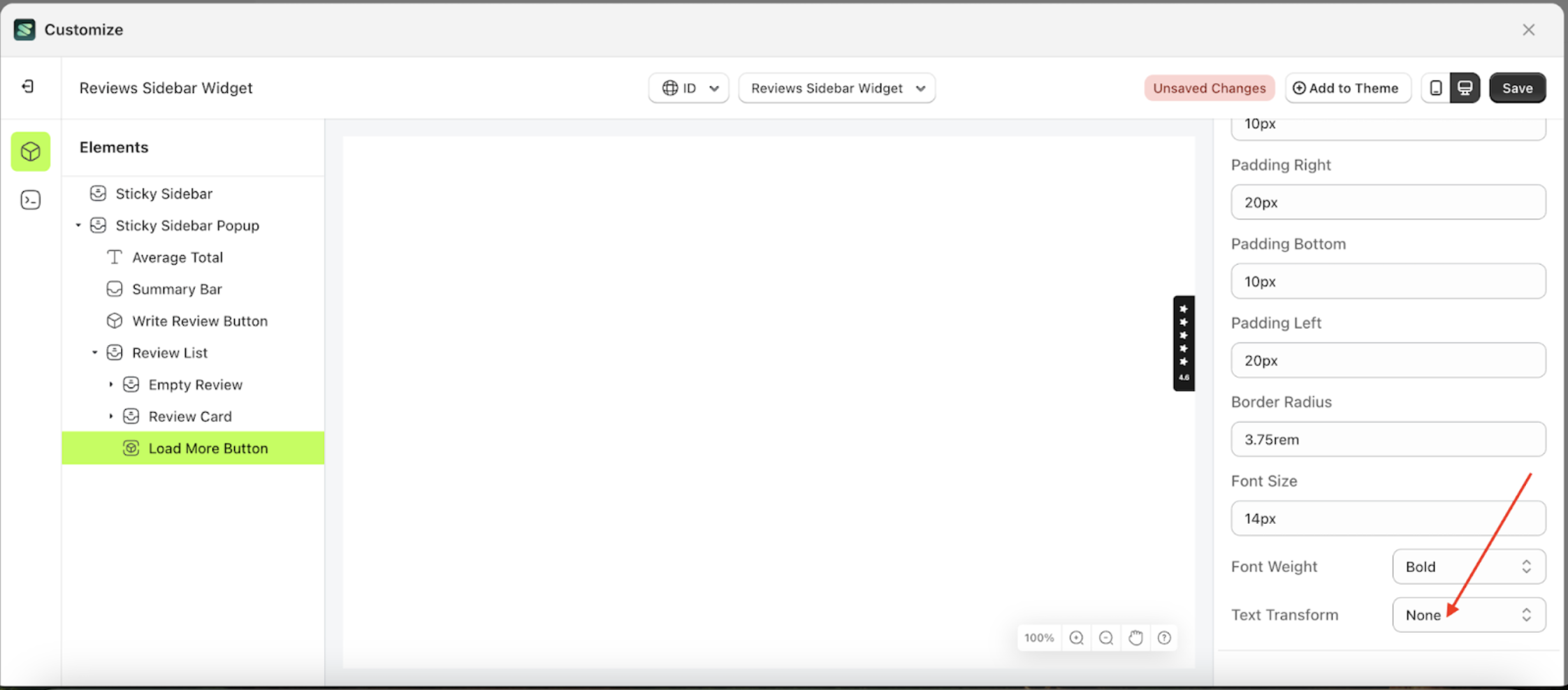
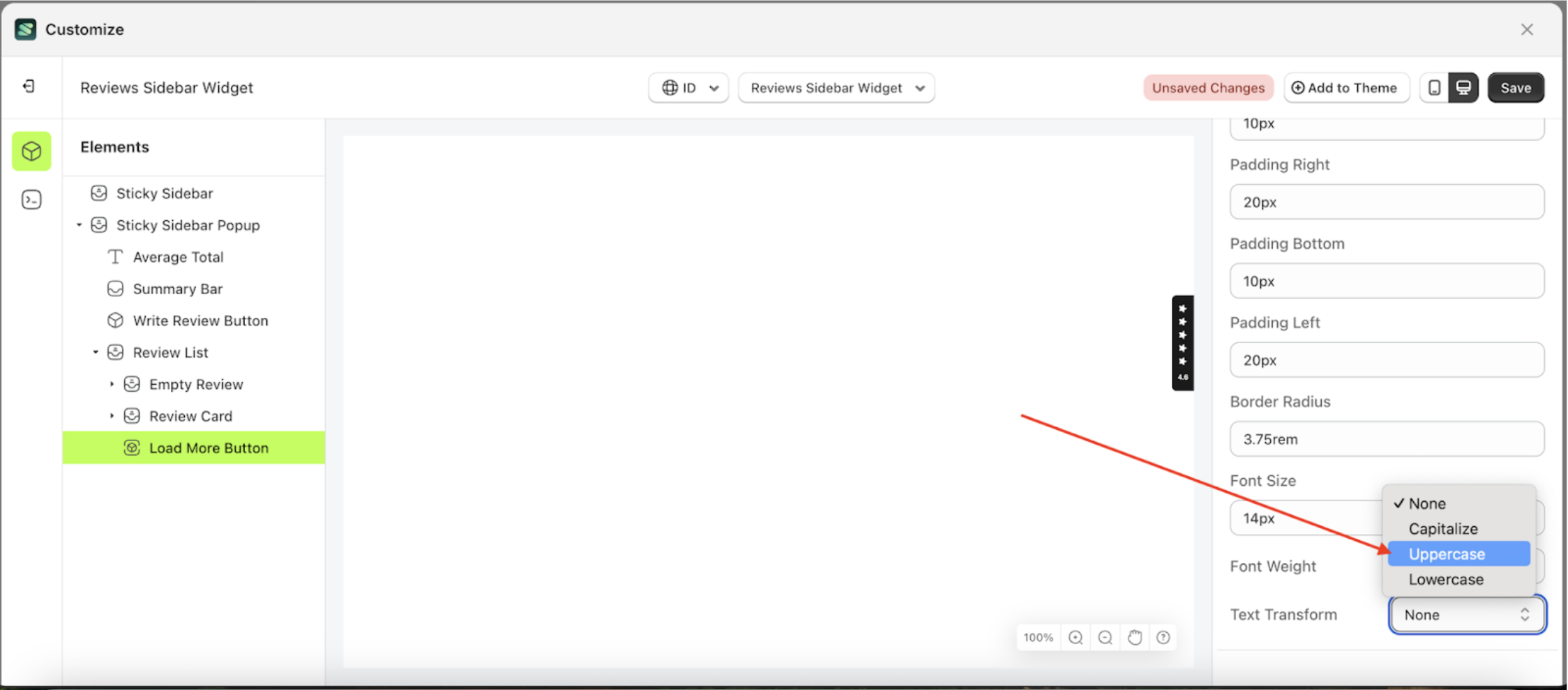
- On the right side, marked with a red arrow, you can change the text transform to your desired value.
- Note: The text transform format can None, Capitalize, Uppercase, Lowercase..
- Once the menu opens, select an option from the list
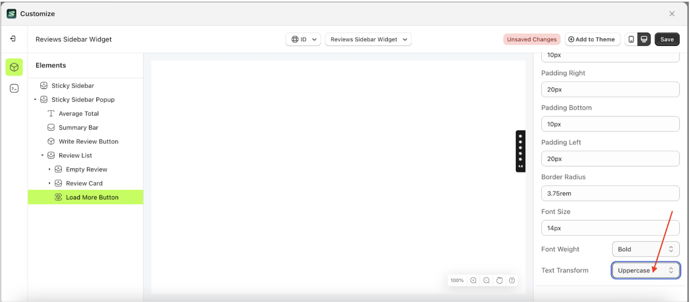
- For example, if you set the text transform to Uppercase
- To see the changes in this setting on the element, click the Sticky Sidebar element
- The text transform of the Load More Button element will adjust accordingly.
- Example : Before text transform change settings
- Example : After text transform change settings