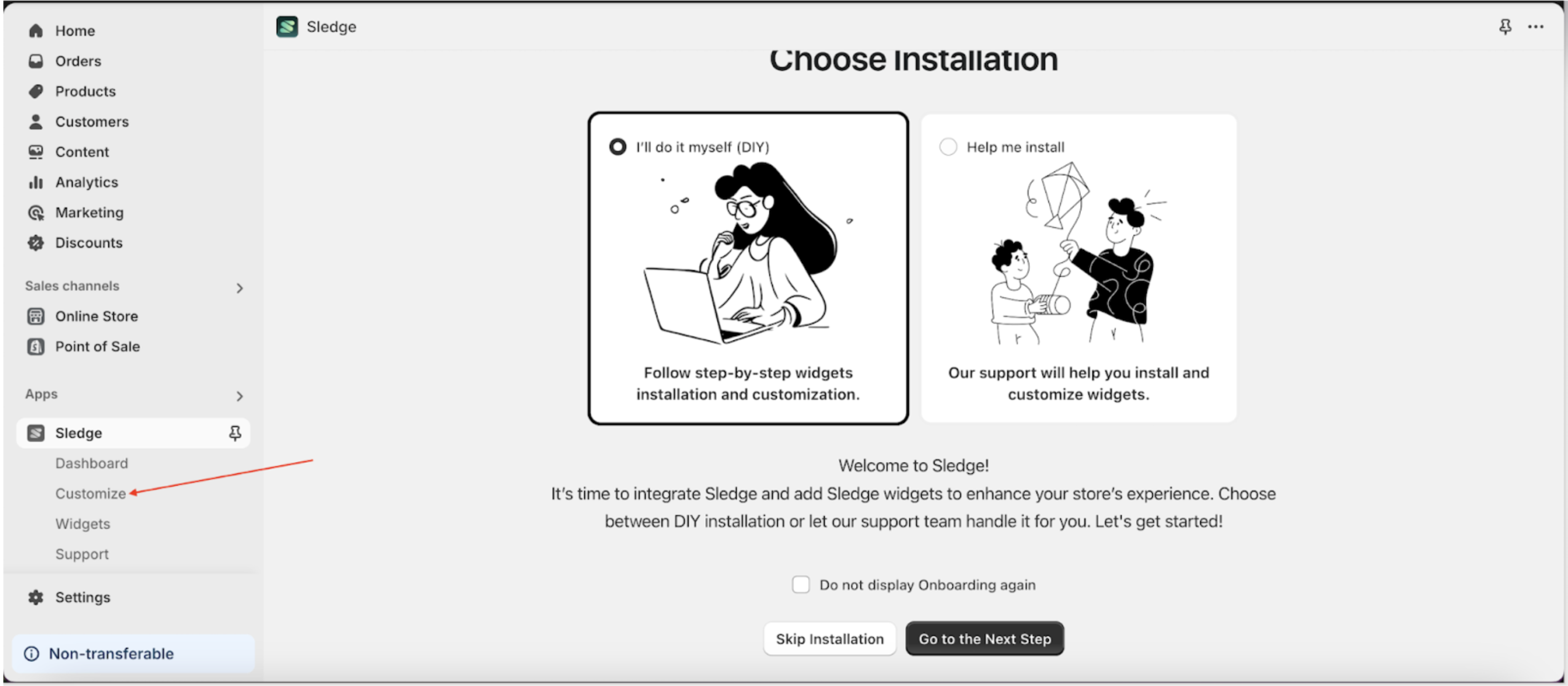
Trust badge widget
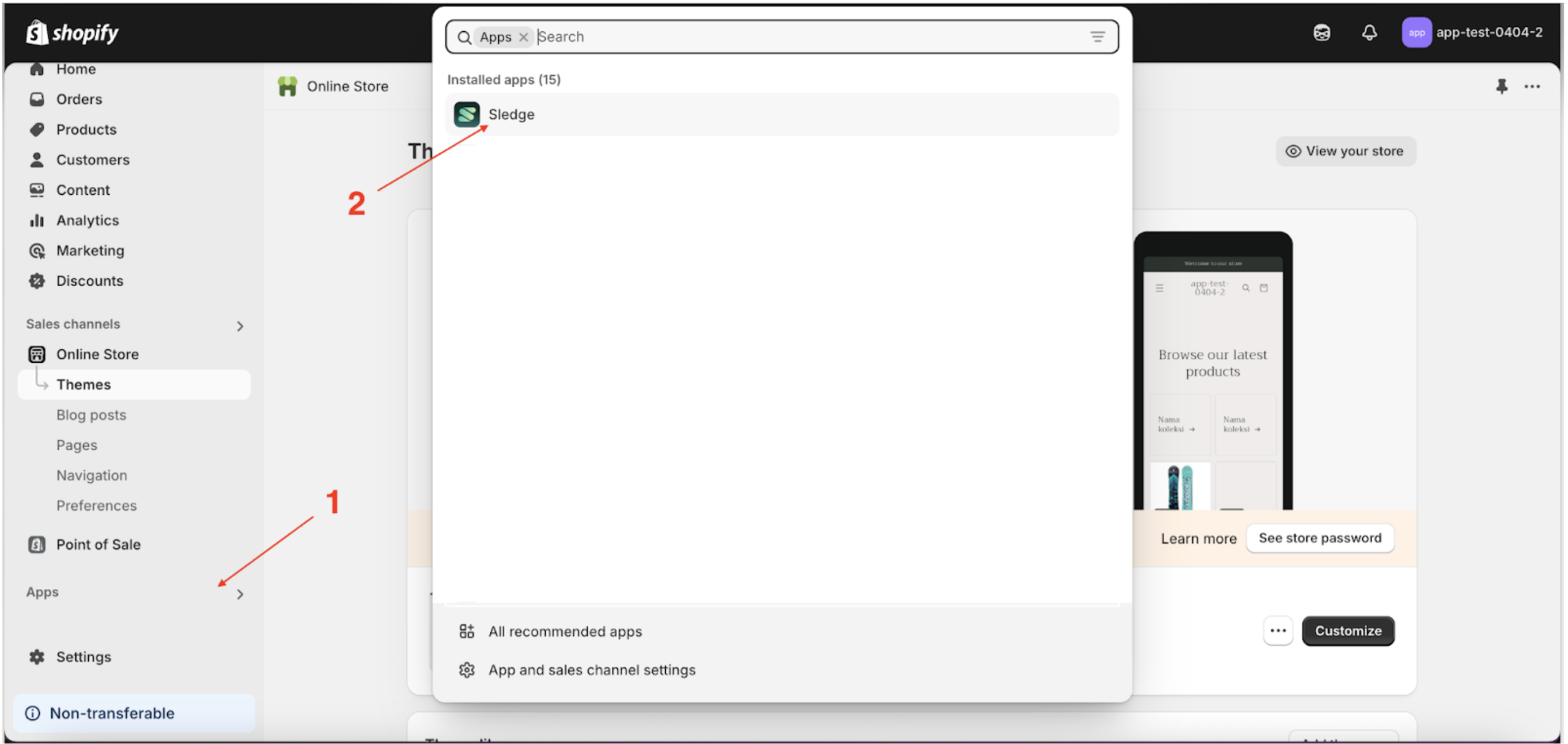
- Go to the Apps Sledge.
- Select the Customizer menu.
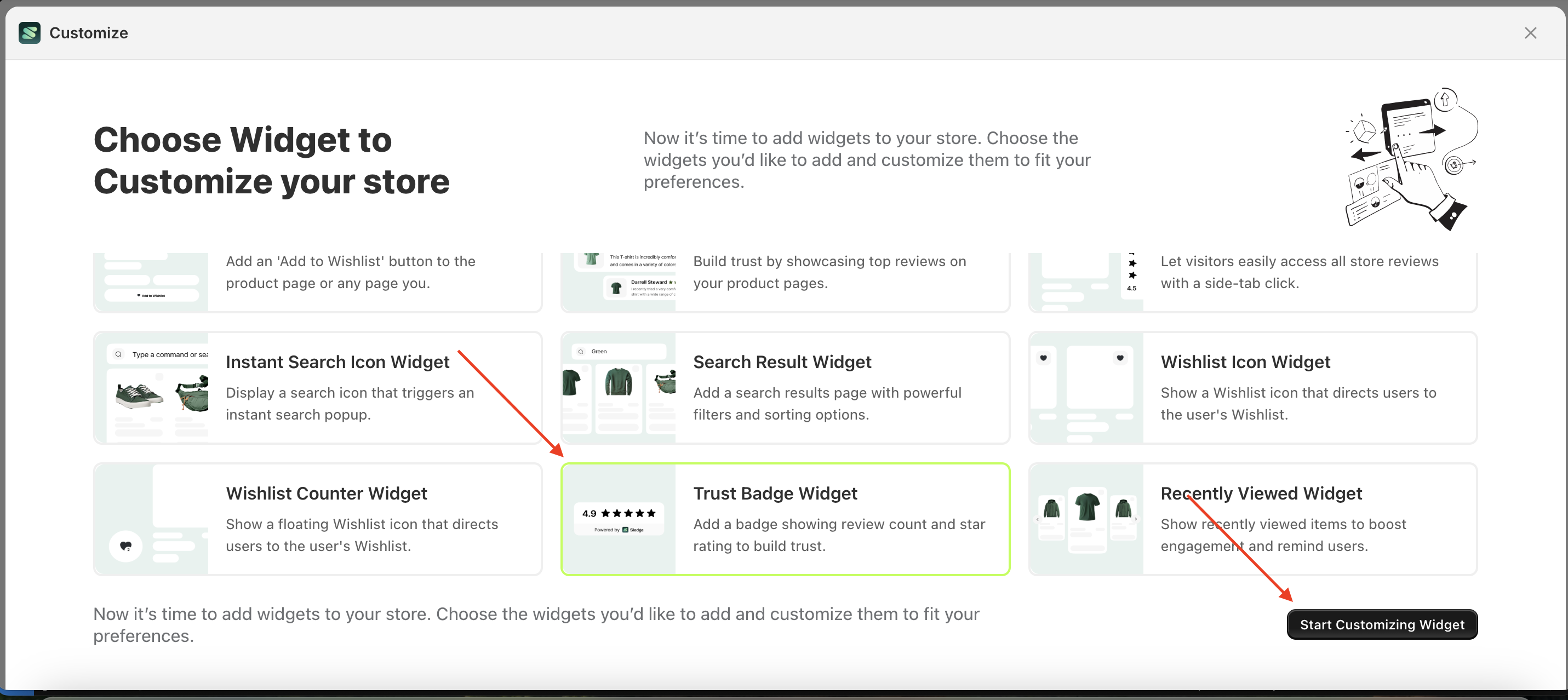
- Choose trust badge widget and click the Start Customizing Widget button.
Layout
This feature is designed to configure the layout you need without the hassle of creating it from scratch.
Available settings:
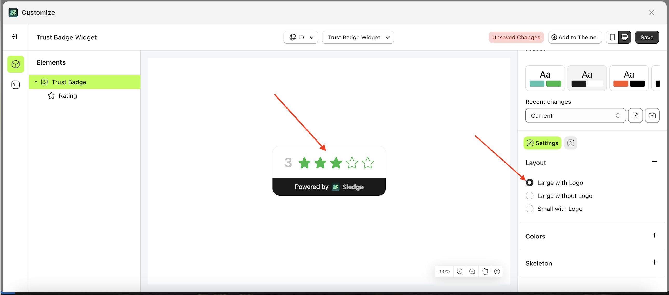
Large with Logo
Follow the steps below:
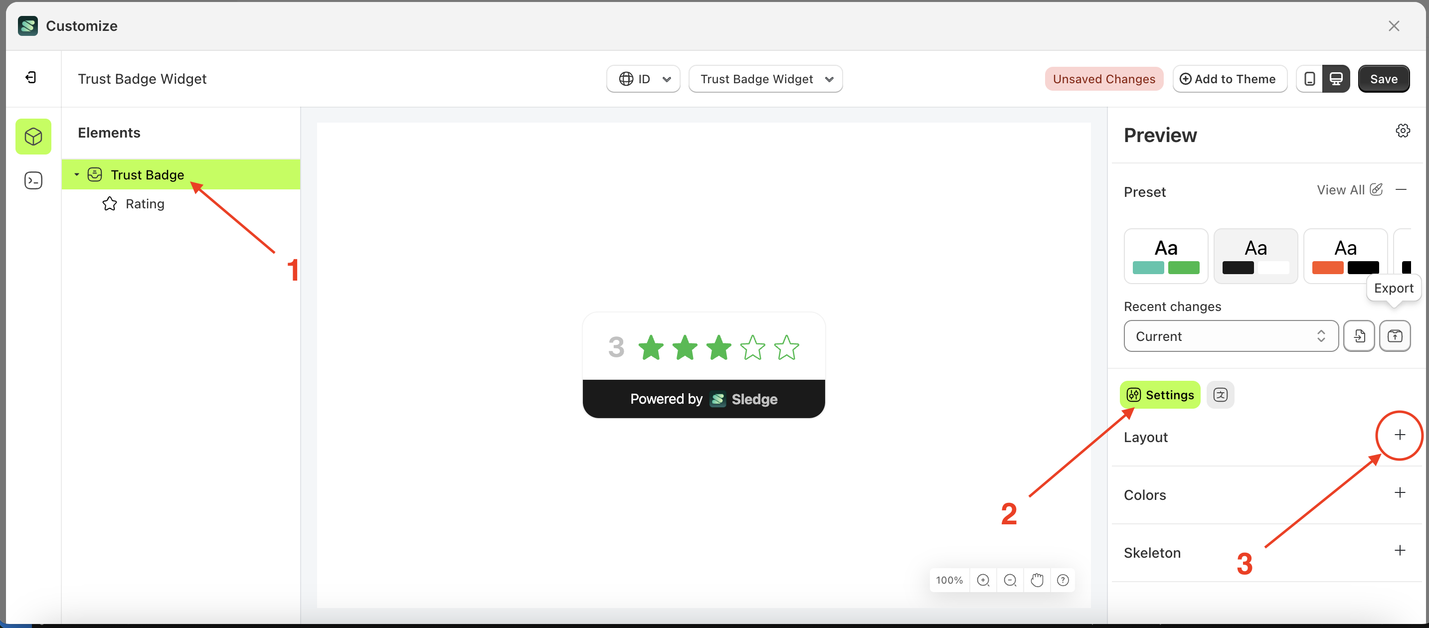
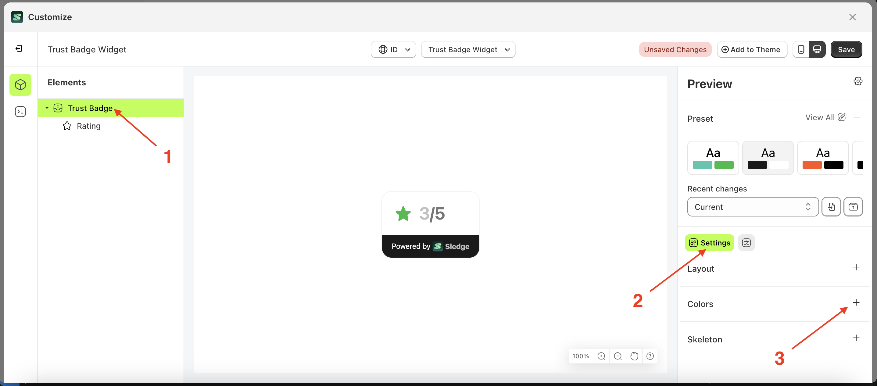
- Select the Trus Badge element on the left, then click the Settings tab and click the icon marked with a red arrow.
- Select Layout Large with Logo by following the red arrow
- Here's the chosen layout display.

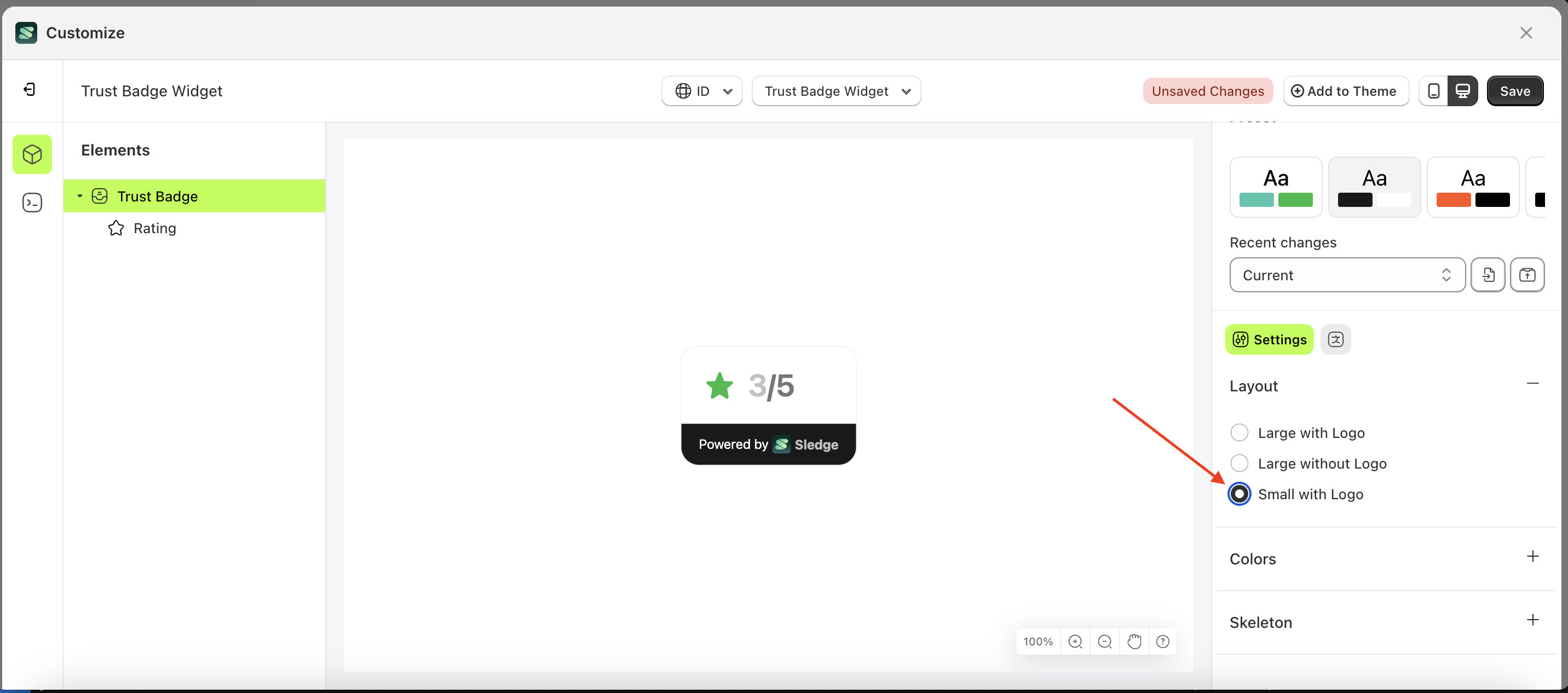
Small without Logo
Follow the steps below:
- Select the Trus Badge element on the left, then click the Settings tab and click the icon marked with a red arrow.
- Select Layout Small without Logo by following the red arrow
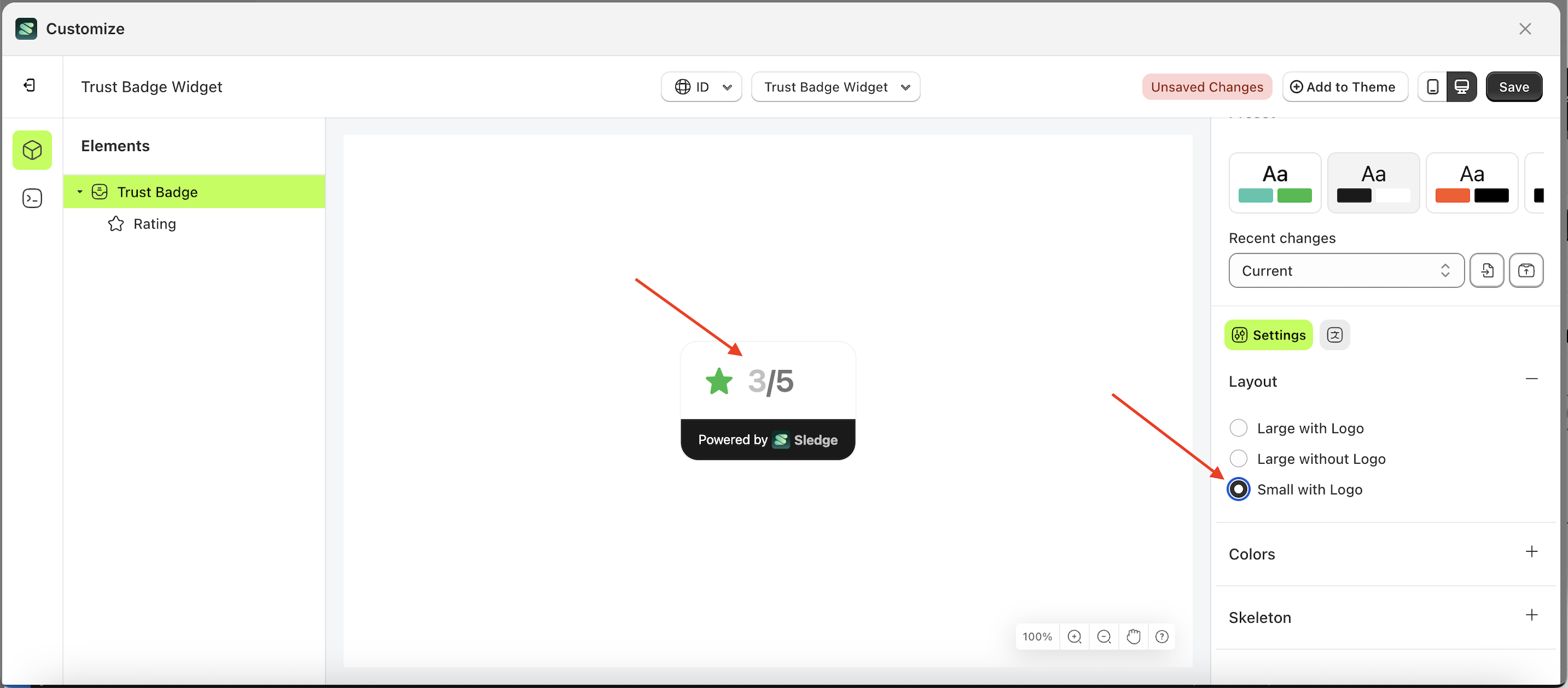
- Here's the chosen layout display.
Colors
Available settings:
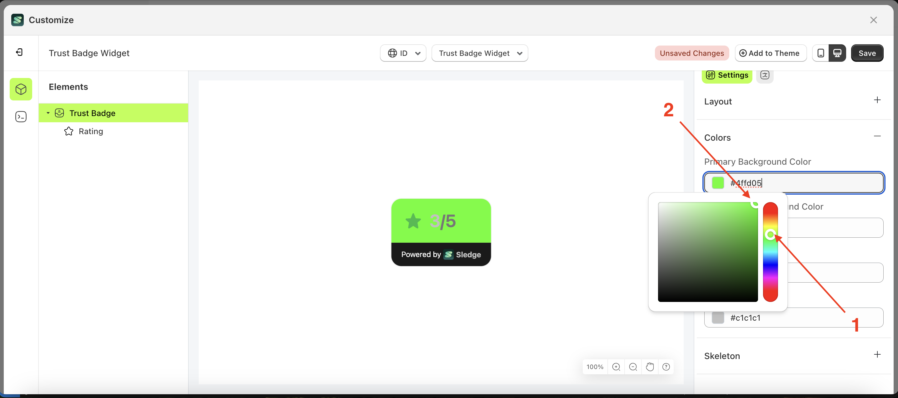
Primary Background Color
This feature is designed to customize the primary background color of the colors
Follow the steps below:
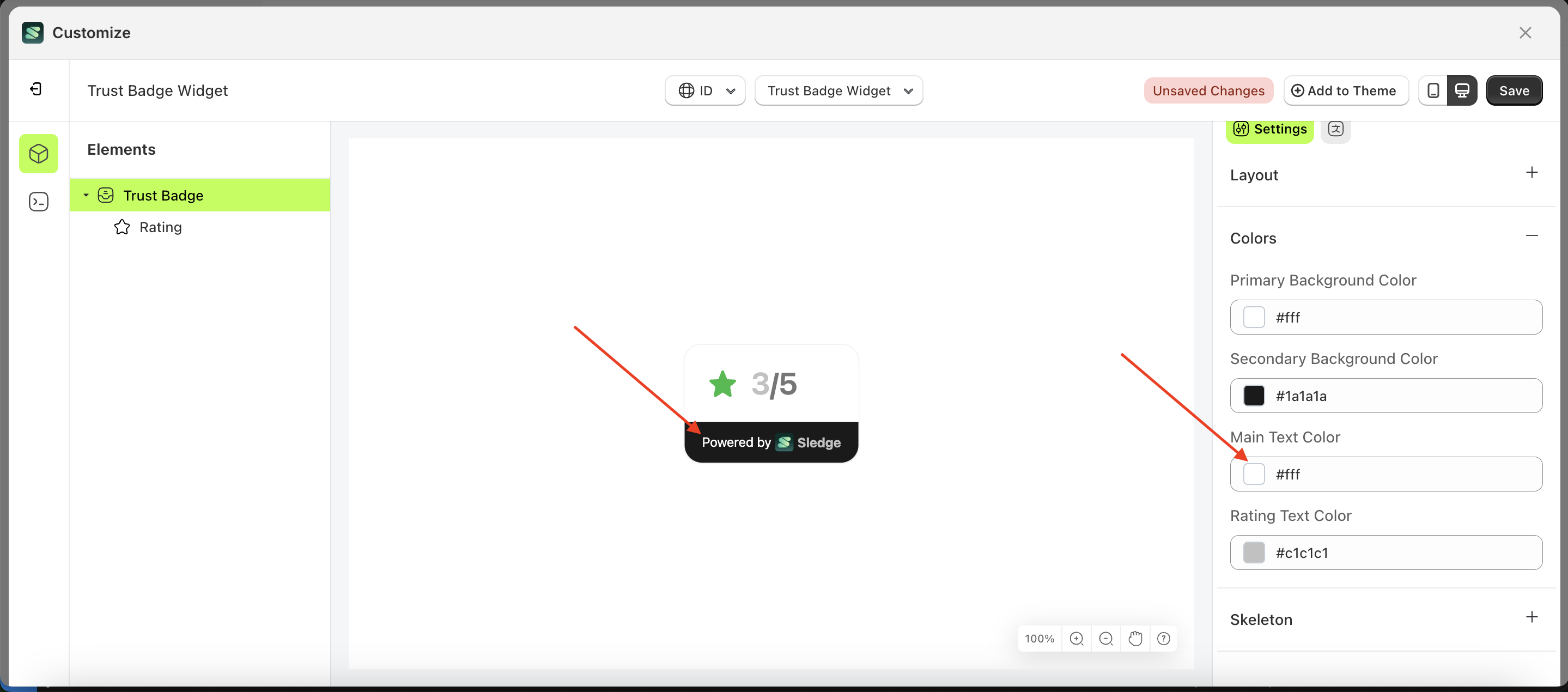
- Select the Trus Badge element on the left, then click the Settings tab and click the icon marked with a red arrow.
- Click the Color Palette on the right side, which is also marked with a red arrow.
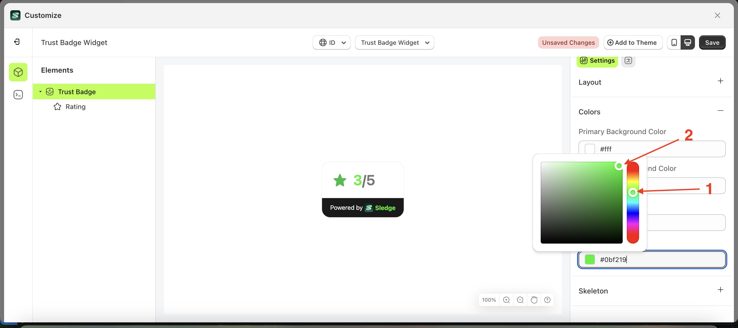
- The Color Palette will appear. Click the right side of the palette where the red arrow and number 1 are indicated, then click the right side again where the red arrow and number 2 are marked.
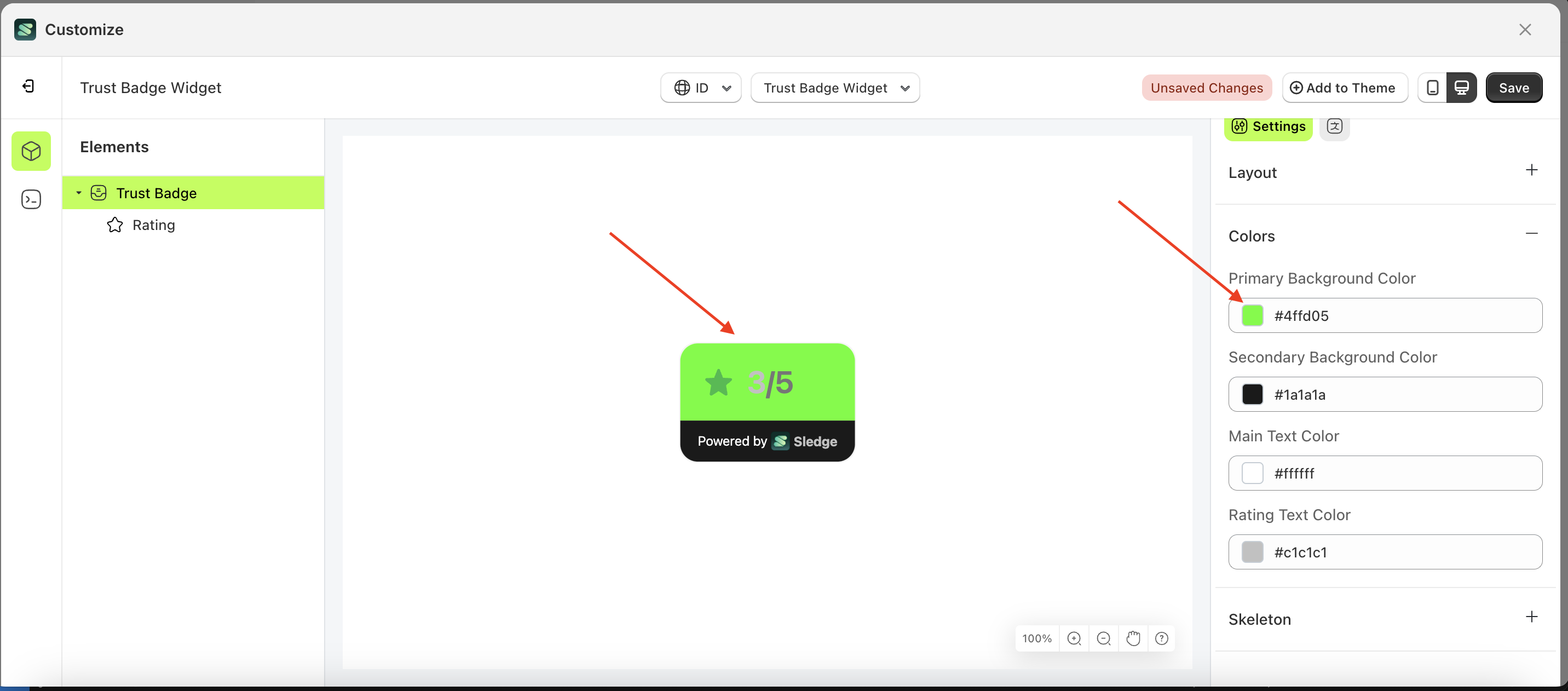
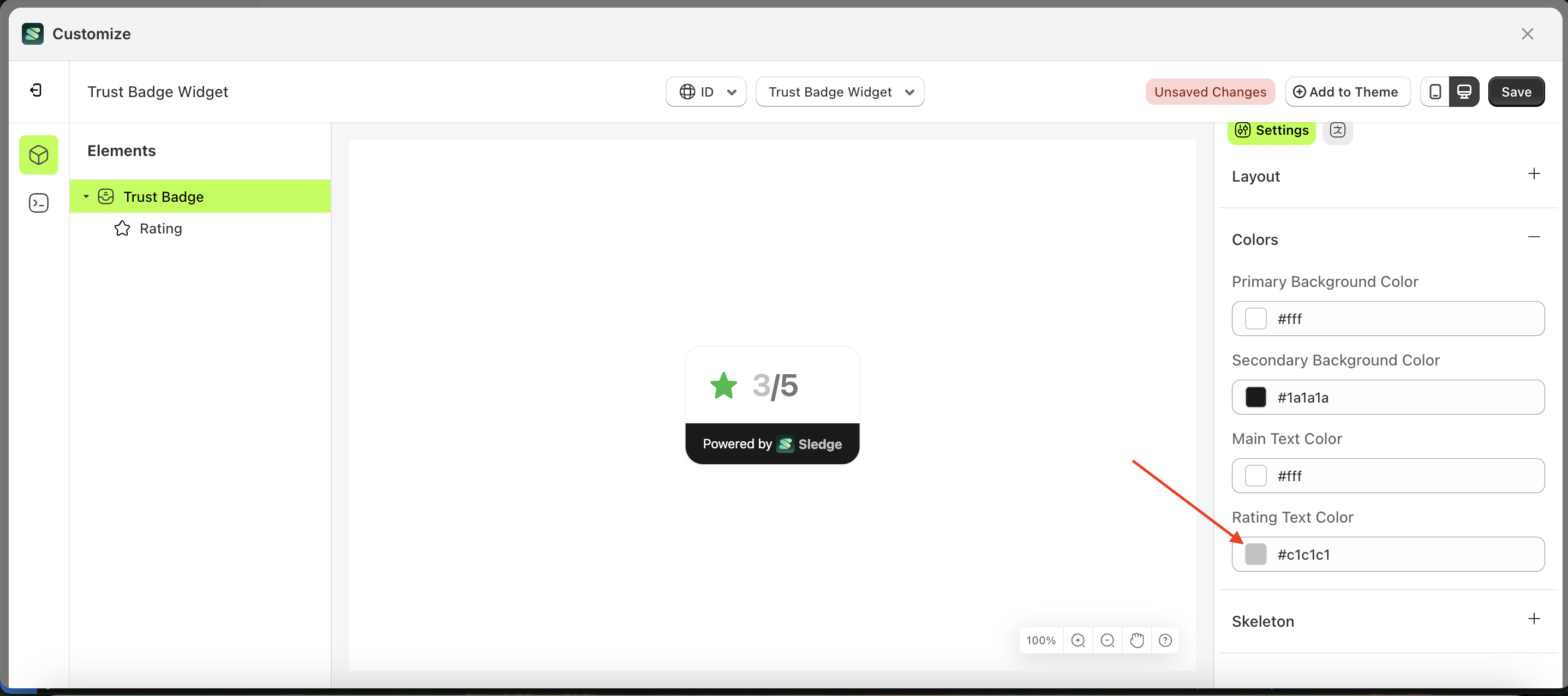
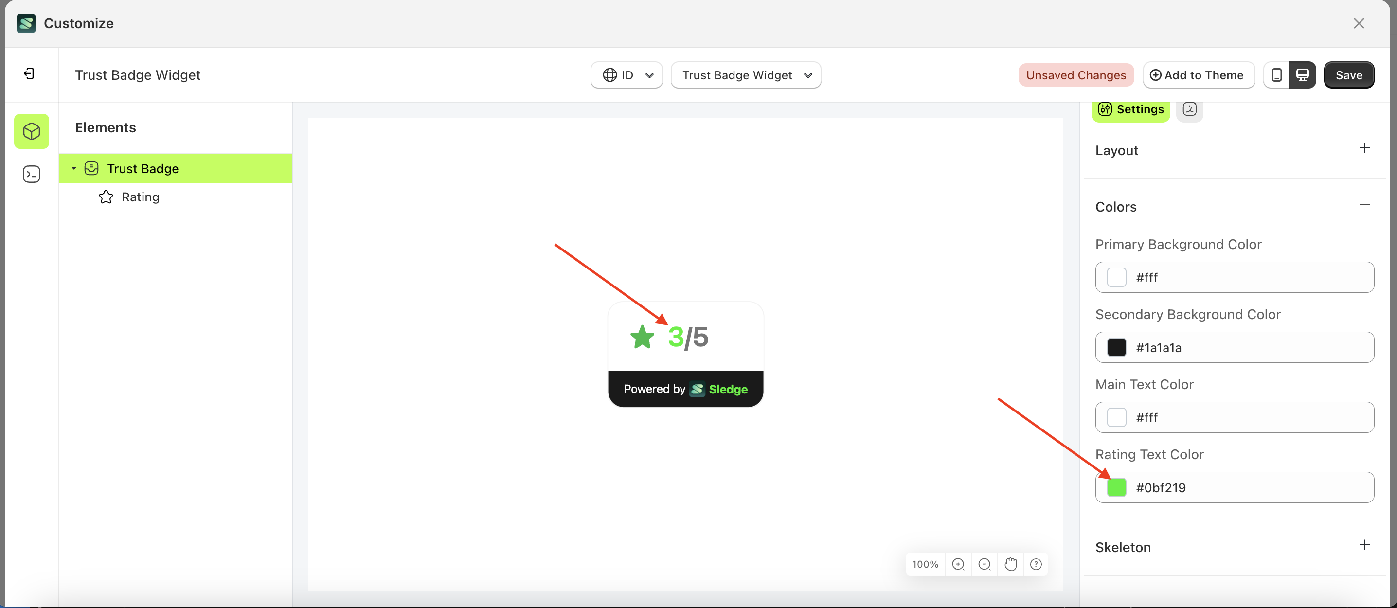
- The trust badge widget of the Trus Badge element will adjust accordingly.
- Example : Before Trus Badge change settings
- Example : After Trus Badge change settings
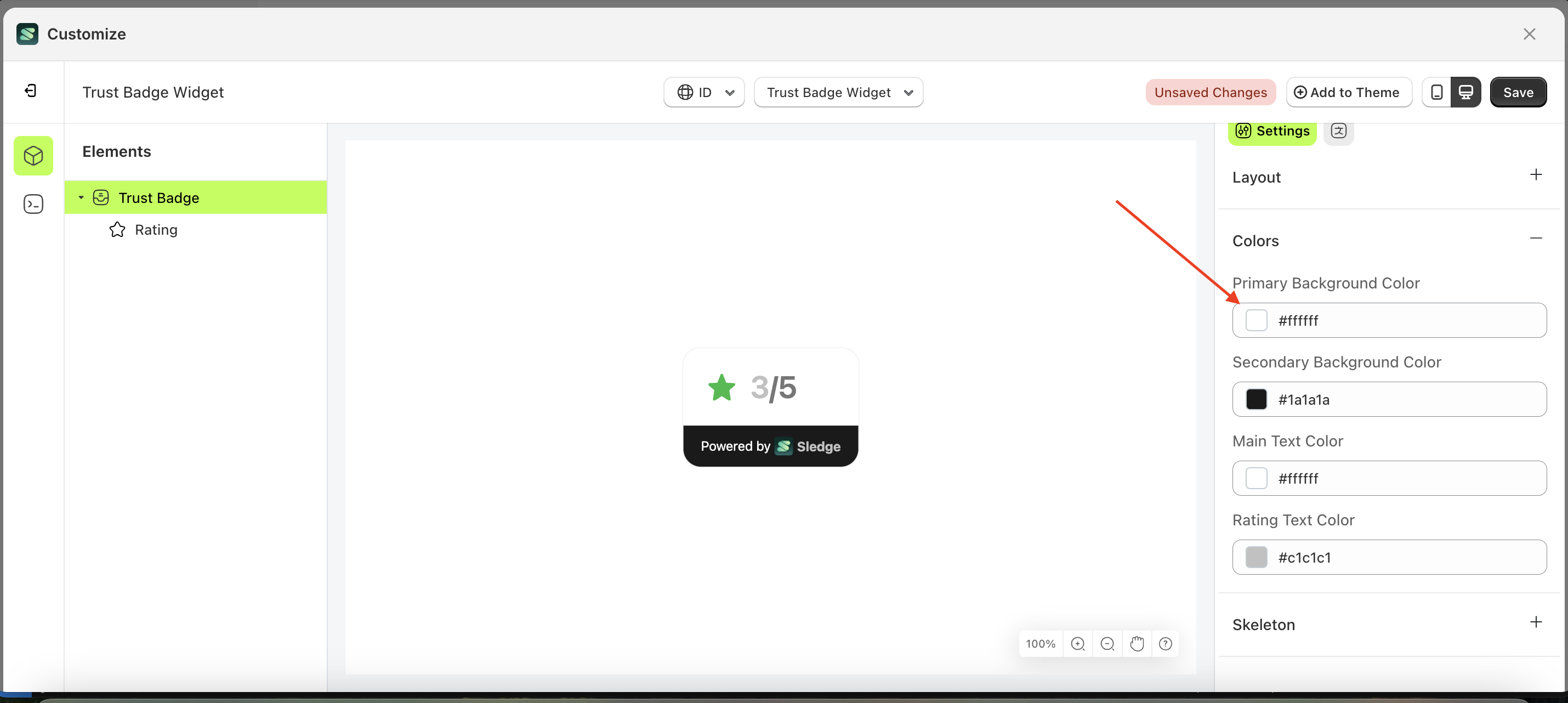

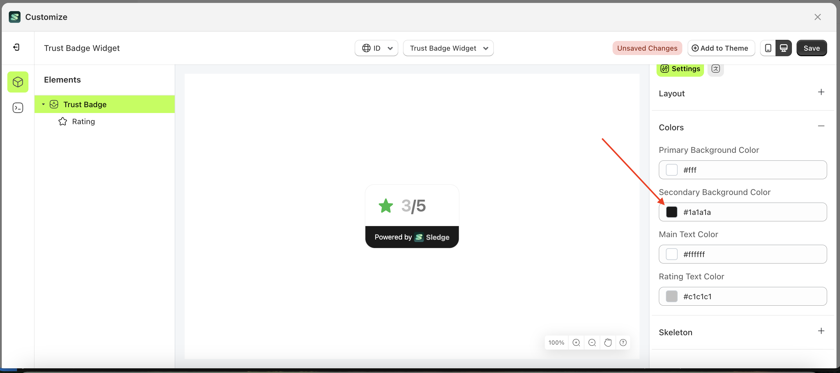
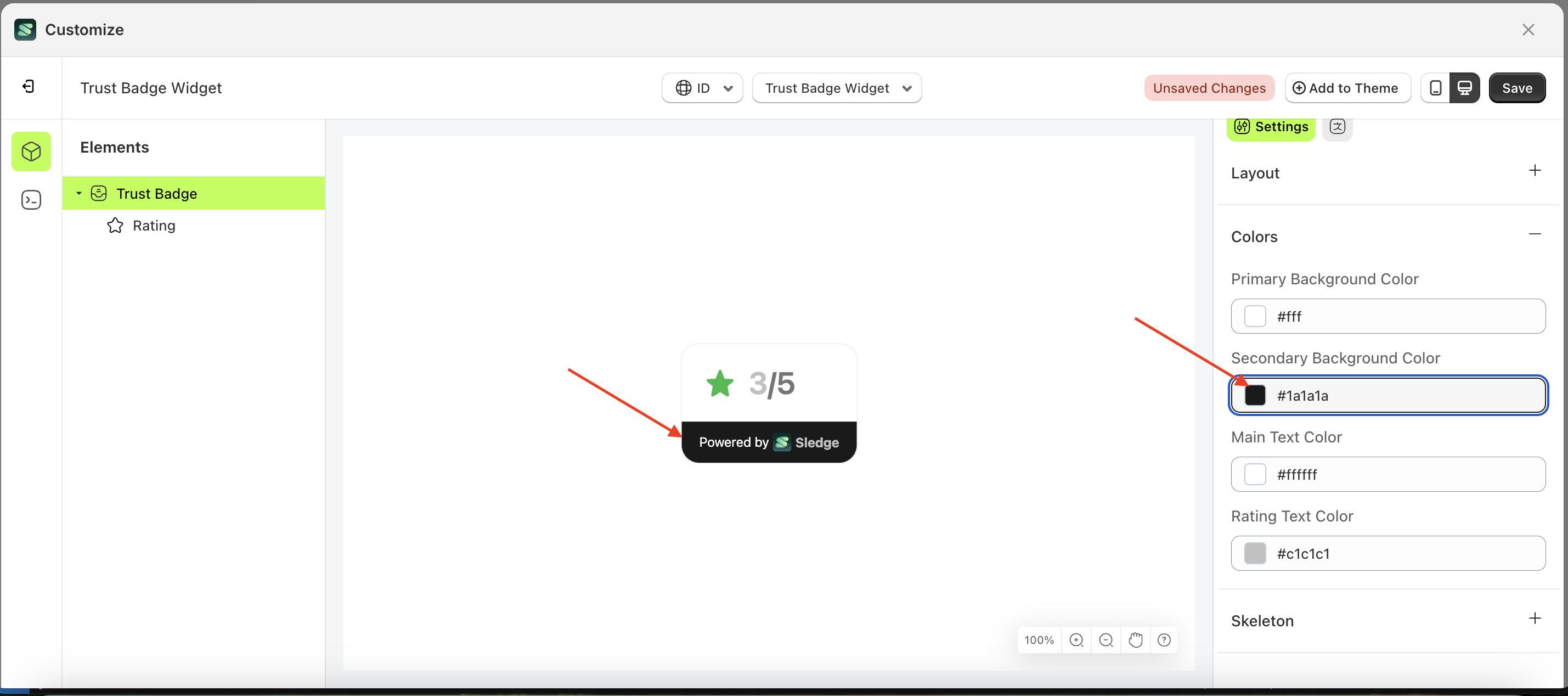
Second Background Color
This feature is designed to customize the second background color of the colors
Follow the steps below:
- Select the Trus Badge element on the left, then click the Settings tab and click the icon marked with a red arrow.
- Click the Color Palette on the right side, which is also marked with a red arrow.
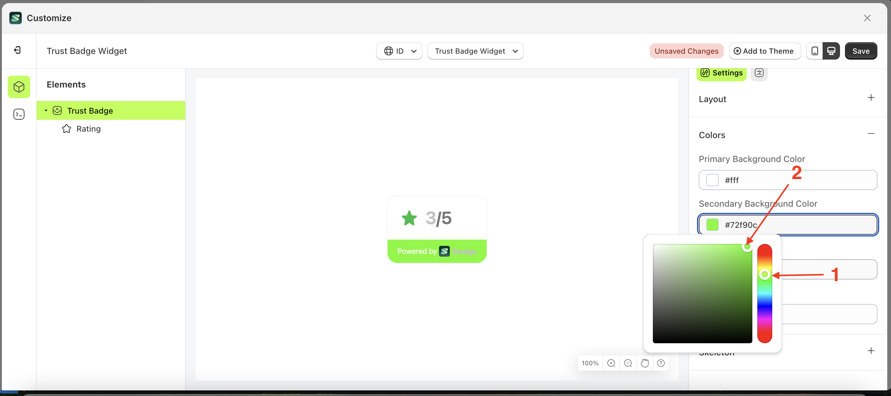
- The Color Palette will appear. Click the right side of the palette where the red arrow and number 1 are indicated, then click the right side again where the red arrow and number 2 are marked.
- The trust badge widget of the Trus Badge element will adjust accordingly.
- Example : Before Trus Badge change settings
- Example : After Trus Badge change settings
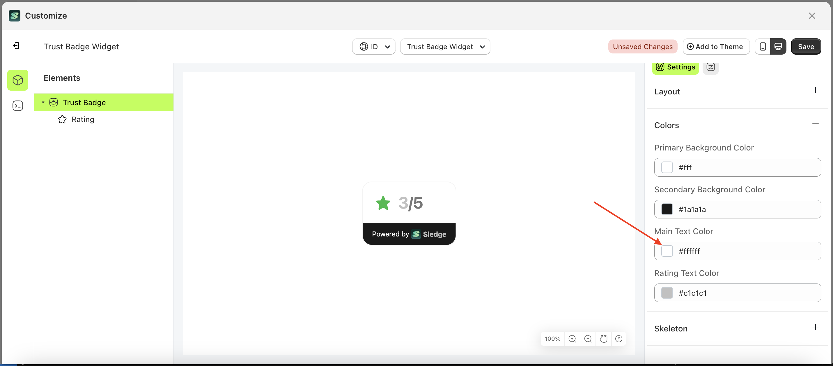
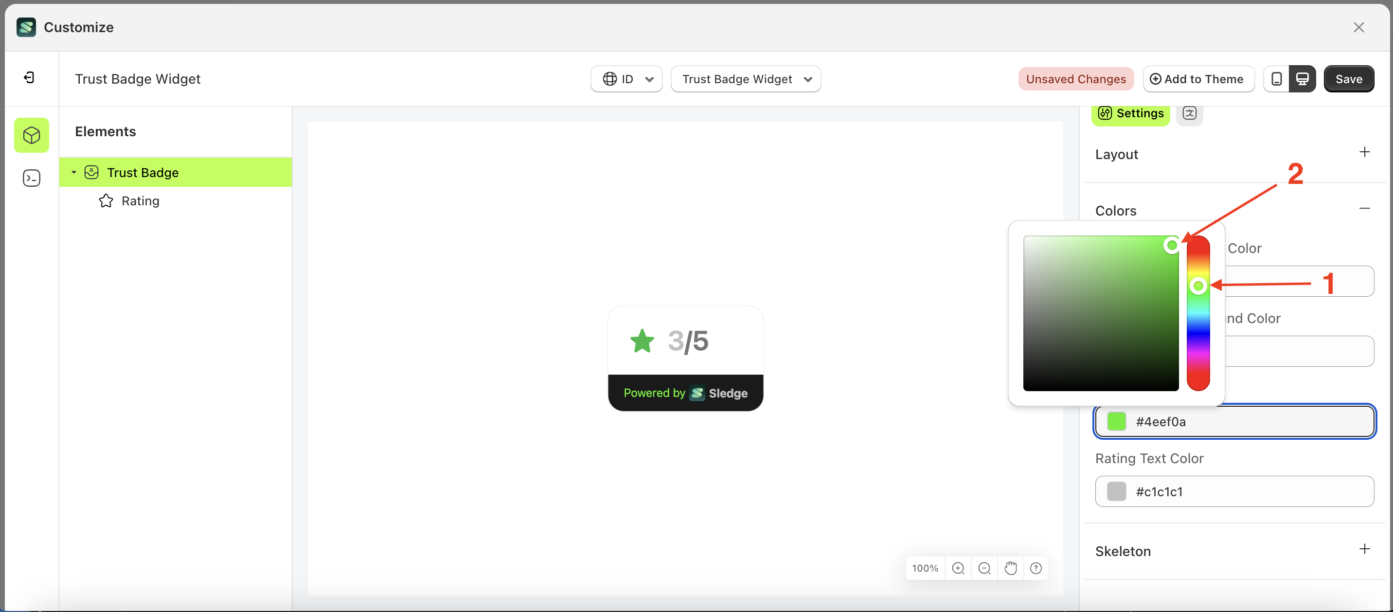
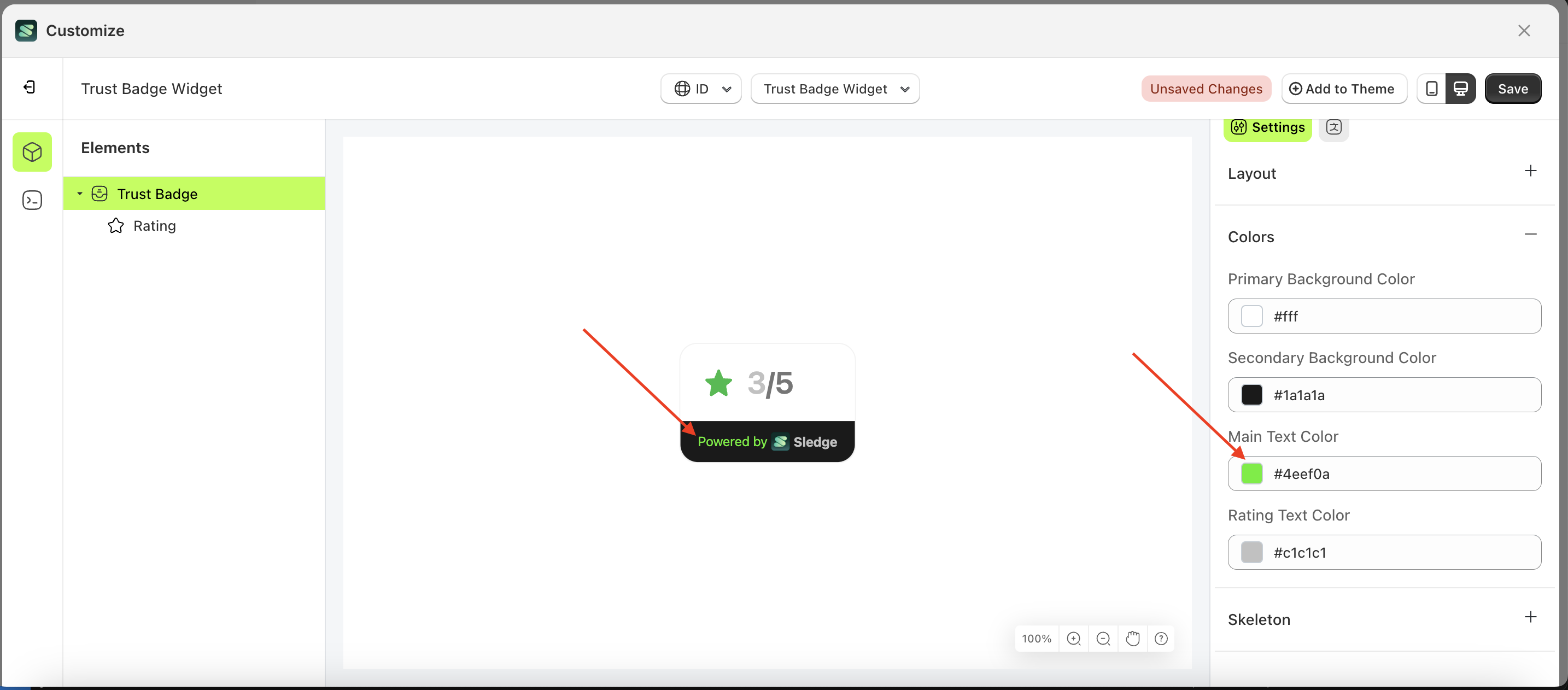
Main Text Color
This feature is designed to customize the main text color of the colors
Follow the steps below:
- Select the Trus Badge element on the left, then click the Settings tab and click the icon marked with a red arrow.
- Click the Color Palette on the right side, which is also marked with a red arrow.
- The Color Palette will appear. Click the right side of the palette where the red arrow and number 1 are indicated, then click the right side again where the red arrow and number 2 are marked.
- The trust badge widget of the Trus Badge element will adjust accordingly.
- Example : Before Trus Badge change settings
- Example : After Trus Badge change settings
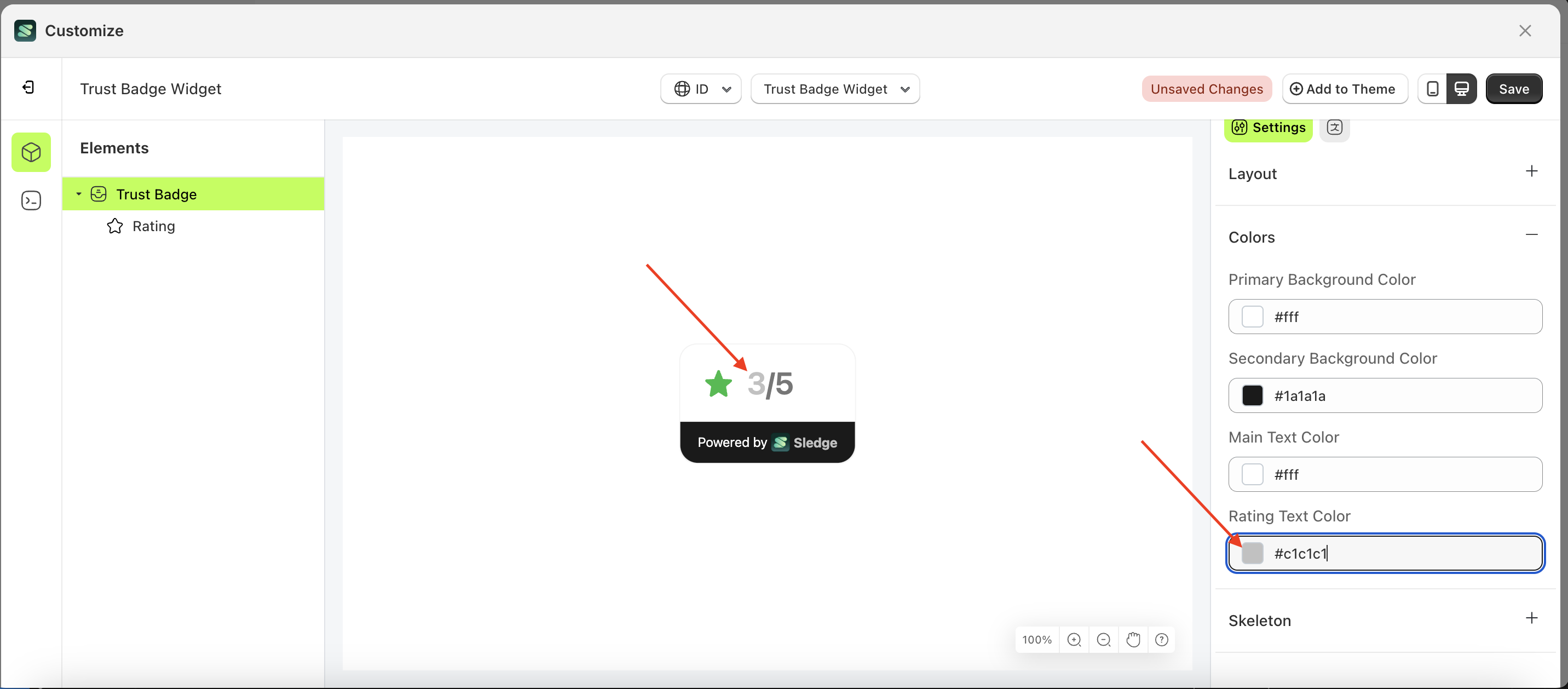
Rating Text Color
This feature is designed to customize the rating text color of the colors
Follow the steps below:
- Select the Trus Badge element on the left, then click the Settings tab and click the icon marked with a red arrow.
- Click the Color Palette on the right side, which is also marked with a red arrow.
- The Color Palette will appear. Click the right side of the palette where the red arrow and number 1 are indicated, then click the right side again where the red arrow and number 2 are marked.
- The trust badge widget of the Trus Badge element will adjust accordingly.
- Example : Before Trus Badge change settings
- Example : After Trus Badge change settings
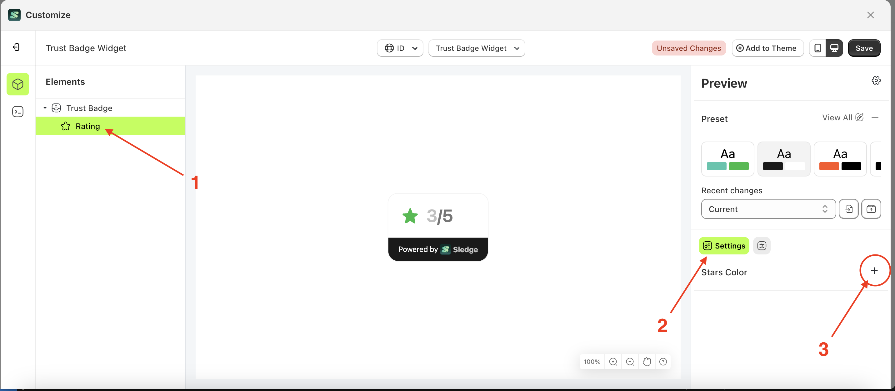
Stars
Available settings:
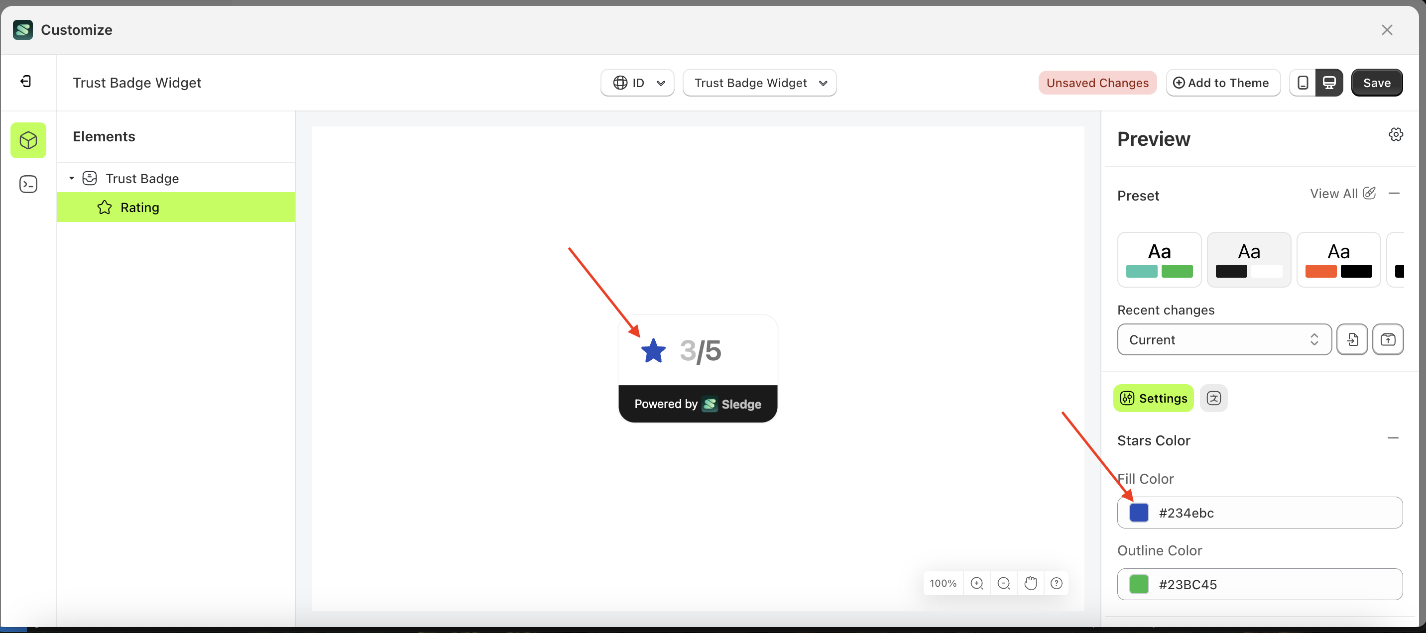
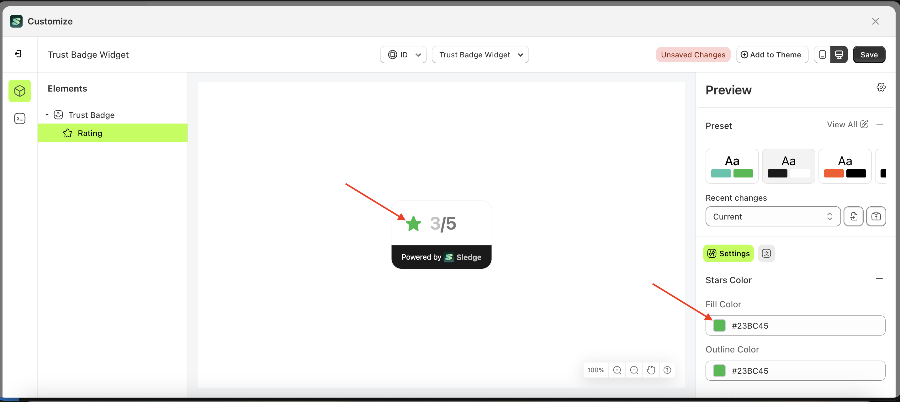
Fill Color
This feature is designed to customize the fill color of the stars
Follow the steps below:
- Select the Trus Badge element on the left, then click the Settings tab and click the icon marked with a red arrow.
- Click the Color Palette on the right side, which is also marked with a red arrow.
- The Color Palette will appear. Click the right side of the palette where the red arrow and number 1 are indicated, then click the right side again where the red arrow and number 2 are marked.
- The trust badge widget of the Trus Badge element will adjust accordingly.
- Example : Before Trus Badge change settings
- Example : After Trus Badge change settings
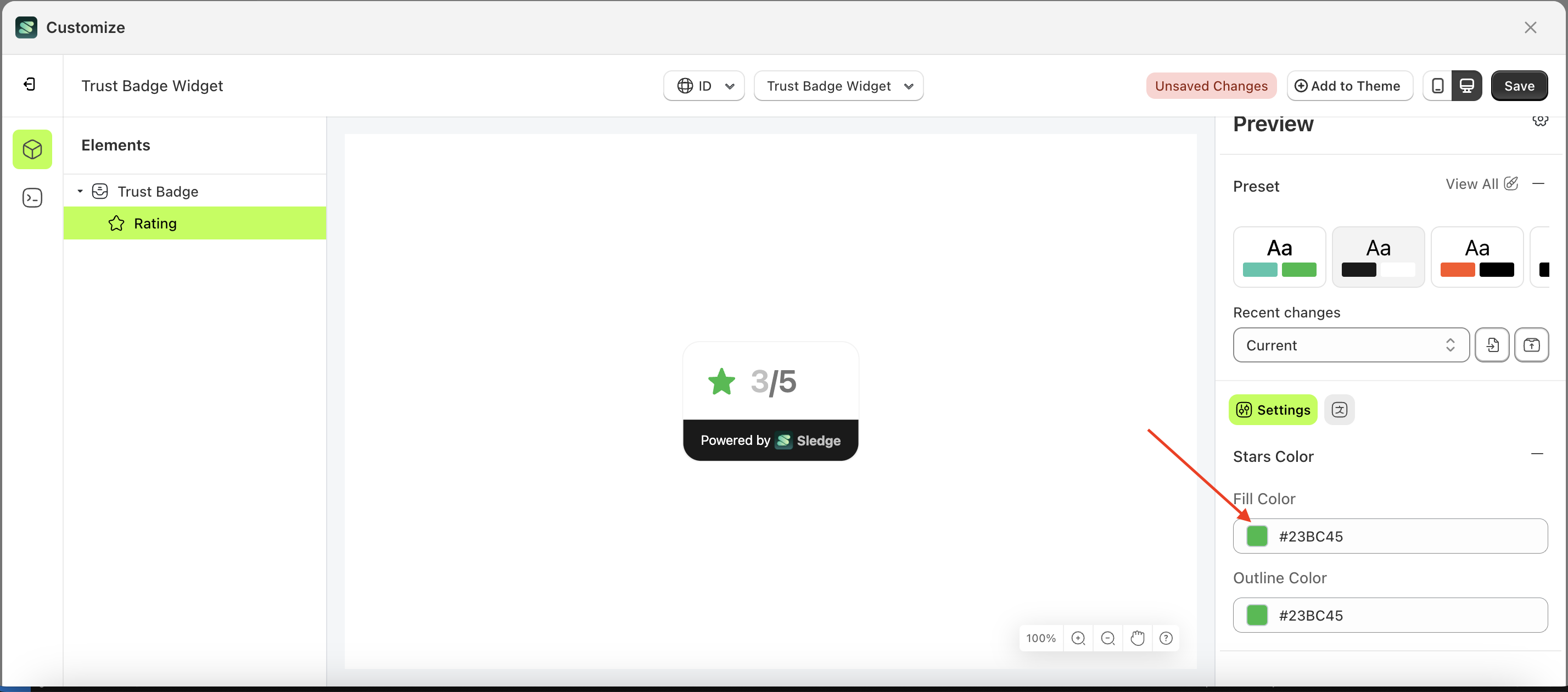
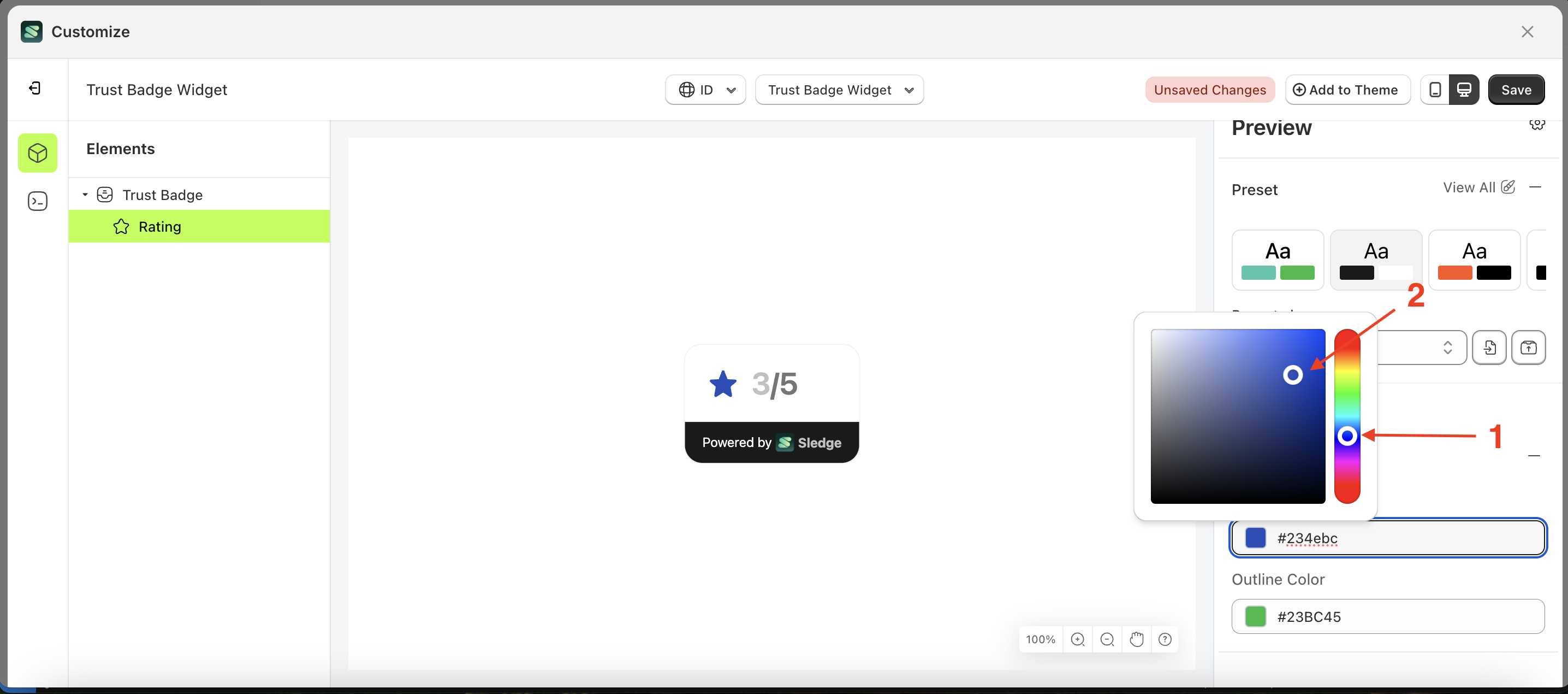
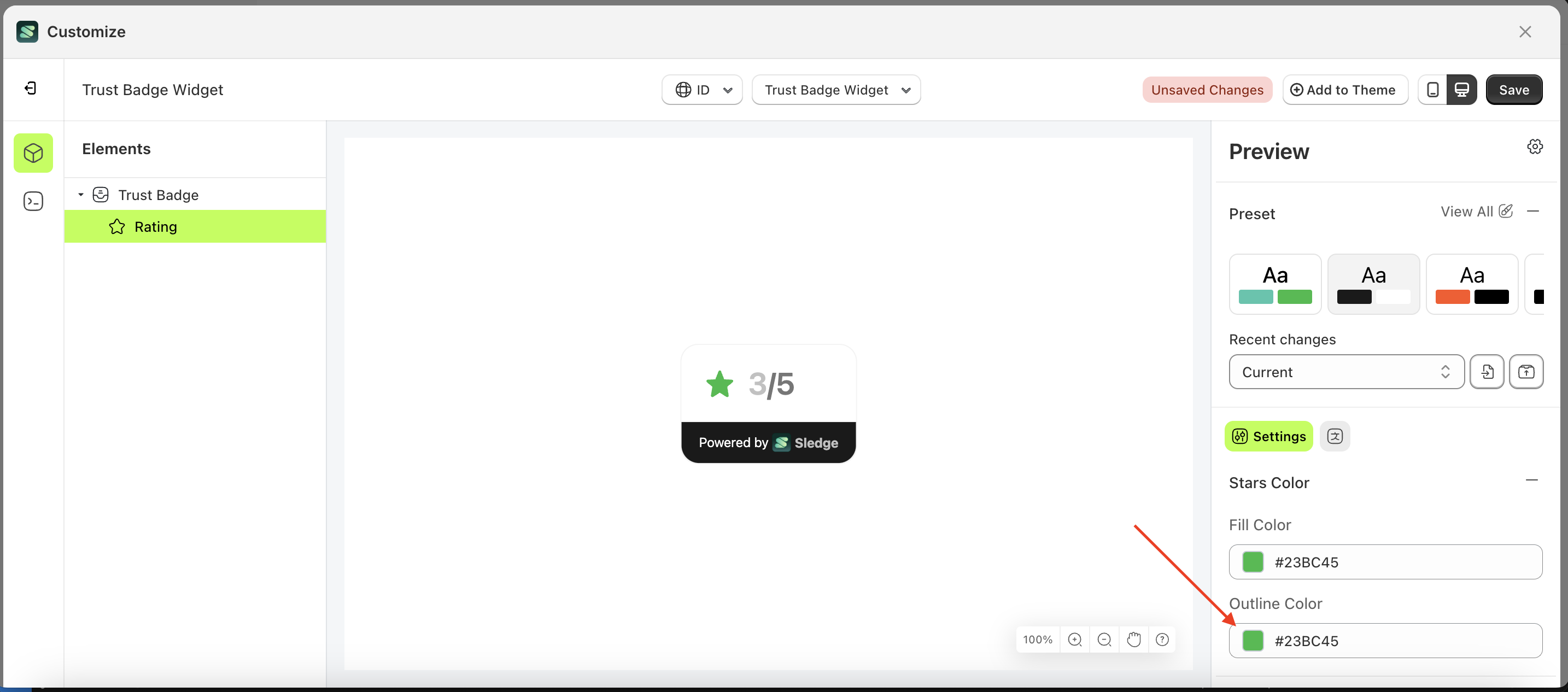
Outline Color
This feature is designed to customize the outline color of the stars
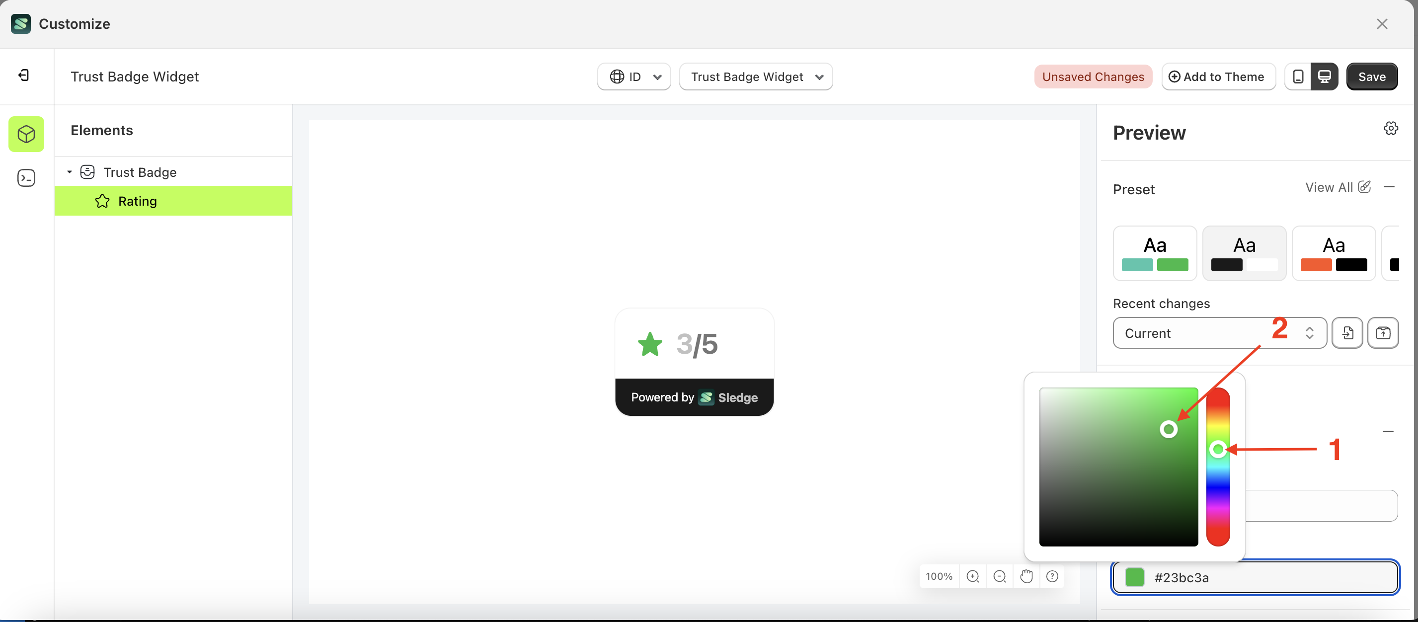
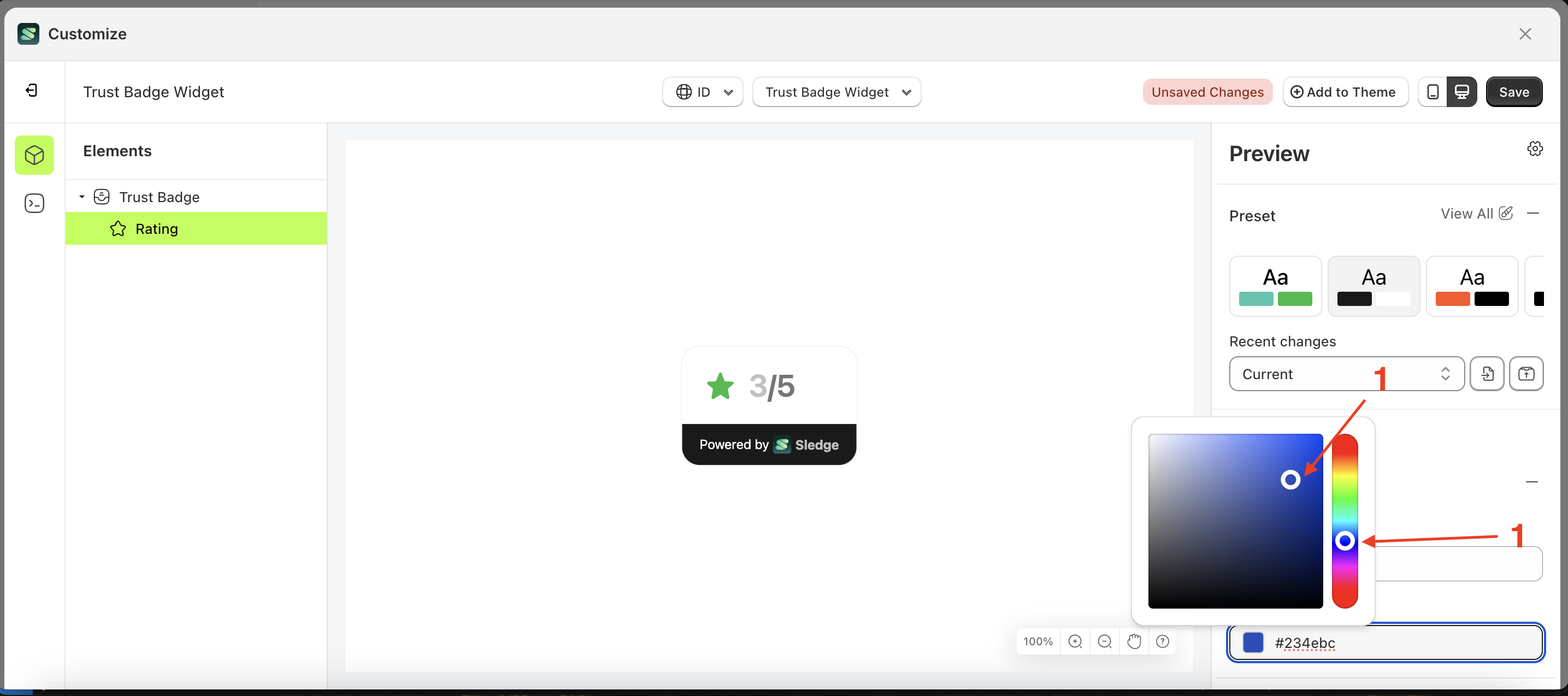
- Select the Trus Badge element on the left, then click the Settings tab and click the icon marked with a red arrow.
- Click the Color Palette on the right side, which is also marked with a red arrow.
- The Color Palette will appear. Click the right side of the palette where the red arrow and number 1 are indicated, then click the right side again where the red arrow and number 2 are marked.
- The trust badge widget of the Trus Badge element will adjust accordingly.
- Example : Before Trus Badge change settings
- Example : After Trus Badge change settings