Add to wishlist widget
To Access the Add to wishlist Widget, Follow These Steps:
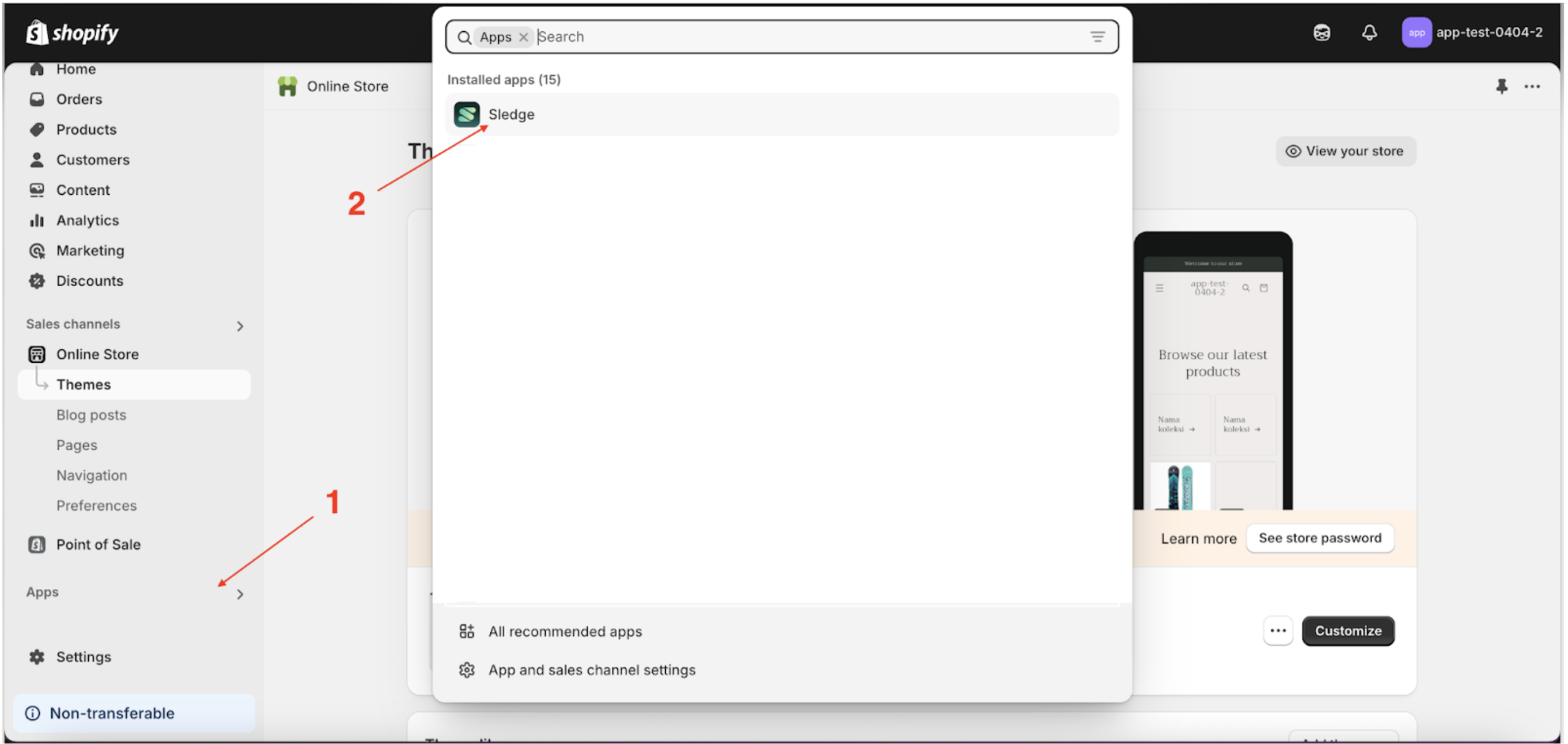
- Go to the Apps Sledge.
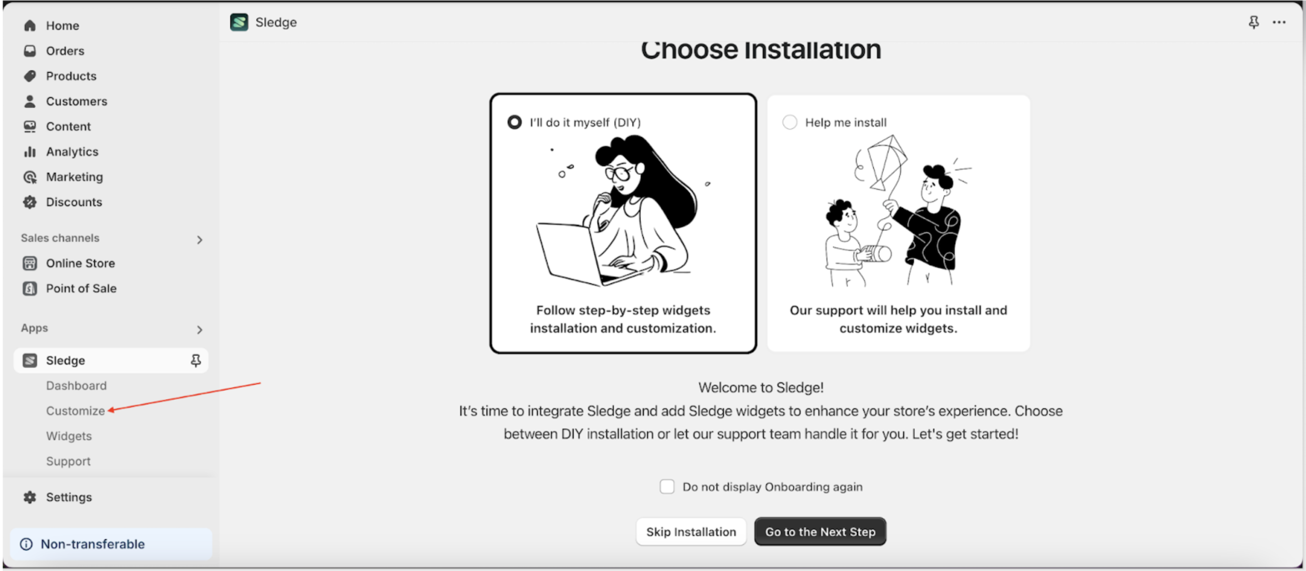
- Select the Customizer menu.
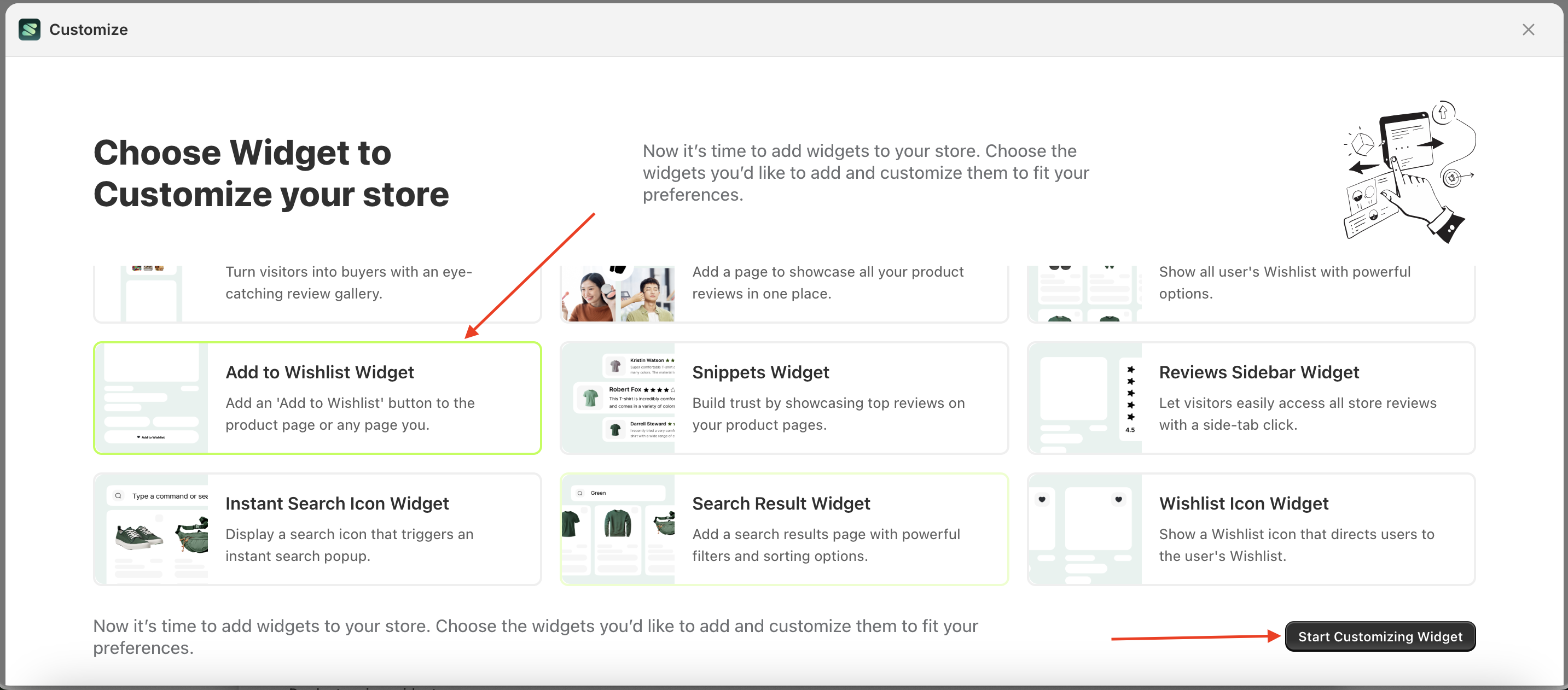
- Choose add to wishlist widget and click the Start Customizing Widget button.
Wishlist Behaviour
Available settings:
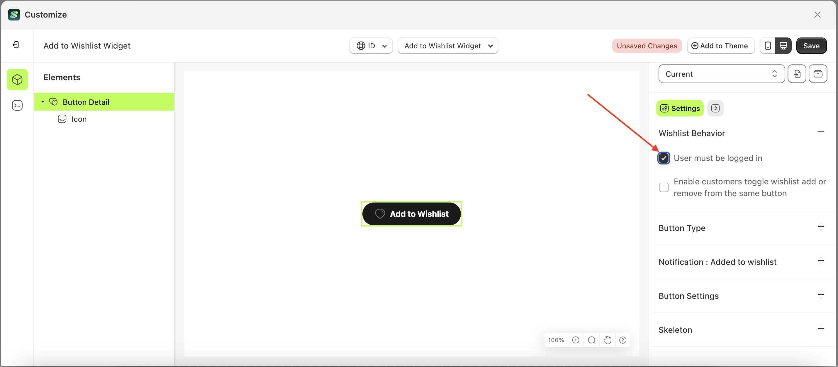
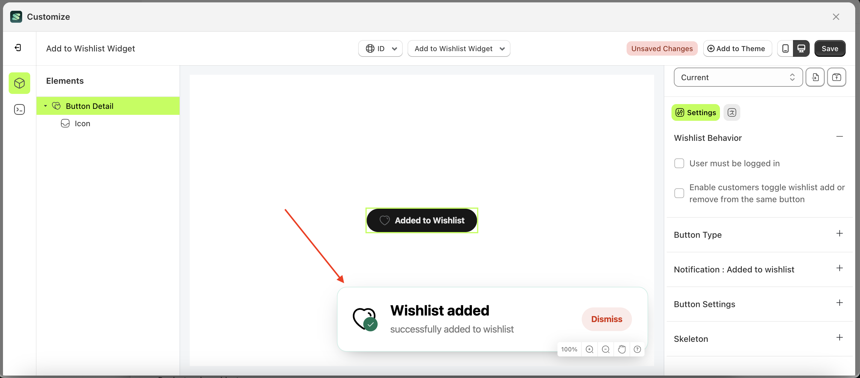
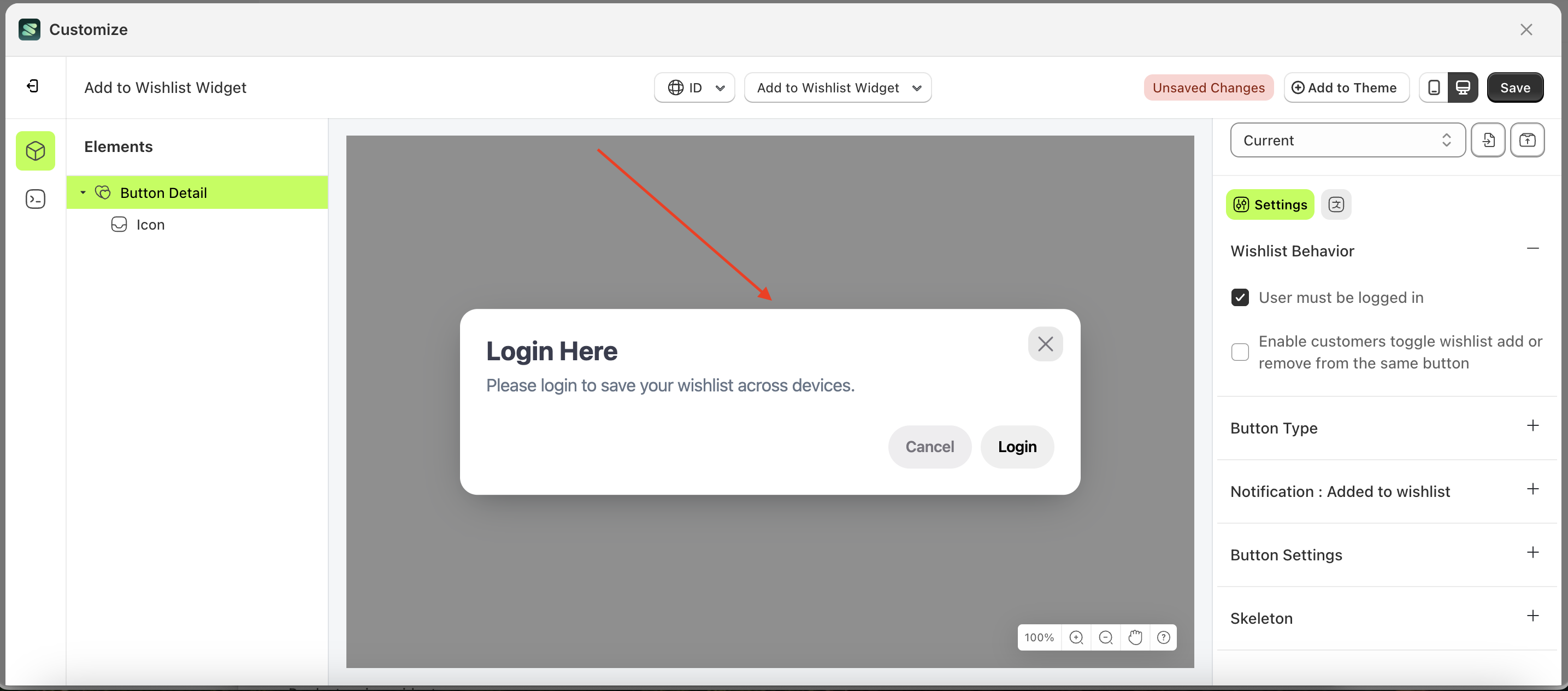
User must be logged in
This feature is used to restrict customer access to the Add to Wishlist feature. If the checkbox is enabled, customers must log in to use the Add to Wishlist action, and vice versa.
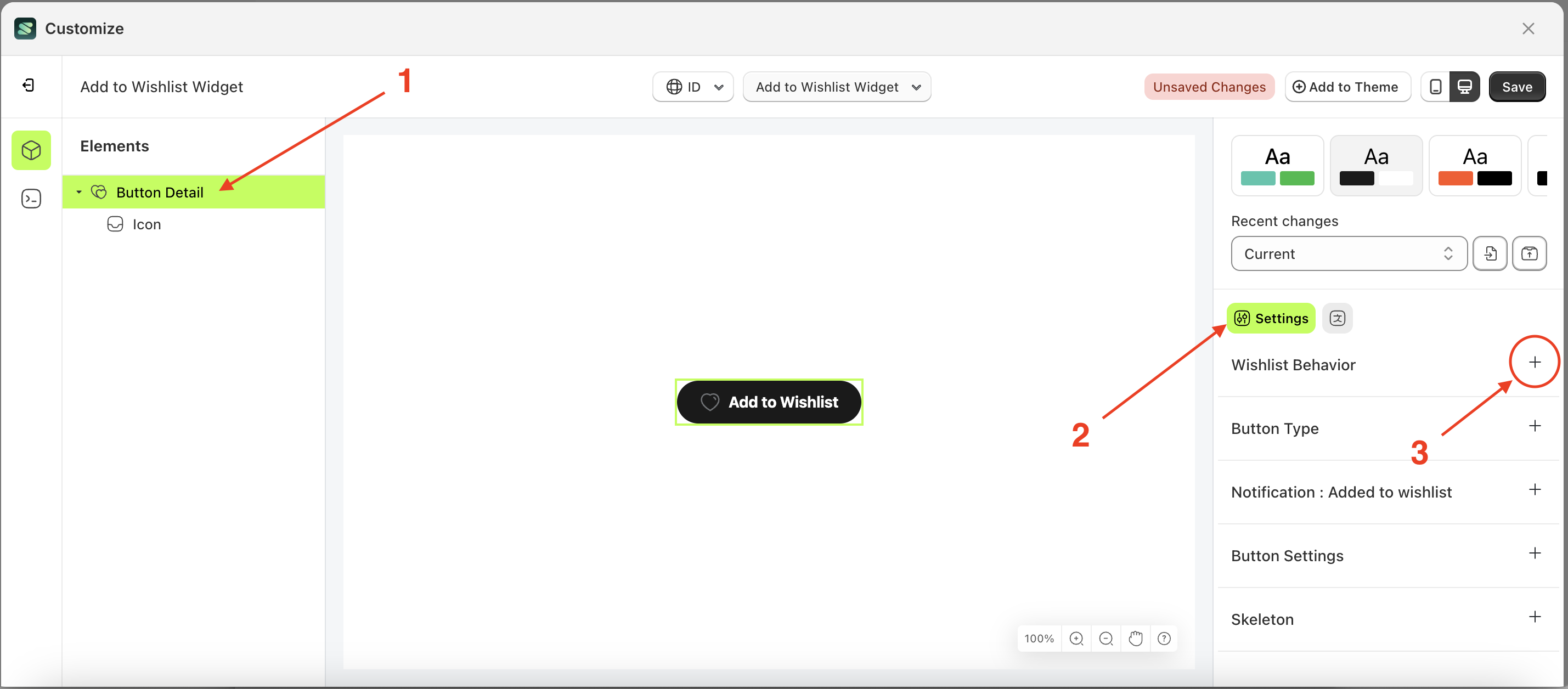
Follow the steps below:
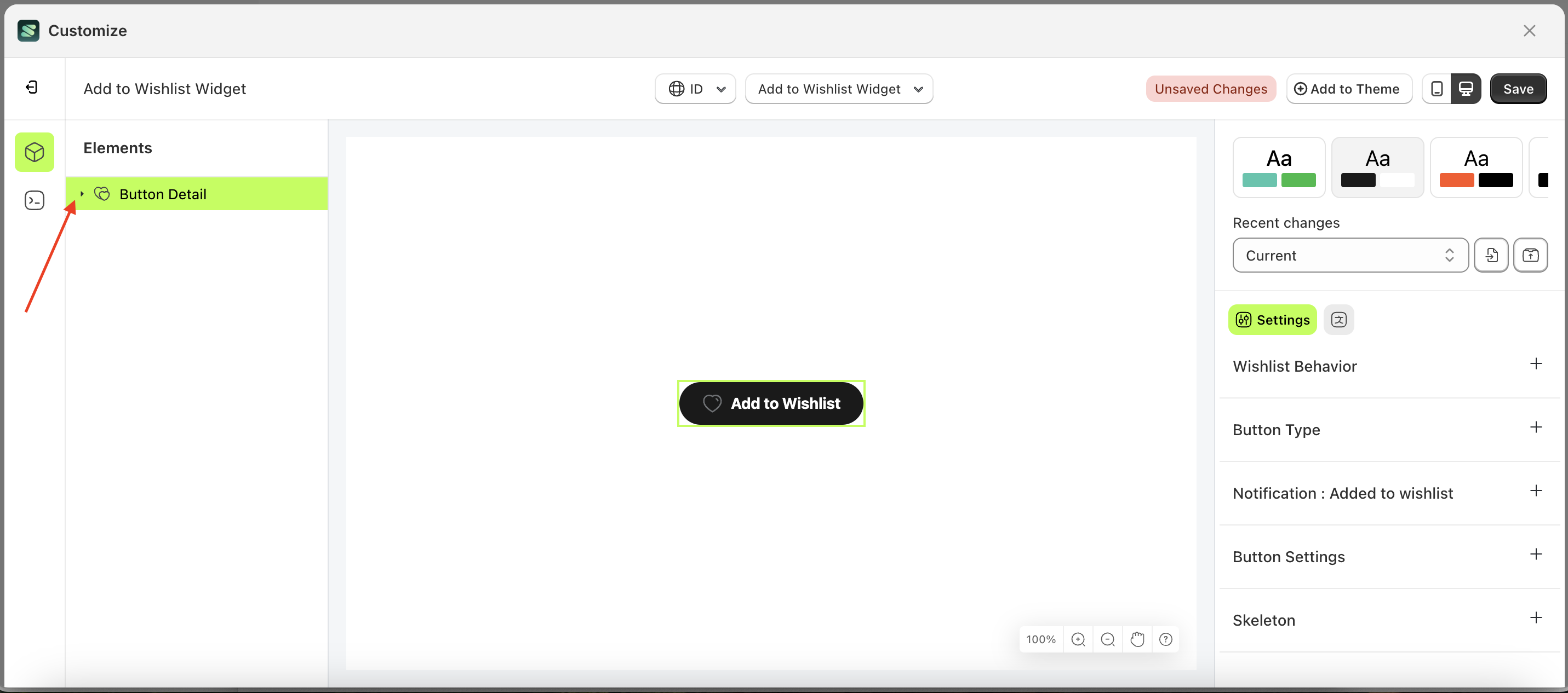
- Select the Button Detail element on the right, then click the Settings tab and click the icon marked with a red arrow.
- Enable the User must be logged in checkbox
- Example : Before User must be logged in is enabled
- Example : After User must be logged in is enabled
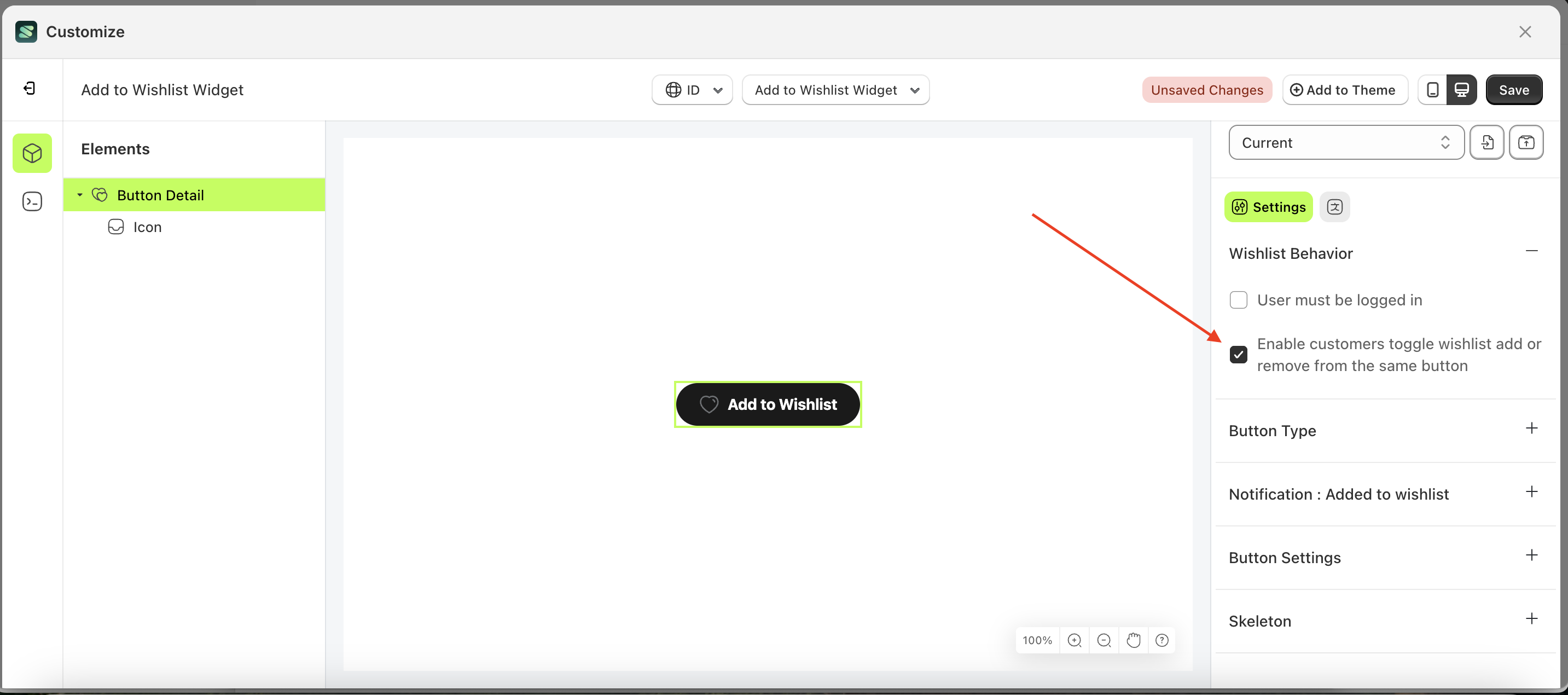
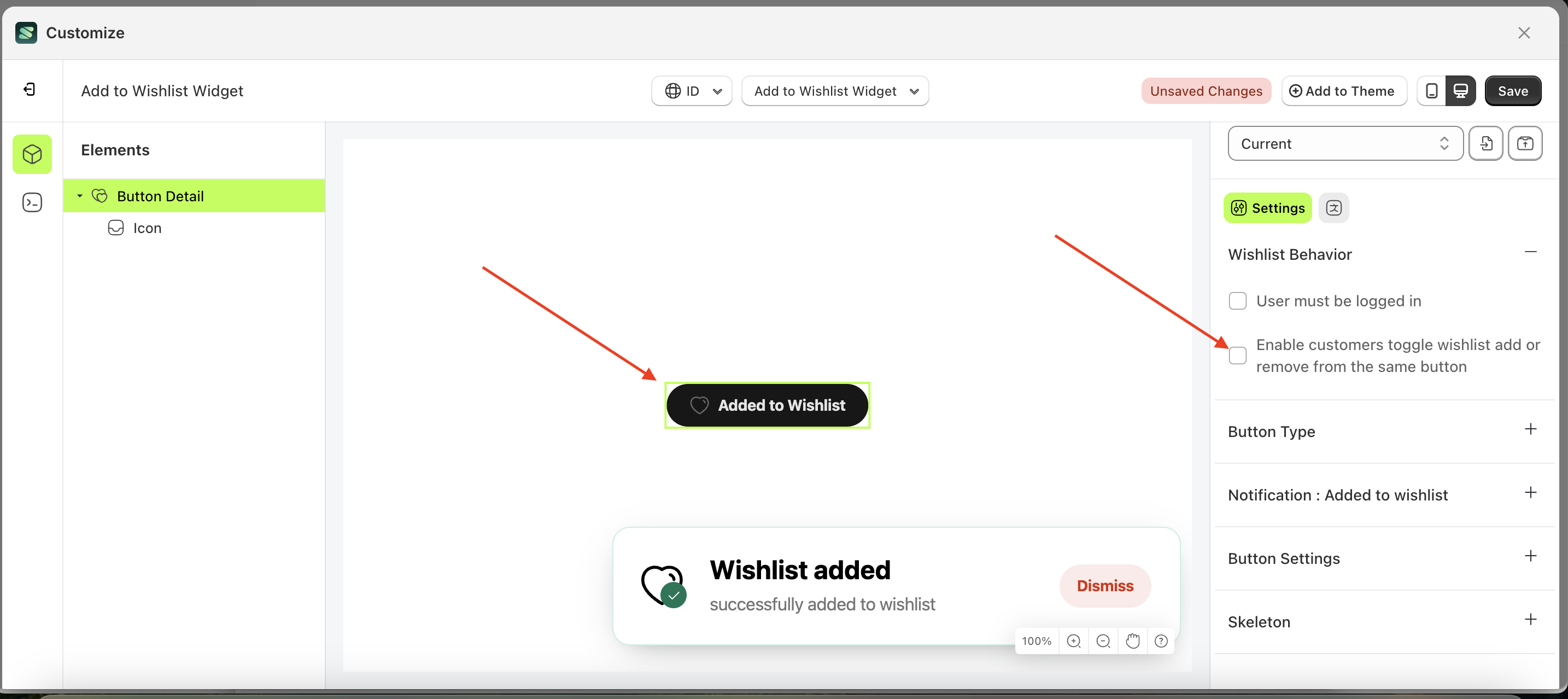
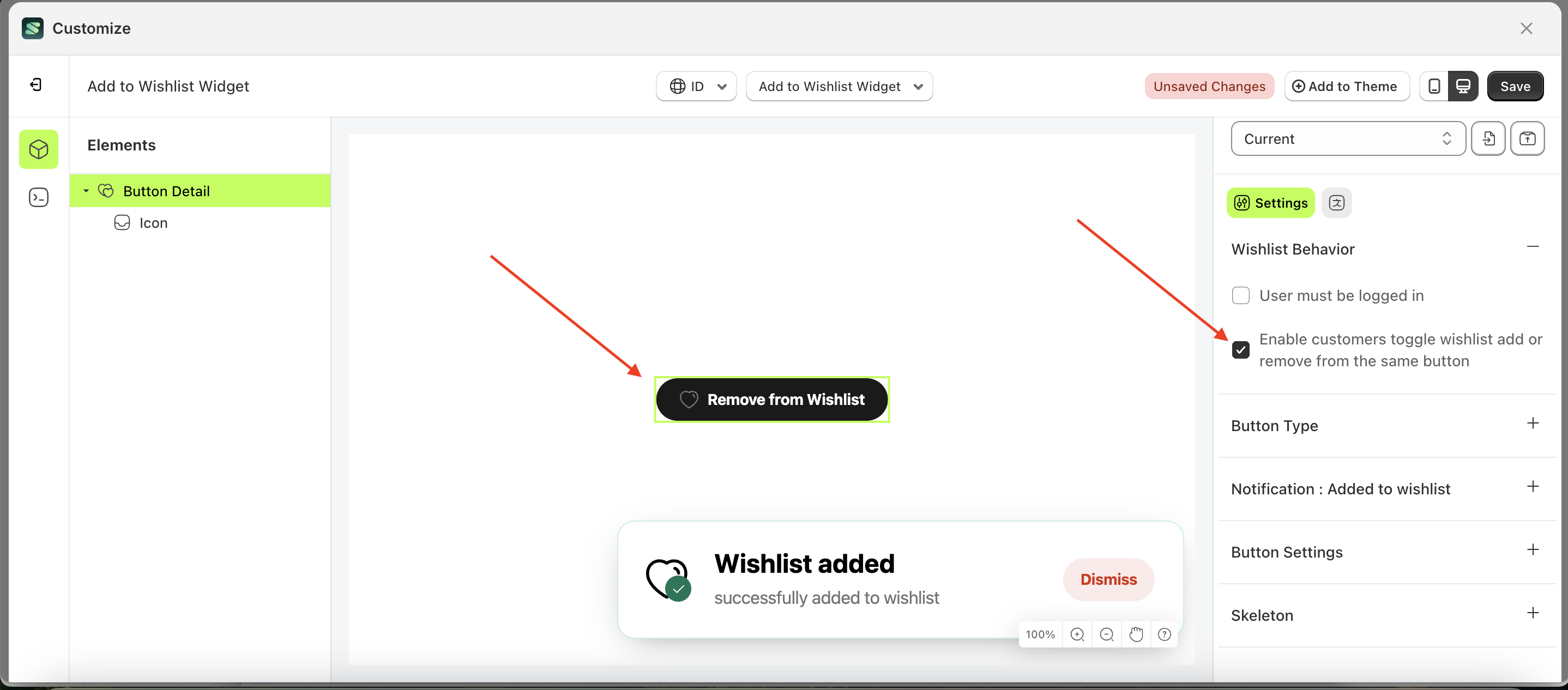
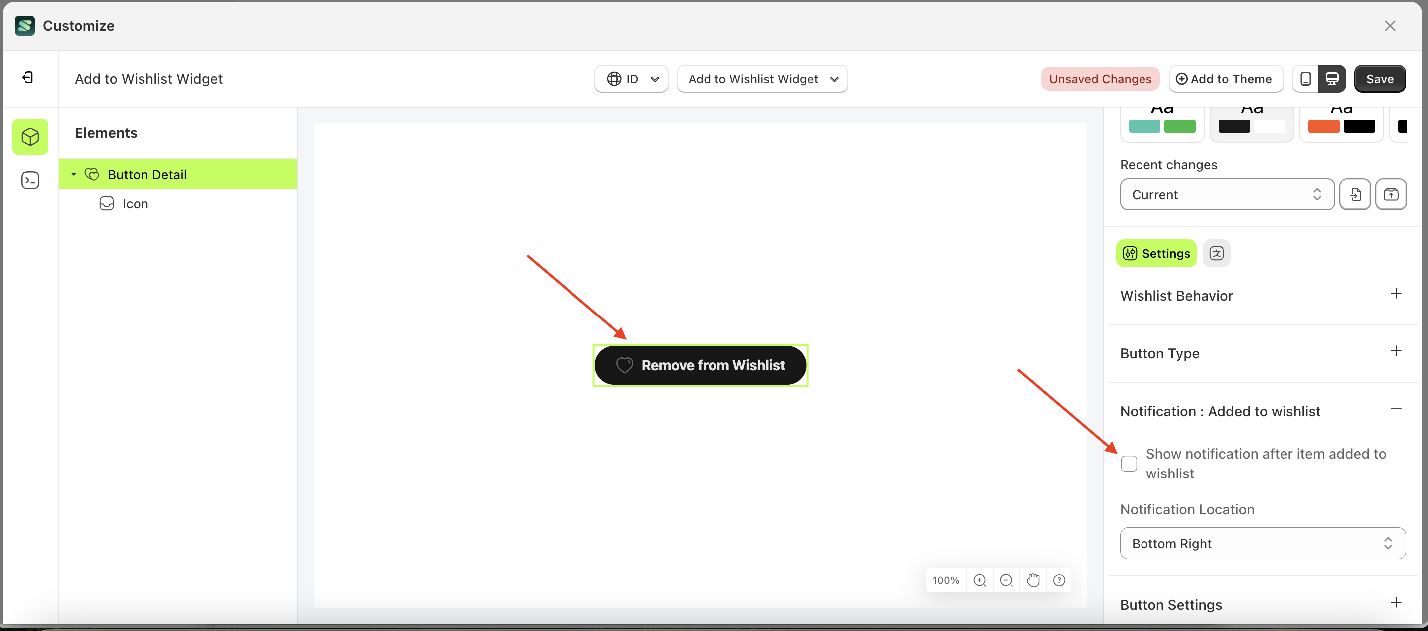
Enable customers toggle wishlist
This feature is designed to configure the Add to Wishlist button to also function as a Remove from Wishlist button within a single button. However, if the checkbox is not enabled, only the Add to Wishlist button will be available.
Follow the steps below:
- Select the Button Detail element on the right, then click the Settings tab and click the icon marked with a red arrow.
- Enable the Enable customers toggle wishlist add or remove from the same button checkbox
- Example : Before Enable customers toggle wishlist add or remove from the same button is enabled
- Example : After Enable customers toggle wishlist add or remove from the same button is enabled
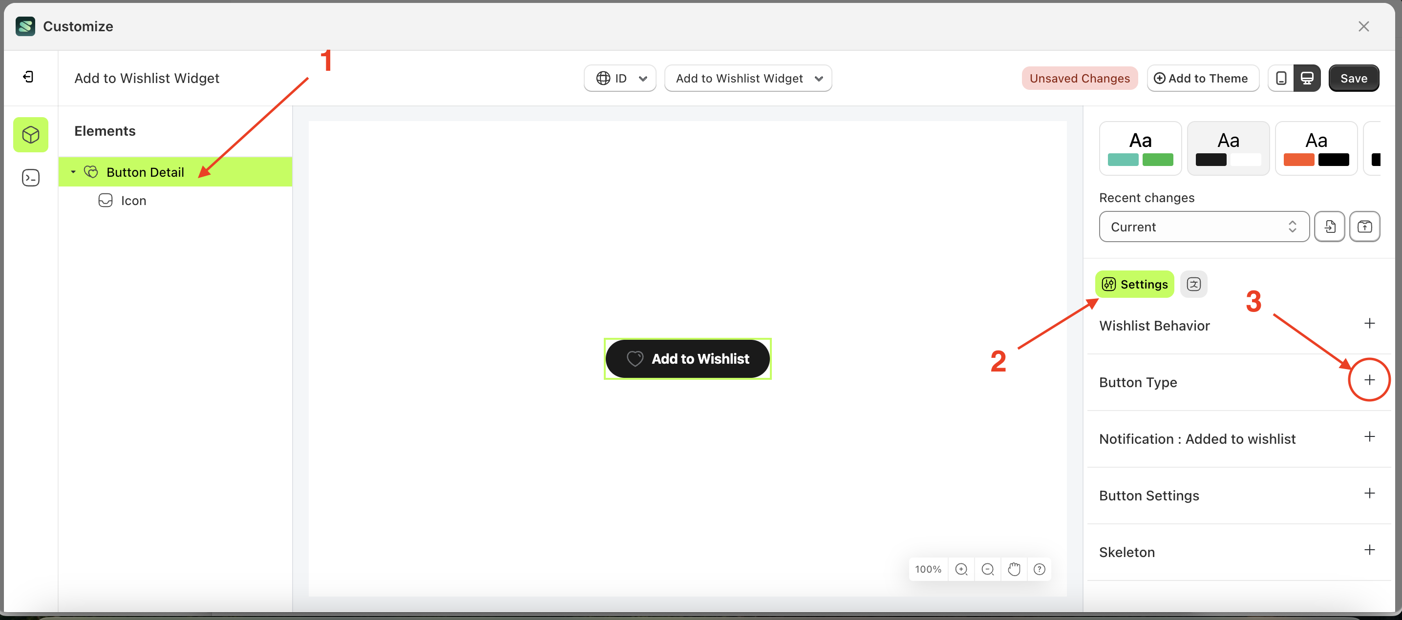
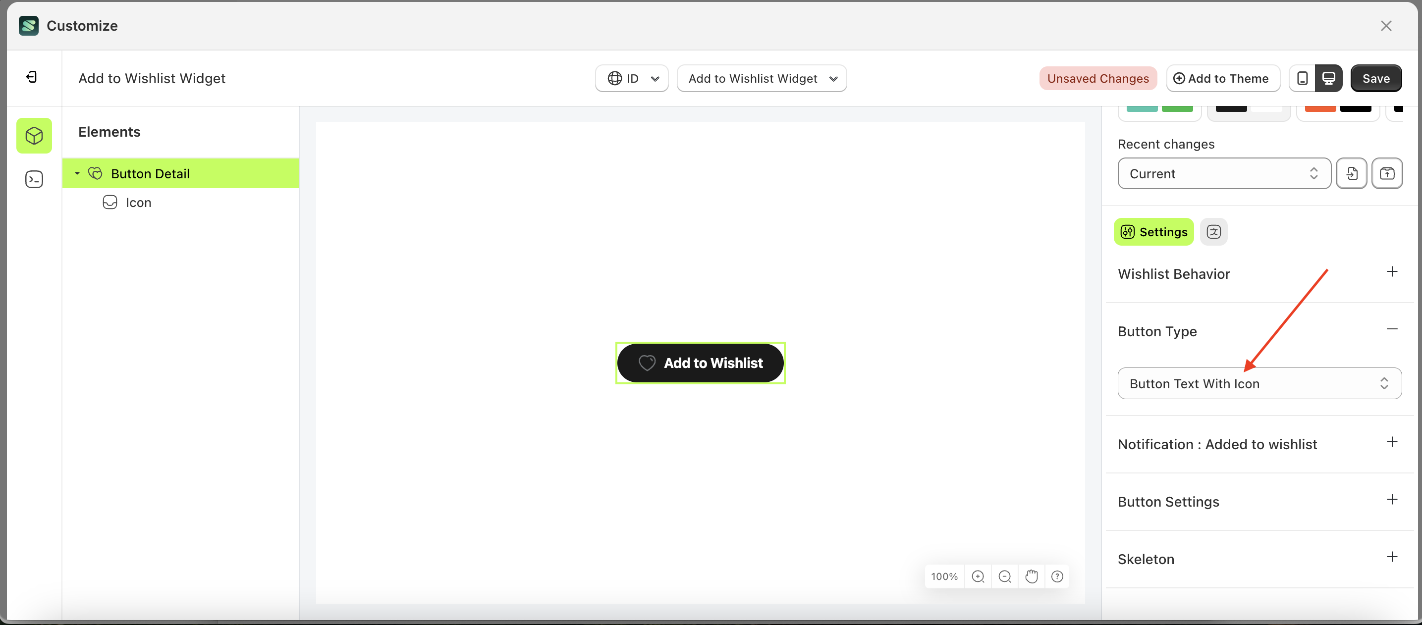
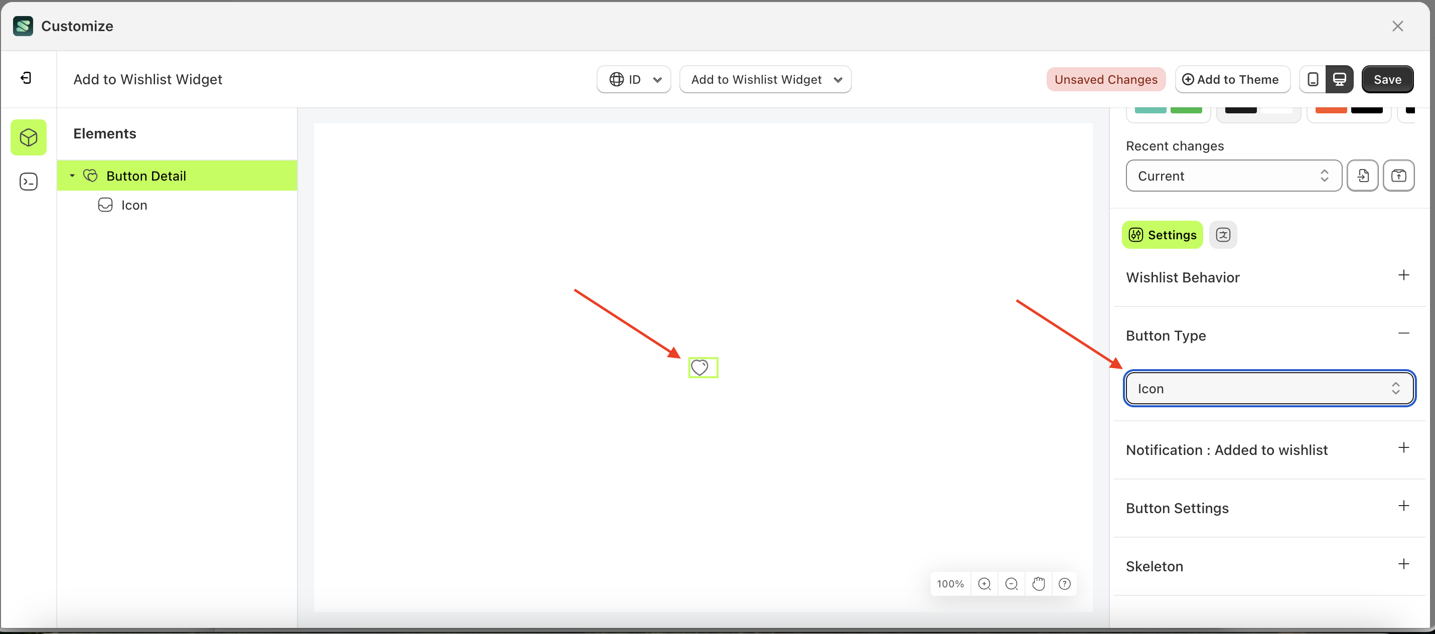
Button type
This feature is designed to customize the shape of the Add to Wishlist button. In this setting, you can choose the shape according to your preference.
Follow the steps below:
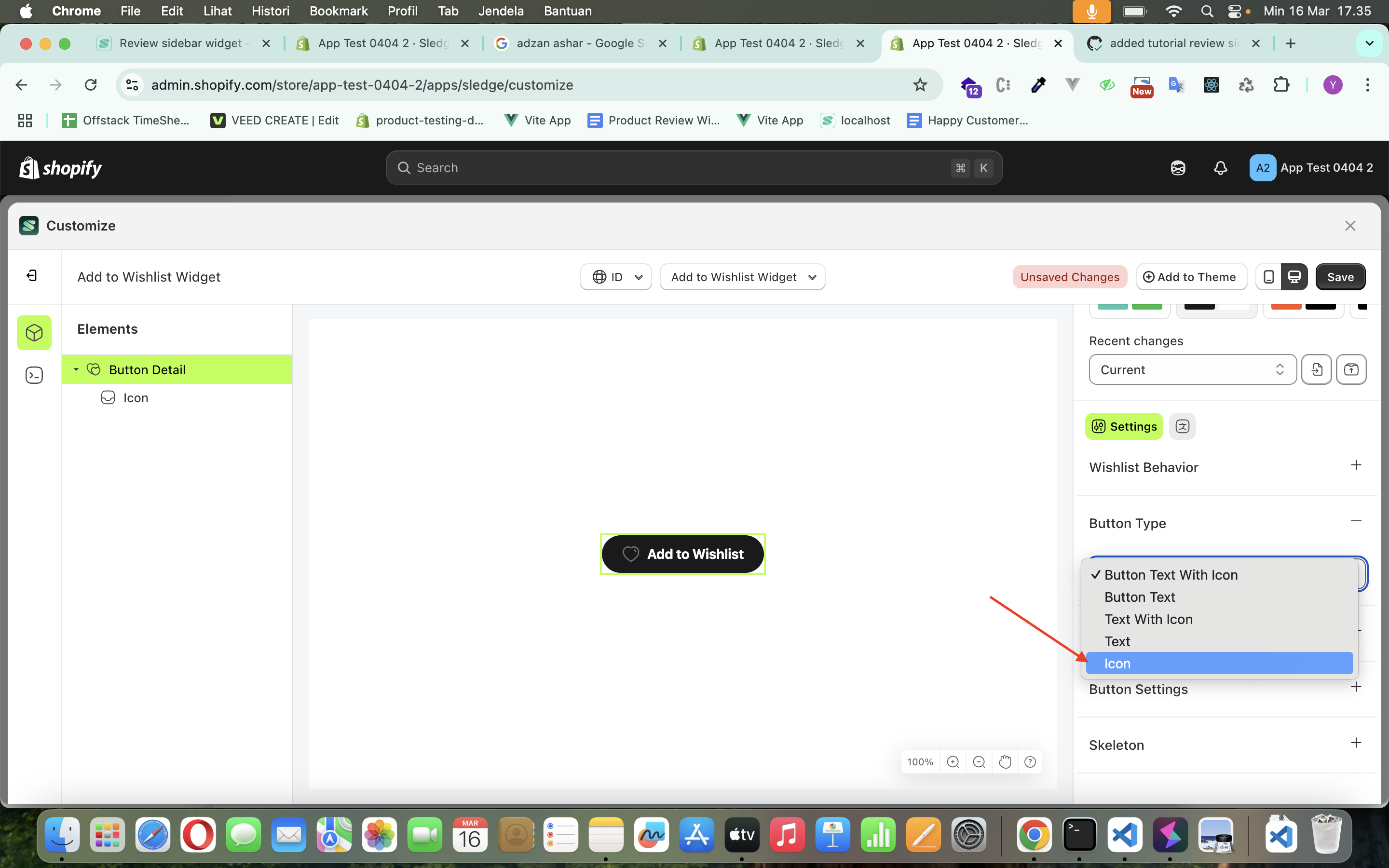
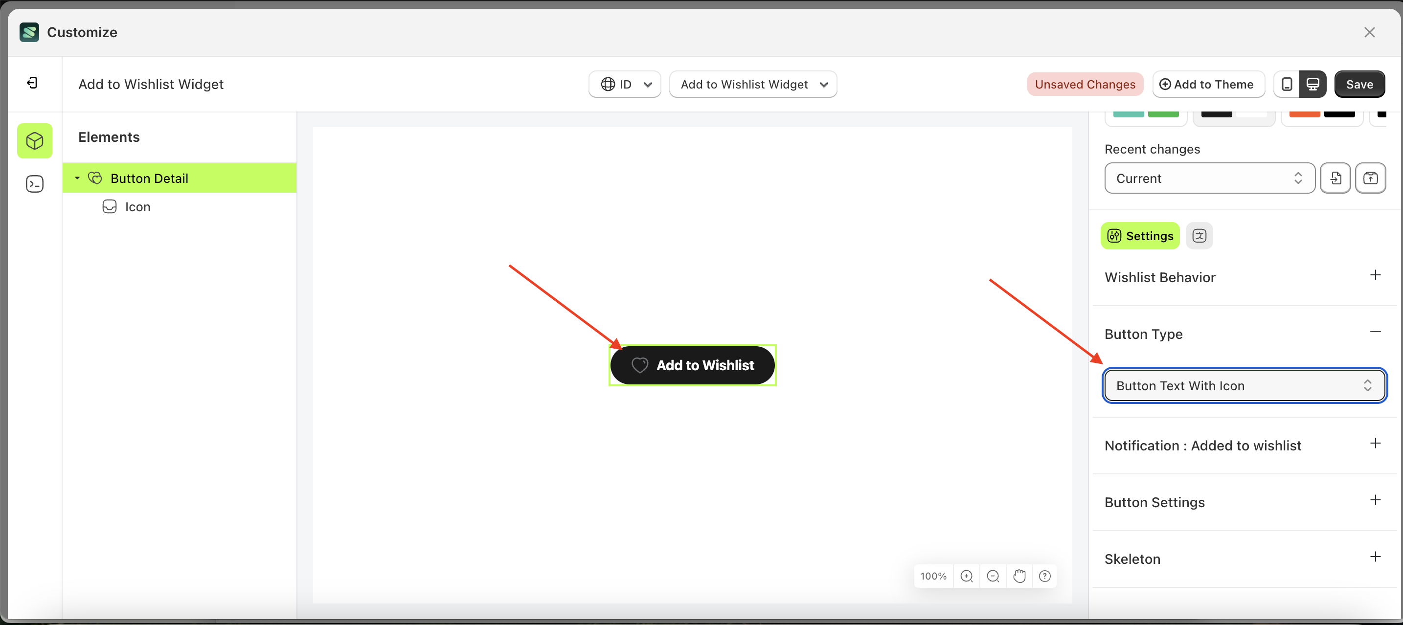
- Select the Button Detail element on the left, then click the Settings tab and click the icon marked with a red arrow.
- On the right side, marked with a red arrow, you can change the button type to your desired value.
- Note: The button type format can be Button Text With Icon, Button Text, Text With Icon, Icon.
- Once the menu opens, select an option from the list
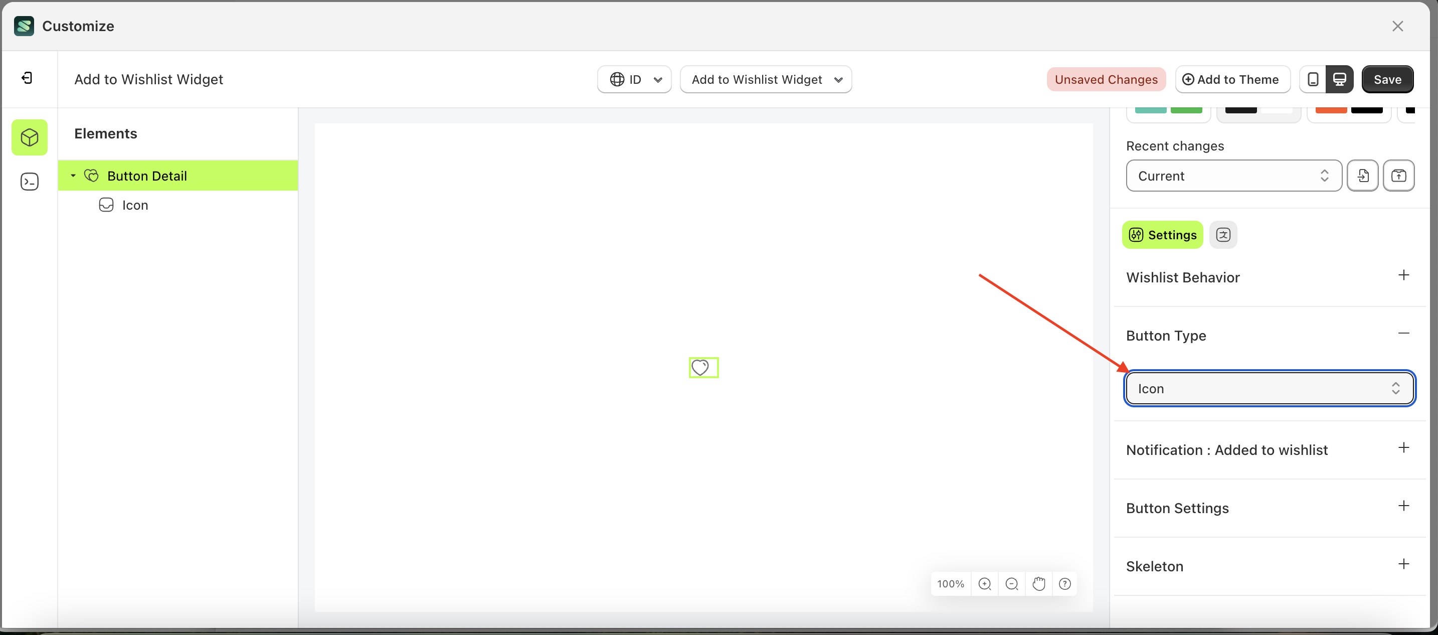
- For example, if you set the button type to icon
- The button type of the Button Detail element will adjust accordingly.
- Example : Before button type change settings
- Example : After button type change settings
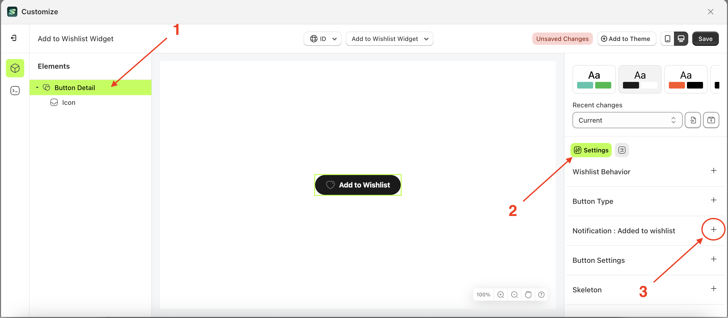
Notification - Added to wishlist
Available settings:
Show Notification after item added to wishlist
This feature is used to control whether a notification appears after performing the Add to Wishlist action. If the checkbox is enabled, a notification will be displayed; otherwise, it will not.
Follow the steps below:
- Select the Button Detail element on the right, then click the Settings tab and click the icon marked with a red arrow.
- Enable the Show Notification after item added to wishlist checkbox
- Example : Before Show Notification after item added to wishlist is enabled
- Example : After Show Notification after item added to wishlist is enabled
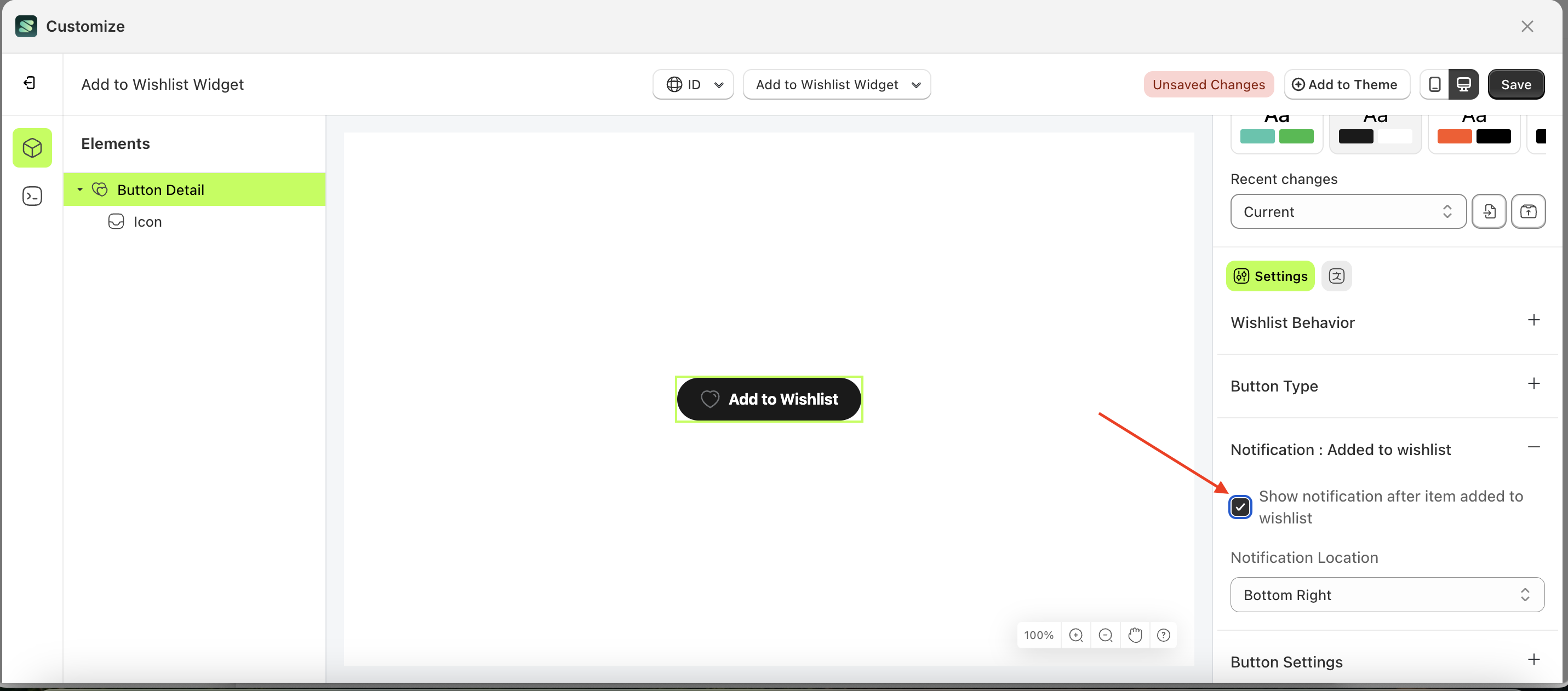
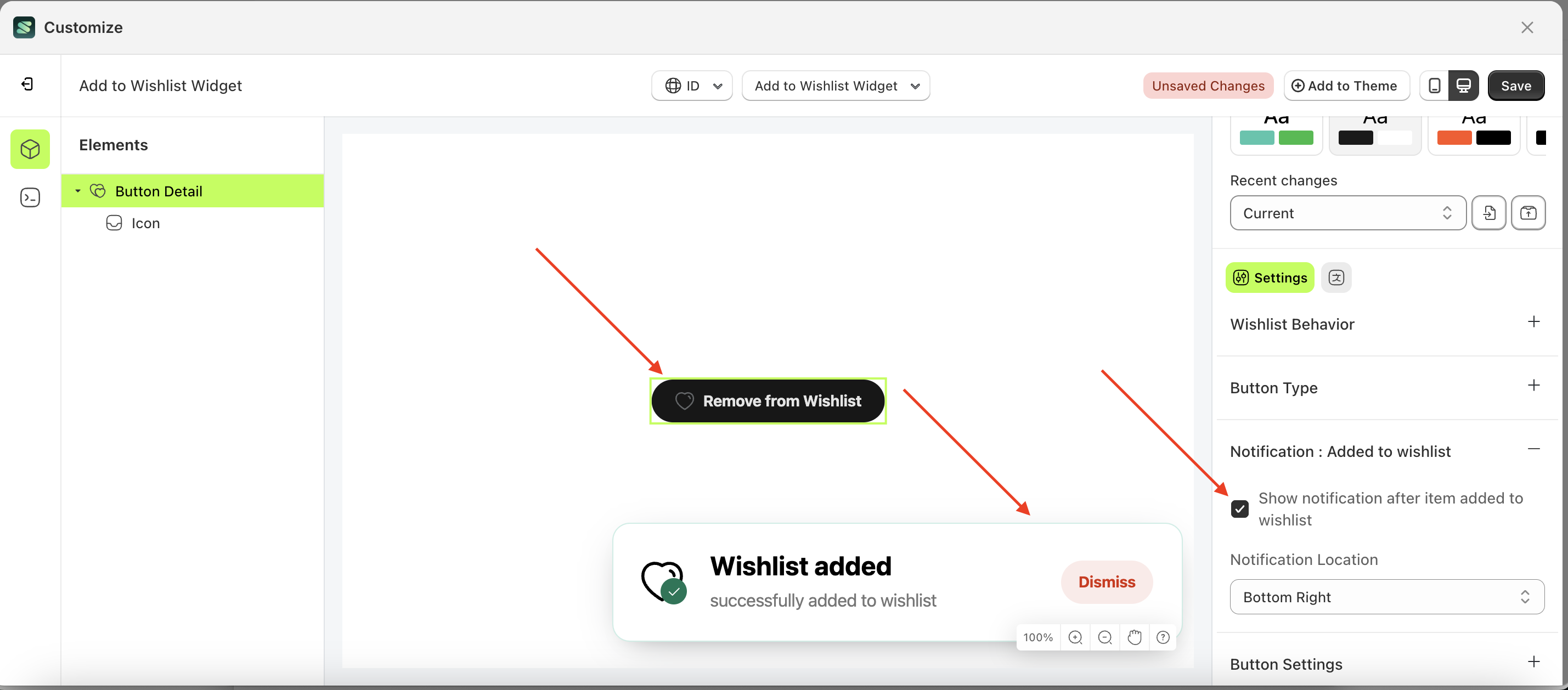
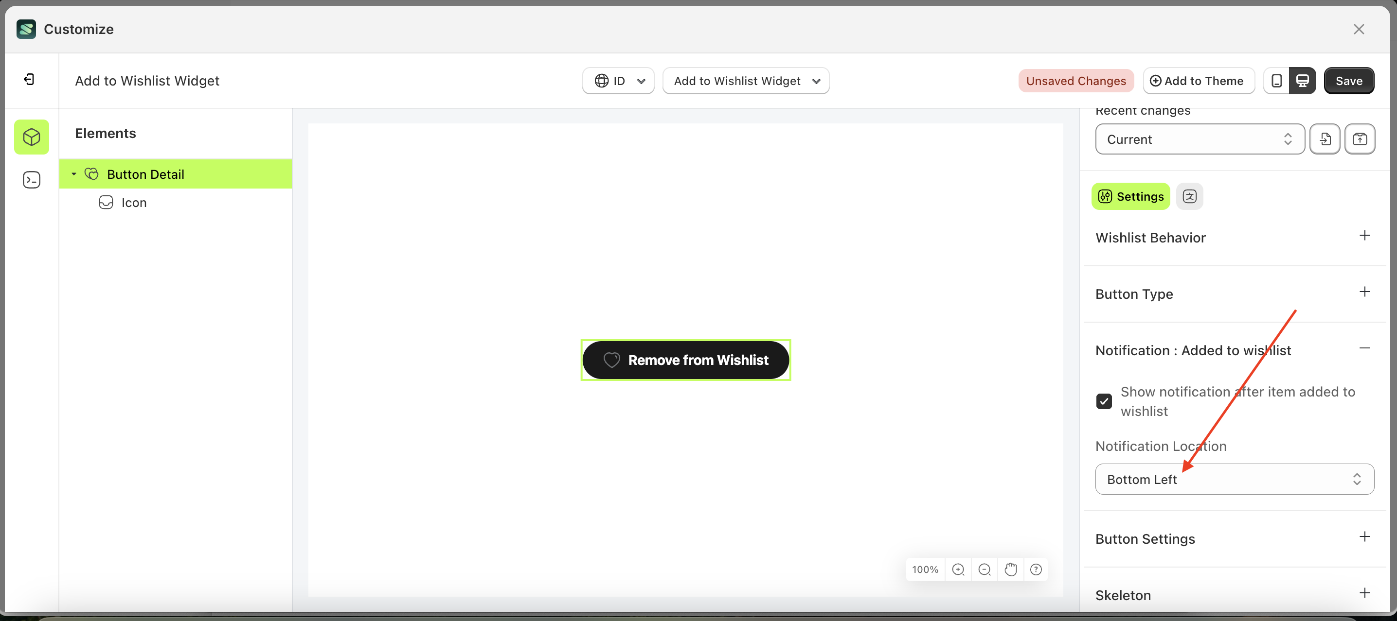
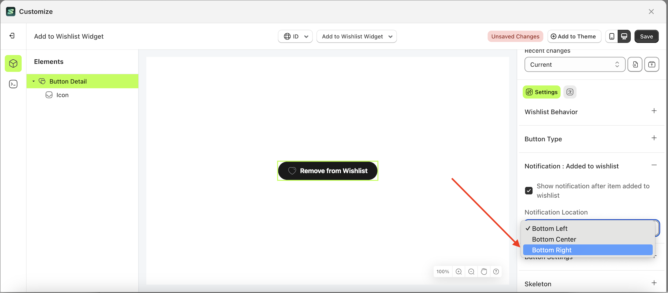
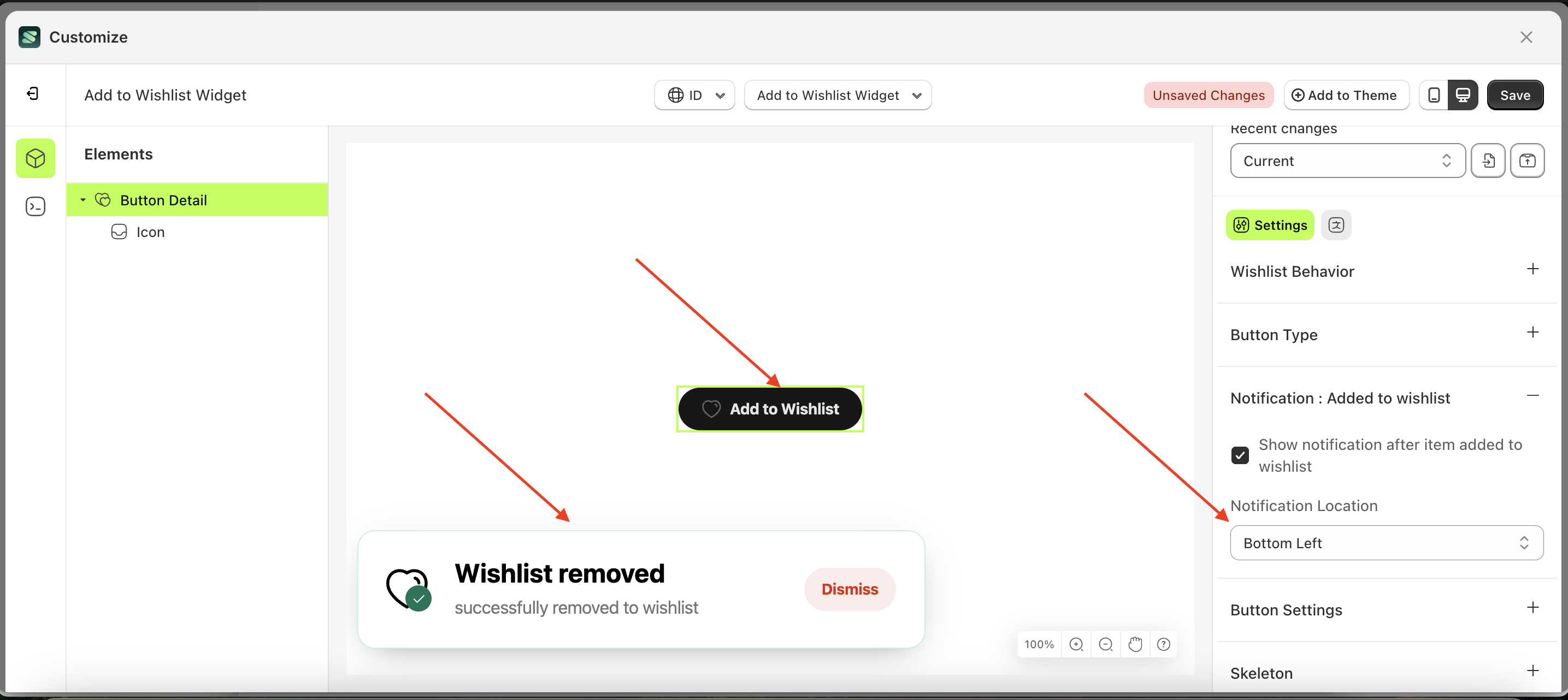
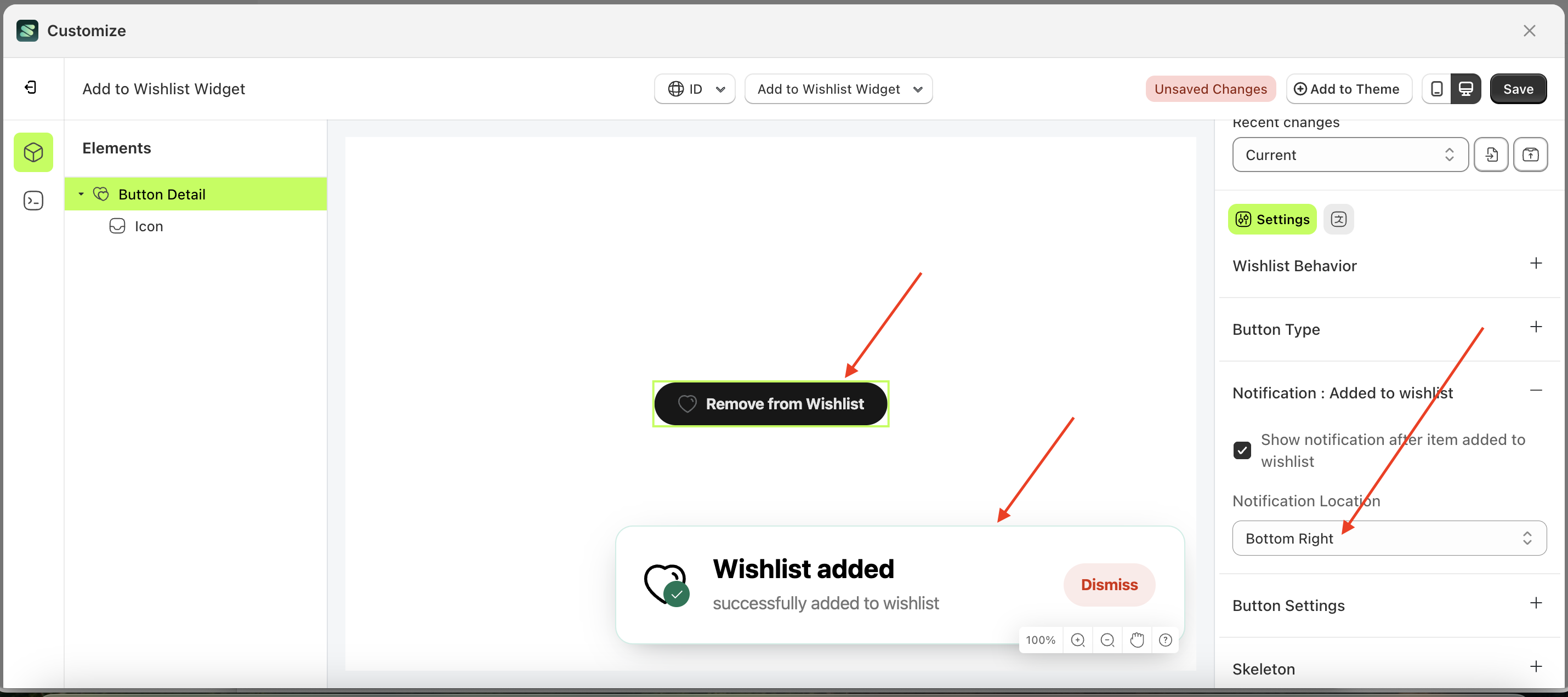
Notification Location
This feature is designed to control the position of the Add to Wishlist notification. However, it requires enabling the "Show notification after item added to wishlist" checkbox.
Follow the steps below:
- Select the Button Detail element on the left, then click the Settings tab and click the icon marked with a red arrow.
- On the right side, marked with a red arrow, you can change the notification location to your desired value.
- Note: The notification location format can be Button Text With Icon, Button Text, Text With Icon, Icon.
- Once the menu opens, select an option from the list
- For example, if you set the notification location to Button Right
- The notification location of the Button Detail element will adjust accordingly.
- Example : Before notification location change settings
- Example : After notification location change settings
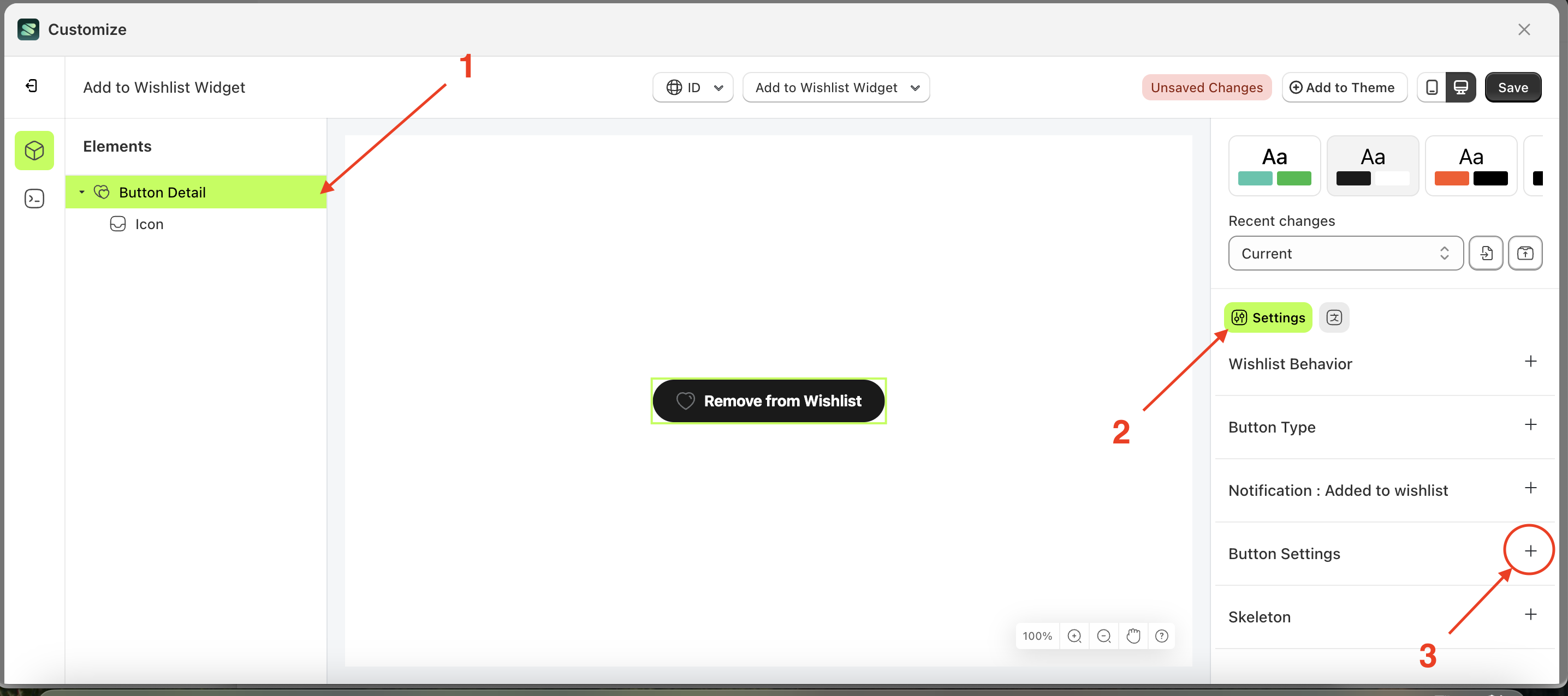
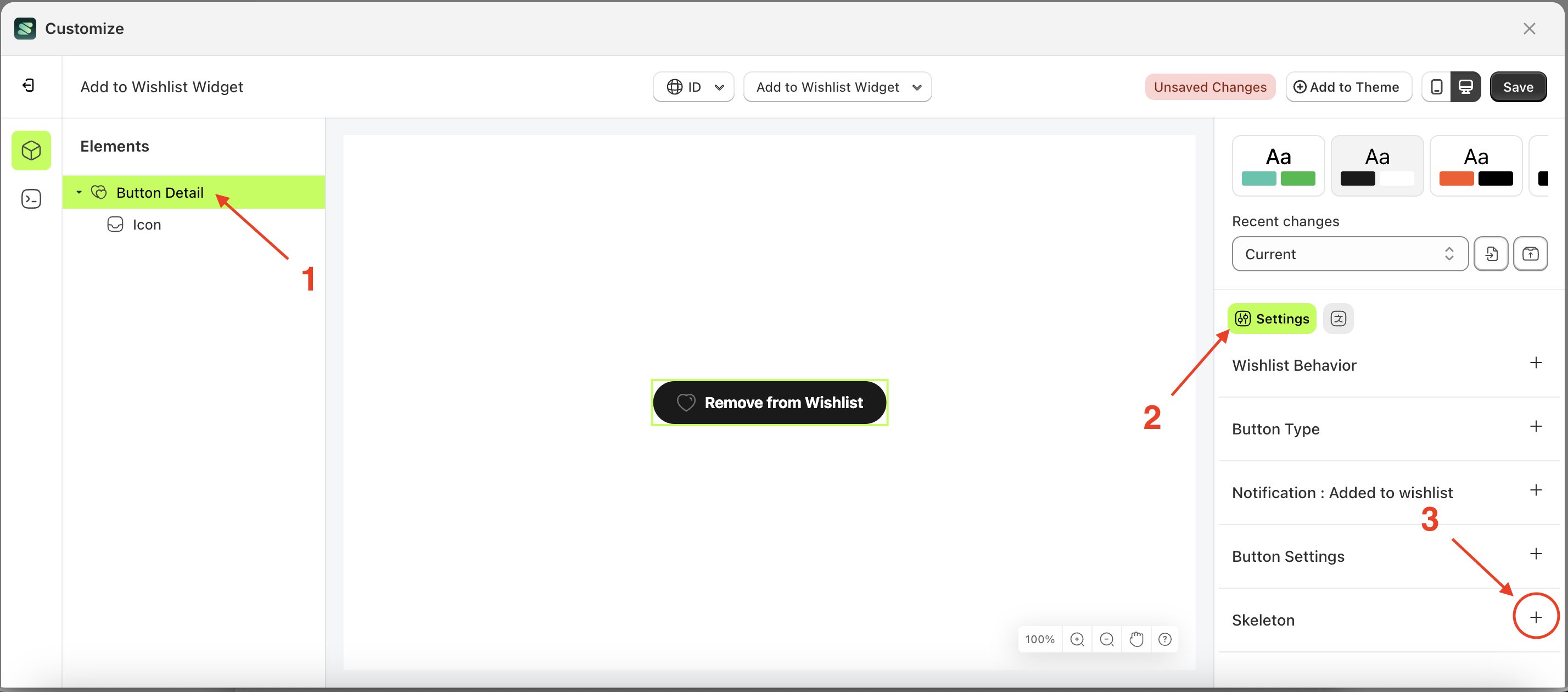
Button Settings Load More
Available settings:
Text Color Load MoreBorder Color Load MoreBackground Color Load MorePadding Top Load MorePadding Right Load MorePadding Bottom Load MorePadding Left Load MoreBorder Radius Load MoreFont Size Load MoreFont Weight Load MoreText Transform Load More
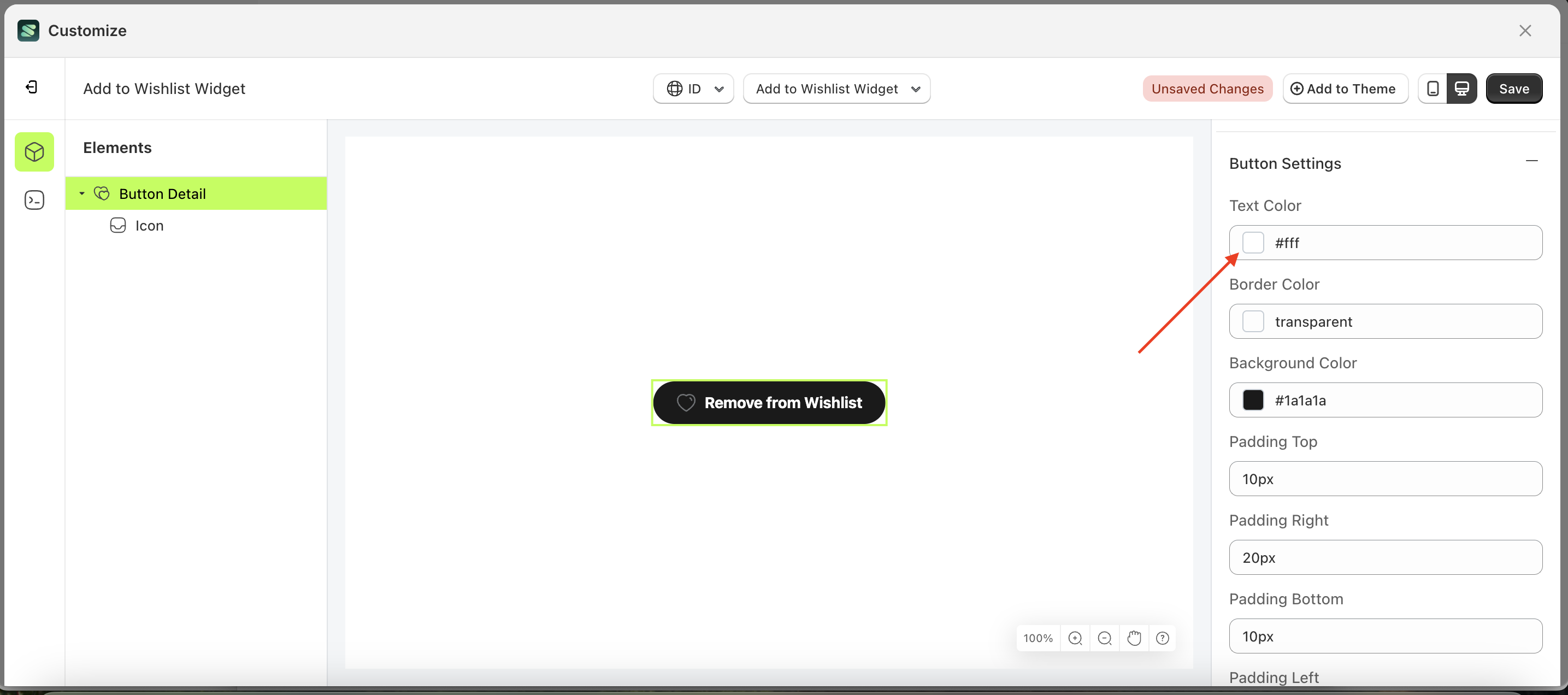
Text Color Load More
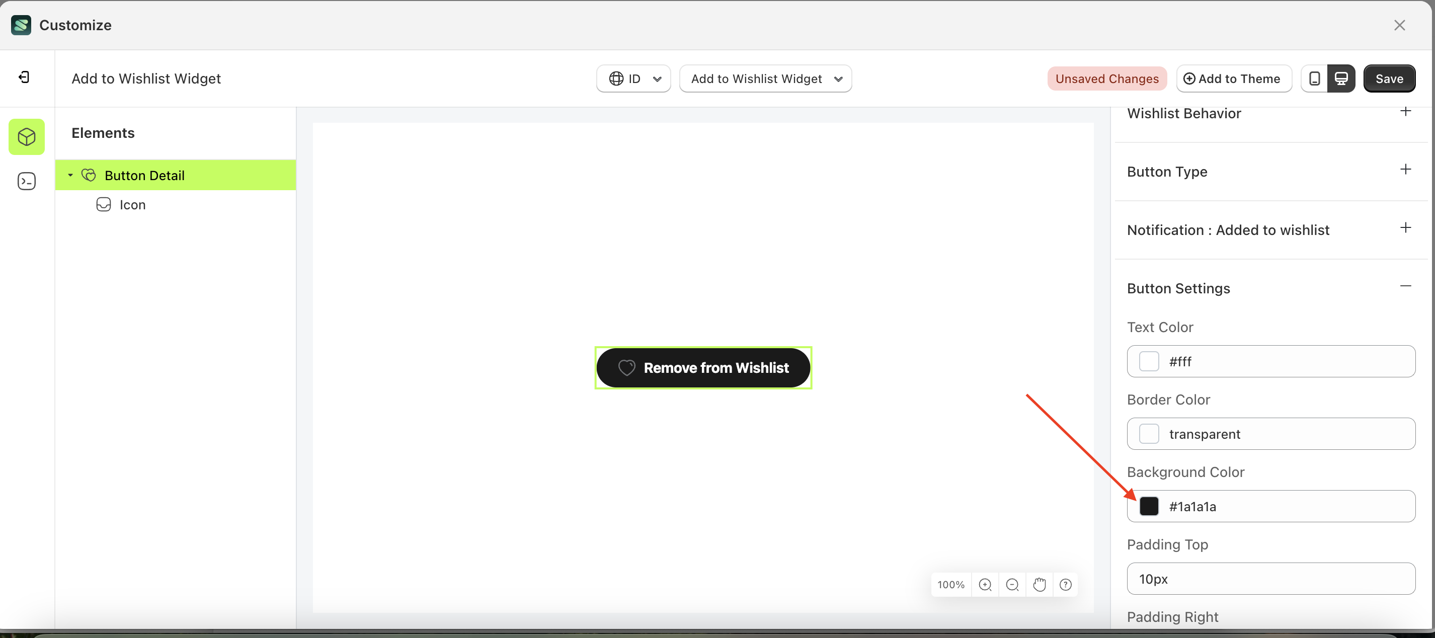
This feature is designed to customize the text color of the button settings
Follow the steps below:
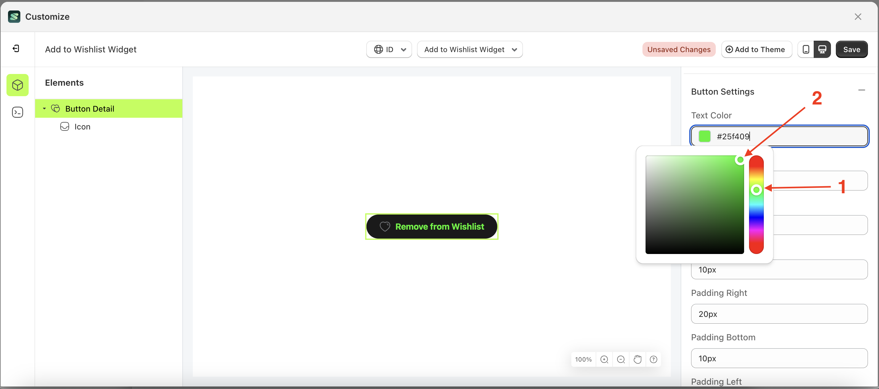
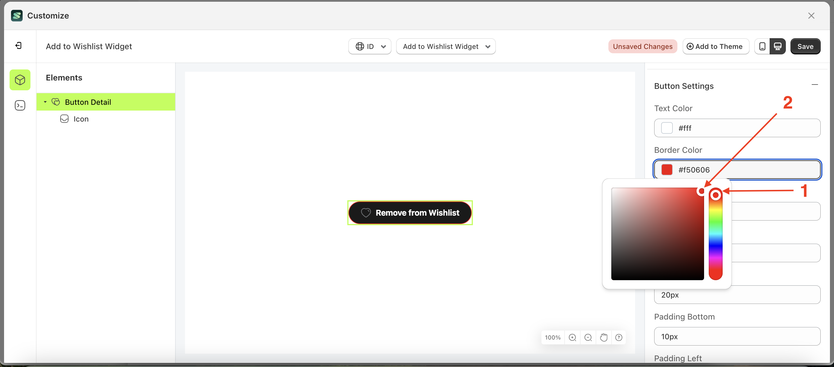
- Select the Button Detail element on the left, then click the Settings tab and click the icon marked with a red arrow.
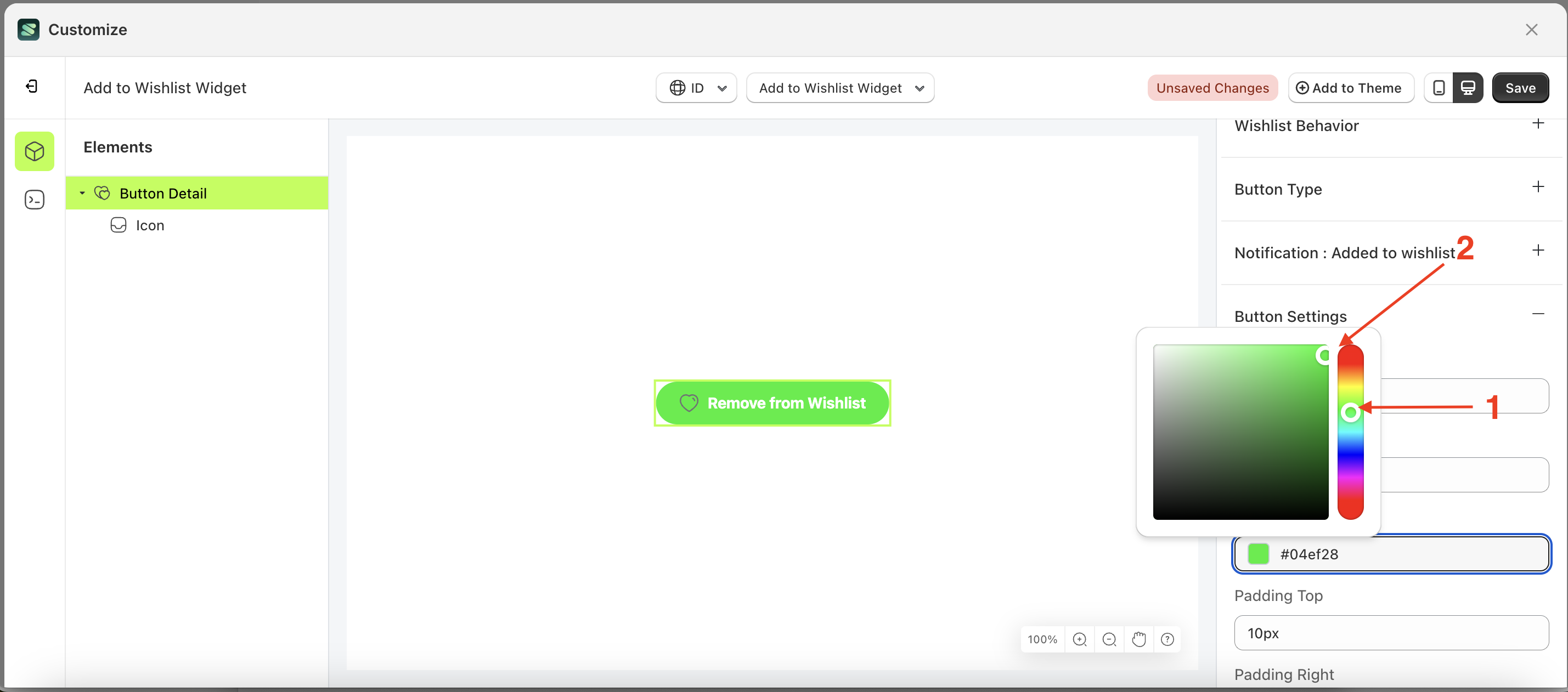
- Click the Color Palette on the right side, which is also marked with a red arrow.
- The Color Palette will appear. Click the right side of the palette where the red arrow and number 1 are indicated, then click the right side again where the red arrow and number 2 are marked.
- The add to wishlist widget of the Button Detail element will adjust accordingly.
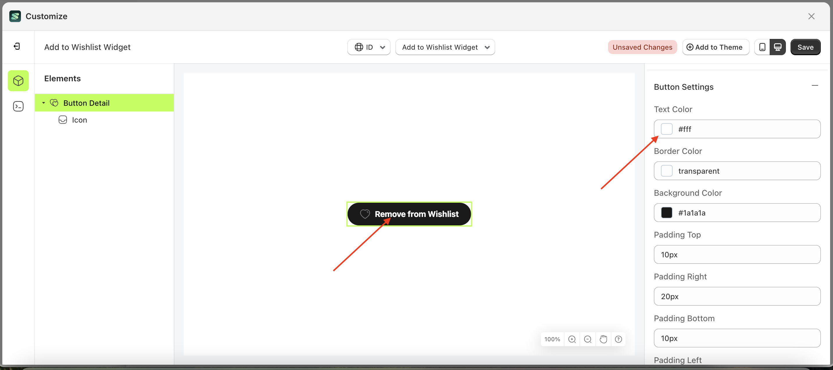
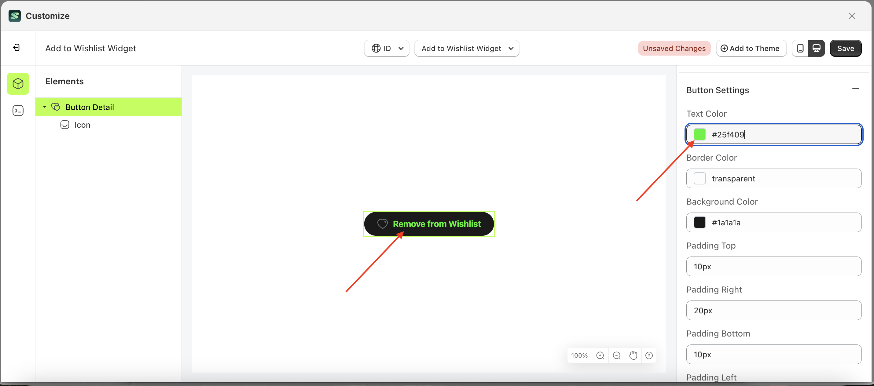
- Example : Before Button Detail change settings
- Example : After Button Detail change settings
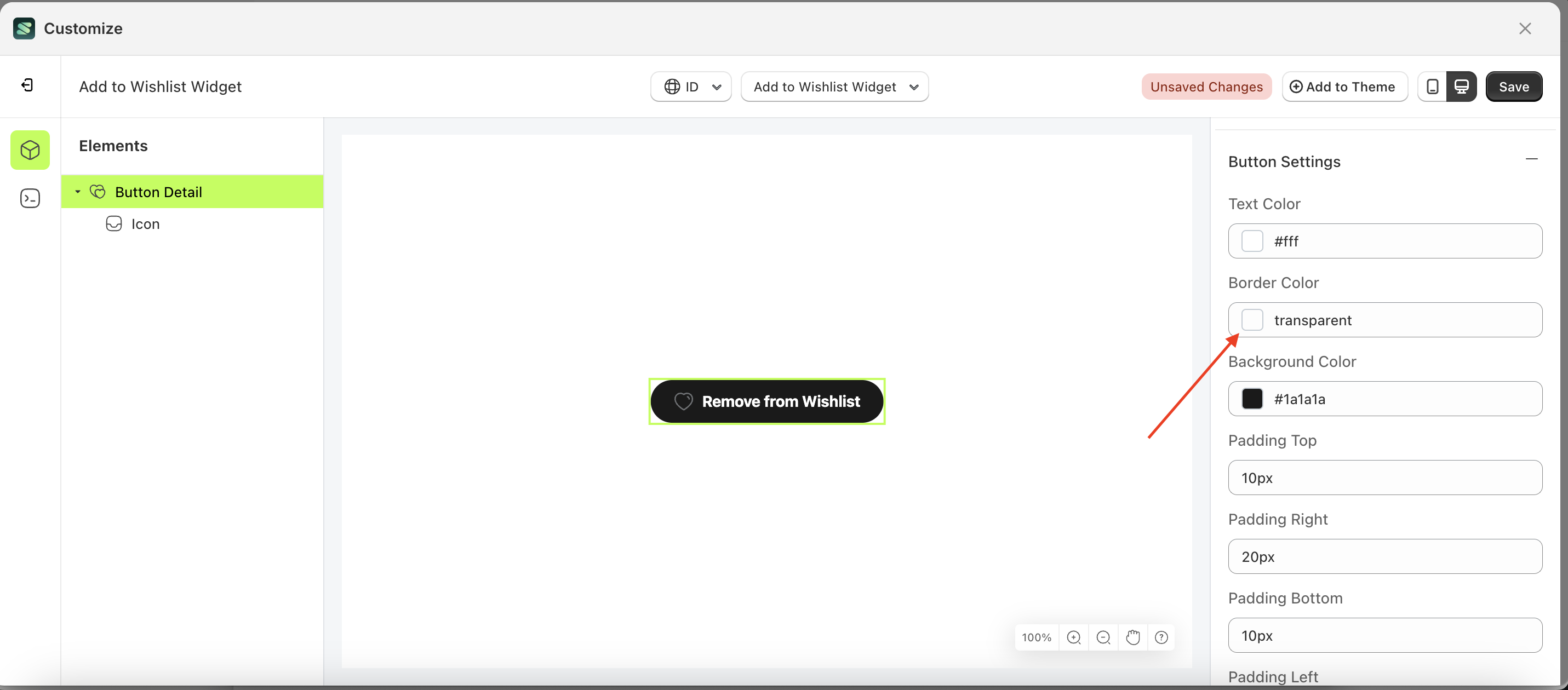
Border Color Load More
This feature is designed to customize the border color of the button settings
Follow the steps below:
- Select the Button Detail element on the left, then click the Settings tab and click the icon marked with a red arrow.
- Click the Color Palette on the right side, which is also marked with a red arrow.
- The Color Palette will appear. Click the right side of the palette where the red arrow and number 1 are indicated, then click the right side again where the red arrow and number 2 are marked.
- The add to wishlist widget of the Button Detail element will adjust accordingly.
- Example : Before Button Detail change settings
- Example : After Button Detail change settings
Background Color Load More
This feature is designed to customize the background color of the button settings
Follow the steps below:
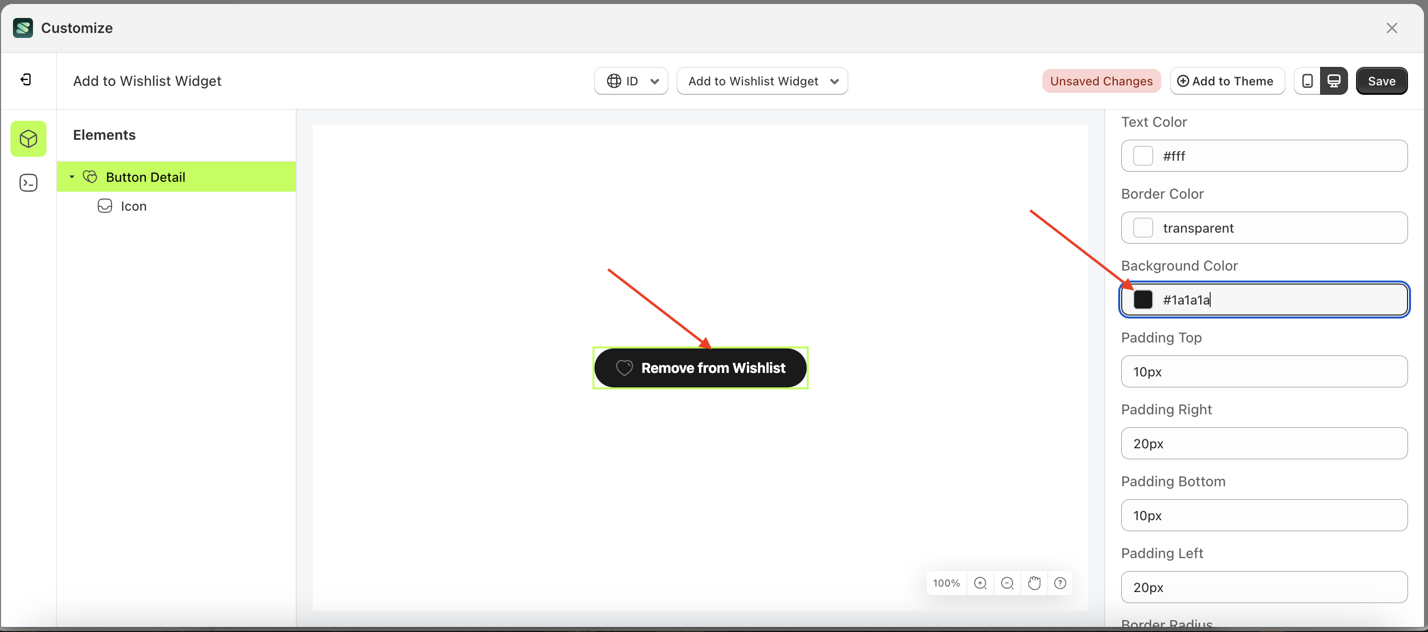
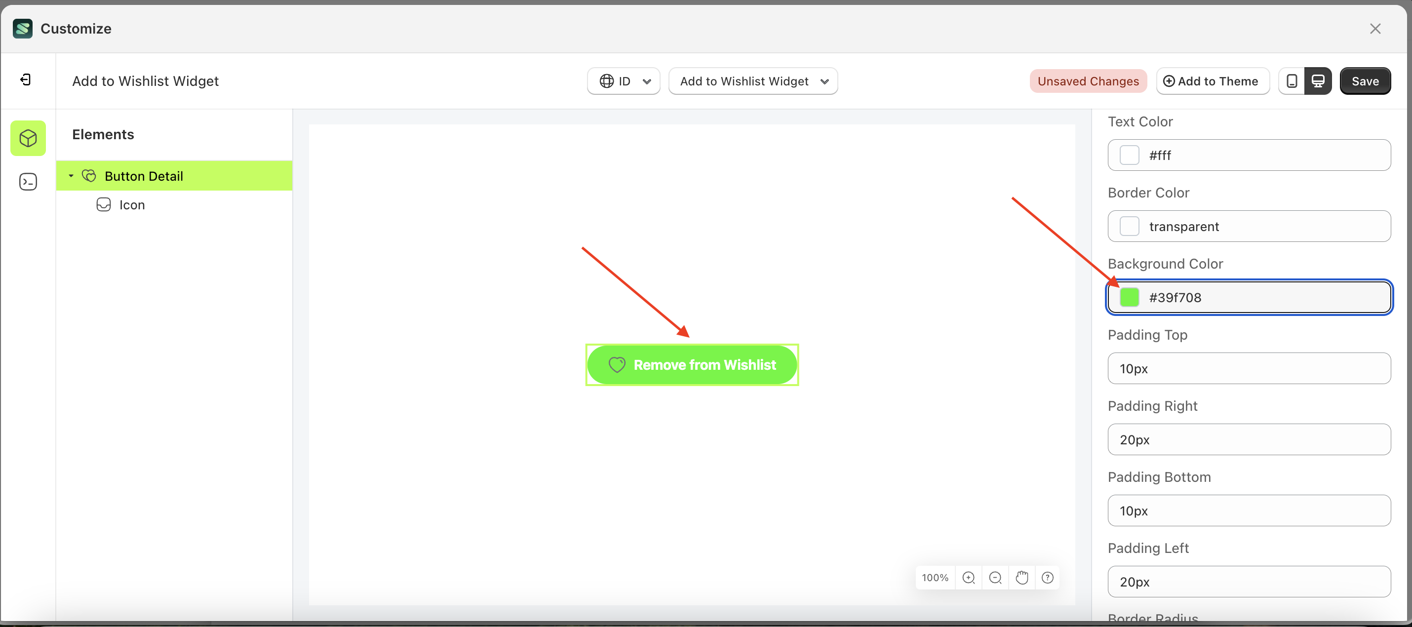
- Select the Button Detail element on the left, then click the Settings tab and click the icon marked with a red arrow.
- Click the Color Palette on the right side, which is also marked with a red arrow.
- The Color Palette will appear. Click the right side of the palette where the red arrow and number 1 are indicated, then click the right side again where the red arrow and number 2 are marked.
- The add to wishlist widget of the Button Detail element will adjust accordingly.
- Example : Before Button Detail change settings
- Example : After Button Detail change settings
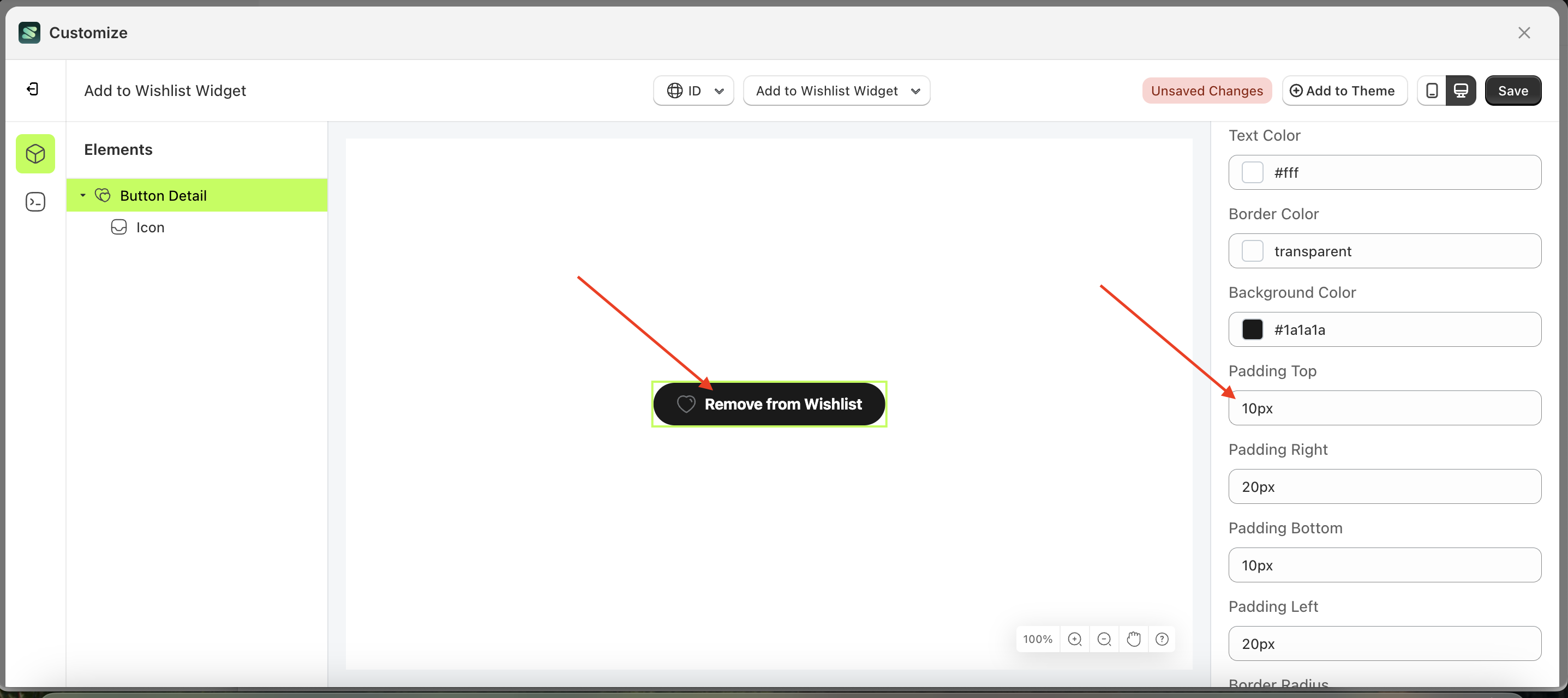
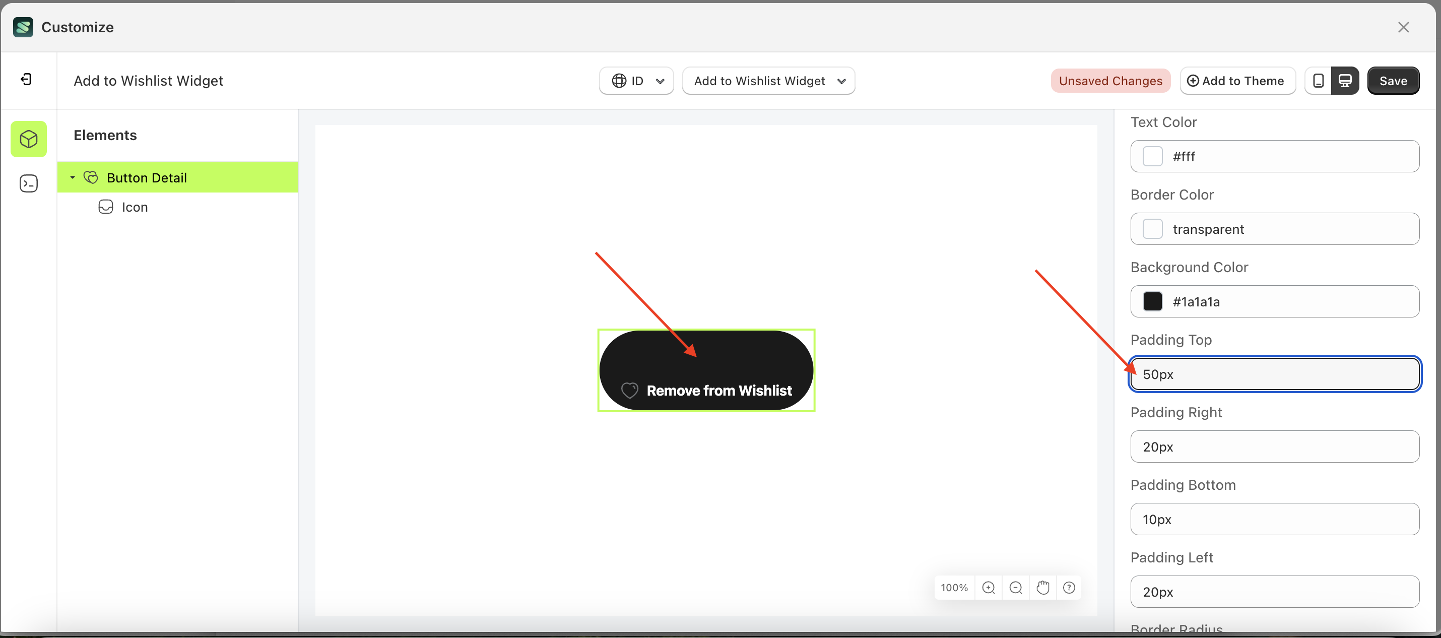
Padding top Load More
This feature is designed to customize the top padding of the button settings
Follow the steps below:
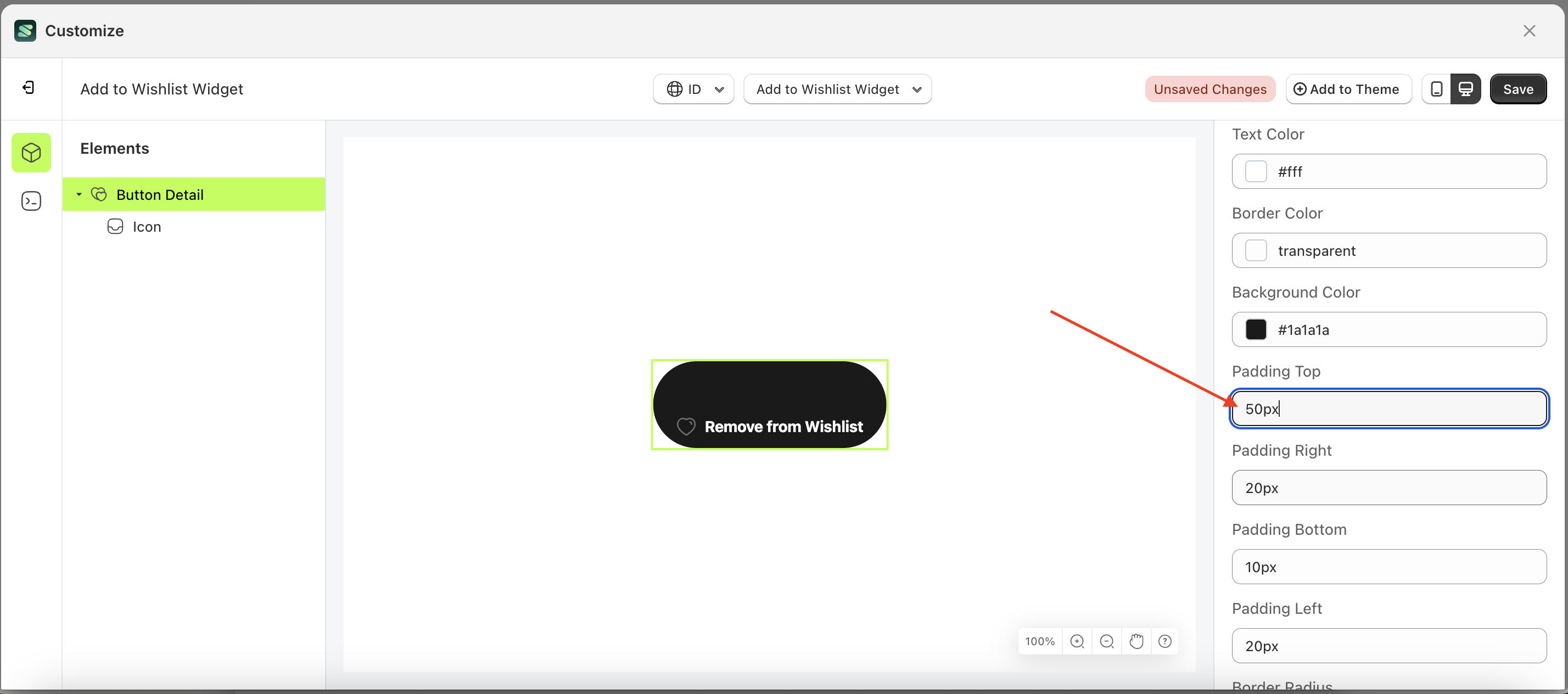
- Select the Button Detail element on the left, then click the Settings tab and click the icon marked with a red arrow.
- On the right side, marked with a red arrow, you can change the padding top to your desired value.
- Note: The padding top format can be px, em, rem, %, or other units..
- For example, if you set the padding top to 50px
- The padding top of the Button Detail element will adjust accordingly.
- Example : Before padding top change settings
- Example : After padding top change settings

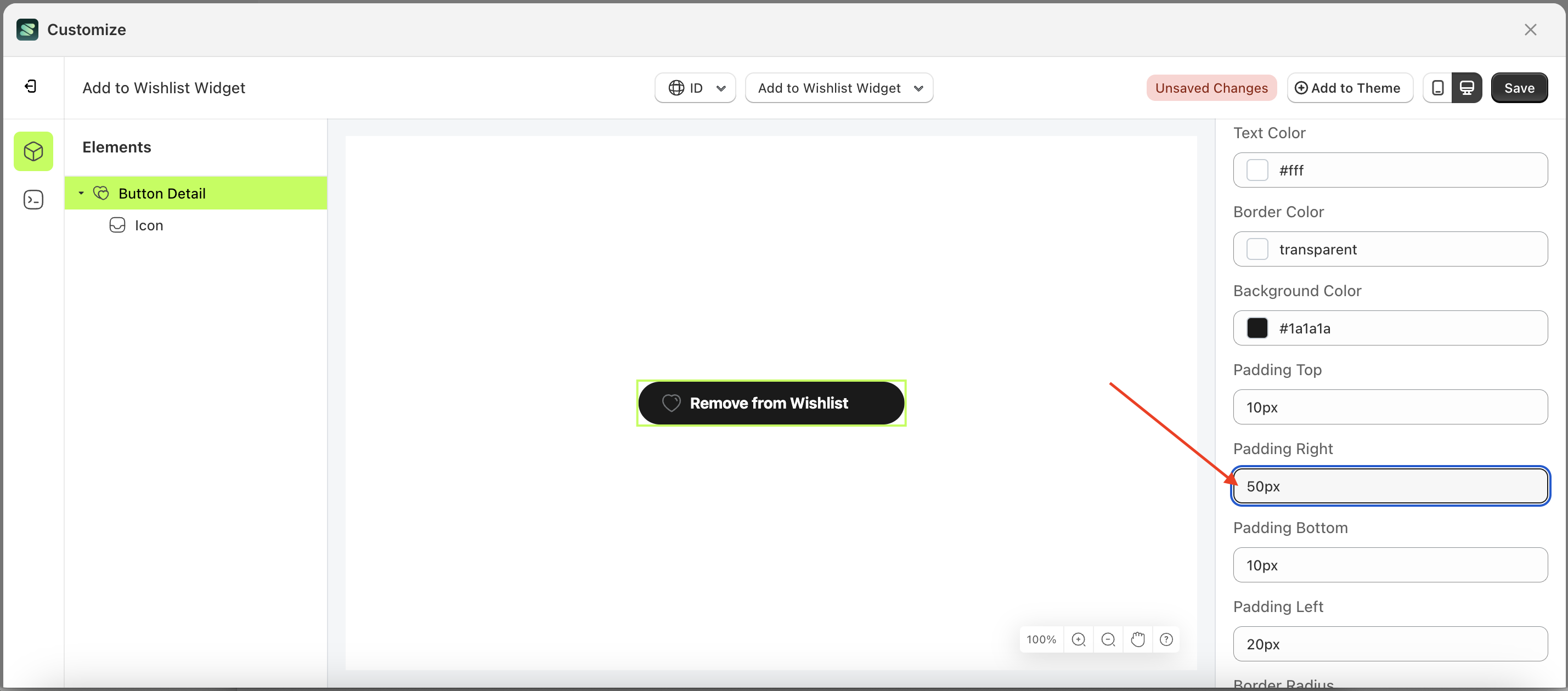
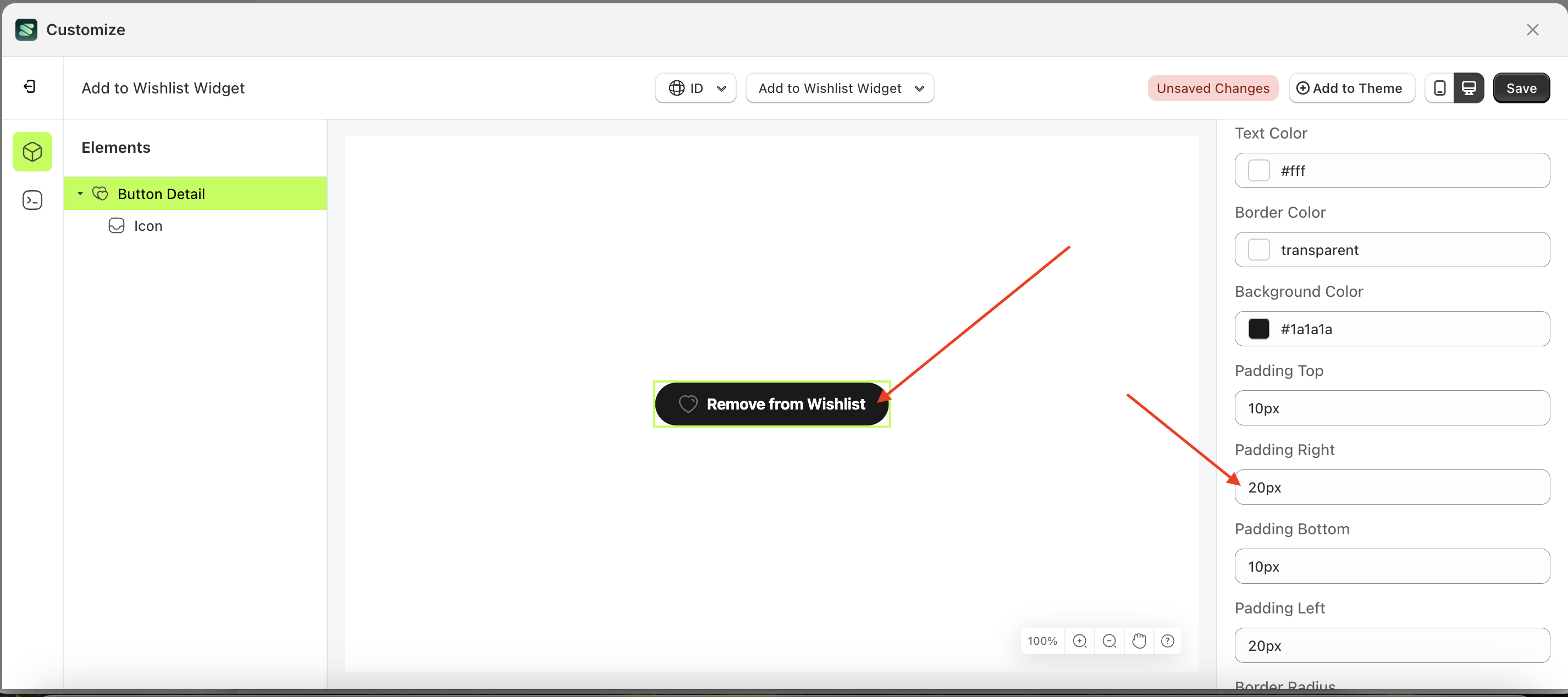
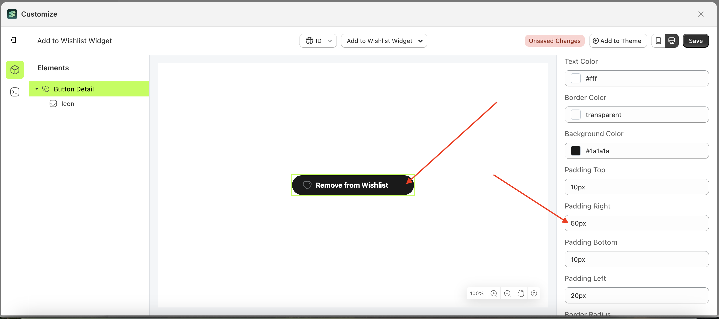
Padding right Load More
This feature is designed to customize the right padding of the button settings
Follow the steps below:
- Select the Button Detail element on the left, then click the Settings tab and click the icon marked with a red arrow.
- On the right side, marked with a red arrow, you can change the padding right to your desired value.
- Note: The padding right format can be px, em, rem, %, or other units..
- For example, if you set the padding right to 50px
- The padding right of the Button Detail element will adjust accordingly.
- Example : Before padding right change settings
- Example : After padding right change settings

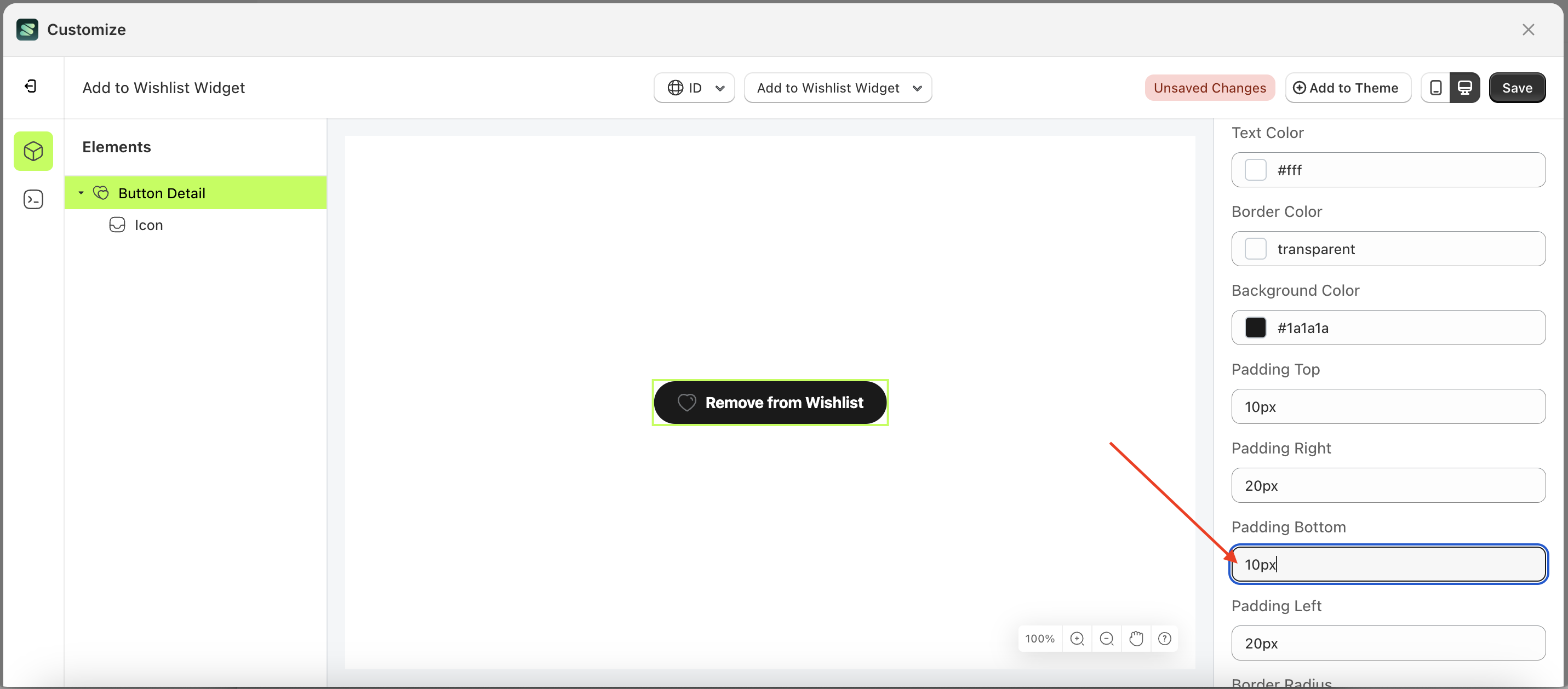
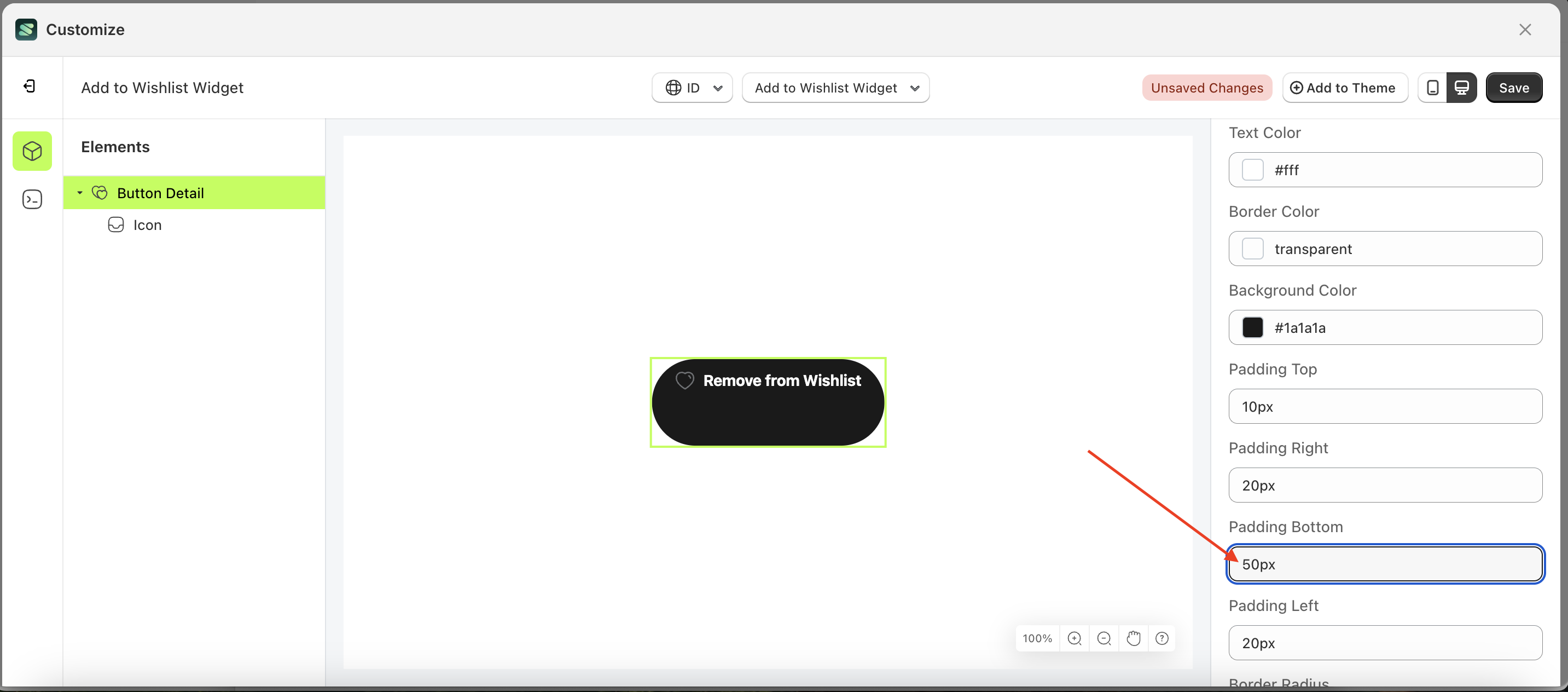
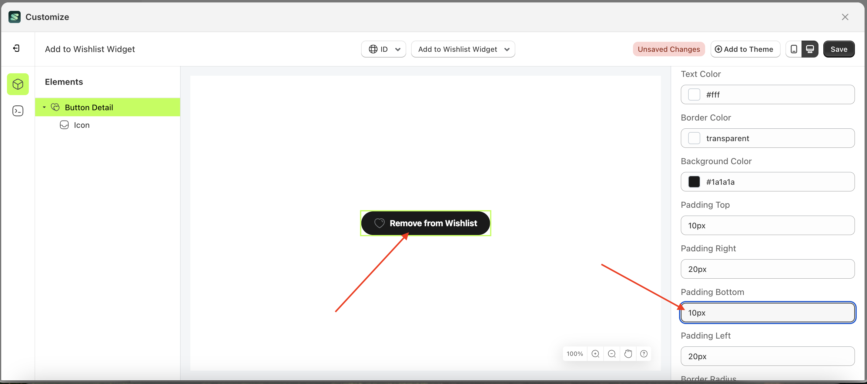
Padding bottom Load More
This feature is designed to customize the bottom padding of the button settings
Follow the steps below:
- Select the Button Detail element on the left, then click the Settings tab and click the icon marked with a red arrow.
- On the right side, marked with a red arrow, you can change the padding bottom to your desired value.
- Note: The padding bottom format can be px, em, rem, %, or other units..
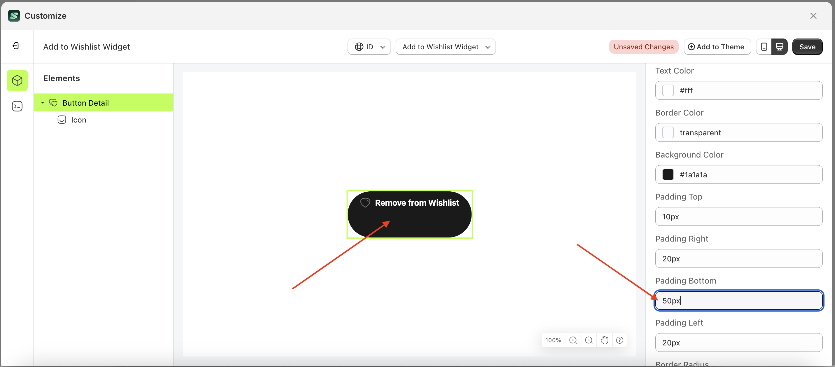
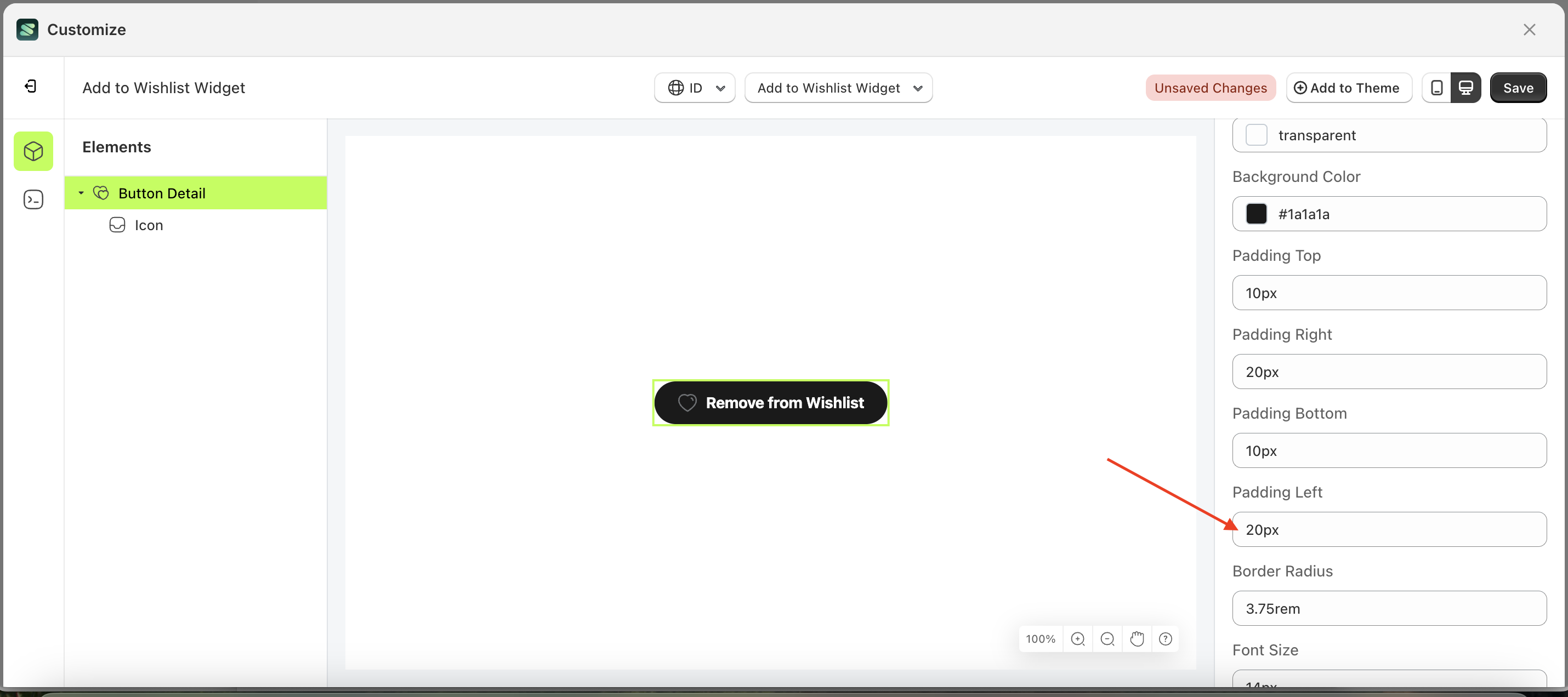
- For example, if you set the padding bottom to 50px
- The padding bottom of the Button Detail element will adjust accordingly.
- Example : Before padding bottom change settings
- Example : After padding bottom change settings
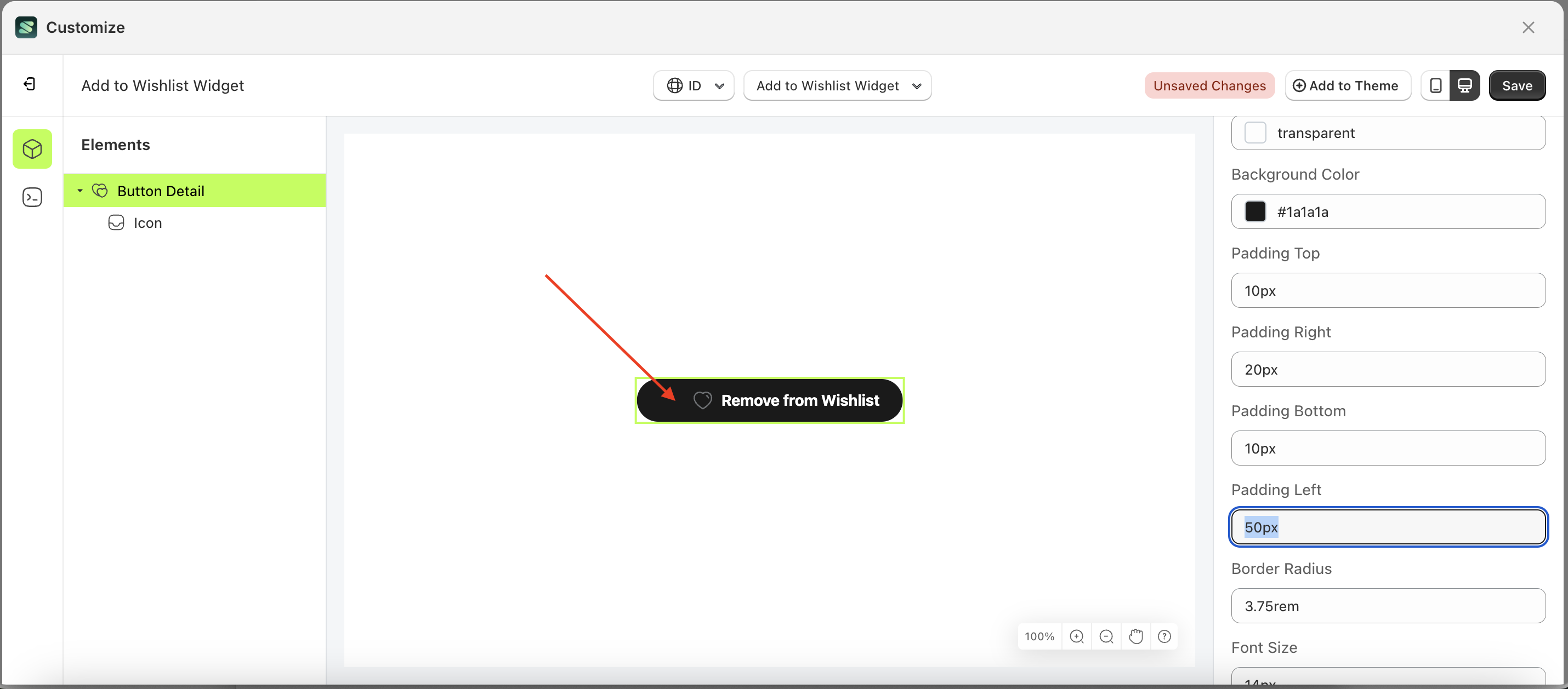
Padding left Load More
This feature is designed to customize the left padding of the button settings
Follow the steps below:
- Select the Button Detail element on the left, then click the Settings tab and click the icon marked with a red arrow.
- On the right side, marked with a red arrow, you can change the padding left to your desired value.
- Note: The padding left format can be px, em, rem, %, or other units..
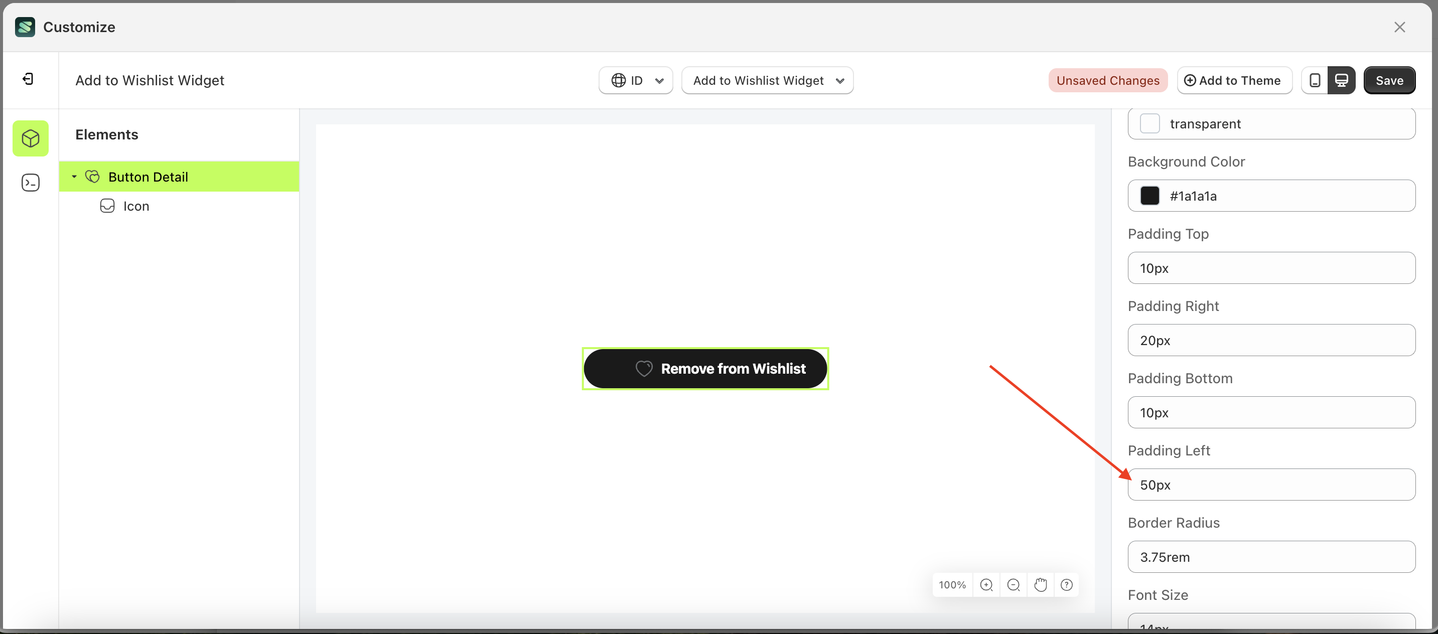
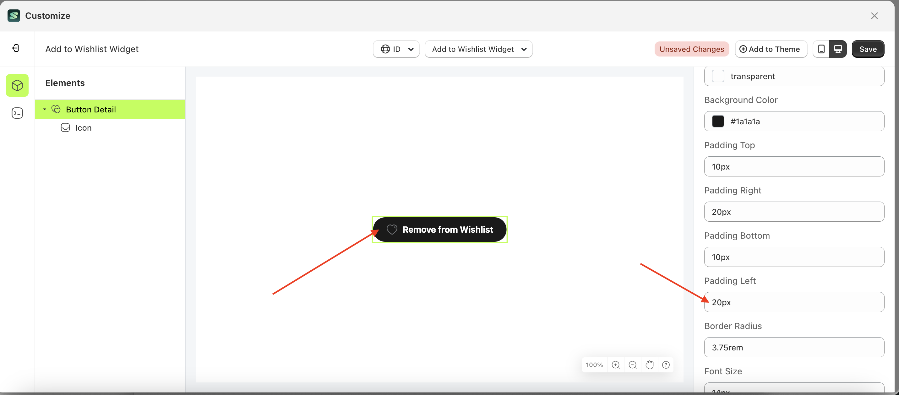
- For example, if you set the padding left to 50px
- The padding left of the Button Detail element will adjust accordingly.
- Example : Before padding left change settings
- Example : After padding left change settings
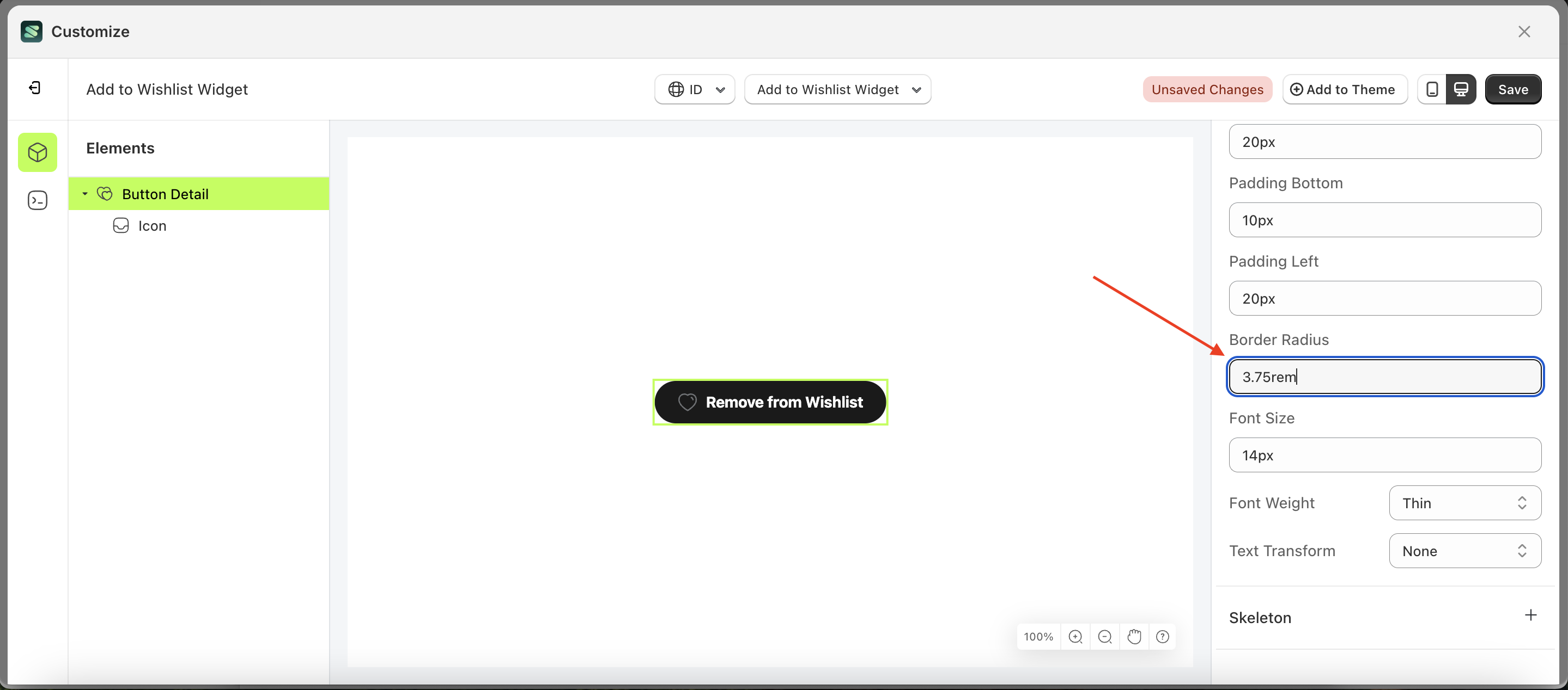
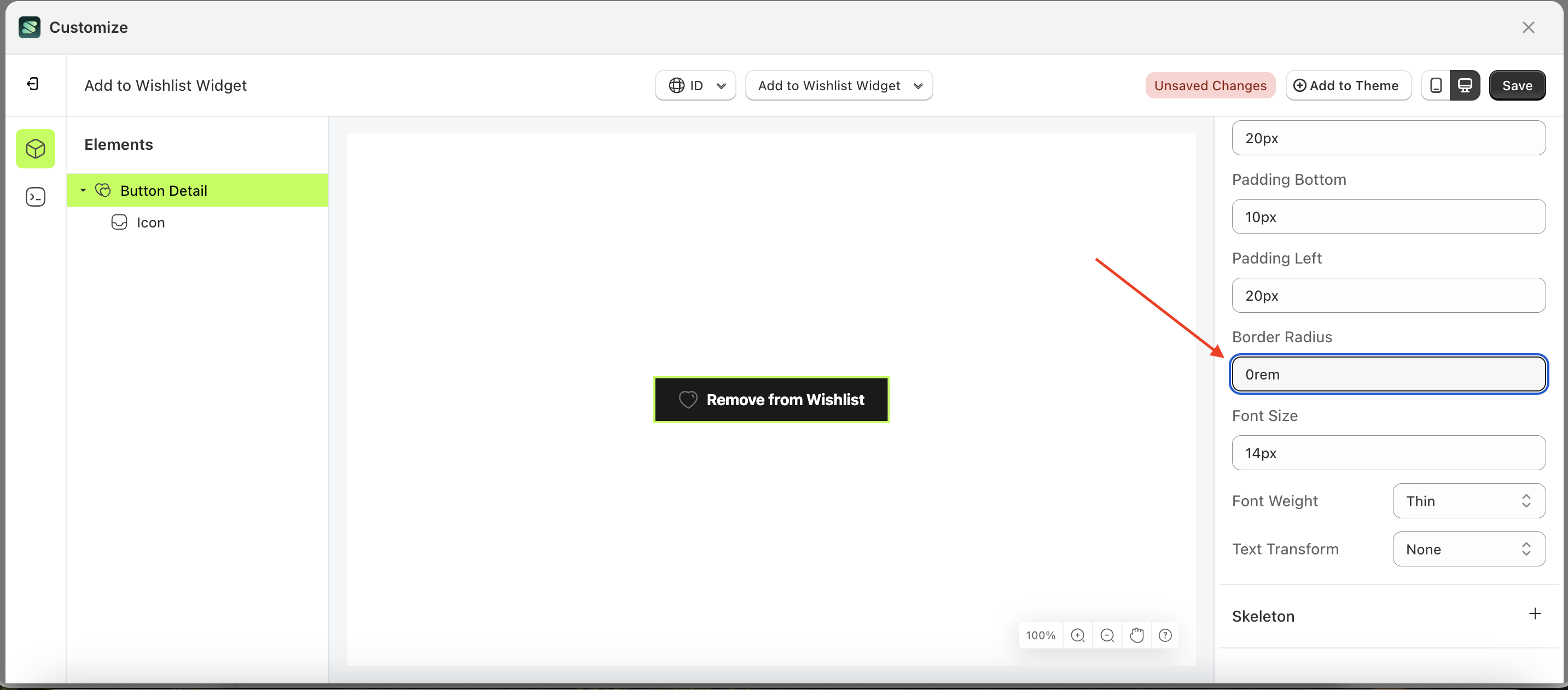
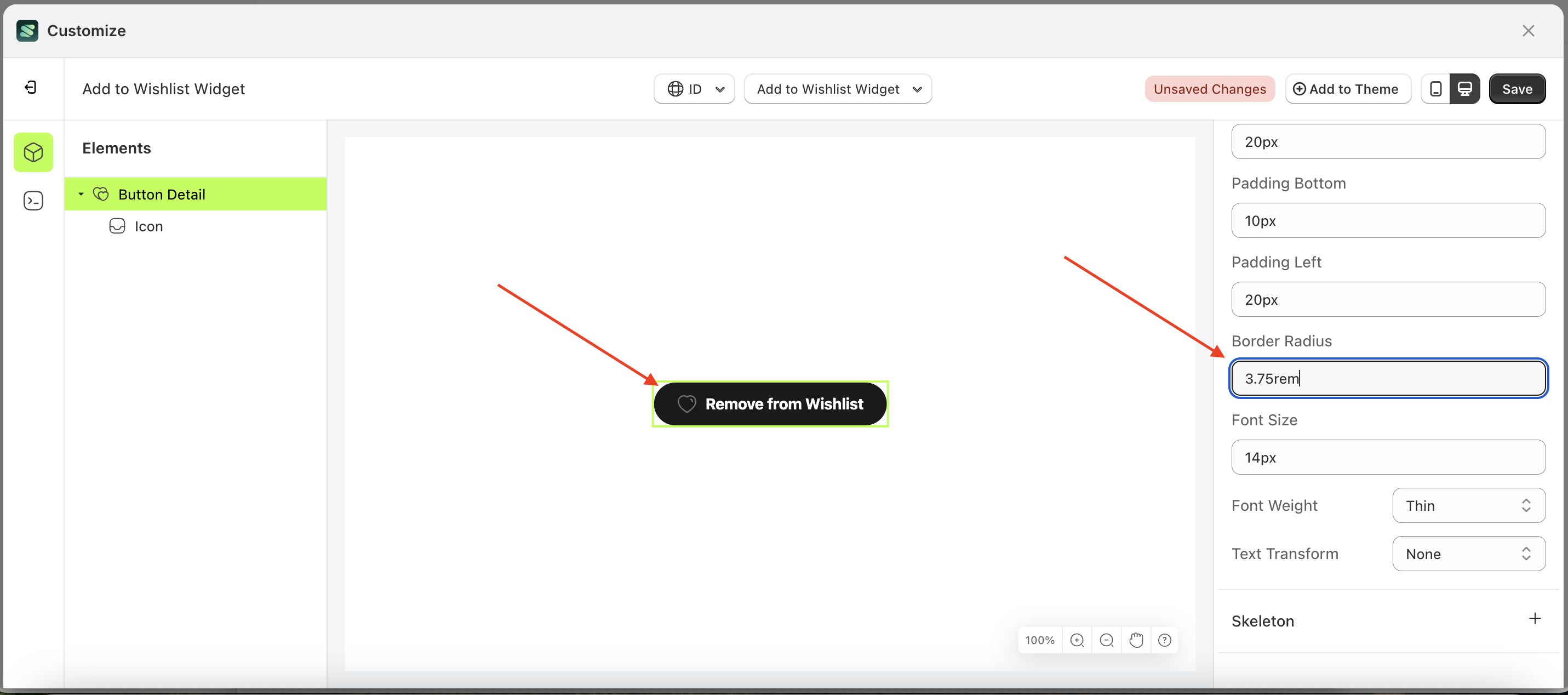
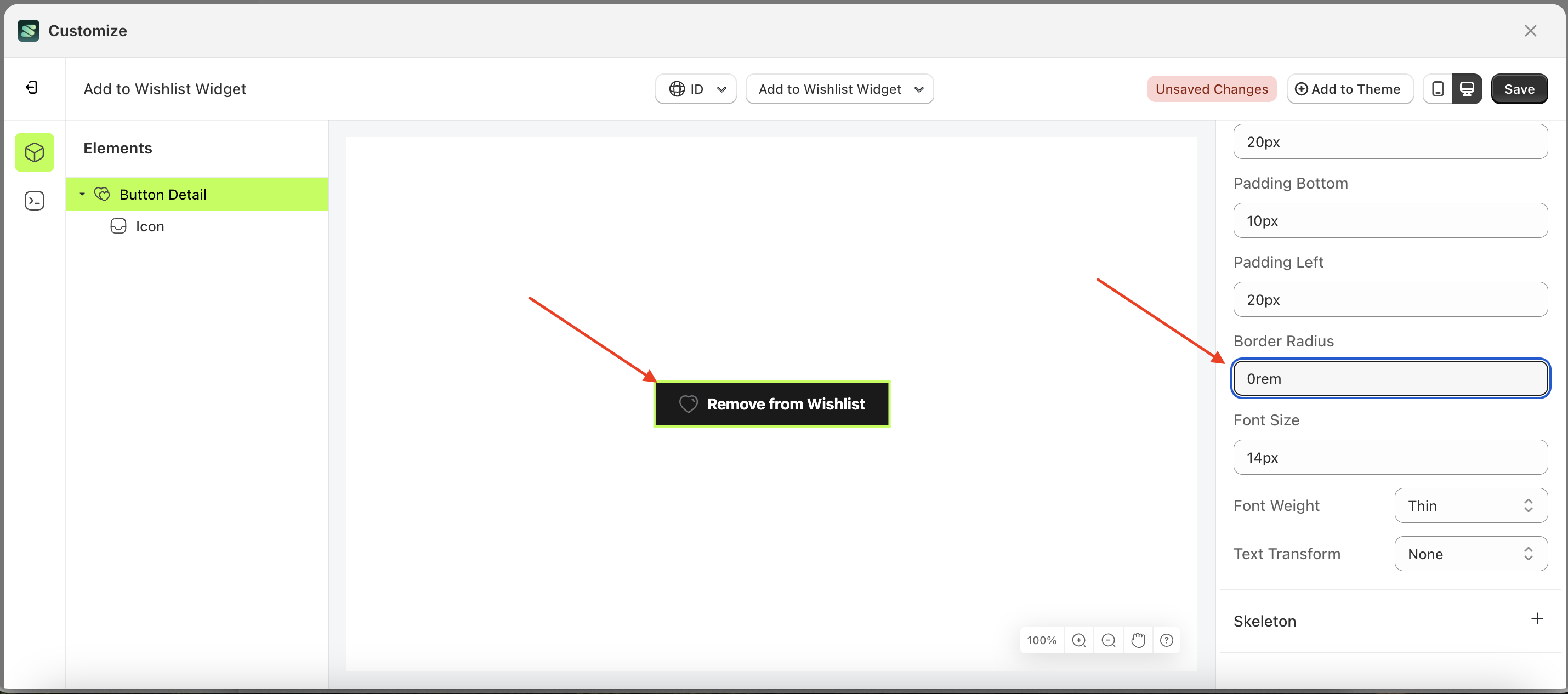
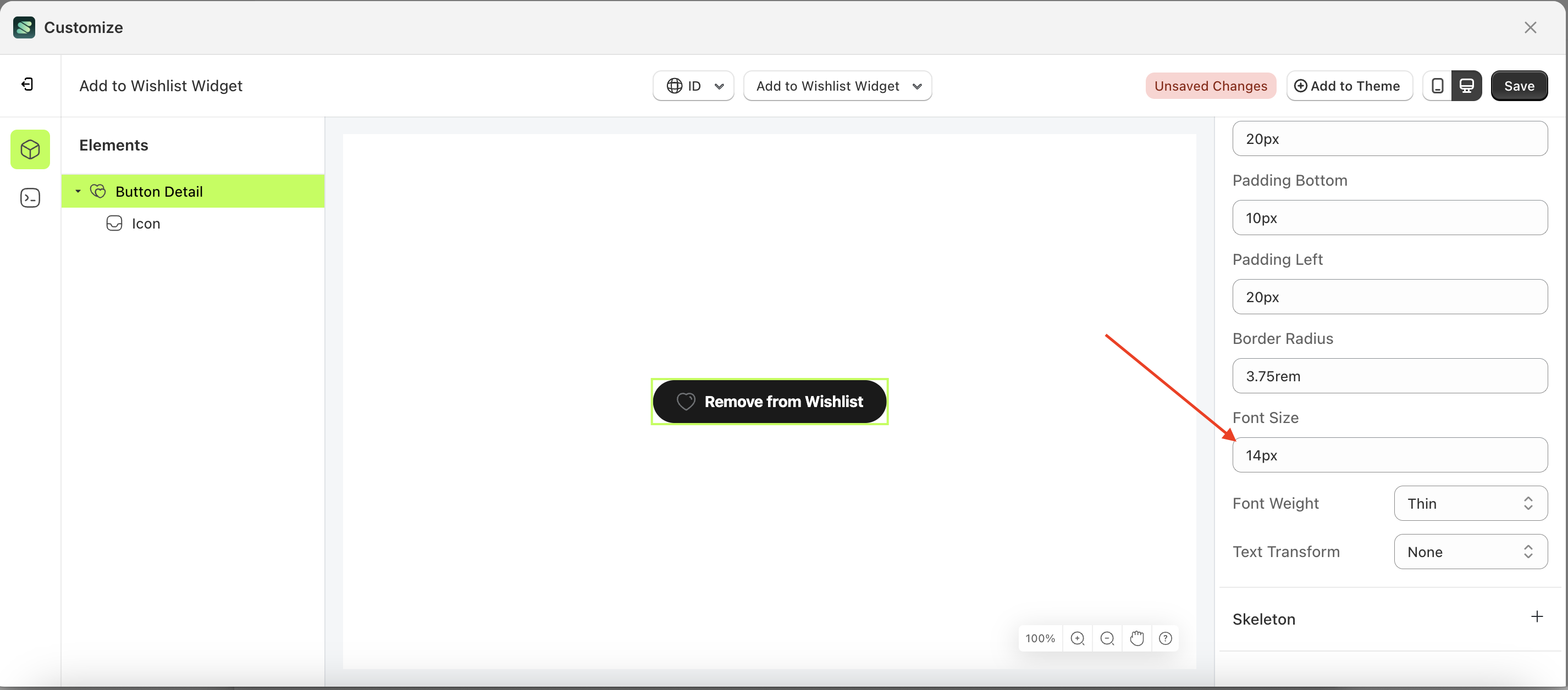
Border Radius Load More
This feature is designed to customize the corner radius of the button settings
Follow the steps below:
- Select the Button Detail element on the left, then click the Settings tab and click the icon marked with a red arrow.
- On the right side, marked with a red arrow, you can change the border radius to your desired value.
- Note: The border radius format can be px, em, rem, %, or other units..
- For example, if you set the border radius to 0rem
- The border radius of the Button Detail element will adjust accordingly.
- Example : Before border radius change settings
- Example : After border radius change settings
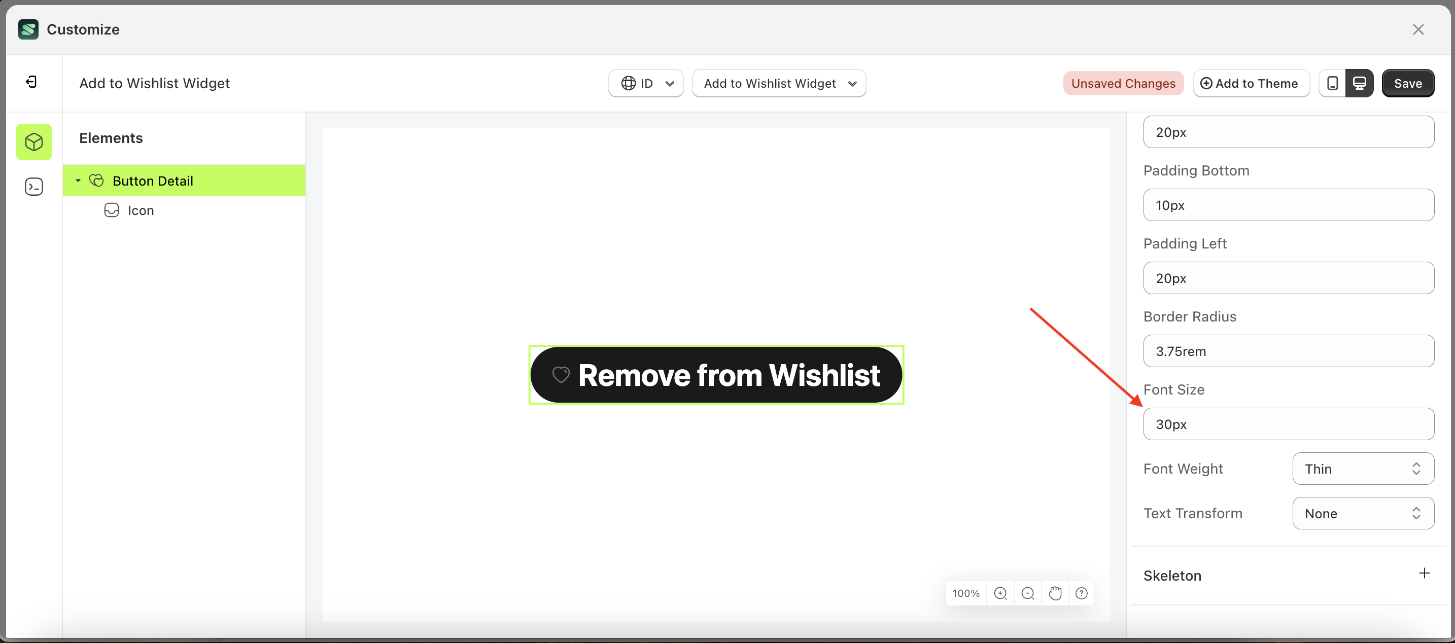
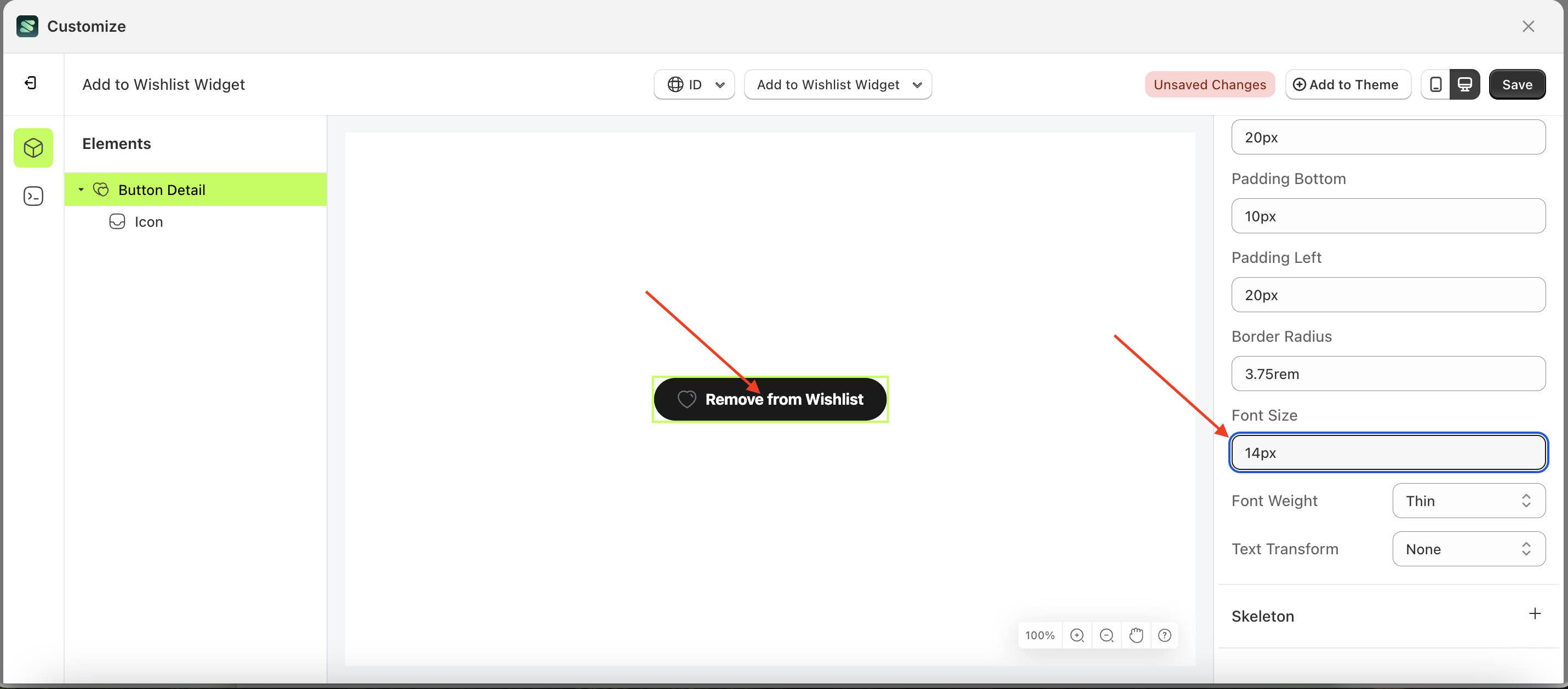
Font Size Load More
This feature is designed to customize the text size of the button settings
Follow the steps below:
- Select the Button Detail element on the left, then click the Settings tab and click the icon marked with a red arrow.
- On the right side, marked with a red arrow, you can change the font size to your desired value.
- Note: The font size format can be px, em, rem, %, or other units..
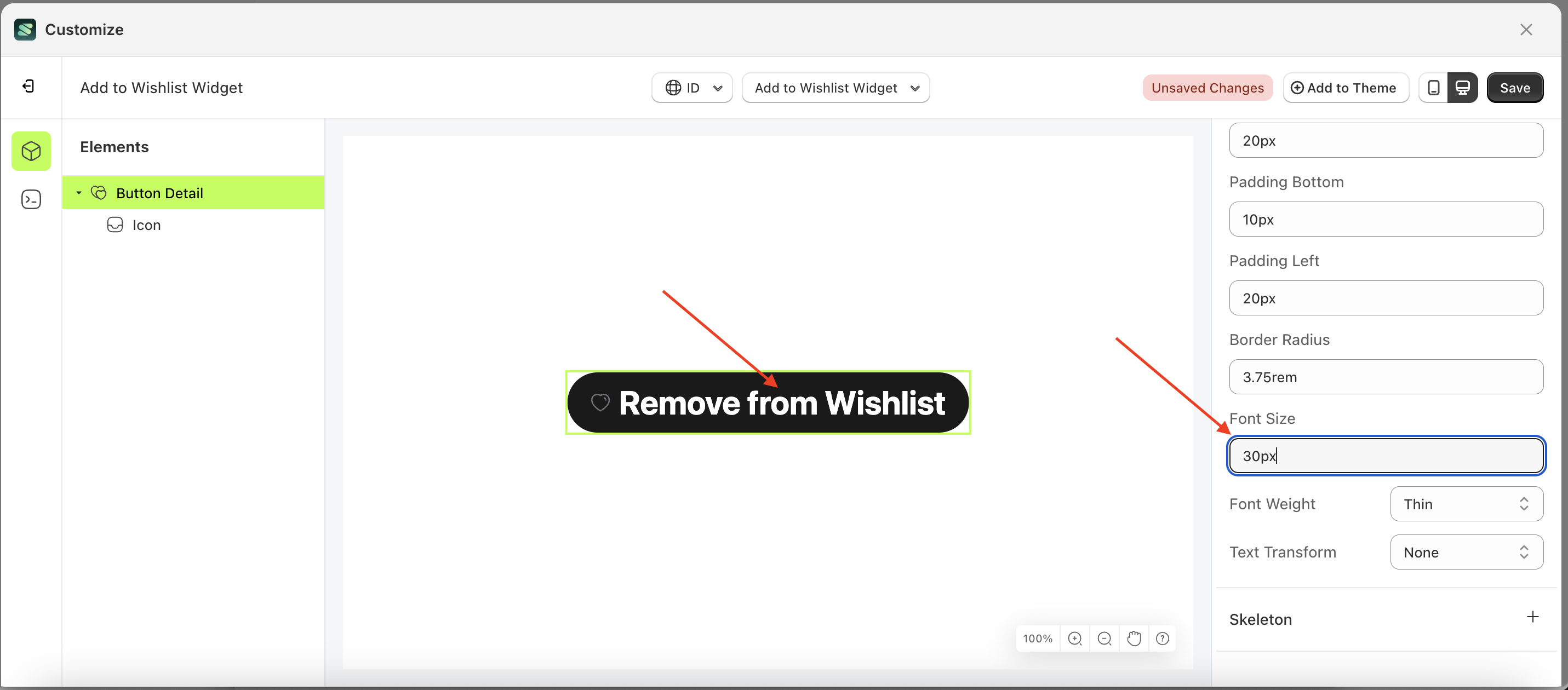
- For example, if you set the font size to 30px
- The font size of the Button Detail element will adjust accordingly.
- Example : Before font size change settings
- Example : After font size change settings
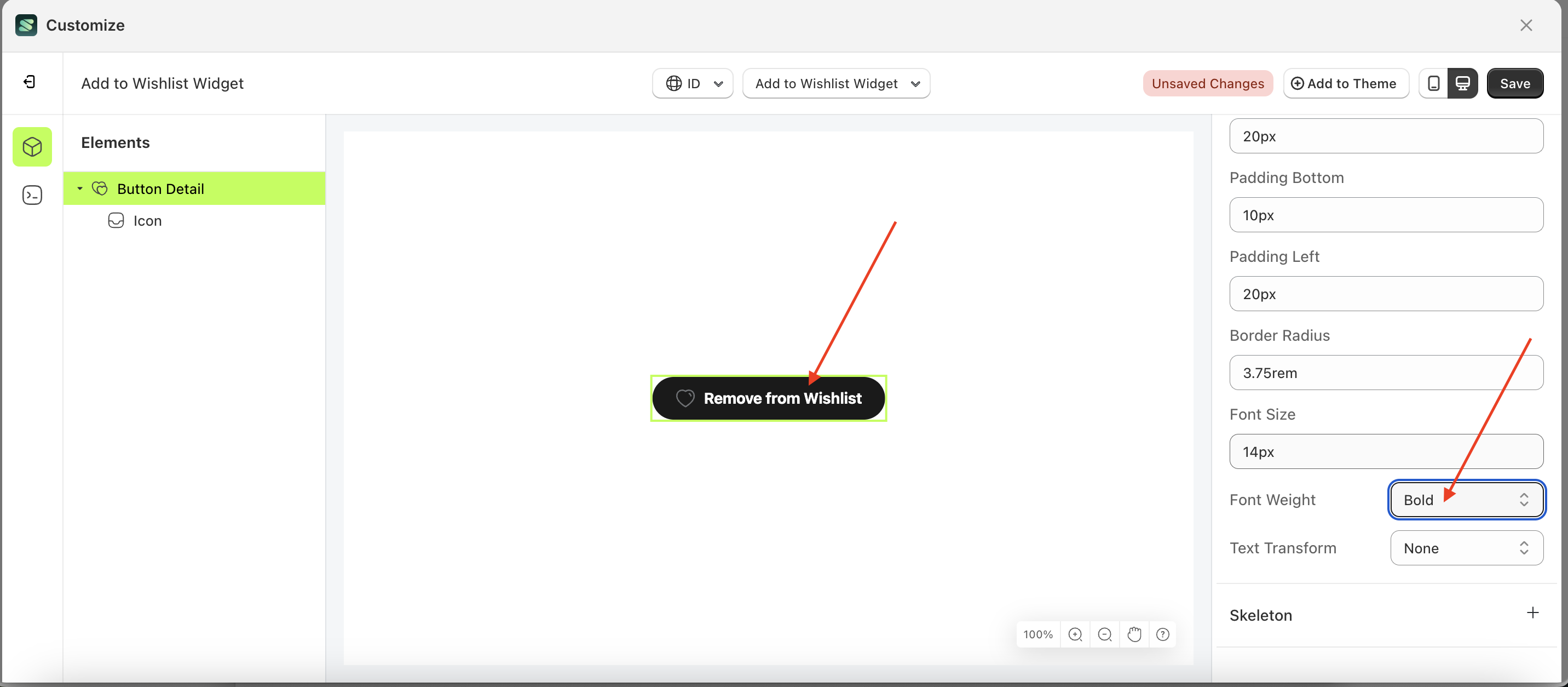
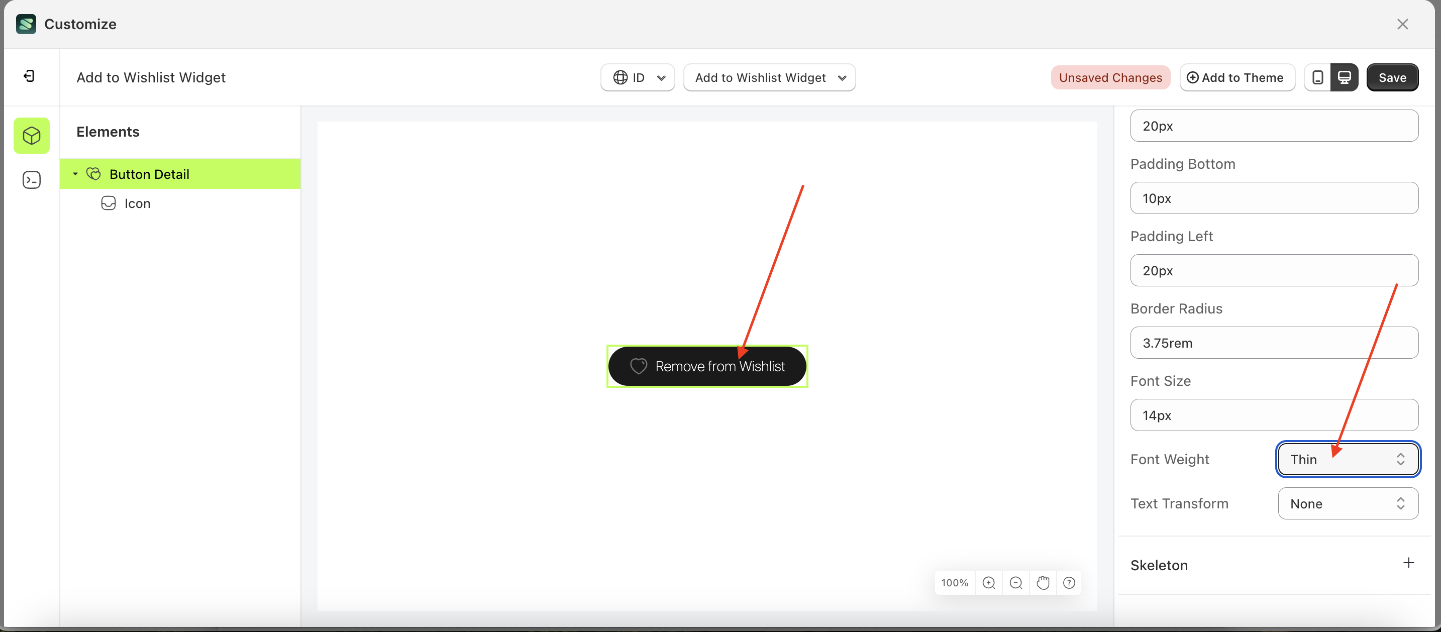
Font Weight Load More
This feature is designed to customize the text weight of the button settings
Follow the steps below:
- Select the Button Detail element on the left, then click the Settings tab and click the icon marked with a red arrow.
- On the right side, marked with a red arrow, you can change the font weight to your desired value.
- Note: The font weight format can be Thin, Extra Light, Light, Normal or other units.
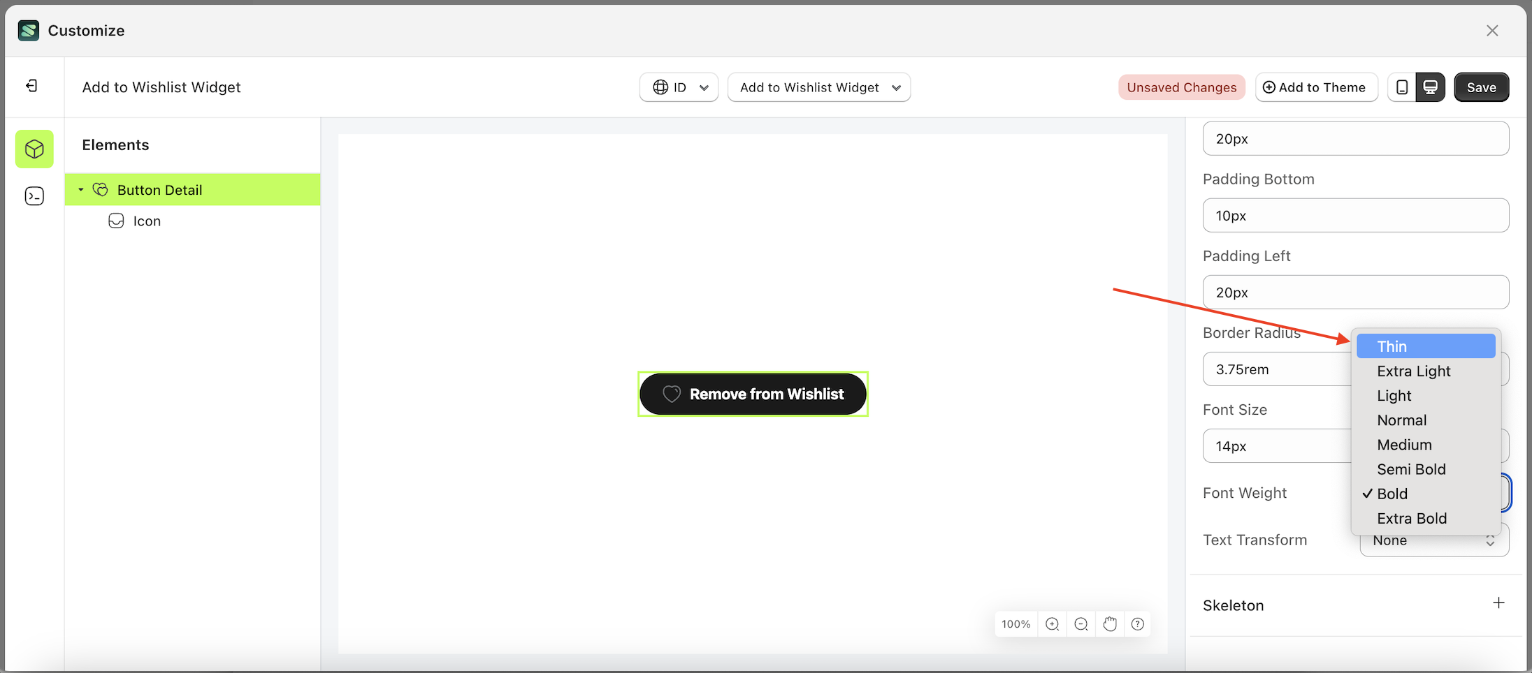
- Once the menu opens, select an option from the list
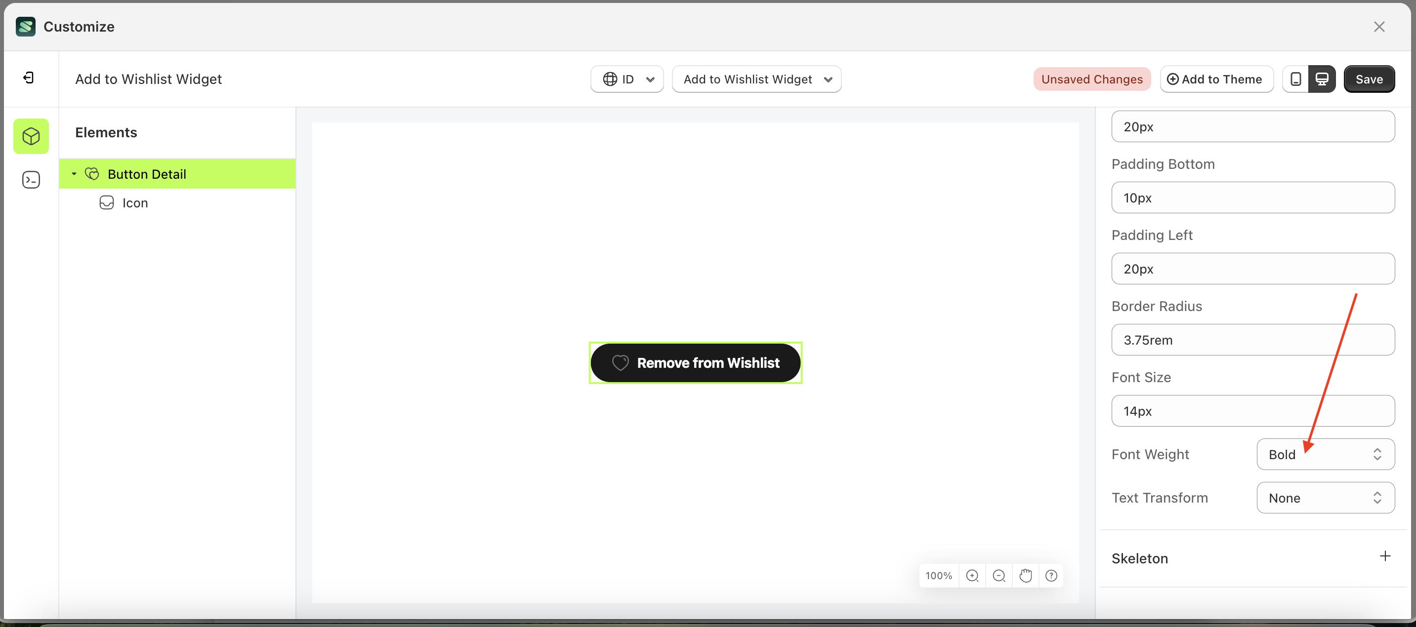
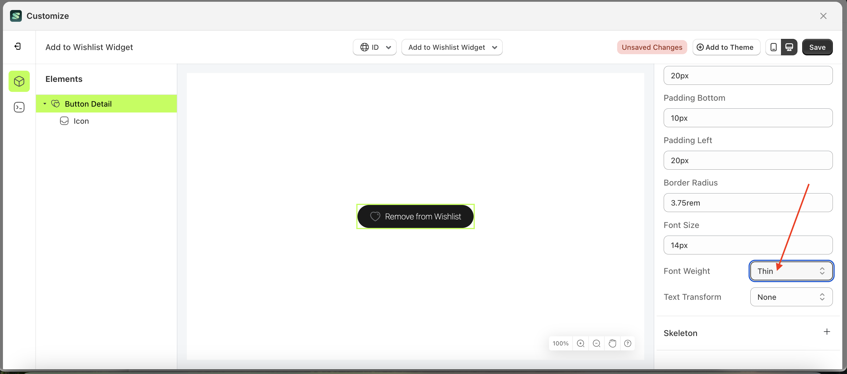
- For example, if you set the font weight to thin
- The font weight of the Button Detail element will adjust accordingly.
- Example : Before font weight change settings
- Example : After font weight change settings
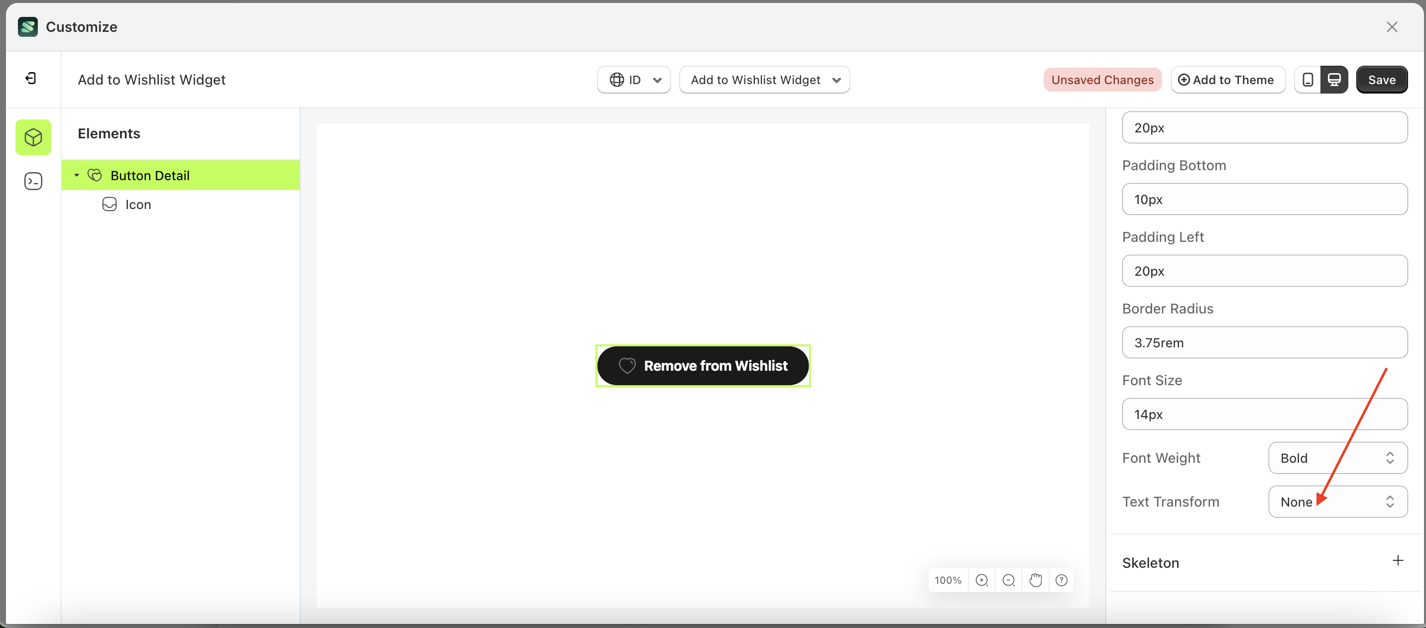
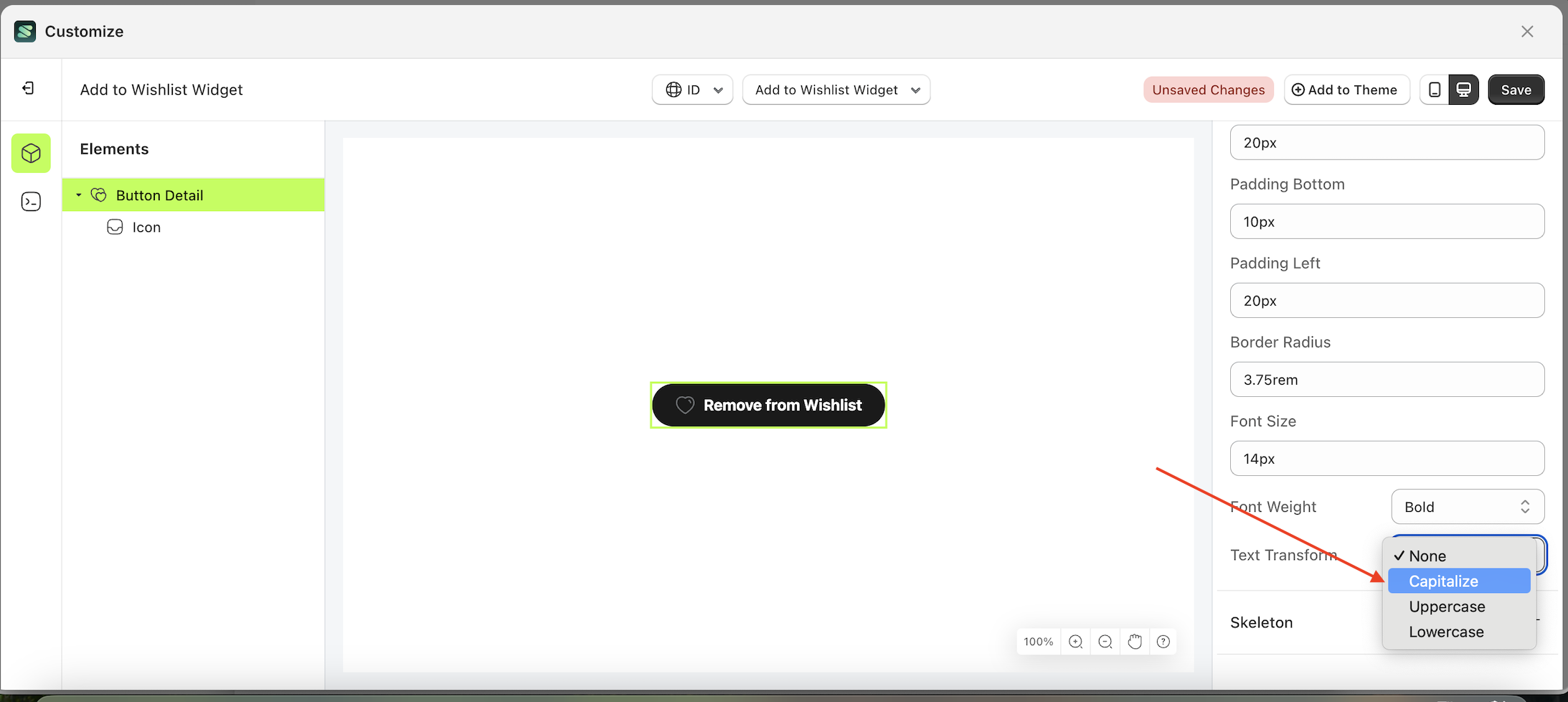
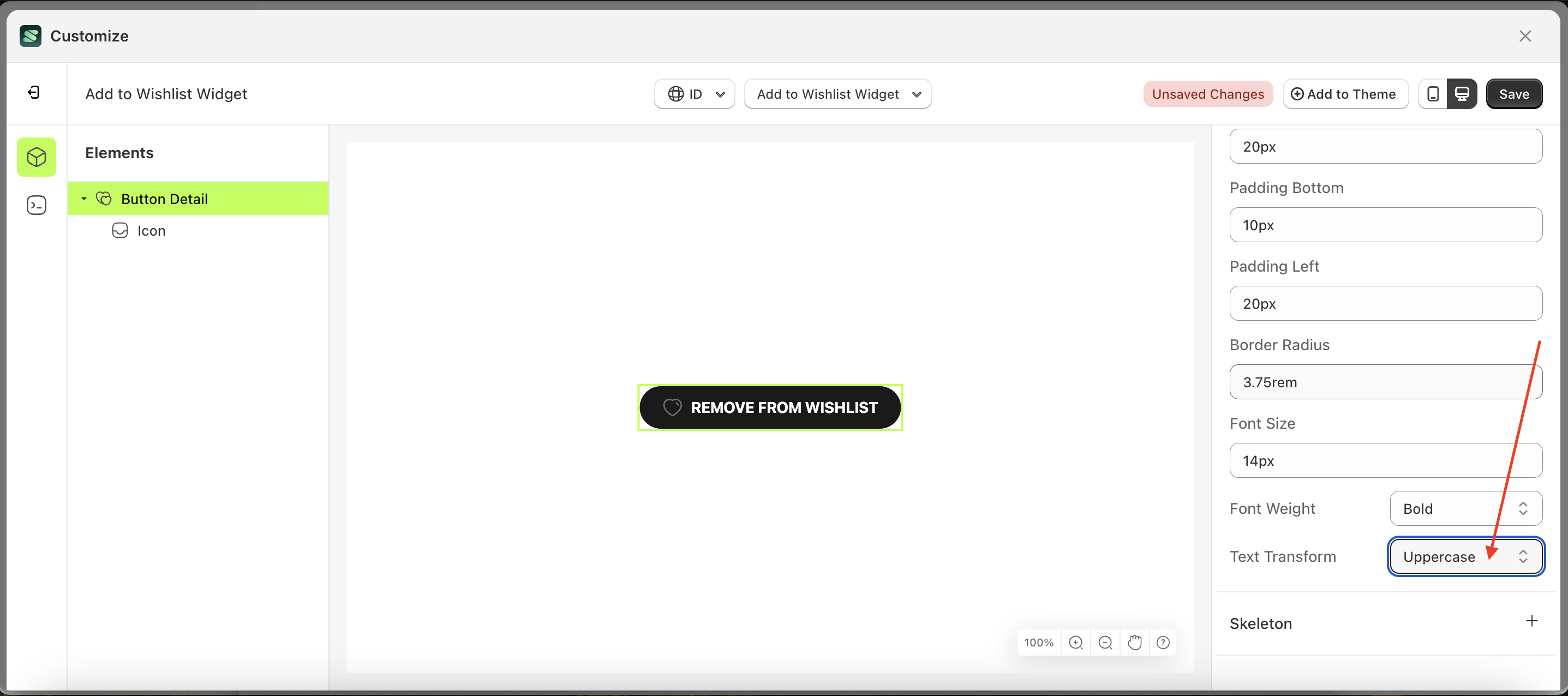
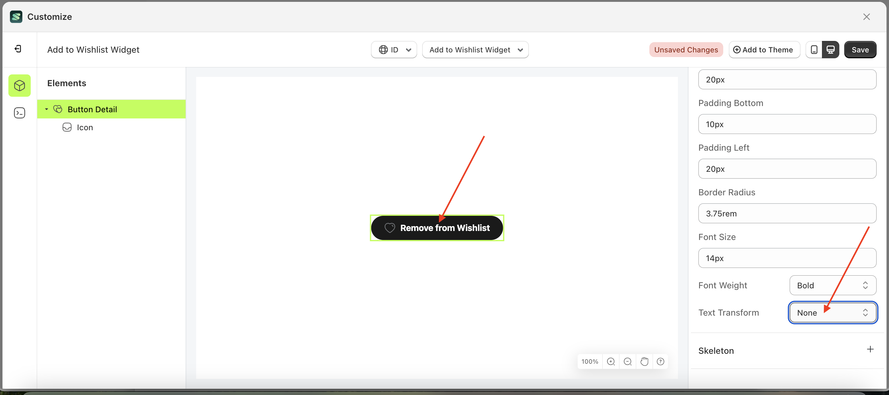
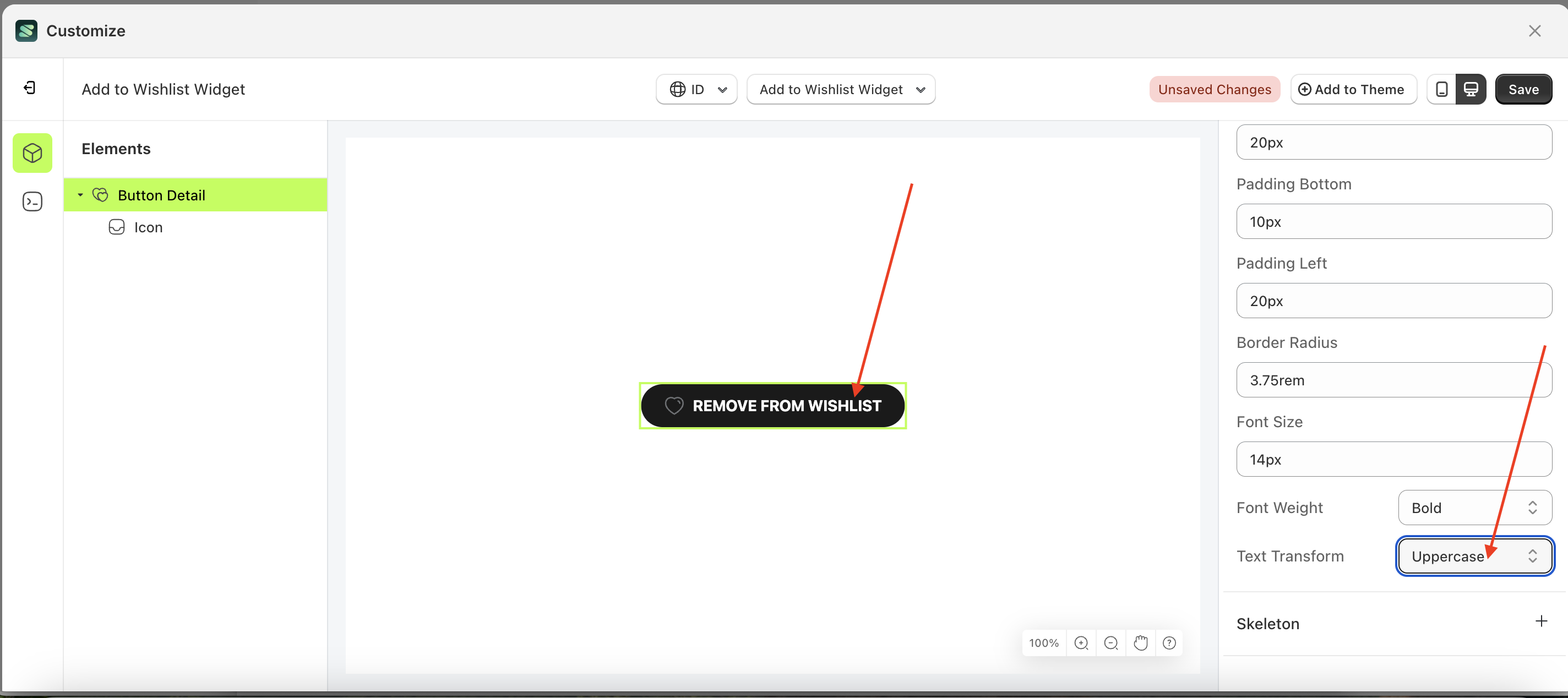
Text Transform Load More
This feature allows you to adjust the capitalization style of the text
Follow the steps below:
- Select the Button Detail element on the left, then click the Settings tab and click the icon marked with a red arrow.
- On the right side, marked with a red arrow, you can change the text transform to your desired value.
- Note: The text transform format can None, Capitalize, Uppercase, Lowercase..
- Once the menu opens, select an option from the list
- For example, if you set the text transform to Uppercase
- The text transform of the Button Detail element will adjust accordingly.
- Example : Before text transform change settings
- Example : After text transform change settings
Skeleton
Available settings:
Enable Skeleton
Enable Skeleton is a setting that controls whether a loader or skeleton is displayed before the required data is fully loaded.
Follow the steps below:
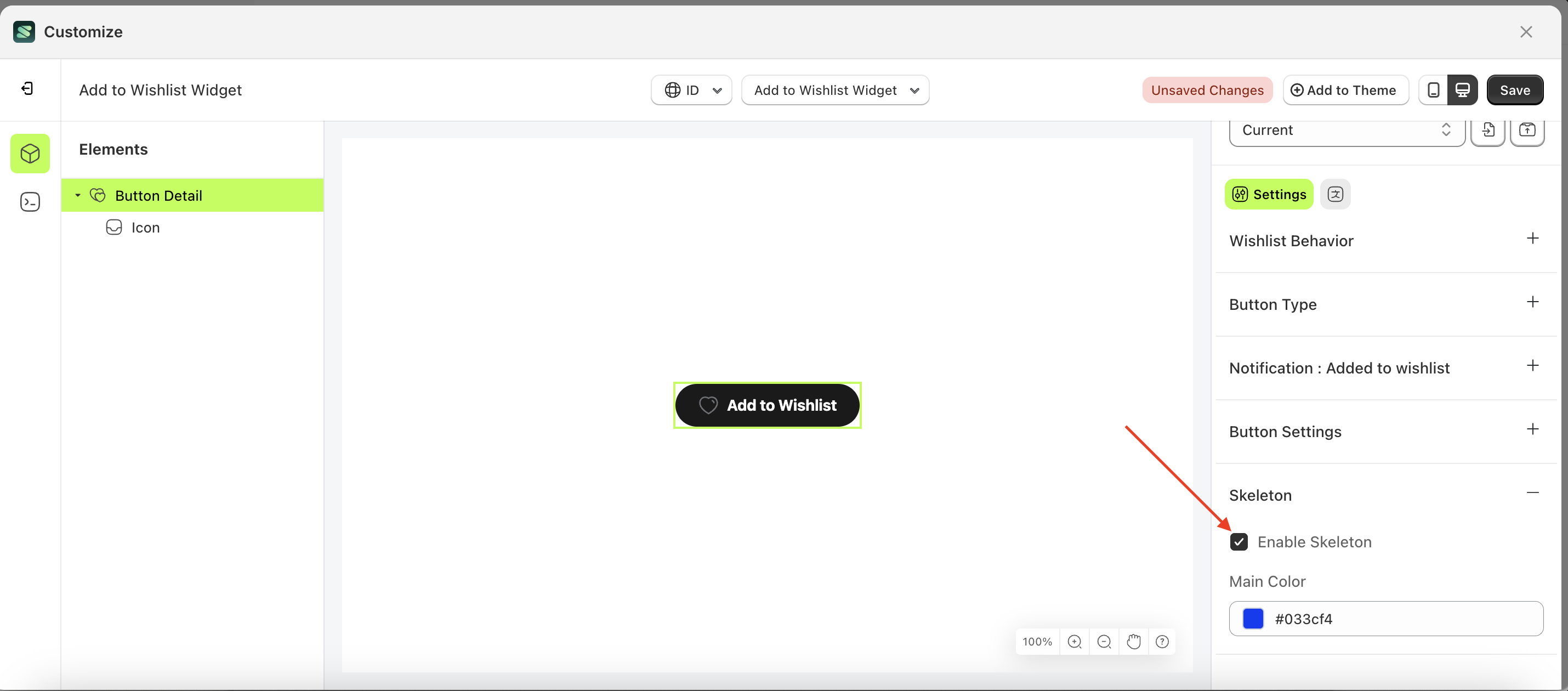
- Select the Button Detail element on the left, then click the Settings tab and click the icon marked with a red arrow.
- Enable the Enable Skeleton
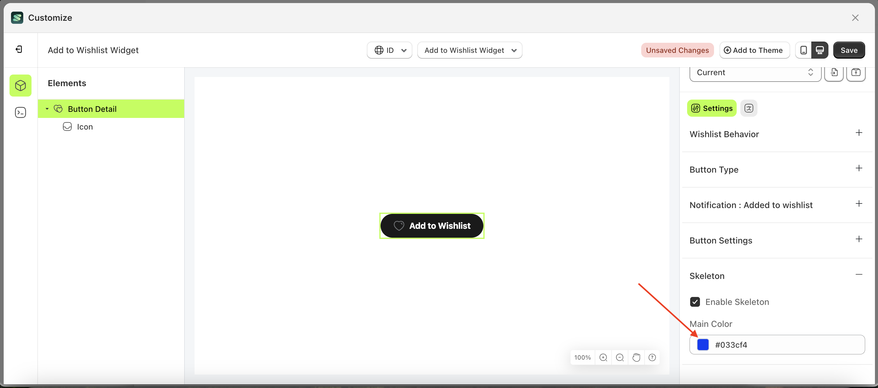
Main Color
Main Color is a setting that manages the color of the skeleton. However, you must first activate the Enable Skeleton feature.
Follow the steps below:
- Select the Button Detail element on the left, then click the Settings tab and click the icon marked with a red arrow.
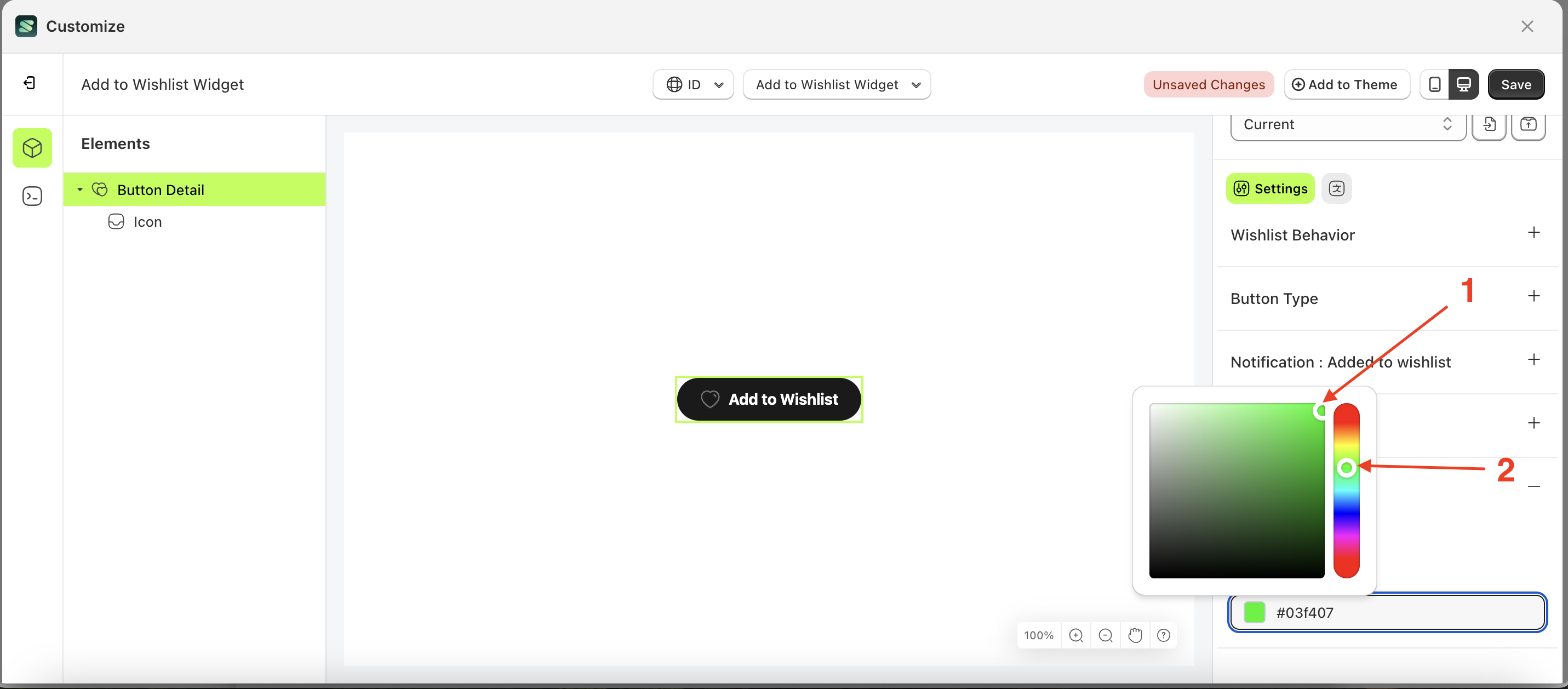
- Click the Color Palette on the right side, which is also marked with a red arrow.
- The Color Palette will appear. Click the right side of the palette where the red arrow and number 1 are indicated, then click the right side again where the red arrow and number 2 are marked
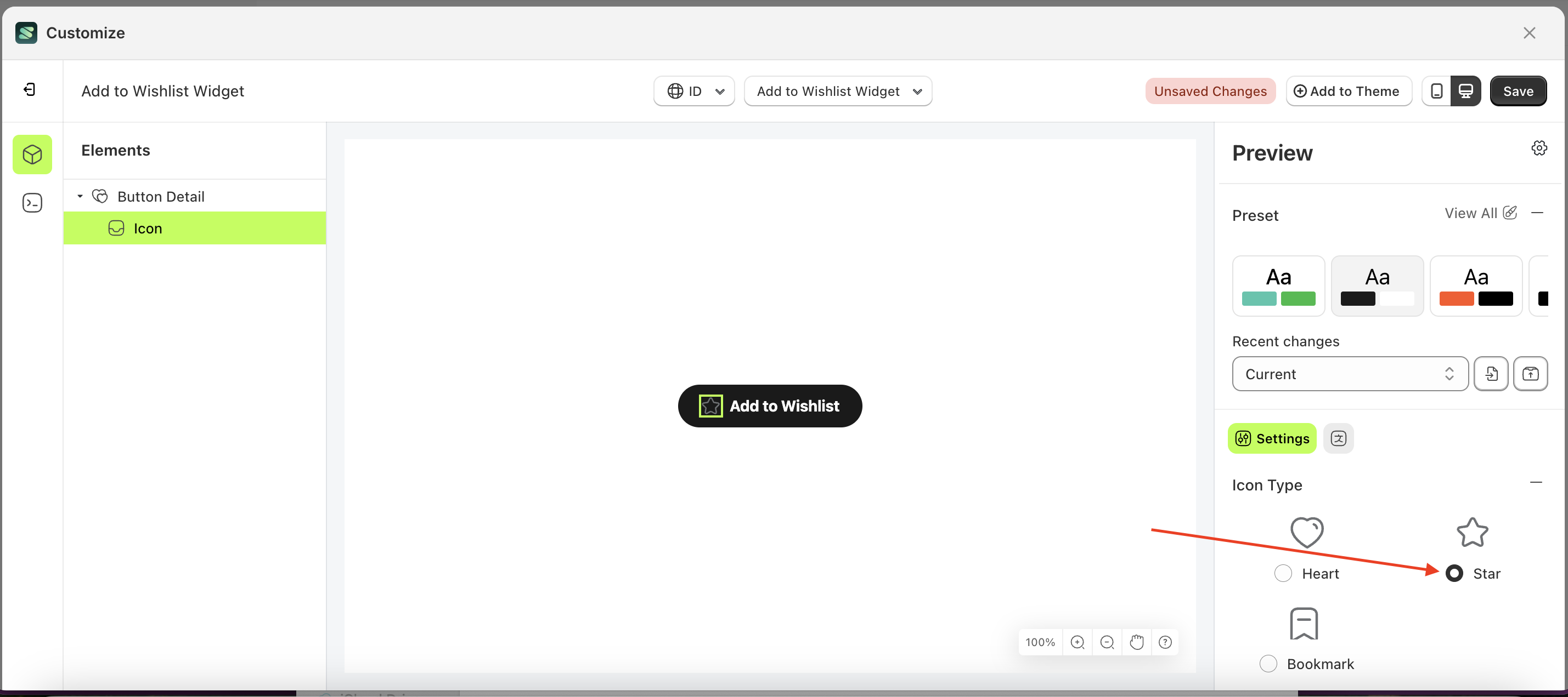
Icon Type
Available settings:
Heart
Follow the steps below:
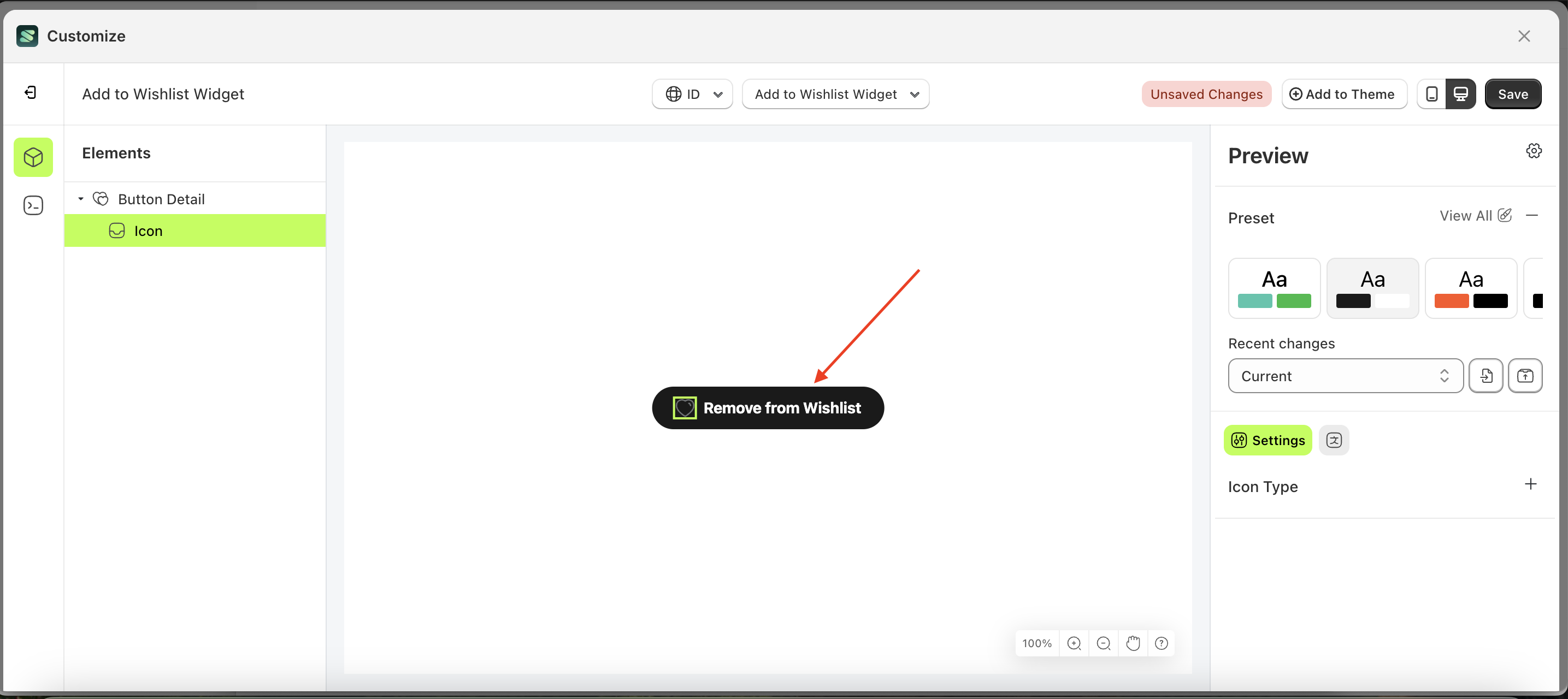
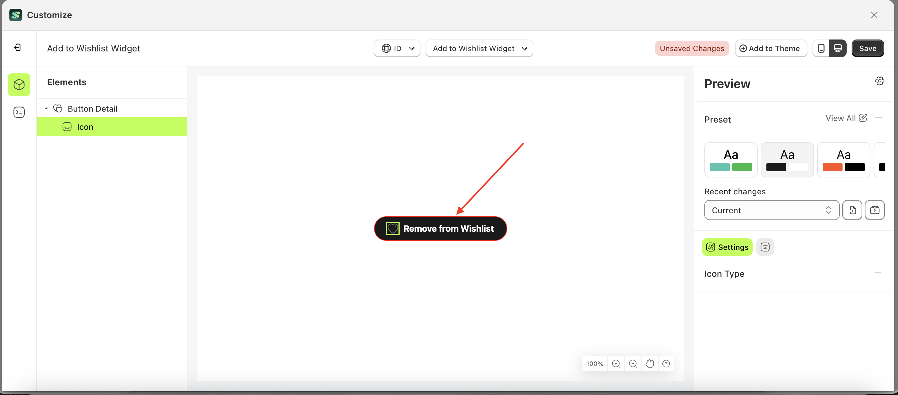
- Select the Button Detail element on the left, then click the icon marked with a red arrow to open the menu within that item.
- Once the menu is open, select the Icon element on the left, then click the Settings tab and click the icon marked with a red arrow.
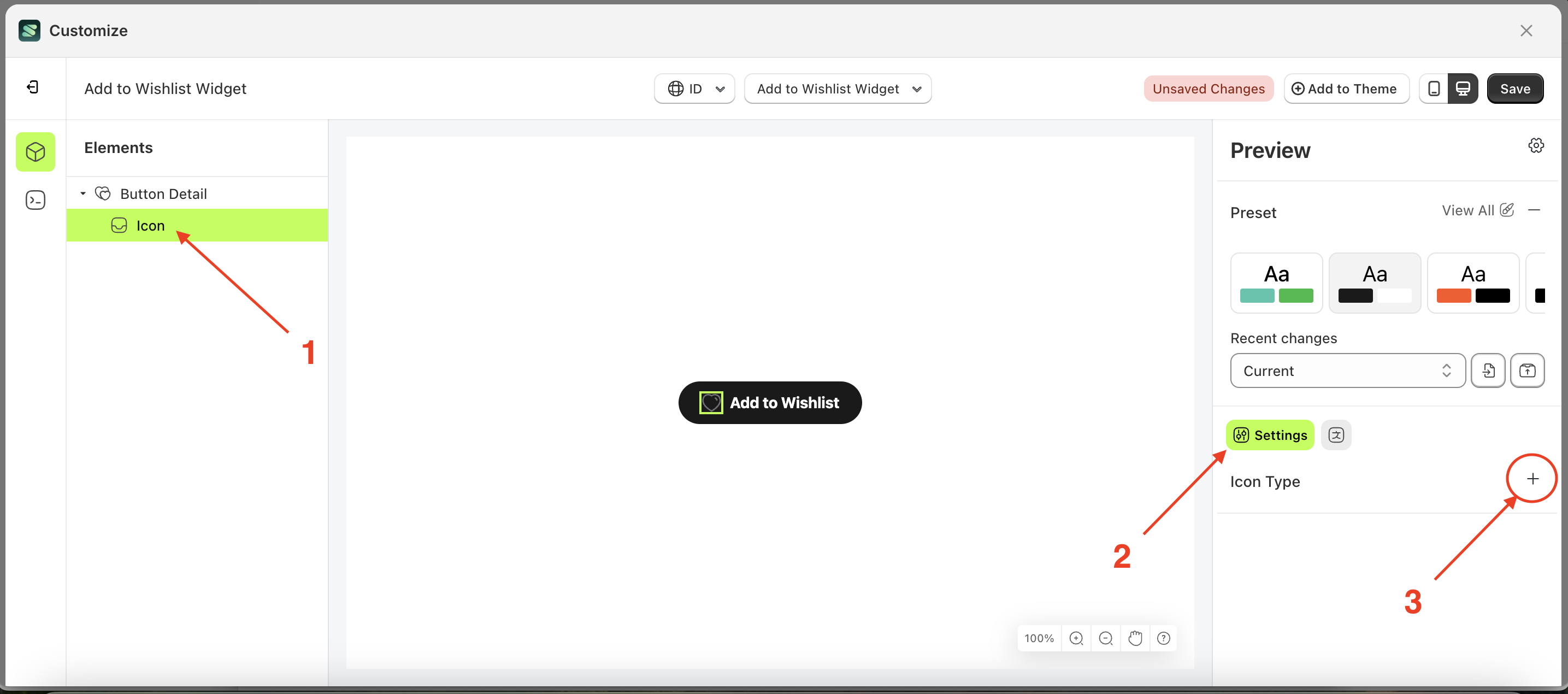
- Select the heart icon if you wish to use it
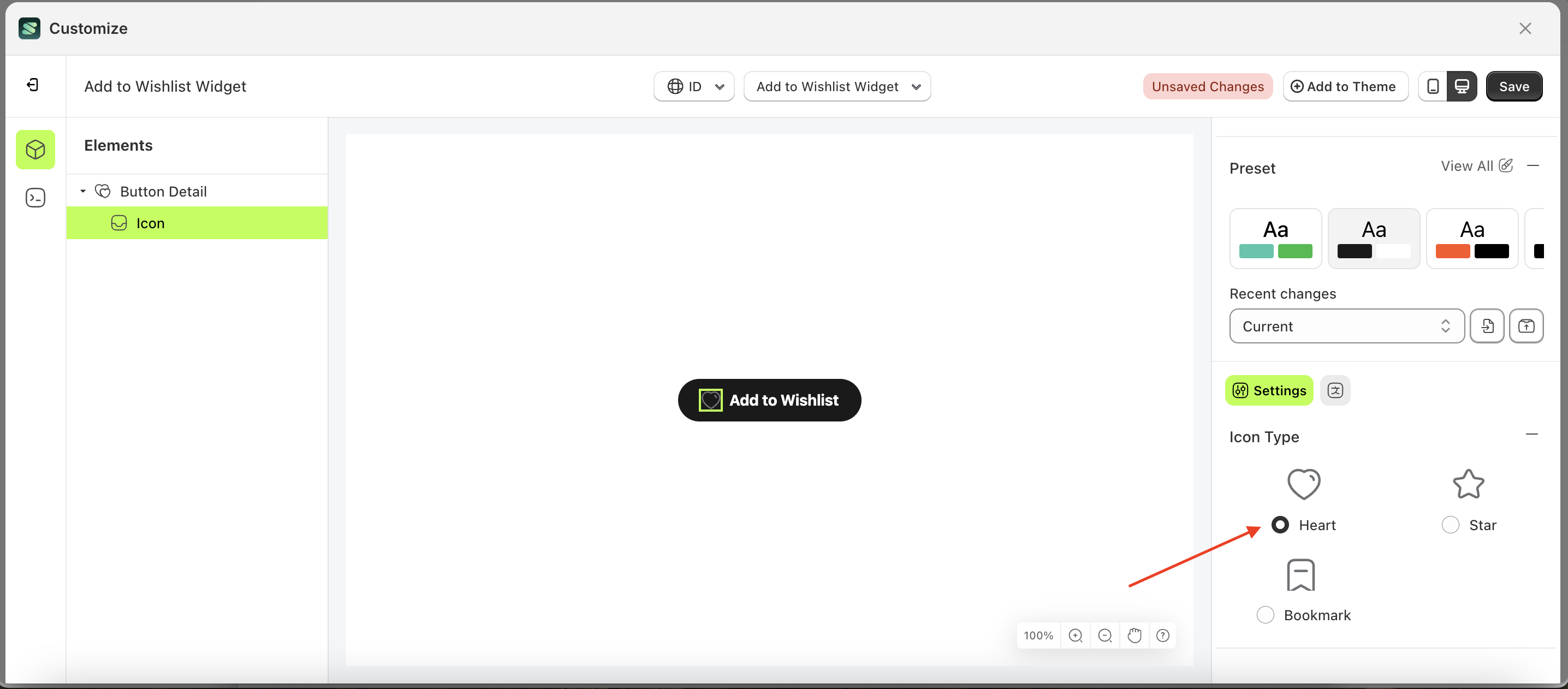
Star
Follow the steps below:
- Select the Button Detail element on the left, then click the icon marked with a red arrow to open the menu within that item.
- Once the menu is open, select the Icon element on the left, then click the Settings tab and click the icon marked with a red arrow.
- Select the star icon if you wish to use it
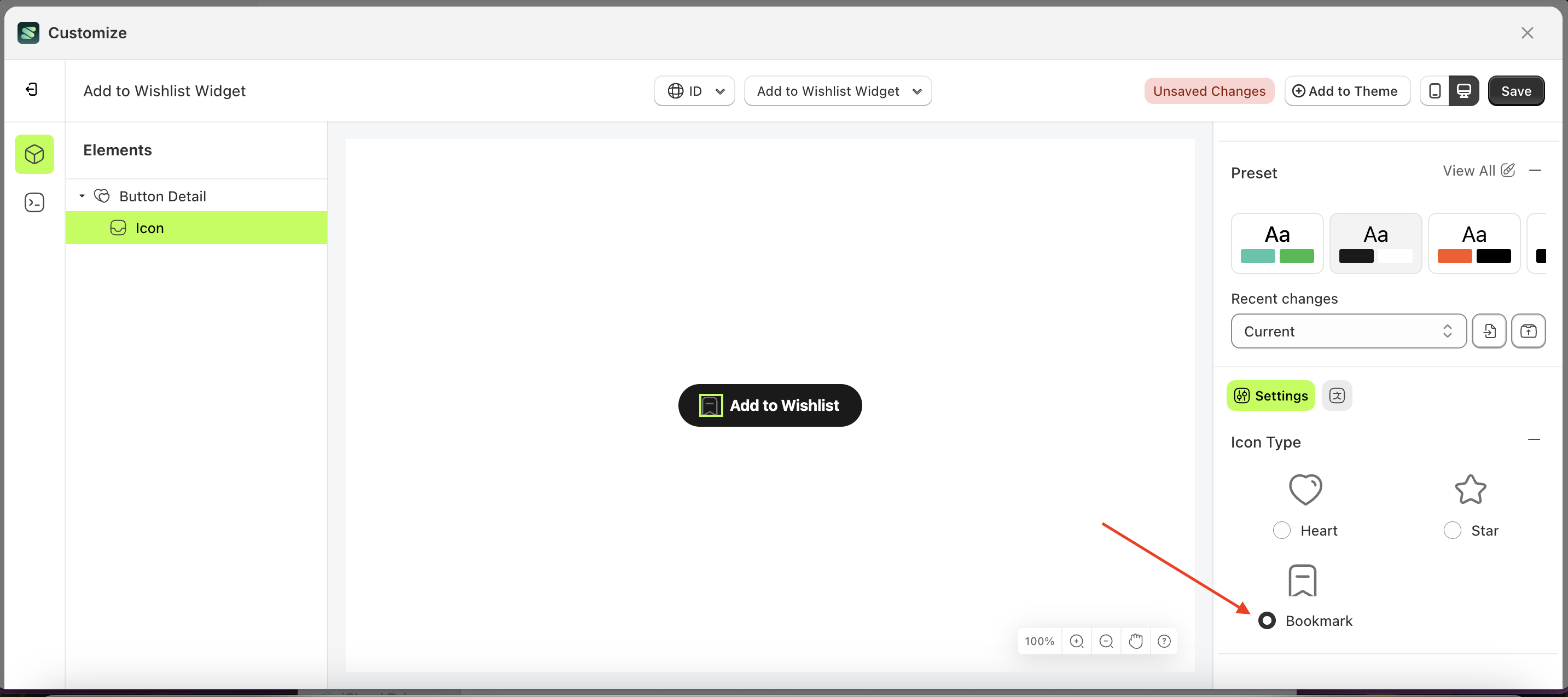
Bookmark
Follow the steps below:
- Select the Button Detail element on the left, then click the icon marked with a red arrow to open the menu within that item.
- Once the menu is open, select the Icon element on the left, then click the Settings tab and click the icon marked with a red arrow.
- Select the bookmark icon if you wish to use it