Snippet widget
To Access the Snippet Widget, Follow These Steps:
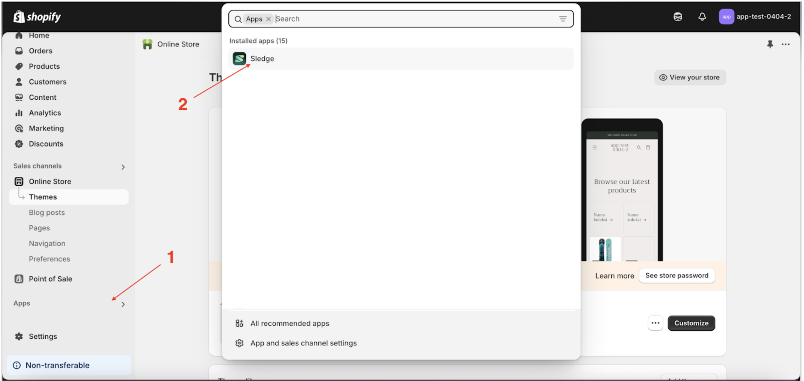
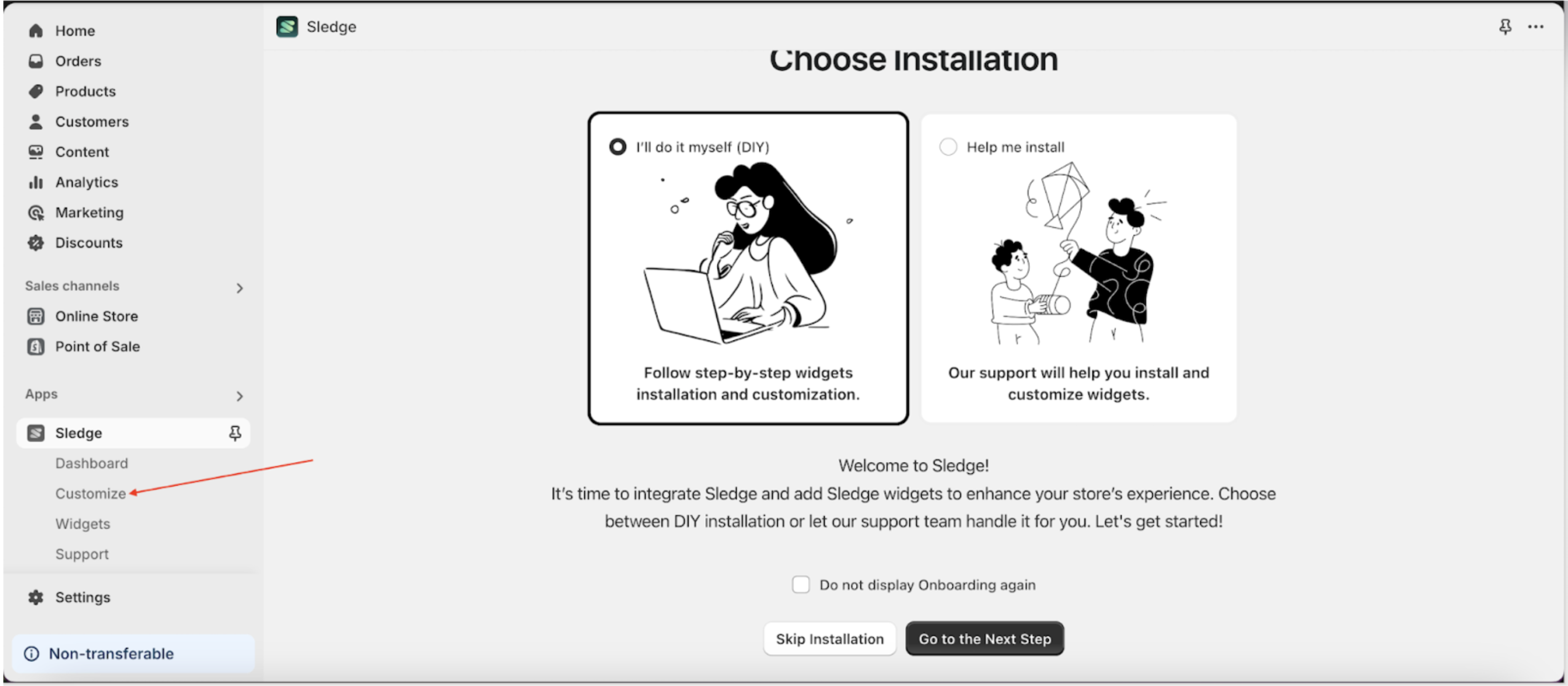
- Go to the Apps Sledge.
- Select the Customizer menu.
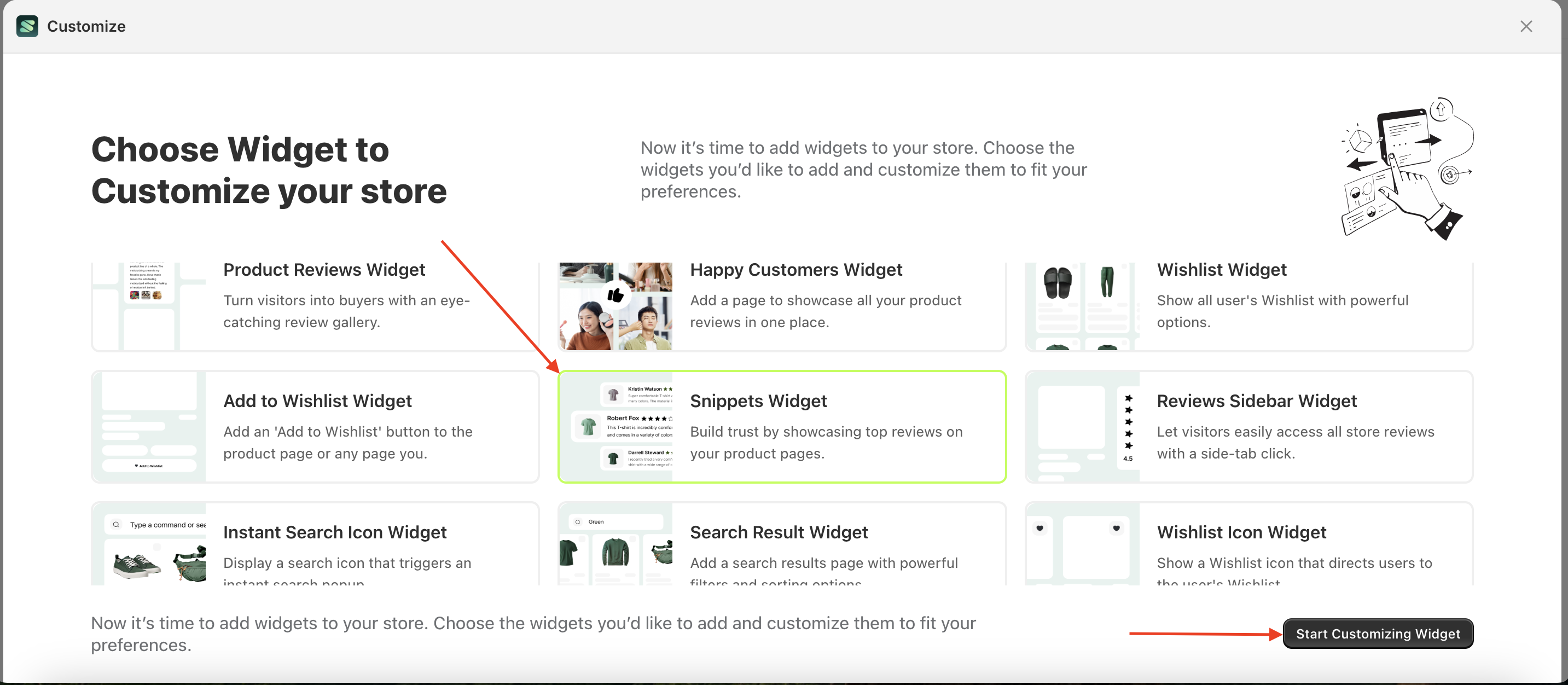
- Choose snippet widget and click the Start Customizing Widget button.
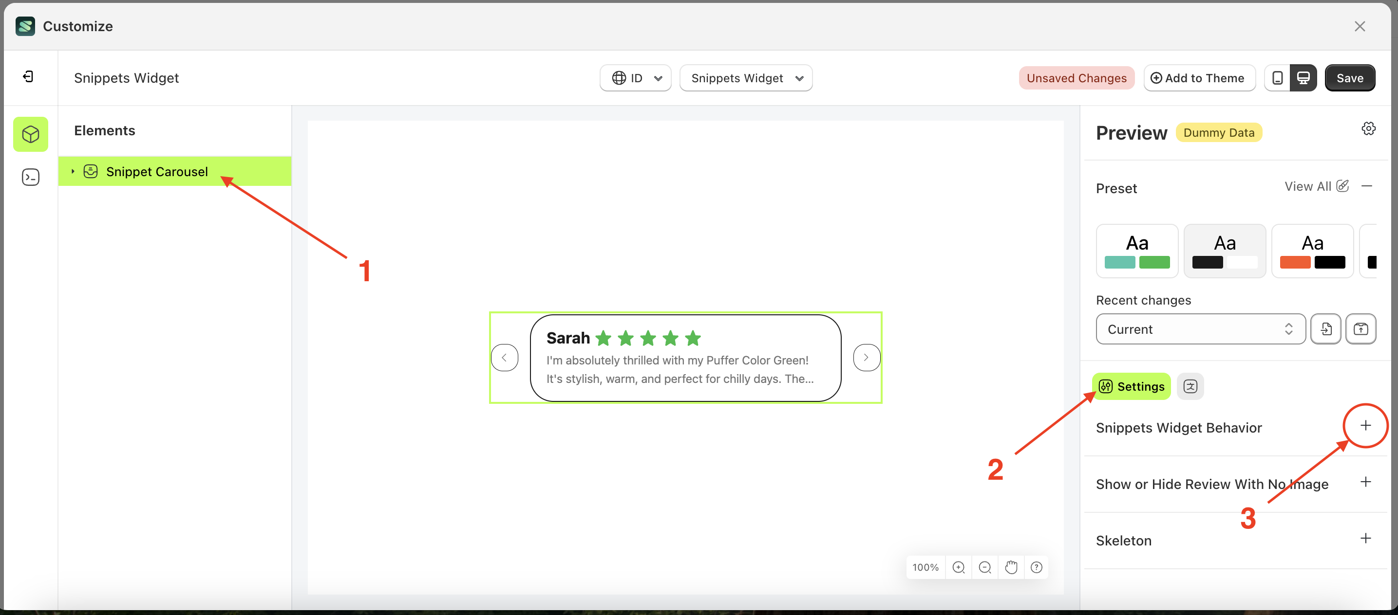
Snipped widget behaviour
Available settings:
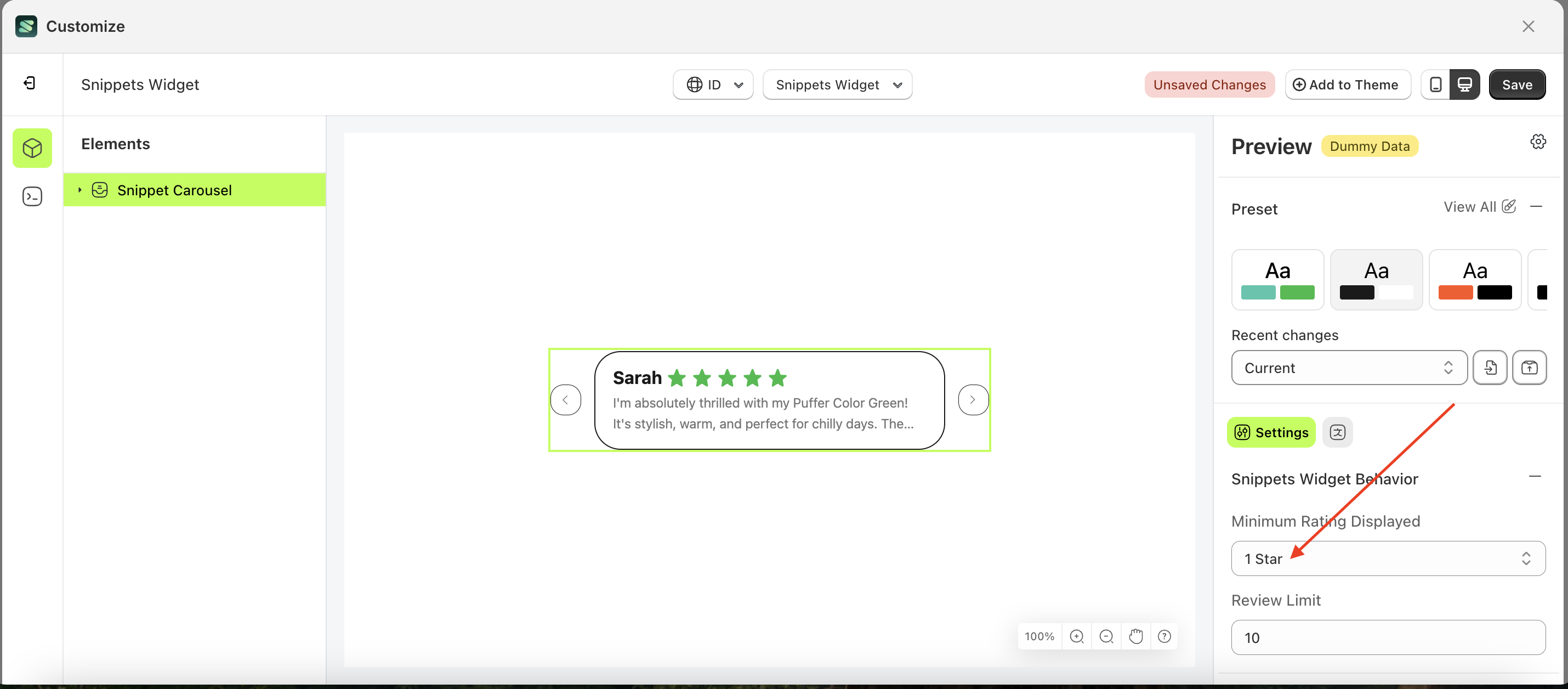
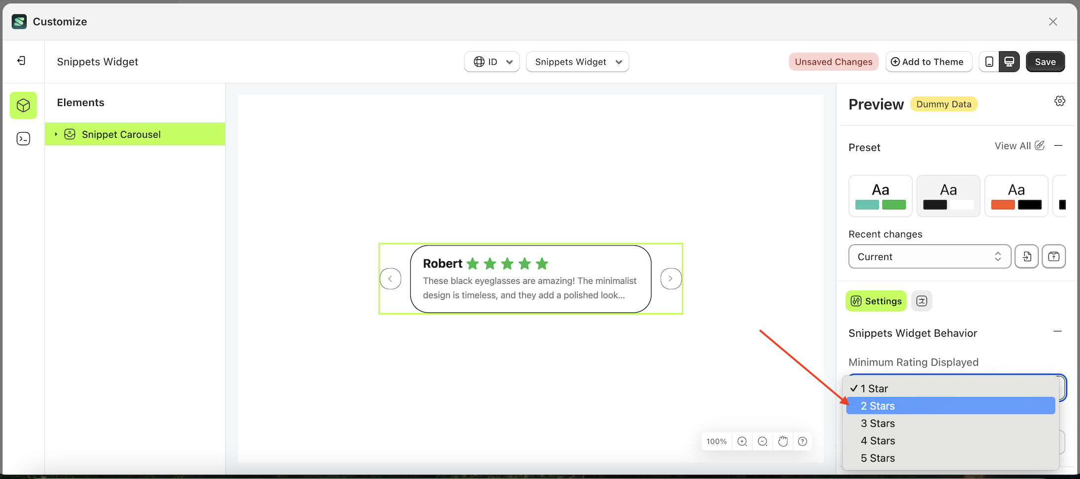
Minimum Rating Displayed
This feature controls whether the submitted rating is displayed. If a customer's rating is lower than the Minimum Rating setting, it will not be shown on the storefront.
Follow the steps below:
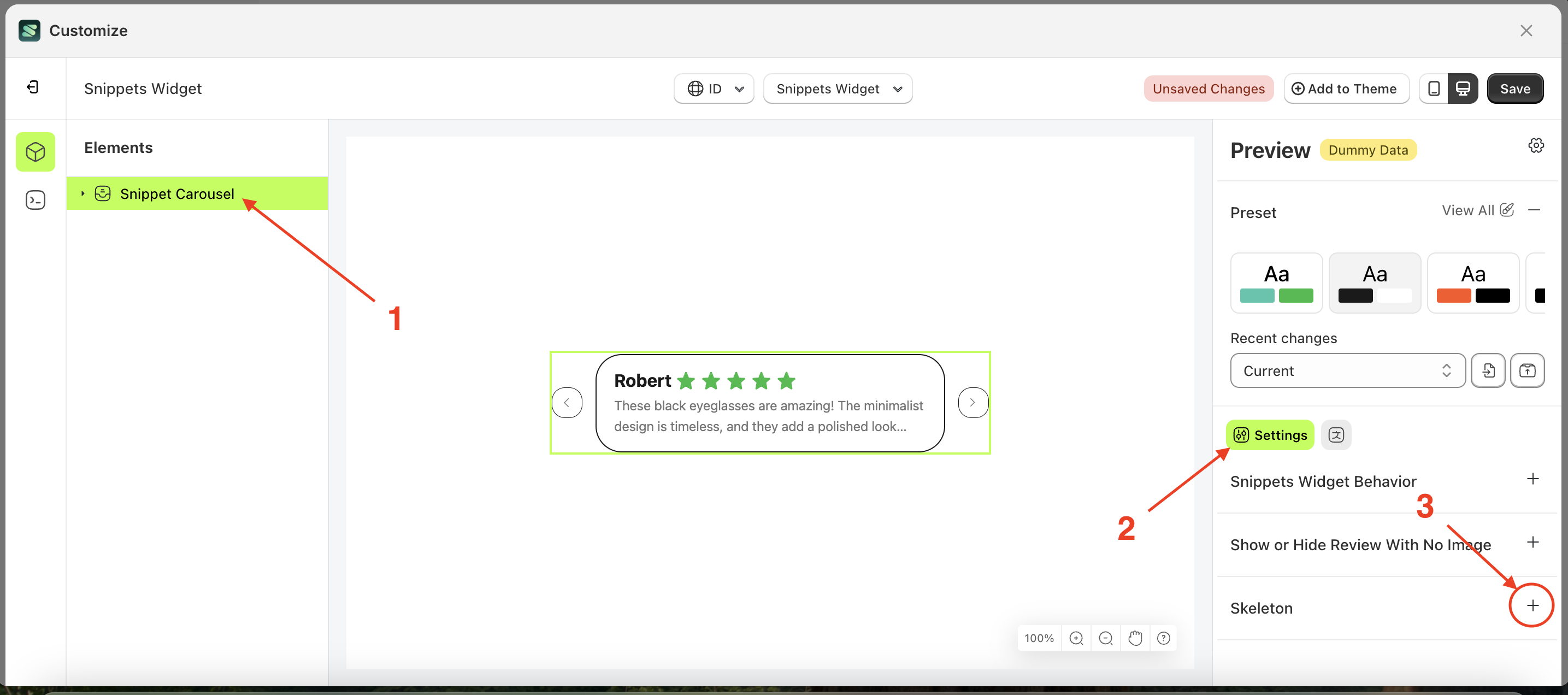
- Select the Snippet Carousel element on the left, then click the Settings tab and click the icon marked with a red arrow.
- On the right side, marked with a red arrow, you can change the font weight to your desired value.
- Note: The minimum rating displayed format can be 1 star, 2 star, 3 star or other units
- Once the menu opens, select an option from the list
- For example, if you set the font weight to thin
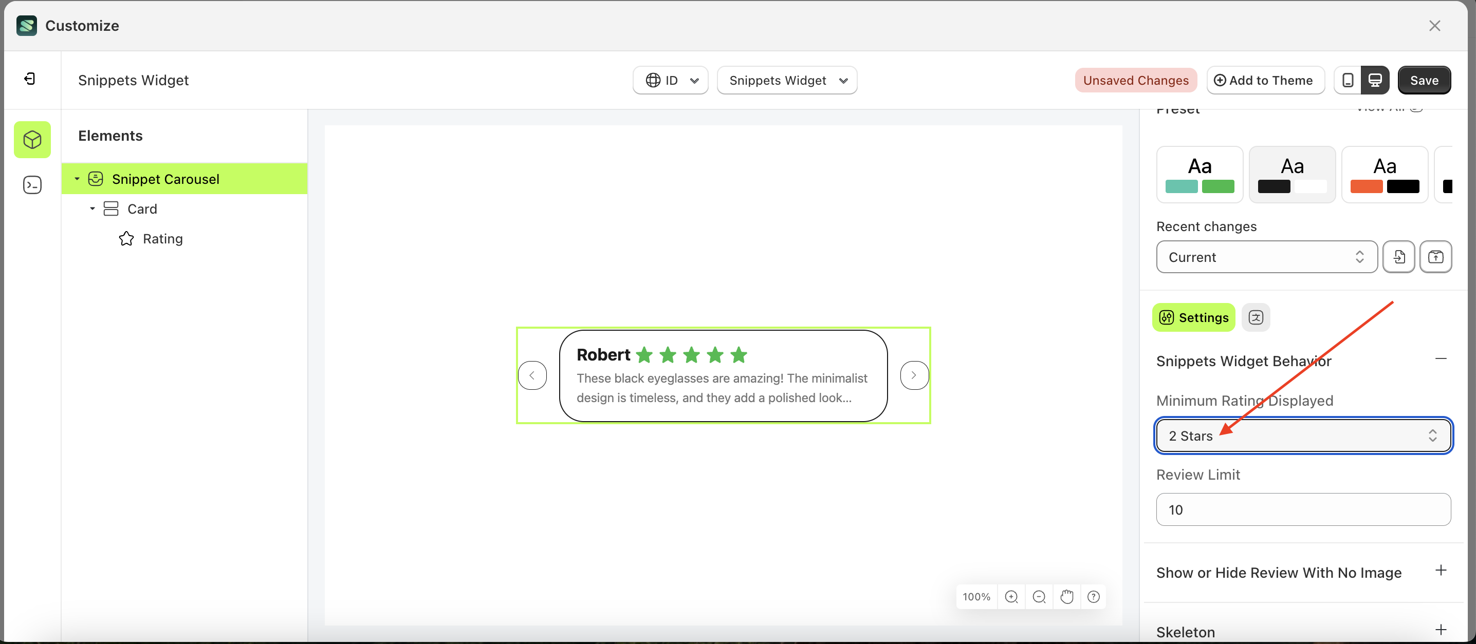
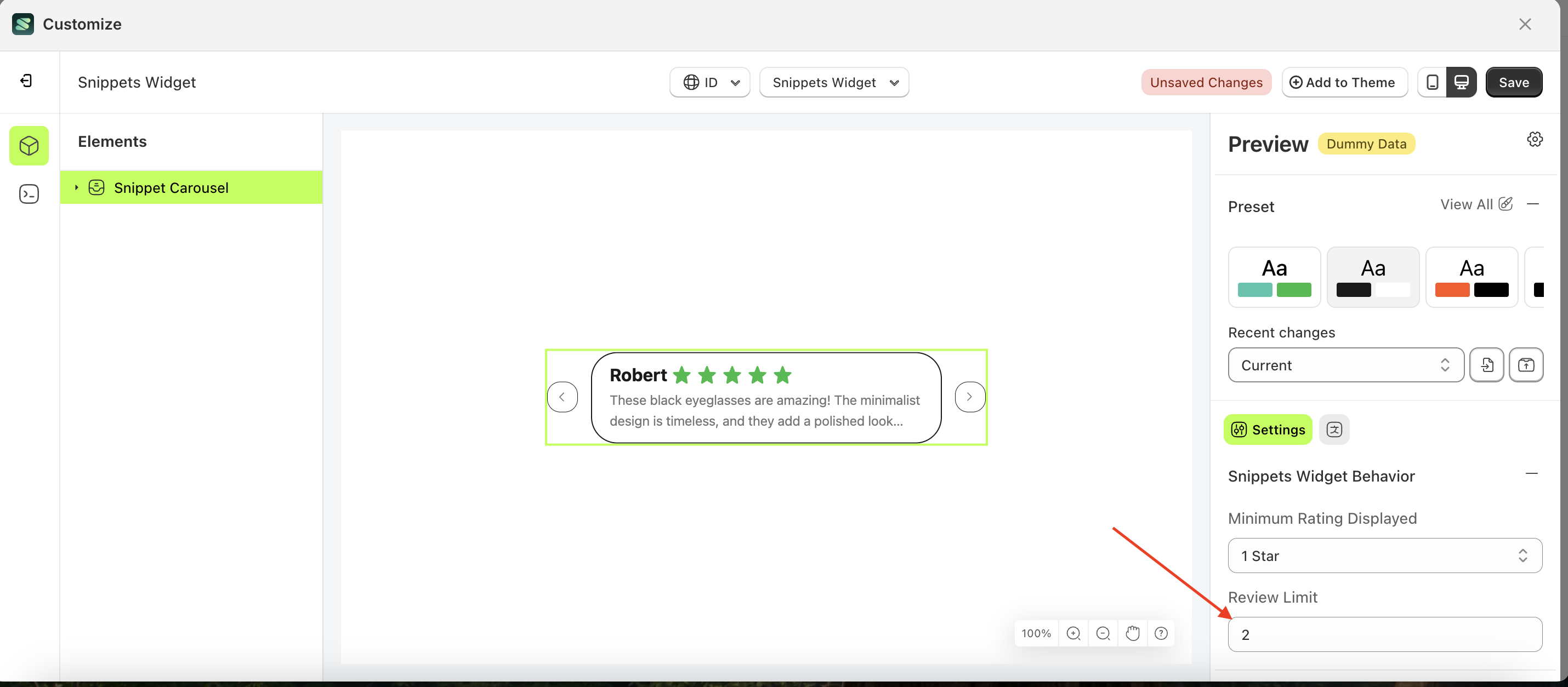
Review Limit
This feature is designed to set a limit on the Rating List according to your requirements.
Follow the steps below:
- Select the Snippet Carousel element on the left, then click the Settings tab and click the icon marked with a red arrow.
- On the right side, marked with a red arrow, you can change the review limit to your desired value.
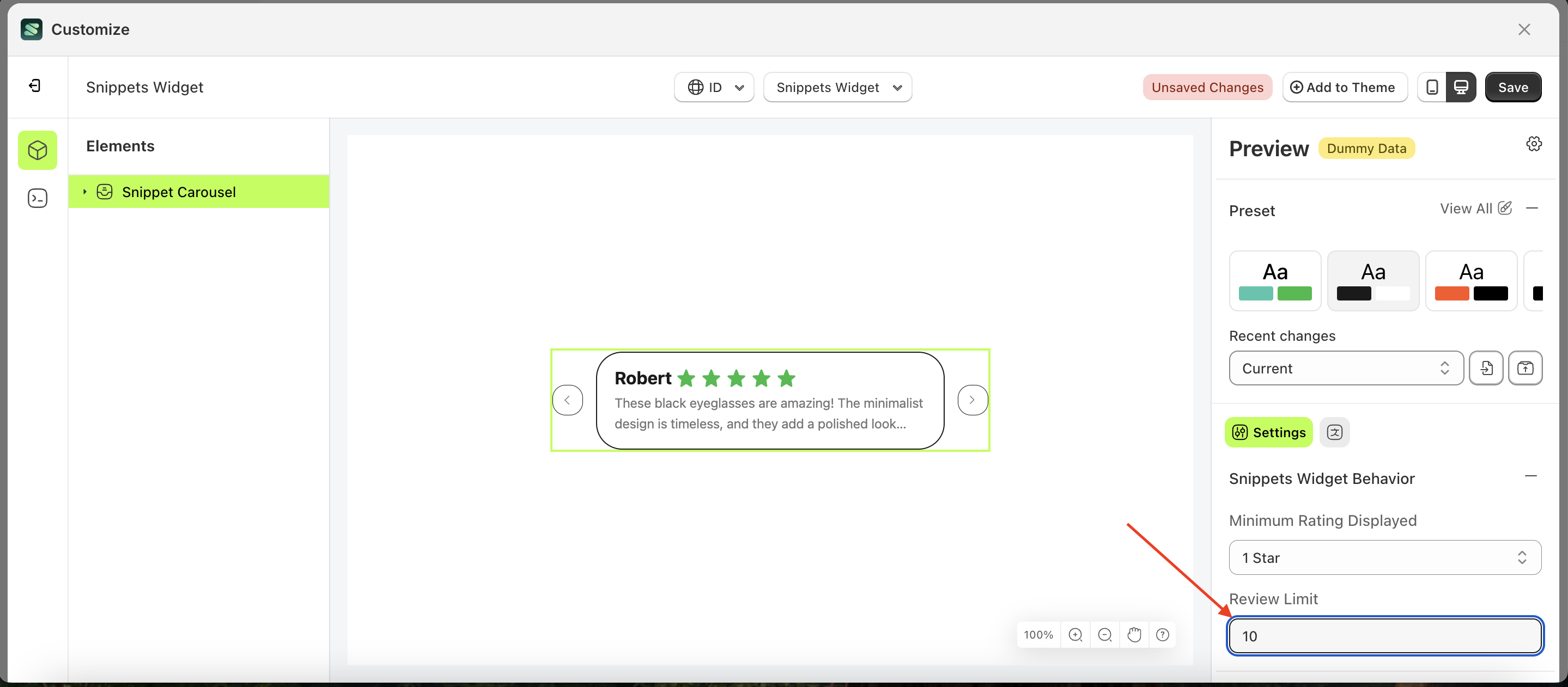
- For example, if you set the review limit to 2
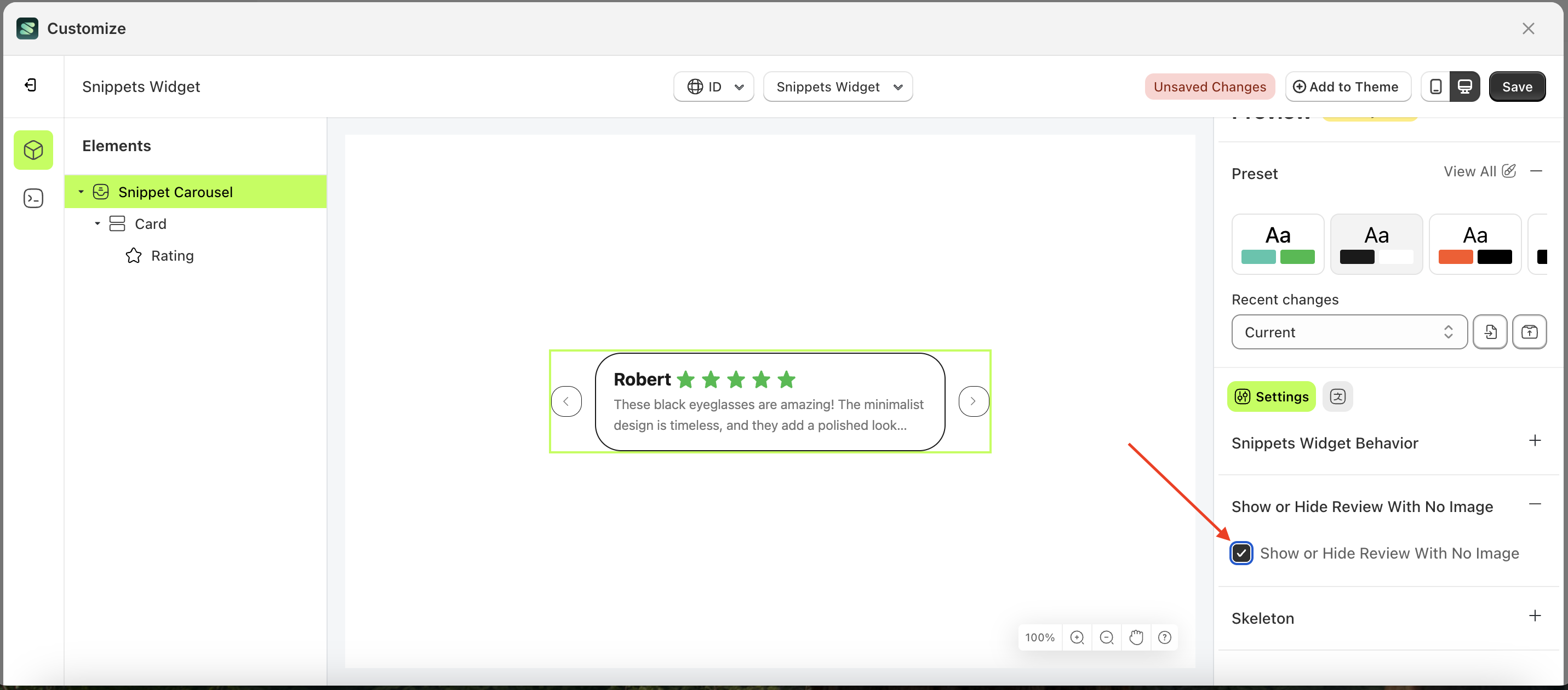
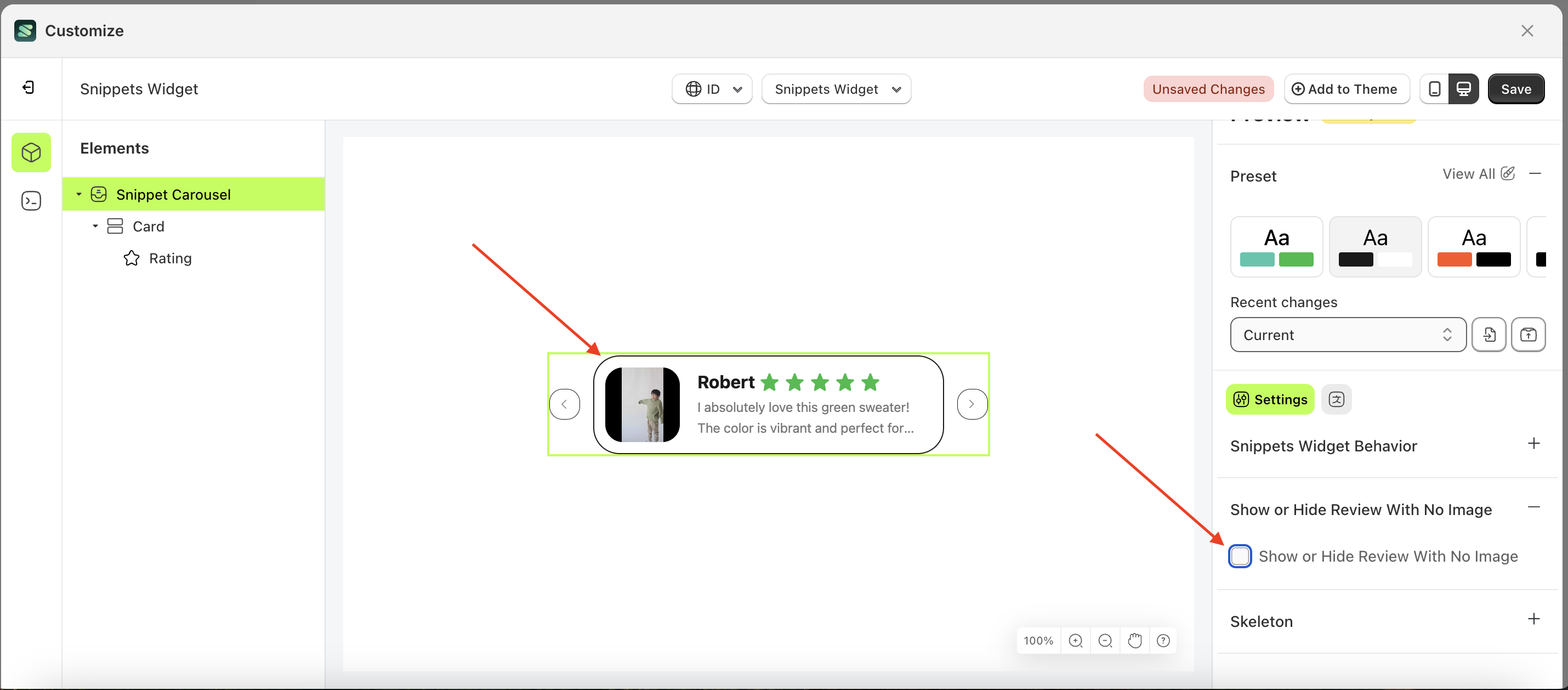
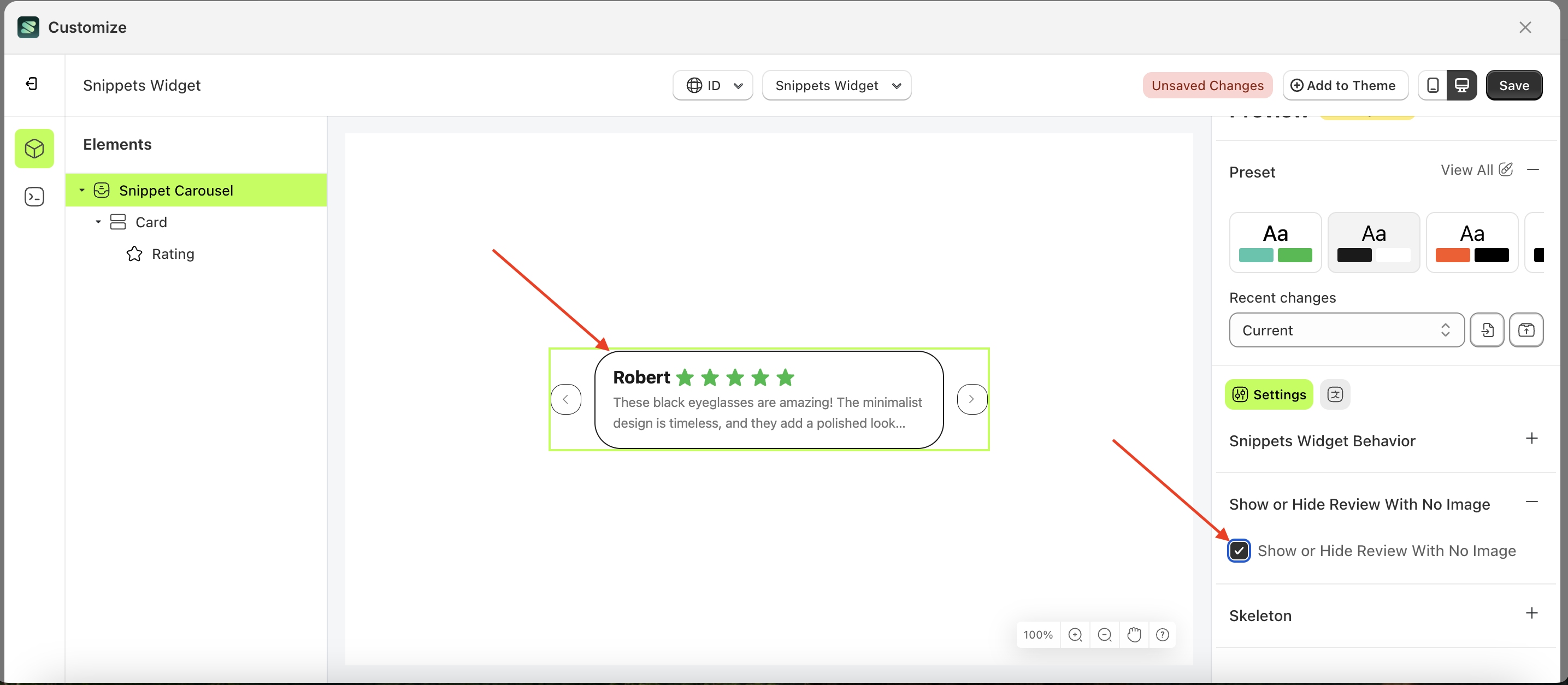
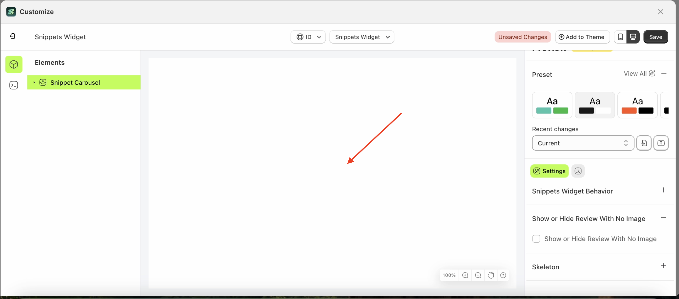
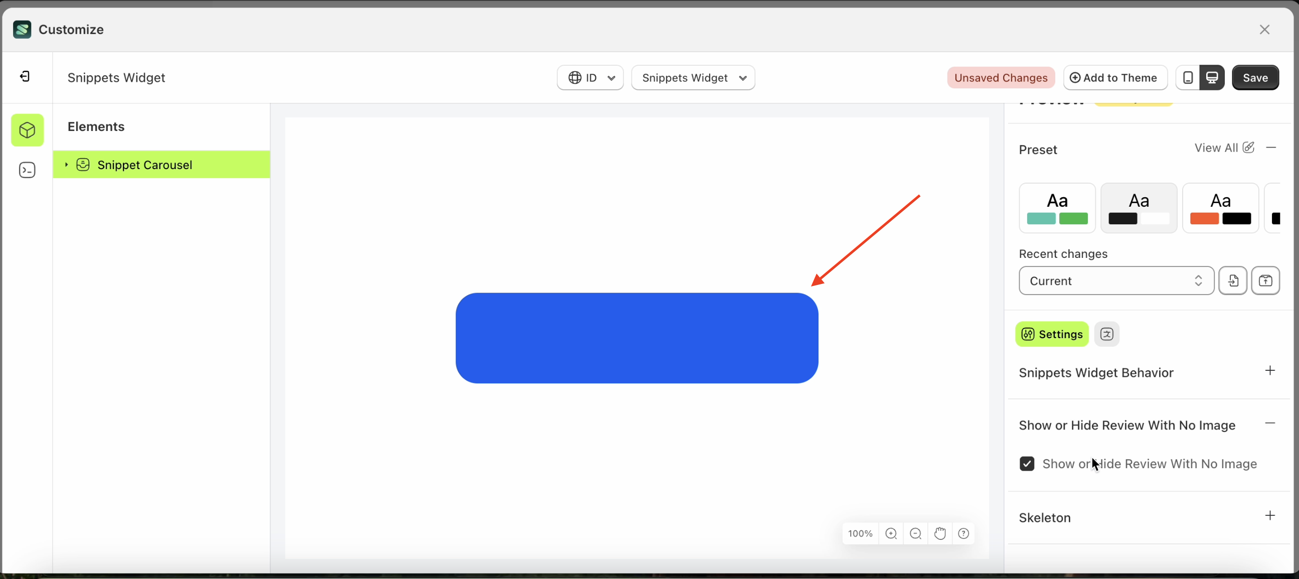
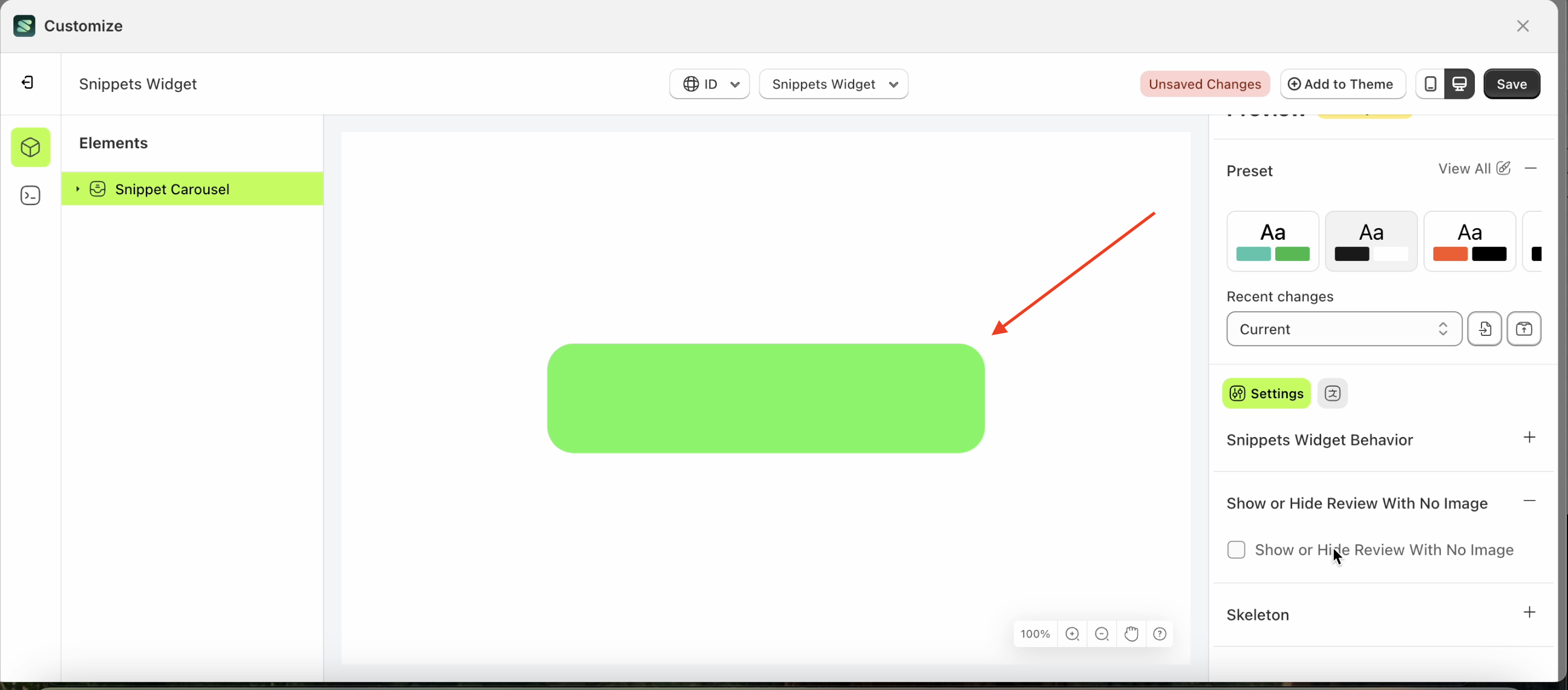
Show or Hide Review With No Image
This feature is designed to manage the Review Image List settings. When the "Input Checked" option is enabled, reviews without images will still be displayed. Otherwise, only reviews with images will be shown.
Follow the steps below
- Select the Snippet Carousel element on the right, then click the Settings tab and click the icon marked with a red arrow.
- Enable the Show or Hide Review With No Image checkbox
- Example : Before Show or Hide Review With No Image is enabled
- Example : After Show or Hide Review With No Image is enabled
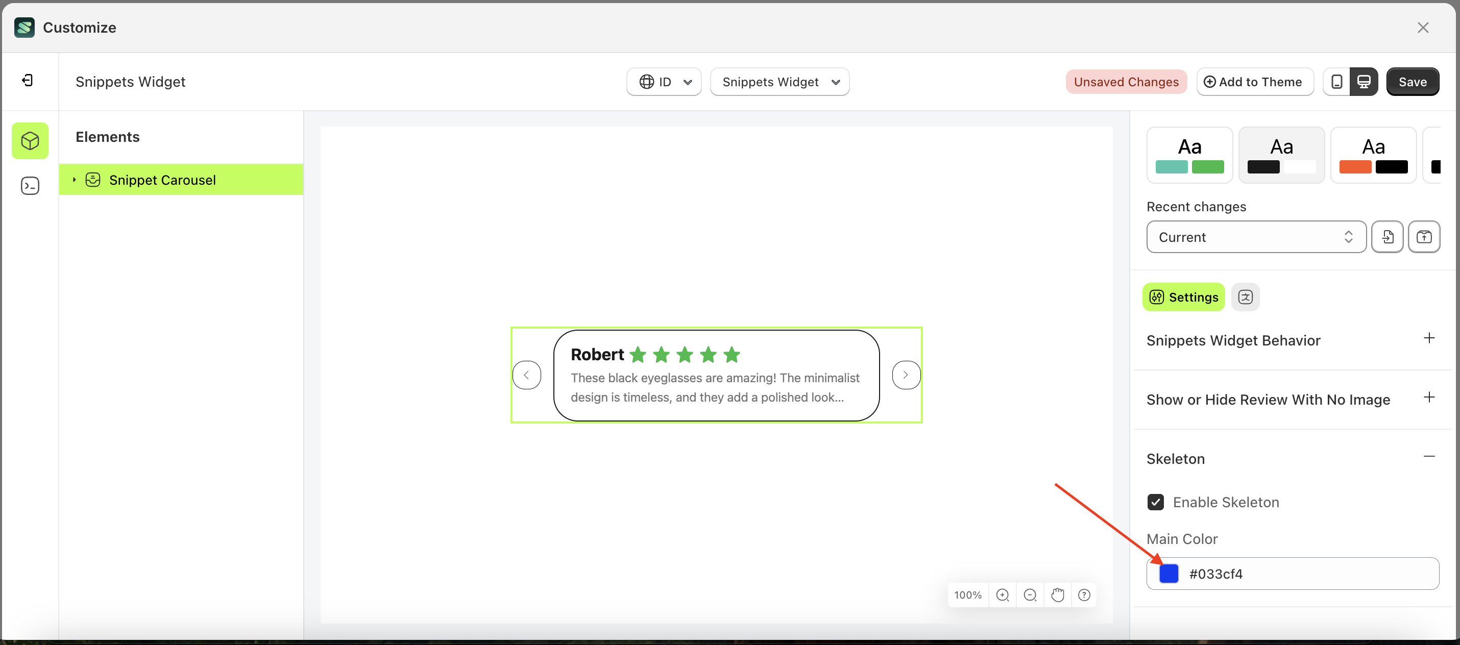
Skeleton
Available settings:
Enable Skeleton
Enable Skeleton is a setting that controls whether a loader or skeleton is displayed before the required data is fully loaded.
Follow the steps below:
- Select the Snippet Carousel element on the right, then click the Settings tab and click the icon marked with a red arrow.
- Enable the Enable Skeleton checkbox
- Example : Before Enable Skeleton is enabled
- Example : After Enable Skeleton is enabled
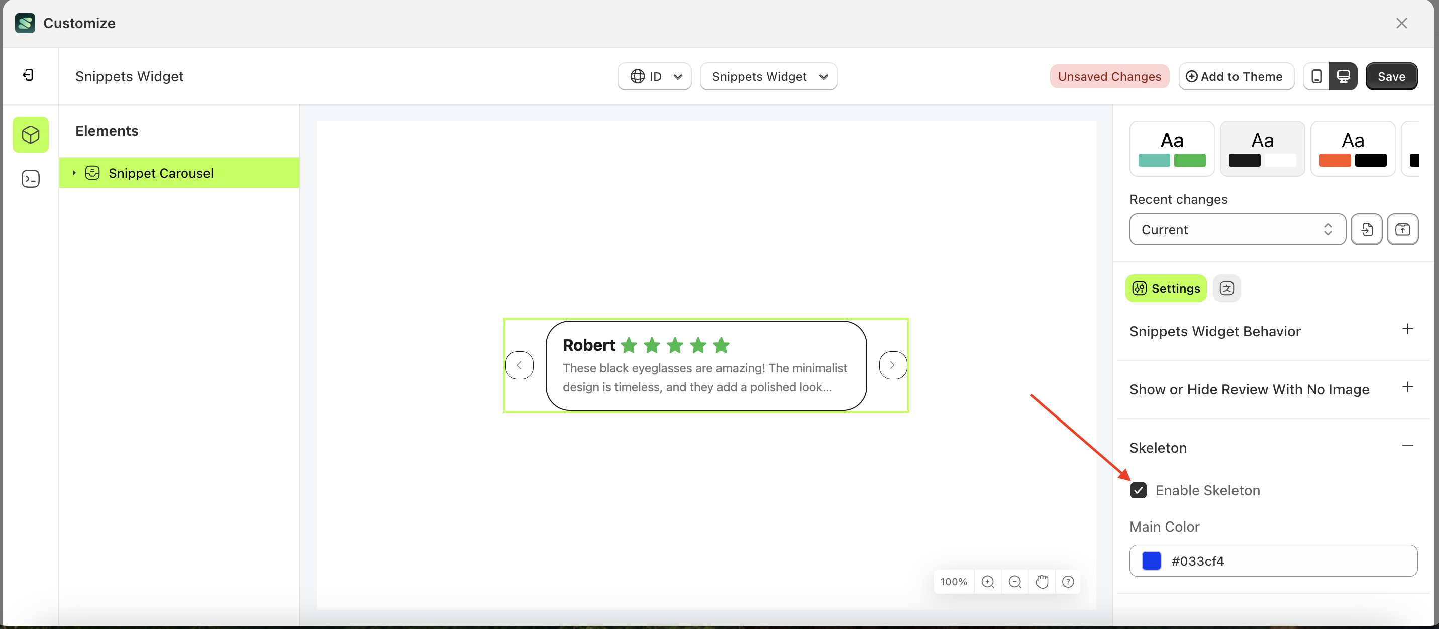
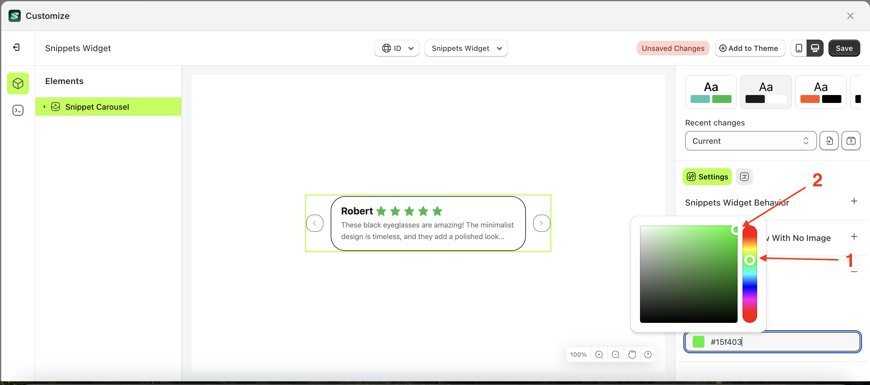
Main Color
Main Color is a setting that manages the color of the skeleton. However, you must first activate the Enable Skeleton feature.
Follow the steps below:
- Select the Snippet Carousel element on the left, then click the Settings tab and click the icon marked with a red arrow.
- Click the Color Palette on the right side, which is also marked with a red arrow.
- The Color Palette will appear. Click the right side of the palette where the red arrow and number 1 are indicated, then click the right side again where the red arrow and number 2 are marked.
- The snippet widget of the Snippet Carousel element will adjust accordingly.
- Example : Before Snippet Carousel change settings
- Example : After Snippet Carousel change settings
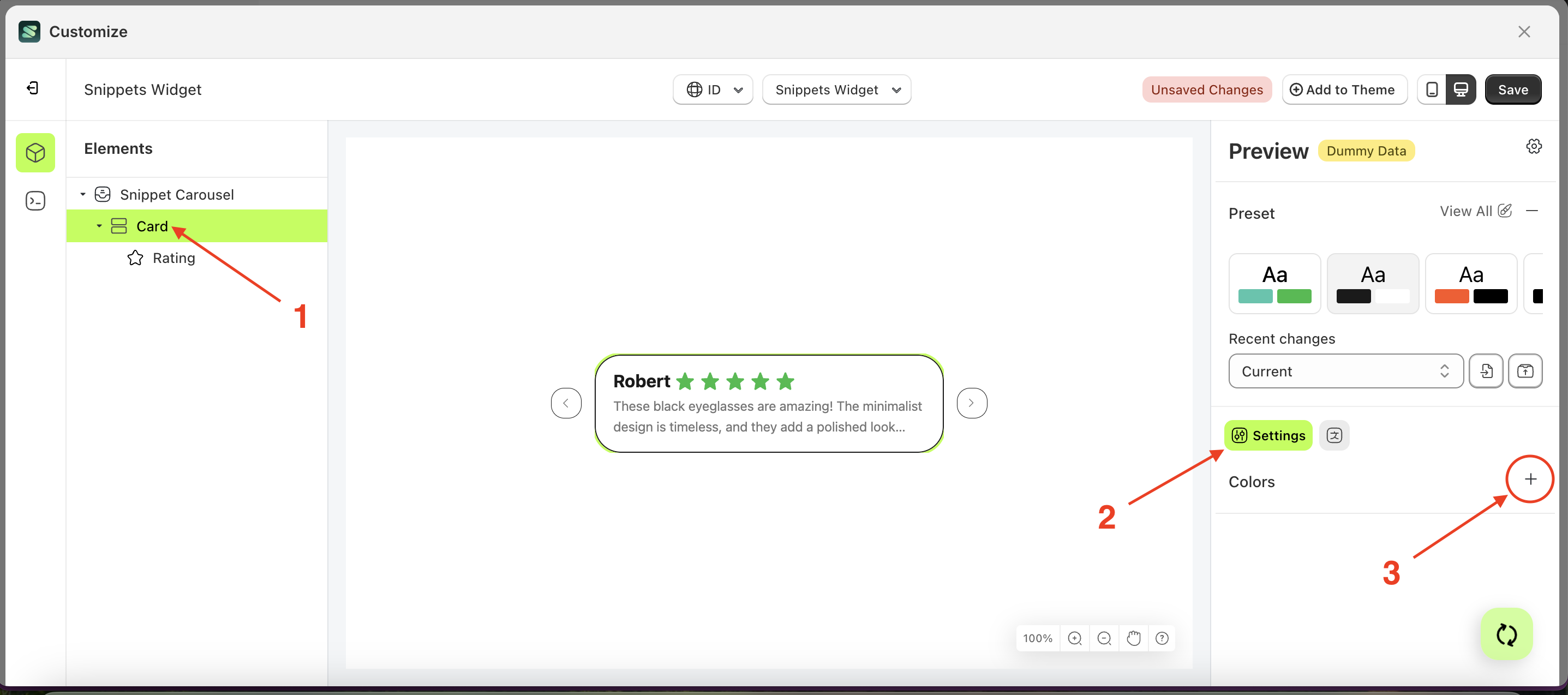
Colors
Available settings:
Background Color
This feature is designed to customize the background color of the colors
Follow the steps below:
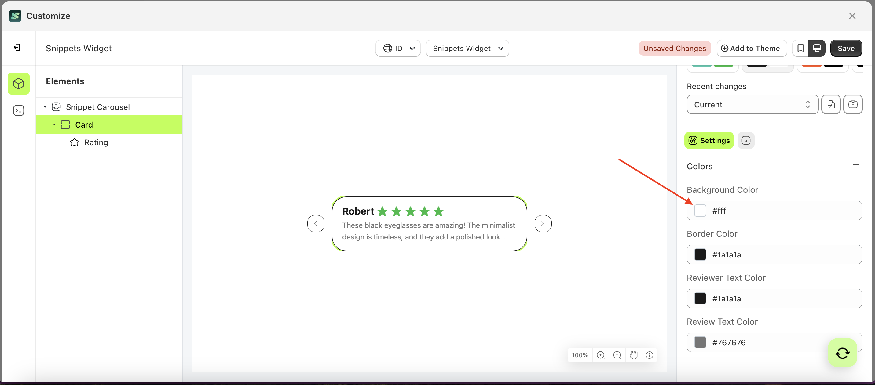
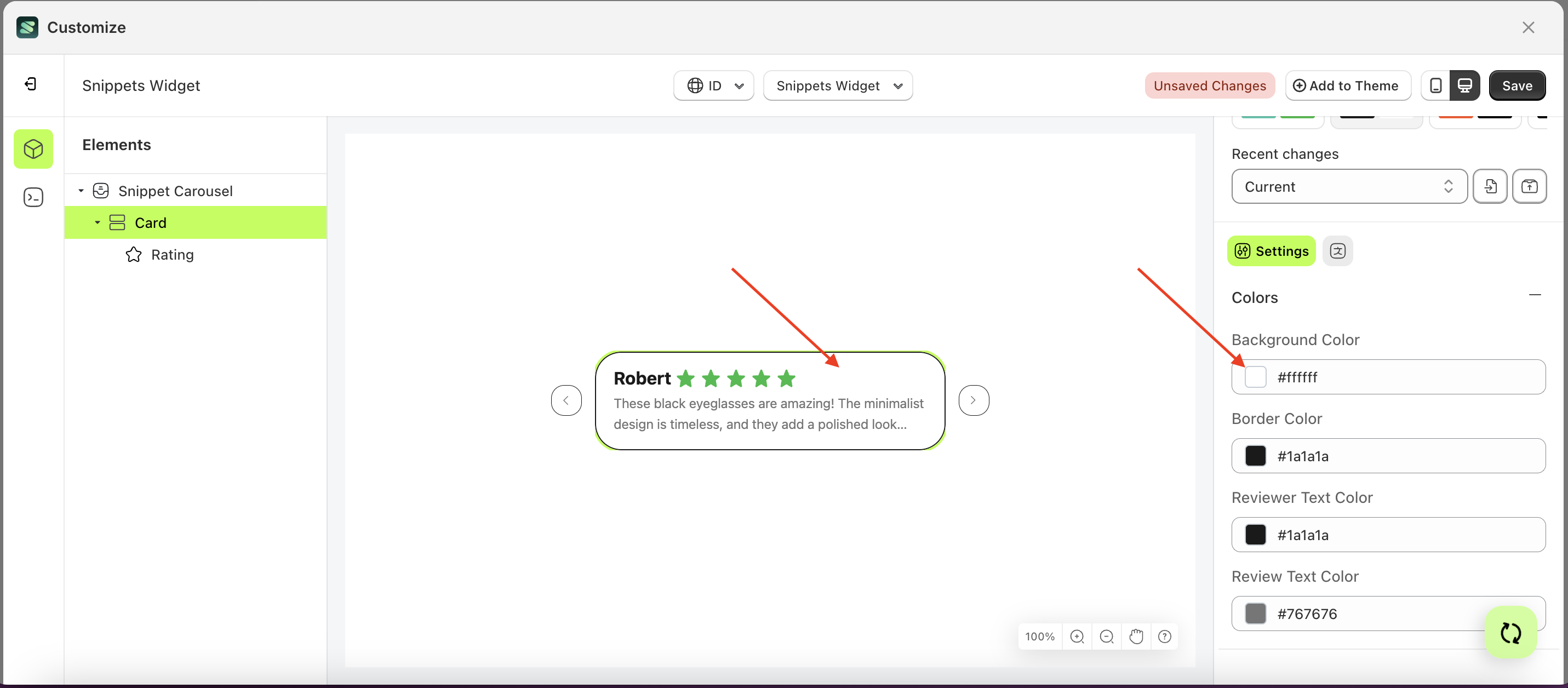
- Select the Card element on the left, then click the Settings tab and click the icon marked with a red arrow.
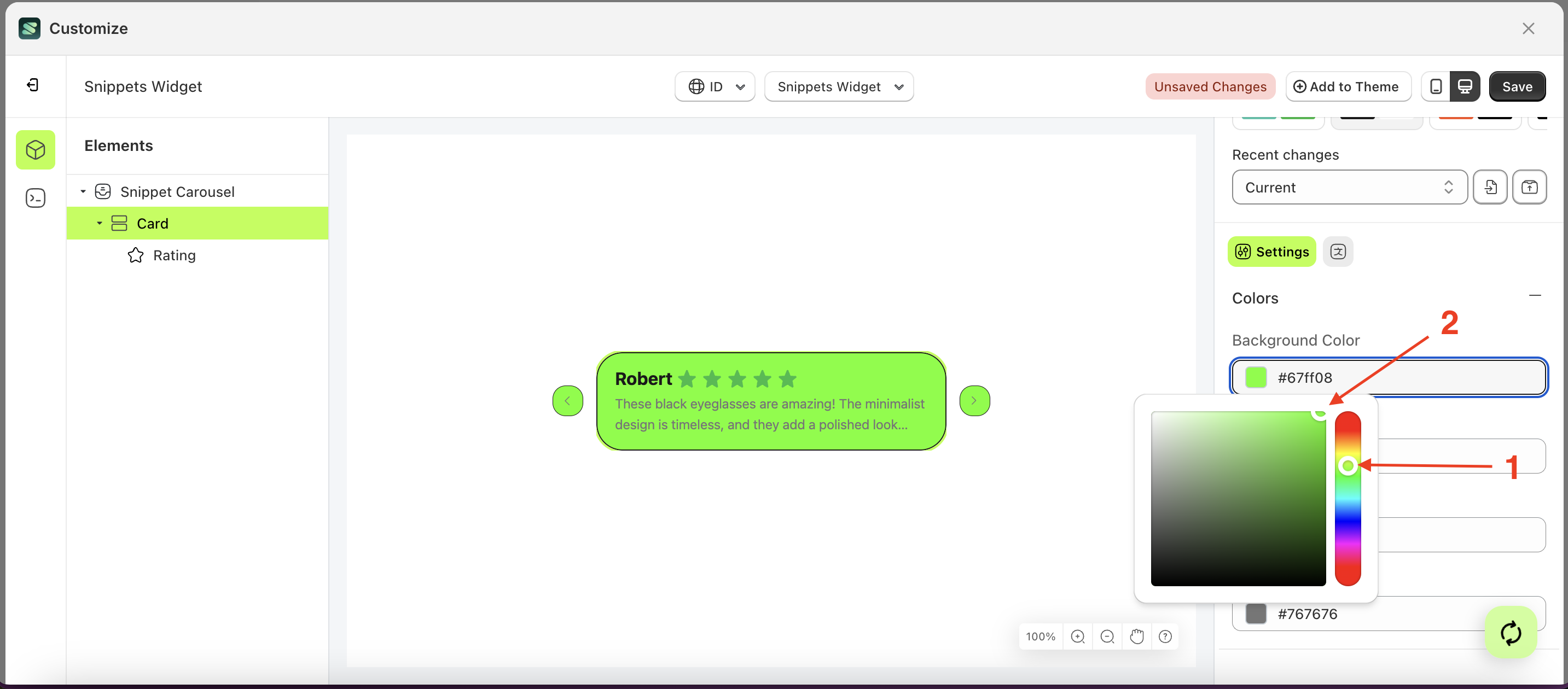
- Click the Color Palette on the right side, which is also marked with a red arrow.
- The Color Palette will appear. Click the right side of the palette where the red arrow and number 1 are indicated, then click the right side again where the red arrow and number 2 are marked.
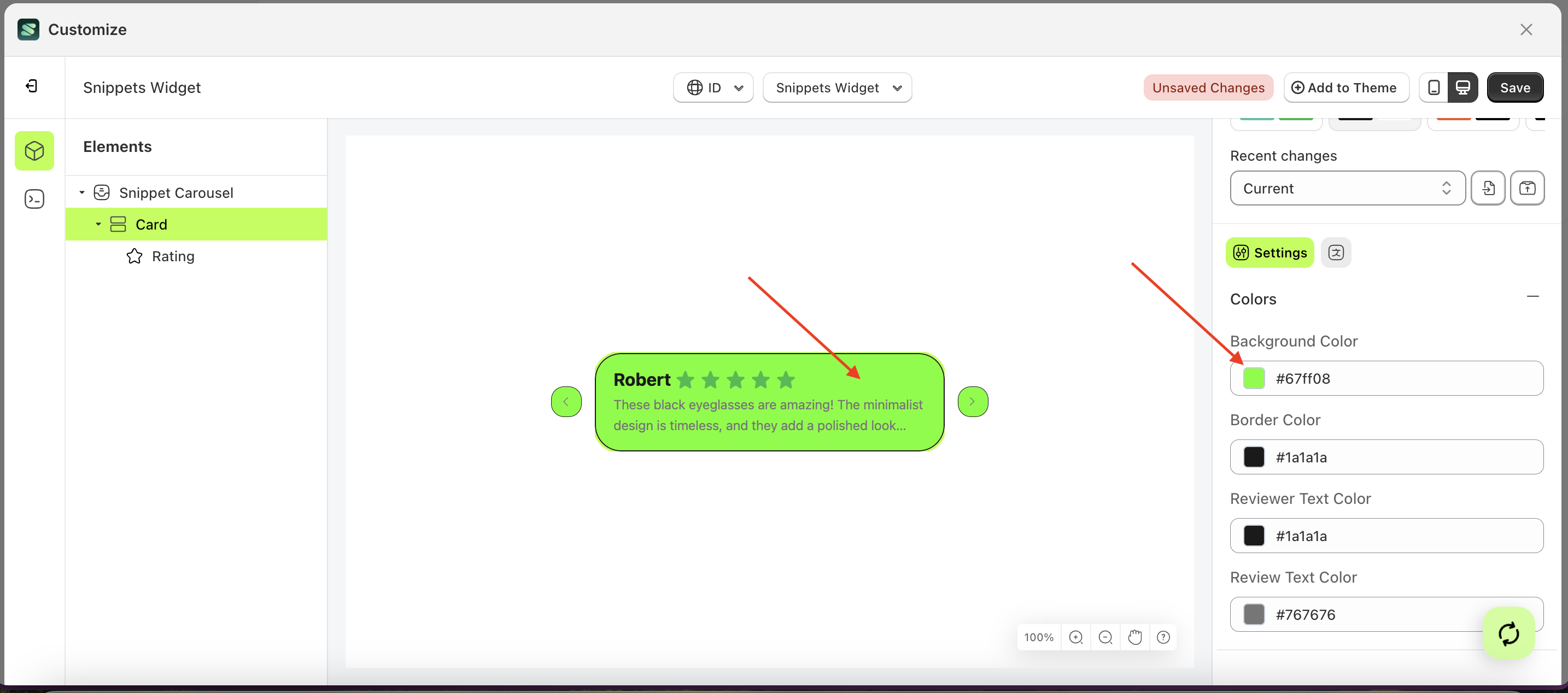
- The snippet widget of the Card element will adjust accordingly.
- Example : Before Card change settings
- Example : After Card change settings
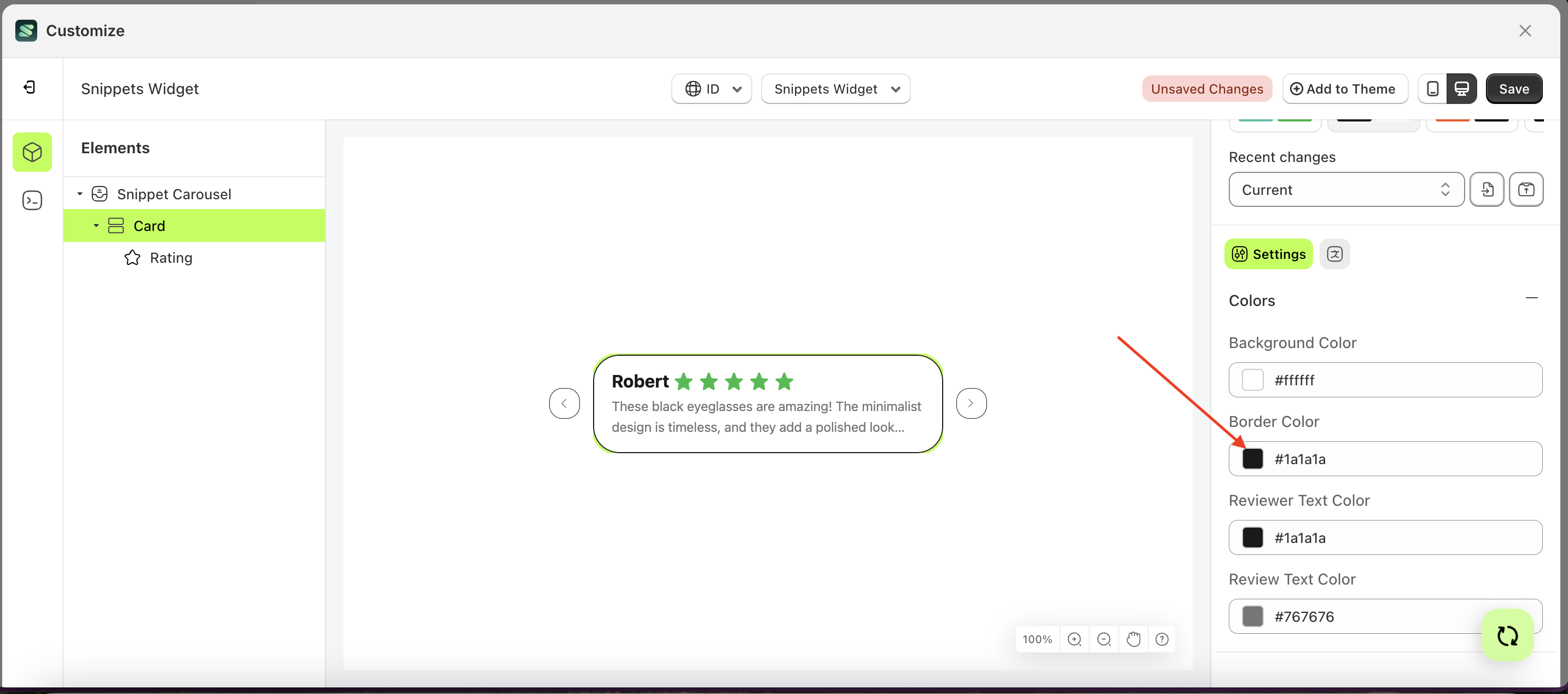
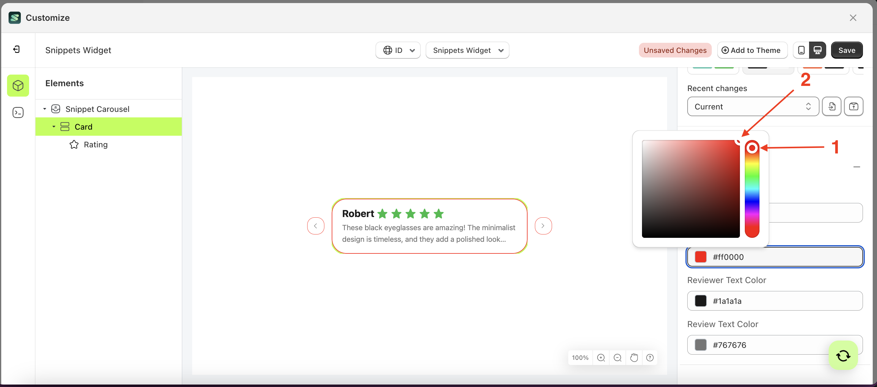
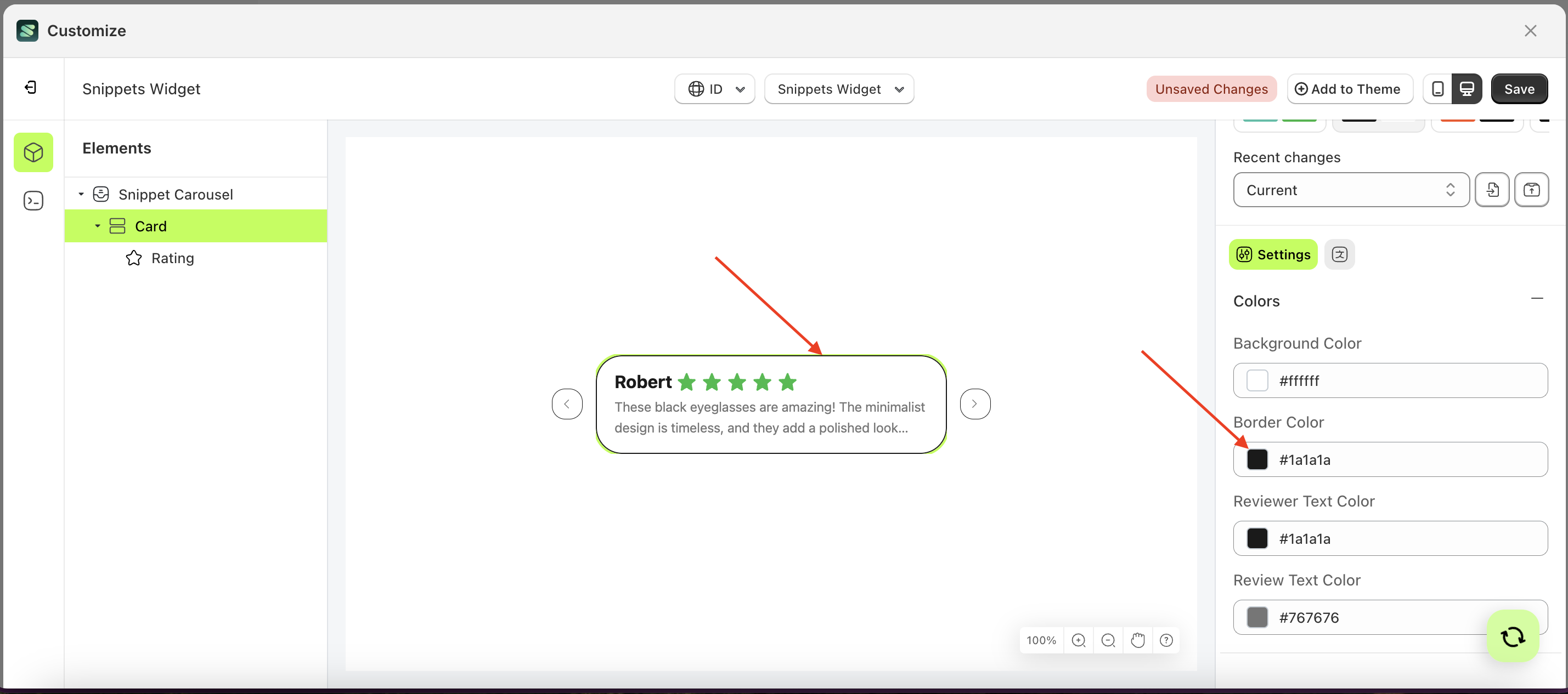
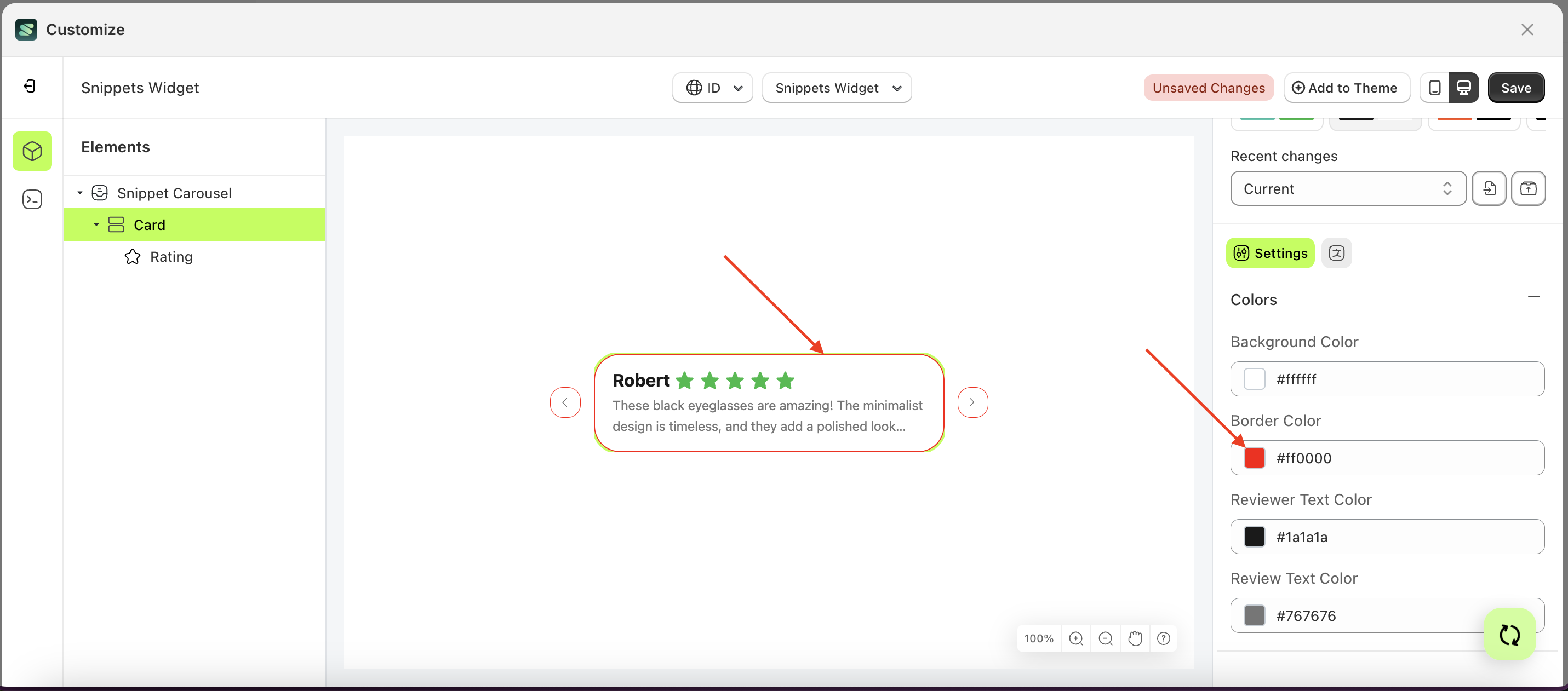
Border Color
This feature is designed to customize the border color of the colors
Follow the steps below:
- Select the Card element on the left, then click the Settings tab and click the icon marked with a red arrow.
- Click the Color Palette on the right side, which is also marked with a red arrow.
- The Color Palette will appear. Click the right side of the palette where the red arrow and number 1 are indicated, then click the right side again where the red arrow and number 2 are marked.
- The snippet widget of the Card element will adjust accordingly.
- Example : Before Card change settings
- Example : After Card change settings
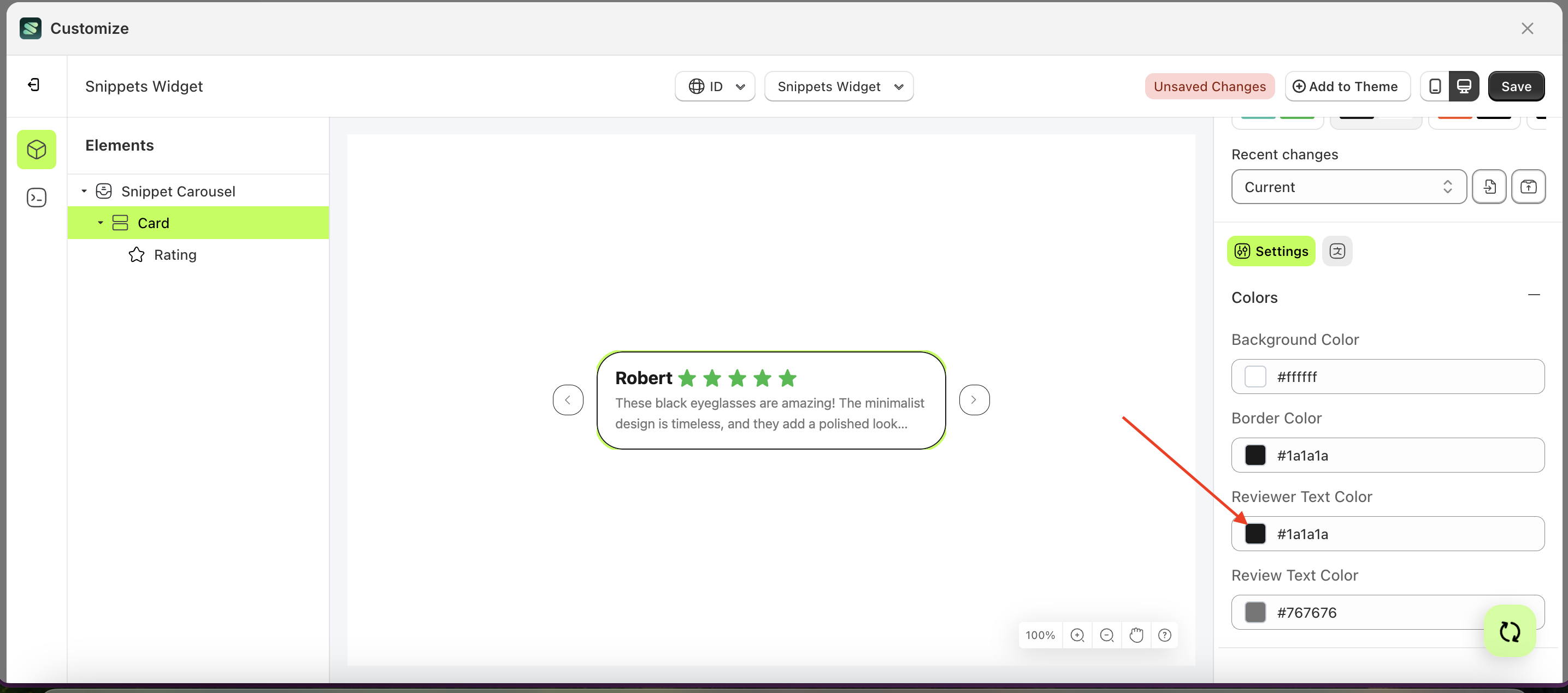
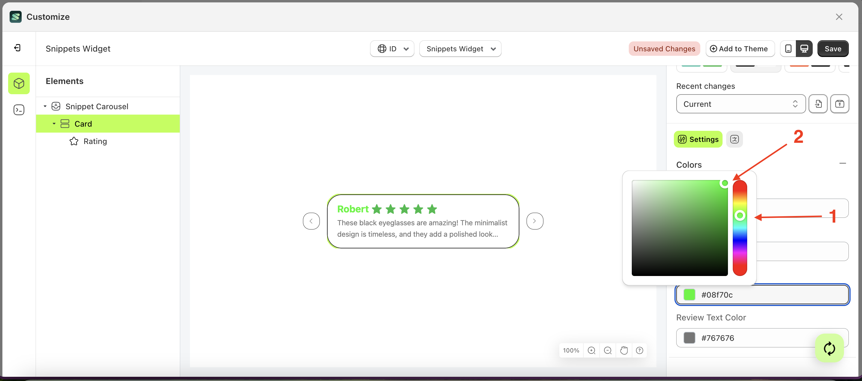
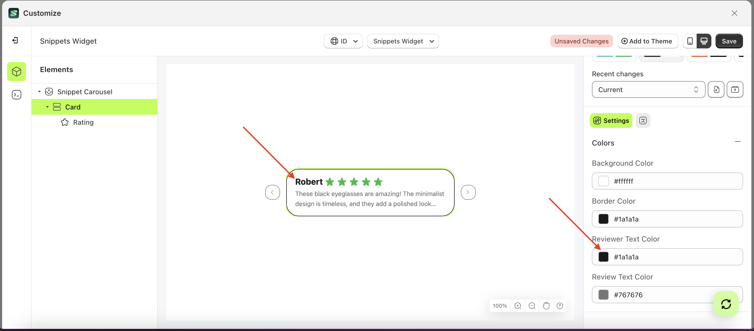
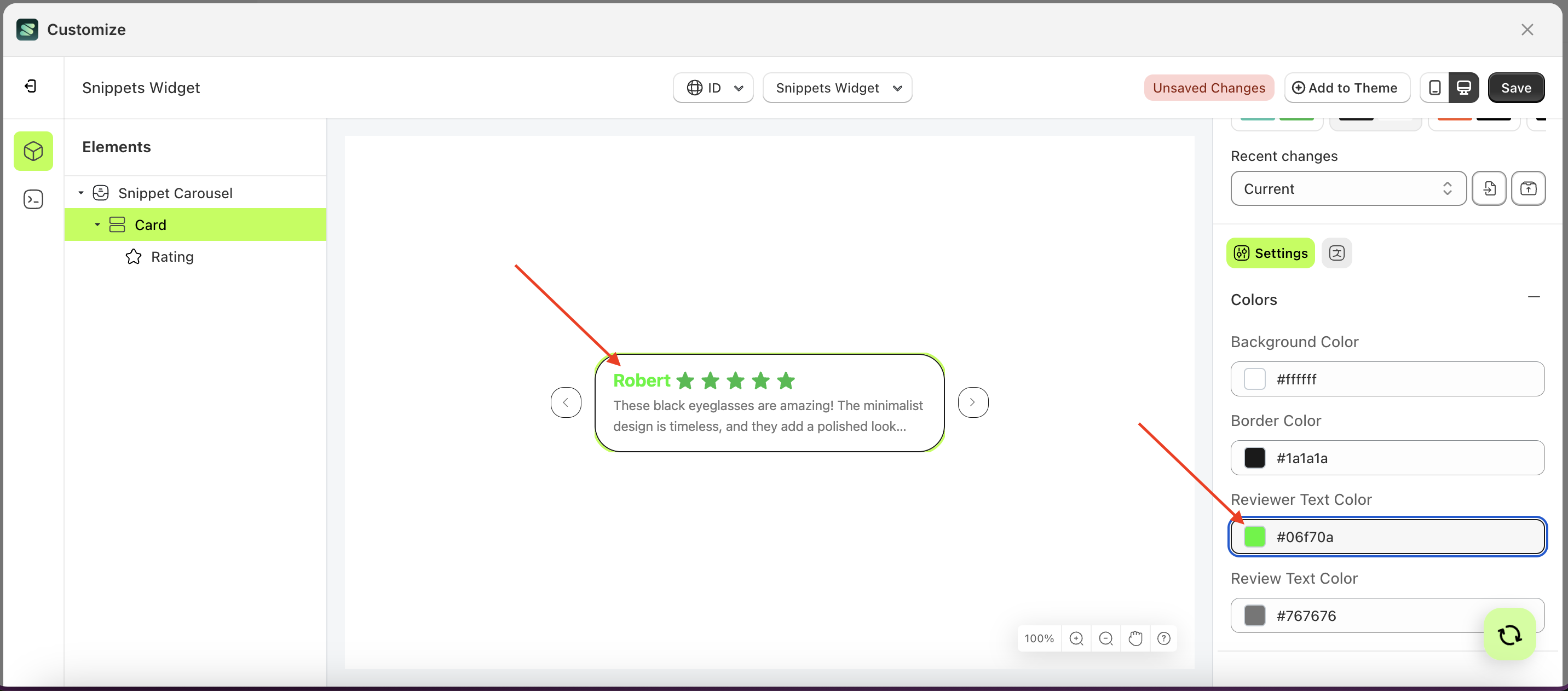
Reviewer Text Color
This feature is designed to customize the reviewer text color of the colors
Follow the steps below:
- Select the Card element on the left, then click the Settings tab and click the icon marked with a red arrow.
- Click the Color Palette on the right side, which is also marked with a red arrow.
- The Color Palette will appear. Click the right side of the palette where the red arrow and number 1 are indicated, then click the right side again where the red arrow and number 2 are marked.
- The snippet widget of the Card element will adjust accordingly.
- Example : Before Card change settings
- Example : After Card change settings
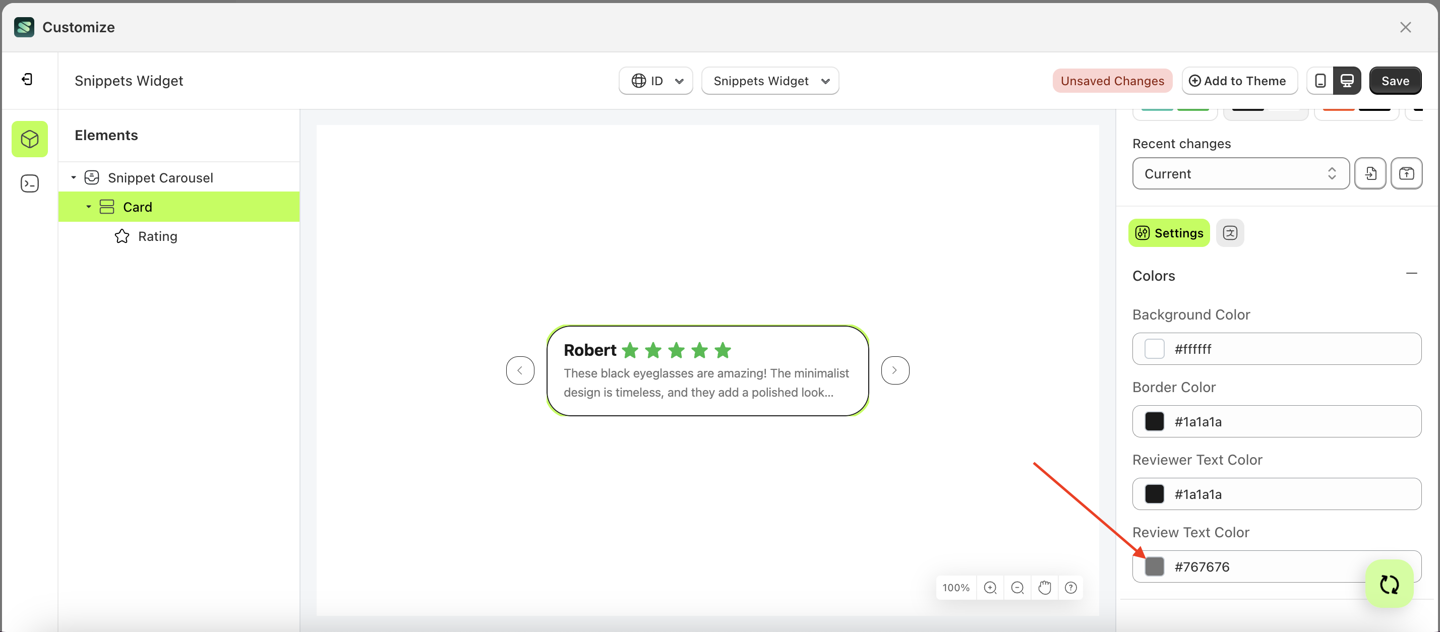
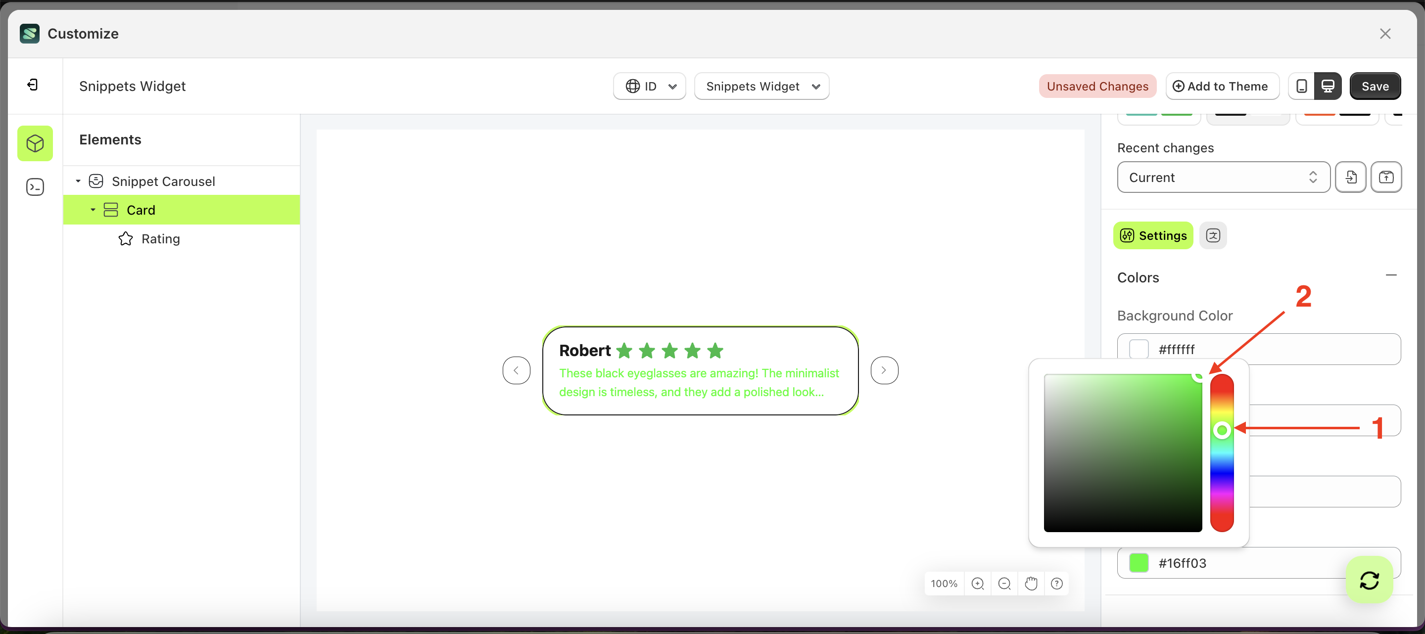
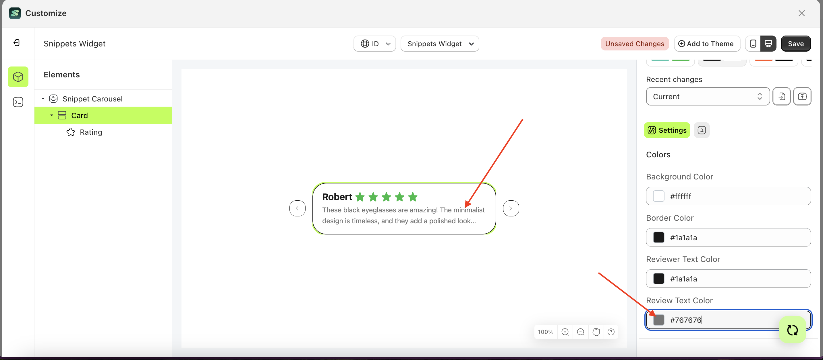
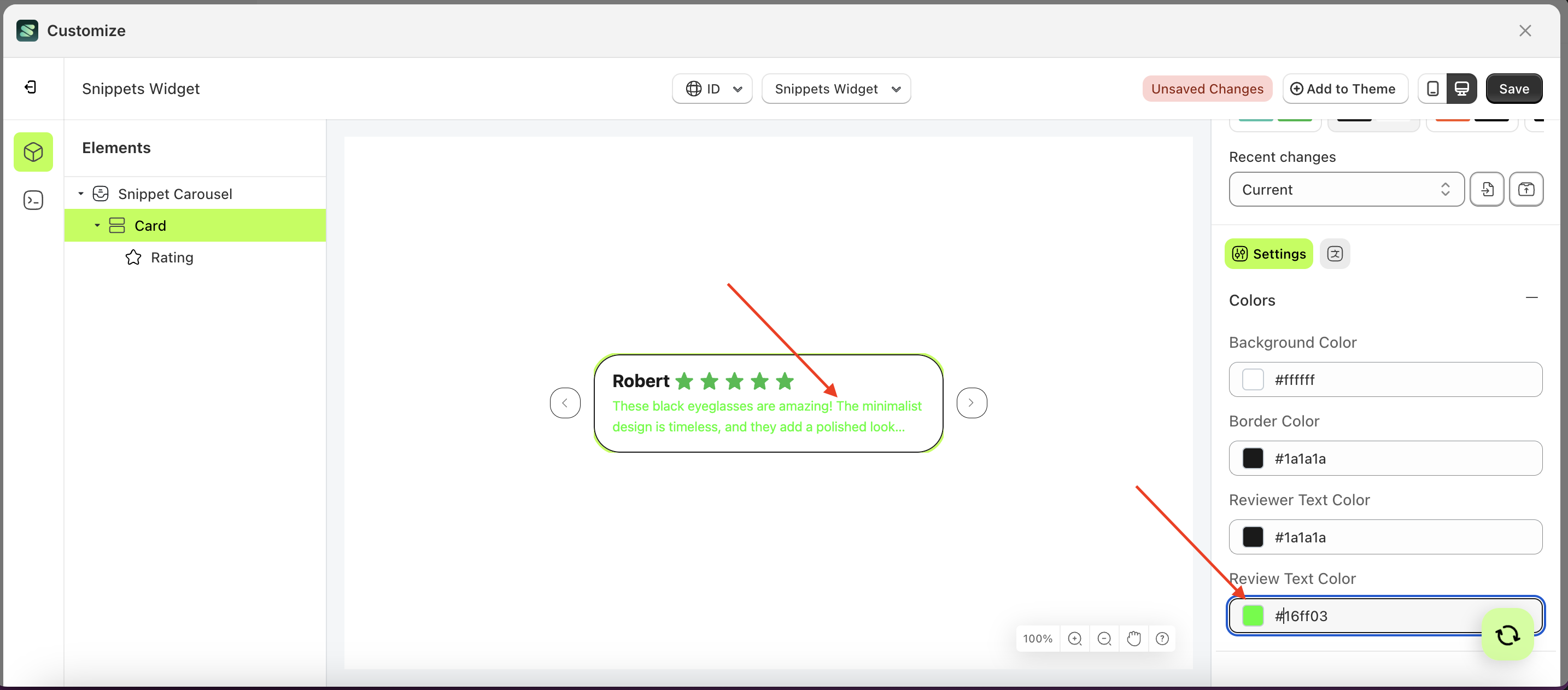
Review Text Color
This feature is designed to customize the review text color of the colors
Follow the steps below:
- Select the Card element on the left, then click the Settings tab and click the icon marked with a red arrow.
- Click the Color Palette on the right side, which is also marked with a red arrow.
- The Color Palette will appear. Click the right side of the palette where the red arrow and number 1 are indicated, then click the right side again where the red arrow and number 2 are marked.
- The snippet widget of the Card element will adjust accordingly.
- Example : Before Card change settings
- Example : After Card change settings
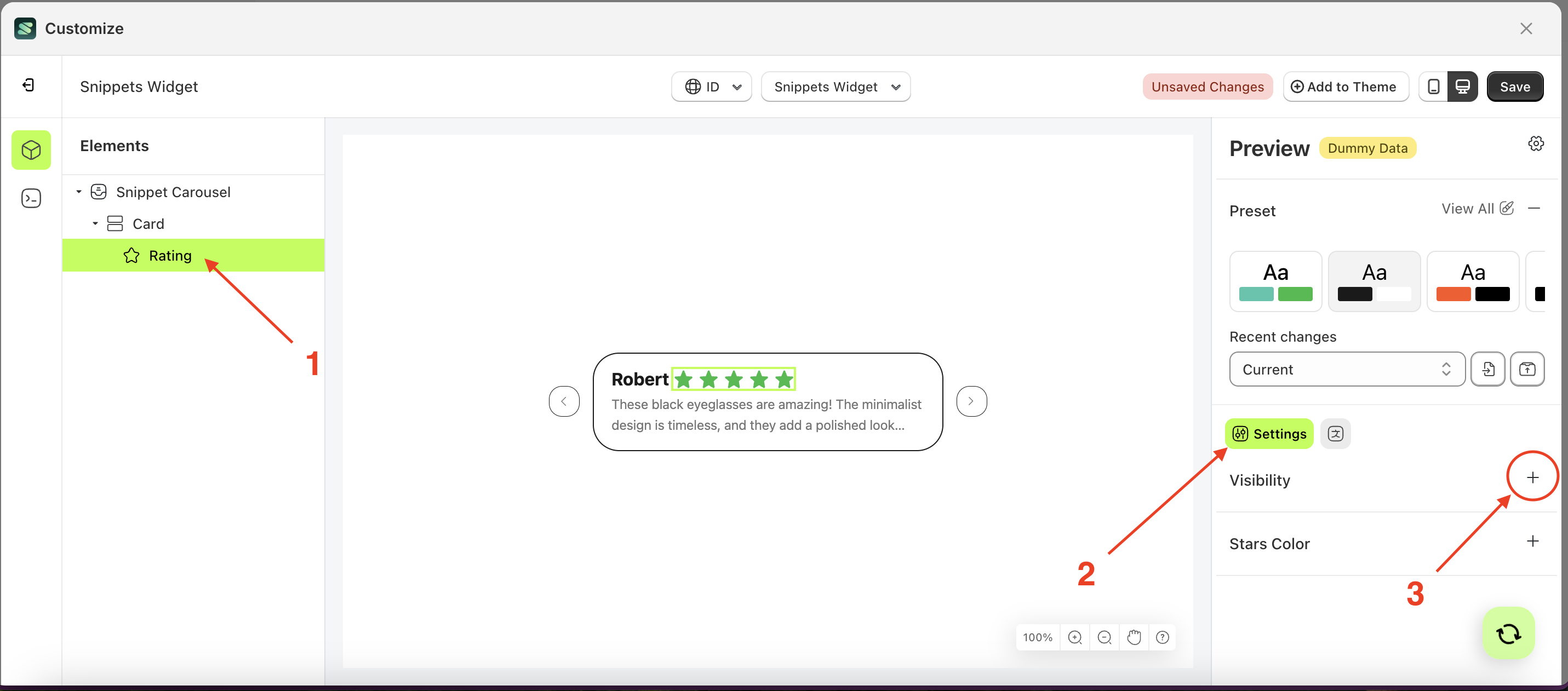
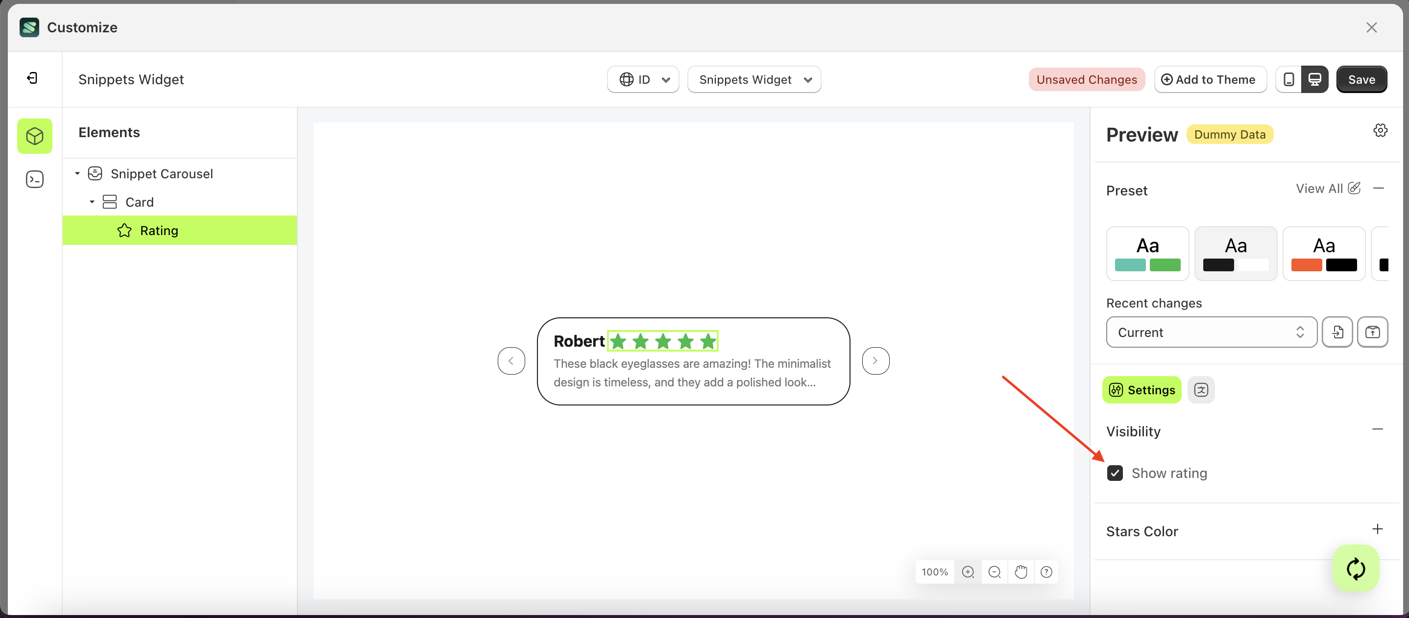
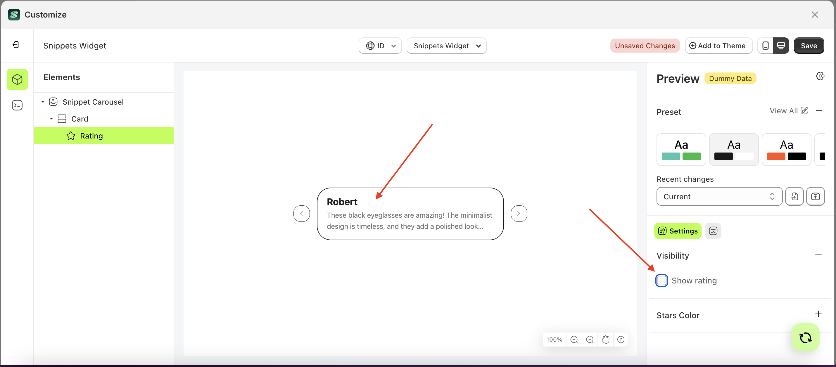
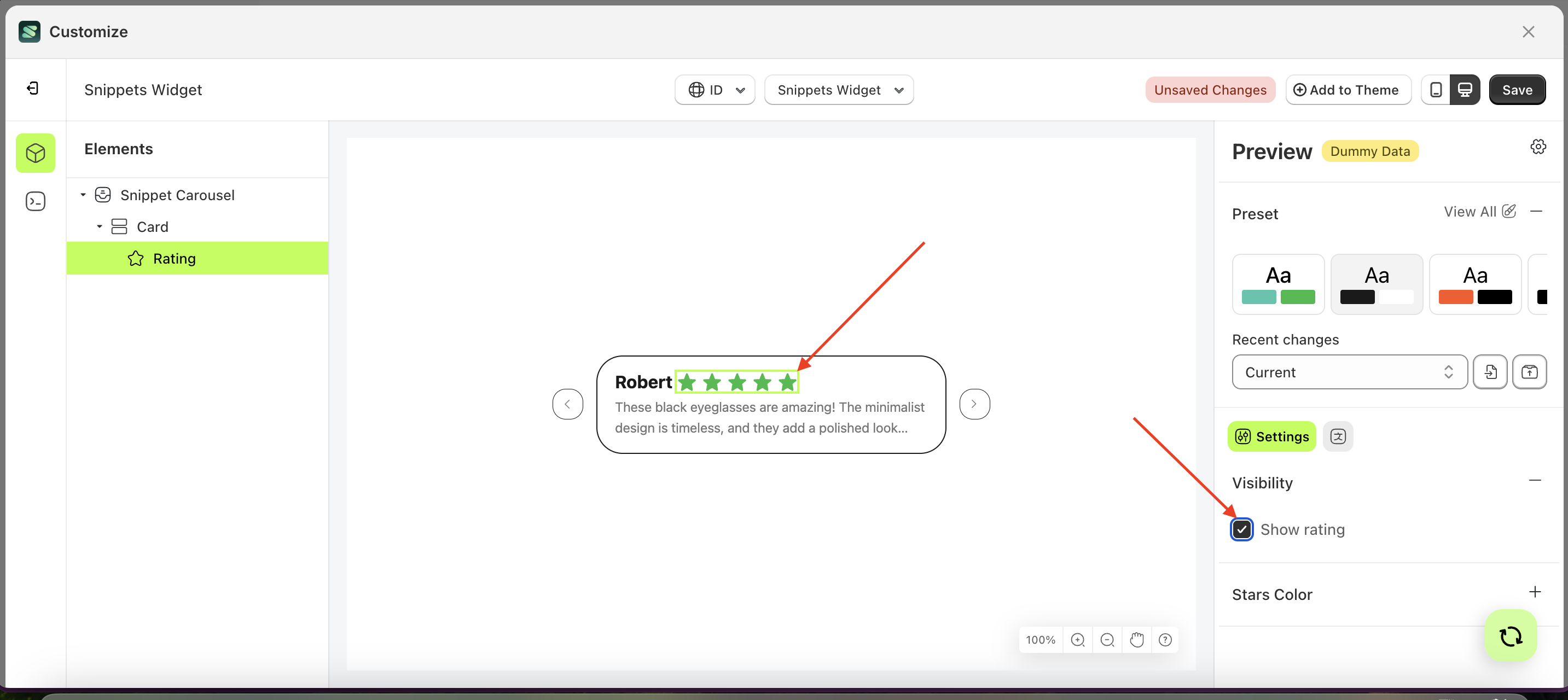
Visibility
Available settings:
Show Rating
This feature is designed to control whether the star rating icons are displayed or not.
Follow the steps below:
- Select the Rating element on the right, then click the Settings tab and click the icon marked with a red arrow.
- Enable the Show rating checkbox
- Example : Before Show rating is enabled
- Example : After Show rating is enabled
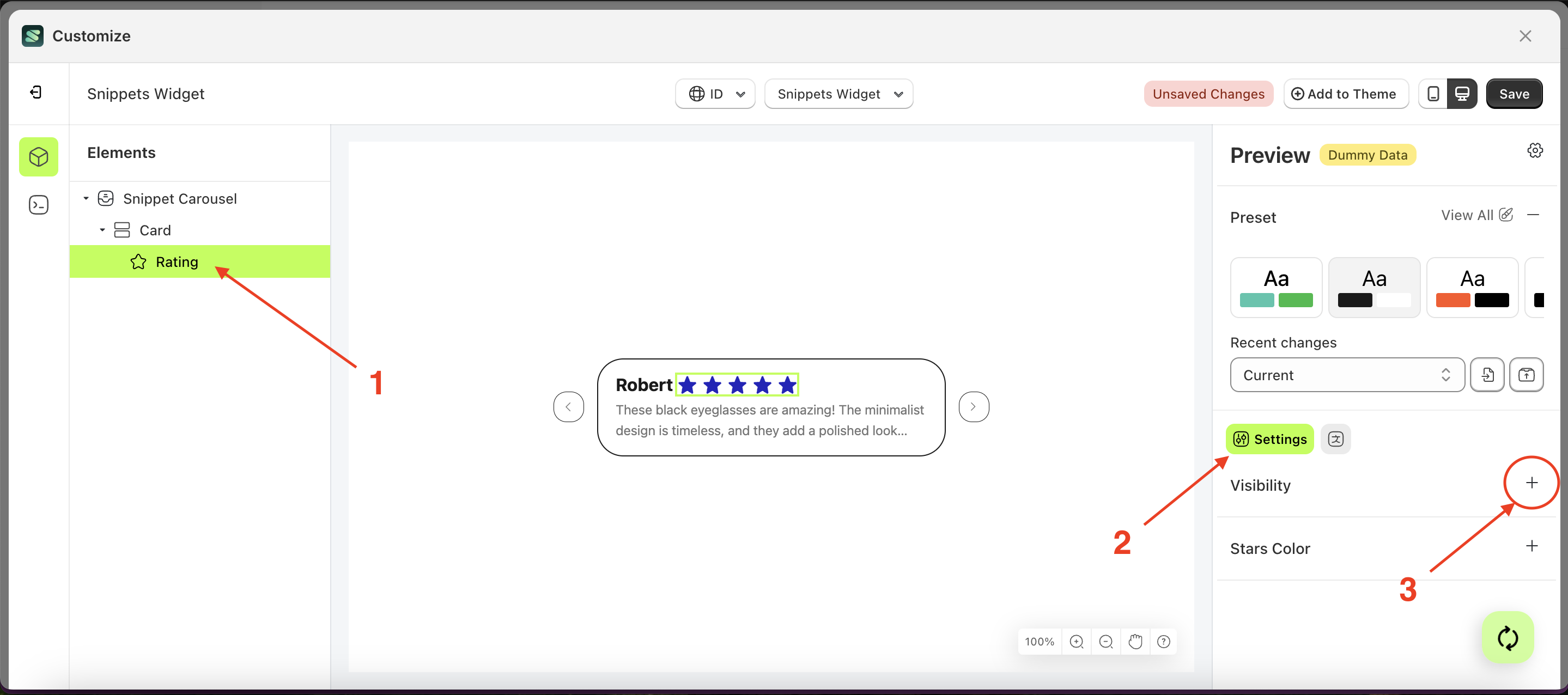
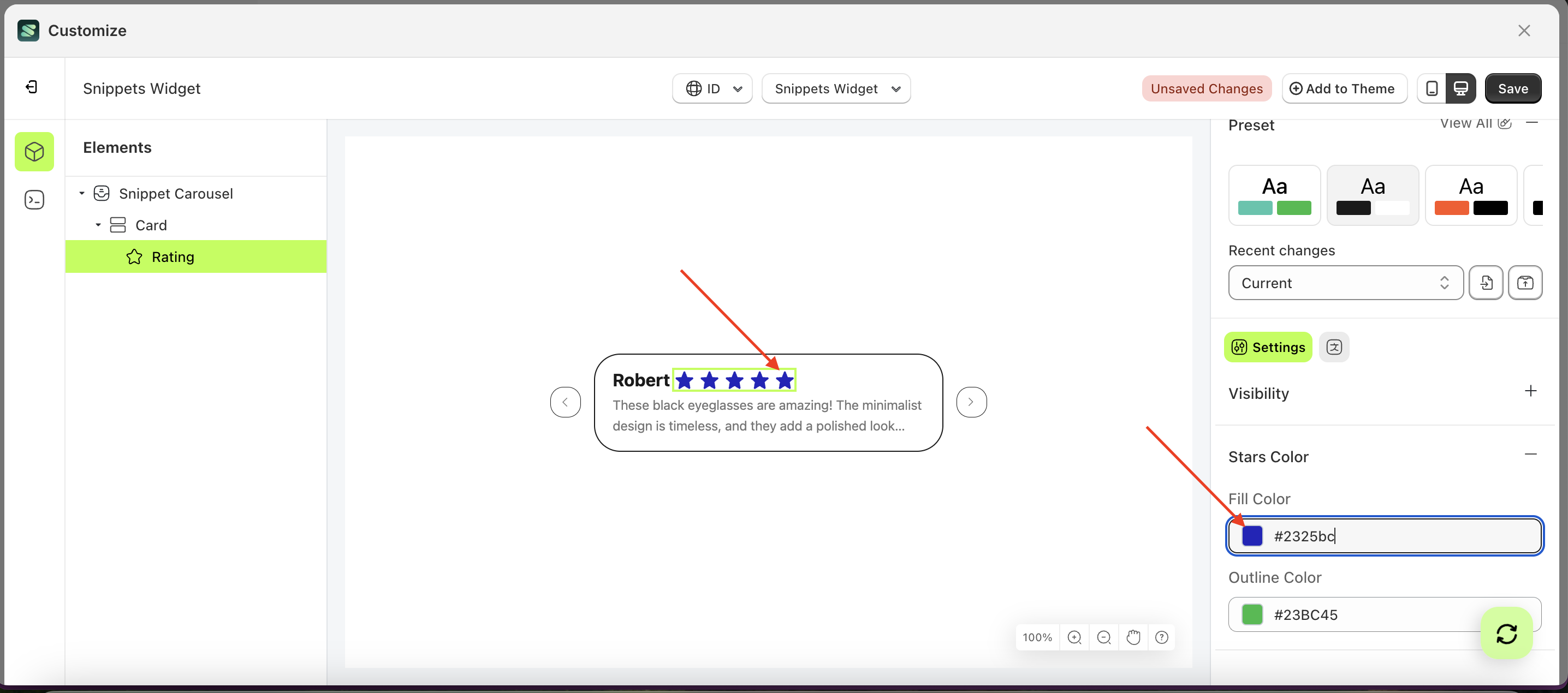
Stars Color
Available settings:
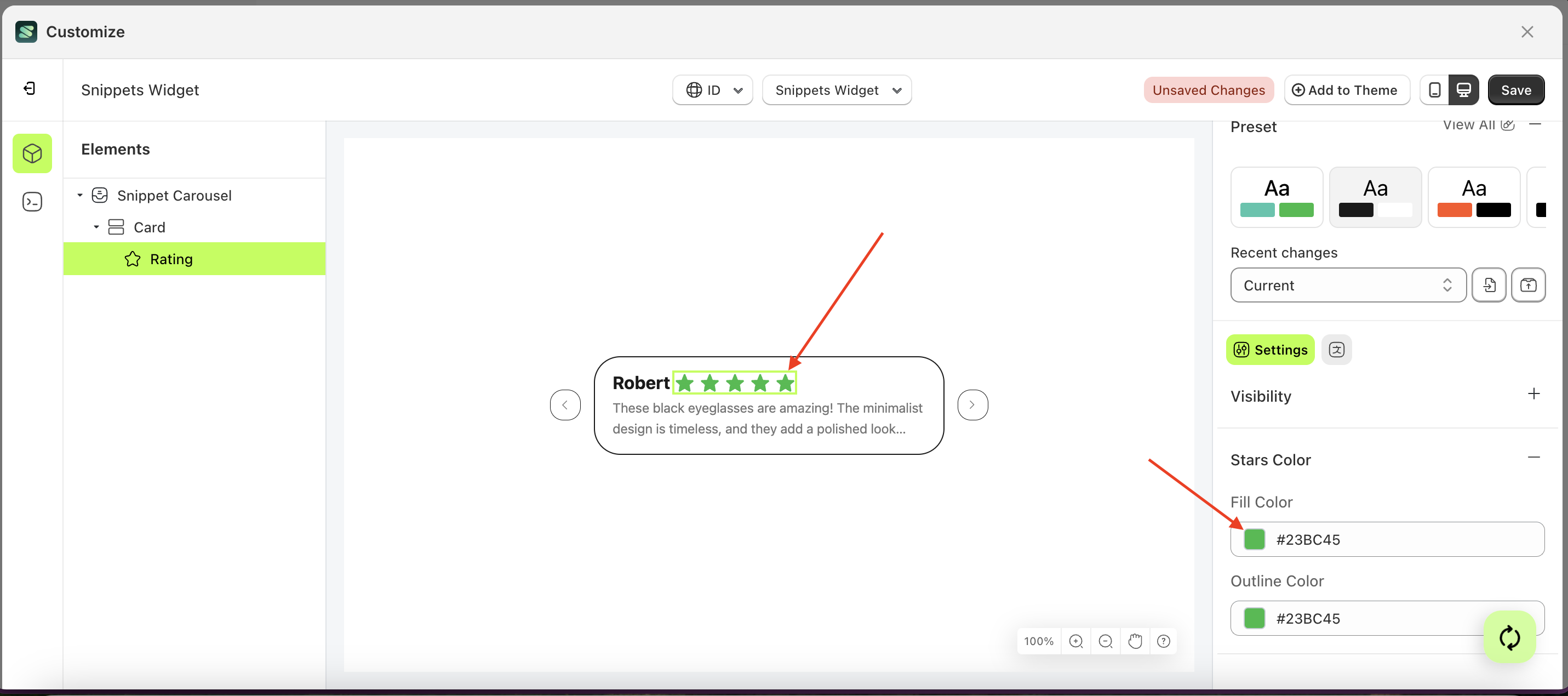
Fill Color
This feature is designed to manage the inner color of the stars.
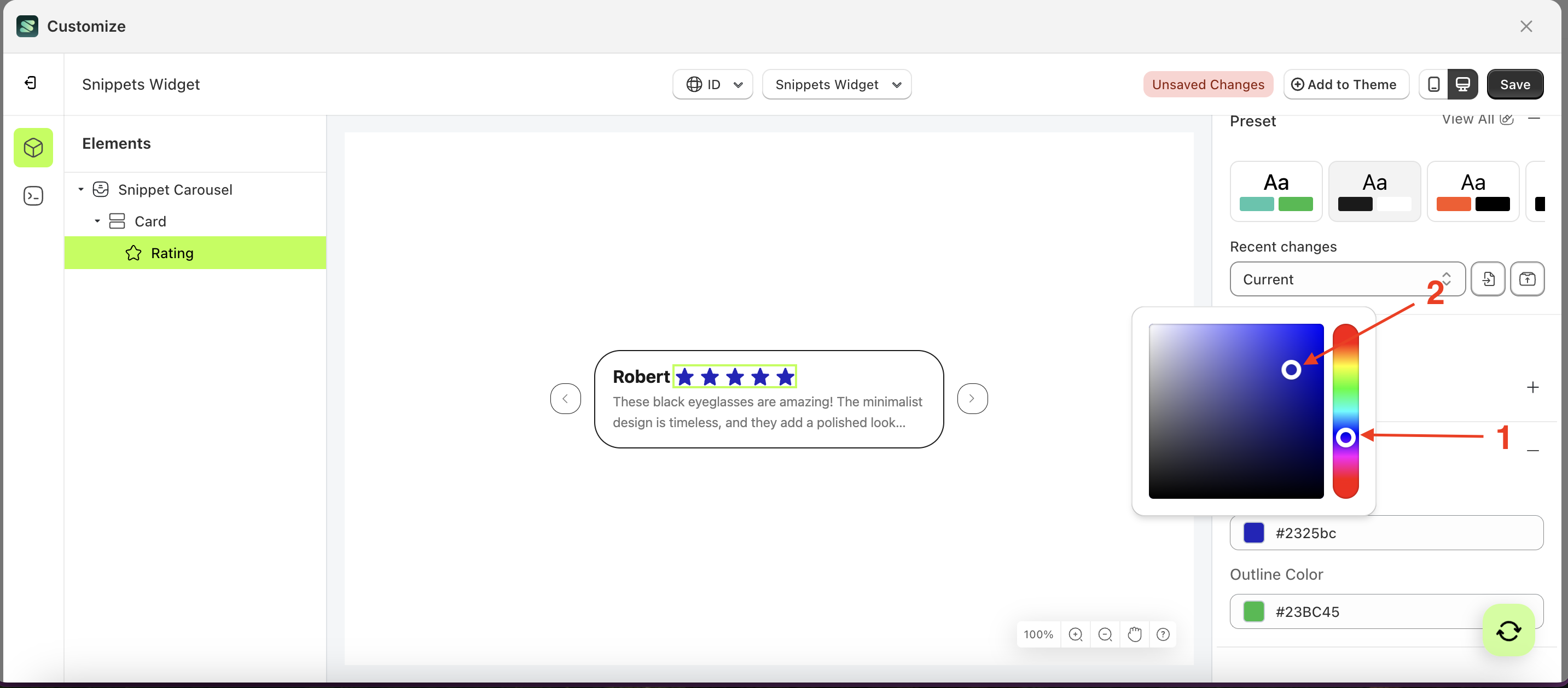
Follow the steps below:
- Select the Rating element on the left, then click the Settings tab and click the icon marked with a red arrow.
- Click the Color Palette on the right side, which is also marked with a red arrow.
- The Color Palette will appear. Click the right side of the palette where the red arrow and number 1 are indicated, then click the right side again where the red arrow and number 2 are marked.
- The snippet widget of the Rating element will adjust accordingly.
- Example : Before Rating change settings
- Example : After Rating change settings
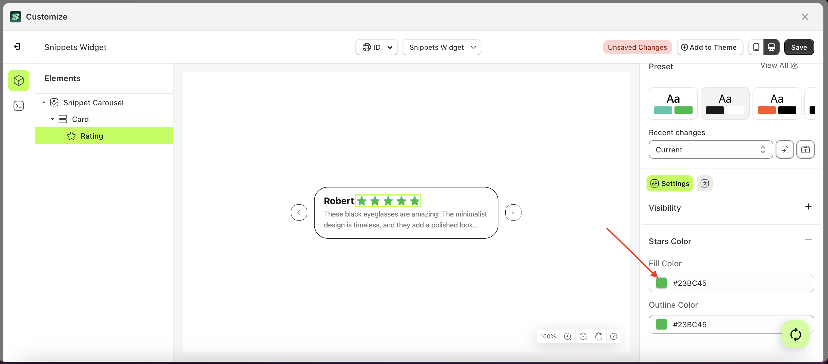
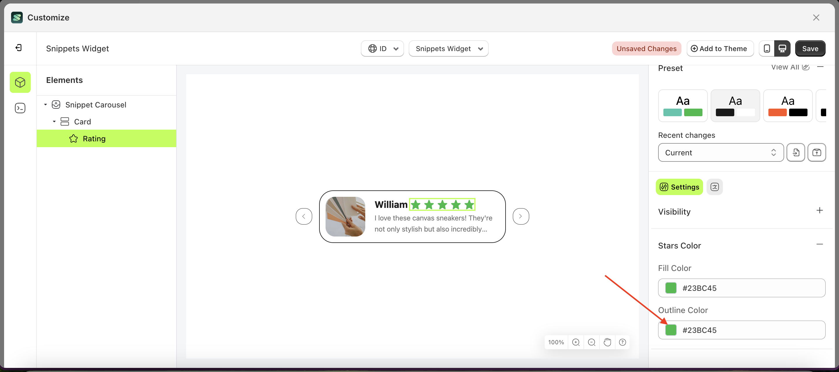
Outline Color
This feature is designed to manage the outer color or border of the stars
Follow the steps below:
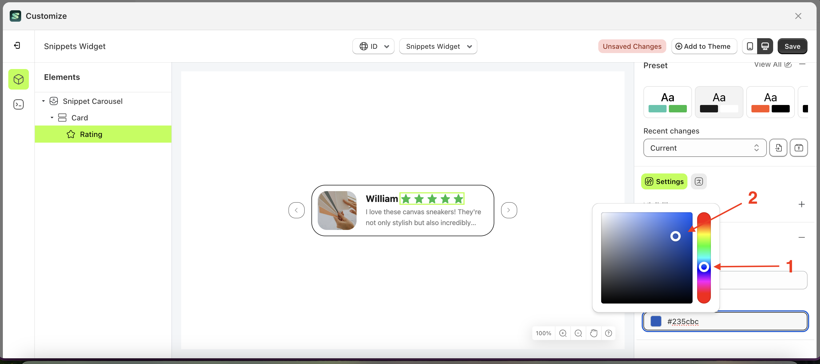
- Select the Rating element on the left, then click the Settings tab and click the icon marked with a red arrow.
- Click the Color Palette on the right side, which is also marked with a red arrow.
- The Color Palette will appear. Click the right side of the palette where the red arrow and number 1 are indicated, then click the right side again where the red arrow and number 2 are marked.
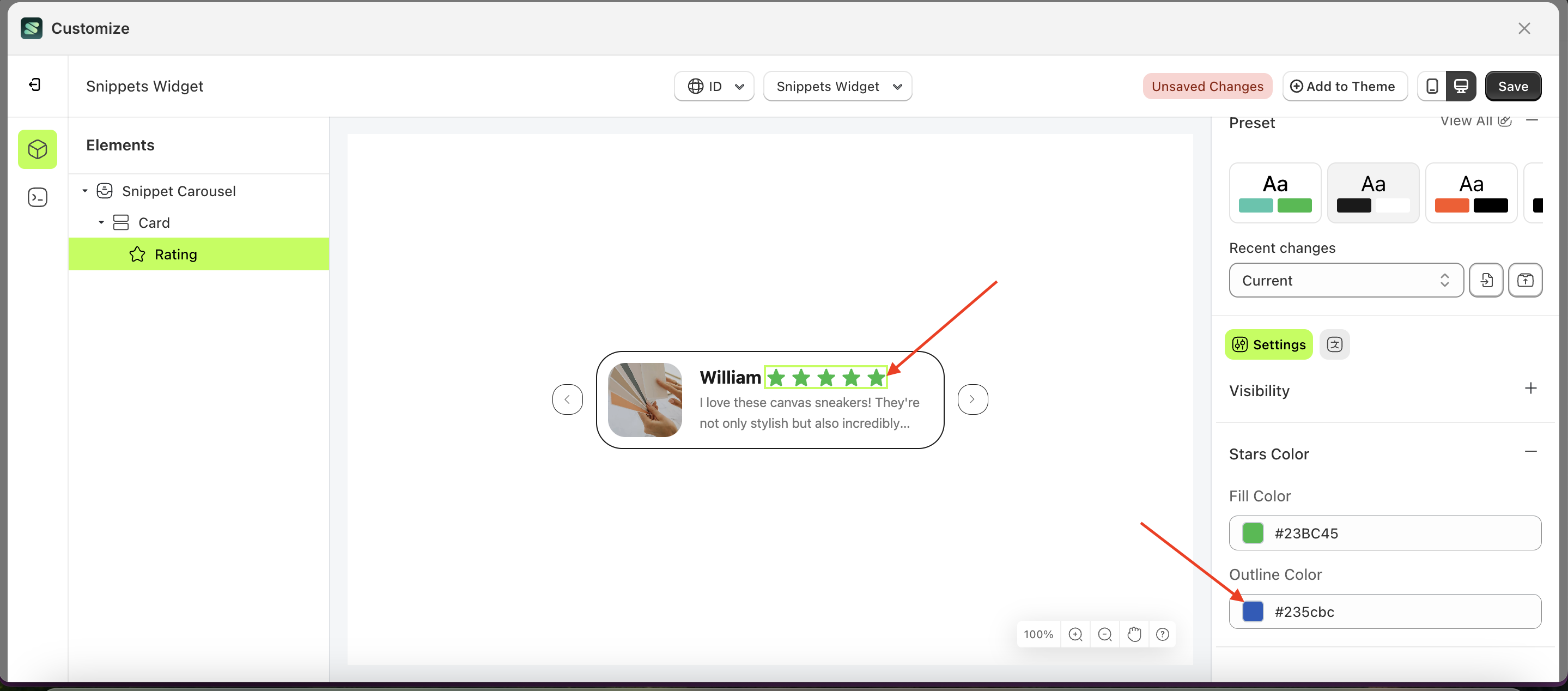
- The snippet widget of the Rating element will adjust accordingly.
- Example : Before Rating change settings
- Example : After Rating change settings