Product review widget
To Access the Product Review Widget, Follow These Steps:
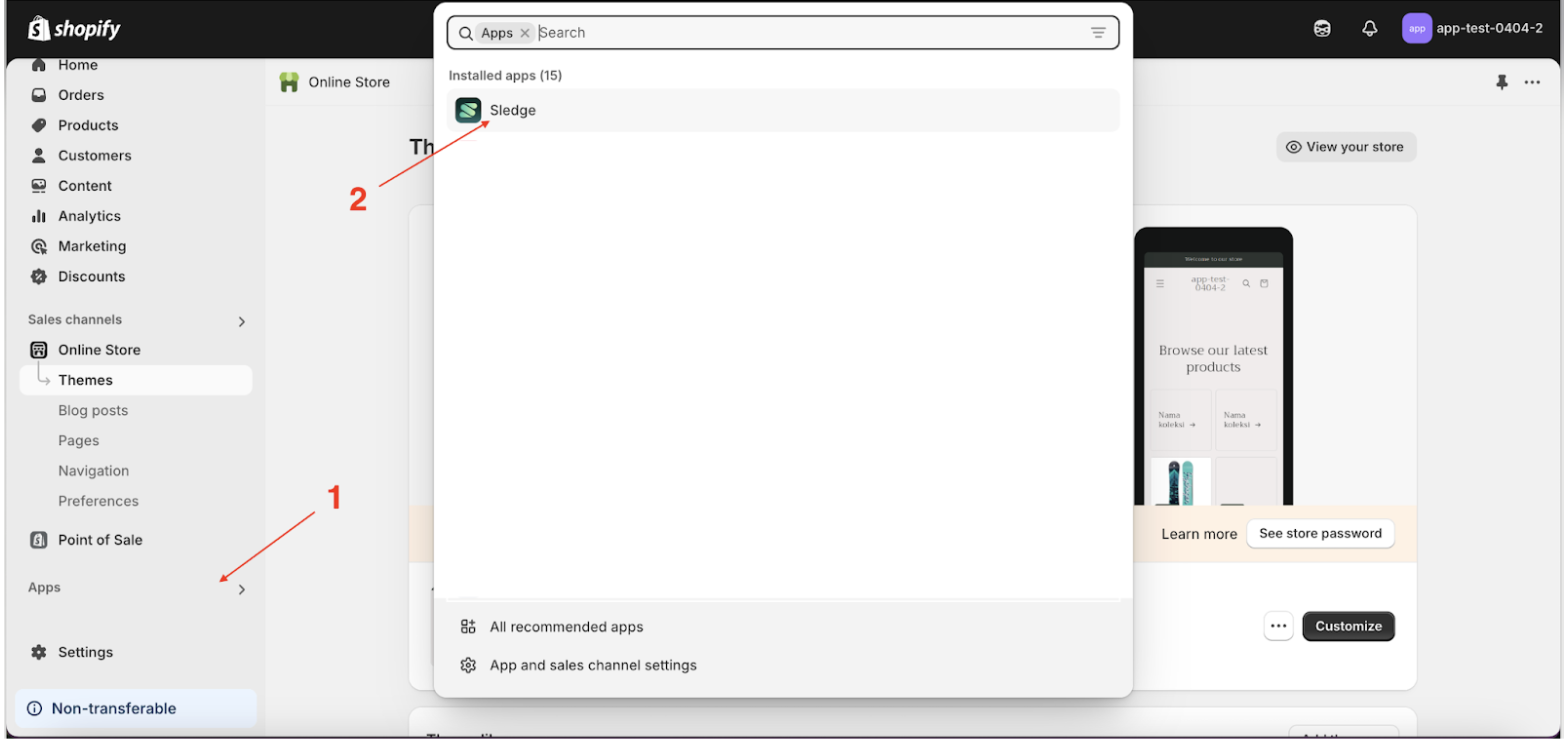
- Go to the Apps Sledge.
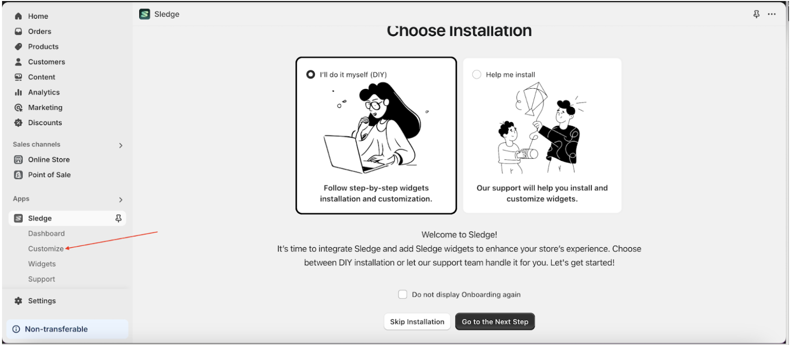
- Select the Customizer menu.
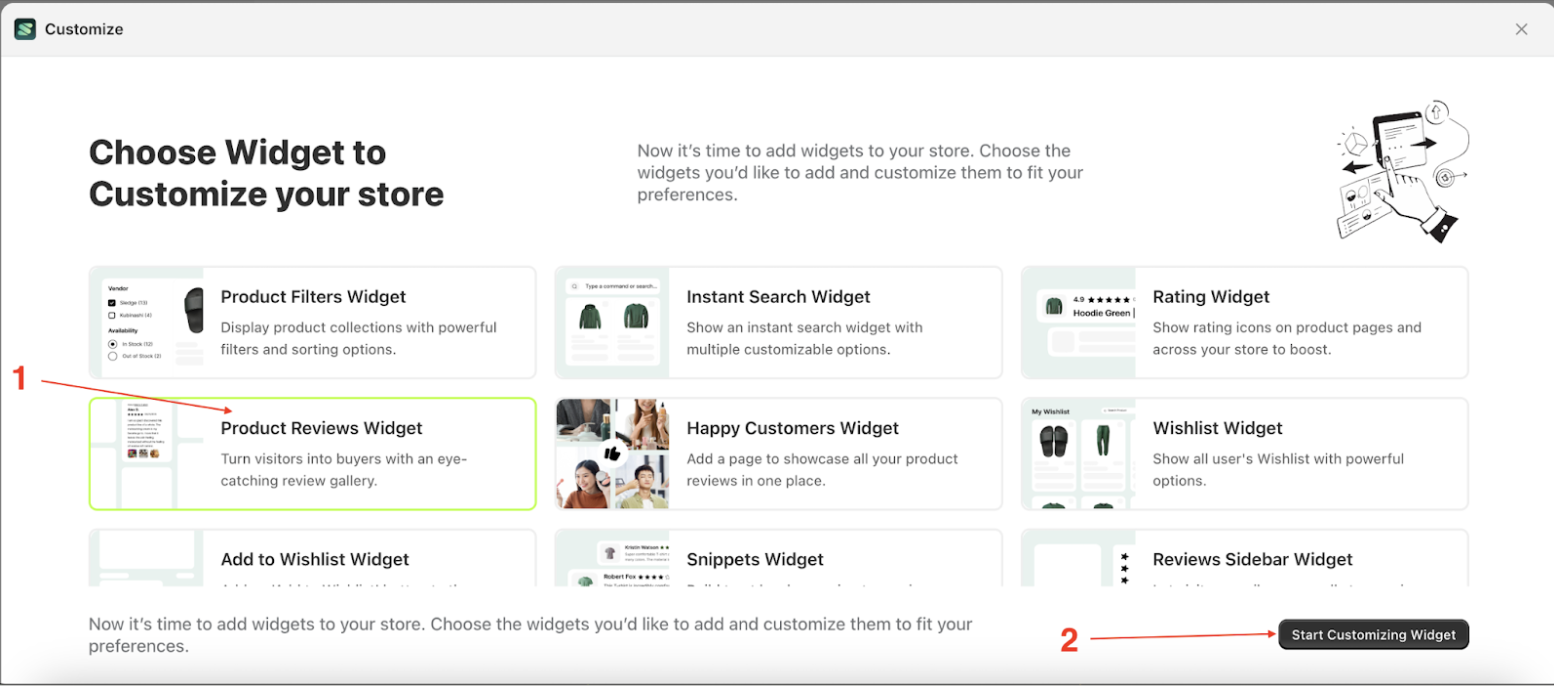
- Choose product review widget and click the Start Customizing Widget button.
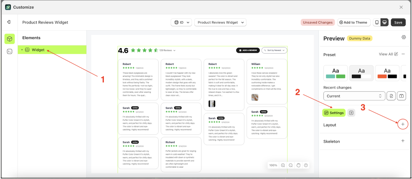
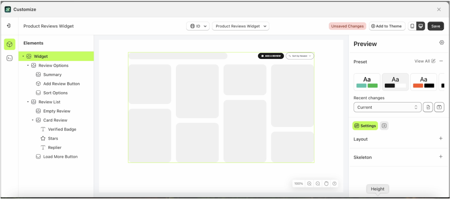
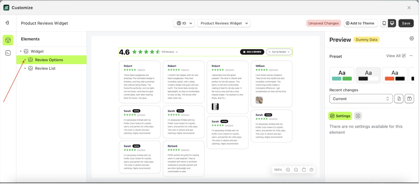
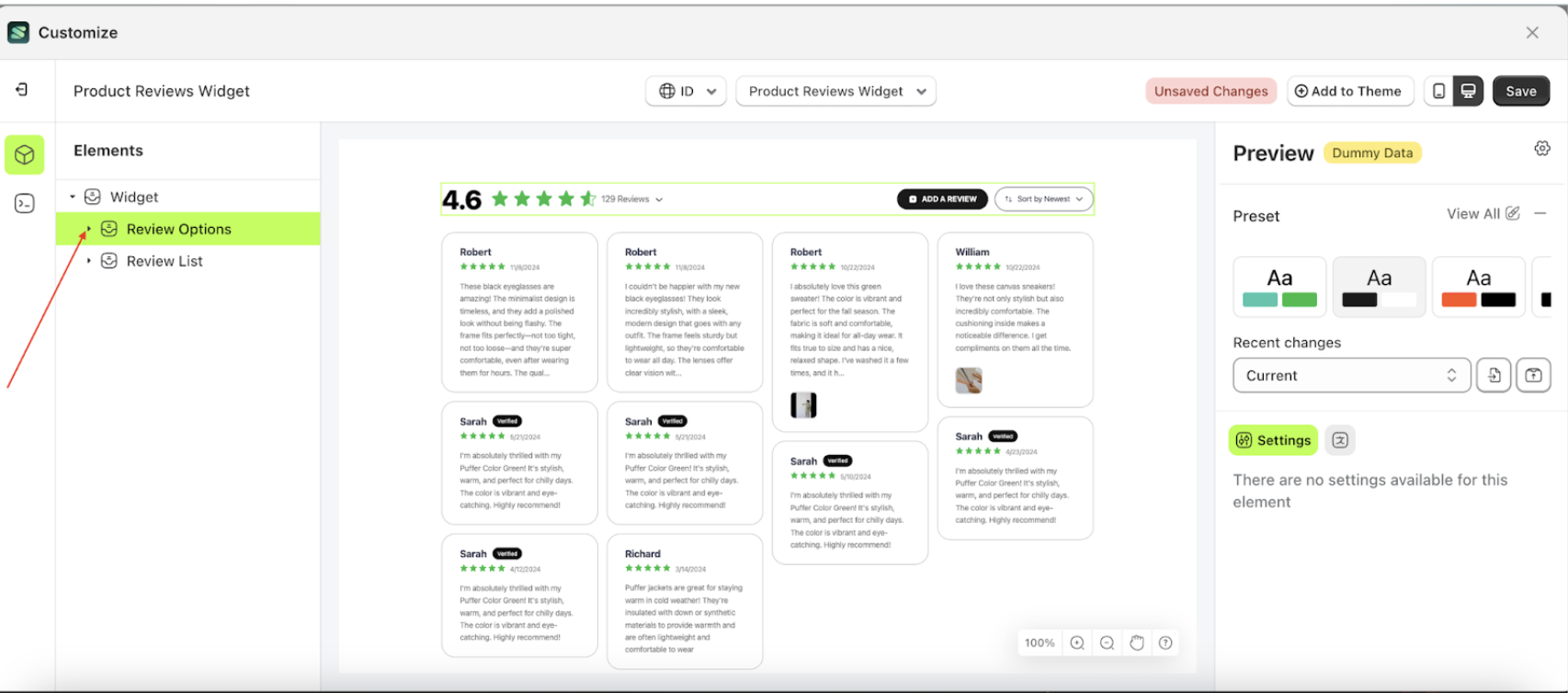
Layout
Follow the steps below:
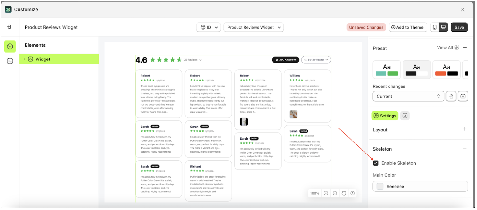
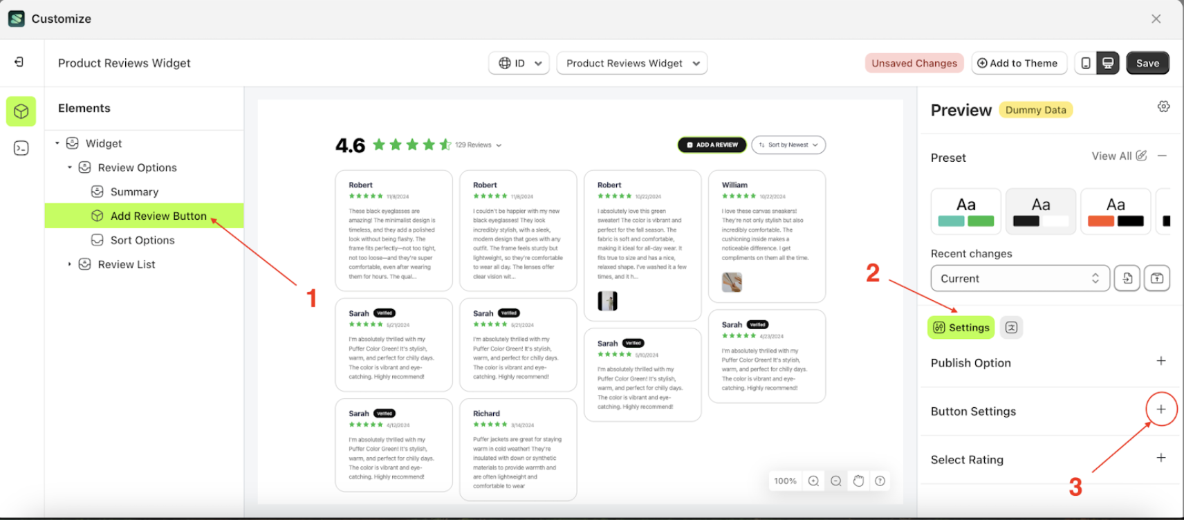
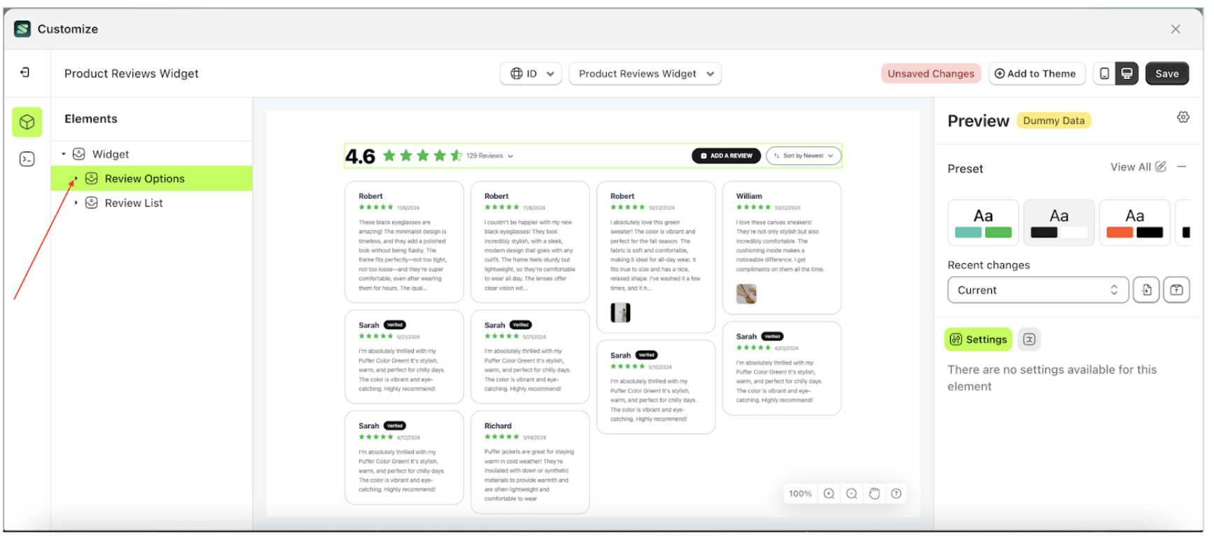
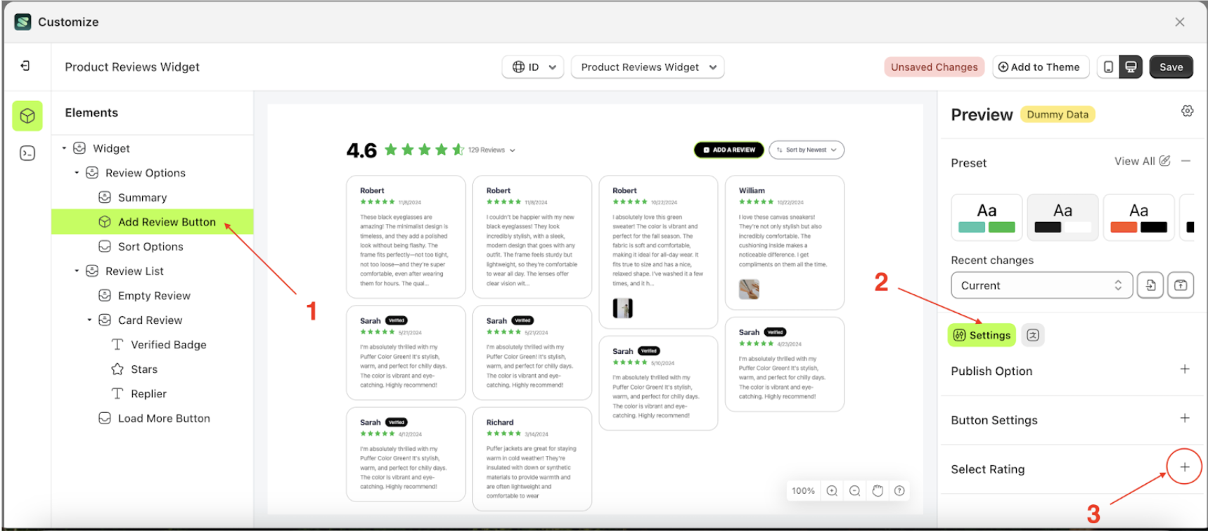
- Select the Widget element on the right, then click the Settings tab and click the icon marked with a red arrow.
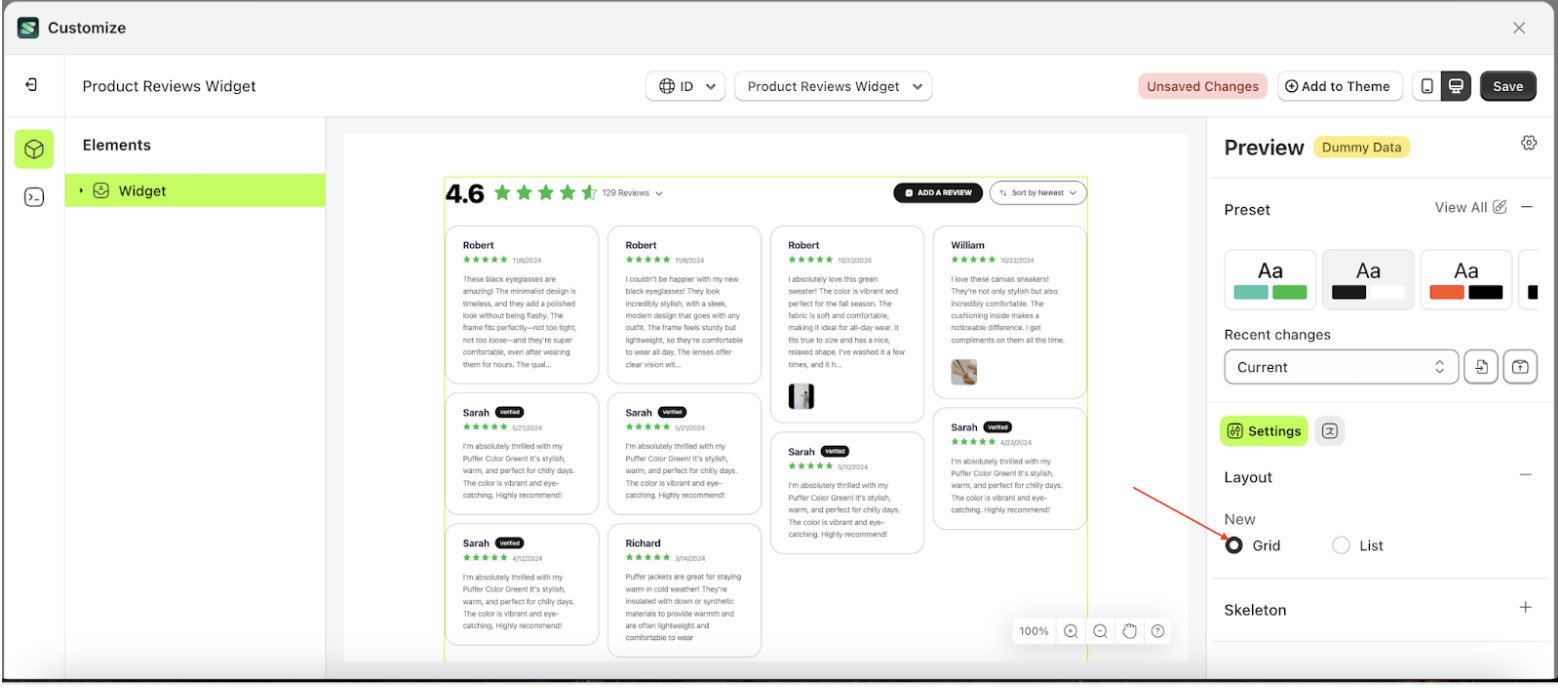
- Select Grid to arrange the review layout horizontally, following the red arrow.
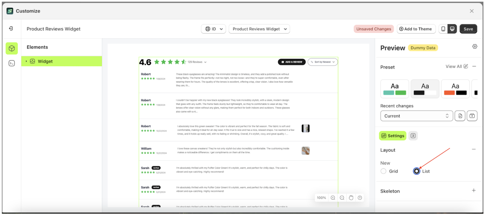
- Select List to arrange the review layout in rows, following the red arrow.
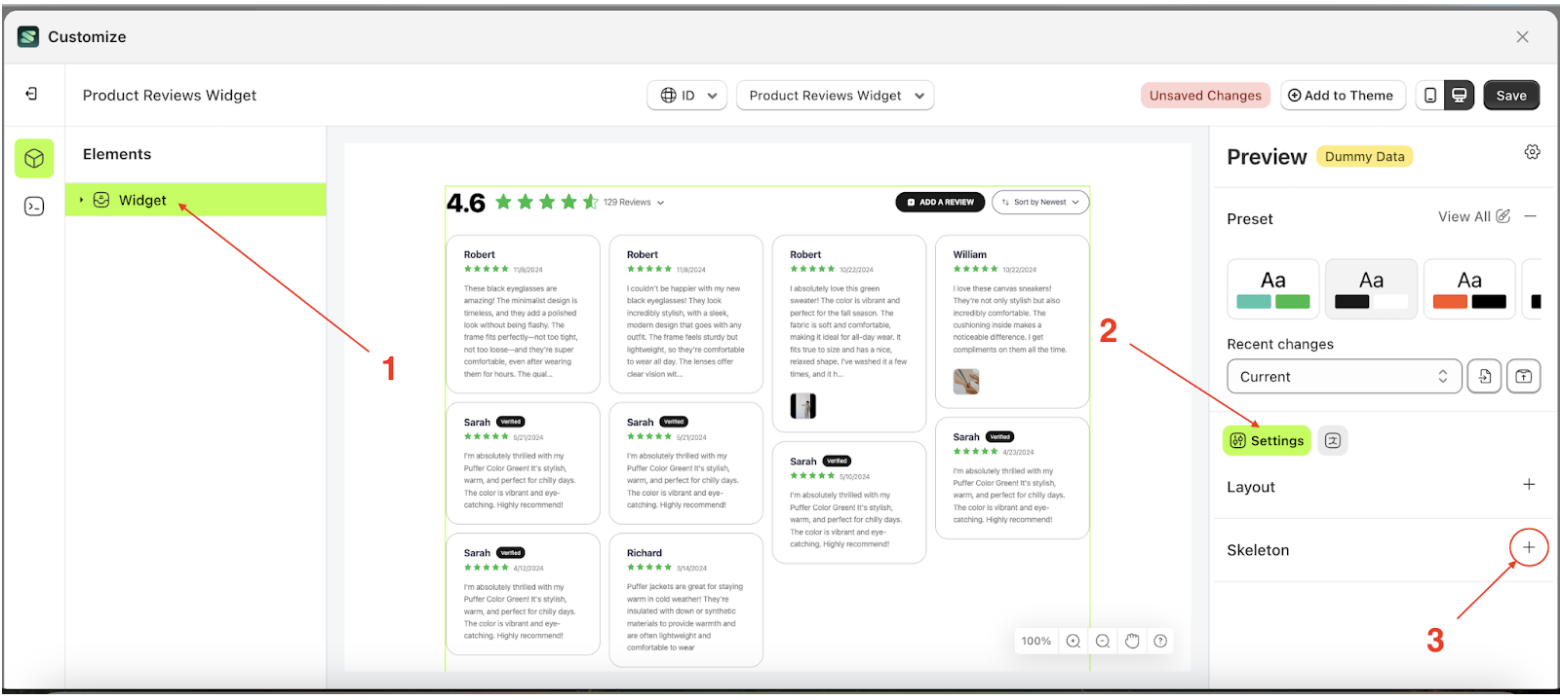
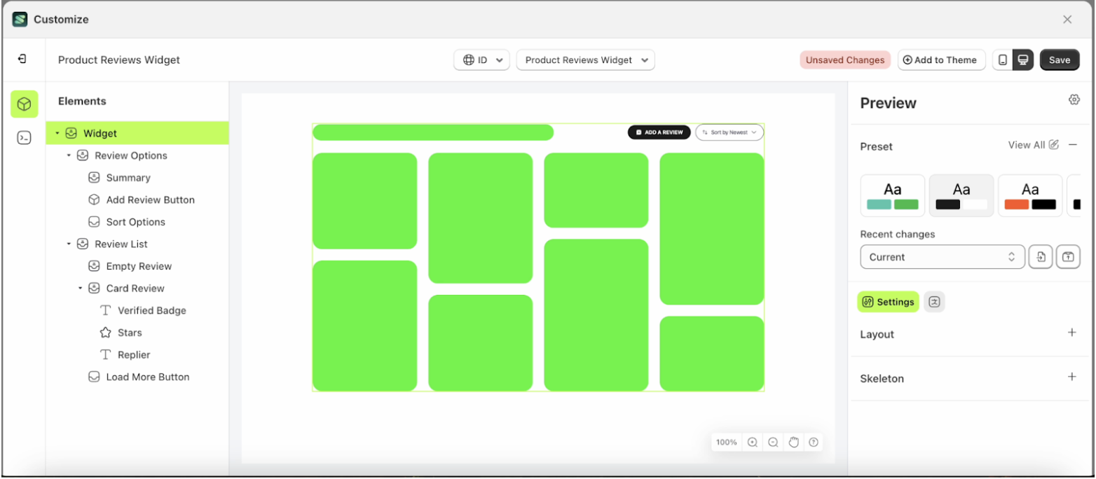
Skeleton
Available settings:
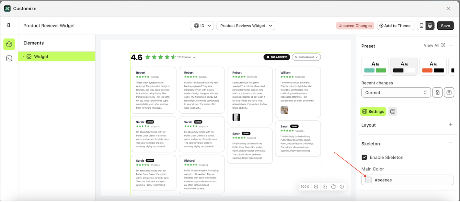
Main Color
Main Color is a setting that manages the color of the skeleton. However, you must first activate the Enable Skeleton feature.
Follow the steps below:
- Select the Widget element on the right, then click the Settings tab and click the icon marked with a red arrow.
- Enable the Enable Skeleton checkbox.
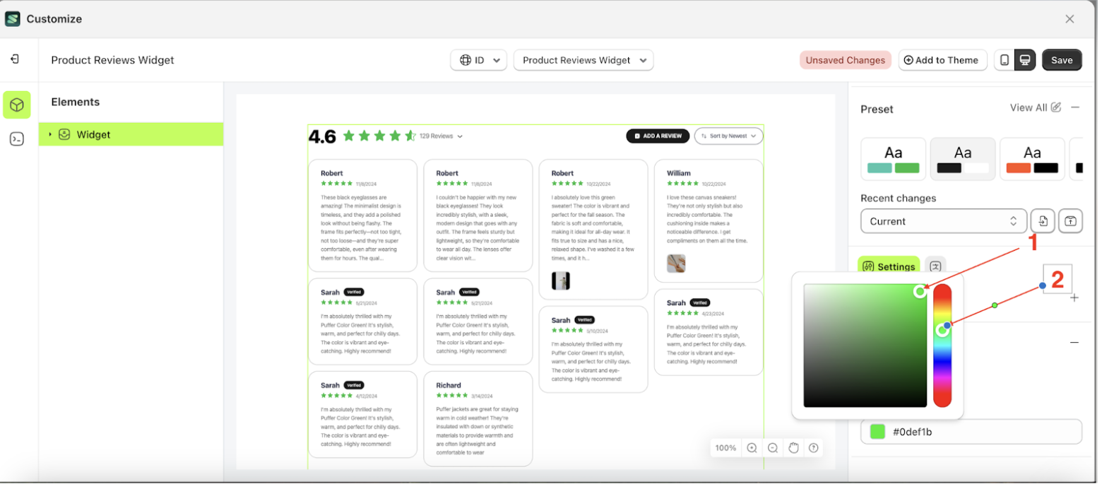
- Click the Color Palette on the right side, which is also marked with a red arrow.
- The Color Palette will appear. Click the right side of the palette where the red arrow and number 1 are indicated, then click the right side again where the red arrow and number 2 are marked.
- Then, click the Save button on the right.
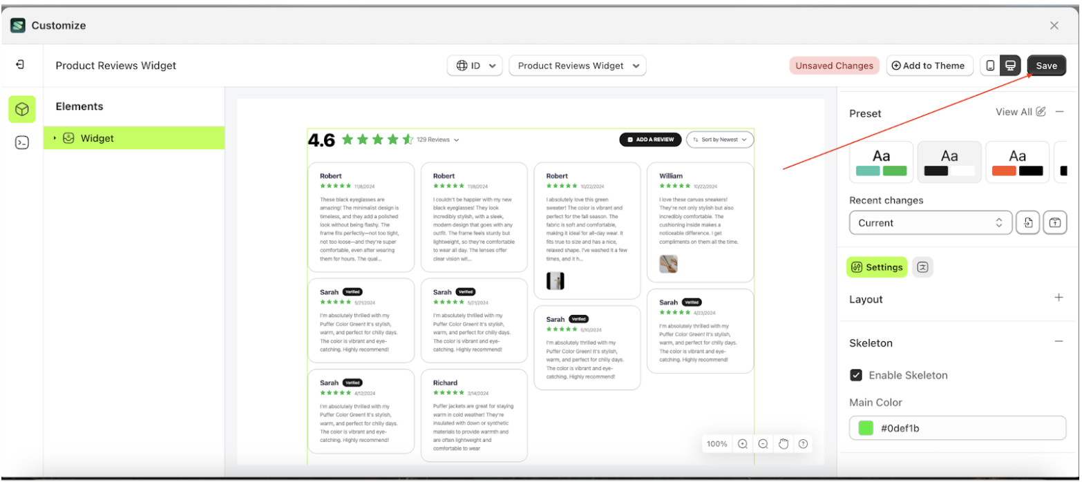
- Then, click the Save button on the rightSkeleton will change with selected color.
- Example : Before Stars change settings
- Example : After Stars change settings
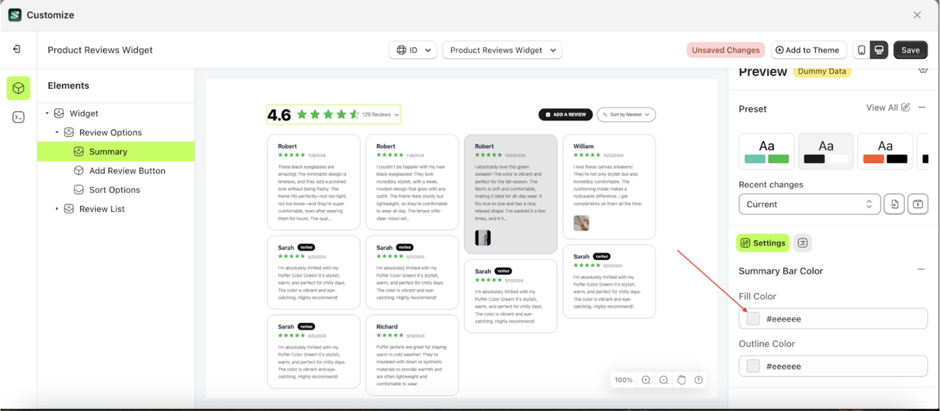
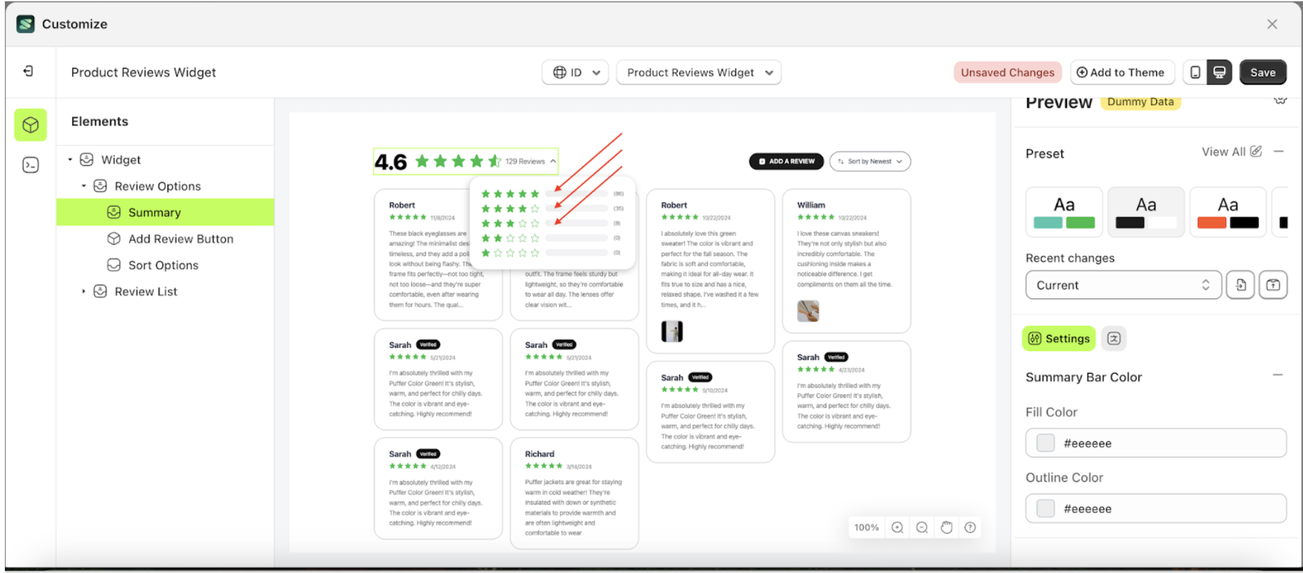
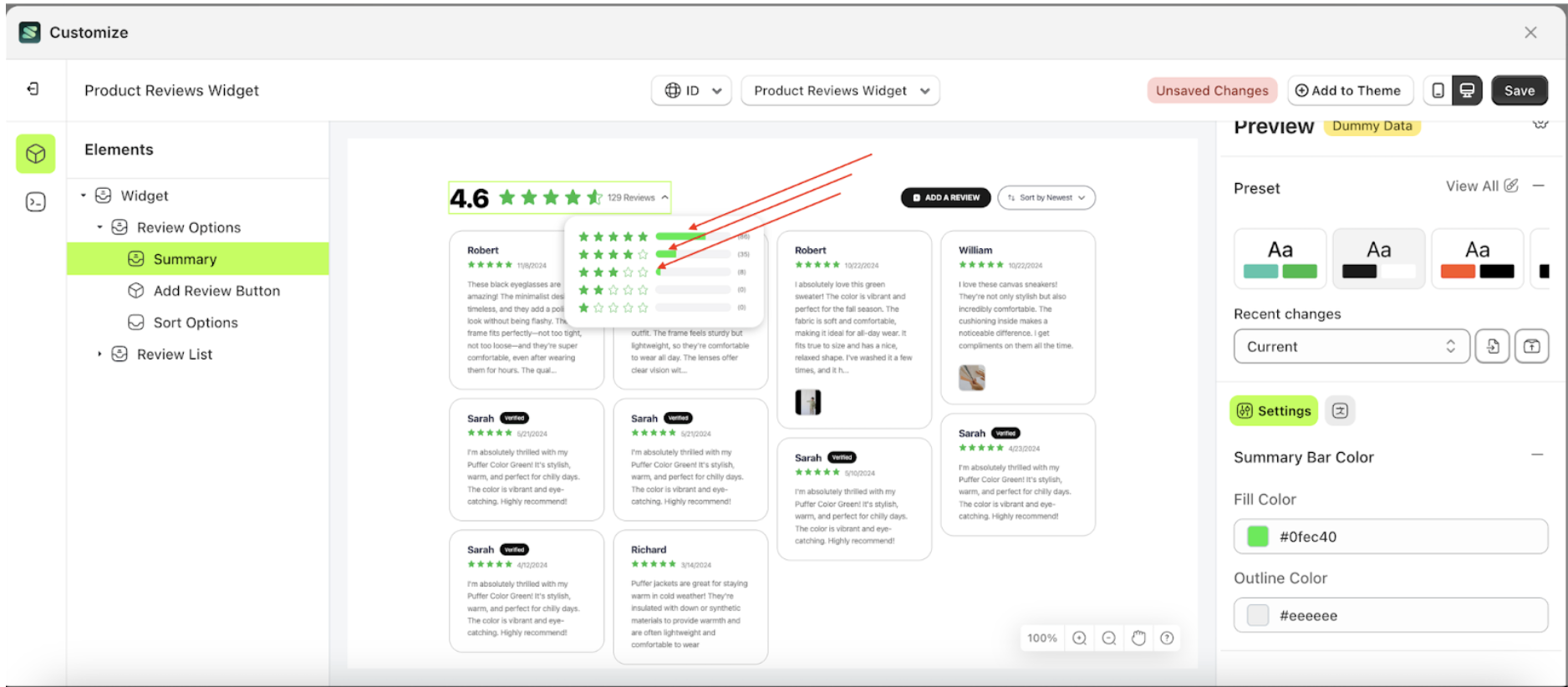
Summary Bar Color
Available settings:
Fill Color
This feature is designed to manage the inner color of the stars.
Follow the steps below:
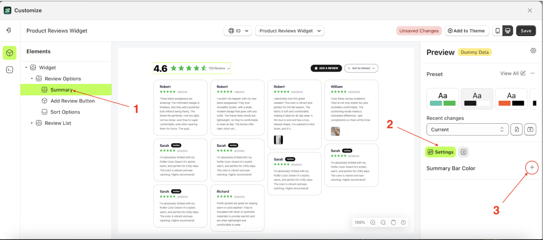
- Select the Review options element on the right, then click the Settings tab and click the icon marked with a red arrow.
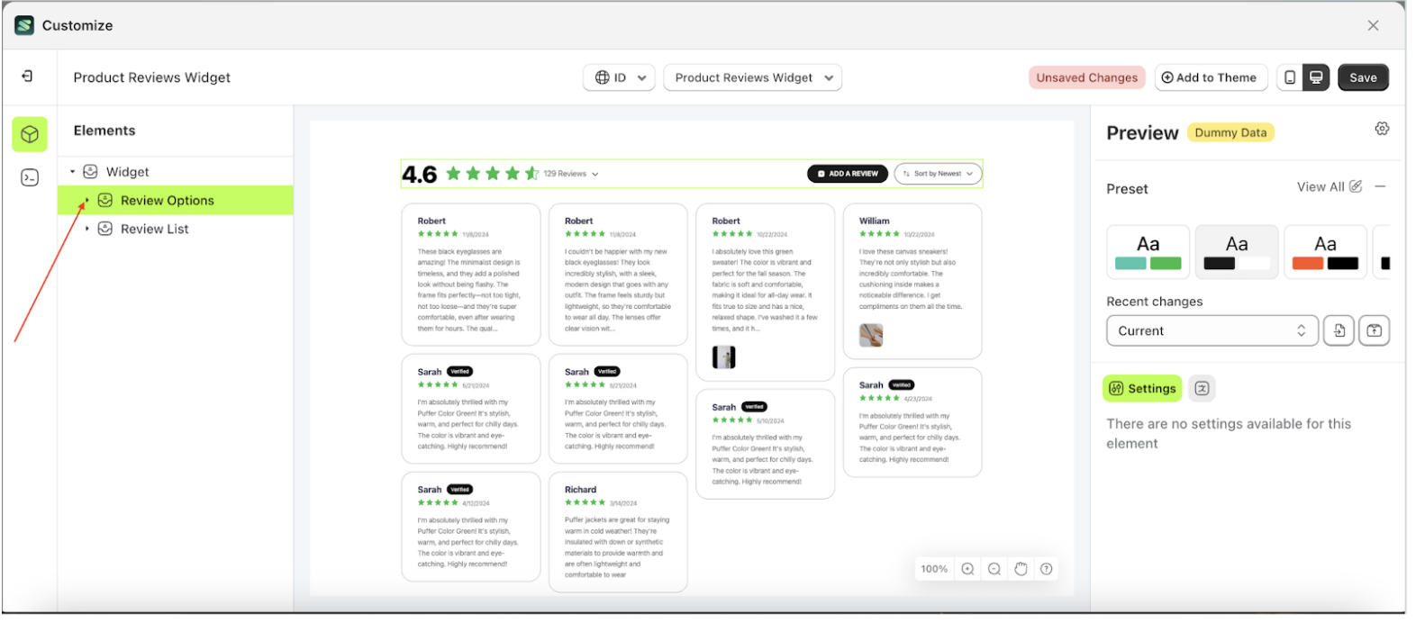
- Once the menu is open, select the Summary element on the left side, then click the icon on the right side, marked with a red arrow, to access the visibility settings.
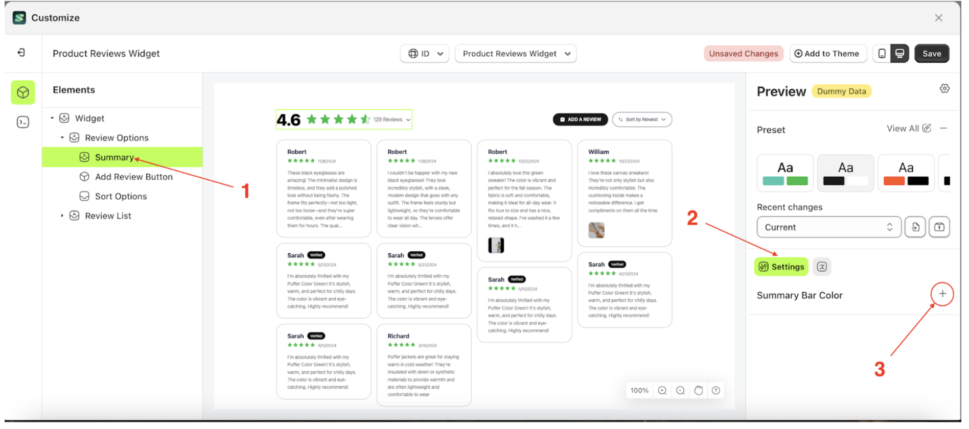
- Click the Color Palette on the right side, which is also marked with a red arrow.
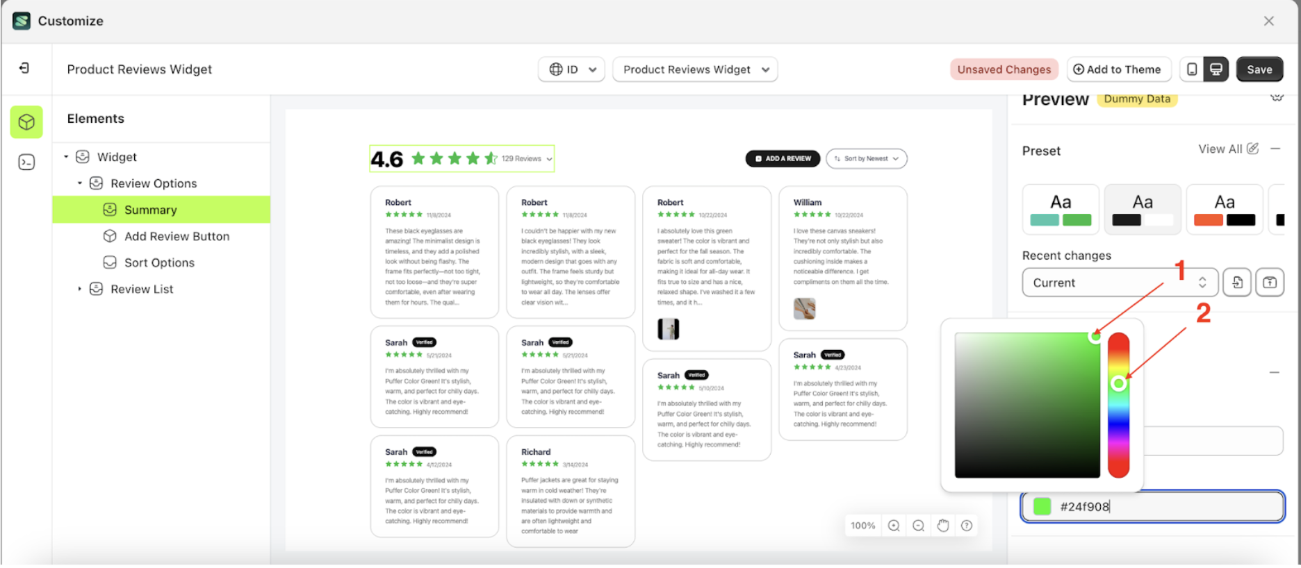
- The Color Palette will appear. Click the right side of the palette where the red arrow and number 1 are indicated, then click the right side again where the red arrow and number 2 are marked.
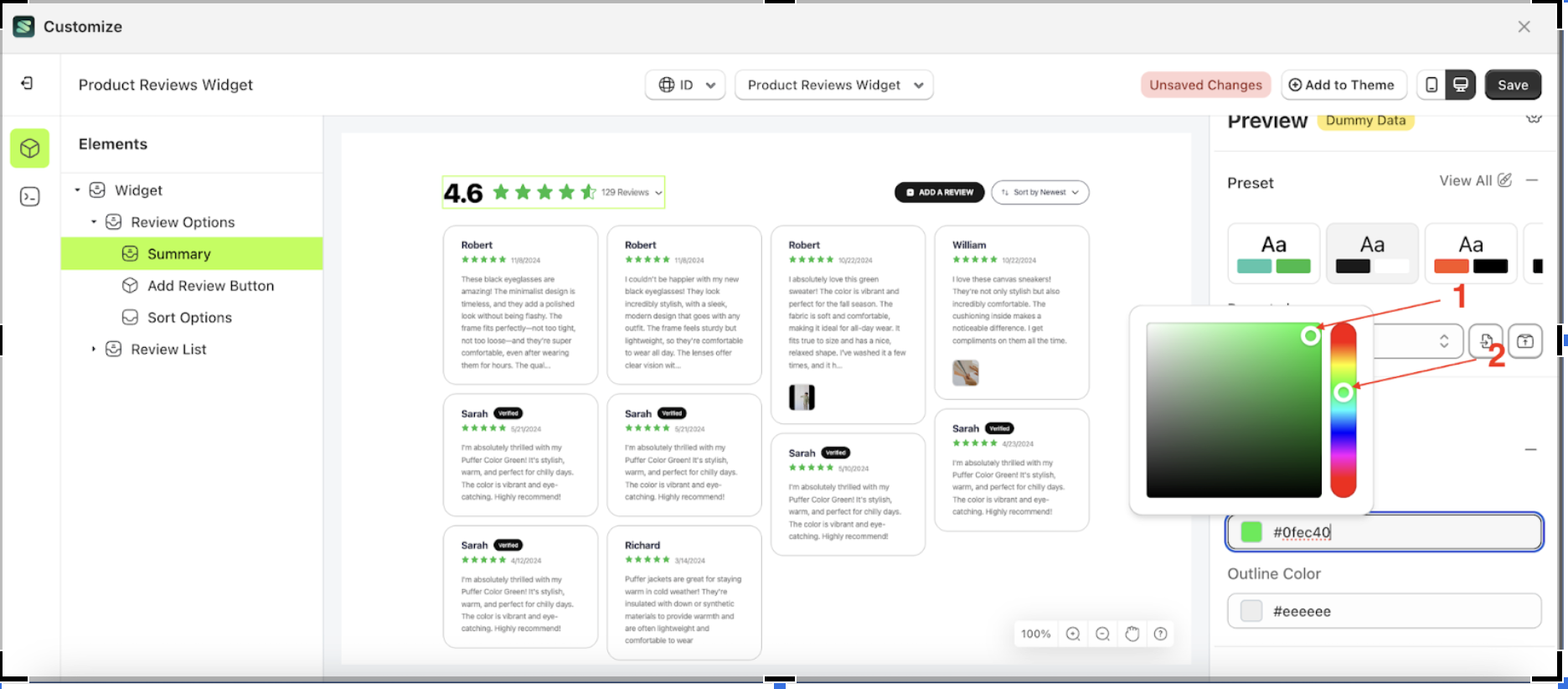
- The Color Palette will appear. Click the right side of the palette where the red arrow and number 1 are indicated, then click the right side again where the red arrow and number 2 are marked.
- Example : Before status bar change settings
- Example : After status bar change settings
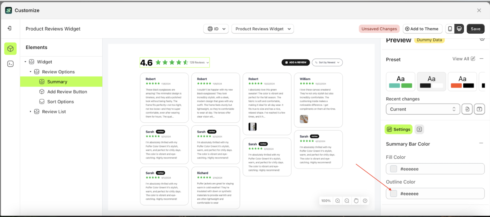
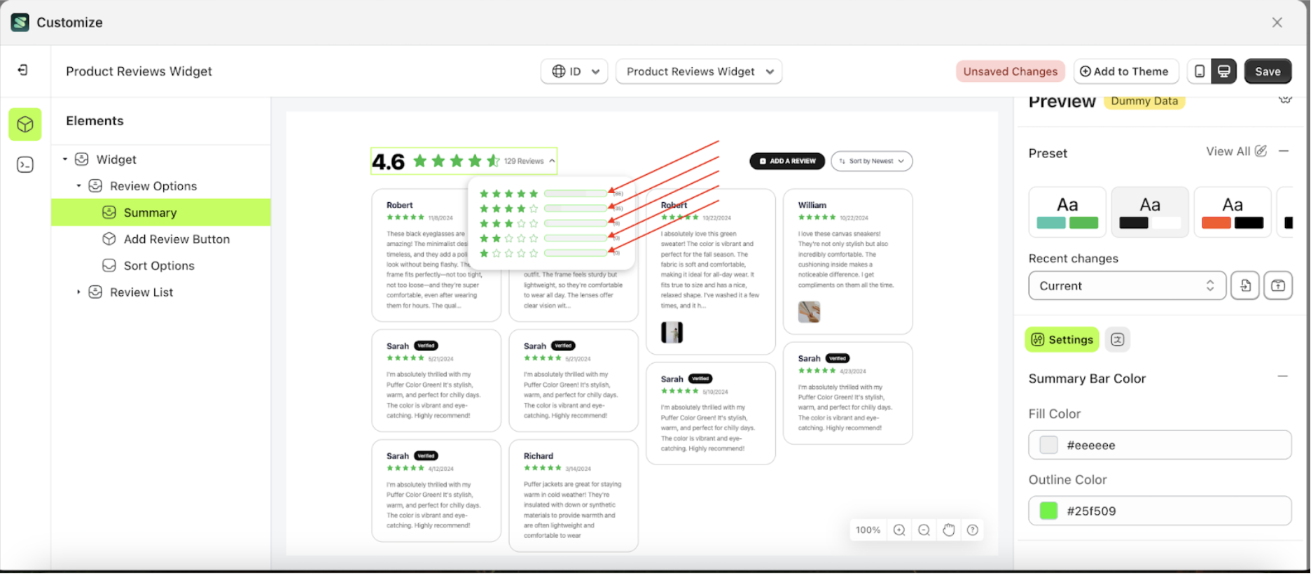
Outline Color
Follow the steps below:
- Select the Review options element on the right, then click the Settings tab and click the icon marked with a red arrow.

- Once the menu is open, select the Summary element on the left side, then click the icon on the right side, marked with a red arrow, to access the visibility settings.
- Click the Color Palette on the right side, which is also marked with a red arrow.
- The Color Palette will appear. Click the right side of the palette where the red arrow and number 1 are indicated, then click the right side again where the red arrow and number 2 are marked.
- Status Bar element will adjust accordingly.
- Example : Before status bar change settings
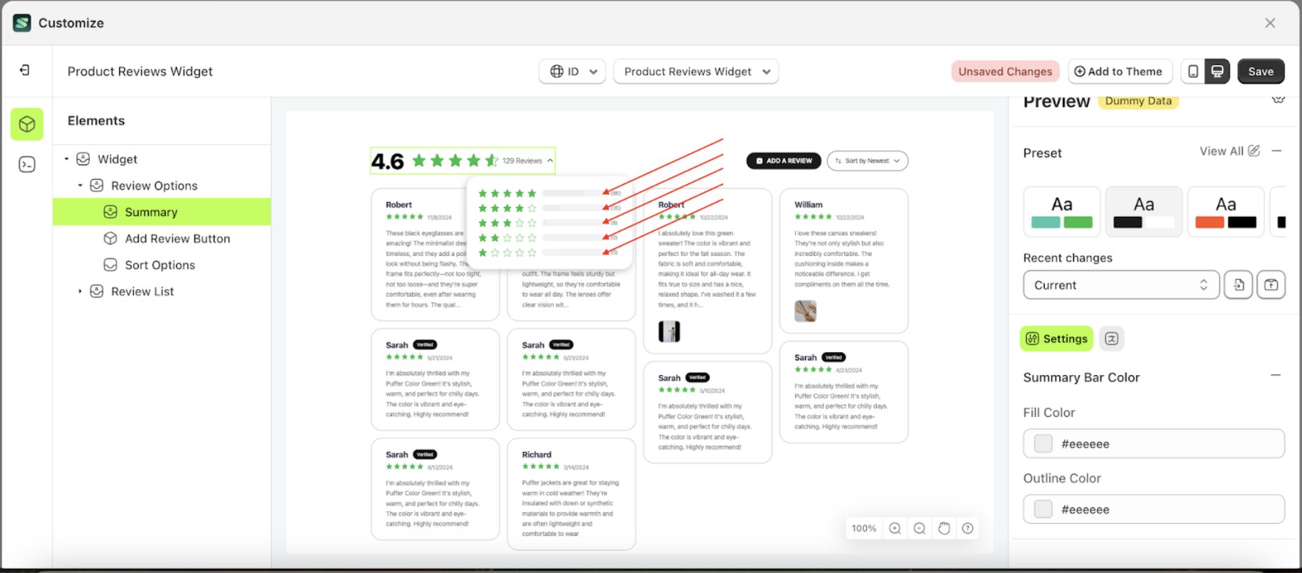
- Example : After status bar change settings
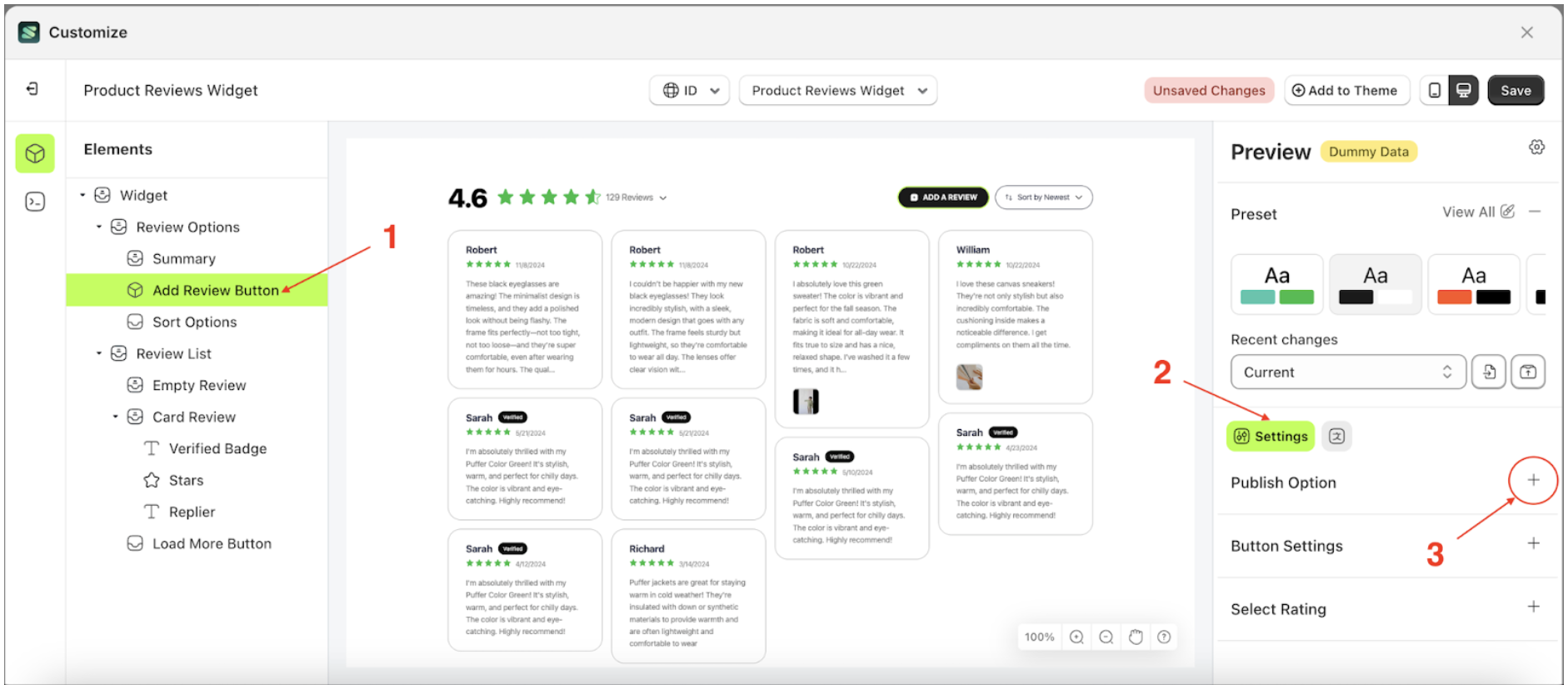
Publish Option
Available settings:
Enable Auto Publish
The Enable Auto Publish feature manages the settings for displaying customer ratings. When this option is enabled, ratings submitted by customers will be published immediately on the storefront. Conversely, if disabled, ratings will require manual approval before appearing.
This feature is closely related to the Minimum Rating setting. If Enable Auto Publish is turned on but a minimum rating is set, only reviews that meet or exceed the minimum rating will be published automatically. Reviews below the set threshold will not appear on the storefront.
Follow the steps below:
- Select the Review options element on the right, then click the Settings tab and click the icon marked with a red arrow.

- Once the menu is open, select the Add Review Button element on the left side, then click the icon on the right side, marked with a red arrow, to access the publish option settings
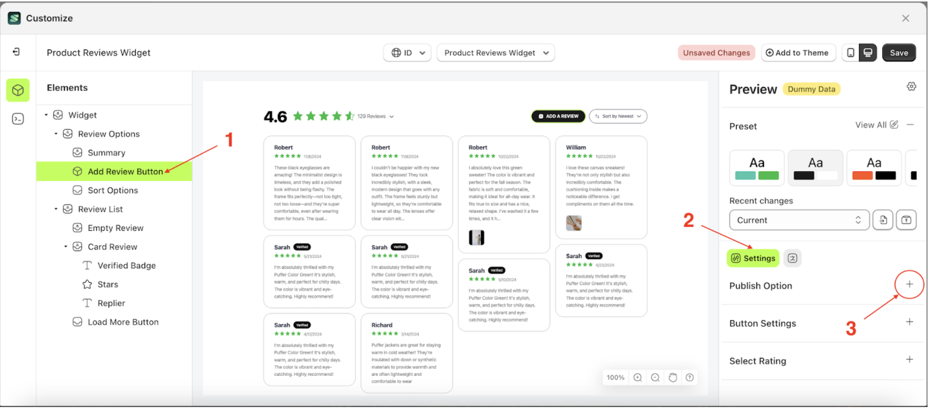
- Check the Enable Auto Publish option
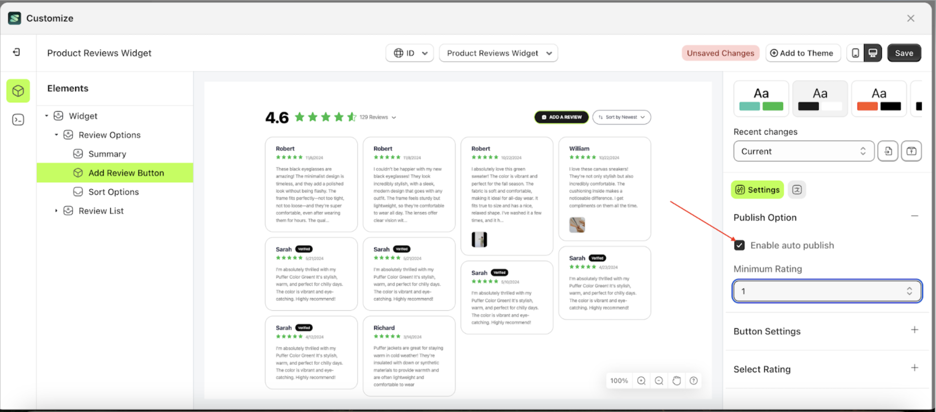
Minimum Rating
This feature controls whether the submitted rating is displayed or not. If a customer's rating is lower than the Minimum Rating setting, it will not be shown on the storefront. Conversely, ratings that meet or exceed the minimum rating will be displayed. However, Enable Auto Publish must be activated for this feature to work.
Follow the steps below:
- Select the Review options element on the right, then click the Settings tab and click the icon marked with a red arrow.

- Once the menu is open, select the Add Review Button element on the left side, then click the icon on the right side, marked with a red arrow, to access the publish option settings.
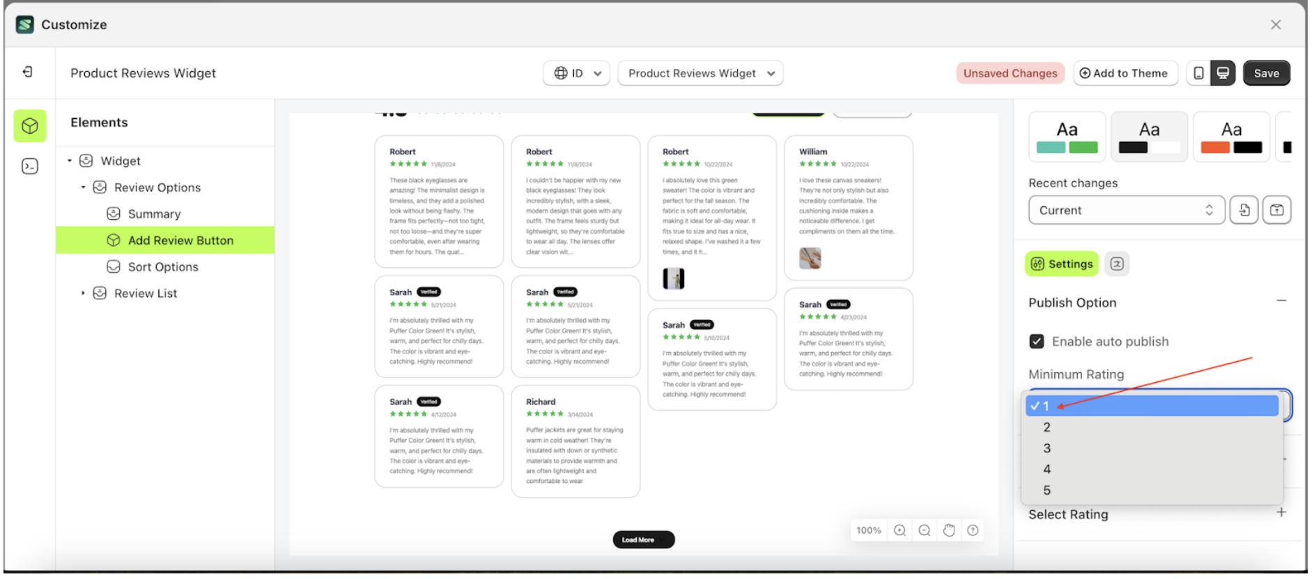
- Click the area marked with a red arrow to open the Minimum Rating list
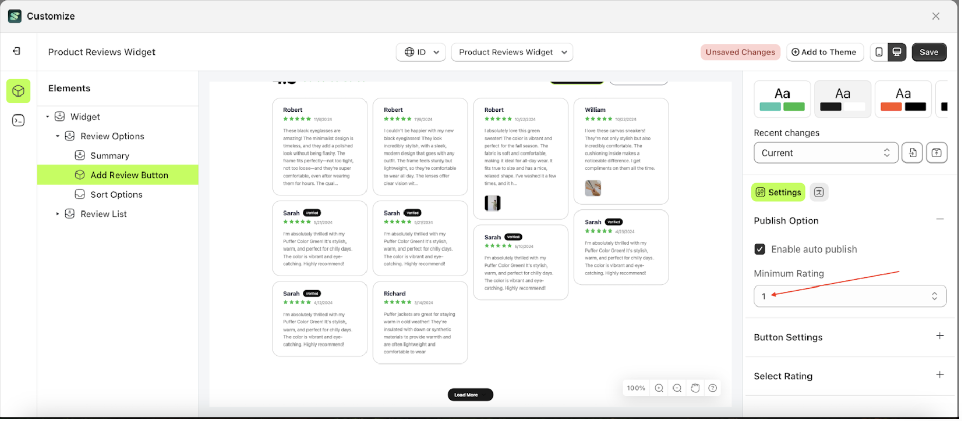
- Select your desired minimum rating. For example, choose 1 as the minimum rating
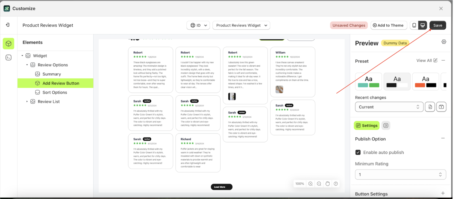
- Click the Save button to apply the changes and update the storefront.
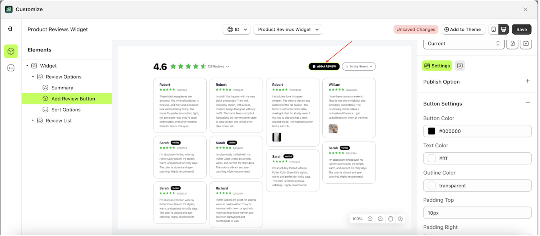
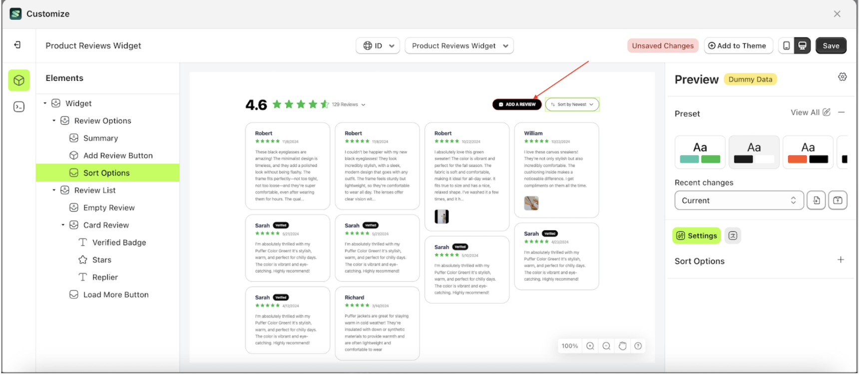
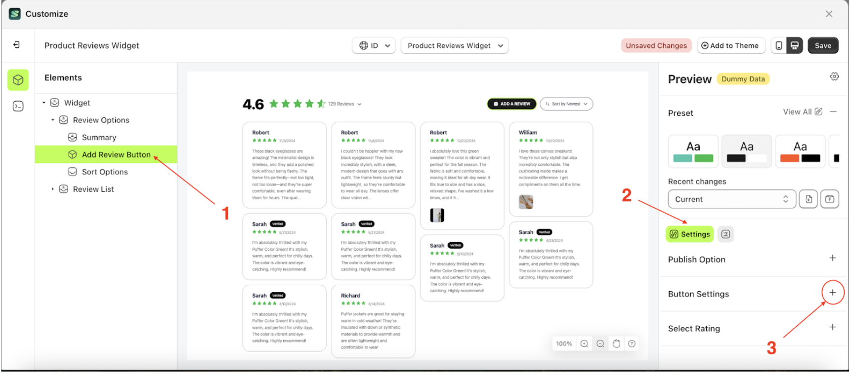
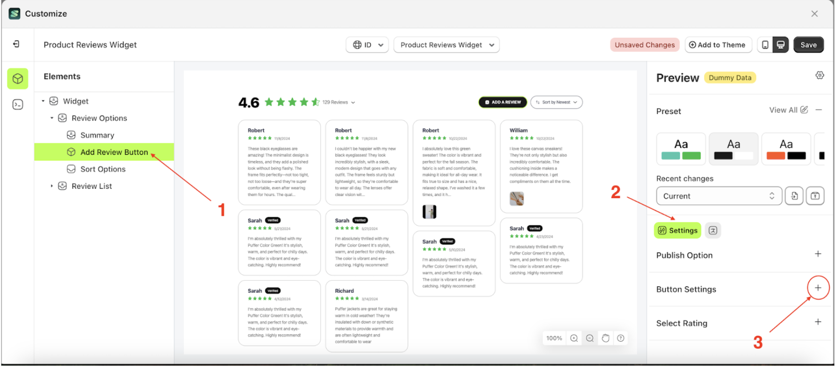
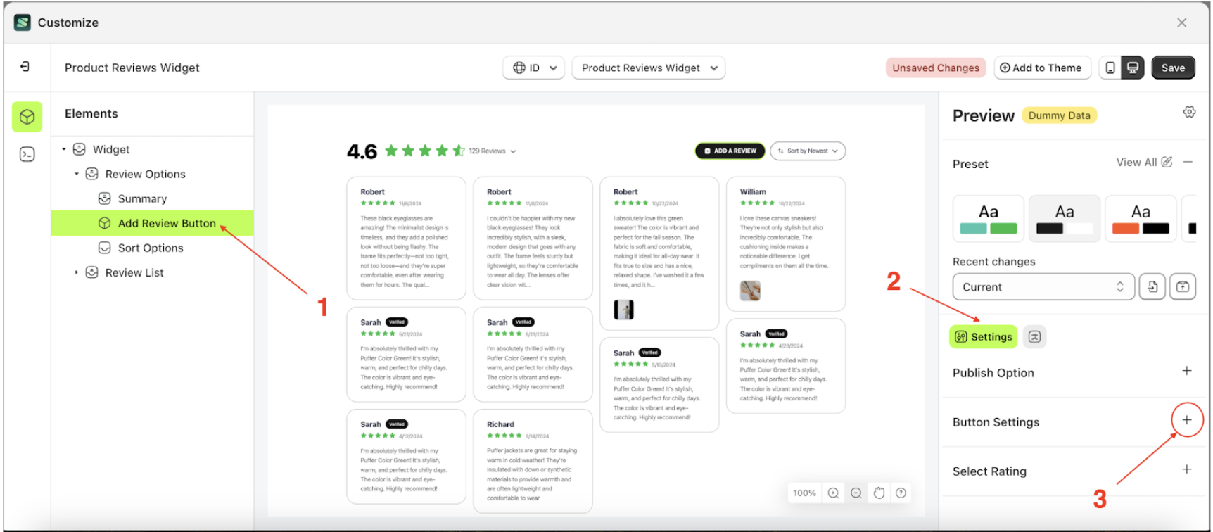
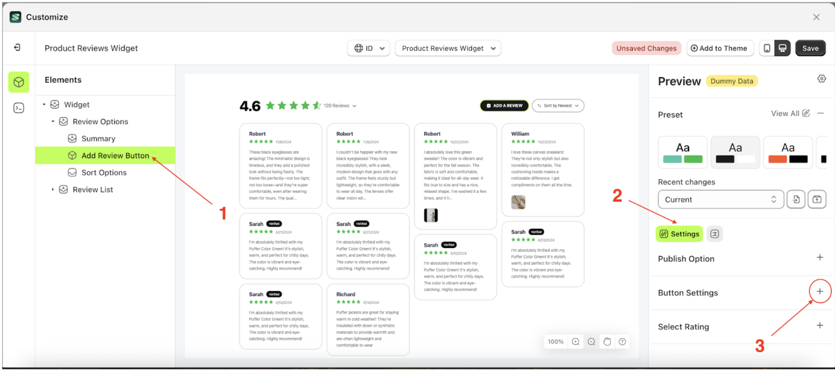
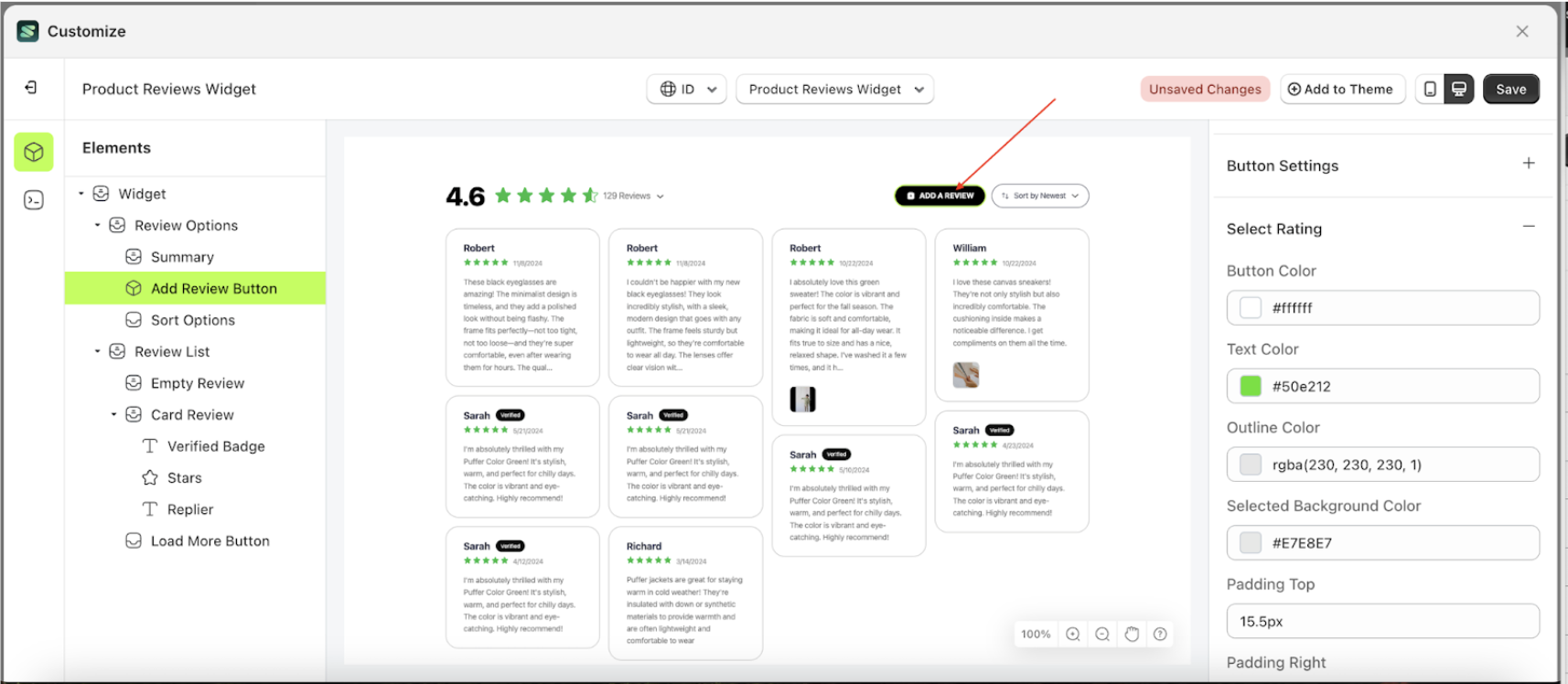
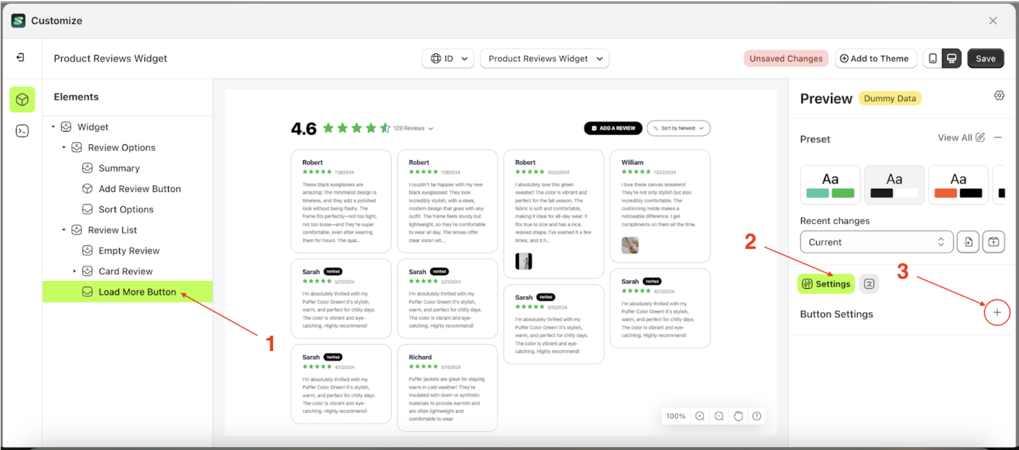
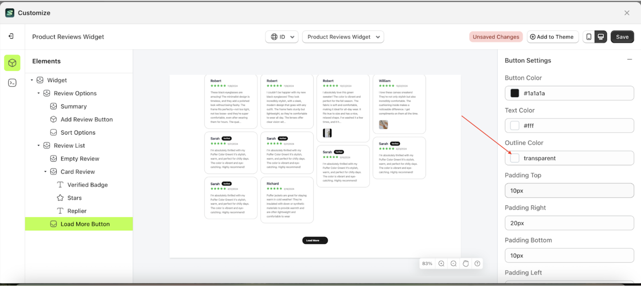
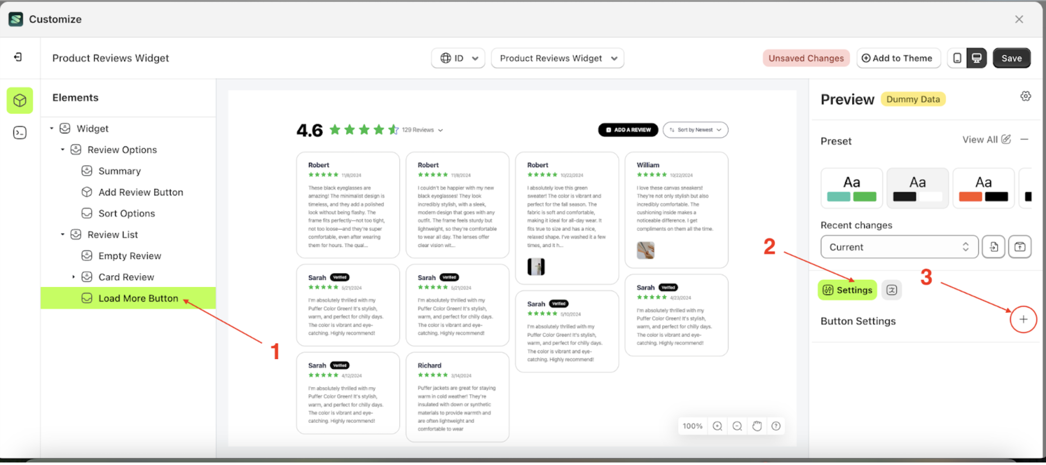
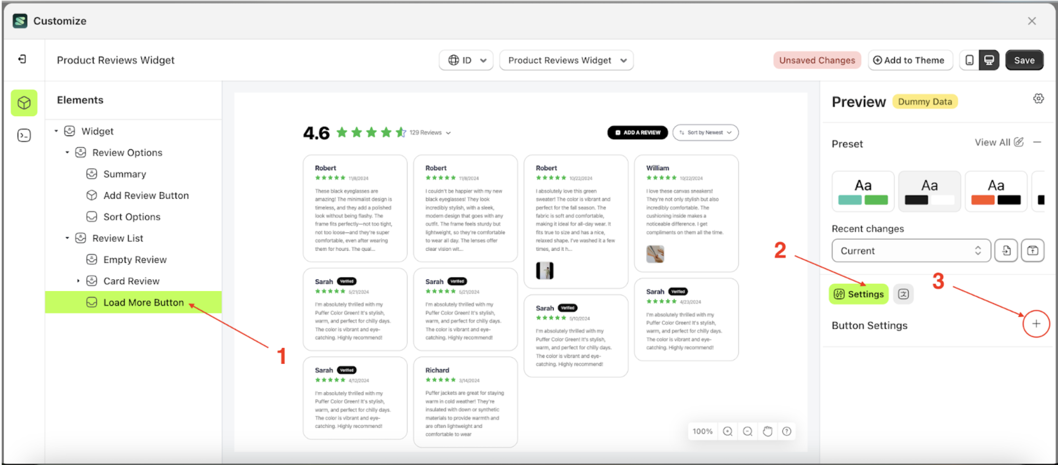
Button Settings
Available settings:
Button ColorText ColorOutline ColorPadding TopPadding RightPadding BottomPadding LeftBorder RadiusFont SizeFont WeightText Transform
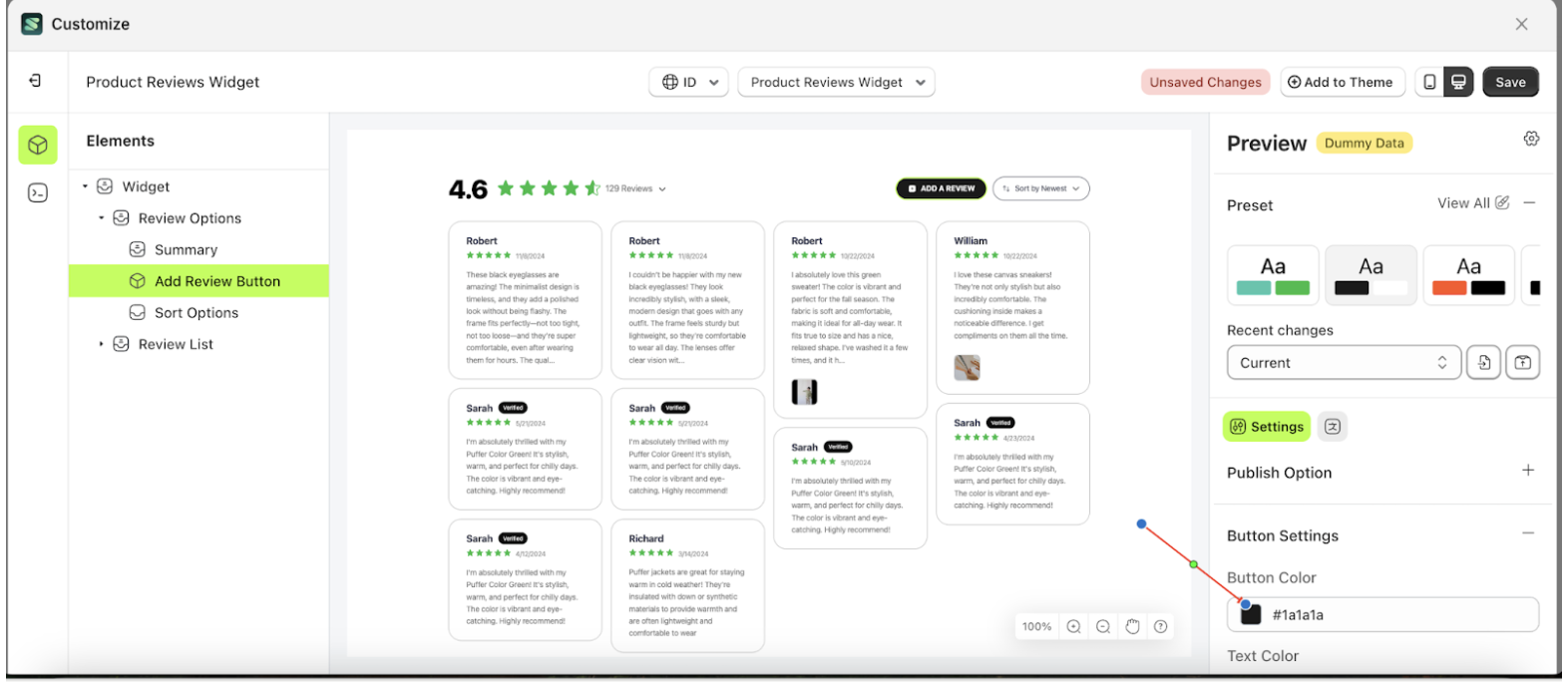
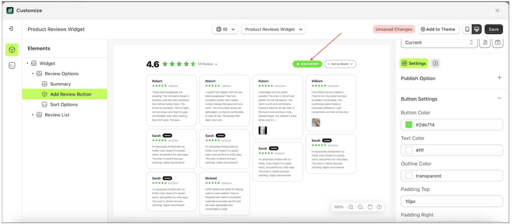
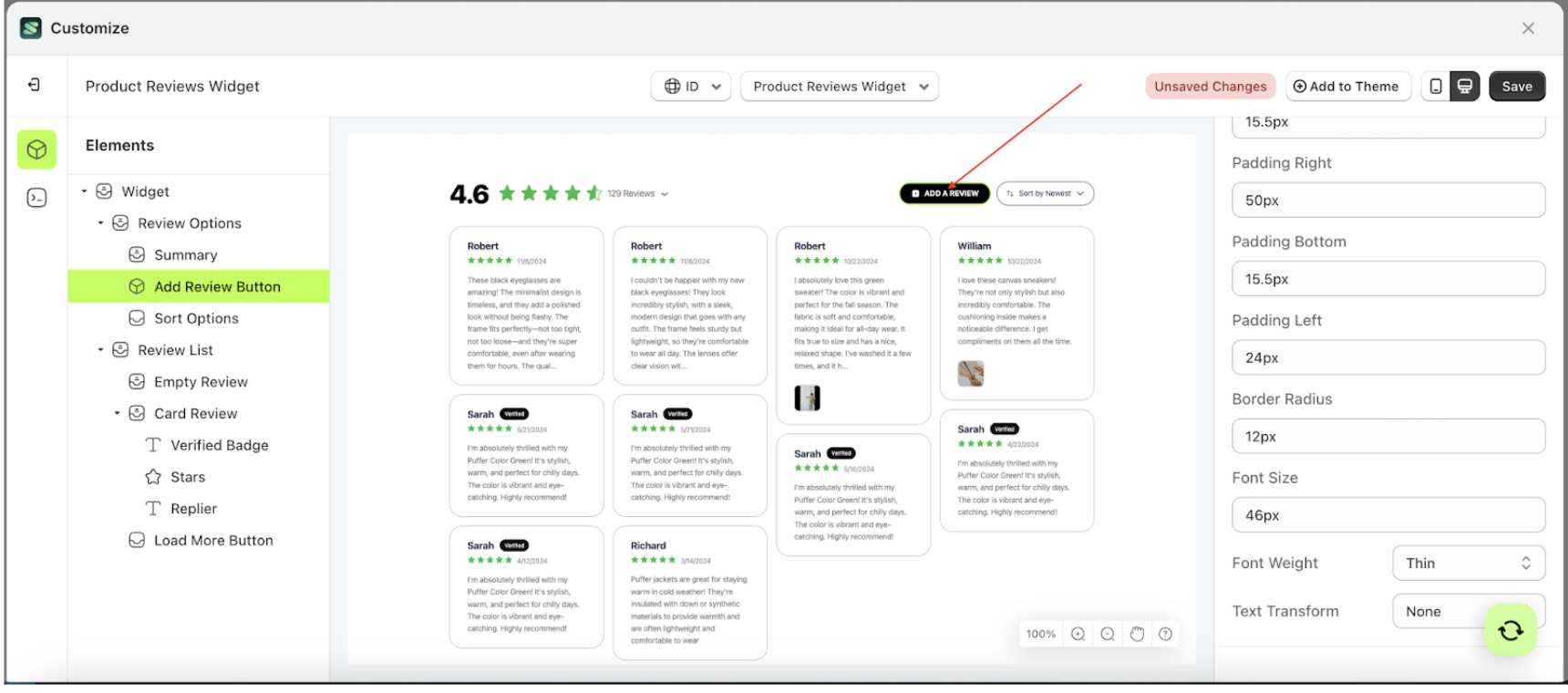
Button Color
This feature is designed to customize the button color of the button settings
Follow the steps below:
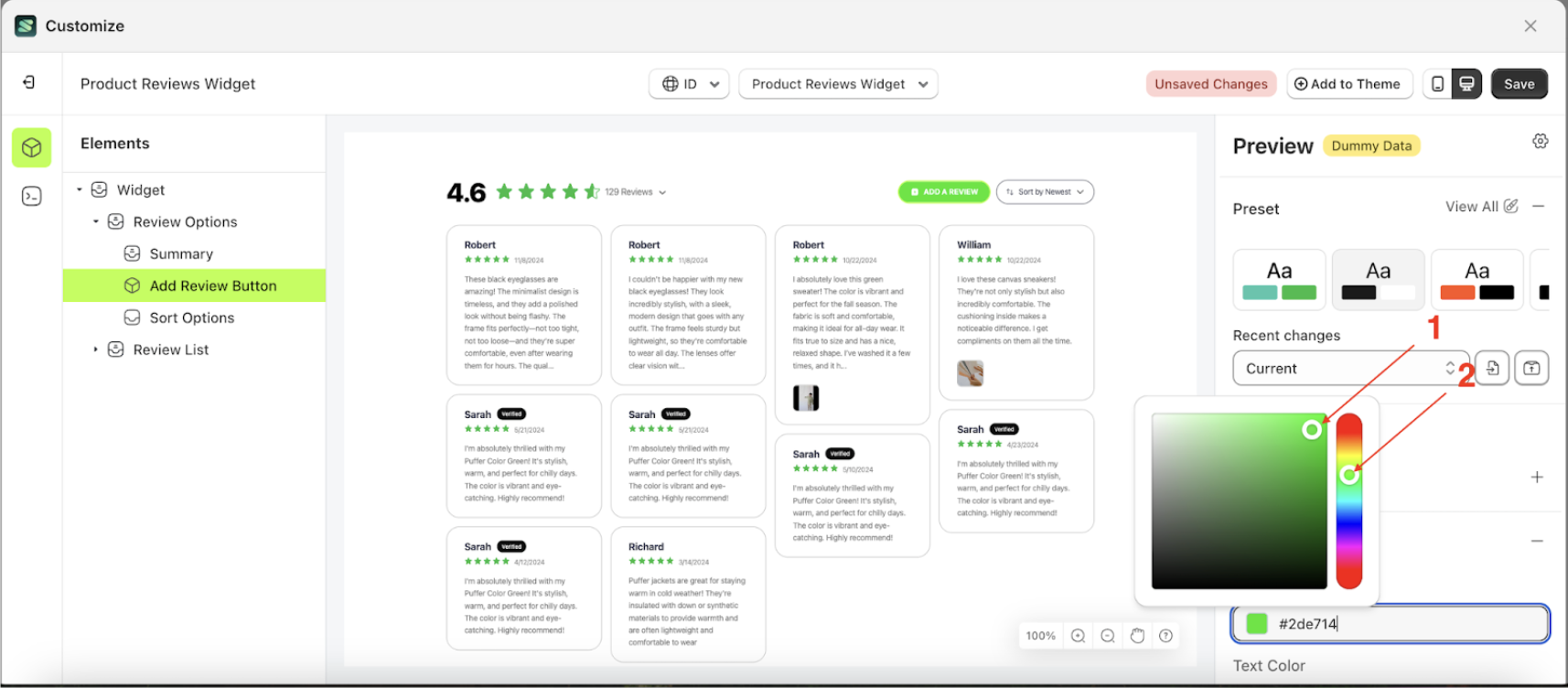
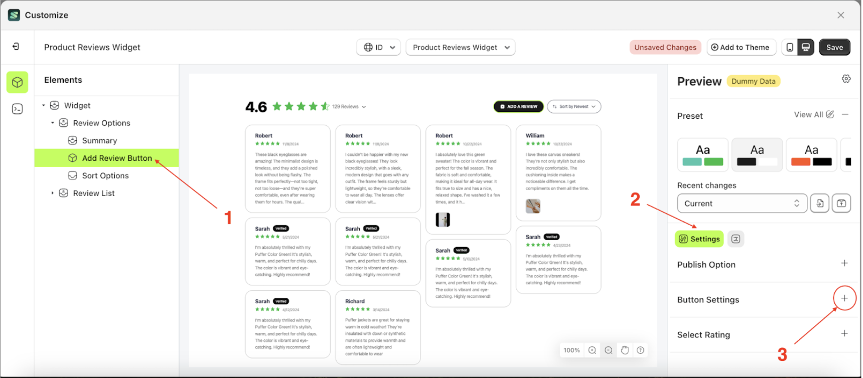
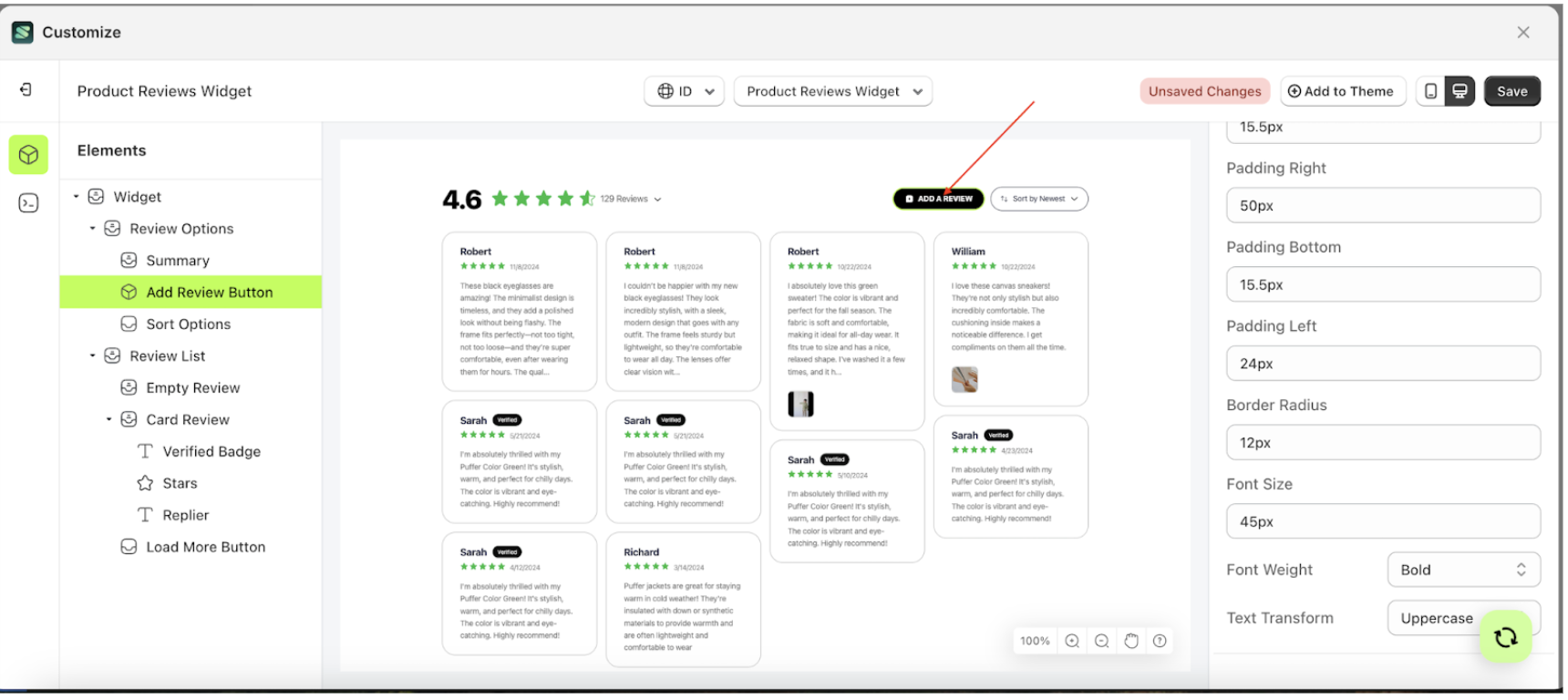
- Select the Review Option element on the left, then click the icon marked with a red arrow to open the menu within that item.
- Once the menu is open, select the Add Review Button element on the left, then click the Settings tab and click the icon marked with a red arrow.
- Click the Color Palette on the right side, which is also marked with a red arrow.
- The Color Palette will appear. Click the right side of the palette where the red arrow and number 1 are indicated, then click the right side again where the red arrow and number 2 are marked.
- The product review widget of the Add Review Button element will adjust accordingly.
- Example : Before Add Review Button change settings
- Example : After Add Review Button change settings


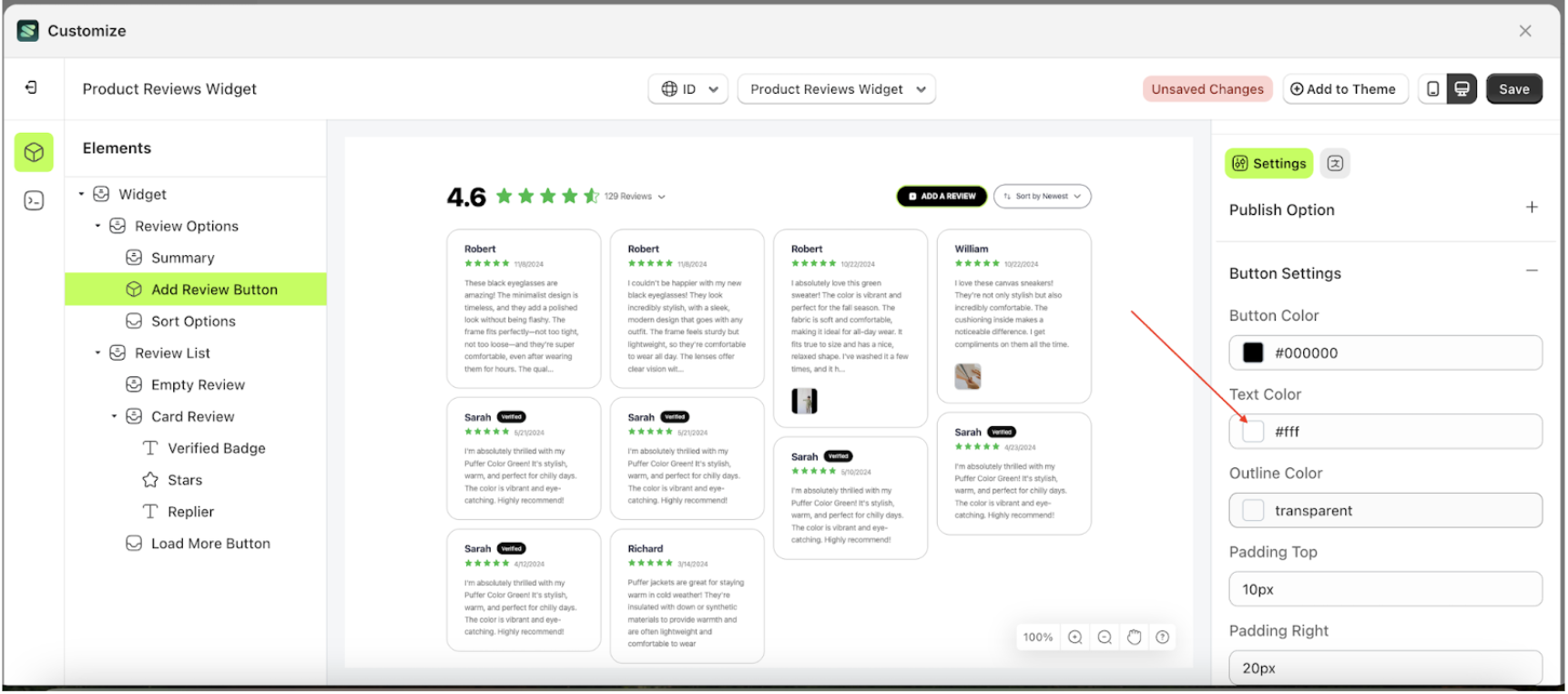
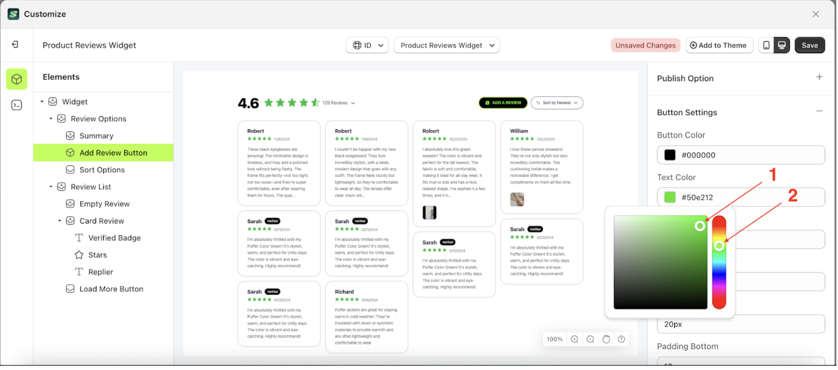
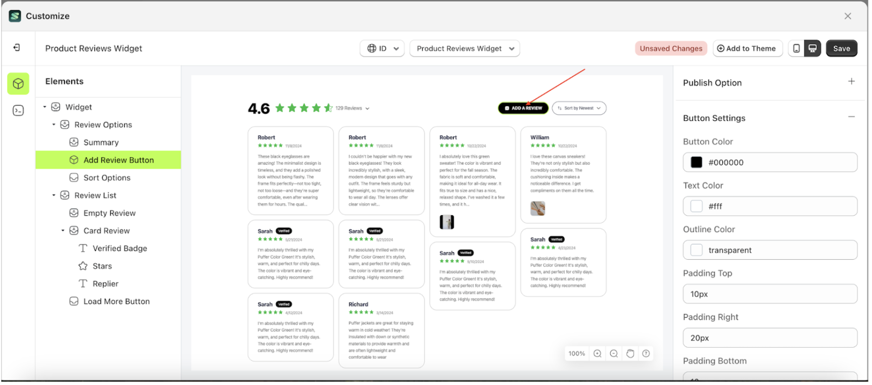
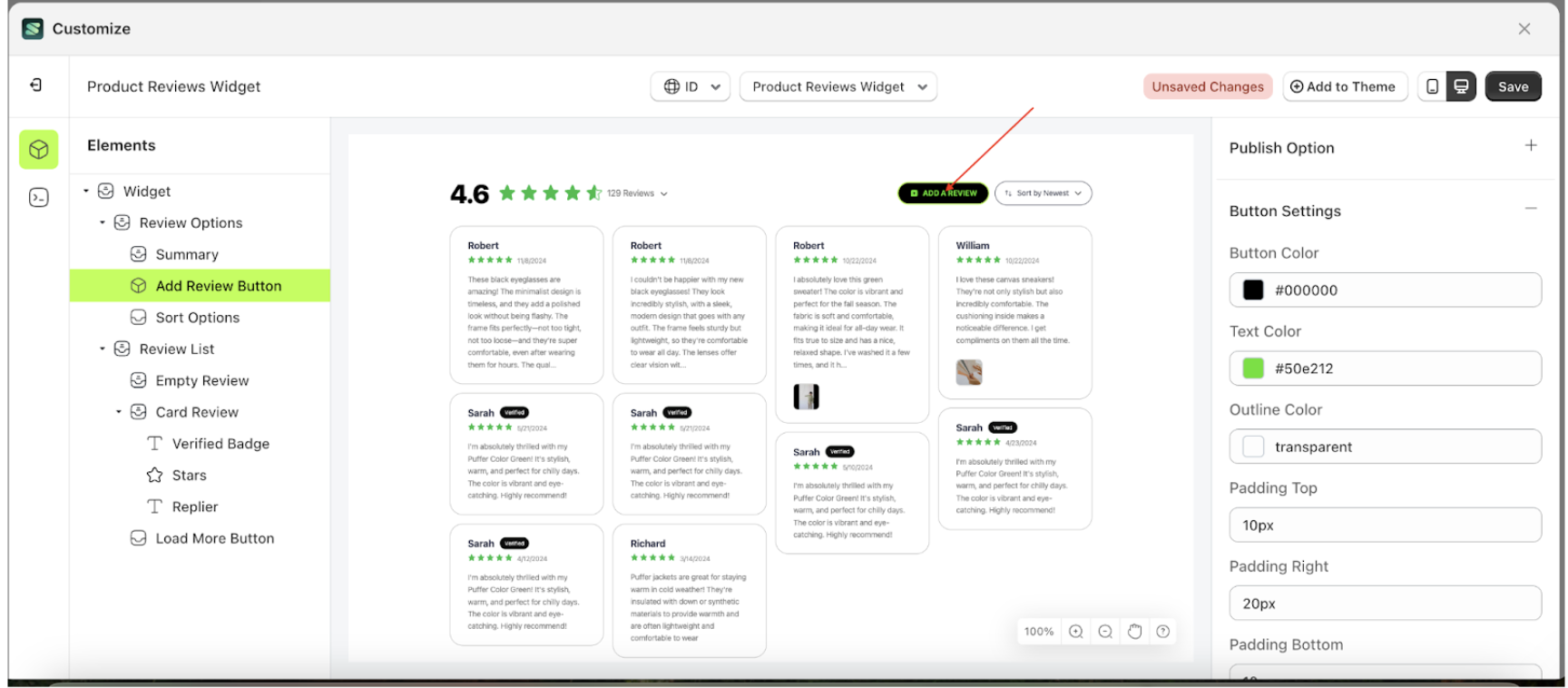
Text Color
This feature is designed to customize the text color of the button settings
Follow the steps below:
- Select the Review Option element on the left, then click the icon marked with a red arrow to open the menu within that item.
- Once the menu is open, select the Add Review Button element on the left, then click the Settings tab and click the icon marked with a red arrow.
- Click the Color Palette on the right side, which is also marked with a red arrow.
- The Color Palette will appear. Click the right side of the palette where the red arrow and number 1 are indicated, then click the right side again where the red arrow and number 2 are marked.
- The product review widget of the Add Review Button element will adjust accordingly.
- Example : Before Add Review Button change settings
- Example : After Add Review Button change settings

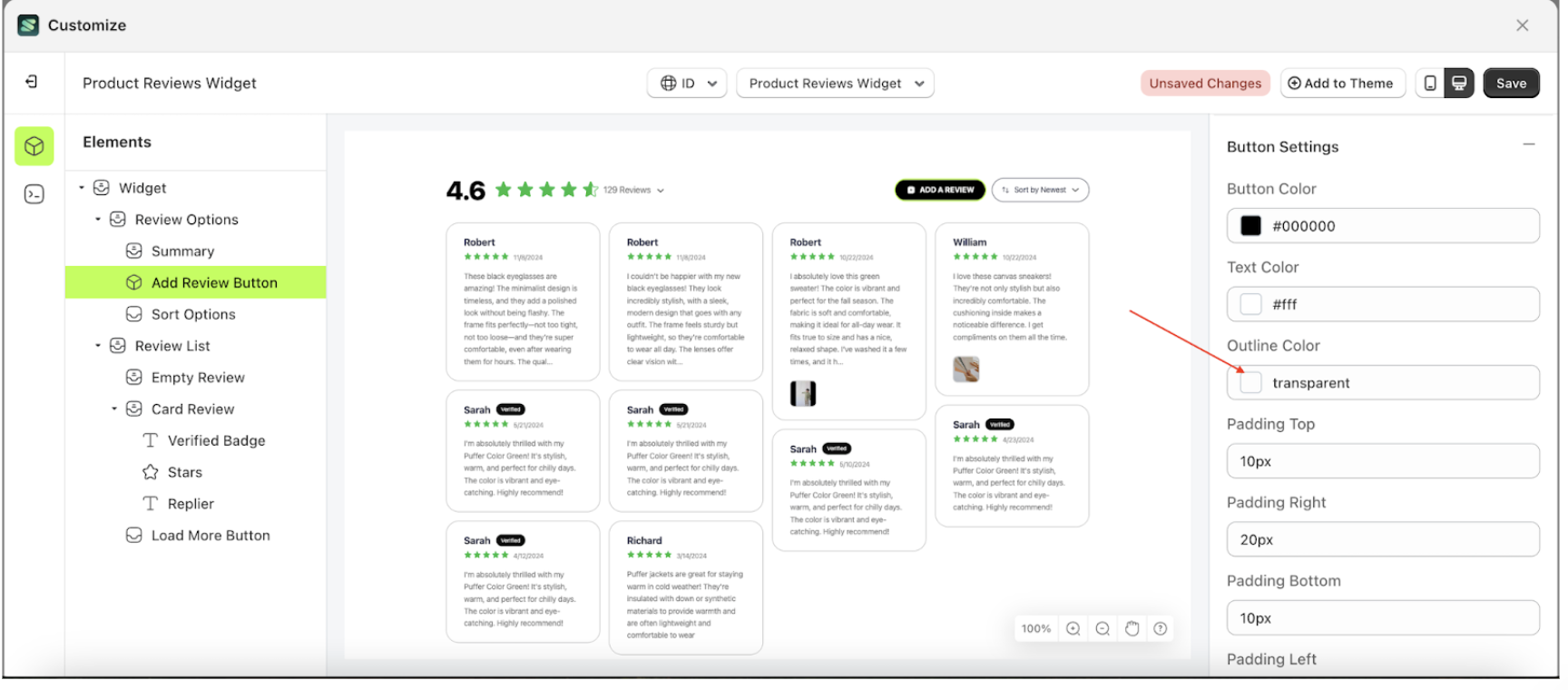
Outline Color
This feature is designed to customize the outline color of the button settings
Follow the steps below:
- Select the Review Option element on the left, then click the icon marked with a red arrow to open the menu within that item.
- Once the menu is open, select the Add Review Button element on the left, then click the Settings tab and click the icon marked with a red arrow.
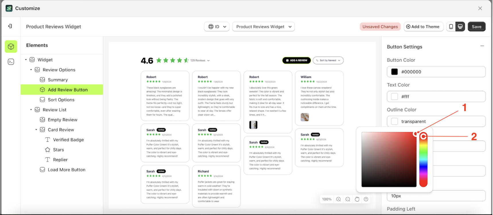
- Click the Color Palette on the right side, which is also marked with a red arrow.
- The Color Palette will appear. Click the right side of the palette where the red arrow and number 1 are indicated, then click the right side again where the red arrow and number 2 are marked.
- The product review widget of the Add Review Button element will adjust accordingly.
- Example : Before Add Review Button change settings
- Example : After Add Review Button change settings

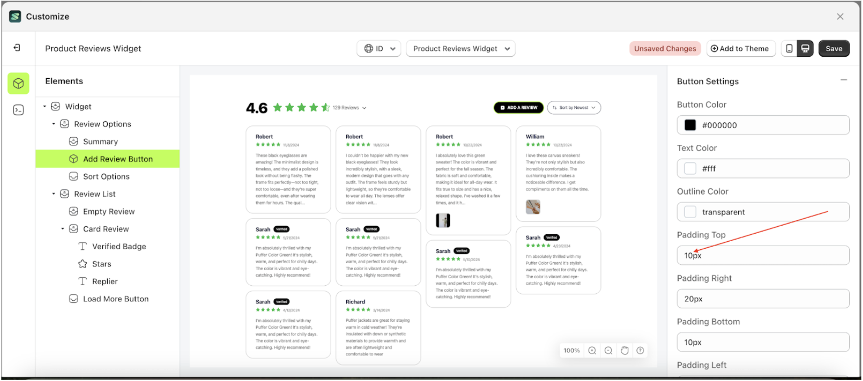
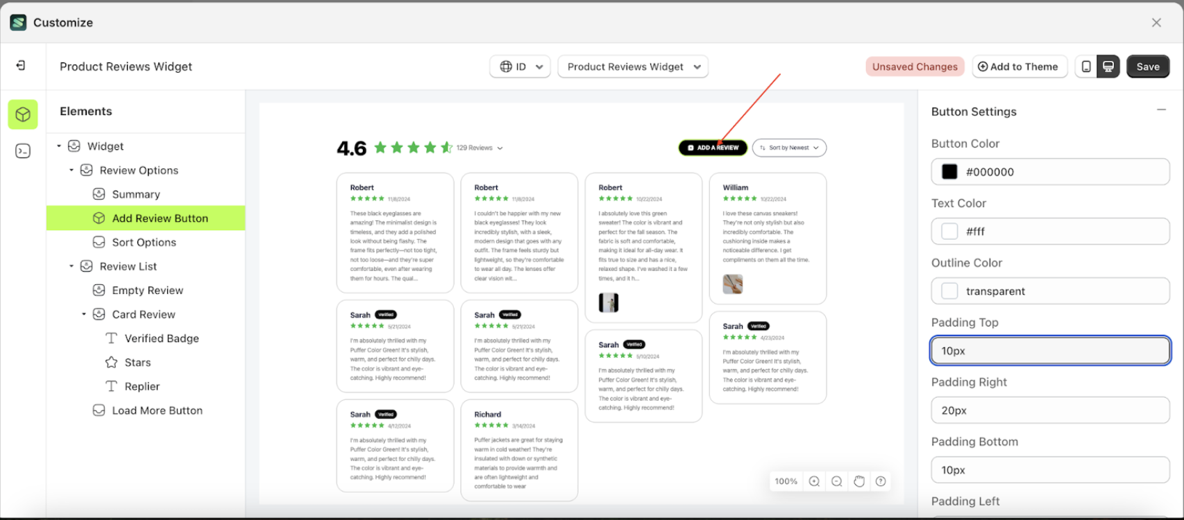
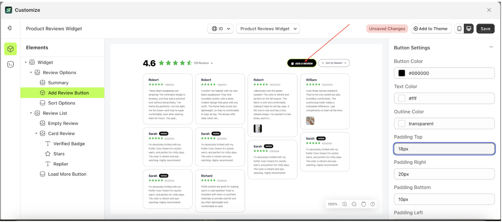
Padding Top
This feature is designed to customize the top padding of the button settings
Follow the steps below
- Select the Review Option element on the left, then click the icon marked with a red arrow to open the menu within that item.
- Once the menu is open, select the Add Review Button element on the left, then click the Settings tab and click the icon marked with a red arrow.
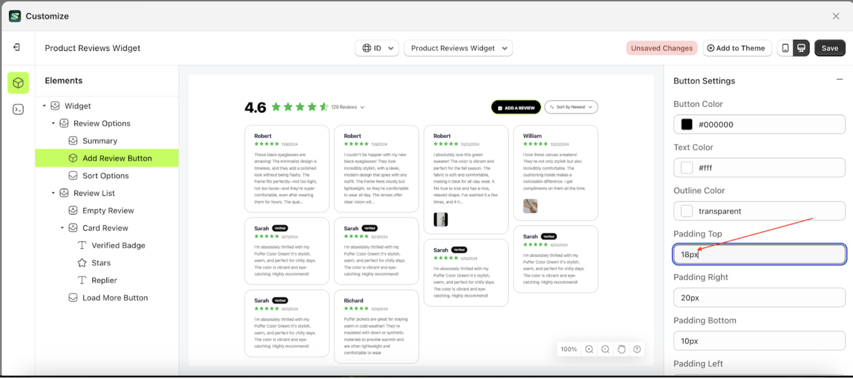
- On the right side, marked with a red arrow, you can change the padding top to your desired value.
- Note: The padding top format can be px, em, rem, %, or other units..
- For example, if you set the padding top to 18px
- The padding top of the Add Review Button element will adjust accordingly.
- Example : Before padding top change settings
- Example : After padding top change settings

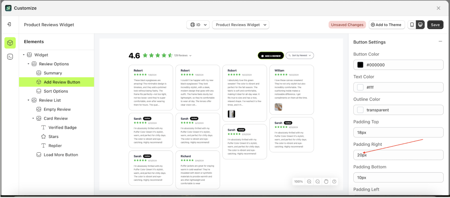
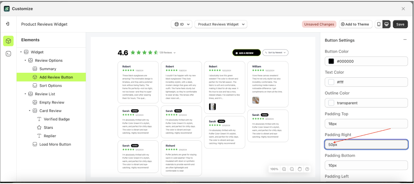
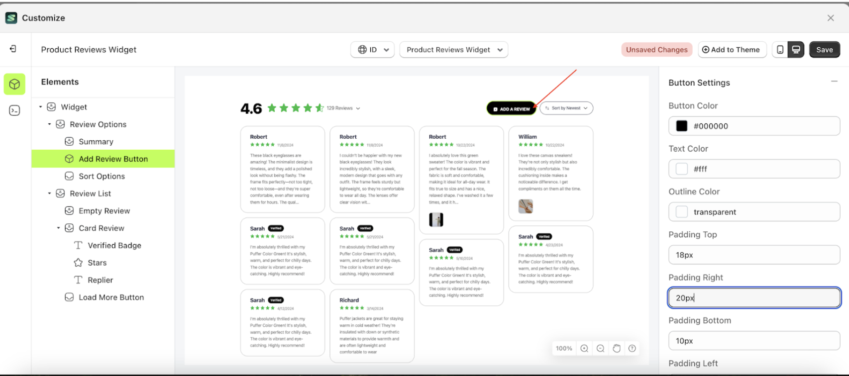
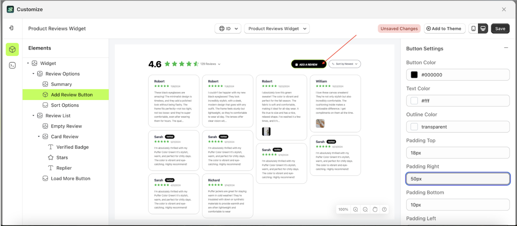
Padding Right
This feature is designed to customize the right padding of the button settings
Follow the steps below
- Select the Review Option element on the left, then click the icon marked with a red arrow to open the menu within that item.
- Once the menu is open, select the Add Review Button element on the left, then click the Settings tab and click the icon marked with a red arrow.
- On the right side, marked with a red arrow, you can change the padding right to your desired value.
- Note: The padding right format can be px, em, rem, %, or other units..
- For example, if you set the padding right to 50px
- The padding right of the Add Review Button element will adjust accordingly.
- Example : Before padding right change settings
- Example : After padding right change settings

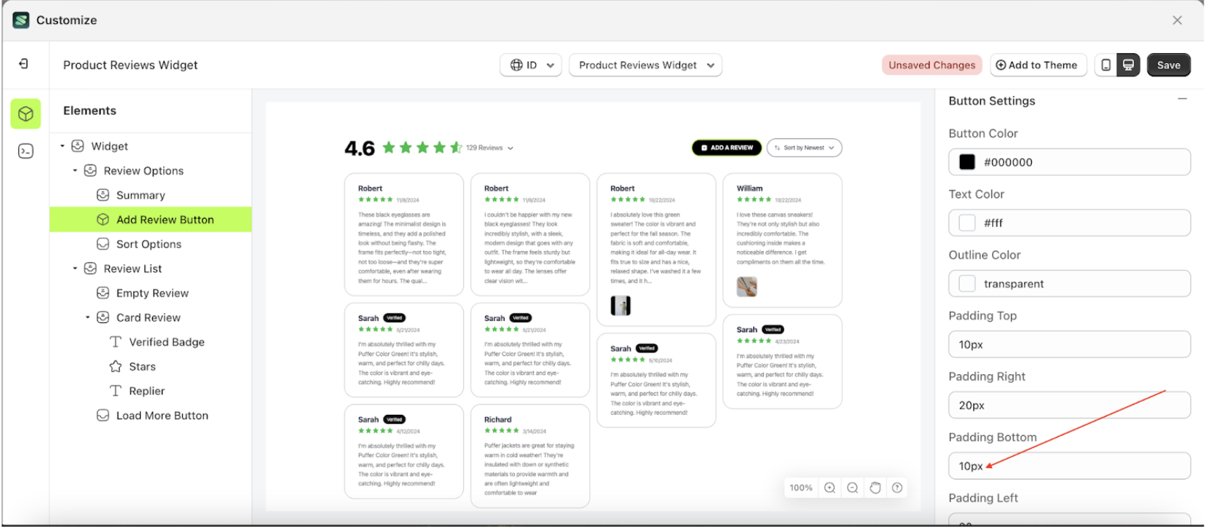
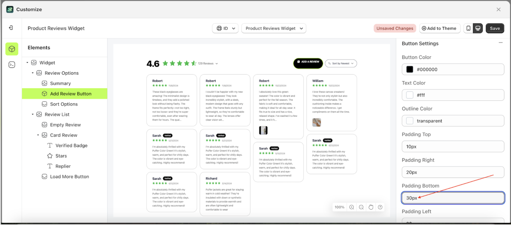
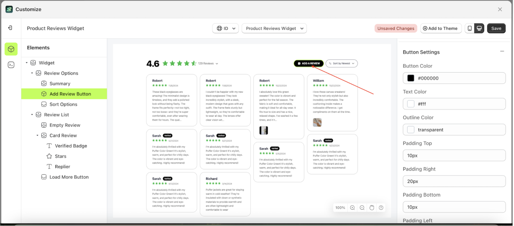
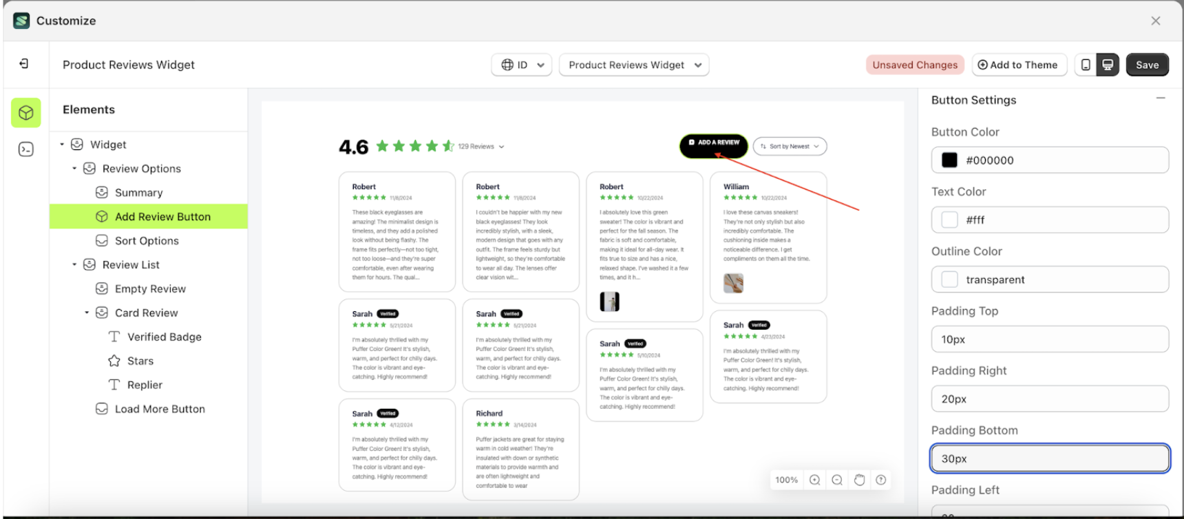
Padding Bottom
This feature is designed to customize the bottom padding of the button settings
Follow the steps below
- Select the Review Option element on the left, then click the icon marked with a red arrow to open the menu within that item.
- Once the menu is open, select the Add Review Button element on the left, then click the Settings tab and click the icon marked with a red arrow.
- On the right side, marked with a red arrow, you can change the padding bottom to your desired value.
- Note: The padding bottom format can be px, em, rem, %, or other units..
- For example, if you set the padding bottom to 30px
- The padding bottom of the Add Review Button element will adjust accordingly.
- Example : Before padding bottom change settings
- Example : After padding bottom change settings
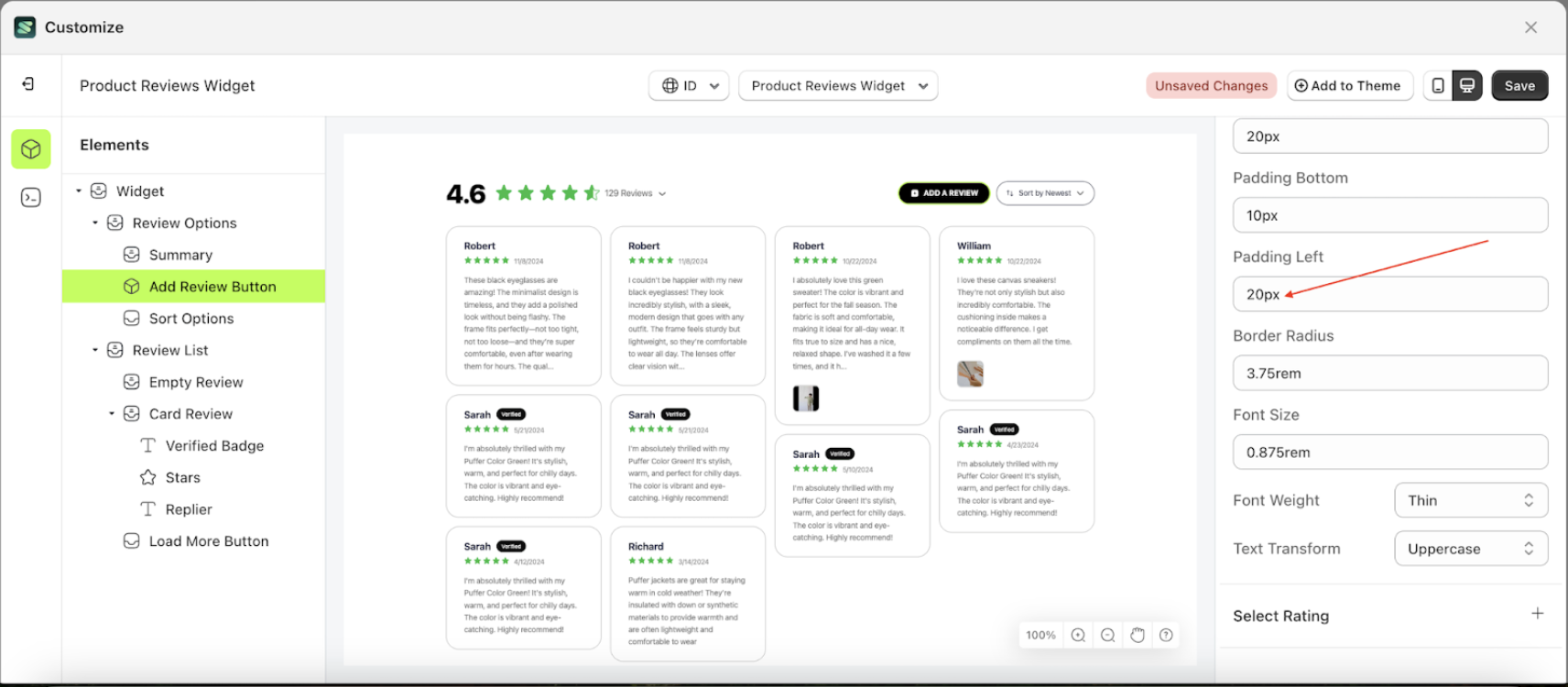
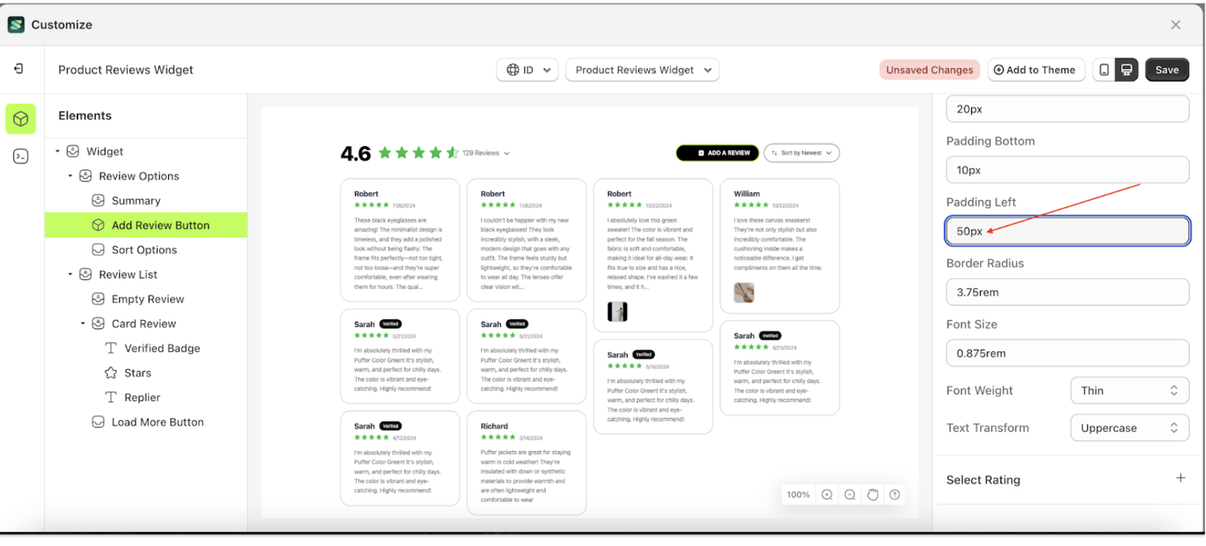
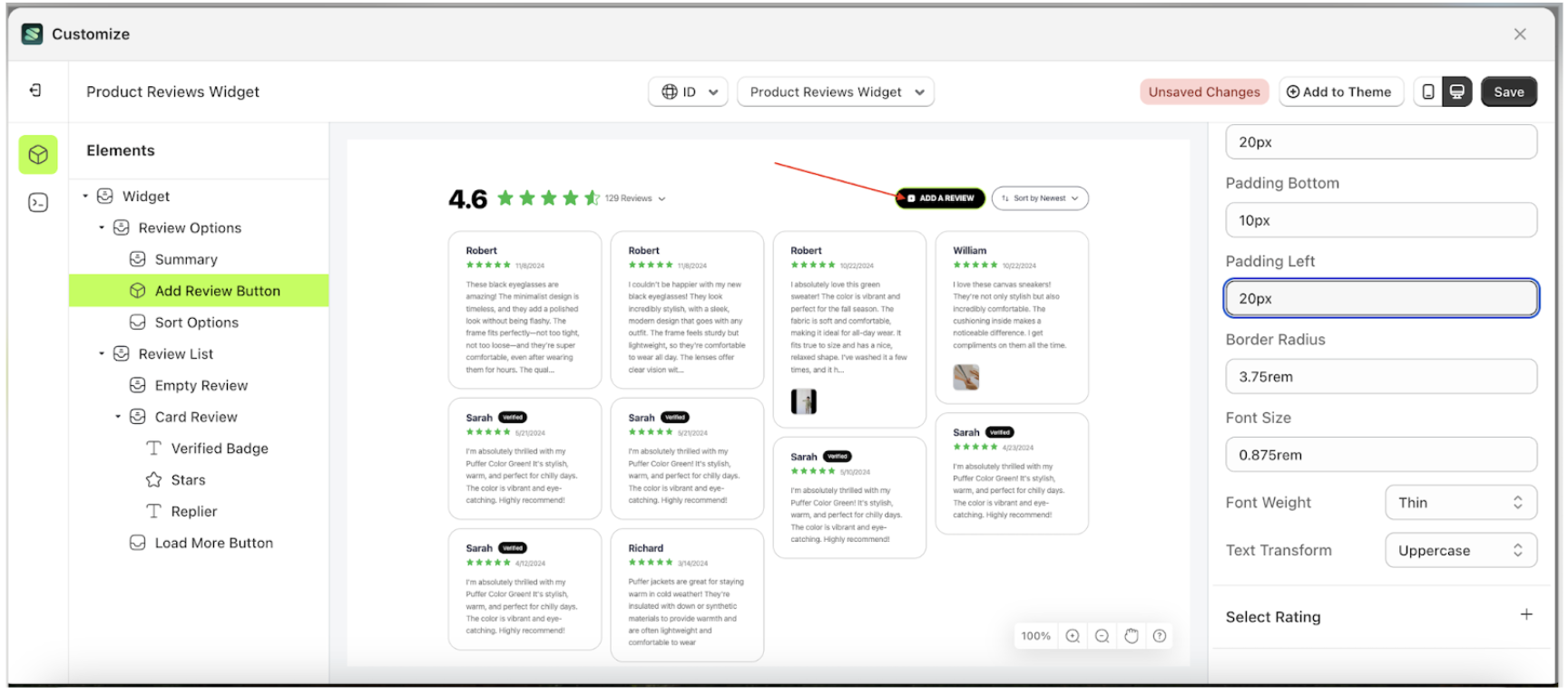
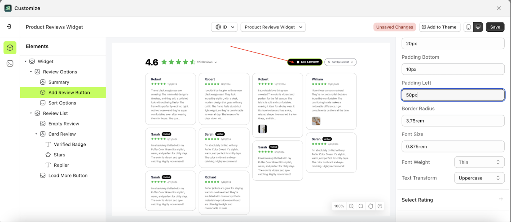
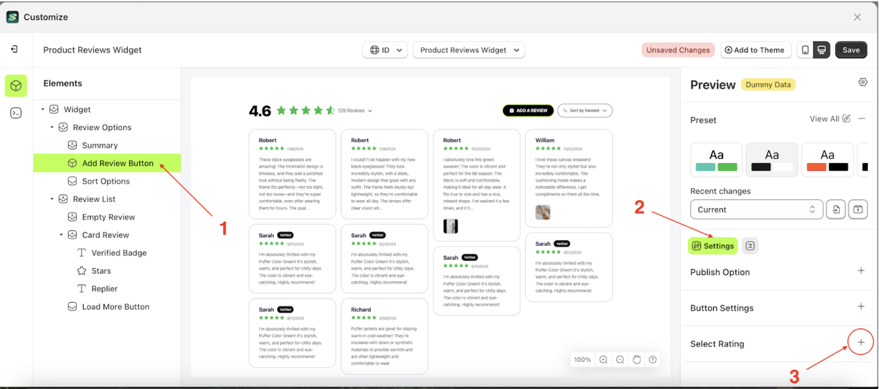
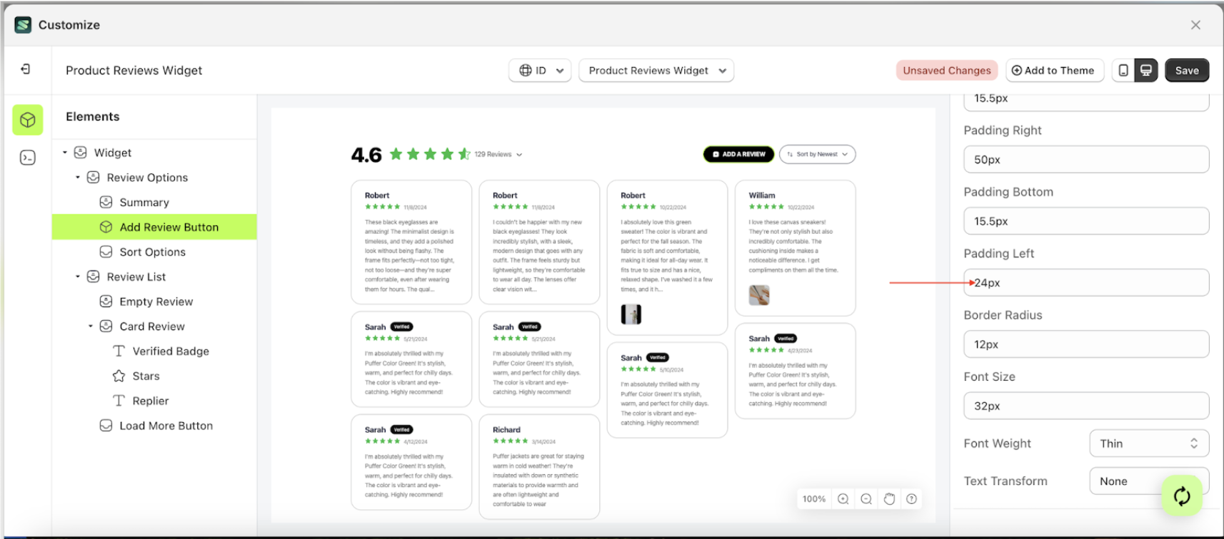
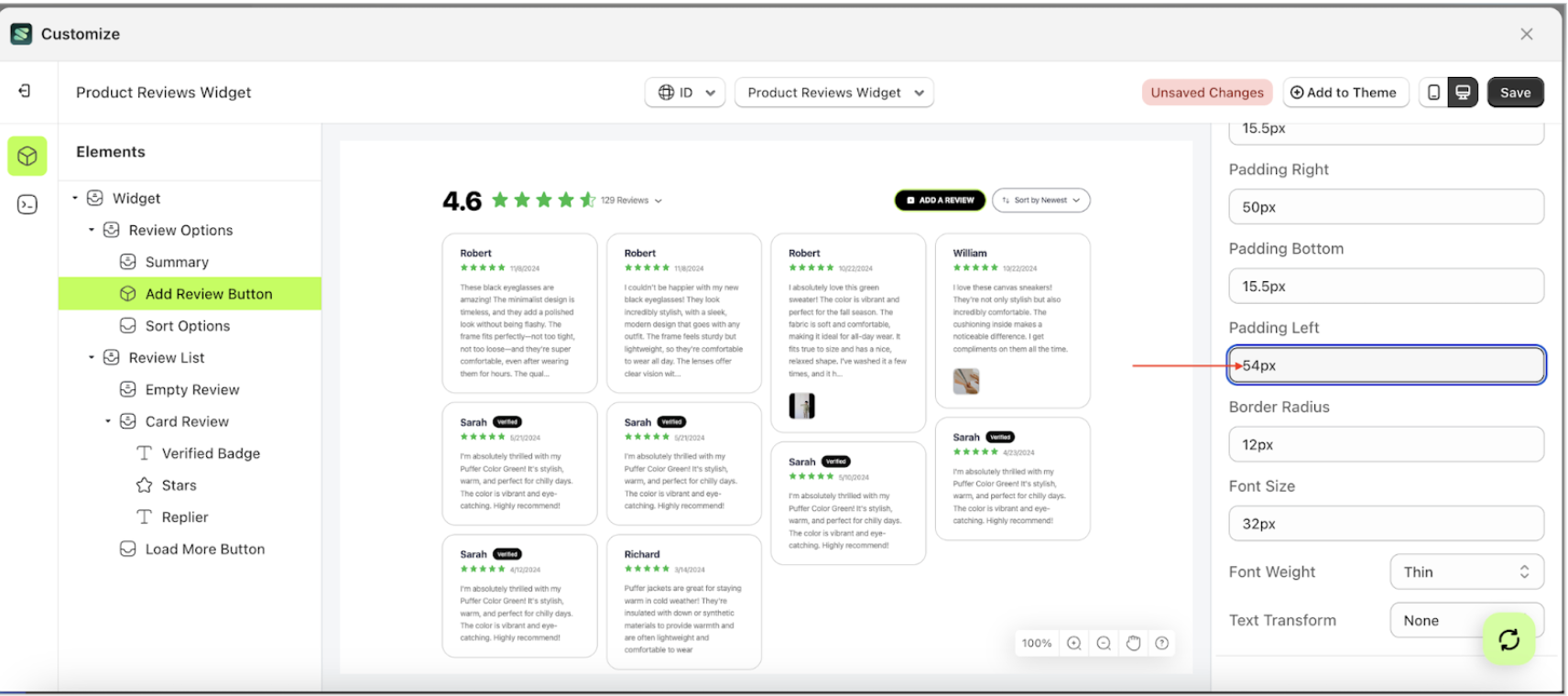
Padding Left
This feature is designed to customize the padding left of the button settings
Follow the steps below
- Select the Review Option element on the left, then click the icon marked with a red arrow to open the menu within that item.
- Once the menu is open, select the Add Review Button element on the left, then click the Settings tab and click the icon marked with a red arrow.
- On the right side, marked with a red arrow, you can change the padding left to your desired value.
- Note: The padding left format can be px, em, rem, %, or other units..
- For example, if you set the padding left to 50px
- The padding left of the Add Review Button element will adjust accordingly.
- Example : Before padding left change settings
- Example : After padding left change settings

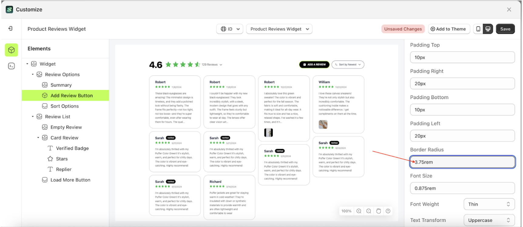
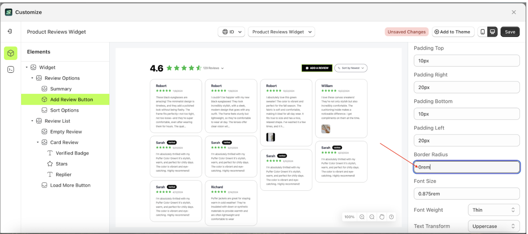
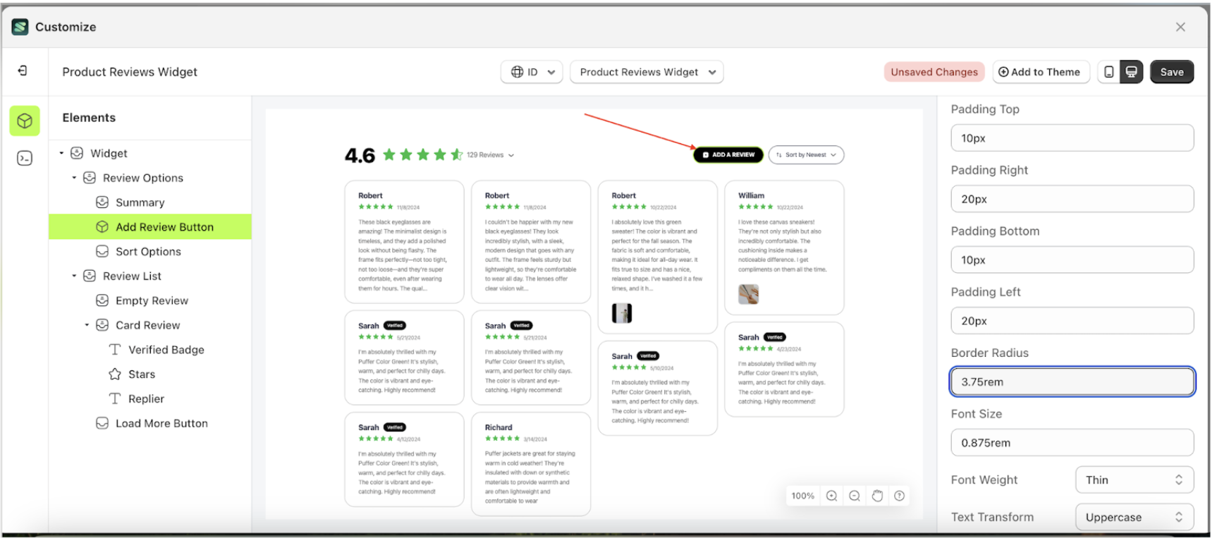
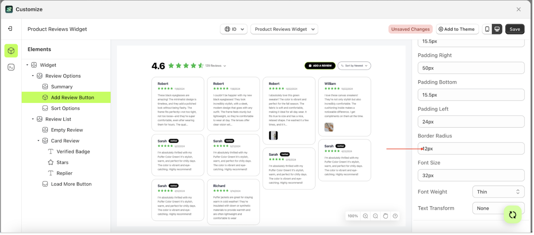
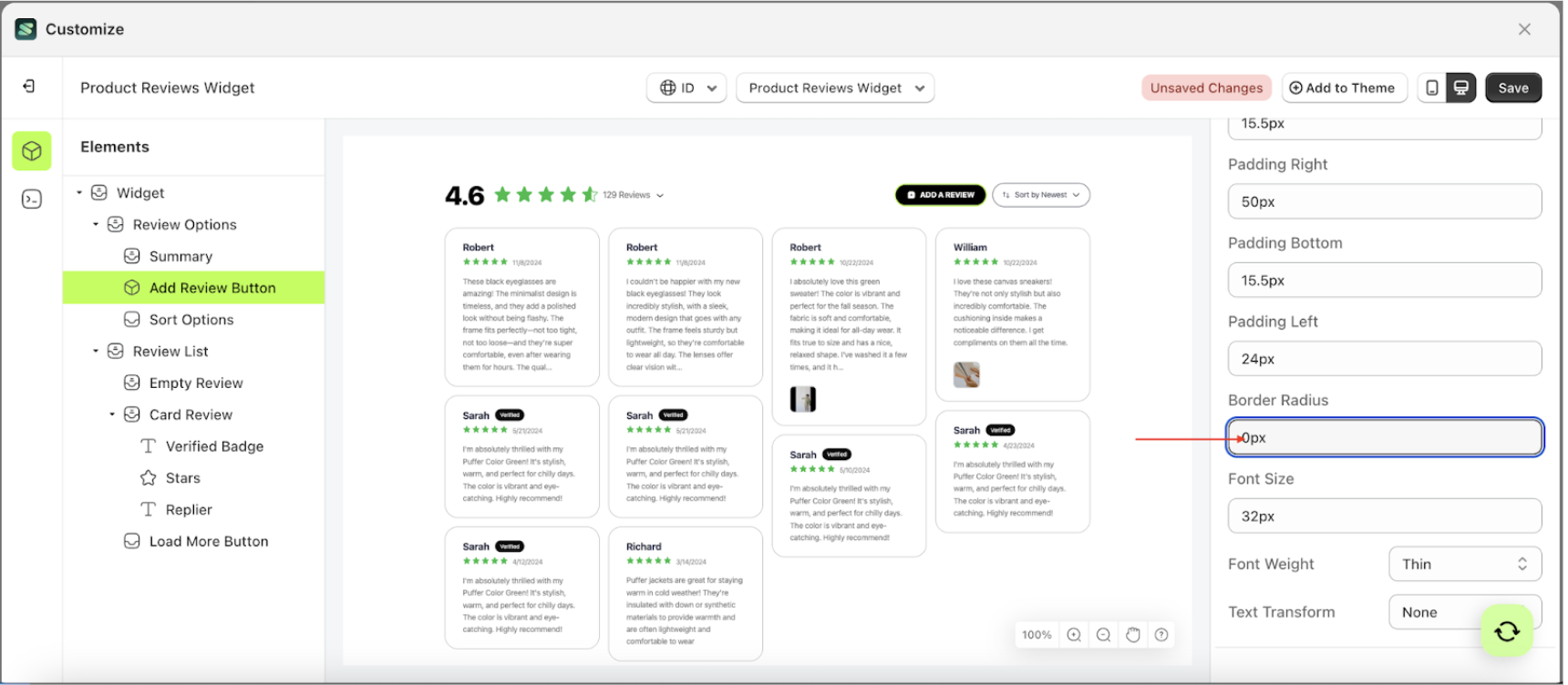
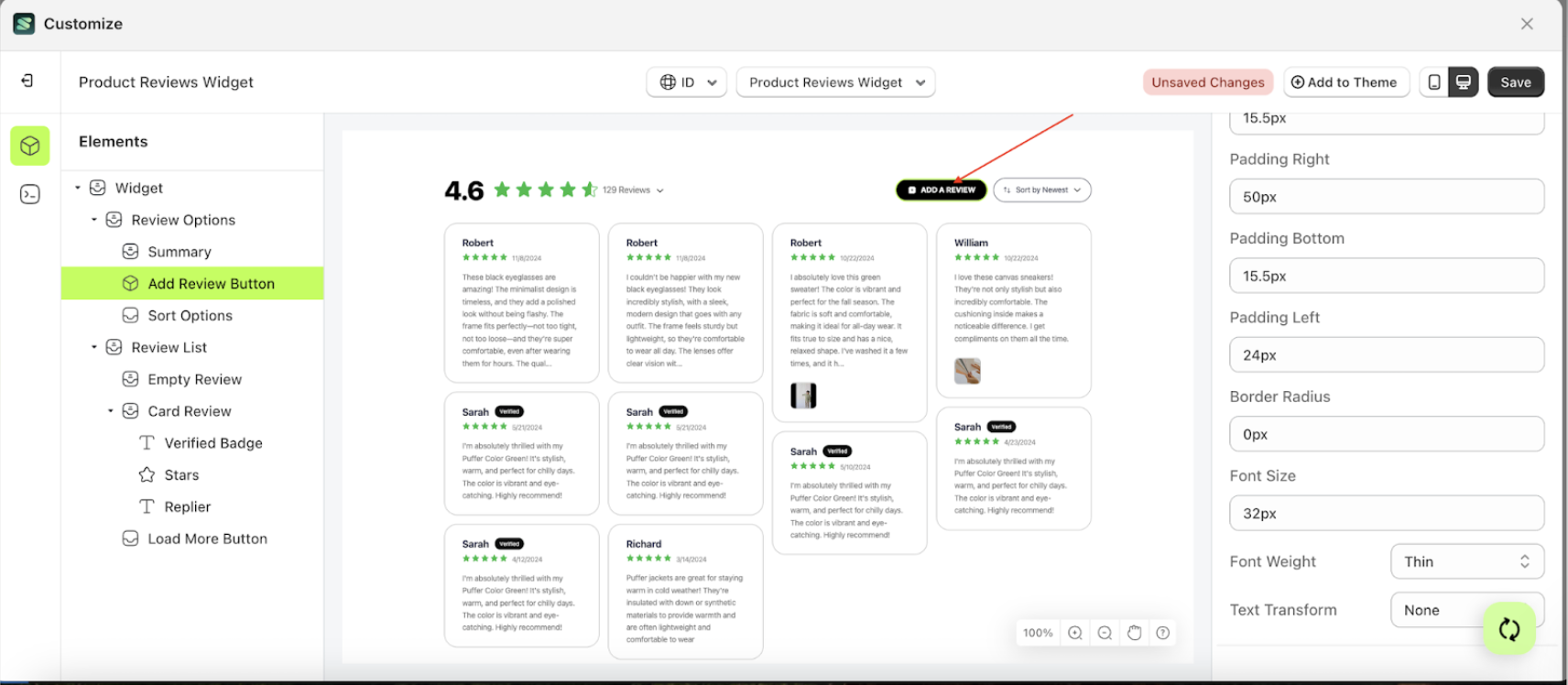
Border Radius
This feature is designed to customize the corner radius of the button settings
Follow the steps below
- Select the Review Option element on the left, then click the icon marked with a red arrow to open the menu within that item.
- Once the menu is open, select the Add Review Button element on the left, then click the Settings tab and click the icon marked with a red arrow.
- On the right side, marked with a red arrow, you can change the border radius to your desired value.
- Note: The border radius format can be px, em, rem, %, or other units..
- For example, if you set the border radius to 0rem
- The border radius of the Add Review Button element will adjust accordingly.
- Example : Before border radius change settings
- Example : After border radius change settings


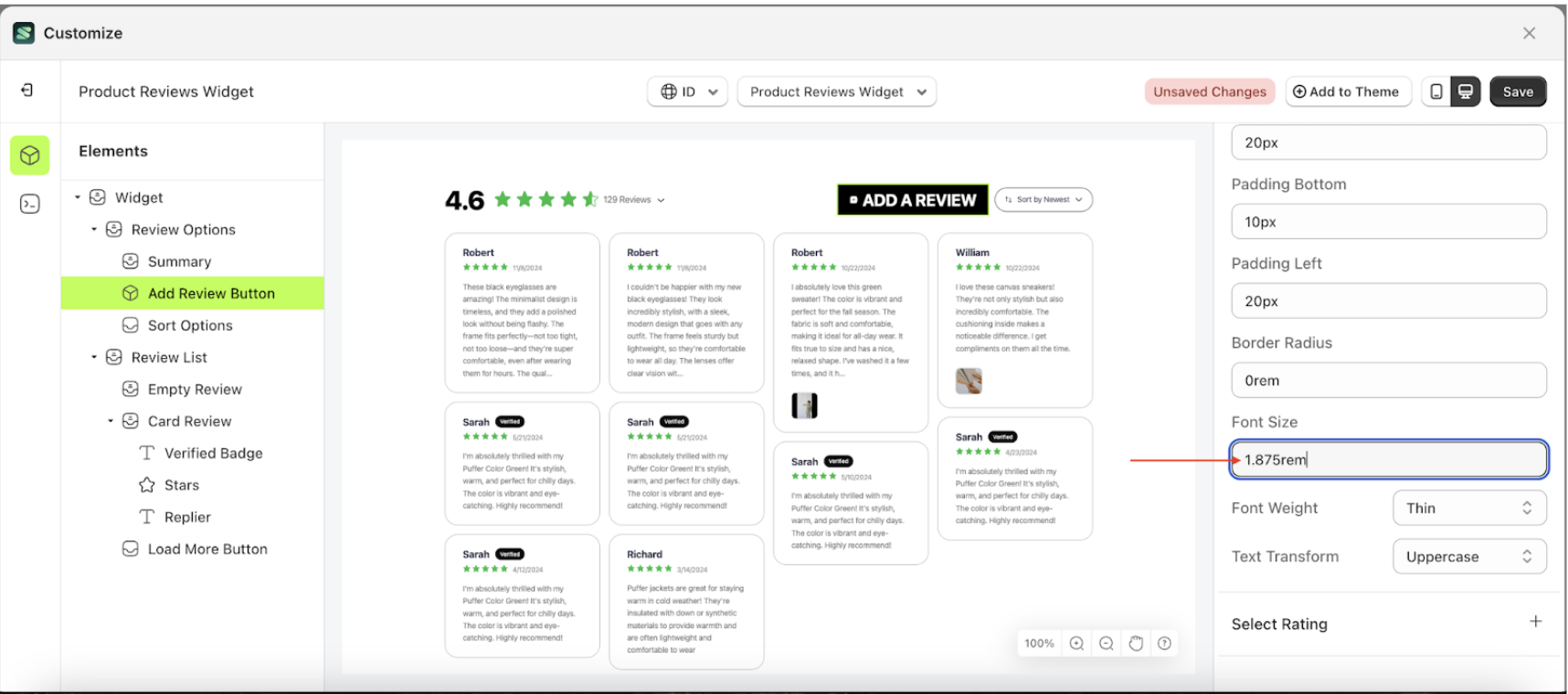
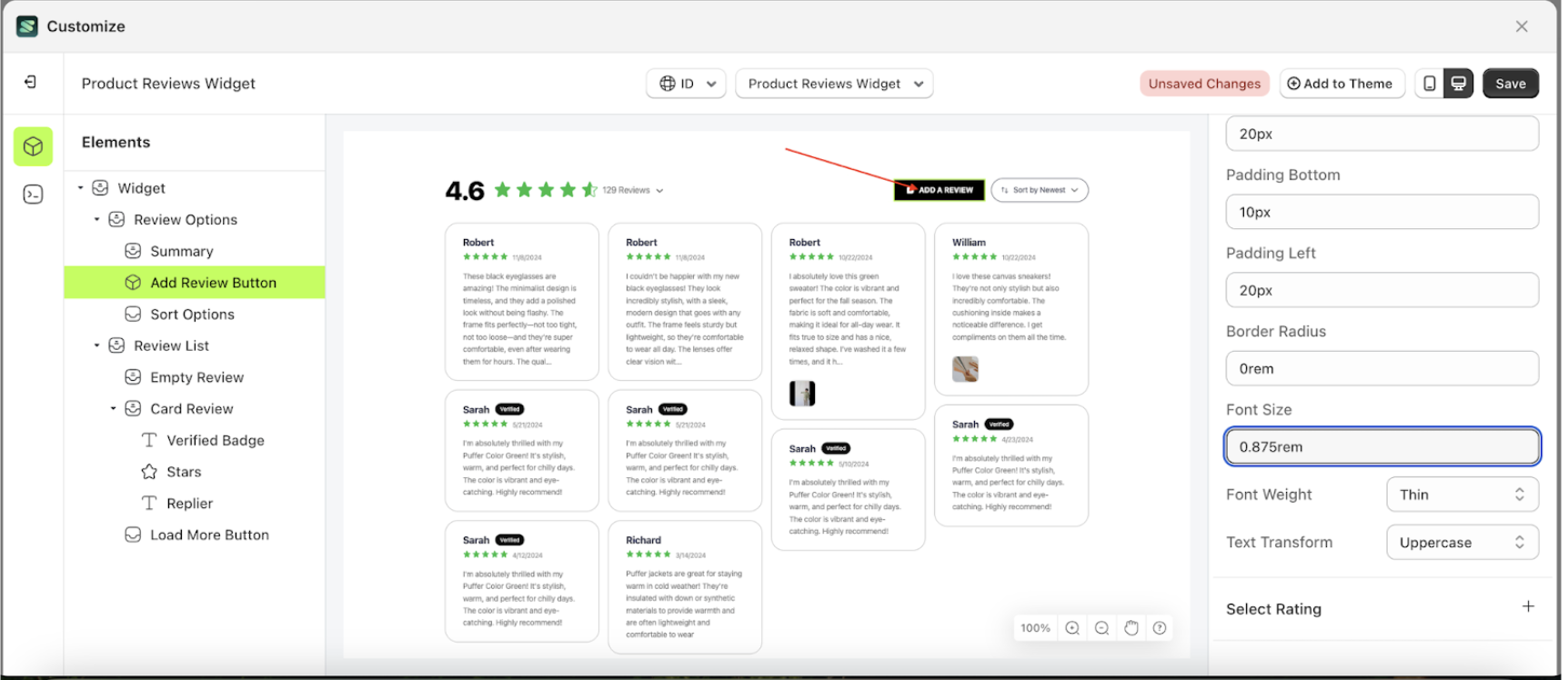
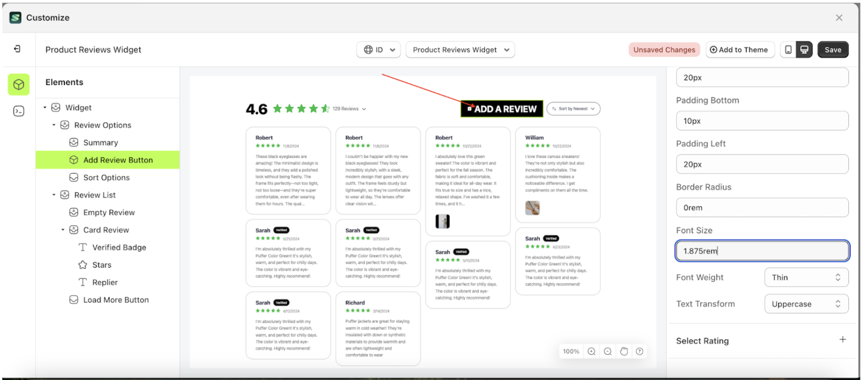
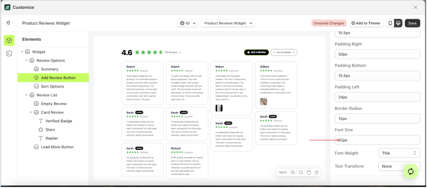
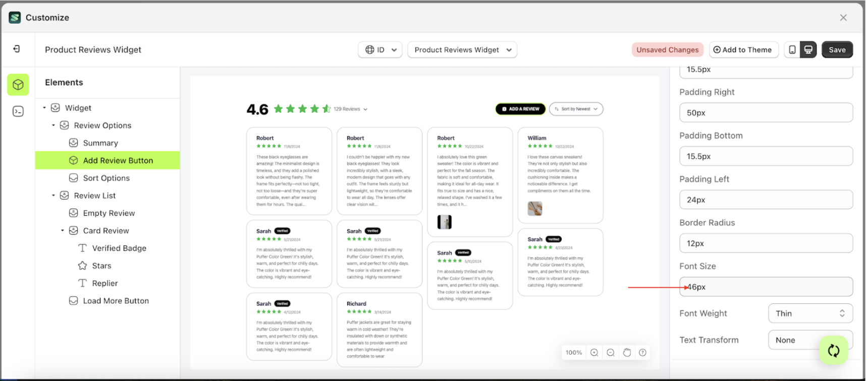
Font Size
This feature is designed to customize the text size of the button settings
Follow the steps below
- Select the Review Options element on the left, then click the icon marked with a red arrow to open the menu within that item.
- Once the menu is open, select the Add Review Button element on the left, then click the Settings tab and click the icon marked with a red arrow.
- On the right side, marked with a red arrow, you can change the font size to your desired value.
- Note: The font size format can be px, em, rem, %, or other units..
- For example, if you set the font size to 1.875rem
- The font size of the Add Review Button element will adjust accordingly.
- Example : Before font size change settings
- Example : After font size change settings


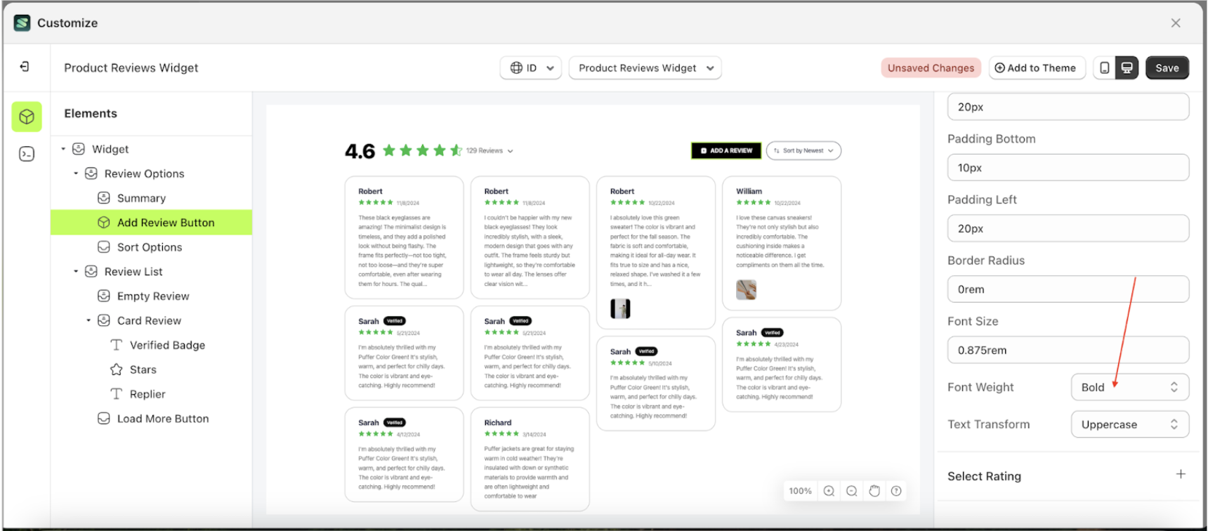
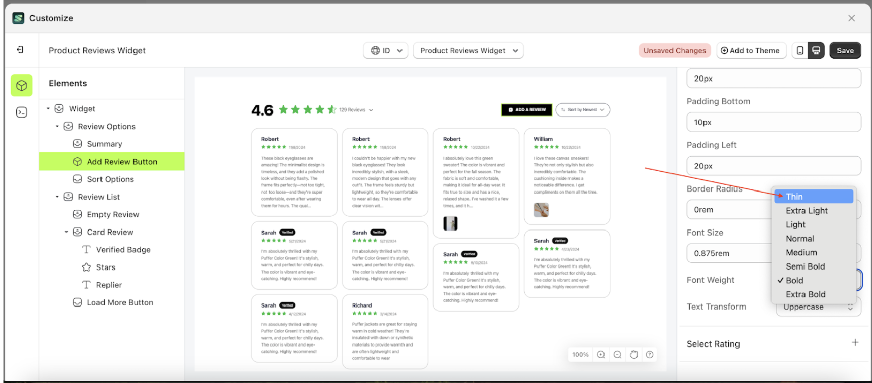
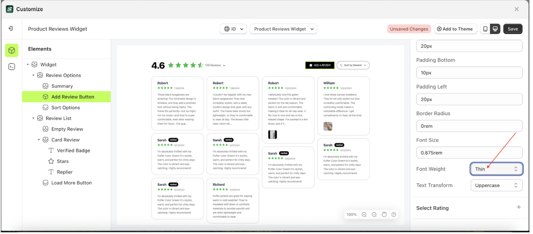
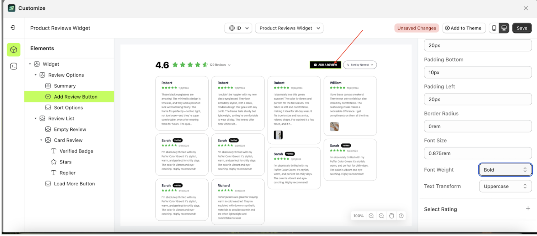
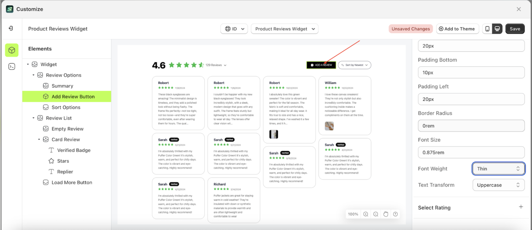
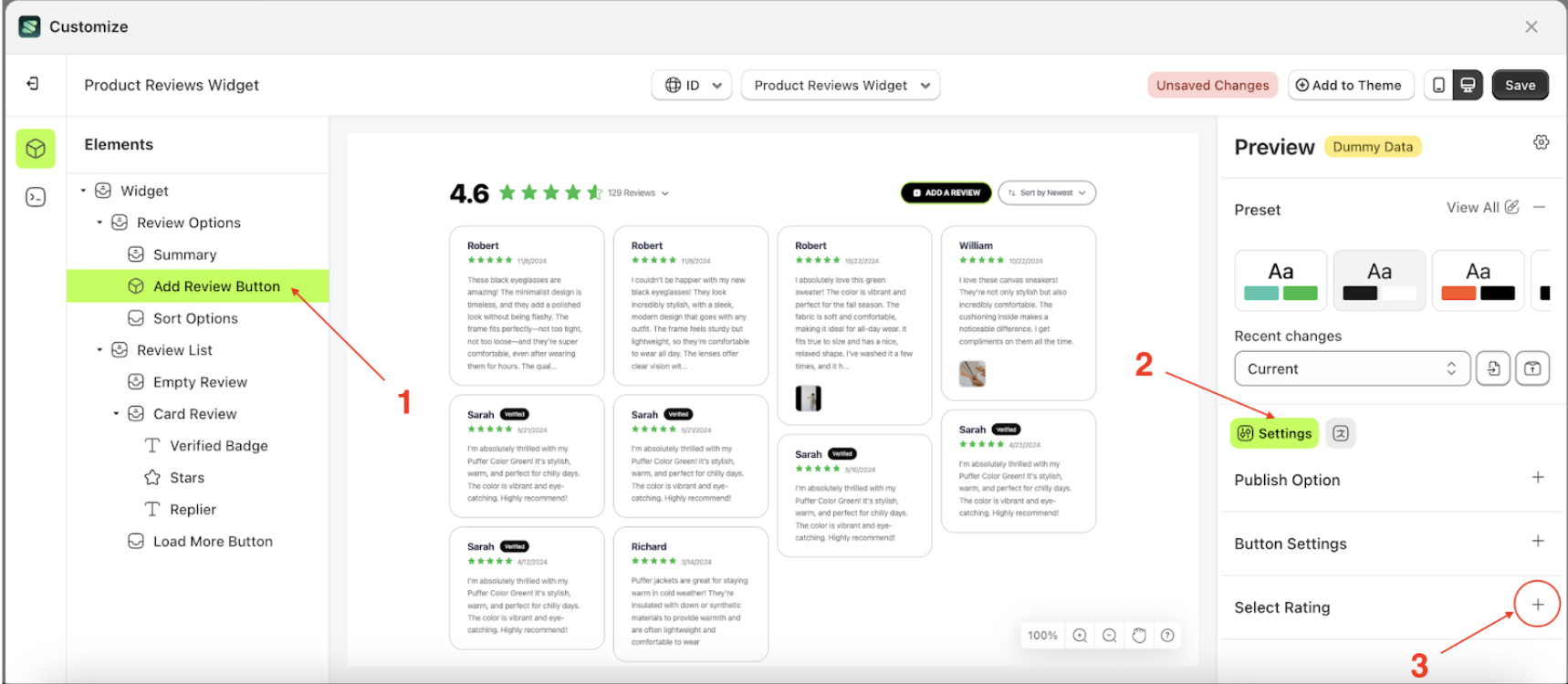
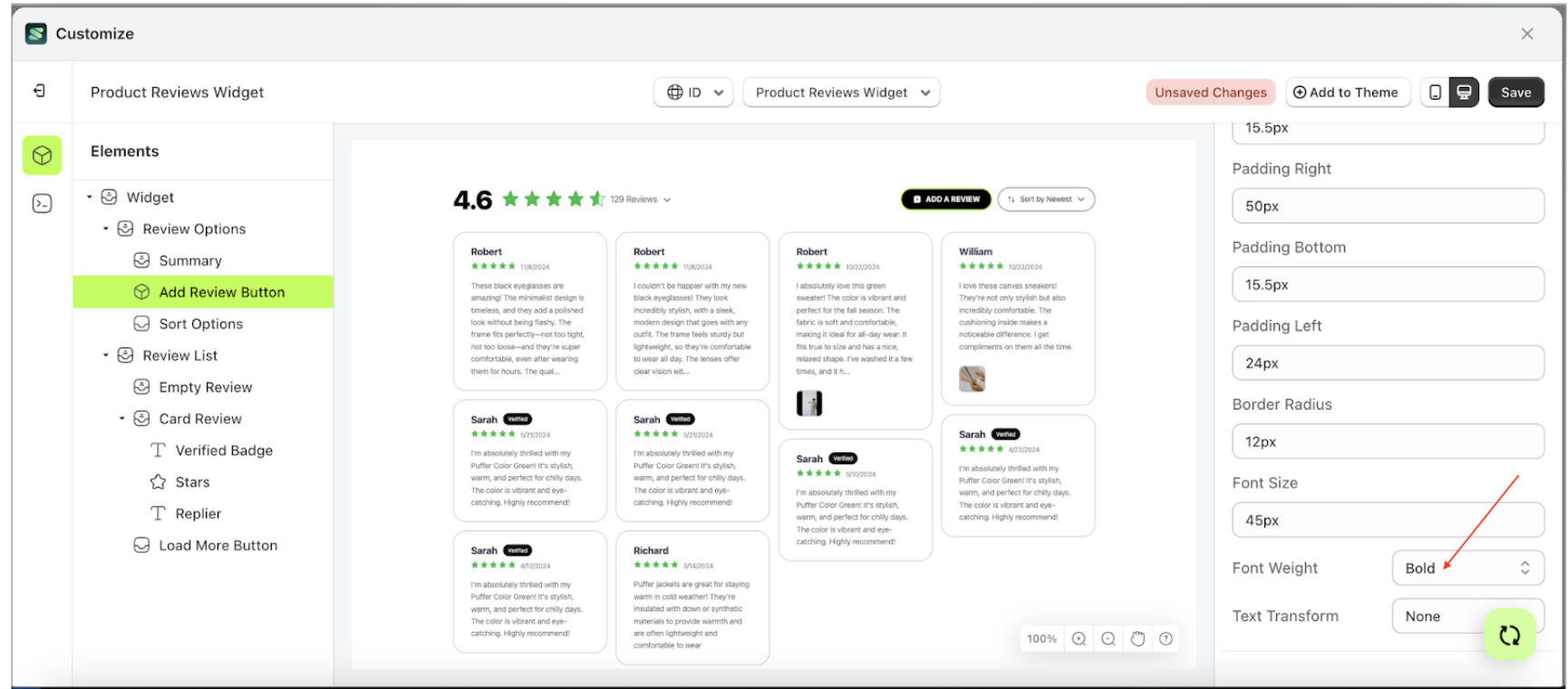
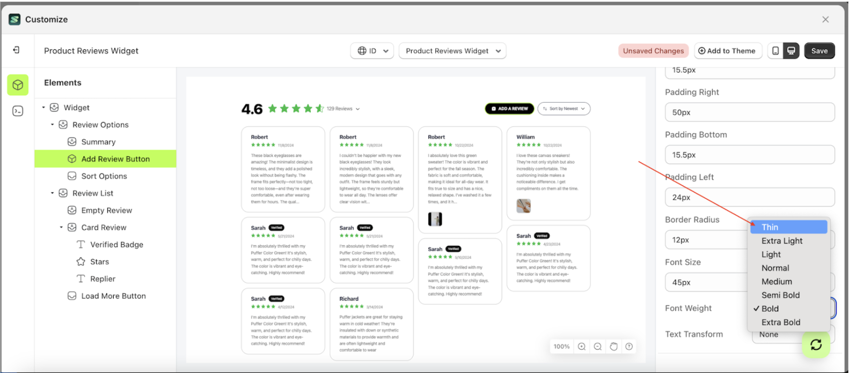
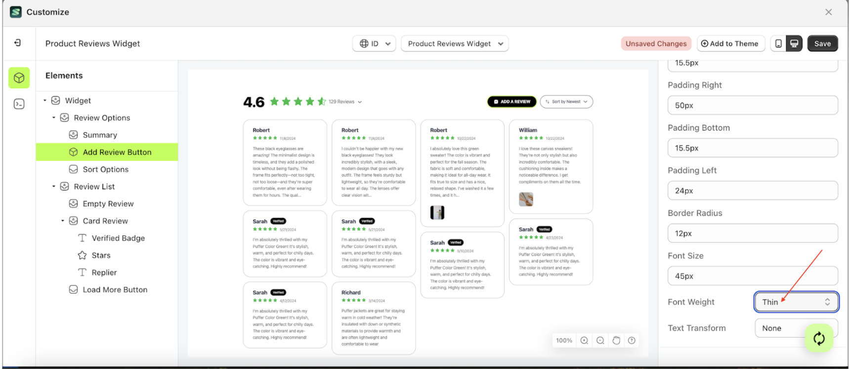
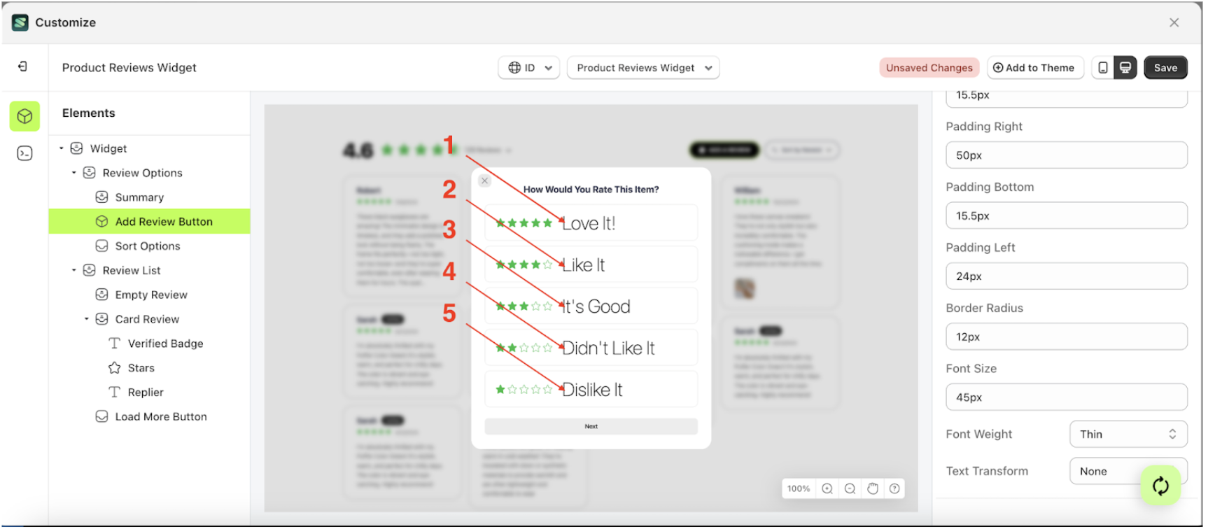
Font Weight
This feature is designed to customize the text weight of the button settings
Follow the steps below
- Select the Review Options element on the left, then click the icon marked with a red arrow to open the menu within that item.
- Once the menu is open, select the Add Review Button element on the left, then click the Settings tab and click the icon marked with a red arrow.
- On the right side, marked with a red arrow, you can change the font weight to your desired value.
- Note: The font weight format can be Thin, Extra light, Light and etc.
- Once the menu opens, select an option from the list
- For example, if you set the font weight to thin
- The font weight of the Add Review Button element will adjust accordingly.
- Example : Before font weight change settings
- Example : After font weight change settings


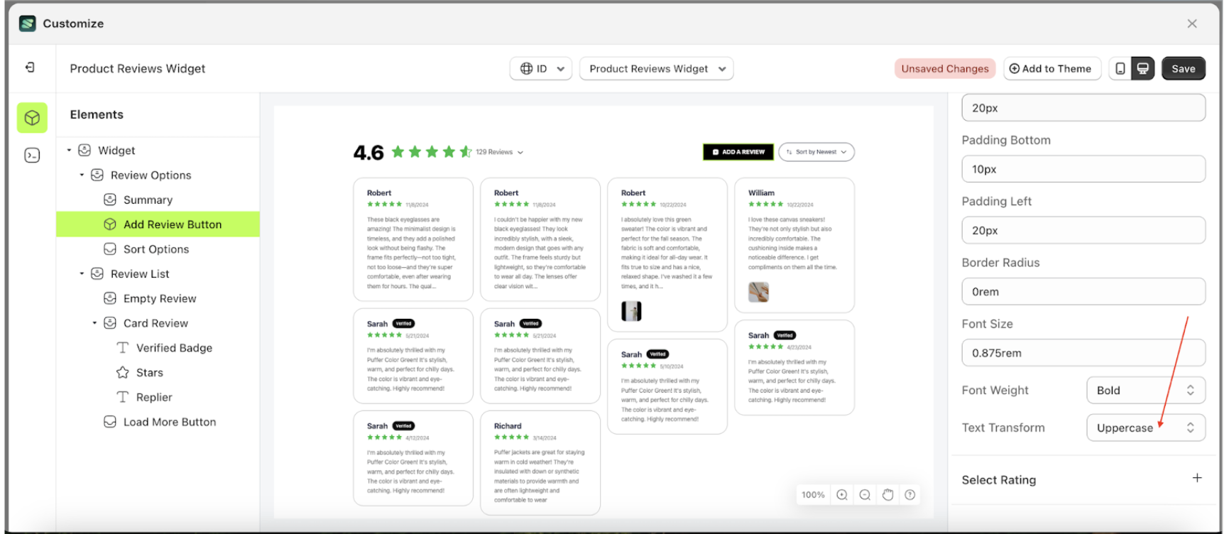
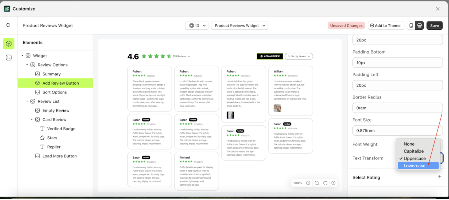
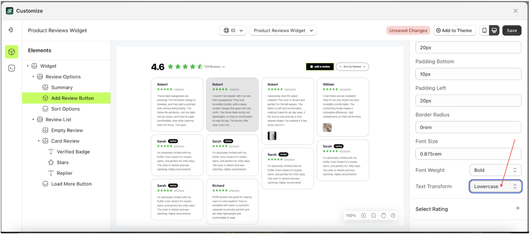
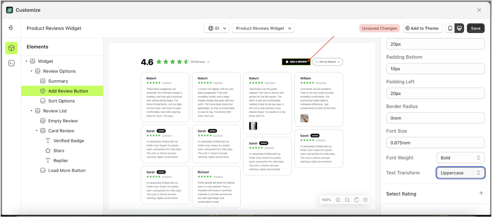
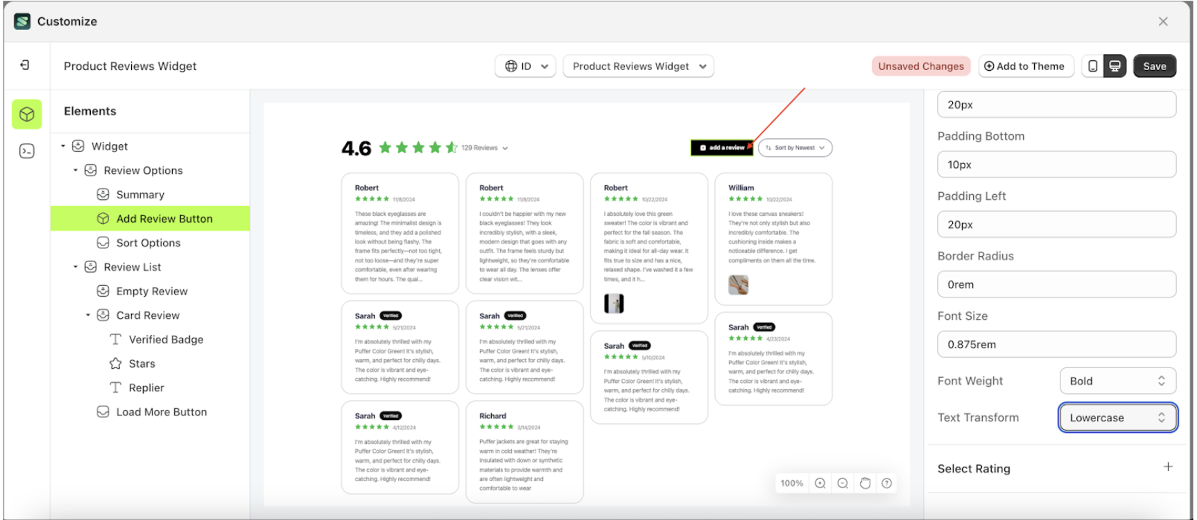
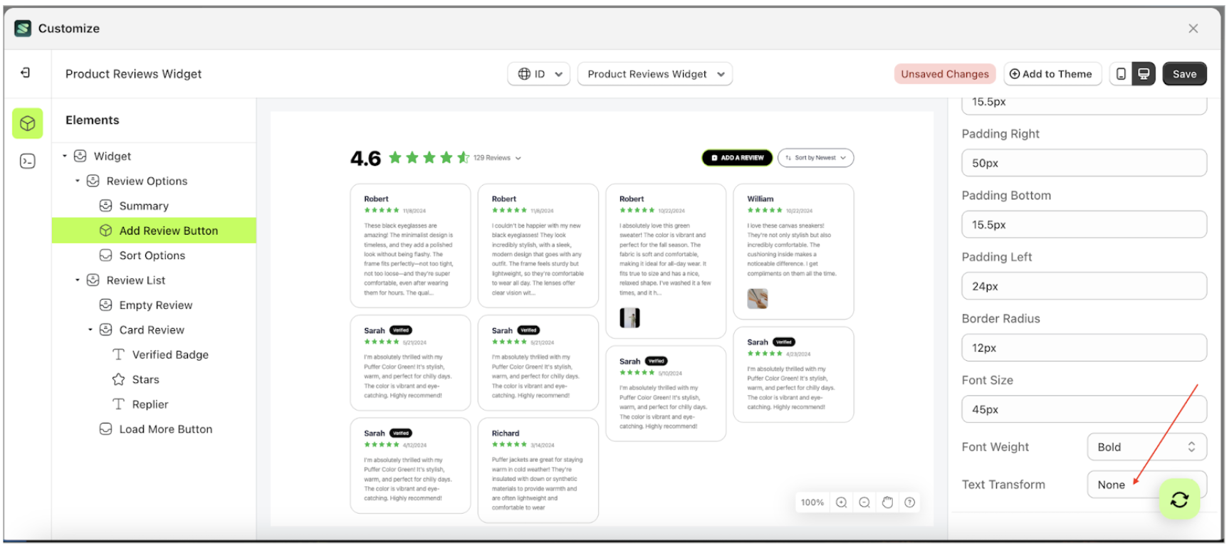
Text Transform
This feature allows you to adjust the capitalization style of the text
Follow the steps below
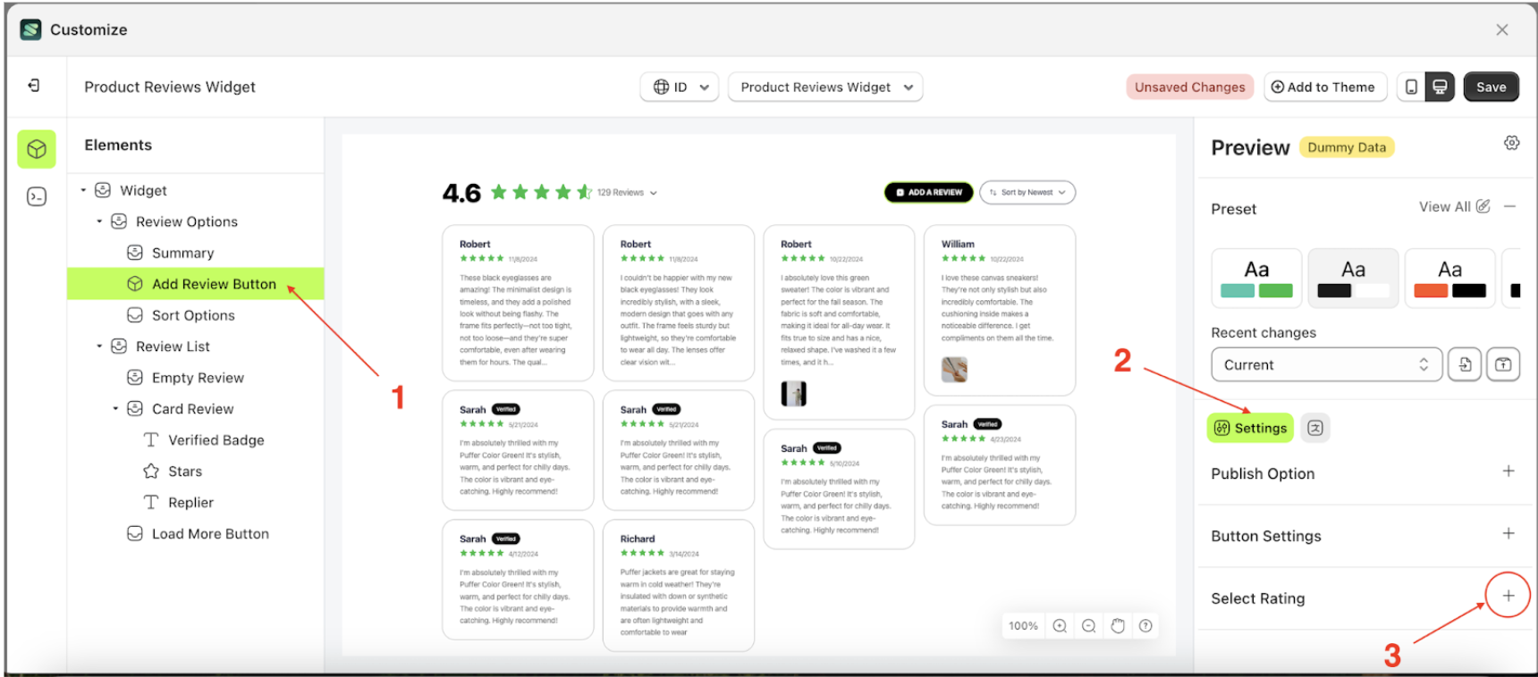
- Select the Review Options element on the left, then click the icon marked with a red arrow to open the menu within that item.
- Once the menu is open, select the Add Review Button element on the left, then click the Settings tab and click the icon marked with a red arrow.
- On the right side, marked with a red arrow, you can change the font weight to your desired value.
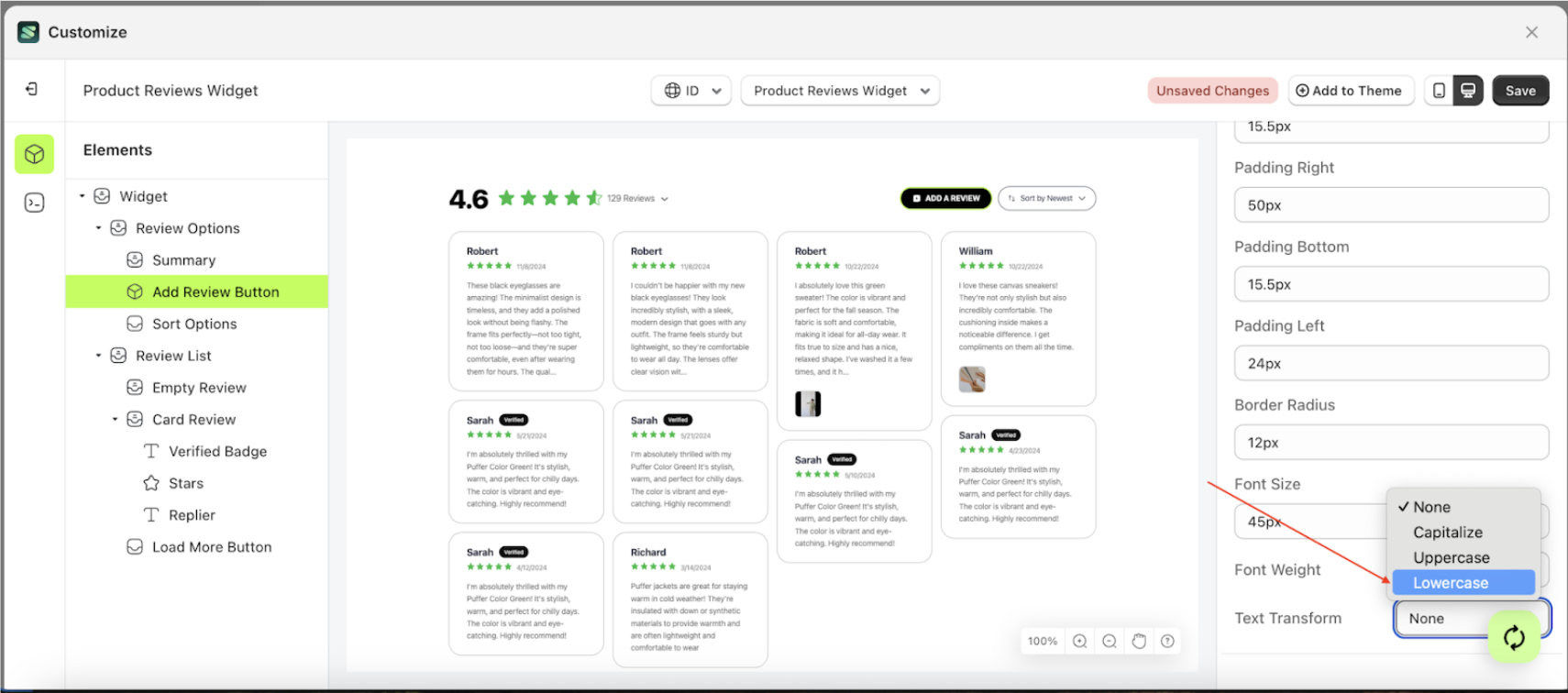
- Note: The font weight format can be None, Capitalize, Uppercase, Lowercase..
- Once the menu opens, select an option from the list
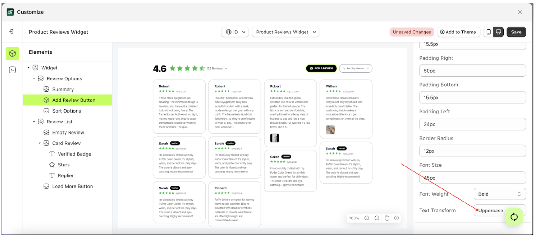
- For example, if you set the font weight to Lowercase
- The font weight of the Add Review Button element will adjust accordingly.
- Example : Before font weight change settings
- Example : After font weight change settings


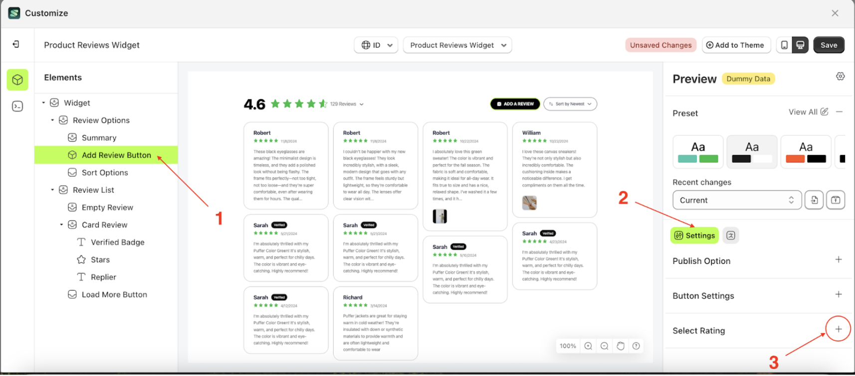
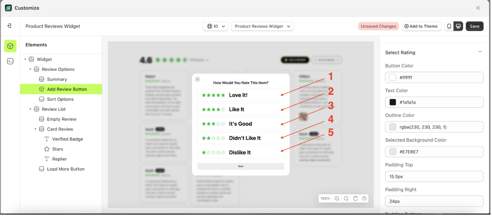
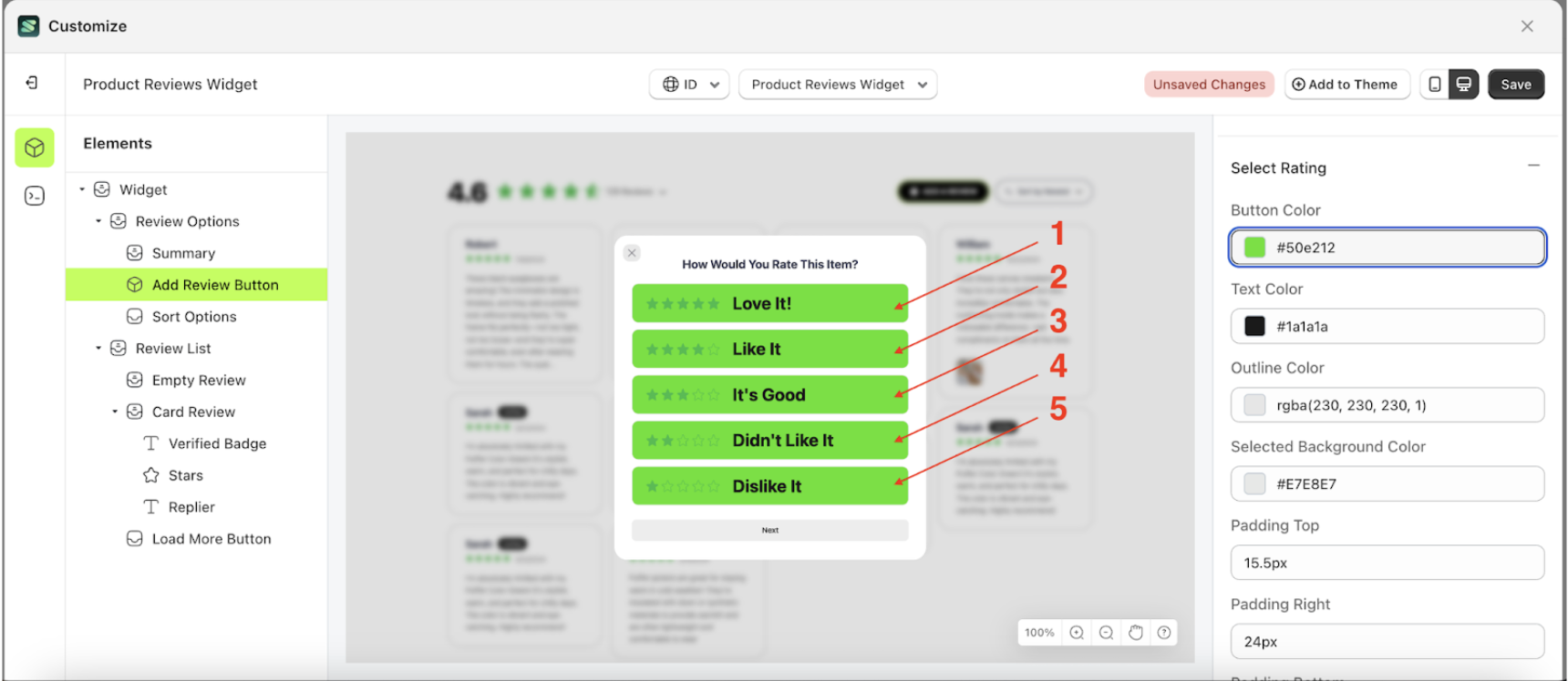
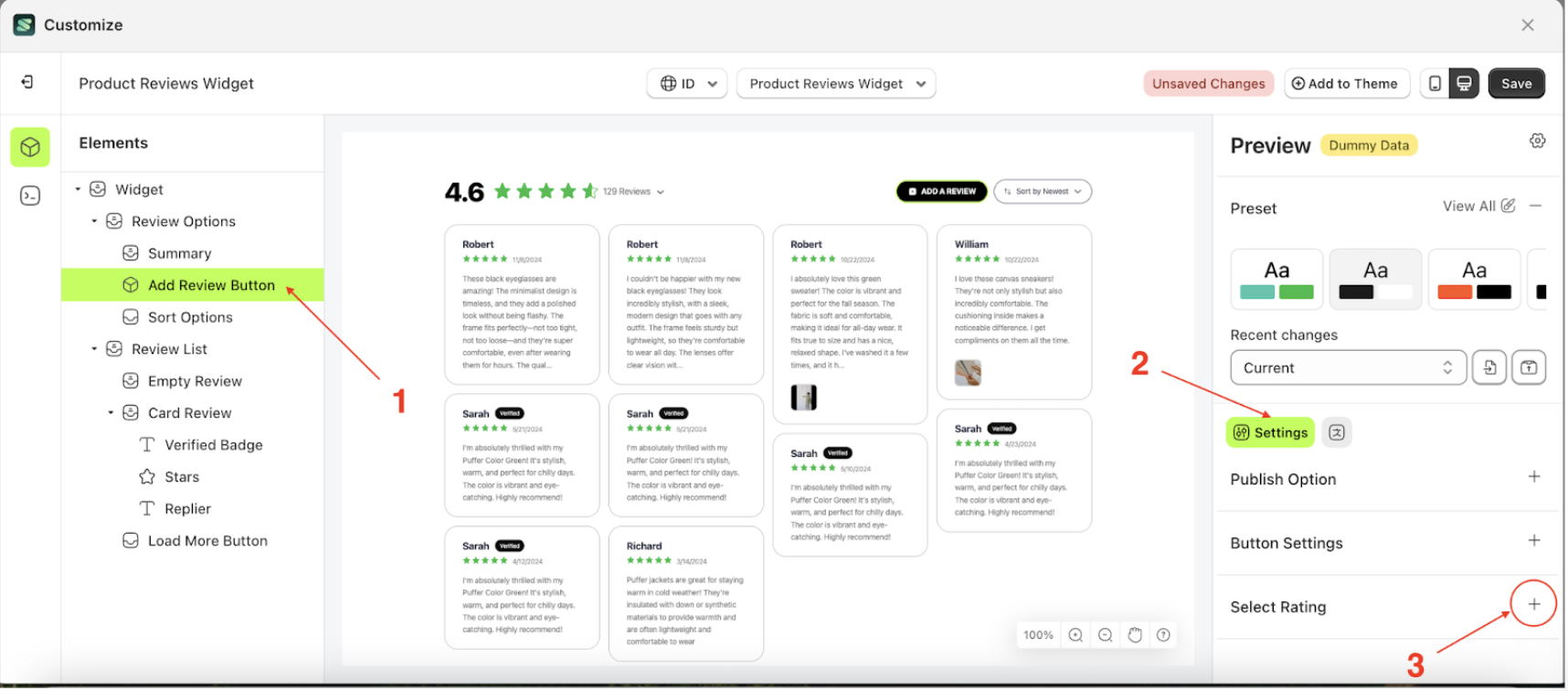
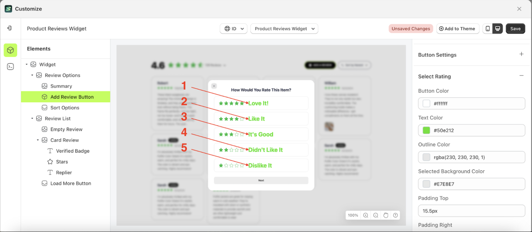
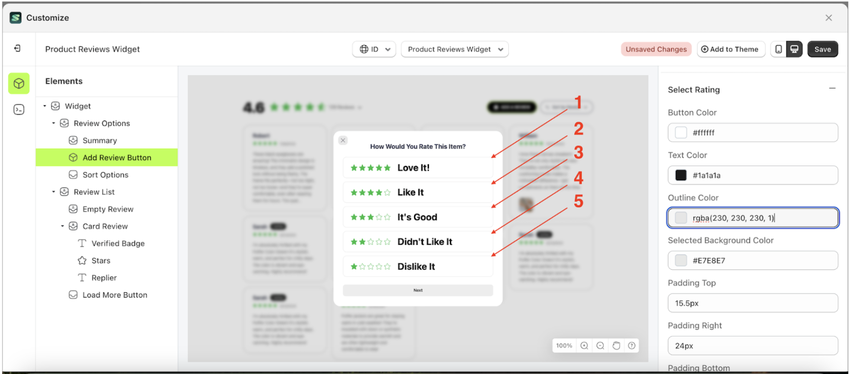
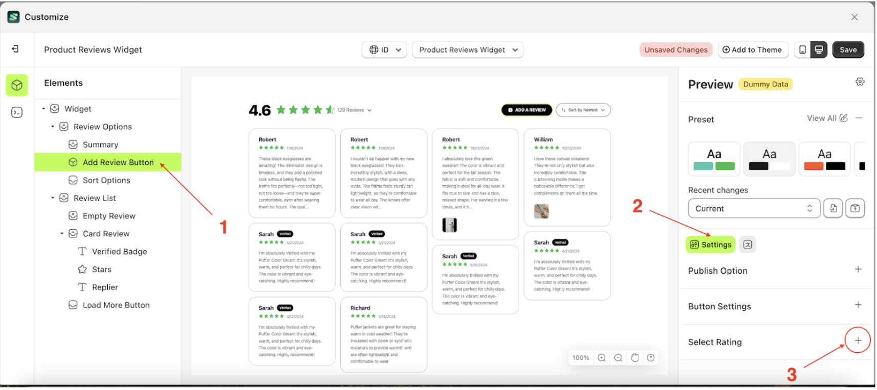
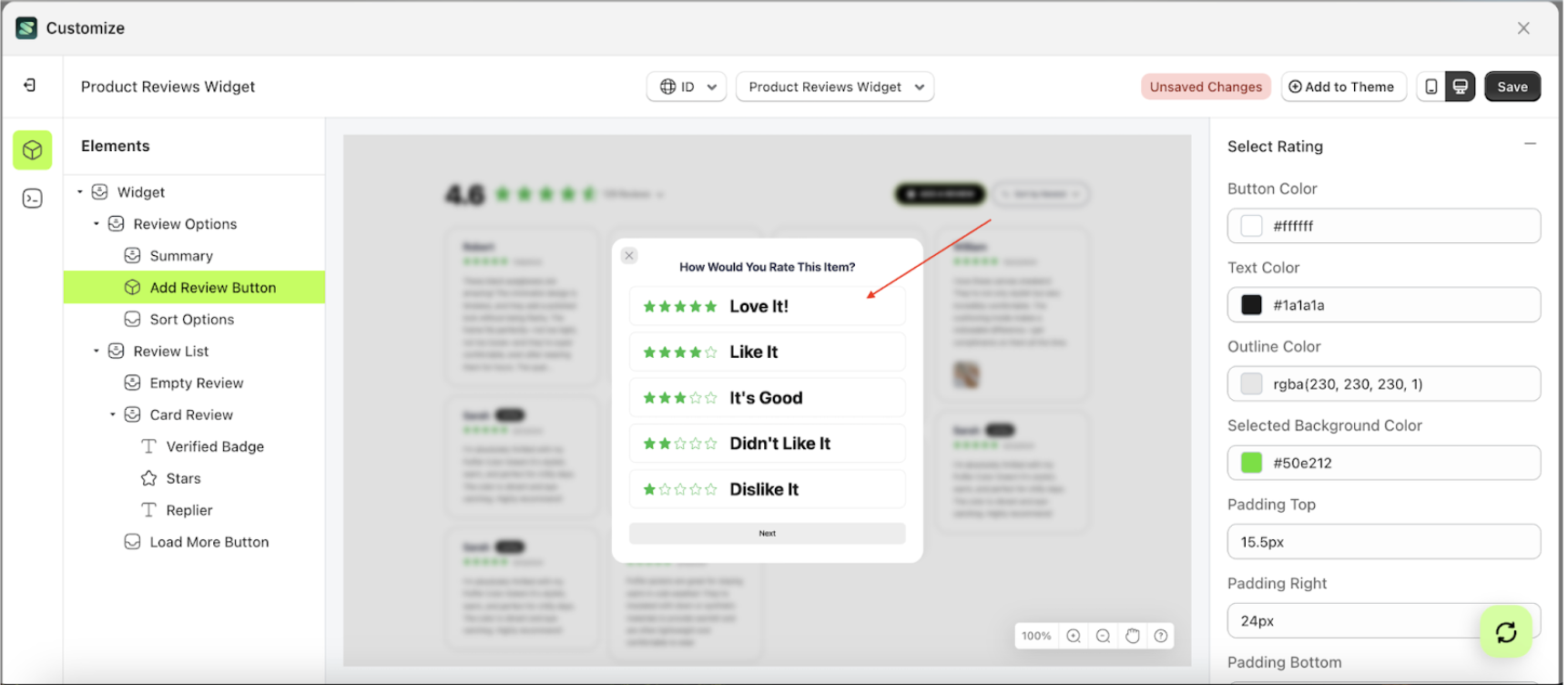
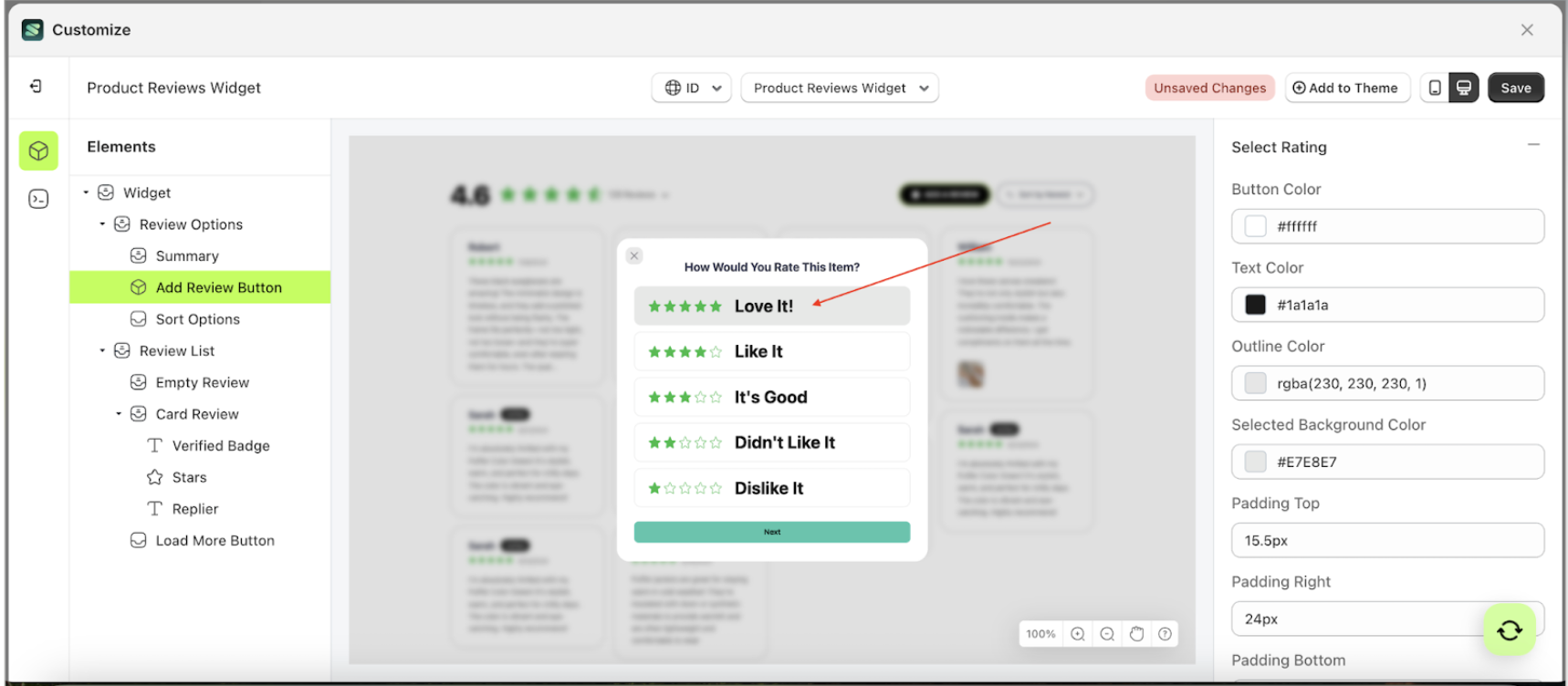
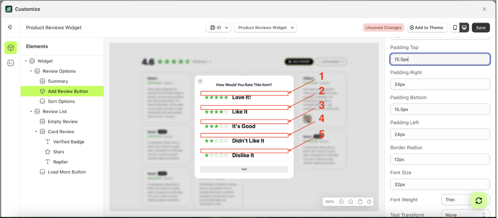
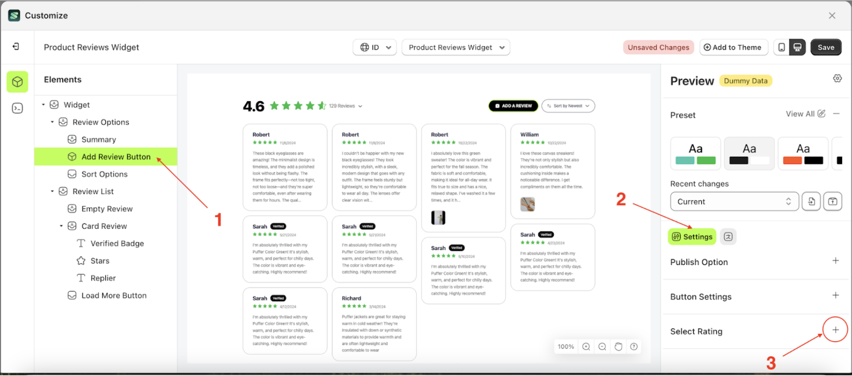
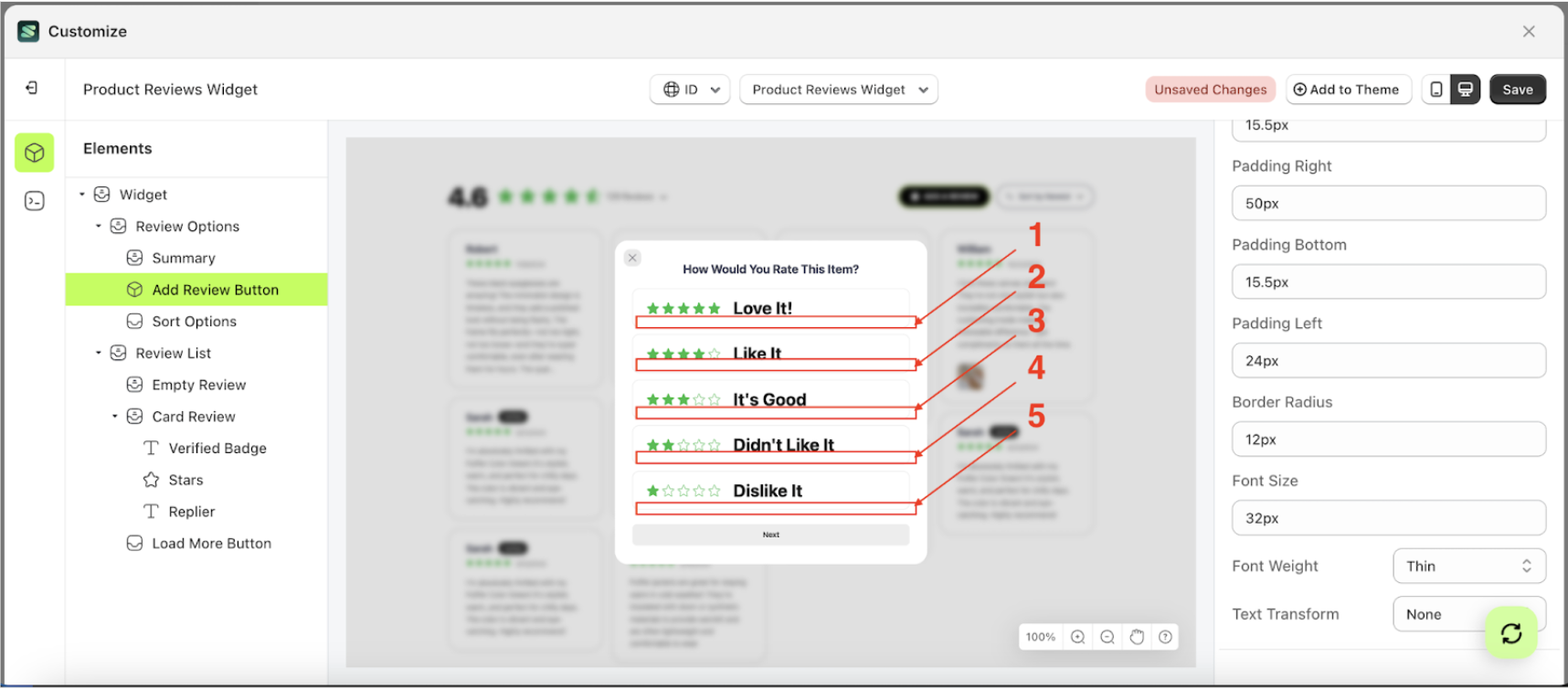
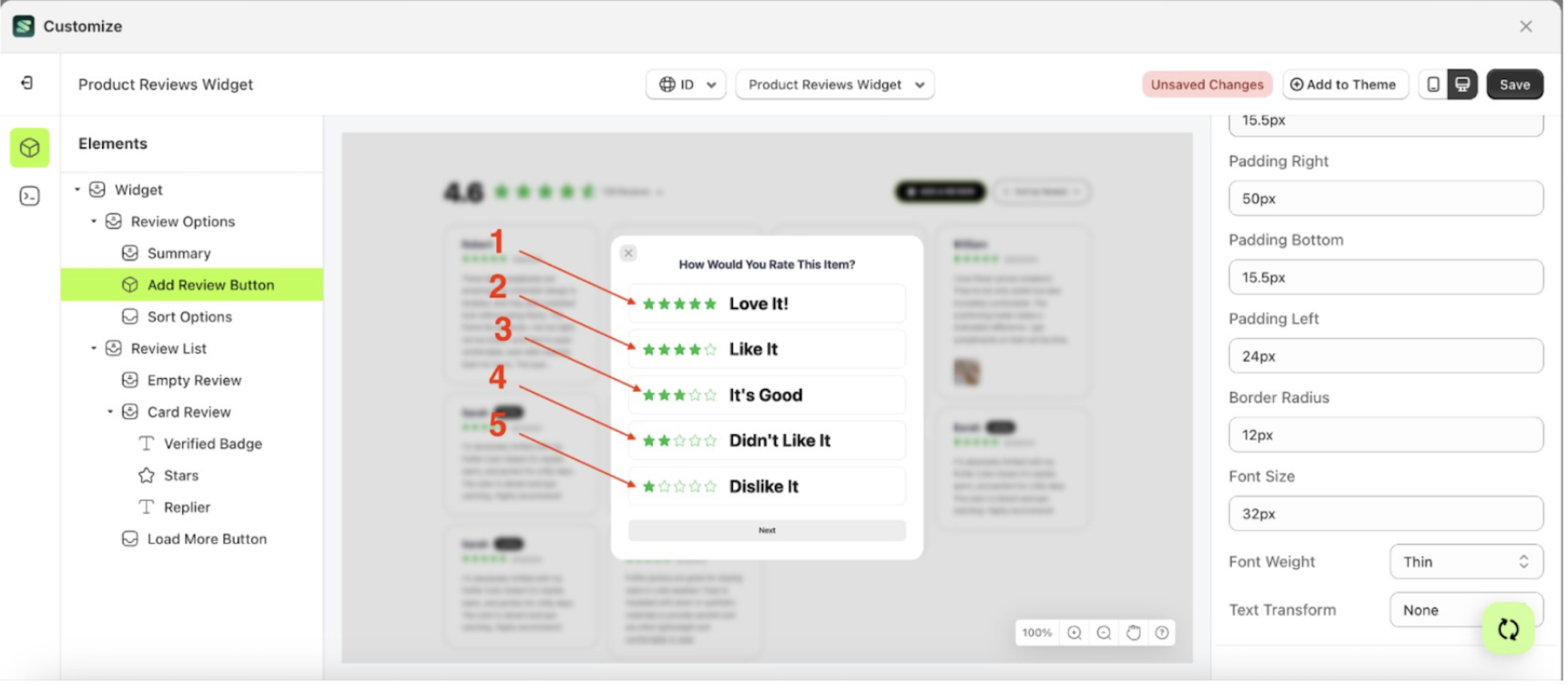
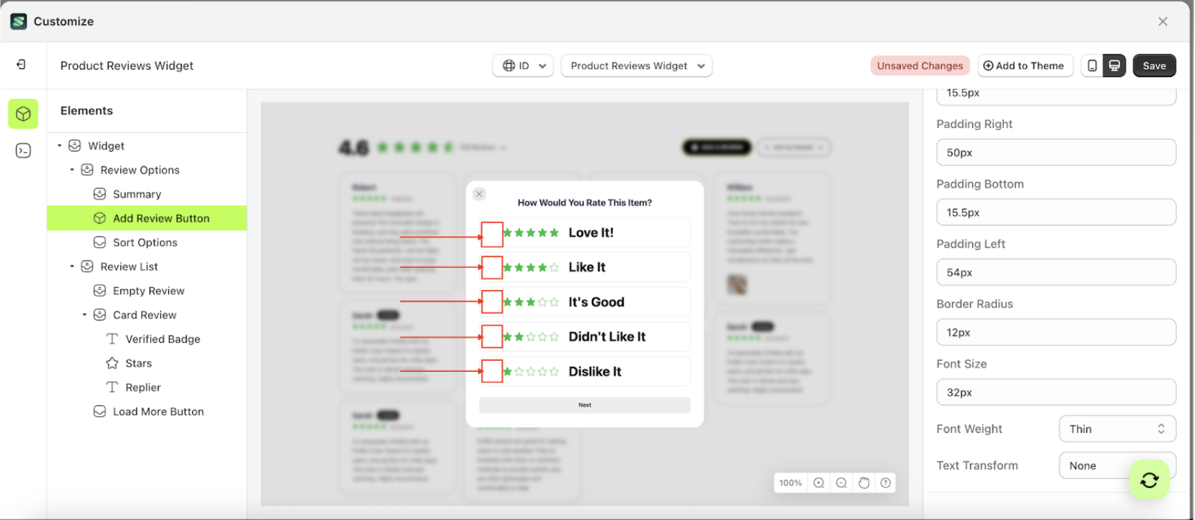
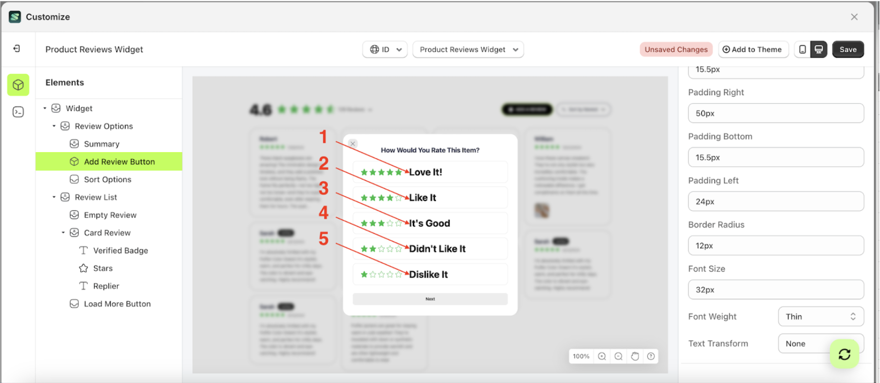
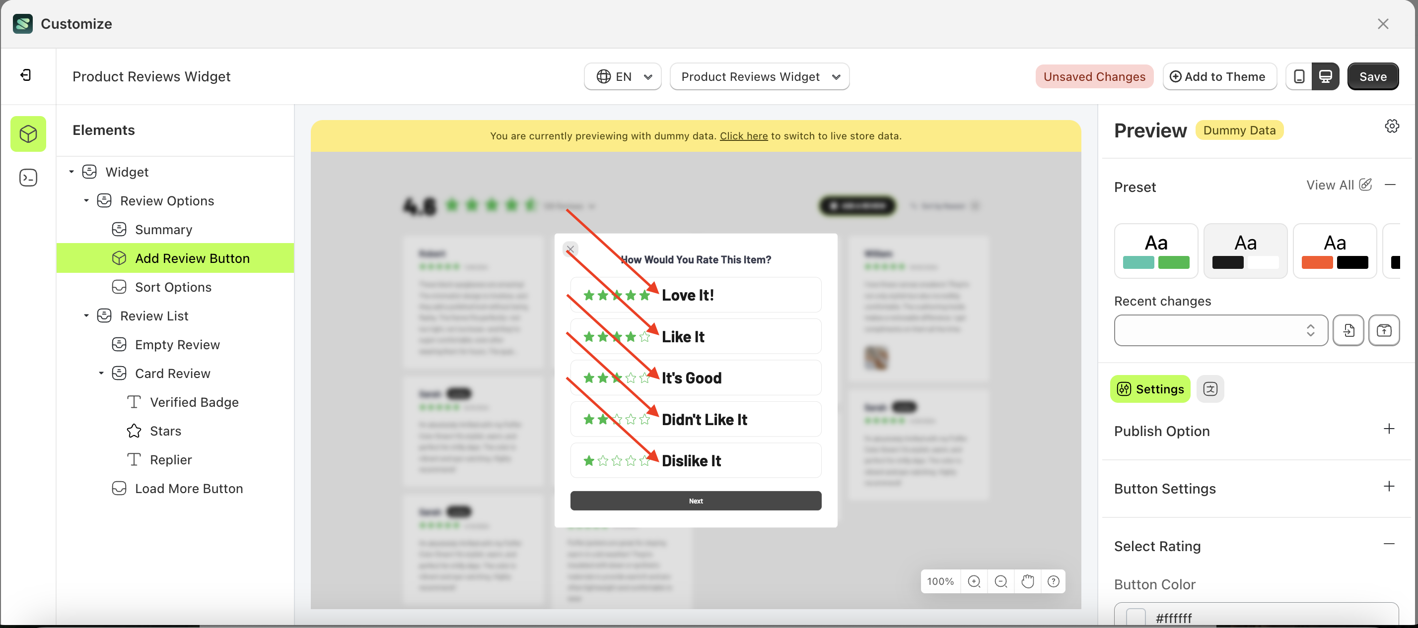
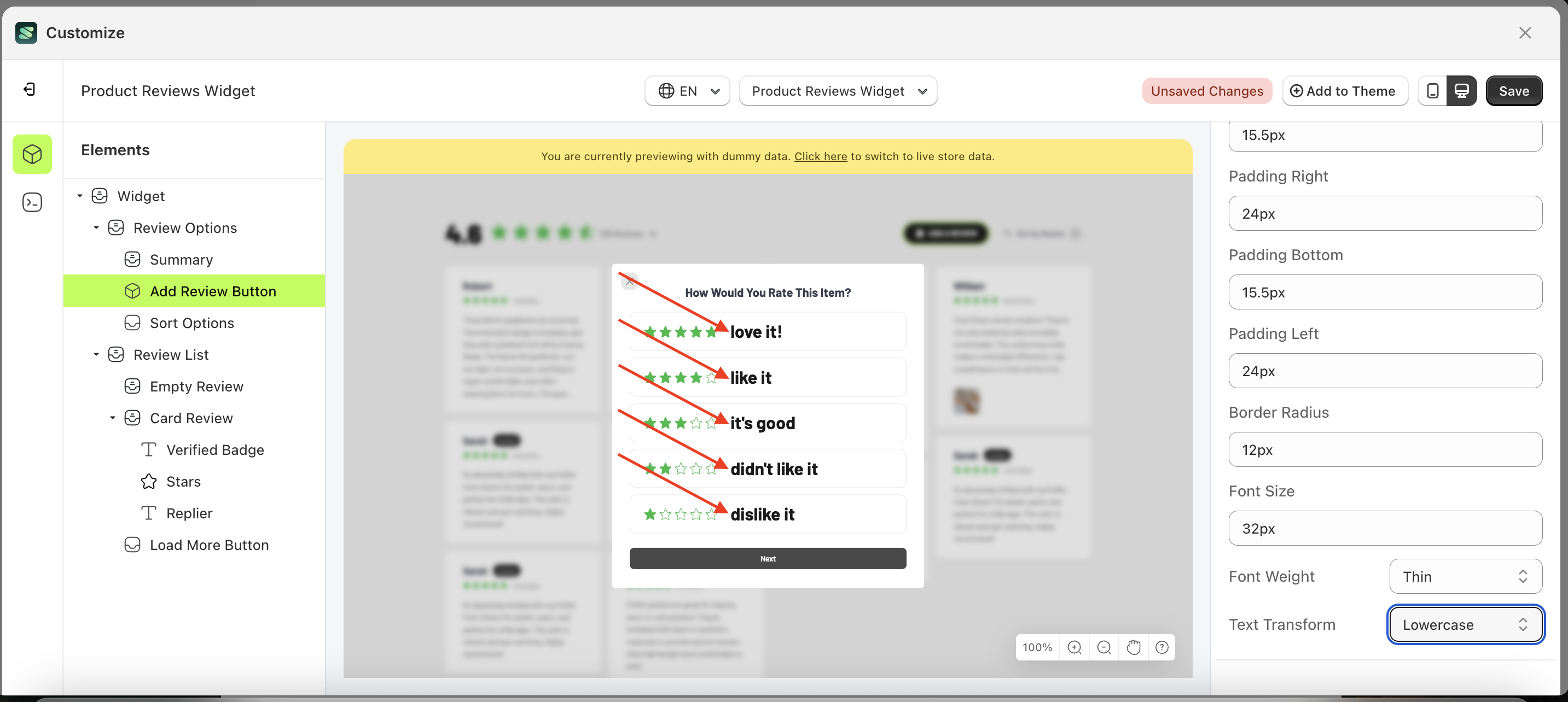
Select Rating
Available settings:
Button Color Select RatingText Color Select RatingOutline Color Select RatingSelected Background ColorPadding Top Select RatingPadding Right Select RatingPadding Bottom Select RatingPadding Left Select RatingBorder Radius Select RatingFont Size Select RatingFont Weight Select RatingText Transform Select Rating
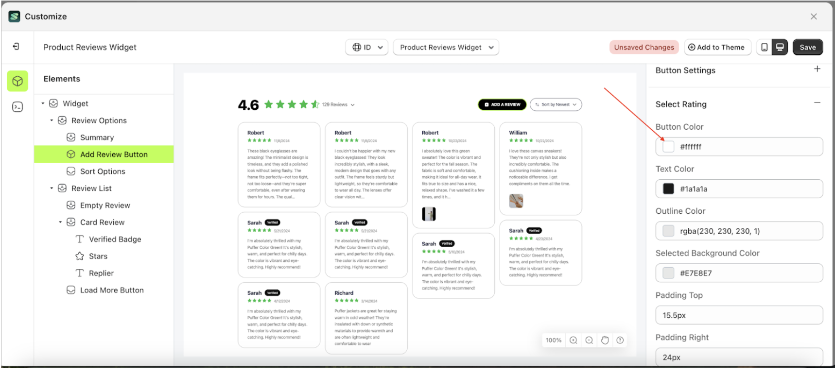
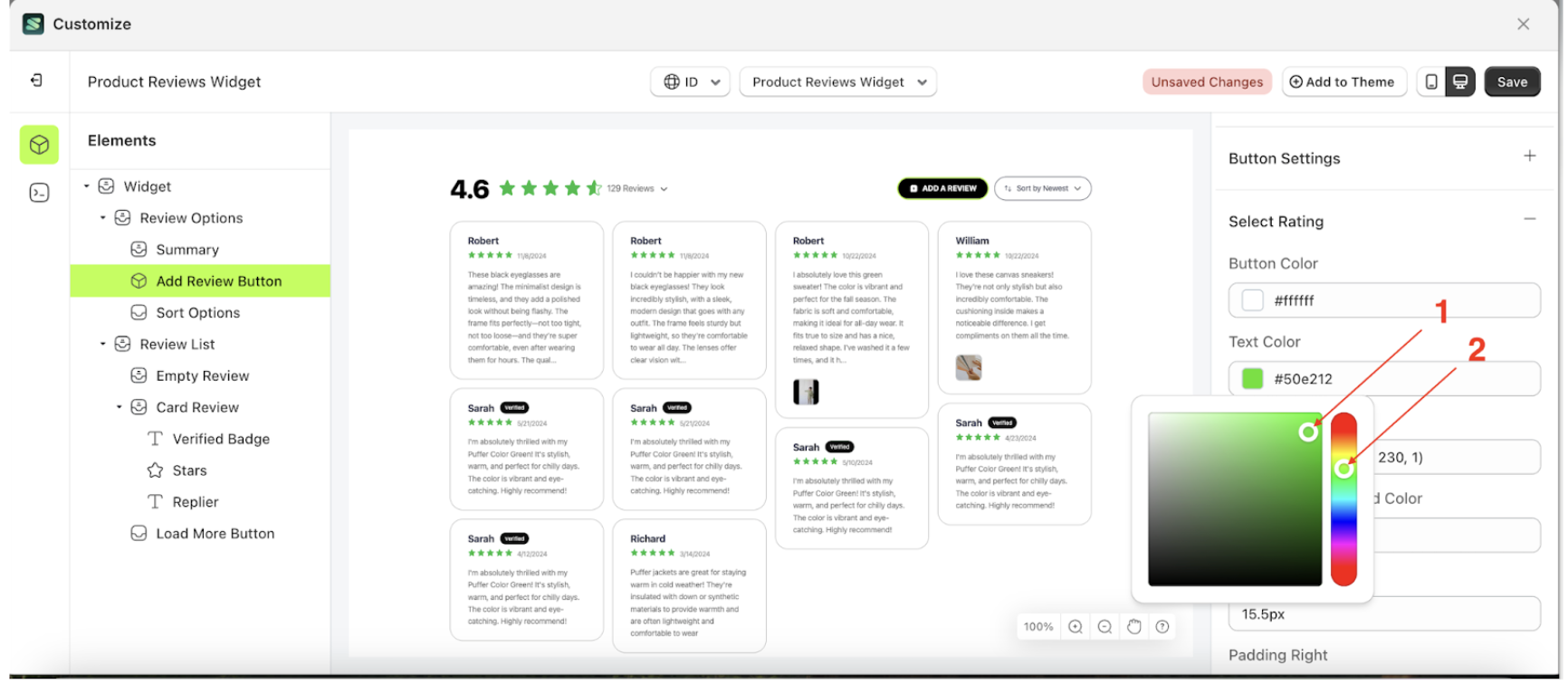
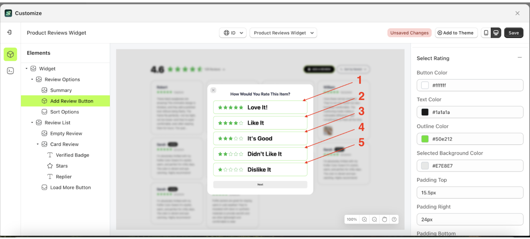
Button Color Select Rating
This feature is designed to customize the button color of the select rating
Follow the steps below:
- Select the Review Option element on the left, then click the icon marked with a red arrow to open the menu within that item.
- Once the menu is open, select the Add Review Button element on the left, then click the Settings tab and click the icon marked with a red arrow.
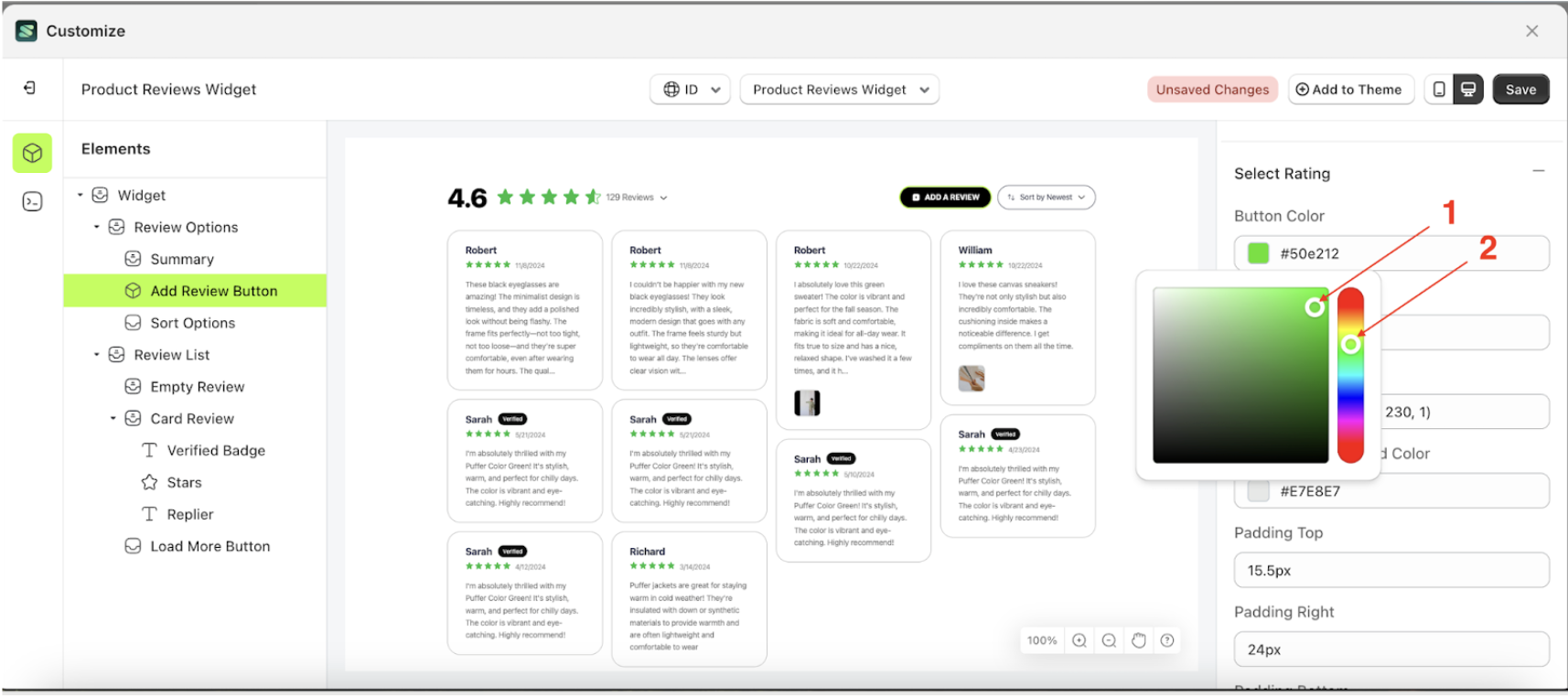
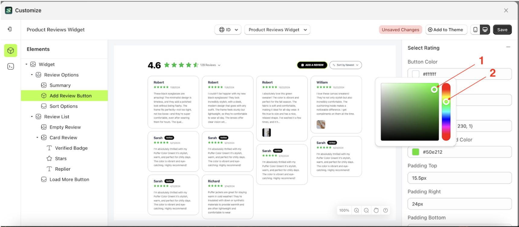
- Click the Color Palette on the right side, which is also marked with a red arrow.
- The Color Palette will appear. Click the right side of the palette where the red arrow and number 1 are indicated, then click the right side again where the red arrow and number 2 are marked.
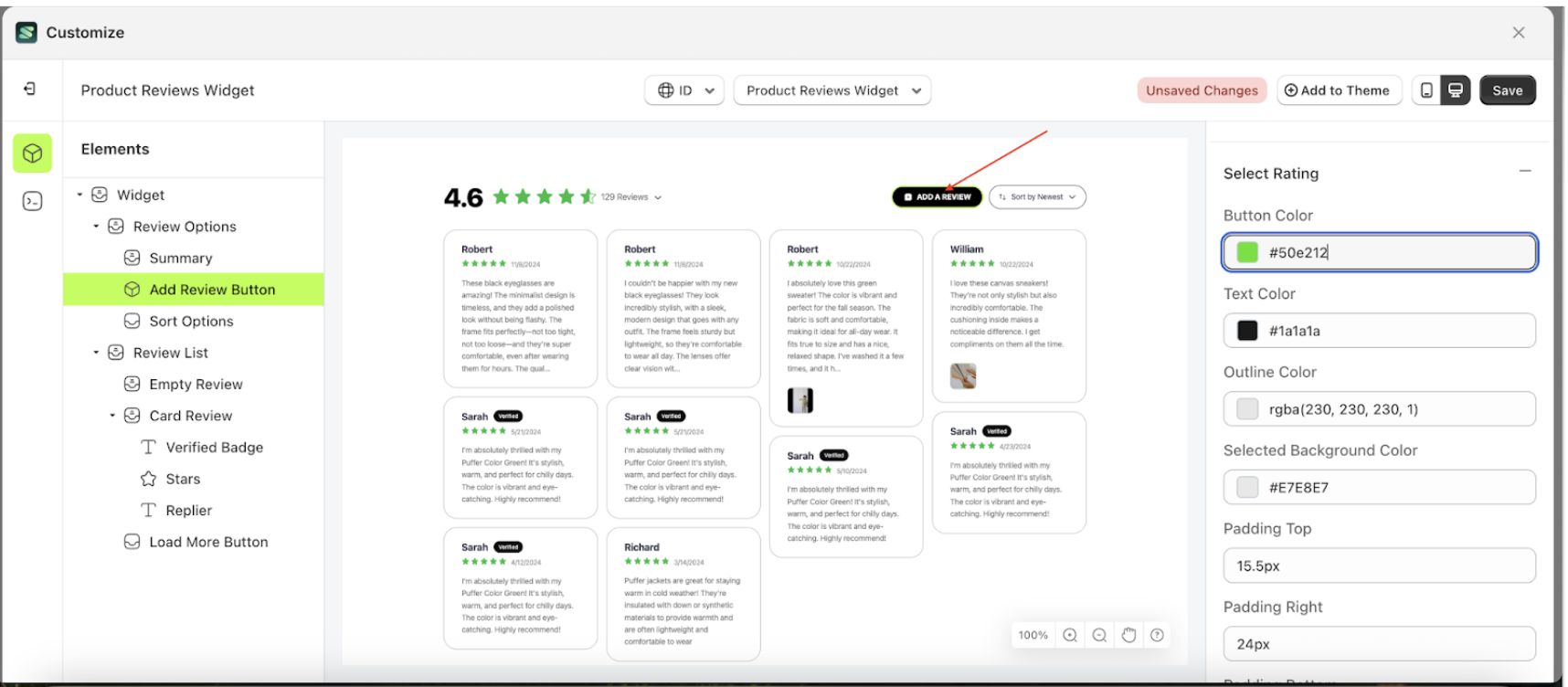
- To see the changes in this setting on the element, click the Add Review Button element
- The product review widget of the Add Review Button element will adjust accordingly.
- Example : Before Add Review Button change settings
- Example : After Add Review Button change settings

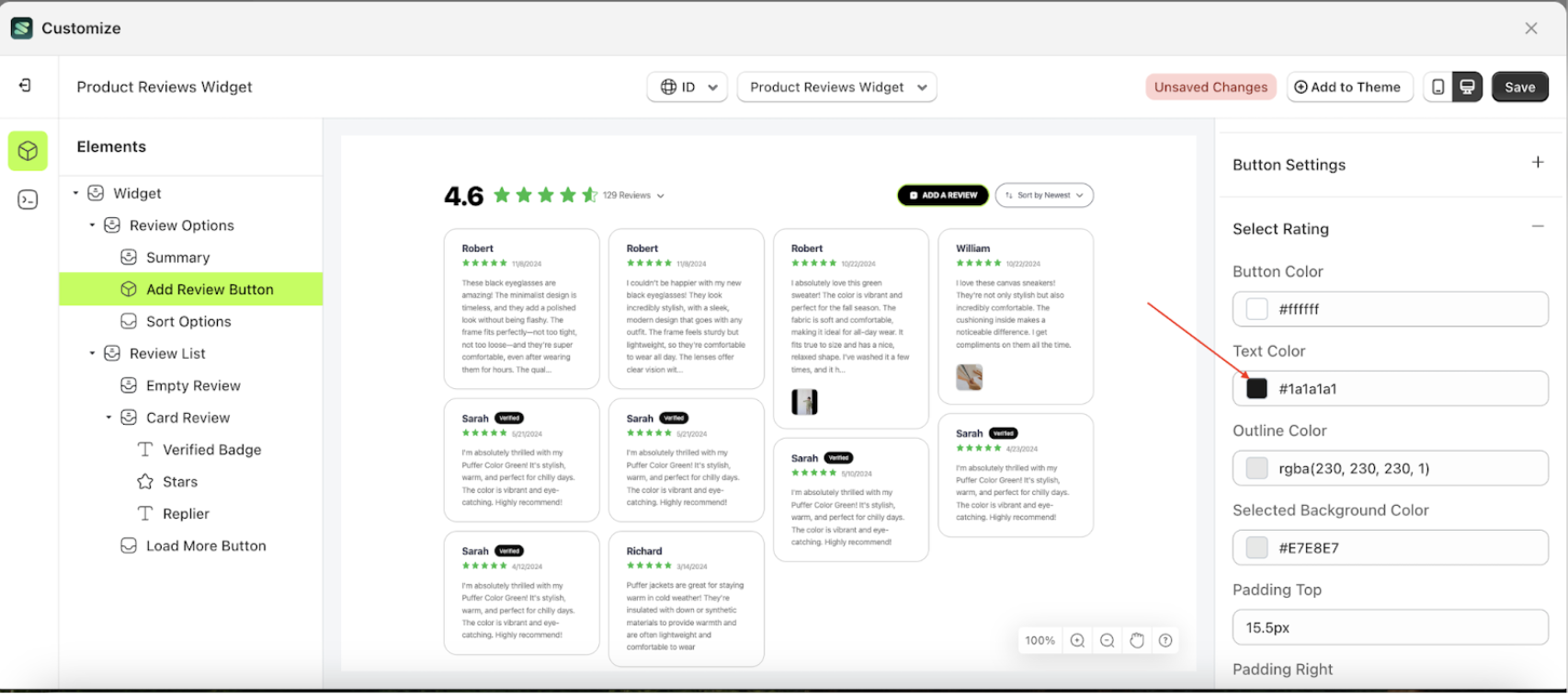
Text Color Select Rating
This feature is designed to customize the text color of the select rating
Follow the steps below:
- Select the Review Option element on the left, then click the icon marked with a red arrow to open the menu within that item.
- Once the menu is open, select the Add Review Button element on the left, then click the Settings tab and click the icon marked with a red arrow.
- Click the Color Palette on the right side, which is also marked with a red arrow.
- The Color Palette will appear. Click the right side of the palette where the red arrow and number 1 are indicated, then click the right side again where the red arrow and number 2 are marked.
- To see the changes in this setting on the element, click the Add Review Button element
- The product review widget of the Add Review Button element will adjust accordingly.
- Example : Before Add Review Button change settings
- Example : After Add Review Button change settings
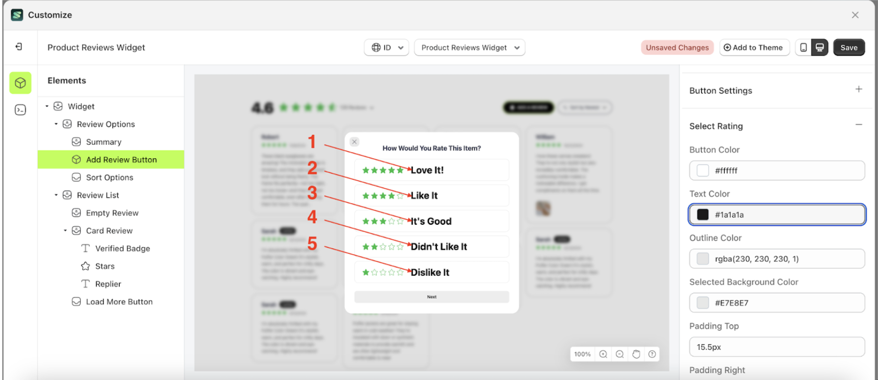
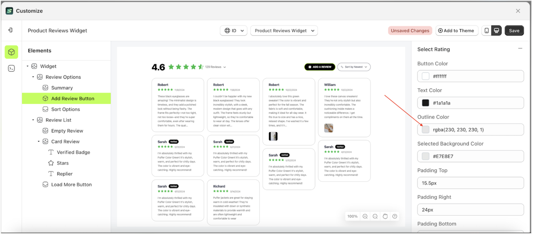
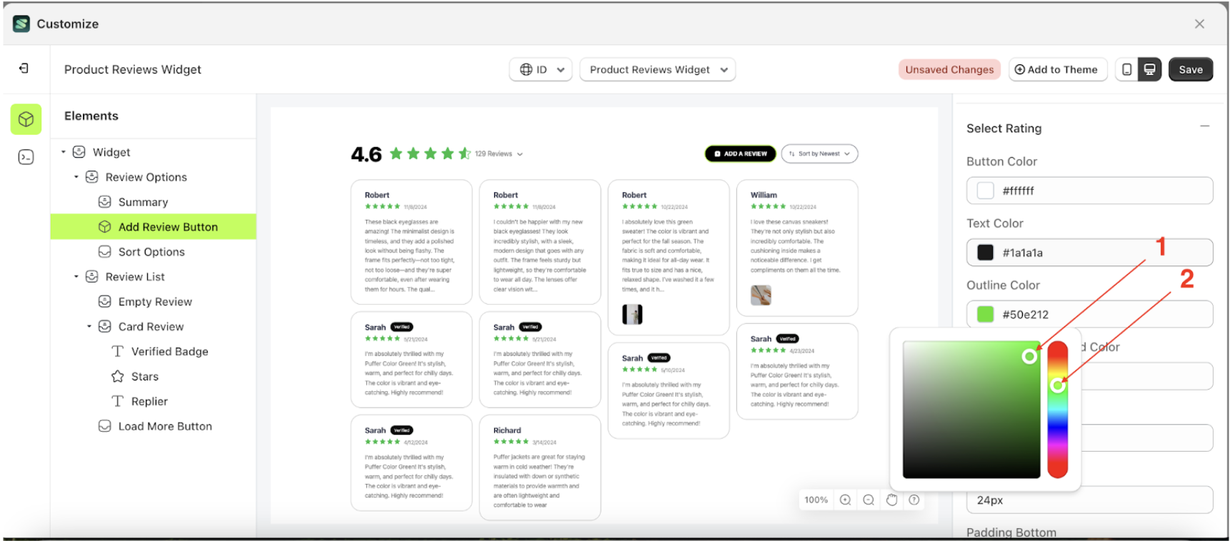
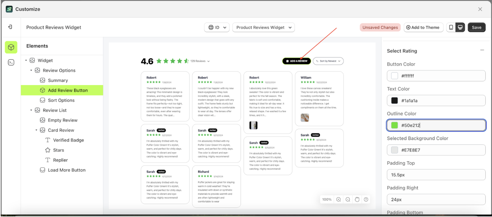
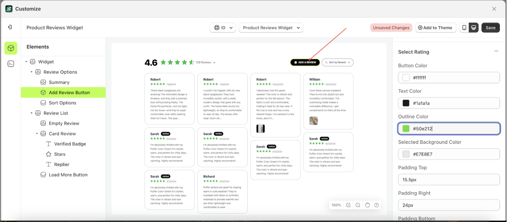
Outline Color Select Rating
This feature is designed to customize the outline color of the select rating
Follow the steps below:
- Select the Review Option element on the left, then click the icon marked with a red arrow to open the menu within that item.
- Once the menu is open, select the Add Review Button element on the left, then click the Settings tab and click the icon marked with a red arrow.
- Click the Color Palette on the right side, which is also marked with a red arrow.
- The Color Palette will appear. Click the right side of the palette where the red arrow and number 1 are indicated, then click the right side again where the red arrow and number 2 are marked.
- To see the changes in this setting on the element, click the Add Review Button element
- The product review widget of the Add Review Button element will adjust accordingly.
- Example : Before Add Review Button change settings
- Example : After Add Review Button change settings


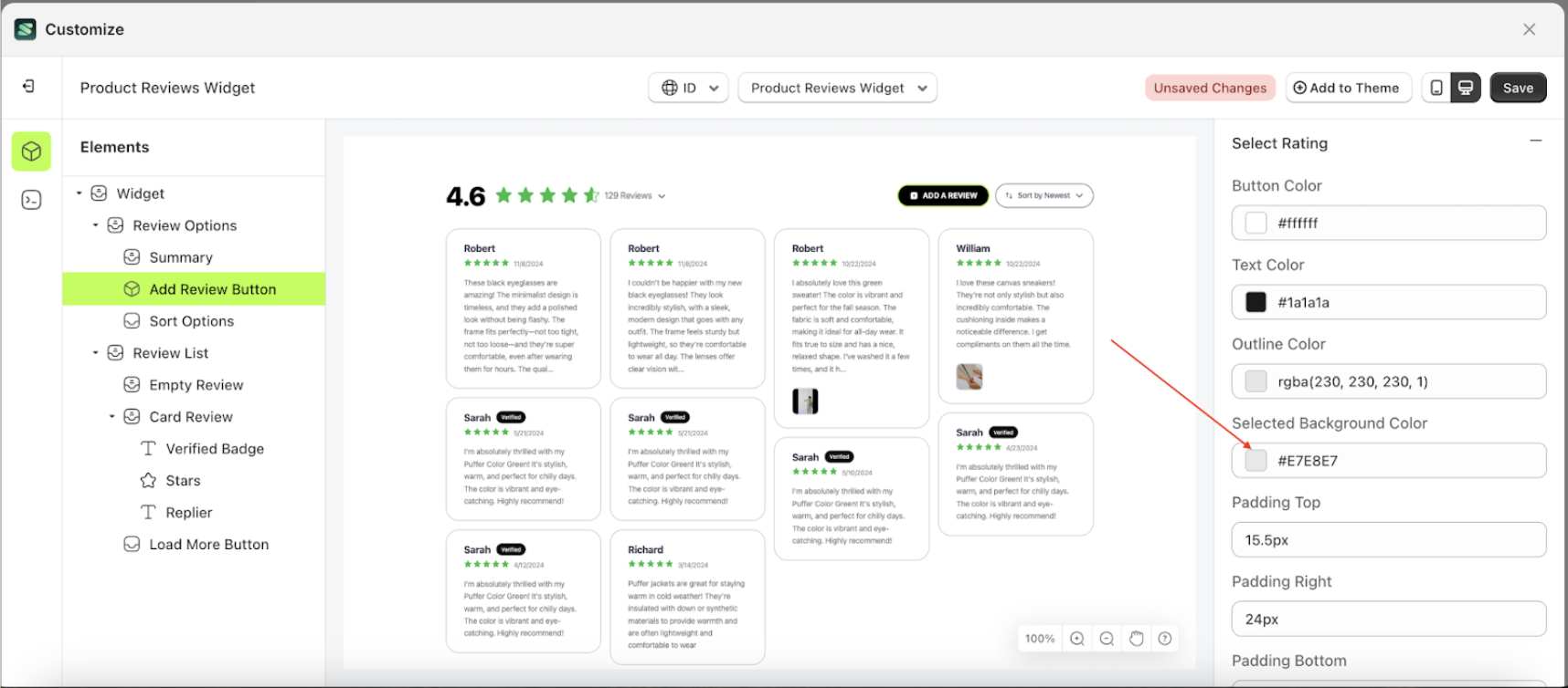
Selected Background Color
This feature is designed to customize the selected background color of the select rating
Follow the steps below:
- Select the Review Option element on the left, then click the icon marked with a red arrow to open the menu within that item.
- Once the menu is open, select the Add Review Button element on the left, then click the Settings tab and click the icon marked with a red arrow.
- Click the Color Palette on the right side, which is also marked with a red arrow.
- The Color Palette will appear. Click the right side of the palette where the red arrow and number 1 are indicated, then click the right side again where the red arrow and number 2 are marked.
- To see the changes in this setting on the element, click the Add Review Button element
- The product review widget of the Add Review Button element will adjust accordingly.
- Example : Before Add Review Button change settings
- Example : After Add Review Button change settings

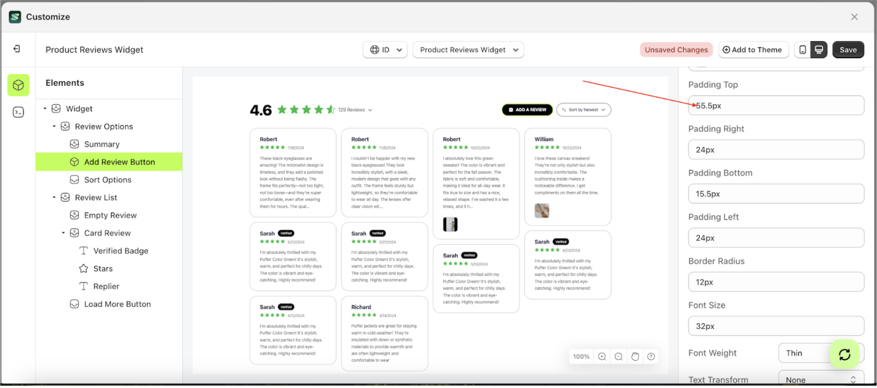
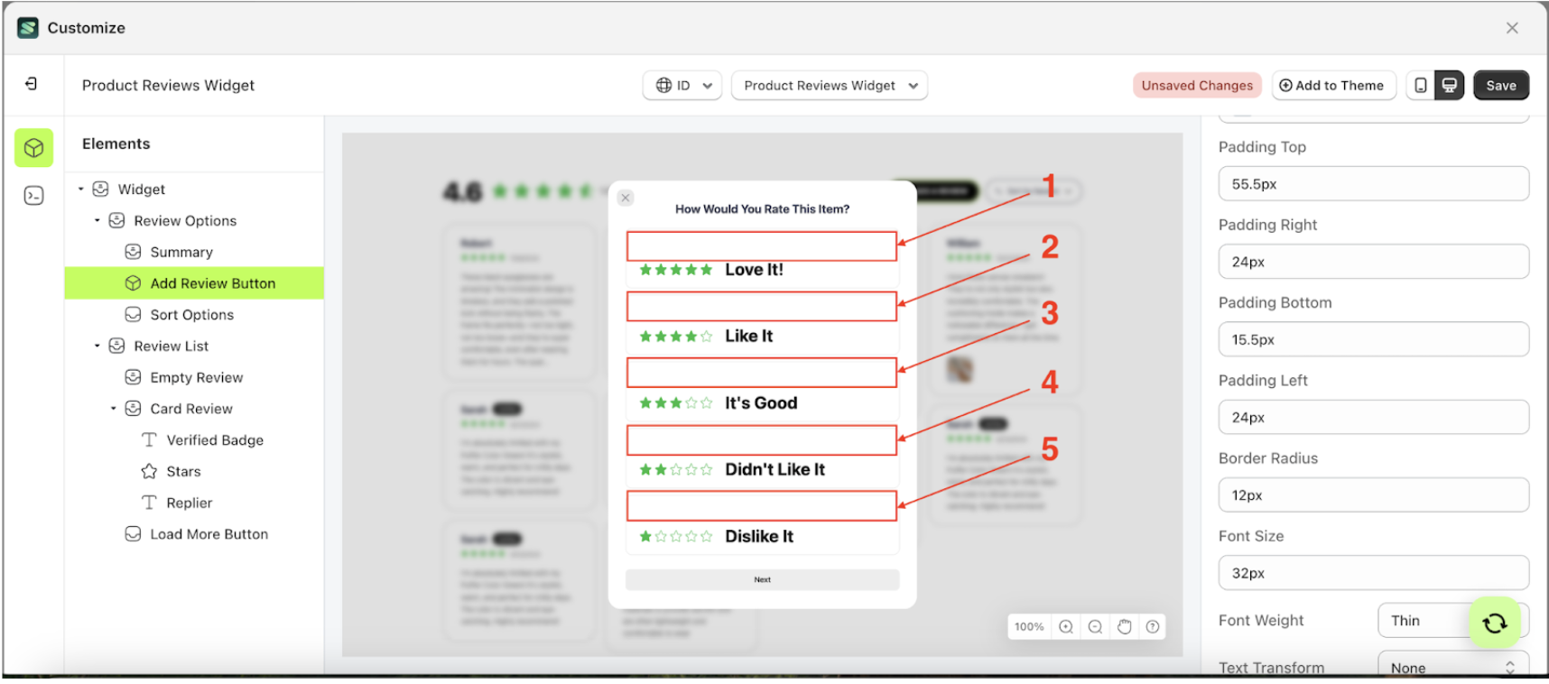
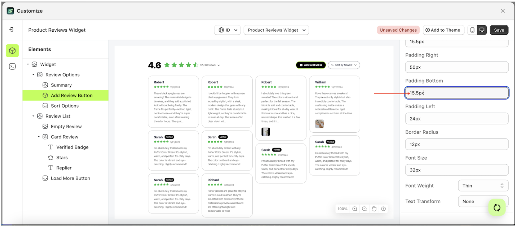
Padding Top Select Rating
This feature is designed to customize the top padding of the select rating
Follow the steps below
- Select the Review Option element on the left, then click the icon marked with a red arrow to open the menu within that item.
- Once the menu is open, select the Add Review Button element on the left, then click the Settings tab and click the icon marked with a red arrow.
- On the right side, marked with a red arrow, you can change the padding top to your desired value.
- Note: The padding top format can be px, em, rem, %, or other units..
- For example, if you set the padding top to 55.5px
- To see the changes in this setting on the element, click the Add Review Button element
- The padding top of the Add Review Button element will adjust accordingly.
- Example : Before padding top change settings
- Example : After padding top change settings


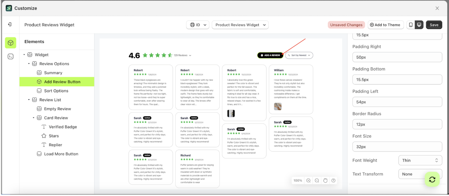
Padding Right Select Rating
This feature is designed to customize the right padding of the select rating
Follow the steps below
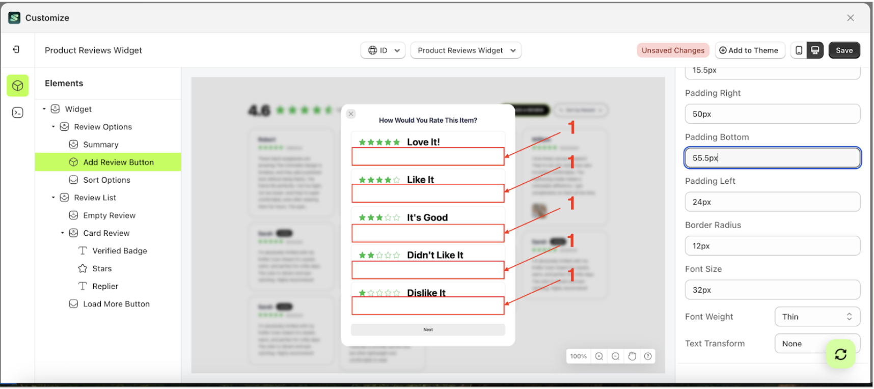
Padding Bottom Select Rating
This feature is designed to customize the bottom padding of the select rating
- Select the Review Option element on the left, then click the icon marked with a red arrow to open the menu within that item.
- Once the menu is open, select the Add Review Button element on the left, then click the Settings tab and click the icon marked with a red arrow.
- On the right side, marked with a red arrow, you can change the padding bottom to your desired value.
- Note: The padding bottom format can be px, em, rem, %, or other units..
- For example, if you set the padding bottom to 55.5px
- To see the changes in this setting on the element, click the Add a review element
- The padding bottom of the Add Review Button element will adjust accordingly.
- Example : Before padding bottom change settings
- Example : After padding bottom change settings


Follow the steps below
Padding Left Select Rating
This feature is designed to customize the left padding of the select rating
Follow the steps below
- Select the Review Option element on the left, then click the icon marked with a red arrow to open the menu within that item.
- Once the menu is open, select the Add Review Button element on the left, then click the Settings tab and click the icon marked with a red arrow.
- On the right side, marked with a red arrow, you can change the padding left to your desired value.
- Note: The padding left format can be px, em, rem, %, or other units..
- For example, if you set the padding left to 54px
- To see the changes in this setting on the element, click the Add a review element
- The padding left of the Add Review Button element will adjust accordingly.
- Example : Before padding left change settings
- Example : After padding left change settings


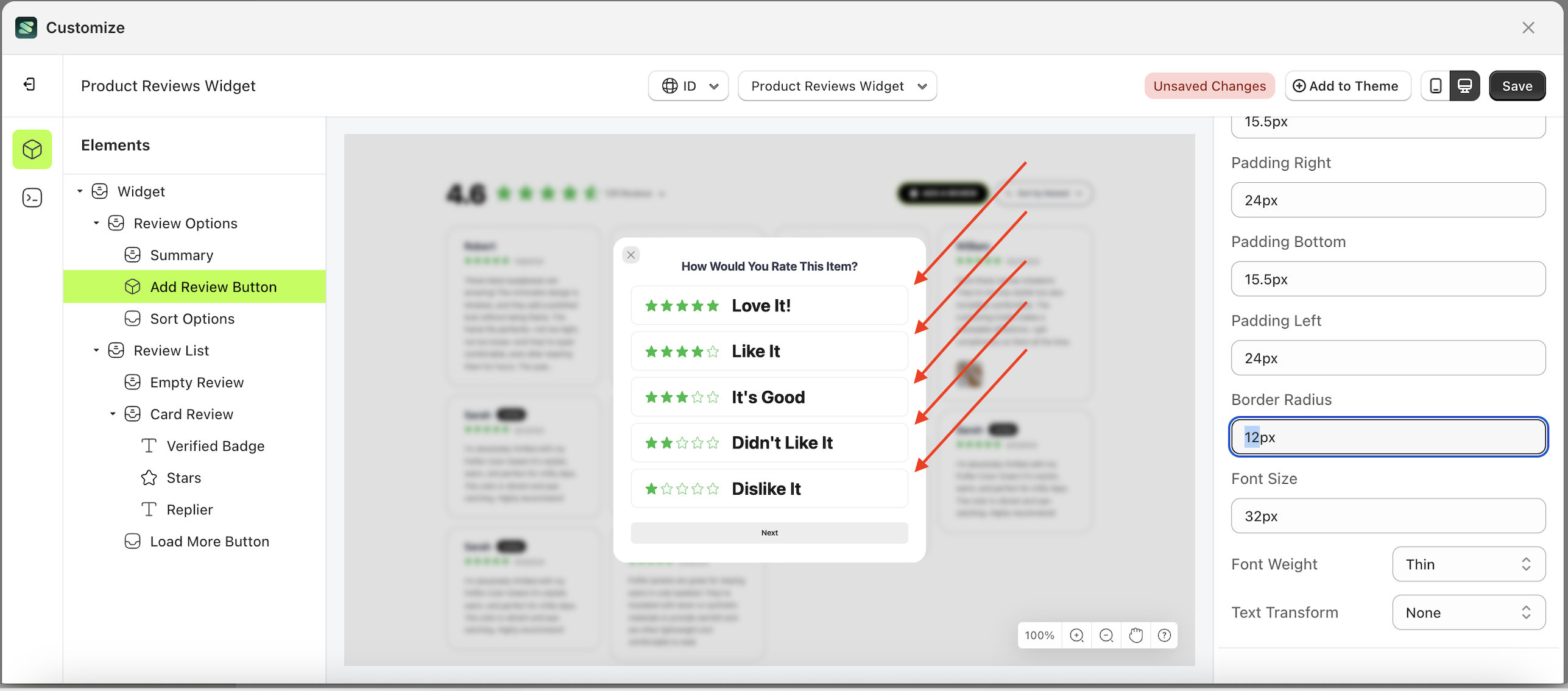
Border Radius Select Rating
This feature is designed to customize the corner radius of the select rating
Follow the steps below
- Select the Review Option element on the left, then click the icon marked with a red arrow to open the menu within that item.
- Once the menu is open, select the Add Review Button element on the left, then click the Settings tab and click the icon marked with a red arrow.
- On the right side, marked with a red arrow, you can change the border radius to your desired value.
- Note: The border radius format can be px, em, rem, %, or other units..
- For example, if you set the border radius to 0px
- To see the changes in this setting on the element, click the Add a review element
- The border radius of the Add Review Button element will adjust accordingly.
- Example : Before border radius change settings
- Example : After border radius change settings

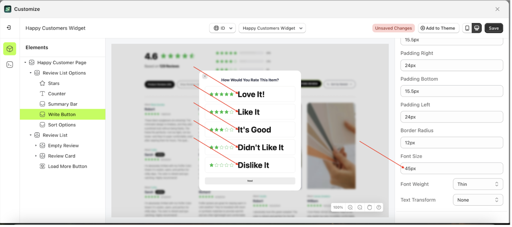
Font Size Select Rating
This feature is designed to customize the text size of the select rating
Follow the steps below
- Select the Review Option element on the left, then click the icon marked with a red arrow to open the menu within that item.
- Once the menu is open, select the Add Review Button element on the left, then click the Settings tab and click the icon marked with a red arrow.
- On the right side, marked with a red arrow, you can change the font size to your desired value.
- Note: The font size format can be px, em, rem, %, or other units..
- For example, if you set the font size to 66px
- To see the changes in this setting on the element, click the Add a review element
- The font size of the Add Review Button element will adjust accordingly.
- Example : Before font size change settings
- Example : After font size change settings


Font Weight Select Rating
This feature is designed to customize the text weight of the select rating
Follow the steps below
- Select the Review Option element on the left, then click the icon marked with a red arrow to open the menu within that item.
- Once the menu is open, select the Add Review Button element on the left, then click the Settings tab and click the icon marked with a red arrow.
- On the right side, marked with a red arrow, you can change the font weight to your desired value.
- Note: The font weight format can be Thin, Extra Light, Light, Normal or other units.
- Once the menu opens, select an option from the list
- For example, if you set the font weight to thin
- To see the changes in this setting on the element, click the Add a review element
- The font weight of the Add Review Button element will adjust accordingly.
- Example : Before font weight change settings
- Example : After font weight change settings

Text Transform Select Rating
This feature allows you to adjust the capitalization style of the text
Follow the steps below
- Select the Review Option element on the left, then click the icon marked with a red arrow to open the menu within that item.
- Once the menu is open, select the Add Review Button element on the left, then click the Settings tab and click the icon marked with a red arrow.
- On the right side, marked with a red arrow, you can change the text transform to your desired value.
- Note: The text transform format can None, Capitalize, Uppercase and Lowercase.
- Once the menu opens, select an option from the list
- For example, if you set the text transform to lowercase
- To see the changes in this setting on the element, click the Add a review element
- The text transform of the Add Review Button element will adjust accordingly.
- Example : Before text transform change settings
- Example : After text transform change settings
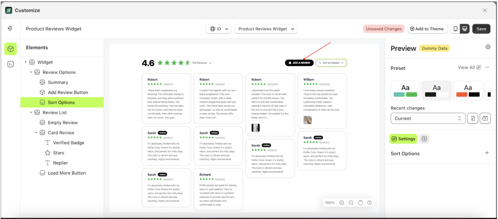
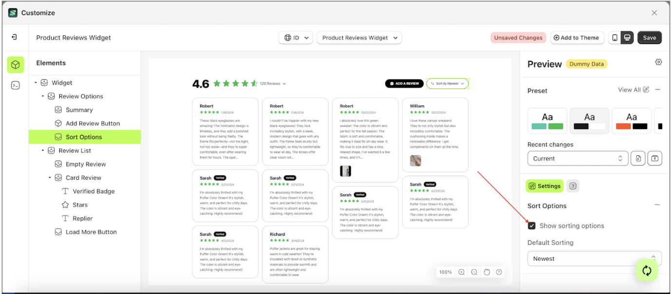
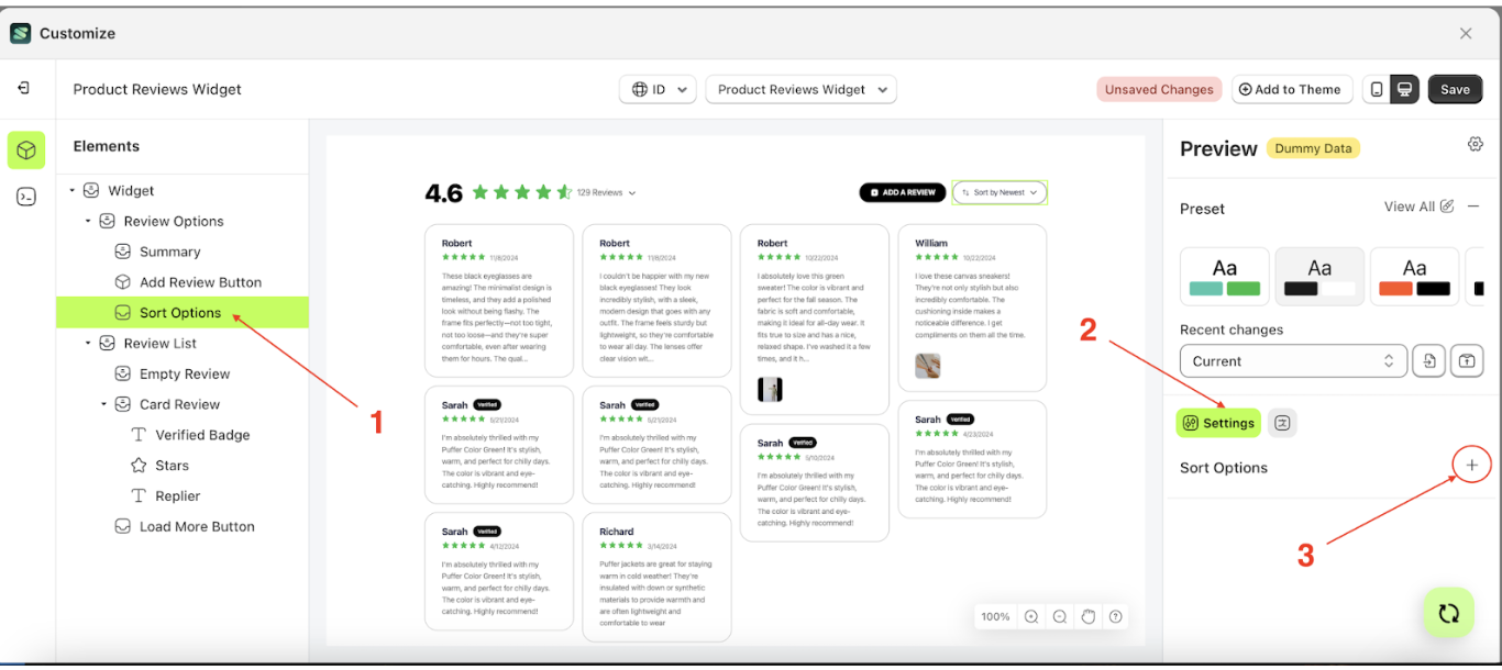
Sort Options
Available settings:
Show Sorting
This feature is designed to show or hide the sorting element.
Follow the steps below
- Select the Sort Option element on the left side, then click the icon on the right side, marked with a red arrow, to access the visibility settings.

- Check the Enable Auto Publish option
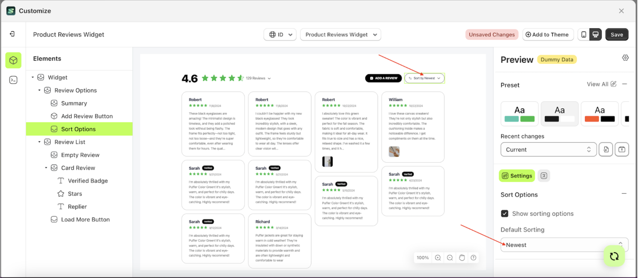
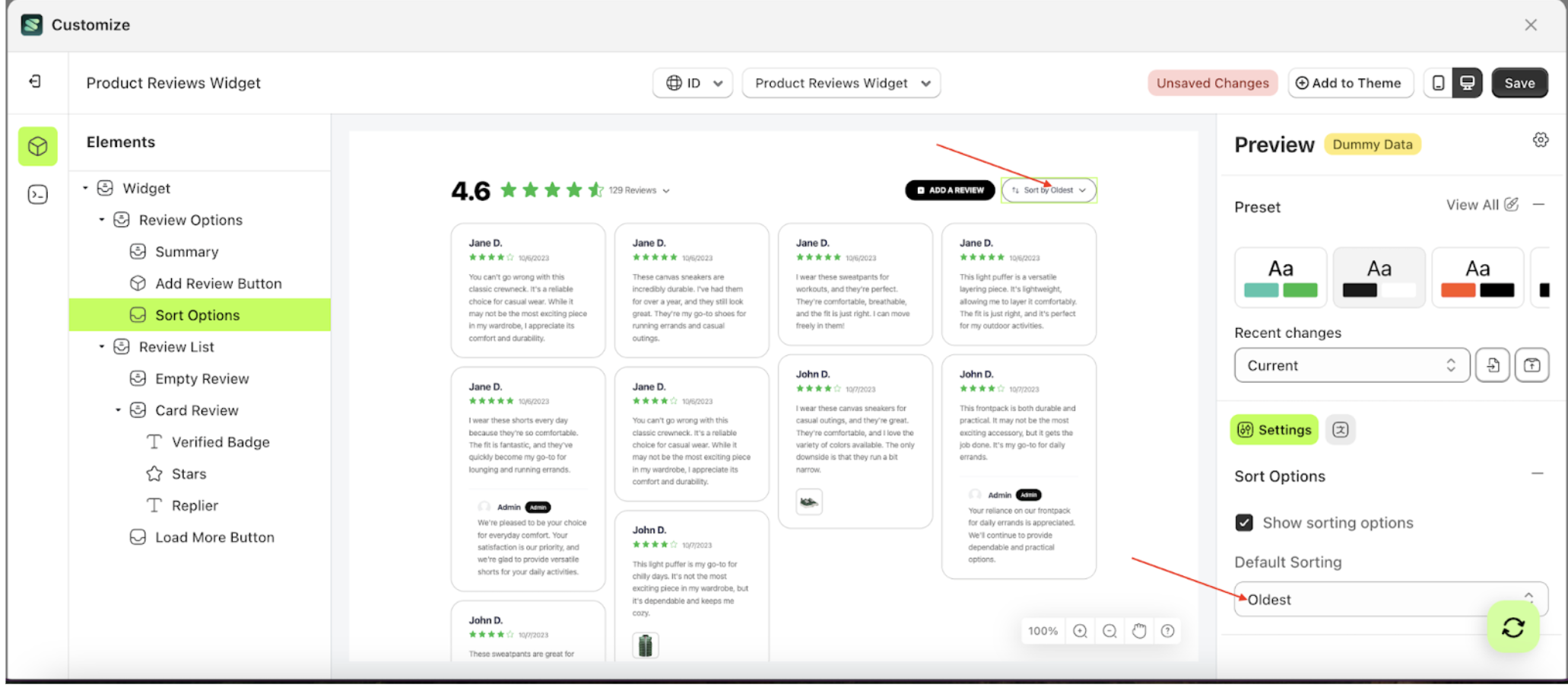
Default Sorting
This feature is designed to determine the active sorting in progress.
- Select the Sort Option element on the left side, then click the icon on the right side, marked with a red arrow, to access the visibility settings.
- Click the area marked with a red arrow to open the Default Sorting list.
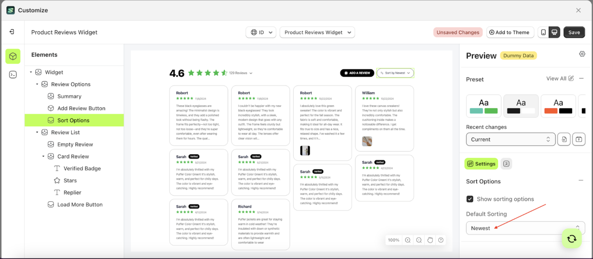
- Select the sorting option you prefer. For example, choose oldest based on the rating
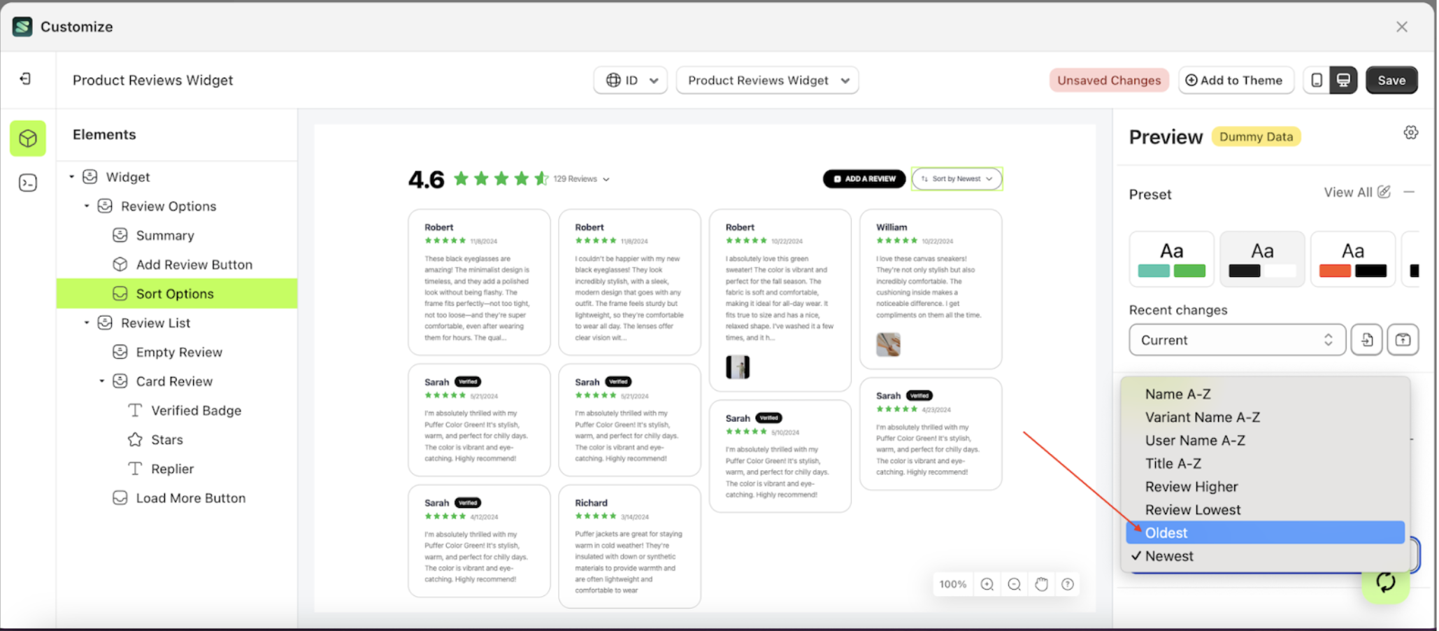
- When a number in the Review Limit List is selected, it will affect the review list on the right
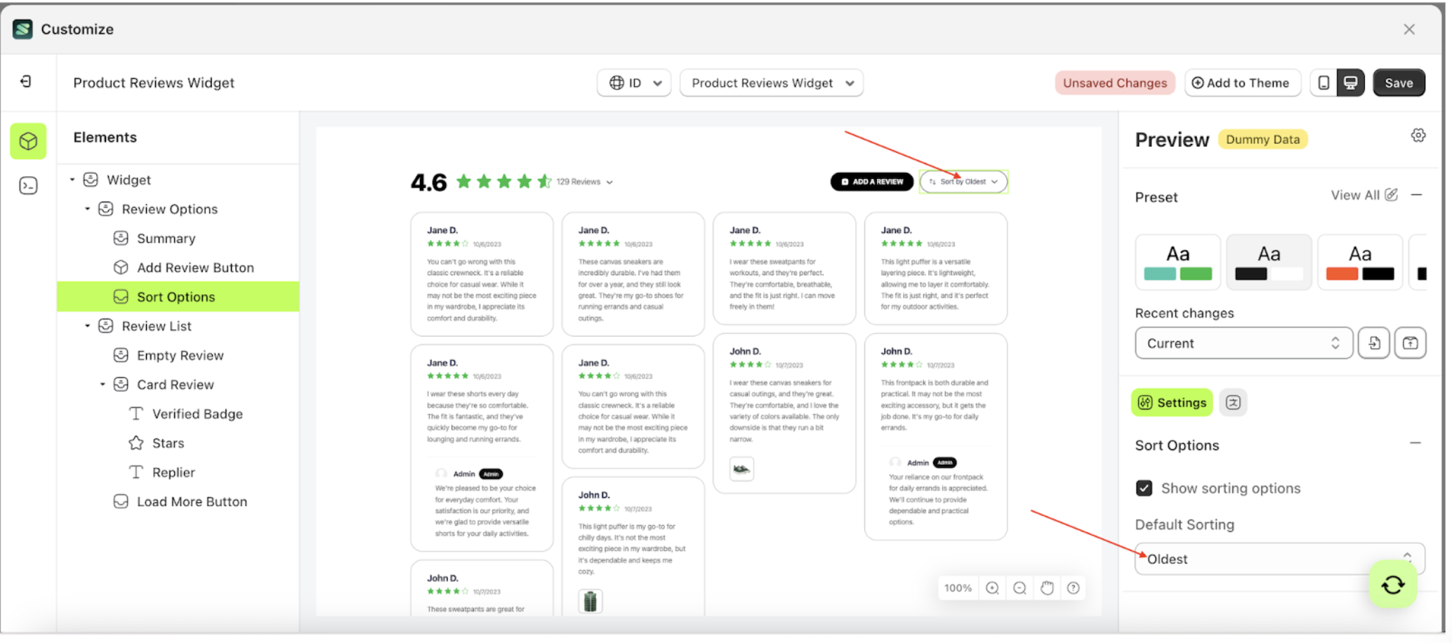
- Sorting element will adjust accordingly
- Example: Before Default sorting change settings
- Example: After Default sorting change settings
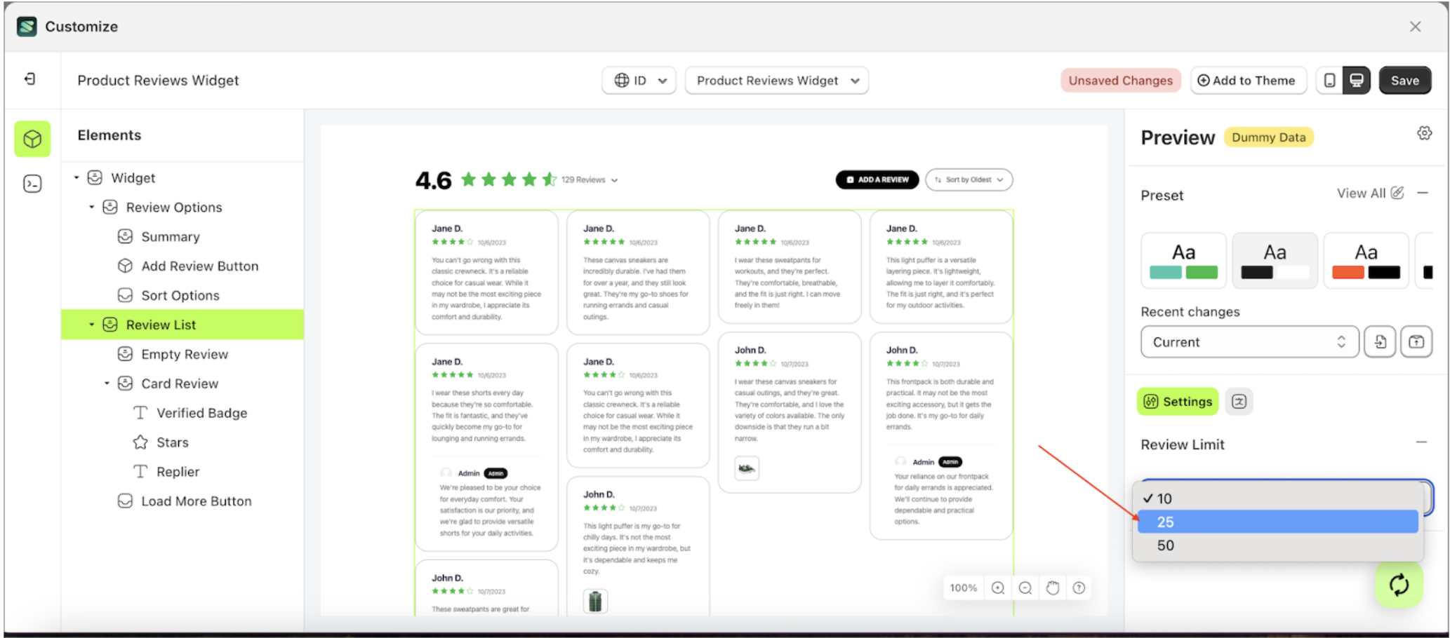
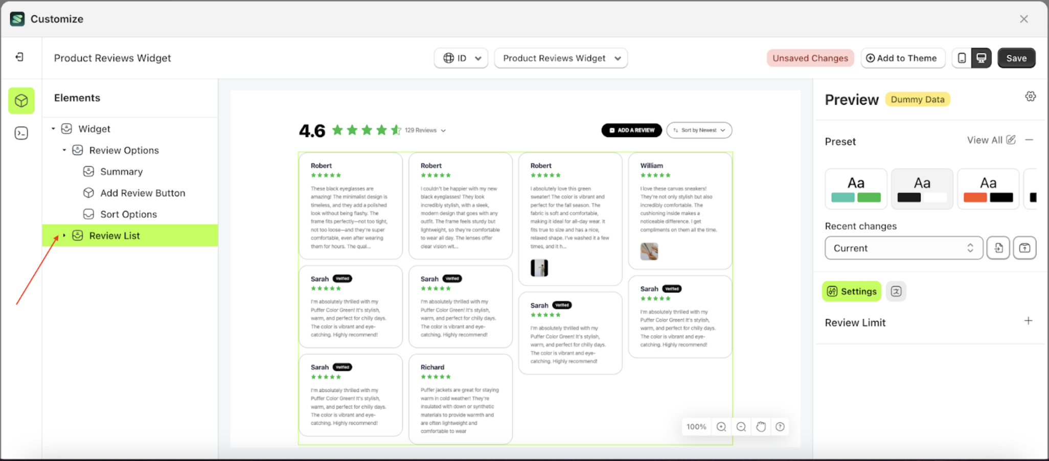
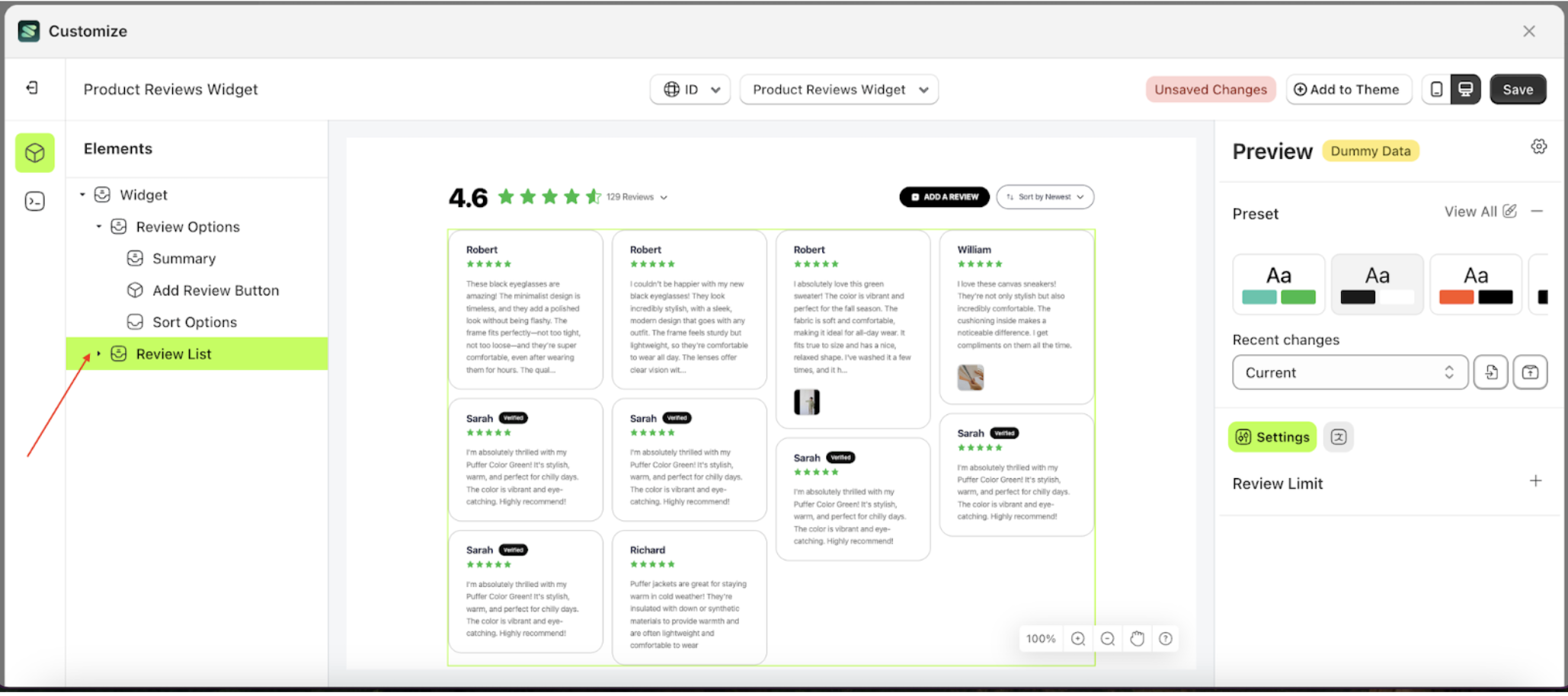
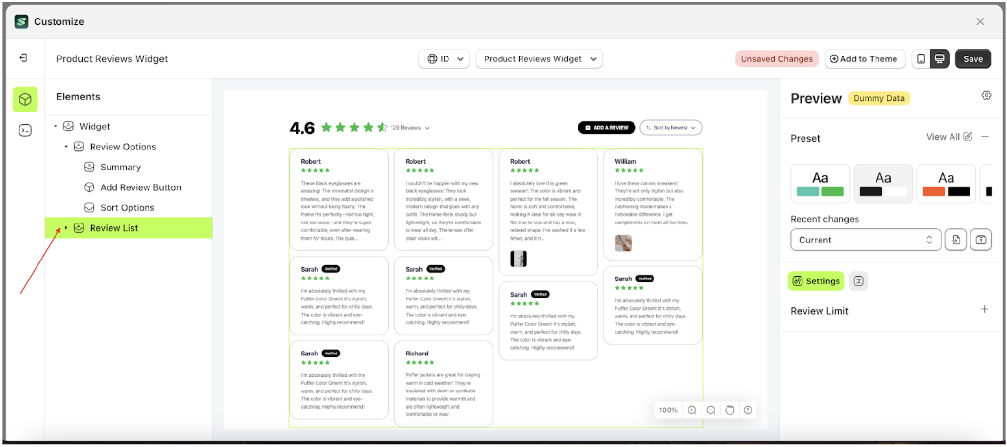
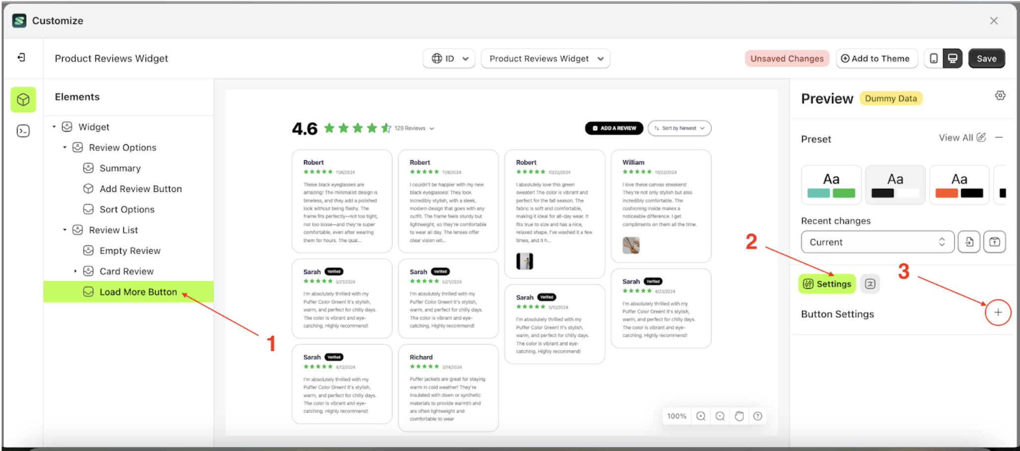
Review Limit
This feature is designed to manage the number of reviews per page
review-limit
- Select the Review LIst element on the left side, then click the icon on the right side, marked with a red arrow, to access the review limit.
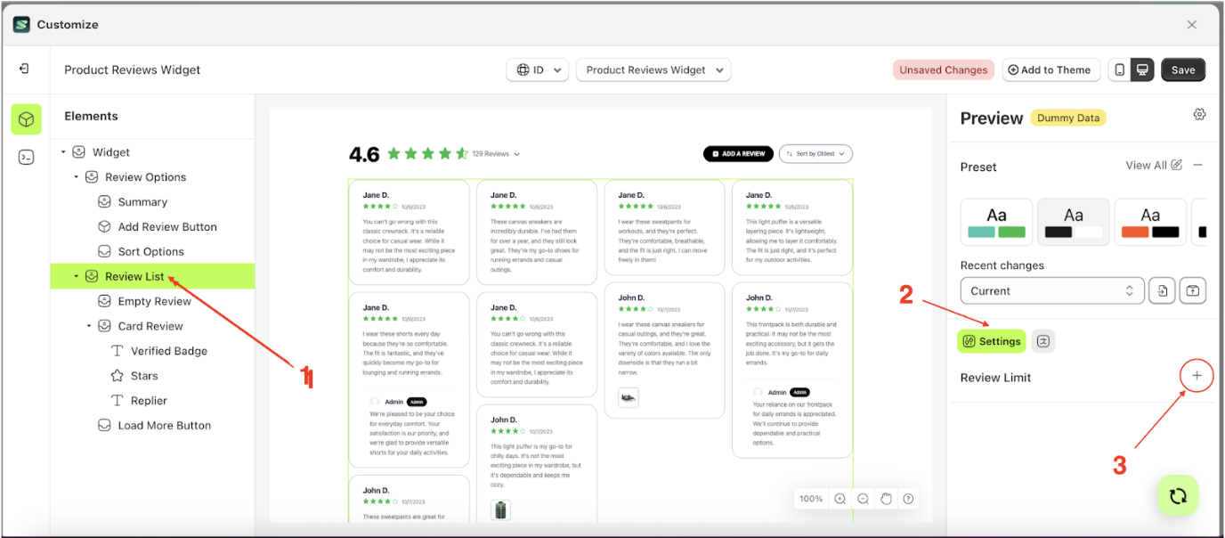
- Click the area marked with a red arrow to open the Review limit list.
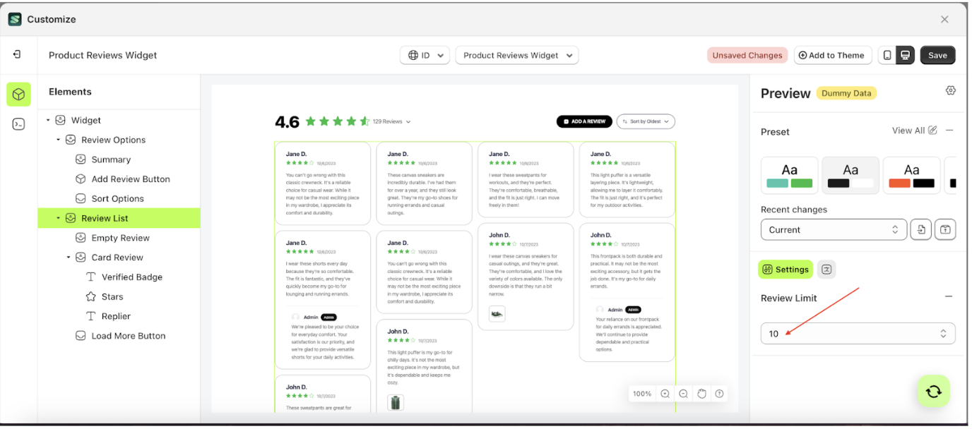
- Select the review limit option you prefer. For example, choose 25.
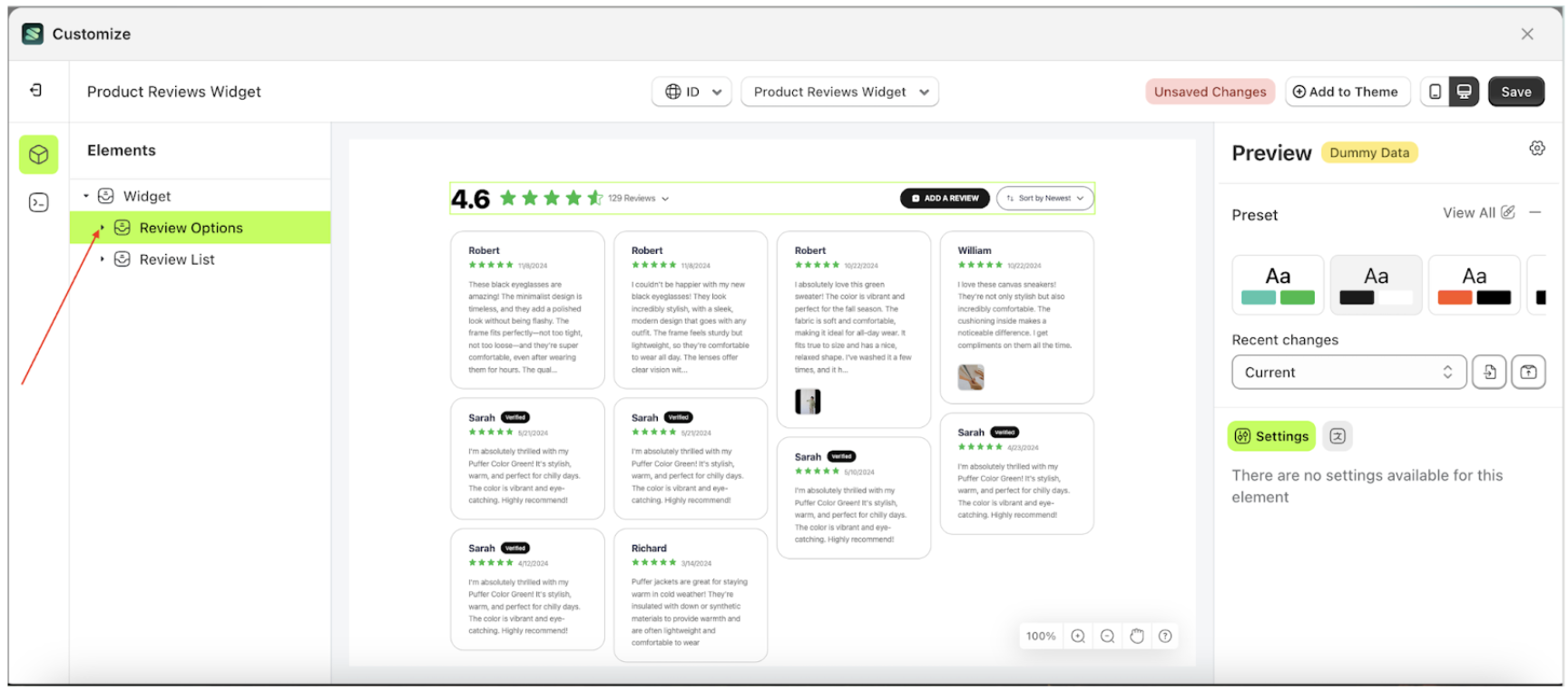
Card Option
Available settings:
Show Review Location
This feature is designed to manage information about the reviewer’s location.
Follow the steps below
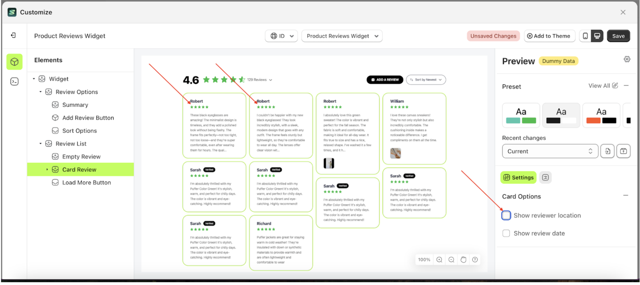
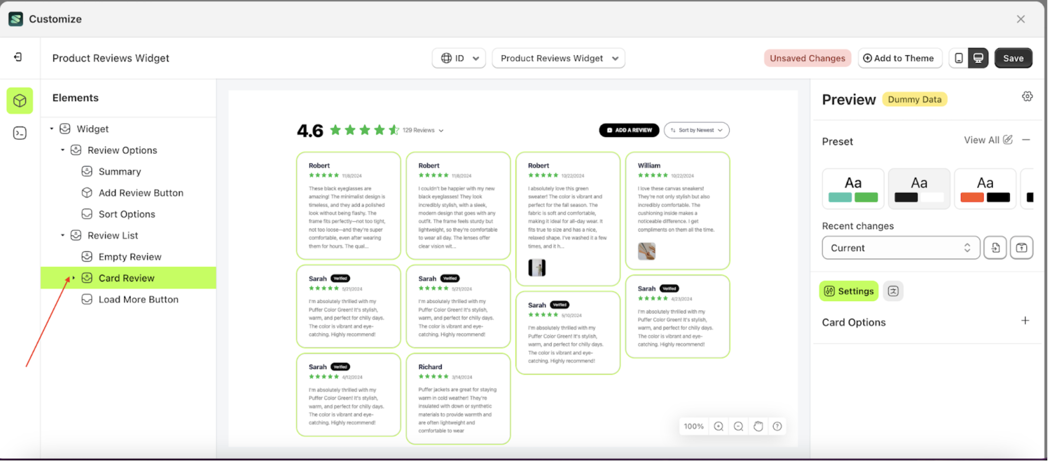
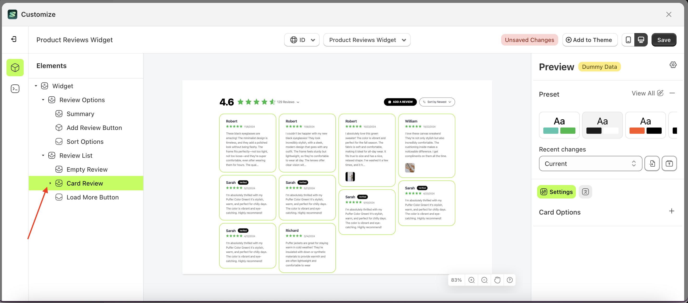
- Select the Review List element, then click the icon marked with a red arrow to open the menu within that item..
- Once the menu is open, select the Card Review element on the left side, then click the icon on the right side, marked with a red arrow, to access the Card options settings
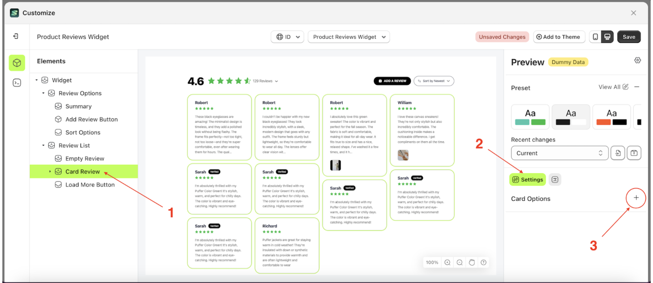
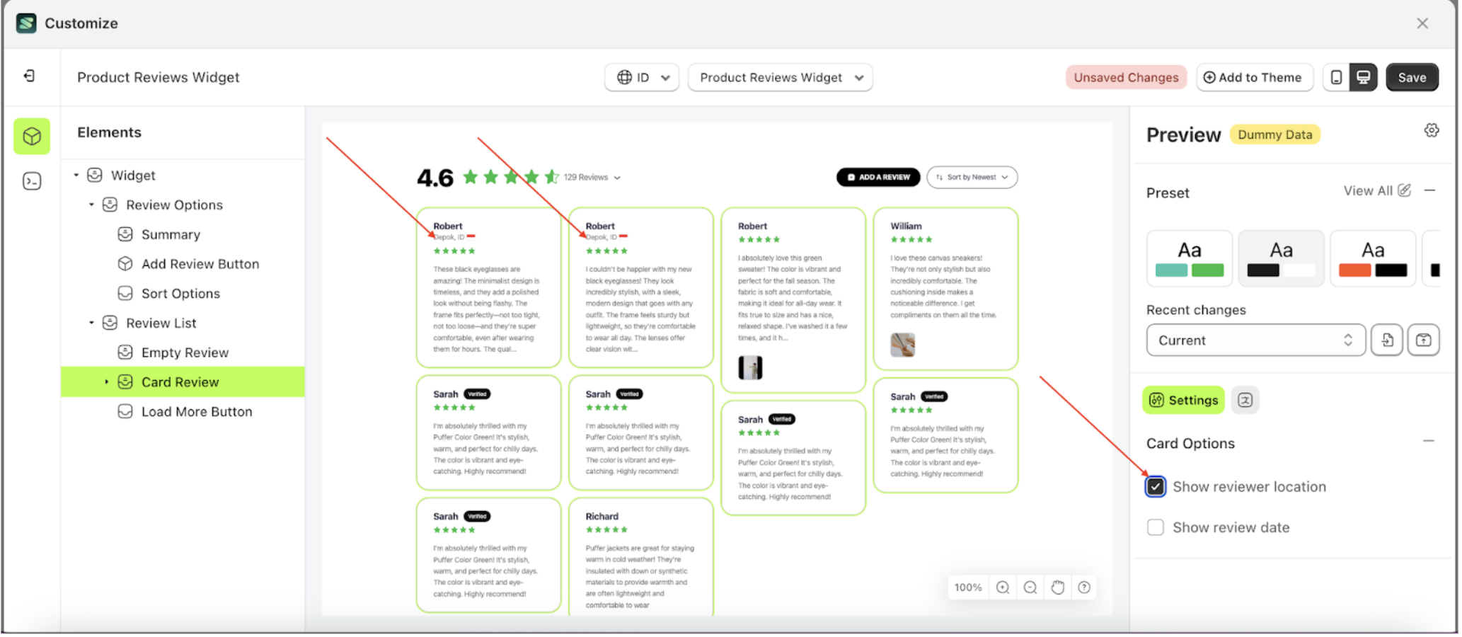
- Enable the Show Reviewer Location checkbox
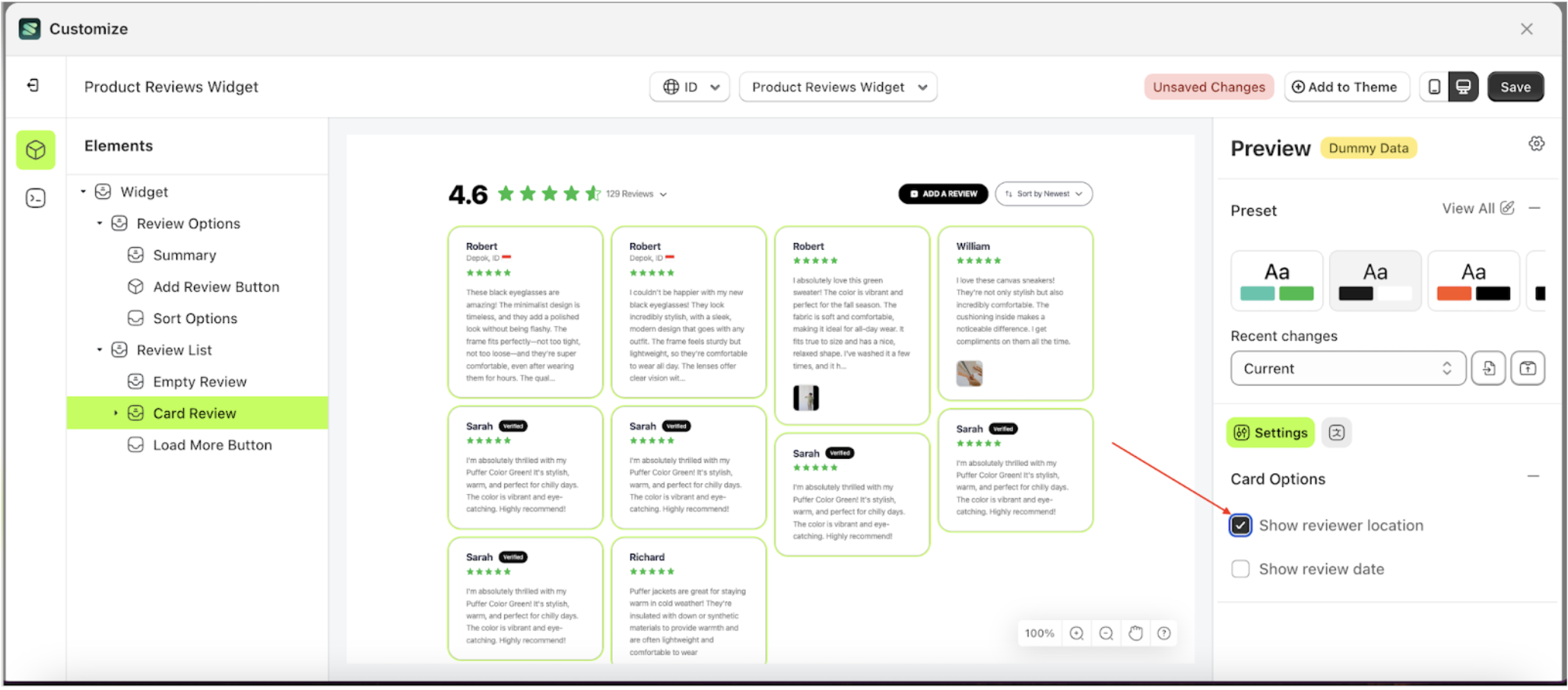
- The Show Review Location information will appear after the setting is enabled
- Example: Before the Show Review Location setting is enabled.
- Example: after the Show Review Location setting is enabled.
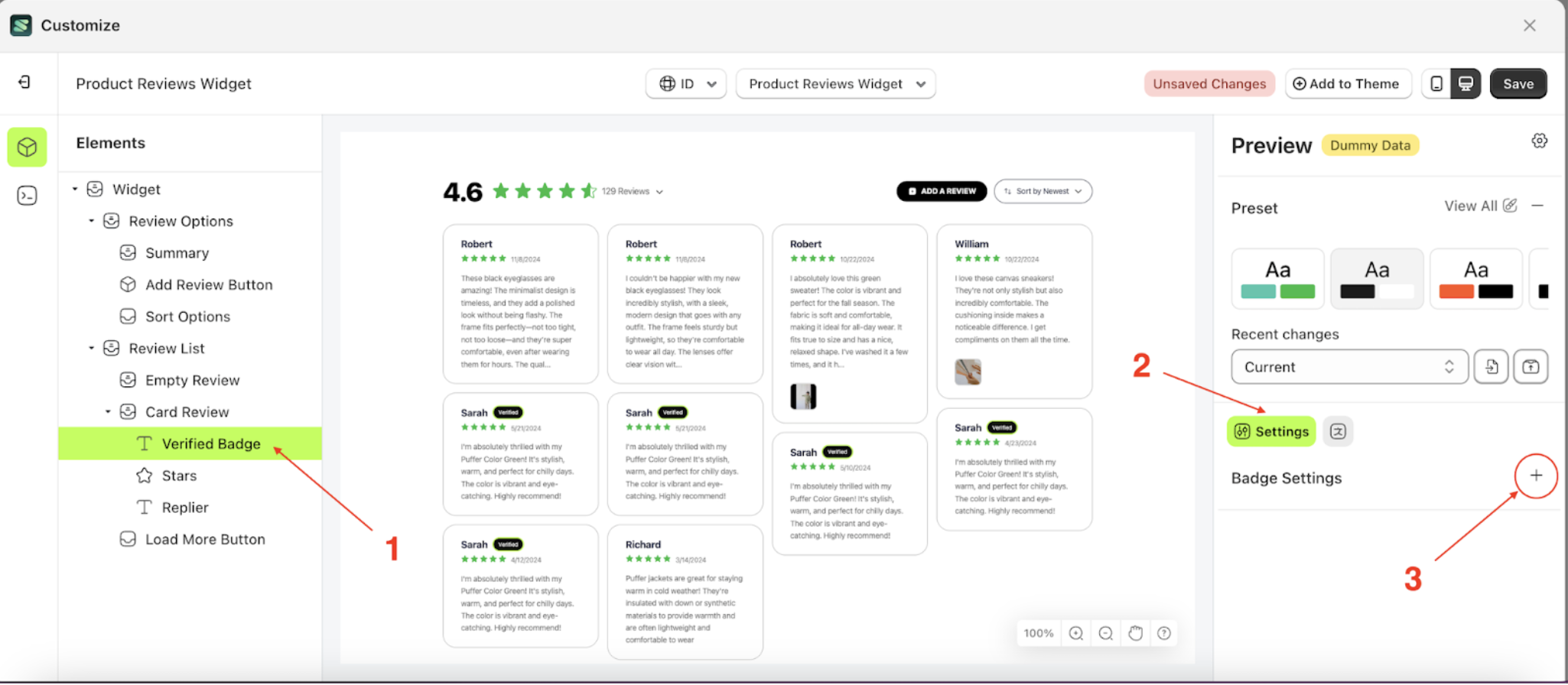
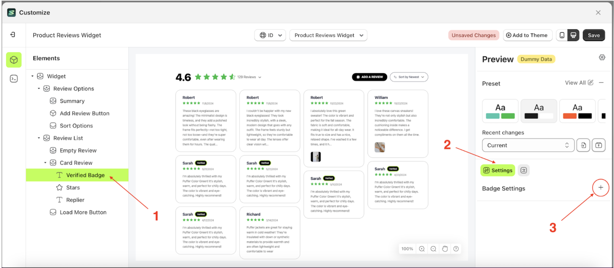
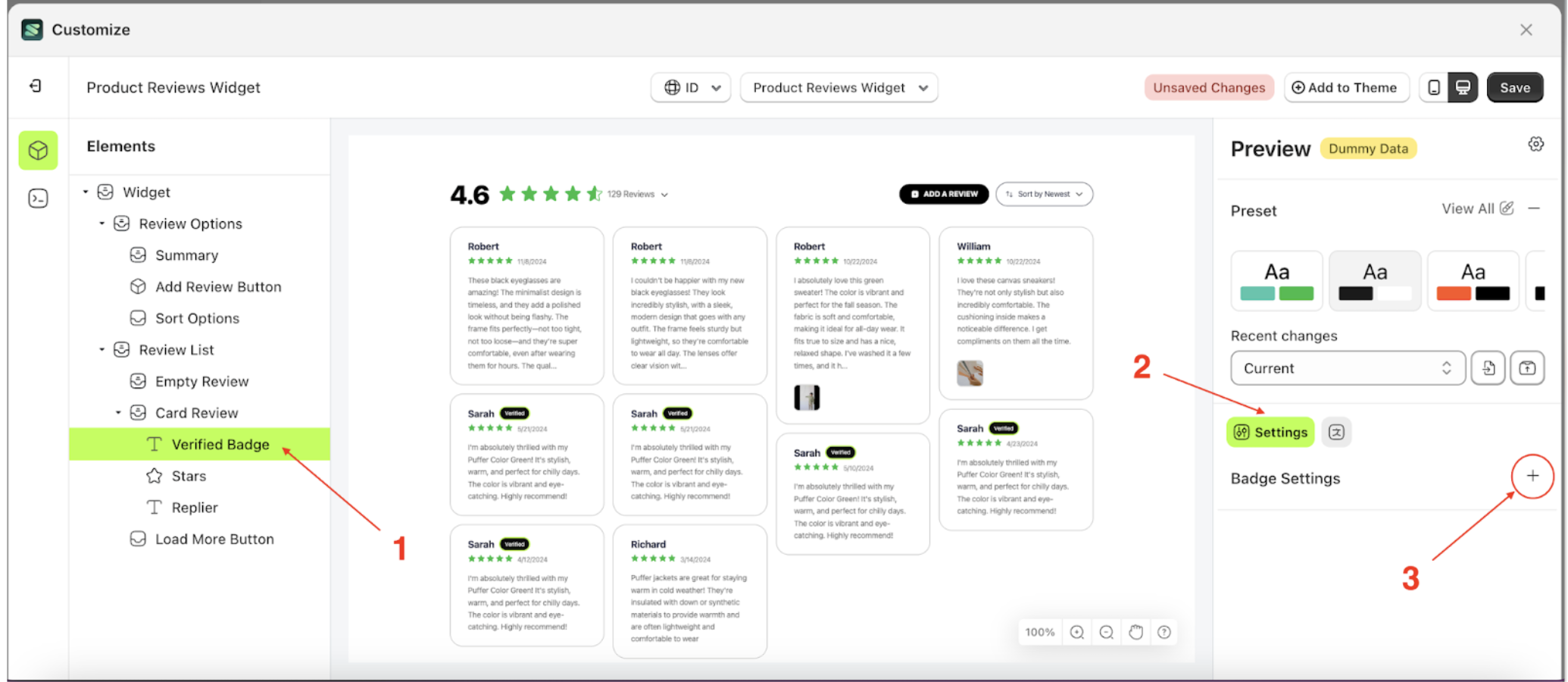
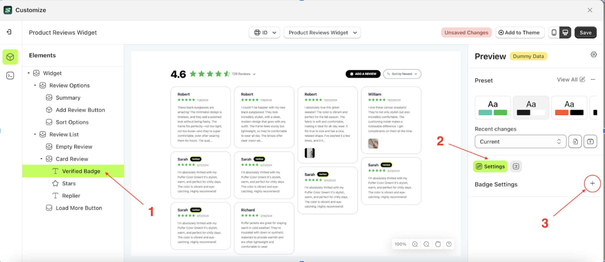
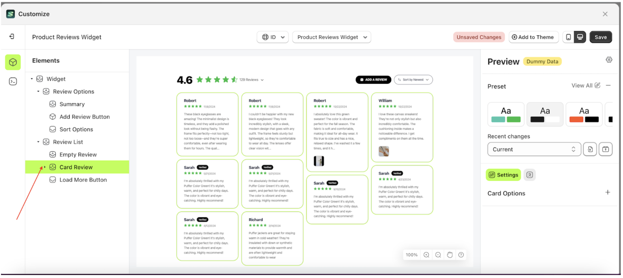
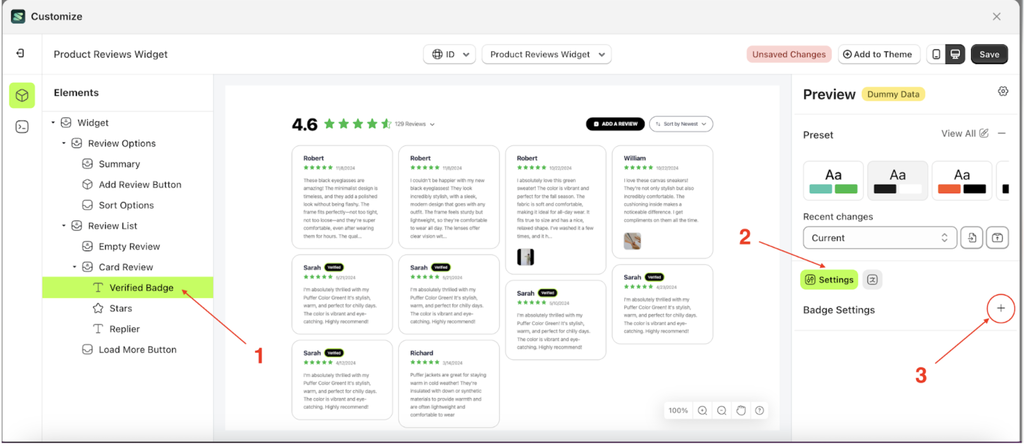
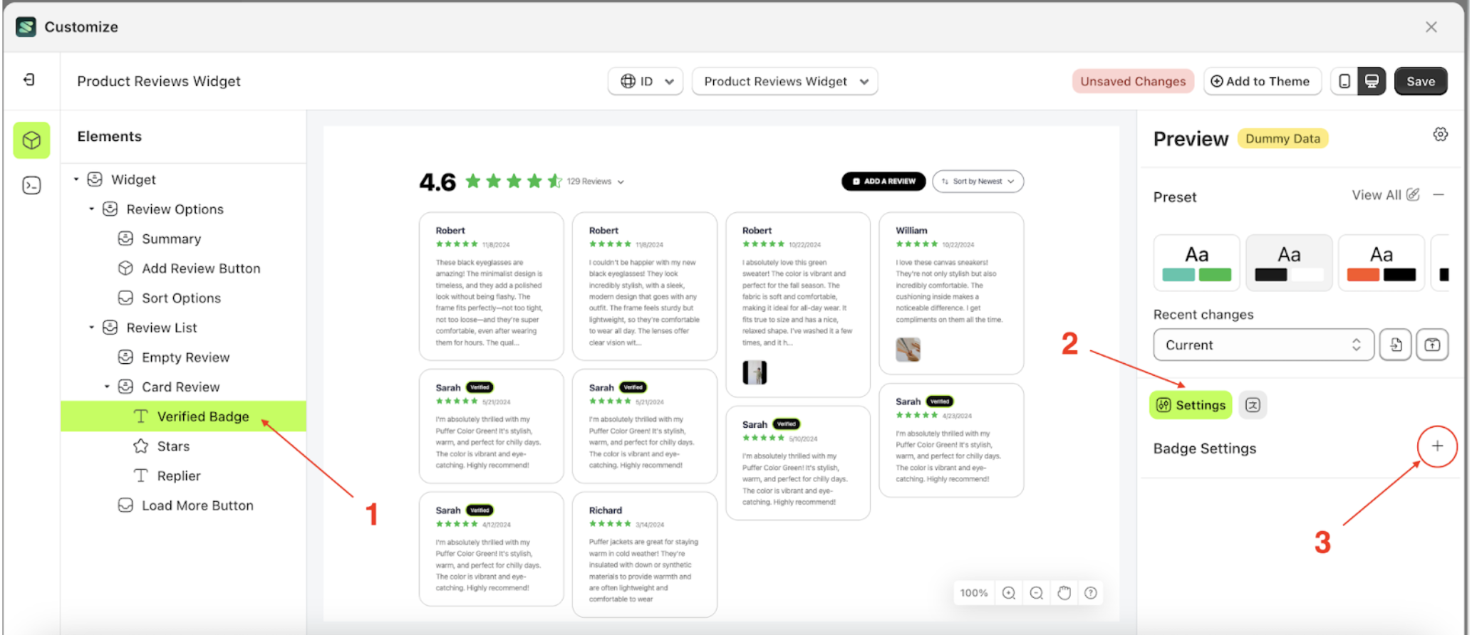
Badge Settings
Available settings:
Button Color Badge SettingText Color Badge SettingOutline Color Badge SettingPadding Top Badge SettingPadding Right Badge SettingPadding Bottom Badge SettingPadding Left Badge SettingBorder Radius Badge SettingFont Size Badge SettingFont Weight Badge SettingText Transform Badge Setting
Button Color Badge Setting
This feature is designed to customize the button color of the badge setting
Follow the steps below:
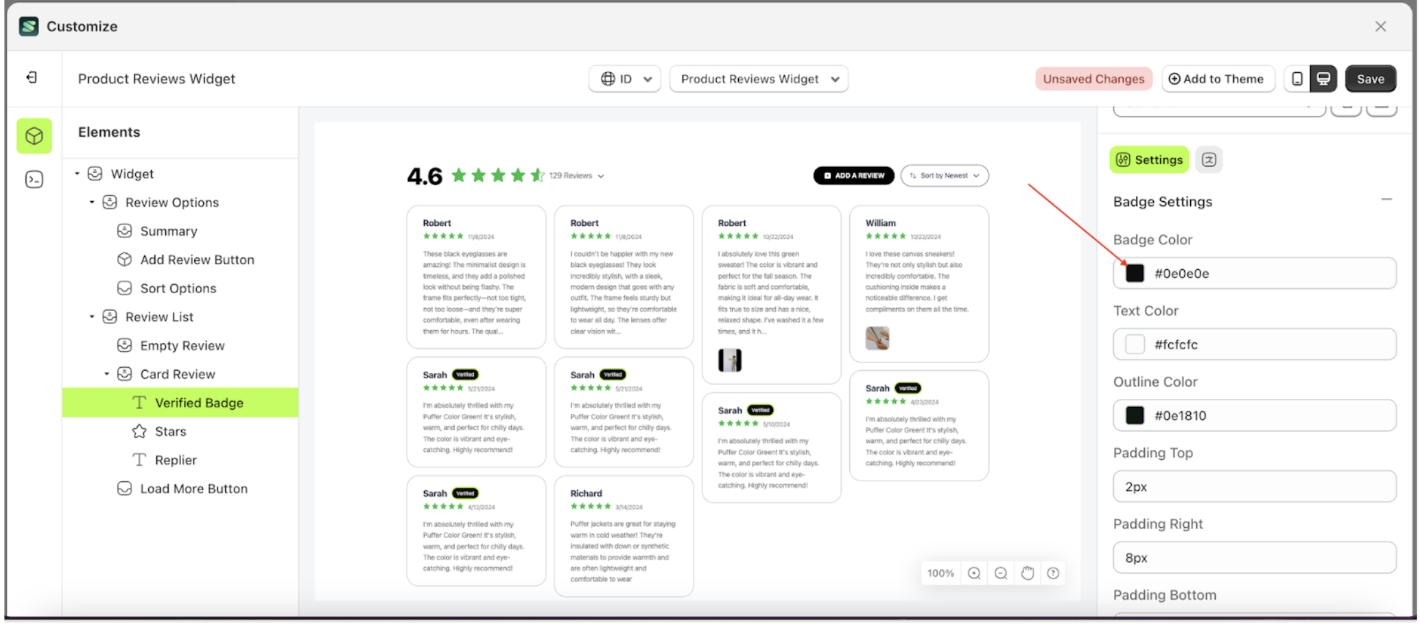
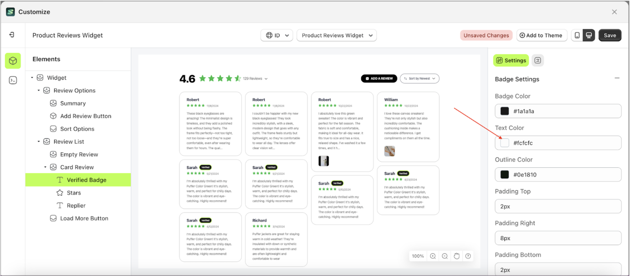
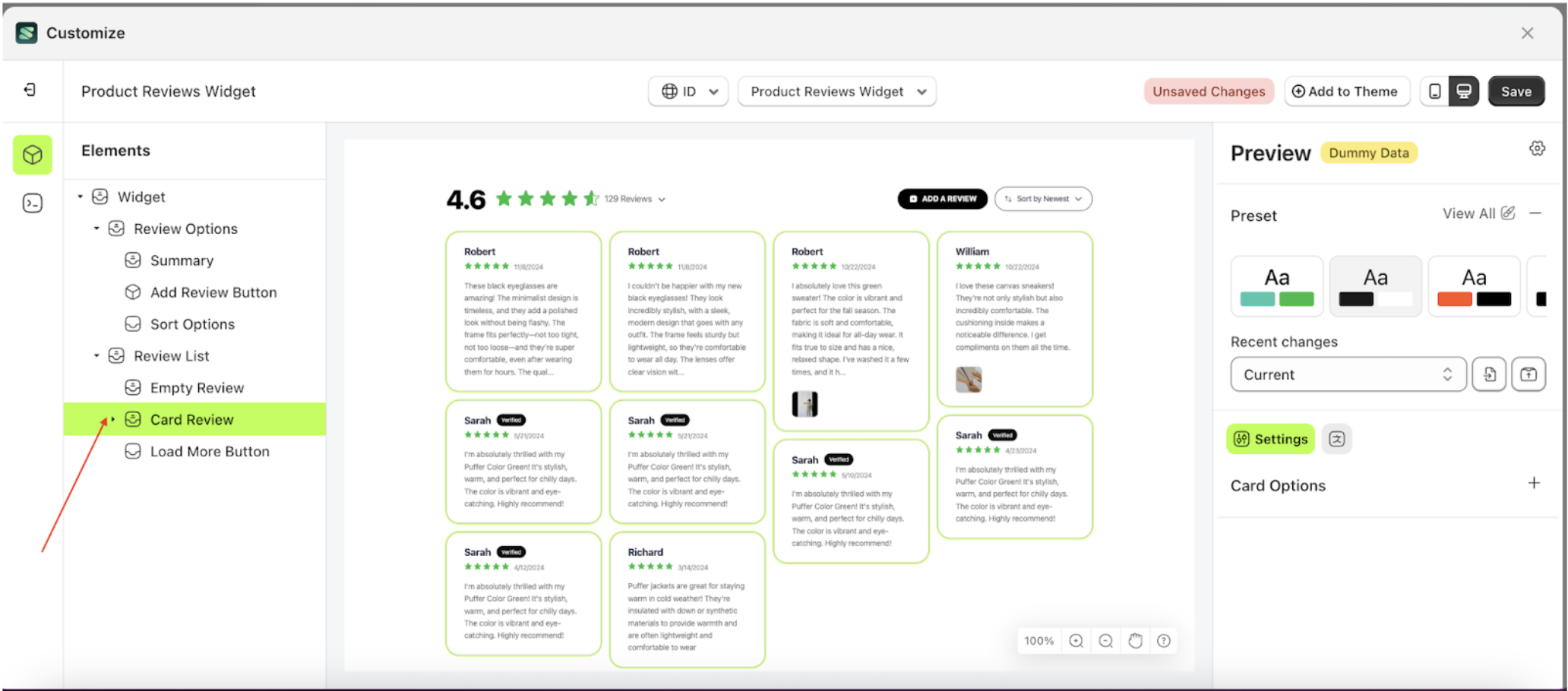
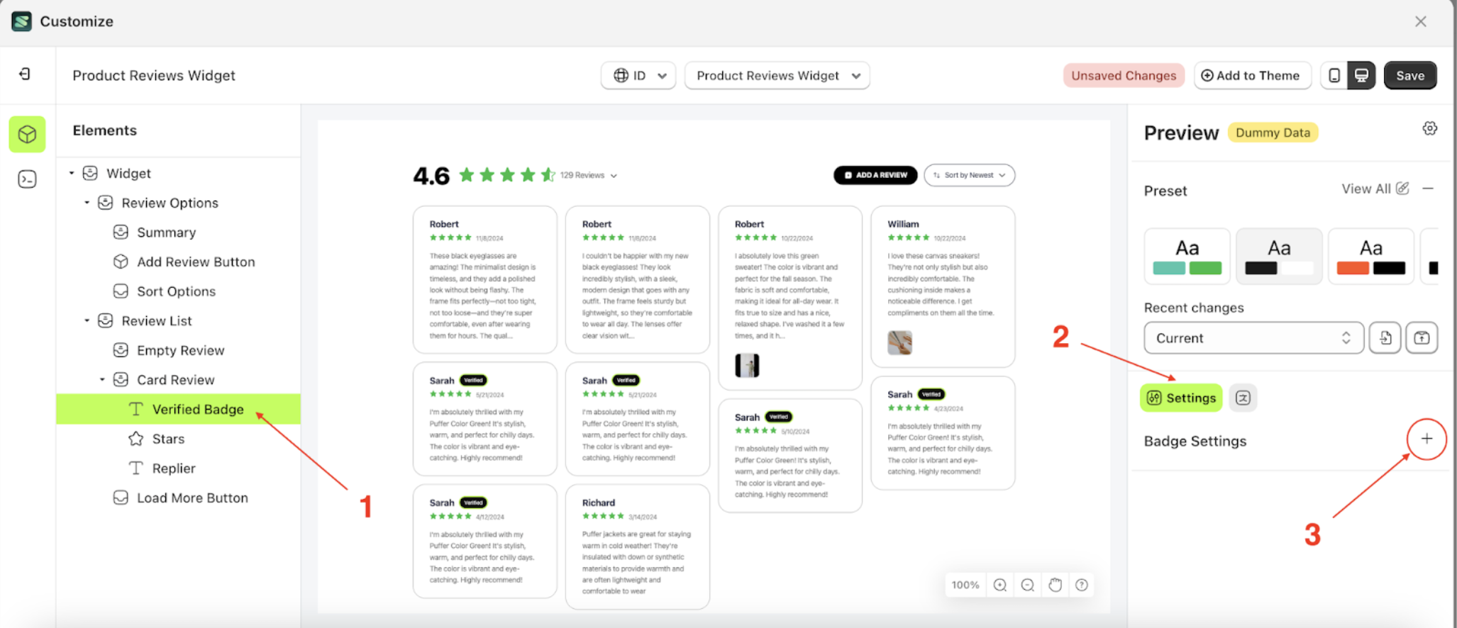
- Select the Card Review element on the left, then click the icon marked with a red arrow to open the menu within that item.
- Once the menu is open, select the Verify Badge element on the left, then click the Settings tab and click the icon marked with a red arrow.
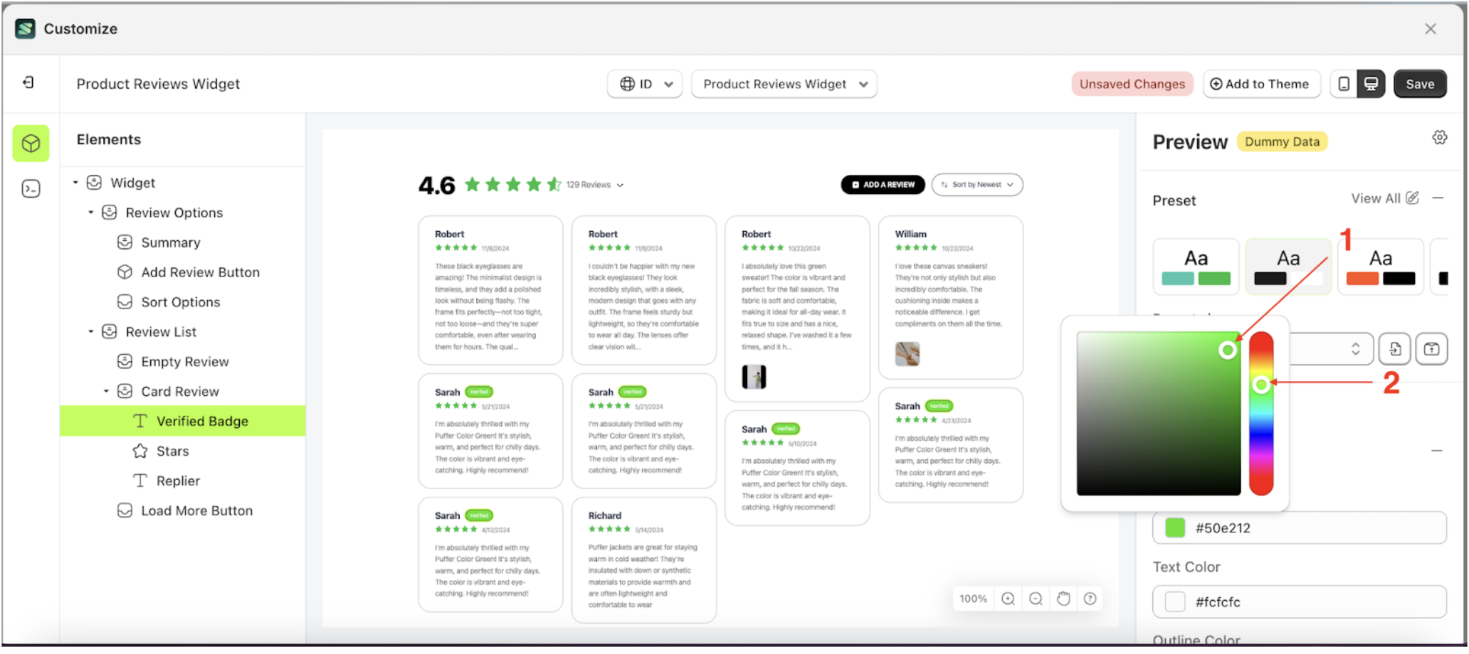
- Click the Color Palette on the right side, which is also marked with a red arrow.
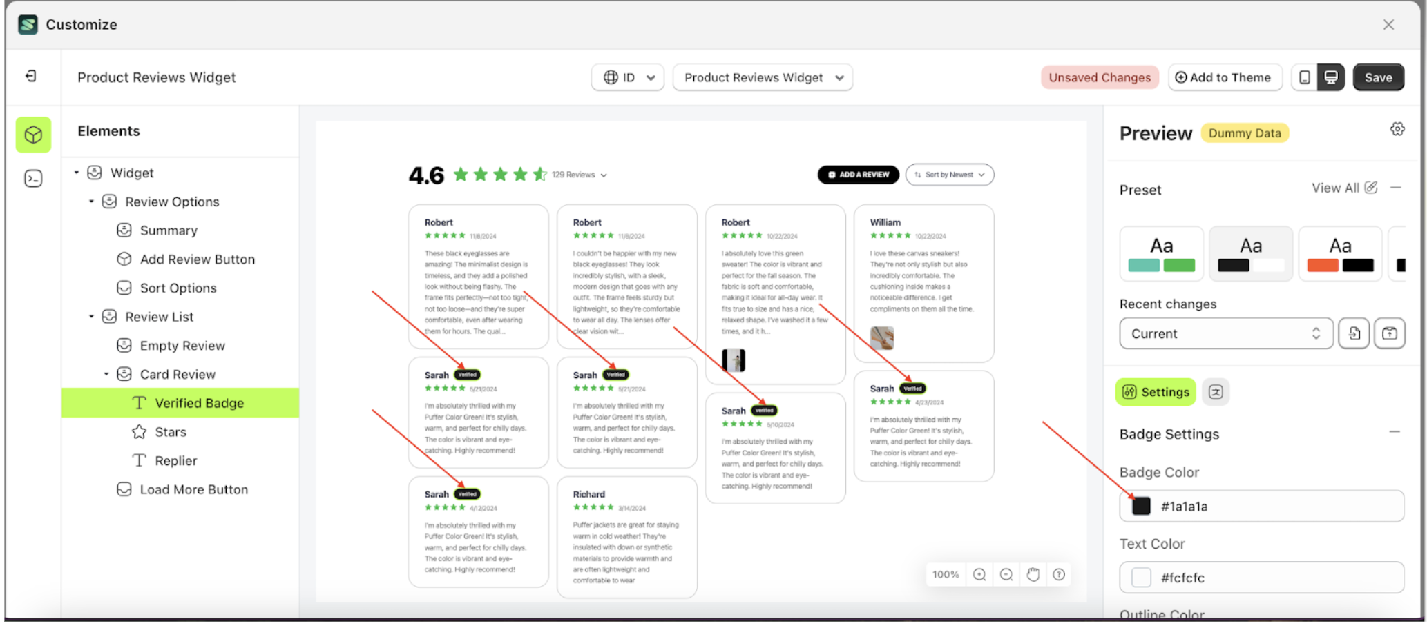
- The Color Palette will appear. Click the right side of the palette where the red arrow and number 1 are indicated, then click the right side again where the red arrow and number 2 are marked.
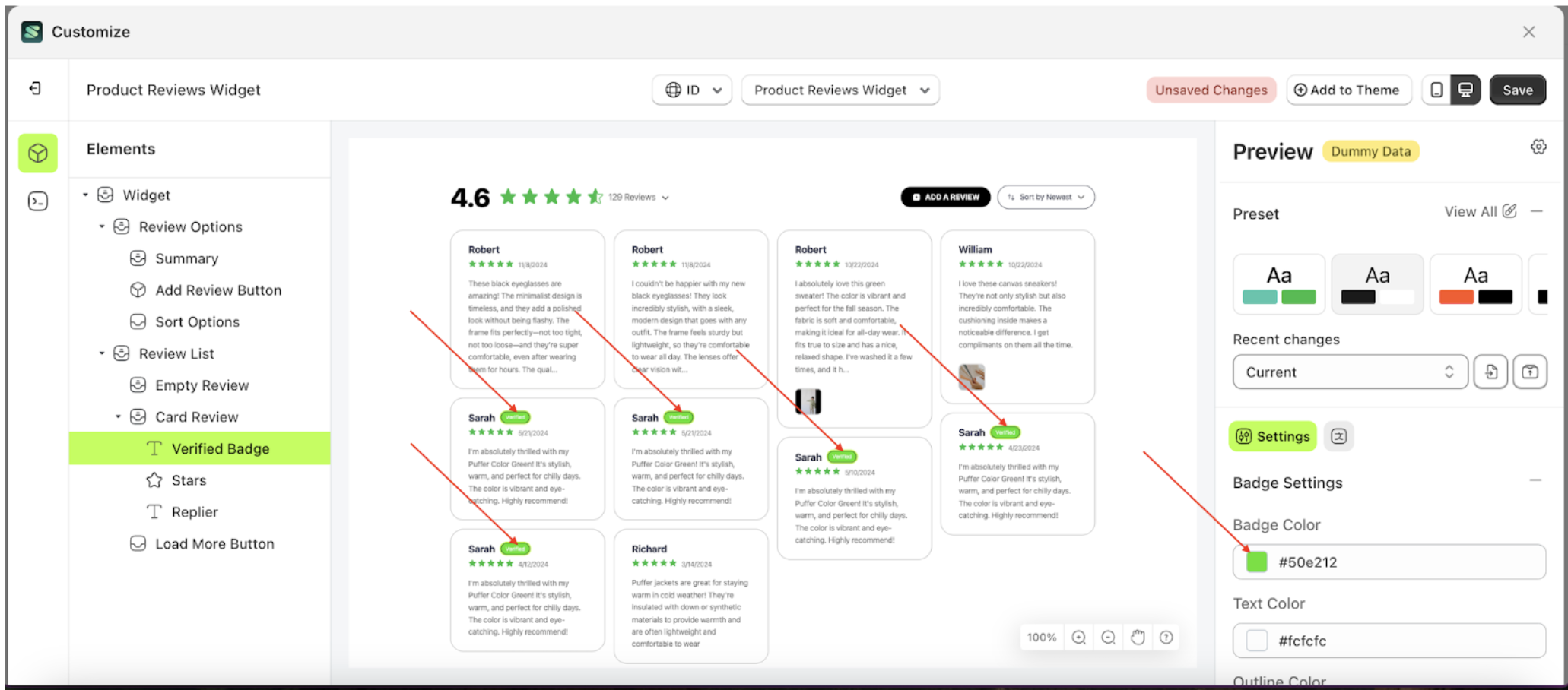
- The product review widget of the Verify Badge element will adjust accordingly.
- Example : Before Verify Badge change settings
- Example : After Verify Badge change settings
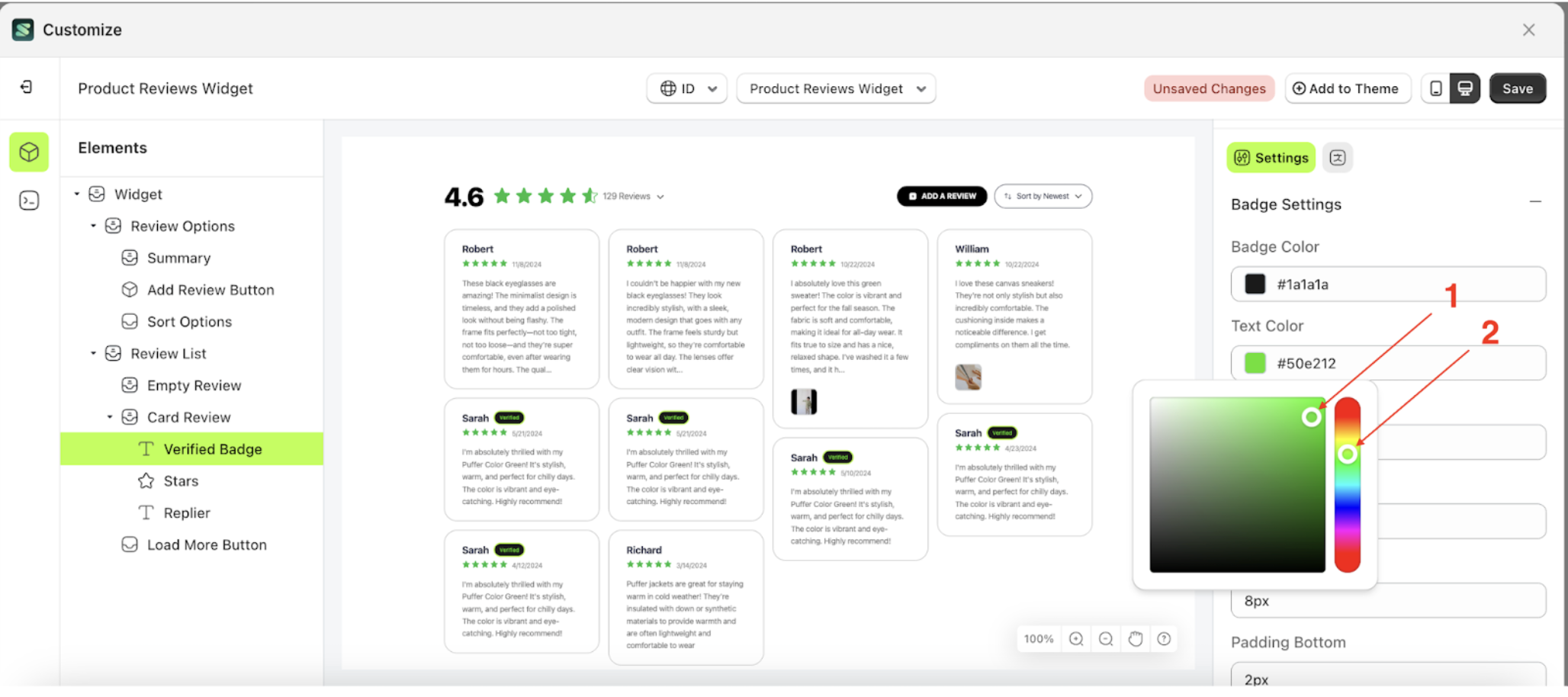
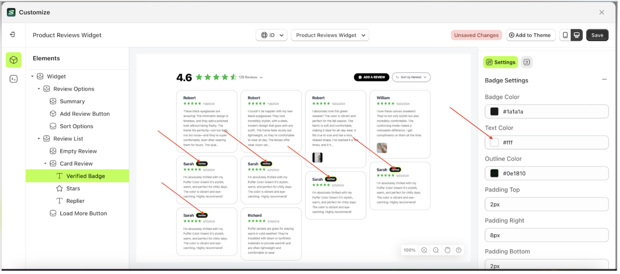
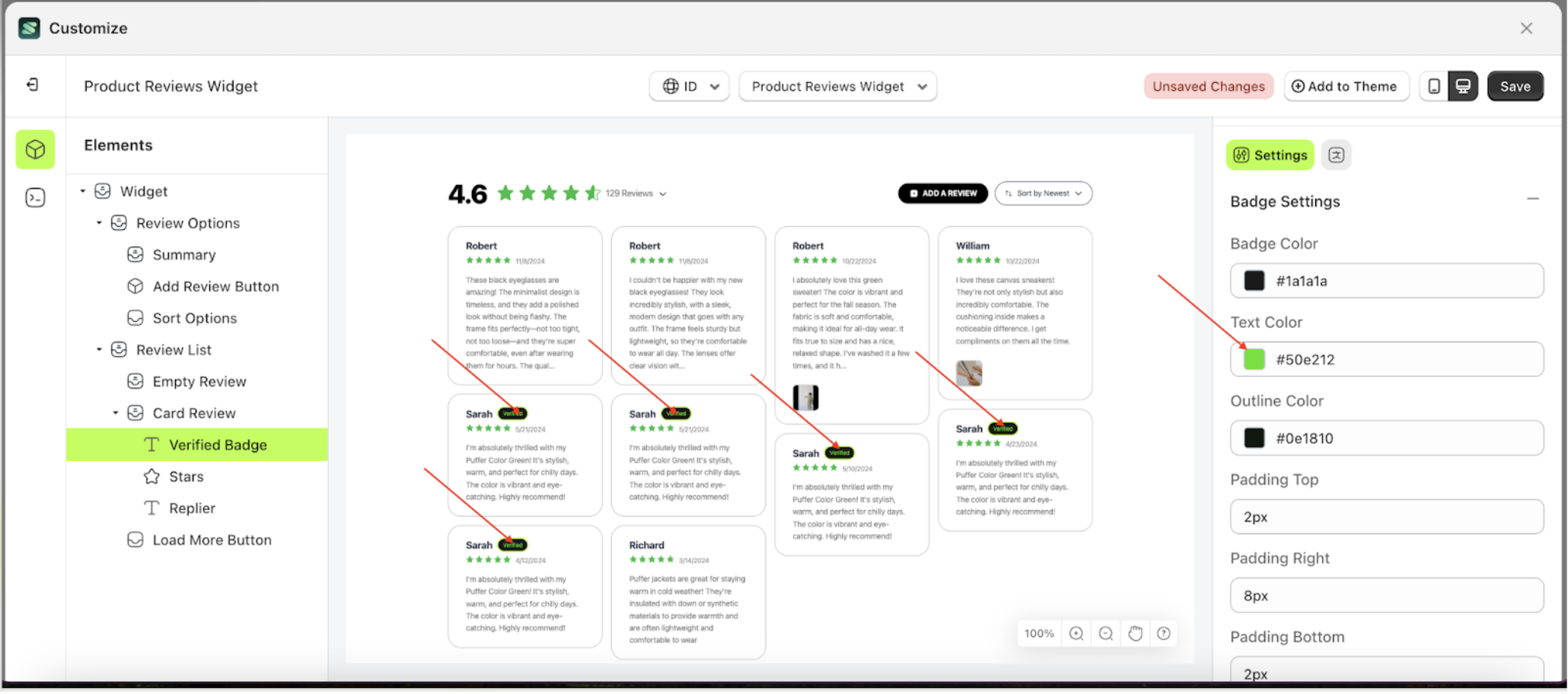
Text Color Badge Setting
This feature is designed to customize the text color of the badge setting
Follow the steps below:
- Select the Card Review element on the left, then click the icon marked with a red arrow to open the menu within that item.
- Once the menu is open, select the Verify Badge element on the left, then click the Settings tab and click the icon marked with a red arrow.
- Click the Color Palette on the right side, which is also marked with a red arrow.
- The Color Palette will appear. Click the right side of the palette where the red arrow and number 1 are indicated, then click the right side again where the red arrow and number 2 are marked.
- The product review widget of the Verify Badge element will adjust accordingly.
- Example : Before Verify Badge change settings
- Example : After Verify Badge change settings


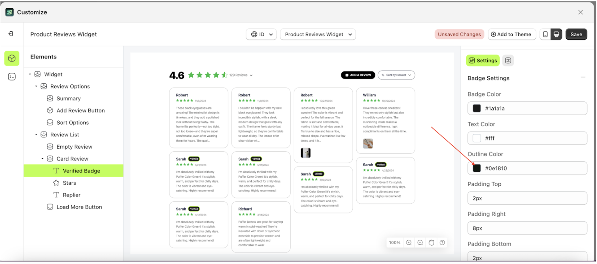
Outline Color Badge Setting
This feature is designed to customize the outline color of the badge setting
Follow the steps below:
- Select the Card Review element on the left, then click the icon marked with a red arrow to open the menu within that item.
- Once the menu is open, select the Verify Badge element on the left, then click the Settings tab and click the icon marked with a red arrow.
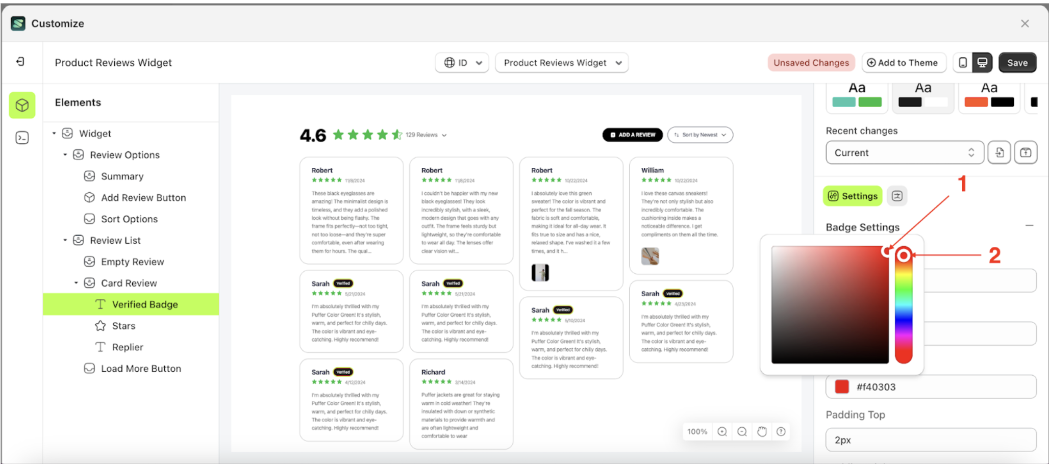
- Click the Color Palette on the right side, which is also marked with a red arrow.
- The Color Palette will appear. Click the right side of the palette where the red arrow and number 1 are indicated, then click the right side again where the red arrow and number 2 are marked.
- The product review widget of the Verify Badge element will adjust accordingly.
- Example : Before Verify Badge change settings
- Example : After Verify Badge change settings
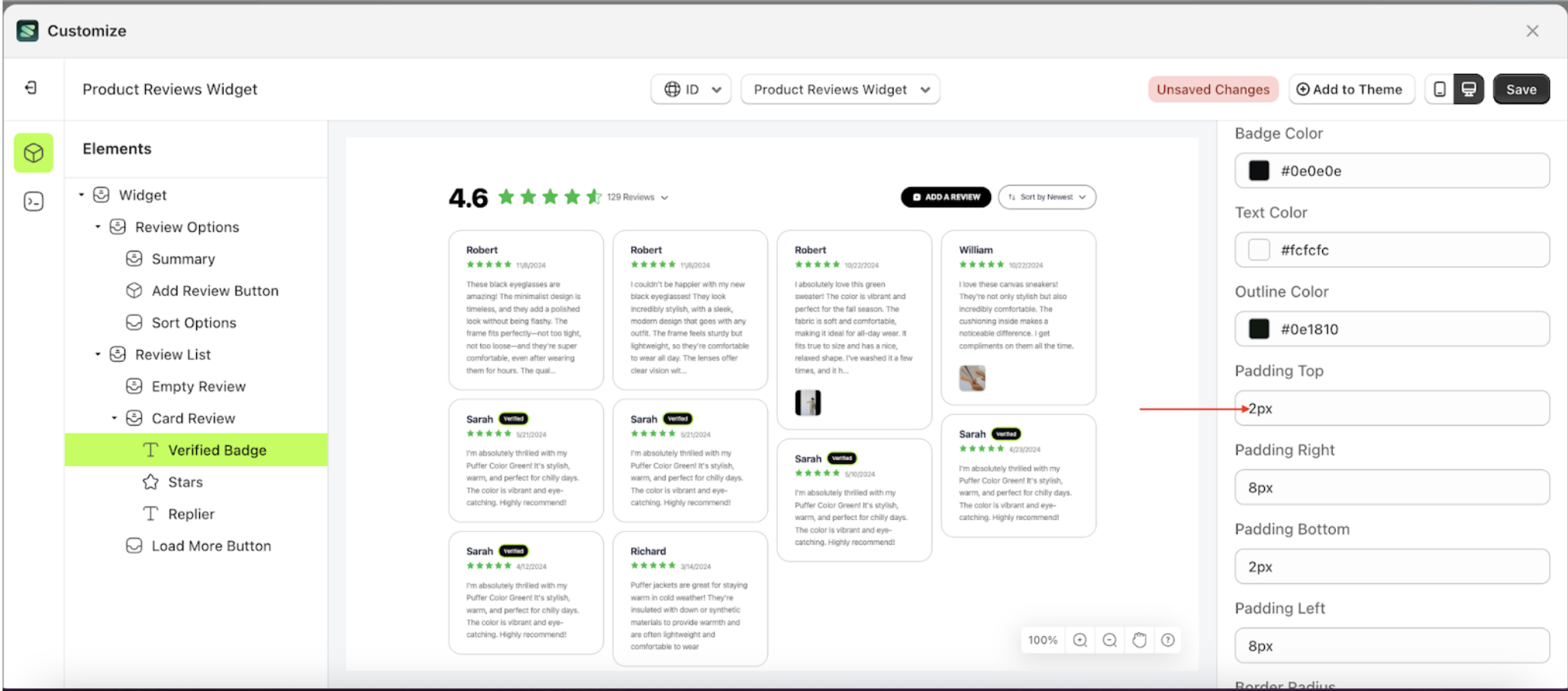
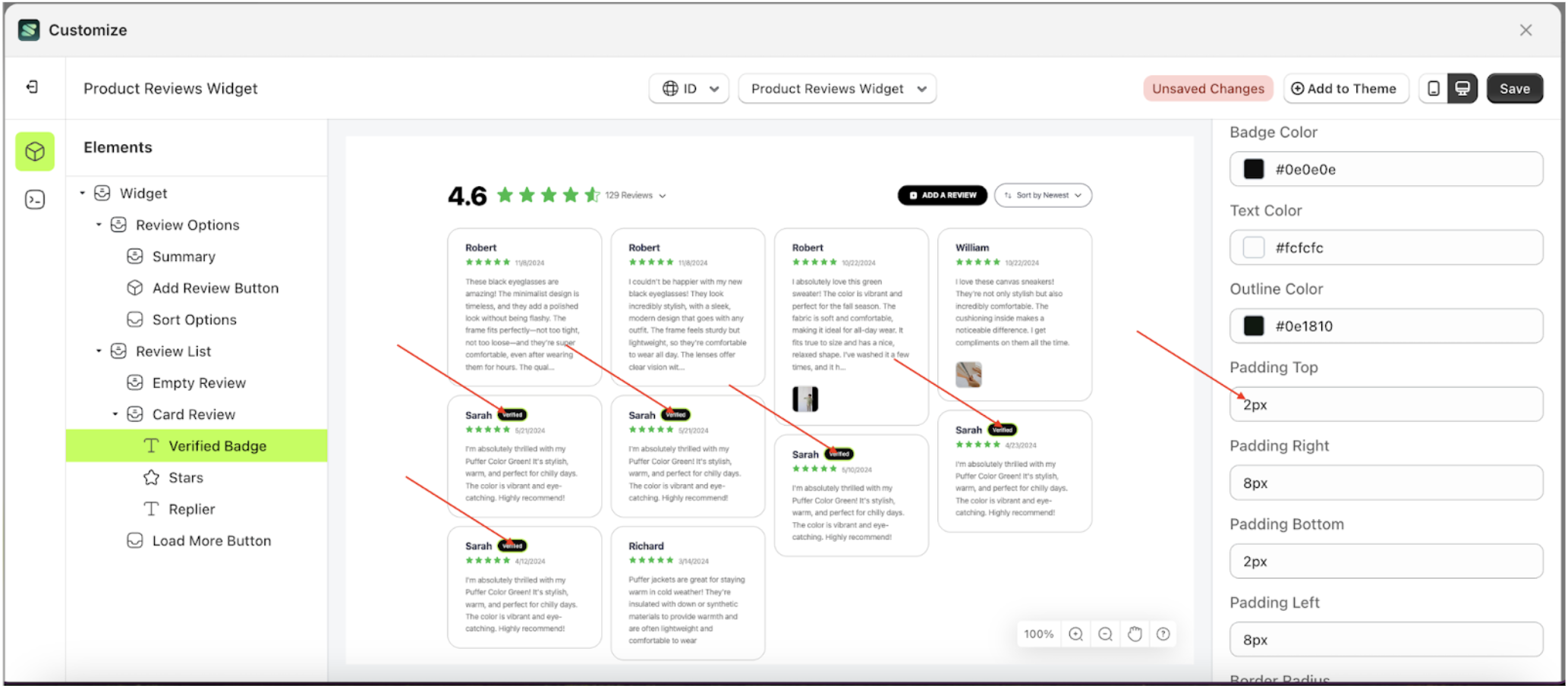
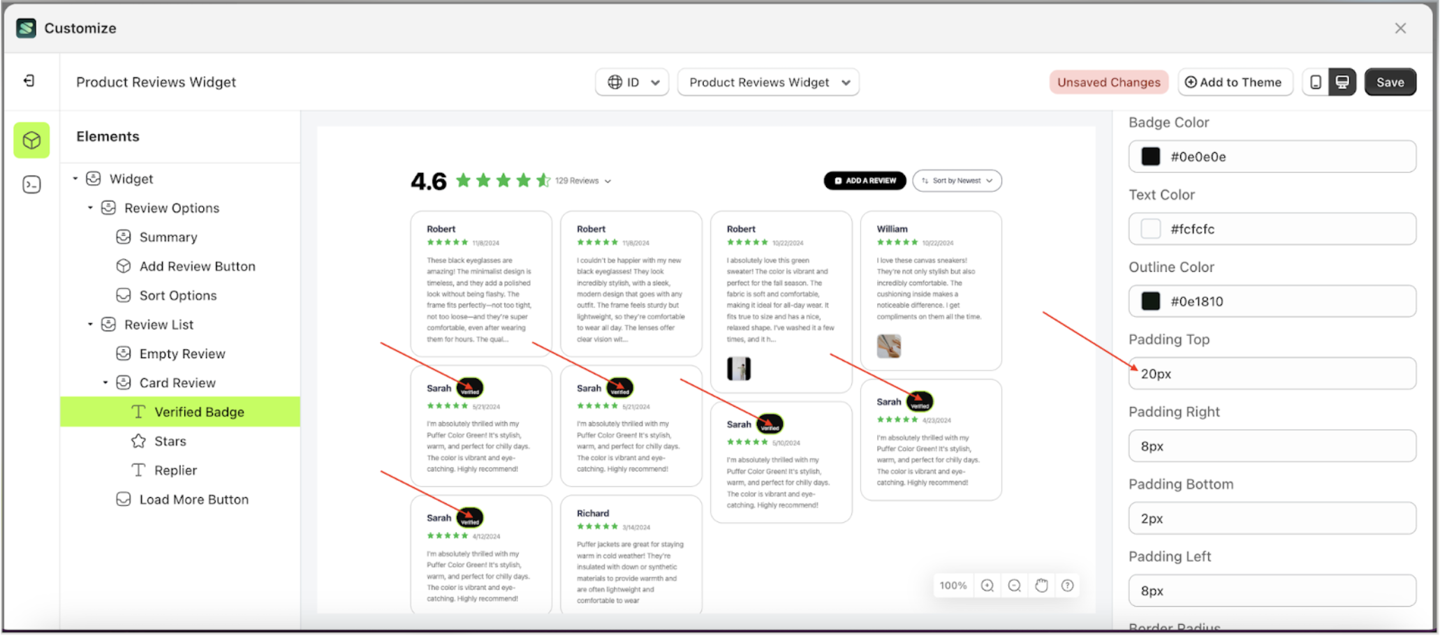
Padding Top Badge Setting
This feature is designed to customize the top padding of the badge setting
Follow the steps below:
- Select the Card Review element on the left, then click the icon marked with a red arrow to open the menu within that item.
- Once the menu is open, select the Verify Badge element on the left, then click the Settings tab and click the icon marked with a red arrow.
- On the right side, marked with a red arrow, you can change the padding top to your desired value.
- Note: The padding top format can be px, em, rem, %, or other units..
- For example, if you set the padding top to 20px
- The padding top of the Verify Badge element will adjust accordingly.
- Example : Before padding top change settings
- Example : After padding top change settings


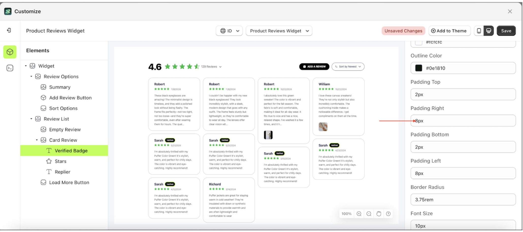
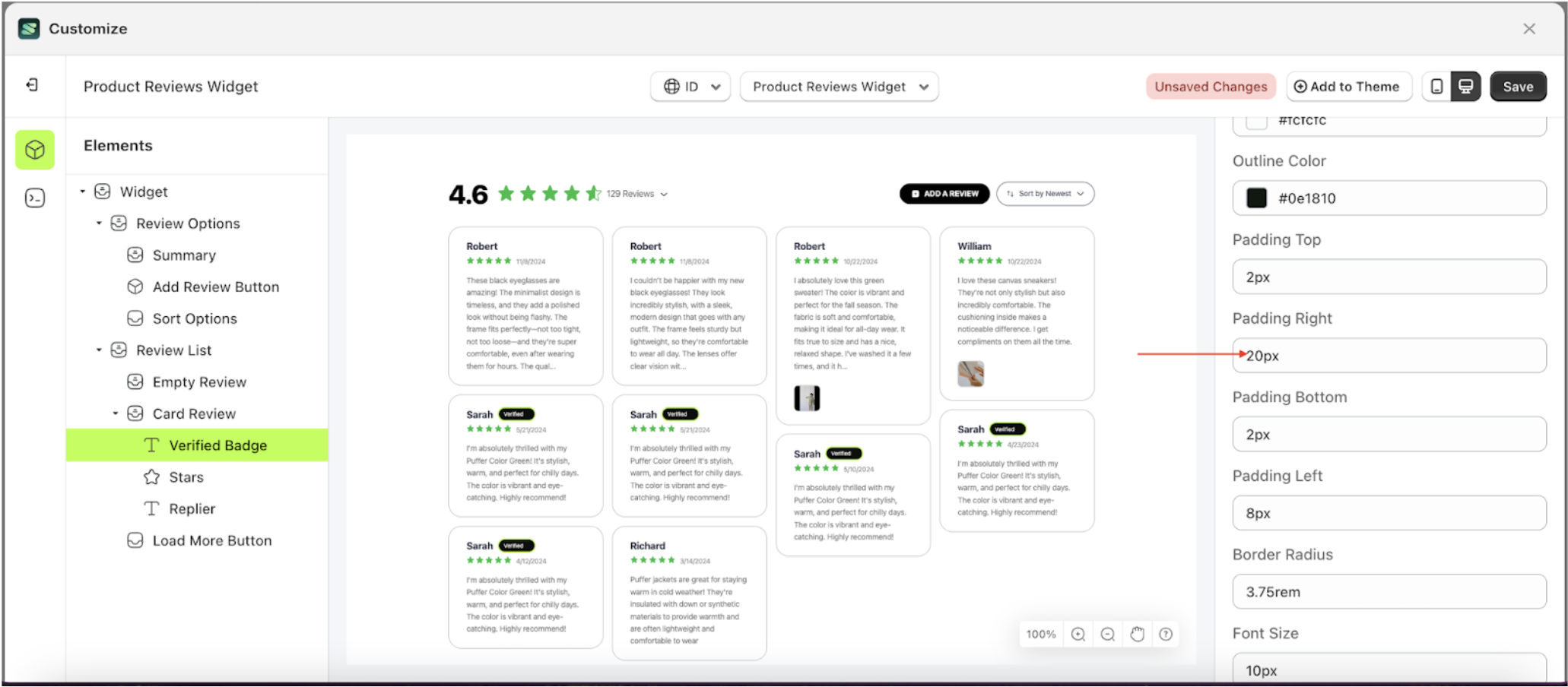
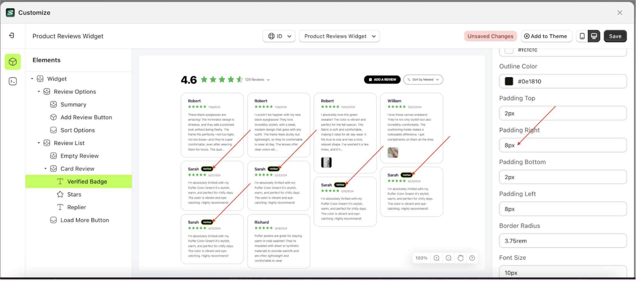
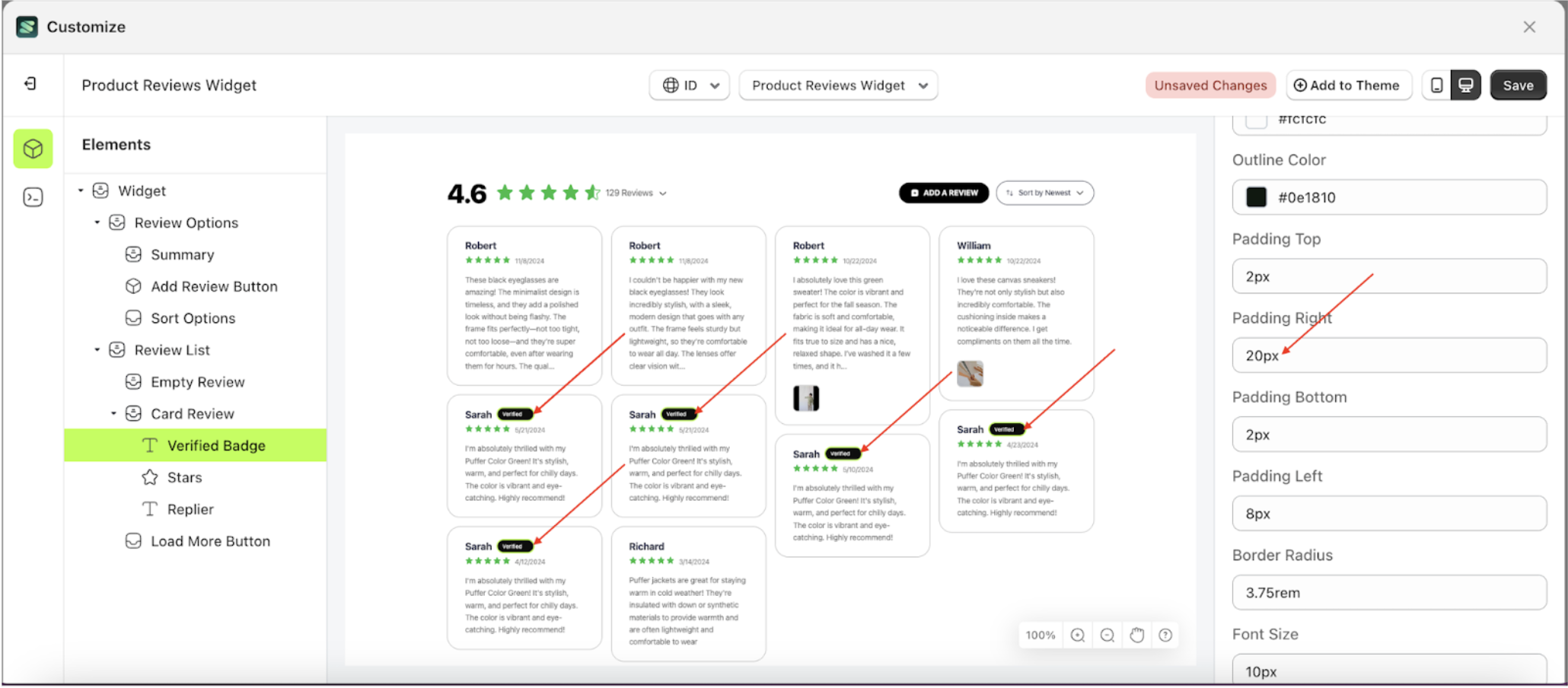
Padding Right Badge Setting
This feature is designed to customize the right padding of the badge setting
Follow the steps below:
- Select the Card Review element on the left, then click the icon marked with a red arrow to open the menu within that item.
- Once the menu is open, select the Verify Badge element on the left, then click the Settings tab and click the icon marked with a red arrow.
- On the right side, marked with a red arrow, you can change the padding right to your desired value.
- Note: The padding right format can be px, em, rem, %, or other units..
- For example, if you set the padding right to 20px
- The padding right of the Verify Badge element will adjust accordingly.
- Example : Before padding right change settings
- Example : After padding right change settings


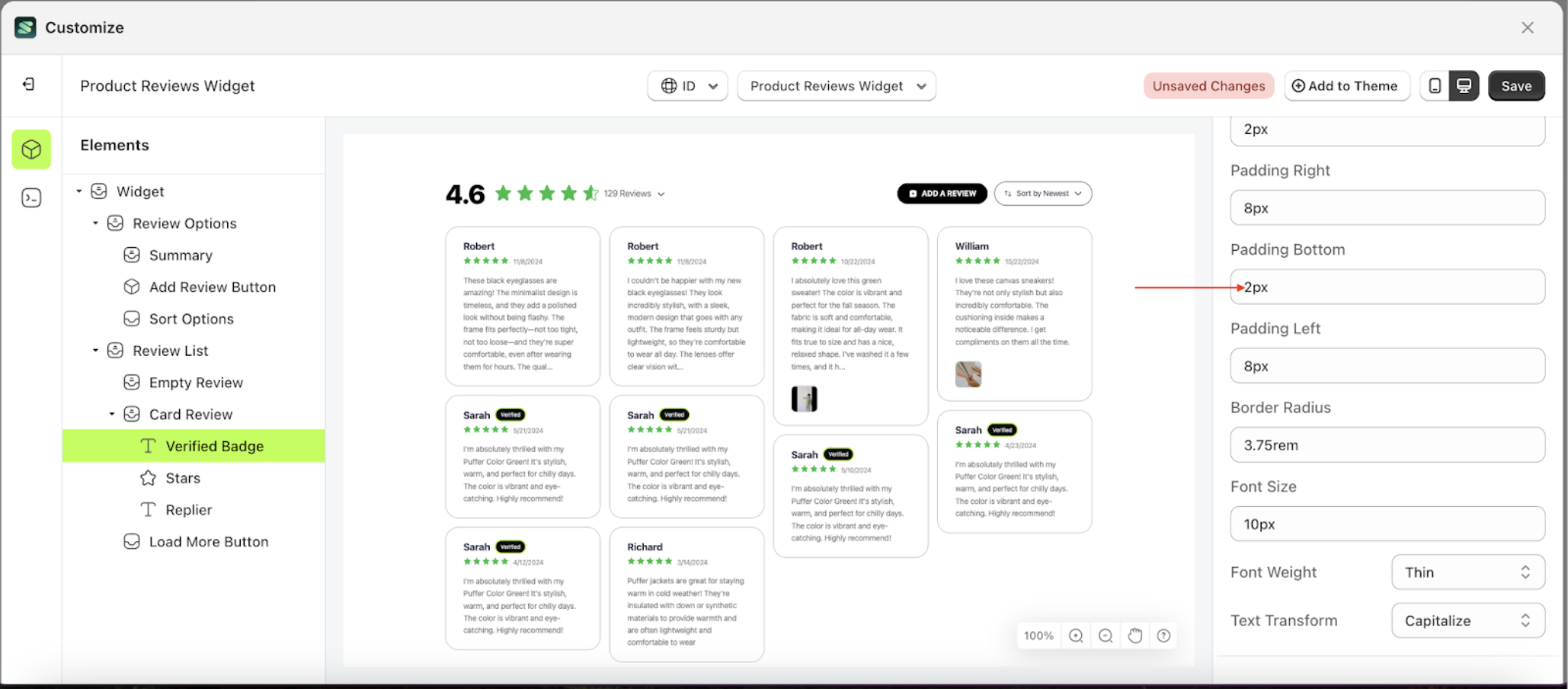
Padding Bottom Badge Setting
This feature is designed to customize the bottom padding of the badge setting
Follow the steps below:
- Select the Card Review element on the left, then click the icon marked with a red arrow to open the menu within that item.
- Once the menu is open, select the Verify Badge element on the left, then click the Settings tab and click the icon marked with a red arrow.
- On the right side, marked with a red arrow, you can change the padding bottom to your desired value.
- Note: The padding bottom format can be px, em, rem, %, or other units..
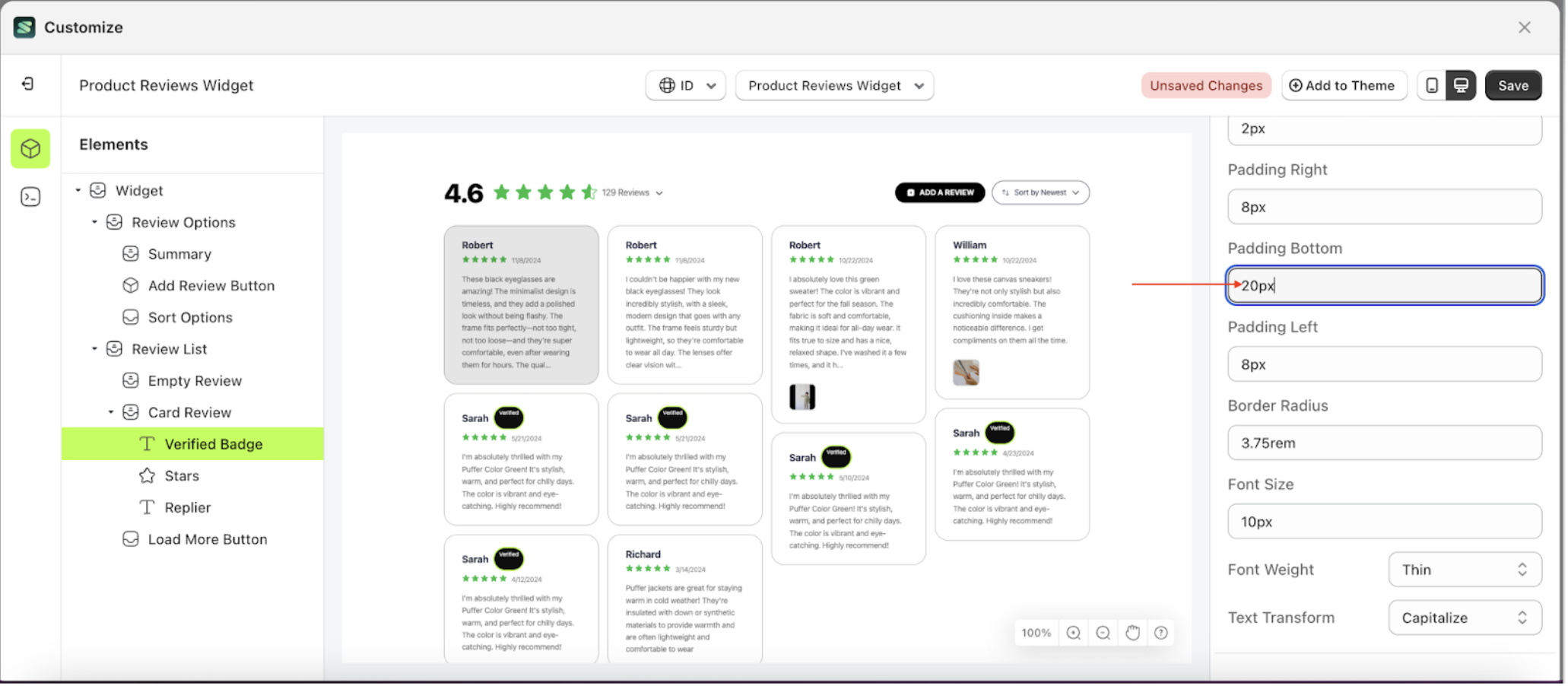
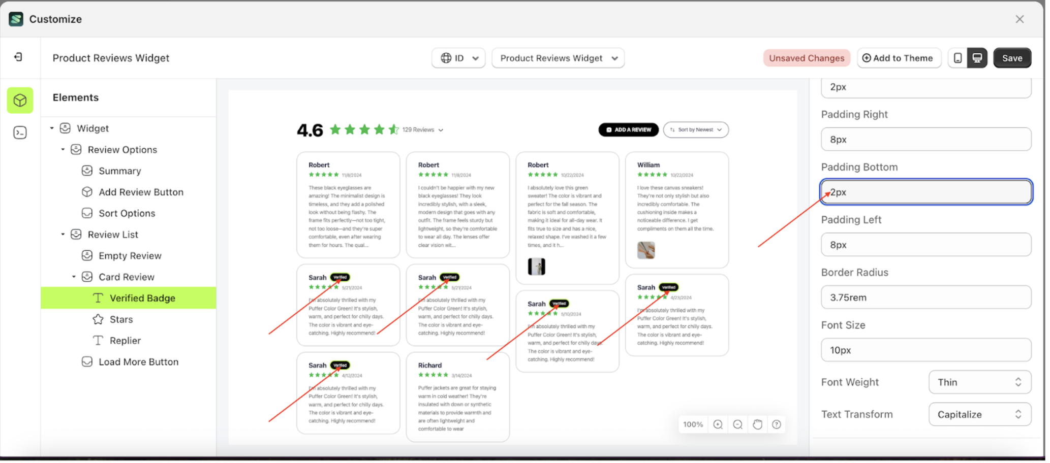
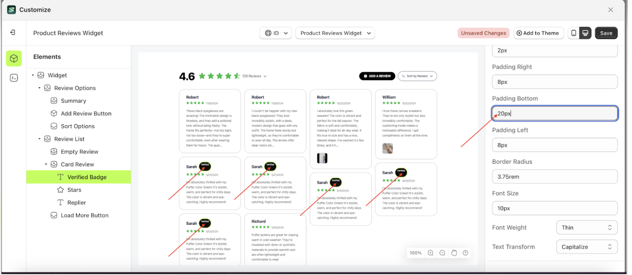
- For example, if you set the padding bottom to 20px
- The padding bottom of the Verify Badge element will adjust accordingly.
- Example : Before padding bottom change settings
- Example : After padding bottom change settings

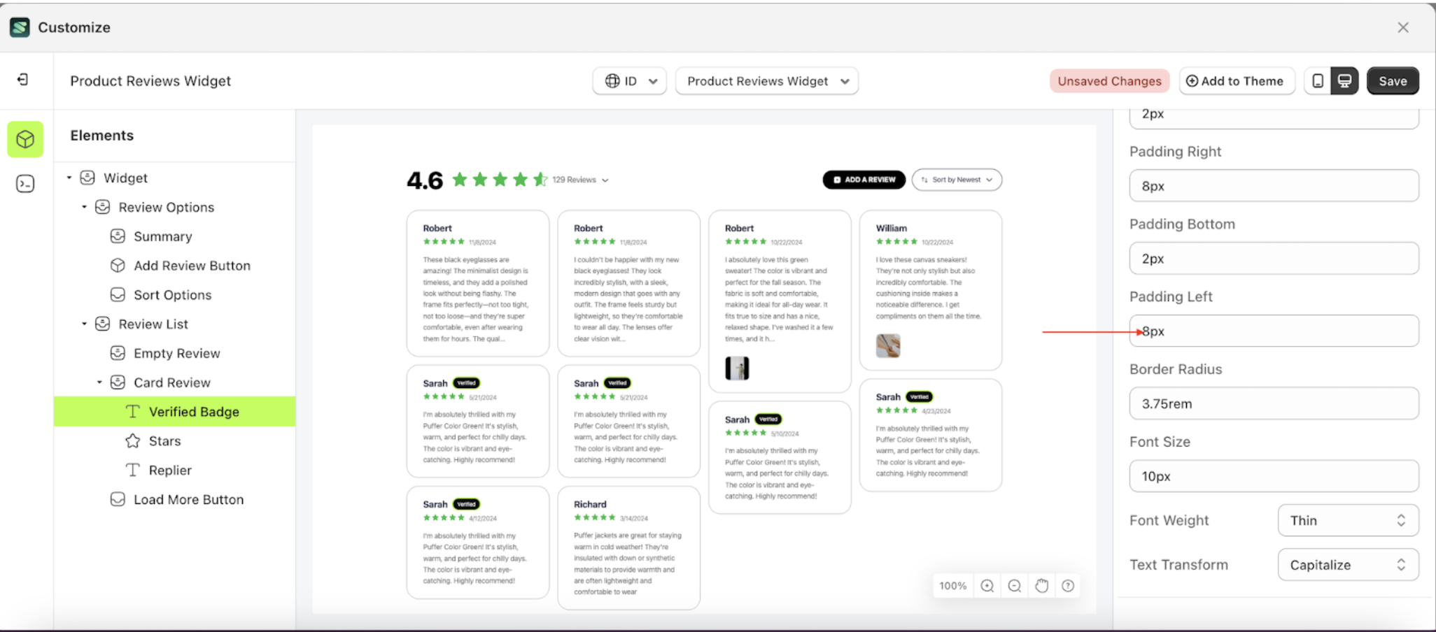
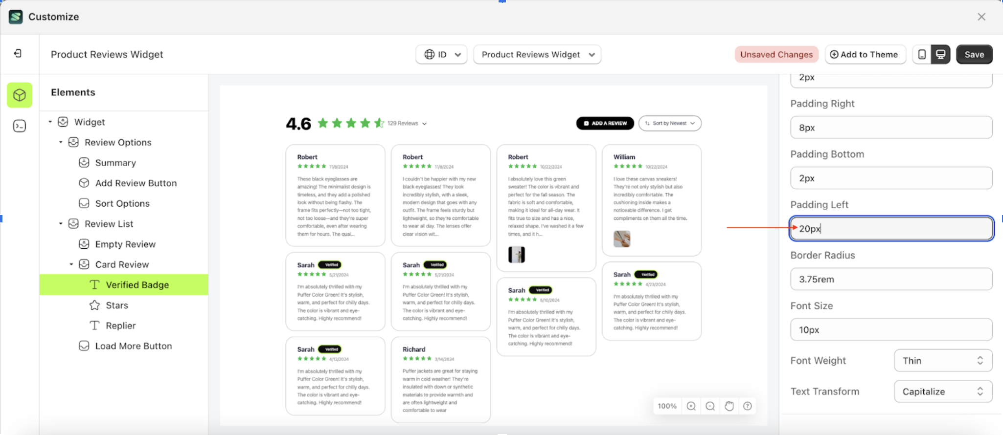
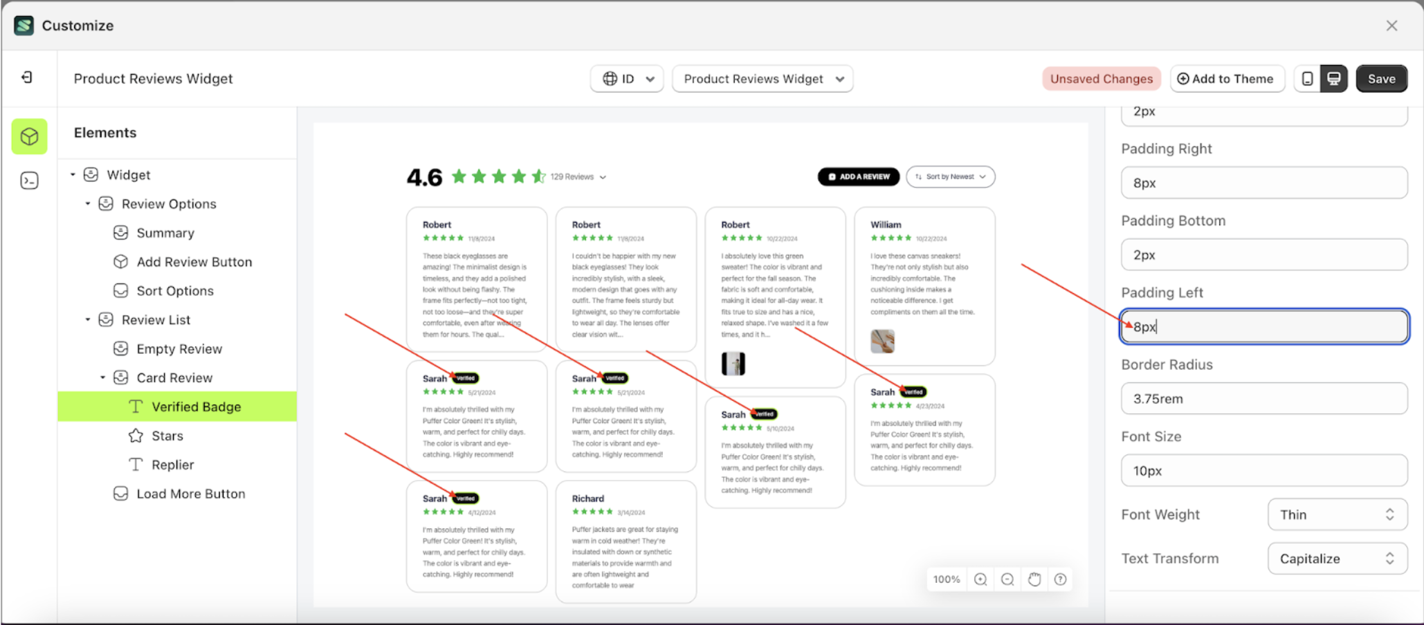
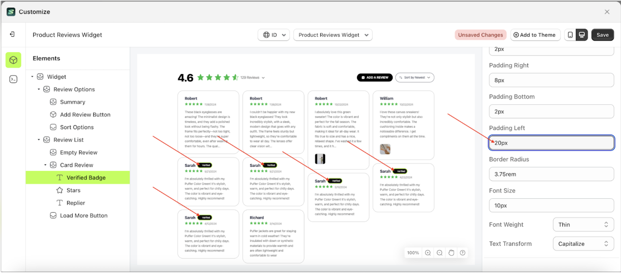
Padding Left Badge Setting
This feature is designed to customize the left padding of the badge setting
Follow the steps below:
- Select the Card Review element on the left, then click the icon marked with a red arrow to open the menu within that item.
- Once the menu is open, select the Verify Badge element on the left, then click the Settings tab and click the icon marked with a red arrow.
- On the right side, marked with a red arrow, you can change the padding left to your desired value.
- Note: The padding left format can be px, em, rem, %, or other units..
- For example, if you set the padding left to 20px
- The padding left of the Verify Badge element will adjust accordingly.
- Example : Before padding left change settings
- Example : After padding left change settings

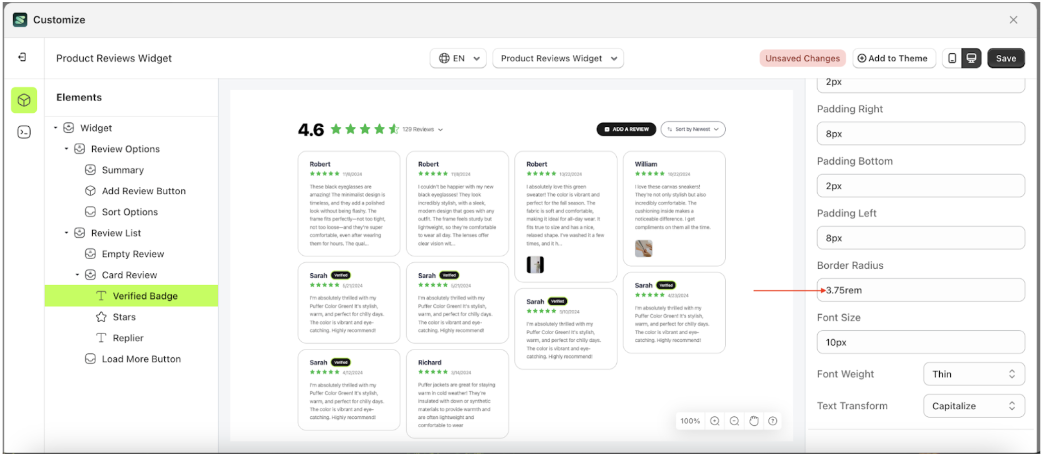
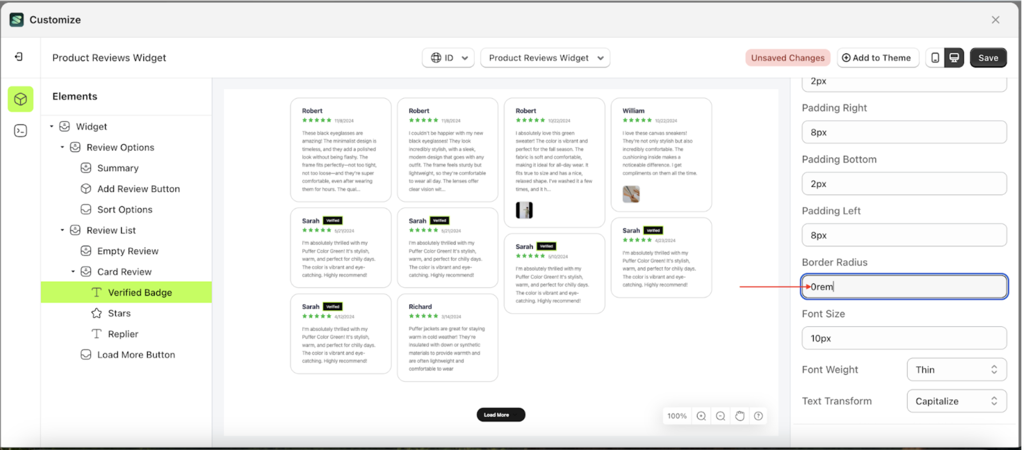
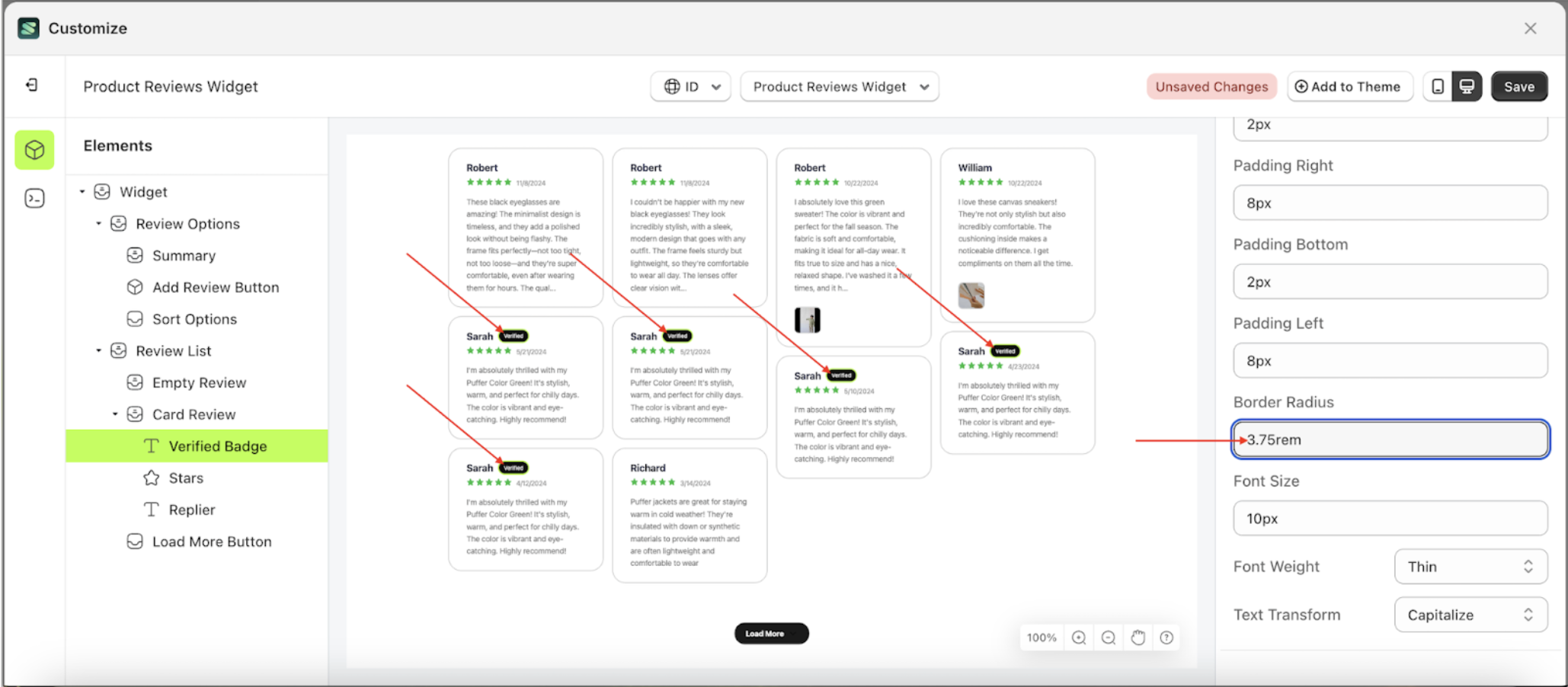
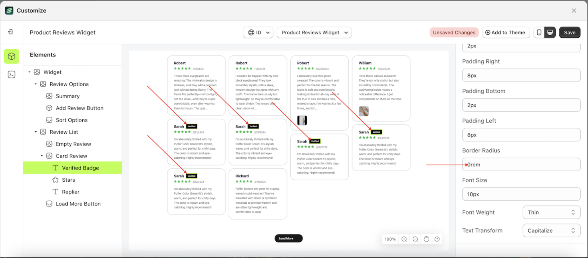
Border Radius Badge Setting
This feature is designed to customize the corner radius of the badge setting
Follow the steps below
- Select the Card Review element on the left, then click the icon marked with a red arrow to open the menu within that item.
- Once the menu is open, select the Verify Badge element on the left, then click the Settings tab and click the icon marked with a red arrow.
- On the right side, marked with a red arrow, you can change the border radius to your desired value.
- Note: The border radius format can be px, em, rem, %, or other units..
- For example, if you set the border radius to 0rem
- The border radius of the Verify Badge element will adjust accordingly.
- Example : Before border radius change settings
- Example : After border radius change settings
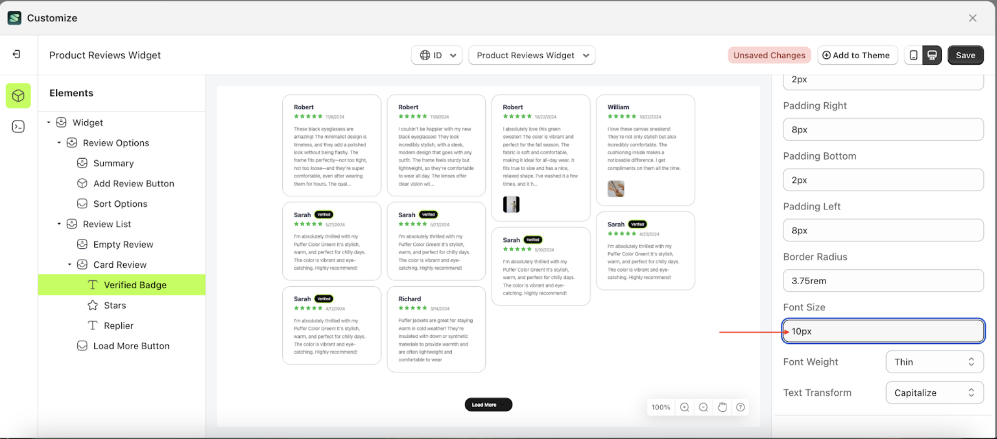
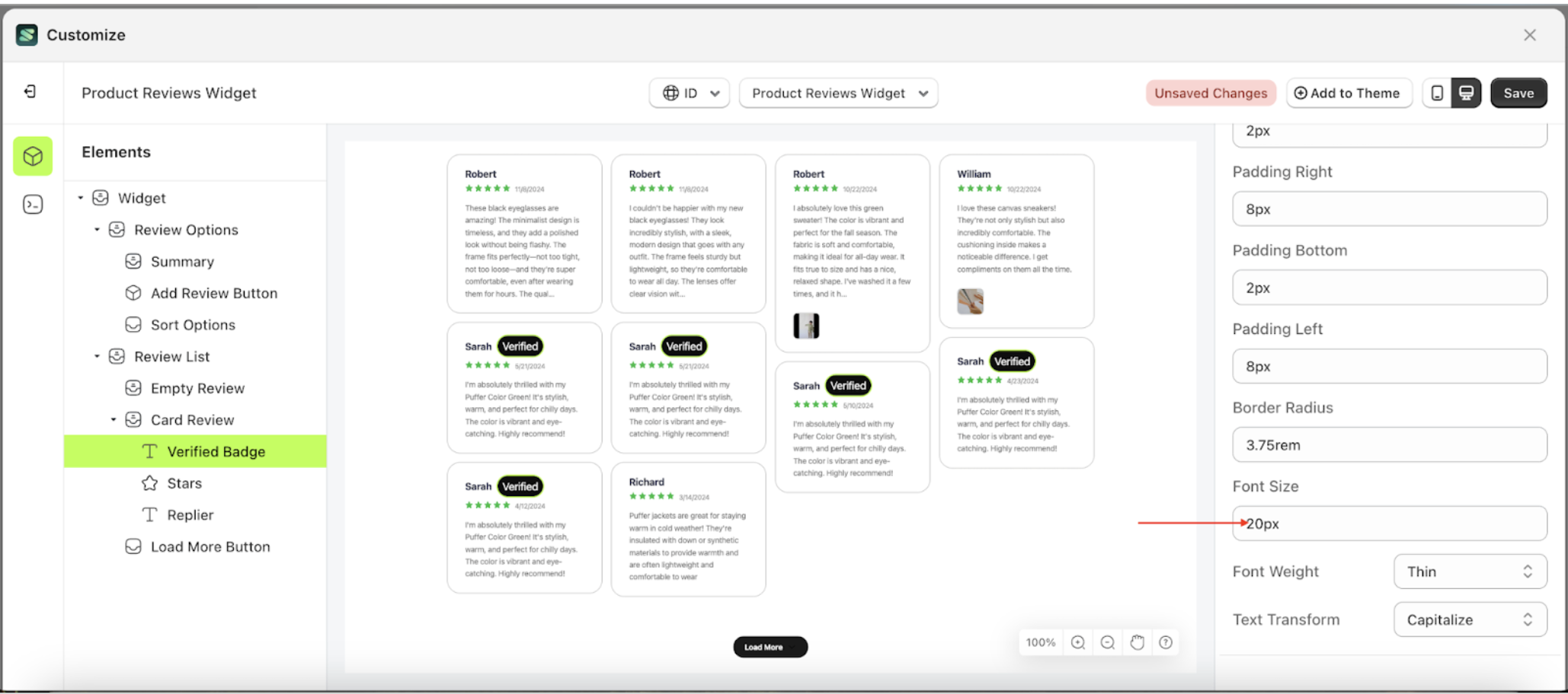
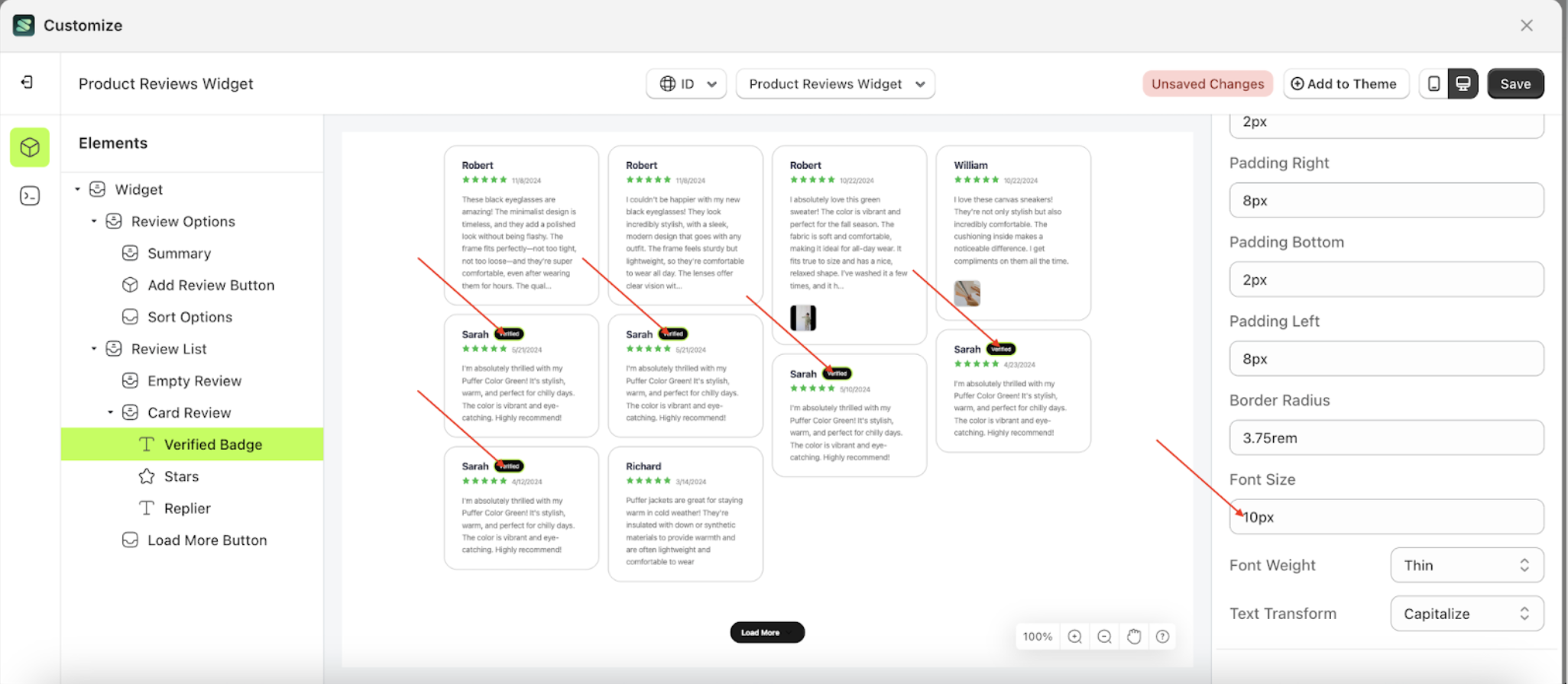
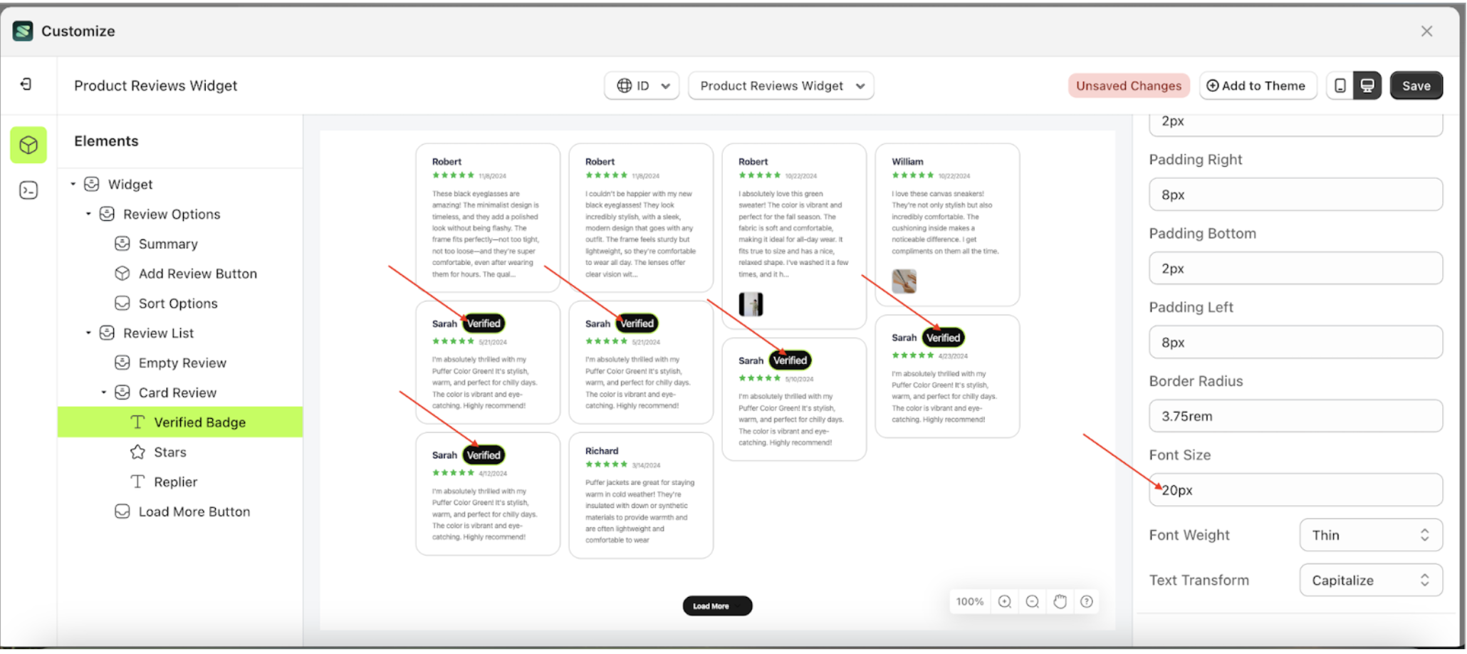
Font Size Badge Setting
This feature is designed to customize the text size of the badge setting
Follow the steps below
- Select the Card Review element on the left, then click the icon marked with a red arrow to open the menu within that item.
- Once the menu is open, select the Verify Badge element on the left, then click the Settings tab and click the icon marked with a red arrow.
- On the right side, marked with a red arrow, you can change the font size to your desired value.
- Note: The font size format can be px, em, rem, %, or other units..
- For example, if you set the font size to 20px
- The font size of the Verify Badge element will adjust accordingly.
- Example : Before font size change settings
- Example : After font size change settings


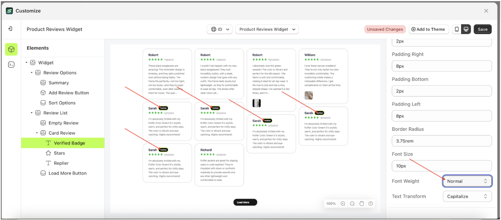
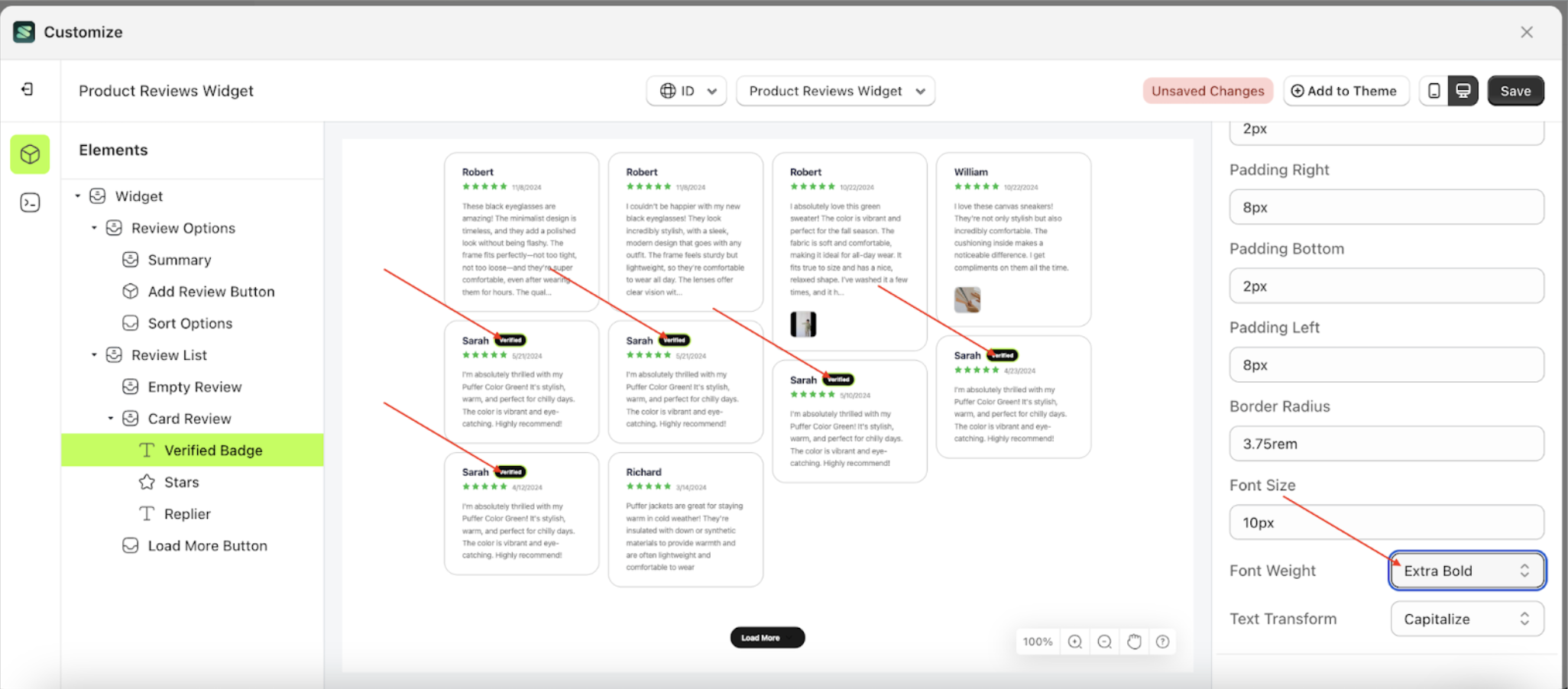
Font Weight Badge Setting
This feature is designed to customize the text weight of the badge setting
Follow the steps below
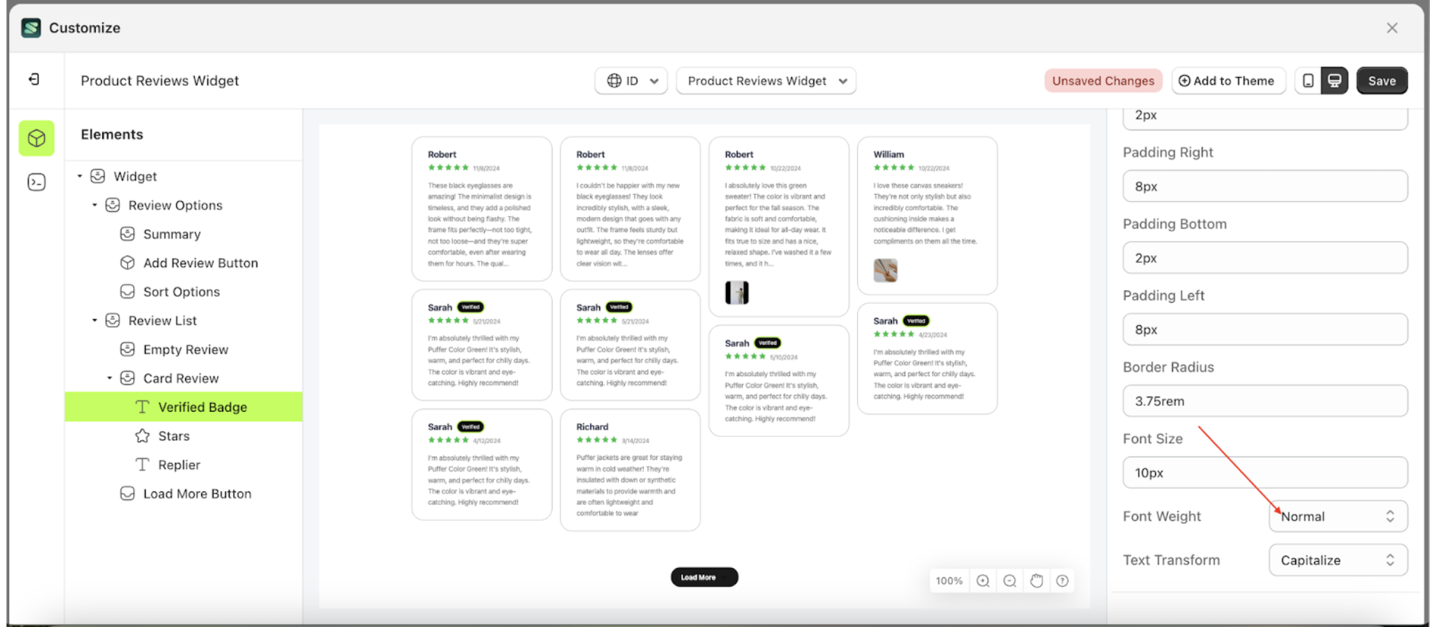
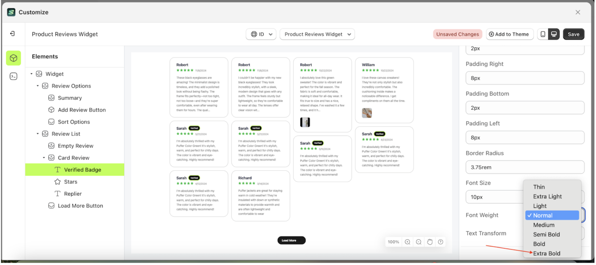
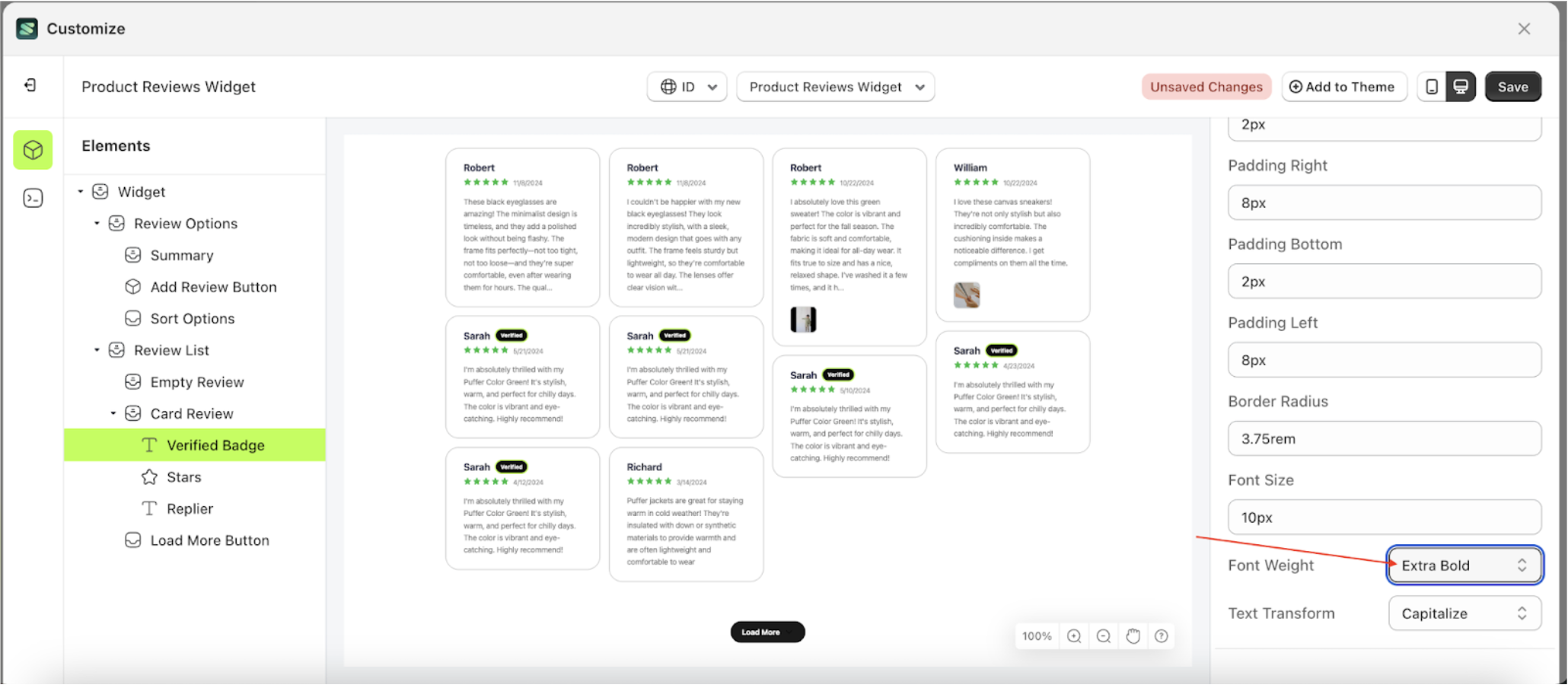
- Select the Card Review element on the left, then click the icon marked with a red arrow to open the menu within that item.
- Once the menu is open, select the Verify Badge element on the left, then click the Settings tab and click the icon marked with a red arrow.
- On the right side, marked with a red arrow, you can change the font weight to your desired value.
- Note: The font weight format can be Thin, Extra Light, Light, Normal or other units..
- Once the menu opens, select an option from the list
- For example, if you set the font weight to Extra Bold
- The font weight of the Verify Badge element will adjust accordingly.
- Example : Before font weight change settings
- Example : After font weight change settings
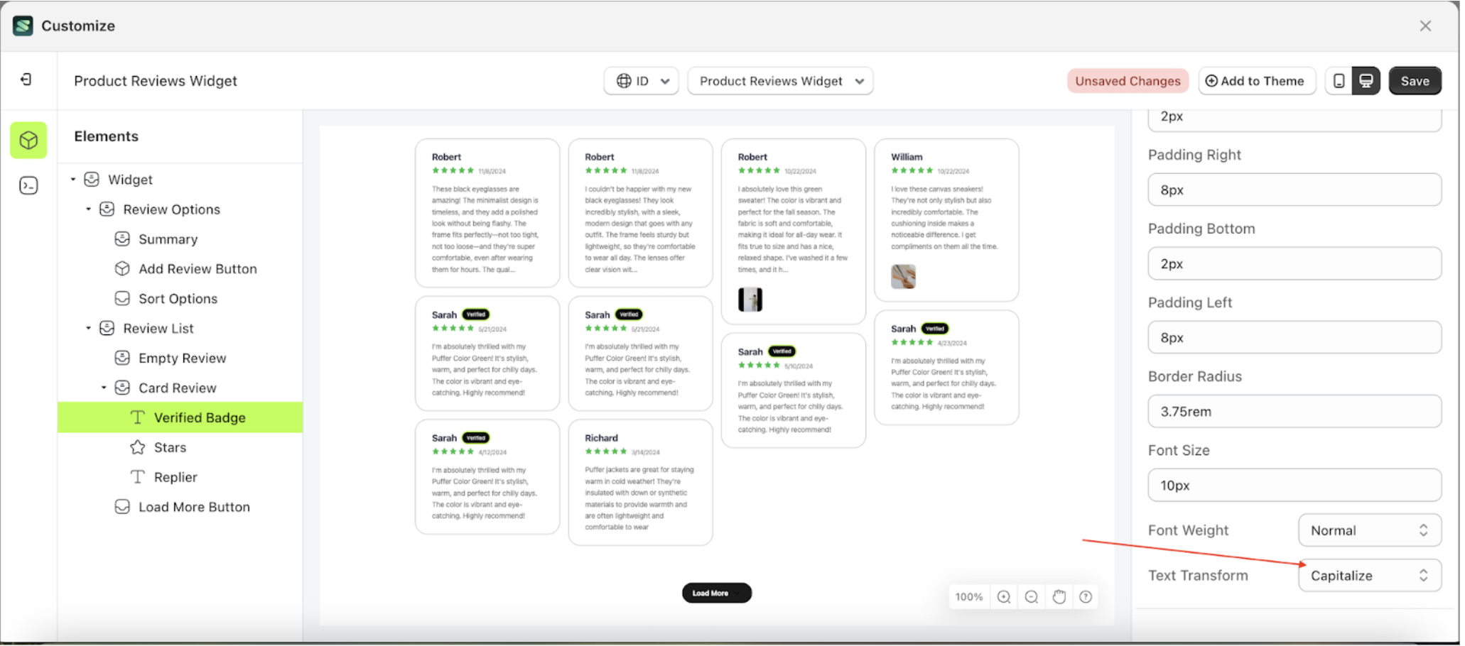
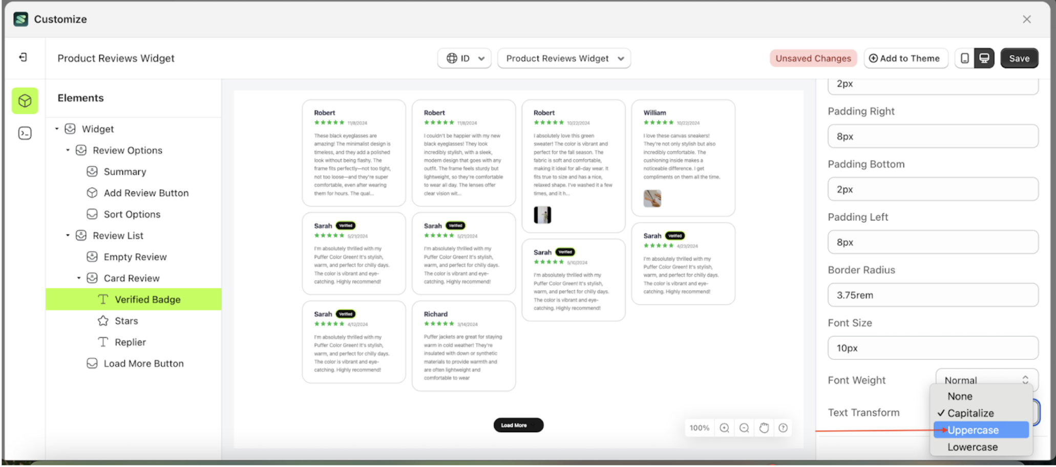
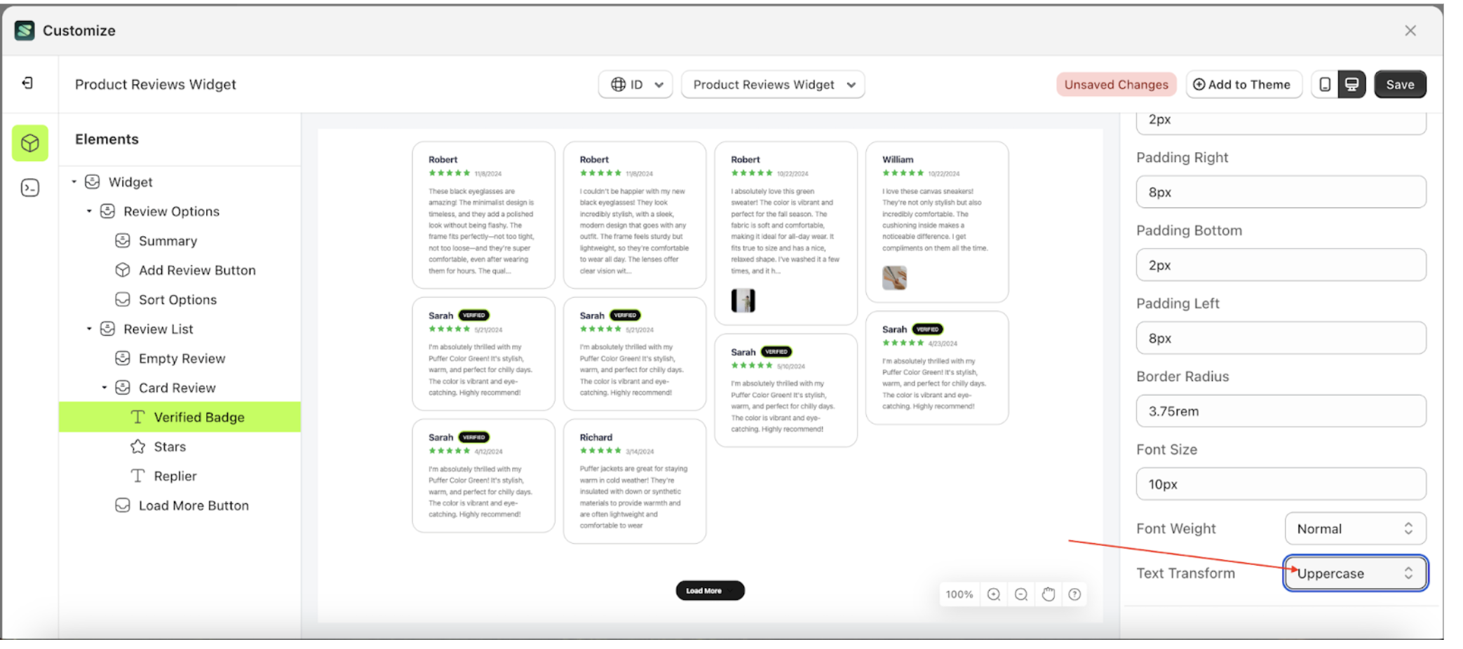
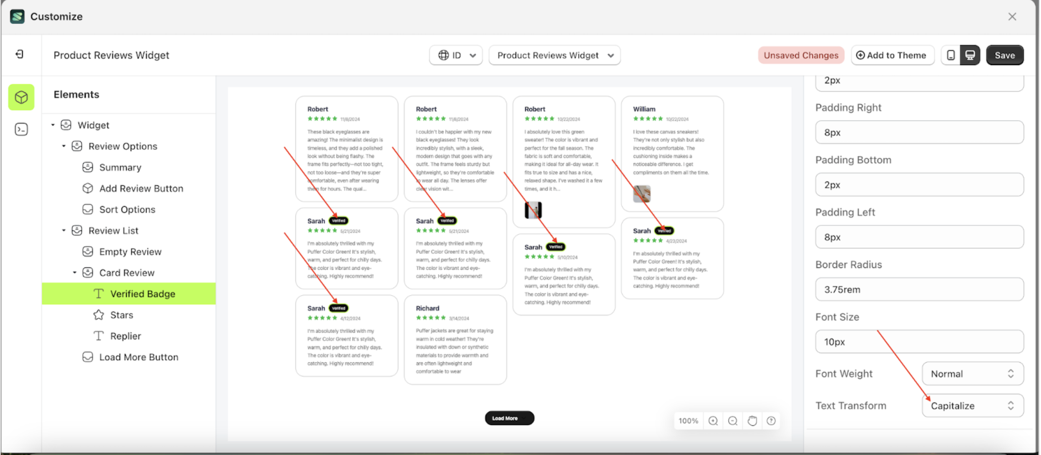
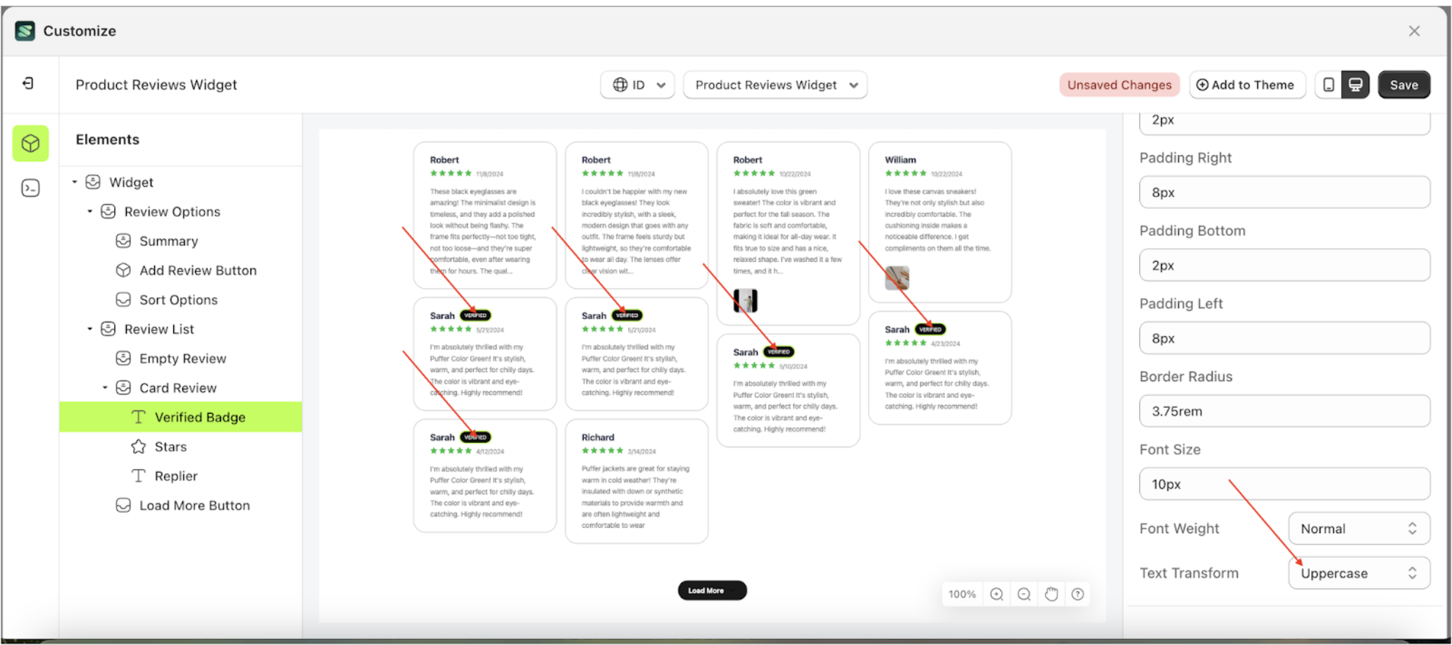
Text Transform Badge Setting
This feature allows you to adjust the capitalization style of the text
Follow the steps below
- Select the Card Review element on the left, then click the icon marked with a red arrow to open the menu within that item.
- Once the menu is open, select the Verify Badge element on the left, then click the Settings tab and click the icon marked with a red arrow.
- On the right side, marked with a red arrow, you can change the text transform to your desired value.
- Note: The text transform format can be Thin, Extra Light, Light, Normal or other units..
- Once the menu opens, select an option from the list
- For example, if you set the text transform to Uppercase
- The text transform of the Verify Badge element will adjust accordingly.
- Example : Before text transform change settings
- Example : After text transform change settings

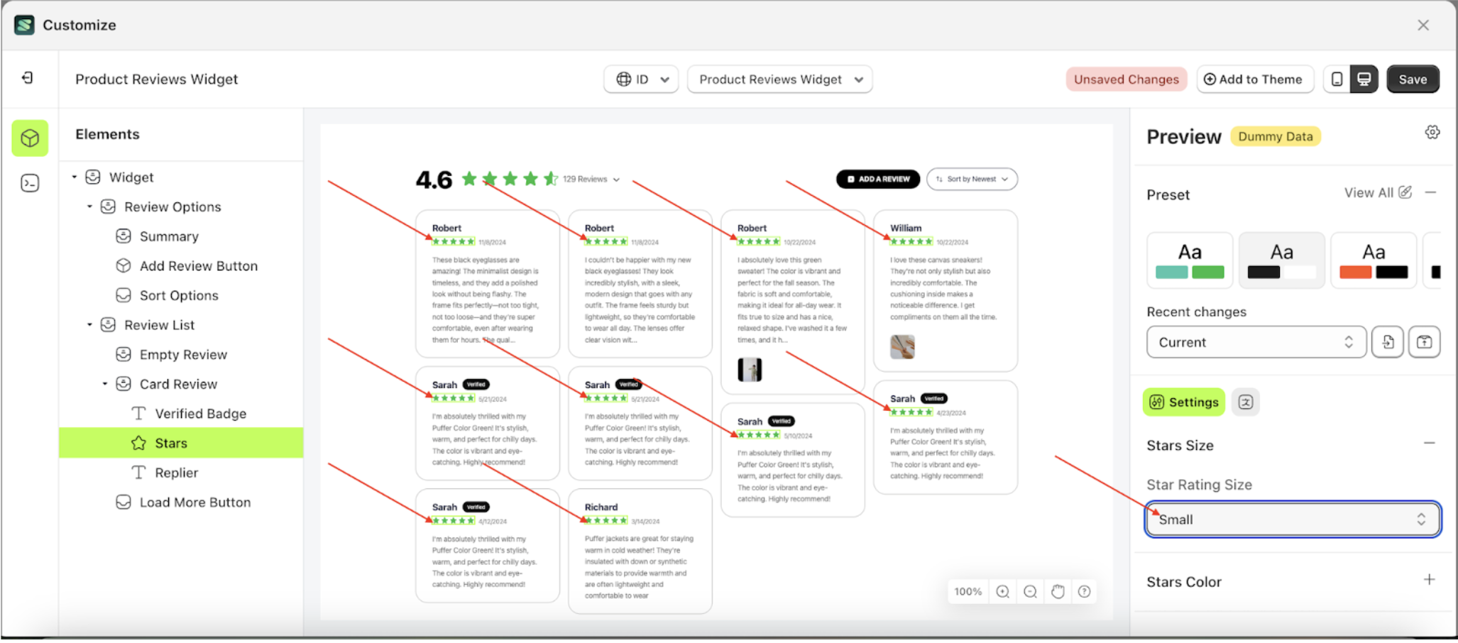
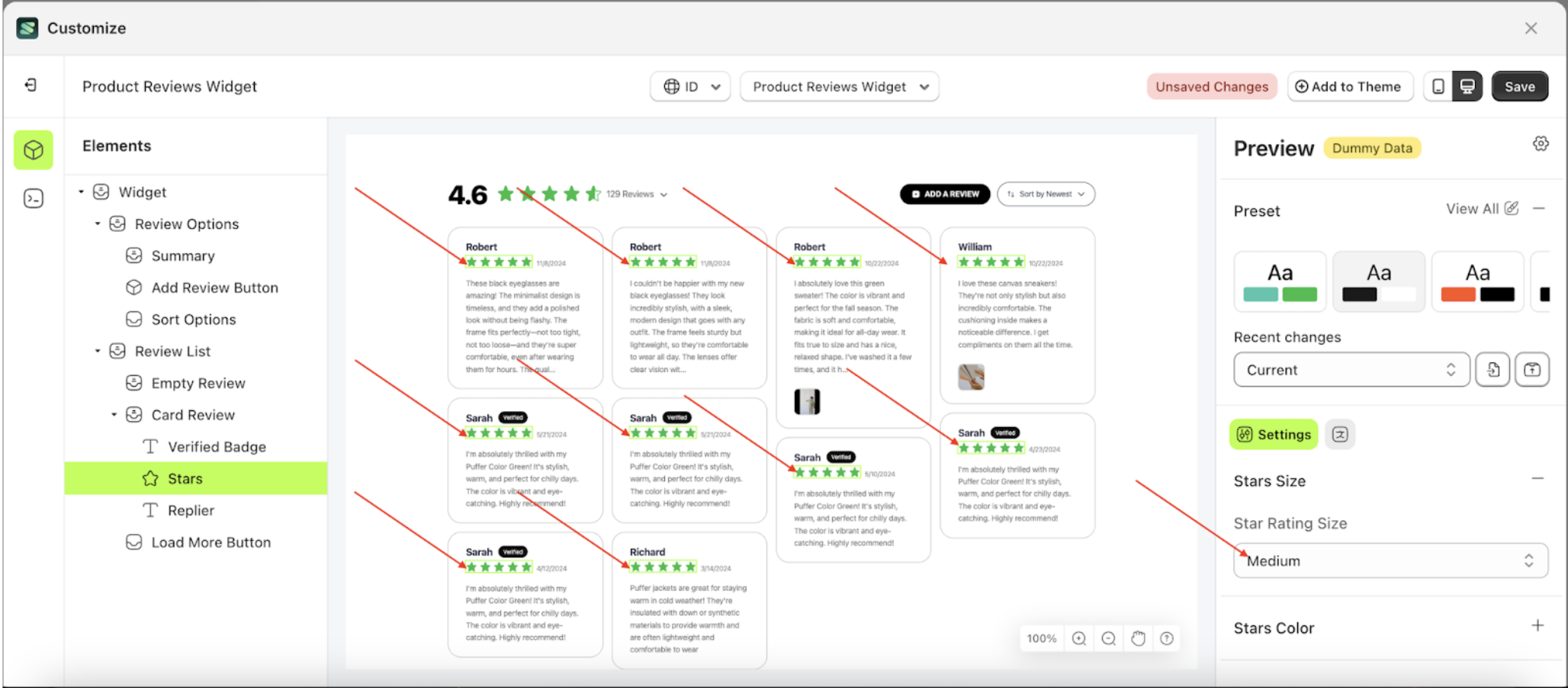
Stars Size
Available settings:
Stars Rating Size
This feature is designed to adjust the size of the star elements.
Follow the steps below
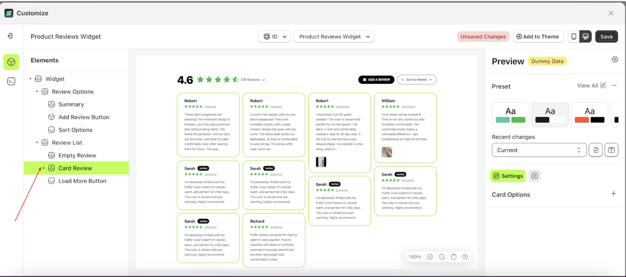
- Select the Card Review element, then click the icon marked with a red arrow to open the menu within that item
- Once the menu is open, select the Stars element on the left side, then click the icon on the right side, marked with a red arrow, to access the badges settings
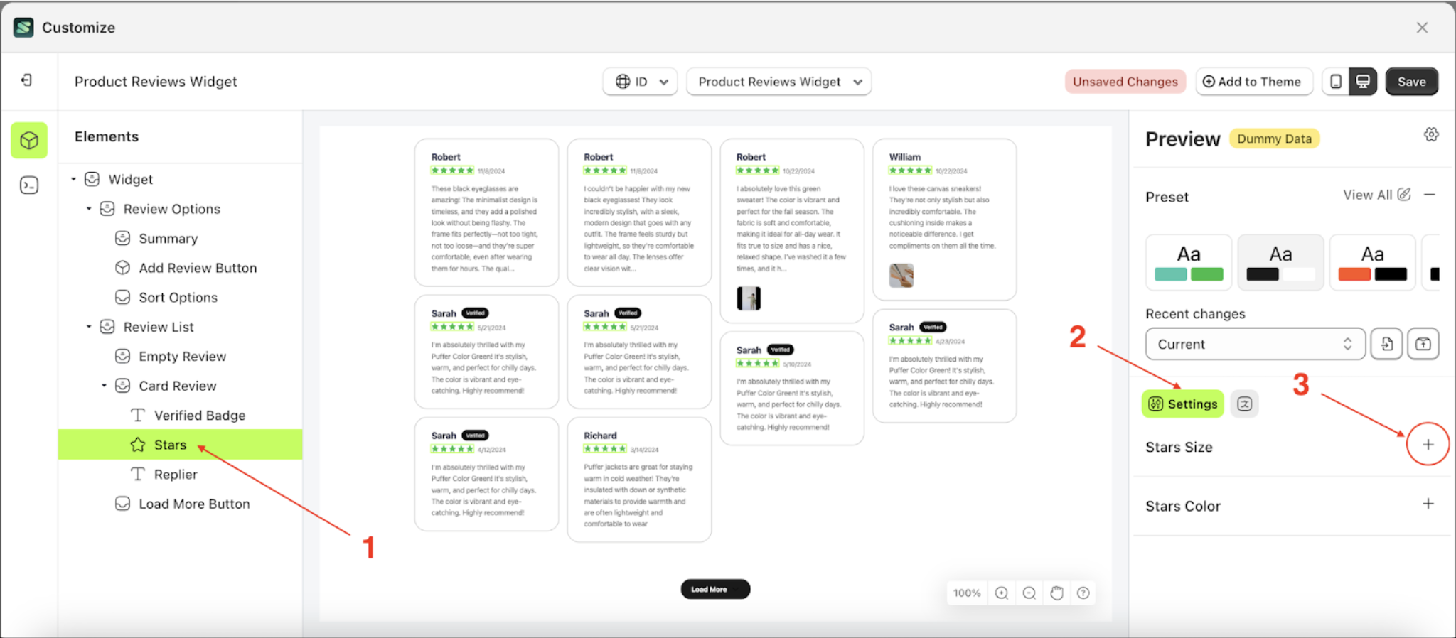
- On the right side, marked with a red arrow, you can adjust the star size as desired.
- Note: The available size options are: Small, Medium, and Large.
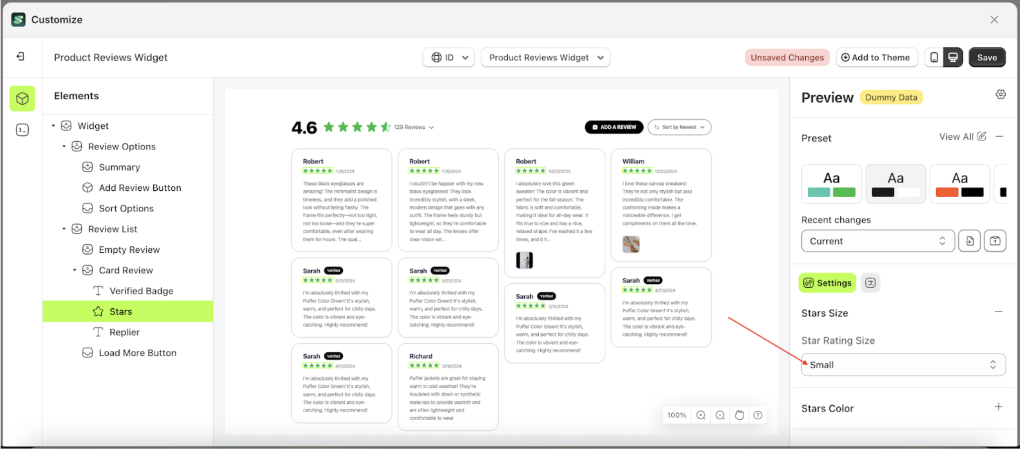
- Once the menu opens, select an option from the list
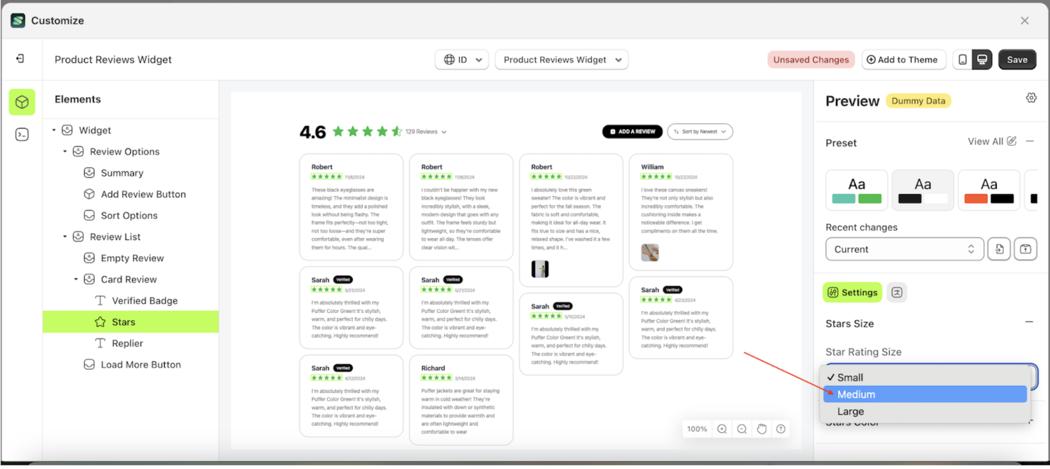
- For example, you can select the Medium size.
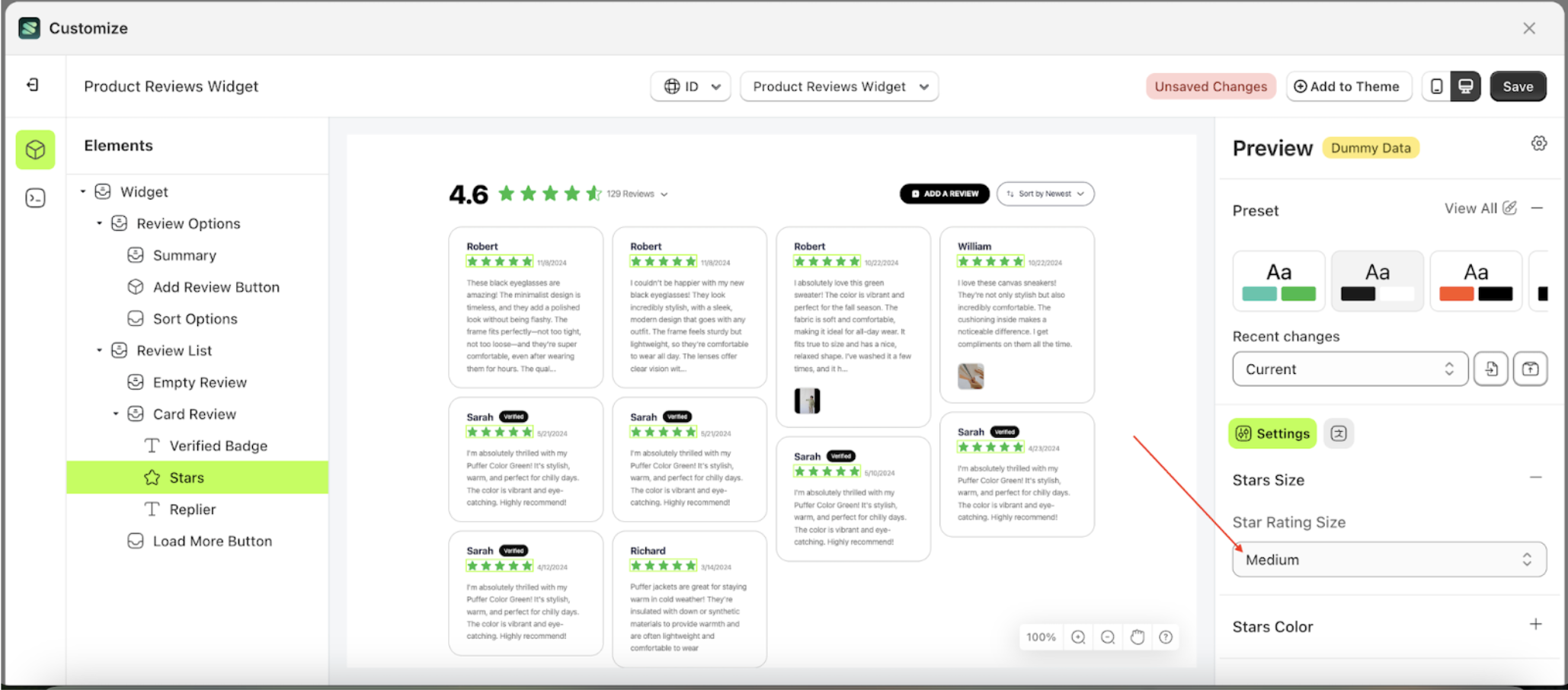
- The size of the star elements will be adjusted accordingly
- Example: Before adjusting the star element size settings
- Example: After adjusting the star element size settings
Stars Color
Available settings:
Fill Color Stars
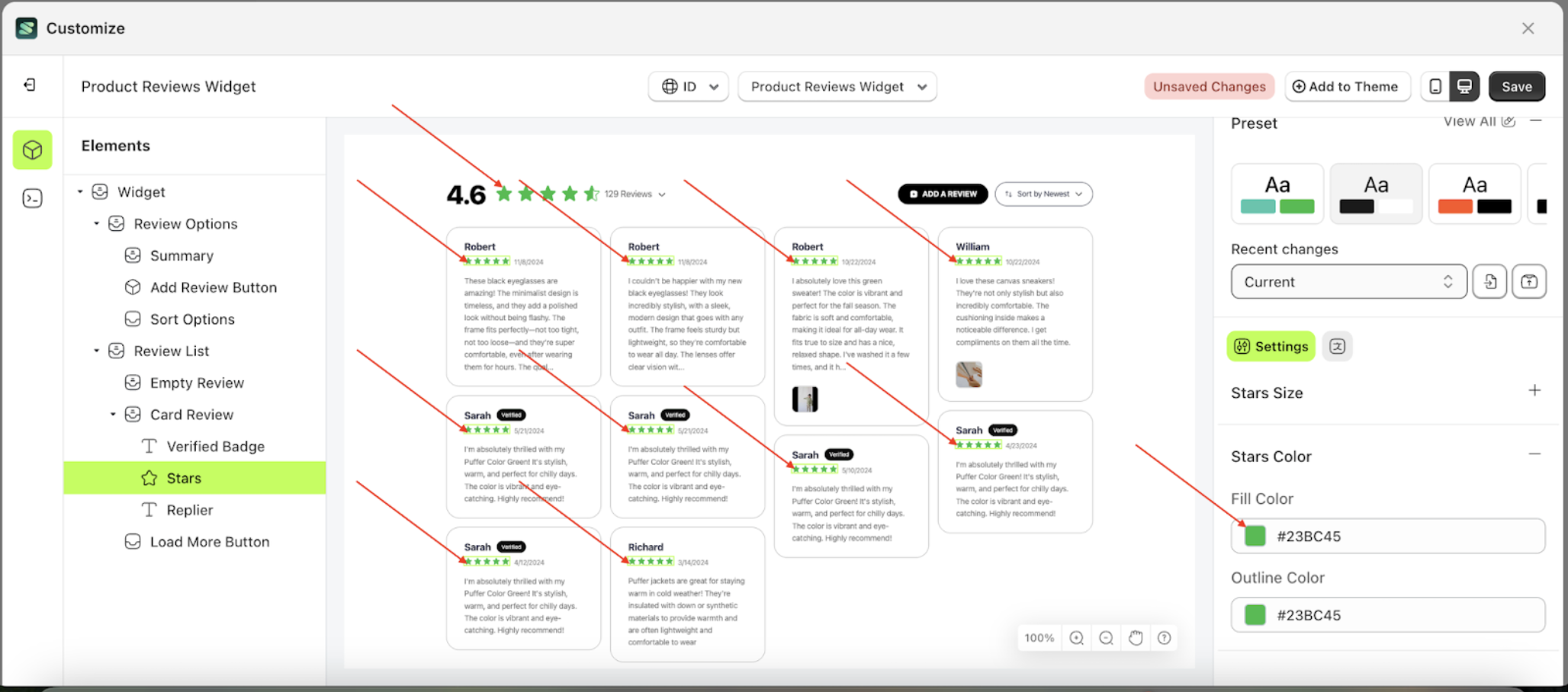
This feature is designed to manage the inner color of the stars.
Follow the steps below:
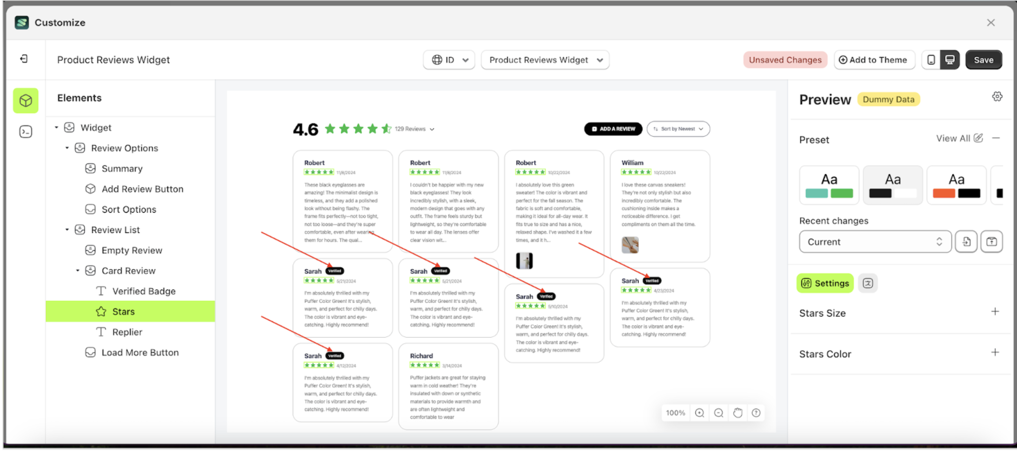
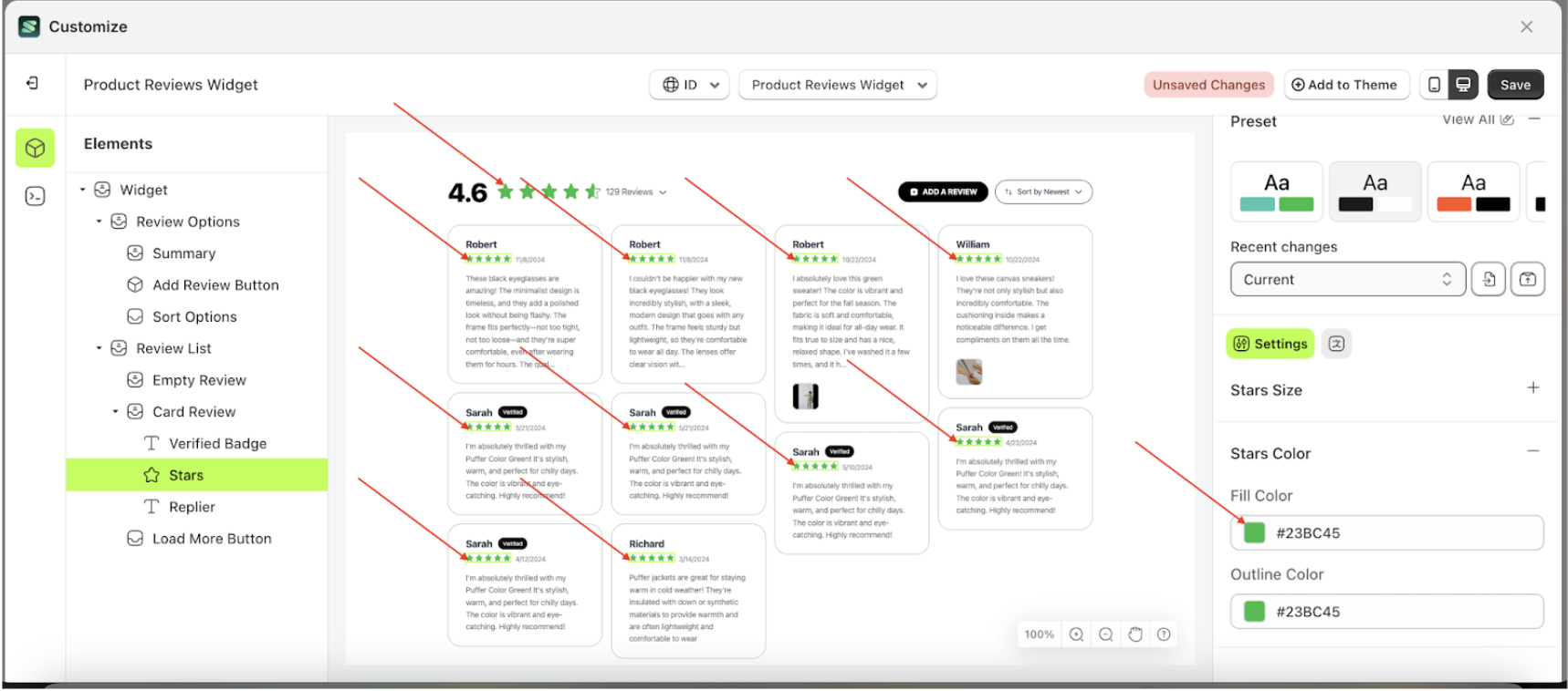
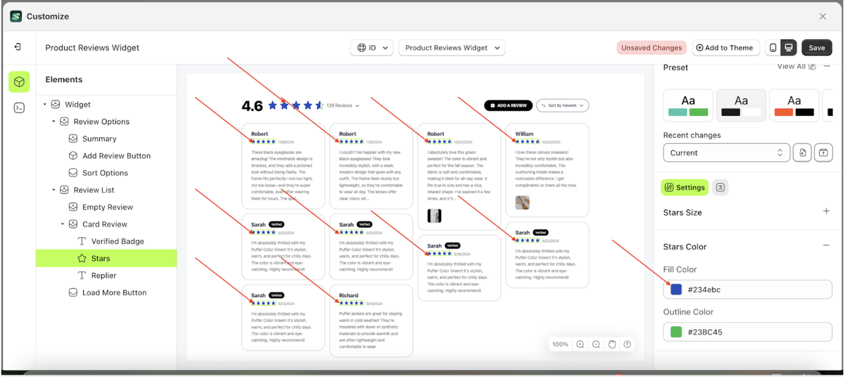
- Select the Card Review element, then click the icon marked with a red arrow to open the menu within that item
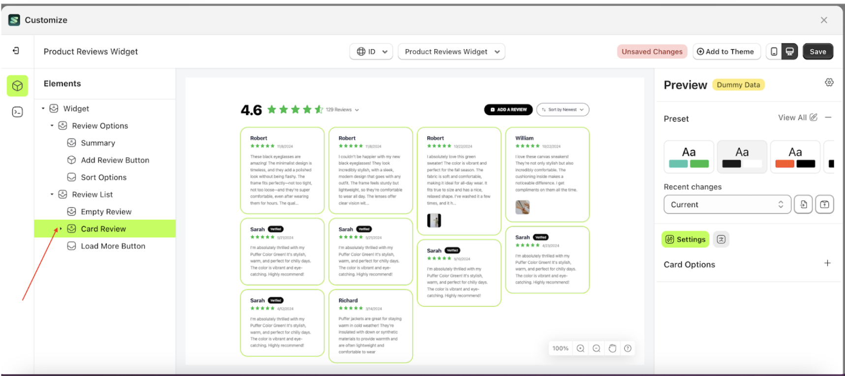
- Once the menu is open, select the Starts element on the left side, then click the icon on the right side, marked with a red arrow, to access the badges settings.
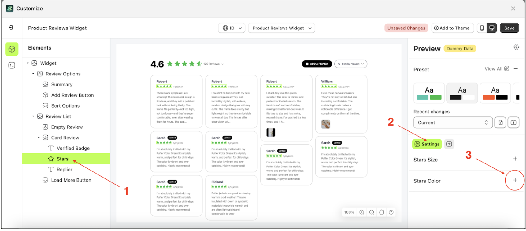
- Click the Color Palette on the right side, which is also marked with a red arrow.
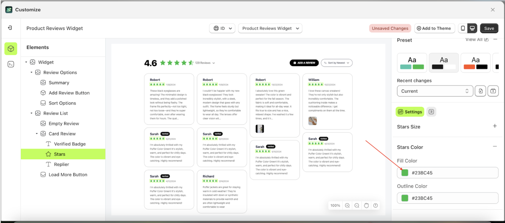
- The Color Palette will appear. Click the right side of the palette where the red arrow and number 1 are indicated, then click the right side again where the red arrow and number 2 are marked.
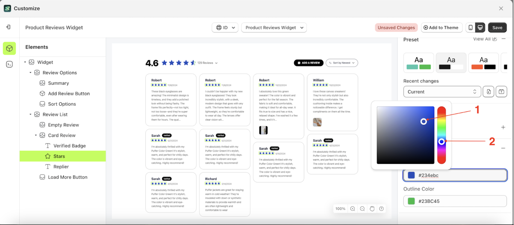
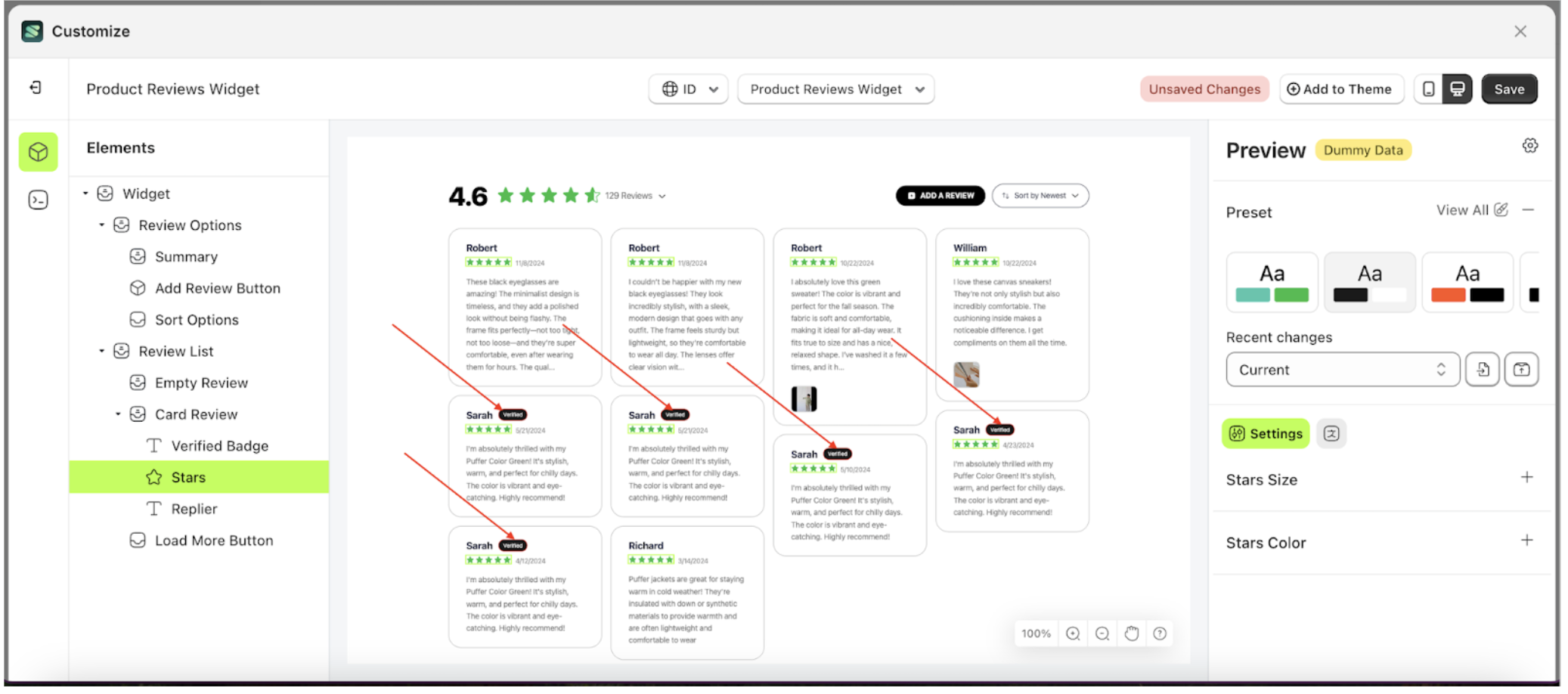
- The Fill Color of the Stars element will adjust accordingly.
- Example : Before Fill color change settings
- Example : After Fill color change settings
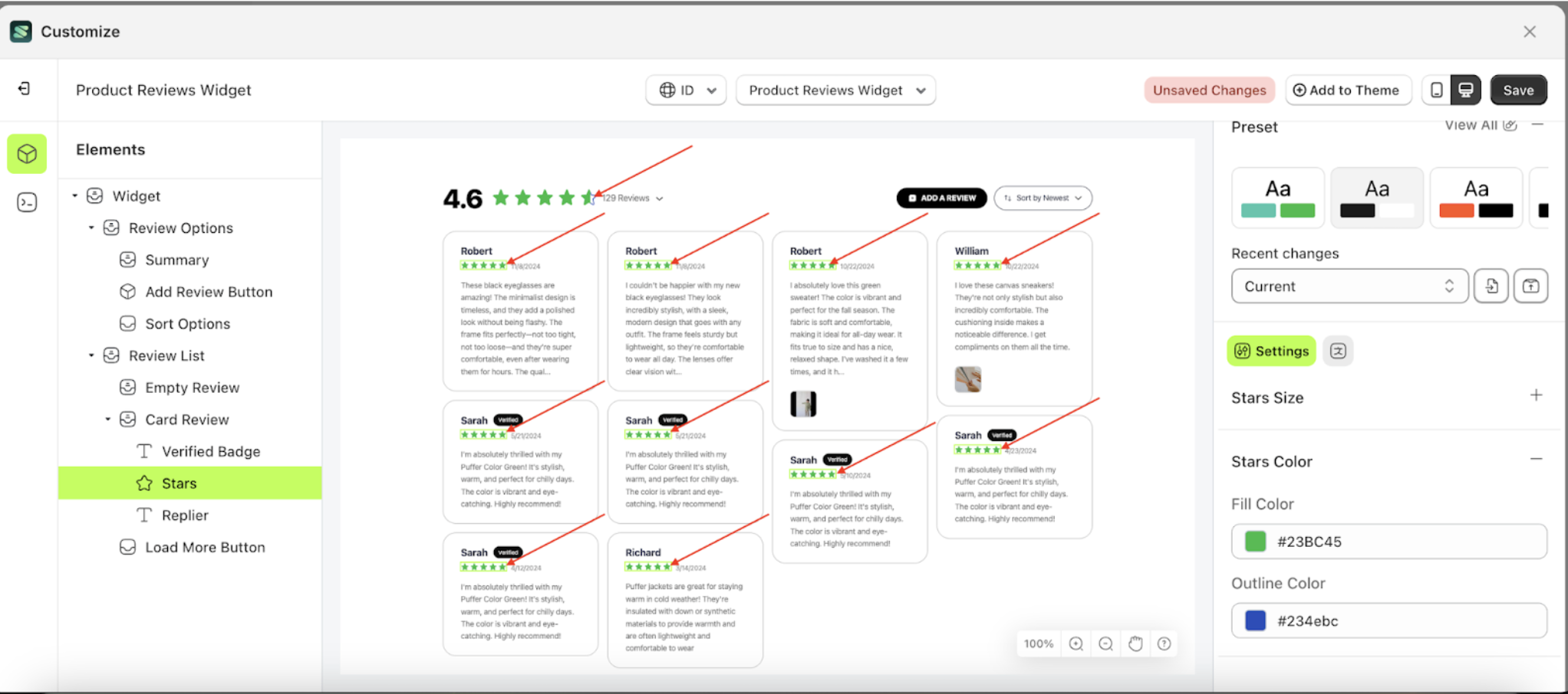
Outline Color Stars
This feature is designed to manage the outer color or border of the stars
Follow the steps below:
- Select the Card Review element, then click the icon marked with a red arrow to open the menu within that item
- Once the menu is open, select the Starts element on the left side, then click the icon on the right side, marked with a red arrow, to access the badges settings.
- Click the Color Palette on the right side, which is also marked with a red arrow.
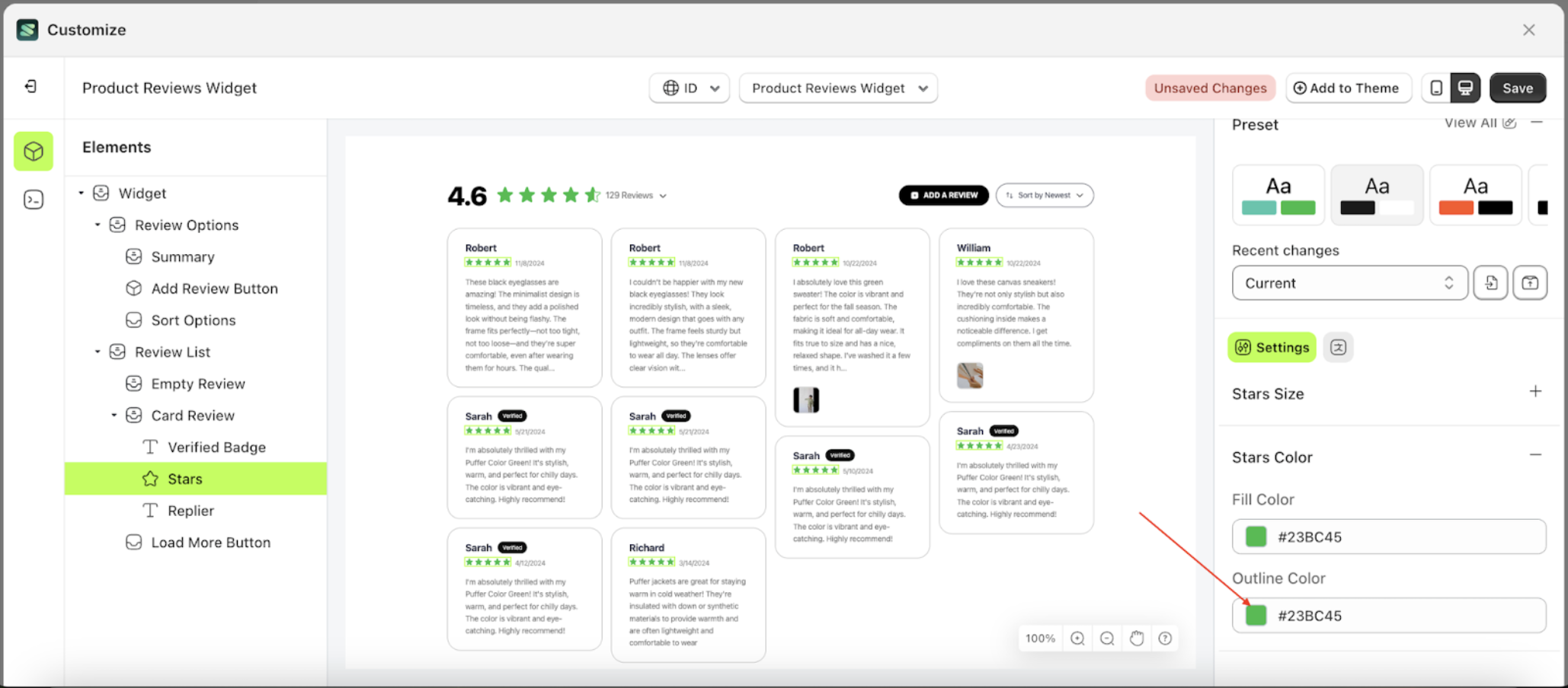
- The Color Palette will appear. Click the right side of the palette where the red arrow and number 1 are indicated, then click the right side again where the red arrow and number 2 are marked.
- The Outline Color of the Stars element will adjust accordingly.
- Example : Before Outline color change settings
- Example : After Outline color change settings
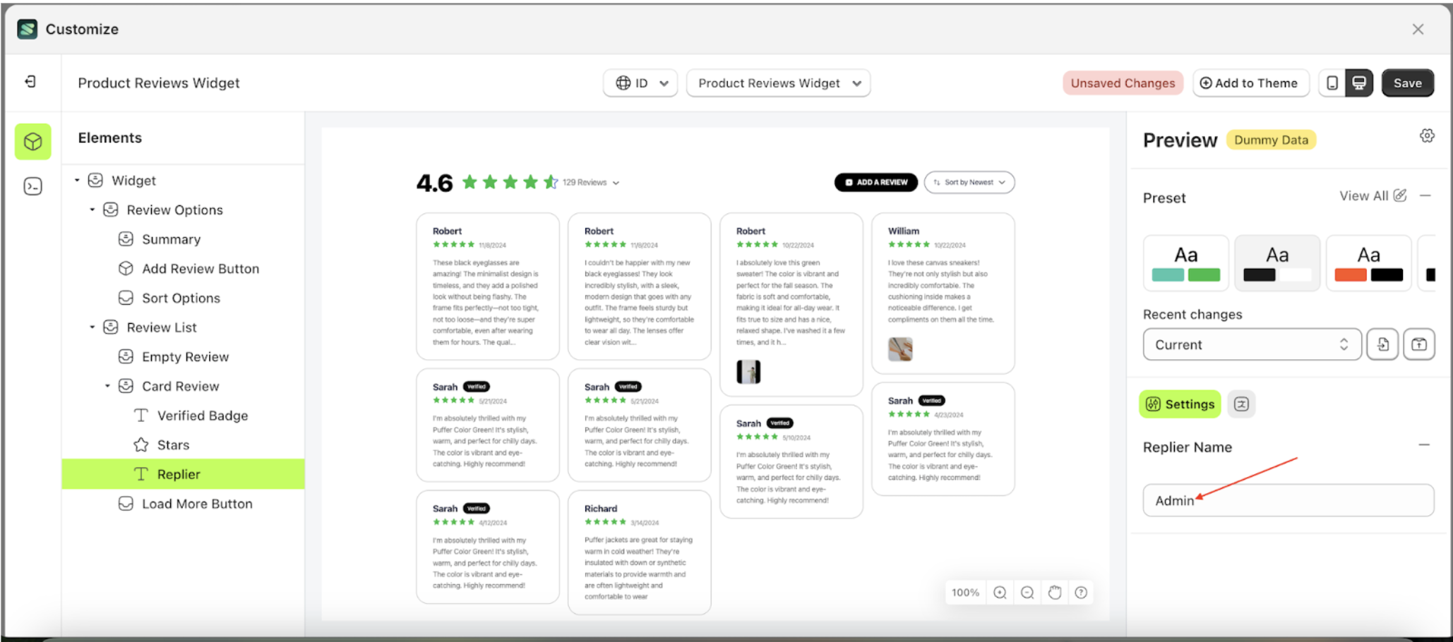
Replier name
This feature is designed to manage the responder's name information for the review author
- Select the Card Review element, then click the icon marked with a red arrow to open the menu within that item
- Once the menu is open, select the Replier element on the left side, then click the icon on the right side, marked with a red arrow, to access the badges settings.
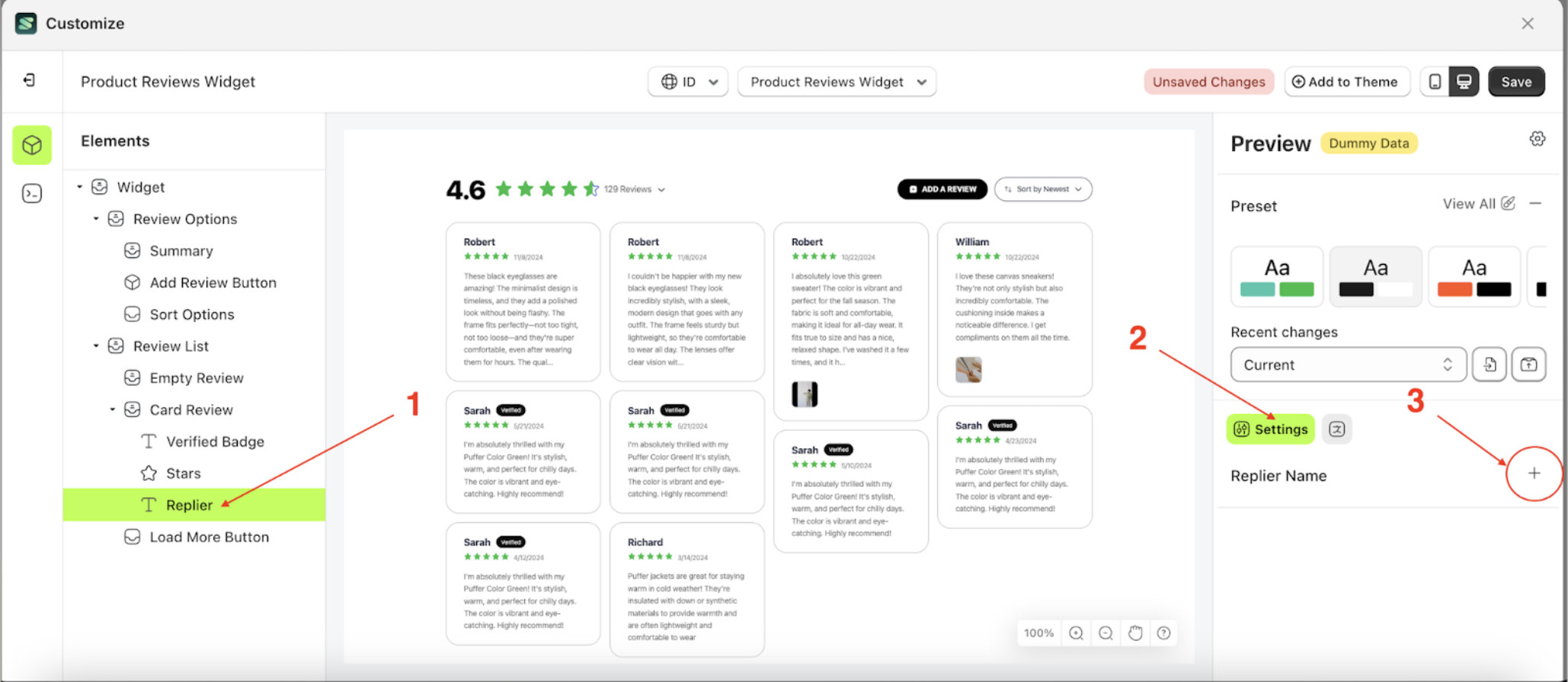
- Change the replier's name to your desired name.
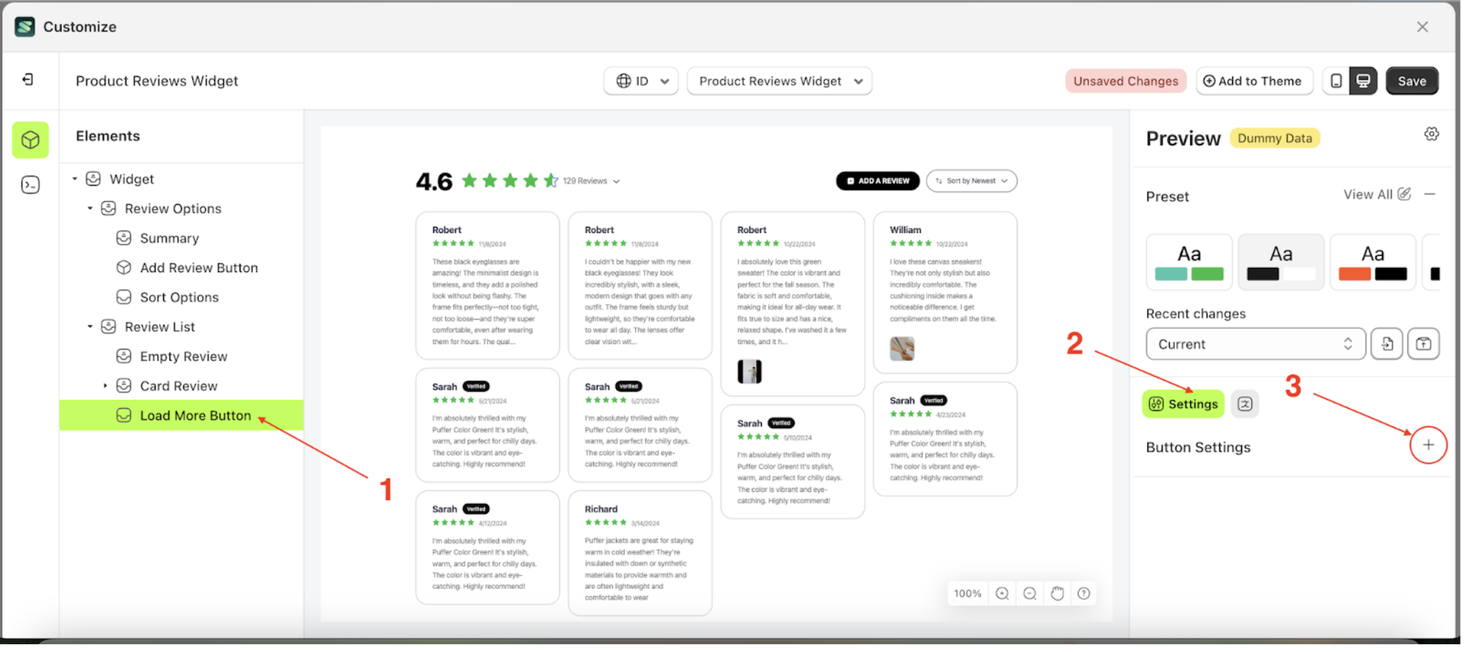
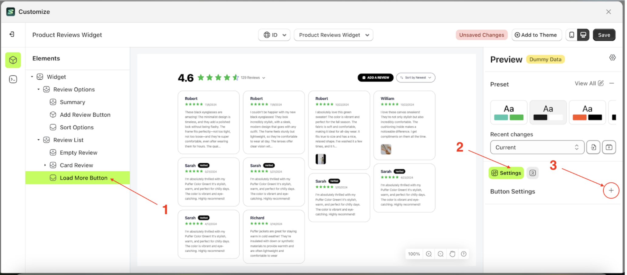
Badge Settings Load More
Available settings:
Button Color Load MoreText Color Load MoreOutline Color Load MorePadding Top Load MorePadding Right Load MorePadding Bottom Load MorePadding Left Load MoreBorder Radius Load MoreFont Size Load MoreFont Weight Load MoreText Transform Load More
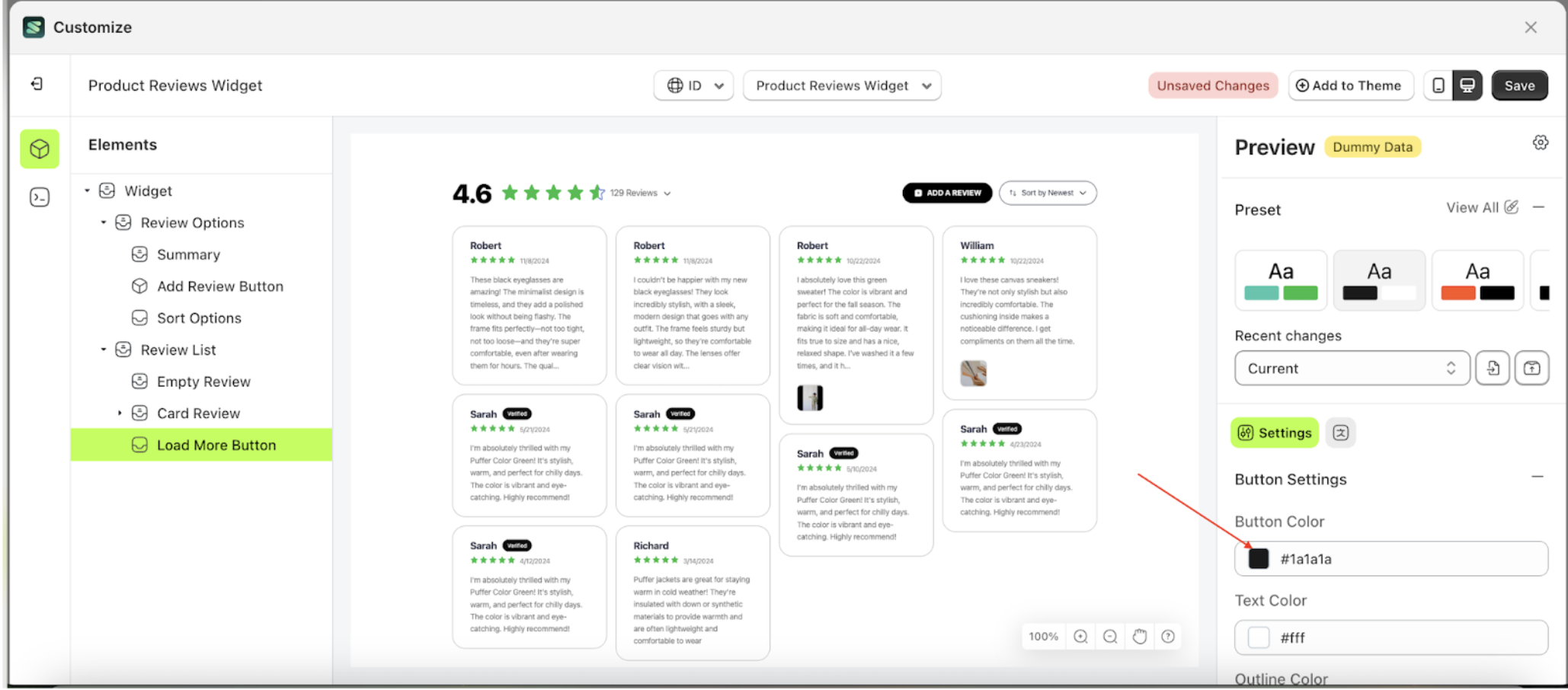
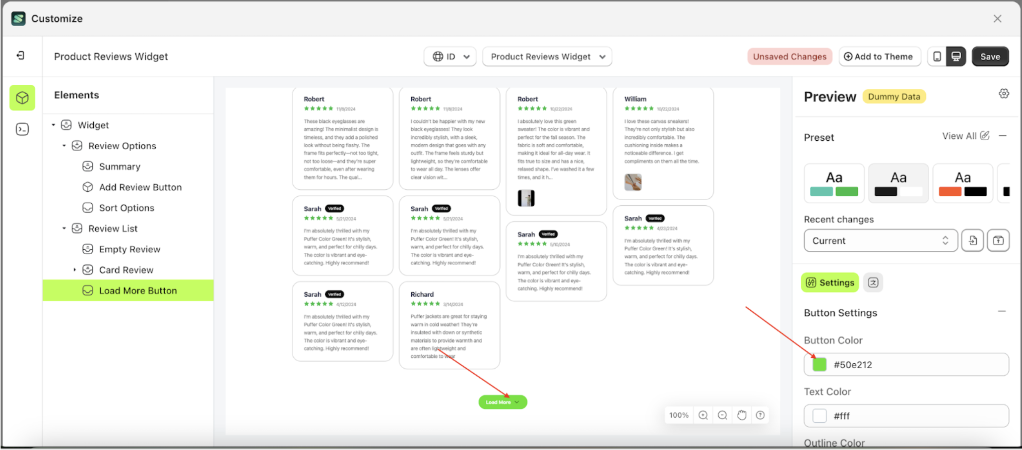
Button Color Load More
This feature is designed to customize the button color of the button settings
Follow the steps below:
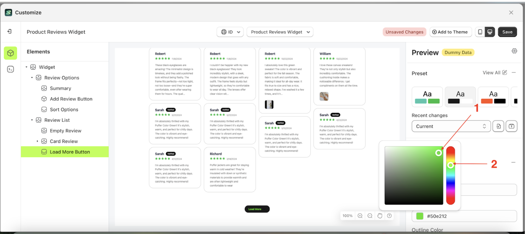
- Select the Load More Button element on the left, then click the Settings tab and click the icon marked with a red arrow.
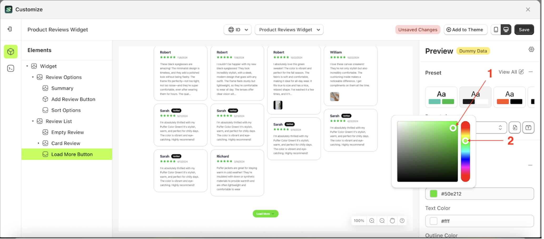
- Click the Color Palette on the right side, which is also marked with a red arrow.
- The Color Palette will appear. Click the right side of the palette where the red arrow and number 1 are indicated, then click the right side again where the red arrow and number 2 are marked.
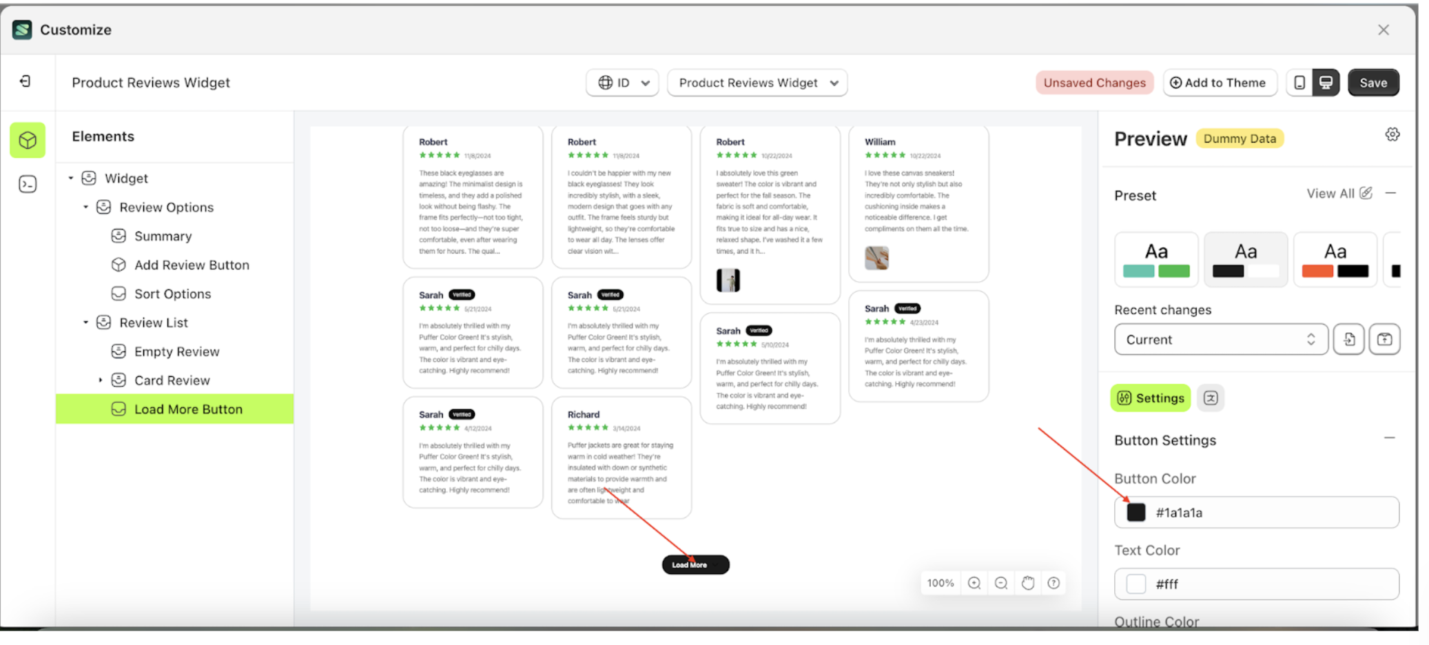
- The product review widget of the Load More Button element will adjust accordingly.
- Example : Before Load More Button change settings
- Example : After Load More Button change settings

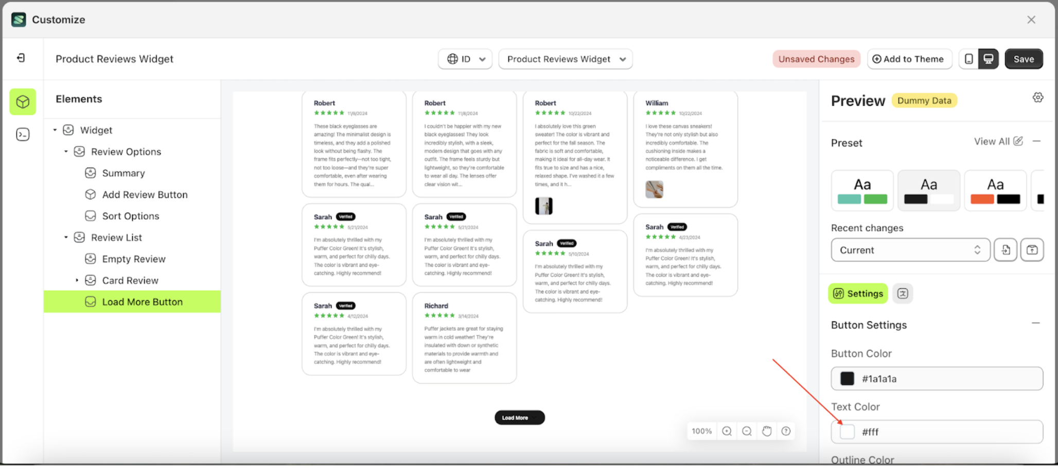
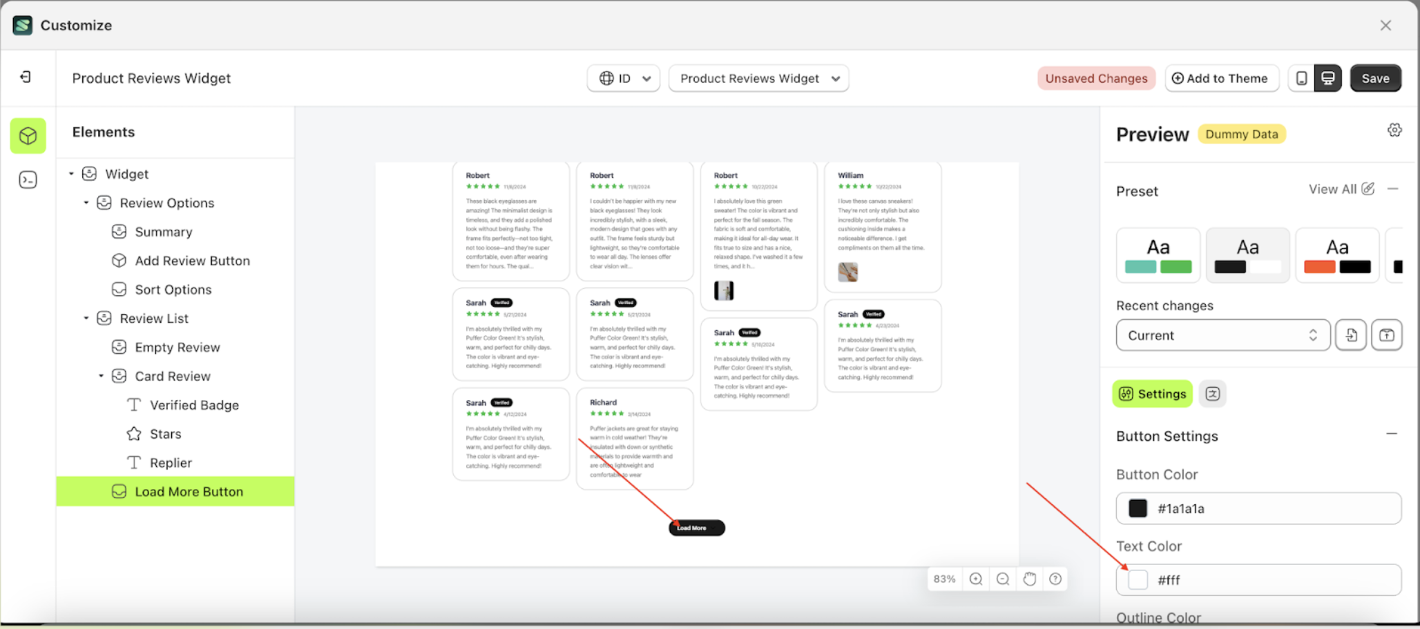
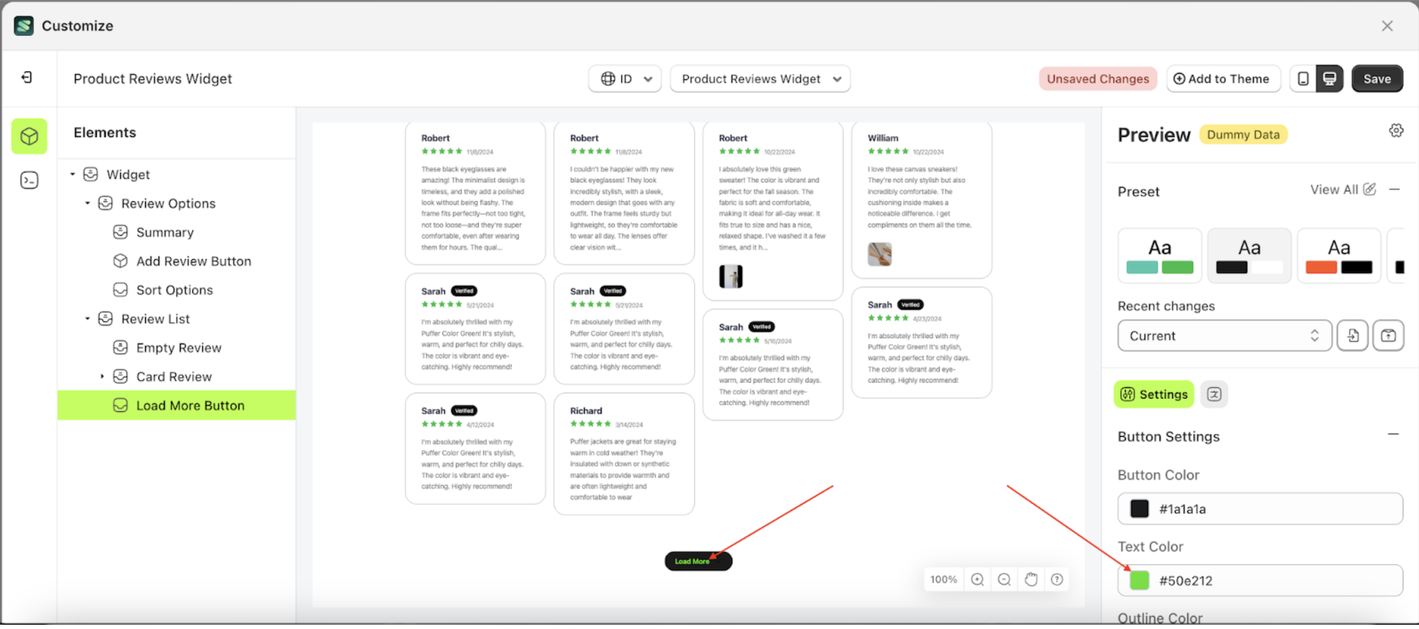
Text Color Load More
This feature is designed to customize the text color of the button settings
Follow the steps below:
- Select the Load More Button element on the left, then click the Settings tab and click the icon marked with a red arrow.
- Click the Color Palette on the right side, which is also marked with a red arrow.
- The Color Palette will appear. Click the right side of the palette where the red arrow and number 1 are indicated, then click the right side again where the red arrow and number 2 are marked.
- The product review widget of the Load More Button element will adjust accordingly.
- Example : Before Load More Button change settings
- Example : After Load More Button change settings
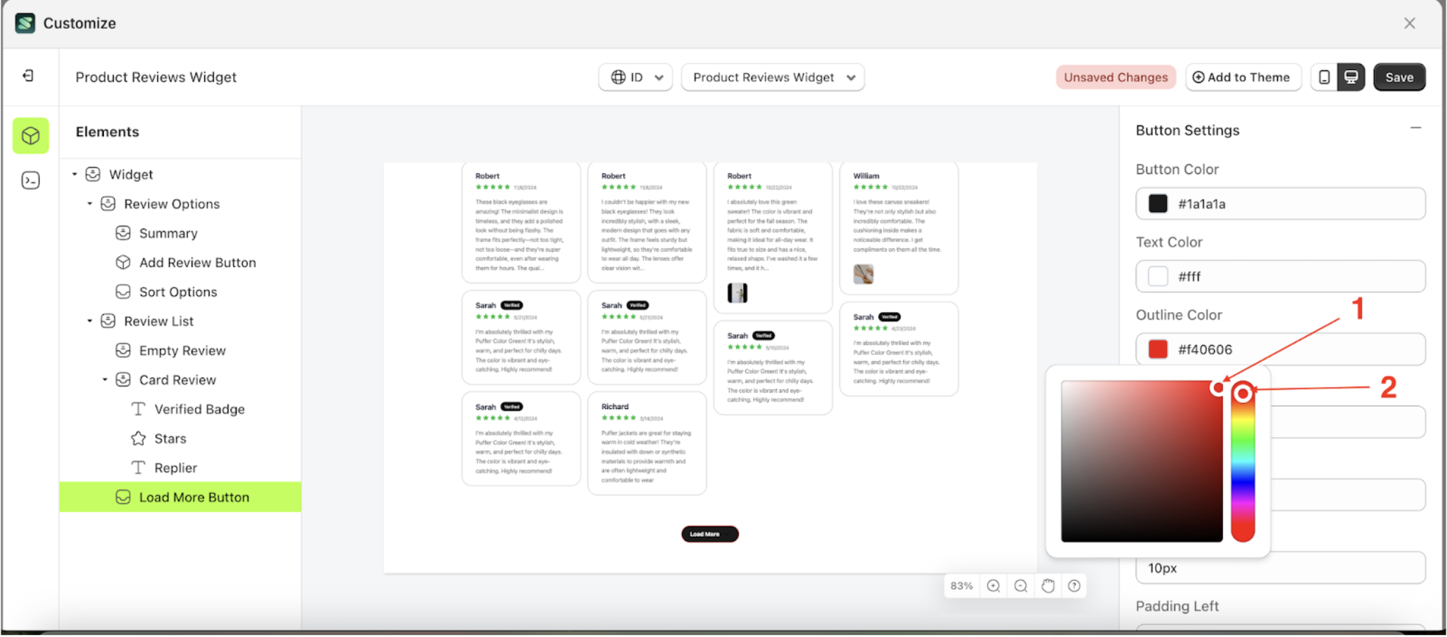
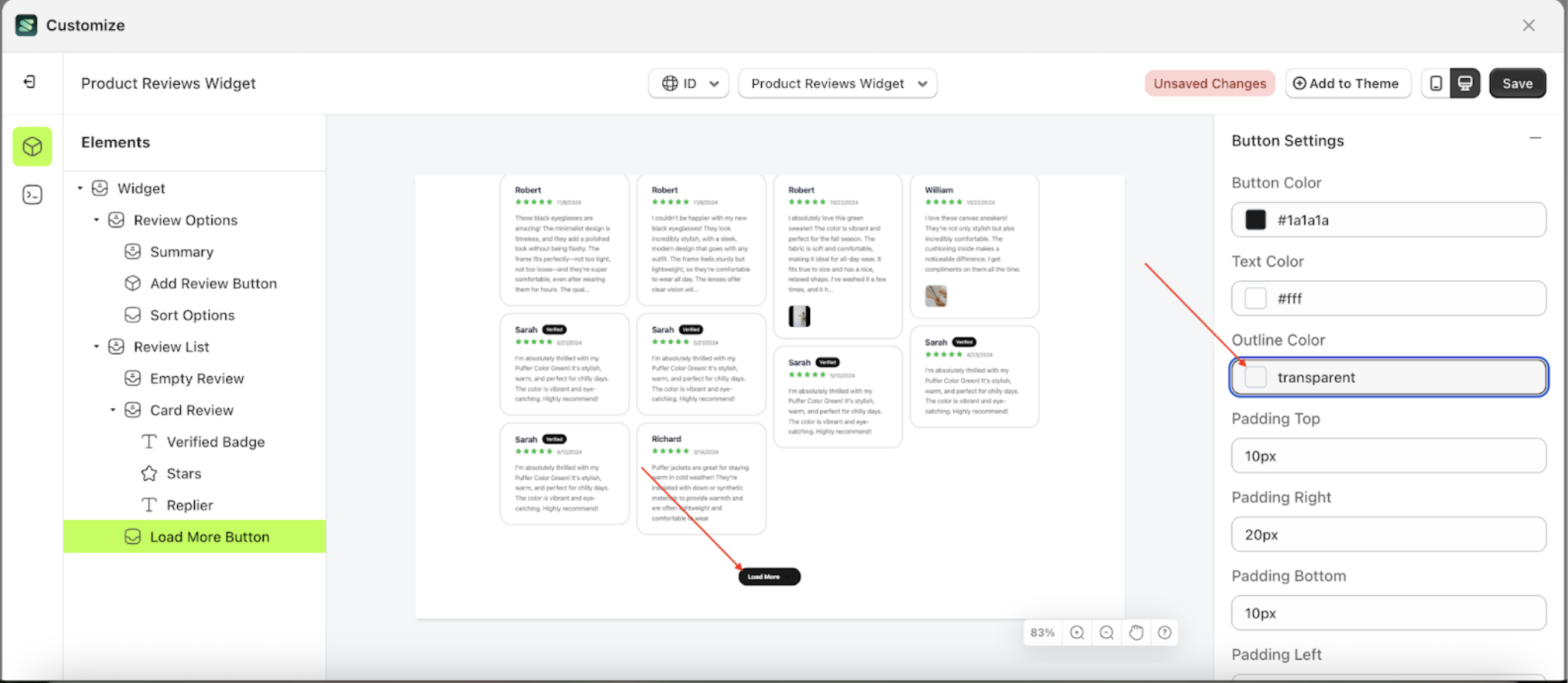
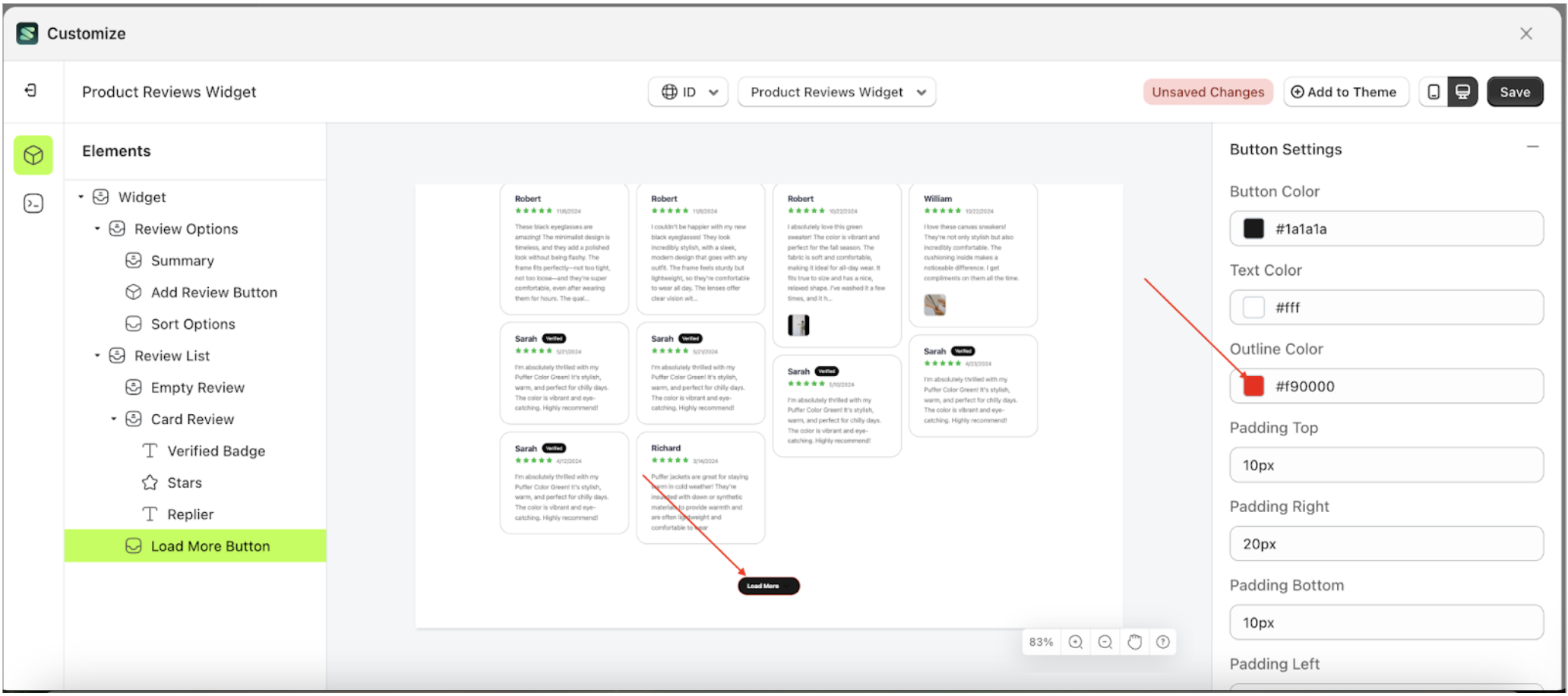
Outline Color Load More
This feature is designed to customize the outline color of the button settings
Follow the steps below:
- Select the Load More Button element on the left, then click the Settings tab and click the icon marked with a red arrow.
- Click the Color Palette on the right side, which is also marked with a red arrow.
- The Color Palette will appear. Click the right side of the palette where the red arrow and number 1 are indicated, then click the right side again where the red arrow and number 2 are marked.
- The product review widget of the Load More Button element will adjust accordingly.
- Example : Before Load More Button change settings
- Example : After Load More Button change settings
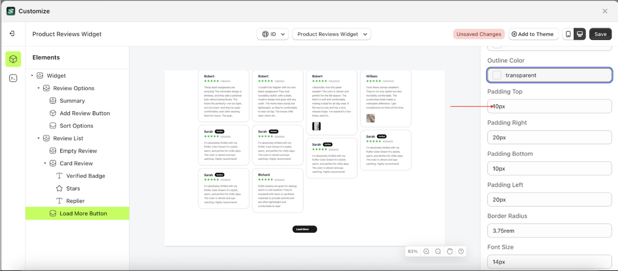
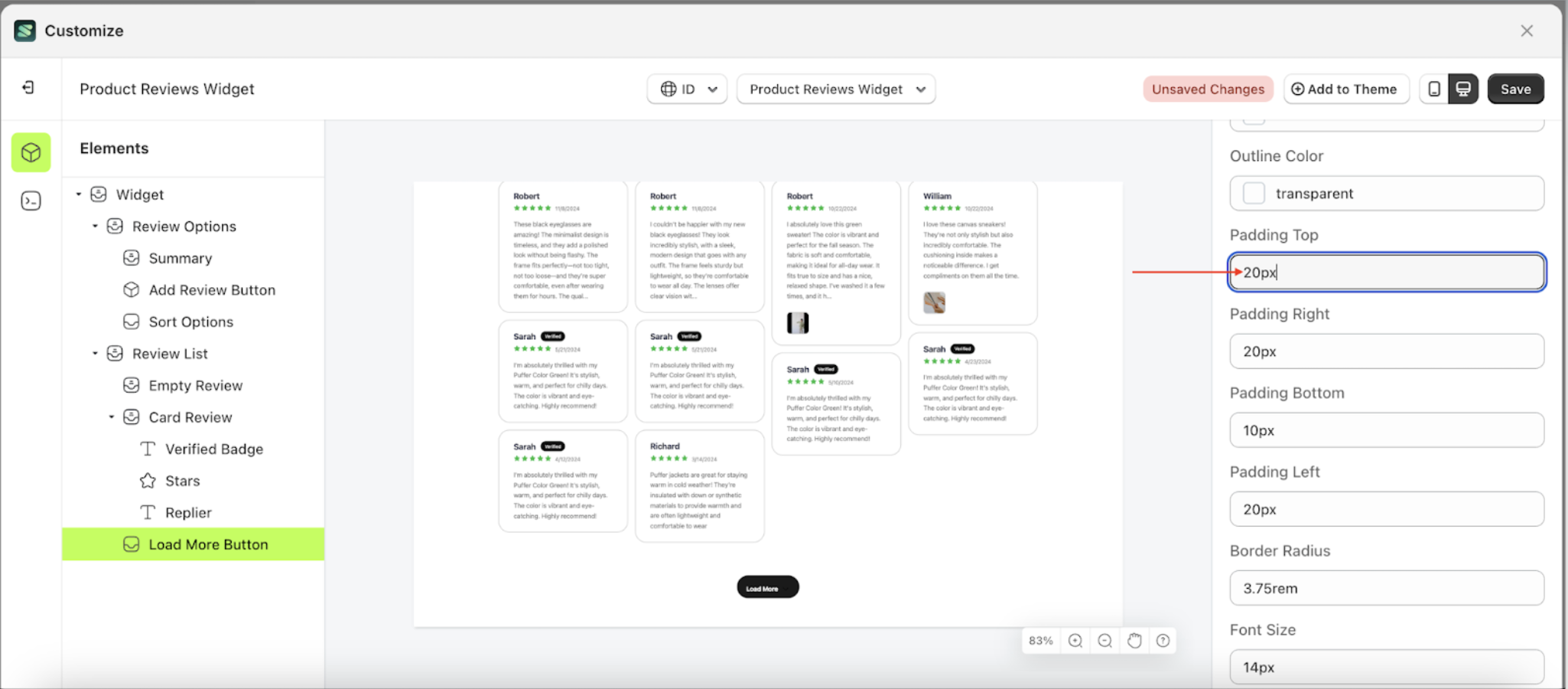
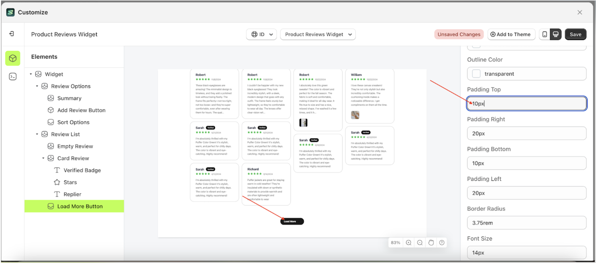
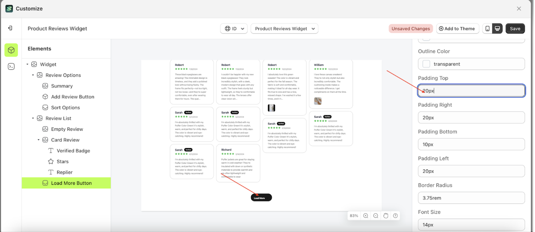
Padding Top Load More
This feature is designed to customize the top padding of the button settings
- Select the Load More Button element on the left, then click the Settings tab and click the icon marked with a red arrow.
- On the right side, marked with a red arrow, you can change the padding top to your desired value.
- Note: The padding top format can be px, em, rem, %, or other units..
- For example, if you set the padding top to 20px
- The padding top of the Load More Button element will adjust accordingly.
- Example : Before padding top change settings
- Example : After padding top change settings
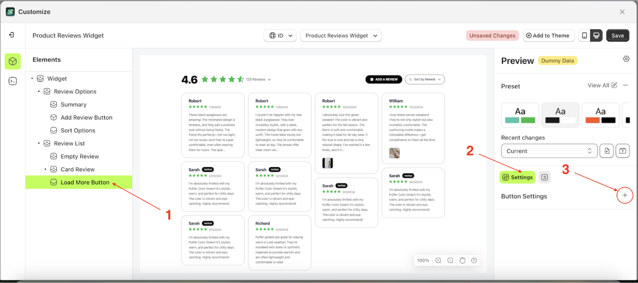
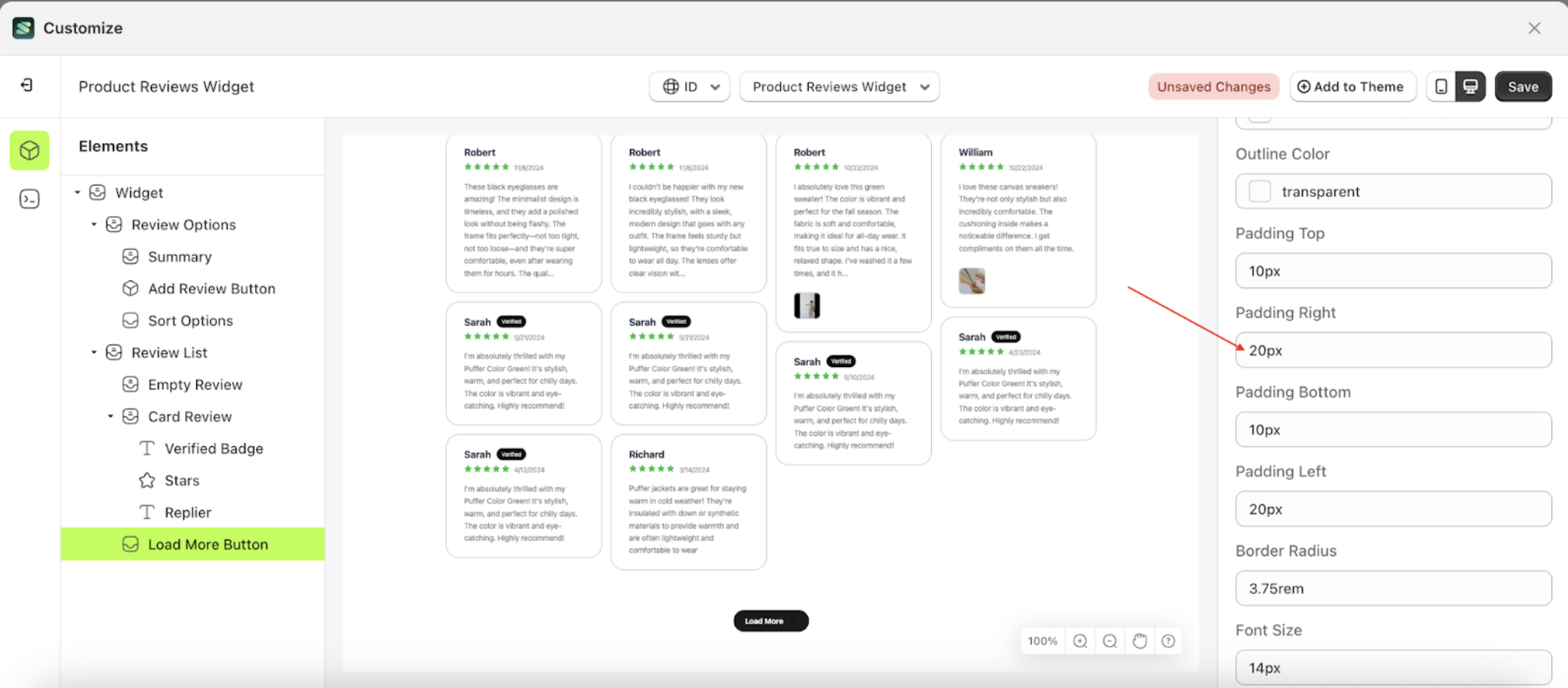
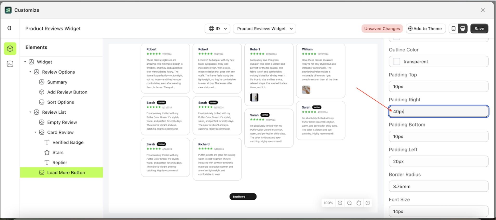
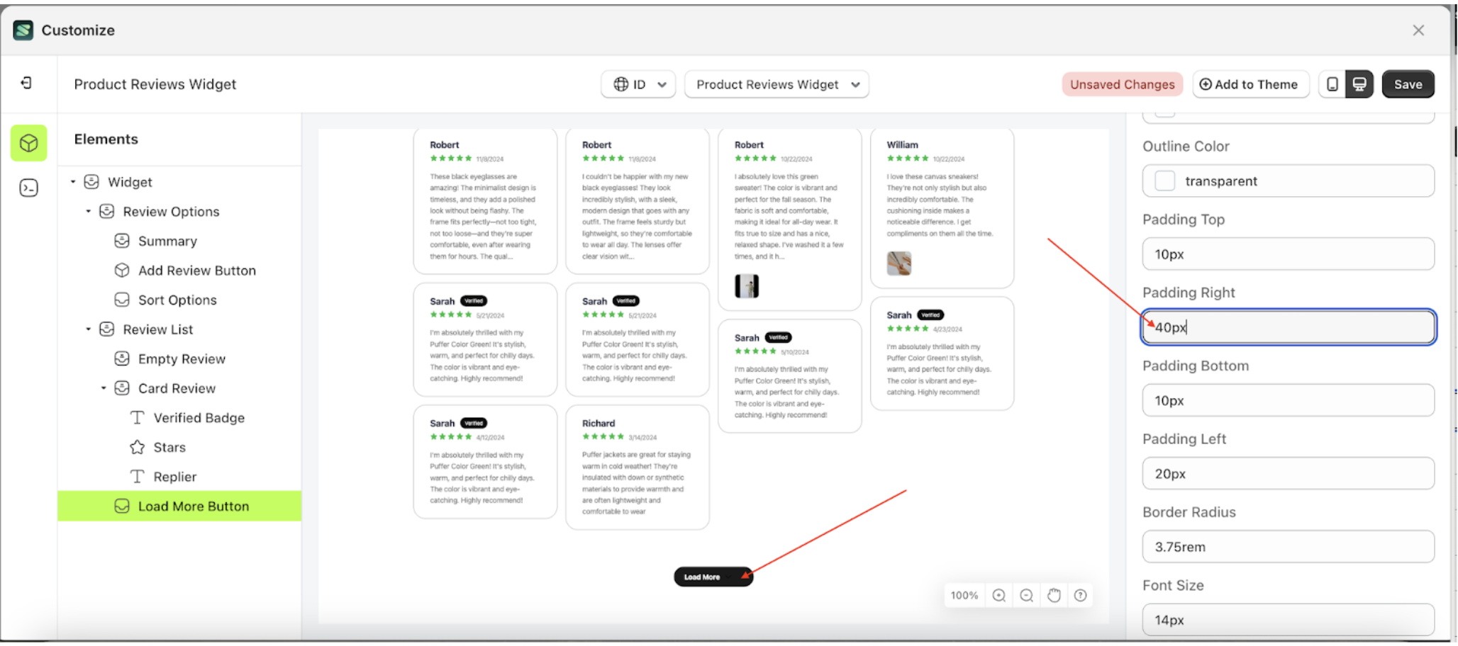
Padding Right Load More
This feature is designed to customize the right padding of the button settings
Follow the steps below:
- Select the Load More Button element on the left, then click the Settings tab and click the icon marked with a red arrow.
- On the right side, marked with a red arrow, you can change the padding right to your desired value.
- Note: The padding right format can be px, em, rem, %, or other units..
- For example, if you set the padding right to 20px
- The padding right of the Load More Button element will adjust accordingly.
- Example : Before padding right change settings
- Example : After padding right change settings
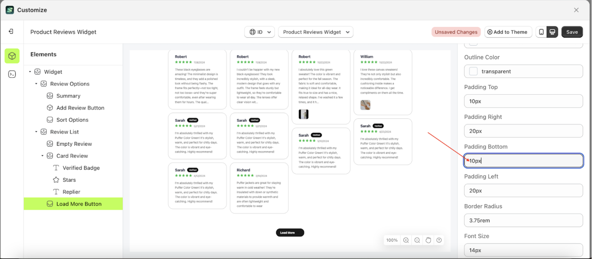
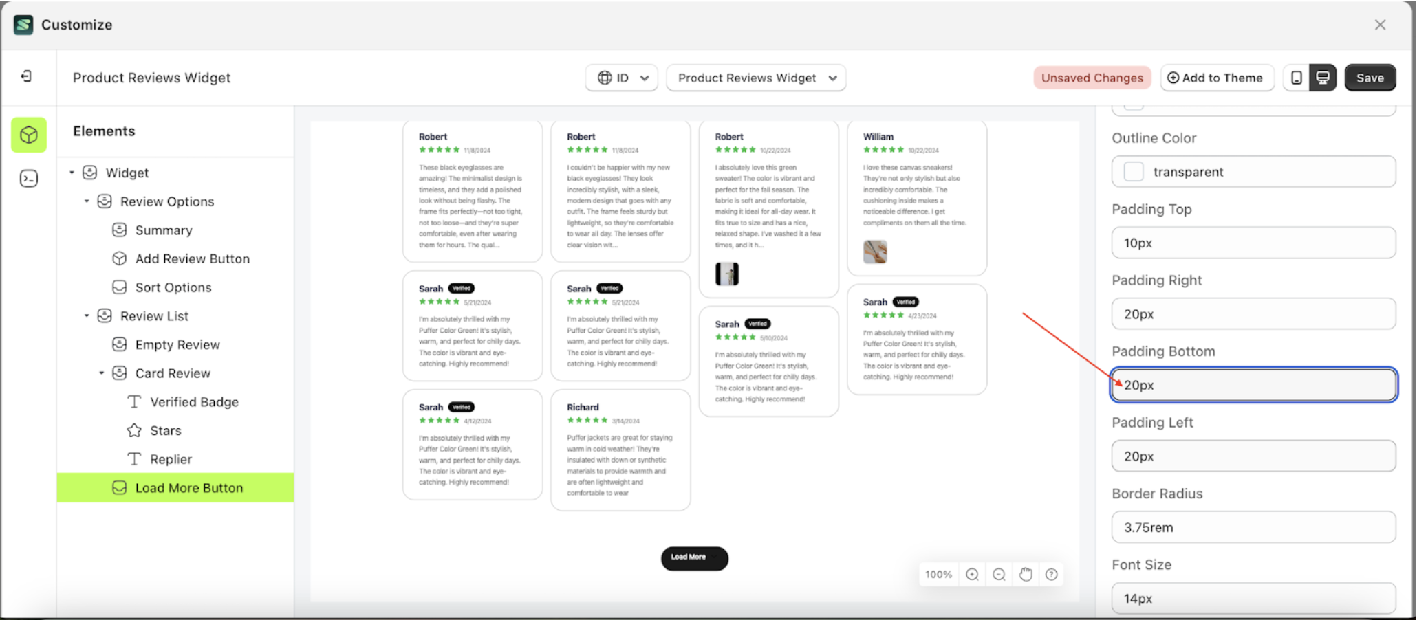
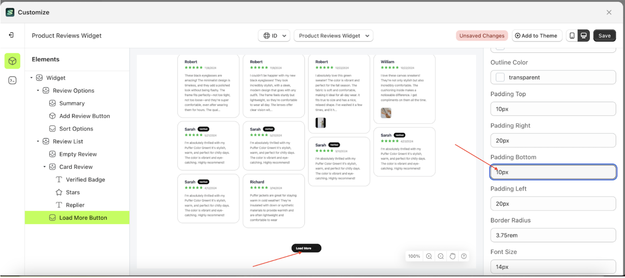
Padding Bottom Load More
This feature is designed to customize the bottom padding of the button settings
Follow the steps below:
- Select the Load More Button element on the left, then click the Settings tab and click the icon marked with a red arrow.
- On the right side, marked with a red arrow, you can change the padding bottom to your desired value.
- Note: The padding bottom format can be px, em, rem, %, or other units..
- For example, if you set the padding bottom to 20px
- The padding bottom of the Load More Button element will adjust accordingly.
- Example : Before padding bottom change settings
- Example : After padding bottom change settings
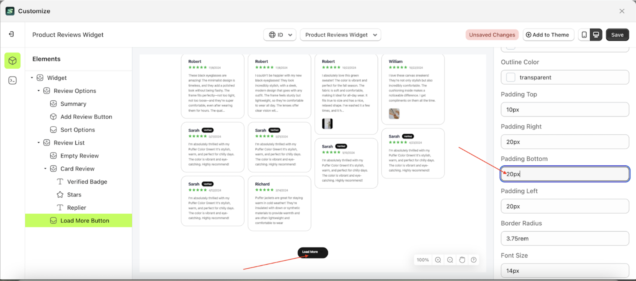
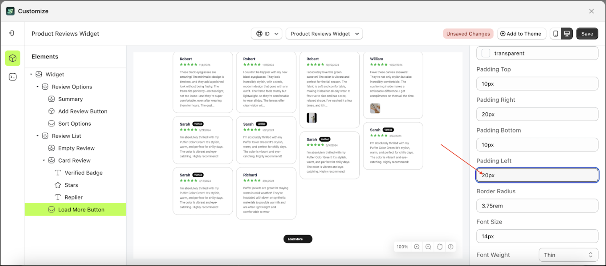
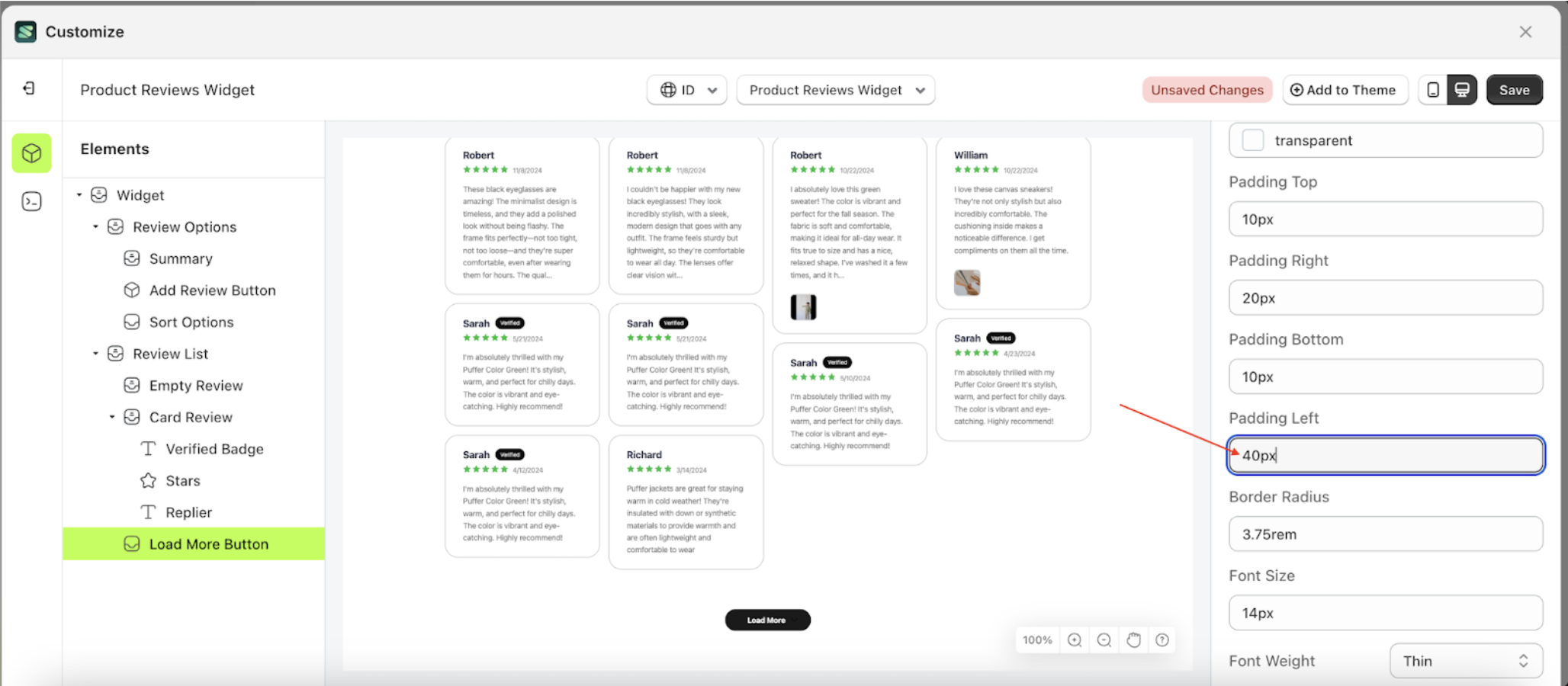
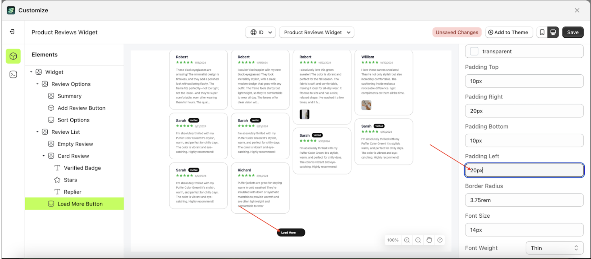
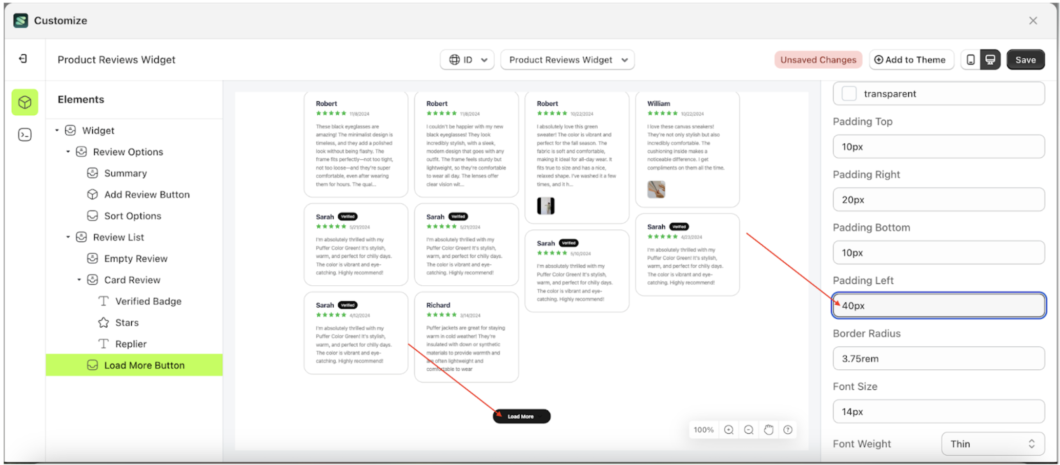
Padding Left Load More
This feature is designed to customize the left padding of the button settings
Follow the steps below:
- Select the Load More Button element on the left, then click the Settings tab and click the icon marked with a red arrow.
- On the right side, marked with a red arrow, you can change the padding left to your desired value.
- Note: The padding left format can be px, em, rem, %, or other units..
- For example, if you set the padding left to 20px
- The padding left of the Load More Button element will adjust accordingly.
- Example : Before padding left change settings
- Example : After padding left change settings
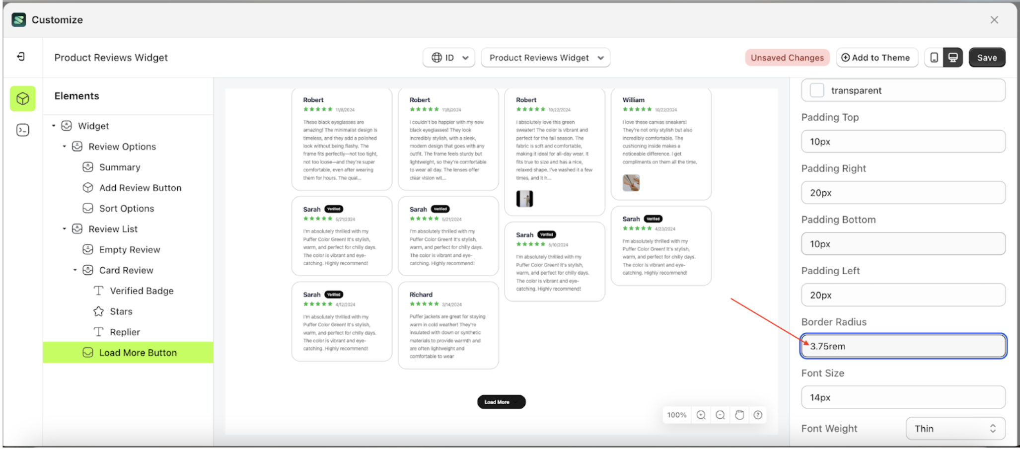
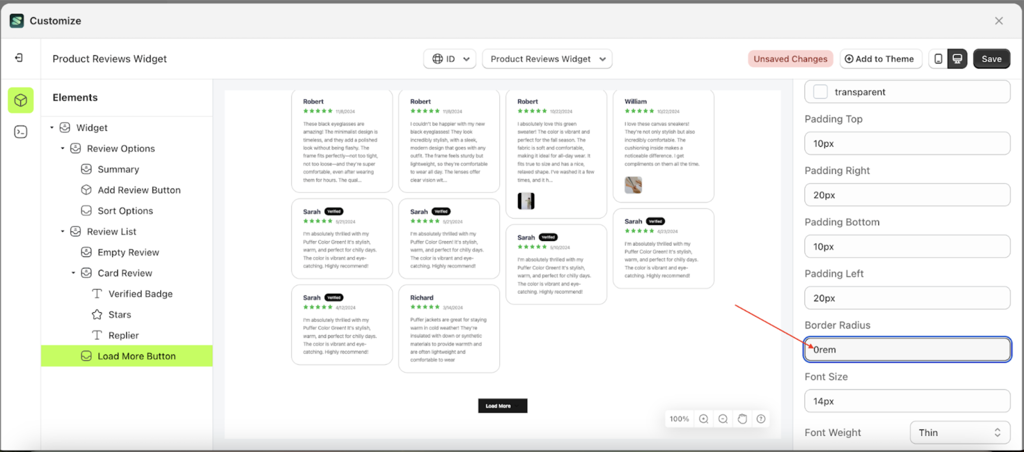
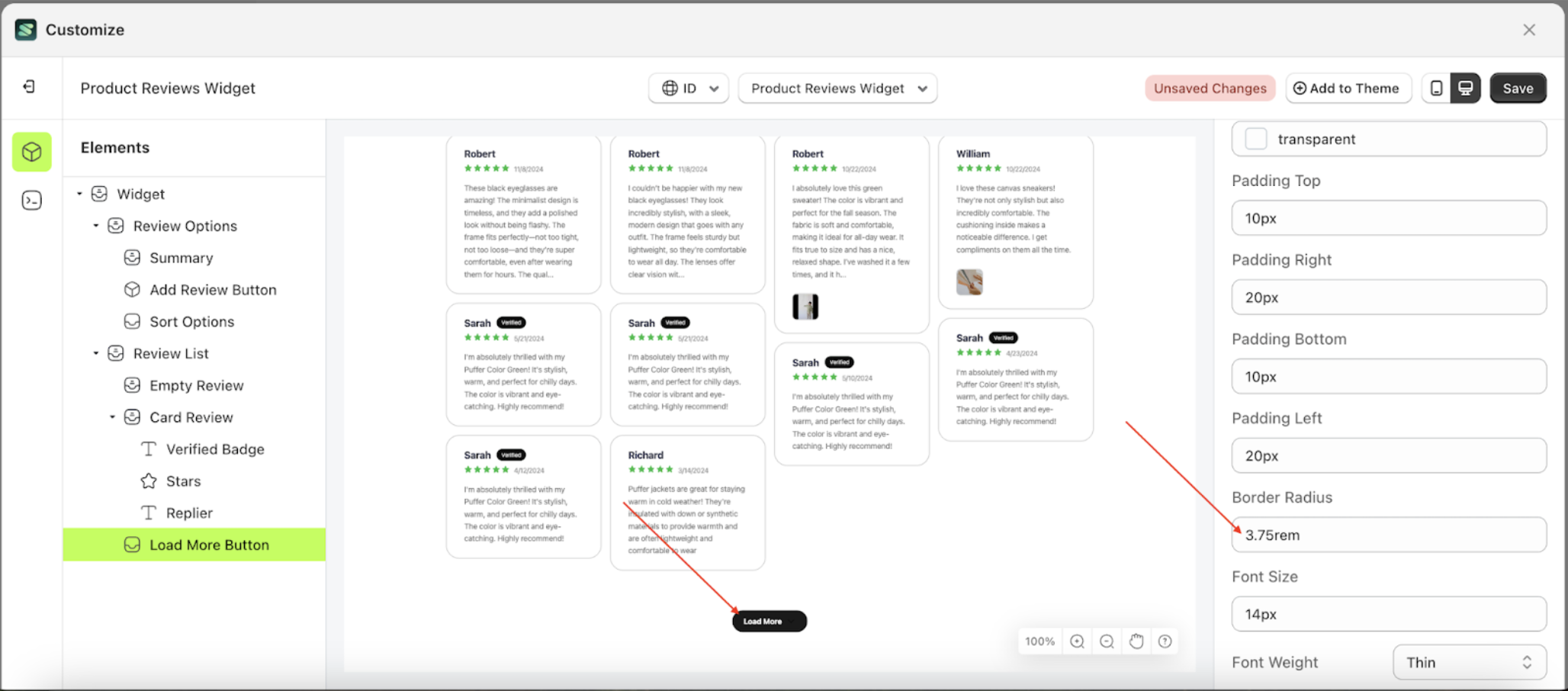
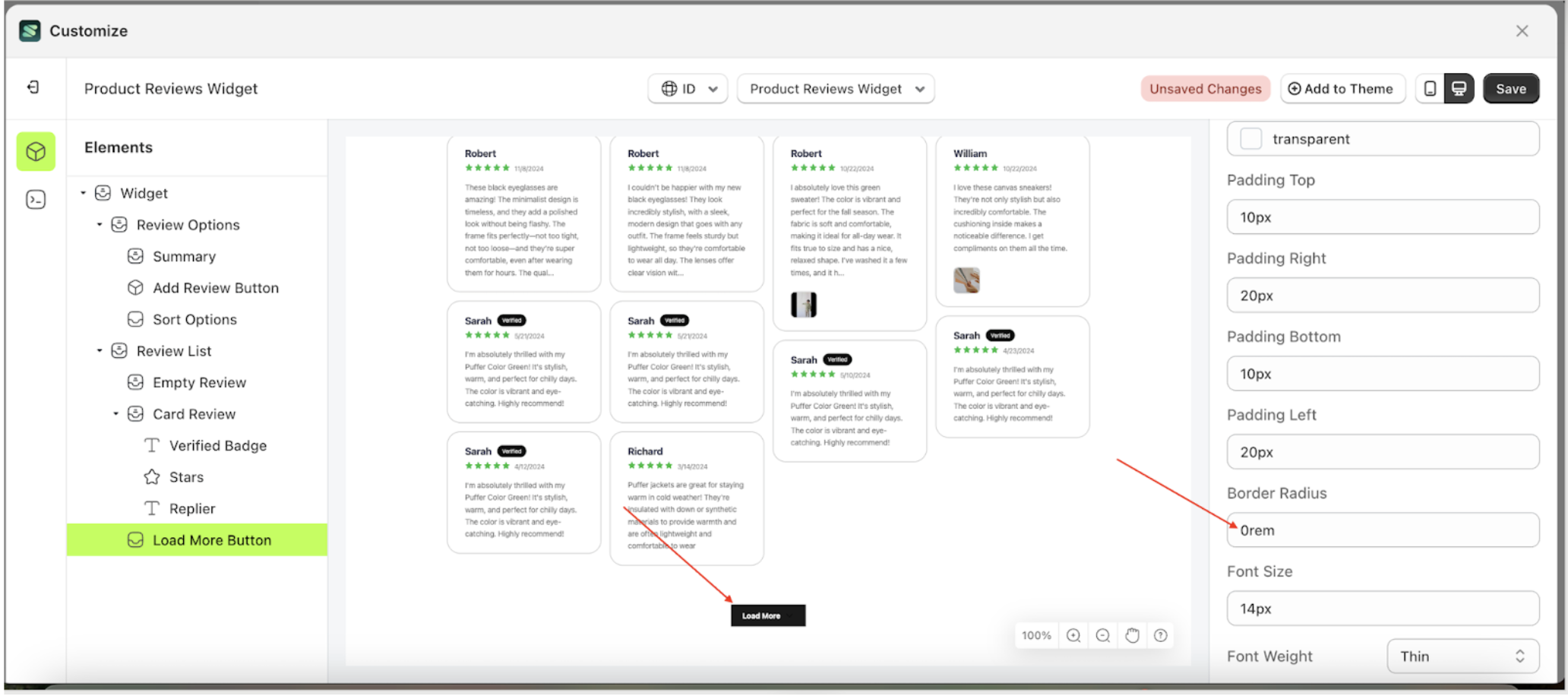
Border Radius Load More
This feature is designed to customize the corner radius of the button settings
Follow the steps below
- Select the Load More Button element on the left, then click the Settings tab and click the icon marked with a red arrow.
- On the right side, marked with a red arrow, you can change the border radius to your desired value.
- Note: The border radius format can be px, em, rem, %, or other units..
- For example, if you set the border radius to 0rem
- The border radius of the Load More Button element will adjust accordingly.
- Example : Before border radius change settings
- Example : After border radius change settings
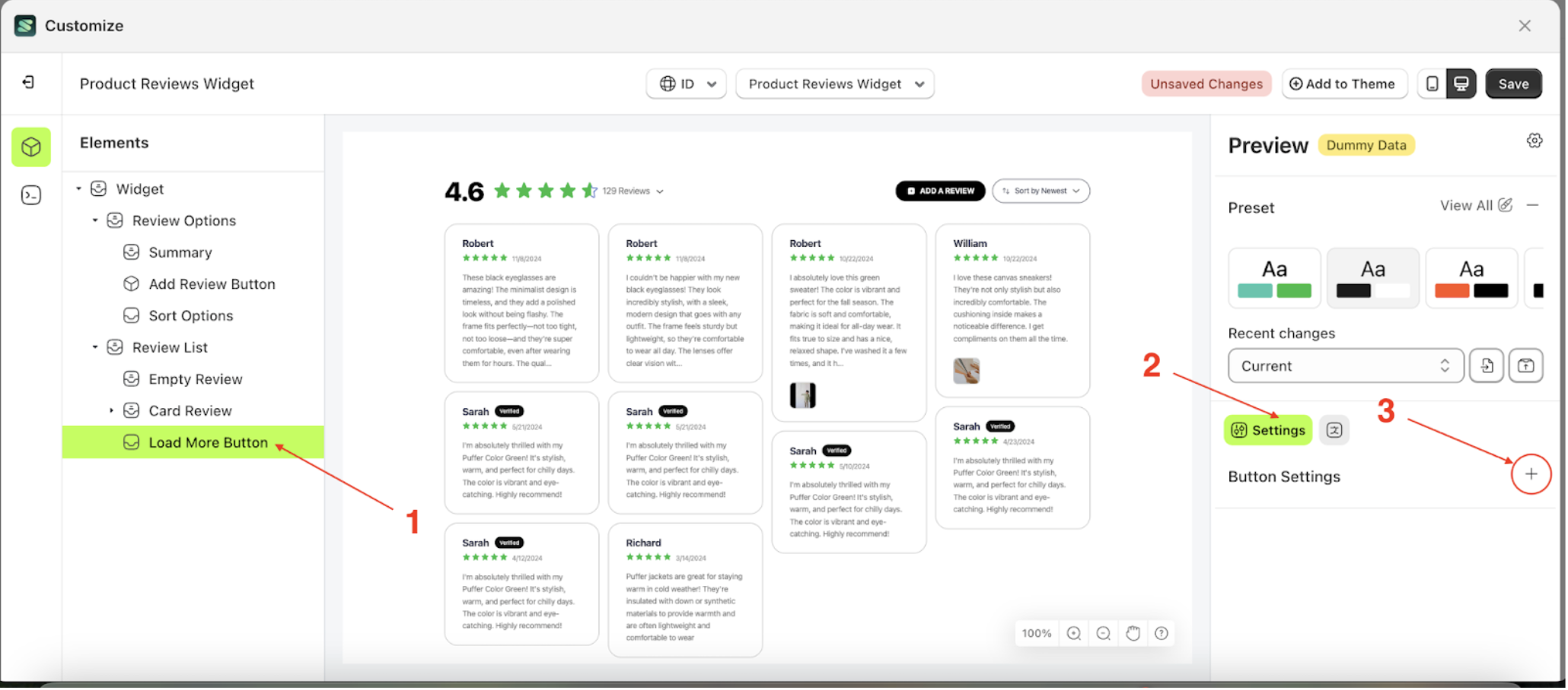
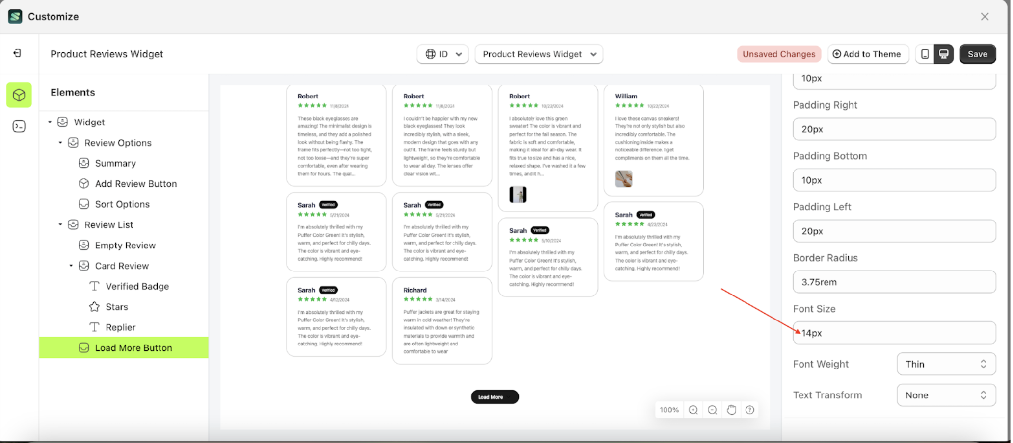
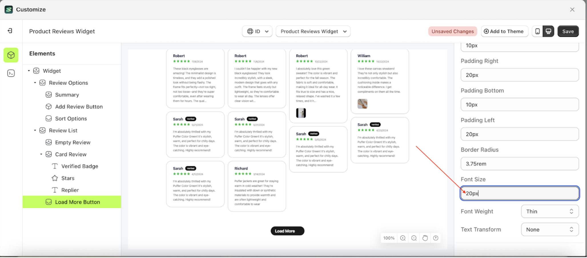
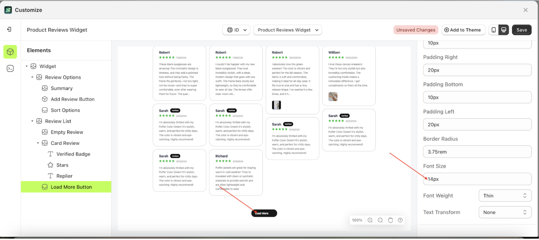
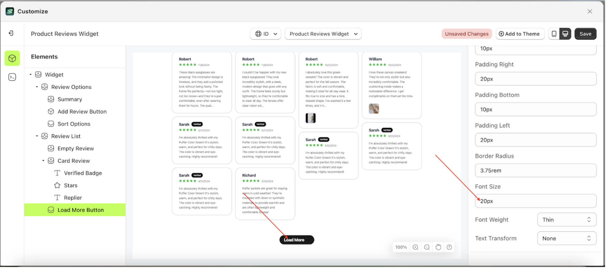
Font Size Load More
This feature is designed to customize the text size of the button settings
Follow the steps below
- Select the Load More Button element on the left, then click the Settings tab and click the icon marked with a red arrow.
- On the right side, marked with a red arrow, you can change the font size to your desired value.
- Note: The font size format can be px, em, rem, %, or other units..
- For example, if you set the font size to 20px
- The font size of the Load More Button element will adjust accordingly.
- Example : Before font size change settings
- Example : After font size change settings
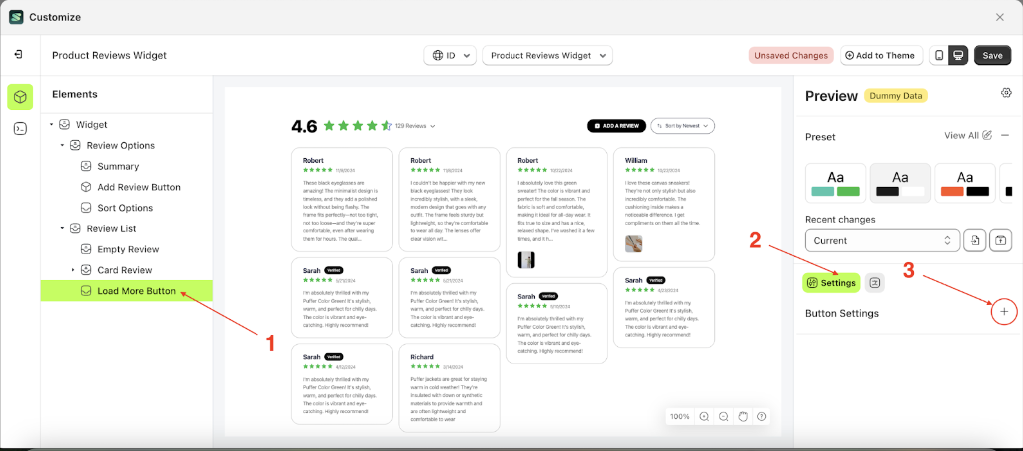
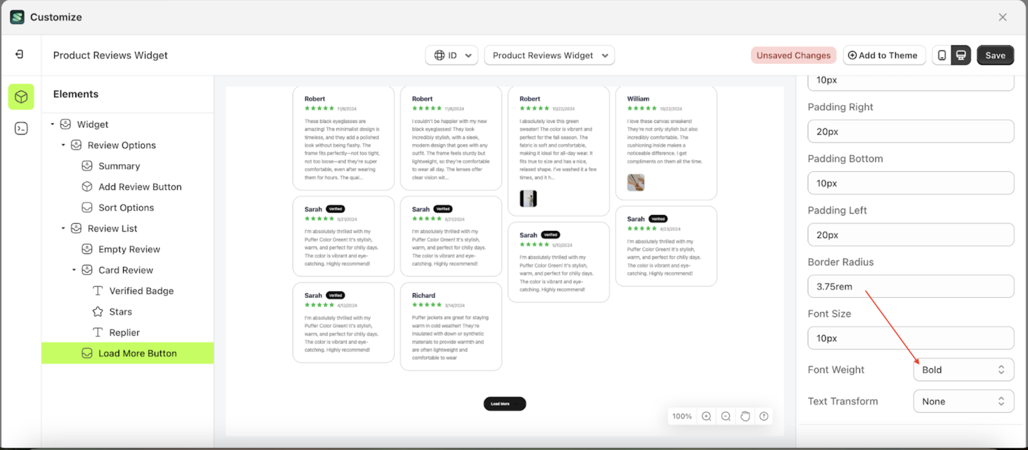
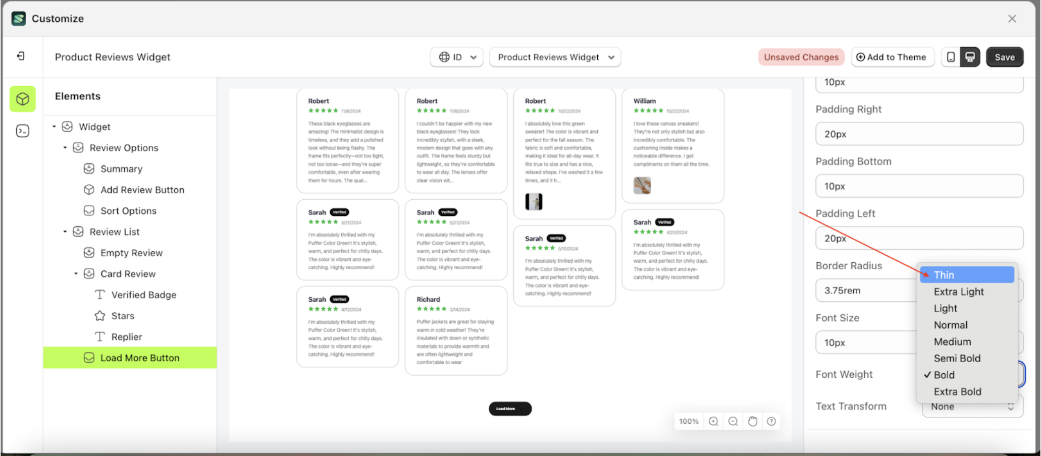
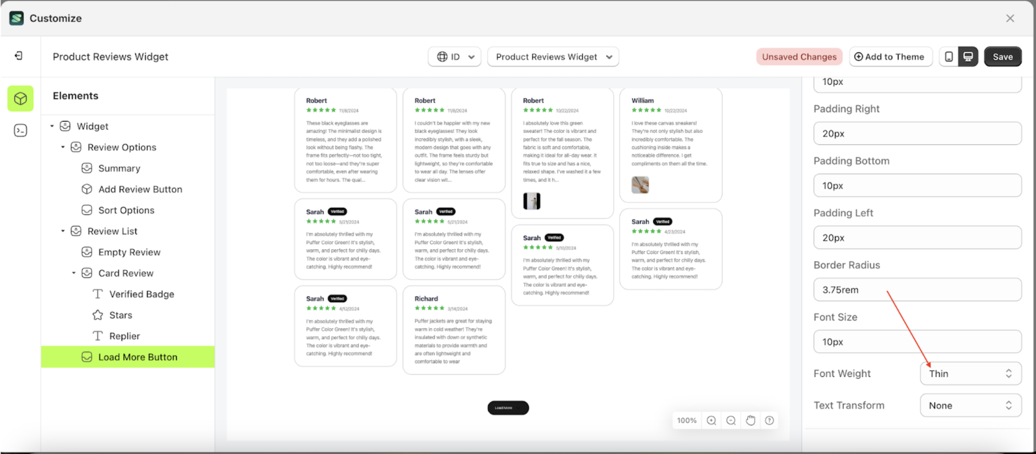
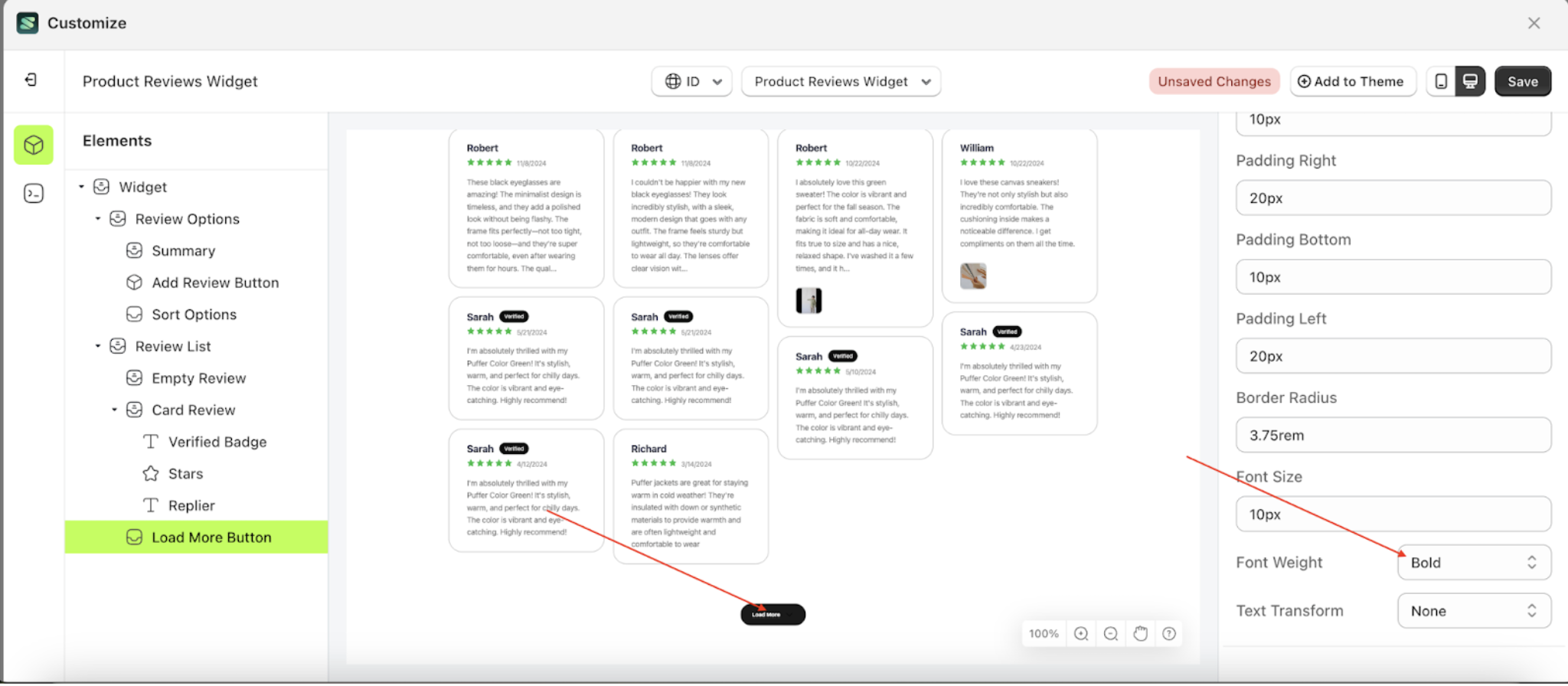
Font Weight Load More
This feature is designed to customize the text weight of the button settings
Follow the steps below
- Select the Load More Button element on the left, then click the Settings tab and click the icon marked with a red arrow.
- On the right side, marked with a red arrow, you can change the font weight to your desired value.
- Note: The font weight format can be Thin, Extra light, Light and etc.
- Once the menu opens, select an option from the list
- For example, if you set the font weight to thin
- The font weight of the Load More Button element will adjust accordingly.
- Example : Before font weight change settings
- Example : After font weight change settings

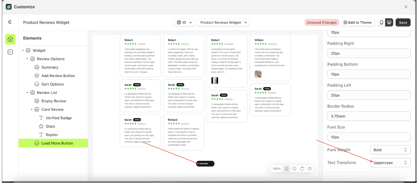
Text Transform Load More
This feature allows you to adjust the capitalization style of the text
Follow the steps below
- Select the Card Review element, then click the icon marked with a red arrow to open the menu within that item

- Once the menu is open, select the Load more button element on the left side, then click the icon on the right side, marked with a red arrow, to access the button settings.

- On the right side, marked with a red arrow, you can change the Text transform to your desired value
- Note: The Text Transform format can be None, Capitalize, Uppercase, Lowercase
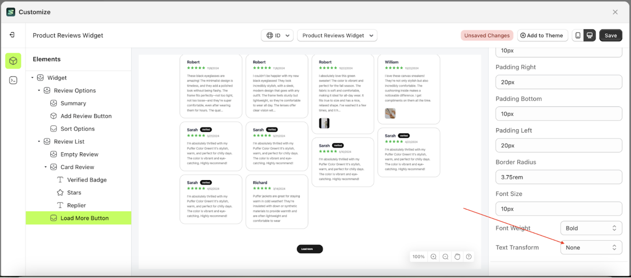
- Once the menu opens, select an option from the list
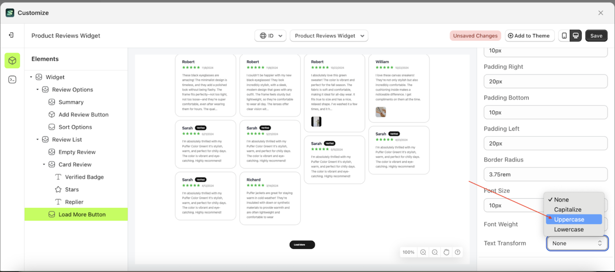
- For example, if you set the Text Transform to Uppercase.
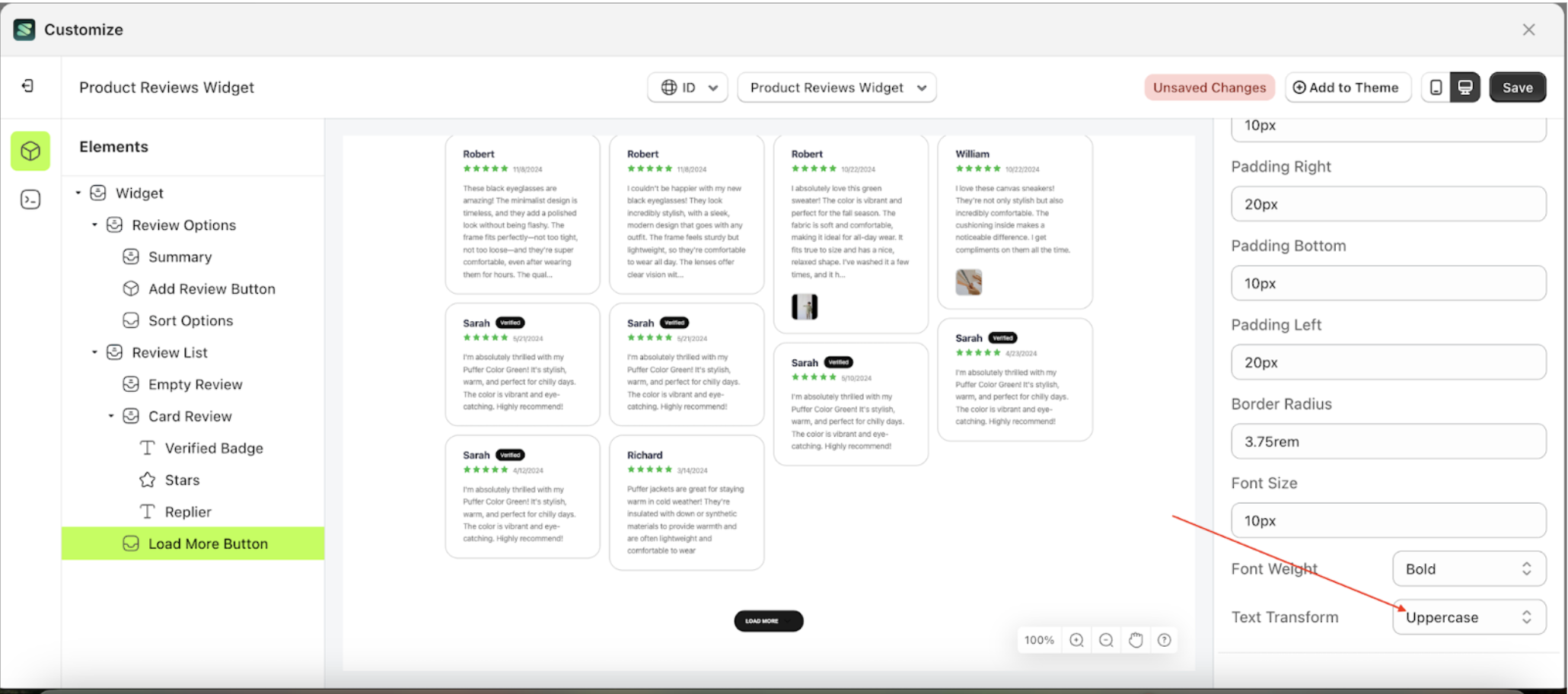
- The Text Transform of the Load more button element will adjust accordingly.
- Example: Before Text Transform change settings
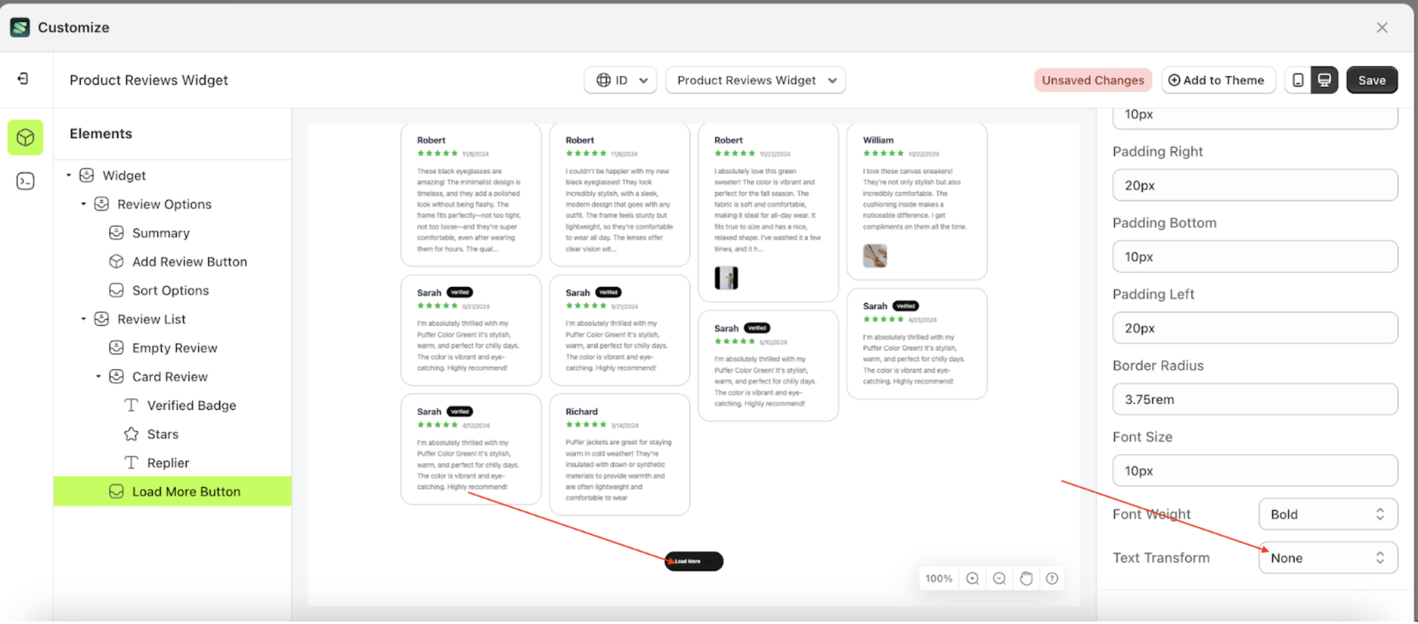
- Example: After Text Transform change settings