Recently viewed widget
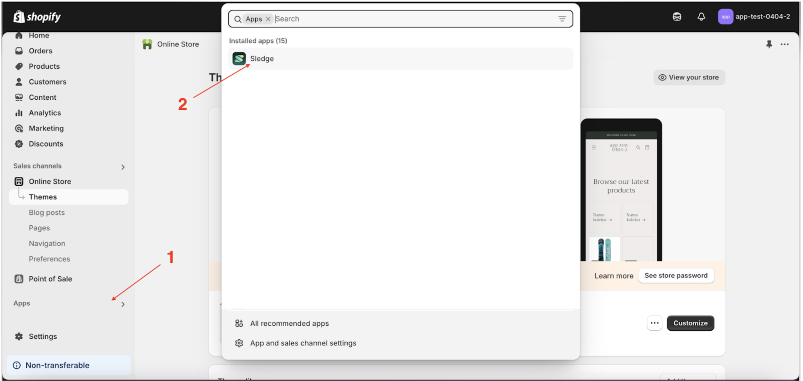
- Go to the Apps Sledge.
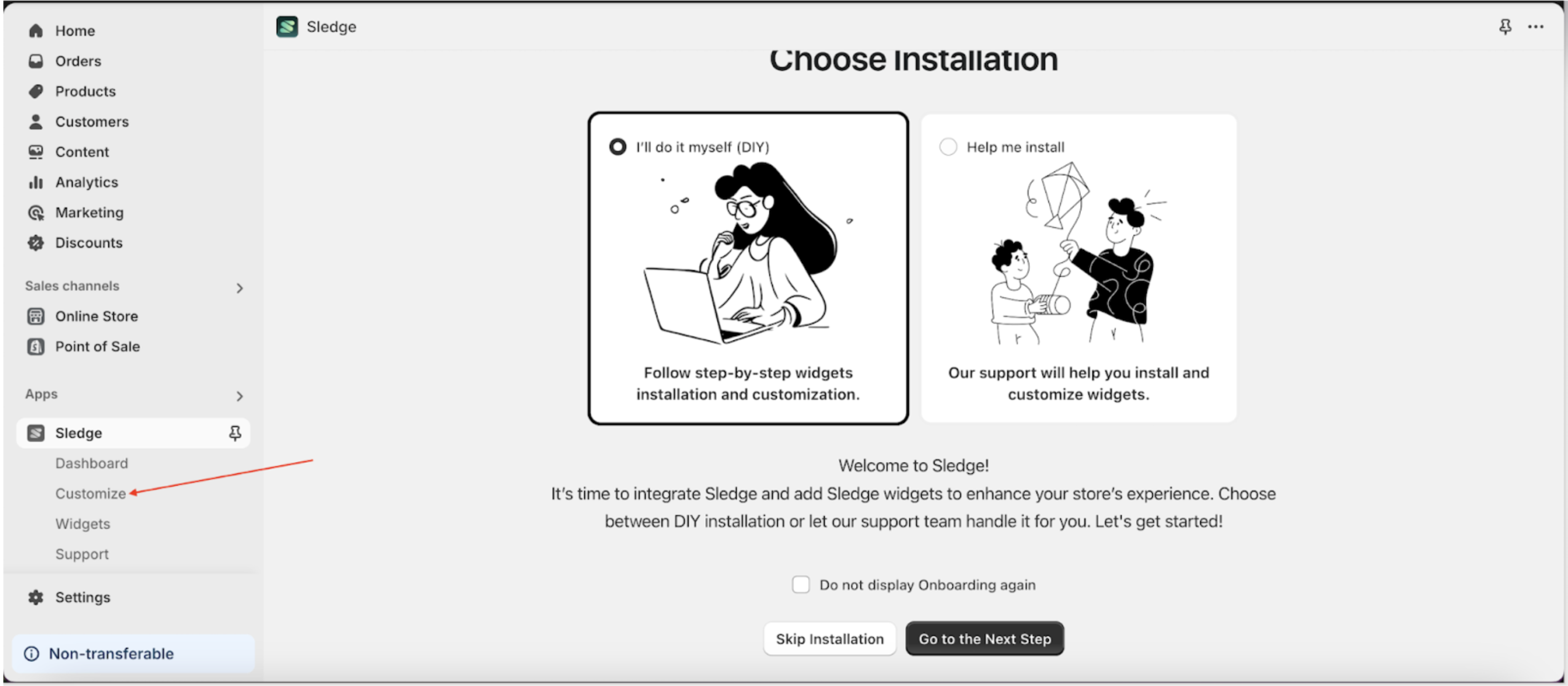
- Select the Customizer menu.
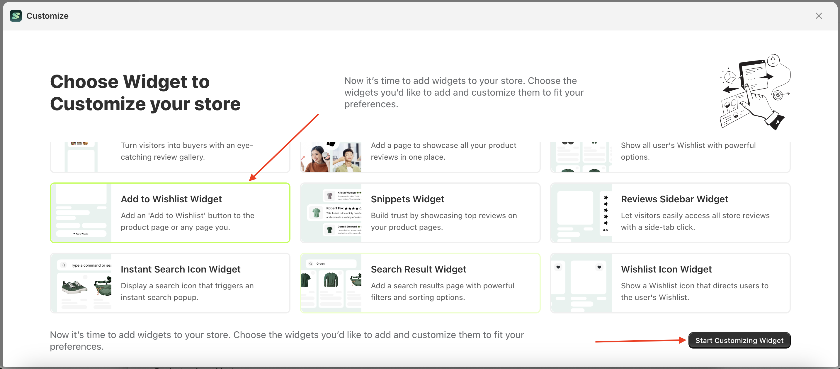
- Choose recently viewed widget and click the Start Customizing Widget button.
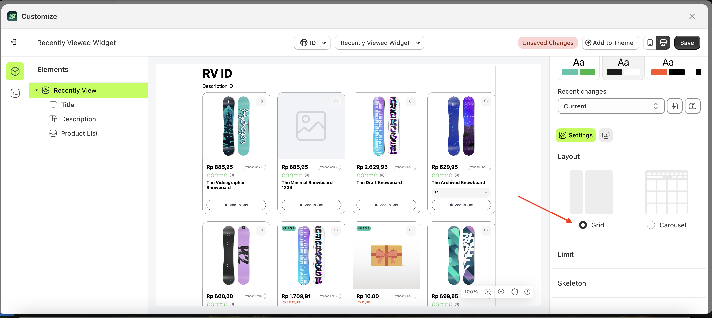
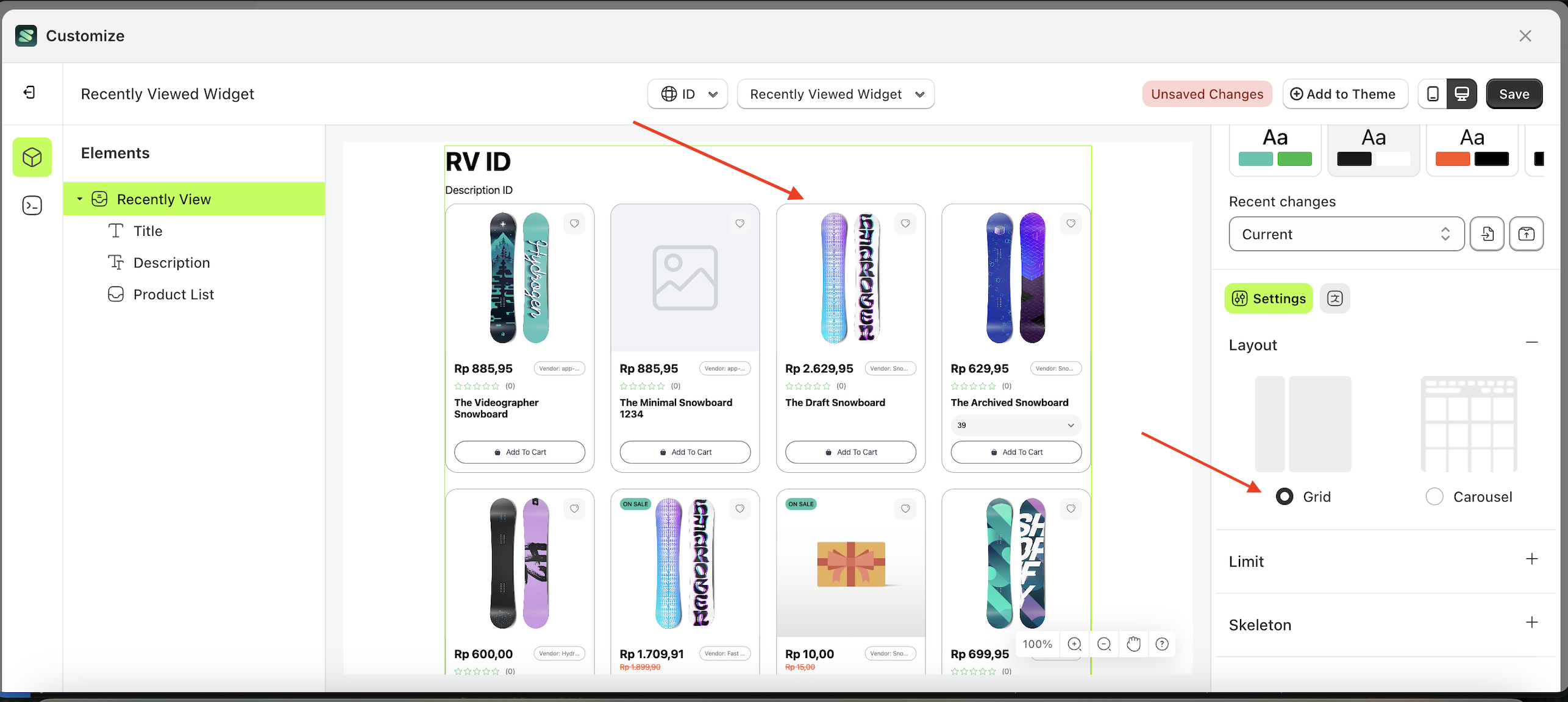
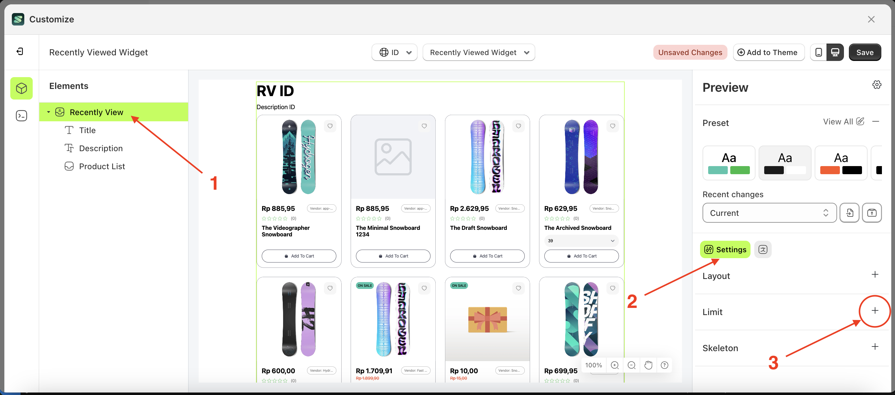
Layout
This feature is designed to configure the layout you need without the hassle of creating it from scratch.
Available settings:
Grid
Follow the steps below:
- Select the Trush Badge element on the left, then click the Settings tab and click the icon marked with a red arrow.
- Select Layout Large with Logo by following the red arrow
- Here's the chosen layout display.
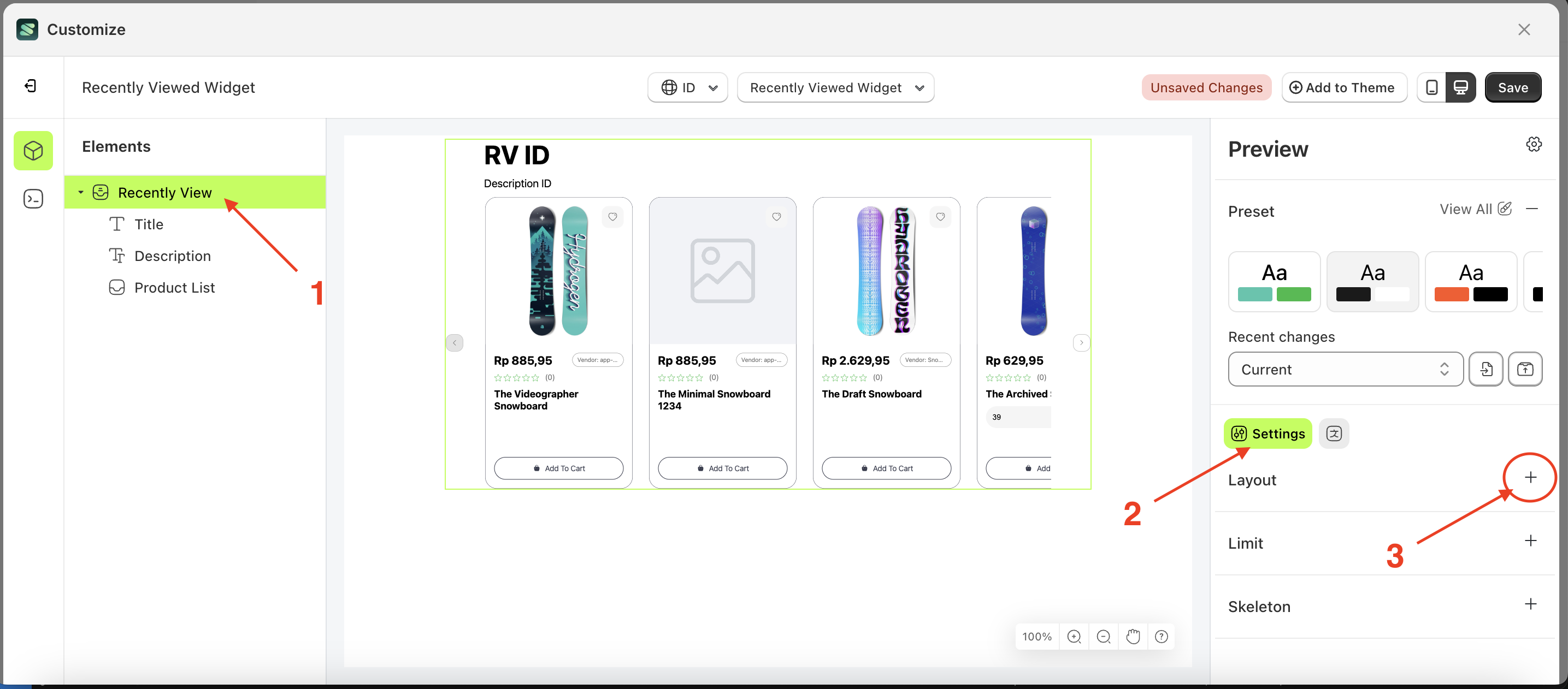
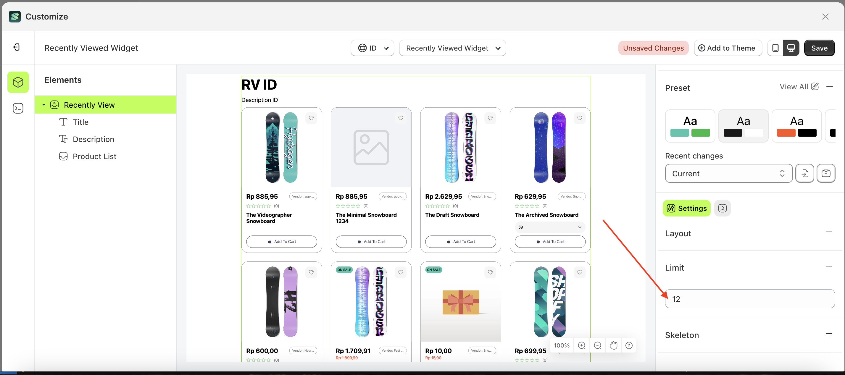
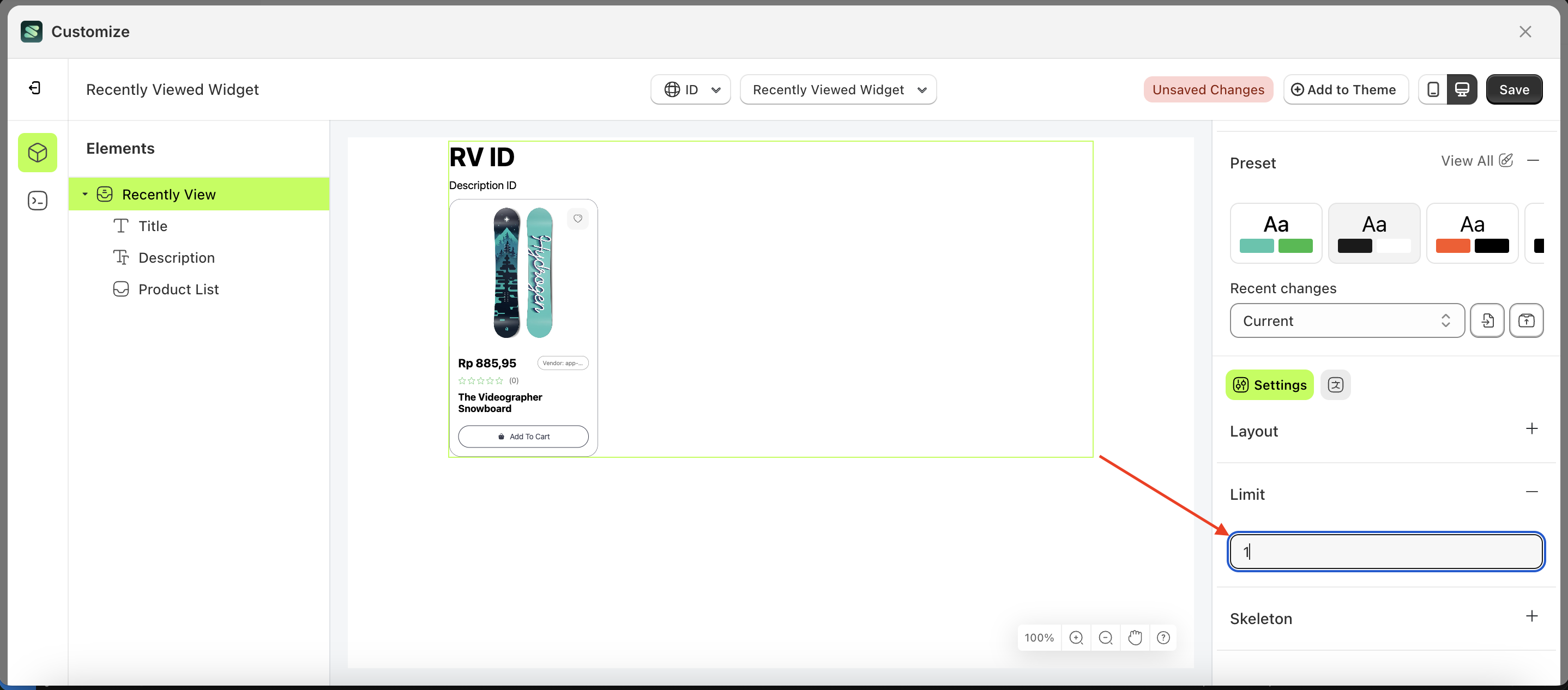
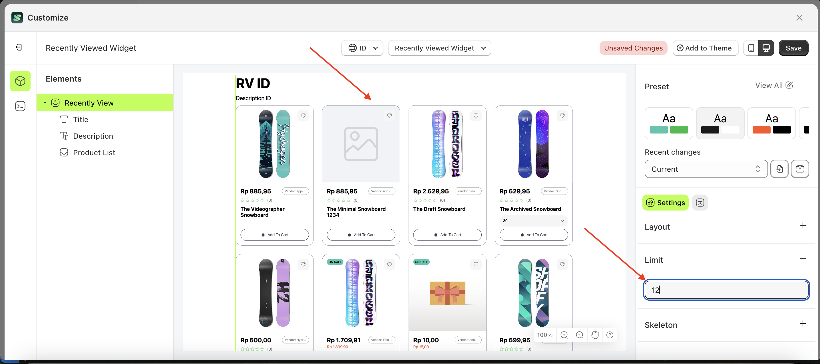
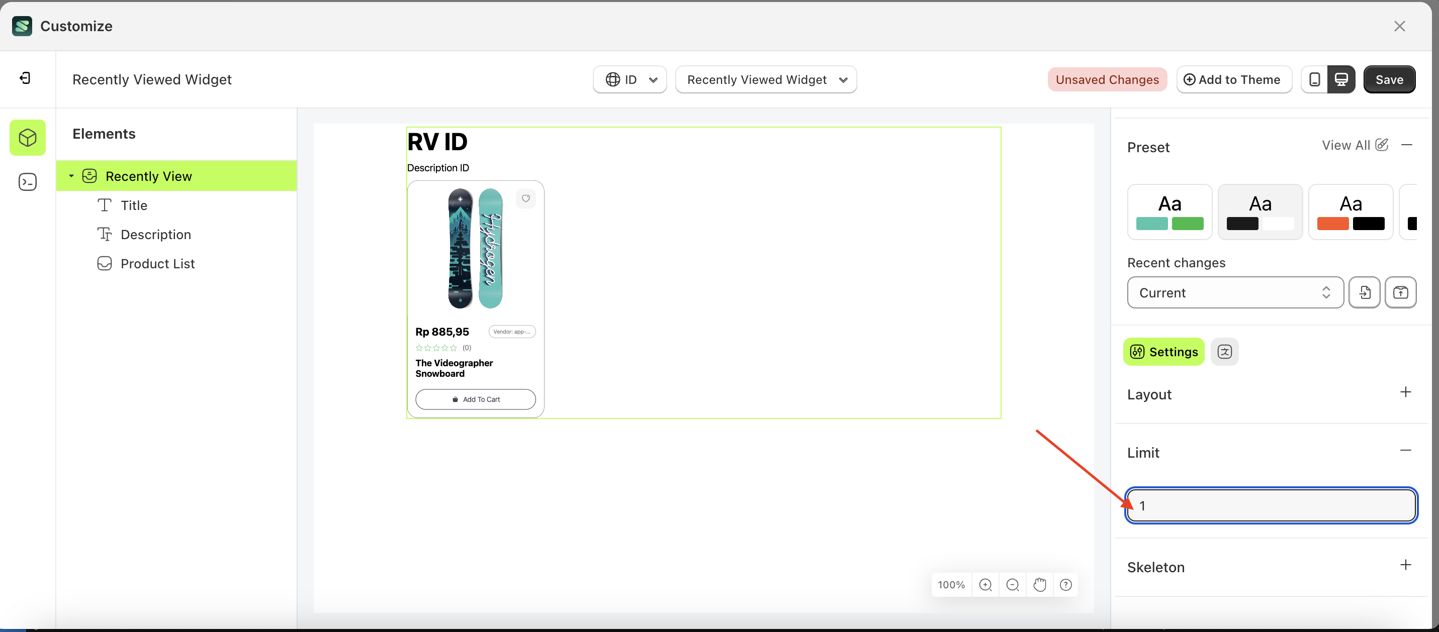
Limit
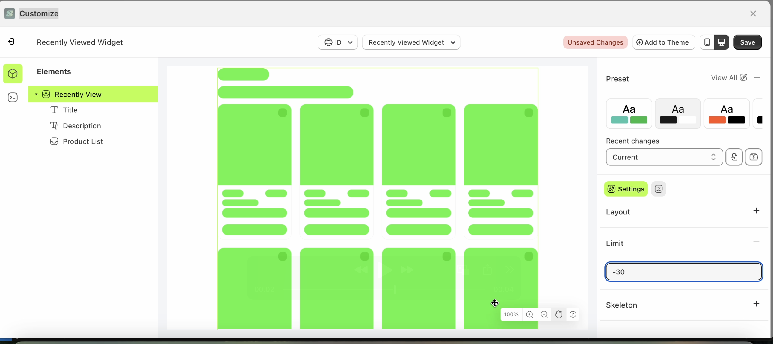
This feature is designed to set the data limit displayed on this widget.
Follow the steps below:
- Select the Search Result element on the left, then click the Settings tab and click the icon marked with a red arrow.
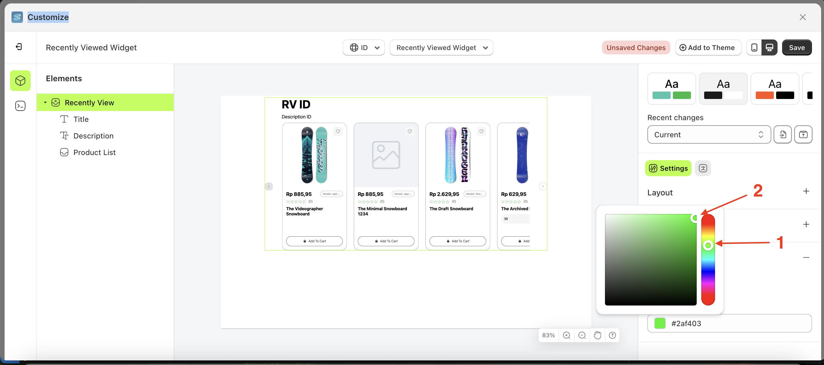
- Click the Color Palette on the right side, which is also marked with a red arrow.
- The Color Palette will appear. Click the right side of the palette where the red arrow and number 1 are indicated, then click the right side again where the red arrow and number 2 are marked.
- The recently viewed widget of the Search Result element will adjust accordingly.
- Example : Before Search Result change settings
- Example : After Search Result change settings
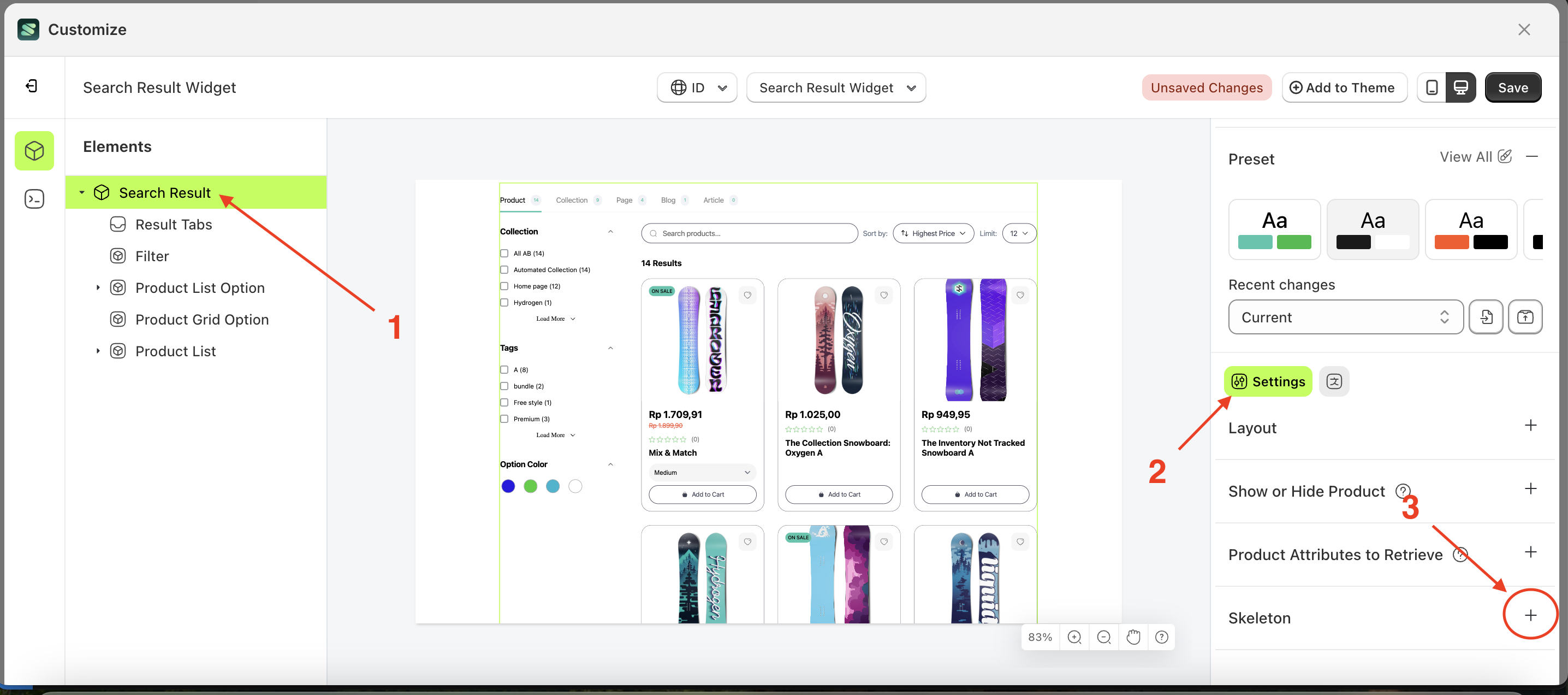
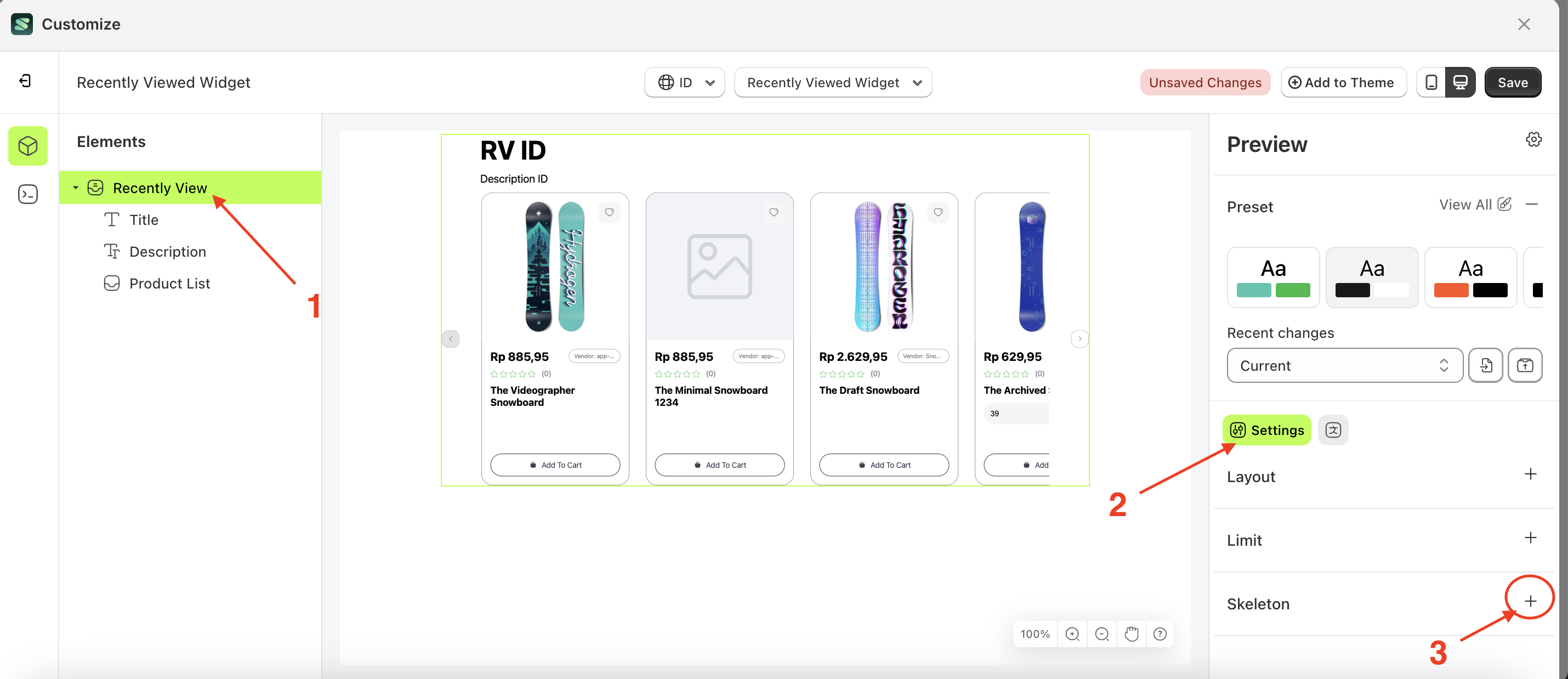
Skeleton
Available settings:
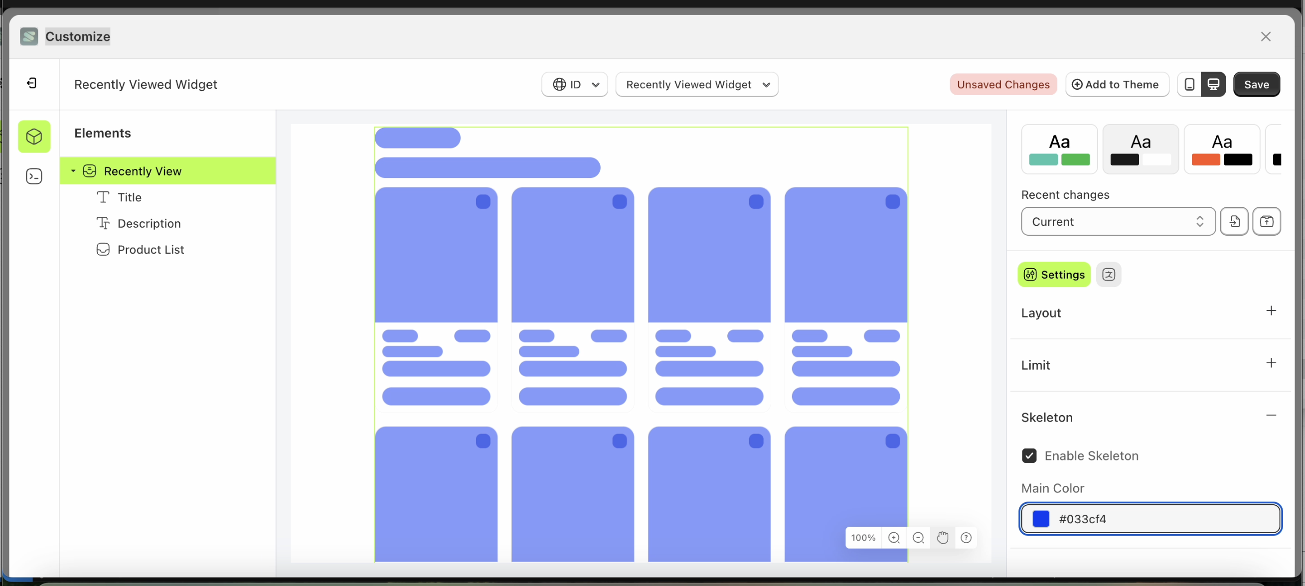
Enable Skeleton
Enable Skeleton is a setting that controls whether a loader or skeleton is displayed before the required data is fully loaded.
Follow the steps below:
- Select the Search Result element on the right, then click the Settings tab and click the icon marked with a red arrow.
- Enable the Enable Skeleton checkbox
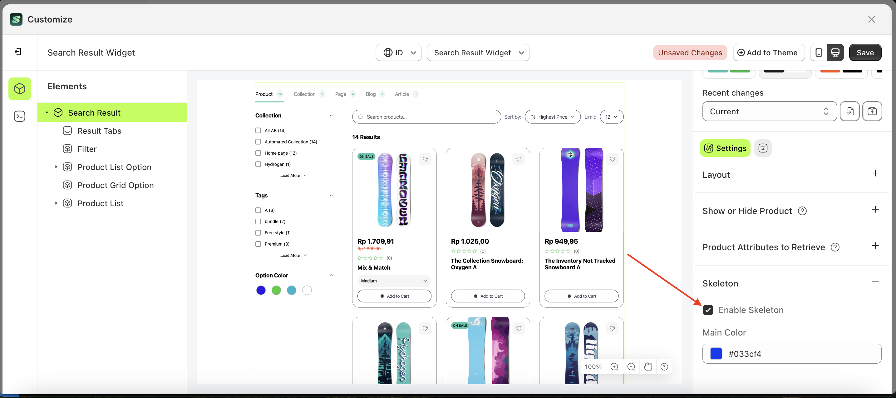
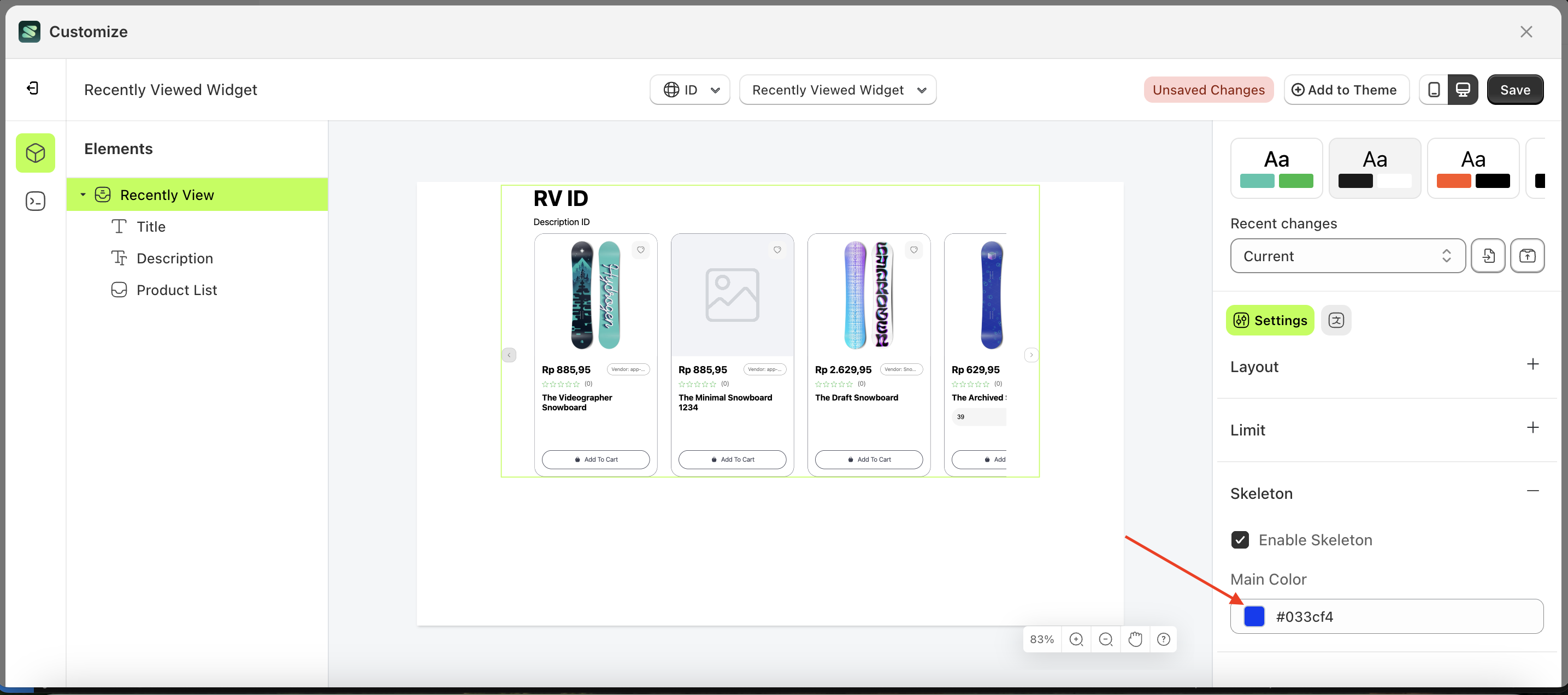
Main Color
Main Color is a setting that manages the color of the skeleton. However, you must first activate the Enable Skeleton feature.
Follow the steps below:
- Select the Search Result element on the left, then click the Settings tab and click the icon marked with a red arrow.
- Click the Color Palette on the right side, which is also marked with a red arrow.
- The Color Palette will appear. Click the right side of the palette where the red arrow and number 1 are indicated, then click the right side again where the red arrow and number 2 are marked.
- The recently viewed widget of the Search Result element will adjust accordingly.
- Example : Before Search Result change settings
- Example : After Search Result change settings
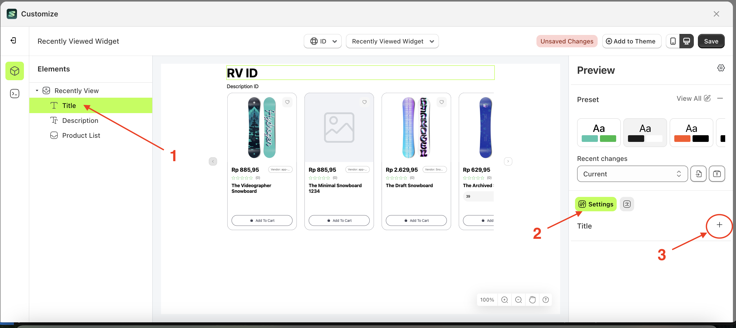
Title
Available settings:
Color
This feature is designed to customize the text color of the title
Follow the steps below:
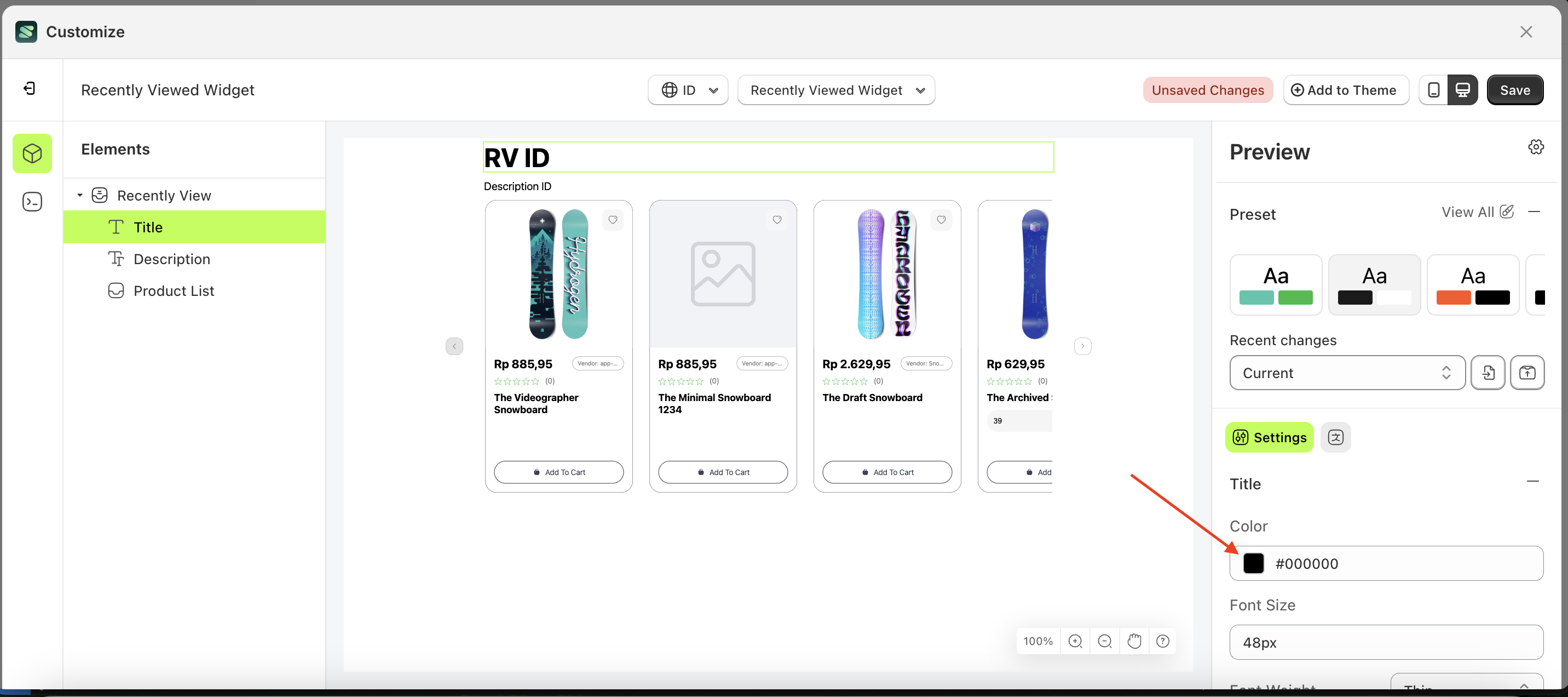
- Select the Search Result element on the left, then click the Settings tab and click the icon marked with a red arrow.
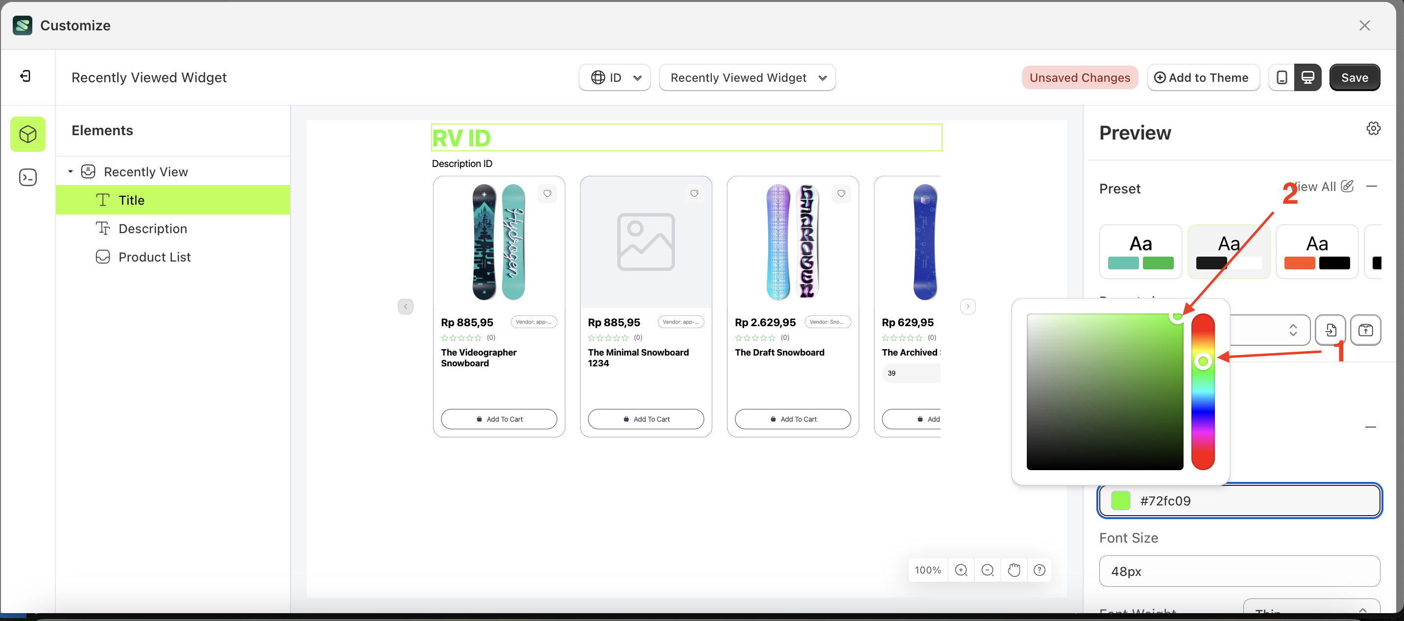
- Click the Color Palette on the right side, which is also marked with a red arrow.
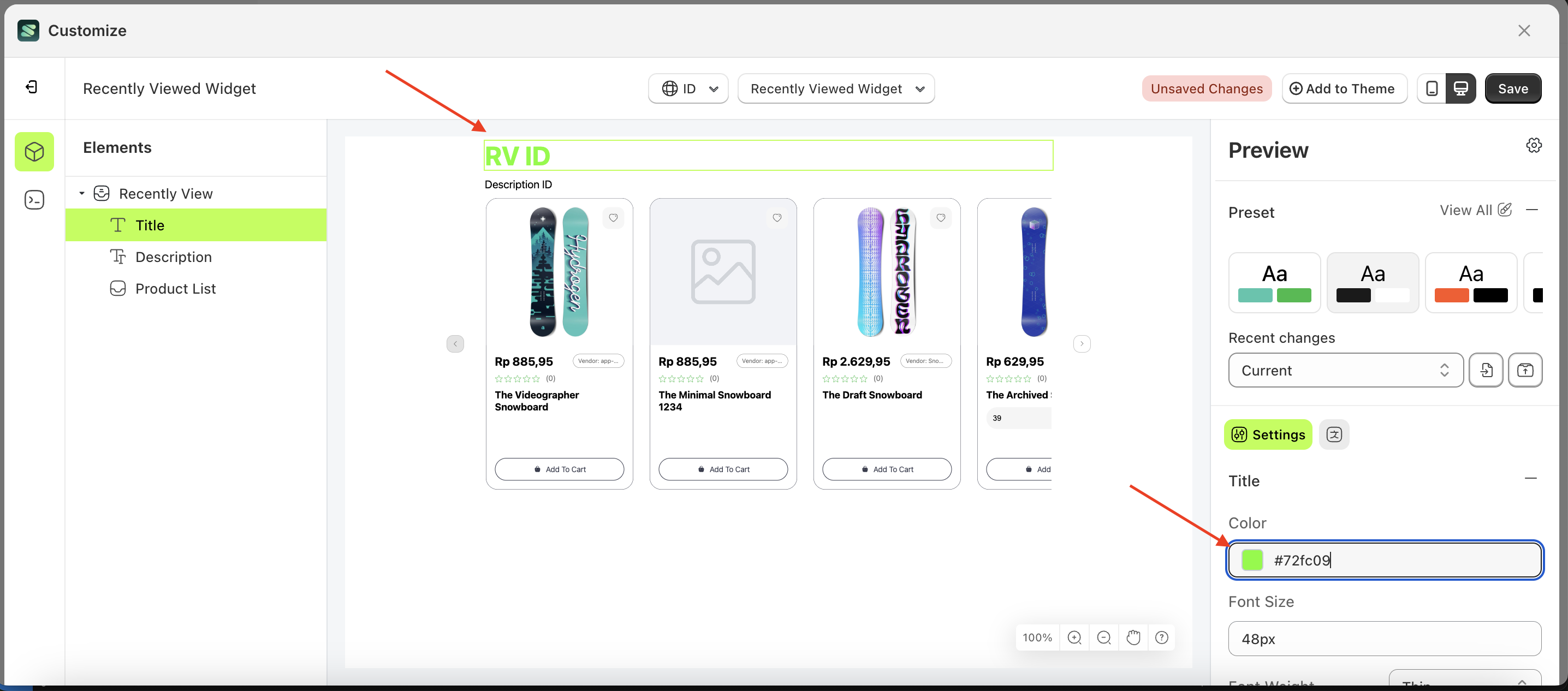
- The Color Palette will appear. Click the right side of the palette where the red arrow and number 1 are indicated, then click the right side again where the red arrow and number 2 are marked.
- The recently viewed widget of the Search Result element will adjust accordingly.
- Example : Before Search Result change settings
- Example : After Search Result change settings

Font Size
This feature is designed to customize the text size of the title
Follow the steps below:
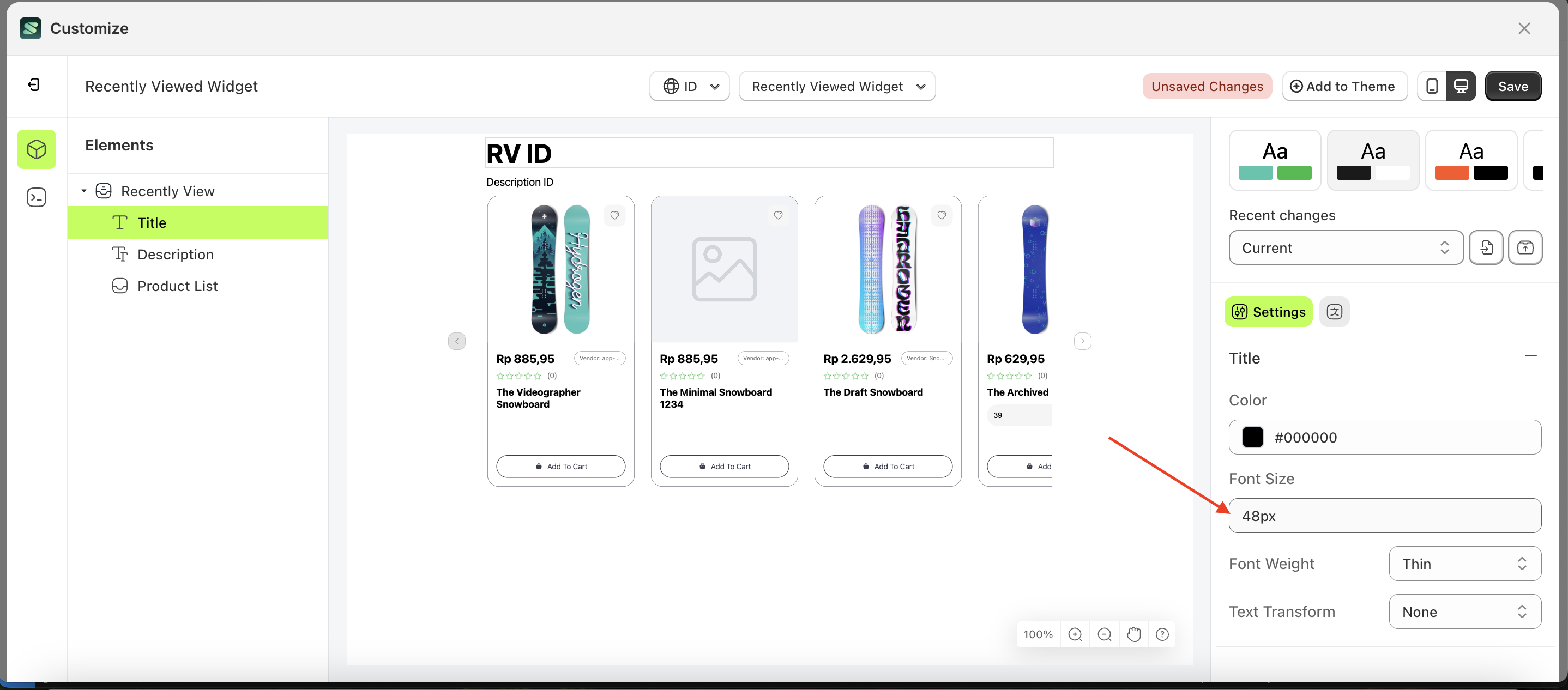
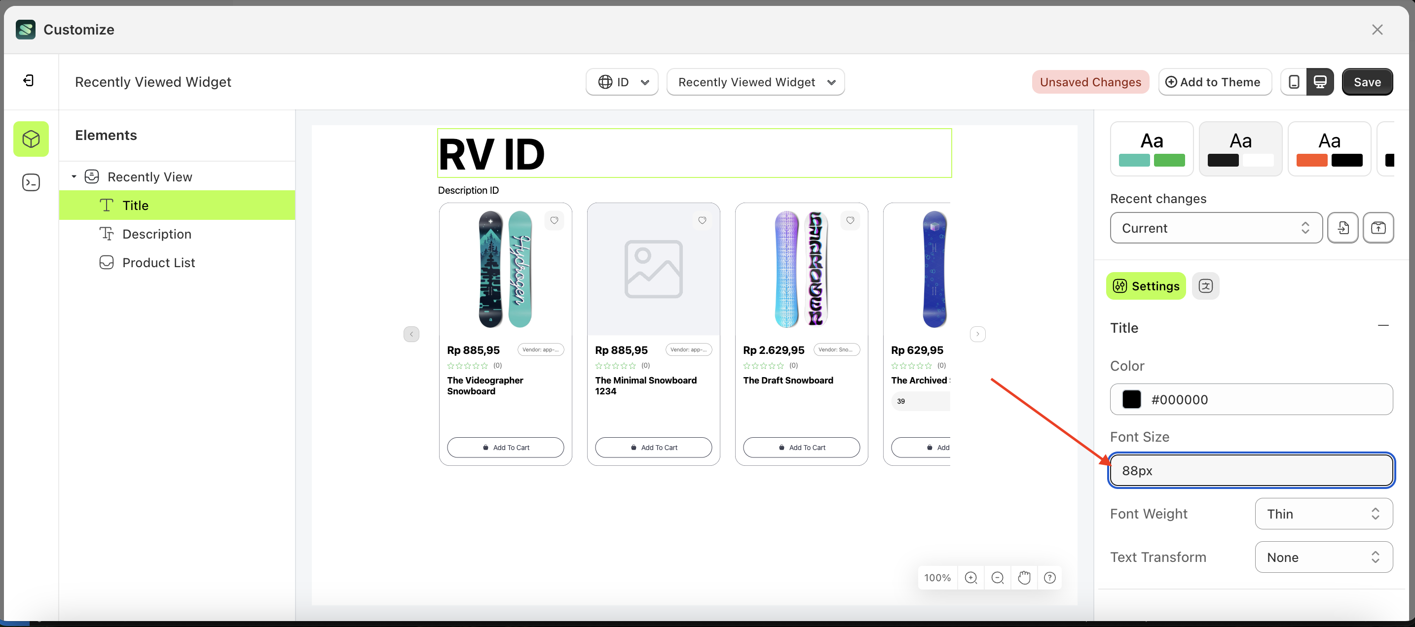
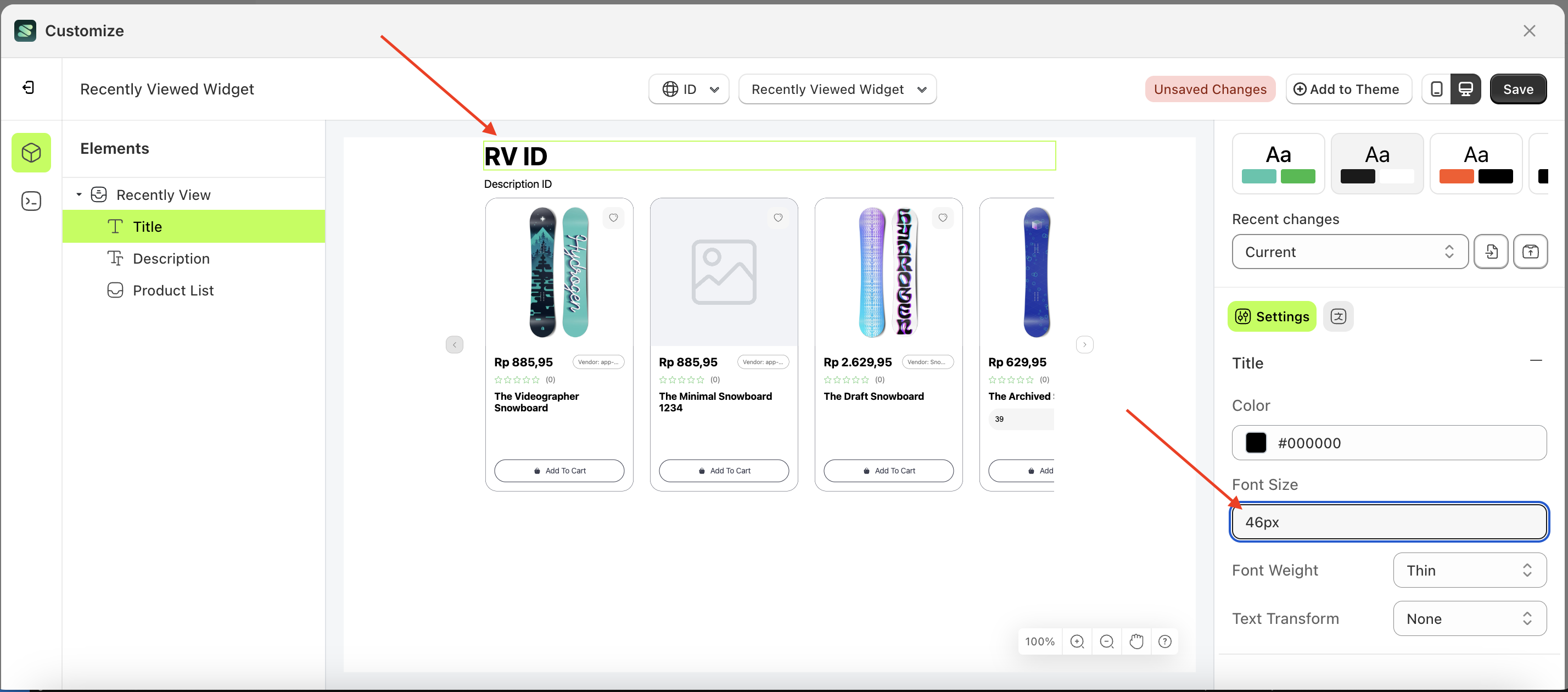
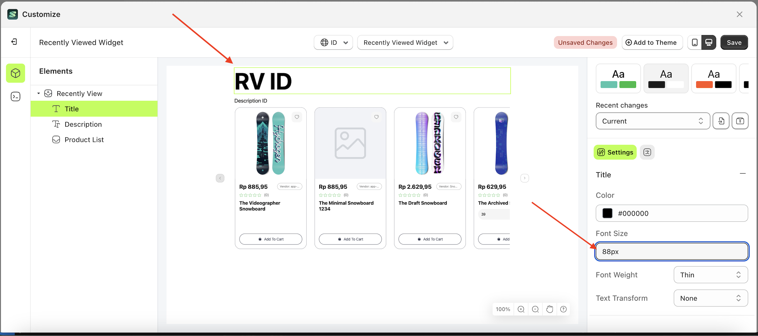
- Select the Title element on the left, then click the Settings tab and click the icon marked with a red arrow.
- On the right side, marked with a red arrow, you can change the font size to your desired value.
- Note: The font size format can be px, em, rem, %, or other units..
- For example, if you set the font size to 80px
- The font size of the Title element will adjust accordingly.
- Example : Before font size change settings
- Example : After font size change settings
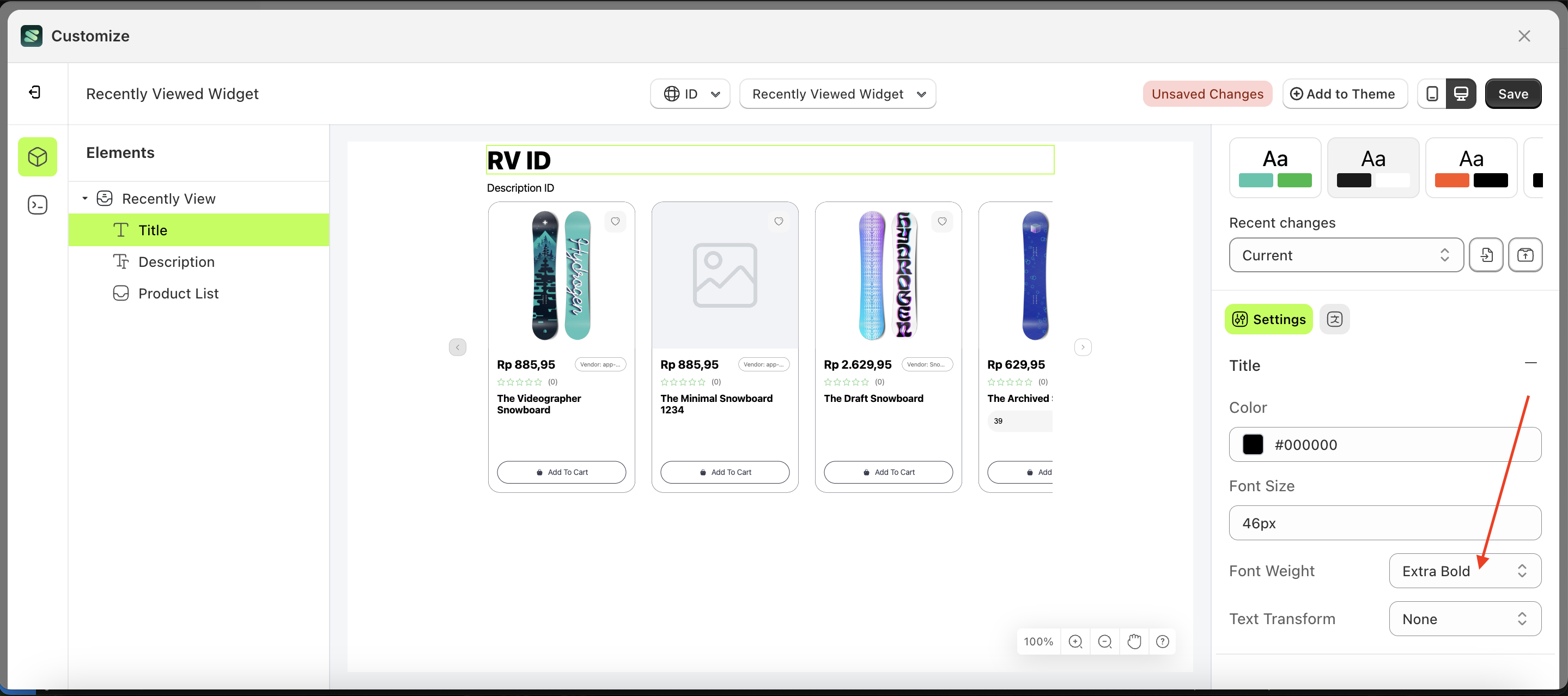
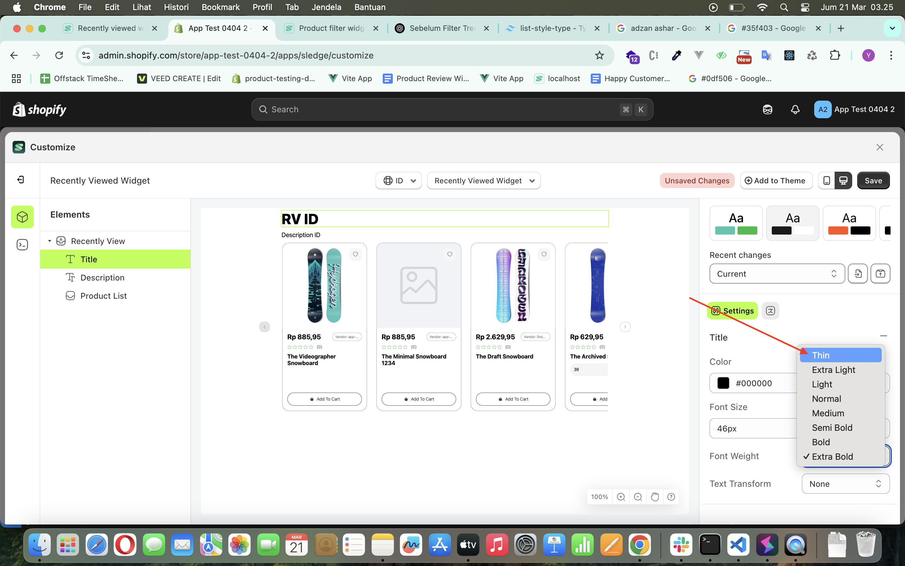
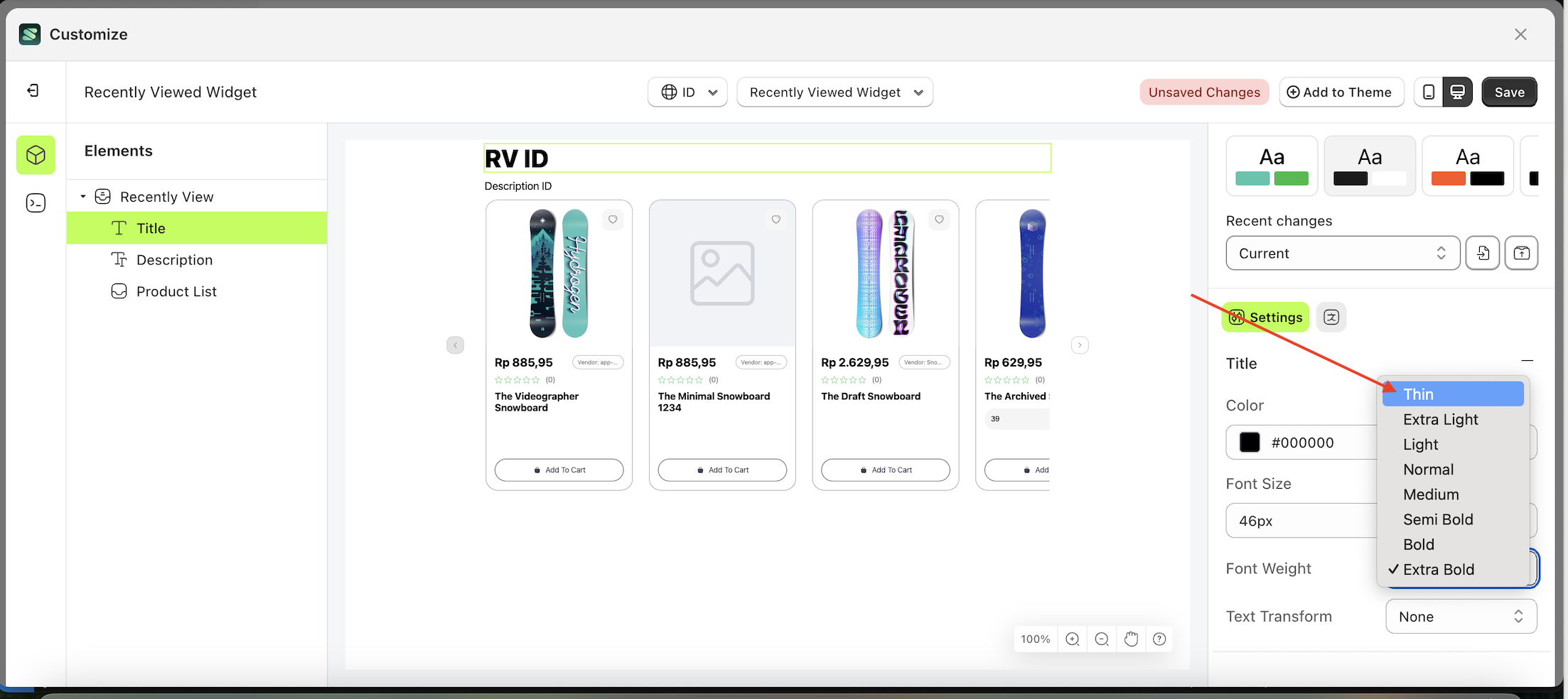
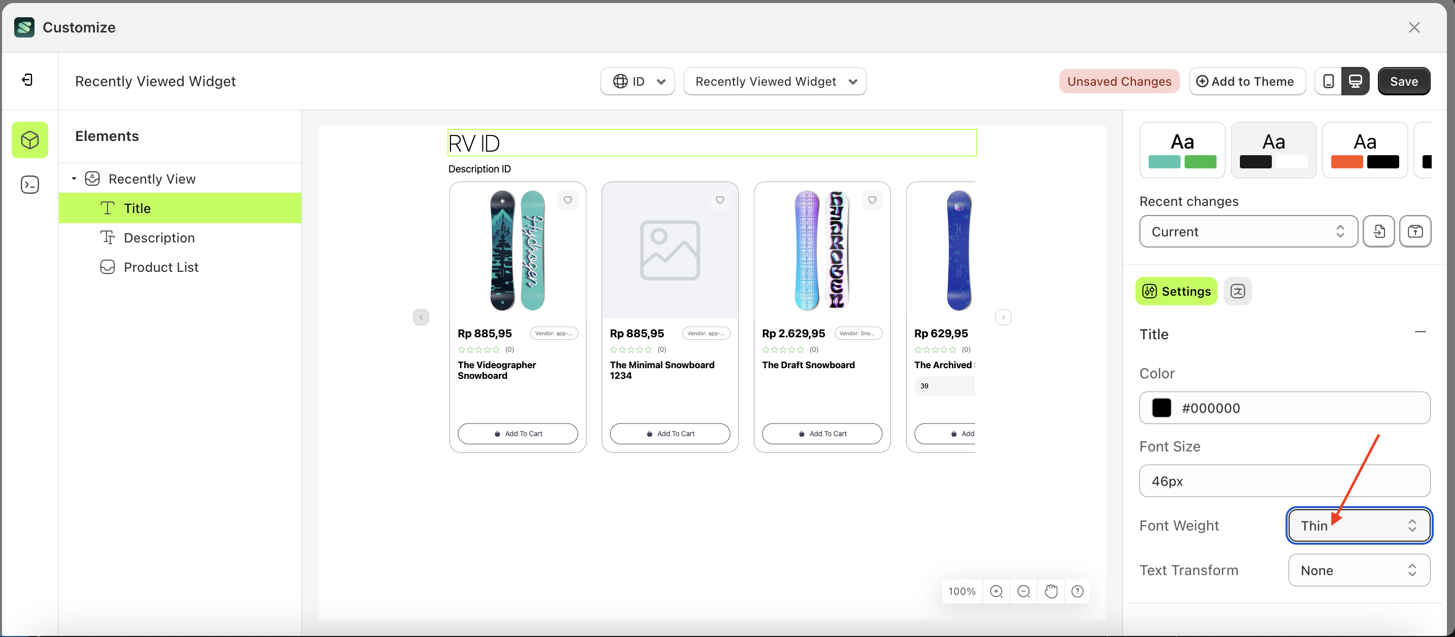
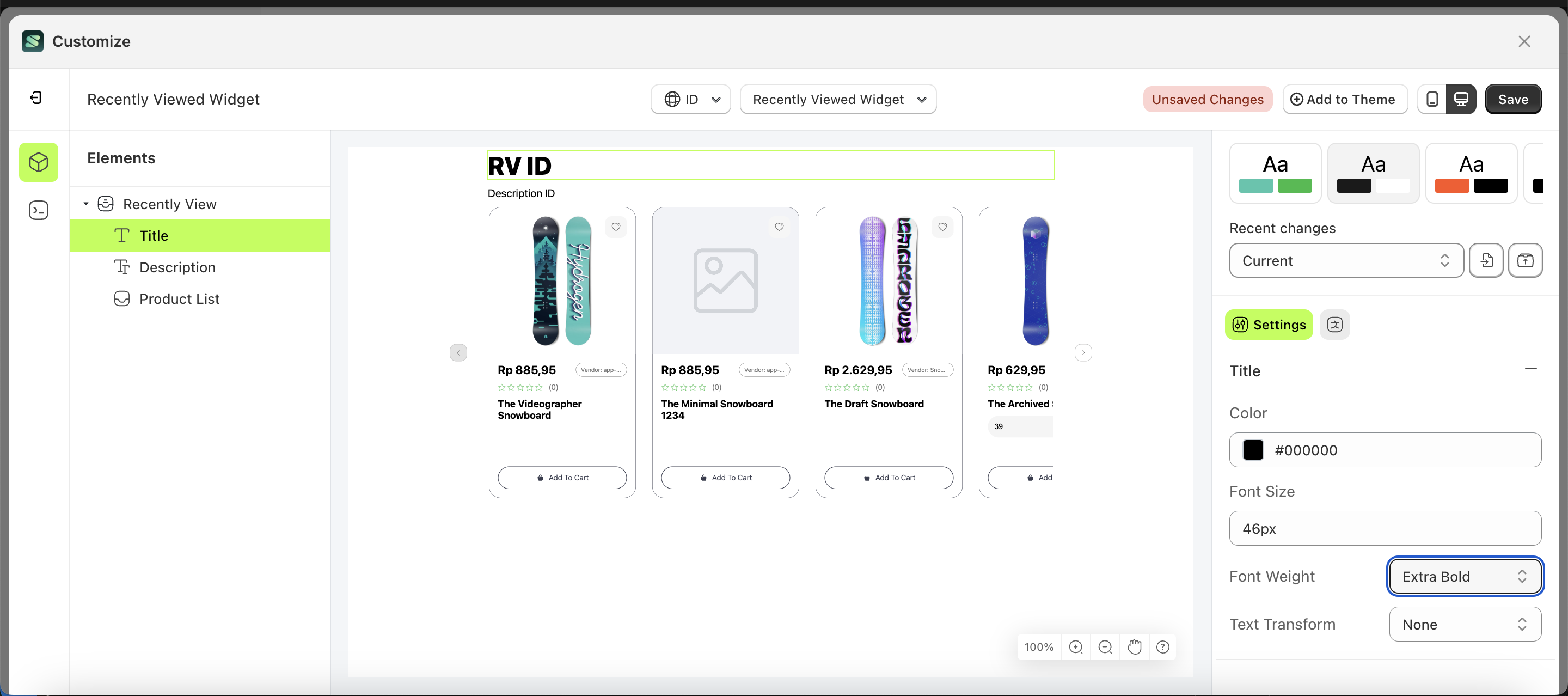
Font Weight
This feature is designed to customize the text weight of the title
Follow the steps below:
- Select the Verify Badge element on the left, then click the Settings tab and click the icon marked with a red arrow.
- On the right side, marked with a red arrow, you can change the padding right to your desired value.
- Note: The padding right format can be px, em, rem, %, or other units..
- Once the menu opens, select an option from the list
- For example, if you set the padding right to 80px
- The padding right of the Verify Badge element will adjust accordingly.
- Example : Before padding right change settings
- Example : After padding right change settings
Text Transform
This feature allows you to adjust the capitalization style of the text
Follow the steps below:
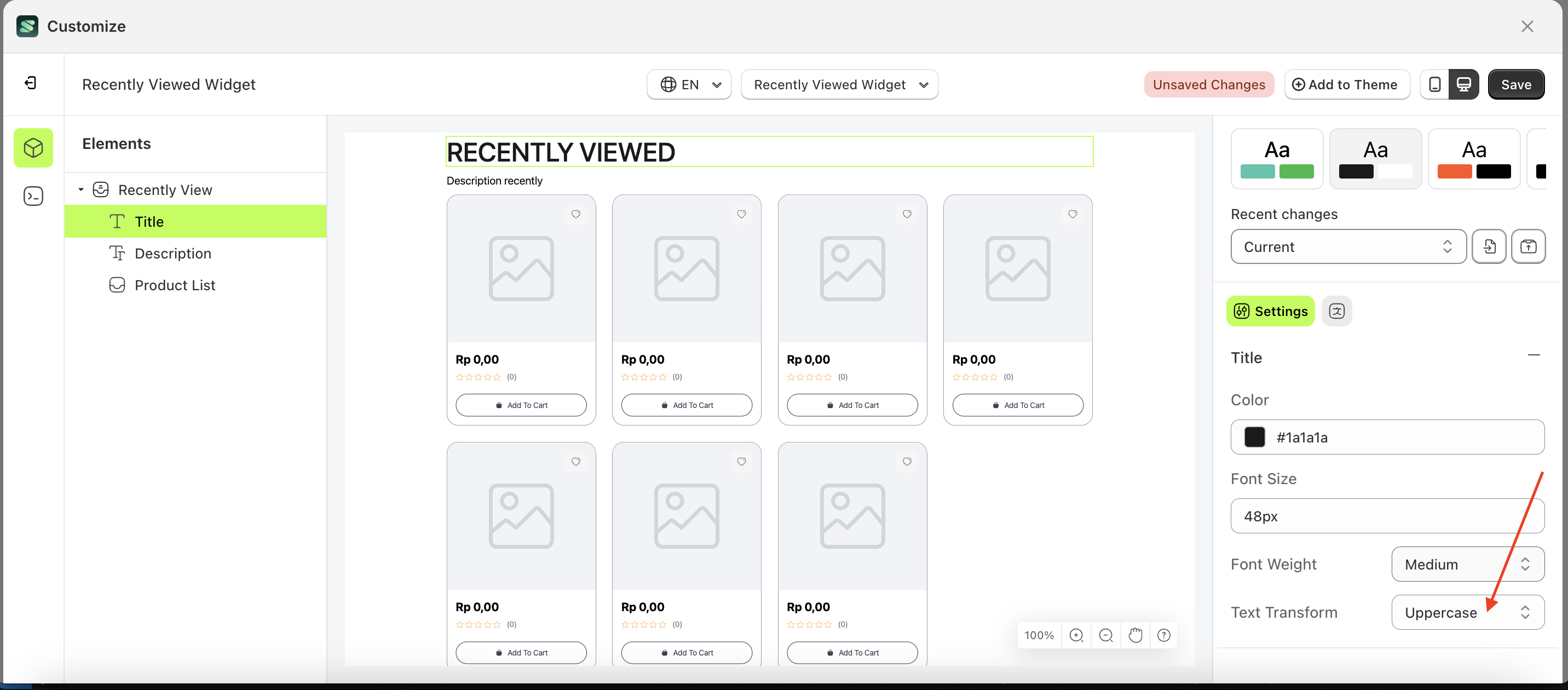
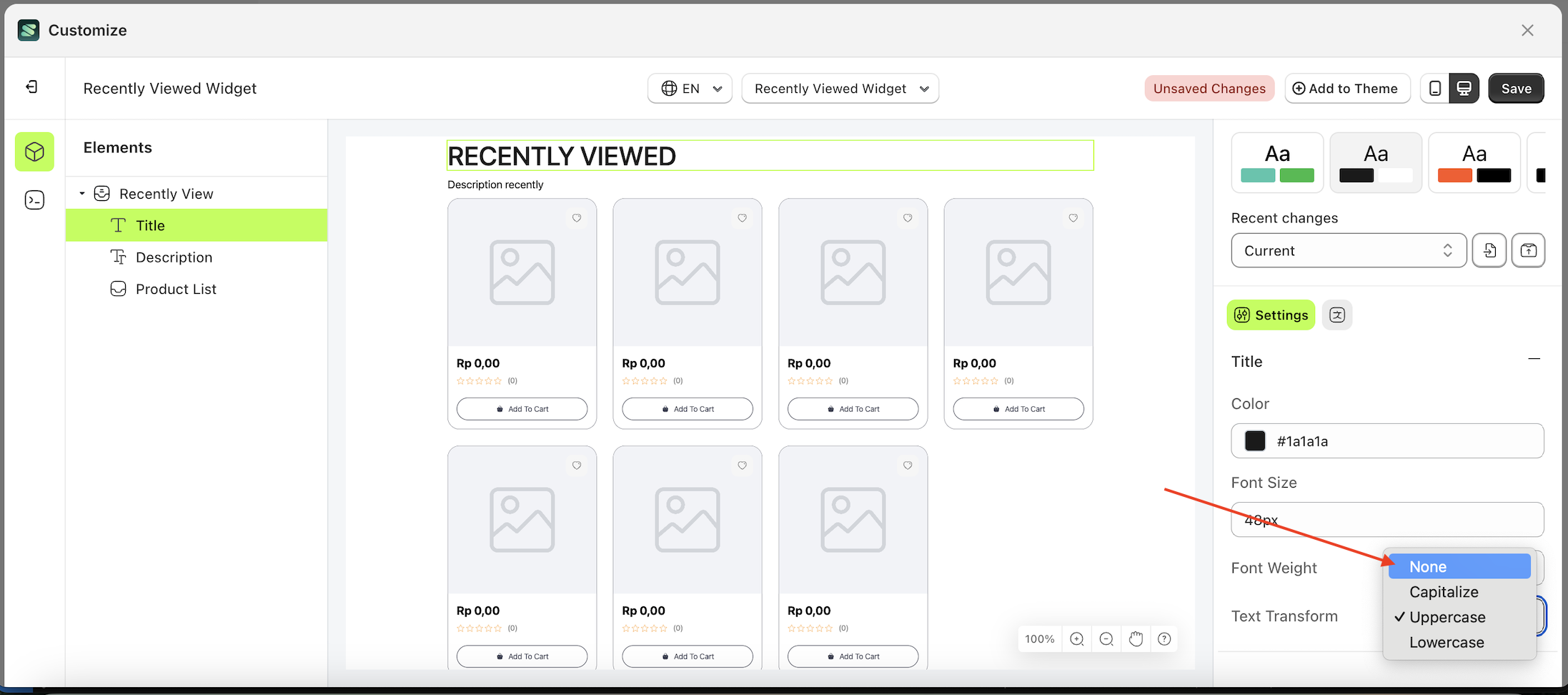
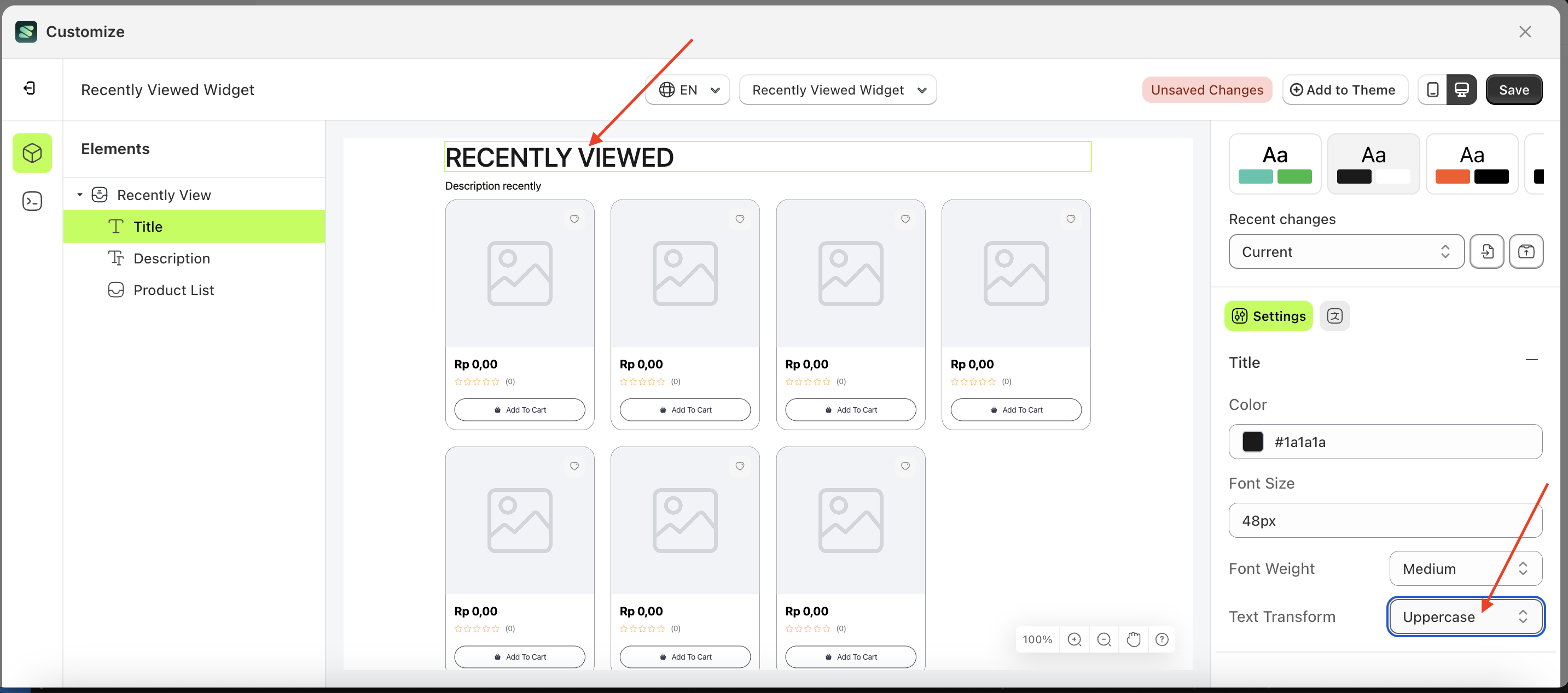
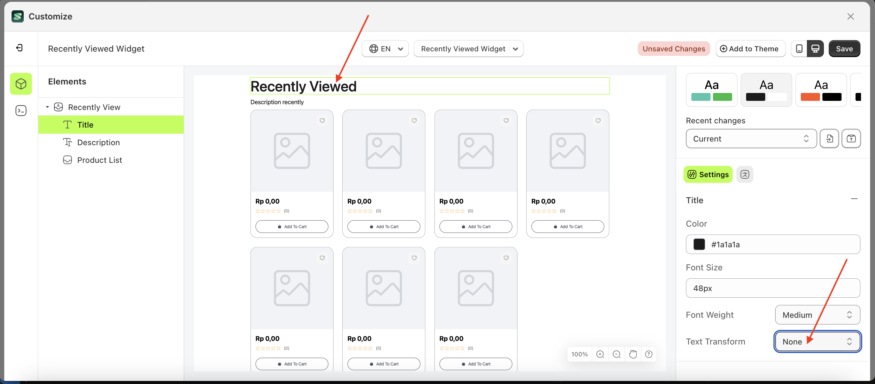
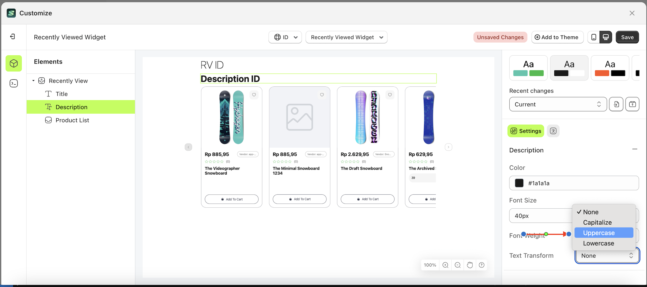
- Select the Title element on the left, then click the Settings tab and click the icon marked with a red arrow.
- On the right side, marked with a red arrow, you can change the text transform to your desired value.
- Note: The text transform format can be None, Capitalize, Uppercase and Lowecase.
- Once the menu opens, select an option from the list
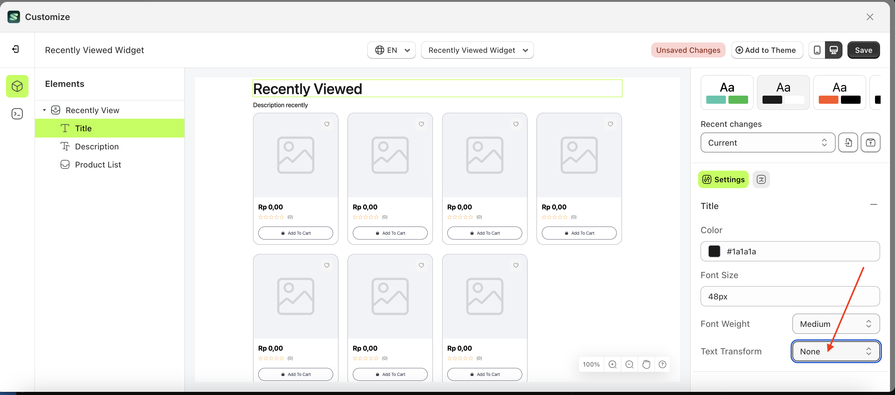
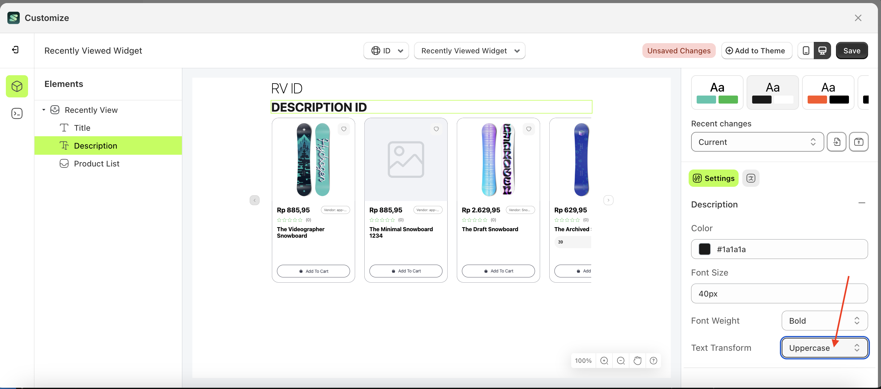
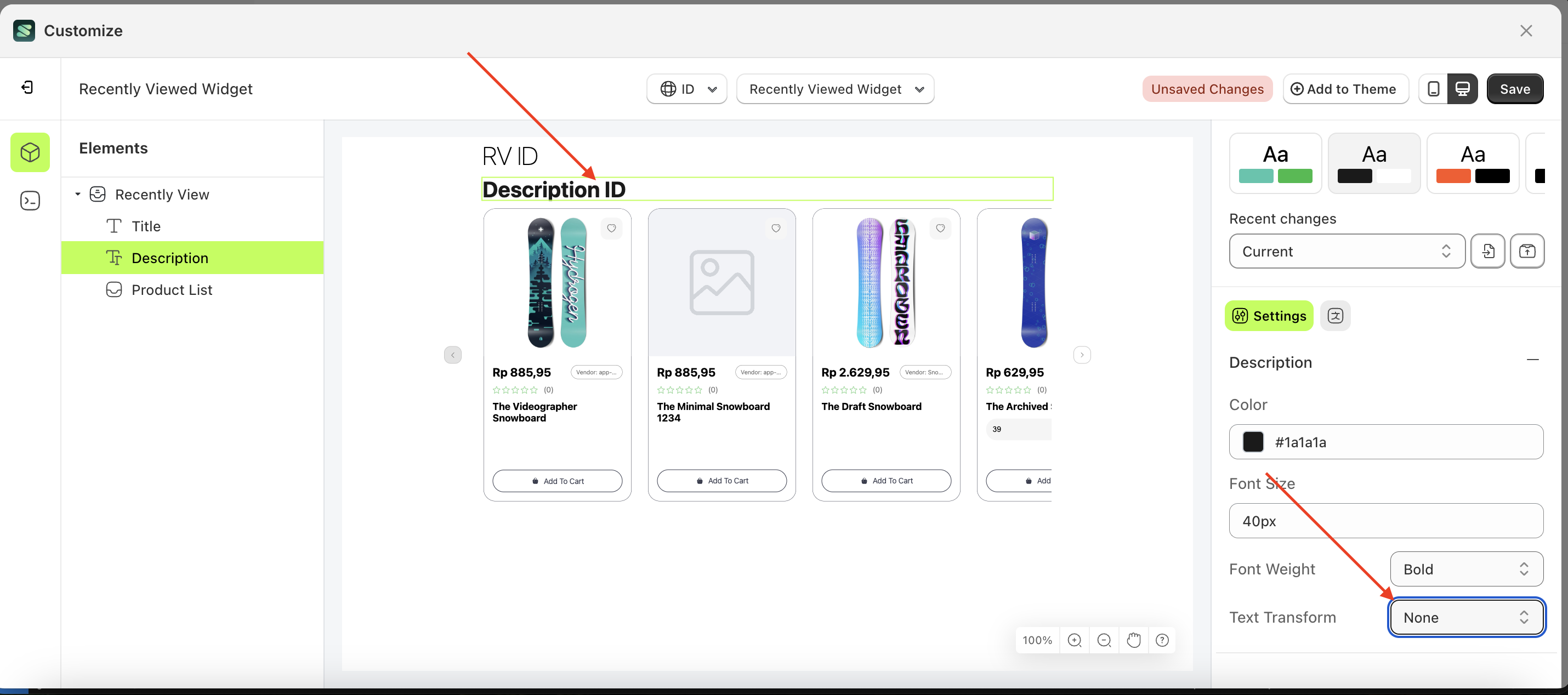
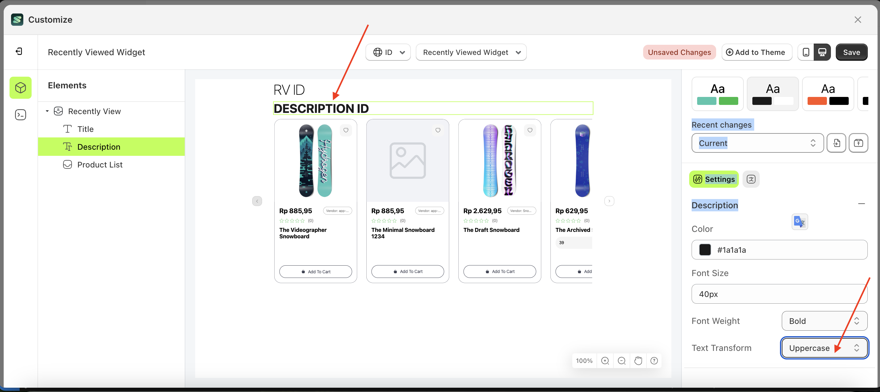
- For example, if you set the text transform to None
- The text transform of the Title element will adjust accordingly.
- Example : Before text transform change settings
- Example : After text transform change settings
Description
Available settings:
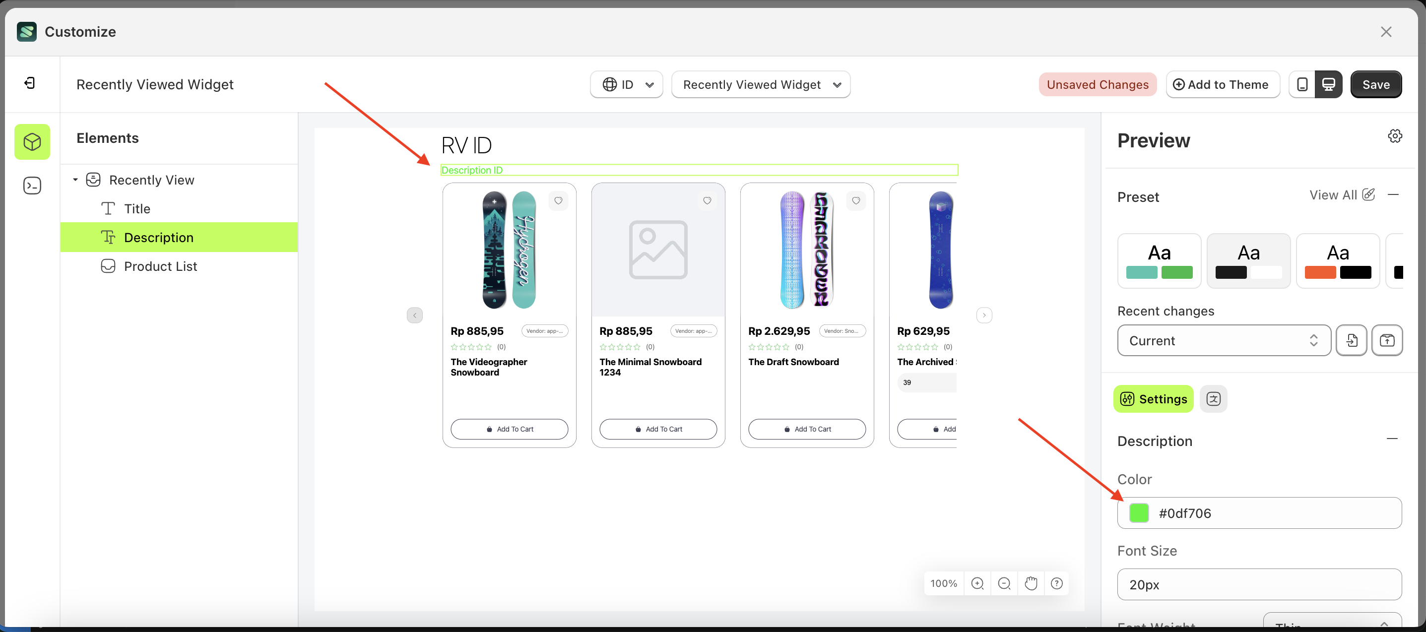
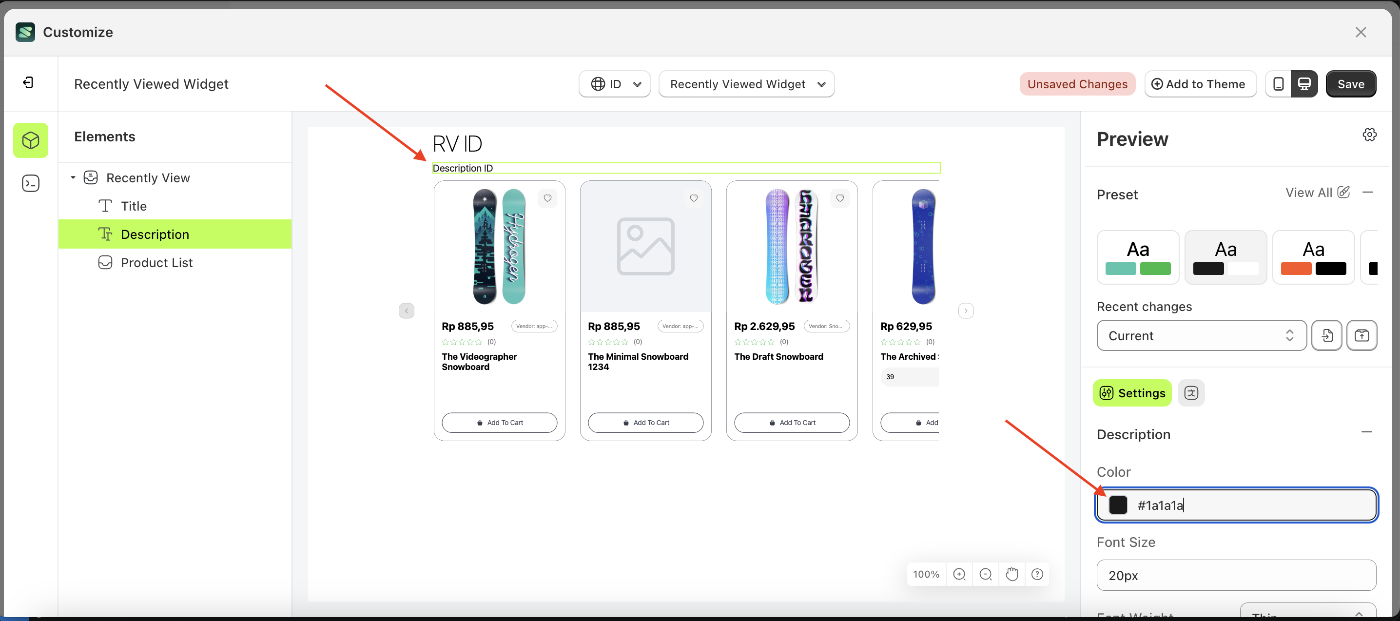
Color
This feature is designed to customize the text color of the description
Follow the steps below:
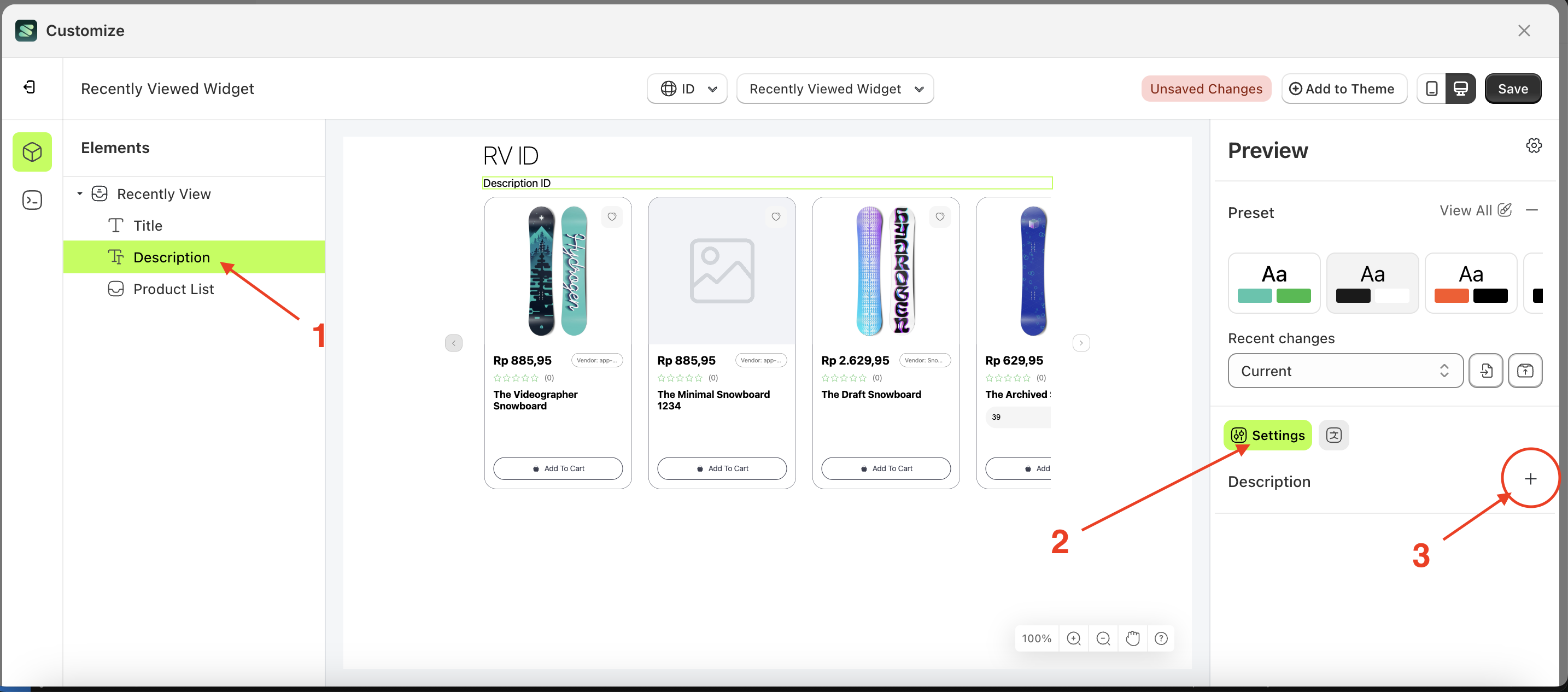
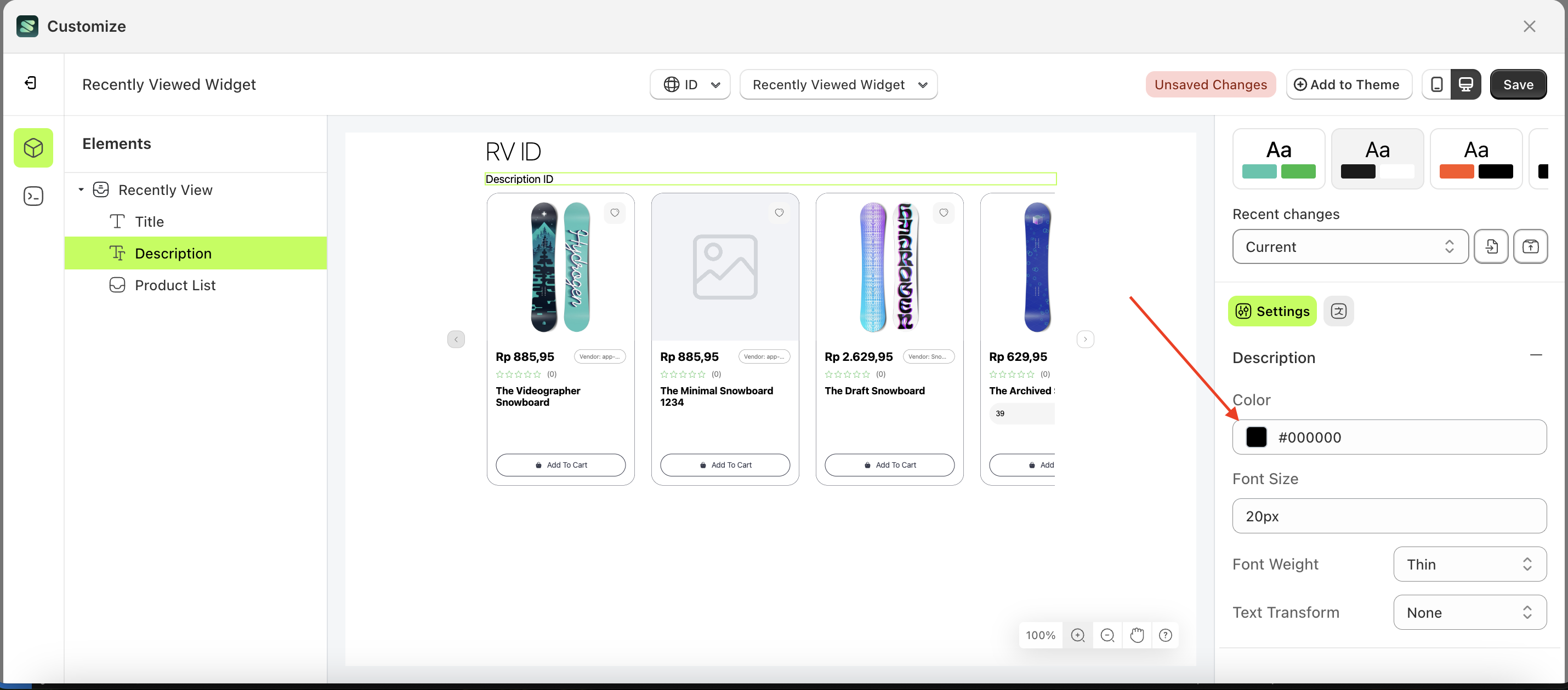
- Select the Search Result element on the left, then click the Settings tab and click the icon marked with a red arrow.
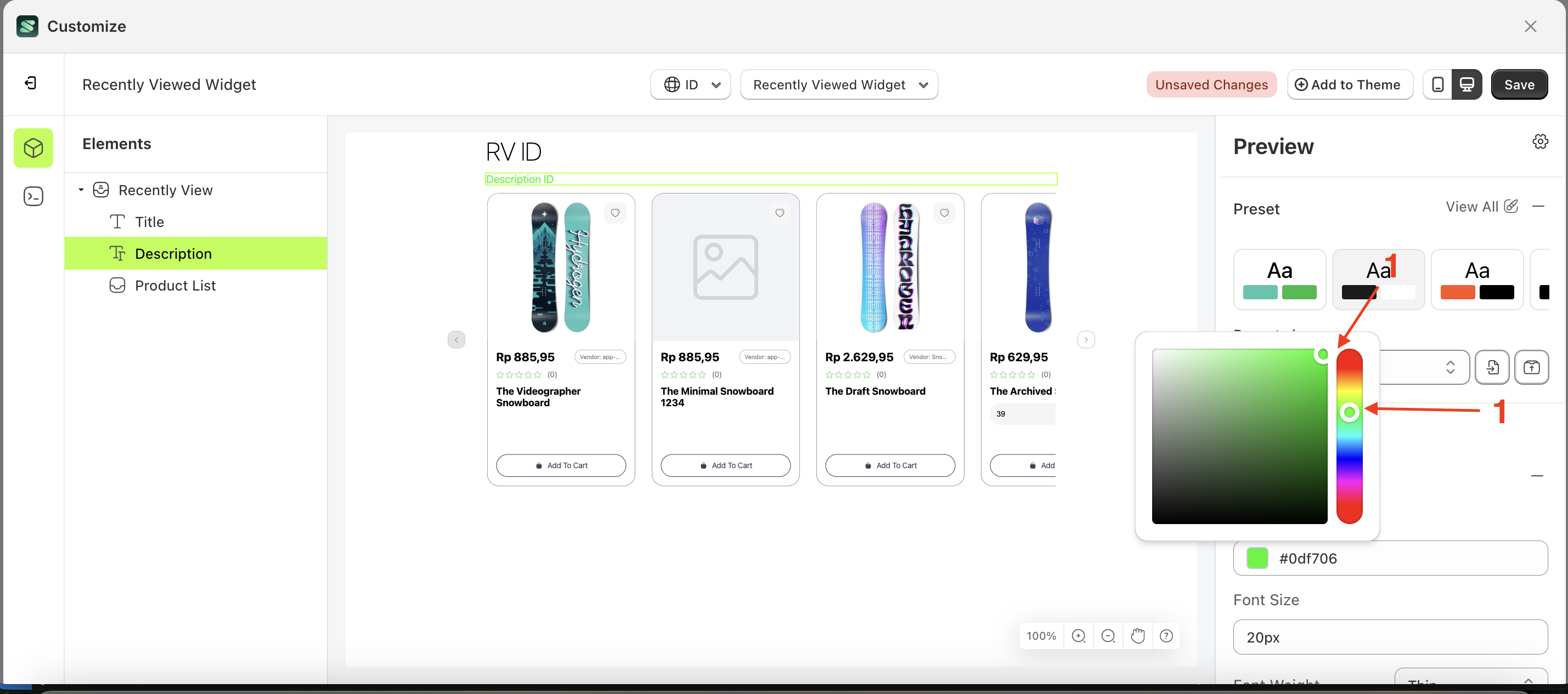
- Click the Color Palette on the right side, which is also marked with a red arrow.
- The Color Palette will appear. Click the right side of the palette where the red arrow and number 1 are indicated, then click the right side again where the red arrow and number 2 are marked.
- The recently viewed widget of the Search Result element will adjust accordingly.
- Example : Before Search Result change settings
- Example : After Search Result change settings
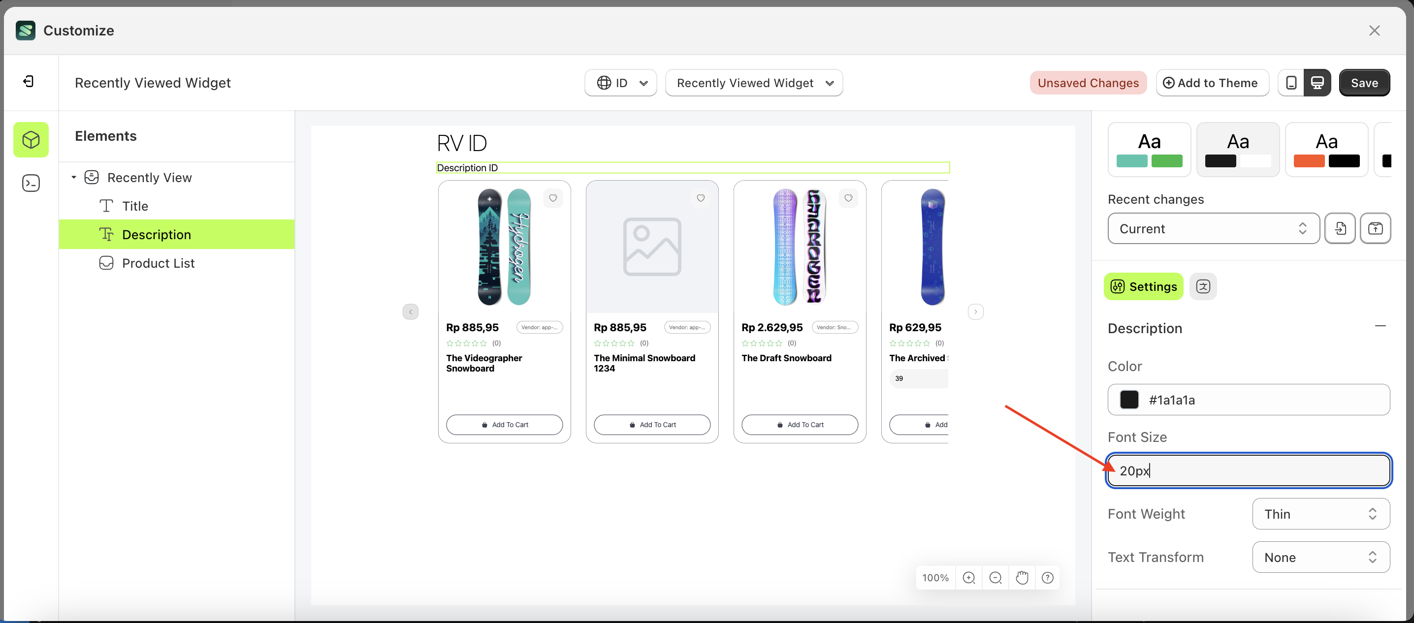
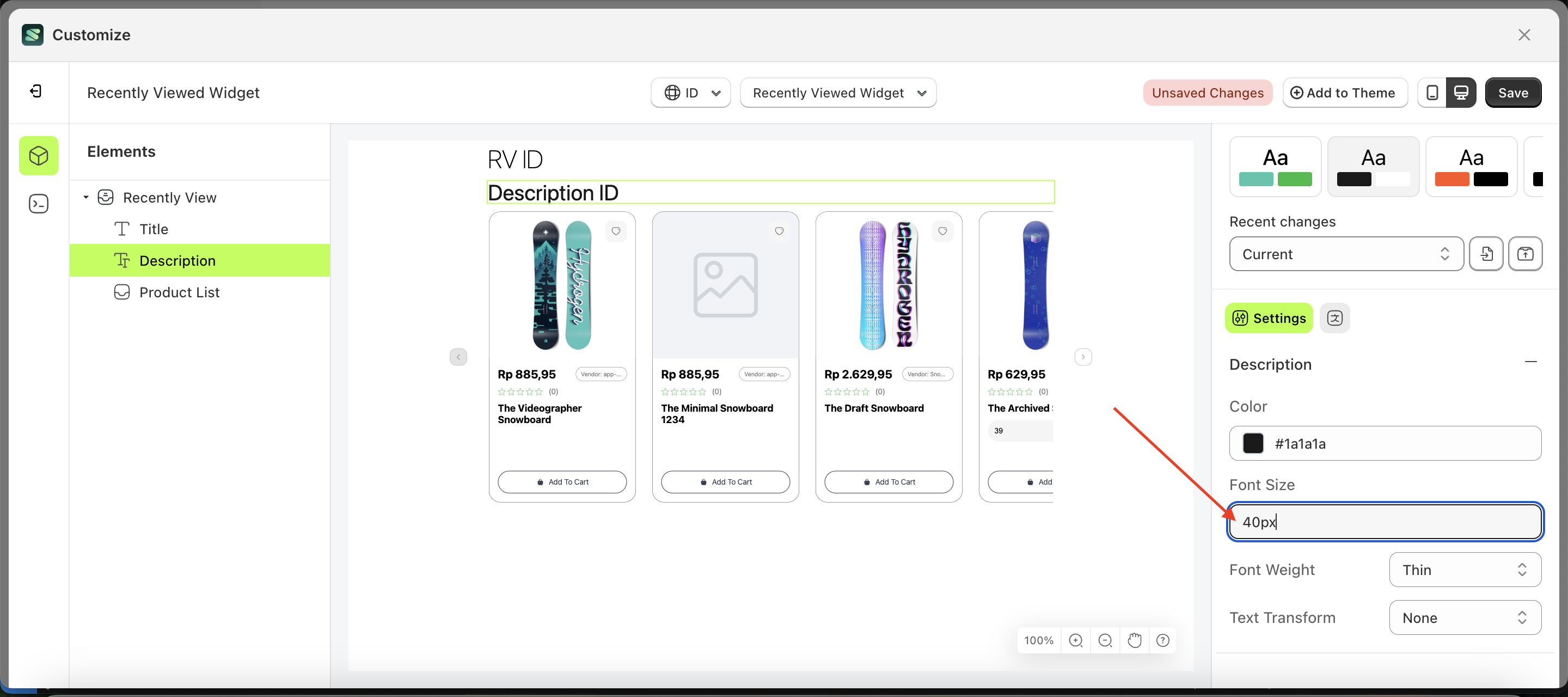
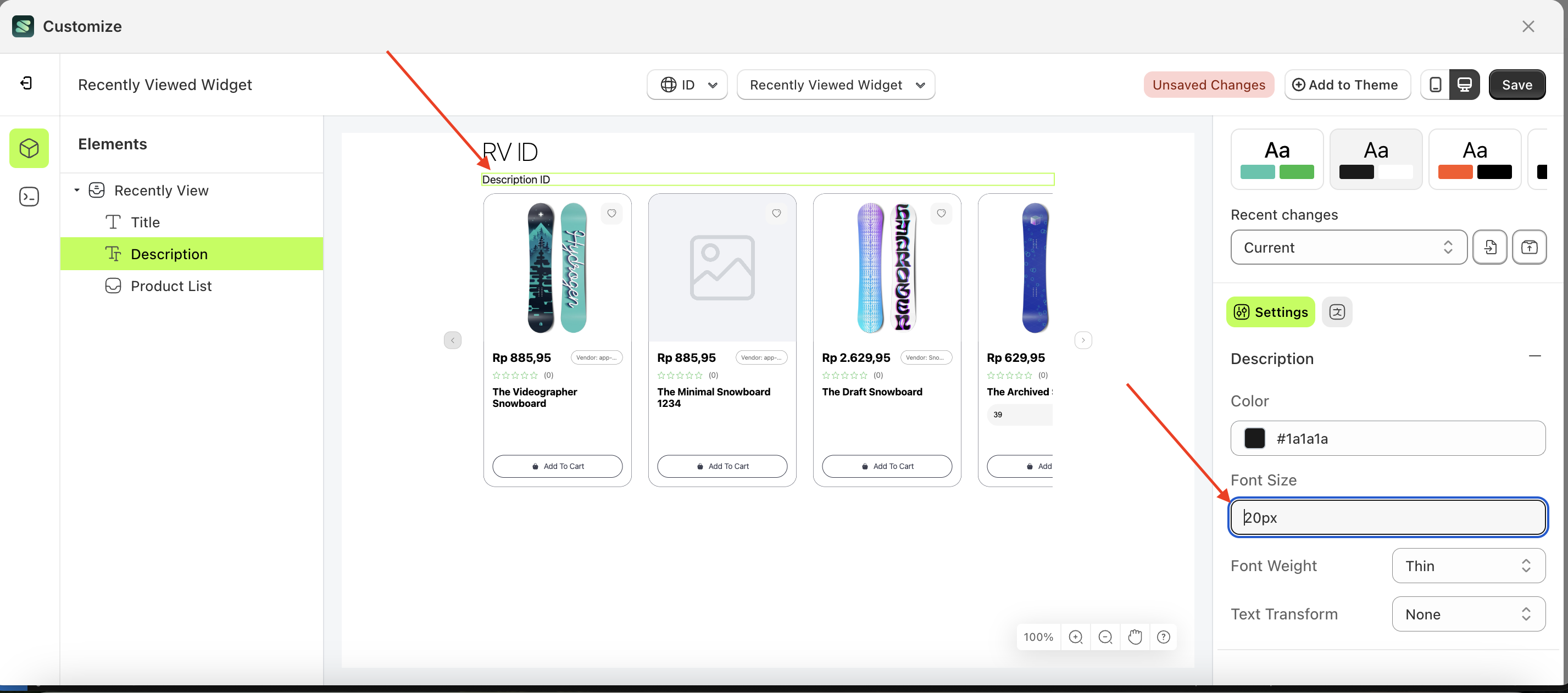
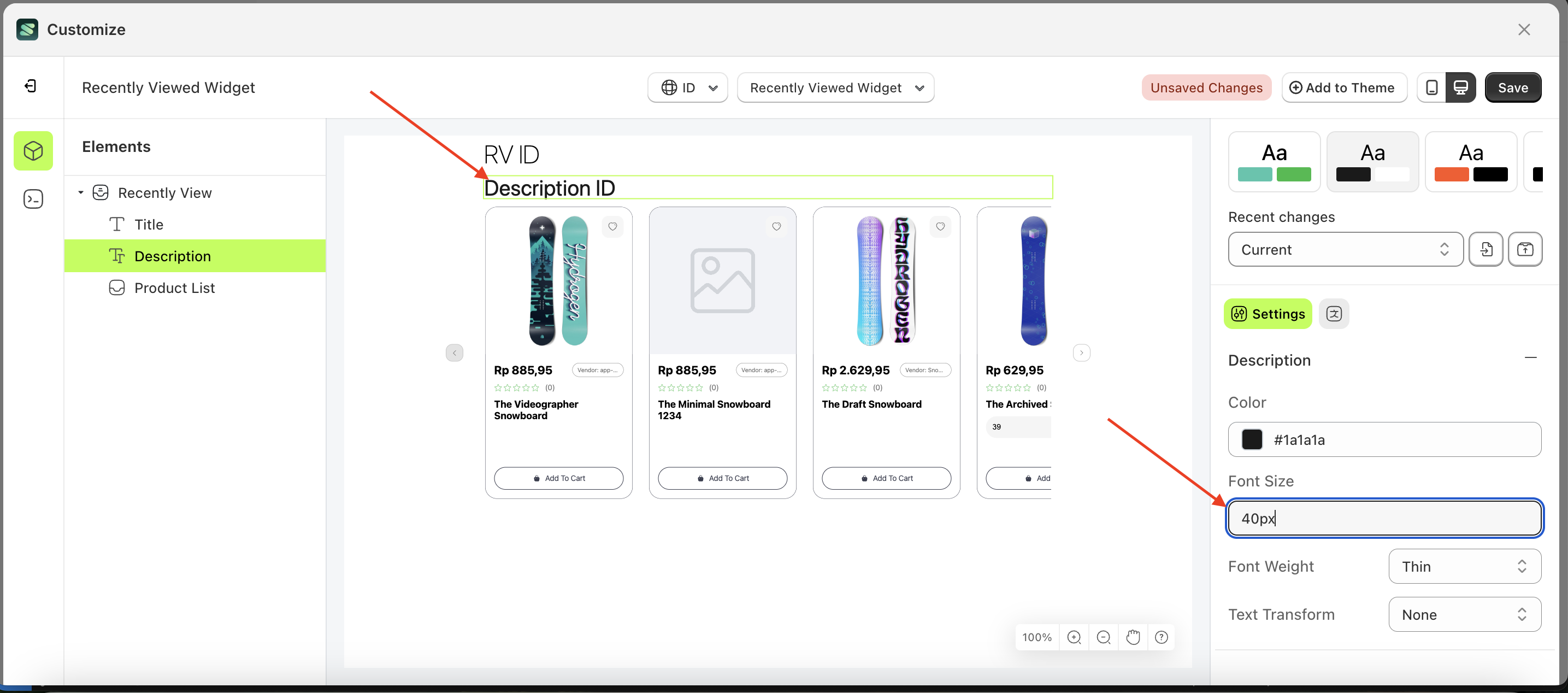
Font Size
This feature is designed to customize the text size of the description
Follow the steps below:
- Select the Search Result element on the left, then click the Settings tab and click the icon marked with a red arrow.
- Click the Color Palette on the right side, which is also marked with a red arrow.
- The Color Palette will appear. Click the right side of the palette where the red arrow and number 1 are indicated, then click the right side again where the red arrow and number 2 are marked.
- The recently viewed widget of the Search Result element will adjust accordingly.
- Example : Before Search Result change settings
- Example : After Search Result change settings
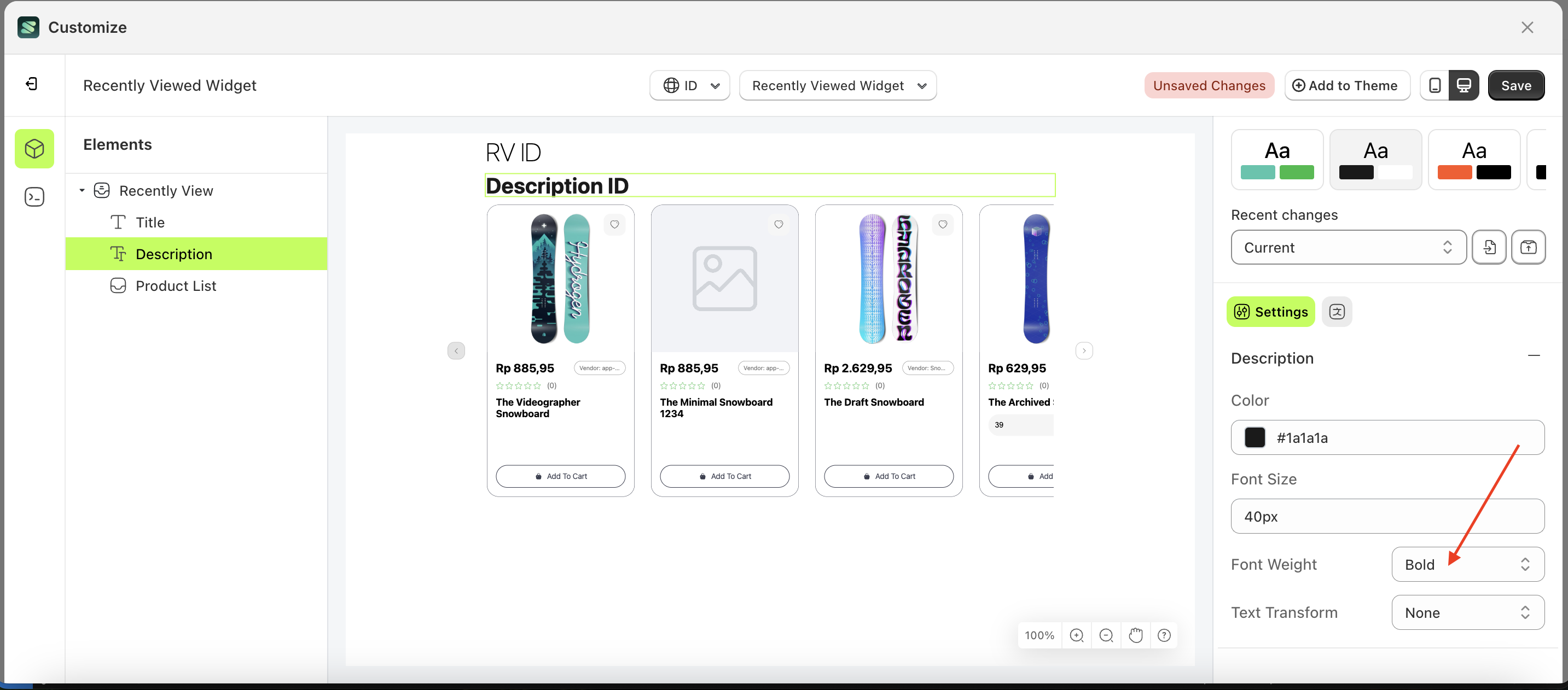
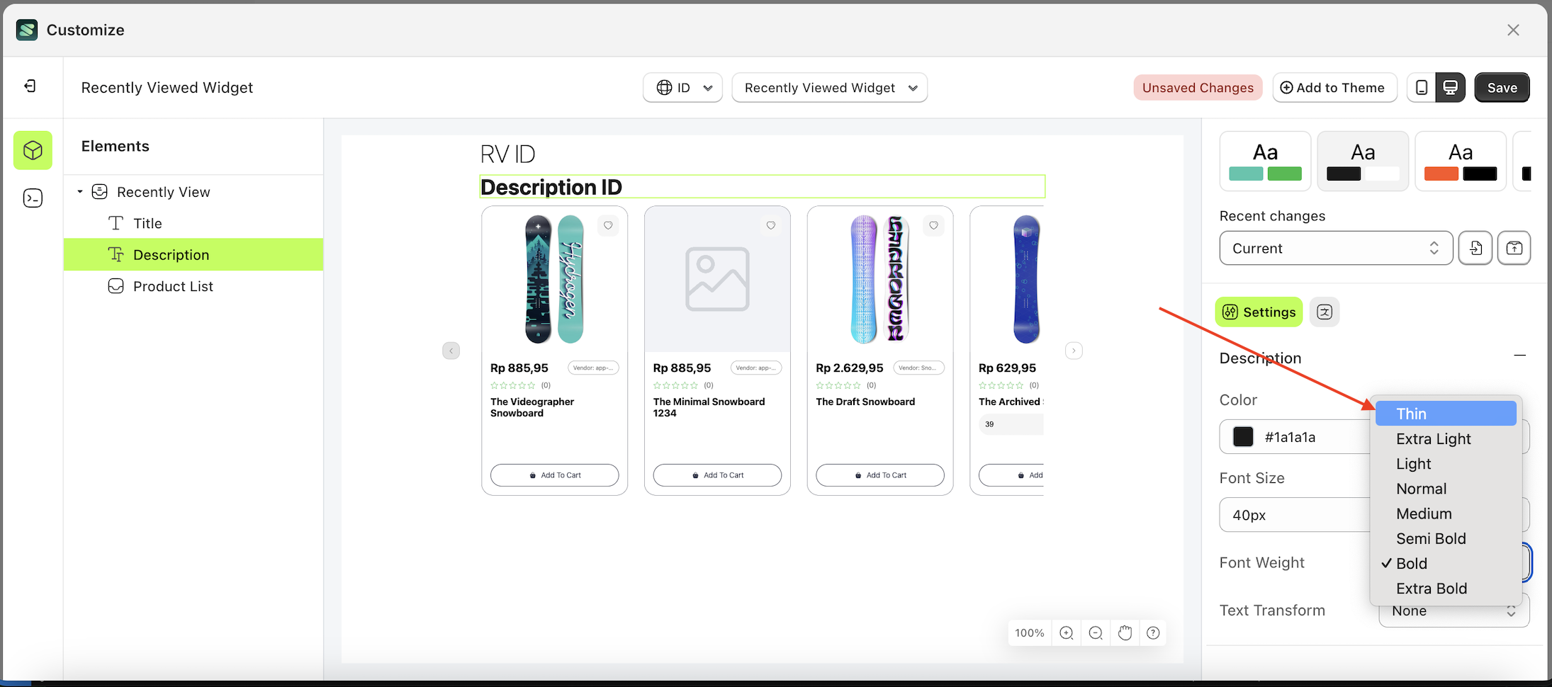
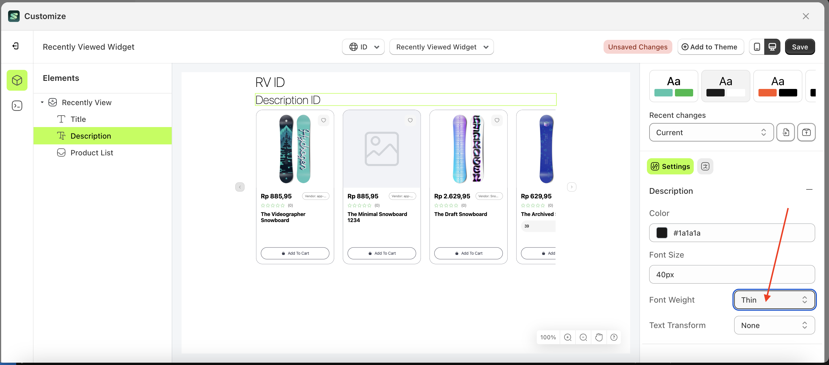
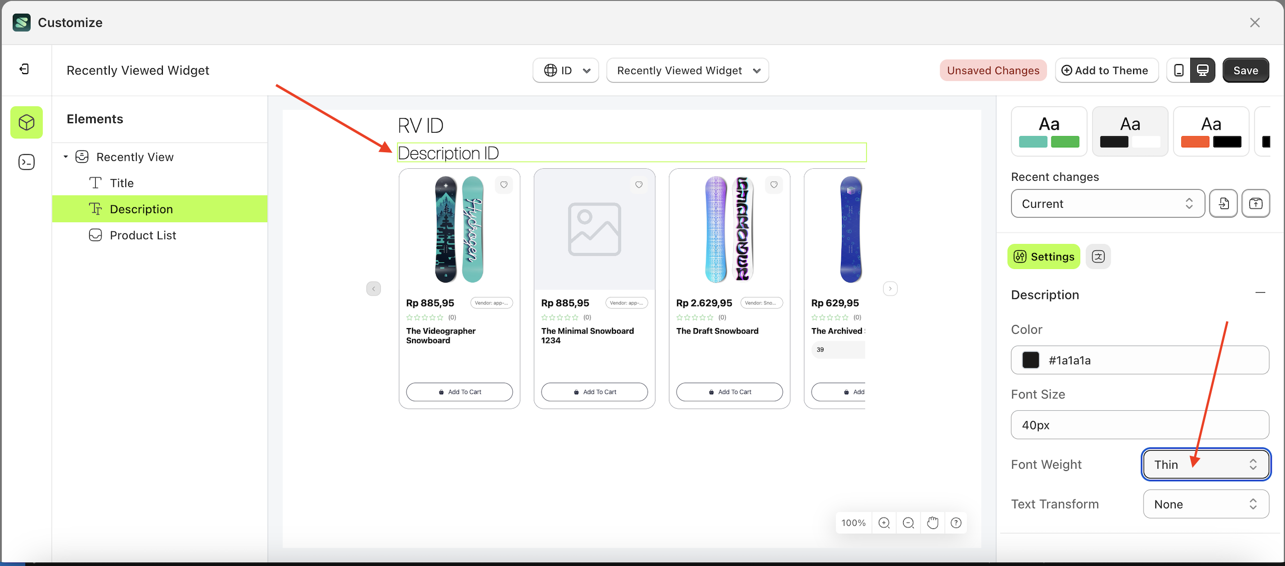
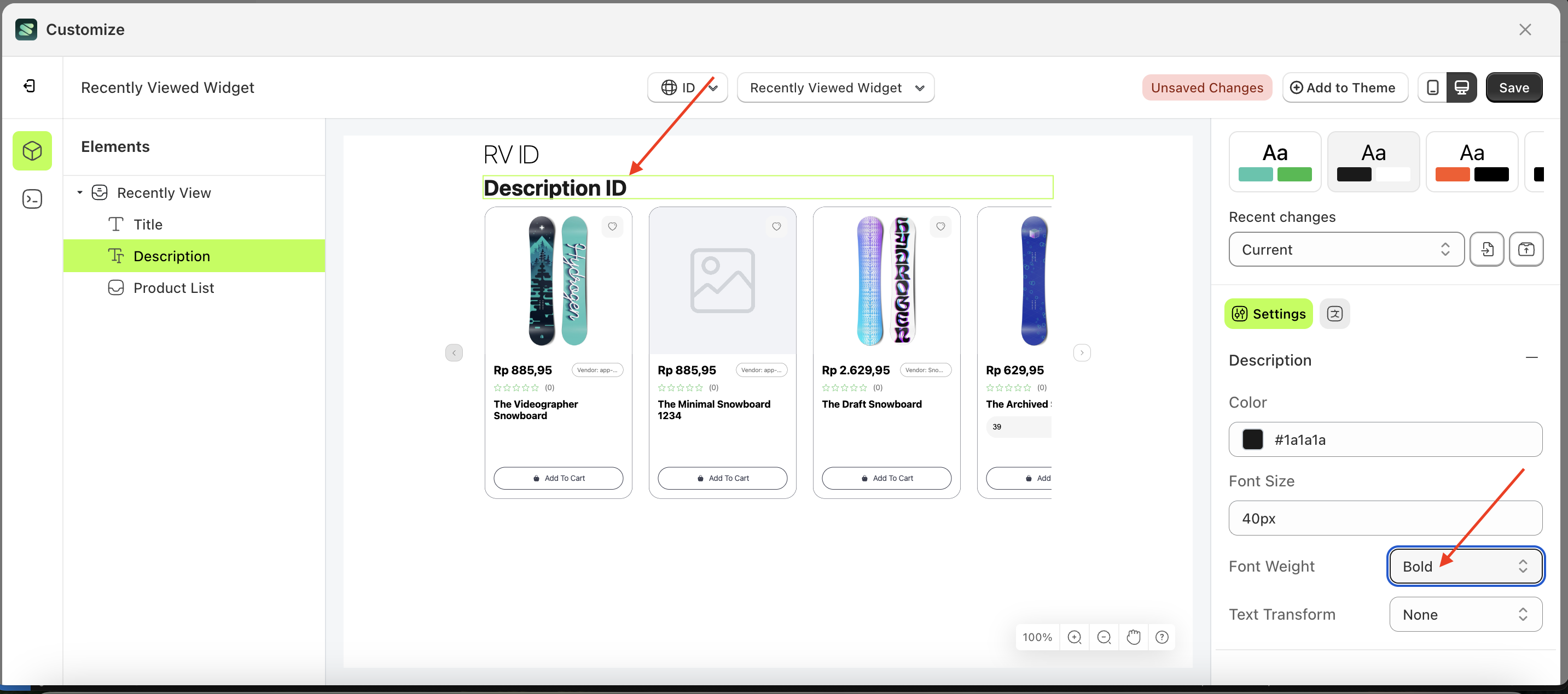
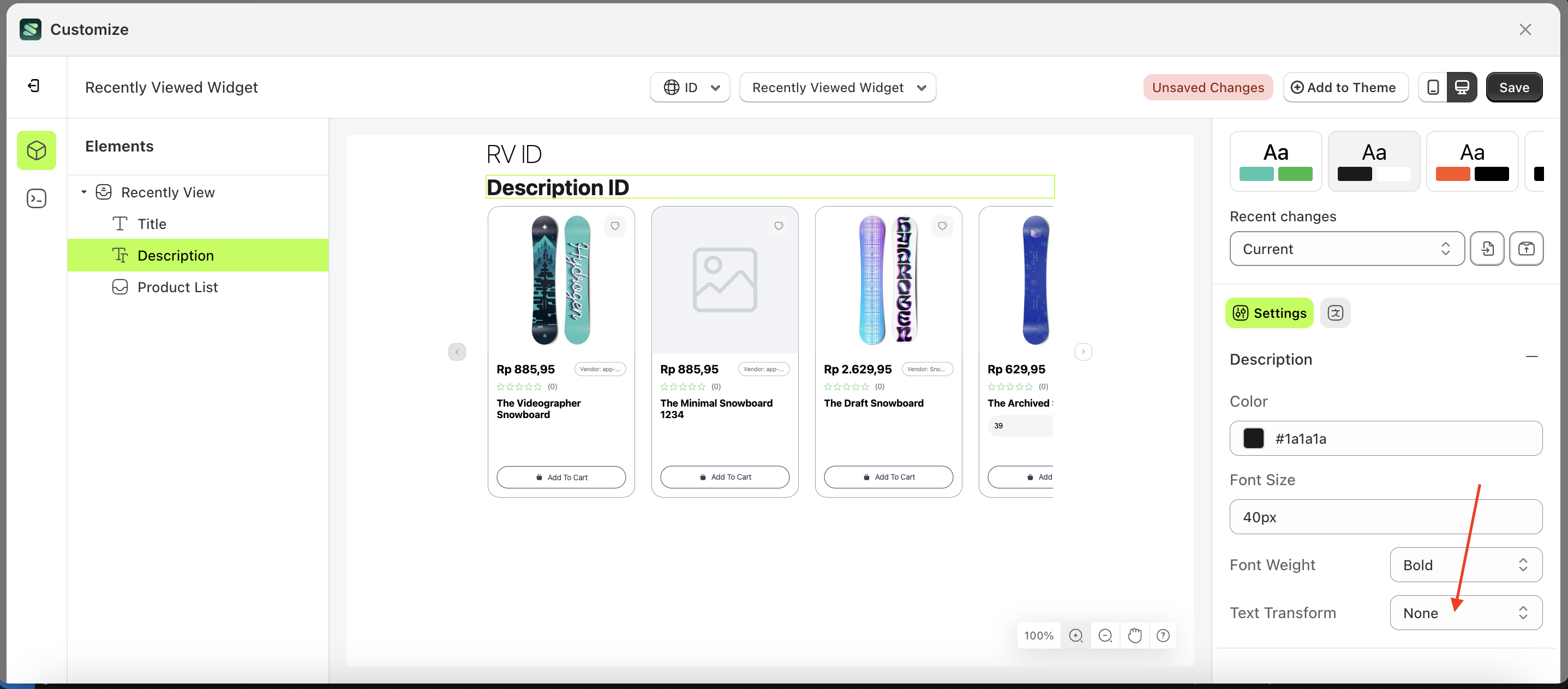
Font Weight
This feature is designed to customize the text weight of the description
Follow the steps below:
- Select the Verify Badge element on the left, then click the Settings tab and click the icon marked with a red arrow.
- On the right side, marked with a red arrow, you can change the padding right to your desired value.
- Note: The padding right format can be px, em, rem, %, or other units..
- Once the menu opens, select an option from the list
- For example, if you set the padding right to 80px
- The padding right of the Verify Badge element will adjust accordingly.
- Example : Before padding right change settings
- Example : After padding right change settings
Text Transform
This feature allows you to adjust the capitalization style of the text
Follow the steps below:
- Select the Verify Badge element on the left, then click the Settings tab and click the icon marked with a red arrow.
- On the right side, marked with a red arrow, you can change the padding right to your desired value.
- Note: The padding right format can be px, em, rem, %, or other units..
- Once the menu opens, select an option from the list
- For example, if you set the padding right to 80px
- The padding right of the Verify Badge element will adjust accordingly.
- Example : Before padding right change settings
- Example : After padding right change settings
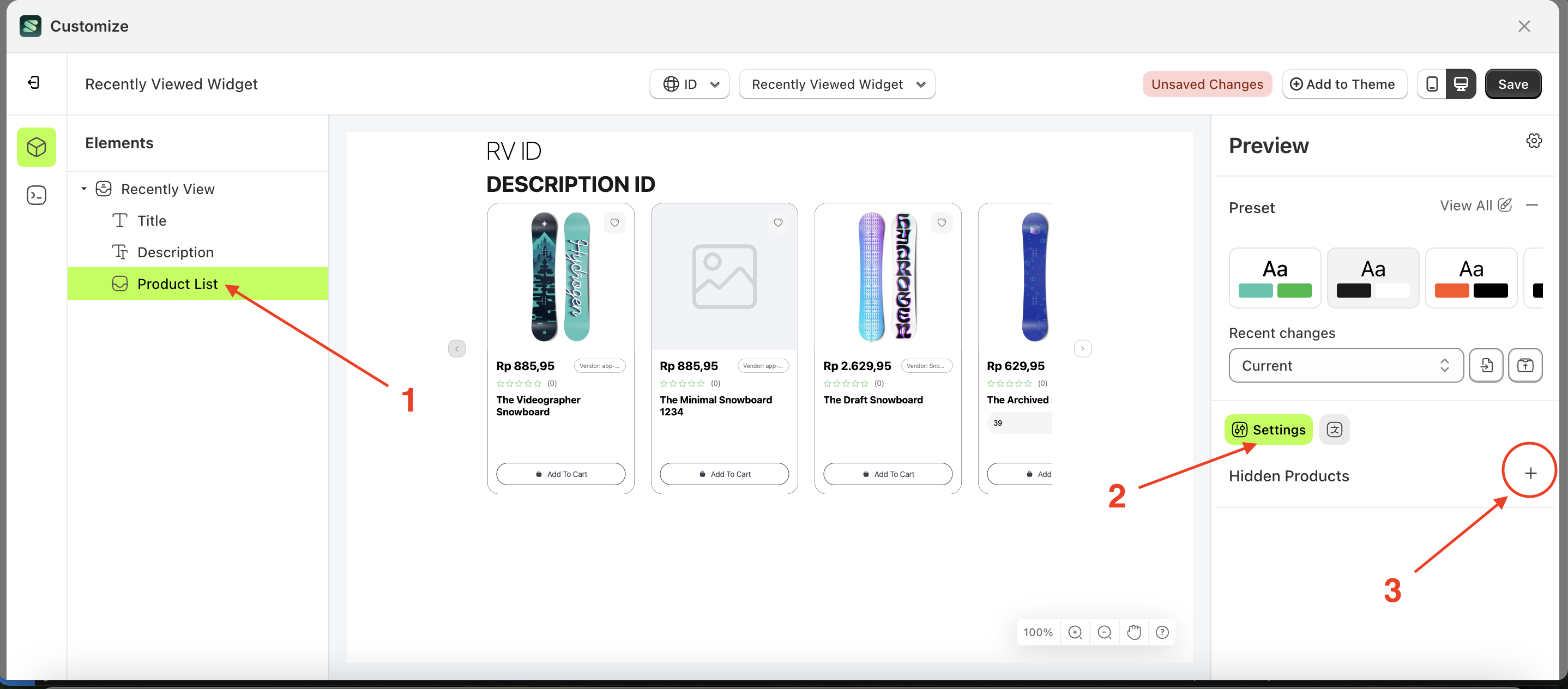
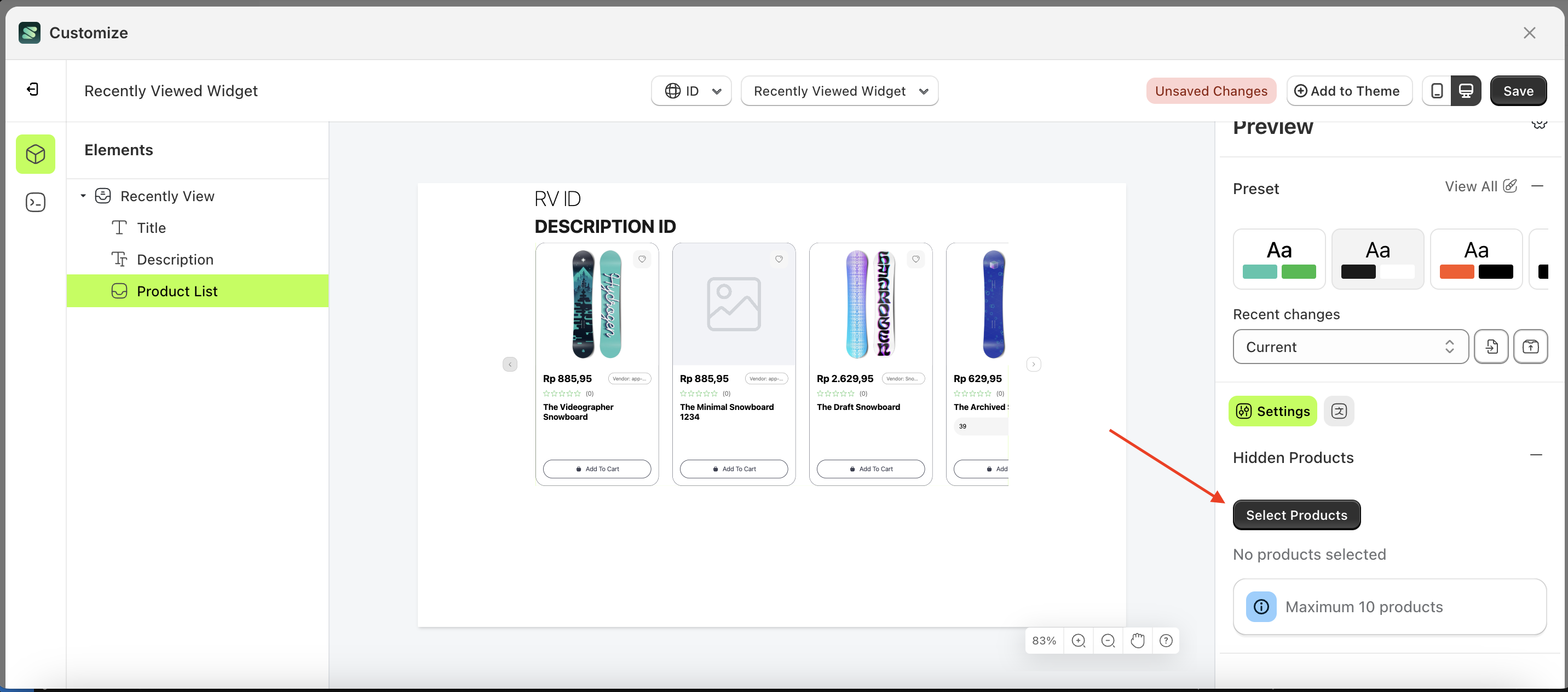
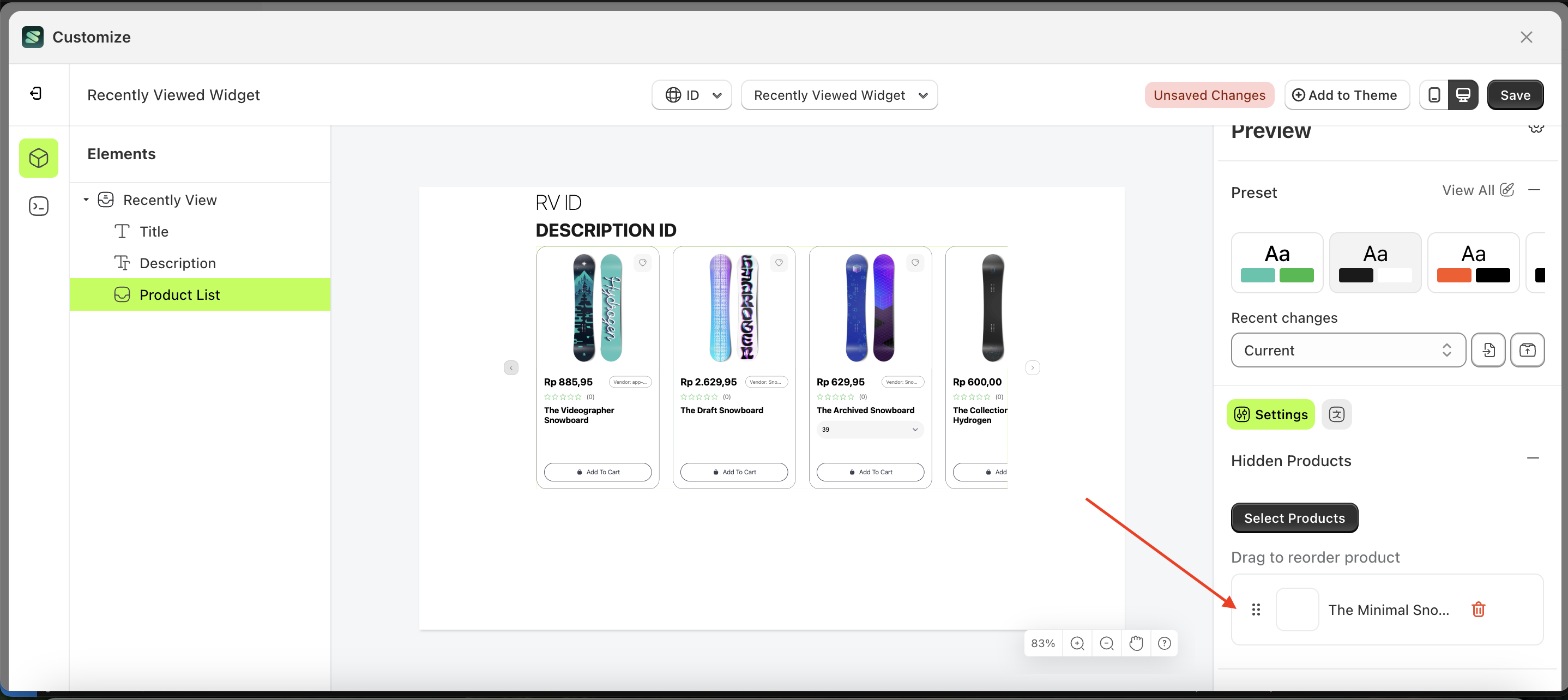
Hidden Products
This feature is used to manage products that will be hidden from this list.
Follow the steps below:
- Select the Product List element on the right, then click the Settings tab and click the icon marked with a red arrow.
- Click the "Select Product" button.
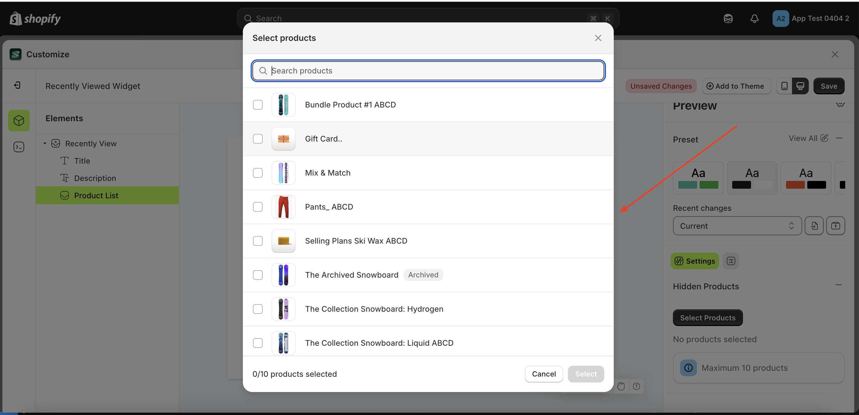
- A popup will appear with a list of products.
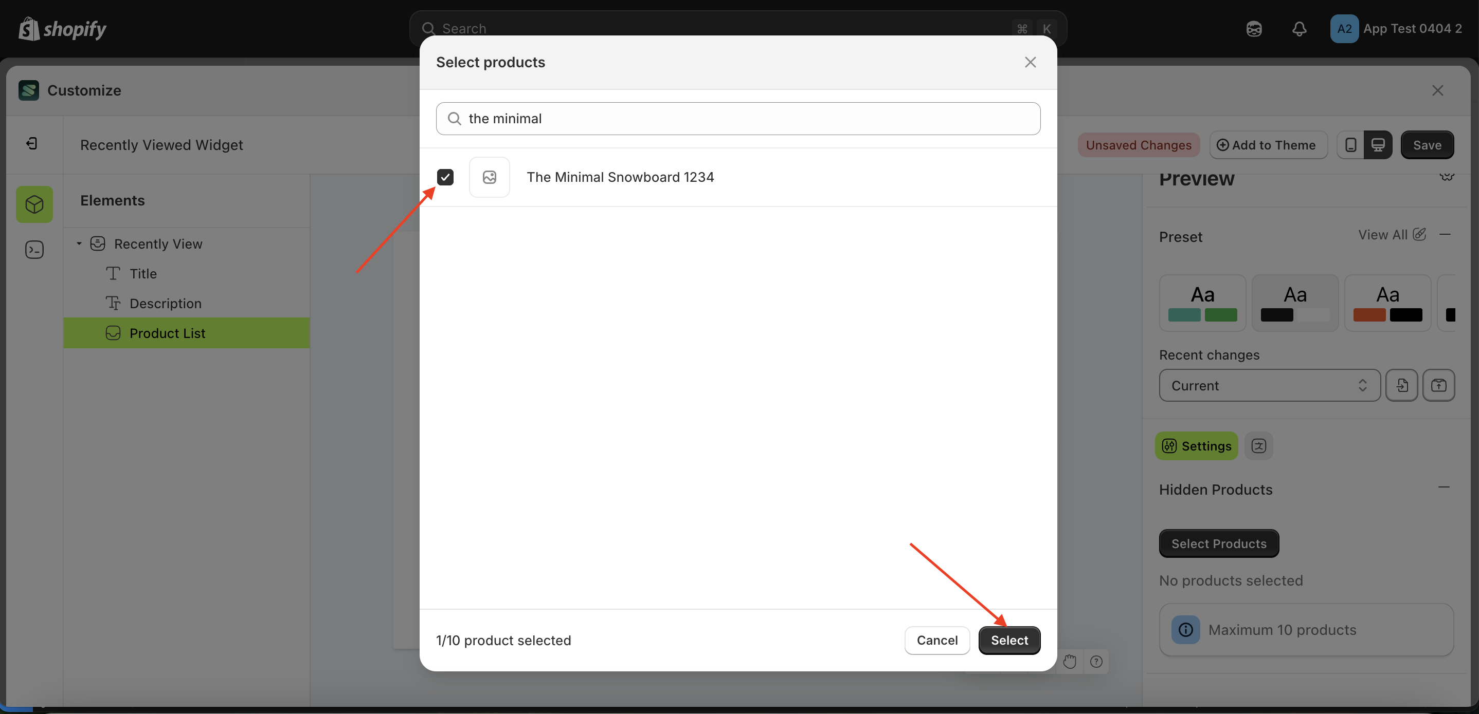
- Choose the product that suits your needs.
- Your selection will appear below the "Select Product" button.